Module 3: Earth's Climate System
Module 3: Earth's Climate System
Video: Module 3 Introduction (1:14)
Introduction
This course is all about the Earth’s climate. Thus, it is essential that you have a solid understanding of how the climate system works. This module is all about the climate system. It is by far the most technical module in the course, and our philosophy is to lay out the science in a comprehensive way, equations and all, so that you can see that Earth's climate is in part fairly simple, governed by physical relationships that describe how heat from the Sun is exchanged on the surface of the Earth and in its atmosphere. Then, there are some very complex aspects of the Earth's climate that we will not devote much time to.
Here is an example of why this module is important. The Polar Vortex has become a household name in the US in recent years. In Texas in the winter of 2021, the cold air from the vortex caused unusually cold temperatures and this crippled the power system that was not built to withstand such temperatures. The power cuts caused chaos, up to 5 million people were without power often for many days, 12 million people lost water service due to freezing pipes, and 151 people died as a result of hypothermia and carbon monoxide poisoning.
Video: Deep freeze in Texas: Millions without power, 21 dead in historic snowstorms (2:54)
Those of us on the East Coast and Midwest of the US and our neighbors in Canada, 187 million people in all, lived through an extremely cold week at the beginning of 2014. Air temperatures, without the windchill factored in, reached -35oC in eastern Montana, South Dakota, and Minnesota. This cold was a result of the southward expansion of the polar vortex, a whirlwind of cold dense air that is normally restricted to the area around the poles. Understanding the polar vortex, and how it became unstable and swept across the Midwest and eastern parts of Canada and US, is key to interpreting the significance of the extreme cold in early 2014. Without this understanding, you might think that the expansion of cold air is a sign of cooling climate. However, it is likely that the opposite is the case; the recent cold snap is actually a result of warming. This is how it works. As you will learn in this module, the northern high latitudes are warming more rapidly than the rest of the globe as a result of melting sea ice. You will also learn that such warming leads to diminished wind velocities, including the polar vortex. As the vortex weakens, it becomes less stable and begins to wobble and stray from the region around the North Pole. It turns out that the recent cold snap was just one of these wobble events, and the projections are for polar vortices to become more common over North America in the future, just as other extreme events like extratropical hurricanes such as Sandy, heat waves and droughts become more frequent.

Now, right off the bat, we need to make it clear that the "simple" relationships are often portrayed in the module in terms of equations. You do not need to be a Math major to understand these equations, nor do we want you to memorize them. The point of showing the equations is not to cause great anxiety, but to provide an understanding of the relationship between two variables. For example, you should be looking to distinguish relationships that are linear (such as a=b*x [where * is multiplied by]) from those that are quadratic (such as a=bx2). This is the level at which we expect you to understand equations. One last word, the lab for this module is designed to strengthen the fundamentals you learn in the reading. By experimenting with climate in the lab, you should come away with a really solid understanding of the climate system.
Goals and Learning Outcomes
Goals and Learning Outcomes
Goals
On completing this module, students are expected to be able to:
- describe how energy is absorbed, stored, and moved around in Earth's climate system;
- distinguish how the amount of energy stored determines the temperature;
- interpret the importance of feedback mechanisms that make our climate system sensitive to forcings, but also provide a stabilizing influence;
- infer how temperature responds to changes in solar input, albedo, and greenhouse gas concentrations;
- evaluate how simple (i.e., STELLA) models can be used to make projections of climate variables.
Learning Outcomes
After completing this module, students should be able to answer the following questions:
- What are heat and thermal energy?
- What are the different types of electromagnetic radiation?
- What is blackbody radiation and what is the significance of the Stefan-Boltzmann law?
- What is emissivity and what is its significance?
- What is albedo and what are albedo values for different materials?
- What is the solar constant and how is it measured?
- What is insolation and what are its geographic and annual distributions?
- What does sunspot history look like and how is it related to solar intensity?
- What are the relative heat capacities of different materials?
- What is the greenhouse effect and what are the different greenhouse gasses?
- What are the basic energy flows in the atmosphere?
- What is positive and negative feedback and what are examples of each?
- What are the energy budgets of different latitudes?
- How is heat transferred in the atmosphere?
- How is heat transferred in the oceans?
- What is the Global Conveyor Belt and what is its significance?
Assignments Roadmap
Below is an overview of your assignments for this module. The list is intended to prepare you for the module and help you to plan your time.
| Action | Assignment | Location |
|---|---|---|
| To Do |
|
|
NOTICE:
There is some math in this section! It is mostly algebra. You should know how to read and understand these equations, but you do not need to memorize equations.
Global Climate
Global Climate
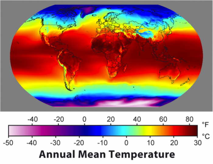
We begin with a quick glimpse of the global climate — and then we’ll try to understand why it looks this way. But first, what does climate mean? In the simplest sense, it is the average weather of a region — the average temperature, rainfall, air pressure, humidity, cloud cover, wind direction, and wind speed. This means that climate is not the same as weather; weather implies a very short-term description of the atmospheric conditions, and it tends to change in a complex manner over short time scales, making it notoriously difficult to predict. In contrast, the climate is less variable — it smoothens out the variability of the short-term weather. This course is about climate, how it is changing, and what that means for our future; as we move through this class, you should remind yourself periodically that we are not talking about the weather — our time frame is much longer.
So, let’s have a look at the climate as expressed by temperature:
As you can see, the equatorial regions are the warmest, and the poles are the coldest, with Antarctica being noticeably colder than the Arctic. The temperature varies more within the continents than the oceans, and there is a pronounced northward extension of warm water in the North Atlantic.
The global climate system is like a big machine receiving, moving, storing, transferring, and releasing heat or thermal energy. The machine consists of the oceans, the atmosphere, the land surface, and the biota on land and in the oceans; in short, it consists of everything at the Earth’s surface. The average state of this system — the global climate — is represented most simply by the pattern of temperatures and precipitation at the surface.
In order to really understand this complex machine, we will have to understand something about its parts, but we also need to begin with some fundamental ideas about energy, heat, and temperature, including the source of the energy for the climate system — the sun.
Useful Terms and Definitions Related to the Energy of the Climate System
Energy
In the broadest terms, energy is a quantity that has the ability to produce change in a physical system; it includes all kinds of kinetic energy (energy of motion) and potential energy (energy based on the body's position) and is measured in joules. One joule represents the amount of energy needed to exert a force of one Newton over a meter; so 1 Joule = 1Nm.
Power
Energy expended over a period of time is a measure of power, and in the context of climate, power is expressed in terms of Watts (1 Watt = 1 joule per second). This is also called a heat flux — the rate of energy flow.
Heat
This is simply the thermal energy of a body, measured in joules. Think of this as the average kinetic energy (vibrations) of the atoms of a material.
Heat Flux Density
This is a measure of how concentrated the energy flow is and is given in units of Watts per square meter.
Temperature
This is obviously closely related to heat, but it is the average kinetic energy within some body. Materials can be the same temperature, but they may have different amounts of thermal energy — for instance, a volume of water has much more thermal energy than a similar volume of air at the same temperature. Remember that there are 3 temperature scales: Fahrenheit, Celsius, and Kelvin. We’ll use Celsius and Kelvin, which have the same scale, just offset so that 0°C = 273°K.
Simple Climate Model
Simple Climate Model
We begin with a very simple analog model for our planet’s climate (figure below) in which solar energy enters the system, is absorbed (some will have been reflected), stored (some will have been transformed or put to work), and then released back into outer space. The amount of energy stored determines the temperature of the planet. The balance between the incoming energy and the outgoing energy determines whether the planet becomes cooler, warmer, or stays the same. Notice the little arrow connecting the box to the Energy Out flow — this means that the amount of energy released by the planet depends on how hot it is; when it is hotter, it releases, or emits, more energy and when it is cooler, it emits less energy. What this does is to drive this system to a state where the energy out matches the energy in — then, the temperature (energy stored) is constant. This energy balance, sometimes called radiative equilibrium, is at the heart of all climate models.

Global Climate System
Global Climate System
Now, let’s consider the connection between this idea of an energy flow system to the actual Earth. As shown in the figure below, this system includes the atmosphere, the oceans, volcanoes, plants, ice, mountains, and even people — it is intimately connected to the whole planet. We will get to some of these other components of the climate system later, but to begin with, we will focus on just the energy flows — the yellow and red arrows shown below.

Numbers in the figure refer to the following key:
- Incoming short-wavelength solar radiation
- Reflected short-wavelength solar radiation
- Emission of long-wavelength radiation (heat) from surface
- Absorption of heat by greenhouse gases and emission of heat from the atmosphere back to the surface (the greenhouse effect)
- Emission of surface heat not absorbed by the atmosphere
- Evaporation cools the surface, adds water to the atmosphere
- Condensation of water vapor releases heat to the atmosphere, precipitation returns water to the surface
- Evapotranspiration by plants cools the surface
- Chemical weathering of rocks consumes atmospheric CO2
- Oceans store and transfer thermal energy
- Sedimentation of organic material and limestone (CaCO3) transfers carbon to sediment on the ocean floor
- Melting and metamorphism of sediments sends carbon back to surface
- Emission of CO2 from volcanoes
- Emission of CO2 from burning fossil fuels
- Cold oceans absorb atmospheric CO2
- Warm oceans release CO2 to the atmosphere
- Photosynthesis and respiration of plants and soil exchange CO2 between the atmosphere and biosphere
The figure above includes some new words and concepts, including short-wavelength and long-wavelength radiation, that will make sense if we devote a bit of time to a review of some topics related to energy.
Electromagnetic Spectrum
Electromagnetic Spectrum
Brief Review of Electromagnetic Radiation
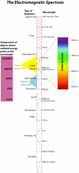
The energy we are concerned with here comes in the form of electromagnetic radiation, so it will help us to review some aspects of this form of energy. Electromagnetic (EM) radiation comes in a spectrum of waves, each consisting of an electrical and a magnetic oscillation of particles called photons; this spectrum is shown in the figure below:
Blackbody Radiation
Blackbody Radiation
In the realm of physics, a blackbody [10] is an idealized material that absorbs perfectly all EM radiation that it receives (nothing is reflected), and it also releases or emits EM radiation according to its temperature. Hotter objects emit more EM energy, and the energy is concentrated at shorter wavelengths. The relationship between temperature and the wavelength of the peak of the energy emitted is given by Wien’s Law, which states that the wavelength, lambda, is:
(λ is in m, T in kelvins)
But the energy emitted covers a fairly broad range, as described by Planck’s Law, [11] as shown below:

The total amount of energy radiated from an object is also a function of its temperature, in a relationship known as the Stefan-Boltzmann law, which looks like this:
where σ is the Stefan-Boltzmann constant, which is 5.67e-8 Wm-2K-4 (this is another way of writing 5.67 x 10⁻⁸; so 100 is 1e2, 1000 is 1e3, one million is 1e6, etc.), T is temperature of the object in °K, and so F has units of W/m2. If you multiply this by the surface area of an object, you get the total rate of energy given off by an object (remember that Watts are a measure of energy, Joules, per second). As you can see, the amount of energy emitted is very sensitive to the temperature, and that can be seen in the figure above if you think about the area beneath the curves of different color. This sensitivity to temperature is very important in establishing the radiative equilibrium or balance of something like our planet — if you add more energy, that warms the planet, and then it emits more energy, which tends to oppose the warming effect of more energy added. Conversely, if you decrease the energy added, the planet cools and emits far less energy, which tends to minimize the cooling. This is a very important example of a negative feedback mechanism, one that works in opposition to some imposed change. The thermostat in your house is another good example of a negative feedback — it works to stabilize the temperature in your house, bringing it into radiative equilibrium.
The version of the Stefan-Boltzmann law described above applies for an ideal blackbody object, but it can easily be adapted to describe all other objects by including something called the emissivity, as follows:
Here, epsilon is the emissivity, which is a unitless value that is a measure of how good an object is at emitting (giving off) energy via electromagnetic radiation. A blackbody has epsilon=1, but most objects have lower emissivities. A very shiny object has an emissivity close to 0, and human skin is between 0.6 to 0.8.
Check Your Understanding
Albedo
Albedo
As mentioned earlier, an ideal blackbody will absorb all incident light, but in the real world, things absorb only part of the incident light. The fraction of light that is reflected by an object is called the albedo, which means whiteness in Latin. Black objects have an albedo close to 0, while white objects have an albedo of close to 1.0. The table below lists some representative albedos for Earth surface materials. Most of these albedos are sensitive to the angle at which the sunlight hits the surface; this is especially true for water. When the Sun is at angles of 40° and higher relative to the horizon, the albedo of the water is fairly constant, but as the angle decreases from 40°, the albedo increases dramatically so that it is about 0.5 at a Sun angle of 10° and 1.0 at a sun angle of 0°. You are aware of this in the form of glare coming off the water in the early morning or in the evening before sunset.
| Substance | Albedo (% reflectance) |
|---|---|
| Whole Planet | 0.31 |
| Cumulonimbus Clouds | 0.9 |
| Stratocumulus Clouds | 0.6 |
| Cirrus Clouds | 0.5 |
| Water | 0.06 - 0.1 |
| Ice & Snow | 0.7 - 0.9 |
| Sand | 0.35 |
| Grass lands | 0.18 - 0.25 |
| Deciduous forest | 0.15 - 0.18 |
| Coniferous forest | 0.09 - 0.15 |
| Rain forest | 0.07 - 0.15 |
Most people have an intuitive sense for the effects of albedo on reflectance and solar energy absorption. This is why people wear white clothes in hot sunny climates and dark clothes in cold sunny climates. What should you wear if it is cloudy and cold?
In the above table, we see that the Earth’s average albedo is 0.31, but there is considerable variation in this value over the surface of the Earth and over time as well — this spatial and temporal variation in albedo of the Earth is shown in the figure below.

Check Your Understanding
Radiative Equilibrium
Radiative Equilibrium
We have already mentioned the idea of radiative equilibrium, where the incoming energy and the outgoing energy are in balance, resulting in a steady temperature, but now we are in a position to combine a few other ideas to express this notion in a simple equation that is at the heart of all climate models. Before we begin, we introduce the solar constant, which is the amount of incoming solar electromagnetic radiation [12] per unit area. Just for your information, this amount is measured on a plane perpendicular to the Sun's rays and at the mean distance from the Sun to the Earth.
We begin with the energy (in units of W/m2):
Here, S is the solar constant — 1370 W/m2, and a is the albedo, which is about .31 based on satellite measurements. Then we deal with the energy out, using the Stefan-Boltzmann law:
Combining energy in (Ein) and energy out (Eout), we get:
Now, we can solve this to find what the equilibrium temperature of our planet is:
adding numbers,Yikes! This is too cold — we know the mean temperature of the Earth is more like 15°C (288°K or 59°F). What have we left out? The simple answer is the emissivity, which makes sense since we know the Earth is not an ideal blackbody. (Remember that emissivity is a measure of how good an object is at emitting (giving off) energy via electromagnetic radiation; in the above, we have effectively assumed an emissivity of 1, which is for a perfect black body material). Using the equation above, let’s see what that emissivity number should be:
So, then, even if all of these equations have you seeing stars, what does this basically mean? There is something about the Earth that prevents it from emitting as much energy as it should. What is this something? It is the greenhouse effect — the key that makes our planet a nice place to live.
Check Your Understanding
Insolation
Insolation
Insolation — Incoming Solar Radiation
It all starts with the Sun, where the fusion of hydrogen creates an immense amount of energy, heating the surface to around 6000°K; the Sun then radiates energy outwards in the form of ultraviolet and visible light, with a bit in the near-infrared part of the spectrum. By the time this energy gets out to the Earth, its intensity has dropped to a value of about 1370 W/m2 —as we just saw this is often called the solar constant (even though it is not truly constant — it changes on several timescales):

Since the Earth spins, the insolation is spread out over an area 4 times greater than the disk shown in the figure above, so the solar constant translates into a value of 343 W/m2. This is a bit less than six 60 Watt light bulbs shining on every square meter of the surface, which adds up to a lot of light bulbs since the total surface area of Earth is 5.1e14 m2. How much energy do we get from the Sun in a year? Take 1370 W/m2, multiply by the area of the disk (pi x r2 where r=radius of Earth, 6.37e6 m), and this gives us an answer in Watts, which has units of joules per second, so if we then multiply by the number of seconds in a year, then we get the total energy in joules per year. The number is staggering — 5.56e24 Joules of energy — and is 10,000 times greater than all of the energy generated and consumed by humans each year.

The insolation is not constant over the surface of the Earth — it is concentrated near the equator (first figure on the page) because of the curvature of the Earth. But, the situation is complicated by the fact that the Earth’s spin axis is tilted by 23.4° relative to a line perpendicular to the Earth’s orbital plane (see the second figure on the page), so that as Earth orbits around the Sun, the insolation is concentrated in the Northern Hemisphere (the Northern Hemisphere summer) and then the Southern Hemisphere (winter in the Northern Hemisphere). This tilt of the spin axis, also called the obliquity, is the main reason we have seasons.
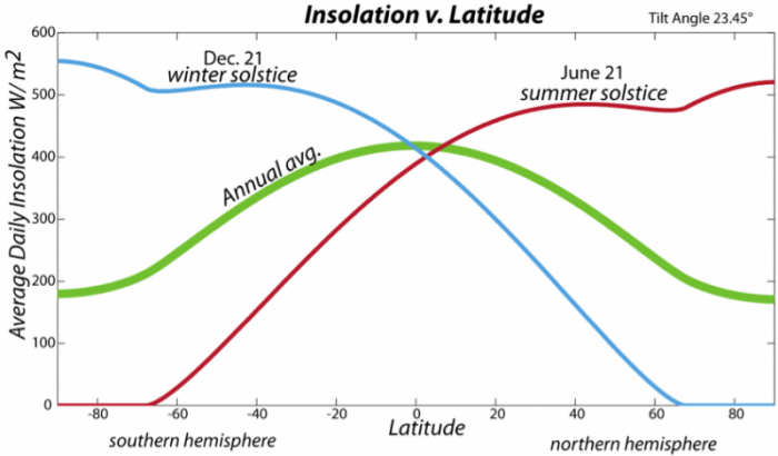
The tilt of the spin axis also means that day length changes, and these changes are most dramatic at the poles, which experience 24 hours of daylight during their summers and no daylight during their winters. The varying day length, along with the angle of incidence of the Sun’s rays, combine to control the average daily insolation variation (see figure above). On a yearly average, the equatorial region receives the most insolation, so we expect it to be the warmest, and indeed it is.
Earlier, we mentioned the Solar Constant — a measure of the amount of solar energy reaching Earth. In reality, this value is not a constant because the Sun is a dynamic star with lots of interesting changes occurring. One of the best known of these changes is the solar cycle, related to sunspots. Sunspots are dark regions on the surface of the Sun related to intense magnetic activity, and measurements have shown that the greater the number of sunspots, the greater the energy output of the Sun. Early observations of these sunspots revealed a pronounced cyclical pattern to them, varying on an 11-year cycle, as shown below.

Here, in blue, we see the annual number of sunspots and in red we see the reconstructed solar intensity or Solar Constant. The reconstruction is made by studying the relationship between sunspot number and solar intensity in the last few decades, where we have good direct measurements of the solar intensity — this provides a relationship that is fairly simple and directly proportional. Higher sunspot numbers correspond to higher solar intensity. Both records are characterized by a strong 11-year cycle, often called the sunspot cycle.
The magnitude of variation in the Solar Constant, however, is quite small, and we shall see in our lab activity for this module that this amounts to a very small change in the temperature of the Earth.
Check Your Understanding
Heat Capacity and Energy Storage
Heat Capacity and Energy Storage
When our planet absorbs and emits energy, the temperature changes, and the relationship between energy change and temperature change of a material is wrapped up in the concept of heat capacity, sometimes called specific heat. Simply put, the heat capacity expresses how much energy you need to change the temperature of a given mass. Let’s say we have a chunk of rock that weighs one kilogram, and the rock has a heat capacity of 2000 Joules per kilogram per °C — this means that we would have to add 2000 Joules of energy to increase the temperature of the rock by 1 °C. If our rock had a mass of 10 kg, we’d need 20,000 Joules to get the same temperature increase. In contrast, water has a heat capacity of 4184 Joules per kg per °K, so you’d need twice as much energy to change its temperature by the same amount as the rock.
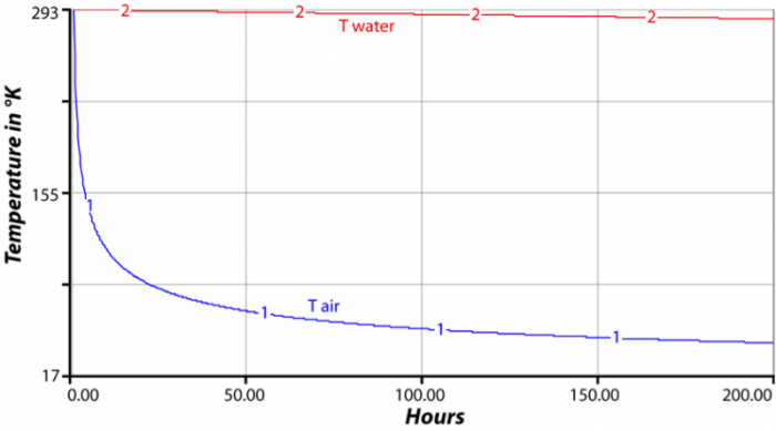
The heat capacity of a material, along with its total mass and its temperature, tell us how much thermal energy is stored in a material. For instance, if we have a square tub full of water one meter deep and one meter on the sides, then we have one cubic meter of water. Since the density of water is 1000 kg/m3, this tub has a mass of 1000 kg. If the temperature of the water is 20 °C (293 °K), then we multiply the mass (1000) times the heat capacity (4184) times the temperature (293) in °K to find that our cubic meter of water has 1.22e9 (1.2 billion) Joules of energy. Consider for a moment two side-by-side cubic meters of material — one cube is water, the other air. Air has a heat capacity of about 1000 Joules per kg per °K and a density of just 1.2 kg/m3, so its initial energy would be 1000 x 1 x 1.2 x 293 = 351,600 Joules — a tiny fraction of the thermal energy stored in the water. If the two cubes are at the same temperature, they will radiate the same amount of energy from their surfaces, according to the Stefan-Boltzmann law described above. If the energy lost in an interval of time is the same, the temperature of the cube of air will decrease much more than the water, and so in the next interval of time, the water will radiate more energy than the air, yet the air will have cooled even more, so it will radiate less energy. The result is that the temperature of the water cube is much more stable than the air — the water changes much more slowly; it holds onto its temperature longer. The figure above shows the results of a computer model that tracks the temperature of these two cubes.
One way to summarize this is to say that the higher the heat capacity, the greater the thermal inertia, which means that it is harder to get the temperature to change. This concept is an important one since Earth is composed of materials with very different heat capacities — water, air, and rock; they respond to heating and cooling quite differently.
The heat capacities for some common materials are given in the table below.
| Substance | Heat Capacity (Jkg-1K-1) |
|---|---|
| Water | 4184 |
| Ice | 2008 |
| Average Rock | 2000 |
| Wet Sand (20% water) | 1500 |
| Snow | 878 |
| Dry Sand | 840 |
| Vegetated Land | 830 |
| Air | 1000 |
Check Your Understanding
The Greenhouse Effect and the Global Energy Budget
The Greenhouse Effect and the Global Energy Budget
Earlier, we noticed that if you do the energy balance calculation to figure out the temperature of our planet, it suggests that Earth should be -19 °C, which is 34 °C colder than the observed average global temperature of 15 °C. Why is Earth warmer than it should be? The answer lies in the greenhouse effect — gases in our atmosphere (including CO2, CH4 (methane) and H2O water vapor) trap much of the emitted heat and then re-radiate it back to Earth’s surface. This means that the energy leaving our planet from the top of the atmosphere is less than one would expect given the known temperature of our planet. As mentioned earlier, this effect can be represented in the simple energy balance equation as a term called the emissivity.
The fact of this greenhouse effect comes out of the very simple calculation we did above, but it can also be observed in great detail from satellite measurements of the infrared energy leaving Earth’s atmosphere.
As we discussed on the topic of black body radiation, the temperature of a body (a planet, for instance) gives us a sense of what the spectrum of energy should look like — that is, a range of wavelengths and intensity of radiation at those wavelengths. For the Earth, this spectrum, as seen from satellites looking down on the surface, is very different from the expected. The figure below shows the difference between the expected and the observed.

In fact, the same thing happens to the energy the Earth receives from the Sun — various gases in the atmosphere absorb that energy, so the amount we receive on the surface is less than what arrives at the top of the atmosphere.

How do gases absorb this energy? It is basically a matter of vibrations of gas molecules being in sync with some of the frequencies of energy associated with insolation or infrared energy given off by Earth. You can think of the bonds between atoms in an H2O molecule like springs that stretch, twist, and bend at specific frequencies (nice animation of H2O movement) [14], and if energy hits those molecules at just the right frequency, the bonds of the molecule absorb that energy and oscillate and stretch and twist more strongly.
There are numerous ways to demonstrate this heat-trapping ability of some gases — here is a nice laboratory demonstration of heat-trapping [15]— but you can also think of the difference between the cold nighttime temperatures when the air is dry (little water vapor) compared to the warmer nighttime temperatures when the air is humid. The fact of the greenhouse effect is one of the most important things to understand about our climate system. This greenhouse effect, which is probably better described as warming produced by heat-trapping gases, is incredibly powerful — it returns more energy to the surface than we absorb from the Sun, and its strength is closely tied to the global carbon cycle, and thus the oceans, and all the biota on Earth.
Let’s try to put a lot of this together now and have a glance at the energy budget for Earth’s climate. The figure below attempts to illustrate where all the energy goes in the climate system. We start with 100 units of energy, which represents the total amount of energy Earth receives from the Sun in a year.

When the insolation strikes the atmosphere, 23 units are reflected back to space from clouds and aerosols, which are tiny particles suspended in the atmosphere. Another 19 units are absorbed by the atmosphere, as described in the figure above, thus adding thermal energy to the atmosphere. The remaining 58 units of energy reach the Earth’s surface, where 9 units are reflected back into space, and the remaining 49 units are absorbed by the surface, warming the planet. The Earth’s surface is mostly water, and by virtue of its temperature and heat capacity, it has a lot more thermal energy than the atmosphere (271.2 vs 16.5). Energy flows up from the surface to the atmosphere in a variety of ways — mainly by emission of infrared radiation, heat transfer by evaporation, and then condensation of water. When water evaporates, it “steals” energy from the surface; this energy is needed to make the phase change from liquid to vapor, and the same energy is then released when water vapor condenses to form liquid water droplets. As you can see from the diagram, the combined flow of energy from the surface is greater than the amount we get from the sun! Of this energy given off by the surface, a little bit (7 units) escapes the atmosphere because there are no gases that absorb infrared energy at wavelengths between 10 to 15 microns; the rest is absorbed by the atmosphere, which then emits infrared energy from its top to outer space and from its bottom back to the surface; this atmospheric absorption of infrared energy and its return to the surface is called the greenhouse effect. Since the bottom of the atmosphere is much warmer than the top, much more energy is returned to the Earth’s surface than is emitted to outer space.
The remarkable thing to observe and remember here is that the surface receives almost twice as much energy from the greenhouse effect than it does directly from the Sun! But, if you look at the diagram a bit, you can see that the energy sent to the surface from the atmosphere is essentially recycled energy, whose origin is the Sun.
Check Your Understanding
Feedback Mechanisms
Feedback Mechanisms
The view of the climate system depicted in the adjacent figure is one of stability — energy flows in and out, in perfect balance, so the temperature of the earth should stay the same. But if we can learn anything from studying Earth’s history, we learn that change is the rule and stability the exception. When change occurs, it almost always brings feedback mechanisms into play — they can accentuate and dampen change, and they are incredibly important to our climate system. There are many good examples of feedback mechanisms, but here are a few to illustrate the idea.
Ice — Albedo Feedback
Ice reflects sunlight better than almost any other material on Earth, and in reflecting sunlight, it lowers the amount of insolation absorbed by Earth, which makes it colder. If the Earth becomes colder, more ice may grow, covering more area and thus reflecting even more insolation, which in turn cools the Earth further. Thus cooling instigates ice expansion, which promotes additional cooling, and so on — this is clearly a cycle that feeds back on itself to encourage the initial change. Since this chain of events furthers the initial change that triggered the whole thing, it is called a positive feedback (but note that the change may not be good from our perspective). Positive feedback mechanisms tend to lead to runaway change — some small initial change is thus accentuated into a major change.
Weathering Feedback
Rocks exposed at the surface interact with water and the atmosphere and undergo a set of chemical and physical changes we call weathering. The chemical part of weathering often involves the consumption of carbonic acid (formed from water and carbon dioxide) in dissolving minerals in rocks. This process of weathering is thus a sink for atmospheric carbon dioxide, which is an important greenhouse gas. If you remove carbon dioxide from the atmosphere, you weaken the greenhouse effect and this leads to cooling of the Earth. Like many chemical reactions, this chemical weathering occurs more rapidly in hotter climates, which are associated with higher levels of carbon dioxide. So consider a scenario in which some warming occurs; this will encourage faster weathering, which will consume carbon dioxide, which will lead to cooling. In this case, the initial change triggered a set of processes that countered the initial change — this is called a negative feedback (even though it may have beneficial results) because it works in opposition to the change that triggered it.
Cloud Feedback
Another important negative feedback mechanism involves the formation of clouds. On the whole, clouds in today's climate have a slight net cooling effect — this is the balance of the increased albedo due to low clouds and the increased greenhouse effect caused by high cirrus clouds. As a general rule, as the atmosphere gets warmer, it can hold more water vapor, and with more water vapor, we expect more clouds, and the increased clouds will then tend to limit the warming that initiated the increased clouds — thus we have another negative feedback mechanism.
Positive and Negative Feedbacks — Yin and Yang
In Asian philosophy, yin and yang can be thought of as interacting, interconnected forces that are essential components of a dynamic system. In the Earth system, positive and negative feedbacks are a bit like yin and yang — they are essential components of the whole system that ultimately play an important role in maintaining a more or less stable state. Positive feedback mechanisms enhance or amplify some initial change, while negative feedback mechanisms stabilize a system and prevent it from getting into extreme states. In many respects, the history of Earth’s climate system can be seen as a bit of a battle between these two types of feedback, but in the end, the negative feedbacks win out and our climate is generally stable with a limited range of change (excepting, of course, a few extremes such as the Snowball Earth events back around 750 Myr ago).

Check Your Understanding
Tipping Points
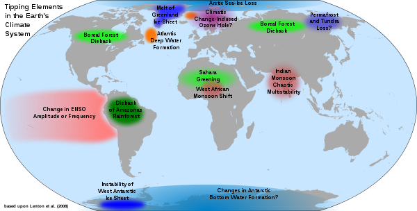
Earth’s climate systems are characterized by thresholds, levels that once crossed herald a new climate state. For example, we often talk about the 1.5 or 2oC thresholds across which the impacts of climate change become dangerous, for example including long heatwaves, devastating droughts and more common extreme weather events. Thresholds can become tipping points if, once crossed, there is no going back from the new climate state, at least temporarily. One of the best examples of a tipping point is the cessation in Atlantic meridional overturning circulation (AMOC) which we will learn about in Module 6 and which is a key driver of heat transport around the globe. This circulation drives the formation of ocean deep waters which in return feeds the Gulf Stream which warms northern latitudes including Western Europe, making them more habitable. It also fuels monsoon rains in places like India. In the past, AMOC has turned off, driving Northern Europe into an ice age. The system is highly complex and difficult to predict, but there have been warning signs that it has been edging closer to that potentially devastating tipping point in recent decades. The system becomes more variable as a tipping point is reached, and that variability is currently showing signs of increasing. Tipping points may involve positive feedbacks. For example, melting and disintegration of the West Antarctic Ice sheet will lower planetary albedo resulting in further melting, and at some stage the feedback will make the system irreversible, at least temporarily. Another example is the melting of permafrost in the Arctic region. Tipping points can lead to cascading changes if they impact one another, for example, significant melting of Antarctic ice can cause enough warming to exacerbate permafrost melting. More examples of tipping points are showing in the figure below.
Tipping points represent one of the most dire threats of climate change due to their irreversible nature. Because of this, they are very much a key driver of the warming thresholds and emissions targets.
A Satellite's View of the Climate Energy Budget
A Satellite's View of the Climate Energy Budget
The diagram we have just been considering (repeated above), presents a good overview of how energy flows through the Earth’s climate system, but it does not give us a sense of how that energy is distributed across the surface of the globe and there are some important things to be learned from looking at this spatial pattern. For many years now, satellites have been monitoring these energy flows using spectrometers that measure the intensity of energy at different wavelengths flowing to the Earth and from the Earth. So, let’s see what can be learned from a quick study of these satellite views. First, we consider the insolation at the top of the atmosphere averaged for the month of March.

Of course, not all of this insolation strikes the surface — remember that just 49% of it reaches the ground. If we then look at the insolation reaching the ground, we see the following:

Notice that the highest flux is about 190 W/m2; far less than the maximum of almost 440 W/m2 that reaches the top of the atmosphere. The difference is due to reflection from clouds, reflection from the surface, and absorption by atmospheric gases.
Now, let’s look at what comes back from the Earth, in the form of long wavelength energy, for the same time period.

At the simplest level, we see that the tropics emit much more energy than the poles. This makes sense since we know they are warmer, and the Stefan-Boltzmann law tells us that the amount of energy emitted varies as the fourth power of temperature, and the tropics are warmer because they receive much more insolation (see figures above). Looking closely at the nearest above image, we see some interesting variations near the tropics — look at South America, Central Africa, and Indonesia, where the emitted energy is far less than we see elsewhere at these same latitudes. Why is this? Is it colder there? No, it is not colder there, which leads to another question — is the atmosphere above these regions absorbing more of the infrared energy emitted by the surface? Recall that one of the main heat-absorbing gases is water, and where you have a lot of water, you have a lot of clouds. So, let’s have a look at the typical average cloud cover for this time of year.

So, it is indeed the case that the amount of energy leaving the Earth varies according not only to the temperature but also to the concentration of heat-absorbing gases such as water.
Recall that we are focused on the energy budget here and whenever you do a budget, at the end, you look at the balance between what is coming in and what is going out. So, let’s do that now with the energy as measured by the satellites.

As can be seen in the figure above, the tropics receive more energy than they emit, while the poles emit more than they receive. This picture can also be seen in a somewhat simpler diagram in which we average the net energy flow at each latitude.

Check Your Understanding
Process of Heat Transfer
Process of Heat Transfer
The atmosphere and oceans are constantly flowing, and this motion is critical to the climate system. What makes them flow? In general, the movement is due to pressure differences — things flow from regions of high pressure to low pressure and the resulting surface winds distribute heat at the Earth's surface.

The pressure changes are themselves due to density and height differences — higher density in the air or the oceans leads to higher pressures. The density differences are due to changes in composition and temperature; this works slightly differently for air and water. In air, the important compositional variable is water vapor content — more water means lower density air. When we say more water, we mean that for a given number of molecules in a volume of air, a greater percentage of them are water, and water, as shown below, is lighter than a nitrogen molecule, which is the most abundant molecule in our atmosphere.
Density of Air
Inverse relationship with Temperature:
Higher temp = lower density → rising air
Weight of H2O= 18
Lower temp = higher density → sinking air
Weight of N2 = 28
Inverse relationship with water content:
More water = lower density → rising air
Less water = higher density → sinking air

As indicated above, density differences can cause either rising or sinking of air masses. Because Earth’s gravity decreases as you move away from the surface, there is a kind of equilibrium profile of density with height above the surface, as shown by the green curve below:

If we lower the density of air at the surface from A to B, then the air rises from B to C. Then, if we increase the density of air at point C, moving it to D, it will sink back down to point A near the surface.
We start with the movement of the atmosphere, which we will try to make as simple as possible by first concentrating on the flow as seen in a vertical slice from pole to pole. The story begins at the equator, where air is warmed and lots of evaporation adds water to the air, giving it a low density:

This air rises until it gets to the top of the tropopause, which is a bit like a lid on the lower atmosphere. It then diverges, with some of the air flowing north and some flowing south. As it rises and moves away from the equator, the air gets colder, water vapor condenses and rains out and the air grows drier — the cooling and drying both make the air grow denser and by the time it reaches about 30°N and 30°S latitude, it begins to sink down to the surface.

The sinking air is dense and dry, creating zones of high pressure in each hemisphere that are associated with very few clouds and rainfall — these are the desert latitudes. The sinking air hits the ground and then diverges. Some flows south and some flows north; the parts of this divergent flow that return towards the equator complete a loop or a convection cell, a Hadley Cell, named after Hadley, a famous meteorologist. Now, let’s turn our attention to the air that flows away from the equator. Moving along the surface, it warms and picks up water vapor, and so, its density decreases, and it eventually rises up when it gets to somewhere between 45° and 60° latitude in each hemisphere.

Once again, the rising air runs into the tropopause (which is lower at these higher latitudes) and diverges, with some of it returning toward the equator, thus completing another convection cell called the Ferrel Cell. The air that flows pole-ward sinks down at the poles, creating yet another convection cell known as the Polar Hadley Cell. These convection cells create bands of low and high pressure that roughly follow lines of latitude that exert a big influence on the climate at different latitudes. The air flowing within these convection cells does not simply move north and south as depicted above — the Coriolis effect alters the flow directions, giving us a surface pattern that is dominated by winds flowing east and west.

Note that the boundary between the Polar Hadley Cell and the Ferrel Cell (often called the Polar Front, and associated with the mid-latitude jet stream) is highly variable, with big loops in it. These loops, or waves, change over time to a much greater extent than the boundaries between the other convection cells.
The Coriolis Effect
The Coriolis Effect
The Coriolis Effect arises because our planet is spinning, which means that objects near the equator are moving at much faster velocities than objects at higher latitudes. If you were standing on the equator, you would be traveling at about 1600 km/hr; if you were standing at the North Pole, you would be traveling at 0 km/hr. This means that a parcel of air moving across the surface moves into regions where the whole planet is traveling either slower or faster. The physics of this phenomenon are well-understood, and without getting into the mathematics behind it, we can summarize it with 4 simple statements:
- objects moving in the Northern Hemisphere get deflected to the right as you look in the direction of motion;
- objects moving in the Southern Hemisphere get deflected to the left as you look in the direction of motion;
- the strength of this effect, this deflection, is greater as you approach the poles; and
- the strength of the effect is more important at higher velocities (e.g., a glacier does not respond to Coriolis).
Let’s think for a minute about what this general circulation of the atmosphere does. Among other things, it mixes the atmosphere quite thoroughly, and this means that the concentrations of things like greenhouse gases get homogenized. It also means that heat gets transferred. Polar air finds its way toward lower latitudes, where it cools the surface and in so doing warms itself, and warmer air finds its way to higher latitudes, where it gives up its heat to the surroundings and thus cools.
But this general circulation does more — it drives the circulation of the surface waters in the ocean.
Ocean Circulation
Ocean Circulation
The oceans swirl and twirl under the influence of the winds, Coriolis, salinity differences, the edges of the continents, and the shape of the deep ocean floor. We will discuss ocean circulation in detail in Module 6, but since ocean currents are critical agents of heat transport, we must include them here as well. In general, the surface currents of the oceans are driven by winds, Coriolis, and the edges of continents, and the deep currents that mix the oceans are driven by density changes related to temperature and salinity as well as the shape of the deep ocean floor.
The pattern of circulation is shown in the figure below, which represents the average paths of flow; on a shorter term, the flow is dominated by eddies that spin around.

In this map, the different colors correspond to the warm currents (red), cold currents (blue), and currents that move mostly along lines of latitude and thus do not transport waters across a temperature gradient (black). These latter currents may involve warm or cold water, but they do not move that water to warmer or colder places. As mentioned earlier, these arrows depict average flow paths, but on a shorter timescale, the water is involved in eddies that move along the directions indicated by these arrows. These ubiquitous eddies are important since they mix up the surface of the oceans, just as swirling a spoon in a coffee cup mixes the coffee. There are several ways of forming eddies, including intermittent winds combining with the Coriolis effect, opposing currents interacting with each other, and currents interacting with coastlines. As this pattern of currents indicates, surface ocean circulation moves a lot of warm water to colder portions of the Earth; it also moves cold water back down to warmer regions — the net effect is to exchange heat and bring the tropics and the poles a little closer to each other in terms of temperature. Or, in other words, this (along with the winds) moves surplus energy from the tropics to the regions of energy deficit near the poles.
It is important to realize that these currents, by themselves, would eventually homogenize the temperature on the surface, were it not for the huge difference in solar energy between the tropics and the poles. In addition, the strength of these air and ocean currents is sensitive to the temperature difference between the poles and the equator — the greater the temperature difference, the stronger the currents.
The surface currents described above are generally confined to the upper hundred meters or so of the oceans, and considering that the average depth of the oceans is about 4000 meters, the surface currents represent a very small part of the ocean system. The rest of the oceans are also in motion, moving much more slowly under the influence of density differences caused by temperature and salinity changes. Cold, salty water is dense, while warm, fresh water is light, and the resulting density differences drive a system of flows sometimes referred to as the thermohaline circulation. In today’s world, there are two principal places where deep waters form — the North Atlantic and Antarctica, as shown below:
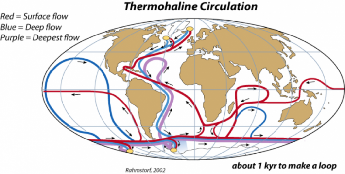
In the North Atlantic, warm, salty water from the Gulf Stream comes into contact with cold Arctic air, and as the water cools it becomes very dense and sinks to the bottom of the ocean — this is called the North Atlantic Deep Water (NADW). When NADW forms, a tremendous amount of heat is transferred from the water to the air; this heat is equivalent to about 30% of the thermal energy received by the whole polar region, so it can influence the Arctic climate in a major way. In the Antarctic, as sea ice forms at the edge of the ice sheet, pure water is removed from seawater, thus increasing the salinity of the remaining water; the resulting density increase makes this the densest water in oceans, and it sinks to the bottom — this water mass is called the Antarctic Bottom Water (ABW). Of these two deep water flows, the NADW is much greater, and it flows in a complex path, hugging the bottom of the ocean as it moves through the Atlantic and into the Indian and Pacific Oceans, by which point it has warmed and mixed with the surrounding water to rise back up into the surface, where it starts its return path back into the North Atlantic, completing the loop in something like a thousand years. This flow is sometimes called the Global Conveyor Belt (we will talk a lot more about this in Module 6), and it represents an important means of mixing the global oceans.
These deep currents are very important to the global climate system in a couple of ways. One of these ways, described above, is the way that NADW formation influences the Arctic climate; this, in turn, can influence the formation or melting of ice in the polar region, which can trigger the ice-albedo feedback mechanism (see below). Another way these deep currents influence the global climate is by transporting CO2 to the deep waters of the oceans. The CO2 is dissolved into the seawater at the surface, so when deep waters form, they bring that CO2 with them, thus removing it from the atmosphere. What this does is to effectively increase the volume of ocean water that can hold CO2, which increases the total mass of carbon the oceans can hold. Indeed, these deep currents are already transporting anthropogenic CO2 and other gases such as CFCs into the deep ocean (we will talk a lot more about this in Modules 5 and 7).
Check Your Understanding
Lab 3: Climate Modeling (Introduction)
Lab 3: Climate Modeling
In this activity, we’ll explore some relatively simple aspects of Earth’s climate system, through the use of several STELLA models. STELLA models are simple computer models that are perfect for learning about the dynamics of systems — how systems change over time. The question of how Earth’s climate system changes over time is of huge importance to all of us, and we’ll make progress towards understanding the dynamics of this system through experimentation with these models. In a sense, you could say that we are playing with these models, and watching how they react to changes; these observations will form the basis of a growing understanding of system dynamics that will then help us understand the dynamics of Earth’s real climate system.
What is a STELLA model?
What is a STELLA model?
It is a computer program containing numbers, equations, and rules that together form a description of how we think a system works — it is a kind of simplified mathematical representation of a part of the real world. Systems, in the world of STELLA, are composed of a few basic parts that can be seen in the diagram below:

A Reservoir is a model component that stores some quantity — thermal energy in this case.
A Flow adds to or subtracts from a Reservoir — it can be thought of as a pipe with a valve attached to it that controls how much material is added or removed in a given period of time. The cloud symbols at the ends of the flows signify that the material or quantity has a limitless source, or sink.
A Connector is an arrow that establishes a link between different model components — it shows how different parts of the model influence each other. The labeled connector, for instance, tells us that the Energy Lost Flow is dependent on the Temperature of the planet.
A Converter is something that does a conversion or adds information to some other part of the model. In this case, Temperature takes the thermal energy stored in the Reservoir and converts it into temperature.
To construct a STELLA model, you first draw the model components and then link them together. Equations and starting conditions are then added (these are hidden from view in the model) and then the timing is set — telling the computer how long to run the model and how frequently to do the calculations needed to figure out the flow and accumulation of quantities the model is keeping track of. When the system is fully constructed, you can essentially press the ‘on’ button, sit back, and watch what happens.
Introduction to a Simple Planetary Climate Model
Introduction to a Simple Planetary Climate Model
Our first model is slightly more complicated than the diagram shown above because there are quite a few other parameters that determine how much energy is received and emitted and how the temperature of the Earth relates to the amount of thermal energy stored. The complete model is shown below, with three different sectors of the model highlighted in color:

The Energy In sector (yellow above - albedo, solar constant, surf area, and insolation) controls the amount of insolation absorbed by the planet. The Solar Constant converter is a constant, as the name suggests — 1370 Watts/m2. This is then multiplied by the cross-sectional area of the Earth — this is the area that faces the Sun — giving a result in Watts (which you should recall is a measure of energy flow and is equal to Joules per second). This is then multiplied by (1 – albedo) to give the total amount of energy absorbed by our planet. In the form of an equation, this is:
S is the Solar Constant (1370 W/m2), Ax is the cross-sectional area, and a is the albedo (0.3 for Earth as a whole).
The Energy Out sector (blue above - surf area, LW int, LW slope) of the model controls the amount of energy emitted by the Earth in the form of infrared radiation. This is simply described by the Stefan-Boltzmann Law as being the surface area times the emissivity times the Stefan-Boltzmann constant times the temperature raised to the fourth power:
A is the whole surface area of the Earth, e is the emissivity, s is the Stefan-Boltzmann constant, and T is the temperature of the Earth.
The Temperature sector (brown above - water density, ocean depth, heat capacity, temp) of the model establishes the temperature of the Earth’s surface based on the amount of thermal energy stored in the Earth’s surface. In order to figure out the temperature of something given the amount of thermal energy contained in that object, we have to divide that thermal energy by the product of the mass of the object times the heat capacity of the object. Here is how it looks in the form of an equation (with units added):
Here, E is the thermal energy stored in Earth’s surface [Joules], A is the area of the planet [m2], d is the depth of the oceans involved in short-term climate change [m], ρ is the density of sea water [kg/m3] and Cp is the heat capacity of water [Joules/kg°K]. We assume water to be the main material absorbing, storing, and giving off energy in the climate system since most of Earth’s surface is covered by the oceans. The terms in the denominator of the above fraction will all remain constant during the model’s run through time — they are set at the beginning of the model and can be altered from one run to the next. This means that the only reason the temperature changes is because the energy stored changes.
The model has a few other parts to it, including the initial temperature of the Earth, which determines how much thermal energy is stored in the Earth at the beginning of the model run. There are also some converters that divide the energy received and the energy emitted by the surface area of the Earth to give a measure of the intensity of energy flow, of the flux, in terms of Watts/m2, which is a common form for expressing energy flows in climate science.
One unit of time in this model is equal to a year, but the program will actually calculate the energy flows and the temperature every 0.01 years.
Now that you have seen how the model is constructed, let’s explore it by doing some experiments. Here is the link to the model [18].
The First Run
What will happen to the temperature of the Earth if we run the model for 30 years with the following initial conditions:
Initial Temp = 0°C
Albedo = 0.3 (this will not change over time)
Emissivity = 1.0 (this will not change over time)
Ocean Depth = 100 m (this will not change over time)
Solar Constant = 1370 W/m2
These are the values you see when you first launch the model.
Video: Climate Model Introduction (3:22)
Video: Sample Problem (2:38)
Lab 3: Climate Modeling
Lab 3: Climate Modeling Instructions
Once you are done answering the questions below, enter your answers into the Module 3 Lab Submission (Practice) to check your answers. If you didn’t do as well as you'd hoped, review the course materials, including the instructional videos, or post questions to the Yammer group to ask for clarification of a particular topic or concept. After that, open the Module 3 Lab Submission (Graded) and complete the graded version of the lab. The graded lab mostly includes questions similar to the practice lab, but has some additional questions.
Download this lab as a Word document: Lab 3: Climate Modeling [21] (Please download required files below.)
Use this Model for Questions 1 - 4. [22] Please Note: The model in the videos below may look slightly different than the model linked here. Both models, however, function the same.
Video: The Simplest Climate Model (Questions 1-3) Part 1 (3:21)
Video: The Simplest Climate Model (Questions 1-3) Part 2 (2:38)
Changing Initial Temperature
-
How will changing the initial temperature affect the model? We saw that when we started with an initial temperature (remember that this is the global average temp.) of 0°, the model ended up with a temperature of about -18°C. What will happen if we start with a different initial temperature? Change the initial temperature to 1, then run the model and take note of the ending temperature by placing your cursor over the curve at the right-hand side (where the time is 30 years) and then click and you should see the little box that tells you the position of your cursor. You should round this temperature to the nearest whole number. Select your answer from the following:
A. 10°
B. -8°C
C. -18°C
D. -33°C
Click on the Restore all Devices button when you are done, before going on to the next question.
Changing the Albedo
-
What will happen to our climate model if we change the albedo? Recall that a low albedo represents a dark-colored planet that absorbs lots of solar energy, while a higher albedo (it can only go up to 1.0) represents a light-colored planet that reflects lots of solar energy. Change the albedo to 0.5, then run the model and find the ending temperature, and select your answer from the following:
A. about -38(plus or minus 1)
B. about 2 (plus or minus 1)
C. about -1 (plus or minus 1)
D. about -16 (plus or minus 1)
Click on the Restore all Devices button when you are done, before going on to the next question.
Changing the Emissivity
-
Next, we will see what happens when we change the emissivity. Recall that if the emissivity is 1.0, the planet has no greenhouse effect and as the emissivity gets smaller, it represents a stronger greenhouse effect — so, how will this change our climate model? Change the emissivity to 0.3, then run the model and find the ending temperature, and select your answer from the following:
A. about -18 (plus or minus 1)
B. about 47 (plus or minus 1)
C. about 16 (plus or minus 1)
D. about 71 (plus or minus 1)
Click on the Restore all Devices button when you are done, before going on to the next question.
Changing the Solar Constant
Video: The Simplest Climate Model (Question 4) (3:24)
Click here for a transcript of The Simplest Climate Model video.Credit: Dutton Institute. Earth103Mod4SA4 [23]. YouTube. January 30, 2018.The solar constant is not really constant for any length of time. For instance, it was only 70% as bright early in Earth’s history, and it undergoes smaller, more rapid fluctuations (and much smaller) in association with the 11-year sunspot cycle. Let’s see how the temperature of the planet reacts to changes in the solar constant. First, we need to run a “control” version of our model, as is shown in the video above. Set the model up with the following parameters:
Initial Temp = 15°C
Albedo = 0.3
Emissivity = 0.6147 (enter the value manually in the box)
Ocean Depth = 100 m
Solar Constant — alter graph as shown in the video. Note the lines in the Solar Constant graph do not line up exactly with numbers. To get the exact number (1372) click on the Solar Constant Plot, then on Graph and enter the value at X=15 Y-1372.
Record the peak temperature (should be 15.04 deg C) and the time lag (should be 1.7 years).
-
What we are going to look at now is how the ocean depth affects the way the model responds to this spike in the solar constant. In our control, the ocean depth is 100 m — this means that only the upper 100 m of the oceans are involved in exchanging heat with the atmosphere on a timescale of a few decades. If the oceans were mixing faster, this depth would be greater, and if they were mixing more slowly, the depth would be less. Change the ocean depth to 50 m. Then run the model and note the peak value of the temperature and estimate the lag time, for comparison with the control version. Select your answer from the following:
A. Peak temp > control; lag time > control
B. Peak temp < control; lag time > control
C. Peak temp > control; lag time < control
D. Peak temp < control; lag time < control
Adding a Feedback
Use this Model for Question 5. [24] Please Note: The model in the videos below may look slightly different than the model linked here. Both models, however, function the same.
Now, we’re ready to try something more challenging and more realistic. In the real world, the surface temperature has a big impact on the albedo — when it gets very cold, snow and ice will form and increase the albedo. So, there is a feedback in the system — a temperature change will cause an albedo change, which will cause a temperature change, and so forth. To explore this feedback, we need to work with an altered version of the model [25], where we have defined the relationship between albedo and temperature as follows:
 Relationship between albedo and temperature in the revised modelCredit: David Bice © Penn State University is licensed under CC BY-NC-SA 4.0 [9]
This graph implies that there is a kind of threshold temperature of about -10 to -15°C, at which point the whole planet becomes frozen. The suggestion is that even with a very cold global temperature of 0 °C, the equatorial region might be relatively ice-free and would thus have a low albedo, but as the temperature gets colder, even the tropics become covered by snow and ice. Once that happens, the planetary albedo changes only slightly. Likewise, at higher temperatures, the albedo decreases only slightly since there is so little snow and ice to remove.
This important to understand what this model includes — a link between planetary temperature and planetary albedo. As the temperature changes, so the albedo changes, and as the albedo changes, so the insolation changes, and as the insolation changes, so the temperature changes — this is a feedback mechanism. Feedback mechanisms are very important components of many systems, and our climate system is full of them.
Video: Simple Planetary Climate Model (Question 5) (4:20)
Click here for the Simple Planetary Climate Model (Question 5) video.Credit: Dutton Institute. Earth103Mod3SA5A [26]. YouTube. January 31, 2018.By definition, feedback mechanisms are triggered by a change in a system — if it is in steady state, the feedbacks may not do much. In the above graph, you may notice that at a temperature of 15°C (our steady state temperature), the albedo is 0.3, which is the albedo of our steady state model. So, if we run the model with an initial temperature of 15 °C, and an unchanging solar constant of 1370, our system will be in a steady state and we will not see the consequences of this feedback. But, if we impose a change on the system, things will happen.
The change we will impose involves the greenhouse effect. The model includes something called the CO2 Multiplier. When this has a value of 1, it gives us a CO2 concentration of 380 ppm, which is the default value that gives us a temperature of 15°C. If we change it to 2, we then have 760 ppm and a stronger greenhouse, which leads to warming. If we change it to 0.5, we then have 190 ppm and a weaker greenhouse, thus cooling.
You will be given a value for the CO2 Multiplier; enter that into the model and run it with the Albedo Switch in the off position (see the video) and note the ending temperature. Then turn the Albedo Switch on, which activates the feedback mechanism, and run the model again, noting the ending temperature. The difference between these two temperatures is what you need for your answer. For example, if you set the CO2 Multiplier to 3 and run the model with the Albedo Switch turned off, you see an ending temperature of 18.17°C, and then with the switch turned on, the ending temperature is 24.86°C, so the temperature difference due to the albedo feedback is +6.69°C — this is the answer you would select.
Set the CO2 Multiplier to 6.0
-
What is the temperature difference due to the albedo feedback? Choose the answer that most closely matches your result. Be sure to study page 3 of the graph pad to get your results.
A. about -5°C
B. about +11°C
C. about +18°C
D. about -20°C
Causes of Climate Change
Use this Model for Questions 6-7. [27] Please Note: The model in the videos below may look slightly different than the model linked here. Both models, however, function the same.
Things that can cause the climate to change are sometimes called climate forcings. It is generally agreed upon that on relatively short time scales like the last 1000 years, there are 4 main forcings — solar variability, volcanic eruptions (whose erupted particles and gases block sunlight), aerosols (tiny particles suspended in the air) from pollution, and greenhouse gases (CO2 is the main one). Solar variability and volcanic eruptions are obviously natural climate forcings, while aerosols and greenhouse gases are anthropogenic, meaning they are related to human activities. The history of these forcings is shown in the figure below.
 The reconstructed record of important climate forcings over the past 1000 years (data from Crowley, 2000). Positive values lead to warming, while negative values lead to cooling. Note that although volcanoes have very strong cooling effects, these effects are very short-lived.Credit: David Bice © Penn State University is licensed under CC BY-NC-SA 4.0 [9]
Volcanoes, by spewing ash and sulfate gases into the atmosphere block sunlight and thus have a cooling effect. This history is based on the human records of eruptions in recent times and ash deposits preserved in ice cores (which we can date because they have annual layers — we count backward from the present) and sediment cores for older times. Note that although the volcanoes have a strong cooling effect, the history consists of very brief events. The solar variability comes from actual measurements in recent times and further back in time, on the abundance of an isotope of Beryllium, whose production in the atmosphere is a function of solar intensity — this isotope falls to the ground and is preserved in ice cores. The greenhouse gas forcing record is based on actual measurements in recent times and ice core records further in the past (the ice contains tiny bubbles that trap samples of the atmosphere from the time the snow fell). The aerosol record is based entirely on historical observations and is 0 earlier in times before we began to burn wood and coal on a large scale.
In this experiment, we will add the history of these forcings over the last 1000 years and see how our climate system responds, comparing the model temperature with the best estimates for what the temperature actually was over that time period. Solar variability, volcanic eruptions, and aerosols all change the Ein or Insolation part of the model, while the greenhouse gas forcing change the Eout part of the model. We can turn the forcings on and off by flicking some switches, and thus get a clear sense of what each of them does and which of them is the most important at various points in time.
We can compare the model temperature history with the reconstructed (also referred to in the model as “observed”) temperature history for this time period, which comes from a combination of thermometer measurements in recent times and temperature proxy data for the earlier part of the history (these are data from tree rings, corals, stalactites, and ice cores, all of which provide an indirect measure of temperature). This observed temperature record, shown in graph #1 on the model, is often referred to as the “hockey stick” because it resembles (to some) a hockey stick with the upward-pointing blade on the right side of the graph.
First, open the model [28]with the forcings built-in, and study the Model Diagram to get a sense of how the forcings are applied to the model. If you run the model with all of the switches in the off position, you will see our familiar steady state model temperature of 15°C over the whole length of time. The model time goes from the year 1000 to 1998 because the forcings are from a paper published in 2000.
Graph #1 plots the model temperature and the observed temperature in °C, graph #2 plots the 4 forcings in terms of W/m2, graph #5 plots the cumulative temperature difference between the model and the observed temperature (it takes the absolute value of the temperature difference at each time step and then adds them up — the lower this number at the end of time, the closer the match between the model and the observed temperatures), and graph #6 shows the same thing, but it begins keeping track of these differences in 1850, so it focuses on the more recent part of the history. Graph #1 gives you a visual comparison of the model and the observed temperatures, while graphs #5 and 6 give you a more quantitative sense of how the model compares with reality.
Video: A Simple Climate Model with 1000 years of Forcings (Questions 6-7) (3:33)
Click here for a transcript of the Simple Climate Model with 1000 years of Forcings (Questions 6-7).Credit: Dutton Institute. Earth103 Mod3 SA6 [29]. YouTube. January 26, 2018 -
Before running the model set the ocean depth to 50 m. Run the model 4 times with each of the forcing switches turned on separately (i.e., only one forcing switch turned on for each model run) and evaluate which of the forcings does the best job of matching the shape of the observed temperature curve from 1800 to 1998. Which one provides the best match?
A. GHG
B. Aerosols
C. Volcanoes
D. Solar
-
Before running the model, set the ocean depth to 150 m. Run the model 3 times — once with only the natural forcing switches turned, once with only the anthropogenic forcings turned on, and once with all of them turned on. Which combination does the best job of matching the shape of the observed temperature curve from 1800 to 1998?
A. natural forcings
B. anthropogenic forcings
C. all forcings
D. natural and anthropogenic forcings are about the same.
Module Summary and Final Tasks
Module Summary and Final Tasks
End of Module Recap: Please go down this list carefully and make sure you understand all of the points below.
- Earth's climate system is essentially an energy balance system, where the energy in (from sunlight or insolation) is balanced by the energy emitted (energy out) (via heat or infrared radiation).
- The energy in varies with latitude and season (and also orbital cycles like precession, axial tilt, and eccentricity mentioned in Module 1 regarding the Ice Ages). The energy in also varies as a function of the albedo (fraction of sunlight reflected); ice and snow have high albedo, water has low albedo, and the land surface is in between, varying according to the type and density of vegetation.
- The energy out depends on temperature and the greenhouse effect, or emissivity, as described by the Stefan-Boltzmann Law.
- The rate at which different parts of the Earth warm and cool is a function of the heat capacity; a larger heat capacity means that things warm and cool more slowly, and they also store much more heat.
- The greenhouse effect is not a theory — it is directly measured by satellites and represents a kind of energy recycling mechanism wherein particular gases in the atmosphere absorb heat emitted from the surface and then re-radiate some of that heat back to the surface.
- Without the greenhouse effect, our planet would be about 33 °C colder!
- Water, carbon dioxide, and methane are the main greenhouse gases. Water contributes the greatest amount of warming, but the atmosphere is saturated with water, and it cycles through the atmosphere very fast, so it cannot drive climate change (even though it is a very important part of the climate system). Carbon dioxide, on the other hand, is not close to saturation, and it cycles through the atmosphere more slowly, so it can drive climate change. Methane is far less abundant in the atmosphere and is quickly converted to carbon dioxide, so it is less important as a greenhouse gas.
- Our climate system is filled with feedback mechanisms. Positive feedback mechanisms like the ice-albedo feedback are triggered by a small climate change and then enhance the strength of that climate change. Negative feedbacks like the weathering feedback are triggered by a small climate change and then act to counter that change — these tend to stabilize the climate.
- If we look at the Earth as a whole, we see that the tropics get more heat than they emit back to space, and the polar regions emit more heat back to space than they get — the balance on a global scale comes about from the transport of heat through the winds and ocean currents.
- Winds and ocean currents are initiated by density differences that create pressure differences (or gradients). Pressure gradients (change in pressure over a certain distance) drive these flows, but the flows are modified by the Coriolis effect caused by the spinning of the Earth.
- Finally, we looked at the effects of historical variations in the four major drivers of the Earth’s climate system — the amount of sunlight, volcanoes, greenhouse gases, and pollutants (aerosols) — on a simple climate model. We saw that combined, they make our climate model warm and cool in a pattern that is pretty close to the reconstructed temperature history, and that among these, the greenhouse gas effect is by far the most important factor in the climate change of the last 100 years or so.
Assignments
You should have read the contents of this module carefully, completed and submitted any labs, the Yellowdig Entry and Reply, and taken the Module Quiz. If you have not done so already, please do so before moving on to the next module. Incomplete assignments will negatively impact your final grade.
Lab
- Lab 3: Climate Modeling.