Module 8: Conservation
Module 8 Overview
Some people fear that “energy conservation” means giving up our worldly wealth and going back to living on dirt floors and eating by candlelight. Nothing could be further from the truth! There are lots of ways that we could reduce our energy consumption (and thus reduce our impacts on the planet) without sacrificing our standard of living. And, at least some conservation saves us money—the cost of installing insulation for houses, better windows, and other changes is less than the savings they provide. Conservation also has roots deep in history—Ben Franklin’s stove heated a room while burning fewer logs than were needed in an open fireplace, and he urged people to buy his stove to conserve the trees of Pennsylvania.
In this module, we’ll see just how vast the potential for energy conservation can be, and that countries can be highly energy-efficient without making people poorer. We’ll also look at a few real-life examples of conservation. Finally, we’ll think about a sticky problem that has puzzled social scientists for decades – if energy conservation is such a good idea, and can save people money without making them worse off –why are some people so hesitant to embrace it?
Goals and Objectives
Goals:
- Recognize the great diversity of energy options currently available to us
- Use numerical tools and publicly available scientific data to demonstrate important concepts about the Earth, its climate, and resources
Learning Objectives:
By the end of this module, you will:
- Recognize that all energy technologies are inefficient
- Compare wealth and energy intensity in developed countries
- Identify options for improving energy efficiency in developed countries
- Analyze why we don't always conserve as much as we should, despite the double benefits for the climate and our wallets
- Use a model to calculate the effects of various strategies such as use of renewable energy sources, conservation, and population control on reducing emissions
Roadmap
| To Read | Materials on course website (Module 8) | |
|---|---|---|
| To Do | Complete Summative Assessment [1] Quiz 8 |
Due Following Tuesday Due Sunday |
Questions?
If you prefer to use email:
If you have any questions, please email your faculty member through your campus CMS (Canvas/Moodle/myShip). We will check daily to respond. If your question is one that is relevant to the entire class, we may respond to the entire class rather than individually.
If you prefer to use the discussion forums:
If you have any questions, please post them to Help Discussion. We will check that discussion forum daily to respond. While you are there, feel free to post your own responses if you, too, are able to help out a classmate.
Global Conservation Potential
Energy Conservation Potential
To understand why energy conservation is even an option (let alone a necessary one), we have to go back to a simple fact about energy conversion: You want some, you waste some. Burning coal in a power plant or gasoline in a car; or heating water using solar energy – all of these things are “energy conversion processes.” We are taking energy that is in one form (like lumps of coal) and going through chemical, mechanical or other conversions to turn that energy into things that we want (like lighting and transportation). While these conversion processes have done great things for people and society, they aren’t perfect. The energy that goes into a conversion process is always greater than the energy that comes out of a conversion process. This is basically a consequence of the second law of thermodynamics, which says that it’s impossible to harness all energy in one form (like a lump of coal) to do useful work in another form (like light a room or make toast).
Technically, the second law of thermodynamics applies only to conversion processes involving heat – which basically describes the vast majority of the world’s energy technologies. These technologies burn fossil fuels in a generic process called a “heat engine.” Internal combustion engines in cars, industrial boilers, and power plants are all examples of the “heat engine” principle. In the 1800s a physicist named Sadi Carnot figured out that there was a theoretical limit to how efficient a heat engine could get, depending on the type of work it was asked to do and the conditions under which the heat engine operated.
Required Reading:
Read this a short but nice article on Carnot below.
What Carnot figured out, in today’s terms, is that a heat engine dependent on steam (like a power plant) could not get much more efficient than about 50%. A heat engine that is driven directly by combustion gases, like a car or truck engine, cannot get much more than 25% efficient. This means that in the most perfect of all circumstances, it’s impossible for a simple power plant to waste less than about 50% of all the fuel that’s put into it. Cars are even worse – they are set to waste about 75% of all the fuel that we pump into them.
Of course, there are some clever ways that we can push the efficiency of energy conversion processes. Combined cycle power plants, for example, are able to capture some of the waste heat from combustion and use that heat to drive a second turbine for power generation. But even these types of plants generally don’t achieve efficiencies of more than about 65%. Wind and solar are “inefficient” as well – a wind turbine might capture about 50% of the potential energy in the wind that hits the turbine, and solar photovoltaic cells are generally able to capture only about 20% of the solar energy that hits their surfaces. (On the other hand, energy from the wind and the sun are free once the equipment is built and installed, so maybe the “efficiency” is not as important in the case of wind and solar.)
Watch the following video about Sankey Diagrams (6:23)
The tales of inefficiencies in modern energy systems are almost too numerous to count, and we haven’t even talked about the ways in which people choose to use energy. The graphic below provides a nice summary of how much energy is wasted in the United States. The figure is called a “Sankey diagram” and it traces the flows of energy (from left to right) through all sectors of a country’s economy. (The example in the graphic below was produced by a US government laboratory, so it naturally focuses on the United States.) The left-hand side of the Sankey diagram shows all of the energy inputs to a nation’s economy and how much of each is used. The box for “petroleum” is larger than the box for “solar” because the US economy uses a lot more petroleum than it does solar energy. From each individual resource, you can trace the various paths, showing how much of that energy resource is used in different sectors of the economy. For example, coal is used for power generation and is used directly in industrial and commercial boilers as well. As indicated by the width of the path, the vast majority of coal in the US economy is used for power generation. The quantities of coal used for industrial and commercial boilers are much smaller. All the way over at the right, you can see two boxes – one is labeled “Energy services” and the other is labeled “Rejected Energy.” The Energy Services box tallies up all of the coal, oil, gas, solar and other resources that we actually harness for doing useful things. The Rejected Energy box measures how much of those resources is lost due to inefficiencies in our energy conversion systems. As you can see, the US is now 32% efficient, and if we switched to an all-electric economic system with the highest efficiency generators, we could approach something closer to 50% efficiency.

Activate Your Learning
Inefficient Use of Energy
Inefficient Use of Energy
So a country like the United States does not convert energy into useful work all that efficiently — the Sankey diagram from the last section shows that we are about 30% efficient (energy services divided by total energy — 32.7/101.2). But it is also true that we do not make the best use of the energy that goes into services — we could get those same services accomplished with less energy. As an example, transporting yourself from New York to Philadelphia is a service, and if you drove by yourself in a gas guzzler, then a lot of energy is going into that service. But, if you take the bus, then the energy used for that same service is the amount of fuel used divided by the number of passengers — so this would be a more efficient means of achieving that service. So, energy efficiency is all about getting services done with the least amount of energy. Another side to this is cutting back on the services themselves — traveling less, keeping our homes a bit cooler in the winter and a bit warmer in the summer.
First, let's consider how much energy people use in different countries. As you might expect, it turns out that richer countries (with a higher per capita GDP, or gross domestic product per person) use more energy per capita than poorer countries, as can be seen in the figure below.

One important point from this graph is that between 1950 and 2013, the per capita GDP has increased by almost a factor of 10, and the per capita energy consumption has also increased, but only by a factor of 4.
Another important question is: How efficient are these economies in their use of energy? We can look at this using data on the "energy intensity" of different economies. The energy intensity of an economy is given by the total primary energy consumption divided by the total GDP for the country (you'd get the same thing by dividing the per capita energy consumption by the per capita GDP). A useful way to think of this energy intensity is that it represents how much energy a country uses to produce a dollar of economic output — so lower values are better. A low value means a country uses less energy to make a buck.

Since most energy use globally comes from burning fossil fuels, it is no big surprise that energy use on a national basis is closely related to carbon emissions on a national basis. (There are some exceptions, like the Nordic countries, which rely primarily on hydroelectricity.) The following short video from the Gapminder Foundation [6] (4:06) has a nice animation showing these trends over time for a number of different countries.
Video: Carbon Dioxide (4:06)
Activate Your Learning
Check out the Gapminder World Website below. If you click “Play” in the lower left-hand corner, you can watch a time progression of GDP per-capita vs. total energy consumption per-capita, for a number of different countries from the 1960s and 1970s to the present. The United States and Denmark are highlighted as an interesting comparison. The animation is customizable, so if you want to highlight other countries you can go to the checklist on the right-hand side of the page.
Options and Opportunities for Energy Conservation
Options and Opportunities for Energy Conservation
Whether you think about the supply side of energy systems (the technologies and conservation processes that we utilize to convert fuels of various sorts into useful activities) or the demand side (relative energy consumption), wasting energy hurts the environment and costs society a tremendous amount of money. Several good reports on this topic have been released in recent years. While all are specific to the US (which isn’t surprising if you look back at the figure or at the Gapminder animation on the previous page), all of these reports identify avenues for increased energy conservation that would be relevant to just about any country with an industrialized economy.
Required Reading:
Have a look at the executive summaries for the three reports listed below. You must have Adobe Reader installed on your computer to view the ones listed as PDF files. If you do not have Adobe Reader installed on your computer, go to the Adobe website [10] to get it for free.
- Real Prospects for Energy Efficiency in the United States, [11] (PDF) Commissioned by the US National Academy of Science, this report focuses separately on energy use in the buildings sector; transportation; and industry. The full report is available freely at National Academy Press [12].
- Unlocking energy efficiency in the US economy [13] (PDF) This report from McKinsey, a consultancy, argues that sufficient energy efficiency potential exists in the US alone to reduce greenhouse gas emissions from that country by approximately one-third, all while saving consumers and businesses more than one trillion dollars (by comparison, the size of the US economy as a whole is about 15 trillion dollars).
- Assessment of Achievable Potential from Energy Efficiency and Demand Response Programs in the US [14] (PDF). This report, from the Electric Power Research Institute (EPRI), an industry group funded by US electric utilities, focuses primarily on efficiency gains in the production and utilization of electric power. EPRI concludes that conservation possibilities in the US are smaller than does the McKinsey report, but EPRI does not dismiss conservation in any way.
The potential for increased energy conservation spreads across several sectors:
- Residential energy conservation through the adoption of energy-efficient appliances, lighting, etc.; or the adoption of technologies and practices that can yield less energy use in existing appliances (examples might include programmable thermostats). Lighting (LEDs and compact fluorescent bulbs) and cooling are particularly singled out in the reports as favorable technological options for conservation, as well as the energy-efficient design of new buildings. Where conditions permit, ground-source heat pumps, which take advantage of constant warm temperatures in the shallow earth to provide heating and cooling, are particularly attractive for single-family new construction. Energy-efficient retrofits of existing buildings are a particularly difficult challenge, due to high costs for older buildings in particular.
- Commercial and industrial energy conservation through building efficiency measures similar to those mentioned for the residential sector, and the adoption of highly-efficient heating and cooling systems. One of the best options for heating and cooling efficiency is so-called “combined cooling, heating and power” (CCHP) or “tri-generation.” CCHP technologies work by using fuel in a combustion turbine to generate electricity and then capturing the waste heat to use in some industrial process. The heat can also be diverted to an absorption chiller to provide cooling for buildings (see figure below). When the cooling cycle is removed from the system, this is referred to as “combined heat and power” or “co-generation.” While cogeneration or CCHP systems are typically fueled by natural gas, they do offer efficiencies of over 90%. Gasified biomass can be used as fuel in place of natural gas, but is typically more expensive unless the cogeneration unit is located close to a large supply of biomass fuel. One example of a biomass cogeneration facility is in Gussing, Austria [15] (PDF). The waste heat produced in the Austrian system is distributed to local households and business through a set of steam distribution pipes, a process known as “district heating.”
- Transportation energy conservation, largely through improvements in gas mileage for passenger vehicles. The reports conclude that improving efficiencies of existing technologies (internal combustion gasoline engines; diesel engines; and hybrid gas-electric vehicles) would have a much larger impact on decreasing energy use in the transportation sector than would the introduction of new automotive technologies such as all-electric, biomass-fueled, or compressed natural gas vehicles. Trucking and air transportation have lower conservation potential than does the passenger vehicle market.

Achieving the Potential of Conservation
We have already mentioned investments like the biomass cogeneration plant in Austria as examples of conservation in action. The following two videos focus on two very different places in the United States that have undertaken aggressive conservation plans.
How the "Take Charge! Challenge" saved billions of BTUs... and four communities won $100,000 in the process.
 Earth: The Operators'Manual'
Video: Kansas: Conservation, the "5th Fuel" (ENERGY QUEST USA) (7:52)
Baltimore: City government, utilities, and "Energy Captains" reach out to neighbors, with economically stressed communities saving most.
Earth: The Operators'Manual'
Video: Baltimore: Conservation in a Big City (6:25)
After you watch the videos, go back to the executive summary of the McKinsey report on energy efficiency, Unlocking Energy Efficiency in the U.S. Economy [21], and scroll down to look at Exhibit G on page 16 of the report. What strategies employed in Kansas and Baltimore can you find on this chart? Remember that a lot of the emphasis in Kansas and Baltimore was on building energy efficiency, which means things like improving lighting and so-called “shell improvements” (like new windows, weatherproofing and so forth). Can you find these strategies on the graph in Exhibit G? What do you notice about the cost of reducing CO2 emissions using these strategies? If you look hard enough, you’ll see that the costs are negative, meaning that the residents of Kansas and Baltimore were saving money and doing something good for the planet.
That’s nice, but it raises an important question for energy conservation. If there really is so much money waiting to be saved through energy conservation, why aren’t people taking advantage? We don’t like to pay more than we have to for food, for clothes, or almost anything, nor do we like to drop hundred-dollar bills on the ground. But people systematically behave like they want to waste money paying for energy. This “energy efficiency paradox” has been noticed by economists for more than thirty years, and we still don’t really know why it happens. There are a few ideas, though:
- Tenancy: Many people do not own the places in which they live, yet are responsible for energy bills. This creates a problem known as the “split incentive,” where a building owner has no incentive to invest in conservation measures because he or she doesn’t pay the energy bills. The tenant has some incentive but does not have the right (since the tenant does not own the property in the case of rentals) to make major energy-efficient renovations. (Tenants can still buy efficient light bulbs and, in some cases, appliances, however.)
- Mobility: People in modern economies move fairly often – about every seven or eight years on average. This is about the typical payback period for a good energy conservation investment. The market does not always price conservation very well (i.e., a conservation investment in a house that you plan to sell soon may not be reflected in the market price of the house), so this makes conservation investments look risky.
- Liquidity: Some types of conservation investments, such as for weatherproofing or new appliances, can be expensive. Not everyone has enough cash lying around to make these investments, and charging expensive items to credit cards involves high-interest payments.
- Myopia or Loss Aversion: The way that people’s brains process difficult decisions may explain part of the energy efficiency paradox. The fact that many people do not make energy conservation investments (whether those are investments in appliances or “investments” in behavioral changes), even though those investments will pay for themselves relatively quickly, suggests some level of myopia (nearsightedness). People may not care about the future as much as we think they should. Another explanation from behavioral economics is that people tend to fear large losses more than they enjoy large gains. (So the bad feeling you get if I take $100 away from you is stronger than the good feeling that you get if I give you $100.) People also tend to fear things that they don’t understand or that represent deviations from historical behavior. So instead of a lack of far-sightedness, the reluctance to engage in conservation measures may reflect a perception among people that those measures will not really save them money; may involve uncomfortable behavioral changes, or will result in the replacement of functional appliances with things that don’t work so well.
Activate Your Learning
All of these factors suggest that there is some role for policy initiatives to play in encouraging conservation. Examples of policy initiatives include efficiency standards for transportation, housing or appliances; financial incentives; and improving information flow to people. Refrigerators in the United States are a simple but good example of how standards can be used to improve energy efficiency without degrading utility. Starting in the 1970s, the US federal government imposed energy efficiency standards on residential refrigerators. The result was, over the course of more than 20 years, the energy usage by individual refrigerators in the US went down by 80% while the size of the average refrigerator went up by nearly 20%.
Planners in some cities have also been able to encourage conservation by making energy-intensive activities more difficult or more expensive. We’ll finish off this module with the following video, which focuses on transportation, shows how Portland, Oregon became the bicycle capital of the US:
Earth: The Operators'Manual
Decisions made 30 years ago are now paying off in fewer car trips, and a more livable city.
Video: Portland: "The Trip Not Taken" (7:55)
In summary, there are ways that communities and other organizations are trying to get beyond the energy efficiency paradox. What the examples from Kansas, Baltimore and Portland (along with stories like the refrigerator standards) show us is that there are different ways to motivate individuals to act (ironically) more in their self-interest, saving money while reducing their environmental footprint at the same time. Good government policy is certainly one way of doing this, although a community-driven organization can be just as effective.
Summative Assessment
Reminder!
After completing your Summative Assessment, don't forget to& take the Module 8 Quiz. If you didn't answer the Learning Checkpoint questions, take a few minutes to complete them now. They will help your study for the quiz and you may even see a few of those question on the quiz!
Global Energy Consumption, Carbon Emissions, and Climate Activity
In this activity, we will explore the relationships between global population, energy consumption, carbon emissions, and the future of climate. The primary goal is to understand what it will take to get us to a sustainable future. We will see that there is a chain of causality here — the future of climate depends on the future of carbon emissions, which depends on the global demand for energy, which in turn depends on the global population. Obviously, controlling global population is one way to limit carbon emissions and thus avoid dangerous climate change, but there are other options too — we can affect the carbon emissions by limiting the per capita (per person) demand for energy through improved efficiencies and by producing more of our energy from “greener” sources. By exploring these relationships in a computer model, we can learn what kinds of changes are needed to limit the amount of global warming in the next few centuries.
Instructions
Read the activity text and then run the experiments using the directions given on the downloadable worksheet below. We recommend that you download the worksheet and follow it, writing down your answers as you go through the exercise.
Files to Download
Download worksheet to use to practice and view the graded model values. [23]
Submitting Your Assessment
Once you have answered all of the questions on the worksheet, go Module 8 Summative Assessment (Graded). The questions listed in the worksheet will be repeated as a Canvas Assessment. So all you will have to do is read the question and select the answer that you have on your worksheet. You should not need much time to submit your answers since all of the work should be done prior to clicking the assessment quiz.
Grading and Rubric
This assignment is worth a total of 19 points. The grading of the questions and problems is below:
| Item | Possible Points |
|---|---|
| Questions 1-13 | 1 point |
Review of Energy Units
Review of Energy Units
Before going ahead, we need to make sure we all have a clear picture of the various units we use to measure energy.
Joule — the joule (J) is the basic unit of energy, work done, or heat in the SI system of units; it is defined as the amount of energy, or work done, in applying a force of one Newton over a distance of one meter. One way to think of this is as the energy needed to lift a small apple (about 100 g) one meter. An average person gives off about 60 J per second in the form of heat. We are going to be talking about very large amounts of energy, so we need to know about some terms that are used to describe larger sums of energy:
| Exponential notation | Scientific Notation | Abbreviation | Unit name |
|---|---|---|---|
| 103J | 1e3 J | kJ | kilojoule |
| 106J | 1e6 J | MJ | megajoule |
| 109J | 1e9 J | GJ | gigajoule |
| 1012J | 1e12 J | TJ | terajoule |
| 1015J | 1e15 J | PJ | petajoule |
| 1018J | 1e18 J | EJ | exajoule |
| 1021J | 1e21 J | ZJ | zettajoule |
| 1024J | 1e24 J | YJ | yottajoule |
In recent years, we humans have consumed about 518 EJ of energy per year, which is something like 74 GJ per person per year.
British Thermal Unit— the btu is another unit of energy that you might run into. One btu is the amount of energy needed to warm one pound of water one °F. One btu is equal to about 1055 joules of energy. Oddly, some branches of our government still use the btu as a measure of energy.
Watt— the watt (W) is a measure of power and is closely related to the Joule; it is the rate of energy flow, or joules/second. For instance, a 40 W light bulb uses 40 joules of energy per second, and the average sunlight on the surface of Earth delivers 343 W over every square meter of the surface.
Kilowatt hours— when you (or you parents maybe for now) pay the electric bill each month, you get charged according to how much energy you used, and they express this in the form of kilowatt hours — kWh. If you use 1000 Watts for one hour, then you have used one kWh. This is really a unit of energy, not power:
In other words, one kilowatt hour is 1000 joules per second (kW) summed up over one hour (3600 seconds), which is the same as 3.6 MJ or 3.6 x 10⁶J or 3.6e6 J.
Global Energy Sources
Global Energy Sources
The energy we use to support the whole range of human activities comes from a variety of sources, but as you all know, fossil fuels (coal, oil, and natural gas) currently provide the majority of our energy on a global basis, supplying about 81% of the energy we use:
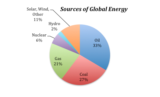
The non-fossil fuel sources include nuclear, hydro (dams with electrical turbines attached to the outflow), solar (both photovoltaic and solar thermal), and a variety of other sources. These non-fossil fuel sources currently supply about 19% of the total energy.
The percentages of our energy provided by these different sources have clearly changed over time and will certainly change in the future as well. The graph below gives us some sense of how dramatically things have changed over the past 210 years:
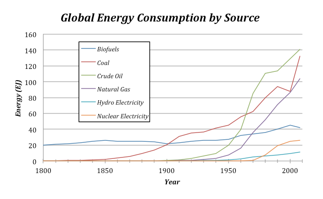
There are a couple of interesting features to point out about this graph. For one, note that the total amount of energy consumed has risen dramatically over time — this is undoubtedly related to both population growth and the industrial revolution. The second point is that shifting from one energy source to another takes a long time. Oil was being pumped out of the ground in 1860, and even though it has a greater energy density and is more versatile than coal, it did not really make its mark as an energy source until about 1920, and it did not surpass coal as an energy source until about 1940. Of course, you might argue that the world changed more slowly back then, but it is probably hard to avoid the conclusion that our energy supply system has a lot of inertia, resulting in sluggish change.
Global Energy Uses
Global Energy Uses
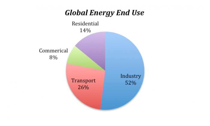
We are all aware of some of the ways we use energy — heating and cooling our homes, transporting ourselves via car, bus, train, or plane — but there are many other uses of energy that we tend not to think about. For instance, growing food and getting it onto your plate uses energy — think of the farming equipment, the food processing plant, the transportation to your local store. Or, think of manufactured items — to make something like a car requires energy to extract the raw materials from the earth and then assembling them requires a great deal of energy. So, when you consider all of the different uses of energy, we see a dominance of industrial uses:
Global Energy Consumption
Global Energy Consumption
Since we are going to be modeling the future of global energy consumption, we should first familiarize ourselves with the recent history of energy consumption.

Question: Why has our energy consumption increased over this time period?
Here, we will explore a few possibilities, the first of which is global population increase — more people on the planet leads to a greater total energy consumption. To evaluate this, we need to plot the global population and the total energy consumption on the same graph to see if the rise in population matches the rise in energy consumption.

The two curves match very closely, suggesting that population increase is certainly one of the main reasons for the rise in energy consumption. But is it as simple as that — more people equals more energy consumption?
If the rise in global energy consumption is due entirely to population increase, then there should be a constant amount of energy consumed per person — this is called the per capita energy consumption. To get the per capita energy consumption, we just need to divide the total energy by the population (in billions) — so we’ll end up with Exajoules of energy per billion people.
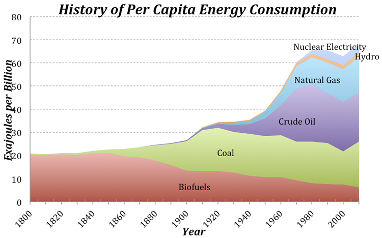
Today, we use about 3 times as much energy per person than in 1900, which is not such a surprise if you consider that we have many more sources of energy available to us now compared to 1900. Note that at the same time that the population really takes off (see Fig. 5), the per capita energy consumption also begins to rise. This means that the total global energy consumption rises due to both the population and the demand per person for more energy.
Let’s try to understand this per capita energy consumption a bit better. We know that the global average is 74 EJ per billion people, but how does this value change from place to place? There are some huge variations across the globe — Afghans use about 4 GJ per person per year, while Icelanders use 709 GJ per person. Why does it vary so much? Is it due to the level of economic development, or the availability of energy, or the culture, or the climate? You can come up with reasons why each of these factors (and others) might be important, but let’s examine one in more detail — the economic development expressed as the GDP (the gross domestic product, which reflects the size of the economy) per capita.

The obvious linear trend to these data suggests that per capita energy consumption is a function of GDP, while the fact that it is not a tight line tells us that GDP is not the whole story in terms of explaining the differences in energy consumption. Not surprisingly, we are near the upper right of this plot, consuming more than 300 GJ per person per year. Iceland’s economy is not as big per person as ours, and yet they consume vast amounts of energy per person, partly because it is cold and they have big heating demands, but also because they have abundant, inexpensive geothermal energy thanks to the fact that they live on a huge volcano. Many European countries with strong economies (e.g., Germany) use far less energy per person than we do (168 GJ compared to our 301 GJ), in part because they are more efficient than us and in part because they are smaller, which cuts down on their transportation. A big part of the reason they are more efficient than us is that energy costs more over there — for instance, a gallon of gas in Italy is about $8. Our neighbor, Mexico, has a per capita energy consumption that is just about the global average.
Pay attention to the two red squares in Fig. 7 — these show the global averages in terms of GDP and energy consumption per person for two points in time. The trend is most definitely towards increasing GDP (meaning increasing economic development) and increasing energy consumption per person. Economic development is definitely a good thing because it is tied to all sorts of indicators of a higher quality of life — better education, better health care, better diet, increased life expectancy, and lower birth rates. But, economic growth has historically come with higher energy consumption, and that means higher carbon emissions.
Now that we’ve seen what some of the patterns and trends are, we are ready to think about the future.
Creating an Emissions Scenario
Creating an Emissions Scenario
There are many ways to meet our energy demands for the future, and each way could include different choices about how much of each energy source we will need. We’re going to refer to these “ways” as scenarios — hypothetical descriptions of our energy future. Each scenario could also include assumptions about how the population will change, how the economy will grow, how much effort we put into developing new technologies and conservation strategies. Each scenario can be used to generate a history of emissions of CO2, and then we can plug that into a climate model to see the consequences of each scenario.
Emissions per unit energy for different sources
The global emission of carbon into the atmosphere due to human activities is dominated by the combustion of fossil fuels in the generation of energy, but the various energy sources — coal, oil, and gas — emit different amounts of CO2 per unit of energy generated. Coal releases the most CO2per unit of energy generated during combustion — about 103.7 g CO2per MJ (106 J) of energy. Oil follows with 65.7 g CO2/MJ, and gas is the “cleanest” or most efficient of these, releasing about 62.2 g CO2/MJ.
At first, you might think that renewable or non-fossil fuel sources of energy will not generate any carbon emissions, but in reality, there are some emissions related to obtaining our energy from these means. For example, a nuclear power plant requires huge quantities of cement, the production of which releases CO2 into the atmosphere. The manufacture of solar panels requires energy as well, and so there are emissions related to that process because our current industrial world gets most of its energy from fossil fuels. For these energy sources, the emissions per unit of energy are generally estimated using a lifetime approach — if you emitted 1000 g of CO2 to make a solar panel and over its lifetime, it generated 500 MJ, then its emission rate is 2 g CO2/MJ. If we average these non-fossil fuel sources together, they release about 5 g CO2/MJ — far cleaner than the other energy sources, but not perfectly clean.
So, to sum it up, here is a ranking of the emissions related to different energy sources:
| Energy Source | g CO2 per MJ |
|---|---|
| Coal | 103.7 |
| Oil | 65.7 |
| Gas | 62.2 |
| Non-Fossil Fuel* | 6.2** |
*Hydro, Nuclear, Wind, Solar
**This will decrease as the non-fossil fuel fraction increases
Calculating global emissions of carbon
Calculating global emissions of carbon
Our recent energy consumption is about 518 EJ (1018 J). Let’s calculate the emissions of CO2 caused by this energy consumption, given the values for CO2/MJ given above and the current proportions of energy sources — 33% oil, 27% coal, 21% gas, and 19% other non-fossil fuel sources. The way to do this is to first figure out how many grams of CO2 are emitted per MJ given this mix of fuel sources, and then scale up from 1 MJ to 518 EJ. Let’s look at an example of how to do the math here — let r1-4 in the equation below be the rates of CO2 emission per MJ given above, and let f1-4 be the fractions of different fuels given above. So r1 could be the rate for oil (65.7) and f1 would be the fraction of oil (.33). You can get the composite rate from:
Plugging in the numbers, we get:
What is the total amount of CO2 emitted? We want the answer to be in Gigatons — that’s a billion tons, and in the metric system, one ton is 1000 kg (1e6 g or 106 g), which means that 1Gt = 1015 g (1e15 g).
So, the result is 31.8 Gt of CO2, which is very close to recent estimates for global emissions.
It is more common to see the emissions expressed as Gt of just C, not CO2, and we can easily convert the above by multiplying it by the atomic weight of carbon divided by the molecular weight of CO2, as follows:
And remember that this is the annual rate of emission.
Let’s quickly review what went into this calculation. We started with the annual global energy consumption at the present, which we can think of as being the product of the global population times the per capita energy consumption. Then we calculated the amount of CO2 emitted per MJ of energy, based on different fractions of coal, oil, gas, and non-fossil energy sources — this is the emissions rate. Multiplying the emissions rate times the total energy consumed then gives us the global emissions of either CO2 or just C.
We now see what is required to create an emissions scenario:
- A projection of global population
- A projection of the per capita energy demand
- A projection of the fractions of our energy provided by different sources
- Emissions rates for the various energy sources
In this list, the first three are variables — the 4th is just a matter of chemistry. So, the first three constitute the three principal controls on carbon emissions.
Here is a diagram of a simple model that will allow us to set up emissions scenarios for the future:

In this model, the per capita energy (a graph that you can change) is multiplied by the Population to give the global energy consumption, which is then multiplied by RC (the composite emissions rate) to give Total Emissions. Just as we saw in the sample calculation above, RC is a function of the fractions and emissions rates for the various sources. Note that the non-fossil fuel energy sources (nuclear, solar, wind, hydro, geothermal, etc.) are all lumped into a category called renew, because they are mostly renewable. The model includes a set of additional converters (circles) that allow you to change the proportional contributions from the different energy sources during the model run.
This emissions model is actually part of a much larger model that includes a global carbon cycle model and a climate model. Here is how it works — the Total Emissions transfers carbon from a reservoir called Fossil Fuels that represents all the Gigatons of carbon stored in oil, gas, and coal (they add up to 5000 Gt) into the atmosphere. Some of the carbon stays in the atmosphere, but the majority of it goes into plants, soil, and the oceans, cycling around between the reservoirs indicated below. The amount of carbon that stays in the atmosphere then determines the greenhouse forcing that affects the global temperature — you’ve already seen the climate model part of this. The carbon cycle part of the model is complicated, but it is a good one in the sense that if we plug in the known historical record of carbon emissions, it gives us the known historical CO2 concentrations of the atmosphere. Here is a highly schematic version of the model:

Experiments with the Model
Experiments with the Model
Video: Energy Emissions Activity (5:32)
Important Instructions
- In this exercise, we will work with a model of a system that has many parts — carbon cycle, climate model, population model, and energy model. We'll explore how making changes to one part of this system alter the behavior of other parts of the system. This illustrates an important part of what we call Systems Thinking, which is that in complex, connected systems, a change in one part may have consequences that spread throughout the system.
- After watching the movie above, run the model [26]without making any changes to establish what we will call the “control” case for these experiments. You can return to this control case by hitting the Restore All Devices button.
- Write down the Total Emissions at the year 2100 — this will be our comparison point in time for later experiments.Look at page 2 of the graph pad, which shows human emissions, which is essentially the same as Total Emissions except that it is limited by the total amount of fossil fuel carbon we have; if we burn through all that carbon, human emissions will drop to 0, and in fact, you’ll see that it drops off to zero about the year 2165 — this is when we run out of fossil fuels. So if we haven’t solved our energy problems by then, we’re in deep trouble!
| - | Practice | Graded |
|---|---|---|
| switch to turn on | coal | oil |
| f reduction | 0.24 | 0.30 |
| f reduction time | 20 | 20 |
The table above gives you a set of instructions related to the practice and graded versions of the summative assessment, including which switch to turn on, the fractional reduction, and the time over which this reduction takes place. As one of the fossil fuel sources is reduced, the model increases the renewable fraction so that the total of all the fractions stays at 1.0.
1. How much does switching from one of the fossil fuel sources to renewables decrease the emissions in the year 2100? First, run the model as is when you open it (all switches are in the off position) and take note of the total emissions for the year 2100 on graph #1 (this is our control case), then make the changes prescribed in the table above and find the new emissions in the year 2100 and then calculate the difference from the control case.
Difference = (±2 Gt)
Practice Answer = 11.3
Video: Module 8 Question 1 (1:39)
2. Does this change lead to a leveling off of emissions, or do they continue to climb?
- Levels off
- Continues to climb [correct answer for practice version]
3. Which has a bigger impact in reducing emissions — limiting population growth to 10 billion, or reducing your fossil fuel fractions as prescribed? Here, make sure all the switches are turned off, and then set the Pop Limit to 10.
- Population limitation
- Fossil fuel reduction [correct answer for practice version]
Video: Module 8 Question 3 (1:10)
Reset the Pop Limit to 12 when you are done with this one.
4. How much does reducing all of the fossil fuel sources to a fraction of 0.05 decrease the emissions in the year 2100 compared to the control case (set all switches to the off position for the control)? Set the start time to 2020, then turn on all the switches, and set the f reductions so that each fossil fuel source ends up at 0.05 after 30 years. You can check to make sure you’ve done this correctly by looking at the fractions on page 4 of the graph pad.
Set all of the reduction times to 20 years. For the graded version, lower the fossil fuel sources to a fraction of 0.1; leave everything else the same as the practice version.
Difference = (±2 Gt)
Practice Answer = 23.8
Follow these steps:
- Run the control case (don’t make any changes to the model)
- Turn on all the switches
- Set all the reduction times to 20
- Set f coal reduction to 0.22; f oil reduction to 0.28; f gas reduction to 0.16
- Run the model again — you should now see a blue curve from the control run and a pink curve from the modified run (looking at graph #1)
- Run the cursor along the control case curve until you get to the year 2100 and write down the total emissions at that point — it should be 29.57 (the units are Gt C/yr).
- Run the cursor along the modified case curve (pink one) until you get to the year 2100 and write down the total emissions at that point — it should be 5.74.
- The question is asking for the difference in emissions, so subtract 5.74 from 29.57 and you get 23.83 Gt C/yr — this is the reduction in emissions we would achieve if we lowered all of the fossil fuels to just 5% of our total energy consumption.
Video: Module 8 Question 4 (1:33)
5. Which has the bigger impact in reducing emissions — halting the rise in per capita energy use, or reducing our fossil fuel fractions? For this one, you’ll use your answer to the above question (#4) and compare to one in which you turn off all the switches, and then change the per capita energy graph so that it is more or less a straight line all the way across. You can check to see how well you’ve done this by looking at page 8 of the graph pad after you run the model. So, which has a bigger impact in reducing emissions?
Video: Module 8 Question 5 (1:50)
This table refers to the question below — it provides a set of model settings that lead to stabilization of emissions.
| - | Practice | Graded |
|---|---|---|
| switches on | coal, oil | all |
| start time | 2020 | 2050 |
| f reduction coal | 0.12 | 0.10 |
| f reduction time coal | 200 | 200 |
| f reduction oil | 0.10 | 0.07 |
| f reduction time oil | 100 | 200 |
| f reduction gas | 0 | 0.05 |
| f reduction time gas | 20 | 200 |
| Pop Limit | 12 | 11 |
| Per capita energy limit | 75 for the whole time | 100@2048, then steady at 100 for the rest of the time |
Refer to the worksheet to see what your per capita energy graphs should look like for the practice and graded versions.
6. One of the main goals people mention in the context of future global warming is halting the growth of our emissions of CO2. As you have seen so far, there are a variety of ways to reduce that growth. Now, let’s see what happens when we stabilize emissions. Modify the original model to create the emissions scenario defined by the parameters supplied in the table above — this should result in an emissions history that more or less stabilizes. Then find the emissions in the year 2100.
Total Emissions in 2100 = ±2.0 Gt C/yr
Practice version — 11.3 Gt C/yr
7. Now that you have an emissions scenario that stabilizes (the human emissions of carbon remain more or less constant over most of the time), let’s look at temperature (page 9 of the graph pad). Remember that global temperature change in this model is the warming relative to the pre-industrial world, which is already about 1°C in 2010, the starting time for our model. What is the global temperature change in the year 2100?
Global temperature change = ±0.5 °C
Practice version — 2.6°C
8. Now study the temperature change (graph#9) and the pCO2 atm (the atmospheric concentration of CO2 in ppm or parts per million — page 10 of the graph pad) for the time period following the stabilization of emissions. Does the stabilization of emissions lead to a stabilization of temperature or atmospheric CO2 concentration?
- Fossil fuel reduction [correct answer for practice version]
- Per capita energy change (i.e., conservation + efficiency)
Video: Module 8 Questions 6 through 8 (4:13)
Reset the model before going to the next question.
9. Now, let’s say we want to keep the warming to less than 2°C, which the IPCC recently decided was a good target — warming more than that will result in damages that would be difficult to manage (we would survive, but it might not be pretty). We have seen by now that it is simply not enough to stabilize emissions at a level similar to or greater than today’s — that leads to continued warming. So we need to reduce emissions relative to our present level, which will be hard with a growing population and economy (and thus a growing per capita energy demand).
So, let’s see what is necessary to stay under that 2° limit, given some constraints. In all cases, we’ll assume that we can get our oil and gas fractions down to 0.1 (i.e., 10% each) over a time period of 30 years with a start time of 2020. We’ll leave population out of it (keep the limit at 12 billion), and for the practice version, we’ll make the assumption that per capita energy demand remains constant at a level of 75 for the whole time period (modify the graph so that it is a horizontal line at a level of 75 on the y-axis). This leaves f coal reduction as our main variable. The time period for reducing coal will be 30 years. You can change four scenarios for coal reduction as follows:
A: Keep the coal fraction unchanged (switch off)
B: Reduce the coal fraction to 10% (so f coal reduction would be .17)
C: Reduce the coal fraction to 5% (set f coal reduction to .22)
D: Reduce the coal fraction to 0% (set f coal reduction to .27)
For the graded version, we will change the per capita energy demand graph so that it drops to 50 by the year 2086 (see worksheet for a picture of what the graph should look like).
Find the coal fraction that keeps the temperature closest to 2°C by the year 2200.
Coal reduction scenario (A,B,C, or D):
Practice version: D is the correct answer
Video: Module 8 Question 9 (1:53)
We’re done with this model for now, but you will be coming back to something similar to this later on when you do your capstone projects. You’ll use the model to design an emissions and energy consumption scenario for the future for which you’ll also explore the environmental and economic consequences.
The following questions encourage you to step back and think about what you’ve learned here. Short answers will suffice here.
10. What are the three principal variables that determine how much carbon is emitted from our production of energy? (Hint: look at page 11 of this worksheet)
11. What is the relationship between economic development (growth) and per capita energy consumption? (Hint: look at figure 7 of this worksheet)
12. Among the various sources of our energy, which has the highest rate of CO2 emitted per unit of energy? (Hint: look at table on page 10 of this worksheet)
13. What happens to the atmospheric concentration of CO2, and thus the global temperature, if we stabilize (hold constant) the emissions rate? (refer to question #8 above)
14. Can we stay under the 2°C warming limit in the year 2200 by completely eliminating our reliance on fossil fuel energy sources alone (reducing coal, oil, and gas to 0% of our energy supply), or do we also need to reduce our energy consumption per capita? (make appropriate changes and then run the model to figure this out)
- both stabilize
- neither stabilizes — both increase [correct answer for practice]
- neither stabilizes — both decrease
- CO2 goes up; temperature goes down
- CO2 goes down; temperature goes up
Summary and Final Tasks
Summary
Energy conservation – making investments or changing behaviors to reduce energy consumption without lifestyle sacrifices – is a critically important energy option, regardless of whether you support broader use of fossil fuels or you support a transition to a low-carbon energy portfolio. Everyone should agree that more conservation is a good thing, and the potential conservation options are vast both in number and in their possible impacts on the environment and climate. Nonetheless, energy conservation presents a difficult paradox. On the one hand, the majority of energy conservation options have a double dividend, saving money and helping the environment all at the same time. On the other hand, convincing individuals and businesses to spend time and money undertaking conservation investments has proven remarkably difficult. (At the very least, you would think that people like to save money.) People make seemingly irrational decisions for all sorts of reasons, and some centralized coordination can help to overcome the energy efficiency paradox. Three examples from the United States have shown how monetary incentives, community outreach, and deliberate planning have all contributed to some form of effective energy conservation.
Reminder - Complete all of the Module 8 tasks!
You have reached the end of Module 8! Double-check the Module Roadmap to make sure you have completed all of the activities listed there before you begin Module 9.