Unit 2: Comparing Energy Choices
Overview
At this point in the course, we are going to take a break from thinking about how our patterns of energy utilization are affecting the planet’s climate and think about some more cheerful news – there are plenty of technological options for meeting our planet’s energy needs without the use of fossil fuels. That may seem like a bold statement – after all, our energy systems have been dominated by fossil fuels for a long, long time; are currently dominated by fossil fuels; and will likely be dominated by fossil fuels for years to come (until they simply get too expensive relative to other energy sources, perhaps helped along by public policy). Over the next couple of weeks we are going to meet a number of these technologies; learn about how they work, where they are currently being used, and where there is potential to use them even more. Our discussion is not going to focus on whether any particular technology is “good” or “bad” – what you’ll find is that these technologies may be relatively advantageous in some parts of the world and disadvantageous in other parts of the world. We are going to focus on technologies that can be used to generate electricity. Transportation and industry are also important sectors when it comes to energy utilization, but in theory transitioning the electricity sector off of fossil fuels should be a simple first step – after all, there are several thousand power plants in the United States, versus hundreds of millions of cars.
But if we have the technological means to get ourselves off of fossil fuels, then why haven’t we done so already? Is someone keeping a big secret from the rest of us?
As usual, things are not all that simple. As part of our discussions over the next couple of weeks, we’ll learn about some factors that have limited the adoption of specific low-carbon technological options. One of the things that makes comparison of technologies difficult is that there are lots and lots of dimensions to compare across. If cost were the only important factor, then there would be no problem with continuing to use fossil fuels at the rate we are currently. But it isn’t, and even “cost” is not as simple as it sounds.
This second unit covers lessons 6-9. Dr. Seth Blumsack, Associate Professor in the Department of Energy and Mineral Engineering at Penn State, shares his deep knowledge of the many energy options available for our future use. You will learn more about solar, wind, geothermal, hydroelectric and nuclear energy, and about other options including conservation, that together can provide more than enough energy to power humanity sustainably.
- Solar and Wind (Module 6)
- Geothermal, Hydroelectric & Nuclear (Module 7)
- Conservation (Module 8)
- Geoengineering (Module 9)
Unit Goals
Upon completion of Unit 2 students will be able to:
- Recognize the great diversity of energy options currently available to us
- Explain scientific concepts in language non-scientists can understand
- Find reliable sources of information on the internet
- Use numerical tools and publicly available scientific data to demonstrate important concepts about the Earth, its climate, and resources
Unit Objectives
In order to reach these goals, the instructors have established the following objectives for student learning. In working through the modules within Unit 2 students will:
- Recognize the advantages and limitations of solar, wind, geothermal, hydroelectric, and nuclear energy
- Recall the basic science behind solar, wind, geothermal, hydroelectric, and nuclear power generation
- Evaluate who is responsible for maintaining "the grid" as home generation grows in popularity
- Analyze why even people who rely heavily on energy resources tend to want those resources to be exploited far from their own homes
- Recognize that all energy technologies are inefficient
- Compare wealth and energy intensity in developed countries
- Identify options for improving energy efficiency in developed countries
- Analyze why we don't always conserve as much as we should, despite the double benefits for the climate and our wallets
- Use a model to calculate the effects of various strategies such as use of renewable energy sources, conservation, and population control on reducing emissions
- Recall the various geoengineering strategies that have been suggested to mitigate climate change
- Recognize that geoengineering alone is unlikely to be sufficient to mitigate climate change
- Assess what you have learned in Unit 2
Assessments
| Module | Assessment | Type |
|---|---|---|
| 6. Solar and Wind Power | Who Pays for Home Generation? | Discussion - Express Your Opinion |
| 7. Geothermal, Hydroelectric, & Nuclear | The NIMBY Syndrome | Discussion - Find an Article |
| 8. Conservation | Emissions Scenarios | Summative - Stella Model |
| 9. Geoengineering | Learning Outcomes Survey | Self-Assessment |
Module 6: Solar and Wind Power
Overview
We are burning fossil fuels about a million times faster than nature saved them for us. We might continue on this path for another century or more, or we might face an “energy crisis” within a few decades as we begin to run out of fossil fuels. But, we cannot choose to rely on fossil fuels for the long-term, because they simply will not be there.
Fortunately, there are vast resources of renewable energy available. If we could collect just 0.01% of the sun’s energy reaching the top of our atmosphere, we would have more energy than is now used by all humans together. With modern technologies, a solar farm in a sunny region near the equator only a few hundred kilometers (or miles) on a side would supply more energy than we are now using. Building such a solar farm would be a huge task, but we have completed huge tasks before.
Roughly 1% of the sun’s energy goes to power the wind so we could energize all of humanity using the wind, too. Building a wind farm on just the windy parts of the plains and deserts of the world would provide much more energy than we now use. Again, there are huge challenges in actually building that many wind turbines, getting the energy where we want it, and smoothing out the effects of night and day, storm and still weather. But, no “breakthroughs” are needed, just building and improving what we already know how to do.
Using renewable energy is not a new idea. Abraham Lincoln advocated wind power, for example, and Thomas Alva Edison promoted the use of solar energy. So, let’s go see what they were thinking of, and how modern scientists and engineers have risen to their challenge.
Goals and Objectives
Goals
- Recognize the great diversity of energy options currently available to us
- Explain scientific concepts in language non-scientists can understand
Objectives
By the end of this module, you should be able to:
- Recognize the advantages and limitations of solar and wind energy
- Recall the basic science behind solar and wind power generation
- Evaluate who is responsible for maintaining "the grid" as home generation grows in popularity
Roadmap
| To Read | Materials on the course website (Module 6) | - |
|---|---|---|
| To Do | Discussion Post [1] Discussion Comments [1] Quiz 6 |
Due Wednesday Due Sunday Due Sunday |
Questions?
If you prefer to use email:
If you have any questions, please email your faculty member through your campus CMS (Canvas/Moodle/myShip). We will check daily to respond. If your question is one that is relevant to the entire class, we may respond to the entire class rather than individually.
If you prefer to use the discussion forums:
If you have any questions, please post them to Help Discussion. We will check that discussion forum daily to respond. While you are there, feel free to post your own responses if you, too, are able to help out a classmate.
Solar Energy
Solar Energy
The sun is far and away the largest potential source of energy to power things on our planet. Humans have been using the sun as an energy source for thousands of years – just think about agriculture and how that would work without sunlight – but the industry of using solar energy to create electricity is in its relative infancy. Growth is fast – in percentage terms, solar is the fastest-growing energy source on the planet. And the cost of solar power, one of its most formidable barriers, is coming down quickly as well. In this module, we’ll take a look at some of the most common technologies used to convert solar energy to electricity.

Solar Photovoltaics
Solar Photovoltaics
When most people think of “solar power,” they think about one of two things – vast arrays of solar collectors laid out in hot deserts (the left-hand panel below) or smaller arrays on rooftops or highways (the right-hand panel below). This is perhaps the most ubiquitous method of converting solar energy into electricity, but it is not the only method. These arrays of solar collectors are known as “solar photovoltaic” installations or Solar PV for short.

Solar PV installations consist of individual collectors called cells, which are packaged together in bundled modules. An individual cell does not generate enough electricity to power much of anything, which is why they must be bundled together. A single module might be enough to provide electricity for a single parking meter or roadside telephone. A number of modules can be further bundled together to form an array (see below). Multiple arrays might be needed to provide electricity for a building or a house.

There are many different kinds of solar PV cells in existence (and even more being developed in research laboratories), but they all work in more or less the same way. Unlike virtually any other type of power plant (be it coal, natural gas or wind), there is no turbine in a Solar PV cell. In fact, there are basically no moving parts at all. .
Solar PV cells harvest solar energy through a phenomenon called the photovoltaic effect, discovered in 1839 by the French physicist Bequerel. Photons of solar energy interact with electrons to “excite” them, causing them to move through conductors, thus producing an electric current. The first solar PV module was made at Bell Labs in the 1950s, but was too expensive to be more than a curiosity; in the 1960’s NASA started to use PV modules in spacecraft and by the 1970s, people started to explore their use in a wider range of terrestrial applications.
This following video explains a bit more about how Solar PV cells work and describes the different Solar PV technologies in use today. One of the potentially most important evolutions in Solar PV technology is the use of semiconducting materials other than silicon in Solar PV cells. These materials are of interest because they could, in concept, allow more of the sun’s energy to be captured on a single array. But they face barriers in the form of high costs and, in some cases, questions about the availability of raw materials.
Video: Photovoltics, a Diverse Technology (4:26)
[music]
NARRATOR: 30 years ago, the first solar cells were made of silicon. And today, silicon makes up more than 3/4 of the rapidly growing worldwide photovoltaic market. But photovoltaic, or PV cells, are also made with other semiconductor materials. Why so many types of solar cells? This diversity is due to innovation. PV materials are improving. Manufacturing costs are dropping. And PV applications are expanding. Balancing these three factors can meet demands for clean, green power, while creating more American jobs.
Innovation means improving photovoltaic materials. Every PV material absorbs sunlight differently, depending on bandgap, which is a unique electronic property of the material. Some cells absorb sunlight within the first micron of material. Others need 100 times more material to absorb the same amount of energy from the sun.
The sun's energy arrives as a combined spectrum of different wavelengths. Each color carries a different amount of energy. This makes solar cell design more complex.
If the energy of the absorbed photon matches the PV material's bandgap, then an electron-hole pair is created. If the photon has more energy, it still creates only one electron-hole pair, but the additional energy is lost as heat. If the photon has less energy than the bandgap, it is not absorbed.
Low bandgap materials absorb most of the solar spectrum, creating many electron-hole pairs, producing a high current. However, PV cells with low bandgap materials have a low voltage. High bandgap materials absorb only higher energy photons, creating fewer electron-hole pairs, producing a lower current with a higher voltage.
A solar cell's efficiency is the percentage of the solar energy, shining on the cell, that is converted into electrical energy. One way to increase efficiency is to use multiple layers, to capture power from multiple wavelengths of light. Understanding the properties of each PV material, allows scientists to improve designs that maximize the power of the cell.
Innovation in PV also means lowering the cost of manufacturing. Crystalline silicon cells have high efficiency because they used very pure single-crystalline silicon, which is expensive to manufacture. Multicrystalline silicon cells have lower efficiency, but they can be cheaper to manufacture, because they use lower quality silicon, less energy, and simpler manufacturing equipment.
Thin-film solar cells can be made for material such as-- cadmium telluride, copper indium diselenide, or amorphous silicon. These materials absorb light more readily than crystalline silicon, so they can be used in very thin layers that are less expensive to produce. Thin-film solar cells are generally less efficient than crystalline silicon cells, but they can be cheaper to manufacture because they use less semiconductor materials, which are grown on glass or flexible foil.
Finally, innovation means meeting different applications best suited by different types of solar cells. Today, PV devices produce power to meet the needs of utilities, businesses, homes, and consumer products.
Large-scale installations can use a range of highly reliable PV technologies. Solar-powered satellites are more sensitive to power per pound. These high-efficiency solar devices can accept higher material and manufacturing costs to get more electricity from less material. Flexible thin-film devices are being installed in innovative ways, including incorporation into structures with complex shapes.
Photovoltaics are here now. And the diversity of PV devices is advancing as scientists improve PV materials and develop new manufacturing methods. More solar applications are emerging, as these innovations make PV more affordable.
Most modern Solar PV technologies are relatively inefficient compared to other forms of electricity generation. Remember here that “efficiency” refers to how much of the fuel that is injected into an electricity generation system is actually converted into useful electricity, versus being rejected as waste heat or otherwise escaping from the generation system. While modern coal-fired and gas-fired power plants can have efficiencies as high as 60% (or sometimes even higher), most Solar PV cells convert sunlight to electricity with an efficiency of 20% or less (see below), though this number has been rising over time.
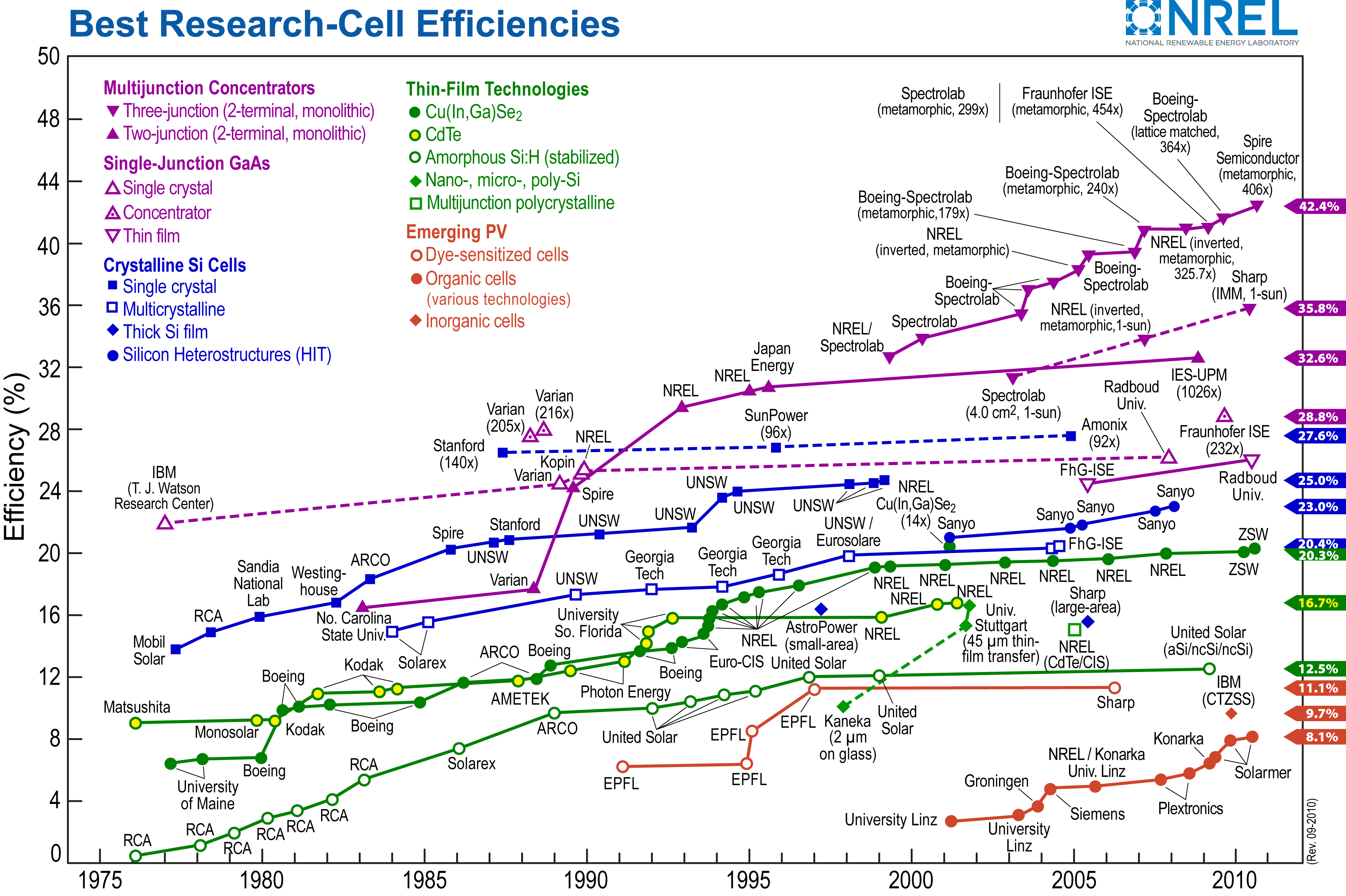
This chart from NREL (National Renewable Energy Laboratory) tracks the best research efficiencies of various solar cell technologies over time. Below is a detailed breakdown of each dataset, categorized by solar cell type, along with trends and notable efficiency milestones.
Multijunction Cells (Purple)
- Description: High-efficiency solar cells made from multiple semiconductor materials that capture different parts of the solar spectrum.
- Types:
- Three-junction (concentrator)
- Three-junction (non-concentrator)
- Two-junction (concentrator)
- Trends:
- Rapid efficiency gains from the 1980s onward.
- 1995: First exceeded 30% efficiency.
- 2005–2015: Surpassed 40% efficiency, reaching 45.5% in 2015 (record efficiency).
- Key contributors: Spectrolab, Fraunhofer ISE, Boeing-Spectrolab, NREL.
Single-Junction GaAs Cells (Pink)
- Description: Made from Gallium Arsenide (GaAs), known for high efficiency.
- Types:
- Concentrator
- Thin-film crystal
- Trends:
- 1980s: Early developments showed steady progress.
- 1995–2005: Efficiency surpassed 25%.
- 2010–2015: Efficiency reached 29–30%.
- Key contributors: NREL, Radboud, Alta Devices.
Crystalline Silicon (Blue)
- Description: The most widely used commercial solar cell technology.
- Types:
- Single crystal (Monocrystalline)
- Multicrystalline (Polycrystalline)
- Thin-film Silicon
- Silicon Heterojunction (HIT)
- Trends:
- 1980s: Efficiency ranged from 10% to 15%.
- 1990s: Research pushed efficiency beyond 20%.
- 2015: Efficiency peaked at about 26.6%.
- Key contributors: SunPower, Panasonic, UNSW, Fraunhofer ISE.
Thin-Film Technologies (Green)
- Description: Low-cost, lightweight solar cells using non-silicon materials.
- Types:
- Cu(In,Ga)Se₂ (CIGS)
- CdTe (Cadmium Telluride)
- Amorphous Si:H (stabilized)
- Nano-, Micro-, Poly-Si
- Multijunction Polycrystalline
- Trends:
- 1975–1990: Slow improvements, with efficiencies around 5–10%.
- 2000s: Notable breakthroughs, pushing CdTe and CIGS beyond 15% efficiency.
- 2015: Best CIGS efficiency reached 22.3%; CdTe around 21.5%.
- Key contributors: First Solar, NREL, ZSW, Solar Frontier, GE.
Emerging PV Technologies (Red)
- Description: Next-generation solar technologies still in early development.
- Types:
- Organic solar cells
- Organic-inorganic perovskites
- Quantum dot solar cells
- Trends:
- 2000s: Initial efficiencies below 5%.
- 2010s: Perovskite solar cells saw rapid efficiency increases, reaching over 20% by 2015.
- Key contributors: Oxford PV, UCLA, EPFL, University of Valencia.
Overall Observations
- Multijunction Cells remain the most efficient, exceeding 45%.
- Crystalline Silicon dominates commercial markets, reaching 26.6%.
- Thin-Film and Emerging PV show promise for future cost-effective solutions.
- Perovskites and Quantum Dots could revolutionize the field if efficiency gains continue.
Whether the efficiency of Solar PV cells is all that important is a matter of some debate. On the one hand, higher-efficiency cells would require less land or space to produce a given amount of electricity. Land use (or the number of rooftops) can be a significant limiting factor in the deployment of Solar PV. On the other hand, fuel from the sun is free and there is no scarcity of sunlight, so whether Solar PV cells can achieve 30% efficiency versus 20% efficiency may not be such a big deal, and may not be worth the extra economic cost to produce such high-efficiency cells.
Concentrating Solar Power
Concentrating Solar Power
If you have ever left a cold drink out in the sun during the summertime (or if you have children, if you have ever left water in the kiddie pool out in the sun for a long time), you would notice that the formerly cold water gets warm – maybe even hot. If it happens to be summertime where you are living right now, try it! Whether you realize it or not, this little science experiment is the basis for a second way of harnessing the sun’s energy to produce electricity, called “concentrated solar power” or CSP. (This technology is also sometimes called “solar thermal.”)

The following video explains how CSP works. The basic idea is that a collection of mirrors reflects the sun’s light (and heat) onto a large vessel of water or some other fluid in a metal container. With enough mirrors reflecting all of that sunlight, the fluid in the metal container will get hot enough to turn water into steam. The steam is then used to power a turbine just like in almost any other power plant technology
 Earth: The Operators' Manual
To get started, please watch the video below. This particular video will discuss the history of the idea of concentrated solar power.
Video: Lightbulbs in the Desert (Powering the Planet) (5:55)
NARRATOR: Planet Earth is awash in renewable energy. The oceans store heat and offer wave and tidal power. Plants harvest sunlight and store its energy. The Sun warms the atmosphere and sets air in motion, and we're getting better at tapping wind power. But the biggest and most promising energy source is the nearby star that lights our days and warms our world. Sunlight reaching the Earth's surface offers about 120,000 terawatts. If the Sun's energy were spread around the world, it would average around 240 watts per square meter. Richard Alley brings that huge number down to earth.
DR. RICHARD ALLEY: If I walk out into this little patch of this great desert, and I hold out my arms about like this-- And then another of me does the same thing-- And each of me is holding two 60 watt incandescent light bulbs, or 10 compact fluorescents, that's 240 watts per square meter that I'm marking out here. That's a lot of energy. And averaged across the globe, day and night, summer and winter, that's how much sunlight is available to power the planet. Let's see what it takes to turn that vast potential into energy we can use. It doesn't take a genius to know that a mirror reflects the Sun, but it does take an inventor and engineer to make the next step. Use the mirror to focus the Sun's rays on a tank filled with liquid to make steam, to drive a turbine, to make electricity, and you have concentrated solar power. That's not a new idea, but one that a little-known American inventor, Frank Shuman, pursued around 1910.
NARRATOR: In his Philadelphia workshop, Shuman invented safety glass for skylights and automobiles. He also came up with designs that could concentrate sunlight on metal tubes, heat liquid, and drive a steam turbine. But in Pennsylvania, back then, it was all about coal. Shuman had difficulty finding local backers. So in 1912, he set off for Egypt. His prototype solar farm used parabolic troughs to concentrate sunlight and boil water. The steam ran a 75 horsepower engine that pumped water from the Nile to irrigate cotton fields. The idea was right, but ahead of its time. Hobbled by both a lack of government support and adequate private capital, the experiment ended with the outbreak of World War One. These parabolic troughs look very similar to Shumans' designs, though they didn't come online until a century later.
This is Solnova 3, at one of the world's first commercial solar power plants. Just as in Shuman's experimental station, the troughs concentrate solar radiation on a pipe that contains a heat-bearing fluid. When completed there'll be three almost identical plants, each with an output of 50 megawatts, large enough to support about 26,000 households. While the Sun powers the Solucar platform, it was the Spanish government that helped develop solar power. The central government set a specific target of 500 megawatts of concentrated solar power and committed to price supports for 25 years. That, in turn, unleashed inventors and industry to prototype plants like this one. The technology works, though changing government policies and the budget crisis have impacted the industry. But, Abengoa, the company building Solucar, is a part of a consortium planning the world's largest solar power project. Formed by a group of European and North African companies and the DESERTEC Foundation, this consortium has energy ambitions that are revolutionary for both Europe and the Middle East.
Unlike some of its neighbors, Morocco has little oil or other fossil fuels. But it does have sun, sand, and empty spaces. The Moroccan government has encouraged the use of distributed solar power by small businesses and individuals. Already, out on the edge of the Sahara, you can see photovoltaic panels on top of tents. But the Desertec vision goes beyond this by including concentrated solar power plants, photovoltaic installations, and wind turbines, linked with low-loss, high-efficiency transmission cables back to Europe. The Desertec project estimates that solar power from the Sahara could provide more than 80% of North Africa's needs, and 15% of Europe's electricity, by 2050. In a single generation, Morocco's young and growing population could go from energy poverty to energy independence. The energy created by this proven technology could generate both electricity and income for some of the world's poorest nations. And updated versions of Shuman's century-old designs and a smart grid could go a very long way toward meeting our species' need for energy. Collecting just 10% of the Sun's energy from a 600-mile-square of low-latitude desert would supply roughly twice today's human consumption of energy.
Recently, more advanced CSP systems have begun to replace the water or synthetic oil with molten salt, as the fluid that is heated molten salt can remain as a liquid from 290 to 550°C. Once it is heated in the tower at the center of the array of mirrors, the hot liquid salt is stored in a highly insulated tank and when there is a demand for electricity, it is sent to a heat exchanger where it turns water into steam, driving the turbine to generate electricity. When the molten salt passes through the heat exchanger, it gives up heat, so it cools off. It is then recirculated to the tower at the center of the mirrors, where the concentrated sunlight heats it back up. These systems have enough liquid salt so that it can act as a thermal battery, storing the solar energy for more than a week before it cools off to the point where it cannot make steam. These kinds of power plants are expensive at the moment, but the technology is still quite new and so we expect prices to drop quickly, as they have for other renewable energy technologies. In fact, a CSP system in Spain using molten salt is now capable of producing energy on demand, 24 hrs a day rather than being limited to times of peak sunlight. The ability to schedule power production versus having to take the electricity when it comes is of great value to the folks that operate electricity systems. Nevertheless, there are still a few obstacles for CSP:
- CSP is difficult to make work on a small scale. A lot of land, usually in sunny deserts, is typically needed. So CSP does not scale up and down to large and small installations like Solar PV can.
- CSP is currently quite expensive — roughly twice as much per unit of energy as Solar PV. However, this is a very new technology and prices are expected to go down in the future.
Solar Energy Potential and Utilization
Solar Energy Potential and Utilization
In addition to being free as a source of energy (it does cost money to harness it and turn it into electricity), energy from the sun is practically limitless. The surface of the Earth receives solar energy at an average of 343 W/m2. If we multiply this times the surface area of the Earth, about 5x10¹⁴ m2, we get 1715x1014 W. But, 30% of this is reflected, and only 30% of the Earth is above sea level, so the usable solar energy we receive on the land surface is about 360x1014 W. We need to reduce this further because not all of the land surface is suited to installation of solar PV panels — we don't want to cut down forests, and ice-covered areas are not suitable, so we reduce the area by about one half. Over the course of a year, this amount of solar energy adds up to 66x1022 Joules. In 2018, we used about 600x1018 Joules of energy, which is just a shade less than 0.1% of the harvestable solar energy we receive on the land. This means that even if we got all of our energy from the Sun, we would not make a dent in the total! The potential is vast — 10,000 times what we need!
Let’s consider what it would mean for us to get all of our energy from Solar PV — how much of the Earth’s surface would we need to cover with panels? The black dots (radii of 100 km) in the figure below represent areas that could generate enough energy from sunlight to completely power the planet for an entire year. Practically, there are barriers to running the planet entirely on sunlight (everything would need to be electrified, we would need very large quantities of battery energy storage, and so forth), but the dots are useful as a demonstration of just how vast the energy production potential from solar is.

This image is a world map illustrating the annual mean solar potential across the globe, measured in watts per square meter (W/m²). The map is sourced from Matthias Loster, 2006, and includes a total solar potential estimate of 18 terawatt-equivalents (TWe) indicated in the bottom right corner with the symbol "Σ⦿ = 18 TWe."
Map Overview:
The map shows a global view with continents outlined in black, including North and South America on the left, Africa in the center, Europe and Asia above, and Australia on the right. The background is a gradient of colors representing solar potential, with a color scale at the bottom ranging from purple (lowest) to red (highest)
- Color Scale:
The color bar at the bottom ranges from 0 to 350 W/m2. Purple represents the lowest solar potential (0–50 W/m2), transitioning through blue (50–100 W/m²), green (100–150 W/m2), yellow (150–200 W/m2), orange (200–300 W/m2), and red (300–350 W/m2) for the highest solar potential. - Solar Potential Distribution:
- High Solar Potential (Red/Orange): Areas with the highest solar potential (250–350 W/m2) are concentrated near the equator, including Central Africa, the Middle East, northern Australia, and parts of the central Andes in South America. These regions appear in shades of red and orange.
- Moderate Solar Potential (Yellow/Green): Moderate solar potential (150–250 W/m2) spans much of South America, Southern Africa, India, Southeast Asia, and northern Australia, shown in yellow and green shades.
- Low Solar Potential (Blue/Purple): Areas with the lowest solar potential (0–150 W/m2) include the polar regions, northern North America, Northern Europe, and parts of Russia, depicted in blue and purple shades
- Black Dots:
Several black dots are scattered across the map, likely representing specific locations or solar energy projects. These dots are located in the southwestern United States, central South America, central and Southern Africa, the Middle East, India, and northern Australia. - Additional Details:
The map uses a gradient color scheme to visually represent the intensity of solar potential, with equatorial regions showing the highest potential due to their proximity to the sun’s direct rays. The source, "Matthias Loster, 2006," is noted in the bottom right corner.
It’s kind of amazing to see how little area of the Earth would need to be covered to achieve this.
Optional Resource
If you are interested in a more detailed view of solar energy resources in your area, a company called Vaisala 3Tier [14] produces maps that you can download for your own personal (non-commercial) use.
One of the important differences between Solar PV and CSP is that CSP requires more intense sunlight, and as such, it is not a viable option in many places. In contrast, Solar PV works just about everywhere — it is more versatile. Another important difference is in scale — CSP is really suited to utility-scale power plants, whereas Solar PV works at both the utility-scale and the very small scale.
The map below shows the PV potential for the world. The variability in the map is mainly a function of cloudiness and latitude. Many of the big, utility-scale solar PV plants are located in the red areas, but there is a surprising amount of Solar PV energy being harvested in places like Germany and Japan, both of which are fairly cloudy. But, even in a fairly cloudy place like Pennsylvania, you can see from the map that we could expect about 1460 kWh per year from a 1 kW PV array. From this, you can calculate how many square meters of PV panels you’d need to provide the electricity for a house that uses the typical 10,800 kWh per year. If you divide 10,800 kWh by 1460, you see that you’d need about 7kW of solar panels, which would fit on a typical house roof. The main point here is that Solar PV is a viable energy source in most parts of the world where people are living. In contrast to Solar PV, energy from CSP is only viable in places where the daily totals in the map above are higher than 6 kWh/day. Nevertheless, there are many regions where CSP viability and human population coincide, so it too can be an important energy resource in the future.

Activate Your Learning
For students living in the United States: According to the map above, do you live in an area that can support PV generation? What about CSP? Do you know anyone who generates solar power at home?
Click for the answer.
The Changing Economics of Solar Energy
The Changing Economics of Solar Energy
The generation of solar energy – primarily through Solar PV – is a story of exponential growth. Since 2000, the global Solar PV industry has grown by around 25% per year on average, so installed capacity has been doubling every 2.7 years (see below). Even so, solar represents a very small sliver of total global power generation — for now.

The nice thing about exponential growth is that it is easy to project it into the future. Over the time period shown in the graph above, solar energy generation has grown by 25% per year; if we continue that into the future, we find that before long, we would have enough solar energy to make up a substantial portion of the global energy needs by 2030 (see figure below). By the year 2040, this growth would rise to 1360 EJ, more than twice the global energy consumption of the present. Of course, that makes no sense — we would not produce more energy than we need, and this reminds us of an important fact, which is that exponential growth cannot continue forever.

The image is a line graph titled "Global Solar Energy Generation Projection," depicting projected solar energy generation from 1985 to 2030. The x-axis represents the year, ranging from 1985 to 2030, and the y-axis represents the energy generated per year in exajoules (EJ), ranging from 0 to 120. The graph starts with a nearly flat blue line from 1985 to around 2015, indicating little to no growth in solar energy production. After 2015, the line turns orange and begins to curve sharply upward, showing a significant increase, projecting exponential growth in solar energy generation up to 2030. A text box within the graph notes "Projection into the future assuming 25% per year growth."
One reason to trust this projected future growth is that the price of solar energy has fallen dramatically over time as can be seen in the graph below. In fact, if the generation of solar PV energy has been growing exponentially, the price has been dropping exponentially.

This bar chart illustrates the decline in the cost of silicon photovoltaic (PV) cells from 1977 to 2015, measured in US dollars per watt ($/Watt).
Key Observations:
1977:
-
- The price of silicon PV cells was $76.00 per watt, the highest recorded in the dataset.
- Marked by a tall blue bar at the far left.
1980s:
-
- Significant price reduction as PV technology improved.
- By 1985, the price dropped to around $10 per watt.
- The bars become progressively shorter, showing a steep decline.
1990s:
-
- The price stabilized around $5–10 per watt.
- The bars maintain similar heights, indicating slower reductions.
2000s:
-
- Continued gradual decline, reaching around $2 per watt by mid-2000s.
- More efficient manufacturing and increased adoption contributed to lower costs.
2015:
-
- The price reached $0.30 per watt, as indicated by a highlighted blue label at the bottom right.
- This marks a 99.6% reduction from 1977 prices.
Additional Details:
- A text box in the center of the graph reads:
"Price history of silicon PV cells in US$ per watt" - Data Source: Bloomberg New Energy Finance & pv.energytrend.com
- The trend follows Swanson’s Law, which states that solar PV prices drop by 20% for every doubling of cumulative shipped volume.
The price decrease is following a pattern that has been given a name: Swanson’s Law, which states that the price drops by about 20% for each doubling in the number of PV cells produced. This law suggests that the prices of solar PV energy will continue to decline in the future.
This brings us to an important question — how does the cost of solar energy compare to other sources of energy? Energy economists have come up with a good way of comparing these costs by adding up all of the costs related to producing energy at some utility-scale power plant (a big wind farm, a big solar PV array, a CSP plant, a nuclear plant, a gas or coal-burning power plant). This is called the levelized cost of energy, and you get it by taking the sum of construction costs, operation and maintenance costs, and fuel costs over the lifetime of a plant and then dividing that by the sum of all the energy produced by the plant over its lifetime. This cost provides us with a way of comparing the energy from different sources. Since the boom in natural gas production due to fracking, natural gas has been the lowest cost form of energy (which is why coal is being used less and less), but energy from solar and wind have been decreasing rapidly, as can be seen in the following graph. When a renewable electrical energy resource such as solar or wind becomes equal in cost to the cheapest fossil fuel source of electricity, we say that the renewable resource has reached "grid parity". Once grid parity is achieved, the renewable resource makes sense from a purely economic standpoint, and as it drops below the grid parity point, it is the smartest electrical energy resource.

This line graph displays the levelized cost of energy (LCOE) for solar, wind, and natural gas from 2008 to 2018 in 2018 dollars per megawatt-hour (MWh). The LCOE represents the total cost of generating electricity from each source, considering installation, maintenance, and fuel costs.
Key Observations:
Solar Energy (Red Line)
-
- In 2008, the LCOE for solar was about $180 per MWh, the highest of the three energy sources.
- The cost declined rapidly over the years, reaching approximately $40 per MWh by 2016.
- By 2018, solar became the cheapest energy source at under $30 per MWh.
- The decline reflects advances in solar panel technology, manufacturing efficiency, and increased adoption.
Wind Energy (Green Line)
-
- The cost of wind energy fluctuated between $60–80 per MWh from 2008 to 2010.
- After 2010, wind costs began to decline, reaching a low of about $20 per MWh in 2018.
- The drop can be attributed to larger and more efficient wind turbines, better grid integration, and falling installation costs.
Natural Gas (Blue Line)
-
- The LCOE for natural gas remained relatively stable, fluctuating between $40-60 per MWh over the period.
- Natural gas was cheaper than solar for most of the timeline but was surpassed by both solar and wind by 2018.
- The stability of natural gas prices is due to fuel costs, infrastructure maintenance, and policy factors.
Overall Trends:
- Solar energy saw the most dramatic cost reduction, making it one of the cheapest electricity sources by 2018.
- Wind energy also experienced a significant drop, becoming the least expensive energy source by 2018.
- Natural gas remained relatively stable, but was no longer the most cost-effective option by the end of the period.
Part of the reason that solar and wind have expanded in recent years has to do with government policies — a number of countries have instituted subsidy and incentive programs that offset a large portion of the construction/installation costs of solar and wind technologies or devise rules that otherwise give advantages to electricity generation from renewables. Subsidies enacted in various countries have included feed-in tariffs (which guarantee an above-market sales price for solar power); rebates (which directly offset capital and installation costs); and favorable tax treatment (which is like an indirect feed-in tariff). Germany has one of the world’s largest Solar PV markets not because it has the best solar resource on earth but because it has been willing to support a generous feed-in tariff on solar power. (For many years the tariff was over 30 cents per kilowatt-hour, or more than five times the average power price in the United States; in recent years the tariff has been reduced.) These government policies have effectively stimulated the growth of these renewable energy resources, which has, in turn, resulted in lower prices.
Wind Energy
Wind Energy
By this point in the course, you have been told repeatedly that our energy and electric power systems are dominated by fossil fuels. And this is true. But you may be surprised to know that in the United States and many other countries, wind is among the fastest-growing sources of new power plant investment, as measured by megawatts of new capacity. In several areas, including Texas and the Mid-Atlantic (where a boom in fossil fuel production is currently underway), wind power is the largest source of new electrical generation capacity, making up a majority of new plants. That’s right – in oily Texas, more than 50% of new electrical generation in recent years has been from wind. In fact, Texas is the US leader in wind energy generation – much more than even California, which has somewhat greener political leanings.
In this section of the course, we’ll take a look at what’s going on in all those tall towers sprouting up along ridgetops and plains – and out in the middle of the ocean, in some places. Humans have been harnessing the wind to do useful work in one fashion or another for many thousands of years – the first “wind energy” systems were actually sailboats. Humans have also been smart enough to realize that wind is a very useful cooling mechanism on hot days. So in some sense, the windows in our houses are a form of wind energy. Windmills (the precursor to today’s wind turbines) appear to have first been used in Greece around two thousand years ago.

How Wind Turbines Work
How Wind Turbines Work
In a conventional power plant (fueled by coal or natural gas), combustion heats water to steam and the steam pressure is used to spin the blades of a turbine. The turbine is then connected to a generator, which is a giant coil of wire turning in a magnetic field. This action induces electric current to flow in the wire. The workings of a wind turbine are much different, except that instead of using a fossil fuel heat to boil water and generate steam, the wind is used to directly spin the turbine blades to get the generator turning and to get electricity produced.
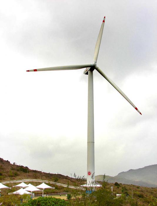
The inner workings of a wind turbine consist of three basic parts, seen in the figure below. The tower is the tall pole on which the wind turbine sits. The nacelle is the box at the top of the tower that contains the important mechanical pieces – the gearbox and generator. The blades are what actually capture the power of the wind and get the gears turning, delivering power to the generator. The direction that the blades are facing can be rotated so that the turbine always faces into the wind, and the pitch of the blades (the angle at which the blades face into the wind) can also be adjusted. Pitch control is important, especially in very windy conditions, to keep the gearbox from getting overloaded.
The amount of power (in Watts) collected by a wind turbine is explained in the following equations:

This figure explains the physics of wind power. So we begin with this notion of the moving wind having some kinetic energy which is 1/2 m v2. So that is kinetic energy. Power is related to energy in the following way: It is energy per unit of time. So if we want the power that we can get from that moving wind, we have to take the kinetic energy, and then the mass flux rate instead of just the mass. Mass flux rate is how much mass is moving per unit of time. That is dm over dt, change in mass over change in time. And that is equal to the air density times the area swept out by the windmill blades times the velocity, so that velocity and area multiplied together gives you something with the units of measure are cubic meters per second, and then you multiply that by the density and that gives you kilograms per second and that’s the mass flux rate. If you put all that together, you see the wind power is equal to one half times the air density times the area swept by the blade times the velocity cubed. So you see, the velocity is super important in this. Now then it turns out that there is an efficiency limit, something called the “ Betts Limit” that means that the power you can actually collect is 0.3 times the air density times the velocity cubed.
The Kinetic Energy (KE) of the wind is:
Where m = mass, and v = velocity of wind.
Power (P) in the wind is the KE per unit time, so we replace the mass(m) with the mass flux rate dm/dt:
Where p = air density, and A = swept area of blades.
So the wind Power(P) is:
If the wind turbine collected all of this power, the wind would have to stop and the blades would stop spinning. If you want the blades to keep spinning, it turns out that you can collect about 60% of the power (called the Betz limit).
So, collectible Power(P) is:
How much power could we get with a turbine whose blades are 100m long, with a wind speed of 10m/s (about 22mpg>, with an air density of 1.2kg/m2?
This is clearly a lot of power! But, mechanical inefficiencies related to the gears and the generator mean that we might only get 30% of this figure, but that is still a lot of power from one turbine.
All wind turbines have a minimum wind speed that differs depending on the size but is typically about 4-5 m/s (10 mph) and maximum wind speed above which they shut down to avoid damage, usually around 20-25 m/s (about 50 mph). Most wind turbines have a maximum spinning rate, reached a bit above the minimum velocity, and when the wind speeds up, the pitch of the blades is adjusted so that the rate of spinning remains more or less constant. The figure below shows a typical "power curve" for a small wind turbine.

This figure shows the power curve for a 1.5 megawatt wind turbine. So on the Y-axis is the power and the X-axis is the wind speed in miles per hour. And what you can see is that there is sort of a threshold speed that is something like 6 miles per hour wind speed you start to get some power. And as the wind speed increases, the power output rises rapidly until you get to about 30 miles per hour. At that point the power sort of saturates and flattens out and with more wind you don’t get any more power. So it reaches its capacity at 1.5 megawatts and it generates that up until 50 miles per hour and above that the power drops off rapidly because the wind turbine has a shut off mechanism will turn off if the wind gets going to fast because of the turbulence that can cause damage to the wind turbine. So they just shut down if the winds get to great.
The wind, as you may have noticed, is highly variable in any given place, but as a general rule, it is stronger and steadier as you rise up above the ground. This is because friction between the wind and the land surface slows the wind. But there is also a lot of regional variation in the wind velocity. Both of these factors (elevation above the ground and location) can be seen in the maps below, showing the average wind speed in the US at two different heights.

These two maps of the United States show the average annual wind speed at two different heights above the surface. The upper map shows the wind speed at 30 meters height and the one below shows it at about a hundred meters. You can see a couple thing right away. One is that there is just a lot more wind at greater velocities at this higher elevation above the lands surface. You get to 100 meters and there are a lot of places in the central part of the US where you get wind speed from 8 to 10 meters per second, which is really moving along quit fast. And you also see this lower map of 100 meter of wind speeds of the offshore regions everywhere on the west coast and the east coast and around the Gulf of Mexico there are very high wind speeds. Also the Great Lakes are like this. The primary reasons these offshore regions have such high wind speeds and also why higher up you have such wind speeds are because there are less friction in those settings. So you go higher up from the surface there is less friction from the air and all the trees and the roughness of the land surface. That roughness slows the wind down and as you rise above that to 100 meters you get away from that disturbance and have higher wind velocities. You can also see that in the mid-continent region, both the 30 meter and the 100 meter heights, that’s the area with the greatest wind potential. You have these annual average wind speeds that are quit high and this is primarily because this is flat part of the country. There are not a whole lot of topography in those areas so the winds can really get going and be maintained. They do not encounter mountains and valleys and the sort of complexity that you see in other areas where further out west the wind speeds are not that high. So you can look at this and see right away that if you wanted to develop wind power, the best places are in the middle of the continent and at a high elevation 100 meters above the surface. That is why you see so many tall wind turbines to get up that high.

These two maps of the United States show the average annual wind speed at two different heights above the surface. The upper map shows the wind speed at 30 meters height, and the one below shows it at about a hundred meters. You can see a couple thing right away. One is that there is just a lot more wind at greater velocities at this higher elevation above the land's surface. You get to 100 meters and there are a lot of places in the central part of the US where you get wind speed from 8 to 10 meters per second, which is really moving along quite fast. And you also see this lower map of 100 meter of wind speeds of the offshore regions everywhere on the west coast and the east coast and around the Gulf of Mexico there are very high wind speeds. Also, the Great Lakes are like this. The primary reasons these offshore regions have such high wind speeds and also why higher up you have such wind speeds are because there are less friction in those settings. So you go higher up from the surface, there is less friction from the air and all the trees and the roughness of the land surface. That roughness slows the wind down and as you rise above that to 100 meters you get away from that disturbance and have higher wind velocities. You can also see that in the mid-continent region, both the 30 meter and the 100-meter heights, that’s the area with the greatest wind potential. You have these annual average wind speeds that are quite high, and this is primarily because this is a flat part of the country. There are not a whole lot of topography in those areas, so the winds can really get going and be maintained. They do not encounter mountains and valleys and the sort of complexity that you see in other areas, where further out west the wind speeds are not that high. So you can look at this and see right away that if you wanted to develop wind power, the best places are in the middle of the continent and at a high elevation 100 meters above the surface. That is why you see so many tall wind turbines to get up that high.
The graphs above show annual average wind speeds in the US at 2 different heights above the ground surface. For reference, 10 m/s is 22.3 mph. You can see that the wind speeds at 100 m are far greater than at 30 m — this is the friction effect of the land surface (which is minimal above large water bodies). As you can see, the Great Plains have great wind potential, as do the Great Lakes and offshore areas on both coasts.
The area covered by the turbine’s blades is another important factor in determining power output. While wind turbines are available in a wide variety of capacities, from a few kilowatts to many thousands of kilowatts, it’s the larger turbine sizes that are being deployed most rapidly in wind farms. Several years ago the image on the right side of the figure below of a Boeing 747 superimposed on a wind turbine gave an astonishing representation of the scale of the state-of-the-art wind technology. Now, turbine rotor diameters are approaching the size of the Washington Monument!

The image is a graph that illustrates the progression of rotor diameters of wind turbines over time, comparing them to the wing span of an Airbus A380.
- The x-axis represents the years from 1985 to 2010 and beyond, with specific years marked: '85, '87, '90, '91, '93, '95, '97, '99, '01, '03, '05, '10, and an estimated future point labeled as "1ˢᵗ year of operation" with a capacity range of 8 to 10 MW.
- The y-axis represents the rotor diameter in meters (m), ranging from 15 meters to 250 meters.
- The graph shows a series of circles, each representing the rotor diameter of wind turbines at different points in time. These circles increase in size as the timeline progresses, indicating the growth in rotor diameter over the years.
- Each circle is labeled with its corresponding rotor diameter:
- 1985: 15 m
- 1987: 30 m
- 1990: 40 m
- 1991: 50 m
- 1993: 60 m
- 1995: 70 m
- 1997: 80 m
- 1999: 90 m
- 2001: 100 m
- 2003: 110 m
- 2005: 120 m
- 2010: 130 m
- Future (8-10 MW): 250 m
- A red line runs through the centers of these circles, showing the trend of increasing rotor diameter over time.
- On the right side of the graph, there is an illustration of an Airbus A380 with a wing span of 80 meters for comparison. An arrow points from the Airbus A380 to the largest circle (250 m), suggesting a comparison between the wing span of the airplane and the rotor diameter of future wind turbines.
- The background of the graph is light blue, and the circles are shaded in orange with red outlines.
This graph visually demonstrates the significant increase in wind turbine rotor diameters over the years, projecting into the future with much larger sizes compared to current standards.
Activate Your Learning
Given that the area of wind captured by the turbine is proportional to the square of the radius (essentially the length of the blade), if you were to double the length of a wind turbine's blade, how much more power would that turbine generate? Assume that wind speed and all other variables remain the same.
Click for the answer.
Market Deployment of Wind Energy
 Market Deployment of Wind Energy
Over the last 20 years, growth in the total installed capacity of wind energy generation across the globe has been growing rapidly. Germany was the first country to lead the development of wind power, but the US and China have dominated the growth since 2010. China is especially impressive in terms of its recent growth.

The image is a line graph titled "Cumulative installed wind energy capacity, gigawatts," which shows the growth in installed wind energy capacity from 1997 to 2016 for several countries. The y-axis represents the capacity in gigawatts (GW), ranging from 0 to 140 GW. The x-axis represents the years from 1997 to 2016.
- China (green line) shows the most significant growth, starting from near 0 GW in 1997 and rising sharply to over 140 GW by 2016.
- United States (red line) starts with a low capacity in 1997 but increases steadily, reaching around 80 GW by 2016.
- Germany (blue line) also shows steady growth, starting from a low base and reaching approximately 45 GW by 2016.
- Spain (orange line) has a moderate increase, peaking at around 25 GW.
- India (purple line) starts from almost 0 GW and grows to about 30 GW by 2016.
- United Kingdom (light blue line), France (dark blue line), and Italy (yellow line) all show growth, but at a slower pace compared to the top countries, with capacities below 20 GW by 2016.
The graph is sourced from the BP Statistical Review of Global Energy and is provided by Our World in Data. Each country's line is color-coded for easy differentiation, with a legend on the right side of the graph identifying each color with its respective country. The overall trend indicates a global increase in wind energy capacity over the years, with China leading significantly.
Part of the reason for this growth is the steady decline in the cost of wind energy, as discussed in the previous section on solar energy. But government policies are another important factor. The United States has one of the most volatile markets for wind energy in the world, while those in Europe and China have been among the most stable. This is due in part to differences in how governments in these countries treat wind energy. In many parts of Europe, wind energy (and other renewable generation technologies) enjoy subsidies and incentives known as feed-in tariffs. The feed-in tariff is essentially a long-term guarantee of the ability to sell output from a specific power generation resource to the grid at a specified price (typically higher than the prices received in the market by other generation resources). The United States, on the other hand, has favored a system of tax incentives called the “Production Tax Credit” (PTC) to encourage renewable energy deployment. In theory, a tax incentive should not work much differently than a feed-in tariff (both are just payments based on how many kilowatt-hours are generated). But the PTC has historically needed to be re-authorized frequently by the US Congress – this “on-off” policy strategy has been a major factor in the volatility of wind energy investment in the US as shown in the figure below. It is worth noting that the PTC was recently renewed for 2013, but will lapse again at the end of 2019, so it is difficult to say what impact it will have on wind investment going forward.

The image is a bar graph titled "Annual U.S. Wind Power Installation," which shows the amount of wind power installed in the United States each year from 1998 to 2018, measured in megawatts (MW).
- The y-axis represents the installed wind power capacity in MW, ranging from 0 to 14,000 MW.
- The x-axis represents the years from 1998 to 2018.
Key points from the graph:
- From 1998 to 2004, the installation of wind power was relatively low, with figures below 2000 MW each year. There is a notable annotation "PTC lapse" pointing to the years 1999, 2000, 2001, and 2003, indicating periods where the Production Tax Credit (PTC) lapsed, leading to lower installations.
- Starting in 2005, there is a noticeable increase, with installations generally above 2000 MW, peaking around 2008-2009 with over 10,000 MW.
- Another significant peak occurs in 2012, reaching over 12,000 MW, followed by a sharp decline in 2013, again marked with a "PTC lapse" annotation.
- From 2014 to 2018, the installations fluctuate but remain relatively high, with values generally between 6,000 MW and 8,000 MW, except for another peak in 2015.
The bars are colored in shades of red, with darker shades representing higher values. The graph visually represents the impact of the PTC lapses on the annual installation of wind power, showing significant drops in those years.
The above clarifies that government policies are important to the growth of renewable energy production (both wind and solar). In a very real way, you can think about these policies (feed-in tariffs or tax credits) as a form of investment. Governments can also provide investments in the form of funding for basic research related to these technologies. In general, these investments do not add up to a huge amount when seen in the context of a country's gross domestic product (GDP), which is a measure of the size of the economy, as seen in the figure below.

The image is a horizontal bar chart titled "Renewable Energy Investment (% of GDP), 2015," which shows the percentage of each nation's gross domestic product (GDP) invested in renewable energy in 2015. The data source is Bloomberg New Energy Finance and the World Bank, provided by Our World in Data.
- Chile has the highest investment at 1.4% of GDP.
- South Africa also invests 1.4% of its GDP in renewable energy.
- China follows with 0.9% of GDP.
- Japan, UK, and India each invest 0.8% of their GDP.
- Brazil invests 0.4% of its GDP.
- Germany and Mexico both invest 0.3% of their GDP.
- United States has the lowest investment at 0.2% of GDP.
The bars are colored in shades of blue, with the length of each bar corresponding to the percentage of GDP invested in renewable energy. The percentages are labeled at the end of each bar for clarity. The chart visually emphasizes the variation in investment levels across different countries.
The Potential Wind Energy Resource
The Potential Wind Energy Resource
A quick look at an annually-averaged wind map of the world (below) shows the regions of the world that are best suited for the production of wind energy in colors ranging from yellows to red (where the average winds are at least 9.75 m/s or 20 mph). The offshore regions are clearly the best in terms of the energy potential, but not all of these offshore regions are close to where people live. Even for onshore portions of the world, the wind energy potential does not always coincide with where the people are concentrated. This points to the necessity of new transmission lines to deliver this wind energy to major population centers.

So, just how much energy could be produced by the wind? In 2009, a group of scientists makes some calculations to estimate the potential for the world and the US, using wind data and some assumptions about the size and spacing of the turbines. They assumed 2.5 MW turbines on land, and 3.5 MW turbines offshore, which were big for that time. They assumed that you could only place the turbines in unforested, ice-free, nonmountainous areas away from any towns and that the turbines had to be spaced by several hundred meters so they do not interfere with their neighbors. They further assumed that each turbine generated just 20% of its rated capacity to account for mechanical problems and intermittent winds. What they came up with is summarized in the table below, and it is pretty remarkable. The units here are exajoules (EJ = 1 x 10¹⁸ Joules) of energy over the course of a year. For reference, in 2018, the US total energy consumption (not just electrical energy) was 106 EJ and the global consumption was about 600 EJ. So, with just onshore wind energy, the potential is more than twice what we consume in the US, and more than 4 times the global consumption. But getting there is a matter of installing a lot of wind turbines!
| Region | World | Contiguous US |
|---|---|---|
| Onshore | 2484 | 223.2 |
| Offshore 0-20m | 151 | 4.32 |
| Offshore 20-50m | 144 | 7.56 |
| Offshore 50-100m | 270 | 7.92 |
| Total | 3024 | 244.8 |
Now let's consider a more practical question — how much wind energy have we managed to produce, and can we somehow project the past trends into the future? The figure below shows the global history of wind energy (solar is plotted too just for comparison), and you can see that it is growing fast.

The image is a line graph titled "Global Solar and Wind Energy Generation History," depicting the growth in energy generation from solar and wind sources from 1985 to 2020, measured in exajoules (EJ) per year.
- The y-axis represents the energy generated per year in EJ, ranging from 0 to 14 EJ.
- The x-axis represents the years from 1985 to 2020.
Two lines are plotted on the graph:
- Solar energy generation is represented by an orange line. It shows a very gradual increase from 1985, remaining almost flat until around 2005. After 2005, there is a noticeable uptick, with a significant rise starting around 2010, reaching approximately 7 EJ by 2020.
- Wind energy generation is represented by a green line. Similar to solar, wind energy generation starts from a low base in 1985, with minimal growth until around 2000. From 2000 onwards, there is a steep increase, particularly sharp after 2010, reaching around 12 EJ by 2020.
The graph visually demonstrates the exponential growth in both solar and wind energy generation over the years, with wind energy showing a more pronounced increase compared to solar. The data points are marked with small dots along the lines, and a legend in the center of the graph identifies the colors associated with solar (orange) and wind (green).
Both of these curves are growing exponentially, and the history so far suggests a growth of about 25% per year on average. If we assume that they continue to grow in the further following this exponential growth, we can project where we'll be at any time in the future. Below, we see where we might be in the year 2030, just eleven years from now. What you see is that we end up with vast amount of wind energy by 2030 — if it grows at the same rate it has been growing at, we end up with almost 300 EJ per year, about half of the current global energy consumption, and if it grows at a smaller rate of 20% per year, we still end up being able to supply about 20% of the total global energy demand.

The image is a line graph titled "Global Wind Energy Generation History and Projection," which illustrates the historical data and projected growth of global wind energy generation from 1985 to 2030, measured in exajoules (EJ) per year.
- The y-axis represents the energy generated per year in EJ, ranging from 0 to 300 EJ.
- The x-axis represents the years from 1985 to 2030.
The graph features two lines:
- Historical Data (blue line) - This line shows the actual wind energy generation from 1985 to around 2020. The generation starts from nearly 0 EJ in 1985 and shows a gradual increase over the years, with a noticeable acceleration starting around 2005, reaching approximately 15 EJ by 2020.
- Projections - There are two projection lines for future growth:
- 20% per year growth (yellow line) - This projection starts from the point where the historical data ends (around 2020) and shows a steep increase, reaching about 100 EJ by 2030.25% per year growth (orange line) - This projection also starts from the end of the historical data and shows an even steeper increase, reaching around 250 EJ by 2030
The graph visually represents the exponential growth expected in wind energy generation if the growth rates continue at 20% or 25% per year. The lines are color-coded with labels indicating the growth rates, and the overall trend suggests a significant future increase in wind energy generation.
Barriers to Additional Wind Energy Development
Barriers to Additional Wind Energy Development
It is worth noting that, as with solar, wind investments are not always happening in the windiest areas. The reality is that there are a large number of factors that influence the development of wind energy globally. As the technology for wind energy has improved, other factors have also come together to create market drivers for wind power. These drivers include:
- Declining Wind Costs
- Fuel Price Uncertainty
- Federal and State Policies
- Economic Development
- Public Support
- Green Power
- Energy Security
- Carbon Risk
Earth: The Operator's Manual
Despite all of these barriers to wind energy deployment, wind is, in fact, one of the fastest-growing sources of power generation in the world. Wind energy is being embraced in areas that have traditionally favored low-carbon energy development as well as in areas that have a long history of fossil fuel extraction and use. The following video explains how two very different regions - Denmark and Texas - have embraced wind energy.
Video: Yes, in My Backyard (aka YIMBY!): (9:08)
NARRATOR: Are there other examples of communities and nations that have begun the transition away from fossil fuels? What does it take to welcome the turbines and solar farms of the new energy system, and say, "Yes, In My Backyard." This is the story of two communities that at first look very different. Samso is a small island off the Danish mainland. West Texas is a vast, dry expanse in America's South. What both have is abundant wind. At times, Samso produces more electricity than it uses, exporting surplus power to the Danish mainland. And Texas wind now generates as much power as the next three U.S. states combined. Samso and West Texas both solved the NIMBY, not in my backyard challenge that has stymied so many renewable energy projects. It's not easy, but with patience, and persistence, and the efforts of the right people, it can be done.
SOREN: Okay-- My name is Soren Hermansen, and I am the Director of the Samso Energy Academy. Samso means, in Danish, means the Meeting Island-- when you make a circle around all of Denmark, then Samso is right in the center of the circle.
NARRATOR: Narrator: But it wasn't geography that brought Lykke Friis, then Denmark's Minister of Climate and Energy, here in mid-2011. It was why and how this community had turned NIMBY into "Yes, in my backyard."
LYKKE FRIIS: Well, Samso is a pioneering project, in the sense that Samso, way back, decided that Samso should become independent of fossil fuels. Narrator: Before its transformation, people thought of Samso as just a cute tourist community, busy in summer, empty and desolate in winter. Now people come here not just to see the turbines, but to understand the process that got the community to welcome wind energy. After a national competition, Samso was selected by the Danish government to be a proof of concept for how to transition from fossil fuels. But it was up to individuals like Soren Hermansen, with the passion and skills to effect change, to figure out just how. Soren: So when we won, the normal reaction from most people was, "Yeah, you can do this project, that's OK, but just leave me out of it."
NARRATOR: Samso has a deep attachment to its past and values its traditional way of life.
SOREN: But gradually we won their confidence in establishing easy projects to understand, and also easy projects to finance. Because basically, it's all about, "What's in it for me?" Because it's not convinced idealists or green environmental hippies who lives here.
NARRATOR: Soren, a native of the island, convinced some of his neighbors to become early adopters. They found success and spread the word. Jorgen Tranberg operated a large and profitable herd of milk cows. After initial reservations, he invested in a turbine on his own land. When that went well, Jorgen became part owner of one of the offshore turbines.
SOREN: Farmers, they have to invent new things and be ready for changes. So when they see a potential, they look at it, no matter what it is. They look at it, say, "Could I do this?" And if they see fellow farmers do the same thing, they are quick to respond to that. So even being very traditional and conservative in their heads I think they have this ability of making moves and do things because they have this independency in them. A farmer is a free man-- maybe he owes a lot of money to the bank, but he's still a free man in his thinking.
NARRATOR: It was seeing what was in it for them and for their community, that won over landowners in West Texas. And it took one of their own, a man whose family had deep roots in Roscoe's cotton fields, to educate them about wind farming. Cliff Etheredge: Well, I'm really a farmer-farmer, you see. I farmed for almost over 40 years. We're in-- right in the middle of the Roscoe Wind Farm. And we've got about 780 megawatts of production, that's per hour, enough electricity for about 265,000 average homes. Narrator: Roscoe had no oil and faced hard times in the early '90s, but it did have wind.
CLIFF: When this land was acquired there was absolutely no value to the wind. Fact is, it was a severe detriment, because of the evaporation of the moisture.
NARRATOR: Cliff, like Soren, had to work with his neighbors to get them ready to accept wind turbines.
CLIFF: The first thing farmers want to know is, "Well, how much is it going to cost me?" It costs them nothing. "What's it going to hurt?" Three to five percent of your farmland is all it's going to take up. You can do what you want to with the rest of it. Then it came down to, "Well, how much money is this going to make me?"
NARRATOR: Cliff did his research and checked his numbers with wind experts and the Farm Bureau.
CLIFF: Then I was able to go to our Landowners' Association and show them, where they had been receiving 35 to 40 dollars an acre, then the landowners could expect somewhere in the neighborhood of three times that.
NARRATOR: In fact, farmers stand to make 10 to 15 thousand dollars a year, per turbine, just from leasing the wind rights.
CLIFF: There was no guarantee in it from the very beginning, but sure enough we've got, I think, in the neighborhood of 95 or more percent of our area that accepted the wind farm.
NARRATOR: In both Samso and West Texas, individuals saw economic benefits. But the whole community, beyond the investors and land-owners, benefited too.
CLIFF: Because of the wind farm, now, and the people working in the wind industry, now we've got jobs available and opportunities for young people to come back from college or from technical school or from whatever. It's just been a Godsend.
NARRATOR: For Kim Alexander, superintendent of the Roscoe school district, that godsend translates into dollars.
KIM ALEXANDER: In 2007, prior to the wind values coming on our tax roll, our property values were at about 65 million dollars. And then, that wind development, they jumped to approximately 400 million dollars, to 465 million dollars.
NARRATOR: The school district will get more than 10 million dollars over a decade. That guaranteed revenue stream unlocked additional funding. School buildings, some dating from the 1930s, could be updated, and computer labs added.
CLIFF: This is an indication to me of what can be done for rural areas, and will be done, all the way to Canada-- bringing life and prosperity back to these rural communities that are suffering just like we have.
NARRATOR: The same oil shock that got Brazil started on ethanol, got Denmark started on manufacturing wind turbines, just in time to compensate for a decline in its shipbuilding industry.
LYYKE: And it's also good for the economy, in terms of export. I mean, 10 percent of Danish exports comes from the cleantech area.
NARRATOR: Energy and environment always require tradeoffs, such as clear vistas versus clean energy. It's something that communities have to make time to work through. Cliff, for one, believes it's worth it.
CLIFF: Everything, the schools, the churches, the civic organizations, all the businesses will benefit from this. It will increase, hopefully, our town's populations, and our economics.
KIM ALEXANDER: My granddad used to say, not realizing he was prophetic, but "If we could sell the wind, we'd be wealthy." Well, who would have ever thought we'd be able to sell the wind?
NARRATOR: For Samso, Denmark, and Texas, clean energy brought economic benefits and energy security. But replacing fossil fuel emissions with wind power has other advantages.
LYKKE: And let's not forget, also good for climate and health, and such, and that's a very important argument.
CLIFF: We've got a constant wind resource here, that's tremendously valuable, and as opposed to oil and gas, it'll last forever, and it doesn't pollute anything.
We have already mentioned the US Production Tax Credit, which is responsible for a good amount of the trend in US wind energy investment – both up and down! A decline in wind investment in 2010 and 2011 was due in part to the global financial crisis. A drop in natural gas/wholesale electricity prices has made some planned projects less competitive than originally expected and halted development. There has also been a slump in the overall demand for energy. Another factor that limits the growth of wind power capacity is the constraint on the transmission infrastructure. As can be seen in the wind capacity map on the previous page, many of the locations that experience the windiest conditions are not close to coastal population centers. The cost of upgrading this infrastructure is significant — perhaps $30 to $90 billion in the US by the year 2030 according to some estimates. This seems like a huge amount, but consider that our government spends about \$20 billion each year in direct subsidies to the fossil fuel industry, which would sum up to \$200 billion by the year 2030. In light of that, the upgrade cost for better transmission lines is a bargain!
Note
A great resource for information on the current state of the US wind market and the wind industry, in general, is the US Wind Technologies Market Report [32]which is annually published by the Mark Bolinger and Ryan Wiser of the Lawrence Berkeley National Laboratory.
Discussion Assignment
Reminder!
After completing your Discussion Assignment, don't forget to take the Module 6 Quiz. If you didn't answer the Learning Checkpoint questions, take a few minutes to complete them now. They will help your study for the quiz and you may even see a few of those question on the quiz!Discussion Question
Objective:
Evaluate who you think is responsible for maintaining infrastructure (power lines, meters, emergency repairs) when people generate their own renewable energy at home. Is it fair for those who can't afford new technology to shoulder the burden? Does charging a fee discourage people who could be installing solar and wind technology at home from doing so?
Goals:
- Find reliable sources of information on the internet
- Communicate scientific ideas in language non-scientists can understand
Read:
Arizona's New Fee Puts a Dent in Rooftop Solar Economics [33]
Salt River Project: Changes to Solar Pricing for New Rooftop Solar Customers [34]
SolarCity Lawsuit Alleges Arizona Utility's Fee Hurts Solar [35]
Description:
Perhaps you’ve heard a story about a person or family who installed solar panels or a wind turbine at their home, and during certain times of day when conditions are right, they can sit and watch their power meter run backward, feeding power back onto the grid. Sounds like a win-win situation, right? Those people are lowering their own dependence on fossil-fuel derived energy, and even supplying power derived from renewable resources to the big power companies to redistribute to other customers. So what’s the catch?
The problem is, as more customers in certain markets (for example, sunny desert areas like New Mexico and Arizona) install home solar and reduce their bills to almost nothing, the power companies are pulling in less profit. Which may not seem like a big deal – times change, new markets emerge and old ones die out. Newspapers have felt the pinch, and the postal service, and cable television. Companies have to keep up or make way. Except solar and wind can’t provide power 100% of the time. People who power their homes with these renewable resources still rely on the grid to provide power at night, or on cloudy or windless days. Maybe they give as much power back to the grid as they take from it over the course of a month, keeping the meter near zero. Now who is paying for the maintenance of the power lines that shuttle that power to and from these homes?
The power companies are paying, of course. But in a more pessimistic (or realistic) sense, the customers who can’t afford solar or wind technology will be the ones who will pay in the long run as power companies raise their prices to cover the loss of revenue. So in a sense, poorer people will be forced to subsidize the power grid while the wealthy sit back and smugly watch their meters run backwards.
Power companies in several states, including Arizona and Oklahoma, are beginning to charge fees of as much as $50-100 per month for customers who create their own solar or wind energy. This is a drastic turnaround from government tax breaks designed to encourage people to install their own renewable power technology. Proponents of renewable energy argue that such high fees will only serve to discourage more people from installing solar panels and wind turbines at home, proliferating our dependence on fossil fuels.
What do you think? Should the power company charge individuals a monthly fee to generate their own power? Who will determine what a reasonable charge would be?
Instructions
Summarize your thoughts on home power generation and responsibility for maintaining infrastructure in a 200-250 word discussion post. Give specific examples of why you think individuals should or should not be responsible for maintaining utilities. Your original post must be submitted by Wednesday. In addition, you are required to comment on one of your peers' posts by Sunday. You can comment on as many posts as you like, but please try to make your first comment to a post that does not have any other comments yet. Once you have an idea of what you want your post to be, go to the course discussion for your campus and create a new post.
Scoring Information and Rubric
The discussion post is worth a total of 20 points. The comment is worth an additional 5 points.
| Description | Possible Points |
|---|---|
| well-reasoned analysis in your own original post (200-250 words) | 20 |
| well-reasoned comment on someone else's post (75-100 words) | 5 |
Summary and Final Tasks
Summary
Humans have been harnessing wind energy in various forms for thousands of years, although the types of wind turbines that you may see sprouting up in various places (if you happen to live in a windy area) have been used widely for only the last few decades. Wind is one of the fastest-growing energy sources on the planet; in many areas, the amount of new electric generation capacity from wind turbines is outpacing the amount of new capacity from natural gas, coal or other fossil fuels. While European countries have embraced wind energy with larger financial incentives (and in some cases, generate a larger percentage of their electricity from wind energy than just about anywhere else in the world), China and the United States are still the world’s biggest wind markets. Despite falling costs and progressive designs that are friendlier to birds and bats, wind energy growth is still hampered in many areas by high costs, unpredictable incentives and, ironically enough, a bad environmental rap.
Reminder - Complete all of the Module 6 tasks!
You have reached the end of Module 6! Please go to the Module Roadmap [36] to make sure you have completed all of the activities listed there before you begin Module 7.
Module 7: Geothermal, Hydroelectric & Nuclear
Overview
Old Faithful Geyser in Yellowstone is a famous tourist attraction, blasting hot water and steam more than 100 feet into the air on a sufficiently regular schedule to keep spectators happy. If you run the hot water through a turbine, you wouldn't get enough energy to supply the Old Faithful Lodge. But, that idea on a larger scale can provide valuable geothermal energy, which is being used in California, Iceland, New Zealand, Italy, and elsewhere. Most of our geothermal energy comes from anomalously "hot" places near volcanoes, and there aren't enough of those to power all of humanity. But, if we were to use "hot, dry rock", pumping waterway down, heating it, and bringing it out artificial geysers to drive turbines, an immense amount of energy is available.
Moving water carries power even if it isn't coming out of a geyser. We get reliable power from hydroelectric dams on rivers, and we can extract more energy from waves and currents. There isn't enough of either one to give us all of our energy, but in some places, they are greatly valuable, and we can develop new ways to make them more valuable—if you're building a breakwater to protect a city from the rising sea, why not install generators to convert the punishing power of storm waves into valuable electricity for the city?
The heat driving geothermal energy is mostly from radioactive decay in rocks. We have figured out how to generate more radioactive decay, where and when we want, in nuclear fission reactors, which are supplying much of our electricity in many countries. Nuclear energy could generate more electricity, too, although it also generates much debate among those who enjoy its reliable electricity, and those worried about contamination now or far into the future, and about the possible use of nuclear programs to generate material for bombs.
These three forms of energy — hydropower, geothermal, and nuclear — have been with us for quite a while (especially hydropower), so it is not surprising to see that they make up a significant portion of the global "renewable" energy portfolio. The quotes around renewable are because hydro, geothermal, and nuclear are not entirely renewable — it is probably better to call them low-carbon sources of energy — but in the literature, they are often labelled as "renewable". As with wind and solar, hydropower, geothermal, and nuclear have extremely low carbon emissions per unit of energy produced. The figure below, showing the history of (mostly) renewable energy production for the world, reveals some interesting trends.

The image is a line graph titled "Global Renewable Energy," which shows the historical generation of various types of renewable energy from 1965 to 2015, measured in exajoules (EJ).
- The y-axis represents the energy generated in EJ, ranging from 0 to 16 EJ.
- The x-axis represents the years from 1965 to 2015.
The graph includes five different colored lines representing various energy sources:
- Solar (blue line) - This line starts from near 0 EJ in 1965 and shows a very gradual increase until around 2005. After 2005, there's a sharp rise, reaching approximately 1 EJ by 2015.
- Wind (orange line) - Similar to solar, it starts from near 0 EJ in 1965. The increase is also gradual until around 2000, after which it rises more steeply, reaching about 2 EJ by 2015.
- Nuclear (red line) - This line begins from near 0 EJ in 1965, with a steady increase over time. It shows a significant rise starting around 1970, peaking at about 7 EJ around 2005, then slightly declining and stabilizing around 6 EJ by 2015.
- Hydro (yellow line) - Hydro energy starts from around 1 EJ in 1965 and shows a steady increase, reaching approximately 4 EJ by 1980. From there, it continues to grow slowly, peaking at around 10 EJ in the early 2000s, then slightly declining and stabilizing around 9 EJ by 2015.
- Geothermal, Biomass, Other (green line) - This category starts from near 0 EJ in 1965. The growth is very gradual until around 2000, after which it starts to increase more noticeably, reaching about 1 EJ by 2015.
A legend in the top left corner identifies each color with its corresponding energy source. The graph visually represents the growth trends of different renewable energy sources over time, with hydro showing the most significant historical contribution, followed by nuclear, while solar, wind, and geothermal/biomass/other show notable increases in recent decades.
We see here that hydropower was already contributing a significant amount of energy in 1965 and has seen more or less steady growth since then. Nuclear energy emerged on the scene about 1970 and grew rapidly at first, but has since leveled off, while geothermal has been growing at a relatively slow pace. These three are all in contrast to wind and solar, which are characterized by exponential growth starting in just the past two decades.
How about costs? Most energy economists like to compare the energy costs from different sources using the "levelized cost" or "life-cycle costs" that we discussed earlier with wind and solar power. The table below provides a comparison of a wide range of energy sources.
| Energy Source | $/MWh | XXX |
|---|---|---|
| Natural Gas | 35 | XXX |
| Coal | 60 | XXX |
| Wind Utility Scale | 14 | XXX |
| Solar PV Utility Scale | 25 | XXX |
| Hydroelectric | 50 | XXX |
| Geothermal | 42 | - |
| Nuclear | 96 | - |
| Biomass | 85 | - |
As you can see, hydroelectric, geothermal, and nuclear are all more expensive than solar PV and wind, but they do have the advantage of being able to supply energy on demand without any kind of battery storage systems.
Let's go look at these interesting power providers — hydro, geothermal, and nuclear. We'll save some of the economic and ethical issues for later.
Goals and Objectives
Goals:
- Recognize the great diversity of energy options currently available to us
- Explain scientific concepts in language non-scientists can understand
- Find reliable sources of information on the internet
Learning Objectives
By the end of this module, you should be able to:
- Recognize the advantages and limitations of geothermal, hydroelectric, and nuclear energy
- Recall the basic science behind geothermal, hydroelectric, and nuclear power generation
- Analyze why even people who rely heavily on energy resources tend to want those resources to be exploited far from their own homes
Roadmap
| To Read | Materials on the course website (Module 7) and: Global view of nuclear reactors (2009) [37] Is the solution to the U.S. nuclear waste problem in France? [38] Nuclear energy 101: Inside the "black box" of power plant [39] |
All on the Web. Click the title of the reading to link to the material. |
|---|---|---|
| To Do | Discussion Post [40] Discussion Comment [40] Quiz 7 |
Due Wednesday Due Sunday Due Sunday |
Questions?
If you prefer to use email:
If you have any questions, please email your faculty member through the CMS. We will check daily to respond. If your question is one that is relevant to the entire class, we may respond to the entire class rather than individually.
If you prefer to use the discussion forums:
If you have any questions, please post them to Help Discussion. We will check that discussion forum daily to respond. While you are there, feel free to post your own responses if you, too, are able to help out a classmate.
Geothermal
Geothermal Energy
In Yellowstone National Park in Wyoming, one of the most popular tourist attractions is a geyser known as Old Faithful." The neat thing about Old Faithful is that it spurts hot steaming water out of the ground at pretty predictable intervals – predictable enough that you can probably time your trip to Yellowstone to see Old Faithful erupt several times a day. If you don't happen to live nearby, you can always use the miracle of technology and check out the Old Faithful webcam [41].
Video: Old Faithful Geyser Eruption (1:28)
PRESENTER: Old faithful here in Yellowstone National Park in July, getting ready for the eruption here.
[CHEERING]
Old Faithful here.
When you watch Old Faithful erupt, what you are seeing is geothermal energy in action. If we could just place a nice shiny turbine on top of the geyser's cone, whenever Old Faithful erupts (about every hour and a half or so), the force of the steam would spin the turbine, generating a nice flood of low-carbon electricity.
No one seriously talks about generating power from Old Faithful, but the heat beneath the surface of the earth could provide a gigantic store of energy – if only we could get at it at some reasonable cost. There are a few places, like California, Alaska, and Iceland, where geothermal energy is used to generate a lot of electricity (in Iceland's case, basically enough for the whole country). There are a lot more places where engineers are hoping that we could generate even more electricity from geothermal energy, using techniques collectively known as "enhanced geothermal."
In this section, we'll talk about how geothermal energy works and where it is currently used. We'll also talk about the potential, and some possible pitfalls, from enhanced geothermal. One really intriguing idea that we won't talk about in this section is using heat in the very shallow surface (maybe as little as fifteen feet below ground) to heat and cool your home. This idea, called "ground-source heat pumps" or "ground source heat exchange" is growing in popularity for new home construction and has the potential to save a lot of energy in buildings. But we'll wait for that until we talk about energy conservation. Here we'll stick to producing electricity directly from the heat deep within the earth's surface.
Generating Electricity from Geothermal Energy
Generating Electricity from Geothermal Energy
Remember how your basic steam turbine works in a power plant that uses fossil fuels: Fuel is burned to heat water in a boiler, to create steam. The steam is used to drive a turbine, which generates electricity. What if you could get all that steam without burning a single ounce of coal, oil or natural gas? That is the appeal of geothermal electricity production. In certain locations (primarily near active or recently active volcanoes) there are very hot rocks deep under the earth’s surface. In these "geothermal" regions, the temperature may rise by 40-50°C every kilometer of depth, so just 3 km, the temperature could be 120 to 150°C, well above the boiling point for water. The rocks in these regions will typically have pore spaces filled with water, and the water may still be in the form of liquid water since the pressure is so high down there (in some very hot areas, the water is actually in the form of steam trapped in the rocks). If you drill a deep well into one of these "geothermal reservoirs", the water will rise up and as it approaches the surface, the pressure decreases and it turns to steam. This steam can then be used to drive a turbine that is attached to a generator to make electricity. In some regards, this is very much like a coal or natural gas electrical plant, except that with geothermal, no fossil fuels are burned, which means no carbon emissions.
There are three basic types of geothermal power plants, depending on the type of hydrothermal reservoir:
- Dry steam plants, which draw steam directly from deep underground (a la Old Faithful);
- Flash steam plants, which draw hot water under high pressure up towards the surface. As the pressure decreases, the water boils, which generates steam to power the turbine;
- Binary steam plants, which utilize hot water (perhaps around 150 degrees Celsius) to vaporize another fluid (one with a lower boiling point). This hot vapor then drives the turbine, generating electricity.
The oldest geothermal plant (1904) in the world is Lardarello, in Italy, which is a dry steam plant. The Geysers, in California, is the largest geothermal installation in the world and the only accessible dry-steam area in the United States (other than Old Faithful and the rest of Yellowstone, which is off-limits). Most modern geothermal plants are “closed-loop” systems, which means that the water (or steam) brought up from the surface is re-injected back into the earth, as shown in the figure below. If the water is not replaced, then eventually, the geothermal reservoir will dry up and cease function.

The image is a diagram titled "Binary Cycle Power Plant," illustrating the operation of a binary cycle geothermal power plant.
- Production Well: On the left side of the diagram, there is a vertical pipe labeled "Production well" which goes down into the ground through various rock layers. This well extracts hot geothermal fluid from beneath the Earth's surface.
- Heat Exchanger: The hot geothermal fluid from the production well is directed into a heat exchanger, represented by a rectangular component with internal structures suggesting heat transfer. Inside the heat exchanger, the geothermal fluid transfers its heat to a secondary working fluid without mixing with it.
- Turbine: Above the heat exchanger, there is a turbine, depicted with blades inside a cylindrical housing. The secondary working fluid, now heated, expands and turns the turbine, converting thermal energy into mechanical energy.
- Generator: Connected to the turbine is a cylindrical component labeled "Generator." The mechanical energy from the turbine is converted into electrical energy by the generator.
- Injection Well: After passing through the heat exchanger, the cooled geothermal fluid is returned to the Earth through another vertical pipe labeled "Injection well," which also goes down through the rock layers.
- Load: On the right side of the diagram, the electrical energy generated is shown being used to power a light bulb, representing the "Load" or the end use of the generated electricity.
- Flow of Fluids: The flow of the geothermal fluid is indicated by arrows, showing movement from the production well, through the heat exchanger, and back into the injection well. The flow of the secondary working fluid is shown entering the turbine.
The diagram uses simple, clear lines and labels to illustrate the process of converting geothermal heat into electricity using a binary cycle system, where the geothermal fluid and the working fluid do not mix.
Geothermal Potential
Geothermal Potential
On a global scale, the potential for geothermal energy is quite large. The IPCC estimates that even though just a fraction of the total heat within the Earth can be used to generate geothermal power, we could nevertheless generate about 90 EJ of energy per year, and this is energy that is constantly renewed from within the Earth. Keep in mind that at present, we generate just over 2 EJ per year, so this energy source can definitely expand, but by itself it cannot meet the total global energy demand of 600 EJ.
To harness geothermal energy to generate electricity using any conventional technology (dry steam, flash steam or binary steam), you’ve got to be in the right place, where there is just the right amount of hot fluid or steam in an accessible reservoir. Unfortunately, those places are few and far between. The figure below shows a map of geothermal resources in the U.S., with identified conventional sites marked with dots on the map. All are located in just a handful of western states, plus Alaska.
This is a geothermal resource map of the United States, showing the locations of identified hydrothermal sites and the favorability of Deep Enhanced Geothermal Systems (EGS). It illustrates where geothermal energy potential is highest in the U.S., particularly in the western states, using color gradients to indicate favorability for Enhanced Geothermal Systems (EGS). It also highlights identified hydrothermal sites where underground reservoirs exceed 90°C.
Map Key & Color Coding:
- Dark Red – Most favorable areas for deep EGS.
- Orange & Yellow Shades – Areas with decreasing geothermal favorability.
- Light Yellow – Least favorable geothermal areas.
- Gray Areas – No data available.
- Black Dots – Identified hydrothermal sites (with temperatures above 90°C).
Geothermal Distribution:
- Western U.S. (California, Nevada, Idaho, Oregon, Utah, and parts of Arizona & New Mexico) has the highest geothermal favorability.
- Eastern U.S. has limited areas with geothermal potential, except for some parts of the Appalachian region.
- Alaska contains numerous identified hydrothermal sites.
Text on the Right Side of the Image:
"Map does not include shallow EGS resources, undiscovered hydrothermal resources, or geopressured resources. EGS resource favorability is based on a combination of depth, temperature, and thermal conductivity. The analysis assumes that permeability enhancement can be achieved anywhere the necessary thermal conditions exist. Identified hydrothermal sites are those with measured or estimated reservoir temperatures greater than 90°C. This map was produced by the National Renewable Energy Laboratory for the U.S. Department of Energy, October 13, 2009. Author: Billy J. Roberts."
Earth: The Operators' Manual
The state of Alaska is known more for oil and gas than for renewable energy resources, but the remote nature of many Alaskan communities calls for different energy solutions that we might use in a more connected part of the world. This video shows how some remote areas of Alaska are using locally-sourced renewable energy to power their communities, rather than relying so much on crude oil that makes up much of the state's economic bounty.
Video: Alaska: America's Renewable State? (10:53)
NARRATOR: Sometimes when Americans hear energy, the next word that comes to mind is crisis. It really doesn't have to be that way. Shirley Jackson, former head of the Nuclear Regulatory Commission, and now president of one of America's leading technical universities, thinks the United States is actually well-placed.
SHIRLEY JACKSON: Well, the U.S. is lucky because we have such a diversity of climates and diversity of geologies and, in the end, diversity of actual energy sources. And that, in fact, makes us very fortunate compared to other parts of the world. They may have a given source of energy, but they don't have the multiple sources.
NARRATOR: Alaska, like the rest of America, has been addicted to oil. Now, can abundant sustainable options make it America's renewable state? Kodiak Island, Alaska, at 3,600 square miles, is about half the size of New Jersey. Getting around almost always involves a boat, or a plane, or a float-plane that's a bit of both. Kodiak's population is less than 14,000, leaving most of the island undeveloped and natural. That beauty is one of Kodiak's economic assets, bringing tourists to watch bears raising cubs and catching fish. Kodiak's human population also catches salmon, with fish exports providing another key source of jobs and income. The island wants to limit imports of dirty and expensive fossil fuels, and tap natural resources to supply as much clean and locally generated energy as possible.
CLIFF DAVIDSON, CHAIRMAN, KODIAK ELECTRIC ASSOCIATION: Fuel prices, because we live on an island, are very expensive. You know, you learn pretty quickly that you need an alternative.
NARRATOR: Kodiak was the first place in Alaska to make wind power a substantial part of the energy mix, with its three 1.5 megawatt turbines on Pillar Mountain.
DARRON SCOTT, CEO, KODIAK ELECTRIC ASSOCIATION: So getting good quality, low-cost sustainable power is really necessary for the long-term viability of the economy of Alaska.
NARRATOR: Upgrades at the Terror Lake hydroelectric plant, plus plans for three more turbines, leave the KEA co-op confident they can hit 95 percent renewables by 2020. Though Kodiak uses diesel as a backup and during repairs, the wind turbines save the island 800,000 gallons of expensive, imported fuel each year. And this matters to the local business community.
JOHN WHIDDON, GENERAL MANAGER, ISLAND SEAFOODS: This morning, we're offloading pink salmon and red salmon, chum salmon and coho that came from the west side of Kodiak-- it keeps us busy, the plants work 24 hours a day, and it's a very, very big industry for Kodiak.
NARRATOR: This processing plant runs 100 percent on renewable energy, so Kodiak's wind power provides a clean, green marketing hook.
JOHN WHIDDON: The package says sustainable seafood, produced in Kodiak, Alaska, with wind-generated renewable energy.
DARRON SCOTT: You got some folks in the community that are really concerned about price. You know, they just want the lowest cost power at their house or at their business. The wind does that. It's less than 50 percent of the cost of power versus diesel. Then you got folks in the town that are very just, environmentally concerned. And they are incredibly excited because it's a whole lot cleaner than diesel is. And then you've got the majority of folks who want both, which is great as well.
NARRATOR: Kodiak is a genuine island, surrounded by ocean, but vast areas of interior Alaska are also islands of habitation, small communities surrounded by open country and dense forests. Many have no road access, and the only way to transport heavy fuel is via rivers like the Yukon. Bear Ketzler is city manager of Tanana, a remote and mainly native Alaskan village at the confluence of the Yukon and Tanana Rivers.
AL "BEAR" KETZLER, CITY MANAGER, TANANA: 90 percent of our bulk freight that comes in, comes by the barge.
NARRATOR: That includes diesel for the power plant and heating oil for homes. Diesel prices increased 83 percent between 2000 and 2005, and utility costs can sometimes be more than one third of a household's income.
BEAR KETZLER: The increase of energy costs, it jeopardizes everything. It jeopardizes our school, it really jeopardizes the ability for the city to function effectively.
NARRATOR: Communities like Tanana rely on the river for the fish protein that's a large part of a subsistence diet. And the river also provides a cheap and local source of energy.
BEAR KETZLER: We have abundant resources of wood, biomass. Wood that floats down the river, in the spring and the fall time.
NARRATOR: Timber is increasingly replacing oil and diesel in Tanana's communal buildings, like the washeteria, a combination laundromat, public showers and water treatment plant.
DENNIS CHARLEY, CITY OF TANANA, ALASKA: Right now, we don't even need oil, we're just running the whole place off this one wood boiler, which is just amazing.
NARRATOR: Using biomass and solar, the washeteria now uses only one quarter as much heating oil. Instead, the city pays residents to gather sustainable timber, keeping dollars in the local community. And using biomass at the washeteria has proven so cost-effective that the city is planning to install boilers in other public buildings.
BEAR KETZLER: We're going to be one of the first communities on Yukon River that is installing biomass systems on the school. In October of this year we're hoping to have that wood system online, so instead of burning 15,000 gallons of oil throughout this winter, we're hoping to burn about 60 cords of wood. And keep that money local and create a little bit of an economy here.
NARRATOR: The bottom line for Tanana-- savings for the city. Biomass is cheaper, local, cleaner and more sustainable.
BEAR KETZLER Even though we are a very rich state, very blessed to have the oil development that we do have, those days are diminishing. If we're going to make it in rural Alaska, we have to move towards renewable resources. I think we have, you know, less than 10 years to move in that area.
NARRATOR: Winter in Alaska presents extreme challenges. On this January day, it was close to minus 50. Gwen Holdmann is an engineer with the University of Alaska's Center for Energy and Power. She and her husband also raise sled dogs and both are mushers who have raced in the Iditarod. Today's run takes her past the Alaska pipeline, which has transported more than 16 billion barrels of oil since it opened in 1977. Despite the fact that Alaska is rich in fossil fuels, Gwen knows they're limited and expensive. She wants to take advantage of every opportunity to tap renewable energy.
GWEN HOLDMANN: We are an isolated part of the world, and we are still dependent very much on imports, and so becoming more self-reliant on energy is still a real goal here.
NARRATOR: Gwen was part of the team that built the first geothermal power plant in Alaska at Chena hot springs. Bernie Karl runs the Chena Resort and came up with the idea of creating an ice museum from the heat energy of the springs.
BERNIE: Now, you've heard of the Great Wall of China. This is the Great Wall of Chena. There's 800 tons of ice here.
NARRATOR: Bernie is a real American pioneer-- a showman, an entrepreneur, a tinkerer and enthusiast for recycling old machinery because it's cheaper. He and Gwen successfully transformed the hot springs into a geothermal resource that now generates power from lower temperature water than anywhere else on earth.
BERNIE KARL, OWNER, CHENA HOT SPRINGS RESORT: What you're looking at is something that's impossible. I went to the world's best manufacturer of geothermal equipment, and they said, "can't be done". The word can't is not in my vocabulary.
GWEN HOLDMANN, DIRECTOR, ALASKA CENTER FOR ENERGY AND POWER, UAF: It wasn't obvious at first that it could be done because these are low, really moderate temperatures for geothermal. The water that we're talking about here is about the same as a good hot cup of coffee and generating power from that isn't a trivial thing.
NARRATOR: Normal conditions for mid-winter Chena are 3–4 feet of snow, subzero temperatures, and only a few hours of daylight. Heating and lighting costs were staggeringly high. But now the resort runs year-round, with over 90 percent of its electricity coming from the hot springs. Bernie's latest impossible idea is to use geothermal power to make the resort self-sufficient in food even when it's minus 50 outside.
BERNIE: We have 85 kw of lights in here, high-pressure sodium. We're changing it to 8.5 kw of L.E.D.s. Now, this takes 1one tenth of the electricity.
NARRATOR: For the past 6 years, Chena has hosted a renewable energy fair. One keynote speaker was U.S. Senator Lisa Murkowski.
LISA MURKOWSKI, US SENATOR, ALASKA: I'm a Republican. Republicans by definition are seemingly more conservative. What is more conservative than harnessing what is available and around us in a long-term, sustainable way? We have more renewable opportunities here in Alaska than any other place in the world. We've got incredible river systems. We have 33,000 miles of coastline, the power of the tides, the power of the currents. We have biomass potential. &It is just beyond belief. As diverse and as big and remote and as costly as things are in Alaska, if we can demonstrate that it can be done here, think about the hope that it provides. They'll look at us and say, "Wow, if Alaska can do it, we can do this. We can take control of our energy future."
Enhanced Geothermal
Enhanced Geothermal
Most places do not have that right combination of an accessible, large reservoir of underground heat. Instead, reservoirs are more dispersed, in geologic formations with less permeability (this naturally inhibits the flow of hot fluid towards the surface). Engineers have discovered how to alter the subsurface to create man-made reservoirs of hot water that could be tapped to produce electricity, in either a flash steam or (with higher potential) a binary steam technology configuration. The process of engineering a geothermal reservoir underground is known as “enhanced geothermal systems” or EGS. As the resource map in Figure 2 shows, EGS could be done in a lot more places than conventional geothermal. Hundreds of thousands of gigawatts of power, basically enough to run the United States several times over, could potentially be harnessed through EGS.
Required Video/Reading:
The US Department of Energy has a nice animation outlining how EGS works: How an Enhanced Geothermal System Works [47]. Also, check out the interactive image of the EGS on the same page to gain a deeper understanding. Note: This animation requires Flash. If you don't have Flash installed, click the link to the Text Version of the animation.
The basic idea behind EGS is to fracture hot rocks deep within the earth to create channels or networks through which water could flow. When water is injected into these networks, the heat from the rocks boils the water directly, or the now-hot water is transported to the surface where it is used to boil a working fluid, much like a binary steam plant. Fracturing of the rock occurs via “hydraulic fracturing,” under which water is injected into the rock formation at high pressures, causing the rock to fracture. This is actually very similar to the way that natural gas and oil is being extracted from shale. So we can “frack” for geothermal in much the same way that we frack for oil and gas.
Barriers to Adoption of Geothermal Power Generation
Barriers to Adoption of Geothermal Power Generation
Only a few countries use geothermal resources as a major source of electricity production –Iceland, El Salvador, and the Philippines all use geothermal for more than 25% of total electricity generation within those countries. New Zealand is the next (but distant) largest at 10%. Where hydrothermal resources are easy to access, they have often been utilized. The trouble is, there just aren’t that many Old Faithfuls in the world.
EGS represents the most significant potential for geothermal electricity production, but other than a few small military or pilot projects, the systems have not really caught on commercially. One of the big reasons is cost – like many low-carbon electricity technologies, EGS is inexpensive to run but very costly to build. Drilling geothermal wells is much more expensive than drilling conventional oil or gas wells, so electricity prices would probably need to increase by 25% or more (relative to current averages) to make EGS a financially viable technology.
Perhaps a more serious challenge for EGS is “induced seismicity,” which is a fancy term for causing earthquakes. EGS wells that were drilled below Basel, Switzerland caused over 10,000 small tremors (less than 3.5 on the Richter scale) within just a few days following the start of the hydraulic fracturing process. In Oregon, a test EGS well is being monitored for induced seismic activity – you can see some neat real-time earthquake data at Induced Seismicity [48] (U.S. Department of Energy: Energy Efficiency and Renewable Energy.
Induced seismicity occurs whenever hydraulic fracturing (related to EGS or developing a natural gas well) takes place, but in most cases, the earthquakes are so small they are not felt. However, if the hydraulic fracturing occurs near pre-existing faults (which are often not visible at the surface), then larger earthquakes can and do occur, and some of these are strong enough to cause minor damage to buildings nearby.
Hydroelectricity (Waves & Tides)
Hydroelectricity - Dams, Waves, & Tides
Fossil fuels dominate the electricity generation mix of the US as a whole and the global energy mix more generally. But in some areas of the US (like the Pacific Northwest) and in some countries, including several in South America and Europe, the 800-pound gorilla of electric power generation isn’t coal, oil or even natural gas – it’s hydropower, generated from immense dams placed along the world’s major rivers. In both the US and globally, hydropower is the largest renewable resource in the energy mix, and certainly the largest source of renewably generated electricity. While growth in the use of hydroelectricity (at least the traditional type – generated by very large dams) has slowed to near zero in the U.S., many other countries in both the developed and developing world are pushing ahead with major projects to dam rivers and generate immense amounts of electricity.
This is a good thing, right? After all, the more power that is generated from hydroelectricity, the less that we might have to generate using fossil fuels, and the fewer greenhouse gases that the global energy sector will release. While it is certainly true that there are no direct greenhouse-gas emissions from hydroelectricity, broadening the use of hydropower, particularly in heavily forested areas of the world, introduces other complex environmental and social impacts. In fact, the reservoirs behind dams are major sources of methane (a potent greenhouse gas), so hydro is not exactly a carbon-free source of energy.
In this section, we’ll take a look at the processes for harnessing water for electric power generation – and these processes are not limited to damming rivers (though dams are certainly the predominant method for harnessing water energy). Like wind energy, humans have been using water for “energy” purposes (i.e., to do useful work) for thousands of years, making river systems one of the world’s oldest energy resources. For the first couple of thousand years of hydro-energy’s existence, the energy in flowing water was used to turn water wheels not for power generation, but for grinding or milling things like wheat, to make flour. It was not until the 1880s that hydroelectricity was born, with small hydropower dams in Michigan and Niagara Falls providing electricity to those places.
How do we turn water into electricity?
There are three basic technologies for using flowing water to generate electricity:
- Hydroelectric dams generate power by allowing water from behind the dam (from a reservoir or impoundment) to flow through a turbine. The turbine spins, generating electricity. This is not unlike a steam turbine (which utilizes coal, gas or oil as a fuel) or wind energy (which utilizes the wind as a fuel to get the turbine to spin).
- Wave and tidal energy projects use the kinetic energy in ocean waters, again to get a turbine to spin, producing electricity.
- In-stream hydro-kinetics is an emerging set of technologies that are similar in design to wave and tidal energy projects but are meant to be placed in streams.
Conventional Hydroelectric Dams
Conventional Hydroelectric Dams
There are three main types of conventional hydropower technologies: impoundment (dam), diversion, and pumped storage.
Impoundment is the most common type of hydroelectric power plant. An impoundment facility, typically a large hydropower system, uses a dam to store river water in a reservoir. Water released from the reservoir flows through a turbine, spinning it, which in turn activates a generator to produce electricity. Generation may be used fairly flexibly to meet baseload as well as peak load demands. The water may also be released either to meet changing electricity needs or to maintain a constant reservoir level. The layout of a typical impoundment hydropower facility is shown below in the first figure. One of the world’s most famous impoundment dams, the Hoover Dam, is shown in the second figure (although it’s worth noting that on a global scale, the Hoover Dam is more famous than it is large).
The image is a labeled diagram of a hydroelectric dam, illustrating how it generates electricity.
- Reservoir: At the top left of the diagram, there is a large body of water labeled as "Reservoir," which stores water at a higher elevation.
- Intake: On the left side of the dam, there is an opening labeled "Intake," where water from the reservoir is directed into the system.
- Penstock: From the intake, water flows through a large pipe called the "Penstock," which channels the water down towards the powerhouse. This pipe is shown running through the dam structure.
- Powerhouse: Inside the dam, there is a structure labeled "Powerhouse," where the main components for electricity generation are housed.
- Turbine: Within the powerhouse, there is a "Turbine" depicted. The water from the penstock is directed to spin this turbine.
- Generator: Above the turbine, there is a "Generator," which is connected to the turbine. The mechanical energy from the spinning turbine is converted into electrical energy by the generator.
- River: At the bottom right of the diagram, there is a body of water labeled "River," into which the water exits after passing through the turbine.
- Long Distance Power Lines: Extending from the powerhouse, there are lines labeled "Long Distance Power Lines," which carry the generated electricity away from the dam to distant locations. These lines are shown leading to a structure that looks like a power distribution station.
The diagram uses simple, clear lines and labels to show the flow of water from the reservoir through the intake and penstock, into the turbine within the powerhouse, and then out to the river. It also illustrates how the mechanical energy from the water's movement is converted into electrical energy by the generator, which is then transmitted via power lines.
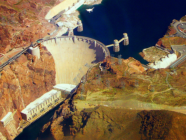
A diversion, sometimes called run-of-river, facility channels a portion of a river through a canal or penstock. It may not require the use of a dam but also has limited flexibility to follow peak variation in power demand. Thus, it will mainly be useful for baseload capacity. This scenario results in limited flooding and changes to river flow. In the United States, many of the dams in the Pacific Northwest (on the Columbia and Snake Rivers) are diversion or run-of-river dams, with limited or no storage reservoir behind the dam. The figure below shows a picture of a diversion hydropower facility. Compare what that facility looks like with the picture of Hoover Dam, the impoundment facility shown above.

A “pumped storage” hydro dam combines a small storage reservoir with a system for cycling water back into the reservoir after it has been released through the turbine, thus “re-using” the same water to generate electricity at a later time. When the demand for electricity is low (typically at night), a pumped storage facility stores energy by pumping water from a lower reservoir to an upper reservoir. During periods of high electrical demand (typically during the day), the water is released back to the lower reservoir to generate electricity. The figure below shows a schematic of a pumped storage hydro facility. Pumped storage facilities are typically smaller in terms of generation capacity than their impoundment or diversion counterparts, but are sometimes combined with impoundment or diversion facilities to increase peak power output or flexibility.

The image is a cross-sectional diagram of a "Pumped-Storage Plant," illustrating the various components and the overall operation of the facility.
- Reservoir: At the top right of the diagram, there is a large body of water labeled "Reservoir," which is at a higher elevation.
- Intake: Water from the reservoir is directed into the system through an opening labeled "Intake."
- Switchyard: To the far right, above the reservoir, there is a structure labeled "Switchyard," which is involved in the distribution of electricity.
- Visitors Center: Near the top of the diagram, there is a building labeled "Visitors Center," located on the surface above the main infrastructure.
- Elevator: A vertical line labeled "Elevator" runs from the surface down to the underground sections, providing access between levels.
- Main Access Tunnel: A horizontal tunnel labeled "Main Access Tunnel" extends from the base of the elevator, leading to various underground chambers.
- Surge Chamber: Connected to the main access tunnel is a vertical structure labeled "Surge Chamber," which helps manage water pressure fluctuations.
- Powerplant Chamber: Below the surge chamber, there is a large room labeled "Powerplant Chamber," where the main machinery for generating electricity is housed.
- Breakers: Adjacent to the powerplant chamber, there is a section labeled "Breakers," which are electrical switches used to control, protect, and isolate electrical equipment.
- Transformer Vault: Below the breakers, there is another section labeled "Transformer Vault," where transformers are located to step up or step down voltage levels for efficient power transmission.
- Discharge: At the bottom left of the diagram, there is an area labeled "Discharge," where water exits after passing through the powerplant, flowing back into a lower body of water or river.
The diagram uses color coding (blue for water flow, brown for earth) and clear labels to show the path of water from the reservoir through the intake, down through the system, and how it's used to generate electricity in the powerplant chamber before being discharged. The various components are interconnected, illustrating the flow of water and electricity in a pumped-storage hydroelectric facility.
Wave and Tidal Energy
Wave and Tidal Energy
Water in the oceans is constantly in motion due to waves and tides, and energy can be harvested from these kinds of motions. Waves, driven by the winds, make the water oscillate in roughly circular orbits extending to a depth of one half of the wavelength of the wave (distance between peaks). Tides, related to the gravitational pull of the Moon and Sun on the oceans, are like very long-wavelength waves that can produce very strong currents in some coastal areas due to the geometry of the shoreline. In terms of power generation technologies, wave and tidal power have both similarities and differences. Both refer to the extraction of kinetic energy from the ocean to generate electricity (again, by spinning a turbine just as hydroelectric dams or wind farms do), but the locations of each and the mechanisms that they use for generating power are slightly different.
Wave energy projects extract energy from waves on the surface of the water, or from wave motion a bit deeper (a few 10s of meters) in the ocean. Surface wave energy technologies capture the kinetic energy in breaking waves – these provide periodic impulses that spin a turbine. The US Department of Energy [55] has a nice description of different types of surface wave projects as follows:
- Oscillating Water Columns: Oscillating water columns consist of a partially submerged concrete or steel structure that has an opening to the sea below the waterline. It encloses a column of air above a column of water. As waves enter the air column, they cause the water column to rise and fall. This alternately compresses and depressurizes the air column. As the wave retreats, the air is drawn back through the turbine as a result of the reduced air pressure on the ocean side of the turbine.
- Tapchans: Tapchans, or tapered channel systems, consist of a tapered channel that feeds into a reservoir constructed on cliffs above sea level. The narrowing of the channel causes the waves to increase in height as they move toward the cliff face. The waves spill over the walls of the channel into the reservoir, and the stored water is then fed through a turbine.
- Pendular Devices: Pendular wave-power devices consist of a rectangular box that is open to the sea at one end. A flap is hinged over the opening, and the action of the waves causes the flap to swing back and forth. The motion powers a hydraulic pump and a generator.
Offshore wave energy systems are typically placed deeper in the ocean, though not too deep – perhaps a few hundred feet below the ocean’s surface. The periodic wave activity at this depth is typically used to power a pump that feeds into a turbine, generating electricity.
Tidal energy projects typically work by forcing water through a turbine or a “tidal fence” that looks like a set of subway turnstiles. The systems depend on regular tidal activity to generate power. Because this tidal activity is predictable (each coast sees at least one tidal cycle per day – high tide and low tide – and some areas actually see two tidal cycles on a daily basis), tidal energy projects have the advantage of being able to provide a fairly predictable source of electricity. The use of tidal power, globally, has been quite limited because there are only a few sites in the world that see sufficiently large variations in tides to produce enough power, as shown in the table below.
| Country | Site | Tidal Range (m) |
|---|---|---|
| Canada | Bay of Fundy | 16.2 |
| England | Severn Estuary | 14.5 |
| France | Port of Granville | 14.7 |
| France | La Rance | 13.5 |
| Argentina | Puerto Rio Gallegos | 13.3 |
| Russia | Bay of Mezen | 10.0 |
| Russia | Penzhinskaya Guba | 13.4 |
| U.S. (Alaska) | Turnagain Arm | 9.2 |
| U.S. (Alaska) | Cook Inlet | 7.6 |
In-River Hydro-kinetics
In-River Hydro-kinetics
When rivers are utilized to produce electricity, that is usually accomplished by building some sort of hydroelectric dam, like the three we discussed earlier. It doesn’t have to be that way, however. Many of the technologies used to extract energy from the tides (or similar technologies) could be deployed in freshwater river systems rather than the saltwater ocean, effectively acting as very small run-of-river facilities. These “hydrokinetic” power generation systems are typically individually small (each generating about 100 kilowatts or less of power) and could be situated in two ways. First, a propeller-like or turnstile-like turbine could be deployed directly into the riverway, operating much like a small-scale tidal power system. Second, a “micro-hydro” type of system could be employed, where river water is channeled to a turbine housing via a channel or pipeline, as shown in the figure below.

The image is a diagram illustrating the components of a run-of-the-river hydroelectric power system set in a hilly landscape.
- Intake: At the top right of the diagram, there is a structure labeled "Intake" located in a river, where water is diverted from the natural flow.
- Canal: From the intake, water is channeled through a man-made waterway labeled "Canal," which runs along the contour of the land.
- Forebay: The canal leads to a wider section labeled "Forebay," which serves as a small reservoir or settling basin to regulate water flow before it enters the penstock.
- Penstock: Water from the forebay is then directed into a large pipe labeled "Penstock," which slopes downward, carrying water under pressure to the power station.
- Powerhouse: At the bottom left of the diagram, there is a building labeled "Powerhouse," where the penstock delivers water to turbines. This is where the conversion of water energy into electrical energy occurs.
- River: The natural river continues to flow beside the canal and penstock, with the powerhouse situated near the riverbank. The river is depicted winding through the landscape, with some water being diverted for power generation.
- Landscape: The background includes hills and trees, indicating a natural setting. There's also a small house near the river, suggesting human habitation in the vicinity.
The diagram uses simple lines and labels to show the flow of water from the river through the intake, canal, forebay, and penstock to the powerhouse, illustrating how run-of-the-river hydroelectric systems work by utilizing the natural flow of the river with minimal storage.
Global Use of Hydroelectricity
Global Use of Hydroelectricity
Globally, hydroelectricity is a major electricity resource, accounting for more than 16% of all electricity produced on the planet. More electricity is produced globally using hydropower than from plants fueled by nuclear fission or petroleum (natural gas and coal do produce more electricity globally than hydropower does). More than 150 countries produce some hydroelectricity, although around 50% of all hydropower is produced by just four countries: China, Brazil, Canada, and the United States. China is by far the largest hydropower producer on the planet, as shown in the figure below. Hydroelectricity production in China has tripled over the past decade, with the completion of some of the world’s largest dam projects, in particular, the Three Gorges Dam (the world’s largest), which could produce nearly enough electricity to power all of New England during a typical summer and left an area roughly the size of San Francisco flooded underwater.
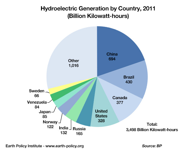
The image is a pie chart titled "Hydroelectric Generation by Country, 2011 (Billion Kilowatt-hours)," which shows the distribution of hydroelectric power generation across different countries for the year 2011. The total hydroelectric generation is 3,496 billion kilowatt-hours.
- China is the largest contributor, represented by the biggest slice of the pie chart, generating 694 billion kilowatt-hours.
- Brazil follows, with a slice showing 430 billion kilowatt-hours.
- Canada is next, depicted with a slice for 377 billion kilowatt-hours.
- United States has a slice for 328 billion kilowatt-hours.
- Russia is shown with 165 billion kilowatt-hours.
- India has a slice for 132 billion kilowatt-hours.
- Norway is represented with 122 billion kilowatt-hours.
- Japan has a smaller slice for 85 billion kilowatt-hours.
- Venezuela is shown with 64 billion kilowatt-hours.
- Sweden has the smallest individual country slice, with 66 billion kilowatt-hours.
There is also a large section labeled Other, which collectively represents 1,016 billion kilowatt-hours from countries not individually listed.
Each country's contribution is color-coded in the pie chart for visual distinction, with labels indicating the amount in billion kilowatt-hours. The source of the data is BP, and it is provided by the Earth Policy Institute. The total generation figure is prominently displayed at the bottom right of the chart.
Once hydroelectric dams are built, they run very cheaply and generally provide reliable supplies of electricity except during times of extreme drought. Developed countries that have substantial hydro resources have, by and large, already utilized those resources to produce electricity. In these countries, hydropower dominates the electricity supply system as shown in the chart below. Norway leads the pack here – the amount of hydropower that it produces is not large in an absolute sense (it is the world’s seventh-largest producer) but nearly all electricity generated in Norway comes from hydro-power. Brazil and Canada are also highly dependent on hydropower. Other large hydro producers, such as China and the United States, produce much less hydroelectricity relative to the size of their overall power sectors.
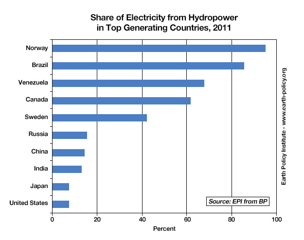
The image is a horizontal bar chart titled "Share of Electricity from Hydropower in Top Generating Countries, 2011." It displays the percentage of electricity generated from hydropower in various countries for the year 2011. The data source is the Earth Policy Institute (EPI) from BP.
- Norway has the highest share, with a bar extending to nearly 100%, indicating almost all of its electricity comes from hydropower.
- Brazil follows, with a bar reaching approximately 80%.
- Venezuela is next, with a share around 70%.
- Canada has a bar showing about 60%.
- Sweden shows a share of roughly 50%.
- Russia has a bar extending to about 20%.
- China is depicted with a bar at around 15%.
- India has a share of about 12%.
- Japan shows a bar at approximately 8%.
- United States has the lowest share among the listed countries, with a bar extending to about 7%.
Each country is listed on the y-axis, with corresponding bars extending horizontally to the right to represent the percentage on the x-axis, which ranges from 0 to 100%. The bars are colored in blue for visual distinction. The source of the data is noted at the bottom right of the chart.
Hydroelectric Potential
Hydroelectric Potential
It is often said that developed countries like the United States have little potential for growth in hydroelectric power generation – the US, in particular, has dammed so many rivers, that what could possibly be left? In some areas of the Pacific Northwest, the US is removing some dams that produce electricity due to environmental concerns. It is certainly the case that there is relatively little potential for new hydro mega-projects in the US. This does not mean, however, that there is nowhere left to build new hydroelectric projects. There are, in fact, several hundred megawatts of planned hydroelectric generation in the Mid-Atlantic US alone (see the map at PJM [57]) [58], though most of the projects would be small pumped storage facilities) We’ll walk briefly through a few examples of the hydro resource potential in the United States before taking a more global look.
First, not all dams in the US are equipped with turbines to generate electricity. There are, actually, quite a few that aren’t (see the interactive map at Energy.gov [59] – potentially enough power generation to supply more than ten million homes. Many of these are located along major shipping routes, like the Ohio and Mississippi Rivers. Others are located in areas where development might not make economic sense because the power would need to be shipped across large and expensive transmission lines. Another unconventional technology – hydro-kinetics – could potentially supply enough electricity to power the state of Virginia, although these resources are highly concentrated in the Lower Mississippi River and in more remote areas such as Alaska.
Globally, the picture is very different. Developing nations with abundant hydro resources, like China, Brazil, and other South American countries, are rushing headlong into planning and building new dams. So globally, hydroelectricity is alive and well, and growing rapidly (no pun intended) – although this growth comes in fits and starts since new dams each represent a big chunk of capacity and take a long time from project start to finish. Nearly half of the world’s fifteen largest dams were built since the year 2000, with only one of those in a country other than China or Brazil (the Sayano Shuskenskaya dam in Russia was recently upgraded, although the original went into place in the 1980s).
Energy from hydropower has been growing at a steady annual rate of 0.3 EJ per year since the year 2000, faster than the previous decades, but overall, hydro still accounts for just 16 EJ of the total 580 EJ we used in 2018. Some estimates suggest that if we really developed all of the economically viable hydroelectric sites, we might be able to generate as much as 50 EJ of hydroelectric energy — still a far cry from the +600 we will need in the near future. But even though hydro cannot solve all of our energy problems, it is nevertheless very important in that it supplies a relatively low-emissions, dispatchable (on-demand) energy source that can help smooth out the variability in wind and solar energy production.
Challenges to Further Hydroelectric Deployment
Challenges to Further Hydroelectric Deployment
While hydro development is still growing in several regions of the world, many countries, including the United States, will not likely pursue larger hydro projects due to two main factors — first, we have already built hydroelectric dams in most of the best places, and secondly, there are concerns over the environmental and societal impacts of building more dams. These environmental impacts have even been used to justify dam removal in some cases, though weighing those environmental impacts against the societal benefits (such as irrigation, flood control, recreation, and so forth…not just electricity) has always been controversial. Some of these specific environmental and societal impacts include:
- Impacts on fish migration – fish migrating up or downstream may find passages blocked by dams or may get killed going through turbines.
- Reduced water quality – changes in natural stream-flow may, in some cases, muddy waters. This affects the river ecosystems that aquatic plants and animals utilize.
- Land inundation – reservoirs behind dams can flood large areas. There is not necessarily a relationship between the size of the dam and the amount of area flooded behind the dam. Two impacts can arise here. First, building large hydro projects often involves the displacement of many people who used to live in the area surrounding the river. The Three Gorges Dam in China involved the relocation of more than one million people.
- Methane release to the atmosphere — plant life can decay in flooded areas, which over time releases large quantities of methane into the atmosphere – enough that it can potentially offset the avoided CO2 emissions from many years worth of fossil fuel use. A recent estimate places the global emissions of methane high enough to make hydropower be just a little bit less than natural gas in terms of CO2 (equivalent) per unit of energy generated.
Nuclear Energy
Nuclear Energy
For those who care a lot about climate change and reducing the carbon intensity of our energy systems, nuclear seems like a bit of a Faustian bargain. On the one hand, nuclear power plants have all of the advantages of fossil fuel plants – they offer controllable and (in the hands of skilled operators) highly reliable electricity supplies; can be built at very large scales (and increasingly smaller scales), and cost very little to operate once they are built – but have basically none of the greenhouse gas emissions. On the other hand, there are serious challenges that come with having an electrical system that depends a lot on nuclear. Plants are very expensive to build, which is why the cost of nuclear energy is so high (more than 6 times as much as wind power). Managing waste products has been difficult, particularly in the United States, where most of our waste is stored at the power plants in a "temporary" mode. Finland is about to begin storing their waste in a safe, long-term facility deep within the Earth, but a similar solution in the US, at Yucca Mountain in Nevada, has stalled due to politics. And when nuclear power plants fail – as happened at Three Mile Island in Pennsylvania; Chernobyl in what is now Ukraine; and most recently Fukushima Daichi in Japan – the results can range from striking terror into the hearts of thousands of people (as was the case with Three Mile Island, which as far as we can tell did not actually kill anyone outside of the plant) to utterly catastrophic (Chernobyl and Fukushima). As bad as these accidents are, it is important to understand that nuclear power plants cannot explode like a nuclear weapon — a fact that not everyone is aware of.
Part of the reason that nuclear energy can become an emotional topic is that nuclear power plants are extremely complex, despite their basic similarity to any other power plant that uses a steam turbine design. While it’s easy to understand how burning coal or natural gas can produce steam (and greenhouse gas emissions) to run a power plant, how nuclear reactions manage to create steam is a bit more complex. When you add in the thorny problem of how to manage a waste product that could potentially pose environmental and human health risks for thousands of years, it’s easy to see why a number of countries are deciding that the potential social costs are not worth the benefits. On the other hand, the global nuclear power industry actually has one of the best safety records of any energy source. Because nuclear power plants can be operated relatively safely in the right hands and because producing electricity from nuclear plants releases virtually no air pollution, some countries are actually seeking to rapidly increase their nuclear energy production. But, as we saw in the introduction to this module, on a global scale, nuclear energy production has not been growing over the past 20 years.
Is nuclear power truly renewable? The supplies of uranium ore that we know about today, given our current rate of consumption, will last for more than 150 years; increased exploration could increase that by a bit, but the fact remains that it is a finite resource. So, nuclear energy, as it is mainly produced today, using the isotope U-235, is not truly renewable. But, there are other types of nuclear reactors called "breeder" reactors, which use the far more abundant stable isotope of uranium, U-238, as the primary fuel. Because there is so much U-238, nuclear energy generated with these breeder reactors is virtually limitless.
How Nuclear Energy Works
How Nuclear Energy Works
Maggie Koerth-Baker has a really great article on how nuclear power plants work, with a focus on the nuclear fission reaction and what mechanisms in a nuclear power plant keep the reaction from spinning out of control. It was written right after the incident at Fukushima Daichi. Before continuing on, please have a look at the article, and pay some attention not only to how plants work, but how the nuclear reactions inside the plants are controlled. The article also has a really nice description of how reactions at nuclear power plants can keep cascading even after the plant has been “shut down,” which is basically what causes meltdowns like those that happened in the Three Mile Island and Chernobyl power plants.
Required Reading:
Nuclear Energy 101: Inside the "black box" of Power Plants [39]
Activate Your Learning
As described in the article linked above, when a reactor core shuts down, it doesn't go all the way to zero immediately. It takes several days for the reactor to stop producing heat, which is typically what leads to meltdowns when they happen. Why isn't shutting down a reactor core like flipping a switch?
Click for the answer.
The basics of a nuclear power plant aren’t actually all that complicated. In fact, there is a remarkable similarity to fossil fuel plants, in that what ultimately happens in a nuclear power plant is that steam is produced, to drive a turbine inside a generator, which produces electricity. But unlike fossil fuel plants, which heat water by burning fuel, the water in nuclear power plants is heated through an atomic reaction.
There are two basic types of atomic reactions. The first is nuclear fusion, with which we are all intimately familiar, whether we know it or not. It is nuclear fusion that keeps the sun hot. In nuclear fusion, atoms are joined together. The word “joined” here is a bit of scientific jargon. In reality, the energy is released when atoms collide together at really high speeds. If you have ever seen two cars collide at high speed, you have some idea of how energy could be released when things hit each other. Despite years of research into nuclear fusion, scientists have never been able to engineer a controllable reaction in a laboratory environment. If they could, most of the world’s energy problems would basically be solved overnight, since the amount of energy released through a fusion reaction would be massive. But for now, fusion goes in the “maybe someday” pile.
The second type of nuclear reaction is fission, which is the opposite of fusion – atoms are broken apart, which also releases energy. U-235 is naturally radioactive, meaning that the nucleus is unstable, and it will eventually give off some energy and parts of its nucleus to get to a stable atom, but this takes a long time — the half-life is 700 million years. The figure below illustrates roughly how this works. An atom (in the case of a nuclear power plant, a uranium-235 atom) is bombarded with neutrons, some of which are absorbed by the nucleus, so the U-235 becomes U-236 — this makes it even more unstable, so the atom splits apart into two lighter atoms called the daughter products. U-236 splits into krypton (Kr-92) and barium (Ba-141), and it also releases energy in the form of heat, gamma radiation (bad for us) and 3 neutrons. (Note that if you add up the weight of the daughter products and the neutrons, 92+141+3, you get 236, the weight of the U-236 that split apart). These neutrons come hurtling out of the original atom and smash into other uranium-235 atoms, triggering 3 more U-235 fission reactions, each of which generates 3 more neutrons. As you can see, before long, there are a lot of neutrons and thus a lot of reactions and thus a lot of heat, which heat the water surrounding the fuel rods, creating steam, spinning the turbine — just like many of the other systems for making electricity.
The nuclear fission reaction described above is an example of a positive feedback mechanism that will naturally tend to speed up until all of the fuel (the U-235) is used up. This means that it has a tendency to create more and more heat, and if left unchecked, this would cause the water in the reactor vessel to get too hot and build up too much pressure for the reactor to contain — then you would have a big steam explosion, such as happened at Chernobyl. To control this reaction, the reactor core has a series of control rods, made of materials that absorb the neutrons emitted during a fission reaction. So the control rods allow the operators to adjust the rate of the reaction and thus the rate of heat production.

The image is a diagram illustrating the nuclear fission process of Uranium-235 (U-235) leading to the production of energy in the form of heat and radiation.
- Uranium-235 (235-U): At the top left, there is a yellow circle labeled "235-U," representing Uranium-235.
- Uranium-236 (236-U): An arrow from 235-U leads to an orange star-like shape labeled "236-U," indicating Uranium-236, which is an intermediate excited state formed when Uranium-235 absorbs a neutron.
- Fission Products: From 236-U, the diagram shows two main arrows splitting off:
- One arrow leads to a purple star labeled "92-Kr," representing Krypton-92.
- The other arrow leads to a blue star labeled "141-Ba," representing Barium-141.
- Heat and Radiation: Between the fission products, there is a large yellow starburst labeled "heat and radiation," indicating that the fission process releases energy in the form of heat and radiation.
- Additional Neutrons: Small blue circles at the ends of additional arrows coming from the heat and radiation starburst represent neutrons that are also produced during the fission process.
The diagram uses color coding and shapes to visually represent the transformation of Uranium-235 into Uranium-236, followed by its fission into Krypton-92 and Barium-141, along with the release of heat, radiation, and additional neutrons.

The image is a schematic diagram of a nuclear power plant, illustrating the main components and the flow of energy and fluids within the system. Here is a detailed description of each part:
- Containment Structure: The entire setup is enclosed within a large grey structure labeled "Containment Structure," which provides safety and containment for the nuclear reactions.
- Reactor Vessel: On the left side within the containment structure, there is a red and yellow structure labeled "Reactor Vessel." This is where nuclear fission occurs, generating heat.
- Control Rods: Inside the reactor vessel, there are grey rods labeled "Control Rods," which are used to control the rate of the nuclear reaction by absorbing neutrons.
- Pressurizer: Above the reactor vessel, there is a yellow component labeled "Pressurizer," which maintains the necessary pressure in the reactor coolant system to prevent boiling at operational temperatures.
- Steam Generator: Connected to the reactor vessel by red and blue pipes, there is a light blue structure labeled "Steam Generator." Here, heat from the reactor vessel is transferred to water in a secondary loop, turning it into steam.
- Turbine: To the right of the steam generator, there is a green component labeled "Turbine." The steam generated in the steam generator expands and spins this turbine, converting thermal energy into mechanical energy.
- Generator: Attached to the turbine, there is a grey cylindrical component labeled "Generator." The mechanical energy from the turbine is converted into electrical energy here.
- Condenser: Below the turbine, there is a blue structure labeled "Condenser," where the steam is cooled and condensed back into water after passing through the turbine.
- Flow of Fluids: The diagram shows the flow of water and steam with arrows:
- Red arrows indicate hot water or steam moving from the reactor vessel to the steam generator.
- Blue arrows show the flow of cooler water from the condenser back to the steam generator and reactor vessel
- City and Power Lines: In the background, there is a silhouette of a city skyline, indicating the end use of the generated electricity. Power lines extend from the generator to a power transmission tower, symbolizing the distribution of electricity to the city.
The diagram uses color coding to differentiate between hot and cold components (red for hot, blue for cold), and simple shapes to represent each part of the nuclear power plant's operation, showing the energy conversion process from nuclear to electrical energy.
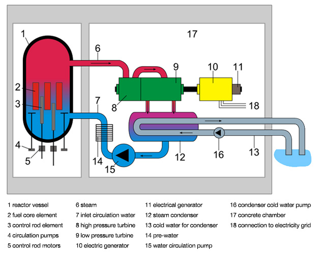
The image is a labeled diagram of a nuclear power plant, showing the main components and the flow of various fluids and electricity within the system. Here is a detailed description of each labeled part:
- Reactor Vessel - This is a large cylindrical container at the left side of the diagram, colored in red at the top and blue at the bottom, representing the containment vessel for the nuclear reaction.
- Fuel Assembly Element - Inside the reactor vessel, there are red vertical structures labeled as fuel assembly elements where the nuclear fission occurs.
- Control Rod Element - Also inside the reactor vessel, there are grey rods labeled as control rod elements, used to control the rate of the nuclear reaction.
- Circulation Pumps - At the bottom of the reactor vessel, there are small grey structures labeled as circulation pumps, which help circulate coolant within the reactor.
- Control Rod Motors - Below the circulation pumps, there are small grey components labeled as control rod motors, which move the control rods in and out of the reactor core.
- Steam - A red pipe labeled "steam" exits from the top of the reactor vessel, indicating the steam produced from the heat of the nuclear reaction.
- Inlet Circulation Water - A blue pipe labeled "inlet circulation water" enters the reactor vessel, representing the water that cools the reactor and turns into steam.
- High Pressure Turbine - The steam from the reactor vessel flows into a green component labeled as the high pressure turbine, where the steam's energy is converted into mechanical energy.
- Low Pressure Turbine - After the high pressure turbine, the steam moves into a larger purple component labeled as the low pressure turbine, continuing the conversion of steam energy into mechanical energy.
- Electric Generator - Connected to the turbines, there is a yellow component labeled "electric generator," which converts the mechanical energy from the turbines into electrical energy.
- Electrical Generator - Another electric generator is shown in yellow, connected to the low pressure turbine, indicating the generation of electricity.
- Steam Condenser - Below the turbines, there is a grey structure labeled "steam condenser," where the steam is cooled and condensed back into water.
- Cold Water - A blue pipe labeled "cold water" leads from the condenser to a body of water outside the plant, indicating the cooling water source.
- Pre-water for Condenser - A blue pipe labeled "pre-water for condenser" shows water being directed towards the condenser.
- Water Circulation Pump - Connected to the pre-water for condenser, there is a grey component labeled "water circulation pump," which helps circulate water through the condenser.
- Condenser Cold Water Pump - Another pump, labeled "condenser cold water pump," is shown in grey, which pumps cold water into the condenser.
- Concrete Chamber - The entire setup is housed within a large grey structure labeled "concrete chamber," providing containment and protection.
- Connection to Electricity Grid - On the right side, there is a grey line labeled "connection to electricity grid," showing where the generated electricity is sent out for distribution.
The diagram uses color coding (red for steam, blue for water, green and purple for turbines, yellow for generators, and grey for various structural and mechanical components) to illustrate the flow of steam, water, and electricity through the nuclear power plant's system. Arrows indicate the direction of flow for steam, water, and electricity.
There are two basic types of nuclear power plants that are in operation today. The first, and most common, is the Pressurized Water Reactor (PWR), which is illustrated in the animation below. In a PWR, hot water passes through the reactor core (where it absorbs the heat from the nuclear fission reactions) and is then pumped through a heat exchanger, where it heats another fluid that produces steam, powering the turbine. The primary advantage to this type of design is that the water in the primary loop (which passes through the core) does not actually come into contact with the fluid in the steam generator, so unless pipes or valves break there is no risk of contamination or radioactive water leaking from the plant. The Boiling Water Reactor (BWR), illustrated in the next figure, utilizes a somewhat simpler design, where the water that runs through the core is allowed to vaporize to steam, thus powering the turbine to generate electricity. While the design is simpler, it does mean that the steam entering the turbine can be radioactive.
Whether one design is inherently more advantageous than another is difficult to say. Both types have been involved in major nuclear power plant incidents. The reactor at Three Mile Island was a PWR while the reactor at Fukushima was a BWR, so the potential exists for problems at either type of plant. It is perhaps worth mentioning that the Three Mile Island incident was likely due as much to human error and poor design of the reactor’s control system at least as much as to the reactor design itself. The reactor at Chernobyl was an unusual Soviet design called a “light water graphite reactor” that was not really designed for use as a commercial nuclear power plant but was adapted for that use anyway. The World Nuclear Association [63] has a nice description of the Chernobyl plant technology with a description of what went wrong (here too, human error played a central role).
Advanced PWRs have been developed that use more passive designs to keep the reactor from overheating, without any pumps or offsite power required. Westinghouse has developed one such design, the AP1000, which is currently being deployed in China. For those who are interested, more information on passive PWR designs can be found at Westinghouse Nuclear [64].
The Nuclear Fuel Cycle
The Nuclear Fuel Cycle
Nuclear fuel rods typically last for 3-5 years, and when a rod is "spent" it still contains some fissionable 235-U along with a host of other radioactive elements. So, what do we do with these spent rods? Many people would argue that recycling is a good thing. In the nuclear energy industry, recycling of spent nuclear fuel is a somewhat contentious topic. Many countries, including those European countries that still use nuclear energy, recycle spent fuel into new fuel for re-use. The United States does not do this, preferring a "once-through" fuel cycle for reasons of security as well as economics. Understanding the pros and cons of recycling nuclear fuel requires some understanding of how fuel for nuclear power plants is mined and fabricated.

The image is a circular flowchart illustrating the nuclear fuel cycle, showing the various stages from uranium extraction to electricity generation and waste management. Each stage is represented by a blue arrow pointing to the next, forming a continuous loop. Here is a detailed description of each stage:
- Mining: The first stage, located at the bottom left, shows an image of a mining operation where uranium ore is extracted from the earth.
- Milling: Moving clockwise, the next stage is milling, depicted with an image of a milling facility where the uranium ore is processed into uranium oxide (yellowcake).
- Conversion: Following milling, the conversion stage is shown with an image of industrial equipment, representing the process where uranium oxide is converted into uranium hexafluoride gas.
- Enrichment: The enrichment stage, illustrated with an image of centrifuges, involves increasing the concentration of the uranium-235 isotope in the uranium hexafluoride gas.
- Fuel Fabrication: Next, fuel fabrication is depicted with an image of fuel rods being assembled, where enriched uranium is formed into fuel rods for use in reactors.
- Power Plant: This stage shows an image of a nuclear power plant, where the fuel rods are used to generate heat through nuclear fission, which then produces steam to drive turbines.
- Electricity Generation: Following the power plant, electricity generation is illustrated with an image of power lines and a city skyline, indicating the distribution of electricity generated from the nuclear power.
- Spent Fuel Storage: After electricity generation, spent fuel storage is shown with an image of storage casks, where used nuclear fuel is temporarily stored.
- Reprocessing: Moving back into the cycle, reprocessing is depicted with an image of a facility where spent fuel can be treated to extract usable materials and reduce waste.
- High Level Waste Storage: This stage, shown with an image of a storage facility, deals with the storage of high-level radioactive waste that results from reprocessing.
- Final Disposal: The final disposal stage is illustrated with an image of a deep geological repository, where high-level waste is permanently disposed of.
- Recycle: The cycle can loop back to the enrichment stage if the materials from reprocessing are recycled into new fuel, indicated by an arrow pointing back to "Enrichment."
Additionally, there is a note indicating "FOR NATURAL URANIUM FUELS" between the conversion and enrichment stages, suggesting this part of the cycle applies specifically to natural uranium fuel processing.
The flowchart uses images to visually represent each stage, with arrows indicating the progression and potential recycling within the cycle.
The figure above outlines the many steps necessary to get uranium out of the ground and into a nuclear power plant. After extraction and processing (“milling”), uranium ore is transported to conversion facilities to remove impurities. The next step in the nuclear fuel cycle is enrichment. Owing to security concerns, all enrichment for the US commercial nuclear industry takes place at one government-owned gas diffusion facility in Paducah, Kentucky. Enriched uranium is then transported to one of several commercial fuel fabrication facilities where the fuel rods are manufactured. In the U.S., fuel fabrication is a competitive industry; private firms compete to provide finished fuel to nuclear power plants. Nuclear fuel rods are generally not purchased directly from the government. Nuclear fission and disposal of spent fuel rods constitute the final steps of the nuclear fuel cycle in the US
The US is heavily dependent on the global market for uranium and nuclear fuel. n 2017, 90% of uranium oxide supplies used to develop nuclear fuel in the US come from outside of the country. The main suppliers for the US are Canada (24%), Kazahkstan (20%), Australia (18%), and Russia (13%). Proposals to open new uranium mines in both the western and eastern United States have been met with resistance, primarily on environmental grounds.
Current US policy prohibits the reprocessing of spent nuclear fuel, for two primary reasons. First is economics – the fuel costs for nuclear power plants are already among the lowest of any non-renewable power generation resource. Once nuclear power plants are built, if they are well-run they cost very little to operate. While the recycling of spent nuclear fuel would eliminate the need for virgin uranium ore to be mined or for additional fuel to be purchased on the world market, it is not at all clear whether the benefits of doing so outweigh the costs of reprocessing. The other reason is nuclear security. The process of recycling nuclear fuel involves the separation of uranium and plutonium from the spent fuel rods. There have been concerns regarding plutonium falling into the wrong hands and contributing to the proliferation of nuclear weapons.
One very serious concern with nuclear power has to do with the highly radioactive waste from the process. Much of the waste needs to be isolated for at least 10,000 years. All civilian nuclear waste was intended to be stored permanently at a repository in Yucca Mountain, Nevada. Yucca Mountain was chosen as a waste repository site back in 1987 and we have spent over $15 billion investigating the site and developing 65 km of tunnels deep underground to store the waste. Currently, it could hold 65,000 tons of waste, but we have 94,000 tons of radioactive waste in temporary storage at nuclear plants. The Yucca Mountain facility is not currently operational and significant uncertainties exist as to whether it will ever be used. In the interim, spent nuclear waste will continue to be stored on-site at the power plants.
Required Reading:
Climatewire and the New York Times [38] recently published a nice piece that looks at both sides of the reprocessing debate.
Global Use of Nuclear Energy
Global Use of Nuclear Energy
There are currently several hundred operating nuclear power plants in the world, spread over a few dozen countries, with over a hundred more “proposed” nuclear power plants (these may or may not get built, depending on economic and political factors in the relevant countries). The US still has the largest number of plants, with about 100 currently operating. France’s economy is the most dependent on nuclear energy, with more than 75% of electricity in that country coming from nuclear power plants. Countries with fleets of nuclear power are primarily wealthier nations, such as the US and European countries, but developing nations are really the biggest growth area, particularly China. Prior to the Fukushima incident, other Asian nations besides China had plans to grow their nuclear fleets, but whether that growth will materialize is highly uncertain. In response to concerns regarding the safety of nuclear power plants and waste disposal/management issues, some European countries have enacted various policies mandating the phase-out of nuclear energy, including Austria, Sweden, Germany, Italy, and Belgium. Other countries, including Spain and Switzerland, have imposed a moratorium on the construction of new nuclear power plants. Of the countries that have decided to phase out nuclear energy, Germany has been among the most aggressive following the Fukushima incident. Because of concerns over electricity supply and costs, however, some countries have delayed or back-stepped on plans to phase out nuclear energy.
Required Reading:
Discussion Assignment
Reminder!
After completing your Discussion Assignment, don't forget to take the Module 7 Quiz. If you didn't answer the Learning Checkpoint questions, take a few minutes to complete them now. They will help you study for the quiz and you may even see a few of those questions on the quiz!Discussion Question
Objective:
Analyze the Not In My Back Yard ("NIMBY") mentality by finding an recent example (something from the last 3 years) online and sharing it with the class. Why is it easier for many people to accept an abstract idea of resource extraction or power generation somewhere in the world than it is to see it happening in their own communities? Is it reasonable to imagine that all of our power needs can be met without venturing into anyone's backyard?
Goals:
- Find reliable sources of information on the internet
- Communicate scientific ideas in language non-scientists can understand
Description:
Many of us understand that our own progress, prosperity, security, and comfort are all built upon access to energy. We also know that no means of producing energy is entirely without side effects. Burning fossil fuels dumps CO2 into the atmosphere, fracking produces toxic brine, wind turbines disrupt bird migration patterns and ruin the view, nuclear generates radioactive waste and is vulnerable to meltdowns. How do we rationalize our reliance on energy with our desire to live in clean, scenic, non-toxic communities? It isn't easy, and for some of us, this results in what is sometimes referred to as NIMBY syndrome - the idea that ugly things like resource exploitation and waste management have to happen somewhere in the world, but we would prefer for that somewhere to be far away from us.
Find a recent example of the NIMBY mentality in an article online. If possible, try to find something that is happening near you - a proposed nuclear power plant, natural gas fracking, offshore oil drilling, wind farms. If you can't find something near you, find a NIMBY controversy you are interested in or have heard something about.
Once you find an article (remember — it should be a recent one) you would like to share, write 3-4 sentences summarizing the content. Why are people opposed? What are the alternatives? Then write an additional 2-3 sentences expressing your thoughts on the NIMBY mentality. Explain in your own words why you think it is or is not possible to maintain our current standard of living without venturing into someone's backyard.
Instructions
Your discussion post should include a link to the article you have chosen, a summary 100-150 words in length, and a personal commentary 75-100 words in length. Your original post must be submitted by Wednesday. In addition, you are required to comment on one of your peers' posts by Sunday. You can comment on as many posts as you like, but please try to make your first comment to a post that does not have any other comments yet. Once you have an idea of what you want your post to be, go to the course discussion for your campus and create a new post.
Scoring Information and Rubric
The discussion post is worth a total of 20 points. The comment is worth an additional 5 points.
| Description | Possible Points |
|---|---|
| link to appropriate article posted | 5 |
| summary provides a clear description of the article content (100-150 words) | 10 |
| well-reasoned comment on the NIMBY mentality (75-100 words) | 5 |
| well-reasoned comment on someone else's article and post (75-100 words) | 5 |
Summary and Final Tasks
Summary
Hydropower, geothermal and nuclear energy are not growing as fast as wind and solar (and don’t get as much good press) but all three are technically and economically viable options for producing carbon-free electricity at a large scale. Moreover, unlike wind and solar, electricity output from these sources is more easily controlled and is less subject to the vagaries of wind speed or cloud cover. Still, each of these resources has its own set of issues. Many countries have basically tapped their rivers for hydroelectricity already, and building large dams is environmentally destructive in its own way. Geothermal resources are great where you’ve got them…but not very many places have them. Nuclear energy represents a serious social dilemma: the promise of producing massive amounts of low-carbon energy alongside a host of economic, environmental and safety risks.
Reminder - Complete all of the Module 7 tasks!
You have reached the end of Module 7! Double-check the Module Roadmap to make sure you have completed all of the activities listed there before you begin Module 8.
References and Further Reading
Module 8: Conservation
Module 8 Overview
Some people fear that “energy conservation” means giving up our worldly wealth and going back to living on dirt floors and eating by candlelight. Nothing could be further from the truth! There are lots of ways that we could reduce our energy consumption (and thus reduce our impacts on the planet) without sacrificing our standard of living. And, at least some conservation saves us money—the cost of installing insulation for houses, better windows, and other changes is less than the savings they provide. Conservation also has roots deep in history—Ben Franklin’s stove heated a room while burning fewer logs than were needed in an open fireplace, and he urged people to buy his stove to conserve the trees of Pennsylvania.
In this module, we’ll see just how vast the potential for energy conservation can be, and that countries can be highly energy-efficient without making people poorer. We’ll also look at a few real-life examples of conservation. Finally, we’ll think about a sticky problem that has puzzled social scientists for decades – if energy conservation is such a good idea, and can save people money without making them worse off –why are some people so hesitant to embrace it?
Goals and Objectives
Goals:
- Recognize the great diversity of energy options currently available to us
- Use numerical tools and publicly available scientific data to demonstrate important concepts about the Earth, its climate, and resources
Learning Objectives:
By the end of this module, you will:
- Recognize that all energy technologies are inefficient
- Compare wealth and energy intensity in developed countries
- Identify options for improving energy efficiency in developed countries
- Analyze why we don't always conserve as much as we should, despite the double benefits for the climate and our wallets
- Use a model to calculate the effects of various strategies such as use of renewable energy sources, conservation, and population control on reducing emissions
Roadmap
| To Read | Materials on course website (Module 8) | |
|---|---|---|
| To Do | Complete Summative Assessment [67] Quiz 8 |
Due Following Tuesday Due Sunday |
Questions?
If you prefer to use email:
If you have any questions, please email your faculty member through your campus CMS (Canvas/Moodle/myShip). We will check daily to respond. If your question is one that is relevant to the entire class, we may respond to the entire class rather than individually.
If you prefer to use the discussion forums:
If you have any questions, please post them to Help Discussion. We will check that discussion forum daily to respond. While you are there, feel free to post your own responses if you, too, are able to help out a classmate.
Global Conservation Potential
Energy Conservation Potential
To understand why energy conservation is even an option (let alone a necessary one), we have to go back to a simple fact about energy conversion: You want some, you waste some. Burning coal in a power plant or gasoline in a car; or heating water using solar energy – all of these things are “energy conversion processes.” We are taking energy that is in one form (like lumps of coal) and going through chemical, mechanical or other conversions to turn that energy into things that we want (like lighting and transportation). While these conversion processes have done great things for people and society, they aren’t perfect. The energy that goes into a conversion process is always greater than the energy that comes out of a conversion process. This is basically a consequence of the second law of thermodynamics, which says that it’s impossible to harness all energy in one form (like a lump of coal) to do useful work in another form (like light a room or make toast).
Technically, the second law of thermodynamics applies only to conversion processes involving heat – which basically describes the vast majority of the world’s energy technologies. These technologies burn fossil fuels in a generic process called a “heat engine.” Internal combustion engines in cars, industrial boilers, and power plants are all examples of the “heat engine” principle. In the 1800s a physicist named Sadi Carnot figured out that there was a theoretical limit to how efficient a heat engine could get, depending on the type of work it was asked to do and the conditions under which the heat engine operated.
Required Reading:
Read this a short but nice article on Carnot below.
What Carnot figured out, in today’s terms, is that a heat engine dependent on steam (like a power plant) could not get much more efficient than about 50%. A heat engine that is driven directly by combustion gases, like a car or truck engine, cannot get much more than 25% efficient. This means that in the most perfect of all circumstances, it’s impossible for a simple power plant to waste less than about 50% of all the fuel that’s put into it. Cars are even worse – they are set to waste about 75% of all the fuel that we pump into them.
Of course, there are some clever ways that we can push the efficiency of energy conversion processes. Combined cycle power plants, for example, are able to capture some of the waste heat from combustion and use that heat to drive a second turbine for power generation. But even these types of plants generally don’t achieve efficiencies of more than about 65%. Wind and solar are “inefficient” as well – a wind turbine might capture about 50% of the potential energy in the wind that hits the turbine, and solar photovoltaic cells are generally able to capture only about 20% of the solar energy that hits their surfaces. (On the other hand, energy from the wind and the sun are free once the equipment is built and installed, so maybe the “efficiency” is not as important in the case of wind and solar.)
Watch the following video about Sankey Diagrams (6:23)
PRESENTER: In this EcoWest presentation, we break down energy trends in the US and western states by using a graphic known as a Sankey diagram. Energy flows through everything, so it's only fitting to use this type of flowchart to depict our complex energy economy. Sankey diagrams are named after an Irish military officer who used the graphic in 1898 in a publication on steam engines. Since then, Sankey diagrams have won a dedicated following among data visualization nerds. The graphic summarizes flows through a system by varying the width of lines according to the magnitude of energy, water, or some other commodity.
One of the earliest and most famous examples of the form illustrates Napoleon's disastrous Russian campaign in the early 19th century. Created by Charles Joseph Minard, a French civil engineer, the graphic depicts the army's movements across Europe and shows how their ranks were reduced from 422,000 troops in June 1812, when they invaded Russia, to just 10,000 when the remnants of the force staggered back into Poland after retreating through a brutal winter. Data visualization guru Edward Tufte says it's probably the best statistical graphic ever drawn.
Sankey diagrams created by the Lawrence Livermore National Laboratory depict both the source and use of energy. The boxes on the left show the nation's power portfolio, and the lines moving to the right show where that energy ends up, with the width varying by the magnitude of the flow. This graphic, using 2008 data, shows that petroleum in the transportation sector accounts for the biggest overall energy flow. In 2008, more than half of electricity generation came from coal, followed by nuclear and natural gas.
Here's the next year's data. Total energy use actually fell slightly as the US economy fell into the recession, but the overall pattern of the flows remained the same. In all of the energy diagrams, you'll notice that a significant share of energy is rejected. A good example of rejected energy is waste heat from power plants. The greater the percentage of rejected energy, the less efficient the system is.
Here's 2010. It's worth noting that in this sequence of slides, the size of the rectangles does not vary according to the amount; it's only the thickness of the lines that change from year to year. Here's 2011, the most recent version. Between 2010 and 2011, the thickness of the coal line decreased as the nation shifted toward natural gas. Besides being used to fuel power plants, natural gas is used directly in homes, businesses, and factories.
Here's another Sankey diagram for US energy flows that was created by the Department of Energy. This version includes some interesting facts and statistics in the margin. Now let's shift to energy flows in the 11 western states. First off, it's worth noting that the region's energy economy is heavily influenced by California, which accounts for 41% of the total energy flows.
Here's the picture for California. As you might expect, petroleum used in the transportation sector dominates the system in a state that is known for its car culture and also home to major transportation hubs. Looking at the electricity generation box, you can see that natural gas now provides the biggest share of the state's power portfolio, but nuclear, hydro, and geothermal are also major contributors. There's barely any coal use for power generation within California, but you'll notice that the state also imports a fair amount of energy from other states, including coal-fired power plants in the southwest.
It's a totally different story in Wyoming, where virtually all of the electricity generated in the state comes from coal. Some of that power is also exported to other states. Compared to California, far less energy flows into the transportation sector in this sparsely populated state. As with the national slides, it's important to note that the rectangles don't change size from state to state. That means the width of the flow lines are not comparable from slide to slide; they merely show within a single state how the energy flows are divided.
It's no surprise that Wyoming, home to the Powder River Basin coal deposit, is so heavily reliant on coal, but so are some other inland states such as New Mexico and Utah, both of which export some of that electricity. Colorado is heavily dependent on coal, but natural gas is also critical, and about 6% of electricity generation comes from wind, a higher fraction than any other western state. Montana also uses lots of coal, but hydropower makes up nearly one-third of the power portfolio.
In Arizona, the Palo Verde nuclear power plant, the nation's largest, accounts for 27% of the state's electric generation, although some of that power is exported to places like California. In Nevada, natural gas is the top source for power plants, while geothermal accounts for 9%. Coal may be king for electricity generation in many states in the Intermountain West, but it's hydropower that dominates the power portfolios in the Pacific Northwest.
Here's Idaho, which imports a good deal of its electricity from surrounding states. In Oregon, hydropower dams account for 64% of electricity generation, while in Washington state, it's 71%. You can download more slides and other resources at ecowest.org.
The tales of inefficiencies in modern energy systems are almost too numerous to count, and we haven’t even talked about the ways in which people choose to use energy. The graphic below provides a nice summary of how much energy is wasted in the United States. The figure is called a “Sankey diagram” and it traces the flows of energy (from left to right) through all sectors of a country’s economy. (The example in the graphic below was produced by a US government laboratory, so it naturally focuses on the United States.) The left-hand side of the Sankey diagram shows all of the energy inputs to a nation’s economy and how much of each is used. The box for “petroleum” is larger than the box for “solar” because the US economy uses a lot more petroleum than it does solar energy. From each individual resource, you can trace the various paths, showing how much of that energy resource is used in different sectors of the economy. For example, coal is used for power generation and is used directly in industrial and commercial boilers as well. As indicated by the width of the path, the vast majority of coal in the US economy is used for power generation. The quantities of coal used for industrial and commercial boilers are much smaller. All the way over at the right, you can see two boxes – one is labeled “Energy services” and the other is labeled “Rejected Energy.” The Energy Services box tallies up all of the coal, oil, gas, solar and other resources that we actually harness for doing useful things. The Rejected Energy box measures how much of those resources is lost due to inefficiencies in our energy conversion systems. As you can see, the US is now 32% efficient, and if we switched to an all-electric economic system with the highest efficiency generators, we could approach something closer to 50% efficiency.

The image is a Sankey diagram titled "Estimated U.S. Energy Consumption in 2018: 101.2 Quads," created by Lawrence Livermore National Laboratory. It visually represents the flow of energy from various sources through different sectors of consumption, showing both energy usage and losses. Here's a detailed breakdown:
Energy Sources (on the left side, each source is represented by a colored block with the energy quantity in quads):
- Solar: Yellow, 0.949 quads
- Nuclear: Red, 8.44 quads
- Hydro: Blue, 2.69 quads
- Wind: Purple, 2.53 quads
- Geothermal: Brown, 0.217 quads
- Natural Gas: Light blue, 31 quads
- Coal: Grey, 13.3 quads
- Biomass: Green, 5.13 quads
- Petroleum: Dark green, 36.9 quads
Energy Flow:
- Electricity Generation:
- Solar, nuclear, hydro, wind, geothermal, natural gas, coal, and biomass contribute to electricity generation, totaling 38.2 quads.
- There's a small addition from net electricity imports of 0.05 quads.
- Losses in electricity generation are significant, with 25.3 quads being rejected energy
- Rejected Energy:
- A large grey block represents 68.5 quads of rejected energy, which includes losses from various stages of energy conversion and use
- Energy Services (on the right side, each sector is represented by a colored block with the energy quantity in quads):
- Residential: Pink, 11.9 quads
- Commercial: Light pink, 9.45 quads
- Industrial: Light red, 26.3 quads
- Transportation: Light green, 28.3 quad
Flow of Energy to Sectors:
- From Electricity Generation:
- 4.16 quads go to Residential, 3.31 to Commercial, 13.4 to Industrial, and 3.25 to Transportation
- Direct Use of Energy Sources:
- Residential: Receives energy directly from Natural Gas (4.7 quads), and small amounts from other sources.
- Commercial: Receives energy directly from Natural Gas (3.25 quads), and small amounts from other sources.
- Industrial: Receives significant energy from Natural Gas (10.4 quads), Coal (1.2 quads), Biomass (2.35 quads), and Petroleum (8.86 quads).
- Transportation: Primarily uses Petroleum (22.4 quads).
Additional Notes:
- The diagram uses colored lines to show the flow of energy from sources to sectors, with the width of the lines proportional to the energy quantity.
- There are various smaller flows and losses throughout the diagram, with specific values indicated where energy is lost or converted.
- The total energy consumption is 101.2 quads, with 32.7 quads being used for energy services and the rest being rejected energy.
The diagram provides a comprehensive overview of how energy is sourced, converted, distributed, and consumed in the U.S. for the year 2018, highlighting inefficiencies and the distribution across different sectors.
Activate Your Learning
Inefficient Use of Energy
Inefficient Use of Energy
So a country like the United States does not convert energy into useful work all that efficiently — the Sankey diagram from the last section shows that we are about 30% efficient (energy services divided by total energy — 32.7/101.2). But it is also true that we do not make the best use of the energy that goes into services — we could get those same services accomplished with less energy. As an example, transporting yourself from New York to Philadelphia is a service, and if you drove by yourself in a gas guzzler, then a lot of energy is going into that service. But, if you take the bus, then the energy used for that same service is the amount of fuel used divided by the number of passengers — so this would be a more efficient means of achieving that service. So, energy efficiency is all about getting services done with the least amount of energy. Another side to this is cutting back on the services themselves — traveling less, keeping our homes a bit cooler in the winter and a bit warmer in the summer.
First, let's consider how much energy people use in different countries. As you might expect, it turns out that richer countries (with a higher per capita GDP, or gross domestic product per person) use more energy per capita than poorer countries, as can be seen in the figure below.

The image is a scatter plot graph titled "Relationship Between GDP and Energy Consumption." It plots the relationship between per capita GDP (in $) on the x-axis and per capita energy consumption (in GJ/person) on the y-axis for various countries over time.
- Axes:
- The x-axis is labeled "Per Capita GDP $" and ranges from 100 to 100,000 on a logarithmic scale.
- The y-axis is labeled "Per Capita Energy Consumption (GJ/person)" and ranges from 1 to 1,000, also on a logarithmic scale
- Data Points:
- Each data point represents a country, with blue circles indicating data from various years.
- Specific countries are highlighted with labels:
- Afghanistan is located at the lower left, indicating low GDP and low energy consumption.
- Mexico is positioned towards the middle of the graph.
- USA is located towards the upper right, indicating higher GDP and energy consumption.
- Qatar and Iceland are at the far right, with very high GDP and energy consumption, with Iceland having the highest energy consumption.
- Global Averages:
- Two red squares mark the global averages:
- One labeled "Global Average 1950" is located lower on the graph, indicating lower GDP and energy consumption.
- Another labeled "Global Average 2013" is positioned higher, showing an increase in both GDP and energy consumption over time
- Two red squares mark the global averages:
- Trends:
- There is a general upward trend, suggesting that as per capita GDP increases, so does per capita energy consumption.
- The spread of data points widens as GDP increases, indicating variability in energy consumption among countries with similar GDP levels
- Annotations:
- Arrows point to the labeled countries and global averages, providing a visual guide to their positions on the graph
The graph uses a logarithmic scale for both axes to accommodate the wide range of values, and the data points are densely packed, showing the distribution and relationship between GDP and energy consumption across different countries.
One important point from this graph is that between 1950 and 2013, the per capita GDP has increased by almost a factor of 10, and the per capita energy consumption has also increased, but only by a factor of 4.
Another important question is: How efficient are these economies in their use of energy? We can look at this using data on the "energy intensity" of different economies. The energy intensity of an economy is given by the total primary energy consumption divided by the total GDP for the country (you'd get the same thing by dividing the per capita energy consumption by the per capita GDP). A useful way to think of this energy intensity is that it represents how much energy a country uses to produce a dollar of economic output — so lower values are better. A low value means a country uses less energy to make a buck.

The image is a line graph titled "Energy intensity of economies," created by Our World in Data. It shows the energy intensity level of primary energy, which is the ratio between energy supply and gross domestic product (GDP) measured at purchasing power parity, over time from 1990 to 2015. The y-axis represents energy intensity in kilowatt-hours per dollar (kWh/$), ranging from 0 to 5 kWh/$. The x-axis represents the years from 1990 to 2015.
The graph includes data for four regions/countries, each represented by a different colored line:
- China is represented by a purple line, starting at around 5 kWh/$ in 1990 and showing a significant decline to approximately 2 kWh/$ by 2015.
- United States is represented by an orange line, starting at about 1.5 kWh/$ in 1990 and gradually decreasing to around 1 kWh/$ by 2015.
- World is represented by a green line, starting at around 1.2 kWh/$ in 1990 and showing a slight decrease to about 1 kWh/$ by 2015.
- Germany is represented by a red line, starting at about 1 kWh/$ in 1990 and remaining relatively stable, slightly decreasing to just below 1 kWh/$ by 2015.
- Switzerland is represented by a blue line, starting at around 0.5 kWh/$ in 1990 and remaining very stable, with a slight decrease to just above 0.5 kWh/$ by 2015.
Key observations:
- China has the highest energy intensity throughout the period, but it shows a marked decrease over time.
- The United States, the World average, Germany, and Switzerland all have lower energy intensities compared to China, with Switzerland having the lowest.
- All regions/countries show a general trend of decreasing energy intensity over the 25-year period, indicating improvements in energy efficiency or changes in economic structure.
Since most energy use globally comes from burning fossil fuels, it is no big surprise that energy use on a national basis is closely related to carbon emissions on a national basis. (There are some exceptions, like the Nordic countries, which rely primarily on hydroelectricity.) The following short video from the Gapminder Foundation [72] (4:06) has a nice animation showing these trends over time for a number of different countries.
Video: Carbon Dioxide (4:06)
HANS ROSLING: All humans emit carbon dioxide and contribute to the climate crisis. But some humans emit much more carbon dioxide than others. Look at the statistics, where each bubble here represents a country. This axis shows the emission of carbon dioxide per person per year in tons, from less than one tone per person a year, to 10 and to 20. And the size of the bubbles, the size of this bubble up here, which is the United States, it shows the emission of carbon dioxide from the whole country, the total amount of carbon dioxide.
And this bubble down here is China. And the size of it shows how much China is emitting. The axis down here shows the income per person, \$1,000, \$10,000, and more. And the color of the bubbles shows the continent. The green ones are Americas, the brown one is the European bubbles, and the red one, are the Asian bubbles. And what you clearly can see is in 1975 because this data is from 1975, countries with low income have low emissions. And when their income increases, they get very high emission.
And what has happened over time? We fast forward the world here. And you can see that as countries grow richer, they emit more. And here comes China with its economic growth, it grows very fast. In the '90s, it moves this, and they start to emit more and more. Whereas the United States continues to hover around about 20 tons per person. And in 2003, it's actually almost the same amount of emission as it was in 1975, 20 tons per person in the United States and in China down here, about three tons per person.
The bubbles are now about the same size. And it's because China has four times as big a population as the United States. So even if the United States emits much more per person, China will get quite a big bubble because they are so many. But most of the countries actually are somewhere in between here in the world. They are somewhere in between China and the United States. China does not emit very much carbon dioxide per person.
Where does the carbon dioxide come from? Well, large parts of it come from coal. And why do they burn coal? To make electricity. I'll show you the statistics on that. This shows the production of electricity, the percentage that comes from burning coal. 10%, 20%, 40%, 60%. In China in 1975, they made 60% of their electricity out of coal, and the United States was a little less, about 45%. And over time, the change has been as you can see here, 75%, 80%; and China is producing more and more energy, and a higher and higher proportion of that electricity, which they produce, is from coal. And it's increasing to reach by the end of the century and the last year. Now China is producing about 80%, 70% to 80% of its electricity is made from coal. In the United States, it's about 50%.
So if we should stop the emission of carbon dioxide from burning coal, we must understand that this is the cheapest way of making electricity. And the people in China want electricity in their homes. There are still hundreds of millions of Chinese that don't have electricity in their homes. So what China needs is a technology that can produce electricity from renewable sources in a way that is cheaper than making it from coal.
Activate Your Learning
Check out the Gapminder World Website below. If you click “Play” in the lower left-hand corner, you can watch a time progression of GDP per-capita vs. total energy consumption per-capita, for a number of different countries from the 1960s and 1970s to the present. The United States and Denmark are highlighted as an interesting comparison. The animation is customizable, so if you want to highlight other countries you can go to the checklist on the right-hand side of the page.
Options and Opportunities for Energy Conservation
Options and Opportunities for Energy Conservation
Whether you think about the supply side of energy systems (the technologies and conservation processes that we utilize to convert fuels of various sorts into useful activities) or the demand side (relative energy consumption), wasting energy hurts the environment and costs society a tremendous amount of money. Several good reports on this topic have been released in recent years. While all are specific to the US (which isn’t surprising if you look back at the figure or at the Gapminder animation on the previous page), all of these reports identify avenues for increased energy conservation that would be relevant to just about any country with an industrialized economy.
Required Reading:
Have a look at the executive summaries for the three reports listed below. You must have Adobe Reader installed on your computer to view the ones listed as PDF files. If you do not have Adobe Reader installed on your computer, go to the Adobe website [76] to get it for free.
- Real Prospects for Energy Efficiency in the United States, [77] (PDF) Commissioned by the US National Academy of Science, this report focuses separately on energy use in the buildings sector; transportation; and industry. The full report is available freely at National Academy Press [78].
- Unlocking energy efficiency in the US economy [79] (PDF) This report from McKinsey, a consultancy, argues that sufficient energy efficiency potential exists in the US alone to reduce greenhouse gas emissions from that country by approximately one-third, all while saving consumers and businesses more than one trillion dollars (by comparison, the size of the US economy as a whole is about 15 trillion dollars).
- Assessment of Achievable Potential from Energy Efficiency and Demand Response Programs in the US [80] (PDF). This report, from the Electric Power Research Institute (EPRI), an industry group funded by US electric utilities, focuses primarily on efficiency gains in the production and utilization of electric power. EPRI concludes that conservation possibilities in the US are smaller than does the McKinsey report, but EPRI does not dismiss conservation in any way.
The potential for increased energy conservation spreads across several sectors:
- Residential energy conservation through the adoption of energy-efficient appliances, lighting, etc.; or the adoption of technologies and practices that can yield less energy use in existing appliances (examples might include programmable thermostats). Lighting (LEDs and compact fluorescent bulbs) and cooling are particularly singled out in the reports as favorable technological options for conservation, as well as the energy-efficient design of new buildings. Where conditions permit, ground-source heat pumps, which take advantage of constant warm temperatures in the shallow earth to provide heating and cooling, are particularly attractive for single-family new construction. Energy-efficient retrofits of existing buildings are a particularly difficult challenge, due to high costs for older buildings in particular.
- Commercial and industrial energy conservation through building efficiency measures similar to those mentioned for the residential sector, and the adoption of highly-efficient heating and cooling systems. One of the best options for heating and cooling efficiency is so-called “combined cooling, heating and power” (CCHP) or “tri-generation.” CCHP technologies work by using fuel in a combustion turbine to generate electricity and then capturing the waste heat to use in some industrial process. The heat can also be diverted to an absorption chiller to provide cooling for buildings (see figure below). When the cooling cycle is removed from the system, this is referred to as “combined heat and power” or “co-generation.” While cogeneration or CCHP systems are typically fueled by natural gas, they do offer efficiencies of over 90%. Gasified biomass can be used as fuel in place of natural gas, but is typically more expensive unless the cogeneration unit is located close to a large supply of biomass fuel. One example of a biomass cogeneration facility is in Gussing, Austria [81] (PDF). The waste heat produced in the Austrian system is distributed to local households and business through a set of steam distribution pipes, a process known as “district heating.”
- Transportation energy conservation, largely through improvements in gas mileage for passenger vehicles. The reports conclude that improving efficiencies of existing technologies (internal combustion gasoline engines; diesel engines; and hybrid gas-electric vehicles) would have a much larger impact on decreasing energy use in the transportation sector than would the introduction of new automotive technologies such as all-electric, biomass-fueled, or compressed natural gas vehicles. Trucking and air transportation have lower conservation potential than does the passenger vehicle market.

The image is a flow diagram illustrating a trigeneration system, which produces electricity, heating, and cooling from a single fuel source. Here is a detailed description of each component and the flow of energy:
- CHP (Combined Heat and Power): On the left side, there is a green rectangular box labeled "CHP." This is the primary unit where fuel is converted into electricity and heat. An arrow labeled "Fuel" points into this box from the left.
- Fuel: A yellow arrow labeled "Fuel" enters the CHP unit from the left, indicating the input of fuel.
- Electricity: A yellow arrow labeled "Electricity" exits from the CHP unit to the right, showing the production of electricity.
- Heat: A red arrow labeled "Heat" also exits from the CHP unit, moving upwards towards the absorption chiller.
- Absorption Chiller: Above the CHP unit, there is a light blue box labeled "Absorption chiller." The red "Heat" arrow from the CHP enters this chiller. From the chiller, a purple arrow labeled "Chilled water" exits to the right towards the cooling system.
- Cooling: To the right of the absorption chiller, there is a blue rectangular box labeled "Cooling," which receives the "Chilled water" from the absorption chiller.
- HVAC System: Below the cooling system, there is an orange rectangular box labeled "HVAC system." This system receives two types of inputs:
- A purple arrow labeled "CHW" (Chilled Water) from the absorption chiller.
- A red arrow labeled "Supply CHP Heat" from the CHP unit, which also goes through the boilers
- Boilers: Below the CHP unit, there is a red rectangular box labeled "Boilers." It receives heat from the CHP unit via a red arrow labeled "Supply CHP Heat." From the boilers, a red arrow labeled "'Top up' heat" goes to a purple box labeled "Heat load."
- Heat Load: To the left of the boilers, there is a purple box labeled "Heat load," which represents the demand for heating. It receives the "'Top up' heat" from the boilers.
The diagram uses different colors to distinguish between the flows of electricity (yellow), heat (red), and chilled water (purple), and it shows how these energy forms are utilized in a trigeneration system to meet various energy demands efficiently.
Achieving the Potential of Conservation
We have already mentioned investments like the biomass cogeneration plant in Austria as examples of conservation in action. The following two videos focus on two very different places in the United States that have undertaken aggressive conservation plans.
How the "Take Charge! Challenge" saved billions of BTUs... and four communities won $100,000 in the process.
Earth: The Operators'Manual'
Video: Kansas: Conservation, the "5th Fuel" (ENERGY QUEST USA) (7:52)
NARRATOR: Kansas, a land of wheat, and corn, and cattle. In the heart of the country, it's number 48 out of all 50 states in energy efficiency. So this is a place where energy conservation can really make a difference.
MAN DRIVING TRUCK: Come on, girls.
NANCY JACKSON, FOUNDER, CLIMATE AND ENERGY PROJECT, KANSAS: Our region is a region of farmers. We are famously conservative, and we have talked from the beginning about putting the conserve back in conservative.
NARRATOR: According to a study by the Natural Resources Defense Council, improvements in energy efficiency have the potential to deliver more than 700 billion dollars in cost savings in the U.S. alone. But, they say, motivating consumers to take action is the key to unlocking this potential and that was the aim of Nancy Jackson's Climate and Energy project, with its Take Charge Challenge.
NANCY JACKSON: Kansans are patriotic, Kansans are hardworking, Kansans are humble.
NARRATOR: And Kansans are competitive.
Dorothy Barnett, Executive Director, Climate and Energy Project: You all are competing against Ottawa, Baldwin City, and Paola, so really, you gotta beat those guys, yes?
Lady representing Take Charge Challenge: Do you want to help us beat Manhattan?
NARRATOR: 2011 was the second year for the Take Charge Challenge, a friendly competition among 16 communities arranged in four regional groups, aiming to reduce their local energy use.
Ray Hammarlund, FMR, Director, State Energy Office Kansas Corporation Commission: Some of the lowest cost, most effective ways that you can take ownership of your energy future is taking ownership of the efficiency and the conservation of your house or your business.
NARRATOR: Ray Hammarlund's office used federal stimulus dollars to fund four prizes of 100,000 for each of the four regions in the competition. Just as important as the grand prize, 25,000 went to each community to fund local coordinators who took the lead in galvanizing grassroots efforts. Here's how the challenge worked in Iola.
JUDY BRIGHAM, FMR, CITY MANAGER, IOLA KANSAS: The challenge started in January of this year and ends October 1st. You're required to have three community events. We're going to have a lot more than that.
JEFF RISLEY, FMR, EXEC. DIRECTOR, CLIMATE AND ENERGY PROJECT: Today, we are at the Fight The Energy Hog Festival.
BECKY NILGES, TEAM LEADER, IOLA TAKE CHARGE CHALLENGE: I love the hog. He was just so ugly that he is cute. He represents energy hogs in your home. You would probably let him in, but you don't know the damage he's going to do.
NARRATOR: Competing towns scored points by counting how many CFL bulbs and programmable thermostats were installed and how many professional home energy audits were done.
RUSS RUDY, ENERGY AUDITOR, OZAWKIE, KANSAS: Our job as energy auditors, both for commercial buildings, as well as residential buildings, is, we're essentially detectives. What's happening here, is there a great deal of air leakage? And we're finding that the majority of the houses that we're dealing with actually use a lot more energy than they need to.
NARRATOR: In Lawrence, a house of worship did an energy audit, made changes, and got a pretty nice donation in its collection plate.
DAVID OWEN, TRINITY EPISCOPAL CHURCH, LAWRENCE, KANSAS: One part of the audit was to contact the power company. Well, during that process, we discovered they had been overcharging us. And so we got a check, a rebate check from them for 4,456 dollars.
NARRATOR: Other changes start small, but add up.
DAVID OWEN: We were a little bit worried at one point that the congregation would not accept the very bright, white type lights. So as an experiment, we took one of these chandeliers and changed all the bulbs in it to the CFLs. And then we took the priest over here, and we said, "Which one did we do?" and he could not tell us. So that told us it was ok to do them all.
NARRATOR: Changing lights, adding insulation, and upgrading windows paid off.
DAVID OWEN: Even though it's an old building, we saved 64 percent on the consumption of energy in this room.
NARRATOR: Lighting makes up about 15 percent of a typical home's electricity bill, and lighting all of our residential and commercial buildings uses about 13 percent of the nation's total electricity. But changing out old bulbs is a lot easier than paying for audits and the energy enhancements they recommend. Here's where the 2011 Take Charge Challenge promised material assistance using stimulus funds.
KEN WAGNER, MAYOR, BALDWIN CITY, KANSAS: It's a 500 dollar audit that costs you 100 dollars. The rest of that $500 is covered under the Take Charge Challenge program through the Kansas Energy Office. We really love the competitive spirit of the program and I think it's really raised a whole awareness of energy efficiency and the importance of energy efficiency to a lot of segments in our community here.
NARRATOR: Even Baldwin City bankers were grateful for financial assistance from state and federal governments.
DAVE HILL, MID-AMERICA BANK, BALDWIN CITY, KANSAS: Nine months ago, we installed a 14 kilowatt solar power system. I believe the initial cost of the system was basically 65,000 dollars, and then we got a substantial grant from USDA, I believe it was 20,000 dollars. We have about 18,000 dollars of our own money invested in the system, after all the deductions. We think it will pay out in about 7-8 years.
NARRATOR: David Crane of NRG Energy thinks that kind of approach makes good business sense.
DAVID CRANE, CEO, NRC ENERGY: What I say to every businessman who has a customer-facing business, think of a solar panel not only as a source of electricity, think of it as a billboard. You don't even have to write your name on it. Just put it on the top of your store and it will be sending a message to your customers that you're doing the right thing when it comes to sustainable energy.
NARRATOR: Surveys of why conservation is hard to achieve have found that people want one-stop shopping, a place where they can find out what to do and get practical recommendations about who to hire and what it all might cost, just what this new facility was to offer. Now it's mid-October, time for the results of the 2011 Take Charge Challenge.
MC: Fort Scott..And the winner is Baldwin City.
NANCY JACKSON: Over 100 billion BTUs were saved as a result of this Challenge, and millions and millions of dollars in each community. Those savings come from measures that have been installed that will guarantee those savings for years to come. So the savings are enormous over time.
KEN WAGNER: 100,000 dollars has a nice ring to it, and it's a nice cash award for a community of our size. Our challenge now is to continue on with energy efficiency and encourage our community to save.
NANCY JACKSON: One of our real goals was to help people to stop thinking about energy efficiency as the things they shouldn't do, as what not to do, and think about it instead as a tremendous opportunity to both save money in the near term, and to make our electric system more resilient in the long term. So it's about what we can do, both individually and together. And for us, that feels like the real win.
UNKNOWN SPEAKER: The United States today is twice as energy efficient as it was in the 1970s. And I think we have the capability in the decades ahead to become twice as energy efficient again.
NANCY WAGNER: We believe this is something that can be done really anywhere with great success.
Baltimore: City government, utilities, and "Energy Captains" reach out to neighbors, with economically stressed communities saving most.
Earth: The Operators'Manual'
Video: Baltimore: Conservation in a Big City (6:25)
NARRATOR: Baltimore, Maryland. According to one study, the air in Maryland is the 5th dirtiest in the nation. Are there ways for America's 21st largest city to cut emissions and save energy and money?
ALICE KENNEDY, SUSTAINABILITY COORDINATOR, BALTIMORE: Baltimore is unique in that it has over 225 neighborhoods within the city limits.
NARRATOR: Like Kansas, it's been using competition to jump-start the process of sustainability.
TEXT ON SCREEN: Park Heights neighborhood, Baltimore, MD
NARRATOR: BNEC, the Baltimore Neighborhood Energy Challenge, used existing events like this anti-crime rally in the Park Heights neighborhood to let city residents know about opportunities to save energy and to share the top ten things to do.
ALICE KENNEDY: We are willing to go and talk to anybody, anywhere, where we can get some face time with people to talk about energy savings and conservation. And if it means going to an event talking about crime, we will go to an event talking about crime. If it's about a neighborhood block party, we will go to a neighborhood block party. We find people where we can get them.
NARRATOR: In addition to sharing information, the Baltimore Challenge enlisted energy captains to canvass their own neighborhoods, taking the conservation message directly to homeowners. That's something the challenge's utility partners knew they couldn't do.
RUTH KISELEWICH, BALTIMORE GAS AND ELECTRIC COMPANY: If somebody just comes to your door and asks you to sign a petition to help the environment, to reduce your energy use, or if you see a message even from the local utility about all these great things you can do, it's not enough.
THMOAS STOSUR, CITY PLANNING DIRECTOR, BALTIMORE, MD: Unique thing about BNEC is the fact that it builds on this neighbor-to-neighbor advocacy and communication for energy conservation, and it goes right down to the household level, you know, neighbors talking to each other across the yard.
ROBBYN LEWIS, PATTERSON PARK ENERGY CAPTAIN, BALTIMORE: What do you guys do to save energy at home?
CITIZEN: Leave the lights off. During the day, we turn the lights off. When we're not looking at TV, we turn the TV off. So the TV cannot watch itself. That's basically what we do.
NARRATOR: To jump-start energy savings, the challenge has a bag of free stuff including indoor/outdoor CFLs, just right for the porch lights so characteristic of Baltimore.
ROBBYN LEWIS: Would you be interested in trying that if you can get up there?
CITIZEN: Yes! Well, he will!
CITIZEN: Everyone's household budgets are shrinking right now, too. so, I think that if we all just can be wise about what we're doing, we're all going save a little bit of money.
ROBBYN: So, you're all signed up? Thank you so much!
CITIZEN: I think I have to give you my account number.
NARRATOR: The challenge found that neighbor-to-neighbor sharing could be even more effective when the energy captains went inside homes to demonstrate quick and effective steps in a simplified peer-to-peer energy audit.
INEZ ROBB, ENERGY CAPTAIN, FULTON COMMUNITY ASSOCIATE: Then when you're not here or you're not using it, turn the power strip off.
NARRATOR: For Baltimore residents, saving water also saves substantial dollars, and this simple bladder reduces the amount used in each and every flush. What impressed the organizers of the first year's challenge was that Park Heights, home to the Pimlico racetrack and one of the most underserved neighborhoods, saved the most energy, nearly 13 percent. The organizers said the main reason was the energy and enthusiasm of the Park Heights energy captains.
THOMAS STOSUR: They actually saw those residents who participated there, the largest benefit of any of the neighborhoods.
TEXT ON SCREEN: Zeta Senior Center Park Heights Neighborhood
THOMAS STOSUR: To see this very grassroots effort take off and outperform any other neighborhood was really impressive.
NARRATOR: The Park Heights captains were also successful in applying for follow-on funding to continue their conservation efforts. The announcement of the 2011 community energy saving grants brought out U.S. Senator Ben Cardin and Baltimore mayor, Stephanie Rawlings-Blake.
STEPHANIE RAWLINGS-BLAKE, BALTIMORE MAYOR: Saving energy means lower utility costs and after the heat wave we've had, I'm sure everyone is interested in lower utility costs and the knowledge about energy savings is contagious.
NARRATOR: Baltimore city itself took lessons from the challenge and started pitting city departments against each other in a competition to catch energy vampires around city buildings. Using their new grant, the Park Heights captains started planning a new outreach campaign, using junior energy ambassadors to reach out to schools and others. With homeowners' permission, challenge staff could access utility bills and so track energy savings, neighborhood by neighborhood.
ALICE KENNEDY: So, we actually are able to show that we have proven savings by looking at utility usage data and showing that some of these little actions in the home can help save money and save energy.
NARRATOR: Bottom line, thanks in part to the challenge, Baltimore is on track to meet its goal of reducing carbon emissions and energy use 15 percent by 2015 and the utilities can cut back too.
RUTH KISELEWICH: As we reduce energy use and energy demand, what we're doing is we're eliminating the need for a new medium-size power plant. Particularly in hard economic times, this challenge helps build a sense of, "I can accomplish something individually. I can impact my life in a very positive way."
STEPHANIE RAWLINGS-BLAKE: Saving energy means a reduced strain on our power grid, lower utility costs, as well as reduced greenhouse gas emissions. Which means, for generations to come, we will have better air quality and a cleaner and more sustainable Baltimore.
After you watch the videos, go back to the executive summary of the McKinsey report on energy efficiency, Unlocking Energy Efficiency in the U.S. Economy [86], and scroll down to look at Exhibit G on page 16 of the report. What strategies employed in Kansas and Baltimore can you find on this chart? Remember that a lot of the emphasis in Kansas and Baltimore was on building energy efficiency, which means things like improving lighting and so-called “shell improvements” (like new windows, weatherproofing and so forth). Can you find these strategies on the graph in Exhibit G? What do you notice about the cost of reducing CO2 emissions using these strategies? If you look hard enough, you’ll see that the costs are negative, meaning that the residents of Kansas and Baltimore were saving money and doing something good for the planet.
That’s nice, but it raises an important question for energy conservation. If there really is so much money waiting to be saved through energy conservation, why aren’t people taking advantage? We don’t like to pay more than we have to for food, for clothes, or almost anything, nor do we like to drop hundred-dollar bills on the ground. But people systematically behave like they want to waste money paying for energy. This “energy efficiency paradox” has been noticed by economists for more than thirty years, and we still don’t really know why it happens. There are a few ideas, though:
- Tenancy: Many people do not own the places in which they live, yet are responsible for energy bills. This creates a problem known as the “split incentive,” where a building owner has no incentive to invest in conservation measures because he or she doesn’t pay the energy bills. The tenant has some incentive but does not have the right (since the tenant does not own the property in the case of rentals) to make major energy-efficient renovations. (Tenants can still buy efficient light bulbs and, in some cases, appliances, however.)
- Mobility: People in modern economies move fairly often – about every seven or eight years on average. This is about the typical payback period for a good energy conservation investment. The market does not always price conservation very well (i.e., a conservation investment in a house that you plan to sell soon may not be reflected in the market price of the house), so this makes conservation investments look risky.
- Liquidity: Some types of conservation investments, such as for weatherproofing or new appliances, can be expensive. Not everyone has enough cash lying around to make these investments, and charging expensive items to credit cards involves high-interest payments.
- Myopia or Loss Aversion: The way that people’s brains process difficult decisions may explain part of the energy efficiency paradox. The fact that many people do not make energy conservation investments (whether those are investments in appliances or “investments” in behavioral changes), even though those investments will pay for themselves relatively quickly, suggests some level of myopia (nearsightedness). People may not care about the future as much as we think they should. Another explanation from behavioral economics is that people tend to fear large losses more than they enjoy large gains. (So the bad feeling you get if I take $100 away from you is stronger than the good feeling that you get if I give you $100.) People also tend to fear things that they don’t understand or that represent deviations from historical behavior. So instead of a lack of far-sightedness, the reluctance to engage in conservation measures may reflect a perception among people that those measures will not really save them money; may involve uncomfortable behavioral changes, or will result in the replacement of functional appliances with things that don’t work so well.
Activate Your Learning
All of these factors suggest that there is some role for policy initiatives to play in encouraging conservation. Examples of policy initiatives include efficiency standards for transportation, housing or appliances; financial incentives; and improving information flow to people. Refrigerators in the United States are a simple but good example of how standards can be used to improve energy efficiency without degrading utility. Starting in the 1970s, the US federal government imposed energy efficiency standards on residential refrigerators. The result was, over the course of more than 20 years, the energy usage by individual refrigerators in the US went down by 80% while the size of the average refrigerator went up by nearly 20%.
Planners in some cities have also been able to encourage conservation by making energy-intensive activities more difficult or more expensive. We’ll finish off this module with the following video, which focuses on transportation, shows how Portland, Oregon became the bicycle capital of the US:
Earth: The Operators'Manual
Decisions made 30 years ago are now paying off in fewer car trips, and a more livable city.
Video: Portland: "The Trip Not Taken" (7:55)
NARRATOR: Can what cities do locally really move the dial toward national sustainability? Portland, Oregon, shows what's possible. 70 percent of all the oil consumed in America is used for transportation. But congestion wastes a huge amount, perhaps 16 percent of all the oil imported from the Persian Gulf.
EARL BLUMENAUER, US REPRESENTATIVE, OR 3RD DISTRICT: Despite our best efforts, we are still taking 10 percent of the world's petroleum supply just to get back and forth to work every day.
NARRATOR: Congressman Earl Blumenauer represents Oregon's third district, including Portland. He heads up the Congressional bike caucus. And his city started finding solutions some 30 years back.
SUSAN ANDERSON, DIRECTOR, BUREAU OF PLANNING AND SUSTAINABILITY, PORTLAND, OR: You know, one of the things we did was, we have an urban growth boundary. And what that is, is a ring around the city of Portland and its surrounding suburbs so that we cannot kind of sprawl out and we can't become Los Angeles.
NARRATOR: Between 1950 and 1990, America's urban population grew by 90 percent. But cities' land area grew more than 250 percent. Remarkably, Portland bucked that trend of urban sprawl.
SAM ADAMS, MAYOR, PORTLAND, OR: Key decisions made include a move from investment in freeways into transit and also to integrate transit planning with land use planning.
NARRATOR: Along with region-wide thinking, Portland now has an infrastructure that emphasizes mass transit, along with something this city pioneered in the 19th century... bicycles. It may be easy to parody Portland's love affair with all things green including the cycling community. But putting bikes to work has practical advantages if they can be made into something used for more than pure recreation. That's the purpose of what's called the Oregon Manifest, a design challenge to come up with clever and practical ways to transport packages as well as people.
STEPHANIE NOLL, BIKE TRANSPORTATION ALLIANCE: A decade ago, it was hard to find a bike that was not a racing bike or a mountain bike or a touring bike. Now any bike shop that you walk into, in the city of Portland anyway, you'll find city bikes, bikes that are really made for commuting to and from work, from riding to the park to the grocery store.
NARRATOR: Half of U.S. car trips cover less than 10 miles, and short trips where engines make a cold start are the most gasoline intensive and polluting. So if city bikes like these became mass-produced and popular and if every one of the nation's more than 100,000,000 households substituted one 5-mile trip each day, the nation would save 36.5 billion dollars on gasoline. Already, one young entrepreneur has put Portland's non-polluting pedal power to work and made a business of it.
FRANKLIN JONES, OWNER, B-LINE URBAN DELIVERY: We use these large tricycle trucks to deliver products into a two-mile radius of the urban core for Portland. We deliver everything from bread and produce to office products to water to cycle parts. Each trike can carry about 800 pounds. They're all electric-assisted. So it's a hybrid human and electric power. The less congestion we have, our goods and services move faster. We're an international global city. We have to be scrappy, so bicyclists are about reducing congestion. Over the past 2 1/2 years, we've helped displace over 25,000 truck or van-based deliveries. And when you start to look at the overall greenhouse gas reduction and avoidance, day by day it's not very much, but cumulatively it really starts to stack up.
NARRATOR: Cycling may be an outward and very visible sign of a transition away from cars, but the region's mass transit network also has serious numbers.
GEORGE BEARD, OFFICE OF RESEARCH AND STRATEGIC PARTNERSHIPS, PORTLAND STATE UNIVERSITY: We have been electrifying our transportation for 30 years here. And today there's literally about 150,000 boardings per day. And that means that people who otherwise might be traveling around in cars are traveling around in electrons.
EARL BLUMENAUER: As a result of how we put the pieces together in Portland over the last 1/3 of a century, Portlanders voluntarily drive 20 percent less than the national average. This translates into a dollar savings for the typical household of more than 2,500 dollars a year. And that's money that stays in our community. It is not going to Houston or Saudi Arabia, Japan or Germany.
NARRATOR: Portland's leaders talk about the trip not taken as something that saves money and benefits the environment. Currently, more than a quarter of Portland's workforce commutes by bike, carpool or mass transit. But planners are working on the next giant step in low carbon transportation, electric vehicles.
UNKNOWN SPEAKER: I think we get to the point where electric vehicles will be able to do, you know, 98 percent of the personal transportation needs, and of course, that's mainly in the cities and the suburbs.
NARRATOR: An average Portlander's daily commute of 20 miles could easily be powered by a single battery charge. So Electric Avenue is a test site to get ground truth on how people might use e-vehicles.
GEORGE BEARD: We think the next 10 to 30 years is going to be focusing on individual passenger vehicles like the ones behind me and also on urban freight and service vehicles, those parcel delivery trucks, the post office.
NARRATOR: Those vehicles also make lots of short trips with starts and stops, producing emissions and using up a lot of fuel. Nationally, companies like Frito-Lay are competing with others like Federal Express to see who can deploy the most low emission delivery vehicles.
UNKNOWN SPEAKER: Tailpipe emissions are the single greatest source of emissions in our major cities. So I think probably every mayor, everywhere, supports the idea of getting more vehicles on their local roads that don't have tailpipes.
NARRATOR: Portland's original plans concentrated on land use and transportation. The focus for the future is the neighborhood. The goal is what's called a 20-minute neighborhood with most everything a family needs in easy walking or biking distance, where kids can learn how to ride safely to and from school.
EARL BLUMENAUER: This effort of integrating the pedestrian, streetcar, bike, along with mixed-use development, it is enriching the experience of going to the store, going to visit a neighbor and makes us a more sustainable, cost-effective community.
NARRATOR: Portland's transportation innovations have direct economic benefits.
SUSAN ANDERSON: By actually doing the right things here, we've built this base of great export. We've got solar firms, wind firms. We have firms focused on energy efficiency with hundreds and hundreds of employees. And they're locating here, or they grew up here because we were trying to do something, and we built demand here.
SAM ADAMS: We're one of the cheapest cities on the West Coast because we offer options other than having to own a car to live and work and have a good life.
SUSAN ANDERSON: I think just like anything you're trying to do, whether it's a business or a government or a city, good things don't happen by accident. You need to have some good plans.
EARL BLUMENAUER: We can reduce that carbon footprint while we provide economic opportunities for our citizens and others.
In summary, there are ways that communities and other organizations are trying to get beyond the energy efficiency paradox. What the examples from Kansas, Baltimore and Portland (along with stories like the refrigerator standards) show us is that there are different ways to motivate individuals to act (ironically) more in their self-interest, saving money while reducing their environmental footprint at the same time. Good government policy is certainly one way of doing this, although a community-driven organization can be just as effective.
Summative Assessment
Reminder!
After completing your Summative Assessment, don't forget to& take the Module 8 Quiz. If you didn't answer the Learning Checkpoint questions, take a few minutes to complete them now. They will help your study for the quiz and you may even see a few of those question on the quiz!
Global Energy Consumption, Carbon Emissions, and Climate Activity
In this activity, we will explore the relationships between global population, energy consumption, carbon emissions, and the future of climate. The primary goal is to understand what it will take to get us to a sustainable future. We will see that there is a chain of causality here — the future of climate depends on the future of carbon emissions, which depends on the global demand for energy, which in turn depends on the global population. Obviously, controlling global population is one way to limit carbon emissions and thus avoid dangerous climate change, but there are other options too — we can affect the carbon emissions by limiting the per capita (per person) demand for energy through improved efficiencies and by producing more of our energy from “greener” sources. By exploring these relationships in a computer model, we can learn what kinds of changes are needed to limit the amount of global warming in the next few centuries.
Instructions
Read the activity text and then run the experiments using the directions given on the downloadable worksheet below. We recommend that you download the worksheet and follow it, writing down your answers as you go through the exercise.
Files to Download
Download worksheet to use to practice and view the graded model values. [88]
Submitting Your Assessment
Once you have answered all of the questions on the worksheet, go Module 8 Summative Assessment (Graded). The questions listed in the worksheet will be repeated as a Canvas Assessment. So all you will have to do is read the question and select the answer that you have on your worksheet. You should not need much time to submit your answers since all of the work should be done prior to clicking the assessment quiz.
Grading and Rubric
This assignment is worth a total of 19 points. The grading of the questions and problems is below:
| Item | Possible Points |
|---|---|
| Questions 1-13 | 1 point |
Review of Energy Units
Review of Energy Units
Before going ahead, we need to make sure we all have a clear picture of the various units we use to measure energy.
Joule — the joule (J) is the basic unit of energy, work done, or heat in the SI system of units; it is defined as the amount of energy, or work done, in applying a force of one Newton over a distance of one meter. One way to think of this is as the energy needed to lift a small apple (about 100 g) one meter. An average person gives off about 60 J per second in the form of heat. We are going to be talking about very large amounts of energy, so we need to know about some terms that are used to describe larger sums of energy:
| Exponential notation | Scientific Notation | Abbreviation | Unit name |
|---|---|---|---|
| 103J | 1e3 J | kJ | kilojoule |
| 106J | 1e6 J | MJ | megajoule |
| 109J | 1e9 J | GJ | gigajoule |
| 1012J | 1e12 J | TJ | terajoule |
| 1015J | 1e15 J | PJ | petajoule |
| 1018J | 1e18 J | EJ | exajoule |
| 1021J | 1e21 J | ZJ | zettajoule |
| 1024J | 1e24 J | YJ | yottajoule |
In recent years, we humans have consumed about 518 EJ of energy per year, which is something like 74 GJ per person per year.
British Thermal Unit— the btu is another unit of energy that you might run into. One btu is the amount of energy needed to warm one pound of water one °F. One btu is equal to about 1055 joules of energy. Oddly, some branches of our government still use the btu as a measure of energy.
Watt— the watt (W) is a measure of power and is closely related to the Joule; it is the rate of energy flow, or joules/second. For instance, a 40 W light bulb uses 40 joules of energy per second, and the average sunlight on the surface of Earth delivers 343 W over every square meter of the surface.
Kilowatt hours— when you (or you parents maybe for now) pay the electric bill each month, you get charged according to how much energy you used, and they express this in the form of kilowatt hours — kWh. If you use 1000 Watts for one hour, then you have used one kWh. This is really a unit of energy, not power:
In other words, one kilowatt hour is 1000 joules per second (kW) summed up over one hour (3600 seconds), which is the same as 3.6 MJ or 3.6 x 10⁶J or 3.6e6 J.
Global Energy Sources
Global Energy Sources
The energy we use to support the whole range of human activities comes from a variety of sources, but as you all know, fossil fuels (coal, oil, and natural gas) currently provide the majority of our energy on a global basis, supplying about 81% of the energy we use:
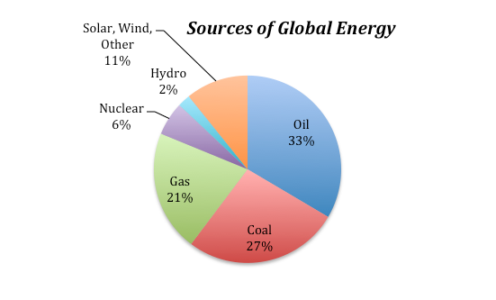
The image is a pie chart titled "Sources of Global Energy," showing the distribution of different energy sources globally. The chart is divided into segments, each representing a different energy source with corresponding percentages:
- Oil: The largest segment, colored in blue, represents 33% of global energy sources.
- Coal: The second largest segment, colored in red, accounts for 27% of global energy.
- Gas: Represented by a green segment, gas makes up 21% of the energy mix.
- Solar, Wind, Other: This segment is yellow and constitutes 11% of the energy sources.
- Hydro: A light blue segment representing 2% of global energy.
- Nuclear: The smallest segment, colored in purple, accounts for 6% of the energy sources.
Each segment is labeled with the energy source and its percentage, providing a clear breakdown of the global energy composition.
The non-fossil fuel sources include nuclear, hydro (dams with electrical turbines attached to the outflow), solar (both photovoltaic and solar thermal), and a variety of other sources. These non-fossil fuel sources currently supply about 19% of the total energy.
The percentages of our energy provided by these different sources have clearly changed over time and will certainly change in the future as well. The graph below gives us some sense of how dramatically things have changed over the past 210 years:
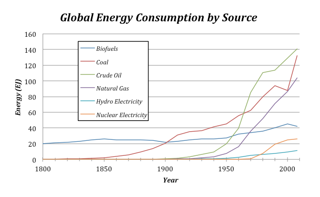
The image is a line graph titled "Global Energy Consumption by Source," showing the consumption of various energy sources from the year 1800 to 2000. The y-axis represents energy consumption in exajoules (EJ), ranging from 0 to 160 EJ. The x-axis represents the years, marked at intervals from 1800 to 2000.
The graph includes data for five different energy sources, each represented by a different colored line:
- Biofuels: Represented by a light blue line, biofuel consumption starts at around 10 EJ in 1800 and shows a slight increase over time, peaking around 20 EJ by 2000.
- Coal: Represented by a red line, coal consumption starts near 0 EJ in 1800, begins to rise significantly around 1850, and continues to increase sharply, reaching approximately 120 EJ by 2000.
- Crude Oil: Represented by a green line, crude oil consumption starts near 0 EJ in 1850, increases steadily from around 1900, and rises sharply post-1950, reaching about 140 EJ by 2000.
- Natural Gas: Represented by a purple line, natural gas consumption starts near 0 EJ in 1900, with a notable increase starting around 1950, reaching around 100 EJ by 2000.
- Hydro Electricity: Represented by a dark blue line, hydroelectricity consumption starts near 0 EJ around 1900, with a gradual increase over time, reaching about 30 EJ by 2000.
- Nuclear Electricity: Represented by an orange line, nuclear electricity consumption starts near 0 EJ around 1950, with a sharp increase from that point, reaching around 30 EJ by 2000.
Key observations:
- Coal and crude oil show the most significant increases in consumption over the period.
- Natural gas consumption also rises sharply, particularly after 1950.
- Biofuels show a relatively flat trend, with a minor increase.
- Hydro and nuclear electricity consumption start later, but show steady growth over time.
- By 2000, crude oil has the highest consumption, followed by coal, natural gas, hydroelectricity, nuclear electricity, and biofuels in that order.
A legend in the top-left corner of the graph identifies the colors associated with each energy source.
There are a couple of interesting features to point out about this graph. For one, note that the total amount of energy consumed has risen dramatically over time — this is undoubtedly related to both population growth and the industrial revolution. The second point is that shifting from one energy source to another takes a long time. Oil was being pumped out of the ground in 1860, and even though it has a greater energy density and is more versatile than coal, it did not really make its mark as an energy source until about 1920, and it did not surpass coal as an energy source until about 1940. Of course, you might argue that the world changed more slowly back then, but it is probably hard to avoid the conclusion that our energy supply system has a lot of inertia, resulting in sluggish change.
Global Energy Uses
Global Energy Uses
We are all aware of some of the ways we use energy — heating and cooling our homes, transporting ourselves via car, bus, train, or plane — but there are many other uses of energy that we tend not to think about. For instance, growing food and getting it onto your plate uses energy — think of the farming equipment, the food processing plant, the transportation to your local store. Or, think of manufactured items — to make something like a car requires energy to extract the raw materials from the earth and then assembling them requires a great deal of energy. So, when you consider all of the different uses of energy, we see a dominance of industrial uses:
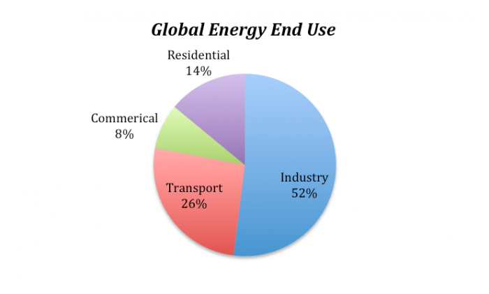
The image is a pie chart titled "Global Energy End Use," showing the distribution of global energy consumption across different sectors. The chart is divided into four segments, each representing a different sector with corresponding percentages:
- Industry: The largest segment, colored in blue, represents 52% of global energy end use.
- Transport: The second largest segment, colored in red, accounts for 26% of the energy consumption.
- Residential: Represented by a purple segment, this sector uses 14% of the global energy.
- Commercial: The smallest segment, colored in green, constitutes 8% of the energy end use.
Each segment is labeled with the sector name and its percentage, providing a clear breakdown of how global energy is utilized across these sectors.
Global Energy Consumption
Global Energy Consumption
Since we are going to be modeling the future of global energy consumption, we should first familiarize ourselves with the recent history of energy consumption.

The image is a stacked area chart titled "History of Global Energy Consumption," showing the consumption of various energy sources from 1800 to 2000. The y-axis represents energy consumption in exajoules (EJ), ranging from 0 to 500 EJ. The x-axis represents the years, marked at intervals from 1800 to 2000.
The chart includes data for six different energy sources, each represented by a different colored area:
- Biofuels: Represented by a red area at the bottom of the stack, biofuel consumption starts at around 10 EJ in 1800 and shows a gradual increase, peaking around 50 EJ by 2000.
- Coal: Represented by a green area above biofuels, coal consumption starts near 0 EJ in 1800, begins to rise significantly around 1850, and continues to increase sharply, reaching approximately 150 EJ by 2000.
- Crude Oil: Represented by a yellow area above coal, crude oil consumption starts near 0 EJ around 1880, with a notable increase starting around 1900, reaching about 150 EJ by 2000.
- Natural Gas: Represented by a light blue area above crude oil, natural gas consumption starts near 0 EJ around 1900, with a sharp increase post-1950, reaching around 100 EJ by 2000.
- Hydro Electricity: Represented by an orange area above natural gas, hydro electricity consumption starts near 0 EJ around 1900, with a steady increase over time, reaching about 30 EJ by 2000.
- Nuclear Electricity: Represented by a dark blue area at the top, nuclear electricity consumption starts near 0 EJ around 1950, with a rapid increase from that point, reaching around 30 EJ by 2000.
Key observations:
- The total energy consumption shows a steep rise starting around the mid-20th century.
- Coal and crude oil have the largest contributions to the total energy consumption, especially from the late 19th century onwards.
- Natural gas becomes significant post-1950.
- Hydro and nuclear electricity start later but show steady growth.
- Biofuels have a consistent but smaller share throughout the period.
A legend on the right side of the chart identifies the colors associated with each energy source.
Question: Why has our energy consumption increased over this time period?
Here, we will explore a few possibilities, the first of which is global population increase — more people on the planet leads to a greater total energy consumption. To evaluate this, we need to plot the global population and the total energy consumption on the same graph to see if the rise in population matches the rise in energy consumption.

The image is a line graph titled "Energy Consumption and Population," showing the relationship between global energy consumption and global population from the year 1800 to 2000.
- Axes:
- The x-axis represents the years, ranging from 1800 to 2000.
- The left y-axis represents energy consumption in exajoules (EJ), ranging from 0 to 500 EJ.
- The right y-axis represents population in billions, ranging from 0.800 to 6.800 billion
- Data Series:
- Energy Consumption: Represented by blue squares connected by a line, this series shows the trend of global energy consumption over time. It starts at a low level around 10 EJ in 1800 and increases steadily, with a significant rise starting around 1950, reaching approximately 450 EJ by 2000.
- Population: Represented by red circles connected by a line, this series shows the trend of global population growth. It starts at around 1 billion in 1800 and grows gradually, with a sharp increase post-1950, reaching about 6.8 billion by 2000
- Trends:
- Both energy consumption and population show a similar trend of gradual increase until around 1950, after which both exhibit exponential growth.
- The correlation between the two trends is evident, with both lines rising sharply in the latter half of the 20th century, indicating a strong relationship between population growth and energy consumption
- Key Points:
- Around 1800, energy consumption is very low, and the population is just above 1 billion.
- By 1900, energy consumption has risen to about 30 EJ, and the population has grown to approximately 1.6 billion.
- Post-1950, there is a dramatic increase in both metrics, with energy consumption reaching nearly 450 EJ and the population reaching 6.8 billion by 2000
The graph uses two different scales to represent energy consumption and population, with the right y-axis for population being in billions and the left y-axis for energy consumption being in exajoules. The visual representation highlights the parallel growth of these two variables over the 200-year period.
The two curves match very closely, suggesting that population increase is certainly one of the main reasons for the rise in energy consumption. But is it as simple as that — more people equals more energy consumption?
If the rise in global energy consumption is due entirely to population increase, then there should be a constant amount of energy consumed per person — this is called the per capita energy consumption. To get the per capita energy consumption, we just need to divide the total energy by the population (in billions) — so we’ll end up with Exajoules of energy per billion people.
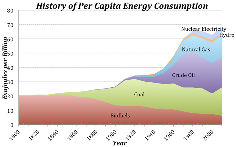
The image is a stacked area chart titled "History of Per Capita Energy Consumption," showing the consumption of various energy sources per capita from 1800 to 2000. The y-axis represents energy consumption in exajoules per billion people, ranging from 0 to 80 EJ per billion. The x-axis represents the years, marked at intervals from 1800 to 2000.
The chart includes data for six different energy sources, each represented by a different colored area:
- Biofuels: Represented by a red area at the bottom of the stack, biofuel consumption starts at around 10 EJ per billion in 1800 and shows a gradual increase, peaking around 20 EJ per billion by the mid-20th century before declining slightly towards 2000.
- Coal: Represented by a green area above biofuels, coal consumption starts near 0 EJ per billion in 1800, begins to rise significantly around 1850, and continues to increase, reaching a peak of about 30 EJ per billion around 1950, then declines slightly but remains significant.
- Crude Oil: Represented by a purple area above coal, crude oil consumption starts near 0 EJ per billion around 1880, with a notable increase starting around 1900, reaching about 30 EJ per billion by 1970, then slightly decreases.
- Natural Gas: Represented by a light blue area above crude oil, natural gas consumption starts near 0 EJ per billion around 1900, with a sharp increase post-1950, reaching around 20 EJ per billion by 2000.
- Hydro: Represented by an orange area above natural gas, hydro energy consumption starts near 0 EJ per billion around 1900, with a steady increase over time, reaching about 10 EJ per billion by 2000.
- Nuclear Electricity: Represented by a dark blue area at the top, nuclear electricity consumption starts near 0 EJ per billion around 1950, with a rapid increase from that point, reaching around 10 EJ per billion by 2000.
Key observations:
- The total per capita energy consumption shows a steady increase from 1800, with a significant rise starting around the mid-20th century.
- Coal and crude oil have significant contributions to per capita energy consumption, especially from the late 19th century onwards.
- Natural gas becomes a major contributor post-1950.
- Hydro and nuclear electricity start later but show steady growth, becoming more prominent towards the end of the 20th century.
- Biofuels have a consistent but decreasing share towards the end of the period.
A legend on the right side of the chart identifies the colors associated with each energy source.
Today, we use about 3 times as much energy per person than in 1900, which is not such a surprise if you consider that we have many more sources of energy available to us now compared to 1900. Note that at the same time that the population really takes off (see Fig. 5), the per capita energy consumption also begins to rise. This means that the total global energy consumption rises due to both the population and the demand per person for more energy.
Let’s try to understand this per capita energy consumption a bit better. We know that the global average is 74 EJ per billion people, but how does this value change from place to place? There are some huge variations across the globe — Afghans use about 4 GJ per person per year, while Icelanders use 709 GJ per person. Why does it vary so much? Is it due to the level of economic development, or the availability of energy, or the culture, or the climate? You can come up with reasons why each of these factors (and others) might be important, but let’s examine one in more detail — the economic development expressed as the GDP (the gross domestic product, which reflects the size of the economy) per capita.

The image is a scatter plot graph titled "Relationship Between GDP and Energy Consumption." It illustrates the relationship between per capita GDP (in $) on the x-axis and per capita energy consumption (in GJ/person) on the y-axis for various countries over time. The graph uses a logarithmic scale for both axes.
- Axes:
- The x-axis is labeled "Per Capita GDP $" and ranges from 1,000 to 100,000.
- The y-axis is labeled "Per Capita Energy Consumption (GJ/person)" and ranges from 1 to 1,000.
- Data Points:
- Each data point represents a country, with blue circles indicating data from various years.
- Specific countries are highlighted with labels:
- Afghanistan is located at the lower left of the graph, indicating low GDP and low energy consumption.
- Mexico is positioned towards the middle of the graph.
- USA is located towards the upper right, indicating higher GDP and energy consumption.
- Qatar and Iceland are at the far right, with very high GDP and energy consumption, with Iceland having the highest energy consumption
- Global Averages:
- Two red squares mark the global averages:
- One labeled "Global Average 1950" is located lower on the graph, indicating lower GDP and energy consumption.
- Another labeled "Global Average 2013" is positioned higher, showing an increase in both GDP and energy consumption over time.
- Trends:
- There is a general upward trend, suggesting that as per capita GDP increases, so does per capita energy consumption.
- The spread of data points widens as GDP increases, indicating variability in energy consumption among countries with similar GDP levels.
- Annotations:
- Arrows point to the labeled countries and global averages, providing a visual guide to their positions on the graph.
The graph uses a logarithmic scale to accommodate the wide range of values, and the data points are densely packed, showing the distribution and relationship between GDP and energy consumption across different countries.
- Two red squares mark the global averages:
The obvious linear trend to these data suggests that per capita energy consumption is a function of GDP, while the fact that it is not a tight line tells us that GDP is not the whole story in terms of explaining the differences in energy consumption. Not surprisingly, we are near the upper right of this plot, consuming more than 300 GJ per person per year. Iceland’s economy is not as big per person as ours, and yet they consume vast amounts of energy per person, partly because it is cold and they have big heating demands, but also because they have abundant, inexpensive geothermal energy thanks to the fact that they live on a huge volcano. Many European countries with strong economies (e.g., Germany) use far less energy per person than we do (168 GJ compared to our 301 GJ), in part because they are more efficient than us and in part because they are smaller, which cuts down on their transportation. A big part of the reason they are more efficient than us is that energy costs more over there — for instance, a gallon of gas in Italy is about $8. Our neighbor, Mexico, has a per capita energy consumption that is just about the global average.
Pay attention to the two red squares in Fig. 7 — these show the global averages in terms of GDP and energy consumption per person for two points in time. The trend is most definitely towards increasing GDP (meaning increasing economic development) and increasing energy consumption per person. Economic development is definitely a good thing because it is tied to all sorts of indicators of a higher quality of life — better education, better health care, better diet, increased life expectancy, and lower birth rates. But, economic growth has historically come with higher energy consumption, and that means higher carbon emissions.
Now that we’ve seen what some of the patterns and trends are, we are ready to think about the future.
Creating an Emissions Scenario
Creating an Emissions Scenario
There are many ways to meet our energy demands for the future, and each way could include different choices about how much of each energy source we will need. We’re going to refer to these “ways” as scenarios — hypothetical descriptions of our energy future. Each scenario could also include assumptions about how the population will change, how the economy will grow, how much effort we put into developing new technologies and conservation strategies. Each scenario can be used to generate a history of emissions of CO2, and then we can plug that into a climate model to see the consequences of each scenario.
Emissions per unit energy for different sources
The global emission of carbon into the atmosphere due to human activities is dominated by the combustion of fossil fuels in the generation of energy, but the various energy sources — coal, oil, and gas — emit different amounts of CO2 per unit of energy generated. Coal releases the most CO2per unit of energy generated during combustion — about 103.7 g CO2per MJ (106 J) of energy. Oil follows with 65.7 g CO2/MJ, and gas is the “cleanest” or most efficient of these, releasing about 62.2 g CO2/MJ.
At first, you might think that renewable or non-fossil fuel sources of energy will not generate any carbon emissions, but in reality, there are some emissions related to obtaining our energy from these means. For example, a nuclear power plant requires huge quantities of cement, the production of which releases CO2 into the atmosphere. The manufacture of solar panels requires energy as well, and so there are emissions related to that process because our current industrial world gets most of its energy from fossil fuels. For these energy sources, the emissions per unit of energy are generally estimated using a lifetime approach — if you emitted 1000 g of CO2 to make a solar panel and over its lifetime, it generated 500 MJ, then its emission rate is 2 g CO2/MJ. If we average these non-fossil fuel sources together, they release about 5 g CO2/MJ — far cleaner than the other energy sources, but not perfectly clean.
So, to sum it up, here is a ranking of the emissions related to different energy sources:
| Energy Source | g CO2 per MJ |
|---|---|
| Coal | 103.7 |
| Oil | 65.7 |
| Gas | 62.2 |
| Non-Fossil Fuel* | 6.2** |
*Hydro, Nuclear, Wind, Solar
**This will decrease as the non-fossil fuel fraction increases
Calculating global emissions of carbon
Calculating global emissions of carbon
Our recent energy consumption is about 518 EJ (1018 J). Let’s calculate the emissions of CO2 caused by this energy consumption, given the values for CO2/MJ given above and the current proportions of energy sources — 33% oil, 27% coal, 21% gas, and 19% other non-fossil fuel sources. The way to do this is to first figure out how many grams of CO2 are emitted per MJ given this mix of fuel sources, and then scale up from 1 MJ to 518 EJ. Let’s look at an example of how to do the math here — let r1-4 in the equation below be the rates of CO2 emission per MJ given above, and let f1-4 be the fractions of different fuels given above. So r1 could be the rate for oil (65.7) and f1 would be the fraction of oil (.33). You can get the composite rate from:
Plugging in the numbers, we get:
What is the total amount of CO2 emitted? We want the answer to be in Gigatons — that’s a billion tons, and in the metric system, one ton is 1000 kg (1e6 g or 106 g), which means that 1Gt = 1015 g (1e15 g).
So, the result is 31.8 Gt of CO2, which is very close to recent estimates for global emissions.
It is more common to see the emissions expressed as Gt of just C, not CO2, and we can easily convert the above by multiplying it by the atomic weight of carbon divided by the molecular weight of CO2, as follows:
And remember that this is the annual rate of emission.
Let’s quickly review what went into this calculation. We started with the annual global energy consumption at the present, which we can think of as being the product of the global population times the per capita energy consumption. Then we calculated the amount of CO2 emitted per MJ of energy, based on different fractions of coal, oil, gas, and non-fossil energy sources — this is the emissions rate. Multiplying the emissions rate times the total energy consumed then gives us the global emissions of either CO2 or just C.
We now see what is required to create an emissions scenario:
- A projection of global population
- A projection of the per capita energy demand
- A projection of the fractions of our energy provided by different sources
- Emissions rates for the various energy sources
In this list, the first three are variables — the 4th is just a matter of chemistry. So, the first three constitute the three principal controls on carbon emissions.
Here is a diagram of a simple model that will allow us to set up emissions scenarios for the future:

The image is a complex systems diagram titled "System Dynamics Model of Energy Consumption and Emissions," which illustrates the relationships and feedback loops between various factors related to energy consumption, population, and emissions. Here's a detailed breakdown:
Components:
- Population: Represented by a rectangular box labeled "Population," which has arrows indicating influence from and to other components.
- Pop Limit: A cloud-shaped symbol labeled "Pop Limit" with an arrow pointing to the "Population" box, indicating a limit or constraint on population growth.
- net change: An arrow labeled "net change" connects from "Population" to a circular node, indicating the net change in population affecting other variables.
- r: A circular node labeled "r" connected to "Population," representing the growth rate of the population.
- per capita energy: Connected to "Population" with an arrow, indicating per capita energy consumption.
- global energy consumption: A circular node connected to "per capita energy," representing the total global energy consumption.
- Total Emissions: A rectangular box connected to "global energy consumption," representing the total emissions resulting from energy consumption.
- RC: A central circular node labeled "RC," which seems to be a key regulatory or control factor influencing various energy sources.
Energy Sources and Emissions:
- f_gas: Connected to "RC," representing emissions from gas.
- f_oil: Connected to "RC," representing emissions from oil.
- f_coal: Connected to "RC," representing emissions from coal.
- er_gas: Connected to "f_gas," representing the energy ratio or efficiency for gas.
- er_oil: Connected to "f_oil," representing the energy ratio or efficiency for oil.
- er_coal: Connected to "f_coal," representing the energy ratio or efficiency for coal.
- er_renew: Connected to "RC," representing the energy ratio or efficiency for renewable energy.
- f_renew: Connected to "er_renew," representing emissions from renewable energy sources.
Switches and Reductions:
- Gas Switch: A diamond-shaped decision node connected to "f_gas," "f_change 3," and "gas red time," indicating a decision point for switching to or from gas.
- Oil Switch: Similar to Gas Switch, connected to "f_oil," "f_change 2," and "oil red time," for oil.
- Coal Switch: Connected to "f_coal," "f_change 1," and "coal red time," for coal.
- gas red time: Connected to "Gas Switch," indicating the time frame for gas reduction.
- f_gas reduction: An arrow from "Gas Switch" indicating the reduction in gas emissions.
- oil red time: Connected to "Oil Switch," indicating the time frame for oil reduction.
- f_oil reduction: An arrow from "Oil Switch" indicating the reduction in oil emissions.
- coal red time: Connected to "Coal Switch," indicating the time frame for coal reduction.
- f_coal reduction: An arrow from "Coal Switch" indicating the reduction in coal emissions.
Feeddack Loops:
- f_change 1, f_change 2, f_change 3: These nodes are connected to the respective switches (Coal, Oil, Gas) and "star," indicating changes or feedback loops affecting the energy mix over time.
- star: A central node labeled "star" with a value of 0.1, connected to "f_change 1," "f_change 2," and "f_change 3," possibly representing a rate of change or a multiplier effect in the system.
Connections:
- Arrows with labels like "er_gas," "er_oil," "er_coal," "er_renew" indicate the flow of influence from energy efficiency ratios to emissions.
- The diagram shows a network of interconnections where changes in one part of the system can influence others, particularly through the "RC" node, which seems to be a regulatory center affecting all energy sources and their emissions.
This diagram visualizes how population growth, energy consumption per capita, and the choice of energy sources (gas, oil, coal, renewable) interact to influence total emissions, with various feedback loops and decision points affecting the dynamics over time.
In this model, the per capita energy (a graph that you can change) is multiplied by the Population to give the global energy consumption, which is then multiplied by RC (the composite emissions rate) to give Total Emissions. Just as we saw in the sample calculation above, RC is a function of the fractions and emissions rates for the various sources. Note that the non-fossil fuel energy sources (nuclear, solar, wind, hydro, geothermal, etc.) are all lumped into a category called renew, because they are mostly renewable. The model includes a set of additional converters (circles) that allow you to change the proportional contributions from the different energy sources during the model run.
This emissions model is actually part of a much larger model that includes a global carbon cycle model and a climate model. Here is how it works — the Total Emissions transfers carbon from a reservoir called Fossil Fuels that represents all the Gigatons of carbon stored in oil, gas, and coal (they add up to 5000 Gt) into the atmosphere. Some of the carbon stays in the atmosphere, but the majority of it goes into plants, soil, and the oceans, cycling around between the reservoirs indicated below. The amount of carbon that stays in the atmosphere then determines the greenhouse forcing that affects the global temperature — you’ve already seen the climate model part of this. The carbon cycle part of the model is complicated, but it is a good one in the sense that if we plug in the known historical record of carbon emissions, it gives us the known historical CO2 concentrations of the atmosphere. Here is a highly schematic version of the model:

The image is a flowchart diagram illustrating the global carbon cycle, showing the movement and storage of carbon in various parts of the Earth's system. Units are provided in gigatons of carbon (GT), where one gigaton equals one billion metric tons or 101510^{15}1015 grams. The diagram uses different colors to represent various carbon reservoirs and arrows to indicate the flow of carbon between these reservoirs. Red arrows indicate flows that are sensitive to human activities, while green arrows represent flows that are sensitive to temperature.
Carbon Reservoirs:
- Atmosphere: Contains 750 GT of carbon. It is connected to other parts of the cycle via various processes.
- Land Biota: Contains 610 GT of carbon, involved in processes like photosynthesis and respiration.
- Soil: Contains 1580 GT of carbon, connected to land biota through litter fall.
- Surface Oceans: Contains 970 GT of carbon, involved in ocean-atmosphere diffusion and upwelling & downwelling.
- Deep Oceans: Contains 38,000 GT of carbon, connected to surface oceans through upwelling & downwelling.
- Ocean Biota: Contains 3 GT of carbon, connected to surface oceans.
- Sedimentary Rocks: Contains 1,000,000 GT of carbon, connected to the deep oceans through sedimentation.
- Fossil Fuels: Contains 5000 GT of carbon, influencing the atmosphere through fossil fuel burning.
- Mantle: Connected to sedimentary rocks through subduction.
Carbon Flows (in GT/year):
- Atmosphere to Land Biota:
- Photosynthesis: 110 GT/year (green arrow, temperature sensitive)
- Burning: 50 GT/year (red arrow, human activity sensitive)
- Land Biota to Atmosphere:
- Respiration: 59.4 GT/year (green arrow, temperature sensitive)
- Burning/Farming: 50 GT/year (red arrow, human activity sensitive)
- Land Biota to Soil: Litter fall: 60 GT/year
- Soil to Atmosphere: Respiration: 60 GT/year (green arrow, temperature sensitive)
- Atmosphere to Surface Oceans: Ocean-atmosphere diffusion: 90 GT/year (green arrow, temperature sensitive)
- Surface Oceans to Atmosphere: Ocean-atmosphere diffusion: 90 GT/year (green arrow, temperature sensitive)
- Surface Oceans to Deep Oceans: Upwelling & downwelling: 105.6 GT/year
- Deep Oceans to Surface Oceans: Upwelling & downwelling: 96.2 GT/year
- Surface Oceans to Ocean Biota: 105 GT/year
- Ocean Biota to Surface Oceans: 105 GT/year
- Deep Oceans to Sedimentary Rocks: Sedimentation: 0.6 GT/year
- Sedimentary Rocks to Mantle: Subduction: 0.6 GT/year
- Fossil Fuels to Atmosphere: Fossil Fuel Burning: 9 GT/year (red arrow, human activity sensitive)
- Volcanic Eruptions: 0.6 GT/year from the mantle to the atmosphere (green arrow, temperature sensitive)
Notes:
- Numbers next to the arrows represent approximate annual flows in gigatons per year (GT/year).
- The diagram highlights the interaction between natural processes and human-induced changes in the carbon cycle, emphasizing the impact of activities like burning fossil fuels and land use changes (farming, burning).
Experiments with the Model
Experiments with the Model
Video: Energy Emissions Activity (5:32)
PRESENTER: Here's the control panel for the model that we will be working with in this exercise, which combines global energy and emissions along with the global carbon cycle model and a global climate model. It's a big, complicated thing but there are just a few controls here you need to know about. They are in kind of different colors here, sectors to kind of control, coal, and oil, and natural gas down in here. This is where we can control the per capita energy history over time, and this is where we can control the population limit that's eventually reached, and this up here, this slider, is the starting time, when some change to reduce the amount of coal oil or gas we use is implemented.
So let me show you how this works. If you just run this the way it comes, without making any changes, you see this. It tells us the total emissions. This is in Gigatons of carbon per year globally, and it shows that going up like this over time, right. Now if I click on the next page, you'll see that in in reality, at this time here, about 2164, we would actually run out of fossil fuels. Here's the fossil fuel reservoir. It's dropping, dropping dropping, gets to zero. At that point, we can't put any more carbon in the air because we don't have any more of these fossil fuels. But this graph here, page 1, shows what we would emit if we could, if we could actually tap into that amount. Anyway, we'll be looking at both of these graphs a little bit.
Let me show you how this works. If we want to say, let's try to reduce the amount of our energy that's supplied by coal. So we switch to that. And this is the coal reduction time. So beginning in the year 2020, and for the next 30 years, we're gonna reduce coal by let's say, let's reduce it by 10%. So currently coal, if you look at this, it's making up 27% of our mix of energy sources. So if we reduce it by 10, then it'll be making up 17. Now the 10 that we reduced coal by is going to add to the renewables down in here, which is currently 0.19. So this is a whole bunch of things, hydro, solar, wind, nuclear, biomass, all lumped together. So if we take from one of these fossil fuel sources, we're going to add it to the renewables here.
So let's implement this change, see what happens. There we go. See we've brought the emissions down quite a bit, and in this case, let's see, we don't run out of fossil fuels for a little bit later here. So let's see if we get it so we don't run out of fossil fuels. Let’s reduce the amount of oil we use by 10 percent. See if that does it, And yeah, we just run out at the very, very end here. Ok, so you see what happens there.
Now, this is connected to a global carbon cycle model. The fossil fuels is part of that. It's also connected to a climate model, so if we were to click through all these different pages in the graph pad, you can see all these little parameters plotted here. Here's the global temperature change, and we see that we have increased the temperature by about six and a half degrees by the year 2020, out in here. So 2100 is in here. 2010 is our starting time here. So if we turn these switches off, then we are not going to restrict our use of fossil fuels for an energy source, and we'll just continue with this mix that's indicated here, the initial fractions. Now, there are a couple of other things that you can change here. You can change the population limit by moving this dial around, more or less people, 12 is sort of the default value. You can also change the per capita energy graph here. So if you look at that, this actually is a little funny, it goes from the year 2010 right here. Let's call it the present. And this line over here, this vertical line is the year 2200. So there are 5 divisions in there for about 190 years. So each one those is 38 years. So this vertical line here is the year 2048 and so on. You just keep adding 38 years to figure out which time each of those vertical lines corresponds to.
You can change this graph. It starts off at 74, and what we're assuming is that it’s going up, at its kind of current pace, but then it levels off up here eventually, by the end of this. But you could take a more optimistic view and say, well, we're going to become more conservative in our use of energy and more efficient, and we'll reduce it to a lower level, and we can follow a trajectory like that. And you hit okay, and then that will be implemented, and you'll see what effect that does. You can undo that change by clicking on this U down here. And let's say you've made a lot of changes, and you've made a lot of graphs, you can reset the graphs, or you can restore all the devices to their kind of default values here. All right, so that's it. Have fun with it.
Important Instructions
- In this exercise, we will work with a model of a system that has many parts — carbon cycle, climate model, population model, and energy model. We'll explore how making changes to one part of this system alter the behavior of other parts of the system. This illustrates an important part of what we call Systems Thinking, which is that in complex, connected systems, a change in one part may have consequences that spread throughout the system.
- After watching the movie above, run the model [90]without making any changes to establish what we will call the “control” case for these experiments. You can return to this control case by hitting the Restore All Devices button.
- Write down the Total Emissions at the year 2100 — this will be our comparison point in time for later experiments.Look at page 2 of the graph pad, which shows human emissions, which is essentially the same as Total Emissions except that it is limited by the total amount of fossil fuel carbon we have; if we burn through all that carbon, human emissions will drop to 0, and in fact, you’ll see that it drops off to zero about the year 2165 — this is when we run out of fossil fuels. So if we haven’t solved our energy problems by then, we’re in deep trouble!
| - | Practice | Graded |
|---|---|---|
| switch to turn on | coal | oil |
| f reduction | 0.24 | 0.30 |
| f reduction time | 20 | 20 |
The table above gives you a set of instructions related to the practice and graded versions of the summative assessment, including which switch to turn on, the fractional reduction, and the time over which this reduction takes place. As one of the fossil fuel sources is reduced, the model increases the renewable fraction so that the total of all the fractions stays at 1.0.
1. How much does switching from one of the fossil fuel sources to renewables decrease the emissions in the year 2100? First, run the model as is when you open it (all switches are in the off position) and take note of the total emissions for the year 2100 on graph #1 (this is our control case), then make the changes prescribed in the table above and find the new emissions in the year 2100 and then calculate the difference from the control case.
Difference = (±2 Gt)
Practice Answer = 11.3
Video: Module 8 Question 1 (1:39)
PRESENTER: For the first problem, we are going to see what happens if we completely eliminate our use of oil. And, so to do this problem, first, we just run the control version. So we hit run, and it shows us those results, that's with all the switches in the off position. Now we are going to turn the oil switch on. We are going to turn f oil new to zero. That means oil, after the adjustment, will represent zero of our energy, so that completely eliminates it. And remember, the renewable fraction will rise as a result of that. We have to make sure that the start time is at 2020, the adjust time is at two. We don't change the per capita energy or the population limit, and we run the model again now. And we see a different result here. Now we are going to look at page two.
This shows the total emissions and this is what we are interested in. We want to find the total emissions in 2100 and how they differ. So I slide the cursor along back and forth here until I get to 2100 and that is right there. And I see that in run one, that's our control, it was 29.57 of gigatons of carbon emitted. And then in run two, it is down to 19.78, and so it's a difference of 9.79. And that is the answer that we are looking for, the difference, the reduction, basically the distance between the blue curve and this dotted red one here.
2. Does this change lead to a leveling off of emissions, or do they continue to climb?
- Levels off
- Continues to climb [correct answer for practice version]
3. Which has a bigger impact in reducing emissions — limiting population growth to 10 billion, or reducing your fossil fuel fractions as prescribed? Here, make sure all the switches are turned off, and then set the Pop Limit to 10.
- Population limitation
- Fossil fuel reduction [correct answer for practice version]
Video: Module 8 Question 3 (1:10)
PRESENTER: For question 3, we are going to see whether or not reducing oil entirely, or reducing the population, has a bigger effect on the total emissions by the year 2100. So we have already done the case where we reduced oil. Completely cut it out. So now we are going to look at the alternative. So we turn that switch off and get the population down to 10, that's the population limit. Then we run the model again and we see in this kind of pink dashed line here, that's the emissions that pertains to this case, where the population limit is 10. You can see that right away the distance between the dashed pink curve here and the blue one is less than the difference between the blue and the dashed red. So, cutting out oil entirely has a bigger effect in reducing emissions than limiting the population growth to 10 billion.
Reset the Pop Limit to 12 when you are done with this one.
4. How much does reducing all of the fossil fuel sources to a fraction of 0.05 decrease the emissions in the year 2100 compared to the control case (set all switches to the off position for the control)? Set the start time to 2020, then turn on all the switches, and set the f reductions so that each fossil fuel source ends up at 0.05 after 30 years. You can check to make sure you’ve done this correctly by looking at the fractions on page 4 of the graph pad.
Set all of the reduction times to 20 years. For the graded version, lower the fossil fuel sources to a fraction of 0.1; leave everything else the same as the practice version.
Difference = (±2 Gt)
Practice Answer = 23.8
Follow these steps:
- Run the control case (don’t make any changes to the model)
- Turn on all the switches
- Set all the reduction times to 20
- Set f coal reduction to 0.22; f oil reduction to 0.28; f gas reduction to 0.16
- Run the model again — you should now see a blue curve from the control run and a pink curve from the modified run (looking at graph #1)
- Run the cursor along the control case curve until you get to the year 2100 and write down the total emissions at that point — it should be 29.57 (the units are Gt C/yr).
- Run the cursor along the modified case curve (pink one) until you get to the year 2100 and write down the total emissions at that point — it should be 5.74.
- The question is asking for the difference in emissions, so subtract 5.74 from 29.57 and you get 23.83 Gt C/yr — this is the reduction in emissions we would achieve if we lowered all of the fossil fuels to just 5% of our total energy consumption.
Video: Module 8 Question 4 (1:33)
PRESENTER: For question number 4 we're going to look at what happens if we drastically reduce all of the different fossil fuel energy sources. So we're going to turn on, well first we'll do the control run, so we run that and see what the emissions are now. We are going to follow the instructions here and turn on all the coal, oil, and gas switches and were going to reduce them all to a new fraction of .05, that's 5%. So each one of them will make up 5% of our total energy sources. Then we're not going to change per capita energy, population limit at 12, start time for reduction at 2020, and adjust time is two years. So we do that, and run the model, and we see results here greatly reduced emissions. So that in 2100, we've got 5.74 gigatons of carbon removed. And so you just subtract 5.74 from 29.57 to get the answer. Which is going to be 23 point something. So that is the answer for that.
5. Which has the bigger impact in reducing emissions — halting the rise in per capita energy use, or reducing our fossil fuel fractions? For this one, you’ll use your answer to the above question (#4) and compare to one in which you turn off all the switches, and then change the per capita energy graph so that it is more or less a straight line all the way across. You can check to see how well you’ve done this by looking at page 8 of the graph pad after you run the model. So, which has a bigger impact in reducing emissions?
Video: Module 8 Question 5 (1:50)
PRESENTER: For question number 5 we are going to see how the emissions reductions that we get from reducing the reliance on fossil fuels dramatically compares to reducing the per capita energy demand instead. So, this shows results from question 4. So, this was when we set all the fractions to 5% or 0.05 for coal, oil, and gas. But we kept the per capita energy graph, in its starting form, here. Now, what we are going to do is just to turn off those switches. So, we are not going do anything in terms of reducing fossil fuels, but we are going to become more efficient in terms of our energy use. And so, we want to have basically a straight line across here. So, I am just going to try to approximate. You do not have to be to precise about this but there, that is more or less a straight line all the way across. So per capita energy will not increase, it will stay the same per person as we go thru time. So, you hit okay and then run the model again. We see the resulting emissions curve, and you can see that it is higher than what we got for reducing fossil fuels. This particular reduction, or at least no growth per capita energy demand, didn’t give us as big of a result in terms of emission reductions in the year 2100 as the fossil fuel reduction scenario. So that is the answer to this question.
This table refers to the question below — it provides a set of model settings that lead to stabilization of emissions.
| - | Practice | Graded |
|---|---|---|
| switches on | coal, oil | all |
| start time | 2020 | 2050 |
| f reduction coal | 0.12 | 0.10 |
| f reduction time coal | 200 | 200 |
| f reduction oil | 0.10 | 0.07 |
| f reduction time oil | 100 | 200 |
| f reduction gas | 0 | 0.05 |
| f reduction time gas | 20 | 200 |
| Pop Limit | 12 | 11 |
| Per capita energy limit | 75 for the whole time | 100@2048, then steady at 100 for the rest of the time |
Refer to the worksheet to see what your per capita energy graphs should look like for the practice and graded versions.
6. One of the main goals people mention in the context of future global warming is halting the growth of our emissions of CO2. As you have seen so far, there are a variety of ways to reduce that growth. Now, let’s see what happens when we stabilize emissions. Modify the original model to create the emissions scenario defined by the parameters supplied in the table above — this should result in an emissions history that more or less stabilizes. Then find the emissions in the year 2100.
Total Emissions in 2100 = ±2.0 Gt C/yr
Practice version — 11.3 Gt C/yr
7. Now that you have an emissions scenario that stabilizes (the human emissions of carbon remain more or less constant over most of the time), let’s look at temperature (page 9 of the graph pad). Remember that global temperature change in this model is the warming relative to the pre-industrial world, which is already about 1°C in 2010, the starting time for our model. What is the global temperature change in the year 2100?
Global temperature change = ±0.5 °C
Practice version — 2.6°C
8. Now study the temperature change (graph#9) and the pCO2 atm (the atmospheric concentration of CO2 in ppm or parts per million — page 10 of the graph pad) for the time period following the stabilization of emissions. Does the stabilization of emissions lead to a stabilization of temperature or atmospheric CO2 concentration?
- Fossil fuel reduction [correct answer for practice version]
- Per capita energy change (i.e., conservation + efficiency)
Video: Module 8 Questions 6 through 8 (4:13)
PRESENTER: Questions 6, 7, and 8 all have to do with a model scenario in which we get the total emissions of carbon to more or less stabilize for a good part of the model run. So, to do this experiment, we will first run the basic model control version, so just hit the run button. Then we follow the instructions in the question to set it up to get a scenario where the emissions more or less stabilize. So, to do that, we turn on all the switches. We are going to set the new fraction to 0.15, that would be15% for each of these, so that is a decent reduction to our reliance on fossil fuels. We are going to make the transition to be a little slower, so we will move the adjust time to ten. And then we're going to change the per capita energy history. Normally when you open this, you just see this graph. If you click on the table here, you see individual entries. And we are going to alter this as follows: 74 there, 72, and this is 70. This is going to be 67, and 64, and 61. This is just another way to alter that graph. So hit OK. And you see that the graph is declining slightly over time. Keep the population limit at 10. Ok. That’s 11, we’ll make it 10. There we go. Now, we’ll run the model, and you see that give us this emissions history that more or less stable. So that is staying the same, and you can see what the emissions are in the year 2100. Gets us down to 6.14 gigatons of carbon in the year 2100. Now, what kind of a temperature change can that cause? That is question number 7. So, we look on page 3of the graph pad here, so the temperature change in the year 2100 is1.91 degrees, as opposed to3.92 for the control version. So that is your answer to number 7.
Then number 8 asks this question. So, we stabilize the emissions, does the temperature stabilize and the CO2 concentration in the atmosphere? Well, you can see right away that the temperature does not stabilize, it continues to rise, it is just not rising as fast as this control case here. So, to look at the pCO2, we go to page 9 of the graph pad here. There you see the CO2 concentration in the atmosphere starts off at about 400, or a little bit less than that in 2010, and by the time you get to 2100, we have a CO2 concentration in the atmosphere, in this altered version of 484, and that is parts per million, as opposed to 851 in the control version. But look even the CO2 concentration, that does not stabilize either, that continues to go up. So, it is not enough to just stabilize carbon emissions, clearly we need to actually get them to reduce if we want to bring the CO2 concentration down to a lower level and kind of keep it sable. And if we do that, CO2 concentration and temperature are very closely linked together in this model, so they’ll generally do more or less the same thing.
Reset the model before going to the next question.
9. Now, let’s say we want to keep the warming to less than 2°C, which the IPCC recently decided was a good target — warming more than that will result in damages that would be difficult to manage (we would survive, but it might not be pretty). We have seen by now that it is simply not enough to stabilize emissions at a level similar to or greater than today’s — that leads to continued warming. So we need to reduce emissions relative to our present level, which will be hard with a growing population and economy (and thus a growing per capita energy demand).
So, let’s see what is necessary to stay under that 2° limit, given some constraints. In all cases, we’ll assume that we can get our oil and gas fractions down to 0.1 (i.e., 10% each) over a time period of 30 years with a start time of 2020. We’ll leave population out of it (keep the limit at 12 billion), and for the practice version, we’ll make the assumption that per capita energy demand remains constant at a level of 75 for the whole time period (modify the graph so that it is a horizontal line at a level of 75 on the y-axis). This leaves f coal reduction as our main variable. The time period for reducing coal will be 30 years. You can change four scenarios for coal reduction as follows:
A: Keep the coal fraction unchanged (switch off)
B: Reduce the coal fraction to 10% (so f coal reduction would be .17)
C: Reduce the coal fraction to 5% (set f coal reduction to .22)
D: Reduce the coal fraction to 0% (set f coal reduction to .27)
For the graded version, we will change the per capita energy demand graph so that it drops to 50 by the year 2086 (see worksheet for a picture of what the graph should look like).
Find the coal fraction that keeps the temperature closest to 2°C by the year 2200.
Coal reduction scenario (A,B,C, or D):
Practice version: D is the correct answer
Video: Module 8 Question 9 (1:53)
PRESENTER: For question 9, we are going to see what needs to be done in terms of reducing the coal fraction to keep the temperature below a two-degree limit by the year 2200. So initially, I am just going to restore everything to the starting conditions here. Then we will run it once and see what happens, there we have got the very high-temperature change. Now we are going to follow the instructions for setting up the model. We are going to set the start time to 2030. Where going to set the adjust time to 10. We are going to turn on the oil switch and the gas switch. And we are going to keep the per capita energy at 74 the whole way across. So, we do it like this, the same thing we have done before. Hit okay. So, there we have that set. We are going to set the f oil new (new oil fraction) to 0.1 and do the same with gas. So, we reduced those two to 10%, .10. Then we have the population limit set at 12, so that is good. Now we are going to explore 4 different scenarios and in each scenario we are going to do something different with the coal. The first one we are going to keep the coal fraction unchanged, so we have the switch off, and we run it. We see what the temperature is, and by the end we are at 3.59 degrees is the temperature change. So that is not acceptable. So that one does not do it so we will try scenario B. So, we turn the coal switch on, and we then reduce the f coal new to .1 and run it. So lower temperature, we are using less coal, but we are still at 2.66 so that is too high. Now we will change f coal new to .05 and run it again. And we see we are still up here at 2.36. So, we are still above two. Now let’s see what happens if we eliminate coal entirely, move it to zero and run it again. And here we are, and at that point we have still a temperature of 2.05, so that one is very close, but it still does not get us quite below that 2-degree limit. I So, in this case, none of those case scenarios works right and that is one of the choices in the question is that none of these above scenarios keeps the temperature below 2 degrees. The last one comes close, but it still does not quite get there.
We’re done with this model for now, but you will be coming back to something similar to this later on when you do your capstone projects. You’ll use the model to design an emissions and energy consumption scenario for the future for which you’ll also explore the environmental and economic consequences.
The following questions encourage you to step back and think about what you’ve learned here. Short answers will suffice here.
10. What are the three principal variables that determine how much carbon is emitted from our production of energy? (Hint: look at page 11 of this worksheet)
11. What is the relationship between economic development (growth) and per capita energy consumption? (Hint: look at figure 7 of this worksheet)
12. Among the various sources of our energy, which has the highest rate of CO2 emitted per unit of energy? (Hint: look at table on page 10 of this worksheet)
13. What happens to the atmospheric concentration of CO2, and thus the global temperature, if we stabilize (hold constant) the emissions rate? (refer to question #8 above)
14. Can we stay under the 2°C warming limit in the year 2200 by completely eliminating our reliance on fossil fuel energy sources alone (reducing coal, oil, and gas to 0% of our energy supply), or do we also need to reduce our energy consumption per capita? (make appropriate changes and then run the model to figure this out)
- both stabilize
- neither stabilizes — both increase [correct answer for practice]
- neither stabilizes — both decrease
- CO2 goes up; temperature goes down
- CO2 goes down; temperature goes up
Summary and Final Tasks
Summary
Energy conservation – making investments or changing behaviors to reduce energy consumption without lifestyle sacrifices – is a critically important energy option, regardless of whether you support broader use of fossil fuels or you support a transition to a low-carbon energy portfolio. Everyone should agree that more conservation is a good thing, and the potential conservation options are vast both in number and in their possible impacts on the environment and climate. Nonetheless, energy conservation presents a difficult paradox. On the one hand, the majority of energy conservation options have a double dividend, saving money and helping the environment all at the same time. On the other hand, convincing individuals and businesses to spend time and money undertaking conservation investments has proven remarkably difficult. (At the very least, you would think that people like to save money.) People make seemingly irrational decisions for all sorts of reasons, and some centralized coordination can help to overcome the energy efficiency paradox. Three examples from the United States have shown how monetary incentives, community outreach, and deliberate planning have all contributed to some form of effective energy conservation.
Reminder - Complete all of the Module 8 tasks!
You have reached the end of Module 8! Double-check the Module Roadmap to make sure you have completed all of the activities listed there before you begin Module 9.
Module 9: Geoengineering
Module 9: Geoengineering
In one sense, humans have been altering or “engineering” different aspects of the Earth since the earliest civilizations — but this has mainly been on a small scale. Now, the threats presented by climate change are leading to the development of a whole new set of schemes that seek to alter the global climate — a fairly ambitious task. Geoengineering is the term used to describe these schemes to intentionally modify or control Earth’s climate system, in order to reduce global warming. There are two general categories of geoengineering schemes — CO2 removal and insolation (sunlight) reduction.
Goals and Objectives
Goals and Objectives
Goals
- Recognize the great diversity of energy options currently available to us
- Explain scientific concepts in language non-scientists can understand
Learning Objectives
By the end of this module, you should be able to:
- Recall the various geoengineering strategies that have been suggested to mitigate climate change
- Recognize that geoengineering alone is unlikely to be sufficient to mitigate climate change
- Assess what you have learned in Unit 2
Roadmap
Roadmap
| To Read | Materials on the course website (Module 9) | - |
|---|---|---|
| To Do | Quiz 9 Unit Self-Assessment |
Due Sunday Due Sunday |
Questions?
If you prefer to use email:
If you have any questions, please email your faculty member through your campus CMS (Canvas/Moodle/myShip). We will check daily to respond. If your question is one that is relevant to the entire class, we may respond to the entire class rather than individually.
If you prefer to use the discussion forums:
If you have any questions, please post them to Help Discussion. We will check that discussion forum daily to respond. While you are there, feel free to post your own responses if you, too, are able to help out a classmate.
Insolation Reduction
Insolation Reduction
These projects seek to reduce the insolation (incoming solar radiation) — the energy input for our climate — absorbed by the Earth. They do not reduce greenhouse gas concentrations in the atmosphere, and thus do not address problems such as ocean acidification caused by the excess CO2. Insolation management projects appear to have the advantage of speed, and in some cases, costs. There are a variety of ways that we might achieve a reduction in insolation and thus cool the planet.
Note:
Ocean acidification is one of the more serious consequences of emitting carbon dioxide into the atmosphere. The atmosphere and the oceans exchange gases like oxygen and carbon dioxide to achieve a kind of equilibrium or balance in terms of concentration. So, if we put more CO2 into the atmosphere, the oceans will try to absorb a lot of that CO2. Indeed, we now know that the oceans absorb something like 25% of the CO2 we have emitted through the burning of fossil fuels. This is a good thing in terms of moderating the greenhouse gas forcing of our climate, but it has the result that the oceans become more acidic — just as carbonated water is more acidic than tap water. The problem with this is that the phytoplankton that make up the base of the food chain in the oceans cannot tolerate acidic conditions. The oceans are in fact becoming more acidic, and while we humans would never sense this change, the far more sensitive phytoplankton definitely feel it. If further acidification occurs, the phytoplankton will decline and because they are the base of the food chain, most other life in the oceans will also decline, putting the whole ocean ecosystem in peril. This is yet another reason why we need to stop emitting CO2 and even reduce the amount of CO2 in the atmosphere. If we pull CO2 out of the atmosphere, the oceans will release some of its CO2 into the atmosphere, reducing the acidity of the oceans.
Changing the Surface Albedo
Directly changing the albedo of the surface through the use of light colored or reflective materials on buildings, glaciers, etc. For buildings, this has the added benefit of reducing the cooling costs, but it is not likely to be as effective on a global scale as some of the other schemes. Buildings in cities represent something like 0.1% of the Earth’s surface, so by changing the albedo of the building tops, we cannot make much of a change in the global albedo and thus the global temperature. To calculate this, we need to do some very simple math. As a whole, our planet has an albedo of 0.3, so if we change the albedo of 0.1% (which, as a fraction, is 0.001) of the whole planet to an albedo of 0.9 (very reflective), then we get the new albedo by adding 0.3*0.999 + 0.9*0.001 — this give us the new albedo of 0.3006. This would lower the temperature by 0.06°C, which is clearly not going to be enough! However, this approach does hold promise for individual cities, which suffer from a phenomenon called the “urban heat island effect” — they are hotter than the surrounding countryside where there are more plants. Plants cool an environment by releasing water in the form of vapor — this is called transpiration, and just like evaporation, it cools the surface. So, it is a good idea to whiten up building tops, but this is not going to solve our global warming problem. There are few, if any, risks associated with these kinds of operations. But, the cost of doing this could be as high as \$300 billion per year based on a study by the Royal Society — a lot of money for a small reduction in temperature!
Increasing Atmospheric Albedo
Increasing Atmospheric Albedo
There are a couple of ideas for making the atmosphere reflect more sunlight, including brightening clouds and adding aerosols (tiny particles, either solids or liquids, that stay suspended in the atmosphere for a relatively long period of time).
Cloud Albedo Enhancement
The basic idea here is to make clouds brighter by increasing the concentration of tiny droplets of water that make up the clouds. It has long been recognized that in parts of the world that are dustier, the clouds tend to be brighter because of a higher concentration of water droplets. The tiny water droplets in clouds form around even tinier particles called Cloud Condensation Nuclei (CCN) — the more CCNs you have, the more water droplets form, the brighter the clouds are, the more sun they reflect. It has been suggested that spraying tiny salt crystals derived from the oceans would serve this purpose, and this, along with the fact that the oceans cover 75% of the Earth, means that this would be done over the oceans. The troposphere (lower part of the atmosphere where clouds form) is a dynamic place, which makes the effectiveness of this approach somewhat difficult to predict, but in theory, it could provide enough of an albedo increase to accomplish the cooling we might want (a couple of degrees C). It is estimated that something like 1500 ships equipped to extract the salt particles and inject them into the atmosphere would be needed — these ships do not exist at present, and they would have to be custom-made. The cost of this approach is a bit uncertain, but is probably not excessive. The main drawbacks of doing something like this include the uncertainty about how this would affect weather in cities near the oceans and the fact that this would not address the problem of ocean acidification.
Stratospheric Aerosols
We could reduce the amount of solar energy reaching the surface and thus cool the planet by making the atmosphere more reflective through the injection of sulfur aerosols into the stratosphere (above the troposphere). We know that this works because of the cooling that follows large, explosive volcanic eruptions that inject tiny aerosols (particles) of sulfate (SO4) into the stratosphere. Based on the volcanic eruptions, we can estimate how much sulfur is needed to counteract a doubling of CO2 — about 5 Tg of S per year (one Tg or teragram is 1012 g), which is about half the amount that injected into the atmosphere by the eruption of Mt. Pinatubo in the Philippines in 1991.

The image is a diagram illustrating the Earth's energy balance with respect to incoming solar radiation. It uses various visual elements to represent the flow and absorption of solar energy:
- Incoming Solar Radiation: Represented by a yellow arrow labeled "100 Incoming Solar Radiation," this indicates the total amount of solar energy reaching the top of the Earth's atmosphere, measured in units of energy (not specified in the image but typically in watts per square meter or similar).
- Reflection by Clouds and Atmosphere: A red arrow labeled "23" branches off upwards from the incoming solar radiation, indicating that 23 units of energy are reflected back into space by clouds and the atmosphere.
- Absorption by Atmosphere: Another red arrow labeled "19" branches off to the right, showing that 19 units of energy are absorbed by the atmosphere.
- Absorption by Surface: The remaining energy, represented by a yellow arrow labeled "49," reaches the Earth's surface. This arrow is labeled "Insolation by Surface," indicating the solar radiation absorbed by the Earth's surface.
- Surface Composition: Below the surface absorption arrow, there's a note stating "SURFACE: 30% land; 70% water," indicating the distribution of land and water on Earth's surface.
- Clouds and Atmosphere: The background includes images of clouds and a simplified representation of the atmosphere to visually contextualize the energy flow.
- Additional Information:
- At the bottom left, there's a note: "Heat from the Sun = 5.67e24 Joules/yr the total annual solar energy received by and over the surface of the Earth."
- At the bottom right, there's a reference: "energy flow estimates from Trenberth, 1997.
- Visual Elements:
- A small image of an airplane is shown in the top left corner, possibly to indicate human activity or perspective.
- The diagram uses color coding: yellow for incoming solar radiation, red for energy flow within the atmosphere, and green for energy absorbed by the surface
This diagram provides a simplified view of how solar energy is distributed within the Earth's climate system, highlighting the interaction between solar radiation, the atmosphere, and the Earth's surface.
The estimated cost of this would be on the order of \$50 billion per year (consider that the US military expenditures are about \$750 billion per year). These particles have a limited residence time (1-2 years) in the stratosphere, so this would require continual injection via airplanes or balloons. The costs of doing this are surprisingly small (as low as \$50 billion per year), but it would have to be maintained — if we were to start down this path and then suddenly realize that it was a mistake and stop, we would face a truly shocking period of rapid warming. This is because we would probably continue to burn fossil fuels and emit more CO2 into the atmosphere.
This scenario is illustrated in the figure below, from a simple climate model like the one we used in Module 4, modified to include a sulfate aerosol geoengineering scheme.

The image is a line graph comparing two scenarios of average planetary temperature over time. The x-axis represents the years, ranging from 2000 to 2200, marked at intervals of 50 years. The y-axis represents the average planetary temperature in degrees Celsius, ranging from 15.00°C to 21.18°C.
- Axes:
- X-axis: Labeled "Years," with values from 2000 to 2200.
- Y-axis: Labeled "Average Planetary Temperature," with values from 15.00°C to 21.18°C.
- Data Series:
- No Geoeng Temp: Represented by a red line. This line shows a steady increase in temperature from approximately 15.00°C in the year 2000, rising continuously to about 21.18°C by the year 2200.
- Geoeng Temp: Represented by a blue line. This line starts similarly to the red line, increasing from around 15.00°C in 2000, but then diverges around 2050. The temperature levels off for a period, maintaining a temperature slightly above 18.09°C until around 2100, after which it begins to rise again, reaching approximately 21.18°C by 2200.
- Legend: Located at the bottom of the graph, indicating:
- Red line: "No Geoeng Temp"
- Blue line: "Geoeng Temp"
- Observation: The graph suggests that without geoengineering (red line), the planetary temperature increases more rapidly and consistently over time. With geoengineering (blue line), there is a period where the temperature increase is halted or slowed down, but eventually, the temperature begins to rise again, though not as steeply as without geoengineering.
This graph visually compares the impact of geoengineering on global temperature trends over a 200-year period.
Reasons Against Geoengineering
Reasons Against Geoengineering
Alan Robock, a volcanologist and climatologist from Rutgers University has made a list of reasons to not embark on this kind of geoengineering. Here is the list of some of the major ones:
- Effects on regional climates. Following large volcanic eruptions like Mt. Pinatubo, climate scientists noted changes in precipitation leading to droughts and problems in food production. Most climate modelers studying this problem agree that these kinds of regional changes would be impossible to avoid and impossible to control.
- Continued ocean acidification. Blocking sunlight in this way may limit the rise in temperature, but it would not address the problem of ocean acidification. A large fraction of the excess CO2 added to the atmosphere by burning fossil fuels is absorbed by the oceans, and this increases the acidity of the oceans, endangering the entire marine ecosystem. This problem would continue if we only blocked the sunlight.
- Ozone depletion. The sulfate additions to the stratosphere would promote the kinds of chemical reactions that destroy ozone, and ozone is a critically important part of our atmosphere in the sense that it blocks harmful UV radiation from reaching the Earth’s surface.
- Effects on plants. The scattering of light caused by the aerosols may create more diffuse light that is beneficial to plants, but the reduced total amount of sunlight could be detrimental — the balance of these effects is not well understood.
- More acid rain. The sulfate aerosols combine with atmospheric water vapor to form tiny droplets of sulfuric acid, which eventually fall out of the sky and land on the Earth’s surface. The global average increase in acid precipitation may not be alarming, but it is likely that there will be some regions that are noticeably impacted.
- Effects on cirrus clouds. The injected aerosols are likely to affect the formation of high cirrus clouds, which can impact the energy balance and thus temperature of the Earth, but this is not well-understood at present — we don’t know whether this would increase or decrease cirrus clouds.
- Whitening of the sky. The sulfate aerosols would make our sky more white than blue, which we might get used to after a while, but it would be unsettling to most people in the short term. We would, however, get much more vibrant sunsets.
- Less sun for solar power. Reducing the amount of sunlight reaching the surface will necessarily reduce the amount of solar energy we can harvest — not a good thing.
- Rapid warming if stopped. If we were to decide that this was a bad idea and stopped, a dramatic, potentially catastrophic warming would ensue (as shown in the model results above). This assumes that we continued to raise CO2 concentrations in the atmosphere.
- Human error. This is always a reality in any human endeavor, and an error in a system such as this could have serious consequences for billions of people.
- Undermining sustainability efforts. Any geoengineering scheme is problematic in the sense that it lets us off the hook and just delays the inevitable transition to a more sustainable energy system. We will definitely run out of fossil fuels and the longer we wait to transition to a system based on renewable energy, the harder it will be.
- Who is in control? Who has the power over the global temperature? This is a huge problem — it cannot be left to one nation, or one group of nations to make the decisions that will affect all of the people on Earth. Altering the climate this way will clearly create some winners and some losers. Island nations threatened with complete submergence in the future will want as much cooling as possible. The US and China and much of Europe will also want a lot of cooling to combat the rising sea levels that will force the relocation of major cities. But the Russians may want even more warming. So, who decides?
- Unintended consequences. Even instance in which humans have undertaken to modify the environment, a whole host of unintended consequences arise. Our world is complex enough, with so many interconnections, that it is impossible for us to foresee all of the consequences of our actions, even with the best of intentions. As just one example of this, the first people to discover the usefulness of fossil fuels did not foresee the potential for global environmental harm.
Nevertheless, the fact remains that this mode of geoengineering would work — we could cool the planet, and the cost would be relatively small. So, perhaps it is something we should carefully study and consider in the event of unexpectedly severe climate damages — a parachute to be deployed only when the plane is going down!
Space Mirrors
Space Mirrors
Reducing insolation could also be accomplished with space-based mirrors or other structures. One proposal here involves the placement of roughly 16 trillion small disks at a stable position 1.5 million km above the Earth. Each disk would have a diameter of 60 cm and would weigh just one gram. They would not be true mirrors, but would scatter enough sunlight to reduce the insolation by 2%, which be sufficient to cool the planet by 2°C. Getting these disks into place and then keeping them there would be a challenge, and it is estimated that it would take 10 years to put them into place using a special type of gun that could transport up to 10 million of them at a time. The total cost could be 5 trillion dollars every 50 years (the lifetime of the disks). This sounds a bit like science fiction, but it has been developed by a group of prominent astronomers and physicists, so we should assume it is viable, but nevertheless very costly and not something we could easily control. As with all of the insolation reduction schemes, this would do nothing to deal with the problem of ocean acidification.
Carbon Dioxide Removal
Carbon Dioxide Removal
Carbon dioxide removal projects address the root cause of warming by removing greenhouse gases from the atmosphere. These kinds of geoengineering schemes have the added benefit that by lowering the CO2 concentration in the atmosphere, they also prevent (and can reverse) ocean acidification. CO2 removal projects are generally slower, more expensive, and less developed than some of the insolation reduction schemes. There are a variety of ways that this could be done, including:
Carbon Capture and Sequestration
You may have heard of this in the context of “clean coal”, which refers to technologies that would allow us to burn coal without emitting CO2 into the atmosphere. Carbon capture and sequestration from power plants that burn fossil fuels involves the chemical removal (sometimes called “scrubbing”) of CO2 from the emissions of power plants, and then the injection of the concentrated CO2 into deep aquifers. In the best case, the sequestered CO2 interacts with minerals in the aquifer to lock the CO2 into a mineral form such as CaCO3 (calcite) which would prevent its release back into the atmosphere. A number of pilot projects of this type have already begun, and it does seem to be technically feasible, but it is not cheap. This would more than double the cost of fossil fuel-generated electricity, making this an expensive proposition, but that in itself would encourage developing clean, renewable energy sources like wind and solar that are also cheaper. Note that this would reduce emissions of CO2, but it would not lower the CO2 concentration in the atmosphere — just prevent it from further increases.
Enhanced Rock Weathering
Other means of carbon capture have been proposed, including the promotion of natural chemical weathering reactions of some rocks, in which atmospheric CO2 is consumed. These natural rock weathering reactions could be accelerated by crushing up the rock, which would increase the surface area of the minerals. This would have minimal environmental side effects, but it would also be quite slow and is limited by the availability of the right kinds of rocks. As such, this is not considered as a viable solution to our climate problems.
Ocean Fertilization
The surface waters in the southern oceans are depleted in iron, which is an important micronutrient for photosynthesizing plankton, so the plankton in this part of the oceans are under-performing. Adding powdered iron promotes an increase in plankton growth, thus drawing more CO2 from the surface oceans, which in turn enables the oceans to absorb more CO2 from the atmosphere. A few small-scale experiments have been conducted, and they appear to work in the short term, but scaling this up would be challenging, and the iron would have to be continuously applied, just as fertilizer is continuously applied to crops. This would be a very expensive solution, and as such, is not considered as a realistic option.
Direct Air Capture and Carbon Sequestration (DACCS)
Direct Air Capture and Carbon Sequestration (DACCS)
Carbon dioxide can be chemically extracted from the atmosphere, and a couple of projects led by universities and private companies have developed systems to do this. These systems involve using natural winds or fans to pass air through filters that are coated with chemicals — either amines (organic molecules derived from ammonium), or a sodium hydroxide solution — that react with C O2, causing it to attach to the filter material. When the filters are full, they are closed off and subjected to either high humidity or temperatures of 100°C, which releases the CO2 — it is then drawn off and eventually concentrated into nearly pure CO2. Once the CO2 has been concentrated, there are several options:
- It can be pumped into a greenhouse to be used by plants. The plants will use this CO2, but when the plants are harvested, that CO2 will be returned to the atmosphere, so the CO2 is not sequestered for long.
- It can be bottled and used to carbonate beverages, but as soon as the beverages are consumed, the CO2 returns to the atmosphere, so this does not really sequester the CO2.
- It can be combined with hydrogen to make a synthetic fuel similar to gasoline or jet fuel, but when the fuel is burned, it releases the CO2 back to the atmosphere. So again, this does not really sequester the CO2.
- It can be mixed with water and injected underground into a geologic material that will undergo a chemical reaction with the carbonated water to precipitate carbonate minerals that effectively lock up or sequester the carbon. This is sometimes called direct air capture and carbon sequestration (DACCS). DACCS leads to negative emissions of CO2, which would lead to lowering the concentration of CO2 in the atmosphere, cooling the planet.
The general scheme of a DACCS system is illustrated in the figure below.

The image is a schematic diagram illustrating a process for carbon dioxide (CO2) removal using a system powered by solar energy. Here's the breakdown of the components and flow:
- Background: The background is black, providing contrast for the elements of the diagram.
- Atmosphere: Represented by a blue arrow labeled "atm w/ CO2" (atmosphere with CO2) coming from the left side of the image, indicating the source of CO2.
- Solar Panels: At the top of the diagram, there are two blue solar panels labeled "solar energy," providing the power for the removal process.
- Removal Unit: A gray rectangular box labeled "Removal Unit" is centrally located, which is powered by the solar energy from the panels. This unit is responsible for extracting CO2 from the atmosphere.
- Flow of CO2:
- CO2 enters the removal unit from the atmosphere via a blue arrow.
- After processing, pure CO2 is directed out of the removal unit via a yellow arrow labeled "Pure CO2."
- Mixer: Below the removal unit, there's a circular component labeled "mixer." This mixer combines the pure CO2 with water, indicated by a blue arrow labeled "water" entering from the right.
- Basaltic Rock: At the bottom of the diagram, there's a label "Basaltic Rock," indicating that the mixture of CO2 and water is directed towards this geological formation.
- Flow to Basaltic Rock: A green arrow labeled "CO2" shows the flow of the CO2-water mixture downward towards the basaltic rock, suggesting a process where the CO2 is intended to be sequestered or reacted with the rock.
- Vegetation: There are green patches representing vegetation or grass at various points around the removal unit and along the flow paths, possibly indicating the natural environment or areas where CO2 might be absorbed by plants.
This diagram visually represents a conceptual system for capturing atmospheric CO2, purifying it, mixing it with water, and then sequestering it in basaltic rock, all powered by solar energy.
These DACCS systems can be relatively small, and they can be deployed anywhere near a site where the CO2 can be injected into a suitable underground geologic storage site. Climeworks [98], a Swiss company, has already deployed several of these units; one is located in Iceland where they use waste heat from a geothermal power plant to provide energy to run the system and then inject the carbonated water into basaltic rock, which is an ideal geologic storage unit. A Canadian company, Carbon Engineering [99], has even gotten some of the major oil companies to invest heavily in this new technology, which is meant to be deployed in larger facilities.
At the moment, these systems are quite expensive. Climeworks is removing carbon for about \$600 per ton of CO2, and they are confident that they can quickly get down to \$200 per ton, and, if they greatly expand their manufacturing process, they might get it down below \$100 per ton. Carbon Engineering says that they will be able to do it for less than \$100 per ton. The lesson we take away from wind and solar energy is that the prices for these technologies are likely to continue to decrease as more units are produced. But, if we use \$100 per ton as a good near-term estimate, it would cost \$1 trillion to remove 10 Gt of CO2 (remember that our current global emissions are in the range of 37 Gt CO2 in 2018). This sounds like a lot of money, but it is only 1% of the global GDP and just a shade more than what we spend in the US on our military. Deploying this on a large scale also requires a lot of energy, but if that energy came from solar or wind power, there would still be a net removal of CO2 from the atmosphere.
One of the attractive features of DACCS technologies is that they could help solve the problem of ocean acidification at the same time as lowering the temperature (or preventing it from getting too high).
If we wanted to use DACCS to get to zero carbon emissions, we would have to remove as much as we emit from burning fossil fuels. Doing this would allow the carbon cycle to begin to return to normal; the temperature would decrease slightly, and ocean acidification would be reversed.
Direct Air Capture and Carbon Sequestration (DACCS) Continued
Direct Air Capture and Carbon Sequestration (DACCS) Continued
The figure below shows the results of a little experiment where a DACCS system is added to a global carbon cycle model to show what would happen if, starting in 2020, we began to remove carbon through DACCS to match the carbon emissions from burning fossils. The model begins in 1880 and runs up to 2014 using the actual human emissions of carbon, and then switches to a projection made by the IPCC for future carbon emissions.
The upper panel shows the gigatons of C from human emissions and the gigatons of C removed by DACCS, which begins in the year 2020. The lower panel shows how this change affects the global temperature change (green, in °C relative to the start), the atmospheric CO2 concentration (red, in parts per million), and the ocean pH, which is inversely related to the acidity).

Top Graph: Human Emissions vs. DACS (Direct Air Carbon Capture and Storage).
- Axes:
- X-axis: Labeled "Years," ranging from 1880 to 2100.
- Y-axis: Labeled "GT of Carbon," ranging from 0.00 to 30.00 GT (Gigatons).
- Data Series:
- Human Emissions: Represented by a solid red line. This line shows a steady increase in human carbon emissions from 1880, with a significant rise post-1950, peaking around 2050, then slightly declining but still remaining high through to 2100.
- DACS: Represented by a blue dotted line starting around 2045, indicating the introduction of direct air capture and storage technology. This line shows a gradual increase in carbon removal via DACS, which helps to mitigate some of the human emissions but does not reduce them to zero by 2100.
- Legend: Located on the right side, identifying:
- Red solid line: "human emissions"
- Blue dotted line: "DACS"
Bottom Graph: pCO2 Atm, pH, and Global Temperature Change
- Title: Not explicitly provided but inferred from the context.
- Axes:
- X-axis: Labeled "Years," ranging from 1880 to 2100.
- Y-axis: Three different scales for three variables:
- Left Y-axis for pCO2 (partial pressure of CO2 in the atmosphere) in ppm (parts per million), ranging from 280.00 to 800.00 ppm.
- Right Y-axis for pH, ranging from 7.80 to 8.20.
- Right Y-axis for global temperature change in °C, ranging from -1.00 to 7.00°C.
- Data Series:
- pCO2 Atm: Represented by a red line. This line shows an increase in atmospheric CO2 concentration from around 280 ppm in 1880, with a sharp rise post-1950, peaking around 2050, then slightly decreasing but still elevated by 2100.
- pH: Represented by a blue line. This line shows a decrease in ocean pH (acidification) from around 8.20 in 1880, with a notable drop starting around 1950, continuing to decrease until around 2050, then leveling off but not recovering to pre-1950 levels by 2100.
- Global Temp Change: Represented by a green line. This line shows the global temperature change, starting near 0°C in 1880, with a significant increase post-1950, peaking around 2050, then slightly decreasing but remaining high by 2100
- Legend: Located at the bottom, identifying:
- Red line: "pCO2 atm"
- Blue line: "pH"
- Green line: "global temp change"
If we continue to burn fossil fuels as we have been (the scenario shown in the figure above), the cost of using DACCS to negate the emissions would be immense — a total of perhaps \$600 trillion by the end of the century. But if we also make drastic reductions in our carbon emissions, the cost of DACCS would be more manageable. This raises an important point — the cheapest thing to do is to switch to renewable energy (mainly wind and solar) and thus dramatically reduce our emissions. And, as we will see later, less money spent on geoengineering means more money to be spent on things like education, healthcare, and other things that improve our quality of life.
Bio-Energy with Carbon Capture and Sequestration (BECCS)
Bio-Energy with Carbon Capture and Sequestration (BECCS)
BECCS encompasses a wide range of different plans, but what they all share in common is the utilization of plants to draw CO2 from the atmosphere (which they have perfected over millions of years) and then using the biomass to generate power. In one version, the plant material is fermented to yield biofuels like ethanol, but when the ethanol is burned, it releases the CO2 back into the atmosphere — this is not going to result in negative carbon emissions. But in another form, a BECCS scheme combusts the biomass to electrical energy in a power plant equipped with CO2 scrubbers on their emissions.

The image is a flowchart diagram illustrating the process of Bio-Energy with Carbon Capture and Storage (BECCS). Here's the step-by-step description:
- Atmospheric CO2: Represented by a green arrow labeled "Atmospheric CO2" pointing downwards, indicating that CO2 from the atmosphere is absorbed by plants.
- Biomass (Trees): On the left side, there is an illustration of a forest or group of trees, representing biomass. These trees absorb CO2 from the atmosphere through photosynthesis.
- Harvest: A green arrow labeled "Harvest" leads from the trees to the next step, indicating that the biomass (trees) is harvested.
- Biomass Burning Power Plant: The harvested biomass is directed into a blue structure labeled "Biomass burning power plant." This plant burns the biomass to generate electricity.
- Electricity to Grid: From the power plant, there is an arrow leading off to the right labeled "Electricity to grid," indicating that the electricity generated is supplied to the electrical grid for distribution.
- CO2 Scrubbed: A yellow arrow labeled "CO2 scrubbed" exits from the power plant, showing that the CO2 produced during the burning of biomass is captured instead of being released into the atmosphere.
- Mixer: The CO2 is then directed to a gray oval labeled "mixer." Here, the captured CO2 is mixed with water, indicated by a blue arrow labeled "water" entering from the right side.
- CO2-Water Mixture: A green arrow labeled "CO2 + water" leads from the mixer downwards.
- Storage Rock: At the bottom, there is a label "Storage Rock," indicating that the mixture of CO2 and water is sequestered into geological formations (storage rock) for long-term storage.
This diagram visually represents the process where biomass (trees) absorbs CO2, is harvested, burned for energy in a power plant, and then the CO2 emissions from this process are captured, mixed with water, and stored underground, effectively removing CO2 from the atmosphere.
The captured CO2 from these power plants is then injected into a deeply buried geologic layer, where it is sequestered — just as with the DACCS approach. A BECCS system will reduce the amount of CO2 in the atmosphere while at the same time producing energy, the sale of which helps offset the costs. Some estimates suggest that a system such as this could remove carbon at a net cost of \$15 per ton of CO2 — significantly cheaper than the DACCS systems (which might get to \$100/ton in the near future).
Deploying BECCS on a large enough scale to make a serious reduction in CO2 would require a lot of land and water to grow the biofuels, and this imposes a limit since we will also need the land and water resources to grow food crops for a growing population. One estimate suggests that in order to remove 12 GT of CO2 from the atmosphere each year, we would need to commit an area equal to one third of the present cropland area to BECCS, and we would need perhaps one half of the water currently used by agriculture. These are some pretty serious environmental constraints!
Nevertheless, BECCS holds great promise for being an important part of a negative emissions strategy that we will need to dramatically lower our net carbon emissions.
Self-Assessment
Self-Assessment
Reminder!
After completing your Discussion Assignment, don't forget to take the Module 9 Quiz. If you didn't answer the Learning Checkpoint questions, take a few minutes to complete them now. They will help you study for the quiz and you may even see a few of those questions on the quiz!
Learning Outcomes Survey
We have now come to the end of Unit 2. The purpose of this exercise is to encourage you to think a little bit about what you have learned well, and just as importantly, about what you feel you have not learned so well. Think about the learning objectives presented at the beginning of the Unit, and repeated below. What did you find difficult or challenging about the things you feel you should have learned better than you did? What do you think would have helped you learn these things better?
For each Module in Unit 2, rank the learning outcomes in order of how well you believe you have mastered them. A rank of 1 means you are most confident in your mastery of that objective. Use each rank only once - so if there are four objectives for a given module, you should mark one with a 1, one with a 2, one with a 3, and one with a 4. All items must be ranked. For each Module, indicate what was difficult about the objective you have marked at the lowest confidence level.
Module 6
- Recognize the advantages and limitations of solar and wind energy.
- Recall the basic science behind solar and wind power generation.
- Evaluate who is responsible for maintaining "the grid" as home generation grows in popularity.
- What did you find most challenging about the objective you ranked the lowest?
Module 7
- Recognize the advantages and limitations of geothermal, hydroelectric, and nuclear energy.
- Recall the basic science behind geothermal, hydroelectric, and nuclear power generation.
- Analyze why even people who rely heavily on energy resources tend to want those resources to be exploited far from their own homes.
- What did you find most challenging about the objective you ranked the lowest?
Module 8
- Recognize that all energy technologies are inefficient.
- Compare wealth and energy intensity in developed countries.
- Identify options for improving energy efficiency in developed countries.
- Analyze why we don't always conserve as much as we should, despite the double benefits for the climate and our wallets.
- Use a model to calculate the effects of various strategies such as the use of renewable energy sources, conservation, and population control on reducing emissions
- What did you find most challenging about the objective you ranked the lowest?
Module 9
- Recall the various geoengineering strategies that have been suggested to mitigate climate change.
- Recognize that geoengineering alone is unlikely to be sufficient to mitigate climate change.
- Assess what you have learned in Unit 2.
- What did you find most challenging about the objective you ranked the lowest?
Scoring Information and Rubric
The self-assessment is worth a total of 25 points.
| Description | Possible Points |
|---|---|
| All options are ranked | 10 |
| Questions are answered thoughtfully and completely | 15 |
Summary and Final Tasks
Summary and Final Tasks
Geoengineering is the deliberate manipulation of the earth’s atmosphere, with the objective of controlling the rate of warming or otherwise mitigating the rate of climatic change. Geoengineering options that would directly reduce the amount of radiation trapped within the atmosphere range from controlling emissions through the capture and long-term storage of greenhouse gasses in geologic formations to the deployment of satellites or other devices aimed at reflecting sunlight back into space. Geoengineering options that would affect the climate through modification of land and sea include reforestation and deploying chemicals in the ocean that would cause oceans to absorb greater amounts of radiation. Geoengineering is a controversial proposition, and geoengineering activities are not currently regulated by any major international agreements. There are two primary reasons for the controversy. First, with few exceptions, most geoengineering options exist only in theory or in the realm of science fiction. The exceptions (options with which we have some real-world experience) include cloud seeding and the injection of carbon dioxide into oil and gas wells to get even more oil and gas out. None of these applications of geoengineering technologies are related to climate change – they have been employed for short-term weather modification or to make fossil fuel production activities even more productive. Second, geoengineering is often perceived as a fix to the climate problem that can (might?) work when all other options have been exhausted. The “bathtub” analogy of the greenhouse effect tells us that most geoengineering options alone will not be sufficient to reverse or mitigate any ill effects from climate change.
Reminder - Complete all of the Module 9 tasks!
You have reached the end of Module 9! Double-check the Module Roadmap to make sure you have completed all of the activities listed there before you begin Module 10.