Lesson 3: Data visualization
Overview
Overview
Visualizing data is a critical step in the analysis process. In this lesson, we will introduce a plotting tool in Python, as well as several types of plots that can be used to show different types of data. We will start with an introduction to plotting with one variable, demonstrating bar plots, box plots, and histograms. Then, we will delve into plots with multiple variables, including bar plots (again) and scatter plots. Finally, we will wrap up with an example of working with time series and line plots.
Learning Outcomes
By the end of this lesson, you should be able to:
- Recognize different types of plots in python
- Implement python code to plot one variable at a time
- Create plots with multiple variables
- Distinguish correlation vs. causation
Lesson Roadmap
| Type | Assignment or Assessment | Location |
|---|---|---|
| To Read | Lock, et. al.: 2.4-2.7 | Textbook |
| To Do |
Complete Homework: H04 Exploratory Data Analysis Take Lesson 3 Quiz |
Canvas |
Questions?
If you prefer to use email:
If you have any questions, please send a message through Canvas. We will check daily to respond. If your question is one that is relevant to the entire class, we may respond to the entire class rather than individually.
If you prefer to use the discussion forums:
If you have questions, please feel free to post them to the General Questions and Discussion forum in Canvas. While you are there, feel free to post your own responses if you, too, are able to help a classmate.
Visualization: One Variable
Visualization: One Variable
 Read It: Visualizations with One Variable
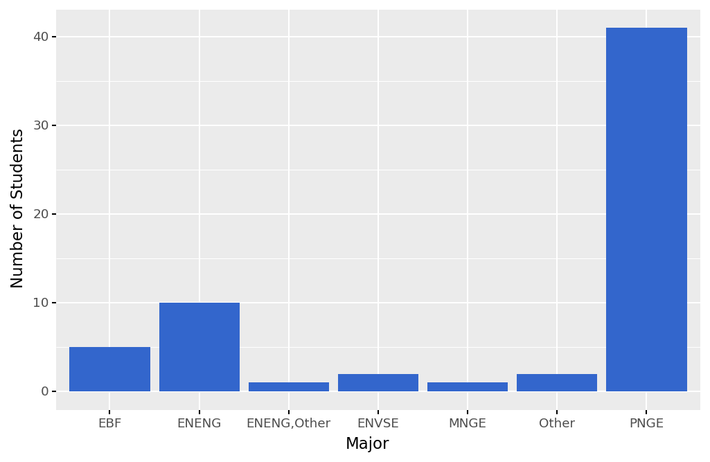
In this lesson, you will learn about various types of plots and how to create those in Python. In particular, we will start with plots that consider one variable. If the variable that you want to plot is a categorical variable, often you will want to create a bar plot, as shown below. Here, the variable we are plotting is the majors of students that took this survey, and on the y-axis we are showing the count of those majors. This type of plot can also be considered a graphical representation of a frequency table.
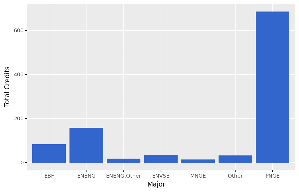
You can also use bar plots to show a quantitative variable that is separated by a category. For example, the plot below shows the total number of credit hours taken by students in the survey, separated by major. We can see that PNGE students took the most credit hours in total, largely because they represent the largest major that took the survey.
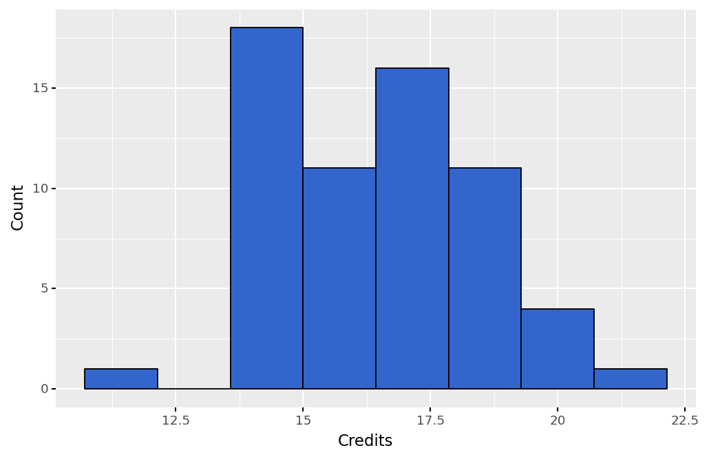
Another way that you can plot quantitative data is through histograms. Histograms are similar to bar plots, but they are only used to show counts of variables. Below, we show an example histogram that plots the credit hours taken by students in the survey. Plotting a histogram can also be a great way to visualize a variable's distribution.
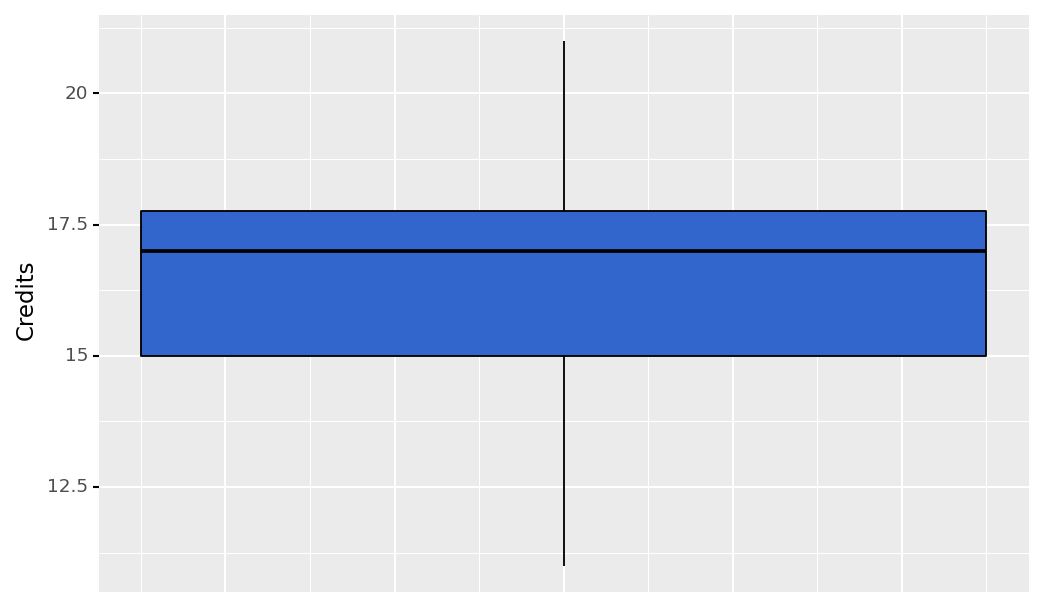
Similar to histograms, box plots can be used to visualize a distribution. They can also be used to identify the 5-number summary of a quantitative variable. Below, we show a boxplot of the credit hours taken by students. We can see the minimum value, the maximum value, the median, and the first and third quantiles. Additionally, box plots will show you which values, if any, are outliers. In this plot, we do not have any outliers.
 Assess It: Check Your Knowledge
Knowledge Check
 FAQ
FAQ
Introduction to Plotnine
Introduction to Plotnine
Read It: Introduction to Plotnine
In this course, we will be use the Plotnine library [2] to create plots in Python. Plotnine uses a style of plotting known as "Grammar of Graphics". The name stems from the idea that you build graphics from the bottom up using a specific syntax, similar to how you build a sentence up using specific grammar! For example, you could write a basic sentence: "The fox jumps." It has all of the necessary components, but is fairly simple. You could increase the complexity of the sentence by adding some adjectives: "The quick, brown fox jumps." Next, you could keep building this sentence with a preposition: "The quick, brown fox jumps over the dog." Finally, you could add another adjective, adding further complexity to the sentence: "The quick, brown fox jumps over the lazy dog." In this way, we will use the "Grammar of Graphics" to start simple and build the complexity of our plots.
There are three key components of any "Grammar of Graphics" (or "ggplot") plot:
-
This command starts the plotting object and specify the pandas dataframe that you are going to use for visualization1
ggplot(...) -
This command defines the variables that you are plotting1
aes(...) -
This command defines the type of plot. You can use points, lines, bars, and many others. For example, in today's tutorial, we use geom_bar as demo for plotting histogram.1
geom_xyz(...)
The most basic syntax, similar to our basic sentence above, is:
1 | ggplot(...) + geom_xyz(aes(...), ...) |
As the plots get more advanced, we can add things like labels:
1 | ggplot(...) + geom_xyz(aes(...), ...) + xlab(...) + ylab(...) |
Or axis controls via `theme`:
1 | ggplot(...) + geom_xyz(aes(...), ...) + xlab(...) + ylab(...) + theme(...) |
Other plotting tools in Python include matplotlib [3] and seaborn [4], but for the purpose of this co
Assess It
Knowledge Check
Bar Plots: One Variable
Bar Plots: One Variable
Read It: Bar Plots
In this lesson, we are going to demonstrate how to create bar plots using ggplot/Plotnine. First, however, we will need to prepare the dataset for plotting. This will involve importing the data, removing columns, and renaming columns.
 Watch It: Video - Importing and Cleaning the Data (9:03 minutes)
Watch It: Video - Creating Bar Plots with One Variable (5:45 minutes)
Below we will create two bar plots. The first will show a categorical variable with counts. The second will show a quantitative variable separated by category.
 Try It: Apply Your Coding Skills in Google Colab
- Click the Google Colab file used in the video is here [5].
- Go to the Colab file and click "File" then "Save a copy in Drive", this will create a new Colab file that you can edit in your own Google Drive account.
- Once you have it saved in your Drive, plot two bar plots by following the outline below:
Note: You must be logged into your PSU Google Workspace in order to access the file.
1 2 3 4 5 6 7 | from plotnine import * # import the library# fill in the blank (...) to plot a bar chart with 'Major' on the x-axis and the count on the y-axisggplot(survey) + ...# fill in the blank (...) to plot a bar chart with 'Major' on the x-axis and 'Credits' on the y-axisggplot(survey) + ... |
Once you have implemented this code on your own, come back to this page to test your knowledge.
Assess It: Check Your Knowledge
Knowledge Check
Box Plots
Box Plots
Read It: Box Plots
In this lesson, we are going to demonstrate how to create bar plots using ggplot/Plotnine.
Watch It: Video - Box Plots (6:24 minutes)
 Try It: Apply Your Coding Skills in Google Colab
- Click the Google Colab file used in the video is linked here [6].
- Go to the Colab file and click "File" then "Save a copy in Drive", this will create a new Colab file that you can edit in your own Google Drive account.
- Once you have it saved in your Drive, use the partial code below to create box plots using plotnine/ggplot. Alternatively, you can continue to build off of the code used in the bar plots example.
Note: You must be logged into your PSU Google Workspace in order to access the file.
1 2 3 4 5 6 7 | from plotnine import * # import the library # fill in the blank (...) to plot a box plot of 'Credits'ggplot(survey) + ... # fill in the blank (...) to plot a box plot with 'Major' on the x-axis and 'Credits' on the y-axisggplot(survey) + ... |
Once you have implemented this code on your own, come back to this page to test your knowledge.
Assess It: Check Your Knowledge
Knowledge Check
Visualization: Multiple Variables
Visualization: Multiple Variables
Read It: Visualization with Multiple Variables
So far in this lesson, you have learned about various types of plots that demonstrate one variable. In this lesson, we will extend these plots to include multiple variables.
First, we will return to bar plots. To add a third variable to a bar plot, you can create a fill variable, which can be used to show a categorical variable. Here, we are plotting a categorical variable on the y-axis (Emissions Scenario), a quantitative variable on the x-axis (Change in Emissions Relative to 2005), and a categorical variable as the fill (Source).

If we have two quantitative variables, we can plot a scatter plot. Below, we show a scatter plot of the maximum gas and the total gas extracted from wells in the Marcellus Shale.

When we have two quantitative variables, we can also begin to discuss the correlation or association between the two variables. For example, based on the plot above, we can say that the maximum and total gas extracted from a well are positively associated. However, if we want to quantitatively measure that association, we need to understand the correlation.
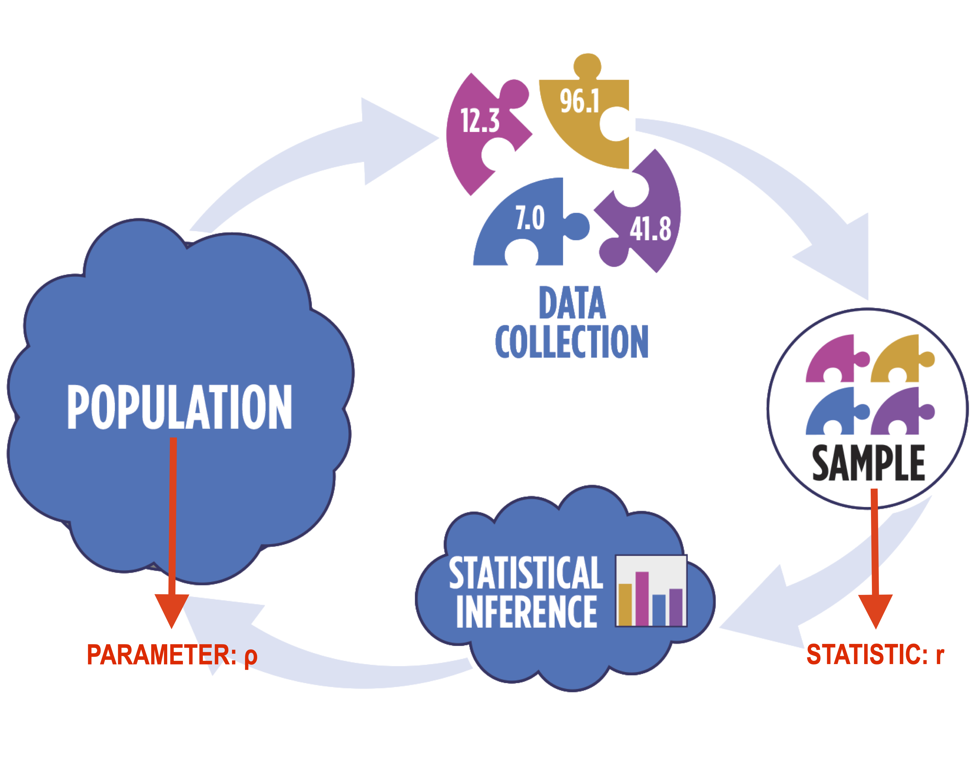
In particular, when working with correlation, you need to use distinct notation, as shown below. In particular, we use the Greek letter "rho" (ρ) to denote the population correlation and the Latin letter "r" to denote the sample correlation.
In terms of correlation, the values typically range from -1 to 1, with values at the edge of the range representing strong correlation (positive or negative, depending on the sign) while values closer to 0 represent weak correlation. The figure below shows possible correlation values. It is important to note, however, that correlation is only applicable to linear relationships! Non-linear relationships can have associations, but they will always have a correlation of 0, as shown below.
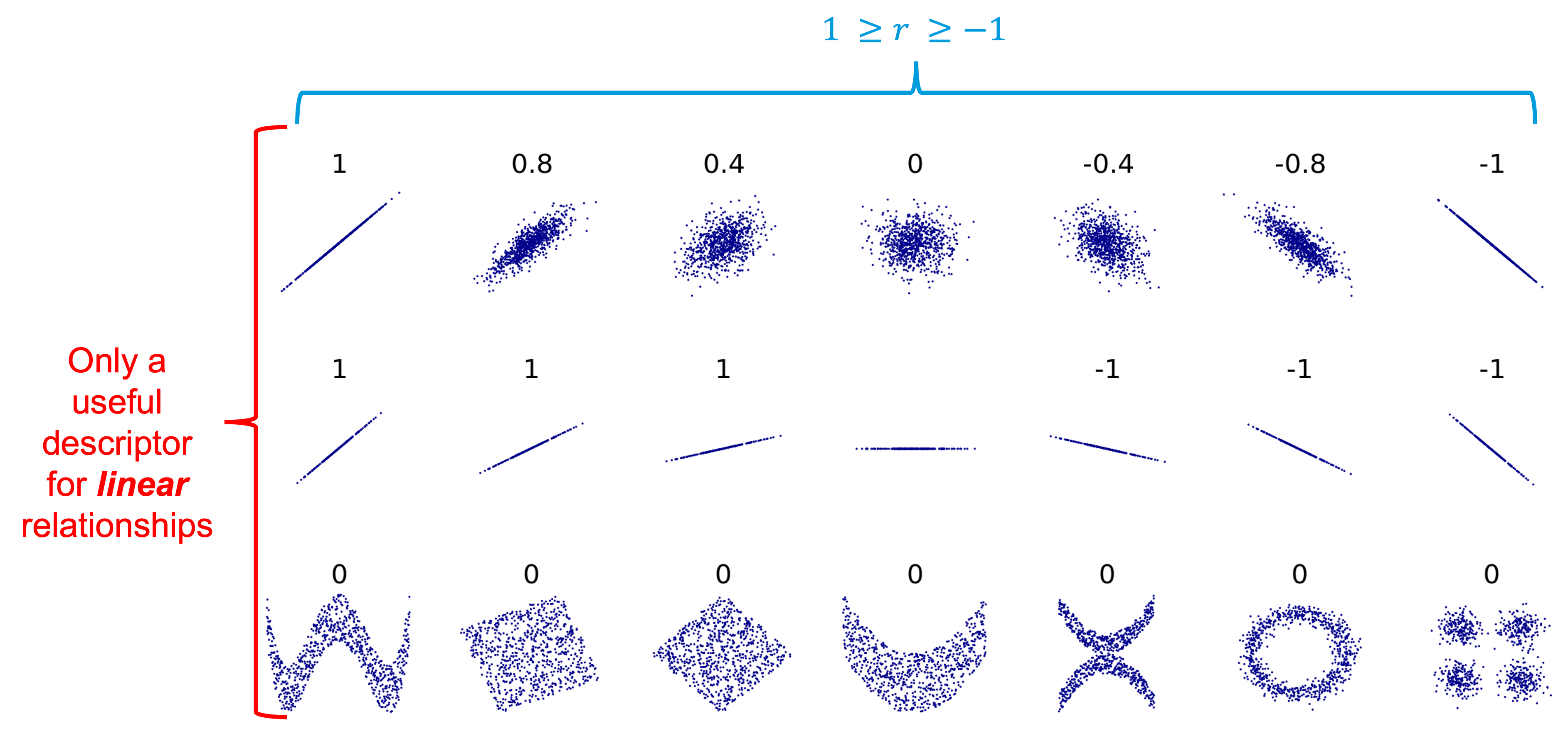
A good example of this is the line plot below, which shows the average hourly kWh produced by Dr. Morgan's solar panels in 2021. There is clearly an association between the time of day and the kWh production, but it is not linear, so the correlation coefficient will be 0.

A final important note when determining correlation is that correlation does NOT equal causation. For example, the plot below shows the number of people that have died in swimming pools plotted against the electricity generated by nuclear power plants in the US. The correlation coefficient is 0.90, which is very strongly positive! This correlation, however, doesn't mean that the increased use of nuclear power has caused the increased swimming pool deaths, simply that they have both increased at roughly the same rate over the years.

Assess It: Check Your Knowledge
Knowledge Check
FAQ
Bar Plots: Multiple Variables
Bar Plots: Multiple Variables
Read It: Bar Plots with Multiple Variables
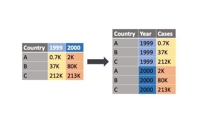
In this lesson, we are going to demonstrate how to create bar plots using ggplot/Plotnine. First, however, we will need to prepare the dataset for plotting. This will involve importing the data and melting the data to get it into "long" form. In other words, the melt command will convert the column names of select variables into their own categorical variable. For example, the code below will convert the data as shown in the figure.
1 | df.melt(id_vars='Country', value_vars=['1999', '2000'], var_name='Year', value_name='Cases') |
Below, we will demonstrate this command with the Emissions Scenarios dataset.
Watch It: Video - Importing and Cleaning the Data for Visualization (5:14 minutes)
Below, we will use the melted dataframe to create a bar plot with three variables.
Watch It: Video - Bar Plots with Multiple Variables (4:54 minutes)
Try It: Apply Your Coding Skills in Google Colab
- Click the Google Colab file used in the video is linked here [8].
- Go to the Colab file and click "File" then "Save a copy in Drive", this will create a new Colab file that you can edit in your own Google Drive account.
- Once you have it saved in your Drive, use the partial code below to create a multiple variable bar plot using plotnine/ggplot.
Note: You must be logged into your PSU Google Workspace in order to access the file.
1 2 3 4 5 | from plotnine import * # import the library # fill in the blank (...) to plot a bar plot with 'Category' on the y-axis, 'Emissions' on the x-axis, and 'Source' as the fill variableggplot(emsc_melt) + ... |
Once you have implemented this code on your own, come back to this page to test your knowledge.
Assess It: Check Your Knowledge
Knowledge Check
Scatter Plots
Scatter Plots
 Read It: Scatter Plots
Scatter plots can be used to plot two (or more) quantitative variables. Below, we will first demonstrate how to create a basic scatter plot. Then, we will show how to add a third categorical or quantitative variable to that plot.
Watch It: Video - Basic Scatter Plots (4:40 minutes)
Watch It: Video - Scatter Plots with Three Variables (6:04 minutes)
Try It: Apply Your Coding Skills in Google Colab
- Click the Google Colab file used in the video is linked here [9].
- Go to the Colab file and click "File" then "Save a copy in Drive", this will create a new Colab file that you can edit in your own Google Drive account.
- Once you have it saved in your Drive, use the partial code below to create scatter plots using plotnine/ggplot.
Note: You must be logged into your PSU Google Workspace in order to access the file.
1 2 3 4 5 6 7 8 9 10 | from plotnine import * # import the library # fill in the blank (...) to plot a scatter plot with 'MaxGas' on the x-axis and 'TotalGas' on the y-axisggplot(marc) + ... # fill in the blank (...) to add a best fit line to your scatter plot from aboveggplot(marc) + ... + stat_smooth(...)# fill in the blank (...) to add a third variable, 'PerfIntervalLength', to your plotggplot(marc) + ... + stat_smooth(...) |
Once you have implemented this code on your own, come back to this page to test your knowledge.
Assess It: Check Your Knowledge
Knowledge Check
Working with Times Series
Working with Times Series
Read It: Working with Time Series
Working with time series requires us to work with DateTime objects, which is a special data type in python. Below, we will present three videos that walk you through various ways to plot time series, as well as how to create and work with DateTime objects.
Watch It: Video - Basic Line Plots (2:56 minutes)
Watch It: Video - Creating and Working with DateTime Objects (7:01 minutes)
Watch It: Video - Using Statistics Within a Time Series Plot (5:29 minutes)
Try It: Apply Your Coding Skills in Google Colab
- Click the Google Colab file used in the video is here [10].
- Go to the Colab file and click "File" then "Save a copy in Drive", this will create a new Colab file that you can edit in your own Google Drive account.
- Once you have it saved in your Drive, use the partial code below to create scatter plots using plotnine/ggplot.
Note: You must be logged into your PSU Google Workspace in order to access the file.
1 2 3 4 5 6 7 8 9 10 11 12 13 14 15 16 | from plotnine import * # import the library # fill in the blank (...) to plot a line plot with 'Date' on the x-axis and 'Produced (kWh)' on the y-axisggplot(solar) + ...# fill in the blank (...) to subset all times > '2021-09-08' and < '09-09-2021'solar_subset = solar[(solar['DateTime'] > ...) ... (solar['DateTime'] < ...)]# fill in the blank (...) to plot a line plot with 'DateTime' on the x-axis and 'Produced (kWh)' on the y-axisggplot(solar_subset) + ... # fill in the blank (...) to plot the average hourly 'Produced (kWh)' with a 95% confidence interval ribbon(ggplot(solar) + stat_summary(..., geom = ..., fun_y = np.mean) + stat_summary(..., geom = ..., fun_data = 'mean_cl_boot', alpha = 0.5) ) |
Once you have implemented this code on your own, come back to this page to test your knowledge.
Assess It: Check Your Knowledge
Knowledge Check
Summary and Final Tasks
Summary
Through this lesson, you are now able to create visualizations in Python and differentiate between different types and purposes of various graphs. You plotted bar charts, box plots, scatter plots, and time series data. You will continue to grow and use these visualization skills throughout the course. Additionally, you learned how to work with time series data, which we will come back to later in the course.
Assess It: Check Your Knowledge Quiz
Reminder - Complete all of the Lesson 3 tasks!
You have reached the end of Lesson 3! Double-check the to-do list on the Lesson 3 Overview page to make sure you have completed all of the activities listed there before you begin Lesson 4.