Lesson 2: Types of data and summarizing data
Overview
Overview
The following section will define different types of data and variables, and will introduce you to some fundamental usage of Pandas along the way. This will lead into summarizing variables into "statistics": proportions and the mean, primarily.
Learning Outcomes
By the end of this lesson, you should be able to:
- Differentiate categorical vs. quantitative variables
- Examine how Python interprets different columns of a dataset
- Execute Python code to merge datasets
- Calculate frequency tables and two-way tables
- Determine a proportion from those tables
- Estimate the center of a set of quantitative values in two ways: the mean and the median
- Find the spread, or standard deviation, of some quantitative values
Lesson Roadmap
| Type | Assignment | Location |
|---|---|---|
| To Read | Lock, et. al.: 1, 2.1 | textbook |
| To Do |
Complete Homework H02: Data Structure & Categorical Variables Take Lesson 2 Quiz |
Canvas Canvas |
Questions?
If you prefer to use email:
If you have any questions, please send a message through Canvas. We will check daily to respond. If your question is one that is relevant to the entire class, we may respond to the entire class rather than individually.
If you prefer to use the discussion forums:
If you have questions, please feel free to post them to the General Questions and Discussion forum in Canvas. While you are there, feel free to post your own responses if you, too, are able to help a classmate.
Variables, Data Types, and Other Important Terminology
 Read It: Important Terminology
First, recall our table from Lesson 1:
| HOME ID | DIVISION | KWH |
|---|---|---|
| 10460 | Pacific | 3491.900 |
| 10787 | East North Central | 6195.942 |
| 11055 | Mountain North | 6976.000 |
| 14870 | Pacific | 10979.658 |
| 12200 | Mountain South | 19472.628 |
| 12228 | South Atlantic | 23645.160 |
| 10934 | East South Central | 19123.754 |
| 10731 | Middle Atlantic | 3982.231 |
| 13623 | East North Central | 9457.710 |
| 12524 | Pacific | 15199.859 |
* Data Source: Residential Energy Consumption Survey (RECS) [1], U.S. Energy Information Administration (accessed Nov. 15th, 2021)
You may already be familiar with talking about the parts of this table as rows and columns. In Data Analytics, one goal of preparing data for subsequent analysis is to get the data into a table (or DataFrame, if using Pandas), such that each row represents a case or unit, and each column represents a variable:
- Rows: cases or units
- Columns: variables
Let's further define these new terms:
Cases or units: the subjects or objects for which we have data
Variable: any characteristic that is recorded for the cases
So, in the example table above, the cases are individual homes (identified by HOME ID), and the variables are DIVISION (geographic region in the U.S.) and KWH (electricity usage).
Types of Variables
For this course, it is important to distinguish two different variables:
Categorical variable: divides the cases into groups, placing each case into exactly one of two or more categories
Quantitative variable: measures or records a numerical quantity for each case
This distinction is important because the type of variables determines what sorts of analyses and methods can be applied to it. Following the example table above, DIVISION is a categorical variable and KWH is a quantitative variable (since it reports the quantity of energy used by each house).
Yet another way to distinguish variables is based on their purpose or role in the intended analysis, if the analysis is looking at relationships between two or more variables:
Response variable: the variable for which an understanding, inference, or prediction is desired
Explanatory variable: used to do the understanding, inference, or prediction of the response variable
So, for example, if we hypothesized that geographic location somehow affects electricity usage, then KWH would be the response variable and DIVISION would be the explanatory variable. In other words, we would want to see whether or not DIVISION explains how KWH responds. Furthermore, this relationship can be swapped: if the hypothesis was that electricity can identify in which region a home resides, then KWH is now the explanatory variable and DIVISION is the response. In other words, KWH could, perhaps, explain the DIVISION.
Data Types in Python
There are many data types in Python and Pandas. Let's focus on some of the common ones that are also relevant for this course.
Any categorical variables should be represented by data type:
category: which contains a finite list of text values
This is not to be confused with:
str or object: string (text; characters), which do not necessarily define categories
Quantitative variables will typically show up as:
int or int64: integers (whole numbers)
or
float or float64: floating-point number (decimal; continuous valued)
Note that categories could just as well be labeled with numbers as they could with text, so just because a variable has numbers in it does not necessarily mean that it is quantitative.
Lastly, one other Pandas data type that will come up in the course because it is especially important when analyzing energy generation and consumption is:
datetime64: a calendar date and/or time
 Watch It: Video - Investigating and Naming Columns in Datasets (13:43 minutes)
 Try It: DataCamp: Identify Data Types
The Pandas function for identifying data types is dtype. See it in action here:
We can see that house and state are both object (text), whereas monthly energy usage is int (numerical). We've previously identified state as a categorical variable, but it is not showing up as such in the code output above. In order to tell Python to recognize state as a categorical variable, we need to add another line of code:
The astype function can be used to convert to other data types as well (for example, from int to float).
A Note on Data Collection
Now, although the table above is good, in its simplicity, for illustrating these important terms and types of variables, it is a bad dataset for investigating the sort of relationship hypothesized above. This is because the sample size is too small; we've only sampled three houses out of a tremendously larger population. Therefore, we do not expect to have adequate representation of the whole population of houses. We will talk more about sample size in the coming lessons, as this is a very important aspect of conducting experiments and surveys ("Data Collection"). Usually, larger sample sizes incur larger costs. However, you need a sufficiently large sample size to ensure that you have adequate representation. Besides having a large enough sample size, it is also important to have a sample of data that is unbiased. In other words, we do not want our data to disproportionately represent one group in the population, which is called "sampling bias". There are other forms of bias, but let's limit our discussion to just sampling bias for now. The main way to combat this form of bias is to collect a random sample.
Random sample: each case in the population has an equal chance of being selected in a sample of size n cases. The goal is to avoid sampling bias.
Therefore, in examining a dataset like that which is in the table above, it is important to know how the data were collected.
 Assess It: Check Your Knowledge
Knowledge Check
Use the table below to answer the following questions.
| Make | Model | Type | City MPG |
|---|---|---|---|
| Audi | A4 | Sport | 18 |
| BMW | X1 | SUV | 17 |
| Chevy | Tahoe | SUV | 10 |
| Chevy | Camaro | Sport | 13 |
| Honda | Odyssey | Minivan | 14 |
 FAQ
FAQ
Data Manipulation: Merging DataFrames
Read It: Merging DataFrames
Often, one can perform more interesting and meaningful analyses by using larger datasets, with more variables and/or cases. One way of creating new, sizeable DataFrames is by merging multiple smaller DataFrames. The merge function in Pandas makes the task or merging two DataFrames (let's call them LeftDataFrame and RightDataFrame) relatively easy:
1 | LeftDataFrame.merge(RightDataFrame, how='inner', on=key) |
Here, we are just focusing on just the main inputs to the merge function, and one can view the documentation [3] to see the other optional inputs. To start, "key" is a variable (or set of variables) common to both DataFrames, and that we want to use as the basis for merging the two DataFrames. Usually, "key" identifies the unique cases in each DataFrame. The argument "how" indicates which rows to keep from the DataFrames. To explain this further, let's examine each of the four possible methods for "how"
1.) how = 'inner'
To begin, consider both DataFrames as a Venn diagram, where each circle represents the values of the "key" variable contained within that DataFrame:
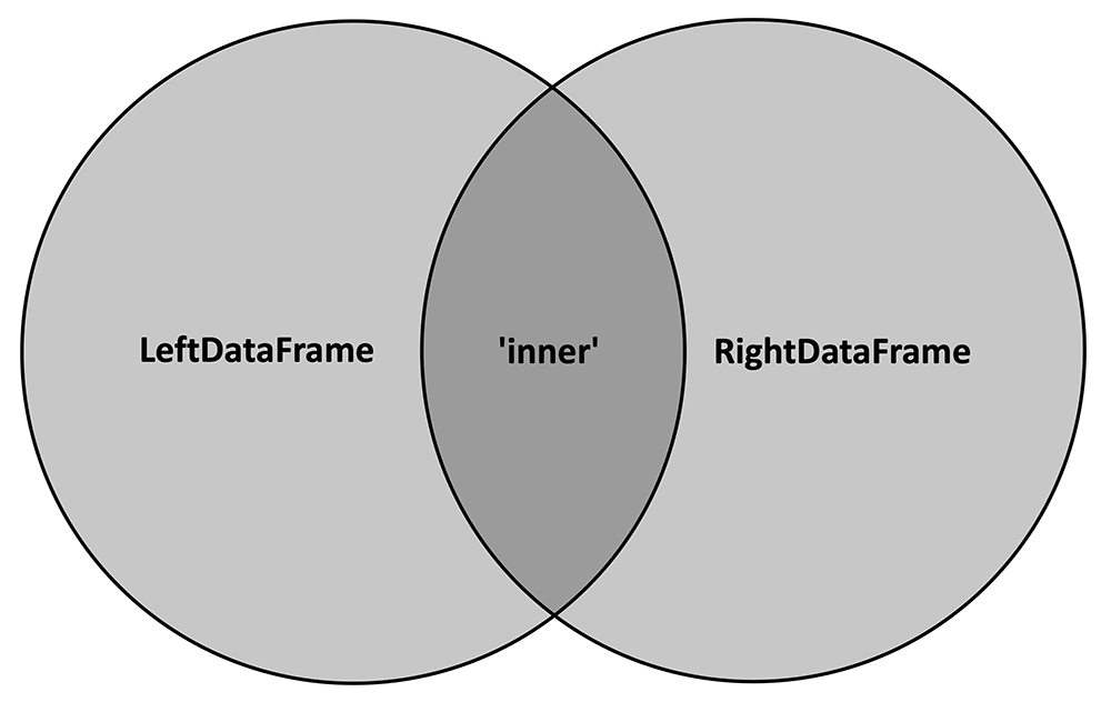
The 'inner' merge method will only keep the key values that are common to both DataFrames, or, in other words, the intersection of the two circles. The following cartoon depicts how this method would work on two example DataFrames:
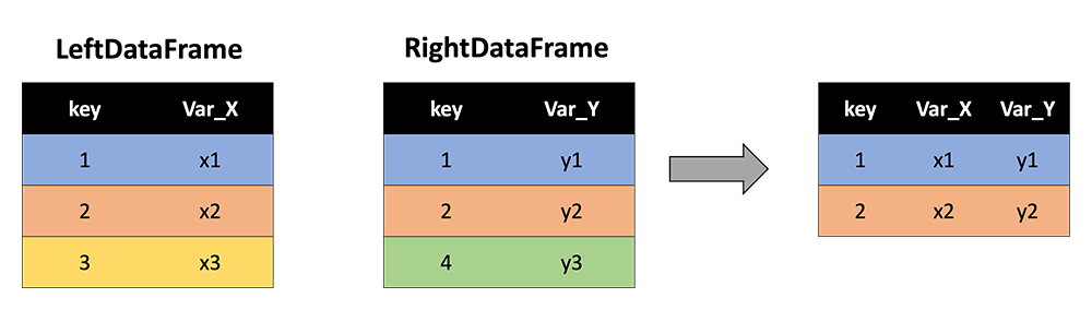
Note that key values of 3 and 4 are dropped because 3 is not contained in RightDataFrame and 4 is not contained in LeftDataFrame. Only 1 and 2 are retained since they are common to both DataFrames. Further, note that the resultant DataFrame contains all variables (columns) from each of the two input DataFrames (and "key" is not repeated).
2.) how = 'outer'
In contrast to the 'inner' method, 'outer' keeps all the key values from both DataFrames, or, in other words, the union of the two circles in the Venn diagram:
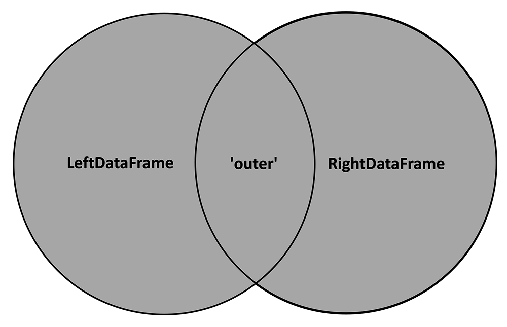
With 'outer' applied, our cartoon with the two example DataFrames now looks like this:
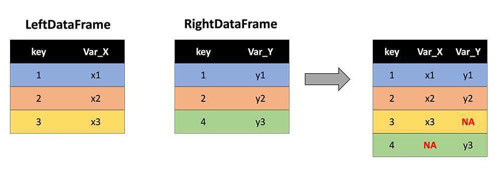
Now key values of 3 and 4 are retained, and NA values are inserted where either Var_X or Var_Y are not observed.
As a special use case, if one wishes to simply "stack" two DataFrames (say, with identical variable names but different rows/keys), they can use 'outer' and leave the on argument blank (defaults to all columns).
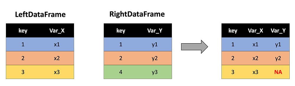
3.) how = 'left'
The 'left' method keeps all the rows with keys from the LeftDataFrame:
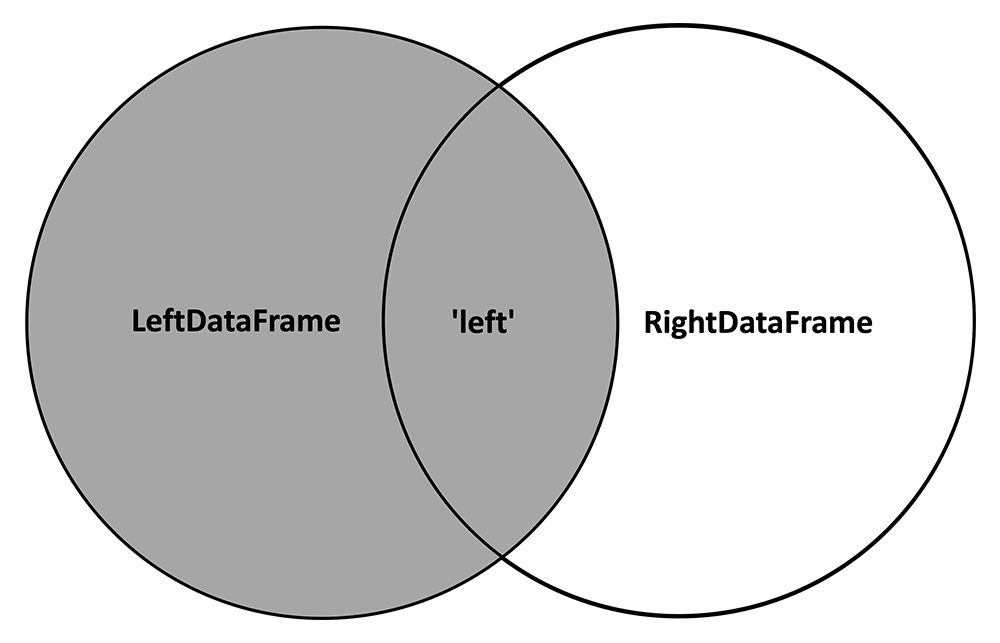
And inserts NA values where variables from the RightDataFrame are not observed:
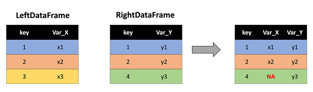
4.) how = 'right'
In contrast, the 'right' method keeps all the rows with keys from the RightDataFrame:
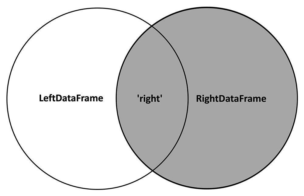
And inserts NA values where variables from the LeftDataFrame are not observed:
Watch It: Video - Datatypes in Python (13:43 minutes)
Try It: DataCamp - Merge Two DataFrames
In the exercise below, you are given two DataFrames:
| HOME ID | DIVISION | KWH |
|---|---|---|
| 10460 | Pacific | 3491.900 |
| 10787 | East North Central | 6195.942 |
| 11055 | Mountain North | 6976.000 |
| 14870 | Pacific | 10979.658 |
| 12200 | Mountain South | 19472.628 |
| 12228 | South Atlantic | 23645.160 |
| 10934 | East South Central | 19123.754 |
| 10731 | Middle Atlantic | 3982.231 |
| 13623 | East North Central | 9457.710 |
| 12524 | Pacific | 15199.859 |
| HOME ID | CLIMATE | TOTAL SQUARE FEET |
|---|---|---|
| 13623 | Cold/Very Cold | 1881 |
| 11055 | Cold/Very Cold | 2455 |
| 10460 | Marine | 800 |
| 12200 | Hot-Dry/Mixed-Dry | 3800 |
| 12524 | Marine | 1110 |
| 10332 | Hot-Dry/Mixed-Dry | 1630 |
| 12106 | Cold/Very Cold | 5184 |
| 11718 | Mixed-Humid | 1812 |
| 14500 | Marine | 2195 |
| 13193 | Marine | 847 |
* Data Source: Residential Energy Consumption Survey (RECS)(link is external) [1], U.S. Energy Information Administration (accessed Nov. 15th, 2021)
Note that these two DataFrames share some of the same cases, identified by "HOME ID" (a numeric idenifier unique to each home). In the exercise below, start by seeing what happens when you perform an 'inner' merge:
How does the resulting DataFrame change when you peform an 'outer' merge? A 'left' merge? A 'right' merge? Pay attention to which rows are kept and where NA values are inserted.
Assess It: Check Your Knowledge
Knowledge Check
FAQ
Data Manipulation: Logic and Subsetting
The last section discussed how to build a new larger DataFrame by merging two DataFrames. When a large DataFrame has too much unnecessary data for the intended analysis, it is useful to subset it to a smaller DataFrame that only contains the relevant data. In this section, we'll discuss two common forms of subsetting: 1.) subsetting observations (rows), and 2.) subsetting variables (columns)
Read It: Subsetting
0.) Logic
Before we actually introduce how to subset a DataFrame, we need to first cover logic in Python. Logical statements in Python are also called "Boolean operators", and that is because the result of a logical statement is a Boolean variable, or a binary variable containing "True" (the logical condition is met) or "False" (the logical condition is not met). Forms of logic in Python are listed in the table below:
| Code | Meaning |
|---|---|
< |
Less than |
> |
Greater than |
== |
Equals |
!= |
Does not equal |
<= |
Less than or equal to |
>= |
Greater than or equal to |
pd.isnull(obj) |
is Nan |
pd.notnull(obj) |
is not Nan |
& |
and |
! |
or |
~ |
not |
df.any() |
any |
df.all() |
all |
Try it: Logic
Note that the logical statement returns a vector of the same length as x, with a True in the position where the condition is met and a False in positions where the condition isn't met. Try out some of the other logical statements in the table above. How does the output change?
Since & and ! combine two logical statements, the logical statements that are being combined need to be enclosed in parentheses. For example, try print( (x > 3) & (x < 5) ) in the code above.
1.) Subsetting observations (rows)
These logical statements can then be used to subset DataFrames by selecting and returning only those rows that meet the conditions (yield True). This sort of filtering works by replacing x in the code above with a reference to a variable in the DataFrame, and enclosing the logical statement in [] immediately after the name of the DataFrame. The example below uses the table of household energy use from previous sections:
| HOME ID | DIVISION | KWH |
|---|---|---|
| 10460 | Pacific | 3491.900 |
| 10787 | East North Central | 6195.942 |
| 11055 | Mountain North | 6976.000 |
| 14870 | Pacific | 10979.658 |
| 12200 | Mountain South | 19472.628 |
| 12228 | South Atlantic | 23645.160 |
| 10934 | East South Central | 19123.754 |
| 10731 | Middle Atlantic | 3982.231 |
| 13623 | East North Central | 9457.710 |
| 12524 | Pacific | 15199.859 |
Try it: Subsetting
Suppose we only want to retain those houses (rows) that use more than 10,000 KWH. We can perform the following:
Another way to accomplish this filtering would be to do df.query('KWH > 10000'). Try out some other logical statements in the code above and see how the resulting DataFrame is subset. Note that Division is a categorical variable whose values are strings (text). Make sure that, when referring to these values, you put them in quotes: df[ df.Division == 'East North Central' ].
Some other useful functions for subsetting by rows include:
| Code | Meaning |
|---|---|
df.head(n) |
Select first n rows (useful for understanding contents of a DataFrame). |
df.tail(n) |
Select last n rows. |
df.nlargest(n, 'variable') |
Select rows containing the largest n values in variable. |
df.nsmallest(n, 'variable') |
Select rows containing the smallest n values in variable. |
df.drop_duplicates() |
Remove rows with identical values. |
2.) Subsetting variables (columns)
Unlike rows which can be identified by the values they contain, variables (columns) in a DataFrame are referred to by name, and these names should be unique. We've actually already seen subsetting by variable in action above, in the form of:
df.KWH
which can alternatively be written as
df['KWH']
Multiple columns can be selected by including a list in the square brackets: df[ ['HOME ID', 'KWH'] ].
df.columns may be useful for finding the column names.
Watch It: Video - Roshambo (7:45 minutes)
Assess It: Check Your Knowledge
Knowledge Check
FAQ
Roshambo: Frequency Tables and Proportions
Read It: Roshambo
Roshambo (a.k.a., Rock, Paper, Scissors) is a tried-and-true method for settling disputes. In this game, two opponents synchronously state "Rock... Paper... Scissors... Shoot!", and on "Shoot!", each has to display one of three choices with their hand: Rock, Paper, or Scissors. The outcome is determined by:
| Player 1 | ||||
|---|---|---|---|---|
| Rock | Paper | Scissors | ||
| Player 2 | Rock | Tie, play again | Player 1 wins | Player 2 wins |
| Paper | Player 2 wins | Tie, play again | Player 1 wins | |
| Scissors | Player 1 wins | Player 2 wins |
Tie, play again |
|
Try It: Roshambo
Your response given in the form above will be randomly paired with another response, and the outcome will be stored in a dataset, which is to be used in the coding exercise further below. But first, let's learn about frequency tables and proportions.
 Learn It: Frequency Tables
Frequency tables list how many times each category appears within a categorical variable. These tables plainly show which categories are the most common, and which are rarely observed. The Pandas function that we will use to make a frequency table is "value_counts". Run the DataCamp code below to see how it works:
It is important to remember that "value_counts" works on a Series, and not a DataFrame. We pass "value_counts" a column from a DataFrame in the example above.
Learn It: Proportions
A proportion, , is the fraction of cases in a population that have a certain value or meet some criteria. From a data sample, the statistic is:
It is easy to calculate a sample proportion from a categorical variable using the output from "value_counts".
Watch It: Video - Importing Files (9:16 minutes)
Try It: DataCamp - Find a Frequency Table and Proportion from Roshambo Data
Using the examples above, see if you can find: 1) a frequency table of Rock, Paper, and Scissors played, and 2) the proportion of times that Rock was played:
Assess It: Check Your Knowledge
Knowledge Check
Use the table below to answer the following questions.
| Make | Model | Type | City MPG |
|---|---|---|---|
| Audi | A4 | Sport | 18 |
| BMW | X1 | SUV | 17 |
| Chevy | Tahoe | SUV | 10 |
| Chevy | Camaro | Sport | 13 |
| Honda | Odyssey | Minivan | 14 |
FAQ
More Roshambo: Two-Way Tables
Read It: Two-Way Tables
In the previous section, we saw how frequency tables displayed the counts of observations in each category of a single categorical variable. However, sometimes it is useful to see how these counts change across the categories of a second categorical variable. A "two-way table" gives the counts of observations in each and every combination of categories from two different categorical variables:
| Category A | Category B | Category C | |
|---|---|---|---|
| Category 1 | # of observations in A and 1 | # of observations in B and 1 | # of observations in C and 1 |
| Category 2 | # of observations in A and 2 | # of observations in B and 2 | # of observations in C and 2 |
| Category 3 | # of observations in A and 3 | # of observations in B and 3 | # of observations in C and 3 |
Let's look at a more interesting example that Dr. Morgan found on Instagram:

We are given a proportion here: 50% (well, actually "over 50%", but let's just round down to 50%). This could easily be exchanged with the actual count of people, so let's treat the proportion synonymously with the count for this discussion. What is the categorical variable here? Race, with the categories "people of color" and "not people of color" (or, "white"). What does the frequency table look like?
| Race | Frequency (near Haz. Waste Site) |
|---|---|
| People of Color | 50% |
| White | 50% |
However, this frequency table alone doesn't give the full picture. In other words, the 50% quoted in the picture above doesn't signify much without more context. What is that context? We need to know how many people of each race category in the U.S. as a whole. In other words, we need to compare the frequency of each race near the hazardous waste sites to the baseline frequency. If the rest of the U.S. is 50% people of color to begin with, then the statement in the picture above isn't significant at all. However, according to the 2020 U.S. Census [4], this isn't the case:
| Location | ||
|---|---|---|
| Race | Near Haz. Waste Site | In all of U.S. |
| People of Color | 50% | 38.4% |
| White | 50% | 61.6% |
Here, the two-way table allows us to see that the proportion of those living near hazardous waste sites is disproportionately comprised of people of color compared to the rest of the U.S. In summary, two-way tables allow us to make some pretty powerful comparisons of frequencies across two categorical variables.
Making two-way tables in Python is very easy, using the crosstab function from Pandas. The following video demonstrate the use of this function, as well as finding proportions from the resulting two-way table.
Watch It: Two-Way Tables (9:43 minutes)
Try It: DataCamp - More Roshambo
Continuing with the Roshambo exercise from the previous page, can you find the proportion of those who played Rock, ended up winning? First find the appropriate two-way table and reference the values in that table to find the appropriate proportion.
By inspection of the table, do the data suggest that one option is more favorable to play?
Assess It: Check Your Knowledge
Knowledge Check
Use the table below to answer the following questions.
| Make | Model | Type | City MPG |
|---|---|---|---|
| Audi | A4 | Sport | 18 |
| BMW | X1 | SUV | 17 |
| Chevy | Tahoe | SUV | 10 |
| Chevy | Camaro | Sport | 13 |
| Honda | Odyssey | Minivan | 14 |
FAQ
Summarizing Quantitative Data: Histograms and Measures of Center
Read It: Histograms
Let's start our discussion with histograms, because this particular form of data visualization is useful for illustrating the measures of center that we discuss a little later in this section. Histograms simply show the number (or "Count") of observations whose values fall within pre-defined intervals (or "bins"). There are many ways to make a histogram in Python, and a convenient method is in the Pandas library, where one applies the function hist to any quantitative variable:
df['x'].hist()
where you would replace df with your dataframe name and x with the variable name. The height of the columns indicates the relative number of observations in each interval. For example, in the histogram below, the tallest column belongs to the interval 0 to 0.1.
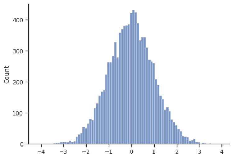
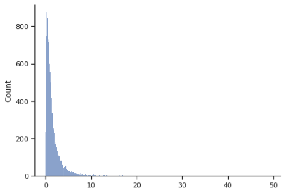
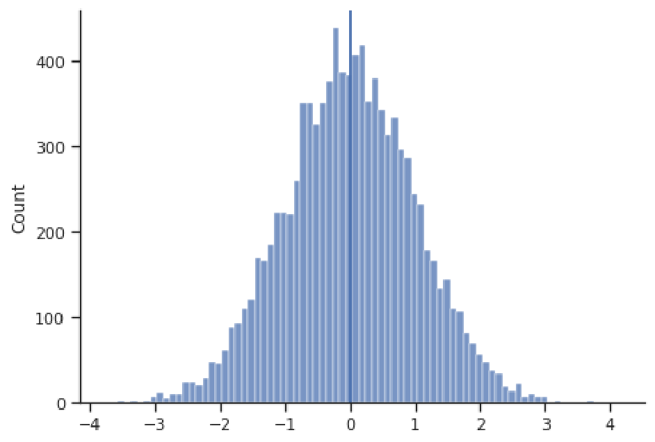
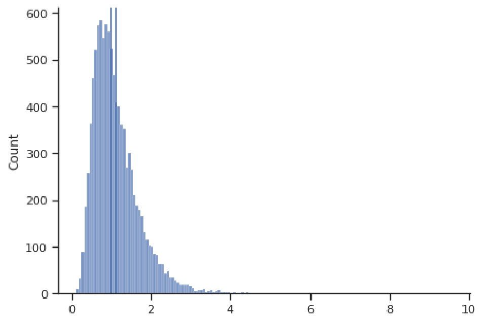
Histograms effectively visualize the distribution of a quantitative variable, showing us what values that variable spans (i.e., the minimum and maximum), where most values are concentrated, and how spread-out typical values are. Some typical shapes of histograms are represented in this section. In the figure above, we have a bell-shaped and symmetric distribution, in which the counts fall off in a similar pattern above and below the center (this example happens to be centered at 0). The next figure shows an example of a right-skewed distribution, where observations are concentrated at lower values, with fewer observations at much larger values. This distribution appears to have a "tail" going off to the right. Note that the values need not be concentrated at 0, or even be positive; these are just features of this example.
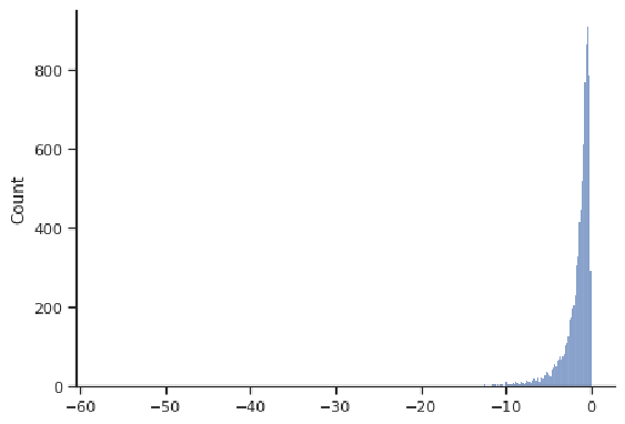
The next figure shows a left-skewed distribution, with a "tail" going off to the left. Most observations are concentrated at larger values. Note that the values need not be concentrated at 0, or even be negative; these are just features of this example.
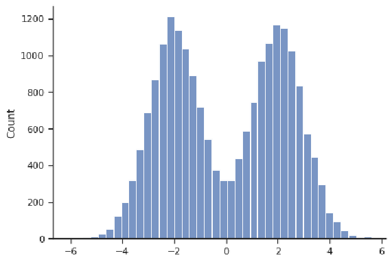
An example of a distribution that is symmetric but not bell-shaped is depicted below. Even though it is centered at 0, that is not where most values are concentrated. This particular example is "bimodal", in that it has two locations where values are concentrated (about -2 and 2).
Read It: Measures of Center
Most often, the primary characteristic of interest for a distribution of data is its center, because one wants to know the most representative value for the variable of interest. in the example below, even though we witness values as large as 4 and as small as -4, these are very rare; the most common values are close to the center at approximately 0.
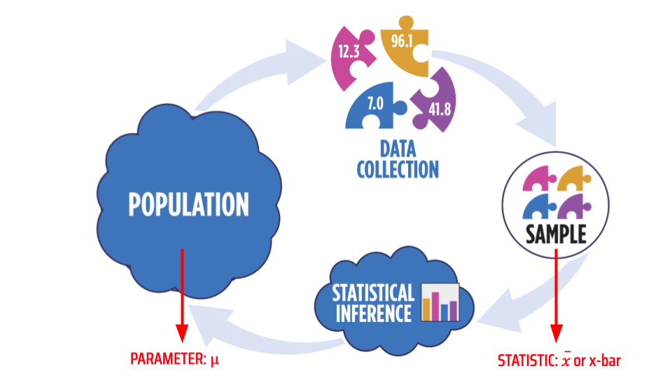
Here, n is the length of x, or the number of values in that vector. When someone talks about the "average", they usually are referring to the mean. When one calculates the mean from a sample of data, we call that the "sample mean" and note it with $\bar{x}$ or "x-bar", whereas the mean of the entire population is noted with $\mu$ or "mu" (a Greek letter). The image below shows this distinction in notation graphically. Throughout this course, whenever we talk about a value that characterizes the population, we refer to that as a "parameter"; and when we talk about a value calculated from a sample, we call that a "statistic".
Another measure of the center of a distribution is the median, which is the middle value after you sort the values from lowest to highest (or the mean of the middle two if there are an even number of values):
Median:
- If is odd, median is middle value of ordered data values
- If is even, median is mean of the middle two values of ordered data values
The median value is noted with m.
A third measure of the center of a distribution is the mode, which is simply the value that appears most often in a variable:
Mode: The value that appears most frequently
We won't work with the mode much in this course, as it is a less useful measure of the center. Often with quantitative variables, the mode cannot be calculated because each value is unique. It is better applied to ranges of values (e.g., comparing the heights of bins in the histograms above), or for categorical data, where values do tend to repeat and one usually sees a distinct category with more observations.
The mean is more affected by skewness (and outliers) than the median!
For symmetric distributions, the mean and median will agree upon the measure of the center. Take the example below, where the mean estimates the center at 0.004 and the median at 0.005. Although not exactly equal, these values are very close (indeed, both are represented by vertical dark blue lines, which are indistinguishable because they plot right on top of one another).
However, for skewed distributions, the mean and median will generally not agree, and the more skewed the distribution, the more these two estimates will disagree. The reason for this disagreement is that the mean will be more influenced by the extreme values in the tail of the distribution, since it sums the values in the numerator. The median doesn't care about the magnitude of the values, just their rank in terms of smallest to largest. Take for example the right-skewed distribution below, where the mean is 1.123 and significantly greater than the median of 0.993 (here the two dark blue vertical lines representing these values are distinguishable). The large positive values in the right tail have led to a larger mean than the median.
Thus, the median tends to give a more stable measure of the center that is robust to extreme values and outliers. For this reason, the median is often the go-to measure of the center for skewed distributions, such as salaries and housing prices, for example.
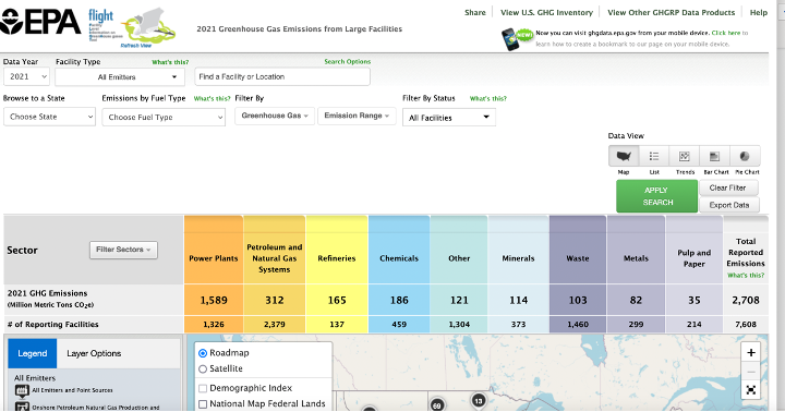
Read It: EPA Flight Tool
In the videos below use data from EPA's Greenhouse Gas Reporting Program (GHGRP [5]) to demonstrate how to make histograms and find the mean and median in Python. You may want to first explore the EPA's web app: Facility Level Information on GreenHouse gases Tool (FLIGHT [6]). This will help you understand the content of the dataset, which gives volumes of emissions from power plants, factories, refineries, etc. across the country.
Watch It: Measures of Center (10:39 minutes)
Watch It: Measures of Center Part 2 (6:16 minutes)
Try It: DataCamp - Find the mean and median
Let's return to our sample of residential energy use, which gives the total electricity consumed in a year (KHW):
| HOME ID | DIVISION | KWH |
|---|---|---|
| 10460 | Pacific | 3491.900 |
| 10787 | East North Central | 6195.942 |
| 11055 | Mountain North | 6976.000 |
| 14870 | Pacific | 10979.658 |
| 12200 | Mountain South | 19472.628 |
| 12228 | South Atlantic | 23645.160 |
| 10934 | East South Central | 19123.754 |
| 10731 | Middle Atlantic | 3982.231 |
| 13623 | East North Central | 9457.710 |
| 12524 | Pacific | 15199.859 |
* Data Source: Residential Energy Consumption Survey (RECS)(link is external) [1], U.S. Energy Information Administration (accessed Nov. 15th, 2021)
Can you use Python to determine, from this sample, the typical annual home electricity use? Find both the mean and median.
Assess It: Check Your Knowledge
Use the table below to answer the following questions.
| Make | Model | Type | City MPG |
|---|---|---|---|
| Audi | A4 | Sport | 18 |
| BMW | X1 | SUV | 17 |
| Chevy | Tahoe | SUV | 10 |
| Chevy | Camaro | Sport | 13 |
| Honda | Odyssey | Minivan | 14 |
FAQ
Summarizing Quantitative Data: Measures of Spread
Read It: Measures of Spread: Standard Deviation
In addition to knowing the center of a distribution of data values, it is often useful to know how dispersed or spread-out the distribution it. A common measure of this spread is the standard deviation:
Standard Deviation: the typical distance of a data value from the mean.
A larger standard deviation indicates a more dispersed collection of values, whereas a smaller standard deviation indicates a narrower distribution. To make the interpretation of the standard deviation more quantitative: a new, randomly drawn value from the population will have a 95% chance of being within the range -2 to +2 standard deviations from the mean (i.e., ). This is depicted in the example image below.
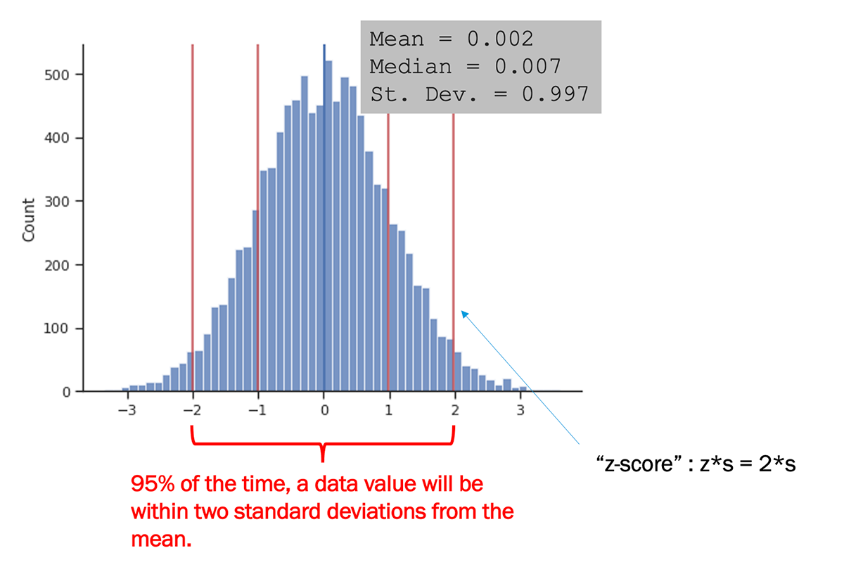
The image above also introduces the z-score, which we will come back to later in the course. The z-score, , is simply the number (or fraction) of standard deviations that a value is from the mean. The z-score can be reported for a data point, or for a hypothetical value, such as the far right red line in the example above (where ).
A Note on Notation
The formula above gives the standard deviation for a sample, noted s. The standard deviation for the entire population is noted with (or "sigma", a Greek letter).

Watch It: Video - Measures of Spread (4:36 minutes)
The above video demonstrates how to calculate standard deviation using the std function from Pandas. There is also a std function from Numpy, however in order to use that function to calculate standard deviation as given in the above formula, you need to specify the argument ddof=1 to represent the 1 being subtracted from n in the denominator:
1 | numpy.std(x, ddof=1) |
where x is an array of values.
Try It: DataCamp - Find the standard deviation
You already found the mean and median of the total electricity consumed in a year (KHW) in the previous page.
| HOME ID | DIVISION | KWH |
|---|---|---|
| 10460 | Pacific | 3491.900 |
| 10787 | East North Central | 6195.942 |
| 11055 | Mountain North | 6976.000 |
| 14870 | Pacific | 10979.658 |
| 12200 | Mountain South | 19472.628 |
| 12228 | South Atlantic | 23645.160 |
| 10934 | East South Central | 19123.754 |
| 10731 | Middle Atlantic | 3982.231 |
| 13623 | East North Central | 9457.710 |
| 12524 | Pacific | 15199.859 |
* Data Source: Residential Energy Consumption Survey (RECS)(link is external) [1], U.S. Energy Information Administration (accessed Nov. 15th, 2021)
Now can you find the standard deviation using Python?
Assess It: Check Your Knowledge
Use the table below to answer the following questions.
| Make | Model | Type | City MPG |
|---|---|---|---|
| Audi | A4 | Sport | 18 |
| BMW | X1 | SUV | 17 |
| Chevy | Tahoe | SUV | 10 |
| Chevy | Camaro | Sport | 13 |
| Honda | Odyssey | Minivan | 14 |
FAQ
Summary and Final Tasks
Summary
In Lesson 2, you've learned about different types of variables: categorical versus quantitative. You've also learned about corresponding data types in Python, both how to recognize those types and change a variable from one type to another. Lesson 2 has presented a lot of basic tools, mostly coming from the Pandas library in Python, for data manipulation and processing. These tools are essential from going from the raw imported data to a useful DataFrame, from which we can easily perform subsequent analyses. Lesson 2 ended with some very basic analyses, in the context of summarizing data: finding proportions, means, medians, standard deviations, and other summary statistics.
As you continue through this course, you may find the Pandas cheet sheet [7] to be a handy reference to the functions we've covered in this lesson.
Assess It: Check Your Knowledge Quiz
Use the table below to answer the questions below.
| Make | Model | Type | City MPG |
|---|---|---|---|
| Audi | A4 | Sport | 18 |
| BMW | X1 | SUV | 17 |
| Chevy | Tahoe | SUV | 10 |
| Chevy | Camaro | Sport | 13 |
| Honda | Odyssey | Minivan | 14 |
Reminder - Complete all of the Lesson 2 tasks!
You have reached the end of Lesson 2! Double-check the to-do list on the Lesson 2 Overview page to make sure you have completed all of the activities listed there before you begin Lesson 3.