Lesson 8: Linear regression
Lesson 8: Linear regression
Overview
Overview
Recall from Lesson 3 that you learned how to create scatter plots with a best fit line. When you created this plot, you were visualizing the result of linear regression! In this lesson, we will delve deeper into linear regression, as well as return to the concept of correlation that we introduced earlier in the course. We will discuss the traditional way of conducting linear regression in addition to several built-in functions in Python. You will learn how to implement linear regression, run hypothesis tests for various parts of the linear regression analysis, and interpret results from the different analyses.
Learning Outcomes
By the end of this lesson, you should be able to:
-
assess whether two variables are associated based on their correlation coefficient
-
explain the simple linear model; solve for the slope and intercept of a regression line in Python
-
test a calculated slope value for significance
-
interpret R-squared values
-
contrast confidence intervals vs. prediction intervals for linear regression; produce both in Python
Lesson Roadmap
| Type | Assignment | Location |
|---|---|---|
| To Read | Lock et. al. 9.1-9.3 | Textbook |
| To Do |
Complete Homework: H10 Linear Regression Take Quiz 8 |
Canvas |
Questions?
If you prefer to use email:
If you have any questions, please send a message through Canvas. We will check daily to respond. If your question is one that is relevant to the entire class, we may respond to the entire class rather than individually.
If you prefer to use the discussion forums:
If you have questions, please feel free to post them to the General Questions and Discussion forum in Canvas. While you are there, feel free to post your own responses if you, too, are able to help a classmate.
Review of Correlation
Review of Correlation
 Read It: Review of Correlation
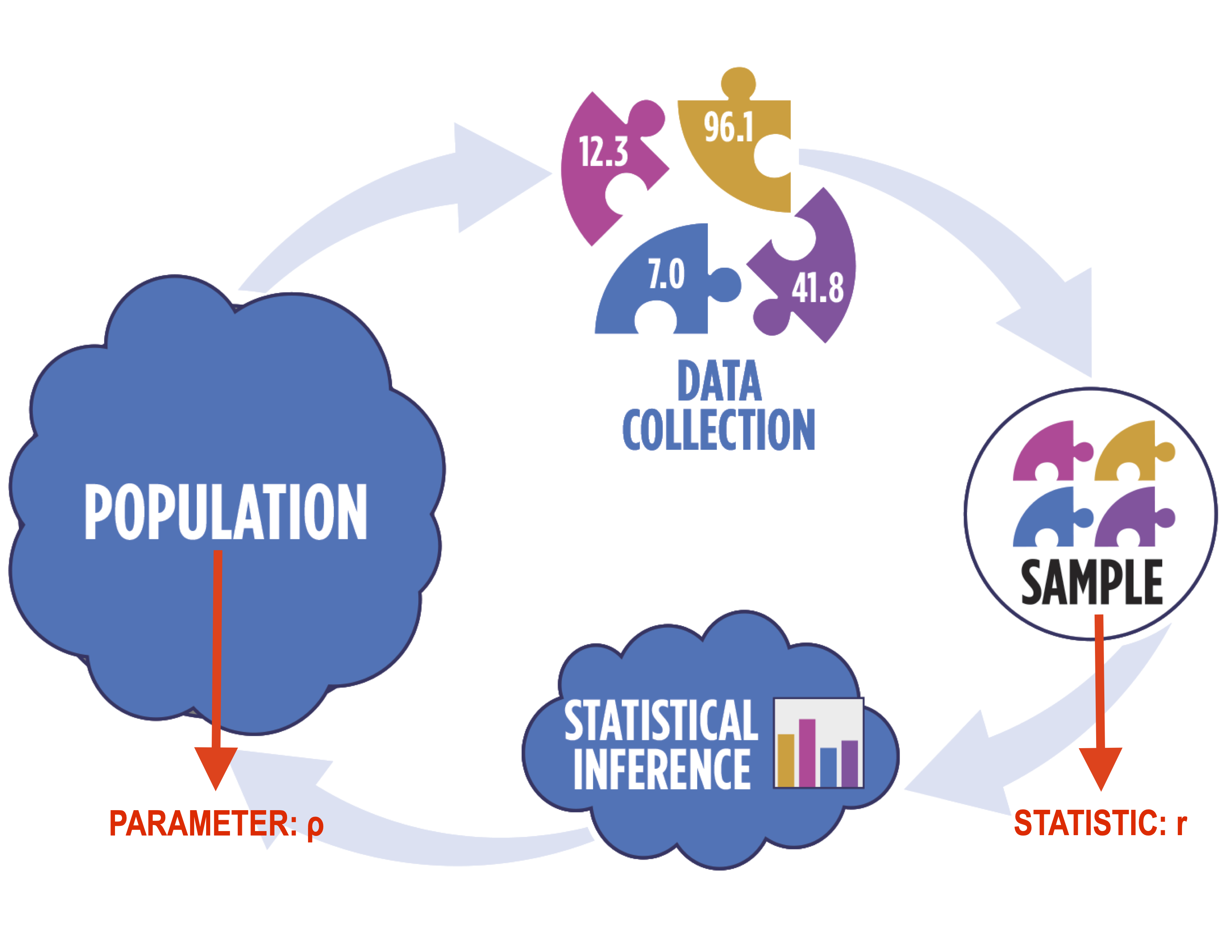
Recall from Lesson 3 when we discussed correlation as a means of describing relationships. In that lesson, we primarily focused on qualitative assessment of the correlation. In particular, when working with correlation, you need to use distinct notation, as shown below. In particular, we use the Greek letter “rho” (ρ) to denote the population correlation and the Latin letter “r” to denote the sample correlation.
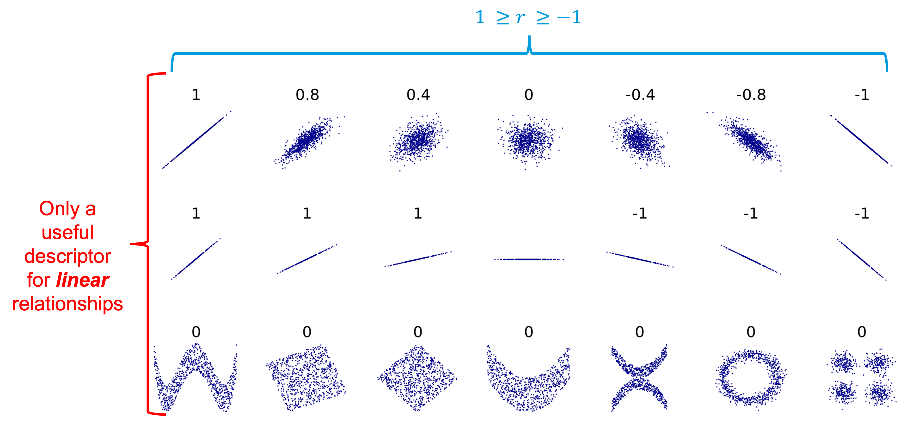
In terms of correlation, the values typically range from -1 to 1, with values at the edge of the range representing strong correlation (positive or negative, depending on the sign) while values closer to 0 represent weak correlation. The figure below shows possible correlation values. It is important to note, however, that correlation is only applicable to linear relationships! Non-linear relationships can have associations, but they will always have a correlation of 0, as shown below.
Below is a video where we demonstrate some key coding principles related to finding the correlation between two variables.
 Watch It: Video - Introduction Correlation (11:37 minutes)
 Try It: DataCamp - Apply Your Coding Skills
Using the partial code below, find the correlation coefficient between the variables x and y.
 Assess It: Check Your Knowledge
Knowledge Check
Randomization Procedure for Correlation
Randomization Procedure for Correlation
 Read It: Randomization Procedure for Correlation
To conduct the randomization procedure for correlation, we will return to np.random.choice, which we used in Lesson 5 to conduct the hypothesis tests. The first step in the procedure is to define the hypotheses. For correlation tests, the hypotheses follow the same basic formula in which the null hypothesis assumes no correlation (i.e., ρ = 0) and the alternative hypothesis is some inequality of that (e.g., ρ > 0, ρ < 0, or ρ != 0), as indicated below.
Once the hypotheses are defined, we can begin the randomization procedure. The main difference between this procedure and previous iterations is that we only shuffle one of the variables we are interested in. For example, say we have the following data:
| ID | x | y |
| A | 1 | 4 |
| B | 2 | 5 |
| C | 3 | 6 |
In this case, we want to randomly sample either x or y without replacement (i.e., reallocate the data for only one variable). If we choose to randomly sample y, for example, the data may then look like this:
| ID | x | y |
| A | 1 | 6 |
| B | 2 | 4 |
| C | 3 | 5 |
Note that all of the original y data is still there, it is simply in a new order, since we sampled without replacement. This procedure effectively breaks the pairs, so we can see if the correlation value was significantly different than 0--if the correlation is close to 0, then it won't matter if we break the pairs, but if the correlation is far from 0, it is more likely to matter and lead to a lower correlation value. Once the random sampling is completed, we recalculate the correlation coefficient with the new pairs, store that value, and repeat for a sufficiently large number of iterations (e.g., N = 1000). Below is a video demonstrating this procedure.
 Watch It: Video - Hypothesis Testing Correlation (10:25 minutes)
 Try It: OPTION 2 DataCamp - Apply Your Coding Skills
Using the same data as the previous DataCamp exercise, edit the following code to implement a randomization procedure.
 Assess It: Check Your Knowledge
Knowledge Check
Correlation One-Line Test
Correlation One-Line Test
 Read It: Correlation One-Line Test
We can also conduct a one-line test for correlation using the stats.pearsonr command from the scipy.stats library. You can read more about the command in the documentation linked here [3]. Below, we demonstrate the implementation of this command in a video.
 Watch It: Video - One Line Test Correlation (2:31 minutes)
 Try It: GOOGLE COLAB
- Click the Google Colab file used in the video here [4].
- Go to the Colab file and click "File" then "Save a copy in Drive", this will create a new Colab file that you can edit in your own Google Drive account.
- Once you have it saved in your Drive, try to edit the following code to implement the one-line correlation test.
Note: You must be logged into your PSU Google Workspace in order to access the file.
1 2 3 4 5 6 7 8 | # create some datadf = pd.DataFrame({'x': np.random.randint(0,100,1000), 'y': np.random.randint(0,200,1000)})# run the test with alternative = greaterresults = ... print('Correlation Coefficient: ', ...)print('p-value: ', ...) |
Once you have implemented this code on your own, come back to this page to test your knowledge.
 Assess It: Check Your Knowledge
Knowledge Check
Introduction to Linear Regression
Introduction to Linear Regression
 Read It: Introduction to Linear Regression
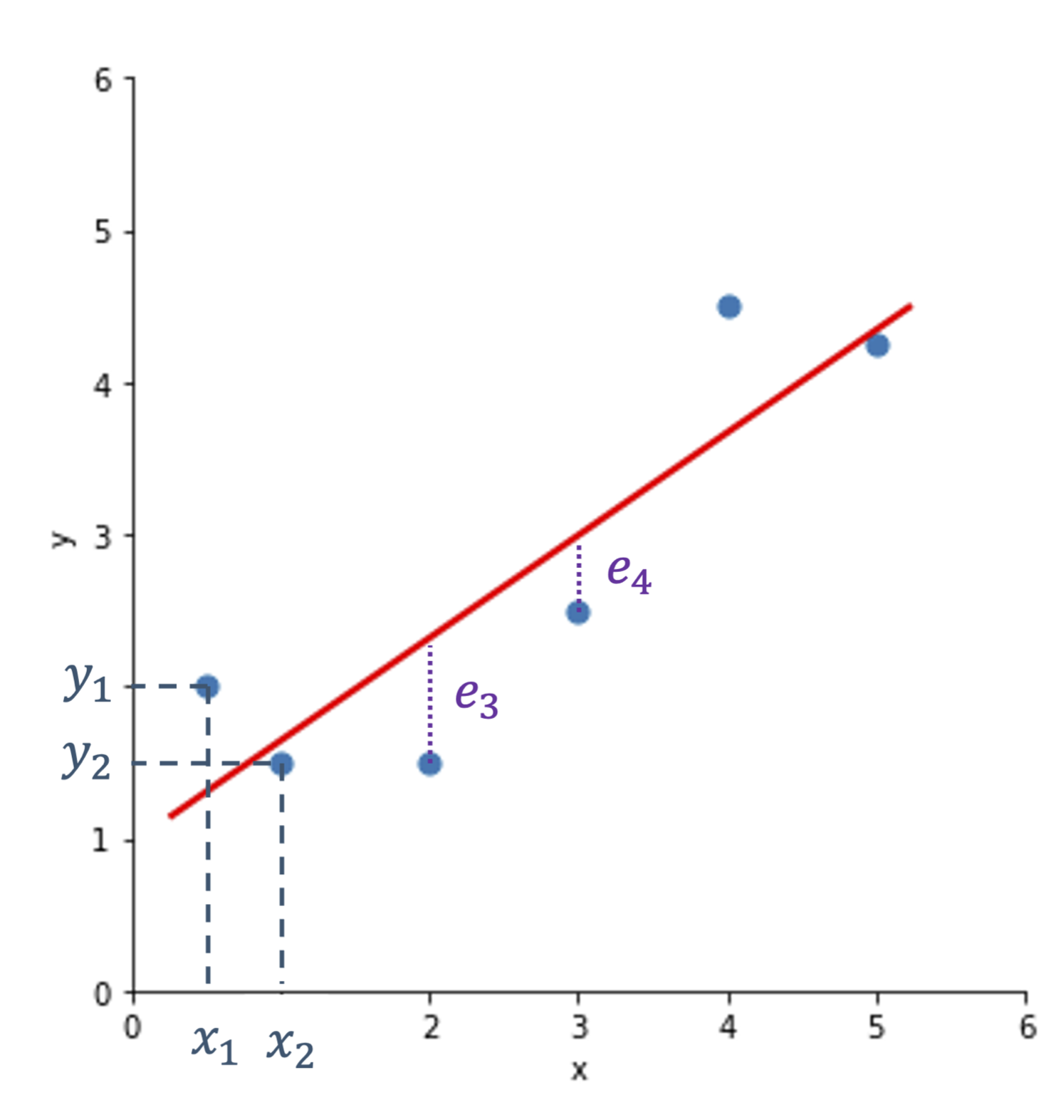
The goal of linear regression is to predict some value y based on the relationship between y and x. In practice, this means we try to find the best fit line to minimize the error. This is shown in the figure below, where we want to find the best line that minimizes the total difference between the data points and the line. The differences are denoted with the letter e. We then define the line based on the slope and intercept, ultimately following the classic equation: , where is the slope and is the intercept.
When working with a sample of data, we usually denote the line as: . For a population, we change the equation to include uppercase letters:
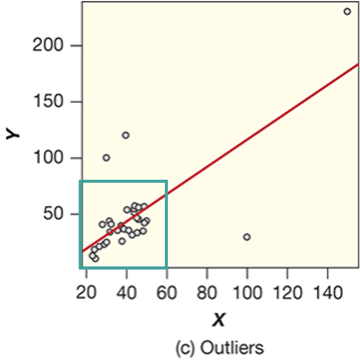
A key aspect of this latter equation is that epsilon is normally distributed (e.g., ). In fact, the normally distributed error is a critical assumption in linear regression models. Additional assumptions include: (a) a linear relationship between x and y, (b) constant variability in the data, and (c) no outliers present. Examples of how each of these conditions might be broken are provided below.

In particular, Figure (a) shows how the first condition (linearity) might be broken. Notice how the pattern is distinctly curved, rather than straight. In Figure (b), the second condition (constant variability) is broken. Here, we see a fan or wedge shape, which indicates that the variance between the y data at x = 20 is much larger than that at x = 10. This means that the variance is not constant, thus breaks one of the conditions for linear regression. Finally, Figure (c) shows the third condition (no outliers) being broken. In particular, there are four likely outliers, which leads to the broken condition. Below, is an example of an ideal example for meeting all three conditions. Notice that the pattern is relatively straight, without increasing variance, and there are no outliers. When conducting linear regression, this is how we want our data to look in an ideal world. Unfortunately, real-world data is rarely this perfect, so we often have to conduct transformations to ensure the model is statistically valid. We will go over these transformations later in the course.
 Assess It: Check Your Knowledge
Knowledge Check
Linear Algebra Solution of Linear Regression
Introduction to Linear Regression
 Read It: Linear Algebra Solution of Linear Regression
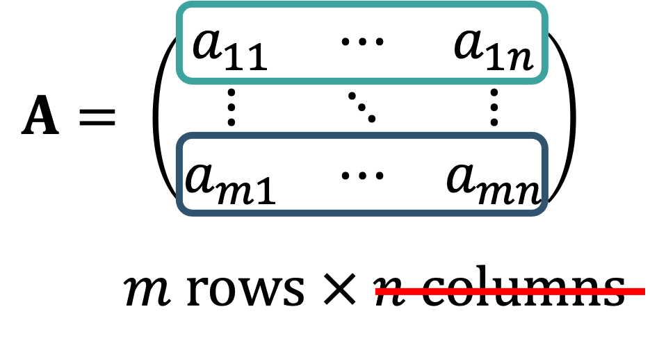
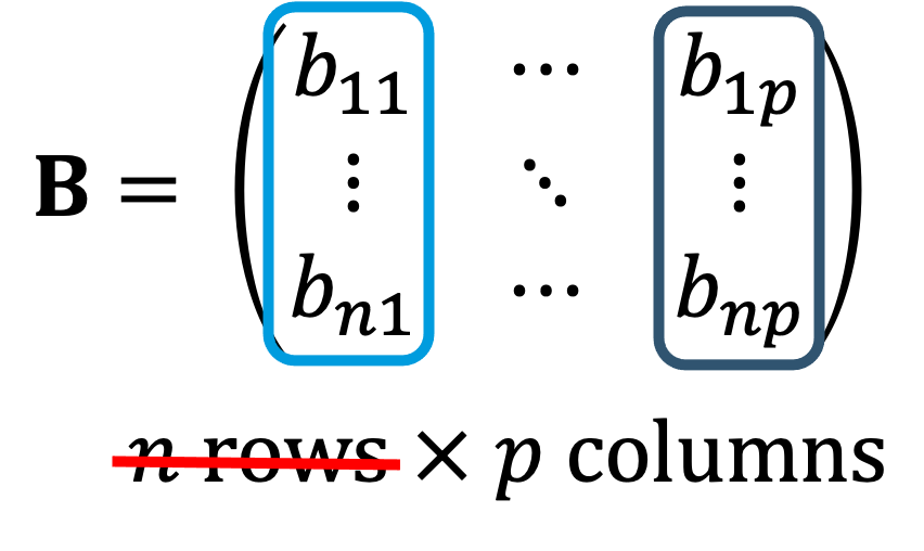
Recall from earlier that linear regression involves finding the best fit line for a given dataset. Traditionally, this best fit line is found through linear algebra. If you have taken a linear algebra course, then you may recall that to multiply two matrices, you sum the products of each row and column together, as demonstrated below.
We will use this concept to find the slope and intercept through linear regression. Below we outline the steps.
- Start with a simple linear model for each point in the dataset.
- Convert the series of equations to matrix form.
- Rewrite in matrix notation.
- Multiply both sides of the equation with the transpose of X.
- Divde both sides by the inverse of X^TX.
- Plug the values for b into the equation for the line:
In the video below, we demonstrate how to implement these steps in Python.
 Watch It: Video - Linear Algebra Solution (12:29 minutes)
Linear Regression: One-Line Test
Linear Regression: One-Line Test
 Read It: Linear Regression: One-Line Test
Previously, we demonstrated how to implement a linear algebra based solution for linear regression. This solution is actually the basis for most computer-based solutions, including the one-line test that you will encounter more often. This test uses the stats.linregress function from the scipy.stats library. Below, we demonstrate how to implement this command in the video.
 Watch It: Video - One Line Linear Regression (4:31 minutes)
OPTION 2 : DATACAMP
 Try It: DataCamp - Apply Your Coding Skills
Edit the code below to implement the linear regression one-line test between the variables x and y. Print the slope and intercept to the screen
 Assess It: Check Your Knowledge
Knowledge Check
Hypothesis Test for Slope
Hypothesis Test for Slope
 Read It: Hypothesis Test for Slope
So far in this lesson, you have learned about a hypothesis test for correlation and have been introduced to simple linear regression. Here, we will go one step further in our analysis to evaluate the significance of the slope of a line. For this analysis, we will return to our one-line linear regression command: stats.linregress. However, before we can start the analysis, we need to define the hypotheses. For a hypothesis test of slope, the parameter of interest is . Additionally, the null hypothesis will always state , while the alternative will be some inequality (e.g., , , or ). Below is an example of a set of hypotheses for slope, which we will test in the video demonstration.
 Watch It: Video - Hypothesis Test Slope (4:40 minutes)
 Try It: DataCamp - Apply Your Coding Skills
Edit the following code to conduct a hypothesis test for the slope between x and y. Print the slope and p-value.
 Assess It: Check Your Knowledge
Knowledge Check
R-squared: Goodness-of-Fit
F-Statistic
Let's start by comparing the hypotheses for a one-way ANOVA test (from Lesson 7) to the hypothese for a simple linear regression model:
| Hypotheses for a One-Way ANOVA Test are: | Hypotheses for a Simple Linear Model are: |
|---|---|
| Ho: All population means, μ i are equal for all k categories | Ho: The model is ineffective (at explaining variability) |
| Ha: At least one μ i is not equal to the others | Ha: The model is effective (at explaining variability) |
The concept that links these two sets of hypotheses is that the grouping of data into k categories in the ANOVA is a model. ANOVA looks at the change in mean (of the response variable) over a categorical variable, whereas a simple linear model looks at the change in mean over a quantitative variable. As such, the simple linear model can also use the F-statistic for its hypothesis test:
where the “Mean Square for the Model” (MSM) replaces “Mean Square for Groups” (MSG) in the numerator and has the equation:
This is essentially the same as MSG, with the main difference being that the denominator has degrees-of-freedom equal to 1 because there is only one explanatory variable in the simple linear model (). Similarly, the equation for MSE is modified with different degrees-of-freedon in the denominator to indicate that there are two “unknowns” in the simple linear model: the slope and intercept (the ’s):
Thus, the F-statistic is conceptually the same as what we saw for ANOVA in Lesson 7:
The p-value is determined from the F-distribution in the same way as introduced in Lesson 7 as well.
Coefficient of Determination:
While the F-statistic above represents the ratio of the variability in the response data that is explained by the model over the unexplained variability (variability outside the model), the coefficient of determination () is the ratio of the variability in the response data that is explained by the model over the TOTAL variability:
In other words, gives the proportion of the total variability in the response data that is explained by the model. Thus, it will always be a value between 0 and 1, with larger values indicating a better “goodness-of-fit” of the linear model.
For a simple linear model, can also be calculated by squaring the correlation coefficient found between the explanatory and response variables:
Since is between -1 and 1, is, again, between 0 and 1, with larger values of corresponding to a stronger correlation. Note that this stronger correlation could be either positive or negative, and cannot distinguish between the two.
It is important to emphasize that is only meaningful for LINEAR models, and won’t capture the variability that could be explained by models that are non-linear (e.g., curved, sinusoidal, clustered, etc.).
Tabular Presentation of Simple Linear Model Test Results
Similar to how ANOVA test results can be presented in a table, simple linear regression results can also be presented in a way that compares the sources of variation:
| Source of Variation | Degrees of Freedom | Sum of Squares | Mean Squares | F | p-value |
|---|---|---|---|---|---|
| BETWEEN | Area under F-distribution and greater than F-statistic | ||||
| WITHIN | |||||
| TOTAL |
 Watch It: Video - Hypothesis Test Slope (4:40 minutes)
 Assess It: Check Your Knowledge
Knowledge Check
Confidence and Prediction Intervals
Confidence and Prediction Intervals
We've previously seen confidence intervals for the mean and proportion in Lesson 4. We can also construct a confidence interval around our line of best fit; that is, a lower and upper bound within which we have a certain level of confidence (e.g., 95%) that the population mean is contained. Similarly, a prediction interval gives a range that we are confident (to a certain level) contains the prediction at that specific value of x.
The video below shows how to calculate both confidence intervals and prediction intervals in Python.
 Watch It: Video - Prediction Intervals (11:59 minutes)
 Assess It: Check Your Knowledge
Knowledge Check
Use the table below to answer the following question:
| mean | mean_se | mean_ci_lower | mean_ci_upper | obs_ci_lower | obs_ci_upper |
|---|---|---|---|---|---|
| 8466.215372 | 5258.166436 | -2411.130644 | 19343.561387 | -38519.240164 | 55451.670907 |
Transforming Non-Linear Data
Transforming Non-Linear Data
 Read It: Transformations
Recall from earlier in this lesson when we discussed the conditions that need to be met for linear regression to be a statistically valid technique. Those conditions are: (a) linear shape, (b) constant variance, and (c) no outliers. If any of these conditions are broken, the linear regression model will not be considered statistically valid. In these cases, it is often possible to transform the data so that we avoid breaking the conditions. For example, in the figure below, we should a plot that breaks the third condition (no outliers). If we want to conduct linear regression on this data, it may be helpful to filter the data so that we only focus on the data in the teal box. Be aware, however, that once you make this transformation, any conclusions are only valid for the data inside the teal box! You cannot extrapolate beyond the box, as at that point, the linear regression will no longer be statistically valid.
Another common transformation is the log-transform. Here, we calculate the logarithm of the data and use that transformed variable in our linear regression analysis. This can be particularly helpful when the data breaks the first condition (linear shape) or the second condition (constant variance). However, similar to the filtering transformation, you need to be cautious that any conclusions drawn from the updated linear regression are only valid for the transformed data! Below, we demonstrate how to use transformations to improve modeling with linear regression.
 Watch It: Video - Transformations (12:17 minutes)
 Try It: DataCamp - Apply Your Coding Skills
Edit the following code to first do a log transform of x and y. Then, run linear regression using the statsmodels.formula.api library,
 Assess It: Check Your Knowledge
Knowledge Check
Logistic Regression
Logistic Regression
 Read It: Logistic Regression
Occasionally, you may encounter a response variable that is categorical, rather than quantitative. In this case, you can conduct logistic regression instead of linear regression. Through logistic regression, you can conduct a form of regression on a binary variable (e.g., 0/1 or yes/no). Below is a figure that shows a dataset that could be used in logistic regression. In particular, the aim of logistic regression in this case would be to find the curve that separates the "yes" points from the "no" points, based on the input data (e.g. TotalGas and TotalBaseWaterVolume).
Mathematically, logistic regression works be defining a response variable with two options: Y = 1 for "yes" and Y = 0 for "no". Then the model tries to predict p, the probability that Y = 1, given the input data. The equation looks like:
This results in a sigmoid curve, as shown below, that indicates the probability of success (Y = 1) as a certain value changes. Here, we show how the probability of success increases as the TotalBaseWaterVolume increases, with the actual data in black at Y = 0 and Y = 1.
Below, we include two videos demonstrating logistic regression. The first sets the data up, including getting our "yes" and "no" values. The second video is where we implement the logistic regression.
 Watch It: Video - Logic Regression Set Up (12:21 minutes)
 Watch It: Video - Logic Regression Modeling (10:45 minutes)
 Try It: DataCamp - Apply Your Coding Skills
Edit the code to run a logistic regression model. Your response variable should be the pre-programmed "success" variable and the explanatory variable should be the pre-programmed "x" variable.
 Assess It: Check Your Knowledge
Knowledge Check
Summary and Final Tasks
Summary and Final Tasks
Summary
In Lesson 8, you have learned about applying linear regression to a dataset. Linear regression allows one to quantitatively asses the relationship between two quantitative variables. One can use such an identified relationship to make predictions of the response variable, given a value of the explanatory variable. Lesson 8 is generally ordered by the tasks that one would want to perform in doing linear regression:
- Measure and Test for Correlation and Slope: if there is little to no linear relationship between the two variables, there is no point in proceeding further.
- Measure Goodness-of-Fit: Does a linear model fit well? Does it explain the majority of variability in the response? If so, what do you learn about the problem by examination of the slope and intercept?
- Make Predictions: Just the prediction alone is not very useful, so make sure to also examine the prediction interval to understand the range of possible values that may arise.
We also covered some transformations that you may need to perform to apply linear regression to your dataset.
 Assess it: Check Your Knowledge Quiz
Reminder - Complete all of the Lesson 8 tasks!
You have reached the end of Lesson 8! Double-check the to-do list on the Lesson 8 Overview page [6] to make sure you have completed all of the activities listed there before you begin Lesson 9.
