Lessons
Chapter 1: Location is Where It’s At: Introduction to GIScience and Technology
Overview
Have you ever found driving directions and maps online, used a smartphone to ‘check in’ to your favorite restaurant, or entered a town name or ZIP code to retrieve the local weather forecast?
Every time you and millions of other users perform these tasks, you are making use of Geographic Information Science (GIScience) and related spatial technologies. Many of these technologies, such as Global Positioning Systems (GPS) and in-vehicle navigation units, are very well known, and you can probably recall the last time you’ve used them.
Other applications and services that are the products of GIScience are a little less obvious, but they are every bit as ubiquitous. In fact, if you’re connected to the Internet, you’re making use of geospatial technologies right now. Every time your browser requests a webpage from a Content Delivery Network (CDN), a geographic lookup occurs, and the server you’re connected to contacts other servers that are closest to it and retrieves the information. This happens so that the delay between your request to view the data and the data being sent to you is as short as possible.
Simply put, GIScience and the related technologies are everywhere, and we use them every day!
In this chapter, you will learn about how location-based data makes GIScience possible; ways geographical data are used; geographical information systems (GIS) that have been developed to collect, store, analyze, and disseminate geographical information; the ways in which GIScience knowledge can contribute to careers as diverse as urban planning, information science, or public health, and the kinds of careers followed by those within GIScience itself.
Objectives
The goal of Chapter 1 is to introduce the many kinds of geographical information that permeate our daily lives and to situate that information and its uses within the larger enterprise known as Geographic Information Science and Technology (GIS&T), what the U.S. Department of Labor calls the "geospatial industry." In particular, students who successfully complete Chapter 1 should be able to:
- identify geographic data and what makes location-based data special;
- explain the qualities of a map and what separates maps from other graphics;
- recognize the sources of geographic data;
- describe the kinds of questions that GIS can help answer.
Chapter lead author: Joshua Stevens.
Portions of this chapter were drawn directly from the following text:
Joshua Stevens, Jennifer M. Smith, and Raechel A. Bianchetti (2012), Mapping Our Changing World, Editors: Alan M. MacEachren and Donna J. Peuquet, University Park, PA: Department of Geography, The Pennsylvania State University.
1.1 Geospatial Research, Careers, and Competencies
"A body of knowledge" is one way to think about the GIS&T field. Another way is as an industry made up of agencies and firms that produce and consume goods and services, generate sales and (sometimes) profits, and employ people. In 2003, the U.S. Department of Labor identified "geospatial technology" as one of 14 "high growth" technology industries, along with biotech, nanotech, and others. However, the Department of Labor also observed that the geospatial technology industry was ill-defined, and poorly understood by the public.
Subsequent efforts by the Department of Labor and other organizations helped to clarify the industry's nature and scope. Following a series of "roundtable" discussions involving industry thought leaders, the Geospatial Information Technology Association (GITA) and the Association of American Geographers (AAG) submitted the following "consensus" definition to the Department of Labor in 2006:
The geospatial industry acquires, integrates, manages, analyzes, maps, distributes, and uses geographic, temporal, and spatial information and knowledge. The industry includes basic and applied research, technology development, education, and applications to address the planning, decision-making, and operational needs of people and organizations of all types.
Currently, the Department of Labor recognizes 10 geospatial occupations: Surveyors, Surveying Technicians, Surveying and Mapping Technicians, Cartographers and Photogrammetrists, Geospatial Information Scientists and Technologists, Geographic Information Systems Technicians, Remote Sensing Scientists and Technologists, Remote Sensing Technicians, Precision Agriculture Technicians, and Geodetic Surveyors. Beyond these explicitly geospatial occupations, there are many others that rely heavily on geographical data and technology; these include urban and regional planning, many careers associated with location-based services, environmental management, landscape architecture and geo-design, transportation engineering, precision agriculture, and others. Still others use geographical data and technologies for selected tasks such as in public health (for infectious disease modeling and health care accessibility analysis), energy industries (to analyze distribution of oil and gas reserves or plan shipments), disaster management (to plan for and respond to events), and criminology (to identify crime hotspots and allocate patrols).
In addition to providing a wide array of occupational opportunities, the geospatial industry is considered a high growth industry. As of 2010, the US Employment and Training Administration is investing $260,000,000 through the WIRED (Workforce Innovation in Regional Economic Development) initiative to promote high-paying geospatial careers.

Although it is helpful to see how the Department of Labor and other agencies define the geospatial industry and how these occupations are expected to grow in the coming decade, many other careers and positions reliant on GIScience exist. Similar to how some geospatial technologies are well known while others operate behind the scenes, some careers in the geospatial industry might seem obvious to you, while others will be a surprise. Some of these careers and applications likely fall within a discipline or area you already find interesting.
Visit the links below to see examples of GIScience being used in fields you might not have considered.

If you like...Video Games and Entertainment,
EA Sports Uses NASA Topographic Data in SSX Game
Link: How NASA topography brought dose of reality to SSX snowboarding courses [4] (ArsTechnica)
"He was like, 'Name any mountain on Earth,' and I was like, 'I don't know, Mount Everest.' So he goes on Wikipedia, gets the latitude and longitude coordinates... and in about 28 seconds, delivered a 3D model of Mount Everest and all the surrounding mountains in that grid from the data. He's like, 'If you give me a couple of days, we can take it for a ride...'"

If you like...Fisheries and Wildlife,
GIS and Remote Sensing are "Critical" to US Fish & Wildlife Service
Link: U.S. Fish & Wildlife Service: Information Resources and Technology Management [6] | Critical Habitat Portal [7]
“Geospatial services provide the technology to create, analyze, maintain, and distribute geospatial data and information. GIS, GPS and remote sensing play a vital role in all of the Service’s long-term goals and in analyzing and quantifying the USFWS Operational Plan Measures.”
1.2 Data and Information
Whether it is a single geographic position of a movie-goer checking in at her favorite restaurant or the locations of thousands of animals equipped with GPS transmitters in a wildlife refuge, every GIS project and application is driven by data.
Data, generally, can be considered to be “values” of “variables”; the variables are the kind of phenomenon or its attributes that are measured, and the values can be numerical (e.g., the population of a city) or categorical (e.g., whether a highway is an Interstate or a U.S. route). When used in a computer system, these data must be in a form suitable for storage and processing. Data can represent all types of information and may consist of numbers, text, images, and many other formats. If you have an online profile, it probably asked you to enter a name, email address, photo, or phone number. These categories are data variables, and what you enter are the data values.
People create and study data as a means to help understand how natural and social systems work. Such systems can be hard to study because they're made up of many interacting phenomena that are often difficult to observe directly, and because they tend to change over time. We attempt to make systems and phenomena easier to study by measuring their characteristics at certain times. Because it's not practical to measure everything, everywhere, at all times, we measure selectively. How accurately data reflect the phenomena they represent depends on how, when, where, and what aspects of the phenomena were measured. It is important to keep in mind that all measurements contain a certain amount of error; the types of error, along with the concepts of accuracy and precision, will be discussed later. For now, however, we will focus on the characteristics of data and how data relate to information.
When phenomena are measured, one or more variables are recorded. As we have mentioned, recorded variables might consist of numerical values, names, or even pictures. All of these are referred to as variables, since they are only representations of the phenomena and may consist of several different values of the same type. Once collected, the variables can be treated as-is or combined and recalculated to form additional representations of the phenomena.
Encoding data in a form that can be reproduced on a computer facilitates storing these data components, sharing them with others, and adding them to structured collections, known as databases. Regardless of the type of data, computers follow instructions to convert data into various formats that are ultimately represented in binary form by series of ones and zeros, or bytes. Although the conversion of digital data to binary representations is beyond the scope of this course, it is important to remember one simple fact: if we can instruct computers to store digital data in this way, we can alter these instructions to make changes to the data. The ability to manipulate, combine, and process data is what allows us to turn a collection of measurements into information that can be used to answer specific questions.
Information is data that has been selected or created in response to a question. For example, the location of a building or a route is data, until it is needed to dispatch an ambulance in response to an emergency. When used to inform those who need to know "where is the emergency, and what's the fastest route between here and there?," the data are transformed into information. The transformation involves the ability to ask the right kind of question, and the ability to retrieve existing data--or to generate new data from the old--that help people answer the question. The more complex the question, and the more locations involved, the harder it becomes to produce timely information. As a result, advancements in both computer software and hardware devices that can collect, integrate, and process large volumes of data quickly have become critical assets in the geospatial industry.
Geographic data and the information derived from it have become valuable commodities. Interestingly, in contrast to a commodity such as corn, the potential value of data is not lost when they are used. Data can be transformed into information again and again, provided that the data are kept up to date. Given the rapidly increasing accessibility of computers and communications networks in the U.S. and abroad, it is not surprising that data and information have become commodities, and that the ability to produce both has become a major growth industry.
When it comes to information, “spatial is special.” Reliance on spatial attributes is what separates geographic information from other types of information. Goodchild (1992) points out several distinguishing properties of geographic information. These properties are paraphrased below. Understanding them, and their implications for the practice of geographic information science, is a key objective of this course.
- Geographic data represent spatial locations and non-spatial attributes measured at certain times.
- Geographic space is continuous.
- Geographic space is nearly spherical.
- Geographic data tend to be spatially dependent.
The next section will clarify some of these properties and prepare you to understand the others as you progress through the course.
Practice Quiz
Registered Penn State students should return now take the self-assessment quiz about the Data and Information.
You may take practice quizzes as many times as you wish. They are not scored and do not affect your grade in any way.
1.3 Location, Attributes, and the First Law of Geography
When we generate information about phenomena that occur on or near the Earth’s surface, we do so using geographic data. Geographic data are data that include a reference to location on the Earth together with some non-spatial attributes. To be useful, they also need to include an indication of when the data refer to. The location specification is a key difference from other types of information that might only have an ID number or other descriptors, like the example in Table 1.1. When locational data are added (Table 1.2), these locations alone may be used to access the data, or one may combine location and non-spatial attributes to access data more specifically, such as when asking, “Which emergency vehicles of the type ‘ambulance’ are within 40 miles of my current location?”
| ID | Type | Description |
|---|---|---|
| 42 | Patrol | Light-weight veh.. |
| 43 | Intercept | Performance crui.. |
| 44 | Ambulance | 2-axel diesel truc.. |
This is not geographic data. It does not have any locational data. Credit: Joshua Stevens, Department of Geography, The Pennsylvania State University.
The data in Table 1.1 above could not be used to answer the question posed. These data could only answer questions such as “which vehicle(s) is/are an ambulance?” (with an answer of ‘#44’) or “Are there any heavy-weight patrol cars in the fleet?” (with an answer of ‘no’). These data cannot answer any “where….?” question, because locations are not encoded.
By including coordinate information in the form of longitude and latitude, the data in Table 1.2 are geographic data. These spatial attributes can be used to identify the location of each item in the database, allowing us to ask questions of the type “where…?” and “how far…?”
| ID | Type | Description | Latitude | Longitude |
|---|---|---|---|---|
| 42 | Patrol | Light-weight veh.. | 40.776853 | -77.87650 |
| 43 | Intercept | Performance crui.. | 34.594421 | -80.301819 |
| 44 | Ambulance | 2-axel diesel truc.. | 34.612899 | -79.635086 |
These geographic data have spatial attributes that can be used to link each entity to a place in the real world. (Locational Data highlighted in table above.) Credit: Joshua Stevens, Department of Geography, The Pennsylvania State University.
Later chapters will cover coordinates in more detail. The key point is that spatial attributes tell us where things are, or where things were at the time the data were collected. By simply including spatial attributes, geographic data allow us to ask a plethora of geographic questions. For example, we might ask “are gas prices in PA high?” The interactive map from GasBuddy.com [8] can help us with such a question while enabling us to generate many other spatial inquiries related to the geographic variation in fuel prices. Section 1.6 of this chapter will provide several more examples of these questions and the types of geographic data that can be used to answer them.
 [8]
[8]
Another important characteristic of geographic space is that it is "continuous.” Although the Earth has valleys, canyons, caves, etc., there are no places on Earth without a location, and connections exist from one place to another. Outside of science fiction, there are no tears in the fabric of space-time. Modern technology can measure location very precisely, making it possible to generate extremely detailed depictions of geographic feature location (e.g., of the coastline of the eastern U.S). It is often possible to measure so precisely that we collect more location data than we can store and much more than is actually useful for practical applications. How much information is useful to store or to display in a map will depend on the map scale (how much of the world we represent within a fixed display such as the size of your computer screen) as well as on the map’s purpose.
Geographic data are generalized according to scale. Click on the buttons beneath the map to zoom in and out on the town of Gorham. (source: U.S. Geological Survey [9], public domain [10]).
For example, the illustration above shows a town called Gorham (in Maine) depicted on three different maps produced by the United States Geological Survey. Take note of the changes that occur when you select different scales (click the buttons below the map to change scale). The shape of the town along with the number and type of features included on the map are different at each scale. The cartographer has made generalization decisions to make sure that the information depicted is legible at each scale and to meet expected uses of maps produced at that scale.
As the map scale becomes larger (when you “zoom in”), the features become larger and more detailed. Switching to smaller scales (“zooming out”) reduces the number of features and simplifies their shapes. This feature reduction and simplification is an example of an important data processing operation called map generalization. Map generalization is a process that involves selecting which features of the world to represent (given what is possible with available data, which also will be selective) and multiple choices about the visible detail included in those representations. In the Gorham example, at the largest scale (1:24,000), all built structures in Gorham are depicted, while at 1:62,000, the built-up area is depicted abstractly as a pink polygon and you (as the map reader) are left to infer that towns include buildings. At the smallest scale (1:250,000), in addition to there being even fewer features depicted, many of the linear features have been smoothed out (e.g., highway 25 on the 1:250,000 map appears to have a slight, gentle curve as it cuts through town while its depiction on the 1:24,000 scale map shows that it has a distinct jog as well as an intersection that will appear to a driver as a U-turn).
In addition to being continuous, geographic data also tend to be spatially dependent. More simply, "everything is related to everything else, but near things are more related than distant things" (which leads to an expectation that things that are near to one another tend to be more alike than things that are far apart). The quote is the First Law of Geography, attributed to geographer Waldo Tobler (1970) -- University of California Department of Geography [11]. How alike things are in relation to their proximity to other things can be measured by a statistical calculation known as spatial autocorrelation. Without this fundamental property, geographic information science as we know it today would not be possible.
1.4 Communicating Geographic Data: What is a Map?
The table in Figure 1.2 of the previous section demonstrates one way to communicate geographic information. We can list data as a series of rows and columns and indicate locations with very specific coordinates. Despite being complete and efficient representations of data, text written in columns and rows is not very user friendly or easy for human beings to interpret. A visual representation would be much better.
The use of graphics and imagery as forms of communication predates written language by several thousand years. It is no surprise then that humans began to visually depict geographic information and have been doing so for millennia. Although the first graphic depiction of geographic information is debated (it is easy to imagine ephemeral maps drawn with sticks in the sand of a beach long before paper or even cave paintings), one of the earliest surviving representations to include both an indication of scale and orientation is the town plan of Nippur, created circa 1330 BC (O'Grady and O'Grady 2008 [12]); for a photo of this plan, see: Archaeology.org: Maps Exhibit review [13].
Try This: How would you define a map?
What is a map...exactly?
While there is a consensus that maps are extremely effective forms of communication, there are numerous definitions of what maps actually are and these definitions vary considerably. To understand why that is, let’s perform a simple exercise. Take a look at the images in Figure 1.5 below and decide which, if any, of them are maps.

It might surprise you, but with the right definition, each of the images above could qualify as a map. All of them rely on the spatial arrangement of information to communicate, and it is the spatial relationships between the elements in each image that provides meaning. Although they are not all geographic, the maps above introduce the idea of abstraction, or the process of representing phenomena or ideas with a simplified counterpart.
The idea of a map, with which you might be most familiar, is also an abstraction. Geographic maps are abstractions of the world we live in and phenomena on, within, or above its surface. As abstractions, maps allow features in the real world to be represented in paper, digital media, and databases, allowing us to calculate, present, and better understand the relationships that objects in the real world have with one another. In this course, you will learn about two primary types of maps: reference maps and thematic maps, defined more completely in Chapter 3.
As can be seen above, and in dictionary definitions, the term “map” is used well beyond geographic representations (e.g., Merriam-Webster definition [14]). Even when a geographic context is assumed, definitions include a wide range of representation forms. The International Cartographic Association has developed the following definition of geographic maps: “A map is a symbolised image of geographical reality, representing selected features or characteristics, resulting from the creative effort of its author’s execution of choices, and is designed for use when spatial relationships are of primary relevance.” This definition still allows tremendous variety. The definition is intentionally broad to include, for example, tactile maps for the visually impaired as shown below in Figure 1.4.

Practice Quiz
Registered Penn State students should return now take the self-assessment quiz About Maps.
You may take practice quizzes as many times as you wish. They are not scored and do not affect your grade in any way.
1.5 Sources of Geographic Data
Geographic data come in many types, from many different sources and captured using many techniques; they are collected, sold, and distributed by a wide array of public and private entities.
In general, we can divide the collection of geographic data into two main types:
- Directly collected data
- Remotely sensed data
Directly collected data are generated at the source of the phenomena being measured. Examples of directly collected data include measurements such as temperature readings at specific weather stations, elevations recorded by visiting the location of interest, or the position of a grizzly bear equipped with a GPS-enabled collar. Also included here are data derived through survey (e.g., the census) or observation (e.g., Audubon Christmas bird count).
Remotely sensed data are measured from remote distances without any direct contact with the phenomena or a need to visit the locations of interest (although directly collected “ground truth” data are often used to support accurate interpretation of the remotely sensed data; this is a topic we will pick up in Chapter 8). Satellite images, sonar readings, and radar are all forms of remotely sensed data.
For each type of data, there is a range of important issues about collection and processing that have an impact on how reliable and useful the data are. The federal agencies that collect and distribute geographic data and the standards by which they operate will be covered in Chapter 8.
1.6 Examples of Geographic Questions and Answers
So far, we have learned why geographic data are unique, how information differs from data, and how various forms of geographic information can be represented in computers and communicated to human beings. Let us now consider the types of questions we can ask, now that we are equipped with this knowledge.
The simplest geographic questions pertain to individual entities
Such questions include:
Questions about space
- Where is the entity located?
- What is its extent?
Questions about attributes
- What are the attributes of the entity located there?
- Do its attributes match one or more criteria?
Questions about time
- When were the entity's location, extent, or attributes measured?
- Has the entity's location, extent, or attributes changed over time?
Simple questions like these can be answered effectively with a good printed map, of course. However, GIS becomes increasingly attractive as the number of people asking the questions and the required level of precision grows, especially if they lack access to the required paper maps.
Questions concerning multiple geographic entities
- Do the entities contain one another?
- Do they overlap?
- Are they connected?
- Are they situated within a certain distance of one another?
- What is the best route from one entity to the others?
- Where are entities with similar attributes located?
Questions about attribute relationships
- Do the entities share attributes that match one or more criteria?
- Are the attributes of one entity influenced by changes in another entity?
Questions about temporal relationships
- Have the entities' locations, extents, or attributes changed over time?
Notice that all of these questions deal with where things are, how things relate to other things, and how things change or persist relative to these locations. These are the kinds of questions that GIScience and professionals in the geospatial industry are prepared to answer.
Practice Quiz
Registered Penn State students should return now take the self-assessment quiz about Geographic Questions and Properties.
You may take practice quizzes as many times as you wish. They are not scored and do not affect your grade in any way.
1.7 Glossary
Abstraction: A simplified representation of an idea, phenomenon, or concept.
Attribute: Data about geographic features are often found in geographic databases and are typically represented in the columns of the database. The spatial dimension is stored as an attribute of geographic data.
Data: Measured values of stored variables that reflect phenomena or characteristics about phenomena.
Directly Measured Data: Data that are measured at the physical location of the phenomena of interest.
Tobler's First Law of Geography: “All things are related, but near things are more alike than distant things.”
Generalization: The product or process of simplifying data or geographic representations.
Geographic Data: Recorded to represent spatial locations, that is a reference to a location on the Earth; often have associated attributes that are variables of locations across dimensions.
Geographic Information Science (GIScience): The theory, use, and application of geographic information systems and databases to answer spatial questions.
Information: Data that has been selected or created to answer a specific question.
Map Scale: The proportional difference between a distance on a map and a corresponding distance on the ground (Dm / Dg).
Remotely Sensed Data: Data collected from a distance without visiting or physically interacting with the phenomena of interest.
Variable: A property of data, that is, a record of a kind of phenomena.
1.8 Bibliography
Carstensen, L. W. (1986). Regional land information systems development using relational databases and geographic information systems. Proceedings of the AutoCarto, London, 507-516.
City of Ontario, California. (n.d.). Geographic information web server. Retrieved on July 6, 1999, from https://www.ontarioca.gov/information-technology [17] (since retired).
Cowen, D. J. (1988). GIS versus CAD versus DBMS: What are the differences? Photogrammetric Engineering and Remote Sensing 54:11, 1551-1555.
DiBiase, D. and twelve others (2010). The New Geospatial Technology Competency Model: Bringing workforce needs into focus [18]. URISA Journal 22:2, 55-72.
DiBiase, D, M. DeMers, A. Johnson, K. Kemp, A. Luck, B. Plewe, and E. Wentz (2007). Introducing the First Edition of the GIS&T Body of Knowledge [19]. Cartography and Geographic Information Science, 34(2), pp. 113-120. U.S. National Report to the International Cartographic Association.
Ennis, M. R. (2008). Competency models: A review of the literature and the role of the employment and training administration (ETA). http://www.careeronestop.org/COMPETENCYMODEL/info_documents/OPDRLiteratureReview.pdf [20].
GITA and AAG (2006). Defining and communicating geospatial industry workforce demand: Phase I report.
Goodchild, M. (1992). Geographical information science. International Journal of Geographic Information Systems 6:1, 31-45.
Goodchild, M. (1995). GIS and geographic research. In J. Pickles (Ed.), Ground truth: the social implications of geographic information systems (pp. of chapter). New York: Guilford.
National Decision Systems. A zip code can make your company lots of money! Retrieved on July 6, 1999, from http://laguna.natdecsys.com/lifequiz [21] (since retired).
National Geodetic Survey. (1997). Image generated from 15'x15' geoid undulations covering the planet Earth. Retrieved 1999, from https://geodesy.noaa.gov/web/science_edu/presentations_archive/ [22] (since retired).
Nyerges, T. L. & Golledge, R. G. (n.d.) NCGIA core curriculum in GIS, National Center for Geographic Information and Analysis, University of California, Santa Barbara, Unit 007. Retrieved November 12, 1997, from http://www.ncgia.ucsb.edu/ [23] (since retired).
O'Grady, J. V. and K. V. O'Grady (2008). The Information Design Handbook. Cincinnati, HOW Books.
Tobler, W.R. 1970: A computer movie simulating urban growth in the Detroit region. Economic Geography 46, 234-240.
United States Department of the Interior Geological Survey. (1977). [map]. 1:24 000. 7.5 minute series. Washington, D.C.: USDI.
United States Geologic Survey. "Bellefonte, PA Quadrangle" (1971). [map]. 1:24 000. 7.5 minute series. Washington, D.C.:USGS.
University Consortium for Geographic Information Science. Retrieved April 26, 2006, from http://www.ucgis.org [24]
Wilson, J. D. (2001). Attention data providers: A billion-dollar application awaits. GEOWorld, February, 54.
Worboys, M. F. (1995). GIS: A computing perspective. London: Taylor and Francis.
Chapter 2: Shrinking and Flattening the Globe: Scale, Projections, and Datums
Overview
Chapter 1 outlined several of the distinguishing properties of geographic information. One of these properties is that geographic maps are necessarily generalized, and that generalization tends to vary with scale. This chapter will introduce another distinguishing property related to the measurement and display of geographic information: that the Earth's complex, nearly-spherical but somewhat irregular shape complicates efforts to specify exact positions on the Earth's surface. In this chapter, we will explore the implications of these properties by illuminating concepts of scale, Earth geometry, coordinate systems, and the "horizontal datums" that define the relationship between coordinate systems and the Earth's shape.
Objectives
Compared to Chapter 1, Chapter 2 may seem long, technical, and abstract, particularly to those for whom these concepts are new. Chapter 2 will introduce some of the more technical concepts that are relevant to map construction and map reading. Students who successfully complete Chapter 2 will be able to:
- understand the concept of map scale and the multiple ways it is specified;
- demonstrate your ability to specify geographic locations using geographic coordinates;
- convert geographic coordinates between two different formats;
- explain the concept of a horizontal datum;
- recognize the kind of transformation that is appropriate to geo-register two or more data sets;
- describe the characteristics of the UTM coordinate system, including its basis in the Transverse Mercator map projection;
- describe the characteristics of the SPC system, including map projection on which it is based;
- interpret distortion diagrams to identify geometric properties of the sphere that are preserved by a particular map projection;
- classify projected map graticules by projection family.
Table of Contents:
- What is Scale?
- The Need for Coordinate Systems
- What are Map Projections?
- The Nearly Spherical Earth
- Glossary
- Biblography
Chapter lead adapter: Raechel Bianchetti.
Portions of this chapter were drawn directly from the following text:
Joshua Stevens, Jennifer M. Smith, and Raechel A. Bianchetti (2012), Mapping Our Changing World, Editors: Alan M. MacEachren and Donna J. Peuquet, University Park, PA: Department of Geography, The Pennsylvania State University.
2.1 What is Scale?
You hear the word "scale" often when you work around people who produce or use geographic information. If you listen closely, you will notice that the term has several different meanings, depending on the context in which it is used. You will hear talk about the scales of geographic phenomena and about the scales at which phenomena are represented on maps. You may even hear the word used as a verb, as in "scaling a map" or "downscaling." The goal of this section is for you to learn to tell these different meanings apart, and to be able to use concepts of scale to help make sense of geographic data.
2.1.1 Scope or Extent
Often "scale" is used as a synonym for "scope," or "extent." For example, the title of the article “Contractors Are Accused in Large-Scale Theft of Food Aid in Somalia,” [25] uses the term "large scale" to describe a widespread theft of food aid. This usage is common among the public. The term scale can also take on other meanings.
2.1.2 Measurement
The word "scale" can also be used as a synonym for a ruler--a measurement scale. Because data consist of symbols that represent measurements of phenomena, it is important to understand the reference systems used to take the measurements in the first place. In this section, we will consider a measurement scale known as the geographic coordinate system that is used to specify positions on the Earth's roughly spherical surface. In other sections, we will encounter two-dimensional (plane) coordinate systems, as well as the measurement scales used to specify attribute data.
2.1.3 Map Scale
Map scale is the proportion between a distance on a map and a corresponding distance on the ground (Dm / Dg). By convention, the proportion is expressed as a representative fraction in which map distance (Dm) is always reduced to 1. The representative fraction 1:100,000, for example, means that a section of road that measures 1 unit in length on a map stands for a section of road on the ground that is 100,000 units long. A representative fraction is unit-less, it has the same meaning if we are measuring on the map in inches, centimeters, or any other unit (in this example, the portion of the world represented on the map is 100,000 times as big as the map’s representation). If we were to change the scale of the map such that the length of the section of road on the map was reduced to, say, 0.1 units in length, we would have created a smaller-scale map whose representative fraction is 0.1:100,000, or 1:1,000,000.
2.1.4 Graphic Scales

Another way to express map scale is with a graphic (or "bar") scale (Figure 2.1). Unlike representative fractions, graphic scales remain true when maps are shrunk or magnified, thus they are especially useful on web maps where it is impossible to predict the size at which users will view them. Most maps include a bar scale like the one shown above left. Some also express map scale as a representative fraction. The implication in either case is that scale is uniform across the map. However, except for maps that show only very small areas, scale varies across every map. This follows from the fact that positions on the nearly spherical Earth must be transformed to positions on two-dimensional sheets of paper. Systematic transformations of the world (or parts of it) to flat maps are called map projections. As we will discuss in greater depth later in this chapter, all map projections are accompanied by deformation of features in some or all areas of the map. This deformation causes map scale to vary across the map. Representative fractions typically, therefore, specify map scale along a line at which deformation is minimal (nominal scale). We will discuss nominal scale in further detail later. Bar scales, also, generally denote only the nominal or average map scale. An alternative to a simple bar scale that accounts for map distortion is a variable scale. Variable scales, like the one illustrated above right, show how scale varies, in this case by latitude, due to deformation caused by map projection.
2.1.5 Changing a Map's Size
As noted above, another way that the term "scale" is used is as a verb. To ‘scale a map’ is to reproduce it at a different size. For instance, if you photographically reduce a 1:100,000-scale map to 50 percent of its original width and height, the result would be one-quarter the area of the original. Obviously, the map scale of the reduction would be smaller too: 1/2 x 1/100,000 = 1/200,000 (or a representative fraction scale specification of 1:200,000). Because of the inaccuracies inherent in all geographic data, scrupulous geographic information specialists avoid enlarging source maps. To do so is to exaggerate generalizations and errors.
In the following sections, you will learn more about the process of converting the three-dimensional Earth into a two-dimensional visual representation, the map. As you move through the chapter, keep in mind the different meanings for the term "scale" and think about how it relates to the process of map creation.
Practice Quiz
Registered Penn State students should return now take the self-assessment quiz about the Map Scale.
You may take practice quizzes as many times as you wish. They are not scored and do not affect your grade in any way.
2.2 The Need for Coordinate Systems
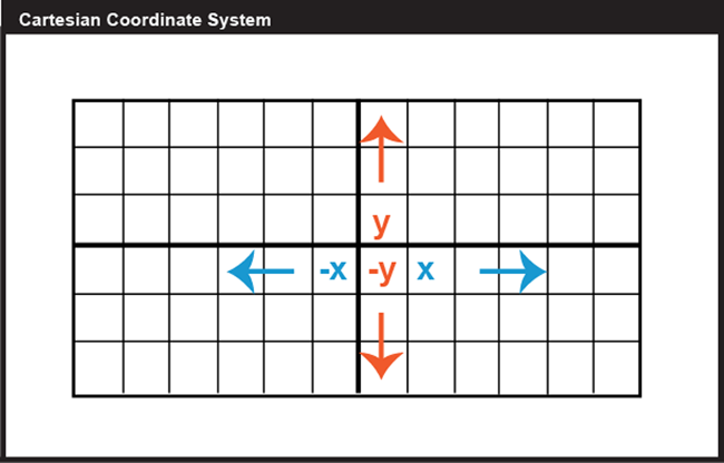
Locations on the Earth's surface are measured and represented in terms of coordinates; a coordinate is a set of two or more numbers that specifies the position of a point, line, or other geometric figure in relation to some reference system. The simplest system of this kind is a Cartesian coordinate system, named for the 17th century mathematician and philosopher René Descartes. A Cartesian coordinate system, like the one above in Figure 2.2, is simply a grid formed by put together two measurement scales, one horizontal (x) and one vertical (y). The point at which both x and y equal zero is called the origin of the coordinate system. In the illustration above, the origin (0,0) is located at the center of the grid (the intersection of the two bold lines). All other positions are specified relative to the origin. The coordinate of the upper right-hand corner of the grid is (6,3). The lower left-hand corner is (-6,-3).

Cartesian and other two-dimensional (plane) coordinate systems are handy due to their simplicity. They are not perfectly suited to specifying geographic positions. However, the geographic coordinate system, as seen in Figure 2.3, is designed specifically to define positions on the Earth's roughly spherical surface. Instead of the two linear measurement scales x and y, the geographic coordinate systems bring together two curved measurement scales.
You have probably encountered the terms latitude and longitude before in your studies. A comparison of these two scales is given below in Figure 2.4. The north-south scale, called latitude (designated by the Greek symbol phi), ranges from +90° (or 90° N) at the North pole to -90° (or 90° S) at the South pole while the equator is 0°. A line of latitude is also known as a parallel.
The east-west scale, called longitude (conventionally designated by the Greek symbol lambda), ranges from +180° to -180°. Because the Earth is round, +180° (or 180° E) and -180° (or 180° W) are the same grid line. A line of longitude is called a meridian. That +/- 180 grid line is roughly the International Date Line, which has diversions that pass around some territories and island groups so that they do not need to cope with the confusion of nearby places being in two different days. Opposite the International Date Line on the other side of the globe is the prime meridian, the line of longitude defined by international treaty as 0°. At higher latitudes, the length of parallels decreases to zero at 90° North and South. Lines of longitude are not parallel, but converge toward the poles. Thus, while a degree of longitude at the equator is equal to a distance of about 111 kilometers, that distance decreases to zero at the poles.

Try This: Geographic Coordinate System Practice Application
Have you ever encountered the terms ‘latitude’ or ‘longitude’? How well do you understand the geographic coordinate system, really? Our experience is that while everyone who enters this class has heard of latitude and longitude, only about half can point to the location on a map that is specified by a pair of geographic coordinates. The websites linked below let you test your knowledge. You’ll practice by clicking locations on a globe as specified by randomly generated geographic coordinates.
Map Quiz Game [27]
2.2.1 Geographic Coordinates
We have discussed the fact that both latitude and longitude are measured in degrees, but what about when we need a finer granularity measurement? To record geographic coordinates, we can further divide degrees into minutes, and seconds. The degree is equal to sixty minutes, and each minute equal to sixty seconds. Geographic coordinates often need to be converted in order to geo-register one data layer onto another. Geographic coordinates may be expressed in decimal degrees, or in degrees, minutes, and seconds. Sometimes, you need to convert from one form to another.
Here's how it works:
To convert Latitude of -89.40062 from decimal degrees to degrees, minutes, seconds:
Subtract the number of whole degrees (89°) from the total (89.40062°). (The minus sign is used in the decimal degree format only to indicate that the value is a west longitude or a south latitude.) In this example, the minus sign indicates South, so keep track of that.
Multiply the remainder by 60 minutes (.40062 x 60 = 24.0372).
Subtract the number of whole minutes (24') from the product.
Multiply the remainder by 60 seconds (.0372 x 60 = 2.232). Round off (to the nearest second in this case).
Assemble the pieces; the result is 89° 24' 2" S. If the starting point had been the Longitude of -89.400062, the only difference would be that the S above would be replaced by a W.
To convert 43° 4' 31" from degrees, minutes, seconds to decimal degrees, use the simple formula below:
DD = Degrees + (Minutes/60) + (Seconds/3600)
Divide the number of seconds by 60 (31 ÷ 60 = 0.5166).
Add the quotient of step (1) to the whole number of minutes (4 + 0.5166).
Divide the result of step (2) by 60 (4.5166 ÷ 60 = 0.0753).
Add the quotient of step (3) to the number of whole number degrees (43 + 0.0753).
The result is 43.0753°
Practice Quiz
Registered Penn State students should return now take the self-assessment quiz about Geographic Coordinates.
You may take practice quizzes as many times as you wish. They are not scored and do not affect your grade in any way.
2.2.2 Plane Coordinates
So far, you have read about Cartesian Coordinate Systems, but that is not the only kind of 2D coordinate system. A plane coordinate system can be thought of as the juxtaposition of any two measurement scales. In other words, if you were to place two rulers at right angles, such that the "0" marks of the rulers aligned, you would define a plane coordinate system. The rulers are called "axes." Just as in Cartesian Coordinates, the absolute location of any point in the space in the plane coordinate system is defined in terms of distance measurements along the x (east-west) and y (north-south) axes. A position defined by the coordinates (1,1) is located one unit to the right, and one unit up from the origin (0,0). The Universal Transverse Mercator (UTM) grid is a widely-used type of geographic plane coordinate system in which positions are specified as eastings (distances, in meters, east of an origin) and northings (distances north of the origin).
Some coordinate transformations are simple. The transformation from non-georeferenced plane coordinates to non-georeferenced polar coordinates, described in further detail later in the chapter, shown below involves nothing more than the replacement of one kind of coordinates with another.

2.2.3 UTM: Universal Transverse Mercator

The geographic coordinate system grid of latitudes and longitudes consists of two curved measurement scales to fit the nearly-spherical shape of the Earth. As discussed above, geographic coordinates can be specified in degrees, minutes, and seconds of arc. Curved grids are inconvenient to use for plotting positions on flat maps. Furthermore, calculating distances, directions, and areas with spherical coordinates is cumbersome in comparison to doing so with plane coordinates. For these reasons, cartographers and military officials in Europe and the U.S. developed the UTM coordinate system. UTM grids are now standard not only on printed topographic maps but also for the geographic referencing of the digital data that comprise the emerging U.S. "National Map" (NationalMap.gov [30]).
"Transverse Mercator" refers to the manner in which geographic coordinates are transformed from a spherical model of the Earth into plane coordinates. The act of mathematically transforming geographic spherical coordinates to plane coordinates necessarily displaces most (but not all) of the transformed coordinates to some extent. Because of this, map scale varies within projected (plane) UTM coordinate system grids. Thus, UTM coordinates provide locations specifications that are precise, but have known amounts of positional error depending on where the place is.
Shown below is the southwest corner of a 1:24,000-scale (for which 1 inch on the map represents 2000 ft. in the world) State College topographic map in Centre County, PA, published by the United States Geological Survey (USGS). Note that the geographic coordinates (40° 45' N latitude, 77° 52' 30" W longitude) of the corner are specified. Also shown, however, are ticks and labels representing two plane coordinate systems, the Universal Transverse Mercator (UTM) system and the State Plane Coordinates (SPC) system. The tick on the west edge of the map labeled "4515" represents a UTM grid line (called a "northing") that runs parallel to, and 4,515,000 meters north of, the equator. Ticks labeled "258" and "259" represent grid lines that run perpendicular to the equator and 258,000 meters and 259,000 meters east, respectively, of the origin of the UTM Zone 18 North grid (see its location on Fig 6 above). Unlike longitude lines, UTM "eastings" are straight and do not converge upon the Earth's poles.

The Universal Transverse Mercator system is not really universal, but it does cover nearly the entire Earth surface. Only polar areas--latitudes higher than 84° North and 80° South--are excluded. (Polar coordinate systems are used to specify positions beyond these latitudes.) The UTM system divides the remainder of the Earth's surface into 60 zones, each spanning 6° of longitude. These are numbered west to east from 1 to 60, starting at 180° West longitude (roughly coincident with the International Date Line).

The illustration above depicts UTM zones as if they were uniformly "wide" from the Equator to their northern and southern limits. In fact, since meridians converge toward the poles on the globe, every UTM zone tapers from 666,000 meters in "width" at the Equator (where 1° of longitude is about 111 kilometers in length) to only about 70,000 meters at 84° North and about 116,000 meters at 80° South.
To clarify this, the illustration below depicts the area covered by a single UTM coordinate system grid zone. Each UTM zone spans 6° of longitude, from 84° North to 80° South. Each UTM zone is subdivided along the equator into two halves, north and south.

The illustration above shows how UTM coordinate grids relate to the area of coverage illustrated above. The north and south halves are shown side by side for comparison. Each half is assigned its own origin. The north south zone origins are positioned to south and west of the zone. North zone origins are positioned on the Equator, 500,000 meters west of the central meridian for that zone. Origins are positioned so that every coordinate value within every zone is a positive number. This minimizes the chance of errors in distance and area calculations. By definition, both origins are located 500,000 meters west of the central meridian of the zone (in other words, the easting of the central meridian is always 500,000 meters E). These are considered "false" origins since they are located outside the zones to which they refer. UTM eastings specifying places within the zone range from 167,000 meters to 833,000 meters at the equator. These ranges narrow toward the poles. Northings range from 0 meters to nearly 9,400,000 in North zones and from just over 1,000,000 meters to 10,000,000 meters in South zones. Note that positions at latitudes higher than 84° North and 80° South are defined in Polar Stereographic coordinate systems that supplement the UTM system.
The distorted ellipse graph below shows the amount of distortion on a UTM map. This kind of plot will be explained in more detail below; the key thing to note here is that the size and shape of features plotted in red indicate the amount of size and shape distortion across the map (a wide range in sizes indicates substantial area distortion, a range from circles to flat ellipses indicates substantial shape distortion). The ellipses centered within the highlighted UTM zone are all the same size and shape. Away from the highlighted zone, the ellipses steadily increase in size, although their shapes remain uniformly circular. This pattern indicates that scale distortion is minimal within Zone 30, and that map scale increases away from that zone. Furthermore, the ellipses reveal that the character of distortion associated with this projection is that shapes of features as they appear on a globe are preserved while their relative sizes are distorted. Map projections that preserve shape by sacrificing the fidelity of sizes are called conformal projections. The plane coordinate systems used most widely in the U.S., UTM and SPC (the State Plane Coordinates system), are both based upon conformal projections.

The Transverse Mercator projection illustrated above minimizes distortion within UTM zone 30 by putting that zone at the center of the projection. Fifty-nine variations on this projection are used to minimize distortion in the other 59 UTM zones. In every case, distortion is no greater than 1 part in 1,000. This means that a 1,000 meter distance measured anywhere within a UTM zone will be no worse than + or - 1 meter off.
One disadvantage of the UTM system is that multiple coordinate systems must be used to account for large entities. The lower 48 United States, for instance, spreads across ten UTM zones. The fact that there are many narrow UTM zones can lead to confusion. For example, the city of Philadelphia, Pennsylvania is east of the city of Pittsburgh. If you compare the Eastings of centroids representing the two cities, however, Philadelphia's Easting (about 486,000 meters) is less than Pittsburgh's (about 586,000 meters). Why? Because although the cities are both located in the U.S. state of Pennsylvania, they are situated in two different UTM zones. As it happens, Philadelphia is closer to the origin of its Zone 18 than Pittsburgh is to the origin of its Zone 17. If you were to plot the points representing the two cities on a map, ignoring the fact that the two zones are two distinct coordinate systems, Philadelphia would appear to the west of Pittsburgh. Inexperienced GIS users make this mistake all the time. Fortunately, GIS software is getting sophisticated enough to recognize and merge different coordinate systems automatically.
Practice Quiz
Registered Penn State students should return now take the self-assessment quiz about the UTM Coordinates.
You may take practice quizzes as many times as you wish. They are not scored and do not affect your grade in any way.
2.2.4 State Plane Coordinates
The UTM system was designed to meet the need for plane coordinates to specify geographic locations globally. Focusing on just the U.S., in consultation with various state agencies, the U.S. National Geodetic Survey (NGS) devised the State Plane Coordinate System with several design objectives in mind. Chief among these were:
- plane coordinates for ease of use in calculations of distances and areas;
- all positive values to minimize calculation errors; and
- a maximum error rate of 1 part in 10,000.
As discussed above, plane coordinates specify positions in flat grids. Map projections are needed to transform latitude and longitude coordinates to plane coordinates. The designers of the SPCS did two things to minimize the inevitable distortion associated with projecting the Earth onto a flat surface. First, they divided the U.S. into 124 relatively small zones that cover the 50 U.S. states. Second, they used slightly different map projection formulae for each zone, one that minimizes distortion along either the east-west or north-south line depending on the orientation of the zone. The curved, dashed red lines in the illustration below represent the two standard lines that pass through each zone. Standard lines indicate where a map projection has zero area or shape distortion (some projections have only one standard line).
As shown below, some states are covered with a single zone while others are divided into multiple zones. Each zone is based upon a unique map projection that minimizes distortion in that zone to 1 part in 10,000 or better. In other words, a distance measurement of 10,000 meters will be at worst one meter off (not including instrument error, human error, etc.). The error rate varies across each zone, from zero along the projection's standard lines to the maximum at points farthest from the standard lines. Errors will be much lower than the maximum at most locations within a given SPC zone. SPC zones achieve better accuracy than UTM zones because they cover smaller areas, and so are less susceptible to projection-related distortion.

As we have seen above, positions in any coordinate system are specified relative to an origin. Like UTM zones, SPC zone origins are defined so as to ensure that every easting and northing in every zone are positive numbers. As shown in the illustration below, SPC origins are positioned south of the counties included in each zone. The origins coincide with the central meridian of the map projection upon which each zone is based. The false origin of the Pennsylvania North zone, is defined as 600,000 meters East, 0 meters North. Origin eastings vary from zone to zone from 200,000 to 8,000,000 meters East.

The SPCS zones are identified with a 4 digita FIPS code, the first two digits represents the state and the second the zone (e.g., PA has a FIPS code of 37 with 2 zones, 1 and 2, thus 3701 for the nothern zone and 3702 for the sourthern). The starting "0" for states in the 1-9 range is typically dropped; thus for CA, as an example, the most norther SPCS zone is 401.
One place you can look up all zone numbers is here: USA State Plane Zones NAD83 [32]
Shown below is the southwest corner of the same 1:24,000-scale topographic map used as an example above. Along with the geographic coordinates (40 45' N latitude, 77° 52' 30" W longitude) of the corner and UTM tick marks discussed above, SPCS eastings and northings are also included. The tick labeled "1 970 000 FEET" represents a SPC grid line that runs perpendicular to the equator and 1,970,000 feet east of the origin of the Pennsylvania North zone. Notice that, in this example, SPC system coordinates are specified in feet rather than meters. The SPC system switched to use of meters in 1983, but most existing topographic maps are older than that and still give the specification in feet (as in the example below). The origin lies far to the west of this map sheet. Other SPC grid lines, called "northings" (the one for 220,000 FEET is shown), run parallel to the equator and perpendicular to SPC eastings at increments of 10,000 feet. Unlike longitude lines, SPC eastings and northings are straight and do not converge upon the Earth's poles.

SPCs, like all plane coordinate systems, pretend the world is flat. The basic design problem that confronted the geodesists who designed the State Plane Coordinate System was to establish coordinate system zones that were small enough to minimize distortion to an acceptable level, but large enough to be useful.
Most SPC zones are based on either a Transverse Mercator or Lambert Conic Conformal map projection whose parameters (such as standard line(s) and central meridians) are optimized for each particular zone. "Tall" zones like those in New York state, Illinois, and Idaho are based upon unique Transverse Mercator projections that minimize distortion by running two standard lines north-south on either side of the central meridian of each zone, much as the same projection is used for UTM zones. "Wide" zones like those in Pennsylvania, Kansas, and California are based on unique Lambert Conformal Conic projections (see below for more on this and other projections) that run two standard lines (standard parallels, in this case) west-east through each zone. (One of Alaska's zones is based upon an "oblique" variant of the Mercator projection. That means that instead of standard lines parallel to a central meridian, as in the transverse case, the Oblique Mercator runs two standard lines that are tilted so as to minimize distortion along the Alaskan panhandle.)
These two types of map projections share the property of conformality, which means that angles plotted in the coordinate system are equal to angles measured on the surface of the Earth. As you can imagine, conformality is a useful property for land surveyors, who make their livings measuring angles.
This section has hinted at some of the characteristics of map projections and how they are used to relate plane coordinates to the globe. Next, we delve more deeply into the topic of map projections, a topic that has fascinated many mathematicians and others over centuries.
Practice Quiz
Registered Penn State students should return now take the self-assessment quiz about the State Plane Coordinates.
You may take practice quizzes as many times as you wish. They are not scored and do not affect your grade in any way.
2.3 What are Map Projections?
Latitude and longitude coordinates specify positions in a spherical grid called the graticule (that approximates the more-or-less spherical Earth). The true geographic coordinates called unprojected coordinate in contrast to plane coordinates, like the Universal Transverse Mercator (UTM) and State Plane Coordinates (SPC) systems, that denote positions in flattened grids. These georeferenced plane coordinates are referred to as projected. The mathematical equations used to project latitude and longitude coordinates to plane coordinates are called map projections. Inverse projection formulae transform plane coordinates to geographic. The simplest kind of projection, illustrated below, transforms the graticule into a rectangular grid in which all grid lines are straight, intersect at right angles, and are equally spaced. Projections that are more complex yield grids in which the lengths, shapes, and spacing of the grid lines vary. Even this simplest projection produces various kinds of distortions; thus, it is necessary to have multiple types of projections to avoid specific types of distortions. Imagine the kinds of distortion that would be needed if you sliced open a soccer ball and tried to force it to be completely flat and rectangular with no overlapping sections. That is the amount of distortion we have in the simple projection below (one of the more common in web maps of the world today).

Many types of map projections have been devised to suit particular purposes. The term "projection" implies that the ball-shaped net of parallels and meridians is transformed by casting its shadow upon some flat, or flattenable, surface. While almost all map projection methods are created using mathematical equations, the analogy of an optical projection onto a flattenable surface is useful as a means to classify the bewildering variety of projection equations devised over the past two thousand years or more.

There are three main categories of map projection, those in which projection is directly onto a flat plane, those onto a cone sitting on the sphere that can be unwrapped, and other onto a cylinder around the sphere that can be unrolled (Figure 2.15 above). All three are shown in their normal aspects. The plane often is centered upon a pole. The cone is typically aligned with the globe such that its line of contact (tangency) coincides with a parallel in the mid-latitudes. Moreover, the cylinder is frequently positioned tangent to the equator (unless it is rotated 90°, as it is in the Transverse Mercator projection). As you might imagine, the appearance of the projected grid will change quite a lot depending on the type of surface it is projected onto, how that surface is aligned with the globe, and where that imagined light is held. The following illustrations show some of the projected graticules produced by projection equations in each category.
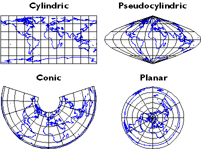
- Cylindric projection equations yield projected graticules with straight meridians and parallels that intersect at right angles. The example shown above is a Cylindrical Equidistant (also called Plate Carrée or geographic) in its normal equatorial aspect.
- Pseudocylindric projections are variants on cylindrics in which meridians are curved. The result of a Sinusoidal projection is shown above.
- Conic projections yield straight meridians that converge toward a single point at the poles, parallels that form concentric arcs. The example shown above is the result of an Albers Conic Equal Area, which is frequently used for thematic mapping of mid-latitude regions.
- Planar projections also yield meridians that are straight and convergent, but parallels form concentric circles rather than arcs. Planar projections are also called azimuthal because every planar projection preserves the property of azimuthality, directions (azimuths) from one or two points to all other points on the map. The projected graticule shown above is the result of an Azimuthal Equidistant projection in its normal polar aspect.
Appearances can be deceiving. It is important to remember that the look of a projected graticule depends on several projection parameters, including latitude of projection origin, central meridian, standard line(s), and others. Customized map projections may look entirely different from the archetypes described above (Figure 2.16).
To help interpret the wide variety of projections, it is necessary to become familiar with Spatial Reference Information that traditionally accompanies a map. There are several terms that you must understand to read the Spatial Reference Information. First, the projection name identifies which projection was used. With this information, you get an understanding of the projection category and the geometric properties the projection preserves. Next, the central meridian is the location of the central longitude meridian. The Latitude of Projection defines the origin of latitude for the projection. There are three common aspects that we can define: polar (projections centered on a pole), equatorial (usually cylindrical or pseudo-cylindrical projections aligned with the equator), and oblique (those centered on any other place). Scale Factor at Central Meridian is the ratio of map scale along the central meridian and the scale at a standard meridian, where scale distortion is zero. Finally, some projections, including the Lambert Conic Conformal, include parameters by which you can specify one or two standard lines along which there is no scale distortion.
2.3.1 Map Projections: Distortion
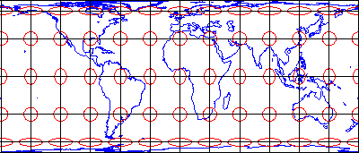
No projection allows us to flatten the globe without distorting it. Distortion ellipses help us to visualize what type of distortion a map projection has caused, how much distortion occurred, and where it occurred. The ellipses show how imaginary circles on the globe are deformed because of a particular projection. If no distortion had occurred in the process of projecting the map shown below, all of the ellipses would be the same size, and circular in shape.
When positions on the graticule are transformed to positions on a projected grid, four types of distortion can occur: distortion of sizes, angles, distances, and directions. Map projections that avoid one or more of these types of distortion are said to preserve certain properties of the globe: equivalence, conformality, equidistance, and azimuthality, respectively. Each is described below.
2.3.1.1 Equivalence
So-called equal-area projections maintain correct proportions in the sizes of areas on the globe and corresponding areas on the projected grid (allowing for differences in scale, of course). Notice that the shapes of the ellipses in the Cylindrical Equal Area projection above are distorted, but the areas each one occupies are equivalent. Equal-area projections are preferred for small-scale thematic mapping (discussed in the next chapter), especially when map viewers are expected to compare sizes of area features like countries and continents.
2.3.1.2 Conformality

The distortion ellipses plotted on the conformal projection shown above vary substantially in size, but are all the same circular shape. The consistent shapes indicate that conformal projections preserve the fidelity of angle measurements from the globe to the plane. In other words, an angle measured by a land surveyor anywhere on the Earth's surface can be plotted at its corresponding location on a conformal projection without distortion. This useful property accounts for the fact that conformal projections are almost always used as the basis for large scale surveying and mapping. Among the most widely used conformal projections are the Transverse Mercator, Lambert Conformal Conic, and Polar Stereographic.
Conformality and equivalence are mutually exclusive properties. Whereas equal-area projections distort shapes while preserving fidelity of sizes, conformal projections distort sizes in the process of preserving shapes.
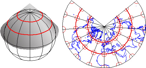
As discussed above in section 2.2.4, SPC zones that trend west to east (including Pennsylvania's) are based on unique Lambert Conformal Conic projections. Instead of the cylindrical projection surface used by projections like the Mercator shown above, the Lambert Conformal Conic and map projections like it employ conical projection surfaces like the one shown below. Notice the two lines at which the globe and the cone intersect. Both of these are standard lines; specifically, standard parallels. The latitudes of the standard parallels selected for each SPC zones minimize scale distortion throughout that zone.
2.3.1.3 Equidistance

Equidistant map projections allow distances to be measured accurately along straight lines radiating from one or, at most, two points or they can have correct distance (thus maintain scale) along one or more lines. In the example below (also sometimes called an "equirectangular" projection because the parallels and meridians are both equally spaced). Notice that ellipses plotted on the Cylindrical Equidistant (Plate Carrée) projection shown above vary in both shape and size. The north-south axis of every ellipse is the same length, however. This shows that distances are true-to-scale along every meridian; in other words, the property of equidistance on this map projection is preserved from the two poles.
2.3.1.4 Azimuthality

Azimuthal projections preserve directions (azimuths) from one or two points to all other points on the map. Gnomonic projections, like the one above, display all great circles as straight lines. A great circle is the most direct path between two locations across the surface of the globe. See how the ellipses plotted on the gnomonic projection shown above vary in both size and shape, but are all oriented toward the center of the projection. In this example, that is the one point at which directions measured on the globe are not distorted on the projected graticule. This is a good projection for uses like plotting airline connections from one airport to all others.
2.3.1.5 Compromise

Some map projections preserve none of the properties described above, but instead seek a compromise that minimizes distortion of all kinds. The example shown above is the Polyconic projection, where parallels are all non-concentric circular arcs, except for a straight equator, and the centers of these circles lie along a central axis. The U.S. Geological Survey used the polyconic projection for many years as the basis of its topographic quadrangle map series until the conformal Transverse Mercator succeeded it. Another example is the Robinson projection, which is often used for small-scale thematic maps of the world (it was used as the primary world map projection by the National Geographic Society from 1988-1997, then replaced with another compromise projection, the Winkel Tripel; thus, the latter has become common in textbooks).
Try This: Album of Map Projections
John Snyder and Phil Voxland (1994) published an Album of Map Projections that describes and illustrates many more examples in each projection category. Excerpts from that important work are included in our Interactive Album of Map Projections, which registered students will use to complete Project 1. The Interactive Album is available at the PSU Interactive Album of Map Projections [33].Flex Projector is a free, open source software program developed in Java that supports many more projections and variable parameters than the Interactive Album. Bernhard Jenny of the Institute of Cartography at ETH Zurich created the program with assistance from Tom Patterson of the US National Park Service. You can download Flex Projector from FlexProjector.com [34]
Those who wish to explore map projections in greater depth than is possible in this course might wish to visit an informative page published by the International Institute for Geo-Information Science and Earth Observation (Netherlands), which is known by the legacy acronym ITC. The page is available at Kartoweb Map Projections. [35]
Practice Quiz
Registered Penn State students should return now take the self-assessment quiz about the Map Projections.
You may take practice quizzes as many times as you wish. They are not scored and do not affect your grade in any way.
2.4 The Nearly Spherical Earth
You know that the Earth is not flat; but, as we have implied already, it is not spherical either! For many purposes, we can ignore the variation from a sphere; but, if accuracy matters, the Earth is best described as a geoid. A geoid is the equipotential surface of the Earth's gravity field; put simply, it has the shape of a lumpy, slightly squashed ball. Determining the precise shape of the geoid is a major concern of the science of geodesy, the study of Earth’s size, shape, and gravitational and magnetic fields. The accuracy of coordinates that specify geographic locations depends upon how the coordinate system grid is aligned with the Earth's surface, and that alignment depends on the model we use to represent the actual shape of the geoid. While geodesy is an old science, many challenging problems remain, and geodesists continue to make advances that increase our ability to locate places accurately (and that gradually make the location of the GPS in your phone more accurate).
Geoids are lumpy because gravity varies from place to place in response to local differences in terrain and variations in the density of materials in the Earth's interior. The Earth’s geoid is also a little squat, as suggested above. Sea level gravity at the poles is greater than sea level gravity at the equator, a consequence of Earth's "oblate" shape as well as the centrifugal force associated with its rotation.

Geodesists at the U.S. National Geodetic Survey (NGS Geoid 12A [36]) describe the geoid as an "equipotential surface" because the potential energy associated with the Earth's gravitational pull is equivalent everywhere on the surface. The geoid is essentially a three-dimensional mathematical surface that fits (as closely as possible) gravity measurements taken at millions of locations around the world. As additional, and more accurate, gravity measurements become available, geodesists revise the shape of the geoid periodically. Some geoid models are solved only for limited areas; GEOID03, for instance, is calculated only for the continental U.S.
It is important to differentiate the bumpiness of a geoid from the ruggedness of Earth’s terrain, since geoids depend on gravitational measurements and are not simply representations of Earth’s topographic features. Although Earth’s topography, which consists of extreme heights like Mount Everest (29,029 ft above sea level) and incredible depths like the Mariana Trench (36,069 ft below sea level), the Earth’s average terrain is relatively smooth. Astronomer Neil de Grasse Tyson (2009) points out: "Earth, as a cosmic object is remarkably smooth; if you had a giant finger and rubbed it across Earth's surface (oceans and all), Earth would feel as smooth as a cue ball. Expensive globes that portray raised portions of Earth’s landmasses to indicate mountain ranges depict a grossly exaggerated reality (p. 39)."
2.4.1 Ellipsoid
An ellipsoid is a three-dimensional geometric figure that resembles a sphere, but whose equatorial axis (a in the Figure 2.23 above) is slightly longer than its polar axis (b). Ellipsoids are commonly used as surrogates for geoids to simplify the mathematics involved in relating a coordinate system grid with a model of the Earth's shape. Ellipsoids are good, but not perfect, approximations of geoids; they more closely model the actual shape of the Earth than a simple sphere. One implication of different models of the Earth is that they represent elevation of places as different. Surveyors and engineers measure elevations at construction sites and elsewhere. Elevations are expressed in relation to a vertical datum, a reference surface such as mean sea level. Different geoids and different ellipsoids define the vertical datum differently. The map below (Figure 2.24) shows differences in elevation between the GEOID96 geoid model and the WGS84 ellipsoid. The surface of GEOID96 represents the surface as being 75 meters higher than does the WGS84 ellipsoid over New Guinea (where the map is colored red). In the Indian Ocean (where the map is colored purple), the surface of GEOID96 represents the surface as about 104 meters below the ellipsoid surface.
Many ellipsoids are in use around the world. Local ellipsoids minimize differences between the geoid and the ellipsoid for individual countries or continents. The Clarke 1866 ellipsoid, for example, minimizes deviations in North America.

Once we have identified a preferable shape with which to represent the Earth (the specific ellipsoid), the next consideration that we must make is the coordinate system to provide a means to define positions of locations on that sphere (spherical coordinate system).
2.4.2 Horizontal Datums
Horizontal datum is an elusive concept for many GIS practitioners. However, it is relatively easy to understand if we start with the concept that the datum defines the position of a coordinate system in relation to the places being located. Before considering horizontal datums in the context of geographic (spherical) coordinates, consider the simple example below that uses plane coordinates. In this example, the “datum” is a simple Cartesian grid. The figure shows what would happen if the horizontal datum of any plane coordinate system had a different origin from which all coordinates were determined (e.g., if the false origin of any SPCS zone was a slightly different place.

Starting from the above model, it is relatively easy to visualize a horizontal datum in the context of unprojected geographic coordinates in relation to a reference ellipsoid. Simply drape the latitude and longitude grid over the ellipsoid and shift it to align the coordinates with the ellipsoid appropriately, and there is your horizontal datum. It is harder to think about datum in the context of a projected coordinate grid like UTM and SPC, however. Think of it this way: First, drape the latitude and longitude grid on an ellipsoid. Then, project that grid to a 2-D plane surface. Finally, superimpose a rectangular grid of eastings and northings over the projection, using control points to geo-register the grids. There you have it--a projected coordinate grid based upon a horizontal datum. It would appear just like the example above; the difference is how we figure out the alignment between the grid and the world.
Around the world, geodesists define different horizontal datums that are appropriate (accurate) for different places. Datums are periodically updated as technology allows for increases in accuracy, but changes are infrequent since every time a change is made, there are serious implications (in cost and time) to update the position information for every place that the datum applies to. In the U.S., the two most frequently encountered horizontal datums are the North American Datum of 1927 (NAD 27) and the North American Datum of 1983 (NAD 83). The advent of the Global Positioning System (GPS) necessitated an update of NAD 27 to NAD 83 that included (a) adoption of a geocentric ellipsoid, GRS 80, in place of the Clarke 1866 ellipsoid; and (b) correction of many distortions that had accumulated in the older datum. Bearing in mind that the realization of a datum is a network of fixed control point locations that have been specified in relation to the same reference surface, the 1983 adjustment of the North American Datum caused the coordinate values of every control point managed by the National Geodetic Survey (NGS) to change. Obviously, the points themselves did not shift because of the datum transformation (although they did move a centimeter or more a year due to plate tectonics). Rather, the coordinate system grids based upon the datum shifted in relation to the new ellipsoid (just like the shift in plane coordinates illustrated above), and because local distortions were adjusted at the same time, the magnitude of grid shift varies from place to place. The illustration below compares the magnitude of the grid shifts associated with the NAD 83 adjustment at one location.

Given the irregularity of the shift (much more complex than the simple translation of the plane coordinate system shown in Figure 2.25), NGS could not suggest a simple transformation algorithm that surveyors and mappers could use to adjust local data based upon the older datum. Instead, NGS created a software program called NADCON (Dewhurst 1990, Mulcare 2004) that calculates adjusted coordinates from user-specified input coordinates by interpolation from a pair of 15° correction grids generated by NGS from hundreds of thousands of previously adjusted control points. The U.S. National Geodetic Survey (NGS Geoid Home [38]) maintains a database of the coordinate specifications of these control points, including historical locations as well as adjustments that are more recent.

Geoids, ellipsoids, and even coordinate systems are all abstractions. The fact that a "horizontal datum" refers to a relationship between an ellipsoid and a coordinate system, two abstractions, may explain why the concept is so frequently misunderstood. Datums do have physical manifestations: approximately two million horizontal and vertical control points that have been established in the U.S. Although control point markers are fixed, the coordinates that specify their locations are liable to change. In the U.S., high-order horizontal control point locations are marked with permanent metal "monuments" like the one shown above in Figure 2.27. The physical manifestation of the datum is a network of control point measurements that are marked in the real world with these monuments (National Geodetic Survey, 2004).
Practice Quiz
Registered Penn State students should return now take the self-assessment quiz about The Nearly Spherical Earth.
You may take practice quizzes as many times as you wish. They are not scored and do not affect your grade in any way.
2.5 Glossary
Azimuthal Projection: A map projection that preserves directions (azimuths) from one or two points to all other points on the map.
Cartesian Coordinate System: A coordinate grid formed by putting together two measurement scales, one horizontal (x) and one vertical (y).
Conformal Projection: A map projection that preserve shape by sacrificing the fidelity of sizes.
Conic Projection: A map projection that yields straight meridians that converge toward a single point at the poles; parallels that form concentric arcs.
Coordinates: A set of two or more numbers specifying the position of a point, line, or other geometric figure in relation to some reference system.
Cylindric Projection: A map projection where projected graticules are straight meridians and parallels that intersect at right angles.
Decimal Degrees: The expression of geographic coordinates in the decimal form (i.e., 43.0753°).
Degrees, Minutes, and Seconds: The expression of geographic coordinates by degree, minute, and second values (i.e., 89° 24' 2" S).
Distortion Ellipse: A tool to visualize what type of distortion a map projection has caused, how much distortion occurred, and where it occurred.
Ellipsoid: A three-dimensional geometric figure that resembles a sphere, but whose equatorial axis (a) is slightly longer than its polar axis (b).
Equal-Area Projection: A map projection maintaining correct proportions in the sizes of areas on the globe and corresponding areas on the projected grid (allowing for differences in scale).
Equator: The equator is the 0-degree line of latitude.
Equidistant Projection: A map projection that allows distances to be measured accurately along straight lines radiating from one or two points only.
Geodesy: Geodesy is the scientific study of Earth’s size, shape, and gravitational and magnetic fields.
Geographic Coordinate System: The coordinate system that is used to specify positions on the Earth's roughly spherical surface.
Geoid: The equipotential surface of the Earth's gravity field; put simply, it has the shape of a lumpy, slightly squashed ball.
Gnomonic Projection: A map projection displaying all great circles as straight lines.
Graphic Scales: A visual tool for representing map scale; unlike representative fractions, graphic scales remain true when maps are shrunk or magnified.
Graticule: The graticule is the geographic coordinate system’s grid.
Great Circle: The most direct path between two locations across the surface of the globe.
Horizontal Datum: An abstraction which defines the relationship between coordinate systems and the Earth's shape.
International Date Line: Roughly the +/- 180 line of longitude.
Lambert Conic Conformal: A map projection whose parameters (such as standard line(s) and central meridians) are optimized for each particular zone.
Latitude: The east-west scale of the geographic coordinate system.
Longitude: The north-south scale of the geographic coordinate system.
Map Projections: Systematic transformations of the world (or parts of it) to flat maps .
Map Scale: The proportion between a distance on a map and a corresponding distance on the ground (Dm / Dg).
Meridian: A line of longitude.
Nominal Scale: A map scale line at which deformation is minimal.
Origin: The point at which both x and y equal zero.
Parallel: A line of latitude.
Planar Projection: Map projection (also called azimuthal projection) that yields meridians that are straight and convergent, and parallels form concentric circles.
Plane Coordinate System: A coordinate system defining a location on the Earth using x and y coordinates.
Prime Meridian: The line of longitude defined by international treaty as 0°.
Project: A method of representing the surface of a sphere or other three-dimensional body on a plane.
Pseudocylindric Projection: A variation of cylindric projection in which meridians are curved.
Representative Fraction: Proportion between a distance on a map and a corresponding distance on the ground (Dm / Dg) in which map distance (Dm) is always reduced to 1 and is unit-less.
Scale a Map: to reproduce a map at a different size.
Scale Factor at Central Meridian: the ratio of map scale along the central meridian and the scale at a standard meridian, where scale distortion is zero.
Standard Lines: A line specified in spatial reference information of a projection along which there is no scale distortion.
State Plane Coordinates: (SPCs) A plane coordinate system consisting of a set of 124 geographic zones or coordinate systems [39] designed for specific regions of the United States.
Transverse Mercator: A map projection that is an adaptation of the standard Mercator projection.
Unit-less: A value that has no units attached, it has the same meaning if we are measuring on the map in inches, centimeters, or any other unit.
Universal Transverse Mercator Coordinate System (UTM): A coordinate system which divides the remainder of the Earth's surface into 60 zones, each spanning 6° of longitude.
Unprojected: Coordinates which have not yet been projected to 2-D surface.
Variable Scale: A graphic representation of scale that shows variability of scale across a map.
Vertical Datum: A reference surface, such as mean sea level.
2.6 Bibliography
3-D Software (2005). Map projections pages [40]. Retrieved January 8, 2005, from www.3dsoftware.com
American Congress on Surveying and Mapping (n. d.). The North American Datum of 1983. A collection of papers describing the planning and implementation of the readjustment of the North American horizontal network. Monograph No. 2.
Burkard, R. K. et al. (1959-2002). Geodesy for the layman [41]. Retrieved October 29, 2003, from the National Imagery and Mapping Agency website: www.ngs.noaa.gov
Chem-Nuclear Systems, Inc. (1993). Site screening interim report: Stage two -- regional disqualification.Harrisburg PA.
Chrisman, N. (2002). Exploring geographic information systems (2nd ed.). New York: John Wiley & Sons.
Clarke, K. (1995). Analytical and computer cartography (2nd ed.). Upper Saddle River, NJ: Prentice Hall.
Dana, P. H. (1998). Coordinate systems overview. The Geographer's Craft Project [42]. Retrieved June 25, 2004, from The University of Colorado at Boulder, Department of Geography website: geography.colorado.edu [43]
Dana, P. H. (1999). Geodetic datums overview. The Geographer's Craft Project [42]. Retrieved June 25, 2004, from The University of Colorado at Bolder, Department of Geography website: geography.colorado.edu [43]
Dewhurst, W. T. (1990). NADCON: The application of minimum-curvature-derived surfaces in the transformation of positional data from the North American datum of 1927 to the North American datum of 1983. [44] NOAA Technical Memorandum NOS NGS 50. Retrieved January 1, 2005, from www.ngs.noaa.gov/PUBS_LIB/NGS50.pdf
Doyle, D. (2004, February). NGS geodetic toolkit, Part 7: Computing state plane coordinates. Professional Surveyor Magazine, 24:, 34-36.
Dutch, S. (2003). The Universal Transverse Mercator System [45]. Retrieved January 9, 2008, from www.uwgb.edu/DutchS/FieldMethods/UTMSystem.htm
Federal Geographic Data Committee. (December 2001). United States National Grid. Retrieved May 8, 2006, fromfgdc.gov/standards/projects/FGDC-standards-projects/usng/fgdc_std_011_2001_usng.pdf
Hildebrand, B. (1997). Waypoint+. Retrieved January 1, 2005, from www.tapr.org [46]
Iliffe, J.C. (2000). Datums and map projections for remote sensing, GIS and surveying. Caithness, Scotland: Whittles Publishing. Distributed in U.S. by CRC Press.
John P. Snyder (1993) Flattening the Earth: Two Thousand Years of Map Projections, University of Chicago Press, Chicago, IL
Larrimore, C. (2002). NGS Geodetic Toolkit [47]. Retrieved October 26, 2004, from noaa.gov/TOOLS
Muehrcke, P. C. & Muehrcke, J. O. (1992). Map use (3rd ed.). Madison WI: JP Publications.
Muehrcke, P. C. & Muehrcke, J. O. (1998). Map use (4th ed.). Madison WI: JP Publications.
Mulcare, D. M. (2004). The National Geodetic Survey NADCON Tool. Professional Surveyor Magazine, February, pp. 28-33.
National Geodetic Survey. (1997). Image generated from 15'x15' geoid undulations covering the planet Earth [22]. Retrieved 1999, from www.ngs.noaa.gov/GEOID [48]
National Geodetic Survey. (2004). Coast and geodetic survey historical image collection [22]. Retrieved June 25, 2004,https://photolib.noaa.gov/ [49]
National Geodetic Survey. (n.d.). North American datum conversion utility [22]. Retrieved April 2004, from www.ngs.noaa.gov/TOOLS/Nadcon/Nadcon.html
National Geographic Society (1999). Round Earth, flat maps [50]. Retrieved April 18, 2006, from www.nationalgeographic.com
Ordnance Survey (2000). National GPS network information. 7: Transverse mercator map projections. [51] Retrieved August 27, 2004, from www.gps.gov.uk/guide7.asp [52]
Robinson, A. et al. (1995). Elements of cartography (5th ed.). New York: John Wiley & Sons.
Robinson, A. H. & Snyder, J. P. (1997). ://courseware.e-education.psu.edu/projection/">Matching the map projection to the need [53]. Retrieved January 8, 2005, from the Cartography and Geographic Information Society and the Pennsylvania State University website: https://courseware.e-education.psu.edu/projection/
Slocum, T. A., McMaster, R. B., Kessler, F, C., & Howard, H. H. (2005). Thematic cartography and visualization (2nd ed.). Upper Saddle River, NJ: Prentice Hall.
Smith, J.R. (1988). Basic geodesy. Rancho Cordova CA: Landmark Enterprises.
Snyder, J. P. & Voxland P. M. (1989). An album of map projections (U.S. Geological Survey Professional Paper No. 1453). Washington DC: United States Government Printing Office.
Snyder, J. P. & Voxland, P. M. (1994). An album of map projections. (USGS Professional Paper No. 1453). Washington DC: U.S. Geological Survey. (ordering information published at USGS Publications Warehouse [54])
Snyder, J. P. (1987). Map projections: A working manual (U.S. Geological Survey Professional Paper No. 1395). Washington DC: United States Government Printing Office.
Snyder, J. P. (1987). Map projections: A working manual. (USGS Professional Paper No. 1395). Washington DC: U.S. Geological Survey.
Stem, J. E. (1990). State Plane Coordinate System of 1983 (NOAA Manual NOS NGS 5). Rockville, MD: National Geodetic Information Center.
Tyson, Neil deGrasse (2009). The Pluto Files: the Rise and Fall of America’s Favorite Planet. New York: W. W. Norton.
United States Geological Survey (2001). The universal transverse mercator grid [55]. Fact sheet 077-01. Retrieved June 30, 2004, from mac.usgs.gov (since retired).
United States Geological Survey (2003). National mapping program standards [56]. Retrieved October 29, 2005, from rockyweb.cr.usgs.gov/nmpstds/nmas647.html
USGS. "State College Quadrangle" [map]. 7.5 minute series. Washington, D.C.: USGS, 1962.
Van Sickle, J. (2004). Basic GIS coordinates. Boca Raton FL: CRC Press.
Wikipedia. The free encyclopedia. (2006). World geodetic system [57]. Retrieved May 8, 2006, from wikipedia.org/wiki/WGS84
Wolf, P. R. & Brinker, R. C. (1994) Elementary Surveying (9th ed.). New York NY: HarperCollins.
Slocum, T., Yoder, S., Kessler, F. and Sluter, R. 2000: MapTime: Software for Exploring Spatiotemporal Data Associated with Point Locations [58]. Cartographica: The International Journal for Geographic Information and Geovisualization 37, 15-32. dx.doi.org/10.3138/T91X-1N21-5336-2R73
Chapter 3: Can I Map That? Maps to Depict Anything in Our World
Overview
Maps are both the raw material and the product of geographic information systems (GIS). All maps represent features and characteristics of locations, and that representation depends upon data relevant at a particular time. All maps are also selective; they do not show us everything about the place depicted; they show only the particular features and characteristics that their maker decided to include. Maps are often categorized into reference or thematic maps based upon the producer’s decision about what to include and the expectations about how the map will be used. The prototypical reference map depicts the location of “things” that are usually visible in the world; examples include road maps and topographic maps (depicting terrain). The U.S. Geological Survey (USGS) website below (Figure 3.1) provides examples of the standard topographic map produced today along with other example reference maps and a wide range of other information (see: National Map [59]).

Thematic maps, in contrast, typically depict “themes.” They generally are more abstract, involving more processing and interpretation of data, and often depict concepts that are not directly visible; examples include maps of income, health, climate, or ecological diversity. There is no clear-cut line between reference and thematic maps, but the categories are useful to recognize because they relate directly to how the maps are intended to be used and to decisions that their cartographers have made in the process of shrinking and abstracting aspects of the world to generate the map.
For example, with a highway map (another example of a typical reference map), we expect the cartographer to take great care in accurately depicting road location, since the map’s main purpose is to act as a reference to the road network. In contrast, on a thematic map of U.S. unemployment rates focused on those rates, the base information such as state boundaries can be quite abstract without impeding our ability to understand the map. In Mapping it Out: Expository cartography for the humanities and social sciences, Mark Monmonier proposed the U.S. visibility map (Figure 3.2), adjusting the areas and shape of each state in order to help map users see all states, especially smaller states such as Rhode Island.

A flat sheet of paper is an imperfect but useful analog for geographic space. Notwithstanding the intricacies of spherical coordinate systems and map projections (see chapter 2.3 and 2.4), it is a fairly straightforward matter to plot points that stand for locations on the globe. Representing the attributes of locations on maps is sometimes not so straightforward, however. Abstract graphic symbols must depict, with minimum ambiguity, the quantities and qualities of the locations they represent. Over more than a century, with particular attention to thematic maps, cartographers have adopted and tested map symbolization principles through which geographic data are transformed into useful information. These principles focus on how color, size, shape, and other components of map symbols are used to represent characteristics of the geographic data depicted. As one example, the map below (Figure 3.3) uses variations in color to represent geographic differences in population change over a decade in the U.S.

The map above makes it easy to see where the U.S. population changed, by county, from 1990 to 2000 as well as where there was little change. To gain a sense of the power of thematic maps in transforming data into information, we need only to compare the map above to a list of population change rates for the more than 3,000 counties of the U.S [60]. that it is based upon. The thematic map reveals geographic patterns that would be virtually impossible to recognize from the table.
Maps of people, like the one above, are just one example of the nearly infinite variety of thematic maps that can be generated from today’s geographic data. This chapter will introduce the “cartographic process” through which maps are generated and then examine thematic maps specifically through exploration of diverse examples and introduce the most common (and a few uncommon) thematic mapping methods and how to interpret them.
Objectives
Students who successfully complete Chapter 3 should be able to:
- understand the core components of the cartographic process;
- understand the basic “graphic variables” of map symbolization and how they are used;
- recognize thematic maps of different types, identify their purpose, and interpret maps within each type;
- understand the data requirements of different thematic map types and recognize maps that depict data in inappropriate or otherwise misleading ways;
- understand the implications of data categorization for what maps show (and do not show) about the phenomenon in the world that the map and data behind it represent;
- select the most appropriate map type to represent a given set of data.
Table of Contents
- The Cartographic Process
- Thematic Maps
- Summary
- Glossary
- Biblography
Chapter lead author: Jennifer M. Smith.
Portions of this chapter were drawn directly from the following text:
Joshua Stevens, Jennifer M. Smith, and Raechel A. Bianchetti (2012), Mapping Our Changing World, Editors: Alan M. MacEachren and Donna J. Peuquet, University Park, PA: Department of Geography, The Pennsylvania State University.
3.1 The Cartographic Process
Today, maps can be produced easily through a wide range of online tools by anyone with access to the Internet. Maps used in most activities (from urban planning, through geological exploration or environmental management, to trip planning and navigation), however, are still typically produced by professionals with expertise in mapping or in the phenomena being depicted on the maps. The academic and professional field that focuses on mapping is called “cartography.” Cartography has been defined by the International Cartographic Association as “the discipline dealing with the conception, production, dissemination and study of maps.” One useful conceptualization of cartography is as a process that links map makers, map users, the environment mapped, and the map itself. One characterization of this process is depicted in Figure 3.4 below.
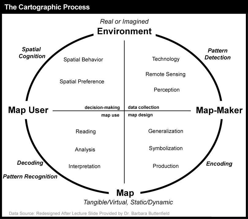
The cartographic process is a cycle that begins with a real or imagined environment. As map makers collect data from the environment (through technology and/or remote sensing), they use their perception to detect patterns and subsequently prepare the data for map creation (i.e., they think about the data and its patterns as well as how to best visualize them on a map). Next, the map maker uses the data and attempts to signify it visually on a map (encoding), applying generalization, symbolization, and production methods that will (hopefully) lead to a depiction that can be interpreted by the map user in the way the map maker intended (its purpose). Next, the map user reads, analyzes, and interprets the map by decoding the symbols and recognizing patterns. Finally, users make decisions and take action based upon what they find in the map. Through their provision of a viewpoint on the world, maps influence our spatial behavior and spatial preferences and shape how we view the environment.
In the cartographic process as outlined above, the fundamental component in generating a map to depict the environment is itself a process – the process of map abstraction. This is the topic we discuss next.
Practice Quiz
Registered Penn State students should return now take the self-assessment quiz about the Overview.
You may take practice quizzes as many times as you wish. They are not scored and do not affect your grade in any way.
3.1.1 Map Abstraction
It has become possible to map the world on the head of a pin, or even a smaller space, as shown here: Art of Science: World on the Head of a Pin [61], but, most details get left out. Even to achieve a screen-sized map of the world on your computer, map abstraction is fundamental to representing entities in a legible manner. The process of map abstraction includes at least five major (interdependent) steps: (a) selection, (b) classification, (c) simplification, (d) exaggeration, and (e) symbolization (Muehrcke and Muehrcke, 1992).
3.1.1.1 Selection
Depending on a map’s purpose, cartographers (map makers) select what information to include and what information to leave out. As Phillip Muehrcke (an Emeritus Professor of Geography from the University of Wisconsin) details, the cartographer must answer four questions: Where? When? What? Why? As an example (Figure 3.5), a cartographer can create a map of San Diego (where) showing current (when) traffic patterns (what) so that an ambulance can take the fastest route to an emergency (why).
The map in Figure 3.5 shows how a cartographer selected specific highways to include along with a few other features; these other features include a very generalized representation of the terrain, a few major rivers and lakes, and an indication of the area included in each of several communities (in pastel colors). The objective is to help drivers pick efficient routes by depicting the highways and whether traffic is moving quickly (green) or stalled (red). Other information is kept to a minimum and visually pushed to the background; that extra information is included to provide context for the primary focus (the highways and traffic on them).
3.1.1.2 Classification
Classification is the grouping of things into categories, or classes. By grouping attributes into a few discernible classes, new visual patterns in the data can emerge and the map becomes more legible. In the example above, the highways are classified into those without traffic detectors (gray) and those with traffic detectors (in color) and furthermore, within the latter, into slow (red), intermediate (yellow), and fast (green) travel conditions. There are many kinds of data classification used on maps; we will focus specifically on classification of numerical map data in more detail later on in the chapter. As a preview of some of the things map readers must consider about classification, the example below shows one dataset for the rate of prostate cancer by county in Pennsylvania mapped using a different number of classes. As you can see, different patterns emerge depending upon how many classes the cartographer chooses to visualize. One must be critical when looking at maps because changing the map classification can change what appears to be true. In How to Lie With Maps, Mark Monmonier discusses how mapmakers intentionally and unintentionally lie through techniques such as map classification, among others.
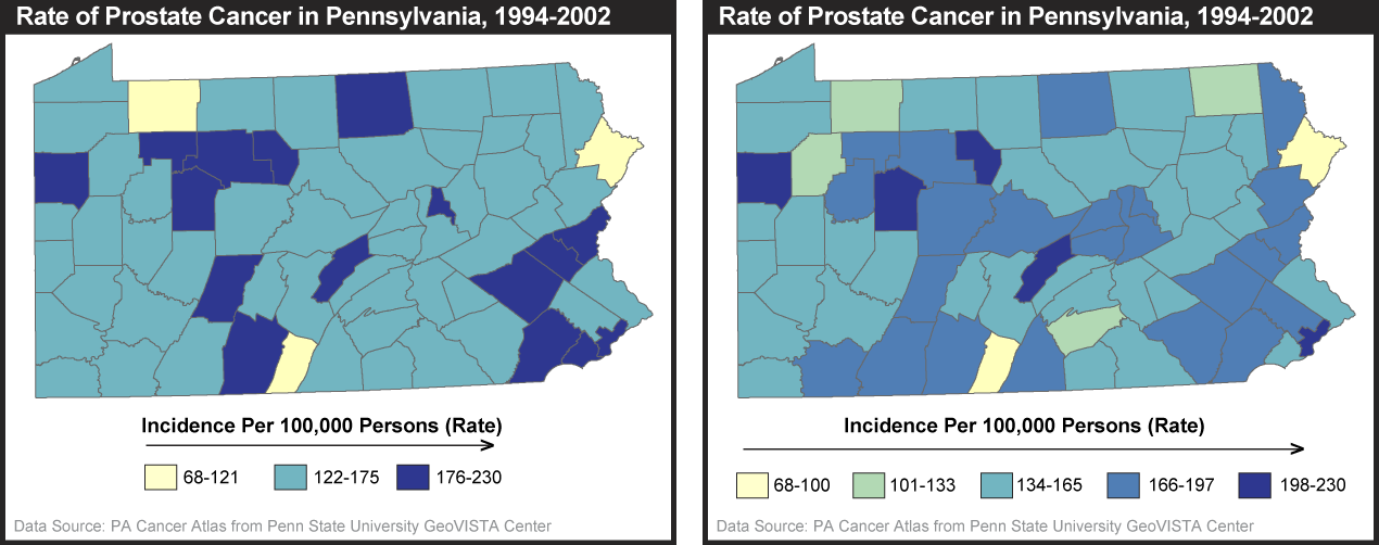
3.1.1.3 Simplification
Cartographers also need to simplify the features on a map beyond the tasks of feature type selection and feature classification in order to make a map more intelligible. This includes choosing to delete, smooth, typify, and aggregate entities within feature types. In the process of deleting entities, imagine creating a map of cities for the United States. As illustrated in Figure 3.7, attempting to include every city in the U.S. would render the map illegible. Map makers must delete, for instance, cities below a certain population (as done in the map on the right) in order to better serve the purpose of the map. In this case, if the purpose was to show the most populous cities, a fixed population threshold produces a very appropriate result. If, however, the purpose was to show the most important cities in the region, then an arbitrary population threshold does not work since, for example, Salt Lake City is just as important to Utah as Phoenix is to Arizona.

Smoothing is the act of eliminating unnecessary elements in the geometry of features, such as the superfluous details of a nation’s shoreline that can only be seen at a larger, zoomed-in regional scale. Typification depicts just the most typical components of the mapped feature. The visibility map above is a good example of typification in which the actual geographic shape of state boundaries is replaced with what might be considered a caricature that retains only key aspects of each state’s shape. Going beyond the simplification processes that act on one feature at a time, aggregation combines multiple features into one. Imagine a river composed of numerous meandering streams at a large scale (i.e., zoomed in), but when moving to a smaller scale (i.e., zooming out), the streams are merged into one larger river as it becomes impossible to maintain the detail. If you visit Google Maps [64] and zoom in to Harrisburg, Pennsylvania, you will find the Susquehanna River flowing through the middle of the capital. As you zoom out to a smaller scale, you will view the various smaller streams of the Susquehanna begin to collapse into a single blue line as the details of the river aggregate.
Try This: Practice Simplification in MapShaper
The purpose of this practice activity is to show you a visual example of simplification and smoothing of geographic features in the online MapShaper application.
- Go to the MapShaper site at MapShaper.org [65].
- Choose one of their sample layers (World Countries or Provinces of Thailand) tab and select OK.
- Choose a simplification method of your choice, and use the slider at the bottom of the page to increase the level of simplification of the mapped features.
I encourage you to experiment with the various methods and settings to see how simplification eliminates unnecessary elements as you move through different map scales.
3.1.1.4 Exaggeration
Deliberate exaggeration of map features is often performed in order to allow certain features to be seen. For instance, on a standard paper highway map of Pennsylvania (the fold-up kind you might have in the glove box of your car, thus about 3 feet across when unfolded), interstate highways are printed at roughly 0.035 inches in width. That sounds pretty small, right? But, if the width of the printed road relative to the map width was the same as the width of the actual highway relative to the width of Pennsylvania, it would mean that the Interstate was nearly 2000 feet wide! This is a typical case of exaggeration to create an abstraction that is useful for travel.
3.1.1.5 Symbolization
In the final process of creating a map, the cartographer symbolizes the selected features on a map. These features can be symbolized in visually realistic ways, such as a river depicted by a winding blue line. But many depictions are much more abstract, such as a circle or star representing a city. Map symbols are constructed from more primitive “graphic variables, the elements that make up symbols. Below, we provide a brief overview of these core graphic variables; then we focus on how color in particular is used (or should be used).
3.1.1.5.1 Graphic Variables
Given the large variety of maps that exist, it might be surprising to learn that the visual appearance of all maps starts from a very small set of display primitives from which all those variations can be constructed. We call these primitives graphic variables because each represents a “graphic” (visible) feature of a map symbol that can be “varied.” While different cartographers have identified a slightly different set of primitives, most agree that there are somewhere between 7 and 12 of them from which all maps symbolization can be constructed. The most commonly cited primitives that can be varied for map symbols are: location, size, shape, orientation, texture, and three components of color – color hue (red, green, blue, etc.), color lightness (how light or dark the color is), color saturation (how pure the color hue is). By convention, each of these "graphic variables" is used to represent particular categories of data variation.
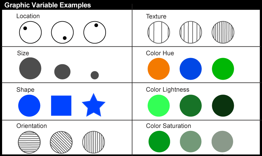
3.1.1.5.2 Color Schemes
As you can see above, three of the graphic variables are components of color. Color is particularly important for map symbolization today since so many maps are seen online where color is always available and nearly always used. While most maps you will see use color to depict data (as well as in aesthetic ways), many maps do not use color in the most logical ways in relation to the data being depicted. Well-designed maps use variations in the three color variables in ways that reflect the kinds of variations in the underlying data they represent. Below, we provide a few simple guidelines that will allow you to recognize maps that use color in logical as well as illogical ways. Recognizing the latter is particularly important so that you are not misled by maps you encounter.
To help cartographers (and others) select good colors for maps, Dr. Cynthia Brewer and Dr. Mark Harrower developed Color Brewer (ColorBrewer2.org [66]), a web app designed to help users pick colors based on data type, number of data classes, and mode of map presentation (i.e., printing, photocopying). The color schemes have been tested with users who have color deficiency (about 8% of the population; difficulty distinguishing red from green is the most common). The web app allows users to interact with a map template by changing colors, background, borders, and terrain. There are three main color scheme forms a user can choose from: sequential, diverging, and categorical. Each is appropriate for specific kinds of data as detailed below.
Sequential color schemes should be employed when data is arranged from a low to a high data value (e.g., data for mean annual income by county in Pennsylvania). This sequential scheme aligns colors from light (depicting low data values) to dark (depicting high data values) in a step-wise sequence. Sequential schemes can rely on only color lightness as shown below (Figure 3.9) at left or may add some color hue variation to enhance differences in categories will retaining the clear visual ordering as shown at right. As an example, Figure 3.10 uses a 4-class purple sequential scheme to depict Avian Influenza, with a focus on Eurasia.


Diverging color schemes highlight an important midrange or critical value of ordered data as well as the maximum and minimum data values. Two contrasting dark hues converge in color lightness at the critical value. This is the scheme used for the population change map in Figure 3.3 above in which the critical dividing point is zero change.

Unlike the ordered data mentioned in the previous color schemes, qualitative color schemes are used to present categorical data, or data belonging to different categories. Different hues visually separate each of the different classes, or categories. The map in Figure 3.13 employs a qualitative color scheme of three different colors (red, blue, green) to represent different categories (coke, pop, and soda respectively).

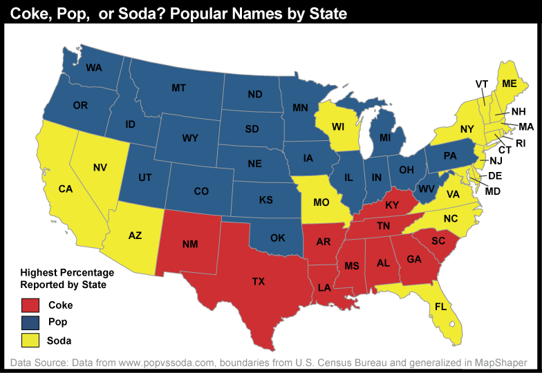
Practice Quiz
Registered Penn State students should return now take the self-assessment quiz about Cartographic Process.
You may take practice quizzes as many times as you wish. They are not scored and do not affect your grade in any way.
3.2 Thematic Maps
As introduced above, unlike reference maps, thematic maps are usually made with a single purpose in mind. Often, that purpose has to do with revealing the spatial distribution of one or two attribute data sets (e.g., to help readers understand changing U.S. demographics as with the population change map). Alternatively, thematic maps can have a decision-making purpose (e.g., to help users make travel decisions as with the real-time traffic map).
In the rest of this chapter, we will explore different types of thematic maps and consider which type of map is conventionally used for different types of data and different use goals. A primary distinction here is between maps that depict categorical (qualitative) data and those that depict numerical (quantitative) data.
3.2.1 Mapping Categorical Data
As mentioned in the section on color schemes, categorical data are data that can be assigned to distinct non-numerical categories. For example, the category of a beach could not be described as two times the value of a wetland; it is different in kind rather than amount. In mapping categorical data, cartographers often focus on displaying the different categories or classes through shape or color hue. The CrimeViz map application (CrimeViz [69]) developed in the GeoVISTA Center at Penn State visualizes violent crimes reported from the District of Columbia Data Catalog (DC Data Catalog [70]). Every crime location is displayed as a circular point, where each crime category is differentiated through hue (arson: orange, homicide: purple, sexual abuse: blue). This interactive map application allows map users to explore and find new patterns across space and time.

Aside from altering color to represent different categories on a map, changing the shape of a point symbol can help map users differentiate different groups. The Ushahidi (signifying “testimony” in Swahili) website [71] developed an online crowd sourcing map application [71]. Following the election in 2008, many Kenyans believed the new president manipulated votes in his favor, which led to violence throughout the country. Users of the Ushahidi website were prompted to report acts of violence in Kenya. Their map, automatically generated from the reports, displays different types of incidents by varying the shape of the point feature (fire: all categories, push pin: specific type of violence, dove: peace efforts, people: displaced people). In addition, each subcategory of violence (represented by push pins) is contrasted by differing hues (blue: riots, orange: deaths, and so on). The tools to create this mapping application have been distributed for free around the world and are now used for a wide array of crisis mapping applications. One recent example is their application to generate maps of sexual violence in Syria (Women Under Siege: Syria Crowdmap [72]); and for those who read Japanese, the tools were applied to the Japan Earthquake and subsequent nuclear disaster [73].

Categorical aspects of linear features can also be visualized on a map. In the figure below, different gas pipelines owned by various companies are depicted in different color hues. The dashed pink line in the top left of the figure represents a proposed gas line from Alaska that could send up to 4.5 billion cubic feet of natural gas a day to the conterminous United States. In this map, the cartographer uses the process of map abstraction for the purpose of displaying the current and proposed gas pipeline network. First, only necessary features (pipelines, territories and major cities) are selected for display in order to produce a clean and legible map. Next, the linear pipeline network is classified into several groups based upon distinct companies. The map is simplified by visualizing only major cities important to the gas pipeline network. The width of the pipeline is constant across the entire system, exaggerating the actual width (if the width of lines represented real-world diameter of the pipes proportionally, the real pipes would be 16 miles across). Finally, the classified/categorical data (the different pipeline companies) is symbolized by different color hues to represent the qualitative difference among the categories.

The maps above focus on depiction of specific discrete entities, things that have a label we use when discussing them. Categorical maps can also represent characteristics of extended areas or territories. In this case, rather than categorizing discrete entities, we categorize the characteristics of the place, and those places may or may not have precise boundaries. A prototypical example is a land use map in which all areas of the map fall into one of a set of distinct land use categories. The most common method to depict this kind of data is to fill the area with a color or a texture. Below is an example in which land use is depicted very abstractly. All places are assigned to one of only three categories: agriculture, forest, or developed.

Practice Quiz
Registered Penn State students should return now take the self-assessment quiz about Mapping Categorical Data.
You may take practice quizzes as many times as you wish. They are not scored and do not affect your grade in any way.
3.2.2 Mapping numerical data
When data are numerical, the mapping focus is typically on representing at least relative rank order among the entities depicted, with some maps trying to represent magnitudes in a direct way. A wide array of map types has been developed over the years to represent numerical data. Here, we will introduce some of the most common map types you are likely to encounter. There is a growing number of online tools that you can use to generate these common map types yourself.
We begin by introducing one of the most common thematic map types for numerical data, the choropleth map. This is followed by a brief discussion of the U.S. Census as an important source of numerical data that is depicted on choropleth thematic maps as well as on other thematic map types. We then introduce three important additional map types you are likely to encounter frequently: proportional symbol maps, dot maps, and cartograms.
Try This: Thematic Mapping of Flu Trends
Google collects certain search terms that users input because they are key indicators of flu among users. Visit Google Flu Trends [77] and explore current flu trends around the world that have been numerically classified from minimal to intense activity and mapped. Pick a country that has flu activity. Do you see any geographic patterns within the country? How does this year compare to the past?
3.2.2.1 Choropleth mapping
Choropleth maps are among the most prevalent types of thematic maps. Choropleth maps represent quantitative data that is aggregated to areas (often called “enumeration units”). The units can be countries of the world, states of a country, school districts, or any other regional division that divides the whole territory into distinct areas. The term choropleth is derived from the Greek; khōra 'region' + plēthos 'multitude' (thus, be careful not to mix up “choro”, which has no ‘l’, with the “chloro” of chlorophyll or chlorine). Choropleth maps depict quantities aggregated to their regions by filling the entire region with a shade or color. Typically, the quantities are grouped into “classes” (representing a range in data value) and a different fill is used to depict each class (see section 3.2.6 for more on data classification). The goal of choropleth maps is to depict the geographic distribution of the data magnitudes; ideally the choice of fill will communicate the range from low data magnitudes to high magnitudes through an obvious change from light to dark as in Figure 3.18 below. Choropleth maps should use either a sequential color scheme (as below) or a diverging color scheme depending upon whether there is a meaningful break point in the data from which values diverge or the data simply range from low to high (see section 2.1.5.2 above).

To generate eye-catching maps with easily distinguishable data classes, choropleth maps often combine color hue differences with a change in color lightness (as with the yellow, through orange, to dark red scheme depicted in Figure 3.18 above). But many maps get produced without following that cartographic rule, leading to some very colorful but misleading maps as shown in the pair below.

Choropleth maps are most appropriate for representing derived quantities, as represented in Figure 3.18 above. Derived quantities relate a data value to some reference value. Examples include density, average, rate, and percent. A density is a count divided by the area of the geographic unit to which the count was aggregated (e.g., the total population divided by the number of square kilometers to produce population/square mile, as in Figure 3.18). An average is a measure of central tendency, specifically the mean value calculated as a total amount divided by the number of entities producing the amount (e.g., the average income for a county calculated by totaling the income of all people in the country and dividing by the number of people). A rate is a quantity that tells us how frequently something occurs, a value compared to a standard value (e.g., Bradford County, PA had a rate of 45.1/100,000 deaths due to colorectal cancer among women over the period of 1994-2002). A percent is the proportion of a total (and can range from 0-100%). While choropleth maps are best for these derived quantities, you will also encounter choropleth maps used for counts (e.g., the number of crimes committed, votes cast in an election, etc.). When you do, it is important to read the map with caution because big regions are likely to have high totals just because they are big.

3.2.2.2 Census Data
Some of the richest sources of attribute data for thematic mapping, particularly for choropleth maps, are national censuses. In the United States, a periodic count of the entire population is required by the U.S. Constitution. Article 1, Section 2, ratified in 1787, states (in the last paragraph of the section shown below) that “Representatives and direct taxes shall be apportioned among the several states which may be included within this union, according to their respective numbers ... The actual Enumeration shall be made [every] ten years, in such manner as [the Congress] shall by law direct." The U.S. Census Bureau is the government agency charged with carrying out the decennial census.

The results of the U.S. decennial census determine states' portions of the 435 total seats in the U.S. House of Representatives. The thematic map below (Figure 3.22) shows states that lost and gained seats as a result of the reapportionment that followed the 2000 census. This map, focused on the U.S. by state, is a variant on a choropleth map. Rather than using color fill to depict quantity, color depicts only change and its direction, red for a loss in number of Congressional seats, gray for no change, and blue for a gain in number of Congressional seats. Numbers are then used as symbols to indicate amount of change (small -1 or +1 for a change of 1 seat and larger -2 or +2 for a change of two seats). This scaling of numbers is an example of the more general application of “size” as a graphic variable to produce “proportional symbols” – the topic we cover in detail in the section on proportional symbol mapping below.

Congressional voting district boundaries must be redrawn within the states that gained and lost seats, a process called redistricting. Constitutional rules and legal precedents require that voting districts contain equal populations (within about 1 percent). In addition, districts must be drawn so as to provide equal opportunities for representation of racial and ethnic groups that have been discriminated against in the past. Further, each state is allowed to create its own parameters for meeting the equal opportunities constraint. In Pennsylvania (and other states), geographic compactness has been used as one of several factors. Article II, Section 16 of the Pennsylvania Constitution says:
§ 16. Legislative districts.
The Commonwealth shall be divided into 50 senatorial and 203 representative districts, which shall be composed of compact and contiguous territory as nearly equal in population as practicable. Each senatorial district shall elect one Senator, and each representative district one Representative. Unless absolutely necessary no county, city, incorporated town, borough, township or ward shall be divided in forming either a senatorial or representative district. (Apr. 23, 1968, P.L.App.3, Prop. No.1). Source: Constitution of Pennsylvania [80]
Whether districts determined each decade actually meet these guidelines is typically a contentious issue and often results in legal challenges. Below, the Congressional District map for PA that defines the boundaries of districts for the 112th Congress illustrates how irregular districts can be. District 12 has a particularly interesting shape.

Beyond the role of the census of population in determining the number of representatives per state (thus in providing the data input to reapportionment and redistricting), the Census Bureau's mandate is to provide the population data needed to support governmental operations, more broadly including decisions on allocation of federal expenditures. Its broader mission includes being "the preeminent collector and provider of timely, relevant, and quality data about the people and economy of the United States". To fulfill this mission, the Census Bureau needs to count more than just numbers of people, and it does. We will discuss this in more detail later (in section 3.3, Thinking about aggregated data: Enumeration versus samples).
3.2.2.3 Proportional Symbol Mapping
Besides reapportionment and redistricting, U.S. Census counts also affect the flow of billions of dollars of federal expenditures, including contracts and federal aid, to states and municipalities. In 2011, for example, some $486 billion of Medicaid funds were distributed according to a formula that compared state and national per capita income. $93 billion worth of highway planning and construction funds were allotted to states according to their shares of urban and rural population. And $120 billion of Unemployment Compensation was distributed from the Federal level. The thematic maps below (using historical data from 1995) illustrate the strong relationship between population counts and the distribution of federal tax dollars using proportional symbols (symbols in which the graphic variable of size is used to depict data magnitude).

There are two types of point features that are typically depicted with proportional symbols: features for which the data represents a geographic position directly (e.g., gallons of oil from individual oil wells), and features that are geographic areas to which data are aggregated and the data magnitudes are assigned to a representative point within the area (e.g., the geographic centroid of a state as in the examples above). In either case, the area of the symbol is scaled to represent the data magnitude, sometimes with a bit of exaggeration to adjust for a general tendency of human vision to underestimate differences in area. A variant on this direct data-to-symbol scaling groups values into categories first, then scales the symbol to represent the mean for the category, assigning a symbol to each place to represent the category range that the mean for the place falls within (see Figure 3.25 below).

One important characteristic of proportional symbols is that they can easily be designed to represent more than one data value per location. Among the most common example is a “pie chart map” in which a circle is scaled proportionally to some total, and the size of wedges within the circle is scaled to depict a proportion of a total for two or more sub-categories. The map below uses circle size to depict population totals in each state, and the pie slices then depict the proportion of that total who identify as Hispanic compared to those who are non-Hispanic.

Practice Quiz
Registered Penn State students should return now take the self-assessment quiz about Choropleth Mapping, Census Data, and Proportional Symbol Mapping.
You may take practice quizzes as many times as you wish. They are not scored and do not affect your grade in any way.
3.2.2.4 Dot Mapping
For data that represent an area, proportional symbols are a fairly extreme abstraction. They provide a very simple overview of data magnitudes geographically but hide any geographic variation that might occur inside the enumeration units to which the data are aggregated. An alternative is the dot map. Dot maps depict magnitude by frequency rather than the size of symbol and add the depiction of geographic distribution by use of the graphic variable of location. Specifically, dot maps assign one to many dots per enumeration area to represent a specific count in each area. The difference between a dot map and a simple map of point features is that each dot represents more than one entity and the locations are representative of the distribution rather than being exact locations. Specifically, dots that represent some count are placed within enumeration units to represent generally where the feature or attribute occurs.
In the example below, the dot map depicts the size of the Hispanic population by the number of dots per state. Each dot represents 100,000 people in this case, and the general geographic distribution of the Hispanic population within the state is signified by the position of the dots. Not surprisingly, dot maps can vary substantially in how well the distribution of dots on the map represents the actual distribution of the phenomena in the world. Cartographers typically use secondary sources of information to help them decide on the appropriate locations for the dots (e.g., land use maps, satellite images, or statistics collected for smaller geographic units like counties). But, the position of dots usually is based on an educated estimate of distribution rather than on any direct measurement of where the people (in this case) or automobiles or bushels of wheat (or the many other kinds of things we can count) actually are.

3.2.2.5 Cartograms
A cartogram can be considered a special case of proportional symbol mapping. But, in this case, the “symbol” that is scaled in proportion to a data magnitude is the geographic area for which data are aggregated. Cartograms are unusual enough that they attract viewer attention, making them a popular mapping method with the media, particularly during election years. Their primary weakness (in addition to distorting geography so that no standard measurements such as distance among places are accurate), is that they cannot be interpreted correctly unless the map reader knows the actual geographic shapes of the map units so that sizes can be related to the places they represent.
The map below shows the results of the 2008 Presidential election, with a red state signifying a majority of votes for John McCain, the republican candidate, and blue states a majority for Barack Obama, the democratic candidate. This cartogram scales the areas of each shape to represent its respective total population, visually showing how the majority of the United States voted.

The following maps illustrate the power that some cartograms can have in helping users visually comprehend a phenomenon. While the map on the left depicts the majority vote results by county (with a vast majority of counties for the Republican candidate), the cartogram on the right shows the areas again depicted by population (this time with the country rather than state level data), revealing the larger number of Democratic support. The map on the left gives a distorted view (even though it does not look distorted) because a majority of counties won by the Republican candidate were low in population and many were large in area.

For more election cartogram examples, visit University of Michigan 2008 election site [82].
Try This: Practice Identifying Mapping Techniques
Visit the National Geographic Earthpulse map [83]. On the left-hand side, you will find numerous check boxes for different thematic maps. Choose two thematic maps and identify at least two cartographic techniques (any that have been discussed in the chapter) the cartographer used when creating this map. For instance, in the map above (Figure 3.30), the cartographer used a qualitative color scheme (blue and red) on a choropleth map to show different categories (democratic or republication majority vote) for each U.S. state.
3.2.2.6 Numerical Data Classification
As discussed above (and in Chapter 1), all maps are abstractions. This means that they depict only selected information, but also that the information selected must be generalized due to the limits of display resolution, comparable limits of human visual acuity, and especially the limits imposed by the costs of collecting and processing detailed data. What we have not previously considered is that generalization is not only necessary, it is sometimes beneficial; it can make complex information understandable.
Consider a simple example. The graph below (Figure 3.31) shows the percent of people who prefer the term “pop” (not soda or coke) for each state. Categories along the x axis of the graph represent each of the 50 unique percentage values (two of the states had exactly the same rate). Categories along the y axis are the numbers of states associated with each rate. As you can see, it's difficult to discern a pattern in these data; it appears that there is no pattern.

The following graph (Figure 3.32) shows exactly the same data set, only grouped into 10 classes with equal 10% ranges). It's much easier to discern patterns and outliers in the classified data than in the unclassified data. Notice that people in a large number of states (23) do not really prefer the term “pop” as they are distributed around 0 to 10 percent of users who favor that term. There are no states at the other extreme (91-100%), but a few states whose vast majority (81-90% of their population) prefer the term pop. Ignoring the many 0-10% states where pop is rarely used, the most common states are ones in which about 2/3 favor the term; looking back to Figure 3.13, these are primarily northern states, including Pennsylvania. All of these variations in the information are obscured in the unclassified data.

As shown above, data classification is a generalization process that can make data easier to interpret. Classification into a small number of ranges, however, gives up some details in exchange for the clearer picture, and there are multiple choices of methods to classify data for mapping. If a classification scheme is chosen and applied skillfully, it can help reveal patterns and anomalies that otherwise might be obscured (as shown above). By the same token, a poorly-chosen classification scheme may hide meaningful patterns. The appearance of a thematic map, and sometimes conclusions drawn from it, may vary substantially depending on the data classification scheme used. Thus, it is important to understand the choices that might be made, whether you are creating a map or interpreting one created by someone else.
Many different systematic classification schemes have been developed. Some produce mathematically "optimal" classes for unique data sets, maximizing the difference between classes and minimizing differences within classes. Since optimizing schemes produce unique solutions, however, they are not the best choice when several maps need to be compared. For this, data classification schemes that treat every data set alike are preferred.

Two commonly used classification schemes are quantiles and equal intervals. The following two graphs illustrate the differences.

The graph above groups the Pennsylvania county population change data into five classes, each of which contains the same number of counties (in this case, approximately 20 percent of the total in each). The quantiles scheme accomplishes this by varying the width, or range, of each class. Quantile is a general label for any grouping of rank ordered data into an equal number of entities; quantiles with specific numbers of groups go by their own unique labels ("quartiles" and "quintiles," for example, are instances of quantile classifications that group data into four and five classes respectively). The figure below, then, is an example of quintiles.

In the second graph, the data range of each class is equivalent (8.5 percentage points). Consequently, the number of counties in each equal interval class varies.


As you can see, the effect of the two different classification schemes on the appearance of the two choropleth maps above is dramatic. The quantiles scheme is often preferred because it prevents the clumping of observations into a few categories shown in the equal intervals map. Conversely, the equal interval map reveals two outlier counties that are obscured in the quantiles map. Due to the potentially extreme differences in visual appearance, it is often useful to compare the maps produced by several different map classifications. Patterns that persist through changes in classification schemes are likely to be more conclusive evidence than patterns that shift. Patterns that show up with only one scheme may be important, but require special scrutiny (and an understanding of how the scheme works) to evaluate.
Practice Quiz
Registered Penn State students should return now take the self-assessment quiz about Dot Mapping, Cartograms, and Data Classification.
You may take practice quizzes as many times as you wish. They are not scored and do not affect your grade in any way.
3.2.3 Thinking about aggregated data: Enumeration versus samples
Quantitative data of the kinds depicted by the maps detailed in the previous section come from a diverse array of sources. In the U.S., one of the most important sources is the U.S. Bureau of the Census (discussed briefly above). Here we focus in on one important distinction in data collected by the Census and by other organizations, a distinction between complete enumeration (counting every entity) and sampling.
Sixteen U.S. Marshals and 650 assistants conducted the first U.S. census in 1791. They counted some 3.9 million individuals, although as then-Secretary of State Thomas Jefferson reported to President George Washington, the official number understated the actual population by at least 2.5 percent (Roberts, 1994). By 1960, when the U.S. population had reached 179 million, it was no longer practical to have a census taker visit every household. The Census Bureau then began to distribute questionnaires by mail. Of the 116 million households to which questionnaires were sent in 2000, 72 percent responded by mail. A mostly-temporary staff of over 800,000 was needed to visit the remaining households, and to produce the final count of 281,421,906. Using statistically reliable estimates produced from exhaustive follow-up surveys, the Bureau's permanent staff determined that the final count was accurate to within 1.6 percent of the actual number (although the count was less accurate for young and minority residences than it was for older and white residents). It was the largest and most accurate census to that time. (Interestingly, Congress insists that the original enumeration or "head count" be used as the official population count, even though the estimate calculated from samples by Census Bureau statisticians is demonstrably more accurate.) As of this writing, some aspects of reporting from the decennial census of 2010 are still underway. Like 2000, the mail-in response rate was 72 percent. The official 2010 census count, by state, was delivered to the U.S. Congress on December 21, 2010 (10 days prior to the mandated deadline). The total count for the U.S. was 308,745,538, a 9.7% increase over 2000.
In the first census, in 1791, census takers asked relatively few questions. They wanted to know the numbers of free persons, slaves, and free males over age 16, as well as the sex and race of each individual. (You can view replicas of historical census survey forms at Ancestry.com [85]) As the U.S. population has grown, and as its economy and government have expanded, the amount and variety of data collected has expanded accordingly. In the 2000 census, all 116 million U.S. households were asked six population questions (names, telephone numbers, sex, age and date of birth, Hispanic origin, and race), and one housing question (whether the residence is owned or rented). In addition, a statistical sample of one in six households received a "long form" that asked 46 more questions, including detailed housing characteristics, expenses, citizenship, military service, health problems, employment status, place of work, commuting, and income. From the sampled data the Census Bureau produced estimated data on all these variables for the entire population.
In the parlance of the Census Bureau, data associated with questions asked of all households are called 100% data and data estimated from samples are called sample data. Both types of data are aggregated by various enumeration areas, including census block, block group, tract, place, county, and state (see the illustration below). Through 2000, the Census Bureau distributes the 100% data in a package called the "Summary File 1" (SF1) and the sample data as "Summary File 3" (SF3). In 2005, the Bureau launched a new project called American Community Survey that surveys a representative sample of households on an ongoing basis. Every month, one household out of every 480 in each county or equivalent area receives a survey similar to the old "long form." Annual or semi-annual estimates produced from American Community Survey samples replaced the SF3 data product in 2010.
To protect respondents' confidentiality, as well as to make the data most useful to legislators, the Census Bureau aggregates the data it collects from household surveys to several different types of geographic areas. SF1 data, for instance, are reported at the block or tract level. There were about 8.5 million census blocks in 2000. By definition, census blocks are bounded on all sides by streets, streams, or political boundaries. Census tracts are larger areas that have between 2,500 and 8,000 residents. When first delineated, tracts were relatively homogeneous with respect to population characteristics, economic status, and living conditions. A typical census tract consists of about five or six sub-areas called block groups. As the name implies, block groups are composed of several census blocks. American Community Survey estimates, like the SF3 data that preceded them, are reported at the block group level or higher. Figure 3.38 details the many geographic unit types that are used to organize data and how they relate. The unit types down the center of the diagram nest, with each higher type composed of some number of the lower type as outlined above for blocks, block groups, and census tracts.

Try This: Acquiring U.S. Census Data via the World Wide Web
The purpose of this practice activity is to guide you through the process of finding and acquiring 2000 census data from the U.S. Census Bureau data via the Web. Your objective is to look up the total population of each county in your home state (or an adopted state of the U.S.).
- Go to the U.S. Census Bureau site at Census.gov [87].
- At the Census Bureau home page, hover your mouse cursor over the Explore Data tab and select Explore Data Main. American FactFinder is the Census Bureau's primary medium for distributing census data to the public. Click on the link for it (an image with label at the top of the page).
- On the American FactFinder homepage, select "Guided Search" - Get Me Started. In the first step, choose "I'm looking for information about people" then click "NEXT".
- Click the Topics search option box. In the Select Topics overlay window, expand the People list. Next expand the Basic Count/Estimate list. Then choose Population Total. Note that a Population Total entry is placed in the Your Selections box in the upper left, and it disappears from the Basic Count/Estimate list.
Close the Select Topics window. - The list of datasets in the resulting Search Results window is for the entire United States. We want to narrow the search to county-level data for your home or adopted state.
Click the Geographies search options box. In the Select Geographies overlay window that opens, under Select a geographic type:, click County.
Next select the entry for your state from the Select a state list, and then from the Select one or more geographic areas.... list select All counties within your state> .
Last click ADD TO YOUR SELECTIONS. This will place your All Counties… choice in the Your Selections box.
Close the Select Geographies window. - The list of datasets in the Search Results window now pertains to the counties in your state. Take a few moments to review the datasets that are listed. Note that there are SF1, SF2, ACS (American Community Survey), etc., datasets, and that if you page through the list far enough you will see that data from past years is listed. We are going to focus our effort on the 2010 SF1 100% Data.
- Given that our goal is to find the population of the counties in your home state, can you determine which dataset we should look at?
There is a TOTAL POPULATION entry, probably on page 2. Find it, and make certain you have located the 2010 SF1 100% Data dataset. (You can use the Narrow your search: slot above the dataset list to help narrow the search.)
Check the box for it and click View.
In the new Results window that opens, you should be able to find the population of the counties in your chosen state.
Note the row of Actions:, which includes Print and Download buttons.
I encourage you to experiment some with the American FactFinder site. Start slow, and just click the BACK TO SEARCH button, un-check the TOTAL POPULATION dataset and choose a different dataset to investigate. Registered students will need to answer a couple of quiz questions based on using this site.
Pay attention to what is in the Your Selections window. You can easily remove entries by clicking the red circle with the white X.
On the SEARCH page, with nothing in the Your Selections box, you might try typing “QT” or “GCT” in the Narrow your search: slot. QT stands for Quick Tables, which are preformatted tables that show several related themes for one or more geographic areas. GCT stands for Geographic Comparison Tables, which are the most convenient way to compare data collected for all the counties, places, or congressional districts in a state, or all the census tracts in a county.
3.2.4 Example Thematic Maps Produced at Penn State
Below, you will find several thematic maps produced by graduate students or faculty in the Department of Geography at Penn State to provide an idea of the variety that exists. Thematic maps cover a virtually unlimited range of topics and goals since they can depict any “theme” that varies from place to place. Thus, the examples below and the ones to follow in the rest of the chapter provide just a hint of what is possible.
In the map below, size, or height of each column, is the key graphic variable used to represent the total number of international passenger arrivals at each airport in Canada and the United States. This is a very direct representation similar to thinking about piling up a stack of pennies, with one for every airline passenger.


Try This: The Purpose of Thematic Mapping
Find a thematic map online and identify both the theme and purpose of the map.
Practice Quiz
Registered Penn State students should return now take the self-assessment quiz about Aggregated Data.
You may take practice quizzes as many times as you wish. They are not scored and do not affect your grade in any way.
3.3 Summary
This chapter has introduced a set of key concepts that underlie how maps represent data, specifically thematic maps. Mapping as a method to represent data has been related to cartography as a professional field focused on developing the science that supports effective mapping and the practice and technology of generating maps. Emphasis has been on the many different map types, how they are created, and what types of data are best suited for each map type. The core building blocks used to create map symbolization have also been introduced.
To summarize this chapter, maps are abstractions of the real world created through systematic selection, classification, simplification, exaggeration, and symbolization. They are products of the cartographic process, a cyclic process involving data as inputs, the final map as an output, as well as the map maker and map user as the creator and consumer of the map. Thematic maps help reveal geographic patterns that are hard or impossible to find in lists of numbers that data are typically presented in. Graphic variables and color schemes form the building blocks for thematic map construction. Furthermore, different types of thematic maps are used to represent different types of data, both categorical and numerical. Count data, for instance, are conventionally portrayed with symbols that are distinct from the statistical areas they represent, because counts are independent of the sizes of those areas. Rates and densities, on the other hand, are often portrayed as choropleth maps, in which the statistical areas themselves serve as symbols whose color lightness is varied with the magnitude of the attribute data they represent. Attribute data shown on choropleth maps are usually classified. Classification schemes that facilitate comparison of map series, such as the quantiles and equal intervals schemes demonstrated in this lesson, are the most common.
Try This: The Good, The Bad, and The Ugly
Surf the Internet and find a good map, a bad map, and an ugly map. What attributes are the important ones for assigning each map to the category you put it in?
3.4 Glossary
Aggregation: The process of combining multiple features into one.
Average: A measure of central tendency, specifically the mean value calculated as a total amount divided by the number of entities producing the amount.
Cartographic Process: A cyclic process linking data from the environment as inputs, the final map as an output, as well as the map maker and map user as the creator and consumer of the map.
Cartography: The academic and professional field focused on mapping.
Choropleth Map: A map that depicts quantities aggregated to their regions (often called “enumeration units”) by filling the entire region with a shade or color.
Count: Whole numbers that represent the individual data such as people or housing units.
Delete: Systematically removing data to better serve the purpose of the map such as map legibility.
Density: A count divided by the area of the geographic unit to which the count was aggregated.
Dot Map: Maps that depict magnitude by frequency rather than size of symbol and add the depiction of geographic distribution by use of the graphic variable of location. Specifically, dot maps assign one to many dots per enumeration area to represent a specific count in each area.
Enumeration Areas: Areas or regions in which quantitative data is aggregated to (e.g., census tracts, counties, states, etc.).
Equal Interval: A data classification scheme that divides the data into equal sections (intervals).
Graphic Variables: Primitives in which map symbols are constructed. The core graphic variables include location, size, shape, orientation, texture, and three components of color – color hue (red, green, blue, etc), color lightness (how light or dark the color is), color saturation (how pure the color hue is).
Map Abstraction: The process of representing the real world in simplified form in order to generate a more legible map. It includes at least five major (interdependent) steps: (a) selection, (b) classification, (c) simplification, (d) exaggeration, and (e) symbolization.
Percent: The proportion of a total ranging from 0-100%.
Proportional Symbols: Symbols in which the graphic variable of size is used to depict data magnitude. There are two types of point features typically depicted: features where data represents a geographic position directly and features that are geographic areas to which data are aggregated and the data magnitudes are assigned to a representative point within the area.
Quantile: A general label for any grouping of rank ordered data into an equal number of entities; quantiles with specific numbers of groups go by their own unique labels ("quartiles" and "quintiles," for example, are instances of quantile classifications that group data into four and five classes respectively).
Rate: A quantity that tells us how frequently something occurs, where a value is compared to a standard value.
Reference Map: A map with a main purpose to act as a reference. The prototypical reference map depicts the location of “things” that are usually visible in the world.
Smoothing: The act of eliminating unnecessary elements in the geometry of features, such as the superfluous details of a nation’s shoreline that can only be seen at a larger, zoomed in regional scale.
Thematic Map: A map typically depicting “themes,” generally more abstract, involving more processing and interpretation of data and often representing concepts that are not directly visible; examples include maps of income, health, climate, or ecological diversity.
Typification: A depiction of the most typical components of the mapped feature.
3.5 Bibliography
Muehrcke, P. and Muehrcke, J.O. 1992: Map Use: Reading, Analysis, and Interpretation. 3rd edition. Madison, WI: JP Publications.
Slocum, T., McMaster, R., Kessler, F. and Howard, H.H. 2009: Thematic Cartography and Visualization. Upper Saddle River, NJ: Prentice Hall.
Brewer, C. & Suchan, T., (2001). Mapping census 2000: The geography of U. S. diversity. U. S. Census Bureau, Census Special Reports, Series CENSR/01-1. Washington, D. C.: U.S. Government Printing Office.
Chrisman, N. (2002). Exploring geographic information systems. (2nd ed.). New York: John Wiley & Sons, Inc.
Monmonier, M. (1995). Drawing the line: Tales of maps and cartocontroversy. New York: Henry Holt and Company.
Roberts, S. (1994). Who we are: A portrait of America based on the latest U.S. census. New York: Times Books.
U.S. Census Bureau (n. d.). Retrieved July 19, 1999, from http://www.census.gov [88]
U.S. Census Bureau (1996). Federal expenditures by state for fiscal year 1995. Retrieved May 9, 2006, from www.census.gov/prod/2/gov/fes95rv.pdf [81]
U.S. Census Bureau (2005). American FactFinder Retrieved July, 19, 1999, from http://factfinder.census.gov [89]
U.S. Census Bureau (n. d.). American FactFinder Retrieved August 2, 2012, from https://factfinder.census.gov/faces/nav/jsf/pages/index.xhtml [89]
U.S. Census Bureau (2008). A Compass for understanding and using American Community Survey data: What general users need to know. U.S. Government Printing Office, Washington DC, 2008.
Chapter 4: Encoding Our World: Geographic Data Representation
Overview
Information is a fundamental commodity, as discussed in Chapter 1, that it has become difficult or impossible for government agencies, businesses, other organizations, as well as individuals, to do without. Many of the problems and opportunities faced by organizations of all types are so complex, and involve so many locations, that the organizations need assistance in creating useful and timely information. That's what information systems are for. Information systems are computer-based tools that help people transform data into information.
Suppose that you've launched a new business that manufactures solar-powered lawn mowers. You're planning a mail campaign to bring this revolutionary new product to the attention of prospective buyers. But, since it's a small business, you can't afford to sponsor coast-to-coast television commercials, or to send brochures by mail to more than 100 million U.S. households. Instead, you plan to target the most likely customers - those who are environmentally conscious, have higher than average family incomes, and who live in areas where there is enough water and sunshine to support lawns and solar power.
Fortunately, lots of data are available to help you define your mailing list. Household incomes are routinely reported to banks and other financial institutions when families apply for mortgages, loans, and credit cards. Personal tastes related to issues like the environment are reflected in behaviors such as magazine subscriptions and credit card purchases. Firms like Claritas [90] collect such data and transform it into information by creating "lifestyle segments" - categories of households that have similar incomes and tastes. Your solar lawnmower company can purchase lifestyle segment information by 5-digit ZIP code, or even by ZIP+4 codes, which designate individual households.
It's astonishing how companies like Claritas can create valuable information from the millions upon millions of transactions that are recorded every day. Their products are made possible by the fact that the original data exist in digital form and because the companies have developed information systems that enable them to transform the data into information that companies like yours value. The fact that lifestyle information products are often delivered by geographic areas, such as ZIP codes, speaks to the appeal of geographic information systems (GIS). The scale of these data and their potential applications are increasing continually with the advent of new mechanisms for sharing information and making purchases that are linked to our GPS-enabled smartphones (more on those in Chapter 5). Here, we focus on how all the geographically-referenced data is organized, stored, and accessed in systems that turn the data into information.
A Geographical Information System (GIS) is a computer-based tool used to help people transform geographic data into geographic information.
The definition implies that a GIS is somehow different from other information systems, and that geographic data are different from non-geographic data. Let's consider these differences.
GIS arose out of the need to perform spatial queries on geographic data (questions addressed to a database such as wanting to know a distance or the location where two objects intersect). A spatial query requires knowledge of locations as well as attributes about that location. For example, an environmental analyst might want to know which public drinking water sources are located within one mile of a known toxic chemical spill. Or, a planner might be called upon to identify property parcels located in areas that are subject to flooding. To accommodate geographic data and spatial queries and help users understand the answer to their queries, the system for managing your data (i.e., a database management system) needs to be integrated with a mapping system. Until about 1990, most maps were printed from handmade drawings or engravings or at least had multiple manual processing steps between data collection and map generation. Geographic data produced by draftspersons consisted of graphic marks inscribed on paper or film. To this day, most of the lines that appear on topographic maps published by the U.S. Geological Survey were originally engraved by hand. The place names shown on the maps were affixed with tweezers, one word at a time. Needless to say, such maps were expensive to create and to keep up to date. Computerization of the mapmaking process had obvious appeal.
As stated earlier, information systems assist decision makers by enabling them to transform data into useful information. GIS specializes in helping users transform geographic data into geographic information. In particular, GIS enables decision makers to identify locations or routes whose attributes match multiple criteria, even though entities and attributes may be encoded in many different data files. A geographic information system uses a data model to incorporate geographic features from the real world into digital data representations. The geographic data are stored in a database and later displayed on a map. Users commonly manipulate and create new data within a database in order to solve a problem. For instance, a city planner may want to enhance public transportation by adding new bus lines. One important issue for the planner is to make sure new bus lines serve a large population. If the planner already has a geographic database with information on population and area for every city block, population density can be computed (density = population/area) into the existing database (Table 4.1).
| Block | Population | Area in Sq. Meters | Population Density |
|---|---|---|---|
| Block 1 | 97 | 1350 | 97/1350 =.07 |
| Block 2 | 254 | 410 | .61 |
| Block 3 | 296 | 275 | 1.08 |
| Block 4 | 122 | 450 | .27 |
| Block 5 | 158 | 700 | .03 |
| ... | ... | ... | ... |
Example of a portion of a table stored in a geographical database. This fictional table depicts data by Census Block (a geographical unit discussed in Chapter 3). In this database, this table will be dynamically linked to another that has coordinate information to define where the Census blocks referred to are in the world.
Credit: Jennifer M. Smith, Department of Geography, The Pennsylvania State University.
The hypothetical database above reveals that for Block 3, there are on average 1.08 people per square meter. Based on the database computations, the city planner should make the bus line stop on along Block 3 where the most people are located per square meter.
This chapter will explore the characteristics of digital data and how it is represented in a GIS by discussing how it is stored, managed, and manipulated.
Objectives
Students who successfully complete Chapter 4 should be able to:
- distinguish the difference between features and attributes;
- identify the different attribute measurement scales and basic operations for each type;
- understand what a database management system is and identify what it is used for;
- understand what metadata is and why it is used;
- identify the difference between vector and raster data.
Table of Contents
- Feature Versus Attributes
- Attribute Measurement Scales
- Database Managmenet Systems
- Metadata
- Vector Versus Raster
- Summary
- Glossary
- Biblography
Chapter lead author: Jennifer M. Smith.
Portions of this chapter were drawn directly from the following text:
Joshua Stevens, Jennifer M. Smith, and Raechel A. Bianchetti (2012), Mapping Our Changing World, Editors: Alan M. MacEachren and Donna J. Peuquet, University Park, PA: Department of Geography, The Pennsylvania State University.
4.1 Feature Versus Attributes
As discussed in Chapter One, geographic data represent spatial locations (i.e., a feature) and non-spatial attributes measured at certain times. For instance, a city (a feature with a spatial location) can contain an endless number of attributes. Geographic data for a specific city may include attributes such as its population, the types of public transportation, and various land use patterns. Over recent years, software developers have created variations on standard query languages (SQL) that incorporate spatial queries. The dynamic nature of geographic phenomena complicates the issue further, however. The need to pose spatio-temporal queries challenges geographic information scientists (GIScientists) to develop ever more sophisticated ways to represent geographic phenomena, thereby enabling analysts to interrogate their data in more sophisticated ways.
4.1.1 Tables: Location versus Attribute
To explore the differences between a location and its attributes, view the table below of a geographic database originating from the U.S. Census Bureau and imported into ESRI’s ArcMap program. Each row in the attribute table refers to a feature’s location on the map, with numerous attributes associated with it. In this example, each object refers to a state that includes attribute data including information such as its FID (unique identifier), shape (polygon), state abbreviation, full state name, a FIPS code (unique code assigned to each state), and the longitude and latitude coordinates. As you can see, the fifth row highlighted in light blue is selected and the mapping program automatically links to the spatial representation of the state of California, also outlined in light blue. This functionality allows users to manipulate, query, and select features and their attributes in the table, while viewing changes dynamically on the map.

4.2 Attribute Measurement Scales
Chapter 2 focused upon measurement scales for spatial data, including map scale (expressed as a representative fraction), coordinate grids, and map projections (methods for transforming three dimensional to two dimensional measurement scales). You may know that the meter, the length standard established for the international metric system, was originally defined as one-ten-millionth of the distance from the equator to the North Pole. In virtually every country except the United States, the metric system has benefited science and commerce by replacing fractions with decimals, and by introducing an Earth-based standard of measurement.
Standardized scales are needed to measure non-spatial attributes as well as spatial features. Unlike positions and distances, however, attributes of locations on the Earth's surface are often not amenable to absolute measurement. In a 1946 article in Science, a psychologist named S. S. Stevens outlined a system of four levels of measurement meant to enable social scientists to systematically measure and analyze phenomena that cannot simply be counted. (In 1997, geographer Nicholas Chrisman pointed out that a total of nine levels of measurement are needed to account for the variety of geographic data.) The levels are important to specialists in geographic information because they provide guidance about the proper use of different statistical, analytical, and cartographic operations. In the following, we consider examples of Stevens' original four levels of measurement: nominal, ordinal, interval, and ratio.
4.2.1 Nominal Level
The term nominal simply means to relate to the word “name.” Simply put, nominal level data are data that are denoted with different names (e.g., forest, water, cultivated, wetlands), or categories. Data produced by assigning observations into unranked categories are nominal level measurements. In relation to terminology used in Chapter 1, nominal data are a type of categorical (qualitative) data. Specifically, nominal level data can be differentiated and grouped into categories by “kind,” but are not ranked from high to low. For example, one can classify the land cover at a certain location as woods, scrub, orchard, vineyard, or mangrove. There is no implication in this distinction, however, that a location classified as "woods" is twice as vegetated as another location classified "scrub."
Although census data originate as individual counts, much of what is counted is individuals' membership in nominal categories. Race, ethnicity, marital status, mode of transportation to work (car, bus, subway, railroad...), and type of heating fuel (gas, fuel oil, coal, electricity...) are measured as numbers of observations assigned to unranked categories. For example, the map below, which appears in the Census Bureau's first atlas of the 2000 census, highlights the minority groups with the largest percentage of population in each U.S. state. Colors were chosen to differentiate the groups through a qualitative color scheme to show differences between the classes, but not to imply any quantitative ordering. Thus, although numerical data were used to determine which category each state is in, the map depicts the resulting nominal categories rather than the underlying numerical data.

4.2.2 Ordinal Level
Like the nominal level of measurement, ordinal scaling assigns observations to discrete categories. Ordinal categories, however, are ranked, or ordered – as the name implies. It was stated in the preceding section that nominal categories such as "woods" and "mangrove" do not take precedence over one another, unless a set of priorities is imposed upon them. This act of prioritizing nominal categories transforms nominal level measurements to the ordinal level. Because the categories are not based upon a numerical value (just an indication of an order or importance), ordinal data are also considered to be categorical (or qualitative).
Examples of ordinal data often seen on reference maps include political boundaries that are classified hierarchically (national, state, county, etc.) and transportation routes (primary highway, secondary highway, light-duty road, unimproved road). Ordinal data measured by the Census Bureau include how well individuals speak English (very well, well, not well, not at all), and level of educational attainment (high school graduate, some college no degree, etc.). Social surveys of preferences and perceptions are also usually scaled ordinally.
Individual observations measured at the ordinal level are not numerical, thus should not be added, subtracted, multiplied, or divided. For example, suppose two 600-acre grid cells within your county are being evaluated as potential sites for a hazardous waste dump. Say the two areas are evaluated on three suitability criteria, each ranked on a 0 to 3 ordinal scale, such that 0 = completely unsuitable, 1 = marginally unsuitable, 2 = marginally suitable, and 3 = suitable. Now say Area A is ranked 0, 3, and 3 on the three criteria, while Area B is ranked 2, 2, and 2. If the Siting Commission was to simply add the three criteria, the two areas would seem equally suitable (0 + 3 + 3 = 6 = 2 + 2 + 2), even though a ranking of 0 on one criteria ought to disqualify Area A.
4.2.3 Interval Level
Unlike nominal- and ordinal-level data, which are categorical (qualitative) in nature, interval level data are numerical (quantitative). Examples of interval level data include temperature and year. With interval level data, the zero point is arbitrary on the measurement scale. For instance, zero degrees Fahrenheit and zero degrees Celsius are different temperatures.

4.2.4 Ratio Level
Similar to interval level data, ratio level data are also numerical (quantitative). Examples of ratio level data include distance and area (e.g., acreage). Unlike the interval level measurement scale, the zero is not arbitrary for ratio level data. For example, zero meters and zero feet mean exactly the same thing, unlike zero degrees Fahrenheit and zero degrees Celsius (both temperatures). Ratio level data also differs from interval level data in the mathematical operations that can be performed with the data. An implication of this difference is that a quantity of 20 measured at the ratio scale is twice the value of 10 (20 meters is twice the distance of 10 meters), a relation that does not hold true for quantities measured at the interval level (20 degrees is not twice as warm as 10 degrees).
4.2.5 Interval and Ratio Level Data
The scales for both interval and ratio level data are similar in so far as units of measurement are arbitrary (Celsius versus Fahrenheit and English versus metric units). These units of measurement are split evenly for each successive value (e.g., 1 meter, 2 meters (add 1 meter), 3 meters (add 1 meter), 4 meters (add 1 meter). Because interval and ratio level data represent positions along continuous number lines, rather than members of discrete categories, they are also amenable to analysis using statistical techniques.
Try This: Surf the Internet and find an interesting map, visualizing data from two of the different attribute measurement scales: nominal, ordinal, interval, and ratio. Provide a written citation for the source of each map as well as one sentence describing how each map uses nominal, ordinal, interval or ratio level data.
4.2.6 Attribute Measurement Level Operations
One reason that it's important to recognize levels of measurement is that different analytical operations are possible with data at different levels of measurement (Chrisman 2002). Some of the most common operations include:
- Group: Categories of nominal and ordinal data can be grouped into fewer categories. For instance, grouping can be used to reduce the number of land use/land cover classes from, for instance, four (residential, commercial, industrial, parks) to one (urban).
- Isolate: One or more categories of nominal, ordinal, interval, or ratio data can be selected, and others set aside. For example, consider a range of temperature readings taken over a large area. Only a subset of those temperatures are suitable for mosquito survival, and health officials can select and isolate areas based upon a specific temperature range that is likely there to take action in order to reduce the threat of a West Nile Virus or Dengue Fever outbreak from these mosquitoes.

- Difference: The difference of two interval-level observations (such as two calendar years) can result in one ratio level observation (such as one age). For example, in 2012 (a year is an interval level value), someone born in 2000 (also interval level, of course) is 12 years old (age is ratio level since it has a definite zero).
- Other arithmetic operations: Two or more compatible sets of interval or ratio level data can be added or subtracted. Only ratio level data can be multiplied or divided. For example, the per capita (average) income of an area can be calculated by dividing the sum of the income (ratio level) of every individual in that area (ratio level), by the number of persons (ratio level) residing in that area (a second ratio level variable).

- Classification: Numerical data (at interval and ratio level) can be sorted into classes, typically defined as non-overlapping numerical data ranges as discussed in Chapter 3.2.6. These classes are frequently treated as ordinal level categories for thematic mapping with the symbolization on choropleth maps, for example, emphasizing rank order without attempting to represent the actual magnitudes.
Practice Quiz
Registered Penn State students should return now take the self-assessment quiz Features and Attributes.
You may take practice quizzes as many times as you wish. They are not scored and do not affect your grade in any way.
4.3 Database Management Systems
Digital data are stored in computers as files. Often, data are arranged in tabular form. For this reason, data files are often called tables. A database is a collection of tables specifically designed for efficient retrieval and use. Businesses and government agencies that serve large clienteles, such as telecommunications companies, airlines, credit card firms, and banks, rely on extensive databases for their billing, payroll, inventory, and marketing operations. Database management systems (DBMS) are information systems that people use to store, update, and analyze non-geographic databases.
Often, data files are composed of rows and columns. Rows, also known as records, correspond to individual entities, such as a customer account or a city. Columns correspond to the various attributes associated with each individual entity. The attributes stored in the accounts database of a telecommunications company, for example, might include customer names, telephone numbers, addresses, current charges for local calls, long distance calls, taxes, etc.
Geographic data are a special case: records typically correspond with places. Columns represent the attributes of places. The data in the following table, for example, consist of records for Pennsylvania counties. Columns contain selected attributes of each county, including the county's ID code (FIPS code), name (County), and 1980 population (1980 Pop).
| FIPS Code | County | 1980 Pop |
|---|---|---|
| 42001 | Adams County | 78274 |
| 42003 | Allegheny County | 1336449 |
| 42005 | Armstrong County | 73478 |
| 42007 | Beaver County | 186093 |
| 42009 | Bedford County | 47919 |
| 42011 | Berks County | 336523 |
| 42013 | Blair County | 130542 |
| 42015 | Bradford County | 60967 |
| 42017 | Bucks County | 541174 |
| 42019 | Butler County | 152013 |
| 42021 | Cambria County | 163062 |
| 42023 | Cameron County | 5913 |
| 42025 | Carbon County | 56846 |
| 42027 | Centre County | 124812 |
Figure 4.9: The contents of one file in a database
Credit: Department of Geography, The Pennsylvania State University.
The example is a small and very simple file, but many geographic attribute databases are in fact large and complex (the U.S. is made up of over 3,000 counties, almost 50,000 census tracts, about 43,000 five-digit ZIP code areas and many tens of thousands more ZIP+4 code areas). Large databases consist not only of lots of data, but also lots of files. Unlike a spreadsheet, which performs calculations only on data that are present in a single document, database management systems allow users to store data in, and retrieve data from, many separate tables (which might be stored within a single database or perhaps as separate files). For example, suppose an analyst wished to calculate population change for Pennsylvania counties between the 1980 and 1990 censuses. More than likely, 1990 population data would exist in a separate table, like so:
| FIPS Code | 1990 Pop |
|---|---|
| 42001 | 84921 |
| 42003 | 1296037 |
| 42005 | 73872 |
| 42007 | 187009 |
| 42009 | 49322 |
| 42011 | 352353 |
| 42013 | 131450 |
| 42015 | 62352 |
| 42017 | 578715 |
| 42019 | 167732 |
| 42021 | 158500 |
| 42023 | 5745 |
| 42025 | 58783 |
| 42027 | 131489 |
Figure 4.10: Another file in a database. A database management system (DBMS) can relate this file to the prior one illustrated above because they share the list of attributes called "FIPS Code."
Credit: Department of Geography, The Pennsylvania State University.
A database management system (DBMS) can relate this table to the prior one illustrated above because they share the list of attributes called "FIPS Code." If two data table have at least one common attribute (e.g., FIPS Code), a DBMS can combine them in a single new table. The common attribute is called a key, and can be used for associating the individual records in the two tables. In this example, the key was the county FIPS code (FIPS stands for Federal Information Processing Standard), allowing the user to merge both tables into one. The DBMS also allows users to create new data such as the "% Change" attribute in the table below calculated from the 1980 and 1990 population totals that were merged together.
| FIPS | County | 1980 | 1990 | % Change |
|---|---|---|---|---|
| 42001 | Adams | 78274 | 84921 | 8.5 |
| 42003 | Allegheny | 1336449 | 1296037 | -3 |
| 42005 | Armstrong | 73478 | 73872 | 0.5 |
| 42007 | Beaver | 186093 | 187009 | 0.5 |
| 42009 | Bedford | 47919 | 49322 | 2.9 |
| 42011 | Berks | 336523 | 352353 | 4.7 |
| 42013 | Blair | 130542 | 131450 | 0.7 |
| 42015 | Bradford | 60967 | 62352 | 2.3 |
| 42017 | Bucks | 541174 | 578715 | 6.9 |
| 42019 | Butler | 152013 | 167732 | 10.3 |
| 42021 | Cambria | 163062 | 158500 | -2.8 |
| 42023 | Cameron | 5913 | 5745 | -2.8 |
| 42025 | Carbon | 56846 | 58783 | 3.4 |
| 42027 | Centre | 124812 | 131489 | 5.3 |
Figure 4.11: A new file produced from the prior two files as a result of two database operations. One operation merged the contents of the two files without redundancy. A second operation produced a new attribute--"% Change"--dividing the difference between "1990 Pop" and "1980 Pop" by "1980 Pop" and expressing the result as a percentage.
Credit: Department of Geography, The Pennsylvania State University.
Above, a new table is produced from the prior two tables as a result of two database operations. One operation merged the contents of the two tables. A second operation produced a new attribute--"% Change"--dividing the difference between "1990 Pop" and "1980 Pop" by "1980 Pop" and expressing the result as a percentage.
Database management systems provide a simple but powerful language that makes data retrieval and manipulation easy. These data can be retrieved and manipulated based upon user specified criteria, enabling users to select data in response to particular questions. A question that is addressed to a database through a DBMS is called a query. In addition, DBMS are valuable because they provide secure means of storing and updating data. Database administrators can also protect files so that only authorized users can make changes and provide transaction management functions that allow multiple users to edit the database simultaneously.
Database queries include basic set operations, including union, intersection, and difference. The product of a union of two or more data files is a single file that includes all records and attributes for features that appear in one file or the other, with records in common merged to avoid repetition. For example, if one wanted to find what both the coyote and red fox could prey upon, you can perform a union by combining the entire area that encompasses the territory of the coyote and the red fox.
An intersection produces a data file that contains only records that are present in all files. This is the area where both animals may compete for food, or where they overlap in territory. A difference operation produces a data file that eliminates records that appear in both original files. The difference of the red fox territory and the coyote territory produces places in which the predation may be lower and the stress of competition less.
Try This
Draw Venn diagrams--intersecting circles that show relationships between two or more entities--to illustrate the three operations. Then compare your sketch to this one [95].) As mentioned earlier in the chapter, all operations that involve multiple data files rely on the fact that all files contain a common key. The key allows the database system to relate the separate files. Databases that contain numerous files that share one or more keys are called relational databases. Database systems that enable users to produce information from relational databases are called relational database management systems. In the example above, if data on foxes and coyotes were aggregated to watersheds, then the watershed specification could act as the geographic key for connecting the two sets of data.
4.3.1 Available Tools
Numerous tools exist to help users perform database management operations. Microsoft Excel and Access allow users to retrieve specific records, manipulate the records, and create new user content. ESRI’s ArcGIS allows users to query and manipulate files, but also map the geographic database files in order to find interesting spatial patterns and processes in graphic form.
4.4 Metadata
Metadata, simply stated, is data about data. It is used to document the content, quality, format, ownership, and lineage of individual data sets. Perhaps the most familiar example of metadata is the "Nutrition Facts" panel printed on food and drink labels in the U.S.
Try This:
Visit the Pennsylvania Spatial Data Access site [96]. This is the website for the Pennsylvania Spatial Data Access (PASDA) geospatial data clearinghouse (built by Penn State). PASDA provides access to a wide array of spatial data for Pennsylvania as a whole and places within the state. Click on “Statewide Data [97]” in the link under "Quick Links" at the bottom left of the page. You will see a list of many state-wide data sets. All can be downloaded (by clicking the disk icon) and are usable by multiple map services (lightning icon). Some have data viewers available (globe icon) and some can be added to a “cart” for mapping (plus icon). Click on a copy of the titles. You will see some basic metadata; what categories are included for all entries? Then, click on “View Full Metadata” to see an example of the kinds of detailed metadata that has been recorded. Users of the site can also download this metadata description as an XML file for later use.
Some metadata also provide the keywords needed to help users search for available data in larger specialized clearinghouses and in the World Wide Web. Going back to the PASDA site, look in the upper right; you will see a “Data Search” facility. Try a term such as “water”, “school”, or others that you might expect to see data for. If the term has been used in the database metadata, the data set will be listed.
In 1990, the U.S. Office of Management and Budget issued Circular A-16, which established the Federal Geographic Data Committee (FGDC) as the interagency coordinating body responsible for facilitating cooperation among federal agencies whose missions include producing and using geospatial data. FGDC is chaired by the Department of Interior, and is administered by United States Geological Survey (USGS).
In 1994, President Bill Clinton’s Executive Order 12906 charged the FGDC with coordinating the efforts of government agencies and private sector firms leading to a National Spatial Data Infrastructure (NSDI). The Order defined NSDI as "the technology, policies, standards and human resources necessary to acquire, process, store, distribute, and improve utilization of geospatial data" (White House, 1994). It called upon FGDC to establish a National Geospatial Data Clearinghouse, ordered federal agencies to make their geospatial data products available to the public through the Clearinghouse, and required them to document data in a standard format that facilitates Internet search. Agencies were required to produce and distribute data in compliance with standards established by FGDC. (The Departments of Defense and Energy were exempt from the order, as was the Central Intelligence Agency.)
Some of the key components included in the FGDC metadata standard include:
- identification information: who created the data, a brief description of its content, form, and purpose; its status, spatial extent, and use restrictions;
- data quality information: accuracy and completeness of attributes, horizontal and vertical positions, sources, and procedures used to create the data;
- spatial reference information: projection and/or coordinate system; datum and ellipsoid;
- entity and attribute information: feature and attribute categories used; and
- distribution information: availability, and how to acquire the data.
FGDC's Content Standard for Digital Geospatial Metadata is published at the FGDC standards publication site [98]. Geospatial professionals understand the value of metadata, know how to find it, and how to interpret it.
Practice Quiz
Registered Penn State students should return now take the Chapter 4 practice quiz in Canvas: Metadata and Databases.
You may take practice quizzes as many times as you wish. They are not scored and do not affect your grade in any way.
4.5 Vector Versus Raster
Innovators in many fields, including engineers, computer scientists, geographers, and others, started developing digital mapping systems in the 1950s and 60s. One of the first challenges they faced was to convert the graphical data stored on paper maps into digital data that could be stored in, and processed by, digital computers. Several different approaches to representing locations and extents in digital form were developed. The two predominant data representation strategies are known as "vector" and "raster."
Recall that data consist of symbols that represent measurements. Digital geographic data are encoded as alphanumeric symbols that represent locations and attributes of locations measured at or near Earth's surface. No geographic data set represents every possible location, of course. The Earth is too big, and the number of unique locations is mathematically infinite. In much the same way that public opinion is measured through polls, geographic data are constructed by measuring representative samples of locations. And just as serious opinion polls are based on sound principles of statistical sampling, so, too, do geographic data represent reality by measuring carefully chosen samples of locations. Vector and raster data are, in essence, two distinct sampling strategies: vector and raster.
The vector approach involves sampling either specific point locations, point intervals along the length of linear entities (like roads), or points surrounding the perimeter of areal entities (like water bodies such as lakes or oceans). When the points are connected by lines or arcs, the sampled points form line features and polygon features that approximate the shapes of their real-world counterparts.
 [99]
[99]
Try This:
Click the graphic above to download and view the animation file (vector.avi, 1.6 Mb) in a separate Microsoft Media Player window. View the same animation in QuickTime format (vector.mov, 1.6 Mb) here [100]. Requires the QuickTime plugin, which is available free at the Apple Quicktime download site [101].
The aerial photograph above left shows two entities, a reservoir and a highway. The graphic above right illustrates how the entities might be represented with vector data. The small squares are nodes: point locations specified by latitude and longitude coordinates. Line segments connect nodes to form line features. In this case, the line feature colored red represents the highway. A series of line segments that begin and end at the same node form polygon features. In this case, two polygons (filled with blue) represent the reservoir.
The vector data model is consistent with how surveyors measure locations at intervals as they traverse a property boundary. The vector strategy is well suited to mapping entities with well-defined edges, such as highways or pipelines or property parcels. Many of the features shown on paper maps, including transportation routes, rivers, and political boundaries, can be represented effectively in digital form using the vector data model.
The raster approach involves sampling attributes for a set of cells having a fixed size. Each sample represents one cell, or pixel, in a checkerboard-shaped grid, as shown in Figure 4.14 below. The cells shown are square, but raster data can be generated with any regular subdivision into interconnected, non-overlapping cells that are identical in shape. While most raster data use square cells, rectangular and hexagonal cells are also encountered.

Try This:
Click the graphic above to download and view the animation file (raster.avi, 0.8 Mb) in a separate Microsoft Media Player window. View the same animation in QuickTime format (raster.mov, 0.6 Mb) here [102]. Requires the QuickTime plugin, which is available free at at the Apple Quicktime download site [101].
The graphic above illustrates a raster representation of the same reservoir and highway as shown in the vector representation. The area covered by the aerial photograph has been divided into a grid. Every grid cell that overlaps one of the two selected entities is encoded with an attribute that associates it with the entity it represents. Actual raster data would not consist of a picture of red and blue grid cells, of course; they would consist of a list of values (either categorical or numerical), one value for each grid cell, each number representing an entity. For example, grid cells that represent the highway might be represented with the value "1" or “H” (either of which could be used to represent the highway category) and grid cells representing the reservoir might be coded with the value "2" or “R” (representing the reservoir category).
The raster strategy is a smart choice for representing phenomena that lack clear-cut boundaries, such as terrain elevation, vegetation, and precipitation. Digital airborne imaging systems, which are replacing photographic cameras as primary sources of detailed geographic data, produce raster data by scanning the Earth's surface pixel by pixel and row by row. This will be discussed in more detail in Chapter 8, Info Without Being There: Imaging Our World.
Both the vector and raster approaches accomplish the same thing: they allow us to represent the Earth's surface with a limited number of locations. What distinguishes the two is the sampling strategies they embody. The vector approach is like creating a picture of a landscape with shards of stained glass cut to various shapes and sizes. The raster approach, by contrast, is more like creating a mosaic with tiles of uniform size. Neither is well suited to all applications, however. Several variations on the vector and raster themes are in use for specialized applications, and the development of new object-oriented approaches is underway.
Practice Quiz
Registered Penn State students should return now take the Chapter 4 practice quiz in Canvas to take a self-assessment: Vector Versus Raster.
You may take practice quizzes as many times as you wish. They are not scored and do not affect your grade in any way.
4.6 Summary
This chapter introduced the characteristics of digital data and how they are represented. These representations included data storage, management, and manipulation, leading to new insights and information. We have identified the difference between a feature (or object) and its associated attributes that describe the feature. The four attribute measurement scales (nominal, ordinal, interval, and ratio) enable social scientists to systematically measure and analyze phenomena that cannot simply be counted. These levels, which subdivide the categorical and numerical distinctions introduced in previous chapters, are important to specialists in geographic information because they provide guidance about the proper use of different operations and mapping techniques. Many of these operations are carried out in a database management system, allowing users to query, store, merge, and manipulate data to create new information within numerous available systems that offer varying levels of sophistication in analysis. A key type of data discussed in this chapter is metadata, or the data about the data. Metadata includes documentation of the content, quality, format, ownership, and lineage of individual data sets. Finally, the chapter ended with introduction of two predominant data representation strategies, known as vector and raster. Both approaches allow us to represent the real world in digital form through representative samples of locations. Most maps that you encounter online or on your smart phones and related devices are generated from data collected and organized using one or both representation forms.
4.7 Glossary
Attribute: Data about a geographic feature often found in geographic databases and typically represented in the columns of the database.
Classification: Numerical data (at interval and ratio level) sorted into classes, typically defined as non-overlapping numerical data ranges.
Database: A collection of tables specifically designed for efficient retrieval and use.
Database Management System: Information systems that people use to store, update, and analyze non-geographic databases.
Difference: A data operation that produces a set of entities that appear in only one of two sets; thus it eliminates records that appear in both original sets.
Geographic Information Systems (GIS): A computer-based tool used to help people transform geographic data into geographic information.
Group: An attribute measurement level operation that combines data into fewer categories.
Information Systems: Computer-based tools that help people transform data into information.
Intersection: A data file that contains only records that are present in all files.
Interval Level Data: Numerical data with an arbitrary zero point on the measurement scale.
Isolate: The operation of selecting specific data and isolating it while setting other parts of the data aside.
Key: A common attribute among multiple databases/files that allow the database system to relate the separate files.
Level of Measurement: A systematic approach to data measurement for phenomena, as it cannot simply be counted.
Metadata: Data about data to document the content, quality, format, ownership, and lineage of individual data sets.
Nodes: Point locations specified by latitude and longitude coordinates.
Nominal Level Data: Data that are denoted with different names or categories.
Ordinal Level Data: The assignment of ranked or ordered observations to discrete categories.
Qualitative: A type of data that is based on a quality or characteristic.
Quantitative: A type of data that is based on quantities.
Query: A question or code addressed to the database for certain information.
Raster: Involves sampling attributes for a set of cells having a fixed size.
Ratio Level Data:Numerical data where the zero is not arbitrary on the measurement scale.
Records: Often rows in a database table, corresponding to individual entities.
Relational Database: Databases that contain numerous files that share one or more keys.
Relational Database Management Systems: Database systems that enable users to produce information from relational databases.
Spatial Queries: Questions addressed to a database, such as wanting to know a distance or the location where two objects intersect.
Standard Query Language: A programming language used in database management systems.
Table: Data arranged in tabular form.
Union: A single file that includes all records and attributes for features that appear in one file or the other, with records in common merged to avoid repetition.
Vector: Involves sampling either specific point locations, point intervals along the length of linear entities, or points surrounding the perimeter of areal entities, resulting in point, line, and polygon features.
4.8 Bibliography
Brewer, C. & Suchan, T., (2001). Mapping census 2000: The geography of U. S. diversity. U. S. Census Bureau, Census Special Reports, Series CENSR/01-1. Washington, D. C.: U.S. Government Printing Office.
Chrisman, N. (1997). Exploring geographic information systems. New York: John Wiley & Sons, Inc.
Chrisman, N. (2002). Exploring geographic information systems. (2nd ed.). New York: John Wiley & Sons, Inc.
Goodchild, M. (1992). Geographical information science. International Journal of Geographic Information Systems 6:1, 31-45.
National Decision Systems. A zip code can make your company lots of money! Retrieved on July 6, 1999, from http://laguna.natdecsys.com/lifequiz [21] (since retired).
Steger, T. D. (1986). Topographic maps. Washington D.C.: U.S. Government Printing Office.
Stevens, S.S. (1946). On the theory of scales of measurement. Science, 103, 677-680.1
U.S. Geological Survey (2012) Topographic Map Symbols, ISBN 0-607-96942-3; available at: https://pubs.usgs.gov/gip/TopographicMapSymbols/topomapsymbols.pdf [103]
Worboys, M. F. (1995). GIS: A computing perspective. London: Taylor and Francis.
Chapter 5: How We Know Where We Are: Land Surveying, GPS, and Technology
Overview
In Chapter 1, we discussed how geographic data rely on locational attributes and provided several examples demonstrating the importance of “place” in GIScience. One of the fastest growing uses of place information is for Location-Based Services (LBS) that take advantage of your phone’s ability to determine your location and, from that location, identify a wide array of nearby “services.” Using your smartphone to check in to your favorite restaurant would do very little if the device had no way to ‘know’ you were in the restaurant. Similarly, your phone could not help you find the nearest gas station while on a trip without knowing where you are at the time.
So, how does this happen - how does your phone know where you are? How can a radio collar detect a grizzly bear’s position and report it back to interested rangers? What, if anything, causes GPS to not work, and how can positional errors be corrected? This chapter will answer these questions and introduce the methods that make these technologies and processes possible.
Although tremendous technological advancements have occurred in the last century, the methods used to determine one’s position on the Earth pre-date satellites, the Internet, and smartphones. Readers of this chapter will trace the history of these technologies back to their foundations in land surveying and triangulation, acquiring knowledge about our incredible technologies and the basic concepts that drive them.
Objectives
Students who successfully complete Chapter 5 should be able to:
- identify and define the key aspects of geographic data quality, including resolution, precision, and accuracy;
- explain how radio signals broadcast by Global Positioning System (GPS) satellites are used to calculate positions on the surface of the Earth;
- state the kinds and magnitude of error associated with uncorrected GPS positioning;
- identify and explain methods used to improve the accuracy of GPS positioning;
- list and explain the procedures land surveyors use to produce positional data, including traversing, triangulation, and trilateration.
Table of Contents
- Geospatial Data Quality:Validity, Accuracy, and Precision
- Global Positioning Systems
- GPS Error Sources
- Correcting GPS Errors
- Land Surveying and Conventional Techinques for Measuring Positions on the Earth's Surface
- Summary
- Glossary
- Biblography
5.1 Geospatial Data Quality: Validity, Accuracy, and Precision
5.1.1 Validity
Data are not created equal; data vary in their quality. Data quality is a concept with multiple components that include ideas of data precision and accuracy, thus a focus on whether the data are specific enough and how much error they contain. Data quality also includes data relevance, which determines whether or not the data are suitable for a particular application. Aspects of data quality are often characterized overall as “fitness for use.” The degree to which data are fit for an application can be affected by a number of characteristics, ranging from discrepancies and inconsistencies in the formatting of the data to the data being of the wrong type or having too many errors.
Imagine you’re one of the interested rangers tracking grizzly bears through a wildlife refuge in an attempt to identify areas where the public might come into contact with the animals. Radio collars worn by the bears are sending new locational data every five minutes, and with each update, the bears’ activity patterns become evident. In this instance, there are no problems with data validity: you are interested in the bears’ positions, and that is exactly the data your tracking equipment is receiving.
Since these fictional, error-free tracking data are perfectly relevant for the problem at hand, there is no need to consider alternative data. The data quality is clearly high enough for the purpose at hand.
Data with quality this high in relation to the purpose is not the norm, nor is it always needed. Often, we must make very careful decisions about which data to use and why one set of data may be better than another. Rather than knowing the precise location of every bear in the refuge, a much more likely scenario would involve rangers relying on one or more of the other databases they may have; their available databases might include: trapping records, reported bear sightings by guests, veterinary logs, and sales from the visitor center.
Although the sales records from the visitor center could be disregarded as not suitable for the purpose at hand, the other data are all potentially relevant. In this case, the rangers would have to decide which database, or combination of databases, would be the best fit for the task of identifying park locations where restrictions on public access might be needed to prevent close encounters with bears.
This scenario illustrates that data quality can depend not just on the data but also on the intended application. Data that may not be suitable and valid for one purpose may be very suitable for another. Locational data that are only certain to the nearest kilometer might be of high enough quality for rangers to determine the number of bears in the refuge. A missile defense system with location sensors having a similar potential for error would probably not be considered of sufficient quality to use.
5.1.2 Precision and Accuracy
Positions are the products of measurements. All measurements contain some degree of error. With geographical data, errors are introduced in the original act of measuring locations on the Earth's surface. Errors are also introduced when second- and third-generation data are produced, for example, when scanning a paper map to convert it to a digital version or when aggregating features in the process of map generalization.
In general, there are three sources of error in measurement: human beings, the environment in which they work, and the measurement instruments they use.
Human errors include mistakes, such as reading an instrument incorrectly, and faulty judgments. Judgment becomes a factor when the phenomenon that is being measured is not directly collected (like a water sample would be), or has ambiguous boundaries (like the home range of a grizzly bear).
Environmental characteristics, such as variations in temperature, gravity, and magnetic declination over time, also result in measurement errors.
Instrument errors follow from the fact that space is continuous. There is no limit to how precisely a position can be specified. Measurements, however, can be only as precise as the instrument’s capabilities. No matter what instrument, there is always a limit to how small a difference is detectable. That limit is called resolution.
The diagram in Figure 5.1 shows the same position (the point in the center of the bullseye) measured by two instruments. The two grid patterns represent the smallest objects that can be detected by the instruments. The pattern on the left represents a higher-resolution instrument.

The resolution of an instrument affects the precision, or degree of exactness, of measurements taken with it. Consider a temperature reading from a water sample. An instrument capable of recording a measurement of 17 °C is not as precise as one that can record 17.032 °C. Precision is also important in spatial data, as can be seen in in Figure 5.2. The measurement on the left was taken with a higher-resolution instrument and is more precise than the measurement at the right.

Precision takes on a slightly different meaning when it is used to refer to a number of repeated measurements. In Figure 5.3, there is less variance among the nine measurements at left than there is among the nine measurements at the right. The set of measurements at the left is said to be more precise.

Precision is often confused with accuracy, but the two terms mean very different things. While precision is related to resolution and variation, accuracy refers only to how close the measurement is to the true value, and the two characteristics are not dependent on one another (Figure 5.4).

When errors affecting precision or accuracy occur, they can be either systemic errors or random errors.
Systemic errors generally follow a trend and demonstrate consistency in magnitude, direction, or some other characteristics. Since systemic errors follow a trend, they can often be corrected by adjusting the measurements by a constant factor. For instance, if temperature readings consistently come out 17 °C too high, subtracting 17 °C from the measured values would bring the readings back to accurate levels. This type of correction is called additive correction. Sometimes more complex adjustments are needed, and values may have to be scaled by an equation that has been determined after investigating the trend in errors. This is referred to as proportional correction.
Random errors do not follow an organized trend and can vary in both magnitude and direction. Without predictable consistency, random errors are more difficult to identify and correct. In the presence of random locational errors, accuracy can often be improved by taking the average of the data points from multiple measurements for the same feature. The resultant data value is likely to be more accurate than any of the individual base measurements.
Prior to 2000, GPS signals were intentionally degraded for civilian use for national security reasons. The process used is called Selective Availability (SA), which deliberately introduced error to degrade the performance of consumer-level GPS measurements. The decision to turn SA off in 2000 made GPS immediately viable for civilian use, and we have seen a dramatic increase in GPS-enabled consumer technology since that point. For more information on Selective Availability, visit GPS.gov [104].
Practice Quiz
Registered Penn State students should return now take the self-assessment quiz about the Geospatial Data Quality.
You may take practice quizzes as many times as you wish. They are not scored and do not affect your grade in any way.
5.2 Global Positioning Systems
The use of location-based technologies has reached unprecedented levels. Location-enabled devices, giving us access to a wide variety of LBSs, permeate our households and can be found in almost every mall, office, and vehicle. From digital cameras and mobile phones to in-vehicle navigation units and microchips in our pets, millions of people and countless devices have access to the Global Positioning System (GPS). Most of us have some basic idea of what GPS is, but just what is it, exactly, that we are all connected to?
Used colloquially, the term “GPS” often refers to an in-vehicle navigation unit or other device capable of measuring one’s location. This terminology is not correct; such devices are not the Global Positioning System – they are GPS receivers. The true Global Positioning System is much too large to fit in our pockets or stick atop our dashboards.
More correctly, GPS (as the S implies) is a system composed of the receivers, the constellation of satellites that orbit the Earth, and the control centers that monitor the velocity and shape of the satellites’ orbits. According to the US Naval Observatory, there are currently 32 satellites in the GPS constellation (2012). Out of all the satellites in orbit, 27 are in primary use (expanded from 24 in 2011), while the others serve as backups in the event a primary satellite fails. We will discuss the importance of this number in the following section.
Together, the satellites, control centers, and users make up the three segments on which GPS relies: the space segment, the control segment, and the user segment. These segments communicate using radio signals.

The Global Positioning System is based on the interoperation of three distinct segments.
5.2.1 The Space Segment
The space segment consists of all the satellites in the GPS constellation, which undergoes continuous change as new satellites are launched and others are decommissioned on a periodic basis. Each satellite orbits the Earth following one of six orbital planes (Figure 5.6), and completes its orbit in 12 hours.

The orbital planes are arranged to ensure that at least four satellites are “in view” at any given time, anywhere on Earth (if obstructions intervene, the satellite's radio signal cannot be received). Three satellites are needed by the receivers to determine position, while the fourth enhances the measurement and provides the ability to calculate elevation. Since four satellites must be visible from any point on the planet and the satellites are arranged into six orbital planes, the minimum number of satellites needed to provide full coverage at any location on Earth is 24.
Exactly why three satellites are needed to determine one’s position will be covered in section 5.5 of this chapter. As you will learn, this process is very similar to the method used by earlier surveyors and navigators who calculated locations with incredible accuracy long before the advent of satellite technology.
To view a map of the operational status of the satellites currently in operation, see the Status of Waas Satellites [105]. Try tracking the movement of an individual satellite of your choice in real-time at N2YO [106] (note the changes in altitude and speed as the satellite moves along its orbit).
5.2.2 The Control Segment
Although the GPS satellites are examples of impressive engineering and design, they are not error free. Gravitational variations that result from the interaction between the Earth and Moon can affect the orbits of the satellites. Disturbances from radiation, electrical anomalies, space debris, and normal wear and tear can also degrade or disrupt a satellite’s orbit and functionality. From time to time, the satellites must receive instructions to correct these errors, based on data collected and analyzed by control centers on the ground. Two types of control centers exist: monitor stations and control stations.
Monitor Stations are very precise GPS receivers installed at known locations. They record discrepancies between known and calculated positions caused by slight variations in satellite orbits. Data describing the orbits are produced at the Master Control Station at Colorado Springs, uploaded to the satellites, and finally broadcast as part of the GPS positioning signal. GPS receivers use this satellite Navigation Message data to adjust the positions they measure.
If necessary, the Master Control Center can modify satellite orbits by radio signal commands transmitted via the control segment's ground antennas.
Technical details for the control segment, including the current arrangement of stations, can be viewed at the GPS control segment site [107].
5.2.3 The User Segment
The U.S. Federal Aviation Administration (FAA) estimated in 2006 that some 500,000 GPS receivers were in use for many applications, including surveying, transportation, precision farming, geophysics, and recreation, not to mention military navigation. This was before in-vehicle GPS navigation gadgets emerged as one of the most popular consumer electronic gifts during the 2007 holiday season in North America. It is also before the first GPS-enabled consumer phone (the Nokia N95, released in 2007) and the first cameras with integrated GPS (which did not show up until 2010).
Today, more than one billion smartphones, tablets, cameras, and other GPS-enabled mobile devices have been activated. On these devices, maps and location-based applications account for nearly 17% of “reference” use – above sports, restaurant information, and retail (mobiThinking, 2012).
These devices, and the operators who use them, make up the user segment of GPS.
GPS satellites broadcast signals at two radio frequencies reserved for radio navigation use: 575.42 MHz (L1) and 1227.6 MHz (L2). The public portion of the user segment until 2012 relied only on the L1 frequency; L2 frequency has been used for two encrypted signals for military use only. Gradually, starting in 2005, new satellites have started to use L2C (a civilian use of the L2 frequency) for non-encrypted, public access signals that do not provide full navigation data. GPS receiver makers are now able to make dual-frequency models that can measure slight differences in arrival times of the two signals (these are called "carrier phase differential" receivers). Such differences can be used to exploit the L2 frequency to improve accuracy without decoding the encrypted military signal. Survey-grade carrier-phase receivers - able to perform real-time kinematic (RTK) error correction - can produce horizontal coordinates at sub-meter accuracy at a cost of $1000 to $2000. No wonder GPS has replaced several traditional instruments for many land surveying tasks.
5.2.4 Satellite Ranging: How GPS Devices Determine Position
Every GPS satellite is equipped with an atomic clock that keeps time with exceptional accuracy. Similarly, every GPS receiver also includes a clock. The time kept by these clocks is used to determine how long it takes for the satellite’s signal to reach the receiver. More precisely, GPS satellites broadcast “pseudo-random codes” which contain the information about the time and orbital path of the satellite. The receiver then interprets this code so that it can calculate the difference between its own clock and the time the signal was transmitted. When multiplied by the speed of the signal (which travels at the speed of light), the difference in times can be used to determine the distance between the satellite and receiver, shown in Figure 5.7.

As discussed above, the GPS constellation is configured so that a minimum of four satellites is always "in view" everywhere on Earth. If only one satellite signal was available to a receiver, the best that a receiver could do would be to use the signal time to determine its distance from that satellite, but the position of the receiver could be at any of the infinite number of points defined by an imaginary sphere with that radius surrounding the satellite (the “range” of that satellite). If two satellites are available, a receiver can tell that its position is somewhere along a circle formed by the intersection of the two spherical ranges. When distances from three satellites are known, the receiver's position must be one of two points at the intersection of three spherical ranges. GPS receivers are usually smart enough to choose the location nearest to the Earth's surface. At a minimum, three satellites are required for a two-dimensional (horizontal) fix. Four ranges are needed for a three-dimensional fix (horizontal and elevation). The process of acquiring a two-dimensional fix is illustrated in Figure 5.8.

Satellite ranging is similar to an older technique called trilateration, which surveyors use to determine a horizontal location based on three known distances. Surveying and trilateration are discussed more fully in section 5.5 of this chapter.
5.3 GPS Error Sources
Try this thought experiment (Wormley, 2004): Attach your GPS receiver to a tripod. Turn it on and record its position every ten minutes for 24 hours. Next day, plot the 144 coordinates your receiver calculated. What do you suppose the plot would look like?
Do you imagine a cloud of points scattered around the actual location? That's a reasonable expectation. Now, imagine drawing a circle or ellipse that encompasses about 95 percent of the points. What would the radius of that circle or ellipse be? (In other words, what is your receiver's positioning error?)
The answer depends in part on your receiver. If you used a very low cost GPS receiver, the radius of the circle you drew might be as much as ten meters to capture 95 percent of the points. If you used a slightly more expensive WAAS-enabled single frequency receiver, your error ellipse might shrink to one to three meters or so (WAAS makes use of both the satellite signals and a network of ground reference stations to increase accuracy; for more on WAAS, see the FAA WAAS site [108]). But, if you were to invest several thousand dollars in a dual frequency, survey-grade receiver, your error circle radius might be as small as a centimeter or less. In general, GPS users get what they pay for.
As the market for GPS positioning grows, receivers are becoming cheaper. Still, there are lots of mapping applications for which it's not practical to use a survey-grade unit. For example, if your assignment was to GPS 1,000 manholes for your municipality, you probably wouldn't want to set up and calibrate a survey-grade receiver 1,000 times. How, then, can you minimize errors associated with mapping-grade receivers? A sensible start is to understand the sources of GPS error.
5.3.1 User Equivalent Range Errors
User Equivalent Range Errors (UERE) are those that relate to the timing and path readings of the satellites due to anomalies in the hardware or interference from the atmosphere. A complete list of the sources of User Equivalent Range Errors, in descending order of their contributions to the total error budget, is below:
- Satellite clock: GPS position calculations, as discussed above, depend on measuring signal transmission time from satellite to receiver; this, in turn, depends on knowing the time on both ends. NAVSTAR satellites use atomic clocks, which are very accurate but can drift up to a millisecond (enough to make an accuracy difference). These errors are minimized by calculating clock corrections (at monitoring stations) and transmitting the corrections along with the GPS signal to appropriately outfitted GPS receivers.
- Upper atmosphere (ionosphere): As GPS signals pass through the upper atmosphere (the ionosphere 50-1000km above the surface), signals are delayed and deflected. The ionosphere density varies; thus, signals are delayed more in some places than others. The delay also depends on how close the satellite is to being overhead (where distance that the signal travels through the ionosphere is least). By modeling ionosphere characteristics, GPS monitoring stations can calculate and transmit corrections to the satellites, which in turn pass these corrections along to receivers. Only about three-quarters of the bias can be removed, however, leaving the ionosphere as the second largest contributor to the GPS error budget.
- Receiver clock: GPS receivers are equipped with quartz crystal clocks that are less stable than the atomic clocks used in NAVSTAR satellites. Receiver clock error can be eliminated, however, by comparing times of arrival of signals from two satellites (whose transmission times are known exactly).
- Satellite orbit: GPS receivers calculate coordinates relative to the known locations of satellites in space, a complex task that involves knowing the shapes of satellite orbits as well as their velocities, neither of which is constant. The GPS Control Segment monitors satellite locations at all times, calculates orbit eccentricities, and compiles these deviations in documents called ephemerides. An ephemeris is compiled for each satellite and broadcast with the satellite signal. GPS receivers that are able to process ephemerides can compensate for some orbital errors.
- Lower atmosphere: The three lower layers of atmosphere (troposphere, tropopause, and stratosphere) extend from the Earth’s surface to an altitude of about 50 km. The lower atmosphere delays GPS signals, adding slightly to the calculated distances between satellites and receivers. Signals from satellites close to the horizon are delayed the most, since they pass through the most atmosphere.
- Multipath: Ideally, GPS signals travel from satellites through the atmosphere directly to GPS receivers. In reality, GPS receivers must discriminate between signals received directly from satellites and other signals that have been reflected from surrounding objects, such as buildings, trees, and even the ground. Antennas are designed to minimize interference from signals reflected from below, but signals reflected from above are more difficult to eliminate. One technique for minimizing multipath errors is to track only those satellites that are at least 15° above the horizon, a threshold called the "mask angle."
Multipath errors are particularly common in urban or woody environments, especially those with large valleys or mountainous terrain, and are one of the primary reasons why GPS works poorly or not at all in large buildings, underground, or on narrow city streets that have tall buildings on both sides. If you have ever been geocaching, hiking, or exploring and noticed poor GPS service while in dense forests, you were experiencing multipath errors.
5.3.2 Dilution of Precision
The arrangement of satellites in the sky also affects the accuracy of GPS positioning. The ideal arrangement (of the minimum four satellites) is one satellite directly overhead, three others equally spaced nearer the horizon (but above the mask angle). Imagine a vast umbrella that encompasses most of the sky, where the satellites form the tip and the ends of the umbrella spines.
GPS coordinates calculated when satellites are clustered close together in the sky suffer from dilution of precision(DOP), a factor that multiplies the uncertainty associated with User Equivalent Range Errors (UERE - errors associated with satellite and receiver clocks, the atmosphere, satellite orbits, and the environmental conditions that lead to multipath errors). The calculation of DOP results in values that range from 1 (the best case, which does not magnify UERE) to more than 20 (in which case, there is so much error the data should not be used). According to Van Sickle (2001), the lowest DOP encountered in practice is about 2, which doubles the uncertainty associated with UERE.
GPS receivers report several components of DOP, including Horizontal Dilution of Precision (HDOP) and Vertical Dilution of Precision (VDOP). The combination of these two components of the three-dimensional position is called PDOP - position dilution of precision. A key element of GPS mission planning is to identify the time of day when PDOP is minimized. Since satellite orbits are known, PDOP can be predicted for a given time and location. Professional surveyors use a variety of software products to determine the best conditions for GPS work.
5.4 Correcting GPS Errors
So far, we have learned about a variety of factors that can degrade GPS performance as well as some common sources of GPS errors. As you might have guessed based on the purpose of the control segment of GPS and our ability to predict some of these errors, a number of techniques exist to correct errors and increase the accuracy and reliability of GPS measurements.
A common method of error correction is called differential correction. Recall the basic concept behind the requirement of three satellites for accurately determining 2-dimensional positions. Differential correction is similar in that it uses the known distances between two or more receivers to enhance GPS readings.
The locations of two GPS receivers - one stationary, one mobile - are illustrated in Figure 5.9 below. The stationary receiver (or "base station") continuously records its fixed position over a control point, which has a known location that has been measured with high accuracy. The difference between the base station's actual location and its calculated location is a measure of the positioning error affecting that receiver at that location at each given moment. In this example, the base station is located about 25 kilometers from the mobile receiver (or "rover"). The operator of the mobile receiver moves from place to place. The operator might be recording addresses for an E-911 database, or trees damaged by gypsy moth infestations, or streetlights maintained by a public works department.
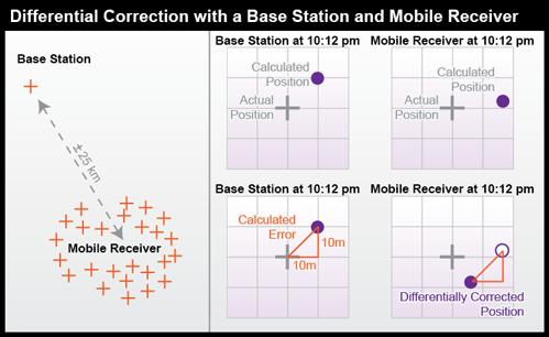
The base station calculates the correction needed to eliminate the error in the position calculated at that moment from GPS signals. The correction is later applied to the position calculated by the mobile receiver at the same instant. The corrected position is not perfectly accurate because the kinds and magnitudes of errors affecting the two receivers are not identical, and because of the low frequency of the GPS timing code.
For differential correction to work, fixes recorded by the mobile receiver must be synchronized with fixes recorded by the base station (or stations). You can provide your own base station, or use correction signals produced from reference stations maintained by the U.S. Federal Aviation Administration, the U.S. Coast Guard, or other public agencies or private subscription services. Given the necessary equipment and available signals, synchronization can take place immediately ("real-time") or after the fact ("post-processing"). First let's consider real-time differential.
5.4.1 Real-time Differential Correction
WAAS-enabled receivers are an inexpensive example of real-time differential correction. "WAAS" stands for Wide Area Augmentation System [109], a collection of about 25 base stations set up to improve GPS positioning at U.S. airport runways to the point that GPS can be used to help land airplanes (U.S. Federal Aviation Administration, 2007c). WAAS base stations transmit their measurements to a master station, where corrections are calculated and then uplinked to two geosynchronous satellites (19 are planned). The WAAS satellite then broadcasts differentially-corrected signals at the same frequency as GPS signals. WAAS signals compensate for positioning errors measured at WAAS base stations, as well as clock error corrections and regional estimates of upper-atmosphere errors (Yeazel, 2003). The WAAS network was designed to provide approximately 7-meter accuracy uniformly throughout its U.S. service area when WAAS-enabled receivers are used.
DGPS: The U.S. Coast Guard has developed a similar system, called the Differential Global Positioning Service [110]. The DGPS network includes some 80 broadcast sites, each of which includes a survey-grade base station and a "radio beacon" transmitter that broadcasts correction signals at 285-325 kHz (just below the AM radio band). DGPS-capable GPS receivers include a connection to a radio receiver that can tune into one or more selected "beacons." Designed for navigation at sea near U.S. coasts, DGPS provides accuracies no worse than 10 meters.
Kinematic Positioning: Survey-grade real-time differential correction can be achieved using a technique called real-time kinematic (RTK) GPS. RTK uses carrier-phase tracking of GPS signals measured by a reference and a remote receiver to generate accuracies of 1 part in 100,000 to 1 part in 750,000 (in practice, this means within centimeters) with relatively brief observations of only one to two minutes each.
5.4.2 Post-processed Differential Correction
For applications that require accuracies of 1 part in 1,000,000 or higher, including control surveys and measurements of movements of the Earth's tectonic plates, static positioning is required (Van Sickle, 2001). In static GPS positioning, two or more receivers measure their positions from fixed locations over periods of 30 minutes to two hours. The receivers may be positioned up to 300 km apart. Only dual frequency, carrier phase differential receivers capable of measuring the differences in time of arrival of the civilian GPS signal (L1) and the encrypted military signal (L2) are suitable for such high-accuracy static positioning.
CORS and OPUS: The U.S. National Geodetic Survey (NGS) maintains an Online Positioning User Service (OPUS) that enables surveyors to differentially-correct static GPS measurements acquired with a single dual frequency carrier phase differential receiver after they return from the field. Users upload measurements in a standard Receiver INdependent EXchange format (RINEX) to NGS computers, which perform differential corrections by referring to three base stations selected from a network of continuously operating reference stations (CORS). NGS oversees two CORS networks; one consisting of its 600 base stations of its own, another is a cooperative of public and private agencies that agree to share their base station data and to maintain base stations to NGS specifications.
Practice Quiz
Registered Penn State students should return now take the Chapter 5 folder in Canvas (via the Resources menu) to take a self-assessment quiz Correcting GPS Errors.
You may take practice quizzes as many times as you wish. They are not scored and do not affect your grade in any way.
5.5 Land Surveying and Conventional Techniques for Measuring Positions on the Earth’s Surface
Ease, accuracy, and worldwide availability have made ‘GPS’ a household term. Yet, none of the power or capabilities of GPS would have been possible without traditional surveyors paving the way. The techniques and tools of conventional surveying are still in use and, as you will see, are based on the very same concepts that underpin even the most advanced satellite-based positioning.
Geographic positions are specified relative to a fixed reference. Positions on the globe, for instance, may be specified in terms of angles relative to the center of the Earth, the equator, and the prime meridian.
Land surveyors measure horizontal positions in geographic or plane coordinate systems relative to previously surveyed positions called control points, most of which are indicated physically in the world with a metal “benchmark” that fixes the location and, as shown here, may also indicate elevation about mean sea level (Figure 5.10). In 1988 NGS established four orders of control point accuracy, ranging in maximum base error from 3mm to 5cm. In the U.S., the National Geodetic Survey (NGS) maintains a National Spatial Reference System (NSRS) that consists of approximately 300,000 horizontal and 600,000 vertical control stations (Doyle,1994).
Doyle (1994) points out that horizontal and vertical reference systems coincide by less than ten percent. This is because:
....horizontal stations were often located on high mountains or hilltops to decrease the need to construct observation towers usually required to provide line-of-sight for triangulation, traverse and trilateration measurements. Vertical control points however, were established by the technique of spirit leveling which is more suited to being conducted along gradual slopes such as roads and railways that seldom scale mountain tops. (Doyle, 2002, p. 1)
You might wonder how a control network gets started. If positions are measured relative to other positions, what is the first position measured relative to? The answer is: the stars. Before reliable timepieces were available, astronomers were able to determine longitude only by careful observation of recurring celestial events, such as eclipses of the moons of Jupiter. Nowadays, geodesists produce extremely precise positional data by analyzing radio waves emitted by distant stars. Once a control network is established, however, surveyors produce positions using instruments that measure angles and distances between locations on the Earth's surface.

5.5.1 Measuring Angles and Distances
You probably have seen surveyors working outside, e.g., when highways are being realigned or new housing developments are being constructed. Often one surveyor operates equipment on a tripod while another holds up a rod some distance away. What the surveyors and their equipment are doing is carefully measuring angles and distances, from which positions and elevation can be calculated. We will briefly discuss this equipment and their methodology. Let us first take a look at angles and how they apply to surveying.
Although a standard compass can give you a rough estimate of angles, the Earth’s magnetic field is not constant and the magnetic poles, which slowly move over time, do not perfectly align with the planet’s axis of rotation; as a result of the latter, true (geographic) north and magnetic north are different. Moreover, some rocks can become magnetized and introduce subtle local anomalies when using compass. For these reasons, land surveyors rely on transits (or their more modern equivalents, called theodolites) to measure angles. A transit (Figure 5.11) consists of a telescope for sighting distant target objects, two measurement wheels that work like protractors for reading horizontal and vertical angles, and bubble levels to ensure that the angles are true. A theodolite is essentially the same instrument, except that it is somewhat more complex and capable of higher precision. In modern theodolites, some mechanical parts are replaced with electronics.

When surveyors measure angles, the resultant calculations are typically reported as either azimuths or bearings, as seen in Figure 5.12. A bearing is an angle less than 90° within a quadrant defined by the cardinal directions. An azimuth is an angle between 0° and 360° measured clockwise from North. "South 45° East" and "135°" are the same direction expressed as a bearing and as an azimuth.

5.5.2 Measuring Distances
To measure distances, land surveyors once used 100-foot long metal tapes that are graduated in hundredths of a foot. An example of this technique is shown in Figure 5.13. Distances along slopes were measured in short horizontal segments. Skilled surveyors could achieve accuracies of up to one part in 10,000 (1 centimeter error for every 100 meters distance). Sources of error included flaws in the tape itself, such as kinks; variations in tape length due to extremes in temperature; and human errors such as inconsistent pull, allowing the tape to stray from the horizontal plane, and incorrect readings.

Since the 1980s, electronic distance measurement(EDM) devices have allowed surveyors to measure distances more accurately and more efficiently than they can with tapes. To measure the horizontal distance between two points, one surveyor uses an EDM instrument to shoot an energy wave toward a reflector held by the second surveyor. The EDM records the elapsed time between the wave's emission and its return from the reflector. It then calculates distance as a function of the elapsed time (not unlike what we’ve learned about GPS!). Typical short-range EDMs can be used to measure distances as great as 5 kilometers at accuracies up to one part in 20,000, twice as accurate as taping.
Instruments called total stations (Figure 5.14) combine electronic distance measurement and the angle measuring capabilities of theodolites in one unit. Next we consider how these instruments are used to measure horizontal positions in relation to established control networks.

5.5.3 Combining Angles and Distances to Determine Positions
Surveyors have developed distinct methods, based on separate control networks, for measuring horizontal and vertical positions. In this context, a horizontal position is the location of a point relative to two axes: the equator and the prime meridian on the globe, or to the x and y axes in a plane coordinate system.
We will now introduce two techniques that surveyors use to create and extend control networks (triangulation and trilateration) and two other techniques used to measure positions relative to control points (open and closed traverses).
Surveyors typically measure positions in series. Starting at control points, they measure angles and distances to new locations, and use trigonometry to calculate positions in a plane coordinate system. Measuring a series of positions in this way is known as "running a traverse." A traverse that begins and ends at different locations, in which at least one end point is initially unknown, is called an open traverse. A traverse that begins and ends at the same point, or at two different but known points, is called a closed traverse. "Closed" here does not mean geometrically closed (as in a polygon) but mathematically closed (defined as: of or relating to an interval containing both its endpoints). By "closing" a route between one known location and another known location, the surveyor can determine errors in the traverse.
Measurement errors in a closed traverse that connects at the point where it started can be quantified by summing the interior angles of the polygon formed by the traverse. The accuracy of a single angle measurement cannot be known, but since the sum of the interior angles of a polygon is always (n-2) × 180, it's possible to evaluate the traverse as a whole, and to distribute the accumulated errors among all the interior angles. Errors produced in an open traverse, one that does not end where it started, cannot be assessed or corrected. The only way to assess the accuracy of an open traverse is to measure distances and angles repeatedly, forward and backward, and to average the results of calculations. Because repeated measurements are costly, other surveying techniques that enable surveyors to calculate and account for measurement error are preferred over open traverses for most applications.
5.5.4 Triangulation
Closed traverses yield adequate accuracy for property boundary surveys, provided that an established control point is nearby. Surveyors conduct control surveys to extend and add point density to horizontal control networks. Before survey-grade satellite positioning was available, the most common technique for conducting control surveys was triangulation (Figure 5.16).

- Using a total station equipped with an electronic distance measurement device, the control survey team commences by measuring the azimuth alpha, and the baseline distance AB.
- These two measurements enable the survey team to calculate position B as in an open traverse.
- The surveyors next measure the interior angles CAB, ABC, and BCA at point A, B, and C. Knowing the interior angles and the baseline length, the trigonometric "law of sines" can then be used to calculate the lengths of any other side. Knowing these dimensions, surveyors can fix the position of point C.
- Having measured three interior angles and the length of one side of triangle ABC, the control survey team can calculate the length of side BC. This calculated length then serves as a baseline for triangle BDC. Triangulation is thus used to extend control networks, point by point and triangle by triangle.
5.5.5 Trilateration
An alternative to triangulation is trilateration, which uses distances alone to determine positions. By eschewing angle measurements, trilateration is easier to perform, requires fewer tools, and is therefore less expensive. Having read this chapter so far, you have already been introduced to a practical application of trilateration, since it is the technique behind satellite ranging used in GPS.
You have seen an example of trilateration in Figure 5.8 in the form of 3-dimensional spheres extending from orbiting satellites. Demo 1 below steps through this process in two dimensions.
Try This: Step through the process of 2-dimensional trilateration.
Once a distance from a control point is established, a person can calculate a distance by open traverse, or rely on a known distance if one exists. A single control point and known distance confines the possible locations of an unknown point to the edge of the circle surrounding the control point at that distance; there are infinitively many possibilities along this circle for the unknown location. The addition of a second control point introduces another circle with a radius equal to its distance from the unknown point. With two control points and distance circles, the number of possible points for the unknown location is reduced to exactly two. A third and final control point can be used to identify which of the remaining possibilities is the true location.
Trilateration is noticeably simpler than triangulation and is a very valuable skill to possess. Even with very rough estimates, one can determine a general location with reasonable success.
Practice Quiz
Registered Penn State students should return now take the self-assessment quiz Land Surveying.
You may take practice quizzes as many times as you wish. They are not scored and do not affect your grade in any way.
5.6 Summary
Positions are a fundamental element of geographic data. Sets of positions form features, as the letters on this page form words. Positions are produced by acts of measurement, which are susceptible to human, environmental, and instrument errors. Measurement errors cannot be eliminated, but systematic errors can be estimated and compensated for.
This chapter has introduced some of the technologies and techniques used in the acquisition of locational data. You have learned how a variety of location-enabled devices make use of signals from orbiting satellites and how satellite ranging is similar to more traditional surveying methods used on the ground. You have also learned how satellite technologies and surveying instruments can be used in conjunction to correct errors and generate data with higher accuracy.
Now that you know how GPS works, you can start putting it to work. The short list below includes some activities you can do with GPS and the techniques you’ve learned in this chapter:
- Go geocaching! Visit GeoCaching.com [111] or OpenCaching.com [112] to get started.
- Turn on your GPS and create shapes by tracking your path through town: Bostovalentinography [113]
- Do you like to jog? Track, time, and trace your runs: Try MapMyRun.com [114] or TrainingPeaks.com [115]
- Find and catalogue confluences. You’re never farther than 49 miles from a confluence, or location where both latitude and longitude are whole numbers. Go find one! Confluence.org [116]
- Measure your yard, record your favorite fishing spot, or enhance your golf game by knowing just how far the pin is. The possibilities are endless.
5.7 Glossary
Accuracy: How close or far a measurement is from the true or accepted value. Close measurements are more accurate than those that a further from the real value.
Additive Correction: A singular amount that is added to or subtracted from a series of measurements as a means to reduce systematic error.
Azimuth: Measurements of direction in terms of degrees, ranging from 0° to 360°.
Bearing: An angle less than 90° within a quadrant defined by the cardinal directions.
Closed Traverse: A measurement of distance between a single point and an unknown point that begins and ends at the same location.
Control Segment: The segment of the Global Positioning System that is comprised of ground stations that monitor and analyze satellite orbits and send corrections as needed.
Data Quality: The fitness of data for their intended use.
DGPS: Differential Global Positioning Service. DGPS offers enhanced locational measurements through the use of radio beacons that provide corrections.
Differential Correction: The use of control station to acquire a differential calculation which is then sent to local receivers to increase the accuracy of their measurements.
Dilution Of Precision (DOP): A factor that multiplies the uncertainty associated with User Equivalent Range Errors, based on the current configuration of viewable satellites. A DOP of 1 represents an ideal scenario, though real-world experiences seldom notice a DOP less than 2.
Environmental Characteristics: Variations in temperature, gravity, and magnetic declination that contribute to measurement errors.
GPS: The Global Positioning System.
Human Errors: Mistakes, improper use of equipment, and poor judgment that leads to measurement errors.
Instrument Errors: Errors that result from limitations related to the finite resolution of measuring equipment and its application in an infinite, continuous space.
Multipath Error: GPS errors that result from poor view of orbiting satellites, which are affected by buildings, valleys, the atmosphere, and other elements that can block, reflect, or refract GPS signals.
Open Traverse: A measurement of distance between a single point and an unknown point that begins and ends at different locations.
Precision: How reliably similar measurements can be taken with respect to variation and resolution.
Proportional Correction: Identifying a trend and applying the proper equation to adjust measurements in an attempt to correct inconsistent systematic errors.
Random Errors: Errors that do not follow a trend and are off by various amounts with no discernable pattern.
Resolution: The smallest measurement unit that can be detected or represented. High resolution refers to smaller units while low resolution refers to larger, and therefore fewer, units of measurement in the same space.
Satellite Ranging: Calculating distances from observable satellites based on their internal clocks and the amount of time taken for a signal to reach a corresponding receiver.
Space Segment: The segment of the Global Positioning System that is composed of a constellation of satellites following a precisely defined array of orbital planes.
Systemic Errors: Errors in measurement that follow a systematic and calculable trend.
Theodolites: Electronic equipment used in surveying for precise and accurate measuring of angles.
Total Station: A surveying instrument that is capable of electronic distance ranging as well as the angle measuring abilities of theodolites.
Triangulation: A trigonometric process of determining the position of unknown points based on the angles and distances calculated from a known point and a determined baseline.
Trilateration: The use of distances from known points to determine the position of an unknown point. At least three known locations are required for two-dimensional trilateration, while four known distances allows 3-dimensions (horizontal plus elevation).
User Segment: The segment of the Global Positioning System that is made up of devices that can receive satellite signals and the humans who operate these devices.
Wide Area Augmentation System (WAAS): The system of ground reference stations and geostationary satellites that enable the calculation and broadcast of corrected GPS signals.
5.8 Bibliography
Brinker, R. C. & Wolf, P. R. (1984). Elementary surveying (7th ed.). New York: Harper and Row. Dana, P. H. (1998). Global positioning system overview. The geographer's craft project. Retrieved August 2, 1999, from http://www.colorado.edu/geography/gcraft/notes/gps/gps_f.html [117]
Doyle, D. R. (1994). Development of the National Spatial Reference System. Retrieved February 10, 2008, from http://www.ngs.noaa.gov/PUBS_LIB/develop_NSRS.html [118]
Federal Geodetic Control Committee (1988). Geometric geodetic accuracy standards and specifications for using GPS relative positioning techniques. Retrieved February 10, 2008, from http://www.ngs.noaa.gov/FGCS/tech_pub/GeomGeod.pdf [119]
Hall, G. W. (1996). USCG differential GPS navigation service. Retrieved November 9, 2005, from http://www.navcen.uscg.gov/pdf/dgps/dgpsdoc.pdf [120]
Hodgson, C. V. Measuring base with invar tape. Tape underway. Base line and astro party, ca. 1916. NOAA Historical Photo Collection (2004). Retrieved on April 20, 2006, from http://www.photolib.noaa.gov/ [121]
Hurn, J. (1989). GPS: A guide to the next utility. Sunnyvale CA: Trimble Navigation Ltd.
Hurn, J. (1993). Differential GPS Explained. Sunnyvale CA: Trimble Navigation Ltd.
mobiThinking (2012, June). Global mobile statistics 2012 Part A: Mobile subscribers; handset market share; mobile operators. Retrieved August 5, 2012, from http://mobithinking.com/mobile-marketing-tools/latest-mobile-stats/a#sub... [122]
mobiThinking (2012, June). Global mobile statistics 2012 Part D: Consumer mobile behavior. Retrieved August 5, 2012, from http://mobithinking.com/mobile-marketing-tools/latest-mobile-stats/d#mob... [123]
Monmonier, M. (1995). Boundary litigation and the map as evidence. In Drawing the Line: Tales of Maps and Cartocontroversy. New York: Henry Holt.
National Geodetic Survey (n. d.). Retrieved November 4, 2009, from http://www.ngs.noaa.gov [124]
National Geodetic Survey (n.d.). National Geodetic Survey - CORS, Continuously Operating Reference Stations. Retrieved August 2, 1999, from http://www.ngs.noaa.gov/CORS/cors-data.html [125]
NAVSTAR GPS Joint Program Office. Retrieved October 21, 2000, from http://gps.losangeles.af.mil/ [126]
Norse, E. T. (2004). Tracking new signals from space - GPS modernization and Trimble R-Track Technology. Retrieved November 9, 2005, from http://www.trimble.com/survey_wp_gpssys.asp?Nav=Collection-27596 [127]
Raisz, E. (1948). McGraw-Hill series in geography: General cartography (2nd ed.). York, PA: The Maple Press Company.
Robinson, A. et al. (1995). Elements of cartography (5th ed.). New York: John Wiley & Sons.
Smithsonian National Air and Space Museum (1998). GPS: A new constellation. Retrieved August 2, 1999, from http://www.nasm.si.edu/gps/ [128]
Snay, R. (2005, September 13). CORS users forum--towards real-time positioning. Power point presentation presented at the 2005 CORS Users Forum, Long Beach, CA. Presentation retrieved October 26, 2005, from http://www.ngs.noaa.gov/CORS/Presentations/CORSForum2005/Richard_Snay_Forum2005.pdf [129]
Thompson, M. M. (1988). Maps for America, cartographic products of the U.S. Geological Survey and others (3d ed.). Reston, Va.: U.S. Geological Survey.
U.S. Coast Guard Navigation Center (n .d.). DGPS general information. Retrieved February 10, 2008, from http://www.navcen.uscg.gov/?pageName=dgpsMainwww.navcen.uscg.gov/ [110]
U.S. Federal Aviation Administration (2007a). Frequently asked questions. Retrieved February 10, 2008, from http://www.faa.gov/about/office_org/headquarters_offices/ato/service_units/techops/navservices/gnss/faq/gps/ [130]
U.S. Federal Aviation Administration (2007b). Global Positioning System: How it works. Retrieved February 10, 2008, from http://www.faa.gov/about/office_org/headquarters_offices/ato/service_units/techops/navservices/gnss/gps/howitworks/ [131]
U.S. Federal Aviation Administration. (2007c). Wide Area Augmentation System. Retrieved February 10, 2008, from http://www.faa.gov/about/office_org/headquarters_offices/ato/service_units/techops/navservices/gnss/gps/howitworks/ [131]
Van Sickle, J. (2001). GPS for land surveyors. New York: Taylor and Francis.
Van Sickle, J. (2004). Basic GIS coordinates. Boca Raton: CRC Press.
Wolf, P. R. & Brinker, R. C. (1994). Elementary surveying (9th ed.). NY, NY: HarperCollins College Publisher.
Wormley, S. (2006). GPS errors and estimating your receiver's accuracy. Retrieved April 20, 2006, from http://www.edu-observatory.org/gps/gps_accuracy.html [132]
Yeazel, J. (2006). WAAS and its relation to enabled hand-held GPS receivers. Retrieved October 12, 2005, from http://gpsinformation.net/exe/waas.html [133]
Chapter 6: Can We Get There From Here? Applications of Topology, TIGER, and Geocoding
Overview
Chapters 1, 2, and 5 introduced the concepts of location specification, coordinate systems, and the methods used to determine positions anywhere on Earth. Together, these concepts provide the ability to easily acquire and organize vast amounts of spatial data. In Chapter 3, we saw how these data can be visualized in the form of thematic maps, with several examples that relied on or were enhanced by data from the US Census Bureau.
The US Census Bureau is well-known for collecting neighborhood statistics and social data. In addition to social and economic data, the Census is also responsible for another important product that underpins a wide array of geographical analysis and mapping: the Topologically Integrated Geographic Encoding and Referencing (TIGER) database. Developed in a partnership between the Geographic Division of the US Census Bureau and the US Geological Survey (USGS), TIGER data are fundamental components of some of the nation’s largest and most used databases for transportation and for the delineation of political boundaries, congressional districts and census tracts. In preparation for the 2010 census, the Bureau conducted a database redesign project that combined TIGER with a Master Address File (MAF) database. MAF/TIGER enables the Bureau to associate census data, which it collects by household address, with the right census areas and voting districts. This is an example of a process called address-matching that will be described in more detail in Sections 6.1 and 6.6.
By the end of this chapter, you will gain familiarity with TIGER data as well as the concepts of topology, geocoding, and map-based routing. You will also learn about the geographic entities on which these products and processes rely.
Objectives
Students who complete Chapter 6 should be able to
- explain how geometric primitives in MAF/TIGER are represented in TIGER/Line Shapefile extracts;
- define topology and explain why and how it is encoded in TIGER;
- understand what address geocoding is and how it works;
- describe how TIGER/Line files and similar products can be used for applications within transportation, routing, and business applications.
Table of Contents
- The MAF/TIGER Model
- Vector Extracts from MAF/TIGER
- TIGER Shapefiles
- Geometric Primitives
- Topology and Relationships Between Geometric Primitives
- Geocoding
- Geocoding Online
- Geocoding Your Customers
- Routing
- Delineating Service Areas
- TIGER, another TIGER, and the Future Going Forward
- Summary
- Glossary
- Biblography
6.1 The MAF/TIGER Model
The US Census Bureau performs many functions, including the collection of census data by mail and in the field, the production of maps and other data products, and generating various reports and documents. These products are then consumed by a wide array of users in the public and private sectors. MAF/TIGER is the geographic database system that houses the data necessary for the success of these operations.
6.1.1 Census by Mail
As the population of the U.S. increased, it became impractical to have census takers visit every household in person. Since 1970, the Census Bureau has mailed questionnaires to most households with instructions that completed forms should be returned by mail. An example of the 2010 surveys can be seen in Figure 6.1. The percentage of surveys that are successfully completed and returned may surprise you — about 72 percent of all questionnaires were returned in 2010. At that rate, the Census Bureau estimates that some $1.6 billion was saved by reducing the need for field workers to visit non-responding households.

To manage its mail delivery and return operations, the Census Bureau relies upon a Master Address File (MAF).
The process of linking these data is not as simple as it sounds. Postal addresses do not specify geographic locations precisely enough to fulfill the Census Bureau’s constitutional mandate. An address is not a position in a grid coordinate system--it is only one in a series of ill-defined positions along a route. The location of an address is often ambiguous because street names are not unique, numbering schemes are inconsistent, and because routes have two sides, left and right. Location matters, as you recall, because census data must be accurately georeferenced to be useful for reapportionment, redistricting, and allocation of federal funds. Thus, the Census Bureau had to find a way to assign address referenced data automatically to particular census blocks, block groups, tracts, voting districts, and so on with a minimum of error. That's what the "Geographic Encoding and Referencing" in the TIGER acronym refers to.
6.1.2 Maps for Census Field Workers
A second motivation that led to MAF/TIGER was the need to help census takers find their way around. Even with a success rate above 70%, the remaining households who fail to return census questionnaires number in the millions. Census takers (called “enumerators” at the Bureau) visit these non-responding households in person. Census enumerators need maps showing streets and select landmarks to help locate households. Census supervisors need maps to assign census takers to particular territories. In return, the notes collected by field workers are an important source of updates and corrections to the MAF/TIGER database.
Prior to 1990, the Bureau relied on local sources for its maps. For example, 137 maps of different scales, quality, and age were used to cover the 30-square-mile St. Louis area during the 1960 census. The need for maps of consistent scale and quality, as well as complete coverage, forced the Bureau to become a map maker as well as a map user. Using the MAF/TIGER system, Census Bureau geographers created over 17 million maps for a variety of purposes in preparation for the 2010 Census.
Data products, including maps and TIGER files, generated by the US Census can be explored at: US Census Maps and Data [134].
You can also hear more about how the Census Bureau's Geography Division uses MAF/TIGER and related tools to create maps for the 2010 Census in the following podcast: Directions Magazine Census1.mp3 [135]
6.2 Vector Extracts from MAF/TIGER
The Census Bureau began to develop a digital geographic database of 144 metropolitan areas in the 1960s. This earlier database enabled computer-based geocoding and map-based routing in those areas. By 1990, the early efforts had evolved into TIGER: a seamless digital geographic database that covered the whole of the United States and its territories.
TIGER/Line Shapefiles are digital map data products extracted from the MAF/TIGER database. They are freely available from the Census Bureau and are suitable for use by individuals, businesses, and other agencies that don’t have direct access to MAF/TIGER.
6.2.1 Geographies Represented in TIGER and Shapefile Extracts
The MAF/TIGER database is selective. Only those geographic entities needed to fulfill the Census Bureau’s operational mission are included. Entities that don't help the Census Bureau conduct its operations by mail or help field workers navigate a neighborhood are omitted. Terrain elevation data, for instance, are not included in MAF/TIGER. A comprehensive list of the "feature classes” and “superclasses” included in MAF/TIGER and Shapefiles can be found in Appendix F-1 of the 2009 TIGER/Line Shapefiles Technical Documentation [136]. Some examples are given in Table 6.1 below. Examples of superclasses include:
- potential living quarters (e.g., sites of shelters, retirement homes, prisons, dormitories);
- road/path features (e.g., primary roads, secondary roads, local neighborhood roads);
- hydrographic features (e.g., stream/river, lake/pond, ocean/sea);
- miscellaneous linear features (e.g., pipeline, powerline, fence line);
- tabulation areas (e.g., county or equivalent, tract, block group, block).
| MTFCC | Feature Class | Superclass | Point | Linear | Areal | Feature Class Description |
|---|---|---|---|---|---|---|
| K2459 | Runway/Taxiway | Transportation Terminal | Y | Y | Y | A fairly level and usually paved expanse used by airplanes for taking off and landing at an airport |
| K2460 | Helicopter Landing Pad | Transportation Terminal | Y | N | Y | A fairly level and usually paved expanse used by helicopters for taking off and landing. |
| K2540 | University or College | Other Workplace | Y | N | Y | A building or group of buildings used as an institution for post-secondary study, teaching, and learning.(including seminary) |
| K2543 | School or Academy | Other Workplace | Y | N | Y | A building or group of buildings used as an institution for preschool, elementary, or secondary study, teaching, and learning. (including elementary school and high school) |
Excerpt above from TIGER/Line Technical Documentation. Credit: Census Bureau 2009.
Note also that neither the MAF/TIGER database nor TIGER/Line Shapefiles include the population data collected through questionnaires and by census takers. MAF/TIGER merely provides the geographic framework within which address-referenced census data are tabulated.
6.3 TIGER Shapefiles
Esri, a leading geographic information systems software and service provider, developed the Shapefile format in the 1990s in order to have a native digital vector format for spatial data within the then-popular ArcView software (ArcInfo and ArcGIS are Esri’s present-day counterparts, which also rely on Shapefiles). Unlike many other common file formats, such as .jpeg, .png, .mp3 or .html, Shapefiles (.shp) are a special kind of file that is actually a package that contains several other files. Every valid Shapefile must contain at least three other files: the main.shp file containing the coordinate data, a .shx file that contains index information, and a .dbf file, which is the dBASE database table that stores all the attribute data for the particular shape.
For example, if we were interested in mapping county-wide statistics for the entire US, we might download a file called Counties.shp. Within Counties.shp we would expect to find:
- Counties.shp – this file contains coordinate information for drawing the shapes of the counties.
- Counties.shx – contains an index of all the information within the file, speeding up many computer operations that occur with the file
- Counties.dbf – the database of all the counties, including their names, unique IDs, and other statistical information of interest. DBF files are also a popular format for database software that does not include mapping capabilities. DBF files can also be read and saved by many spreadsheet applications, such as the open source LibreOffice suite and Open Office, and very old versions of Microsoft Excel.
Many Shapefiles also include an optional .prj file that indicates the appropriate projection to be used by the mapping software when drawing the Shapefile.
Although the Esri Shapefile format is proprietary and developed by a corporate entity, it is an open format and is supported by many open source GIS tools and mapping software. For this reason, the Shapefile format is now considered a de facto standard for spatial data. MAF/TIGER is distributed in the Shapefile format, and has been since 2007.
A single Shapefile data set can contain one of three types of spatial data primitives, or features – points, lines, or polygons (areas). These features and their counterparts in the MAF/TIGER database will be covered in the next section.
6.4 Geometric Primitives
Previous chapters have described the collection and storage of geospatial data in terms of coordinates and locations. Since a location is a zero-dimensional entity (it has no length, width, height, or volume), locations alone are not sufficient for representing the complexity of the real world. Locations are frequently composed into one or more geometric primitives, which include the set of entities more commonly referred to as:
- Points;
- Lines; and
- Polygons (or Areas).
The concepts of a point, line, and polygon (or area) have been discussed briefly in Chapter 4. In the context of the MAF/TIGER model, we will expand upon these terms and refer to them (in the same order) by the labels used in the field of Topology (discussed in more detail in section 6.5):
- Nodes;
- Edges; and
- Faces.
Nodes are zero-dimensional entities represented by coordinate pairs. Coordinates for nodes may be x,y values like those in Euclidean geometry or longitude and latitude coordinates that represent places on Earth’s surface. In both cases, a third z value is sometimes added to specify a location in three dimensions.
Edges are the one-dimensional entities created by connecting two nodes. The nodes at either end of an edge are called connecting nodes and can be referred to more specifically as a start node or end node, depending on the direction of the edge, which is indicated by arrowheads. Edges in TIGER have direction so that the left and right side of the street can be determined for use in address matching. Nodes that are not associated with an edge and exist by themselves are called isolated nodes. Edges can also contain vertices, which are optional intermediate points along an edge that can define the shape of an edge with more specificity than start and end nodes alone. Examples of edges encoded in TIGER are streets, railroads, pipelines, and rivers.
Faces are two-dimensional (length and width) entities that are bounded by edges. Blocks, counties, and voting districts are examples of faces. Since faces are bounded by edges and edges have direction, faces can be designated as right faces or left faces.
Figure 6.3 below shows an example of these geometric primitives in a realistic arrangement. In this example, note that:
- Nodes N17 and N14 are isolated nodes;
- N.D and N.D are the start and end nodes of edge E-M; and
- Due to the directionality of edges, face F'S is on the left of edge E-M.

6.4.1 Geometric Accuracy of TIGER Features
Until recently, the geometric accuracy of the vector features encoded in TIGER were notoriously poor (see illustration below in Figure 6.4). How poor? Through 2003, the TIGER/Line metadata [137] stated that:
Coordinates in the TIGER/Line files have six implied decimal places, but the positional accuracy of these coordinates is not as great as the six decimal places suggest. The positional accuracy varies with the source materials used, but generally the information is no better than the established National Map Accuracy standards for 1:100,000-scale maps from the U.S. Geological Survey (Census Bureau 2003)
NAS horizontal accuracy requires that at least 90 percent of points tested are within 0.02 inch of the true position. On a 1:100,000 map, 0.02 in = approximately 166 feet (about 50 meters).

Fortunately this lack of accuracy has been addressed during a project that began in preparation for the 2010 census. During this time, the Census Bureau commissioned a six-year, $200 million MAF/TIGER Accuracy Improvement Project (MTA). One objective of the effort was to use GPS to capture accurate geographic coordinates for every household in the MAF. Another objective was to improve the accuracy of TIGER's road/path features. The project aimed to adjust the geometry of street networks to align within 7.6 meters of street intersections observed in aerial images or measured using GPS. The corrected streets are necessary not just for mapping, but for accurate geocoding. Because streets often form the boundaries of census areas, it is essential that accurate household locations are associated with accurate street networks.
MTA integrated over 2,000 source files submitted by state, tribal, county, and local governments. Contractors used survey-grade GPS to evaluate the accuracy of a random sample of street centerline intersections of the integrated source files. The evaluation confirmed that most, but not all, features in the spatial database equal or exceed the 7.6 meter target.
MTA was completed in 2008. In conjunction with the continuous American Community Survey and other census operations, corrections and updates are now ongoing. TIGER/Line Shapefile updates are now released annually.
Practice Quiz
Registered Penn State students should return now take the self-assessment quiz about the Geometric Primitives.
You may take practice quizzes as many times as you wish. They are not scored and do not affect your grade in any way.
6.5 Topology and Relationships Between Geometric Primitives
Topology is the subfield of mathematics that deals with the relationship between geometric entities, specifically with properties of objects that are preserved under continuous deformation. As will be illustrated in this section, the concepts of topology are very useful for geographers, surveyors, transportation specialists, and others interested in how places and locations relate to one another.
In the previous section, you learned how coordinates, both geometric and geographic, can define points and nodes, how nodes can build edges, and how edges create faces. We will now consider how nodes, edges, and faces can relate to one another through the concepts of containment, connectedness, and adjacency. A fundamental property of all topological relations is that they are constant under continuous deformation: re-projecting a map will not alter topology, nor will any amount of rubber-sheeting or other data transformations change relations from one form to another.
Containment is the property that defines one entity as being within another. For example, if an isolated node (representing a household) is located inside a face (representing a congressional district) in the MAF/TIGER database, you can count on it remaining inside that face no matter how you transform the data. Topology is vitally important to the Census Bureau, whose constitutional mandate is to accurately associate population counts and characteristics with political districts and other geographic areas.
Connectedness refers to the property of two or more entities being connected. Recall the visual representation of the geometric primitives in Figure 6.3. Topologically, node N14 is not connected to any other nodes. Nodes N9 and N21 are connected because they are joined by edges E10, E1, and E10. In other words, nodes can be considered connected if and only if they are reachable through a set of nodes that are also connected; if a node is a destination, we must have a path to reach it.
Connectedness is not immediately as intuitive as it may seem. A famous problem related to topology is the Königsberg bridge puzzle (Figure 6.5).
Try This: Can you solve the Königsberg bridge problem?

The challenge of the puzzle is to find a route that crosses all seven bridges, while respecting the following criteria:
- Each bridge must be crossed;
- A bridge is a directional edge and can only be crossed once (no backtracking);
- Bridges must be fully crossed in one attempt (you cannot turn around halfway, and then do the same on the other side to consider it “crossed”).
- Optional: You must start and end at the same location. (It has been said that this was a traditional requirement of the problem, though it turns out that it doesn’t actually matter – try it with and without this requirement to see if you can discover why.)
Take some time to see if you can figure out the solution. When you’ve found the answer or given up, scroll down the page to see the correct solution to the problem.
Did you find the route that crosses all seven bridges and meets the above criteria? If not, you got the right answer; there is no such route. Euler proved, in 1736, that there was no solution to this problem. In fact, his techniques paved the way for graph theory, an important area of mathematics and computer science that deals with graphs and connections. Graph theory is beyond the scope of this course, but it does have applications to geography. Interested readers can learn more about graph theory at Diestel Graph Theory [138].
The property of adjacency relates to entities being directly next to one another. In Figure 6.3, all of the faces are adjacent. This is easy to determine: if two faces share an edge, they are adjacent. Adjacency becomes less intuitive with other entities, however. See Figure 6.6 for an example of adjacency and why it cannot be simply assessed from a visual perspective:

At first, the two nodes in Figure 6.6 might look like they are adjacent. Zooming in or tilting the plane of view reveals otherwise. This is because nodes, as points made from coordinate pairs, do not have a length or width; they are size-less and shapeless. Without any size or dimensionality, it is impossible for nodes to be adjacent. The only way for two nodes to ‘touch’ would be for them to have the exact same coordinates – which then means that there aren’t really two nodes, just one that has been duplicated.
This is exactly why features in the MAF/TIGER database are represented only once. As David Galdi (2005) explains in his white paper “Spatial Data Storage and Topology in the Redesigned MAF/TIGER System,” the “TI” in TIGER stands for “Topologically Integrated.” This means that the various features represented in the MAF/TIGER database—such as streets, waterways, boundaries, and landmarks (but not elevation!)—are not encoded on separate “layers.” Instead, features are made up of a small set of geometric primitives — including 0-dimensional nodes and vertices, 1-dimensional edges, and 2-dimensional faces —without redundancy. That means that where a waterway coincides with a boundary, for instance, MAF/TIGER represents them both with one set of edges, nodes and vertices. The attributes associated with the geometric primitives allow database operators to retrieve feature sets efficiently with simple spatial queries.
To accommodate this efficient design and eliminate the need for visual or mental exercises in order to determine topological states, the MAF/TIGER structure abides by very specific rules that define the relations of entities in the database (Galdi 2005):
- Every edge must be bounded by two nodes (start and end nodes).
- Every edge has a left and right face.
- Every face has a closed boundary consisting of an alternating sequence of nodes and edges.
- There is an alternating closed sequence of edges and faces around every node.
- Edges do not intersect each other, except at nodes (note, this is a specialized use of the term "intersect" that includes the concept of "cross", which edges do not do, and "meet" which they can do).
Compliance with these topological rules is an aspect of data quality called logical consistency. In addition, the boundaries of geographic areas that are related hierarchically — such as blocks, block groups, tracts, and counties (all defined in Chapter 3) — are represented with common, non-redundant edges. Features that do not conform to the topological rules can be identified automatically, and corrected by the Census geographers who edit the database. Given that the MAF/TIGER database covers the entire U.S. and its territories, and includes many millions of primitives, the ability to identify errors in the database efficiently is crucial.
So how does topology help the Census Bureau assure the accuracy of population data needed for reapportionment and redistricting? To do so, the Bureau must aggregate counts and characteristics to various geographic areas, including blocks, tracts, and voting districts. This involves a process called “address matching” or “address geocoding” in which data collected by household is assigned a topologically-correct geographic location. The following pages explain how that works.
6.6 Geocoding
Geocoding is the process used to convert location codes, such as street addresses or postal codes, into geographic (or other) coordinates. The terms “address geocoding” and “address mapping” refer to the same process. Geocoding address-referenced population data is one of the Census Bureau’s key responsibilities. However, as you may know, it is also a very popular capability of online mapping and routing services. In addition, geocoding is an essential element of a suite of techniques that are becoming known as “business intelligence.” We will look at applications like these later in this chapter, but, first, let’s consider how the Census Bureau performs address geocoding.
6.6.1 Address Geocoding at the US Census: Pre-Modernization
Prior to the MAF/TIGER modernization project that led up to the decennial census of 2010, the TIGER database did not include a complete set of point locations for U.S. households. Lacking point locations, TIGER was designed to support address geocoding by approximation. As illustrated below, the pre-modernization TIGER database included address range attributes for the edges that represent streets. Address range attributes were also included in the TIGER/Line files extracted from TIGER. Coupled with the Start and End nodes bounding each edge, address ranges enable users to estimate locations of household addresses (Figure 6.7).

Here’s how it works. The diagram above highlights an edge that represents a one-block segment of Oak Avenue. The edge is bounded by two nodes, labeled "Start" and "End." A corresponding record in an attribute table includes the unique ID number (0007654320) that identifies the edge, along with starting and ending addresses for the left (FRADDL, TOADDL) and right (FRADDR, TOADDR) sides of Oak Avenue. Note also that the address ranges include potential addresses, not just existing ones. This is done in order to future-proof the records, ensuring that the data will still be valid as new buildings and addresses are added to the street.
6.6.2 After MAF/TIGER Modernization
Prior to MAF/TIGER modernization, local governments relied on their own digitized data for location-sensitive projects such as property tax assessments, E-911 dispatch, and the like. The modernization project for MAF/TIGER, which began in 2002, aimed to bring the accuracy of the local data to the entire nation in time for the 2010 census. The illustration in Figure 6.8 shows the intended result of the modernization project, including properly aligned streets, shorelines, and individual household locations, shown in relation to an aerial image.

The modernized MAF/TIGER database is now in use, including precise geographic locations of over 100 million household units. However, because household locations are considered confidential, non-federal government users of TIGER/Line Shapefiles extracted from the MAF/TIGER database still must rely upon address geocoding using address ranges.
6.6.3 TIGER’s Role in the Geospatial Boom
Launched in 1996, MapQuest was one of the earliest online mapping, geocoding and routing services. MapQuest combined the capabilities of two companies: a cartographic design firm with long experience in producing road atlases and a start-up company that specialized in custom geocoding applications for business. Initially, MapQuest relied in part on TIGER/Line street data extracted from the pre-modernization TIGER database. MapQuest and other commercial firms were able to build their businesses on TIGER data because of the U.S. government’s wise decision not to restrict its reuse. It has been said that this decision triggered the rapid growth of the U.S. geospatial industry.
6.7 Geocoding Online
No doubt you're familiar with one or more popular online mapping services. How well do they do at geocoding the location of a postal address? You can try it out for yourself at several Web-based mapping services, including MapQuest.com (Mapquest [139]), Microsoft's Bing Maps (Bing Maps [140]), and similar user-created tools like GPS Visualizer (GPSVisualizer.com [141]). Other services, such as the Federal Financial Institutions Examination Council (FFIEC)’s geocoding system (FFIEC Geocoding System [142]) provide census information instead of latitude and longitude. Try using the FFIEC’s system and view related census information for your area.
Let's compare the geocoding capabilities of MapQuest.com to locate the address on an actual map. Figure 6.9 displays a recent screen capture of an address lookup.

The MapQuest.com map generated in 2011 places the address close to its actual location. Below, Figure 6.10 shows a similar MapQuest product created back in 1998, when this course was first being developed. On the older map, the same address is plotted on the opposite side of the street. What do you suppose is wrong with the address range attribute in that case? Also, note the shapes of the streets and the differences in map design.

It is likely that the older map relied on pre-modernization TIGER data from 1990 for the street shapes. MapQuest, like many other commercial navigation services, now uses detailed street data purchased from NAVTEQ (Navteq.com [143]).
The point of this section is to show that geocoding with address ranges involves a process of estimation. The Census Bureau's TIGER/Line Shapefiles, like the commercial street databases produced by Tele Atlas, Navigation Technologies, and other private firms, represents streets as vector line segments. The vector segments are associated with address range attributes, one for the left side of the street, one for the right side. The geocoding process takes a street address as input, finds the line segment that represents the specified street, checks the address ranges to determine the correct side of the street, then estimates a location at the appropriate point between the minimum and maximum address for that segment and assigns an estimated latitude/longitude coordinate to that location. For example, if the minimum address is 401, and the maximum is 421, a geocoding algorithm would locate address 411 at the midpoint of the street segment. This estimation process is approximate and some addresses will not be located correctly as explained in the Google Earth help system explanation of what they call “address interpolation,” see: Google Earth Support [144].
Practice Quiz
Registered Penn State students should return now take the self-assessment quiz about Topology & Geocoding.
You may take practice quizzes as many times as you wish. They are not scored and do not affect your grade in any way.
6.8 Geocoding Your Customers
The amount of data collected about customers is so vast, and the resulting analysis so powerful, that companies can determine which of their customers may be pregnant and which aren’t. Earlier in 2012, a major retailer unknowingly informed a father that his teenage daughter was pregnant [145] – based on her recent purchases matching a trend of other expecting mothers – long before she had planned to share the news (Forbes, 2012).
Shoppers are frequently asked for their zip code while paying for items. Have you ever wondered why this is? Based on the content of this chapter, you can probably wager a pretty good guess. That’s right: the store or, more correctly, the company who owns the store, uses this information to pair places with purchases. This helps companies determine regional trends to see which items sell best in certain locations, deliver ads targeted for certain areas, and analyze the habits and characteristics of their customers. Analysis of this kind is a major component of modern business practices and helps increase efficiency, customer satisfaction, and overall sales. It can also lead to some very surprised customers, as we’ve seen in the example above.
Customer addresses can also be harvested from automobile license plates. Business owners pay to record license plate numbers of cars parked in their parking lots or in their competitors' lots. Addresses of registered owners can be purchased from organizations that acquire motor vehicle records from state departments of transportation. These addresses are used to identify trade areas, or the locations in which their customers live and work. Companies can then target their trade areas, or their competitors’ trade areas, with direct mail advertising or match their products and prices to the socio-economic characteristics of the local population.
Data of this type is also collected by popular websites who track their visitors; this happens frequently without the users’ knowledge. Chapter 1 discussed how Content Delivery Networks (CDNs) use locations to determine the closest server in order to speed up the load times of websites. When combined with the ads users click, the products users mention in status updates, and the “likes” made across popular social networking sites, geocoded data enables companies to analyze and discover a great deal of information about their users. Individual surfing habits and preferences are also collected behind the scenes via ‘cookies,’ which are small files stored by your web browser that allow one site to save and read information that was created when you viewed previous sites.
6.9 Routing
Operations such as mail and package delivery, food and beverage distribution, and emergency medical services need to know not only where their customers are located, but how to deliver products and services to those locations as efficiently as possible. Geographic data products like TIGER/Line Shapefiles are valuable to analysts responsible for prescribing the most efficient delivery routes. The larger and more complex the service areas of such organizations, the more incentive they have to automate their routing procedures.
In its simplest form, routing involves finding the shortest path through a network from an origin to a destination. If the nodes are specified within geographic or plane coordinate systems, the distance between them can be calculated readily. Routing procedures sum the lengths of every plausible sequence of line segments that begins and ends at the specified locations. The sequence of segments associated with the smallest sum represents the shortest route. In addition to geographic distances, modern transportation data can also make use of local speed limits or, where available, current traffic conditions to determine the length of time needed to travel a particular line segment. This allows analysts and users to compare and make compromises between a route of the shortest distance and a route of the shortest travel time.
To enable this kind of analysis and computation, the data must indicate which line segment follows immediately after another line segment. In other words, the procedure needs to know about the connectivity of features. As discussed earlier, connectivity is an example of a topological relationship. If topology is not encoded in the data product, it can be calculated by the GIS software in which the procedure is coded.
Several online travel planning services, including MapQuest.com and Google Maps, provide routing capabilities. Both take origin and destination addresses as input, and produce optimal routes as output. These services are based on vector feature databases in which street segments are attributed with address ranges, as well as with other data that describe the type and conditions of the roads they represent. Recent advances in these services have added routing for pedestrians and bicyclists as well as by mass transit.
Try This: Use a routing tool to help you find your way
Let’s take a practical look at a routing application you might use while on vacation or exploring a new city.
1: Visit Google Maps [146]
2: In the search box, enter: The Henley Park Hotel, Massachusetts Avenue Northwest, Washington, DC. The Henley Park Hotel will be marked by the ‘A’ pin.
3: Click it and then click the ‘Directions’ link shown in Figure 6.11:

4: A new textbox will appear on the left of the map. Enter Library of Congress, Independence Avenue Southeast, DC in the empty textbox.
5: Click ‘Get Directions’ (Figure 6.12):

6: Use the buttons indicated in Figure 6.13 to toggle different transpiration options:

Experiment with the different routes and travel modes. Which travel mode takes the shortest route? Which route has more turns? Which travel mode/route is quickest? Note that each mode of travel may also have additional routes that can be toggled (Figure 6.14).

Which mode of travel would you choose?
Sometimes routes have more than one destination and several stops must be made during a trip. This is a complex special case of routing called the traveling salesman problem. School bus dispatchers, mail and package delivery service managers, and food and beverage distributors all seek to minimize the transportation costs involved in servicing multiple, dispersed destinations. Choosing the optimal route requires very sophisticated analysis to evaluate all possible routes, keeping in mind speed limits, typical traffic volumes, one-way streets, and other characteristics of the transportation network. As the number of destinations and the costs of travel increase, the high cost of purchasing up-to-date, properly attributed network data becomes easier to justify.
6.10 Delineating Service Areas
The need to redraw voting district boundaries every ten years was one of the motivations that led the Census Bureau to create its MAF/TIGER database. Like voting districts, many other kinds of service area boundaries need to be revised periodically. School districts are a good example. The state of Massachusetts, for instance, has adopted school districting laws that are similar in effect to the constitutional criteria used to guide congressional redistricting. The Framingham (Massachusetts) School District's Racial Balance Policy once stated that "each elementary and middle school shall enroll a student body that is racially balanced. ... each student body shall include a percentage of minority students, which reflects the system-wide percentage of minority students, plus or minus ten percent. ... The racial balance required by this policy shall be established by redrawing school enrollment areas" (Framingham Public Schools 1998). Particularly in places with policies like this, each time districts are redrawn, the students and locations served by the buses also changes. Thus, the routes must also be reanalyzed and optimized.
Another example of service area analysis is provided by the City of Beaverton, Oregon. In 1997, Beaverton officials realized that 25 percent of the volume of solid waste that was hauled away to land fills consisted of yard waste, such as grass clippings and leaves. Beaverton decided to establish a yard waste recycling program, but it knew that the program would not be successful if residents found it inconvenient to participate. A GIS procedure was used to partition Beaverton's street network into service areas that minimized the drive time from residents' homes to recycling facilities. Beaverton’s yard waste recycling program has since been updated and at the time of this writing includes curbside pickup.
6.11 TIGER, another TIGER, and the Future Going Forward
We’ve discussed how MAF/TIGER data have been used, improved, and relied upon for many projects, ranging from census data collection to geocoding and navigation. MAF/TIGER data are continuously being created, and projects related to developing and using the MAF/TIGER database are a major focus of the US Department of Transportation (USDOT).
As part of President Obama’s Build America: A 21st Century Infrastructure budget plan, $476 billion has been allocated for a six-year goal that includes improvements to surface transportation, such as motorways, runways, and passenger rail. This sum is separate from an initial $50 billion that was set aside for job creation related to the expansion of surface transportation (Whitehouse.gov, 2012).
Money provided by the President’s budget is being used by USDOT to fund several grants related to another kind of TIGER program – Transportation Investment Generating Economic Recovery. Secretary of USDOT, Ray LaHood, stated on his official blog:
From roadways to help reduce costly bottlenecks to transit choices that help commuters save on gas and freight rail upgrades that improve safety and efficiency, America needs a 21st century transportation system capable of supporting our 21st century economy. An America that's built to last needs transportation that's built to last (FastLane Blog, 2012).
Following through on these claims, LaHood and USDOT have announced several rounds of multi-million dollar grants that are being awarded to projects that extend America’s transportation potential and stimulate transportation-related job growth.
Building new roads or rails requires new entries to the MAF/TIGER database and a wide array of jobs for surveying, measuring, analyzing, and coding the updated information. Each of these activities relies in whole or in part on the geospatial technologies and methods that you have read about in this and previous chapters.
Practice Quiz
Registered Penn State students should return now take the self-assessment quiz about TIGER.
You may take practice quizzes as many times as you wish. They are not scored and do not affect your grade in any way.
6.12 Summary
To fulfill its mission of being the preeminent producer of attribute data about the population and economy of the United States, the U.S. Census Bureau also became an innovative producer of digital geographic data. The Bureau designed its MAF/TIGER database to support automatic geocoding of address-referenced census data, as well as automatic data quality control procedures. The key characteristics of TIGER/Line Shapefiles, including use of vector features to represent geographic entities, and address range attributes to enable address geocoding, are now common features of proprietary geographic databases used for trade area analysis, districting, routing, transportation, and allocation.
6.13 Glossary
Adjacency: The topological property of two faces being next to one another by sharing an edge.
Connectedness: A topological relationship that determines if nodes are connected, edges, or faces are connected.
Connecting Node: A node that is connected to an edge.
Containment: The topological relationship in which one primitive is contained within another, such as an isolated node existing within a face.
Edge: The segment represented between two connecting nodes.
End Node: The last node in a direction segment, or set of nodes along such a segment.
Face: The closed area created by three or more edges with a continuous linkage of connecting nodes.
Geocoding: The process of determining an address based on geographic coordinates or position along a spatially-referenced line segment.
Geometric Primitives: The fundamental entities that are represented within topology: nodes, edges, and faces.
Left Face: The face immediately to the left of a directional edge, in respect to the direction of the edge.
MAF/TIGER: The database resulting from a combination of the Master Address File and the Topologically Integrated Geographic Encoding and Referencing system.
Node: A zero-dimensional topographic primitive represented by spatial coordinates.
Master Address File (MAF): The complete inventory of housing units and many business locations in the U.S., Puerto Rico, and associated island areas.
Right Face: The face immediately to the right of a directional edge, in respect to the direction of the edge.
Routing: The process of analyzing possible paths between two locations in a transportation network and choosing the optimal path, based on either shortest distance or shortest travel time (or a trade-off of the two).
Shapefile: The proprietary but open file format developed by Esri to represent digital vector data for spatial applications.
Start Node: The first node along an edge.
Topology: The subfield of mathematics that deals with the relationship between geometric entities.
Vertice: An intermediate point along an edge that can define the shape of an edge with more specificity than start and end nodes alone, without being a recorded location.
6.14 Bibliography
Budget Overview, US White House (n.d.). Retrieved August 11, 2012, from http://www.whitehouse.gov/omb/overview [147]
Charlotte-Mecklenberg Public Schools (n. d.). Retrieved July 19, 1999, from http://www.cms.k12.nc.us [148]
Cooke, D. F. (1997). Topology and TIGER: The Census Bureau's Contribution. In T. W. Foresman (Ed.), The history of geographic information systems: Perspectives from the pioneers. (pp. 47 –57). Upper Saddle River, NJ: Prentice Hall.
Dangermond, J. (1982). A Classification of Software Components Commonly Used in Geographic Information Systems. In Proceedings of the U.S.—Australia Workshop on the Design and Implementation of Computer-Based Geographic Information Systems, Honolulu, HI, pp. 0-91.
Demers, M.N. (1997) Fundamentals of Geographic Information Systems. John Wiley & Sons, Inc.
Discreet Research (n.d.). Retrieved July 19, 1999, from http://www.dresearch.com [149]
ESRI (1998) Shapefile Technical Description, An ESRI White paper. Environmental Systems Research Institute, Inc. Retrieved October 4, 2010, from http://www.esri.com/library/whitepapers/pdfs/shapefile.pdf [150]
Federal Geographic Data Committee (April 2006). Retrieved July 19, 1999, from http://www.fgdc.gov [151]
Framingham Public Schools (1998). Racial balance policy: Assignment of students to schools. Retrieved July 19, 1999, from www.framingham.k12.ma.us/update/0198rbp.html [152] (since retired).
Francica, J. (n.d.). Geodezix Consulting. Retrieved July 19, 1999, from www.geodezix.com [153] (since retired).
Galdi, D. (2005). Spatial Data Storage and Topology in the Redesigned MAF/TIGER System. Retrieved 19 October 2010, from http://www.census.gov/geo/mtep_obj2/topo_and_data_stor.html [154] (since retired).
MapQuest (n.d. a). Retrieved July 19, 1998, from http://www.mapquest.com [139]
MapQuest (n.d. b). Retrieved August 2, 2011, from http://www.mapquest.com [139]
Marx, R. M. (Ed.). (1990). The Census Bureau's TIGER system. [Special issue]. Cartography and Geographic Information Systems 17:1.
MSN (2005). Maps and directions. Retrieved May 3, 2006, from http://www.mapblast.com [155]
Navigation Technologies Inc. (2006). Welcome to NavTech. Retrieved July 19, 1999, from http://www.navtech.com [156]
Rammage, S. and P. Woodsford (2002). The Benefits of Topology in the Database. Retrieved October 6, 2010, from http://spatialnews.geocomm.com/features/laserscan2/ [157]
TeleAtlas (2006). Welcome to TeleAtlas. Retrieved May 3, 2006, from http://www.teleatlas.com/Pub/Home [158] (since retired).
Theobald, D. M. (2001). Understanding Topology and Shapefiles. ArcUser April-June 2001. Retrieved October 5, 2010, from http://www.esri.com/news/arcuser/0401/topo.html [159]
US DOT Fast Lane Blog (2012).TIGER 2012 Applications Far Exceed Available Funds; Overwhelming Demand Demonstrates Investment Need. Retrieved August 11, 20012, from http://fastlane.dot.gov/2012/04/tiger-2012-applications.html#.UChF3cjSV7Q [160]
U.S. Census Bureau (1997). TIGER/Line Files (1997 Technical Documentation). Retrieved January 2, 1999, from http://www.census.gov/geo/tiger/TIGER97C.pdf [161] (since retired).
U.S. Census Bureau (2003). TIGER/Line Files, 2003 (metadata). Retrieved February 3, 2008, from http://www.census.gov/geo/www/tlmetadata/tl2003meta.txt [162]
U.S. Census Bureau (n. d.). 21st Century MAF/TIGER Enhancements. Retrieved February 3, 2008, from http://www.census.gov/geo/mod/overview.pdf [163] (since retired).
U.S. Census Bureau (2004). MAF/TIGER Redesign Project Overview. Retrieved October 19, 2010, from http://www.census.gov/geo/mtep_obj2/obj2_issuepaper12_2004.pdf [164] (since retired).
U.S. Census Bureau (2005). Geography division map gallery. Retrieved July 19, 1999, from http://www.census.gov/geo/www/mapGallery/ [165]
U.S. Census Bureau (2009). TIGER/Line Shapefiles Technical Documentation. Retrieved October 19, 2010, from http://www.census.gov/geo/www/tiger/tgrshp2009/TGRSHP09.pdf [166]
Chapter 7: Remote Sensing: Imaging Our World
Overview
Chapters 5 and 6 focused on acquisition and application of geographic data that are collected in the world using GPS-enabled devices and other means (e.g., traditional field surveys). This chapter moves the focus to acquisition and application of geographic data collected remotely, using a range of remote sensing technologies. Remote sensing is the measurement of an object without direct contact; the Office of Naval Research derived the term remote sensing in the early 1960s.
This chapter considers the characteristics and uses of raster data produced with airborne and satellite remote sensing systems. Remote sensing is a key source of data for land use and land cover mapping, agricultural and environmental resource management, mineral exploration, weather forecasting, and global change research.
Remotely sensed images are now prevalent in many aspects of our daily lives. You are exposed to imagery through media sources, such as CNN or Fox News, and you can view imagery across the world with Google Maps or Bing Maps. You will encounter examples of imagery from these and other sources in this chapter. In addition to introducing these types of data products, you will also learn about some of the techniques that are used to analyze such images.
Objectives
The overall goal of Chapter 7 is to acquaint you with the properties of data produced by satellite-based sensors. Specifically, in the chapter, you will learn to:
- compare and contrast the characteristics of image data produced by photography and digital remote sensing systems;
- use the Web to find Landsat data for a particular place and time;
- explain why and how remotely sensed image data are processed; and what types of corrections are necessary for getting geographically accurate information;
- understand how remotely sensed imagery is turned into a range of map products through application of photogrammetric techniques.
Table of Contents
- Introducing Remote Sensing
- Electromagnetic Radiation
- Resolution
- Multi-spectral Image Processing
- Survey of Multispectral Imagery Types and Their Applications
- Other Types of Imagery
- Case Study: Using Landsat for Land Cover Classification for NLCD
- Orthoimagery
- Glossary
7.1 Introducing Remote Sensing
Remote sensing is defined in Chapter 1 as data collected from a distance without visiting or interacting directly with the phenomena of interest. The distance between the object and observer can be large, for example imaging from the Hubble telescope, or rather small, as is the case in the use of microscopes for examining bacterial growth. In geography, the term remote sensing takes on a specific connotation dealing with space-borne and aerial imaging systems used to remotely sense electromagnetic radiation reflected and emitted from Earth’s surface. Space-borne remote sensing suggests the use of sensors attached to satellite systems continually orbiting around the Earth. In contrast, aerial imaging systems are typically sensors attached to aircraft and flown on demand, meaning that their data capture is not continuous.
Aerial photographs were first captured using balloons and pigeons, but with the invention of the airplane in 1903, a new method for aerial image acquisition was instated. The beginning of the modern remote sensing age began with the launch of the first satellite, Sputnik, in 1957. Since that point in time, numerous satellites have been launched carrying sensors, instruments for capturing electromagnetic energy emitted and reflected by objects on the Earth's surface. While early remote sensing was based on photographs, most of today’s remote sensing uses such sensors. Figure 7.1 below shows the launch dates of some of the more common remote sensing sensors. Later in this chapter, we will describe their specific uses in more detail.

Remote sensing systems work in much the same way as a desktop scanner you may connect to your personal computer. A desktop scanner creates a digital image of a document by recording, pixel by pixel, the intensity of light reflected from the document. Color scanners may have three light sources and three sets of sensors, one each for the blue, green, and red wavelengths of visible light. Remotely sensed data, like the images produced by your desktop scanner, consist of reflectance values arrayed in rows and columns that make up raster grids. An example of a satellite used to scan the surface of the Earth to produce such raster images is provided in Figure 7.2.

Remote sensing is used to solve a host of problems across a wide variety of disciplines. For example, Landsat imagery is used to monitor plant health and foliar change. In contrast, imagery such as that produced by IKONOS is used for geospatial intelligence applications and monitoring urban infrastructure. Other satellites, such as AVHRR (Advanced High-Resolution Radiometer), are used to monitor the effects of global warming on vegetation patterns on a global scale. The MODIS (Moderate Resolution Imaging Spectroradiometer) Terra and Aqua sensors are designed to monitor atmospheric and oceanic composition in addition to the typical terrestrial applications. View animations of NASA’s MODIS satellite images over 2007 wildfires in Southern California [167].
Next, it is important to understand the basic terminology used to describe electromagnetic energy. Analysis of the reflectance of this energy can be used to characterize the Earth’s surface. You will see that digital remote sensing is like scanning a paper document with a desktop scanner, but more complicated, due to factors that include movement of both the Earth and the sensors and the atmosphere intervening between them. In the following section, we will learn how objects on the Earth's surface reflect and emit electromagnetic energy in ways that allow for the analysis of objects and phenomena on the Earth's surface.
7.2 Electromagnetic Radiation
Most remote sensing instruments measure the same thing: electromagnetic radiation. Electromagnetic radiation is a form of energy emitted by all matter above absolute zero temperature (0 Kelvin or -273° Celsius). X-rays, ultraviolet rays, visible light, infrared light, heat, microwaves, and radio and television waves are all examples of electromagnetic energy.

The graph above shows the relative amounts of electromagnetic energy emitted by the Sun and the Earth across the range of wavelengths called the electromagnetic spectrum. Values along the horizontal axis of the graph range from very long wavelengths (TV and radio waves) to very short wavelengths (cosmic rays). Hotter objects, such as the sun, radiate energy at shorter wavelengths. This is exemplified by the emittance curves for the Sun and Earth, depicted in Figure 7.3. The sun peaks in the visible wavelengths, those that the human eye can see, while the longer wavelengths that the Earth emits are not visible to the naked eye. By sensing those wavelengths outside of the visible spectrum, remote sensing makes it possible for us to visualize patterns that we would not be able to see with only the visible region of the spectrum.
The remote sensing process is illustrated in Figure 7.4. During optical remote sensing, a satellite receives electromagnetic energy that has been (1) emitted from the Sun, and (2) reflected from the Earth’s surface. This information is then (3) transmitted to a receiving station in the form of data that are processed into an image. This process of measuring electromagnetic energy is complicated by the Earth’s atmosphere. The Earth's land surface reflects about three percent of all incoming solar radiation back to space. The rest is either reflected by the atmosphere, or absorbed and re-radiated as infrared energy. As energy passes through the atmosphere, it is scattered and absorbed by particles and gases. The absorption of electromagnetic energy is tied to specific regions in the electromagnetic spectrum. Areas of the spectrum which are not strongly influenced by absorption are called atmospheric windows. These atmospheric windows, seen above in Figure 7.3, govern what areas of the electromagnetic spectrum are useful for remote sensing purposes. The ability of a wavelength to pass through these atmospheric windows is termed transmissivity. In the following section, we will discuss how the energy we are able to sense can be used to differentiate between objects.

7.2.1 Visual Interpretation Elements
You have seen how a sensor captures information about the reflectance of electromagnetic energy. But, what can we do with that information once it has been collected? The possibilities are numerous. One simple thing that we can do with a satellite image is to interpret it visually. This method of analysis has its roots in the early air photo era and is still useful today for interpreting imagery. The visual interpretation of satellite images is based on the use of image interpretation elements, a set of nine visual cues that a person can use to infer relationships between objects and processes in the image.

7.2.1.1 Size
The size of an object in an image can be visually discerned by comparing the object to other objects in the scene that you know the size of. For example, we know the relative size of a two-lane highway, but we may not be familiar with a building next to it. We can use the relative size of the highway and the building to judge the building’s size and then (having a size estimate) use other visual characteristics to determine what type of building it may be. An example of the use of size to discern between two objects is provided in figure 7.6.

7.2.1.2 Shape
There are not many cases where an individual object has a distinct shape, and the shape of an object must be considered within the context of the image scene. There are several examples where the shape of an object does give it away. A classic example of shape being used to identify a building is the Pentagon, the five-sided building in figure 7.7 below.

7.2.1.3 Tone/Color
In grayscale images, tone refers to the change in brightness across the image. Similarly, tone refers to the change in color in a color image. Later in this chapter, we will look at how we can exploit these differences to automatically derive information about the image scene. In Figure 7.8 below, you can see that the change in tone for an image can help you discern between water features and forests.

7.2.1.4 Pattern
Pattern is the spatial arrangement of objects in an image. If you have ever seen the square plots of land as you flew over the Midwest, or even in an aerial image, you have probably used the repetitive pattern of those fields to help you determine that the plots of land are agricultural fields. Similarly, the patten of buildings in a city allows you to recognize street grids as in Figure 7.9 below.

7.2.1.5 Shadow
The presence or absence of shadows can provide information about the presence or absence of objects in the image scene. In addition, shadows can be used to determine the height of objects in the image. Shadows also can be a hindrance to image interpretation by hiding image details, as in Figure 7.10 below.

7.2.1.6 Texture
The term texture refers to the perceived roughness or smoothness of a surface. The visual perception of texture is determined by the change in tone, for example, a forest is typically very rough looking and contains a wide range of tonal values. In comparison, a lake where there is little to no wind looks very smooth because of a lack of texture. Whip up the winds though, and the texture of that same body of water soon looks much rougher, as we can see in Figure 7.11.

7.2.1.7 Association
Association refers to the relationships that we expect between objects in a scene. For example, in an image over a barnyard you might expect a barn, a silo, and even fences. Also, the placement of a farm is typically in rather rural areas. You would not expect a dairy farm in downtown Los Angeles. Figure 7.12 shows an instance where association can be used to identify a city park.

7.2.1.8 Site
Site refers to topographic or geographic location. The context around the feature under investigation can help with its identification. For example, a large sunken hole in Florida can be easily identified as a sink hole due to limestone dissolution. Similar shapes in the desserts of Arizona however are more likely to be impact craters resulting from meteorites.

7.2.2 Spectral Response Patterns
You have now seen the possibility of visually interpreting an image. Next, you will learn more about how to use the reflectance values that sensors gather to further analyze images. The various objects that make up the surface absorb and reflect different amounts of energy at different wavelengths. The magnitude of energy that an object reflects or emits across a range of wavelengths is called its spectral response pattern.
The following graph illustrates the spectral response pattern of coniferous and deciduous trees. The chlorophyll in green vegetation absorbs visible energy (particularly in the blue and red wavelengths) for use during photosynthesis. About half of the incoming near-infrared radiation is reflected (a characteristic of healthy, hydrated vegetation). We can identify several key points in the spectral response curve that can be used to evaluate the vegetation.
Notice that the reflectance patterns within the visual band are nearly identical. At longer, near- and mid-infrared wavelengths, however, the two types are much easier to differentiate. As you'll see later, land use and land cover mapping were previously accomplished by visual inspection of photographic imagery. Multispectral data and digital image processing make it possible to partially automate land cover mapping, which, in turn, makes it cost effective to identify some land use and land cover categories automatically, all of which makes it possible to map larger land areas more frequently.

Spectral response patterns are sometimes called spectral signatures. This term is misleading, however, because the reflectance of an entity varies with its condition, the time of year, and even the time of day. Instead of thin lines, the spectral responses of water, soil, grass, and trees might better be depicted as wide swaths to account for these variations.
7.2.2.1 Spectral Indices
One advantage of multispectral data is the ability to derive new data by calculating differences, ratios, or other quantities from reflectance values in two or more wavelength bands. For instance, detecting stressed vegetation amongst healthy vegetation may be difficult in any one band, particularly if differences in terrain elevation or slope cause some parts of a scene to be illuminated differently than others. However, using the ratio of reflectance values in the visible red band and the near-infrared band compensates for variations in scene illumination. Since the ratio of the two reflectance values is considerably lower for stressed vegetation regardless of illumination conditions, detection is easier and more reliable.
7.2.2.2 Normalized Vegetation Index
Besides simple ratios, remote sensing scientists have derived other mathematical formulae for deriving useful new data from multispectral imagery. One of the most widely used examples is the Normalized Difference Vegetation Index (NDVI). NDVI can be calculated for any sensor that contains both a red and infrared band; NDVI scores are calculated pixel-by-pixel using the following algorithm:
NDVI = (NIR - R) / (NIR + R)
R stands for the visible red band, while NIR represents the near-infrared band. The chlorophyll in green plants strongly absorbs radiation within visible red band during photosynthesis. In contrast, leaf structures cause plants to strongly reflect radiation in the near-infrared band. NDVI scores range from -1.0 to 1.0. A pixel associated with low reflectance values in the visible band and high reflectance in the near-infrared band would produce an NDVI score near 1.0, indicating the presence of healthy vegetation. Conversely, the NDVI scores of pixels associated with high reflectance in the visible band and low reflectance in the near-infrared band approach -1.0, indicating clouds, snow, or water. NDVI scores near 0 indicate rock and non-vegetated soil.
The NDVI provides useful information relevant to questions and decisions at geographical scales ranging from local to global. At the local scale, the Mondavi Vineyards in Napa Valley California can attest to the utility of NDVI data in monitoring plant health. In 1993, the vineyards suffered an infestation of phylloxera, a species of plant louse that attacks roots and is impervious to pesticides. The pest could only be overcome by removing infested vines and replacing them with more resistant root stock. The vineyard commissioned a consulting firm to acquire high-resolution (2-3 meter) visible and near-infrared imagery during consecutive growing seasons using an airborne sensor. Once the data from the two seasons were georegistered, comparison of NDVI scores revealed areas in which vine canopy density had declined. NDVI change detection proved to be such a fruitful approach that the vineyards adopted it for routine use as part of their overall precision farming strategy (Colucci, 1998).
7.3 Resolution
So far, you've read that remote sensing systems measure electromagnetic radiation, and that they record measurements in the form of raster image data. The resolution of remotely sensed image data varies in several ways. As you recall, resolution is the least detectable difference in a measurement. In this context, four of the most important kinds of measurement for which resolution is a consideration are spectral, radiometric, spatial, and temporal resolution.
7.3.1 Spectral Resolution
First, there is spectral resolution, the ability of a sensor to detect small differences in wavelength. For example, panchromatic film is sensitive to a broad range of wavelengths but not to small wavelength differences. An object that reflects a lot of energy in the green portion of the visible band would be indistinguishable in a panchromatic photo from an object that reflected the same amount of energy in the red band, for instance. A sensing system with higher spectral resolution would make it easier to tell the two objects apart.
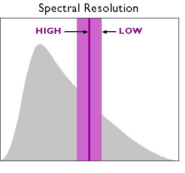
7.3.2 Spatial Resolution
Spatial resolution refers to the coarseness or fineness of a raster grid. The grid cells in high resolution data, such as those produced by digital aerial imaging, or by the IKONOS sensor (described in detail below), correspond to ground areas as small as one square meter. Remotely sensed data, whose grid cells range from 15 to 80 meters on a side, such as the Landsat ETM+ and MSS sensors (also described below), are considered medium resolution. The cells in low resolution data, such as those produced by NOAA's AVHRR (Advanced Very High Resolution Radiometer) sensor (see below), are measured in kilometers.
The higher the spatial resolution of a digital image, the more detail it contains. Detail is valuable for some applications, but it is also costly. Although data compression techniques reduce storage requirements greatly, the storage and processing costs associated with high resolution satellite data often make medium and low resolution data preferable for analyses of extensive areas.
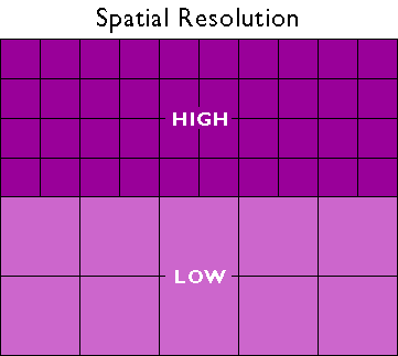
7.3.3 Radiometric Resolution
A third aspect of resolution is radiometric resolution, the measure of a sensor's ability to discriminate small differences in the magnitude of radiation within the ground area that corresponds to a single raster cell. The greater the bit depth (number of data bits per pixel) of the image that a sensor records, the higher its radiometric resolution is said to be. The AVHRR sensor, for example, stores 210 bits per pixel, meaning that the sensor is able to differentiate between 1023 intensity levels. In contrast, the Landsat sensors record the 28 bits per pixel (referred to as 8-bit), or just 256 intensity levels. Thus, although its spatial resolution is very coarse (~4 km), AVHRR takes its name from its high radiometric resolution.
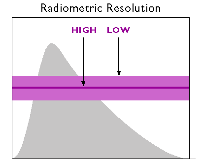
7.3.4 Temporal Resolution
Temporal resolution describes the amount of time it takes for a sensor to revisit a given location at the same viewing angle during its orbit. The temporal resolution is dependent upon the sensor’s capabilities to adjust the sensor direction, swatch overlap, and the latitude at which the image is being taken. Temporal resolution is extremely important to consider when performing change analysis or for tracking temporal events. Aerial photography gives users the most flexibility when it comes to temporal resolution because flights are not limited by a continual orbital path.
Practice Quiz
Registered Penn State students should return now take the self-assessment quiz on the Nature of Image Data.
You may take practice quizzes as many times as you wish. They are not scored and do not affect your grade in any way.
7.4 Multi-spectral Image Processing
One of the main advantages of digital data is that they can be readily processed using digital computers. Over the next few pages, we focus on digital image processing techniques used to correct, enhance, and classify digital, remotely sensed image data.
7.4.1 Image Correction
As suggested earlier, scanning the Earth's surface from space is like scanning a paper document with a desktop scanner, only a lot more complicated. Raw remotely sensed image data are full of geometric and radiometric flaws caused by the curved shape of the Earth, the imperfectly transparent atmosphere, daily and seasonal variations in the amount of solar radiation received at the surface, and imperfections in scanning instruments, among other things. Understandably, most users of remotely sensed image data are not satisfied with the raw data transmitted from satellites to ground stations. Most prefer preprocessed data from which these flaws have been removed.
Relief displacement is one source of geometric distortion in digital image data, although it is less of a factor in satellite remote sensing than it is in aerial imaging, because satellites fly at much higher altitudes than airplanes. Another source of geometric distortions is the Earth itself, whose curvature and eastward spinning motion are more evident from space than at lower altitudes.
The Earth rotates on its axis from west to east. At the same time, remote sensing satellites like IKONOS, Landsat, and the NOAA satellites that carry the AVHRR sensor, orbit the Earth from pole to pole. If you were to plot on a cylindrical projection the flight path that a polar orbiting satellite traces over a 24-hour period, you would see a series of S-shaped waves. As a remote sensing satellite follows its orbital path over the spinning globe, each scan row begins at a position slightly west of the row that preceded it. In the raw scanned data, however, the first pixel in each row appears to be aligned with the other initial pixels. To properly georeference the pixels in a remotely sensed image, pixels must be shifted slightly to the west in each successive row. This is why processed scenes are shaped like skewed parallelograms when plotted in geographic or plane projections.
The reflectance at a given wavelength of an object measured by a remote sensing instrument varies in response to several factors, including the illumination of the object, its reflectivity, and the transmissivity of the atmosphere. Furthermore, the response of a given sensor may degrade over time. With these factors in mind, it should not be surprising that an object scanned at different times of the day or year will exhibit different radiometric characteristics. Such differences can be advantageous at times, but they can also pose problems for image analysts who want to create a mosaic, by adjoining neighboring images together, or to detect meaningful changes in land use and land cover over time. To cope with such problems, analysts have developed numerous radiometric correction techniques, including Earth-sun distance corrections, sun elevation corrections, and corrections for atmospheric haze.
To compensate for the different amounts of illumination of scenes captured at different times of day, or at different latitudes or seasons, image analysts may divide values measured in one band by values in another band, or they may apply mathematical functions that normalize reflectance values. Such functions are determined by the distance between the earth and the sun and the altitude of the sun above the horizon at a given location, time of day, and time of year. To make the corrections, analysts depend on metadata that includes the location, date, and time at which a particular scene was captured.
In addition to radiometric correction, there is a need for images to be geometrically corrected. Geometric correction and orthorectification are two methods for converting imagery into geographically-accurate information. Geometric correction is applied to satellite imagery to remove terrain related distortion and earth movement based on a limited set of information. In contrast, orthorectification uses precise sensor information, orbital parameters, ground control points, and elevation to precisely align the image to a surface model or datum. At the end of this chapter, you will read more about orthorectification as it relates to aerial imagery.
7.4.2 Image Enhancement
Correction techniques are routinely used to resolve geometric, radiometric, and other problems found in raw remotely sensed data. Another family of image processing techniques is used to make image data easier to interpret. These so-called image enhancement techniques include contrast stretching, edge enhancement, and deriving new data by calculating differences, ratios, or other quantities from reflectance values in two or more bands, among many others. This section considers briefly two common enhancement techniques: contrast stretching and derived data. Later, you'll learn how vegetation indices derived from two bands of AVHRR imagery are used to monitor vegetation growth at a global scale.
Consider the pair of images shown side by side below. Although both were produced from the same Landsat MSS data, you will notice that the image on the left is considerably dimmer than the one on the right. The difference is a result of contrast stretching. As you recall, Landsat data have a precision of 8 bits, that is, reflectance values are encoded as 256 intensity levels. As is often the case, reflectance in the near-infrared band of the scene partially shown below include an intensity range of only 30 to 80 in the raw image data. This limited range results in an image that lacks contrast and, consequently, appears dim. The image on the right shows the effect of stretching the range of reflectance values in the near-infrared band from 30-80 to 0-255, and then similarly stretching the visible green and visible red bands. As you can see, the contrast-stretched image is brighter and clearer.

7.4.3 Image Classification
Along with military surveillance and weather forecasting, a common use of remotely sensed image data is to monitor land cover and to inform land use planning. The term land cover refers to the kinds of vegetation that blanket the earth's surface, or the kinds of materials that form the surface where vegetation is absent. Land use, by contrast, refers to the functional roles that the land plays in human economic activities (Campbell, 1983).
Both land use and land cover are specified in terms of generalized categories. For instance, an early classification system adopted by a World Land Use Commission in 1949 consisted of nine primary categories, including settlements and associated non-agricultural lands, horticulture, tree and other perennial crops, cropland, improved permanent pasture, unimproved grazing land, woodlands, swamps and marshes, and unproductive land. Prior to the era of digital image processing, specially trained personnel drew land use maps by visually interpreting the shape, size, pattern, tone, texture, and shadows cast by features shown in aerial photographs. As you might imagine, this was an expensive, time-consuming process. It's not surprising then that the Commission appointed in 1949 failed in its attempt to produce a detailed global land use map.
Part of the appeal of digital image processing is the potential to automate land use and land cover mapping. To realize this potential, image analysts have developed a family of image classification techniques that automatically sort pixels with similar multispectral reflectance values into clusters that, ideally, correspond to functional land use and land cover categories. Two general types of image classification techniques have been developed: supervised and unsupervised techniques.
7.4.3.1 Supervised Classification
Human image analysts play crucial roles in both supervised and unsupervised image classification procedures. In supervised classification, the analyst's role is to specify in advance the multispectral reflectance or, in the case of the thermal infrared band, emittance values typical of each land use or land cover class.

For instance, to perform a supervised classification of the Landsat Thematic Mapper (TM) data shown above into two land cover categories, Vegetation and Other, you would first delineate several training fields that are representative of each land cover class. The illustration below shows two training fields for each class; however, to achieve the most reliable classification possible, you would define as many as 100 or more training fields per class.

The training fields you defined consist of clusters of pixels with similar reflectance or emittance values. If you did a good job in supervising the training stage of the classification, each cluster would represent the range of spectral characteristics exhibited by its corresponding land cover class. Once the clusters are defined, you would apply a classification algorithm to sort the remaining pixels in the scene into the class with the most similar spectral characteristics. One of the most commonly used algorithms computes the statistical probability that each pixel belongs to each class. Pixels are then assigned to the class associated with the highest probability. Algorithms of this kind are known as maximum likelihood classification. The result is an image like the one shown below, in which every pixel has been assigned to one of two land cover classes, vegetation and “other.”

7.4.3.2 Unsupervised Classification
Image analysts play a different role in unsupervised classification. They do not define training fields for each land cover class in advance. Instead, they rely on one of a family of statistical clustering algorithms to sort pixels into distinct spectral classes. Analysts may or may not even specify the number of classes in advance. Their responsibility is to determine the correspondences between the spectral classes that the algorithm defines and the functional land use and land cover categories established by agencies like the U.S. Geological Survey. An example in Section 7.7 below outlines how unsupervised classification contributes to the creation of a high-resolution national land cover data set.

Practice Quiz
Registered Penn State students should return now take the self-assessment quiz about Image Processing.
You may take practice quizzes as many times as you wish. They are not scored and do not affect your grade in any way.
7.5 Survey of Multispectral Imagery Types and Their Applications
There are a number of sources for satellite imagery, and the choice of which imagery you would need is dependent upon the context of the problem that you wish to solve. It is impossible to give you an in-depth survey of all of the available sensors and their data because of the sheer number of sensors in orbit. Instead, in the next section, we explore examples of remotely sensed image data produced by measuring electromagnetic energy in the visible, near-infrared, and thermal infrared bands.
7.5.1 IKONOS
When the Russian space agency first began selling its space surveillance imagery in 1994, a new company called Space Imaging, Inc. was chartered in the United States. Recognizing that high-resolution images were then available commercially from competing foreign sources, the U.S. government authorized private firms under its jurisdiction to produce and market remotely sensed data at spatial resolutions as high as one meter. By 1999, after a failed first attempt, Space Imaging successfully launched its IKONOS I satellite into an orbital path that circles the Earth 640 km above the surface, from pole to pole, crossing the equator at the same time every day. Such an orbit is called a sun synchronous polar orbit, in contrast with the geosynchronous orbit of communications and some weather satellites that remain over the same point on the Earth's surface at all times.

IKONOS' panchromatic sensor records reflectances in the visible band at a spatial resolution of one meter, and a bit depth of eleven bits per pixel. The expanded bit depth enables the sensor to record reflectances more precisely, and allows technicians to filter out atmospheric haze more effectively than is possible with 8-bit imagery. Archived, unrectified, panchromatic IKONOS imagery within the U.S. is available for as little as $7 per square kilometer, but new orthorectified imagery costs $28 per square kilometer and up.
The previous paragraph highlighted the one-meter panchromatic (pan) data produced by the IKONOS satellite sensor. Pan data is not all that IKONOS produces, however. It is a multispectral sensor that records reflectances within four other (narrower) bands, including the blue, green, and red wavelengths of the visible spectrum, and the near-infrared band. The range(s) of wavelengths that a sensor is able to detect is called its spectral sensitivity.
| Spectral Sensitivity | Spatial Resolution |
|---|---|
| 0.45 - 0.90 µm (panchromatic) | 1m |
| 0.45 - 0.52 µm (visible blue) | 4m |
| 0.51 - 0.60 µm (visible green) | 4m |
| 0.63 - 0.70 µm (visible red) | 4m |
| 0.76 - 0,85 µm (near IR) | 4m |
Credit: Pennsylvania State University.
A competing firm called ORBIMAGE acquired Space Imaging in early 2006, after ORBIMAGE secured a half-billion dollar contract with the National Geospatial-Intelligence Agency. The merged companies are now called GeoEye. [171]
7.5.2 Landsat TM and ETM
As NASA prepared to launch Landsat 4 in 1982, a new sensing system was added called Thematic Mapper (TM). TM was a new and improved version of Landsat Multispectral Scanner (MSS) that featured higher spatial resolution (30 meters in most channels) and expanded spectral sensitivity (seven bands, including visible blue, visible green, visible red, near-infrared, two mid-infrared, and thermal infrared wavelengths). An Enhanced Thematic Mapper Plus (ETM+) sensor, which includes an eighth (panchromatic) band with a spatial resolution of 15 meters, was onboard Landsat 7 when it successfully launched in 1999.
The spectral sensitivities of the TM and ETM+ sensors are attuned to both the spectral response characteristics of the phenomena that the sensors are designed to monitor, as well as to the windows within which electromagnetic energy are able to penetrate the atmosphere. The following table outlines some of the phenomena revealed by each of the wavelengths bands, phenomena that are much less evident in panchromatic image data alone.
| Band | Phenomena revealed |
|---|---|
| 0.45 - 0.52 µm (visible blue) | Shorelines and water depths (these wavelengths penetrate water) |
| 0.52 - 0.60 µm (visible green) | Plant types and vigor (peak vegetation reflects these wavelengths strongly) |
| 0.63 -0.69 µm (visible red) | Photosynthetic activity (plants absorb these wavelengths during photosynthesis) |
| 0.76 - 0.90 µm (near IR) | Plant vigor (healthy plant tissue reflects these wavelengths strongly) |
| 1.55 - 1.75 µm (mid IR) | Plant water stress, soil moisture, rock types, cloud cover vs. snow |
| 10.40 - 12.50 µm (thermal IR) | Relative amounts of heat, soil moisture |
| 2.08 - 2.35 µm (mid IR) | Plant water stress, mineral and rock types |
Phenomena revealed by different bands of Lndsat TM/ETM data.
Table Credit: USGS

Until 1984, Landsat data were distributed by the U.S. federal government (originally by the USGS's EROS Data Center, later by NOAA). Data produced by Landsat missions 1 through 4 are still available for sale from EROS. With the Land Remote Sensing Commercialization Act of 1984, however, the U.S. Congress privatized the Landsat program, transferring responsibility for construction and launch of Landsat 5, and for distribution of the data it produced, to a firm called EOSAT.
Dissatisfied with the prohibitive costs of unsubsidized data (as much as $4,400 for a single 185 km by 170 km scene), users prompted Congress to pass the Land Remote Sensing Policy Act of 1992. The new legislation returned responsibility for the Landsat program to the U.S. government. Data produced by Landsat 7 is distributed by USGS at a cost to users of $600 per scene (about 2 cents per square kilometer). Scenes that include data gaps caused by a "scan line corrector" failure are sold for $250; $275 for scenes in which gaps are filled with earlier data.
7.5.3 AVHRR
AVHRR sensors have been onboard sixteen satellites maintained by the National Oceanic and Atmospheric Administration (NOAA) since 1979 (TIROS-N, NOAA-6 through NOAA-15). The data the sensors produce are widely used for large-area studies of vegetation, soil moisture, snow cover, fire susceptibility, and floods, among other things.
AVHRR sensors measure electromagnetic energy within five spectral bands, including visible red, near infrared, and three thermal infrared. As we discovered earlier, the visible red and near-infrared bands are particularly useful for large-area vegetation monitoring through the calculation of NDVI (see 2.2.2 for review of the concept NDVI).
| Spectral Sensitivity | Spatial Resolution |
|---|---|
| 0.58 - 0.68 µm (visible red) | 1-4 km* |
| 0.725 - 1.10 µm (near IR) | 1-4 km* |
| 3.55 - 3.93 µm (thermal IR) | 1-4 km* |
| 10.3 - 11.3 µm (thermal IR) | 1-4 km* |
| 11.5 - 12.5 µm (thermal IR) | 1-4 km* |
Wavelengths are expressed in micrometers (millionths of a meter). Spatial resolution is expressed in kilometers (thousands of meters). *Spatial resolution of AVHRR data varies from 1 km to 16 km. Processed data consist of uniform 1 km or 4 km grids.
Credit: NASA
The NOAA satellites that carry AVHRR sensors trace sun-synchronous polar orbits at altitudes of about 833 km. Traveling at ground velocities of over 6.5 kilometers per second, the satellites orbit the Earth 14 times daily (every 102 minutes), crossing over the same locations along the equator at the same times every day. As it orbits, the AVHRR sensor sweeps a scan head along a 110°-wide arc beneath the satellite, taking many measurements every second. (The back and forth sweeping motion of the scan head is said to resemble a whisk broom.) The arc corresponds to a ground swath of about 2400 km. Because the scan head traverses so wide an arc, its instantaneous field of view (IFOV: the ground area covered by a single pixel) varies greatly. Directly beneath the satellite, the IFOV is about 1 km square. Near the edge of the swath, however, the IFOV expands to over 16 square kilometers. To achieve uniform resolution, the distorted IFOVs near the edges of the swath must be resampled to a 1 km grid (resampling is discussed later in this chapter). The AVHRR sensor is capable of producing daily global coverage in the visible band, and twice daily coverage in the thermal IR band.
7.6 Other Types of Imagery
The remote sensing systems you've studied so far are sensitive to the visible, near-infrared, and thermal infrared bands of the electromagnetic spectrum, wavelengths at which the magnitude of solar radiation is greatest. IKONOS, AVHRR, and the Landsat MSS, TM, and ETM+ instruments are all passive sensors that only measure radiation emitted by other objects.
There are two main shortcomings to passive sensing of the visible and infrared bands. First, clouds interfere with both incoming and outgoing radiation at these wavelengths. Secondly, reflected visible and near-infrared radiation can only be measured during daylight hours. This is why the AVHRR sensor only produces visible and near-infrared imagery of the entire Earth once a day, although it is capable of two daily scans.

7.6.1 Microwave Data
Longwave radiation, or microwaves, are made up of wavelengths between about one millimeter and one meter. Microwaves can penetrate clouds, but the sun and Earth emit so little longwave radiation that it can't be measured easily from space. Active remote sensing systems solve this problem. Active sensors like those aboard the European Space Agency's ERS satellites, the Japanese JERS satellites, and the Canadian Radarsat, among others, transmit pulses of long wave radiation, then measure the intensity and travel time of those pulses after they are reflected back to space from the Earth's surface. Microwave sensing is unaffected by cloud cover, and can operate day or night. Both image data and elevation data can be produced by microwave sensing, as you will discover in the sections on imaging radar and radar altimetry that follow.
7.6.2 Imaging Radar
One example of active remote sensing that everyone has heard of is radar, which stands for Radio Detection And Ranging. Radar was developed as an air defense system during World War II and is now the primary remote sensing system air traffic controllers use to track the 40,000 daily aircraft takeoffs and landings in the United States. Radar antennas alternately transmit and receive pulses of microwave energy. Since both the magnitude of energy transmitted and its velocity (the speed of light) are known, radar systems are able to record either the intensity or the round-trip distance traveled by pulses reflected back to the sensor. Systems that record pulse intensity are called imaging radars.
In addition to its indispensable role in navigation, radar is also an important source of raster image data about the Earth's surface. Radar images look the way they do because of the different ways that objects reflect microwave energy. In general, rough-textured objects reflect more energy back to the sensor than smooth objects. Smooth objects, such as water bodies, are highly reflective, but unless they are perpendicular to the direction of the incoming pulse, the reflected energy all bounces off at an angle and never return to the sensor. Rough surfaces, such as vegetated agricultural fields, tend to scatter the pulse in many directions, increasing the chance that some back scatter will return to the sensor.

The imaging radar aboard the European Resource Satellite (ERS-1) produced the data used to create the image shown above. The smooth surface of the flooded Mississippi River deflected the radio signal away from the sensor, while the surrounding rougher-textured land cover reflected larger portions of the radar pulse. The lighter an object appears in the image, the more energy it reflected. Imaging radar can be used to monitor flood extents regardless of weather conditions. Passive instruments like Landsat MSS and TM that are sensitive only to shorter wavelengths are useless as long as cloud-covered skies prevail.
Practice Quiz
Registered Penn State students should return now take the self-assessment quiz about Visible and Infrared Imagery.
You may take practice quizzes as many times as you wish. They are not scored and do not affect your grade in any way.
7.7 Case Study: Using Landsat for Land Cover Classification for NLCD
The USGS developed one of the first land use/land cover classification systems designed specifically for use with remotely sensed imagery. The Anderson Land Use/Land Cover Classification system, named for the former Chief Geographer of the USGS who led the team that developed the system, consists of nine land cover categories (urban or built-up; agricultural; range; forest; water; wetland; barren; tundra; and perennial snow and ice), and 37 subcategories (for example, varieties of agricultural land include cropland and pasture; orchards, groves, vineyards, nurseries, and ornamental horticulture; confined feeding operations; and other agricultural land). Image analysts at the U. S. Geological Survey created the USGS Land Use and Land Cover (LULC) data by manually outlining and coding areas on air photos that appeared to have homogeneous land cover that corresponded to one of the Anderson classes.
The LULC data were compiled for use at 1:250,000 and 1:100,000 scales. Analysts drew outlines of land cover polygons onto vertical aerial photographs. Later, the outlines were transferred to transparent film georegistered with small-scale topographic base maps. The small map scales kept the task from taking too long and costing too much, but also forced analysts to generalize the land cover polygons quite a lot. The smallest man-made features encoded in the LULC data are four hectares (ten acres) in size, and at least 200 meters (660 feet) wide at their narrowest point. The smallest non-man-made features are sixteen hectares (40 acres) in size, with a minimum width of 400 meters (1320 feet). Smaller features were aggregated into larger ones. After the land cover polygons were drawn onto paper and georegistered with topographic base maps, they were digitized as vector features, and attributed with land cover codes. A rasterized version of the LULC data was produced later.
The successor to LULC is the USGS's National Land Cover Data (NLCD). Unlike LULC, which originated as a vector data set in which the smallest features are about ten acres in size, NLCD is a raster data set with a spatial resolution of 30 meters (i.e., pixels represent about 900 square meters on the ground) derived from Landsat TM imagery. The steps involved in producing the NLCD include preprocessing, classification, and accuracy assessment, each of which is described briefly below.
7.7.1 Preprocessing
The first version of NLCD--NLCD 92--was produced for subsets of ten federal regions that make up the conterminous United States. The primary source data were bands 3, 4, 5, and 7 (visible red, near-infrared, mid-infrared, and thermal infrared) of cloud-free Landsat TM scenes acquired during the spring and fall (when trees are mostly bare of leaves) of 1992. Selected scenes were geometrically and radiometrically corrected, then combined into sub-regional mosaics comprised of no more than 18 scenes. Mosaics were then projected to the same Albers Conic Equal Area projection (with standard parallels at 29.5° and 45.5° North Latitude, and central meridian at 96° West Longitude) based upon the NAD83 horizontal datum.
7.7.2 Image Classification
An unsupervised classification algorithm was applied to the preprocessed mosaics to generate 100 spectrally distinct pixel clusters. Using aerial photographs and other references, image analysts at USGS then assigned each cluster to one of the classes in a modified version of the Anderson classification scheme. Considerable interpretation was required, since not all functional classes have unique spectral response patterns.
| Level I Classes | Level II Classes | |
|---|---|---|
| Water | 11 | Open Water |
| 12 | Perennial Ice/Snow | |
| Developed | 21 | Low Intensity Residential |
| 22 | High Intensity Residential | |
| 23 | Commercial/ Industrial/Transportation | |
| Barren | 31 | Bare Rock/Sand/Clay |
| 32 | Quarries/ Strip Mines/Gravel Pits | |
| 33 | Transitional | |
| Forested Upland | 41 | Deciduous Forest |
| 42 | Evergreen Forest | |
| 43 | Mixed Forest | |
| Shrubland | 51 | Shrubland |
| Non-Natural Woody | 61 | Orchards/Vineyards/Other |
| Herbaceous Upland Natural/Semi-natural Vegetation | 71 | Grasslands/Herbaceous |
| Herbaceous Planted/Cultivated | 81 | Pasture/Hay |
| 82 | Row Crops | |
| 83 | Small Grains | |
| 84 | Fallow | |
| 85 | Urban/Recreational Grasses | |
| Wetlands | 91 | Woody Wetlands |
| 92 | Emergent Herbaceous Wetlands |
Table credit: USGS.
7.7.3 Accuracy Assessment
The USGS hired private sector vendors to assess the classification accuracy of the NLCD 92 by checking randomly sampled pixels against manually interpreted aerial photographs. Results from the first four completed regions suggested that the likelihood that a given pixel is correctly classified ranges from only 38 to 62 percent. Much of the classification error was found to occur among the Level II classes that make up the various Level I classes, and some classes were much more error-prone than others. USGS encourages users to aggregate the data into 3 x 3 or 5 x 5 pixel blocks (in other words, to decrease spatial resolution from 30 meters to 90 or 150 meters), or to aggregate the 21 Level II classes into the nine Level I classes.


7.8 Orthoimagery
One important use of remote sensing is as input to the production of reference maps that cover the U.S. (and other countries). An important part of the process of utilizing remotely sensed information for mapping is rectification of the imagery; that process produces orthoimages. The U.S. Federal Geographic Data Committee (FGDC, 1997, p. 18) defines orthoimage as "a georeferenced image prepared from an aerial photograph or other remotely sensed data ... [that] has the same metric properties as a map and has a uniform scale." Unlike orthoimages, the scale of ordinary aerial images varies across the image, due to the changing elevation of the terrain surface (among other things). The process of creating an orthoimage from an ordinary aerial image is called orthorectification. Photogrammetrists are the professionals who specialize in creating orthorectified aerial imagery, and in compiling geometrically-accurate vector data from aerial images. So, to appreciate the requirements of the orthoimagery and its use in national mapping efforts (which will be discussed in more detail in Chapter 8), we first need to investigate the field of photogrammetry.
7.8.1 Photogrammetry
Photogrammetry is a profession concerned with producing precise measurements of objects from photographs and photoimagery. One of the objects measured most often by photogrammetrists is the surface of the Earth. Since the mid-20th century, aerial images have been the primary source of data used by USGS and similar agencies to create and revise topographic maps. Before then, topographic maps were compiled in the field using magnetic compasses, tapes, plane tables (a drawing board mounted on a tripod, equipped with a leveling telescope like a transit), and even barometers to estimate elevation from changes in air pressure. Although field surveys continue to be important for establishing horizontal and vertical control, photogrammetry has greatly improved the efficiency and quality of topographic mapping.
A vertical aerial photograph is a picture of the Earth's surface taken from above with a camera oriented such that its optical axis is vertical. In other words, when a vertical aerial photograph is exposed to the light reflected from the Earth's surface, the digital imaging surface (historically, it was a sheet of photographic film) is parallel to the ground. In contrast, an image you might create by snapping a picture of the ground below while traveling in an airplane is called an oblique aerial photograph, because the camera's optical axis forms an oblique angle with the ground.

A straight line between the center of a lens and the center of a visible scene is called an optical axis. The nominal scale of a vertical air photo is equivalent to f / H, where f is the focal length of the camera (the distance between the camera lens and the image surface -- usually six inches), and H is the flying height of the aircraft above the ground. It is possible to produce a vertical air photo such that scale is consistent throughout the image. This is only possible, however, if the terrain in the scene is absolutely flat. In rare cases where that condition is met, topographic maps can be compiled directly from vertical aerial photographs. Most often, however, air photos of variable terrain need to be transformed, or rectified, before they can be used as a source for mapping.
Government agencies at all levels need up-to-date aerial imagery. Early efforts to sponsor complete and recurring coverage of the U.S. included the National Aerial Photography Program (NAPP [172]), which replaced an earlier National High Altitude Photography program in 1987. NAPP was a consortium of federal government agencies that aimed to jointly sponsor vertical aerial photography of the entire lower 48 states every seven years or so at an altitude of 20,000 feet, suitable for producing topographic maps at scales as large as 1:5,000. More recently NAPP has been eclipsed by another consortium called the National Agricultural Imagery Program (NAIP [173]).

Aerial photography missions involve capturing sequences of overlapping images along many parallel flight paths. In the portion of the air photo mosaic shown below, note that the photographs overlap one another end to end, and side to side. This overlap is necessary for stereoscopic viewing, which is the key to rectifying photographs of variable terrain. It takes about 10 overlapping aerial photographs taken along two adjacent north-south flight paths to provide stereo coverage for a 7.5-minute quadrangle.
Try This
Use the USGS' EarthExplorer [174] to identify the vertical aerial photograph that shows the "populated place" in which you live. How old is the photo? (EarthExplorer is part of a USGS distribution system.)
Note: The Digital Orthophoto backdrop that EarthExplorer allows you to view is not the same as the NAPP photos the system allows you to identify and order. By the end of this lesson, you should know the difference! If you don't, use the Chapter 6 Discussion Forum to ask.
7.8.2 Perspective and Planimetry
To understand why topographic maps can't be traced directly off of most vertical aerial photographs, you first need to appreciate the difference between perspective and planimetry. In a perspective view, all light rays reflected from the Earth's surface pass through a single point at the center of the camera lens. A planimetric (plan) view, by contrast, looks as though every position on the ground is being viewed from directly above. Scale varies in perspective views. In plan views, scale is everywhere consistent (if we overlook variations in small-scale maps due to map projections). Topographic maps are said to be planimetrically correct. So are orthoimages. Vertical aerial photographs are not.
As discussed above, the scale of an aerial photograph is partly a function of flying height. As terrain elevation increases, flying height in relation to the terrain decreases and photo scale increases. As terrain elevation decreases, flying height increases and photo scale decreases. Thus, variations in elevation cause variations in scale on aerial photographs. Specifically, the higher the elevation of an object, the farther the object will be displaced from its actual position away from the principal point of the photograph (the point on the ground surface that is directly below the camera lens, Figure 7.10). Conversely, objects at positions lower than the mean elevation of the surface will be displaced toward the principal point. This effect, called relief displacement, is illustrated in the diagram below. Note that the effect increases with distance from the principal point; scale distortion is zero at the principal point.
Compare the map and photograph below. Both show the same gas pipeline, which passes through hilly terrain. Note the deformation of the pipeline route in the photo relative to the shape of the route on the topographic map. The deformation in the photo is caused by relief displacement. The photo would not serve well on its own as a source for topographic mapping.

Confused? Think of it this way: where the terrain elevation is high, the ground is closer to the aerial camera, and the photo scale is a little larger than where the terrain elevation is lower. Although the altitude of the camera is constant, the effect of the undulating terrain is to zoom in and out. The effect of continuously-varying scale is to distort the geometry of the aerial photo. This effect is called relief displacement.

Distorted perspective views can be transformed into plan views through a process called rectification. Digital aerial photographs can be rectified using specialized photogrammetric software that shifts image locations (encoded digitally as pixels) toward or away from the principal point of each photo in proportion to two variables: the elevation of the point of the Earth's surface at the location that corresponds to each pixel, and each pixel's distance from the principal point of the photo.
Another way to rectify perspective images is to view pairs of images stereoscopically.
7.8.3 Stereoscopy
If you have normal or corrected vision in both eyes, your view of the world is stereoscopic. Viewing your environment simultaneously from two slightly different perspectives enables you to estimate very accurately which objects in your visual field are nearer, and which are farther away. You know this ability as depth perception.
When you fix your gaze upon an object, the intersection of your two optical axes at the object form what is called a parallactic angle. The keenness of human depth perception is what makes photogrammetric measurements possible.
Your perception of a three-dimensional environment is produced from two separate two-dimensional images. The images produced by your eyes are analogous to two aerial images taken one after another along a flight path. Objects that appear in the area of overlap between two aerial images are seen from two different perspectives. A pair of overlapping vertical aerial images is called a stereopair. When a stereopair is viewed such that each eye sees only one image, it is possible to “see” a three-dimensional image of the area of overlap.
If you have access to a pair of red-cyan (anaglyph) glasses (some of you might have a cardboard pair obtained for viewing 3D movies), you will be able to see the image in this video in 3D: Micro-Images Stereo Zoom-In [175] (the video has a 3D control that allows you to manipulate some viewing options, but you will not see 3D without either a pair of anaglyph glasses or special graphics hardware on your computer). Without such glasses, you will see a somewhat messy looking merger of slightly offset images in these colors.
7.8.4 Rectification by Stereoscopy
Aerial images need to be transformed from perspective views into plan views before they can be used to trace the features that appear on topographic maps, or to digitize vector features in digital data sets. One way to accomplish the transformation is through stereoscopic viewing.
Below are portions of a vertical aerial photograph and a topographic map that show the same area, a synclinal ridge called "Little Mountain" on the Susquehanna River in central Pennsylvania. A linear clearing, cut for a power line, appears on both (highlighted in yellow on the map). The clearing appears crooked on the photograph due to relief displacement. Yet, we know that an aerial image like this one was used to compile the topographic map. The air photo had to be rectified to be used as a source for topographic mapping.

Below are portions of two aerial photographs showing Little Mountain. The two photos were taken from successive flight paths. The two perspectives can be used to create a stereopair.

Next, the stereopair is superimposed in an anaglyph image. Using red/cyan glasses, you should be able to see a three-dimensional image of Little Mountain in which the power line appears straight, as it would if you were able to see it in person. Notice that the height of Little Mountain is exaggerated due to the fact that the distance between the principal points of the two photos is not exactly proportional to the distance between your eyes.

Photogrammetrists use instruments called stereoplotters to trace, or compile, the data shown on topographic maps from stereoscopic images like the ones you've seen here. The operator pictured below is viewing a stereoscopic model similar to the one you see when you view the anaglyph stereo images with red/blue glasses. A stereopair is superimposed on the right-hand screen of the operator's workstation. The left-hand screen shows dialog boxes and command windows through which she controls the stereoplotter software. Instead of red/blue glasses, the operator is wearing glasses with polarized lens filters that allow her to visualize a three-dimensional image of the terrain. She handles a 3-D mouse that allows her to place a cursor on the terrain image within inches of its actual horizontal and vertical position.

7.8.5 Orthorectification
An orthoimage (or orthophoto) is a single aerial image in which distortions caused by relief displacement have been removed. The scale of an orthoimage is uniform. Like a planimetrically correct map, orthoimages depict scenes as though every point were viewed simultaneously from directly above. In other words, they represent the surface as if every optical axis were orthogonal to the ground surface. Notice how the power line clearing has been straightened in the orthophoto on the right below.
Since the early 1990s, orthophotos have been commonly used as sources for editing and revising of digital vector data.
7.8.6 Digital Orthophoto Quadrangle (DOQ)
Digital Orthophoto Quads (DOQs) are raster images of rectified aerial photographs. They are widely used as sources for editing and revising vector topographic data. For example, the vector roads data maintained by businesses like NAVTEQ and Tele Atlas, as well as local and state government agencies, can be plotted over DOQs then edited to reflect changes shown in the orthoimage.
Most DOQs are produced by electronically scanning, then rectifying, black-and-white vertical aerial photographs. DOQs may also be produced from natural-color or near-infrared false-color photos and from digital imagery. Like USGS topographic maps, scale is uniform across each DOQ as a result of the rectification process.
Most DOQs cover 3.75' of longitude by 3.75' of latitude (the ' symbol represents minutes). A set of four DOQs corresponds to each 7.5' quadrangle. (For this reason, DOQs are sometimes called DOQQs--Digital Orthophoto Quarter Quadrangles.) For its National Map, USGS has edge-matched DOQs into seamless data layers, by year of acquisition.
7.9 Summary
This chapter provides a broad introduction to the process of sensing the Earth remotely from satellites and aircraft. Remotely sensed data have become a critical input to our ability to understand the Earth system, to monitor weather and other environmental events, to plan cities and manage resources, to monitor environmental change, and many other applications. Important among the applications is the use of remotely sensed information as an input to mapping the surface of the Earth (its "relief"). Chapter 8: Representing Surfaces will include additional attention to remote sensing and photogrammetry as one of the major tools in the process of representing the surfaces.
Practice Quiz
Registered Penn State students should return now take the self-assessment quiz about Photogrammetry.
You may take practice quizzes as many times as you wish. They are not scored and do not affect your grade in any way.
7.9 Glossary
Remote sensing: Data collected from a distance without visiting or interacting with the phenomena of interest.
Space-borne remote sensing: The use of sensors attached to satellite systems continually orbiting around the Earth.
Aerial imaging systems: Sensors attached to aircraft and flown on demand, meaning that their data capture is not continuous.
Sensors: Instruments for capturing electromagnetic energy emitted and reflected by objects on the Earth's surface.
Electromagnetic radiation: A form of energy emitted by all matter above absolute zero temperature (0 Kelvin or -273° Celsius).
Electromagnetic spectrum: Relative amounts of electromagnetic energy emitted by the Sun and the Earth across the range of wavelengths.
Visible wavelengths: The peak wavelengths of electromagnetic spectrum which humans can see.
Atmospheric window: Areas of the electromagnetic spectrum which are not strongly influenced by absorption.
Transmissivity: The ability of a wavelength to pass through these atmospheric windows.
Image Interpretation Elements: A set of nine visual cues that are used to interpret imagery. Those elements are: size, shape, color/tone, pattern, shadow, texture, association, height, and site.
Spectral Response Pattern (spectral signature): The magnitude of energy that an object reflects or emits across a range of wavelengths.
Normalized Difference Vegetation Index: Mathematical formula for calculating the “greenness” in a scene using Near-Infrared and Red bands from an image.
Spatial Resolution: Refers to the coarseness or fineness of a raster grid.
Spectral Resolution: The ability of a sensor to detect small differences in wavelength.
Radiometric Resolution: The measure of a sensor's ability to discriminate small differences in the magnitude of radiation within the ground area that corresponds to a single raster cell.
Temporal Resolution: Describes the amount of time it takes for a sensor to revisit a given location at the same viewing angle during its orbit.
Geometric Correction: Is applied to satellite imagery to remove terrain related distortion and Earth movement based on a limited set of information.
Radiometric Correction: Techniques for removing noise from imagery, including Earth-sun distance corrections, sun elevation corrections, and corrections for atmospheric haze.
Mosaic: Adjoining neighboring images together in a way that preserves their geographic relationship.
Land cover: The kinds of vegetation that blanket the Earth's surface, or the kinds of materials that form the surface where vegetation is absent.
Land use: The functional roles that the land plays in human economic activities (Campbell, 1983).
Maximum likelihood classification: One of the most commonly used algorithms computes the statistical probability that each pixel belongs to each class. Pixels are then assigned to the class associated with the highest probability.
Sun synchronous polar orbit: Orbital path that circles the Earth 640 km above the surface, from pole to pole, crossing the equator at the same time every day.
Geosynchronous orbit: Orbital path common to communications and some weather satellites that remain over the same point on the Earth's surface at all times.
Instantaneous Field of View: The ground area covered by a single pixel.
Passive remote sensors: Only measure radiation emitted by other objects (IKONOS, Landsat, AVHRR).
Active remote sensors: Transmit pulses of long wave radiation, then measure the intensity and travel time of those pulses after they are reflected back to space from the Earth's surface (JERS, ERS, Radarsat).
Imaging Radar: Active remote sensor system that record pulse intensity or the round-trip distance traveled by pulses reflected back to the sensor.
Georeference: Define the images existence in a physical space, establishing a location in terms of map projection and coordinate system.
Orthoimage: A georeferenced image prepared from an aerial photograph or other remotely sensed data ... [that] has the same metric properties as a map and has a uniform scale.
Orthorectification: The process of creating an orthoimage from an ordinary aerial image.
Photogrammetry: Profession concerned with producing precise measurements of objects from photographs and photoimagery.
Optical Axis: A straight line between the center of a lens and the center of a visible scene.
Vertical Aerial Photograph: Is a picture of the Earth's surface taken from above with a camera oriented such that its optical axis is vertical.
Perspective View: All light rays reflected from the Earth's surface pass through a single point at the center of the camera lens.
Planimetric View: Looks as though every position on the ground is being viewed from directly above.
Relief Displacement: Objects at positions lower than the mean elevation of the surface will be displaced toward the principal point.
Rectification: Process by which distorted perspective views can be transformed into plan views.
Stereoscopic: Viewing your environment simultaneously from two slightly different perspectives enables you to estimate very accurately which objects in your visual field are nearer, and which are farther away.
Parallactic Angle: The intersection of your two optical axes at the object form when you fix your gaze upon an object.
Stereopair: A pair of overlapping vertical aerial images.
Stereoplotter: Instruments to trace, or compile, the data shown on topographic maps from stereoscopic images.
Anaglyph Image: Images contain two differently filtered colored images, one for each eye, to create a 3 dimensional viewing perspective.
Digital Orthophoto Quad (DOQ): Raster images of rectified aerial photographs.
Chapter 8: Representing Surfaces
Overview
So far, we have discussed how to collect geographic data, how to manage and manipulate it in a database, and how to represent thematic data in map form. This chapter will explore the various geographic approaches to representing Earth’s surfaces. We will begin the chapter describing topographic maps, from their historical use to their current applications. Next, we will consider different approaches to storing, creating, and representing Earth’s elevation data. Finally, we end the chapter by considering surfaces that are not land-based: bathymetry, the measurements of oceanic depths, or the varying sea floor elevations.
Objectives
Students who successfully complete Chapter 8 should be able to:
- identify different techniques and approaches to representing the Earth’s surfaces;
- describe how topographic data are compiled from aerial imagery;
- calculate an interpolated spot elevation based on neighboring elevations;
- understand how continuous surfaces are created from a set of measured values at discrete locations through interpolation;
- given a regular or irregular array of spot elevations, construct a triangulated irregular network, interpolate contour intervals and draw contour lines;
- compare vector and raster representations of terrain elevation;
- acquire and view digital elevation data from the National Elevation Dataset.
Table of Contents
- Topographics Maps
- Elevation
- Beyond Terrain Surfaces: Bathymetry
- Summary
- Glossary
- Biblography
Chapter lead author: Jennifer Smith.
Portions of this chapter were drawn directly from the following text:
Joshua Stevens, Jennifer M. Smith, and Raechel A. Bianchetti (2012), Mapping Our Changing World, Editors: Alan M. MacEachren and Donna J. Peuquet, University Park, PA: Department of Geography, The Pennsylvania State University.
8.1 Topographic Maps
Since the eighteenth century, the preparation of a detailed basic reference map has been recognized by the governments of most countries as fundamental for the delimitation of their territory, for underpinning their national defense, and for management of their resources (Parry, 1987).
Specialists in geographic information recognize two broad functional classes of maps: reference maps and thematic maps. As you recall from Chapter 3, a thematic map is usually made with one particular purpose in mind. Often, the intent is to make a point about the spatial pattern of a single phenomenon. Reference maps, on the other hand, are designed to serve many different purposes. Like a reference book -- such as a dictionary, encyclopedia, or gazetteer -- reference maps help people look up facts. Common uses of reference maps include locating place names and features, estimating distances, directions, and areas, and determining preferred routes from starting points to a destination. Reference maps are also used as base maps upon which additional geographic data can be compiled. Because reference maps serve various uses, they typically include a greater number and variety of symbols and names than thematic maps. The portion of the United States Geological Survey (USGS) topographic map shown below is a good example.

The term topography derives from the Greek topographein, "to describe a place." Topographic maps show, and name, many of the visible characteristics of the landscape, as well as political and administrative boundaries. Topographic map series provide base maps of uniform scale, content, and accuracy (more or less) for entire territories. Many national governments include agencies responsible for developing and maintaining topographic map series for a variety of uses, from natural resource management to national defense. Affluent countries, countries with especially valuable natural resources, and countries with large or unusually active militaries, tend to be mapped more completely than others.
8.1.1 Legacy Data: USGS Topographic Maps
The systematic mapping of the entire U.S. began in 1879, when the U.S. Geological Survey (USGS) was established. Over the next century, USGS and its partners created topographic map series at several scales, including 1:250,000, 1:100,000, 1:63,360, and 1:24,000. The diagram below illustrates the relative extents of the different map series. Since much of today’s digital map data was digitized from these topographic maps, one of the challenges of creating continuous digital coverage of the entire U.S. has been to seam together all of these separate map sheets. The current process for topographic mapping in the U.S. is organized as The National Map (NationalMap.gov [30]). But, since the process still relies on some data collected in traditional ways using the sheet-based organizational structure, we begin with a description of past topographic mapping practice.

Map sheets in the legacy 1:24,000-scale series are known as quadrangles or simply quads. A quadrangle is a four-sided polygon. Although each 1:24,000 quad covers 7.5 minutes longitude by 7.5 minutes latitude, their shapes and area coverage vary. The area covered by the 7.5-minute maps varies from 49 to 71 square miles (126 to 183 square kilometers), because the length of a degree of longitude varies with latitude.

Through the 1940s, topographers in the field compiled by hand the data depicted on topographic maps. Anson (2002) recalls being outfitted with a 14 inch x 14 inch tracing table and tripod, plus an alidade [a 12 inch telescope mounted on a brass ruler], a 13 foot folding stadia rod, a machete, and a canteen (p. 1). Teams of topographers sketched streams, shorelines, and other water features; roads, structures, and other features of the built environment; elevation contours, and many other features. To ensure geometric accuracy, their sketches were based upon the geodetic control network (of about 240,000 locations of known position as described here: Horizontal Control PDF [176]), as well as positions and spot elevations they surveyed themselves using alidades and rods. Depending on the terrain, a single 7.5-minute quad sheet might have taken weeks or months to compile. In the 1950s, however, photogrammetric methods (discussed in Chapter 7) permitted topographers to make accurate stereoscopic measurements directly from overlapping pairs of aerial photographs providing a viable and more efficient alternative to field mapping.
8.1.2. Scanned Topographic Maps
Many digital data products have been derived from the USGS topographic map series. The simplest of such products are Digital Raster Graphics (DRGs). DRGs are scanned raster images of USGS 1:24,000 topographic maps. DRGs are useful as backdrops over which other digital data may be superimposed. For example, the accuracy of a vector file containing lines that represent lakes, rivers, and streams could be checked for completeness and accuracy by plotting it over a DRG (subject to the age of the data on the DRG).

DRGs are created by scanning paper maps at 250 pixels per inch resolution. Since at 1:24,000 1 inch on the map represents 2,000 feet on the ground, each DRG pixel corresponds to an area about 8 feet (2.4 meters) on a side. Each pixel is coded from 0 to 12; the numbers stand for the 13 standard DRG colors. Like the paper maps from which they are scanned, DRGs comply with National Map Accuracy Standards (Standards and Specifications [177]).

To investigate DRGs in greater depth, visit the USGS DRG site [178] or search the Internet on “USGS Digital Raster Graphics”.
Try This:
Explore a DRG with Global Mapper (dlgv32 Pro)
You can use a free software application called Global Mapper (also known as dlgv32 Pro) to investigate the characteristics of a USGS Digital Raster Graphic. Originally developed by the staff of the USGS Mapping Division at Rolla, Missouri as a data viewer for USGS data, Global Mapper has since been commercialized but is available in a free trial version. The instructions below will guide you through the process of installing the software and opening the DRG data. Penn State students will later be asked questions that will require you to explore the data for answers.
Note: Global Mapper is a Windows application and will not run under the Macintosh operating system. The questions asked of Penn State students that involve the use of Global Mapper are not graded.
Global Mapper (dlgv32 Pro) Installation Instructions
Skip this step if you already downloaded and installed Global Mapper or dlgv32 Pro.
- Navigate to GlobalMapper.com [179] or search the Internet for “Global Mapper” or "dlgv32 Pro"
- Download the trial version of the software. The zip archive containing the Global Mapper installer is 10 Mb in size and will take approximately 2 minutes to download via high speed DSL or cable, or about 35 minutes via 56 Kbps modem.
- Double-click on the setup file you downloaded to install the program.
- Launch Global Mapper or dlgv32 Pro.
Downloading and exploring DRG data in Global Mapper
- First, create a directory called "USGS Data" on your hard disk, where you can file your course materials if you haven't done so already.
- Download the DRG.zip data archive [180]. The ZIP archive is 2.7 Mb in size and will take approximately 35 seconds to download via high speed DSL or cable, or about 9 minutes and 35 seconds minutes via 56 Kbps modem. Registered Penn State students who cannot download the file should contact their assigned teaching assistant for help.
- Now, decompress the archive into a directory on your hard disk:
- open the ZIP archive you downloaded;
- extract all files in the ZIP archive into a known subdirectory.
The result will be five files that make up one Digital Raster Graphic.
- Open your DRG in Global Mapper.
- Choose File > Open Data File(s)..., then navigate to the subdirectory into which you extracted the DRG files.
- Open the file 'bushkill_pa.tif'
The DRG data correspond with the 7.5 minute quadrangle for Bushkill, PA.
- Notice that as you glide the magnifying glass cursor over the DRG, the UTM (NAD 27) and geographic coordinates of the cursor's position change in the lower right-hand corner of the window. This tells you that the DRG is in fact georeferenced.
- Experiment with Global Mapper’s tools. Use the Zoom and Pan tools to magnify and scroll across the DRG. The Full View button (the one with the house icon) refreshes the initial full view of the data set.
- The Measure tool (ruler icon) allows you to not only measure distance as the crow flies, but also to see the area enclosed by a series of line segments drawn by repeated mouse clicks. Note again the location information that is given to you near the bottom of the application window.
Certain tools, e.g., the 3D Path Profile/Line of Sight tool are not functional in the free (unregistered) version of Global Mapper.
- To view an excerpt from the DRG metadata, navigate to Tools > Control Center, then click the Metadata button.
By 1992, the series of over 53,000 separate quadrangle maps covering the lower 48 states, Hawaii, and U.S. territories at 1:24,000 scale was completed, at an estimated total cost of $2 billion. However, by the end of the century, the average age of 7.5-minute quadrangles was over 20 years, and federal budget appropriations limited revisions to only 1,500 quads a year (Moore, 2000). As landscape change has exceeded revisions in many areas of the U.S., the USGS topographic map series has become legacy data outdated in terms of format as well as content. The paper quad-based topographic map series has been replaced by the National Map program. The National Map is designed to produce a multi-scale digital map for the country; this is discussed in Section 1.3 below. First, we discuss map accuracy, which is a topic that applies to both the legacy paper map products and the new digital products of the National Map.
Try This!
Search the Internet on "USGS topographic maps" to investigate the history and characteristics of USGS topographic maps in greater depth. View preview images, look up publication and revision dates, and order topographic maps at "USGS Store."
8.1.3 Accuracy Standards
Errors and uncertainty are inherent in geographic data. Despite the best efforts of the USGS Mapping Division and its contractors, topographic maps include features that are out of place, features that are named or symbolized incorrectly, and features that are out of date.
The locational accuracy of spatial features encoded in USGS topographic maps and data are guaranteed to conform to National Map Accuracy Standards. The standard for topographic maps states that horizontal positions of 90 percent of the well-defined points tested will occur within 0.02 inches (map distance) of their actual positions (thus, 10% of points can vary by more than this). Similarly, the vertical positions of 90 percent of well-defined points tested are to be true to within one-half of the contour interval. Both standards are scale-dependent. For example, at 1:24,000, 0.02 inches equals 40 feet (thus 90% of points tested at this scale must be within 40 feet of their true location; in contrast, at 1:250,000, the tolerance is 416.7 feet).
Objective standards do not exist for the accuracy of attributes associated with geographic features. Attribute errors certainly do occur, however. A chronicler of the national mapping program (Thompson, 1988, p. 106) recalls a worried user who complained to USGS that "My faith in map accuracy received a jolt when I noted that on the map the borough water reservoir is shown as a sewage treatment plant."
The passage of time is perhaps the most troublesome source of errors on topographic maps. As mentioned in the previous page, the average age of the original USGS topographic map series was over 20 years at the turn of the century when the decision was made to stop updating maps on a quad-by-quad basis. Geographic data quickly lose value (except for historical analyses) unless they are continually revised. The sequence of map fragments below shows how frequently revisions were required between 1949 and 1973 for the quad that covers Key Largo, Florida. Revisions are based primarily on geographic data produced by aerial photography.
Try This!
Investigate standards for data quality and other characteristics of U.S. national map data at Standards and Specifications [177] or by searching the Internet for "usgs national map accuracy standards"
8.1.4 USGS National Map
Executive Order 12906 decreed that a designee of the Secretary of the Department of Interior would chair the Federal Geographic Data Committee. The USGS, an agency of the Department of Interior, has lead responsibility for three of the seven National Spatial Data Infrastructure (NSDI) framework themes--orthoimagery, elevation, and hydrography, and secondary responsibility for several others. In 2001, USGS announced its vision of a National Map that "aligns with the goals of, and is one of several USGS activities that contribute to, the National Spatial Data Infrastructure" (USGS, 2001, p. 31). A 2002 report of the National Research Council identified the National Map as the most important initiative of USGS’ Geography Discipline at the USGS (NRC, 2002). Recognizing its unifying role across science disciplines, USGS moved management responsibility for the National Map from Geography to the USGS Geospatial Information Office in 2004. (One reason that the term "geospatial" is used at USGS and elsewhere is to avoid association of GIS with a particular discipline, i.e., Geography.) In 2001, USGS envisioned the National Map as the nation’s topographic map for the 21st Century (USGS, 2001, p.1). According to Characteristics of the National Map (USGS, 2001, p. 11-13), improvements over the original topographic map series were to include:
- Currentness
Content will be updated on the basis of changes in the landscape instead of the cyclical inspection and revisions cycles now in use [for printed topographic map series]. The ultimate goal is that new content be incorporated within seven days of a change in the landscape. - Seamlessness
Features will be represented in their entirety and not interrupted by arbitrary edges, such as 7.5-minute map boundaries. - Consistent classification
Types of features, such as "road" and "lake/pond," will be identified in the same way throughout the nation. - Variable resolution
Data resolution, or pixel size, may vary among imagery of urban, rural, and wilderness areas. The resolution of elevation data may be finer for flood plain, coastal, and other areas of low relief than for areas of high relief. - Completeness
Data content will include all mappable features (as defined by the applicable content standards for each data theme and source). - Consistency and integration
Content will be delineated geographically (that is, in its true ground position within the applicable accuracy limit) to ensure logical consistency between related features. For example, ... streams and rivers [should] consistently flow downhill... - Variable positional accuracy
The minimum positional accuracy will be that of the current primary topographic map series for an area. Actual positional accuracy will be reported in conformance with the Federal Geographic Data Committee’s Geospatial Positioning Accuracy Standard. - Spatial reference systems
Tools will be provided to integrate data that are mapped using different datums and referenced to different coordinates systems, and to reproject data to meet user requirements. - Standardized content
...will conform to appropriate Federal Geographic Data Committee, other national, and/or international standards. - Metadata
At a minimum, metadata will meet Federal Geographic Data Committee standards to document ... [data] lineage, positional and attribute accuracy, completeness, and consistency.
As of 2012, USGS’ ambitious vision has not yet been fully realized. Insofar as it depends upon cooperation by many federal, state, and local government agencies, the vision may never be fully achieved. Still, elements of a National Map do exist, including national data themes, data access and dissemination technologies such as the Geospatial One Stop portal (GeoPortal [181]) and the National Map Viewer [182], and the U.S. National Atlas [183]. A new Center of Excellence for Geospatial Information Science (CEGIS) was established in 2006 under the USGS Geospatial Information Office to undertake the basic GIScience research needed to devise and implement advanced tools that will make the National Map more valuable to end users. The data themes included in the National Map are shown in table 8.1.
| -- | National Map Themes | NSDI framework themes |
|---|---|---|
| Geodetic control | No | Yes |
| Orthoimagery | Yes | Yes |
| Land Cover | Yes | No |
| Elevation | Yes | Yes |
| Transportation | Yes | Yes |
| Hydrography | Yes | Yes |
| Boundaries | Yes | Yes |
| Structures | Yes | No |
| Cadastral | No | Yes |
| Geographic Names | Yes | No |
To Watch
The status of the effort as of fall, 2012 is detailed in this US Topo video:
In the following sections of this chapter, we will describe in more detail about how Earth’s surfaces are derived and represented on maps.
Practice Quiz
Registered Penn State students should return now take the self-assessment quiz about Topographic Maps.
You may take practice quizzes as many times as you wish. They are not scored and do not affect your grade in any way.
8.2 Elevation
The NSDI Framework Introduction and Guide (FGDC, 1997, p. 19) points out that "elevation data are used in many different applications." Civilian applications include flood plain delineation, road planning and construction, drainage, runoff, and soil loss calculations, and cell tower placement, among many others. Elevation data are also used to depict the terrain surface by a variety of means, from contours to relief shading and three-dimensional perspective views.
The NSDI Framework calls for an "elevation matrix" for land surfaces. That is, the terrain is to be represented as a grid of elevation values. The spacing (or resolution) of the elevation grid may vary between areas of high and low relief (i.e., hilly and flat). Specifically, the Framework Introduction states that:
Elevation values will be collected at a post-spacing of 2 arc-seconds (approximately 47.4 meters at 40° latitude) or finer. In areas of low relief, a spacing of 1/2 arc-second (approximately 11.8 meters at 40° latitude) or finer will be sought (FGDC, 1997, p. 18).
The elevation theme also includes bathymetry--depths below water surfaces--for coastal zones and inland water bodies. Specifically,
For depths, the framework consists of soundings and a gridded bottom model. Water depth is determined relative to a specific vertical reference surface, usually derived from tidal observations. In the future, this vertical reference may be based on a global model of the geoid or the ellipsoid, which is the reference for expressing height measurements in the Global Positioning System (FGDC, 1997, p. 18).
USGS has lead responsibility for the elevation theme of the NSDI. Elevation is also a key component of USGS' National Map. The next sections consider how heights and depths are created, how they are represented in digital geographic data, and how they may be depicted cartographically.
8.2.1 Vector and Raster Approaches
The terms raster and vector were introduced back in Chapter 4 to denote two fundamentally different strategies for representing geographic phenomena. Both strategies involve simplifying the infinite complexity of the Earth's surface. As it relates to elevation data, the raster approach involves measuring elevation at a sample of locations that are evenly spaced. The vector approach, on the other hand, involves measuring the locations of a sample of elevations and depicting the surface with elevation contours.

The illustration above compares how elevation data are represented in vector and raster data. On the left are elevation contours, a vector representation that is familiar to anyone who has used a USGS topographic map. Contours are a kind of isarithm, from the Greek words for "same" and "number." A contour line, then, is a line along with an elevation value (number) that remains equal (the same). There are many kinds of isarithm, with the variants reflecting the kind of thing depicted (an isobaths is a line of equal bathymetry, or depth under water; an isotherm is a line of equal temperature). Contours are one of the few isarithmic line types with a name that does not include “iso” as a prefix.
As you will see later in this chapter, when you explore Digital Line Graphs, elevations in vector data are encoded as attributes of line features. The distribution of locations with precisely specified elevations across the quadrangle is therefore irregular. Raster elevation data, by contrast, consist of grids at which elevation is encoded at regular intervals at each intersection. Raster elevation data are what is called for by the NSDI Framework and the USGS National Map. Contours can now be rendered easily from digital raster data. However, much of the raster elevation data used in the National Map was produced from digital vector contours and hydrography (streams and shorelines). For this reason, we will consider the vector approach to terrain representation first.
8.2.2 Contours

Drawing contour lines is a way to represent a terrain surface with a sample of elevations. Instead of measuring and depicting elevation at every point, you measure only along lines at which a series of imaginary horizontal planes slice through the terrain surface. The more imaginary planes, the more contours, and the more detail is captured with a smaller the contour interval (the magnitude of difference from one contour to the next).

Until photogrammetric methods came of age in the 1950s, topographers in the field sketched contours on the USGS 15-minute topographic quadrangle series. Since then, contours shown on most of the 7.5-minute quads were compiled from stereoscopic images of the terrain, as described in Chapter 7. Today computer programs draw contours automatically from the spot elevations that photogrammetrists compile stereoscopically.
Although it is uncommon to draw terrain elevation contours by hand these days, it is still worthwhile to know how to develop an understanding of how automated methods work and of the kinds of error they can produce. In the next few pages, you'll have a chance to practice the technique, which is analogous to the way computers do it.
8.2.3 Contouring by Hand
This page will walk you through a methodical approach to rendering contour lines from an array of spot elevations (Rabenhorst and McDermott, 1989). To get the most from this exercise, we suggest that you print the illustration in the attached image file [186]. Find a pencil (preferably one with an eraser!) and a straightedge, and duplicate the steps illustrated below. A "Try This!" activity will follow this step-by-step introduction, providing you a chance to go solo.

Starting at the highest elevation, draw straight lines to the nearest neighboring spot elevations. Once you have connected to all of the points that neighbor the highest point, begin again at the second highest elevation. (You will have to make some subjective decisions as to which points are "neighbors" and which are not.) Taking care not to draw triangles across the stream, continue until the surface is completely “triangulated,” where triangles connect any given three neighbors.

The result is a triangulated irregular network (TIN). A TIN is a vector representation of a continuous surface that consists entirely of triangular facets. The vertices of the triangles are spot elevations that may have been measured in the field by leveling, or in a photogrammetrist's workshop with a stereoplotter, or by other means. (Spot elevations produced photogrammetrically are called mass points.) A useful characteristic of TINs is that each triangular facet has a single slope degree and direction. With a little imagination and practice, you can visualize the underlying surface from the TIN even without drawing contours.
Wonder why we suggest that you not let triangle sides that make up the TIN cross the stream? Well, if you did, the stream would appear to run along the side of a hill, instead of down a valley as it should. In practice, spot elevations would always be measured at several points along the stream, and along ridges as well. Photogrammetrists refer to spot elevations collected along linear features as breaklines (Maune, 2007). We omitted breaklines from this example just to make a point.
You may notice that there is more than one correct way to draw the TIN. As you will see, deciding which spot elevations are "near neighbors" and which are not is subjective in some cases. Related to this element of subjectivity is the fact that the fidelity of a contour map depends in large part on the distribution of spot elevations on which it is based. In general, the density of spot elevations should be greater where terrain elevations vary greatly, and sparser where the terrain varies subtly. Similarly, the smaller the contour interval you intend to use, the more spot elevations you need. In the example below, we use a contour interval of 100.
There are algorithms for triangulating from irregular arrays of point elevations that produce unique solutions. One approach is called Delaunay Triangulation which, in one of its constrained forms, is useful for representing terrain surfaces. The distinguishing geometric characteristic of a Delaunay triangulation is that a circle surrounding each triangle side does not contain any other vertex.

Now, draw ticks to mark the points at which elevation contours intersect each triangle side. As noted above, we will use a contour interval of 100 feet in this example, with each contour line representing some increment of 100. For instance, see the triangle side that connects the spot elevations 2360 and 2480 in the lower left corner of the illustration above? One tick mark is drawn on the triangle where a contour representing elevation 2400 intersects. Now find the two spot elevations, 2480 and 2750, in the same lower left corner. Note that three tick marks are placed where contours representing elevations 2500, 2600, and 2700 intersect.
This step should remind you of the equal interval classification scheme you read about in Chapter 3. The right choice of contour interval depends on the goal of the mapping project. In general, contour intervals increase in proportion to the variability of the terrain surface. It should be noted that the assumption that elevations increase or decrease at a constant rate is not always correct, of course. We will consider that issue in more detail later.

Finally, draw your contour lines. Working downslope from the highest elevation, thread contours through ticks of equal value. Move to the next highest elevation when the surface seems ambiguous.
Keep in mind the following characteristics of contour lines (Rabenhorst and McDermott, 1989):
- Contours should always point upstream in valleys.
- Contours should always point downridge along ridges.
- Adjacent contours should always be sequential or equivalent.
- Contours should never split into two.
- Contours should never cross or loop.
- Contours should never spiral.
- Contours should never stop in the middle of a map.
How does your finished map compare with the one we drew below?

Try This!
Now try your hand at contouring on your own. The purpose of this practice activity is to give you more experience in contouring terrain surfaces.
- First, view an image of an irregular array of 16 spot elevations [187].
- Print the image.
- Use the procedure outlined in this lesson to draw contour lines that represent the terrain surface that the spot elevations were sampled from. You may find this to be a moderately challenging task that takes about half an hour to do well. TIP: Label the tick marks to make it easier to connect them.
- When finished, compare your result to an existing map. [188]
Here are a couple of somewhat simpler problems and solutions in case you need a little more practice.
- Practice Problem #1 [189]
- Practice Problem #1 Solution [190]
- Practice Problem #2 [191]
- Practice Problem #2 Solution [192]
You will be asked to demonstrate your contouring ability again in the Lesson 7 Quiz and in the final exam.
Kevin Sabo (personal communication, Winter 2002) remarked that "If you were unfortunate enough to be hand-contouring data in the 1960's and 70's, you may at least have had the aid of a Gerber Variable Scale. (See Joe Gerber's Pajamas [193]) After hand contouring in Lesson 7, I sure wished I had my Gerber!"
8.2.4 Digital Line Graph (DLG)
Identification
Digital Line Graphs (DLGs) are vector representations of most of the features and attributes shown on USGS topographic maps. Individual feature sets (outlined in the table below) are encoded in separate digital files. DLGs exist at three scales: small (1:2,000,000), intermediate (1:100,000) and large (1:24,000). Large-scale DLGs are produced in tiles that correspond to the 7.5-minute topographic quadrangles from which they were derived (Digital Line Graphs [178]).
|
Layer |
Features |
|---|---|
|
Public Land Survey System (PLSS) |
Township, range, and section lines |
|
Boundaries |
State, county, city, and other national and State lands such as forests and parks |
|
Transportation |
Roads and trails, railroads, pipelines and transmission lines |
|
Hydrography |
Flowing water, standing water, and wetlands |
|
Hypsography |
Contours and supplementary spot elevations |
|
Non-vegetative features |
Glacial moraine, lava, sand, and gravel |
|
Survey control and markers |
Horizontal and vertical monuments (third order or better) |
|
Man-made features |
Cultural features, such as building, not collected in other data categories |
|
Woods, scrub, orchards, and vineyards |
Vegetative surface cover |
Credit: USGS, 2006.

Data quality
Like other USGS data products, DLGs conform to National Map Accuracy Standards. In addition, however, DLGs are tested for the logical consistency of the topological relationships among data elements. Similar to the Census Bureau's TIGER/Line, line segments in DLGs must begin and end at point features (nodes), and line segments must be bounded on both sides by area features (polygons).
Spatial Reference Information
DLGs are heterogenous in terms of the projection they are based upon. Some use UTM coordinates, others State Plane Coordinates. Some are based on NAD 27, others on NAD 83. Elevations are referenced either to NGVD 29 or NAVD 88 (USGS, 2006a).
Entities and attributes
The basic elements of DLG files are nodes (positions), line segments that connect two nodes, and areas formed by three or more line segments. Each node, line segment, and area is associated with two-part integer attribute codes. For example, a line segment associated with the attribute code "050 0412" represents a hydrographic feature (050), specifically, a stream (0412).
Distribution
Not all DLG layers are available for all areas at all three scales. Coverage is complete at 1:2,000,000. At the intermediate scale, 1:100,000 (30 minutes by 60 minutes), all hydrography and transportation files are available for the entire United States. At 1:24,000 (7.5 minutes by 7.5 minutes), coverage remains spotty. The files are in the public domain, and can be used for any purpose without restriction.
Large- and Intermediate- scale DLGs are available for download through EarthExplorer system (EarthExplorer [194]). You can plot 1:2,000,000 DLGs on-line at the USGS' National Atlas of the United States (National Atlas [183]).
Digital Line Graph Hypsography
In one sense, DLGs are as much "legacy" data as the out-of-date topographic maps from which they were produced. Still, DLG data serve as primary or secondary sources for several themes in the USGS National Map, including hydrography, boundaries, and transportation. DLG hypsography data are not included in the National Map, however. It is assumed that GIS users can generate elevation contours as needed from DEMs.

Hypsography refers to the measurement and depiction of the terrain surface, specifically with contour lines. Several different methods have been used to produce DLG hypsography layers, including:
- scanning contour lines on photographic film or paper maps, converting the scanned raster data to vectors, then editing and attributing the vector features;
- manually digitizing and attributing contour lines on photographic film or paper maps;
- producing contours by photogrammetric processes; and
- deriving contours from LiDAR (discussed later in section 8.2.8).

Try This!
Exploring DLGs with Global Mapper (dlgv32 Pro)
Now I'd like you to use Global Mapper (or dlgv32 Pro) software to investigate the characteristics of the hypsography layer of a USGS Digital Line Graph (DLG). The instructions below assume that you have already installed software on your computer. (If you haven't, return to installation instructions [195] presented earlier in Chapter 6). First, you'll download and a sample DLG file. In a following activity, you'll have a chance to find and download DLG data for your area.
- If you haven't done so already, create a directory called "USGS Data" on your hard disk, where you file your course materials.
- Next, Download the DLG.zip data archive [196]. The ZIP archive is 1.2 Mb in size and will take approximately 15 seconds to download via high speed DSL or cable, or about 4 minutes and 15 seconds minutes via 56 Kbps modem.
- Now decompress the archive into a directory on your hard disk.
- Open the archive DLG.zip.
- Create a subdirectory called "DLG" within the directory in which you save data for this class.
- Extract all files in the ZIP archive into your new subdirectory.
The end result will be five subdirectories, each of which includes the data files that make up a DLG "layer," along with a master directory.
- Launch Global Mapper or dlgv32 Pro.
- Open a Digital Line Graph by choosing File > Open as New..., then navigate to the directory "DLG/Hypso." Open the file 'Hp01catd.ddf' (you can open up to four files at once in the trial version of Global Mapper). The data correspond with the 7.5 minute quadrangle for Bushkill, PA. The file is encoded in Spatial Data Transfer Standard (SDTS) format. For information about SDTS, see the SDTS Tutorial [197] (PDF format).
- Global Mapper may ask you to direct it to a 'Master Data Dictionary' file. If so, navigate to, and select, the file 'Dlg/MasterDlg/Dlg3mdir.ddf'.
- Experiment with Global Mapper's tools. Use Zoom and Pan to magnify and scroll across the DLG. The Full View button (the one with the house icon) refreshes the initial full view of the data set.
- TheFeature Info tool allows you to query the attributes of a particular feature. Try clicking a single line segment. Note that you can display the attributes of a feature in the lower left portion of the application window by simply hovering over the feature.
- The Measure tool (ruler icon) allows you to not only measure distance as the crow flies, but also to see the area enclosed by a series of line segments drawn by repeated mouse clicks. Note again the location information that is given to you near the bottom of the application window.
- Certain tools, e.g., the 3D Path Profile/Line of Sight tool (next to the Feature Info tool) are not functional in the free (unregistered) version of Global Mapper.
- The trial version of Global Mapper allows you to open and view up to four files at once. You might find it interesting to open and compare the Bushkill DLG hypsography file and the corresponding DRG you viewed in Lesson 6. Note that you can turn layers on and off, and even adjust their transparency at Tools > Control Center. How do the contours in the DLG compare with those in the DRG? What explains the difference?
- Global Mapper provides the metadata you'll need to answer questions in a practice quiz. To access the metadata, navigate to Tools > Control Center, then click the Metadata button.
Practice Quiz
Registered Penn State students should return now take the self-assessment quiz about Elevation: Vector-Raster, Contours, and DLGs.
You may take practice quizzes as many times as you wish. They are not scored and do not affect your grade in any way.
8.2.5 Digital Elevation Model (DEM)
The term "Digital Elevation Model" has both generic and specific meanings. Generically, a DEM is any raster representation of a terrain surface. Specifically, in relation to the NSDI, a DEM is a data product of the U.S. Geological Survey. Here we consider the characteristics of DEMs produced by the USGS. Later in this chapter, we'll consider sources of global terrain data.
Identification
USGS DEMs are raster grids of elevation values that are arrayed in series of south-north profiles. Like other USGS data, DEMs were produced originally in tiles that correspond to topographic quadrangles. Large scale (7.5-minute and 15-minute), intermediate scale (30 minute), and small scale (1 degree) series were produced for the entire United States. The resolution of a DEM is a function of the east-west spacing of the profiles and the south-north spacing of elevation points within each profile.
DEMs corresponding to 7.5-minute quadrangles are available at 10-meter resolution for much, but not all, of the United States. Coverage is complete at 30-meter resolution. In these large scale DEMs, elevation profiles are aligned parallel to the central meridian of the local UTM zone, as shown in Figure 8.19, below. See how the DEM tile in the illustration below appears to be tilted? This is because the corner points are defined in unprojected geographic coordinates that correspond to the corner points of a USGS quadrangle. The farther the quadrangle is from the central meridian of the UTM zone, the more it is tilted.

As shown below, the arrangement of the elevation profiles is different in intermediate- and small-scale DEMs. Like meridians in the northern hemisphere, the profiles in 30-minute and 1-degree DEMs converge toward the North Pole. For this reason, the resolution of intermediate- and small-scale DEMs (that is to say, the spacing of the elevation values) is expressed differently than for large-scale DEMs. The resolution of 30-minute DEMs is said to be 2 arc seconds and 1-degree DEMs are 3 arc seconds. Since an arc second is 1/3600 of a degree, elevation values in a 3 arc second DEM are spaced 1/1200 degree apart, representing a grid cell about 66 meters "wide" by 93 meters "tall" at 45º latitude (the width expands to over 80 meters in the southern US).

DEMs are produced from a wide range of sources, using the highest quality date available for each location. The sources in order of descending priority are:
- High-resolution data, typically derived from lidar or digital photogrammetry, and often with edited water bodies. If collected at a ground sample distance no coarser than 5 meters, such data may also be offered within the NED at a resolution of 1/9th arc-second.
- Moderate-resolution data, other than that compiled from cartographic contours. These data may also be derived from lidar or digital photogrammetry, or less often by Interferometric Synthetic Aperture Radar IFSAR. A typical ground sample distance is 10 meters, though it is commonly called “1/3 arc-second data”.
- 10-meter DEMs derived from cartographic contours and mapped hydrography. Most often, such data are produced by or for the USGS as a standard elevation product, and they currently account for the bulk of the NED.
- 30-meter cartographically derived DEMs. Similar in most respects to their 10-meter counterparts, though usually of lower overall quality.
- 30-meter photogrammetrically derived DEMs. These are the oldest DEMs in the 7.5-minute series. These data were derived directly from stereo photography, either by a human operator or by an early form of electronic image correlation. They are badly marred by production artifacts that are addressed to the greatest practical extent by digital filtering within the NED production process.
- 2-arc-second DEMs are a standard USGS product. They are derived from cartographic contours at a scale of 1:63,360 over the state of Alaska, and a scale of 1:100,000 elsewhere.
- 1-arc-second Shuttle Radar Topography Mission (SRTM) data, to date, are only used in preference to 3 arc-second data in the Aleutian Islands.
- 3-arc-second DEMs are another standard USGS product and are generally only used within the NED as a source of fill values over large water bodies.
The list above comes from the NED site, which is no longer in service.
Some older DEMs were produced from elevation contours digitized from paper maps or during photogrammetric processing, then smoothed to filter out errors. Others were produced photogrammetrically from aerial photographs.
Data quality
The vertical accuracy of DEMs is expressed as the root mean square error (RMSE) of a sample of at least 28 elevation points. The target accuracy for large-scale DEMs is seven meters; 15 meters is the maximum error allowed.
Spatial Reference Information
Like DLGs, USGS DEMs are heterogeneous in terms of their relationship to position on the Earth. They are cast on the Universal Transverse Mercator projection used in the local UTM zone. Some DEMs are based upon the North American Datum of 1983, others on NAD 27. Elevations in some DEMs are referenced to either NGVD 29 or NAVD 88.
Entities and attributes
Each record in a DEM is a profile of elevation points. Records include the UTM coordinates of the starting point, the number of elevation points that follow in the profile, and the elevation values that make up the profile. Other than the starting point, the positions of the other elevation points need not be encoded, since their spacing is defined. (Later in this lesson, you'll download a sample USGS DEM file. Try opening it in a text editor to see what we are talking about).
Distribution
DEM tiles (subregions divided into areas for easier download) are available for free download through many state and regional clearinghouses. You can find these sources by searching GeoData.Gov [198].
As part of its National Map initiative, the USGS has developed a "seamless" National Elevation Dataset [199] that is derived from DEMs, among other sources. NED data are available at three resolutions: 1 arc second (approximately 30 meters), 1/3 arc second (approximately 10 meters), and 1/9 arc second (approximately 3 meters). Coverage ranges from complete at 1 arc second to extremely sparse at 1/9 arc second. An extensive FAQ on NED data is published at: NED FAQ [200]. The second of the two following activities involves downloading NED data and viewing it in Global Mapper.
8.2.6 Interpolation
When DEMs are derived from contours and when other surface representations (e.g., see bathemitry mapping below) are derived from sample data at points, the process used is interpolation. In general, interpolation is the process of estimating an unknown value from neighboring known values. It is a process used to create gridded surfaces for many kinds of data, not just elevation (an example will be shown below).

The elevation points in DLG hypsography files are not regularly spaced. DEMs need to be regularly spaced to support the slope, gradient, and volume calculations they are often used for. Grid point elevations must be interpolated from neighboring elevation points. In Figure 8.22, below, for example, the gridded elevations shown in purple were interpolated from the irregularly spaced spot elevations shown in red.

Elevation data are often not measured at evenly-spaced locations. Photogrammetrists typically take more measurements where the terrain varies the most. They refer to the dense clusters of measurements they take as "mass points." Topographic maps (and their derivatives, DLGs) are another rich source of elevation data. Elevations can be measured from contour lines, but obviously contours do not form evenly-spaced grids. Both photogrammetry and topographic maps give rise to the need for interpolation.

The illustration above shows three number lines, each of which ranges in value from 0 to 10. If you were asked to interpolate the value of the tick mark labeled "?" on the top number line, what would you guess? An estimate of "5" is reasonable, provided that the values between 0 and 10 increase at a constant rate. If the values increase at a geometric rate, the actual value of "?" could be quite different, as illustrated in the bottom number line. The validity of an interpolated value depends, therefore, on the validity of our assumptions about the nature of the underlying surface.
As was mentioned in Chapter 1, the surface of the Earth is characterized by a property called spatial dependence. Nearby locations are more likely to have similar elevations than are distant locations. Spatial dependence allows us to assume that it is valid to estimate elevation values by interpolation.
Many interpolation algorithms have been developed. One of the simplest and most widely used (although often not the best) is the inverse distance weighted algorithm. Thanks to the property of spatial dependence, we can assume that estimated elevations are more similar to nearby elevations than to distant elevations. The inverse distance weighted algorithm estimates the value z of a point P as a function of the z-values of the nearest n points. The more distant a point, the less it influences the estimate.

As indicated above, interpolation is used for many kinds of data beyond elevation. One example is to generate a temperature estimate from sample values at weather stations. The map below shows how 1995 average surface air temperature differed from the average temperature over a 30-year baseline period (1951-1980). The temperature anomalies are depicted for grid cells that cover 3° longitude by 2.5° latitude.

The gridded data shown above were estimated via interpolation from the temperature records associated with the very irregular array of 3,467 locations pinpointed in the map below.

8.2.7 Slope
Slope is a measure of change in elevation. If you have ever ridden a bike up a hill, you have an understanding of slope. Slope is also a crucial parameter in several well-known predictive models used for environmental management, including the Universal Soil Loss Equation (that deal with soil erosion driven by water, which moves faster with steeper slope) as well as for agricultural non-point source pollution models (that deal with agricultural run-off, which is also obviously influenced by slope).
One way to express slope is as a percentage. To calculate percent slope, divide the difference between the elevations of two points by the distance between them, then multiply the quotient by 100. The difference in elevation between points is called the rise. The distance between the points is called the run. Thus, percent slope equals (rise / run) x 100.

Another way to express slope is as a slope angle, or degree of slope. As shown below, if you visualize rise and run as sides of a right triangle, then the degree of slope is the angle opposite the rise. Since degree of slope is equal to the tangent of the fraction rise/run, it can be calculated as the arctangent of rise/run.

You can calculate slope on a contour map by analyzing the spacing of the contours (relatively, on any contour map, the slope is steepest in locations where contour lines are most closely spaced). If you have many slope values to calculate, however, you will want to automate the process. It turns out that slope calculations are much easier for gridded elevation data than for vector data, since elevations are more or less equally spaced in raster grids.
Several algorithms have been developed to calculate percent slope and degree of slope. The simplest and most common is called the neighborhood method. The neighborhood method calculates the slope at one grid point by comparing the elevations of the eight grid points that surround it.

The neighborhood algorithm estimates percent slope at grid cell 5 (Z5) as the sum of the absolute values of east-west slope and north-south slope, and multiplying the sum by 100. The diagram below illustrates how east-west slope and north-south slope are calculated. Essentially, east-west slope is estimated as the difference between the sums of the elevations in the first and third columns of the 3 x 3 matrix. Similarly, north-south slope is the difference between the sums of elevations in the first and third rows (note that in each case the middle value is weighted by a factor of two).

The neighborhood algorithm calculates slope for every cell in an elevation grid by analyzing each 3 x 3 neighborhood. Percent slope can be converted to slope degree later. The result is a grid of slope values suitable for use in various soil loss and hydrologic models.
Practice Quiz
Registered Penn State students should return now take the self-assessment quiz about Slope.
You may take practice quizzes as many times as you wish. They are not scored and do not affect your grade in any way.
8.2.8 Relief Shading
You can see individual pixels in the zoomed image of a 7.5-minute DEM below. We used dlgv32 Pro's "Gradient Shader" to produce the image. Each pixel represents one elevation point. The pixels are shaded through 256 levels of gray. Dark pixels represent low elevations, light pixels represent high ones.

It's also possible to assign gray values to pixels in ways that make it appear that the DEM is illuminated from above. The image below, which shows the same portion of the Bushkill DEM as the image above, illustrates the effect, which is called shaded relief (also referred to as terrain shading or hill shading).

The appearance of a shaded terrain image depends on several parameters, including vertical exaggeration. Click the buttons under the image below to compare the four terrain images of North America shown below, in which elevations are exaggerated 5 times, 10 times, 20 times, and 40 times respectively.
Another influential parameter for hill shading is the angle of illumination. Click the buttons to compare terrain images that have been illuminated from the northeast, southeast, southwest, and northwest. Does the terrain appear to be inverted in one or more of the images? To minimize the possibility of terrain inversion (where hills look like valleys and the reverse), it is conventional to illuminate terrain from the northwest.
8.2.9 LIDAR
For many applications, 30-meter DEMs whose vertical accuracy is measured in meters are simply not detailed enough. Greater accuracy and higher horizontal resolution can be produced by photogrammetric methods, but precise photogrammetry is often too time-consuming and expensive for extensive areas. Lidar is a digital remote sensing technique that provides an attractive alternative.
Lidar stands for LIght Detection And Ranging. Like radar (RAdio Detecting And Ranging), lidar instruments transmit and receive energy pulses, and enable distance measurement by keeping track of the time elapsed between transmission and reception. Instead of radio waves, however, lidar instruments emit laser light (laser stands for Light Amplifications by Stimulated Emission of Radiation).
Lidar instruments are typically mounted in low altitude aircraft. They emit up to 5,000 laser pulses per second, across a ground swath some 600 meters wide (about 2,000 feet). The ground surface, vegetation canopy, or other obstacles reflect the pulses, and the instrument's receiver detects some of the backscatter. Lidar mapping missions rely upon GPS to record the position of the aircraft, and upon inertial navigation instruments (gyroscopes that detect an aircraft's pitch, yaw, and roll) to keep track of the system's orientation relative to the ground surface.
In ideal conditions, lidar can produce DEMs with 15-centimeter vertical accuracy, and horizontal resolution of a few meters. Lidar has been used successfully to detect subtle changes in the thickness of the Greenland ice sheet that result in a net loss of over 50 cubic kilometers of ice annually.

To learn more about the use of lidar in mapping changes in the Greenland ice sheet, visit NASA’s Scientific Visualization Studio Greenland's Receding Ice [201].
8.2.10 Global Elevation Data
This section profiles three data products that include elevation (and, in one case, bathymetry) data for all or most of the Earth's surface.
ETOPO1

ETOPO1 is a digital elevation model that includes both topography and bathymetry for the entire world. It consists of more than 233 million elevation values which are regularly spaced at 1 minute of latitude and longitude. At the equator, the horizontal resolution of ETOPO1 is approximately 1.85 kilometers. Vertical positions are specified in meters, and there are two versions of the dataset: one with elevations at the “Ice Surface" of the Greenland and Antarctic ice sheets, and one with elevations at “Bedrock" beneath those ice sheets. Horizontal positions are specified in geographic coordinates (decimal degrees). Source data, and thus data quality, vary from region to region. You can download ETOPO1 data from the National Geophysical Data Center at the NOAA ETOPO1 site [202].
GTOPO30

GTOPO30 is a digital elevation model that extends over the world's land surfaces (but not under the oceans). GTOPO30 consists of more than 2.5 million elevation values, which are regularly spaced at 30 seconds of latitude and longitude. At the equator, the resolution of GTOPO30 is approximately 0.925 kilometers -- two times greater than ETOPO1. Vertical positions are specified to the nearest meter, and horizontal positions are specified in geographic coordinates. GTOPO30 data are distributed as tiles, most of which are 50° in latitude by 40° in longitude.
GTOPO30 tiles are available for download from USGS' EROS Data Center at the EROS GTOPO30 site [203]. GTOPO60, a resampled and untiled version of GTOPO30, is available through the USGS products and data site [204].
Shuttle Radar Topography Mission (SRTM)
From February 11 to February 22, 2000, the space shuttle Endeavor bounced radar waves off the Earth's surface, and recorded the reflected signals with two receivers spaced 60 meters apart. The mission measured the elevation of land surfaces between 60° N and 57° S latitude. The highest resolution data products created from the SRTM mission are 30 meters. Access to 30-meter SRTM data for areas outside the U.S. are restricted by the National Geospatial-Intelligence Agency, which sponsored the project along with the National Aeronautics and Space Administration (NASA). A 90-meter SRTM data product is available for free download without restriction (Maune, 2007).

The image above shows Viti Levu, the largest of the some 332 islands that comprise the Sovereign Democratic Republic of the Fiji Islands. Viti Levu's area is 10,429 square kilometers (about 4000 square miles). Nakauvadra, the rugged mountain range running from north to south, has several peaks rising above 900 meters (about 3000 feet). Mount Tomanivi, in the upper center, is the highest peak at 1324 meters (4341 feet).
Learn more about the Shuttle Radar Topography Mission at websites published by NASA [205] and USGS [206].
8.3 Beyond Terrain Surfaces: Bathymetry
There are many other kinds of “surfaces” that methods discussed here are used to represent. They include the ocean depths (bathymetry), atmospheric surfaces in which the concept of a surface is more abstract than that for visible terrain to include any continuous mathematical “field” across which quantities can be measured (e.g., precipitation, atmospheric pressure, wind speed), and even conceptual surfaces such as population density. One example of the latter is this population density surface:
Population density map [207]
Here, we provide one example that is closest to those above, the representation of the surface under water bodies, bathymetry. The term bathymetry refers to the process and products of measuring the depth of water bodies. The U.S. Congress authorized the comprehensive mapping of the nation's coasts in 1807, and directed that the task be carried out by the federal government's first science agency, the Office of Coast Survey (OCS). That agency is now responsible for mapping some 3.4 million nautical square miles encompassed by the 12-mile territorial sea boundary, as well as the 200-mile Exclusive Economic Zone claimed by the U.S., a responsibility that entails regular revision of about 1,000 nautical charts. The coastal bathymetry data that appears on USGS topographic maps, like the one shown below, is typically compiled from OCS charts.

Early hydrographic surveys involved sampling water depths by casting overboard ropes weighted with lead and marked with depth intervals called marks and deeps. Such ropes were called leadlines for the weights that caused them to sink to the bottom. Measurements were called soundings. By the late 19th century, piano wire had replaced rope, making it possible to take soundings of thousands rather than just hundreds of fathoms (a fathom is six feet).

Echo sounders were introduced for deepwater surveys beginning in the 1920s. Sonar (SOund NAvigation and Ranging) technologies have revolutionized oceanography in the same way that aerial photography revolutionized topographic mapping. The seafloor topography revealed by sonar and related shipborne remote sensing techniques provided evidence that supported theories about seafloor spreading and plate tectonics.
Below is an artist's conception of an oceanographic survey vessel operating two types of sonar instruments: multibeam and side scan sonar. On the left, a multibeam instrument mounted in the ship's hull calculates ocean depths by measuring the time elapsed between the sound bursts it emits and the return of echoes from the seafloor. On the right, side scan sonar instruments are mounted on both sides of a submerged "towfish" tethered to the ship. Unlike multibeam, side scan sonar measures the strength of echoes, not their timing. Instead of depth data, therefore, side scanning produces images that resemble black-and-white photographs of the sea floor.

A detailed report of the recent bathymetric survey of Crater Lake, Oregon, USA, is published by the USGS at Crater Lake Bathymetry Survey [208].
Practice Quiz
Registered Penn State students should return now take the self-assessment quiz about Relief Shading, Data Sources, and Bathymetry.
You may take practice quizzes as many times as you wish. They are not scored and do not affect your grade in any way.
8.4 Summary
This chapter introduced the various techniques for representing Earth’s continuous surfaces, both on land and underwater, often derived from a set of measured values at discrete locations. These representations included various methods for gathering, depicting, and computing elevation from both vector and raster-based strategies such as contouring, digital elevation models, interpolation, relief shading, LiDAR, and bathymetry. We manually drew TINs and contours to understand the vector-based approaches towards representing elevation. The first section discussed the history and current use of topographic maps in the USGS’s National Map. Additionally, the accuracy standards and topographic map improvements were detailed based upon the National Spatial Data Infrastructure (NSDI) Framework under the USGS. Finally, the chapter ended with an overview of other surface representations: bathymetry.
8.5 Glossary
Angle of Illumination: The angle at which the illumination source is directed from. Terrain images are often illuminated from the northeast, southeast, southwest, and northwest. To minimize the possibility of terrain inversion (where hills look like valleys and the reverse), it is conventional to illuminate terrain from the northwest.
Bathymetry: The representation of the surface under water bodies.
Breaklines: Spot elevations collected along linear features.
Contours: A line along with an elevation value (number) that remains equal (the same).
Contour Interval: The interval or difference in magnitude between two sequential contour lines on a map.
Delaunay Triangulation: A circle surrounding each triangle side on a TIN surface does not contain any other vertex.
Digital Elevation Model: Any raster representation of a terrain surface. Specifically, in relation to the NSDI, a DEM is a data product of the U.S. Geological Survey. Here we consider the characteristics of DEMs produced by the USGS.
Digital Raster Graphics (DRGs): Scanned raster images of USGS 1:24,000 topographic maps.
Interpolation: The process of estimating an unknown value from neighboring known values. It is a process used to create gridded surfaces for many kinds of data, not just elevation.
Inverse Distance Weighted: An algorithm that assumes that estimated elevations are more similar to nearby elevations than to distant elevations. The algorithm estimates the value z of a point P as a function of the z-values of the nearest n points. The more distant a point, the less it influences the estimate.
Isarithm: A line that connects locations of the same value.
LIDAR: LIght Detection And Ranging. Like radar (RAdio Detecting And Ranging), lidar instruments transmit and receive energy pulses, and enable distance measurement by keeping track of the time elapsed between transmission and reception. Instead of radio waves, however, lidar instruments emit laser light (laser stands for Light Amplifications by Stimulated Emission of Radiation).
Mass Points: Spot elevations produced photogrammetrically.
Multibeam: A multibeam instrument mounted in the ship's hull calculates ocean depths by measuring the time elapsed between the sound bursts it emits and the return of echoes from the sea floor.
National Spatial Data Infrastructure (NDSI): "The technology, policies, standards and human resources necessary to acquire, process, store, distribute, and improve utilization of geospatial data" (White House, 1994). See Chapter 4.4 for more.
Neighborhood Method: A calculation of the slope at one grid point by comparing the elevations of the eight grid points that surround it (i.e., those in its neighborhood).
Quadrangles: A four-sided polygon where each 1:24,000 quad covers 7.5 minutes longitude by 7.5 minutes latitude, with its shapes and area coverage varying depending on its location on Earth.
Raster: Involves sampling attributes for a set of cells having a fixed size.
Reference Maps: Maps that help people look up facts. They are designed to serve many different purposes such as locating place names and features, estimating distances, directions, and areas, and determining preferred routes from starting points to a destination. They can also be used as base maps.
Shaded Relief: A method of assigning gray values to pixels in ways that make it appear that a DEM is illuminated from above.
Side Scan Sonar: Instruments are mounted on both sides of a submerged "towfish" tethered to the ship. Unlike multibeam, side scan sonar measures the strength of echoes, not their timing. Instead of depth data, therefore, side scanning produces images that resemble black-and-white photographs of the sea floor.
Slope: A measure of change in elevation.
Sonar: (SOund NAvigation and Ranging) Echo sounders for deepwater surveys beginning in the 1920s.
Spatial Dependence: Nearby locations are more likely to have similar elevations than are distant locations.
Tiles: Regions that correspond to the 7.5-minute topographic quadrangles. Users often download data that is bound to the region in a tile for each quadrangle.
Topography: A science that studies the surface of the Earth.
Topographic Maps: Maps that show and name many of the visible characteristics of the landscape, as well as political and administrative boundaries.
Triangulated Irregular Network (TIN): a vector representation of a continuous surface that consists entirely of triangular facets.
Vector: Involves sampling either specific point locations, point intervals along the length of linear entities, or points surrounding the perimeter of areal entities, resulting in point, line, and polygon features.
Vertical Exaggeration: The effect of elevations exaggerated several times to make the terrain more pronounced.
8.6 Bibliography
Anson, A. (2002) Topographic mapping with plane table and alidade in the 1940s. [CD-ROM] Professional Surveyors Publishing Co.
Doyle, David R. 1994 Development of the national spatial reference system. Retrieved 9 November 2007, from http://www.ngs.noaa.gov/PUBS_LIB/develop_NSRS.html [118]
Eischeid, J. D., Baker, C. B., Karl, R. R., Diaz, H. F. (1995). The quality control of long-term climatological data using objective data analysis. Journal of Applied Meteorology, 34, 27-88.
Federal Geodetic Control Committee (1988). Geometric geodetic accuracy standards and specifications for using GPS relative positioning techniques. Retrieved February 11, 2008, from https://docs.lib.noaa.gov/noaa_documents/NOS/NGS/Geom_Geod_Accu_Standards.pdf [209]
Federal Geographic Data Committee (1997). Framework introduction and guide. Washington DC: Federal Geographic Data Committee.
Federal Geographic Data Committee (1998a). Geospatial positing accuracy standards part 2: standards for geodetic networks. Retrieved February 11, 2008, from http://www.fgdc.gov/standards/standards_publications/ [98]
Federal Geographic Data Committee (1998b). Geospatial positing accuracy standards part 1: reporting methodology. Retrieved February 11, 2008, from http://www.fgdc.gov/standards/standards_publications/ [98]
Federal Geographic Data Committee (1998c). Content standard for digital geospatial metadata. Retrieved February 19, 2008, from http://www.fgdc.gov/standards/standards_publications/ [98]
Gidon, P. (2006). Alpes_stereo. Retrieved May 10, 2006, from http://perso.infonie.fr/alpes_stereo/i_index.htm [210] (Expired link.)
Goddard Space Flight Center, National Aeronautics and Space Administration (n.d.). Greenland's receding ice. Retrieved Feburary 26, 2008, from http://svs.gsfc.nasa.gov/stories/greenland/ [201]
Gould, P. (1989). Geographic dimensions of the AIDS epidemic. Professional Geographer, 41:1, 71-77.
Masser, I. (1998). Governments and geographic information. London: Taylor & Francis.
Maune, D. F. (Ed.) (2007). Digital elevation model technologies and applications: The DEM users manual, 2nd edition. Bethesda, MD: American Society for Photogrammetric Engineering and Remote Sensing.
Monmonier, M. S. (1982). Drawing the line: tales of maps and cartocontroversy. New York, NY: Henry Holt.
Moore, Larry (2000) The U.S. Geological Survey's revision program for 7.5-Minute topographic maps. Retrieved December 14, 2007, from http://pubs.usgs.gov/of/2000/of00-325/moore.html [211]
Muehrcke, P. C. and Muehrcke, J. O. (1998) Map use, 4th Ed. Madison, WI: JP Publications.
National Aeronautics and Space Administration, Jet Propulsion Laboratory (2006). Shuttle radar topography mission. Retrieved May 10, 2006, from http://www.jpl.nasa.gov/srtm [205]
National Aeronautic and Space Administration (1997). Mars pathfinder. Retrieved June 7, 2006, from http://mars.jpl.nasa.gov/MPF/index0.html [212]
National Geodetic Survey (2007). The National Geodetic Survey 10 year plan; mission, vision and strategy 2007-2017. Retrieved February 19, 2008, from www.ngs.noaa.gov/INFO/ngs_tenyearplan.pdf [213]
National Geophysical Data Center (2010). ETOPO1 global gridded 1 arc-minute database. Retrieved March 2, 2010, from http://www.ngdc.noaa.gov/mgg/global/global.html [202]
National Oceanic and Atmospheric Administration, National Climatic Data Center (n. d.). Merged land-ocean seasonal temperature anomalies. Retrieved August 18, 1999, from http://www.ncdc.noaa.giv/onlineprod/landocean/seasonal/form.html [214] (expired)
National Oceanic and Atmospheric Administration (2002). Side scan and multibeam sonar. Retrieved February 18, 2008, from http://www.nauticalcharts.noaa.gov/hsd/hydrog.htm [215]
National Oceanic and Atmospheric Administration (2007) NOAA history. Retrieved February 18, 2008, from http://www.history.noaa.gov/ [216]
National Research Council (2002). Research opportunities in geography at the U.S. Geological Survey. Washington DC: National Academies Press.
National Research Council (2007). A research agenda for geographic information science at the United States Geological Survey. Washington DC: National Academies Press.
Office of Management and Budget (1990) Circular A-16, revised. Retrieved February 19, 2008, from http://www.whitehouse.gov/omb/circulars_a016_rev [217]
Parry, R.B. (1987). The state of world mapping. In R. Parry & C. Perkins (Eds.), World mapping today. Butterworth-Heinemann.
Rabenhorst, T. D. and McDermott, P. D. (1989). Applied cartography: source materials for mapmaking. Columbus, OH: Merrill.
Raitz, E. (1948). General cartography. New York, NY: McGraw-Hill.
Ralston, B. A. (2004). GIS and public data. Clifton Park NY: Delmar Learning.
Robinson, A. et al. (1995). Elements of cartography (5th ed.). New York: John Wiley & Sons.
Thompson, M. M. (1988). Maps for America, cartographic products of the U.S. geological survey and others (3d ed.). Reston, Va.: U.S. Geological Survey.
United States Geological Survey (1987) Digital elevation models. Data users guide 5. Reston, VA: USGS.
United States Geological Survey (1999) The National Hydrography Dataset. Fact Sheet 106-99. Reston, VA: USGS. Retrieved February 19, 2008, from http://erg.usgs.gov/isb/pubs/factsheets/fs10699.html [218]
United States Geological Survey (2000) The National Hydrographic Dataset: Concepts and Contents. Reston, VA: USGS. Retrieved February 19, 2008, from http://nhd.usgs.gov/chapter1/chp1_data_users_guide.pdf [219]
United States Geological Survey (2001). The National Map: topographic mapping for the 21st century. Final Report, November 30. Retrieved 11 January 2008, from http://nationalmap.gov/report/national_map_report_final.pdf [220]
United States Geological Survey (2002) The National Map - Hydrography. Fact Sheet 060-02. Reston, VA: USGS. Retrieved February 19, 2008, from http://erg.usgs.gov/isb/pubs/factsheets/fs06002.html [221]
United States Geological Survey (2006a) Digital Line Graphs (DLG). Reston, VA: USGS. Retrieved February 18, 2008, from http://edc.usgs.gov/products/map/dlg.html [222] (In 2010, the site became http://eros.usgs.gov/#/Find_Data/Products_and_Data_Available/DLGs [223])
United States Geological Survey (2006b) GTOPO30. Retrieved February 27, 2008, from http://edc.usgs.gov/products/elevation/gtopo30/gtopo30.html [224]
United States Geological Survey (2006c) National Hydrographic Dataset (NHD) – High-resolution (Metadata). Reston, VA: USGS. Retrieved February 19, 2008, from http://nhdgeo.usgs.gov/metadata/nhd_high.htm [225]
United States Geological Survey (2007). Vector data theme development of The National Map. Retrieved 24 February 2008, from http://bpgeo.cr.usgs.gov/model/ [226] (expired or moved)
White House (1994) Executive order 12906: coordinating geographic data access. Retrieved February 19, 2008, from http://www.fgdc.gov/policyandplanning/executive_order [227]
Chapter 9: Geo-Analytics: From Data to Answers
Overview
Geographic data are being generated in ever-increasing volumes from a rapidly increasing array of devices. But the process of collecting, cleaning, validating, integrating, and maintaining those data can be very expensive and time consuming. Data often account for a major portion of the cost of building and running geographic information systems. The expense of GIS is justifiable when it gives people the information they need to make wise decisions in the face of complex problems. In this chapter, we will consider an example where this cost is justifiable: the search for suitable and acceptable sites for low level radioactive waste (LLRW) disposal facilities. Two case studies will demonstrate that GIS is very useful for assimilating the many site suitability criteria that must be taken into account, provided that the necessary data can be assembled in a single, integrated system. The case studies will also allow us to compare vector and raster approaches as applied to site selection problems.
The ability to integrate diverse geographic data is a hallmark of mature GIS software. The know-how required to accomplish data integration is also the mark of a truly knowledgeable GIS user. What knowledgeable users also recognize, however, is that while GIS technology is well suited to answering certain well defined questions, it often cannot help resolve crucial conflicts between private and public interests. The objective of this final chapter is to consider the challenges involved in using GIS to address a complex problem that has both environmental and social dimensions.
Objectives
Chapter 9 should help prepare you to:
- recognize the characteristics of geographic data that must be taken into account to overlay multiple data layers;
- compare and contrast vector and raster approaches to site suitability studies;
- have realistic expectations about what geographic data analysis can achieve.
Table of Contents
- Context
- Low Level Radioactive Waste
- Siting LLRW Storage Facilities
- Map Overlay Concept
- Pennsylvania Case Study
- PA Case Study: A Vector Approach
- Stage One: Statewide Screening
- Stage Two: Regional Screening
- Stage Three: Local Disqualification
- Buffering
- New York: A Raster Case Study
- Outcomes
- Conclusion
- Glossary
- Biblography
Chapter lead author: Raechel Bianchetti
Portions of this chapter were drawn directly from the following text:
Joshua Stevens, Jennifer M. Smith, and Raechel A. Bianchetti (2012), Mapping Our Changing World, Editors: Alan M. MacEachren and Donna J. Peuquet, University Park, PA: Department of Geography, The Pennsylvania State University.
9.1 Context
This section sets a context for two case studies that are described in detail in subsequent sections. First, we will briefly define low level radioactive waste (LLRW). Then we discuss the legislation that mandated construction of a dozen or more regional LLRW disposal facilities in the United States. Finally, we will reflect briefly on how the capability of GIS to integrate multiple data "layers" is useful for siting problems like the ones posed by LLRW. As you read, keep in mind that, although finding sites for LLRW is a special application for GIS in many ways (due to the controversies that surround nuclear power and concerns over public and individual safety), the methods outlined below are equally applicable to any situation in which a location for an facility or an activity needs to be picked with multiple (perhaps conflicting) criteria taken into account (e.g., locating an airport, a highway, a shopping mall, or a park).
9.2 Low Level Radioactive Waste
According to the U.S. Nuclear Regulatory Commission (2004), LLRW consists of discarded items that have become contaminated with radioactive material or have become radioactive through exposure to neutron radiation. Trash, protective clothing, and used laboratory glassware make up all but about 3 percent of LLRW. These "Class A" wastes remain hazardous for less than 100 years. "Class B" wastes, consisting of water purification filters and ion exchange resins used to clean contaminated water at nuclear power plants, remain hazardous for up to 300 years. "Class C" wastes, such as metal parts of decommissioned nuclear reactors, constitute less than 1 percent of all LLRW, but remain dangerous for up to 500 years.
The danger of exposure to LLRW varies widely according to the types and concentration of radioactive material contained in the waste. Low level waste containing some radioactive materials used in medical research, for example, is not particularly hazardous unless inhaled or consumed, and a person can stand near it without shielding. On the other hand, exposure to LLRW contaminated by processing water at a reactor can lead to death or an increased risk of cancer (U.S. Nuclear Regulatory Commission, n.d.).

Hundreds of nuclear facilities across the country produce LLRW, but only a very few disposal sites are currently willing to store it. As of 2012, only three sites are licensed to accept LLWR (Locations of Low-Level Waste Disposal Facilities [228]). Disposal facilities at Clive, UT; Barnwell, SC; and Richland, WA accepted over 4,000,000 cubic feet of LLRW in both 2005 and 2006, up from 1,419,000 cubic feet in 1998. By 2008, the volume had dropped to just over 2,000,000 cubic feet (U.S. Nuclear Regulatory Commission, 2011a). Sources include nuclear reactors, industrial users, government sources (other than nuclear weapons sites), and academic and medical facilities. (We have a small nuclear reactor here at Penn State that is used by students in graduate and undergraduate nuclear engineering classes. It is the longest operating research reactor in the country, in operation since August, 1955.)
9.3 Siting LLRW Storage Facilities
The U.S. Congress passed the Low Level Radioactive Waste Policy Act in 1980. As amended in 1985, the Act made states responsible for disposing of the LLRW they produce. States were encouraged to form regional "compacts" to share the costs of locating, constructing, and maintaining LLRW disposal facilities. The intent of the legislation was to avoid the very situation that has since come to pass, that the entire country would become dependent on a very few disposal facilities.

State government agencies and the consultants they hire to help select suitable sites assume that few if any municipalities would volunteer to host a LLRW disposal facility. You have probably heard the acronym “NIMBY” (Not In My Back Yard) used in relation to radioactive waste. They prepare for worst-case scenarios in which states would be forced to exercise their right of eminent domain to purchase suitable properties without the consent of landowners or their neighbors. GIS seems to offer an impartial, scientific, and, therefore, defensible approach to the problem. As Mark Monmonier has written, "[w]e have to put the damned thing somewhere, the planners argue, and a formal system of map analysis offers an 'objective,' logical method for evaluating plausible locations" (Monmonier, 1995, p. 220).
9.4 Map Overlay Concept
Environmental scientists and engineers consider many geological, climatological, hydrological, and surface and subsurface land use criteria to determine whether a plot of land is suitable or unsuitable for a LLRW facility. Each criterion can be represented with geographic data, and visualized as a thematic map. In theory, the site selection problem is as simple as compiling onto a single map all the disqualified areas on the individual maps, and then choosing among whatever qualified locations remain. In practice, of course, it is not so simple.
There is nothing new about superimposing multiple thematic maps to reveal optimal locations. One of the earliest and most eloquent descriptions of the process was written by Ian McHarg, a landscape architect and planner, in his influential book Design With Nature. In a passage describing the process he and his colleagues used to determine the least destructive route for a new roadway, McHarg (1971) wrote:
...let us map physiographic factors so that the darker the tone, the greater the cost. Let us similarly map social values so that the darker the tone, the higher the value. Let us make the maps transparent. When these are superimposed, the least-social-cost areas are revealed by the lightest tone. (p. 34).
The process that McHarg describes has become known as map overlay. Storing digital data in multiple "layers" is not unique to GIS; computer-aided design (CAD) packages and even spreadsheets also support layering. What's unique about GIS, and important about map overlay, is its ability to generate a new data layer as a product of existing layers. In the example illustrated in Figure 9.3 below, analysts at Penn State's Environmental Resources Research Institute estimated the agricultural pollution potential of every major watershed in the state by overlaying watershed boundaries, the slope of the terrain (calculated from USGS DEMs), soil types (from U.S. Soil Conservation Service data), land use patterns (from the USGS LULC data), and animal loading (livestock wastes estimated from the U.S. Census Bureau's Census of Agriculture).
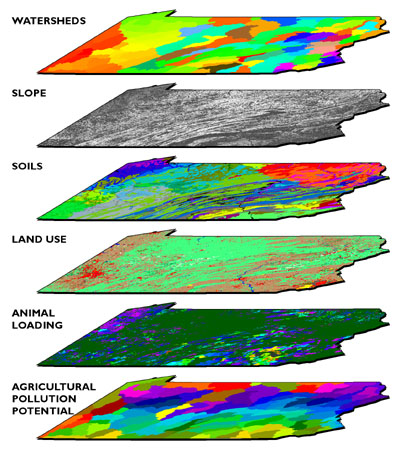
As illustrated in Figure 9.4, map overlay can be implemented in either vector or raster systems. In the vector case, often referred to as polygon overlay, the intersection of two or more data layers produces new features (polygons). Attributes (symbolized as colors in the illustration) of intersecting polygons are combined. The raster implementation (known as grid overlay) combines attributes within grid cells that align exactly. Misaligned grids must be resampled to common formats.
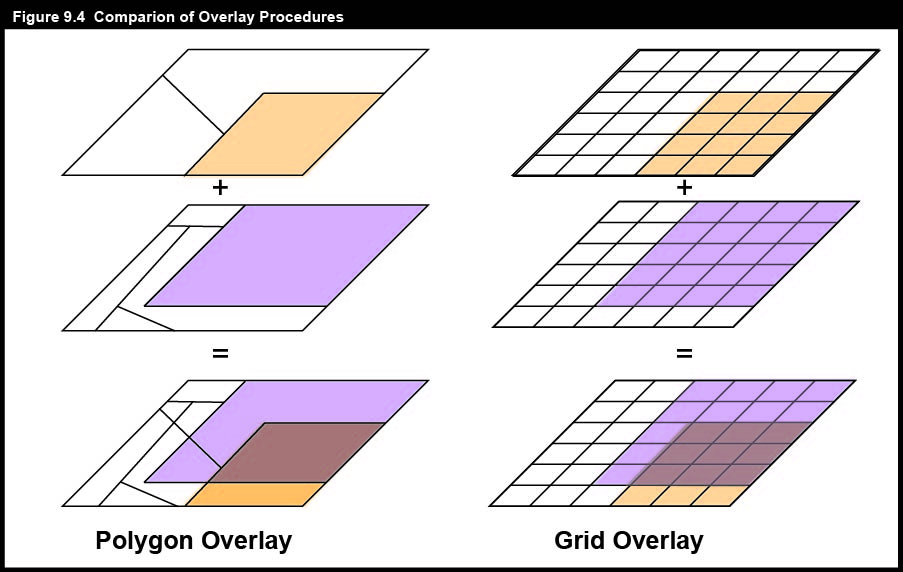
Polygon and grid overlay procedures produce useful information only if they are performed on data layers that are properly georegistered. Data layers must be referenced to the same coordinate system (e.g., the same UTM and SPC zones), the same map projection (if any), and the same datum (horizontal and vertical, based upon the same reference ellipsoid). Furthermore, locations must be specified with coordinates that share the same unit of measure.
9.5 Pennsylvania Case Study
In response to the LLRW Policy Act, Pennsylvania entered into an "Appalachian Compact" with the states of Delaware, Maryland, and West Virginia to share the costs of siting, building, and operating a LLRW storage facility. Together, these states generated about 10 percent of the total volume of LLRW then produced in the United States. Pennsylvania, which generated about 70 percent of the total produced by the Appalachian Compact, agreed to host the disposal site.
In 1990, the Pennsylvania Department of Environmental Protection commissioned Chem-Nuclear Systems Incorporated (CNSI) to identify three potentially suitable sites to accommodate two to three truckloads of LLRW per day for 30 years. CNSI, the operator of the Barnwell South Carolina site, would also operate the Pennsylvania site for profit.

CNSI's plan called for storing LLRW in 55-gallon drums encased in concrete, buried in clay, surrounded by a polyethylene membrane. The disposal facilities, along with support and administration buildings and a visitors center, would occupy about 50 acres in the center of a 500-acre site. (Can you imagine a family outing to the Visitors Center of a LLRW disposal facility?) The remaining 450 acres would be reserved for a 500 to 1000 foot wide buffer zone.
The three stage siting process agreed to by CNSI and the Pennsylvania Department of Environmental Protection corresponded to three scales of analysis: statewide, regional, and local. All three stages relied on vector geographic data integrated within a GIS.
9.6 PA Case Study: A Vector Approach
CNSI and its subcontractors adopted a vector approach for its GIS-based site selection process. When the process began in 1990, far less geographic data was available in digital form than it is today. Most of the necessary data was available only as paper maps, which had to be converted to digital form using one of two digitizing procedures, manual digitizing and scanning. In one of its interim reports, CNSI described two digitizing procedures used. Here's how it described "digitizing:"
In the digitizing process, a GIS operator uses a hand-held device, known as a cursor, to trace the boundaries of selected disqualifying features while the source map is attached to a digitizing table. The digitizing table contains a fine grid of sensitive wire imbedded within the table top. This grid allows the attached computer to detect the position of the cursor so that the system can build an electronic map during the tracing. In this project, source maps and GIS-produced maps were compared to ensure that the information was transferred accurately. (Chem Nuclear Systems, 1993, p. 8).
One aspect overlooked in the CNSI description is that operators must encode the attributes of features as well as their locations. Tablet digitizing (illustrated in the photo below left) is an extraordinarily tedious task.
Compared to the drudgery of tablet digitizing, electronically scanning paper maps seems simple and efficient. Here's how CNSI describes it:
The scanning process is more automated than the digitizing process. Scanning is similar to photocopying, but instead of making a paper copy, the scanning device creates an electronic copy of the source map and stores the information in a computer record. This computer record contains a complete electronic picture (image) of the map and includes shading, symbols, boundary lines, and text. A GIS operator can select the appropriate feature boundaries from such a record. Scanning is useful when maps have very complex boundaries lines that cannot be easily traced. (Chem Nuclear Systems, Inc., 1993, p. 8)
Notice that the CNSI's description glosses over the distinction between raster and vector data. If scanning is really as easy as they suggest, why would anyone ever tablet-digitize anything? In fact, it is not quite so simple to "select the appropriate feature boundaries" from a raster file, which is analogous to a remotely sensed image. The scanned maps had to be transformed from pixels to vector features using a semi-automated procedure called raster to vector conversion, otherwise known as "vectorization." Time-consuming manual editing is required to eliminate unwanted features (like vectorized text), correct digital features that were erroneously attached or combined, and to identify the features by encoding their attributes in a database.
In either the vector or raster case, if the coordinate system, projection, and datums of the original paper map were not well defined, the content of the map first had to be redrawn, by hand, onto another map whose characteristics were known.
9.7 Stage One: Statewide Screening
CNSI considered several geological, hydrological, surface and subsurface land use criteria in the first stage of its LLRW siting process.
|
STAGE ONE: STATEWIDE SCREENING CRITERIA |
|
|
GEOLOGICAL CRITERIA
|
|
|
HYDROLOGICAL CRITERIA
|
|
|
SURFACE LAND USE CRITERIA
|
|
|
SUBSURFACE LAND USE CRITERIA
|
|
|
|
|
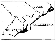
CNSI's GIS subcontractors created separate digital map layers for every criterion. Sources and procedures used to create three of the map layers are discussed briefly below.

One of the geological criteria considered was carbonate lithology. Limestone and other carbonate rocks are permeable. Permeable bedrock increases the likelihood of ground water contamination in the event of a LLRW leak. Areas with carbonate rock outcrops were therefore disqualified during the first stage of the screening process. Boundaries of disqualified areas were digitized from the 1:250,000-scale Geologic Map of Pennsylvania (1980). What concerns would you have about data quality given a 1:250,000-scale source map?

Analysts needed to make sure that the LLRW disposal facility would never be inundated with water in the event of a coastal flood, or a rise in sea level. To determine disqualified areas, CNSI's subcontractors relied upon the Federal Emergency Management Agency's Flood Insurance Rate Maps (FIRMs). The maps were not available in digital form at the time, and did not include complete metadata. According to the CNSI interim report, "[t]he 100-year flood plains shown on maps obtained from FEMA ... were transferred to USGS 7.5-minute quad sheet maps. The 100-year flood plain boundaries were digitized into the GIS from the 7.5-minute quad sheet maps." (Chem Nuclear Systems, 1991, p. 11) Why would the contractors go to the trouble of redrawing the floodplain boundaries onto topographic maps prior to digitizing? What kinds of error might be generated by this process?

Areas designated as "exceptional value watersheds" were also disqualified during Stage One. Pennsylvania legislation protected 96 streams. Twenty-nine additional streams were added during the site screening process. "The watersheds were delineated on county [1:50,000 or 1:100,000-scale topographic] maps by following the appropriate contour lines. Once delineated, the EV stream and its associated watershed were digitized into the GIS." (Chem Nuclear Systems, 1991, p. 12) What digital data sets could have been used to delineate the watersheds automatically, had the data been available?
After all the Stage One maps were digitized, georegistered, and overlayed, approximately 23 percent of the state's land area was disqualified.
9.8 Stage Two: Regional Screening
CNSI considered additional disqualification criteria during the second, "regional" stage of the LLRW siting process.
|
STAGE TWO: REGIONAL SCREENING |
|
|
GEOLOGICAL CRITERIA
|
|
|
HYDROLOGICAL CRITERIA
|
|
|
SURFACE LAND USE CRITERIA
|
|
|
SUBSURFACE LAND USE CRITERIA
|
|
|
|
|


Some of the Stage Two criteria had already been considered during Stage One, but were now reassessed in light of more detailed data compiled from larger-scale sources. In its interim report, CNSI had this to say about the composite disqualification map shown below:
When all the information was entered in to Stage Two database, the GIS was used to draw the maps showing the disqualified land areas. ... The map shows both additions/refinements to the Stage One disqualifying features and those additional disqualifying features examined during Stage Two. (Chem Nuclear Systems, 1993, p. 19)

CNSI added this disclaimer:
The Stage Two Disqualifying maps found in Appendix A depict information at a scale of 1:1.5 million. At this scale, one inch on the map represents 24 miles, or one mile is represented on the map by approximately four one-hundreds of an inch. A square 500-acre area measures less than one mile on a side. Printing of such fine detail on the 11" × 17" disqualifying maps was not possible, therefore, it is possible that small areas of sufficient size for the LLRW disposal facility site may exist within regions that appear disqualified on the attached maps. [Emphasis in the original document] The detailed boundary information for these small areas is retained within the GIS even though they are not visually illustrated on the maps. (Chem Nuclear Systems, 1993, p. 20)
CNSI representatives took some heat about the map scale problem in public hearings. Residents took little solace in the assertion that the data in the GIS were more truthful than the data depicted on the map.
9.9 Stage Three: Local Disqualification
Many more criteria were considered in Stage Three.
|
STAGE THREE: LOCAL SCREENING |
|
|---|---|
|
GEOLOGICAL CRITERIA
|
|
|
HYDROLOGICAL CRITERIA
|
|
|
SURFACE LAND USE CRITERIA
|
|
|
SUBSURFACE LAND USE CRITERIA
|
|
|
|
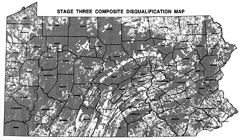
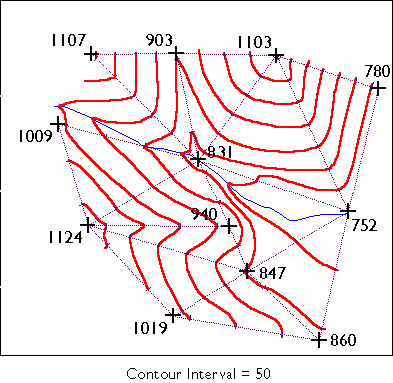
At the completion of the third stage, roughly 75 percent of the state's land area had been disqualified.
One of the new criteria introduced in Stage Three was slope. Analysts were concerned that precipitation runoff, which increases as slope increases, might increase the risk of surface water contamination should the LLRW facility spring a leak. CNSI's interim report (1994a) states that "[t]he disposal unit area which constitutes approximately 50 acres ... may not be located where there are slopes greater than 15 percent as mapped on U.S. Geological Survey (USGS) 7.5-minute quadrangles utilizing a scale of 1:24,000 ..." (p. 9).
A 15 percent slope changes at a rate of 15 feet of elevation for every 100 feet of horizontal distance. CNSI's GIS subcontractors were able to identify areas with excessive slope on topographic maps using plastic templates called "land slope indicators" that showed the maximum allowable contour spacing.
Subcontractors used 7.5-minute USGS DEMs that were available for 85 percent of the state (they're all available now). Several algorithms have been developed to calculate slope at each grid point of a DEM. As described in Chapter 8, the simplest algorithm calculates slope at a grid point as a function of the elevations of the eight points that surround it to the north, northeast, east, southeast, and so on. CNSI's subcontractors used GIS software that incorporated such an algorithm to identify all grid points whose slopes were greater than 15 percent. The areas represented by these grid points were then made into a new digital map layer.
Try This:
You can create a slope map of the Bushkill PA quadrangle with Global Mapper (dlgv32 Pro) software.
Launch Global Mapper Open the file "bushkill_pa.dem" that you downloaded earlier (either the 10-meter or 30-meter version). Change from the default "HSV" shader to the "Slope" shader. By default, pixels with 0 percent slope are lightest, and pixels with 30 percent slope or more are darkest.
You can adjust this at Tools > Configure > Shader Options. Notice that the slope symbolization does not change even as you change the vertical exaggeration of the DEM (Tools > Configure > Vertical Options).
9.10 Buffering
Several of the disqualification criteria involve buffer zones. For example, one disqualifying criterion states that "[t]he area within 1/2 mile of an existing important wetland ... is disqualified." Another disqualifying criterion states that "disposal sites may not be located within 1/2 mile of a well or spring which is used as a public water supply." (Chem-Nuclear Systems, 1994b). Buffering is a GIS operation by which zones of specified radius or width are defined around selected vector features or raster grid cells.
Like map overlay, buffering has been implemented in both vector and raster systems. The vector implementation involves expanding a selected feature or features, or producing new surrounding features (polygons). The raster implementation accomplishes the same thing, except that buffers consist of sets of pixels rather than discrete features. You can view both methods in Figure 9.12 below. What issue can you see below that may be a concern with using raster data for buffering? What needs to be done to minimize the issue?

9.11 New York: A Raster Case Study
Like Pennsylvania, the State of New York was compelled by the LLRW Policy Act to dispose of its waste within its own borders. New York also turned to GIS in the hope of finding a systematic and objective means of determining an optimal site. Instead of the vector approach used by its neighbor, however, New York opted for a raster framework.

Mark Monmonier, a professor of geography at Syracuse University (and a Penn State Dept. of Geography alumnus), has written that the list of siting criteria assembled by the New York Department of Environmental Conservation (DEC) was "an astute mixture of common sense, sound environmental science, and interest-group politics" (1995, p. 226). Source data included maps and attribute data produced by the U.S. Census Bureau, the New York Department of Transportation, and the DEC itself, among others. The New York LLRW Siting Commission overlaid the digitized source maps with a grid composed of cells that corresponded to one square mile (640 acres; slightly larger than the 500 acres required for a disposal site) on the ground. As illustrated above, the Siting Commission's GIS subcontractors then assigned each of the 47,224 grid cells a "favorability" score for each criterion. The process was systematic, but hardly objective, since the scores reflected social values (to borrow the term used by McHarg).

To acknowledge the fact that some criteria were more important than others, the Siting Commission weighted the scores in each data layer by multiplying them all by a constant factor. Like the original integer scores, the weighting factors were a negotiated product of consensus, not of objective measurement. Finally, the commission produced a single set of composite scores by summing the scores of each raster cell through all the data layers. A composite favorability map could then be produced from the composite scores. All that remained was for the public to embrace the result.
9.12 Outcomes
To date, neither Pennsylvania nor New York has built a LLRW disposal facility. Both states gave up on their unpopular siting programs shortly after Republicans replaced Democrats in the 1994 gubernatorial elections.
The New York process was derailed when angry residents challenged proposed sites after inaccuracies were discovered in the state's GIS data, and because of the state's failure to make the data accessible for citizen review in accordance with the Freedom of Information Act (Monmonier, 1995). A National Research Council Committee was commissioned to analyze the process and results, and ultimately produced a detailed report that clarifies/elucidates what can go wrong in a complex site decision process like this in which GIS can be applied in a rigorous way, yet many aspects of the data are dependent on a subjective and, at times, political process (National Research Council, 1996). That report contains a set of lessons to be learned. The first relates to data, specifically that it is important to recognize limits of data availability and quality and avoid carrying out analysis when data do not meet standards. The other two lessons learned are both about human aspects of decisions that people care deeply about, specifically that public involvement in the process is critical and that careful strategic planning is essential.
Pennsylvania's $37 million siting effort succeeded in disqualifying more than three quarters of the state's land area, but failed to recommend any qualified 500-acre sites. With the volume of its LLRW decreasing, and the Barnwell, South Carolina facility still willing to accept Pennsylvania's waste shipments, the search was suspended "indefinitely" in 1998.
To fulfill its obligations under the LLRW Policy Act, Pennsylvania has initiated a "Community Partnering Plan" that solicits volunteer communities to host a LLRW disposal facility in return for jobs, construction revenues, shares of revenues generated by user fees, property taxes, scholarships, and other benefits. The plan has this to say about the GIS site selection process that preceded it: "The previous approach had been to impose the state's will on a municipality by using a screening process based primarily on technical criteria. In contrast, the Community Partnering Plan is voluntary." (Chem Nuclear Systems, 1996, p. 3)
Meanwhile, a Democrat replaced a Republican as governor of South Carolina in 1998. The new governor warned that the Barnwell facility might not continue to accept out-of-state LLRW. "We don't want to be labeled as the dumping ground for the entire country," his spokesperson said (Associated Press, 1998).
No volunteer municipality has yet come forward in response to Pennsylvania's Community Partnering Plan. If the South Carolina facility does stop accepting Pennsylvania's LLRW shipments, and if no LLRW disposal facility is built within the state's borders, then nuclear power plants, hospitals, laboratories, and other facilities may be forced to store LLRW on site. It will be interesting to see if the GIS approach to site selection is resumed as a last resort, or if the state will continue to up the ante in its attempts to attract volunteers, in the hope that every municipality has its price. If and when a volunteer community does come forward, detailed geographic data will be produced, integrated, and analyzed to make sure that the proposed site is suitable, after all.
The New York and Pennsylvania state governments turned to GIS because it offered what was considered at the time to be an impartial and scientific means to locate a facility that nobody wanted in their backyard. Concerned residents criticized the GIS approach as impersonal and technocratic. There is truth to both points of view. While many aspect of GIS are “objective” from the perspective of being repeatable with predictable results given the same data inputs, specialists in geographic information need to understand that while GIS can be effective in answering certain well-defined questions, it does not ease the problem of resolving conflicts between private and public interests. Plus, many aspects of geographic data are not objective. Choices are made about what data to collect, how frequently, and at what resolution. Additional choices are made about how to process the data, how to weight variables in overlay analysis, and how to represent the results.
Try This!
To find out about LLRW-related activities where you live, use your favorite search engine to search the Web on "Low-Level Radioactive Waste [your state or area of interest]". If GIS is involved in your state's LLRW disposal facility site selection process, your state agency that is concerned with environmental affairs is likely to be involved. Add a comment to this page to share your discovery.
9.13 Conclusion
Site selection projects like the ones discussed in this chapter require the integration of diverse geographic data. The ability to integrate and analyze data organized in multiple thematic layers is a hallmark of geographic information systems. Not surprisingly, once a decision is made about something as important and potentially controversial as locating a LLRW site, then the geographic information methods and technologies you have learned about in the course are equally applicable to monitoring and managing the site picked (see Jensen, et al, 2009 for an example).
To contribute to GIS analyses like these, you need to be both a knowledgeable and skillful GIS user. The objective of this text, and the associated Penn State course, has been to help you become more knowledgeable about geographic data, its representation, and its uses.
Knowledgeable users are well versed in the properties of geographic data that need to be taken into account to make data integration possible. Knowledgeable users understand the distinction between vector and raster data, and know something about how features, topological relationships among features, attributes, and time can be represented within the two approaches. Knowledgeable users understand that in order for geographic data to be organized and analyzed as layers, the data must be both orthorectified and georegistered. Knowledgeable users look out for differences in coordinate systems, map projections, and datums that can confound efforts to georegister data layers. Knowledgeable users know that the information needed to register data layers is found in metadata.
Knowledgeable users understand that all geographic data are generalized, and that the level of detail preserved depends upon the scale and resolution at which the data were originally produced. Knowledgeable users are prepared to convince their bosses that small-scale, low resolution data should not be used for large-scale analyses that require high resolution results. Knowledgeable users never forget that the composition of the Earth's surface is constantly changing, and that, unlike fine wine, the quality of geographic data does not improve over time.
Knowledgeable users recognize situations in which existing data are inadequate, and when new data must be produced. They are familiar enough with geographic information technologies such as GPS, aerial imaging, and satellite remote sensing that they can judge which technology is best suited to a particular mapping problem. Knowledgeable users understand the choices in how geographic data are represented visually and that these choices can make a substantial impact on how data are interpreted and decisions are evaluated.
And knowledgeable users know what kinds of questions GIS is, and is not, suited to answer.
Practice Quiz
Registered Penn State students should return now to Canvas to take a self-assessment quiz about Geo-Analytics.
9.14 Glossary
Overlay: a GIS operation by which two or more maps or layers registered to a common coordinate system are stacked upon each other and their corresponding data joined.
Digitizing: a GIS process of converting analog data, such as a paper map, to a digital format by tracing the analog data using a digital input device, such as a mouse.
Scanning: a GIS process whereby analog data, such as a paper map, is converted to a digital format by using a computer scanner.
Buffering: a GIS operation by which zones of specified radius or width are defined around selected vector features or raster grid cells.
9.15 Bibliography
Associated Press (1998). South Carolina Says Pennsylvania Waste Not Wanted in State. Centre Daily Times, November 28, pp. 1A.
Chem-Nuclear Systems, Inc. (1991). Pennsylvania low-level radioactive waste disposal facility site screening interim report, stage one -- Statewide disqualification. Harrisburg, PA.
Chem-Nuclear Systems Inc (1993). Pennsylvania low-level radioactive waste disposal facility site screening interim report stage two -- Regional disqualification. Harrisburg PA.
Chem-Nuclear Systems, Inc. (1994a). Pennsylvania low-level radioactive waste disposal facility site screening interim report, stage three -- local disqualification. Harrisburg PA.
Chem-Nuclear Systems, Inc. (1994b). Site selection manual. S80-PL-007, Rev. 0
Chem-Nuclear Systems Inc. (1996). Community partnering plan: Pennsylvania low-level radioactive waste disposal facility. S80-PL-021, Rev. 0.
Chrisman, N. (1997). Exploring geographic information systems. New York: John Wiley & Sons.
Jensen, J.R., Hodgson, M.E., Garcia-Quijano, M., Im, J. and Tullis, J.A. 2009: A remote sensing and GIS-assisted spatial decision support system for hazardous waste site monitoring. Photogrammetric Engineering and Remote Sensing 75, 169-177.
McHarg, I. (1971). Design with nature. New York: Doubleday / Natural History Press.
Mertz, T. (1993). GIS targets agricultural nonpoint pollution. GIS World, April, 41-46.
Monmonier, M. (1995). Drawing the line: Tales of maps and carto-controversy. New York: Henry Holt.
National Research Council Committee to Review New York State's Siting and Methodology Selection for Low-Level Radioactive Waste Disposal 1996: Review of New York State Low-Level Radioactive Waste Siting Process. Washington, D.C.: NATIONAL ACADEMY PRESS.
Pennsylvania Department of Environmental Protection. (1998). Proposed model of the PA low-level radioactive waste disposal facility.
U.S. Nuclear Regulatory Commission. (n. d.). Radioactive waste: Production, storage, disposal (Report NUREG/BR-0216).
U.S. Nuclear Regulatory Commission. (2005). Radioactive Waste Statistics. Retrieved May 14, 2006, from http://www.nrc.gov/waste/llw-disposal/statistics [230]
U.S. Nuclear Regulatory Commission. (2011a). Low-Level Waste Disposal Statistics. Retrieved November 30, 2011, from http://www.nrc.gov/waste/llw-disposal/licensing/statistics.html [231] [6]
U.S. Nuclear Regulatory Commission. (2011b). Low-Level Waste Compacts. Retrieved November 30, 2011, from [5] http://www.nrc.gov/waste/llw-disposal/licensing/compacts.html [232] [7]
Joshua Stevens, Jennifer M. Smith, and Raechel A. Bianchetti (2012), Mapping Our Changing World, Editors: Alan M. MacEachren and Donna J. Peuquet, University Park, PA: Department of Geography, The Pennsylvania State University.
Adapted from DiBiase, David, The Nature of Geographic Information (http://natureofgeoinfo.org [233]), with contributions by Jim Sloan and Ryan Baxter, John A. Dutton e-Education Institute, College of Earth and Mineral Sciences, The Pennsylvania State University.