Lessons
Course Overview
Course Overview
There are eight lessons and a Final Project in this course. I will reveal Lessons 1 - 8 over the course of the 10-week class to ensure that we are all working through the content as a group and to make sure all of the content is up to date. The Final Project will be revealed during or before Week 7. Be sure to skim it over so you have an idea of where we will end up. You do NOT need to start the Final Project until Week 9. Of course - I'm always happy to discuss Final Project ideas whenever you like.
Lesson 1: Context of Environmental Applications of Geospatial Technology
Lesson 1 Overview and Checklist
Lesson 1 Overview and Checklist
Introduction
As we begin the course, it is important to delve into the unique aspects or distinctive characteristics of employing geospatial technology in the context of environmental challenges. The term 'environmental' can encompass varied interpretations for different individuals, and even within the realm of GIS, there exist diverse perspectives and various ways to frame it. Within this lesson, we will strive to clarify this area of application by introducing environmental concepts, exploring three instances of environmental challenges, and contemplating the role played by GIS and other geospatial technology in addressing these challenges.
Goals
At the successful completion of Lesson 1, you will have:
- investigated the concepts of conservation, preservation, and ecosystem services;
- explored three scenarios of environmental challenges;
- participated in conversations about what it means to employ geospatial technology when grappling with environmental challenges.

Questions?
If you have questions now or at any point during this lesson, please feel free to post them in the Lesson 1 Discussion.
Checklist
This lesson is one week in length and is worth a total of 100 points. Please refer to the Course Calendar for specific time frames and due dates. To finish this lesson, you must complete the activities listed below. You may find it useful to print this page first so that you can follow along with the directions. Simply click the arrow to navigate through the lesson and complete the activities in the order that they are displayed.
- Read all of the pages in Lesson 1.
Read the information on the Discussion Activity and Summary and Deliverables pages. - Complete the Lesson 1 Discussion Activity.
See the Discussion Activity page for details of what to discuss. - Post in the Lesson 1 Discussion.
See the Summary and Deliverables page.
SDG image retrieved from the United Nations
Defining Environmental Geospatial Technology
Defining Environmental Geospatial Technology
Environmental geospatial technology applications typically manage a physical system involving its land, water, air, and biota. An interesting question to ask is, “for whom are we managing this environment?” We can divide environmental applications of geospatial technology and data into two broad categories within this line of inquiry: 1) managing the environment to protect ecosystem services that humans rely on, and 2) managing the environment for its own sake and protecting the wildlife that lives there.
One way to distinguish these two scenarios is by using the labels conservation and preservation. Conservation is the management of natural resources that we, humans, use so that they are available today and will be available to us in the future. These ecosystem services include managing the environment to protect sources of clean drinking water, vegetation that prevents erosion and filters the air, landscapes that have healthy soil that will continue to support agriculture and food production, and bolstering insect populations, like bees, which are required to sustain plants and food we eat. On the other hand, preservation is the management of habitats and natural areas so that they are unmolested by human activity and allowed to operate according to their natural processes and support wildlife for its own sake. In many cases, it may appear that we are protecting the environment for its own sake when, in fact, we are protecting the ecosystem services that benefit humans. This begs the question of whether all of our management activities target ecosystem services.
The Millennium Ecosystem Assessment (2005) defines ecosystem services this way and illustrates the four categories in Figure 1:
Ecosystem services are the benefits people obtain from ecosystems. These include provisioning services such as food, water, timber, and fiber; regulating services that affect climate, floods, disease, wastes, and water quality; cultural services that provide recreational, aesthetic, and spiritual benefits; and supporting services such as soil formation, photosynthesis, and nutrient cycling. The human species, while buffered against environmental changes by culture and technology, is fundamentally dependent on the flow of ecosystem services.
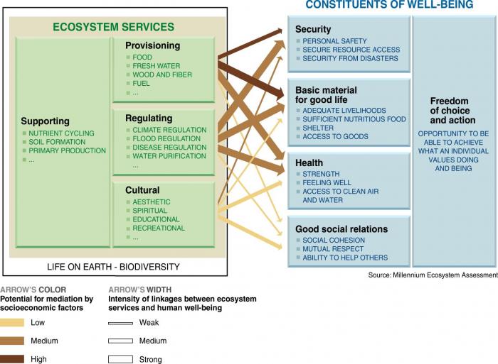
Graphic from millennium ecosystem assessment showing ecosystem services and constituents of well-being. Arrows point from different sections of the ecosystem services to the constituents of well-being. The arrows’ color and width indicate the potential for mediation by socioeconomic factors and the intensity of linkages between ecosystem services and human well-being.
Ecosystem Services
Supporting: nutrient cycling, soil formation, primary production
Provisioning: food, fresh water, wood and fiber, fuel
Regulating: climate, flood, and disease regulation, water purification
Cultural: Aesthetic, spiritual, educational, recreational
Constituents of well-being
Freedom of choice and action: opportunity to be able to achieve what an individual values doing and being
Security: personal safety, secure resource access, security from disasters
Basic material for a good life: Adequate livelihoods, sufficient nutritious food, shelter, access to goods
Health: strength, feeling well, access to clean air and water
Good Social Relations: social cohesion, mutual respect, ability to help others
| Arrow Start | Arrow End | Potential for Mediation | Linkage Intensity |
|---|---|---|---|
|
Provisioning |
Security |
High |
Medium |
|
Provisioning |
Basic Material |
High |
Strong |
|
Provisioning |
Health |
Medium |
Strong |
|
Provisioning |
Social Relations |
Low |
Weak |
|
Regulating |
Security |
Medium |
Strong |
|
Regulating |
Basic Material |
Medium |
Strong |
|
Regulating |
Health |
Medium |
Strong |
|
Regulating |
Social Relations |
Low |
Weak |
|
Cultural |
Security |
Medium |
Weak |
|
Cultural |
Basic Material |
Low |
Weak |
|
Cultural |
Health |
Low |
Medium |
|
Cultural |
Social Relations |
Low |
Medium |
There is some overlap between the conservation and preservation approaches to environmental management, but it’s useful to be cognizant of this distinction when performing analyses so we have a clear understanding of our end goal and what our results are intended to inform.
Let’s narrow our focus on environmental management from the broad concepts of conservation and preservation and contemplate some specific themes to which GIS and geospatial technology could be applied. Some that come to mind are:
- Health
- Pollution (land, water, air)
- Waste Management (human, animal, garbage, chemical)
- Construction Impacts
- Land use impacts
- Habitat management
I see these application areas as likely use cases for geospatial technology within an environmental context. These themes overlap with many disciplines like medicine, engineering, biology, and chemistry, which makes defining “environmental” challenging. There are environmental aspects to all of these themes, and geospatial technology is well-suited to many of them. So, what is it about these themes that make them well-suited to use geospatial technology? How are we using geospatial technology in these contexts that are unique relative to other geospatial applications? Ultimately, how can we evaluate environmental challenges in spatial data science?”
To help answer these questions, this course presents environmental challenges and engages analysis and evaluation methods with projects that are more representative of what you might encounter in the field as an environmental analyst of some sort. As I think about the question of what 'environmental' is, I break it down into a few categories that can be useful in defining it. Consider the characteristics of each of the following prompts in the context of environmental applications:
- What are typical scenarios or application areas to which geospatial technology is applied?
- What types of spatial data are commonly used?
- What types of analysis functions are utilized?
- What is the audience of the analysis output?
- What are the challenges and implications of communicating results?
I can imagine instances where environmental applications of geospatial technology stand apart from other projects in each of these categories. An outcome of Lesson 1 is to identify how environmental geospatial applications are unique by digesting some background material and having a discussion about it. In the next section, we will investigate three particular use cases of environmental geospatial applications to help frame our discussion.
References
Millennium Ecosystem Assessment, 2005. Ecosystems and Human Well-being: Synthesis. Island Press, Washington, DC.
UN Environment (2019). Global Environment Outlook – GEO-6: Healthy Planet, Healthy People. Nairobi, Kenya. University Printing House, Cambridge, United Kingdom.
Application Scenarios
Application Scenarios
The deliverable for this week is a discussion about the role of geospatial technology and spatial data in environmental management. To facilitate that discussion, I present three well-suited applications for geospatial technology utilization. Take a look at the resources provided here, and feel free to extend your search beyond these links to get an idea of what these use cases entail and how geospatial technology and spatial data fit into the process. I've chosen these three applications to try to represent different types of environmental work: a large construction project, municipal waste management, and wildfire and resource management. They are each what we would consider "environmental challenges." Still, each has a different purpose and context that range from broad-scale government regulation to local-scale engineering to applied science. Think about any similarities or differences among these examples as you explore them.
1. Environmental Impact Statements
In 1970, the National Environmental Policy Act and the Environmental Protection Agency were created to formalize attention on the environmental impacts of other decisions and projects. Browse their websites and any other resources you discover to research what NEPA and the EPA are all about. Specifically, look at what their missions are.
A key component of NEPA is the requirement for certain projects to develop an Environmental Impact statement (EIS) that details the potential consequences of the project's implementation on the physical environment. EISs, therefore, are essentially thorough analyses of large construction projects and how they might interact with all sorts of physical and biological systems. These statements have tremendous potential for geospatial technology application due to the spatially-explicit nature of the large projects that require an EIS. The official specification for Environmental Impact Statements can be found in the Federal Code of Regulations. Check out sections 1502.1, 1502.15, and 1502.16, which provide some insights into why EISs are required and what they should include.
To view a completed EIS, all of which are public records, you can search for one on the EPA website. To help you see a final EIS, I've downloaded one for a couple of wind farm projects:
- Final Environmental Impact Statement - Interconnection of the Grande Prairie Wind Farm (December 2014)
- Final Environmental Impact Statement - Plum Creek Wind Farm Transmission Project (April 2021)
Other related documents that you might find interesting are: the GPWF Record of Decision, which details how or if the project will proceed, and a video that describes the completed Grand Praire Wind Farm project and a video that describes
2. Municipal Waste Management
The University Area Joint Authority (UAJA) manages the wastewater treatment for the municipalities of State College and the surrounding region. It is a traditional municipal sewage treatment facility that is responsible for the transport of sewage into the facility and the disposal of residual waste and water. Some of the facility's output enters local waterways directly, and other outputs are reused in agricultural settings, an initiative they call "beneficial reuse alternatives." Additionally, the UAJA has addressed other environmental impacts, such as an issue with odors in the nearby neighborhoods.
These two activities, beneficial reuse and odor control, provide opportunities for geospatial analysis. UAJA produced a report describing their plans for alternative uses of treated wastewater. You will see sections about different options, including urban reuse, agricultural irrigation, and direct injection, and the potential impacts of these plans on drinking water quality and water temperature. UAJA also shared findings from an odor study performed in response to complaints from residents living near the treatment facility. The study sampled odor levels in various locations surrounding the facility and identified possible sources of the nuisance smells. Efforts to control the odors require spatial data showing where issues currently occur, where they originate, and how they are transported via wind, etc. Much of the sample data was collected using "human sensory testing" via an observation form. The form is interesting both for the fun of seeing how odors are classified and, more importantly, how the location of each observation was recorded, which has implications for how the spatial data must be processed for use in a GIS. This is a form that citizens can submit to record an odor observation.
3. Fire Detection and Management
Wildfires stand as one of the most catastrophic natural disasters, impacting millions of acres burned and countless ecosystems globally each year. Their consequences extend to endangering human well-being, biodiversity, climate stability, and socio-economic progress. In order to avert, control, and alleviate the ramifications of these fast-moving fires, dependable and prompt data regarding fire frequency, behavior, and repercussions are imperative for researchers and decision-makers. In this context, geospatial technology and spatial data emerge as potent instruments capable of furnishing vital insights.
NASA's Fire Information for Resource Management System, or FIRMS, is a tool that provides data about active fires and thermal anomalies or hot spots. As outlined on the website, the focus and objectives of FIRMS include "providing quality resources for fire data on demand, working with end users to enhance critical applications, assisting global organizations in fire analysis efforts, delivering effective data presentation and management." The University of Maryland originally developed the system using funding from NASA's Applied Sciences Program and the United Nations Food and Agriculture Organization (UN FAO). FIRMS migrated to NASA's LANCE (Land, Atmosphere Near real-time Capability for EOS) in 2012.
Real-time fire detections in the U.S. and Canada are viewable online at FIRMS US/Canada Fire Map, and global fire detections are viewable online at FIRMS Global within 3 hours of satellite observation. The active fire data is also downloadable in various formats, including shapefiles and KML files. FIRMS uses satellite observations from the Moderate Resolution Imaging Spectroradiometer (MODIS) and the Visible Infrared Imaging Radiometer Suite (VIIRS) instruments to detect, verify, and track active fires and thermal anomalies or hot spots. The information is considered to be delivered in near real-time (NRT) to decision-makers through alerts, analysis-ready data, online maps, and web services.
For additional information, check out the AGO StoryMap: FIRMS: Fire Information for Resource Management System Managing Wildfires with Satellite Data. Also, data about air quality during wildfires can be found at AirNow. The Fire and Smoke Map reports information about wildfire smoke and air quality information using the official U.S. Air Quality Index (AQI) for more than 500 cities across the U.S. and Canada. Try viewing the full extent of North America as well as zooming in on your city or region.
Discussion Activity
Discussion Activity
Answering the question, "What are environmental applications of geospatial technology?" is perhaps more complicated than it first seems. This is due in part to the diversity of application areas, purposes, and audiences for geospatial analysis projects that deal with spatial data and the physical environment. This discussion activity is our opportunity to start engaging in environmental geospatial technology by talking about what it is before we get into the nuts and bolts of how we commonly implement it in later lessons.
First, read through the three scenarios on the previous page and think about how each of them represents an environmental application of geospatial technology.
Deliverables for this week's lesson:
- Write a post in this week's discussion forum that answers the question, "What are environmental applications of geospatial technology?" You are welcome to approach this question in any way that you'd like so that it gets you thinking and generates conversation with your classmates. You may include any or all of the three scenario examples in your post. Here are some things to consider to help address what it is about environmental applications of geospatial technology and spatial data that makes them unique relative to other applications:
- What is it about these scenarios that make them "environmental?"
- How was geospatial technology used in the scenarios, or, if geospatial technology wasn't used much, how could it have been employed effectively?
- What types of spatial data and geospatial operations could be used, and are there any commonalities across the scenarios?
- Who is the audience for the output in these scenarios, and what are some potential challenges in communicating the information? (I'm thinking of an audience that may be too informed or not informed enough, perhaps results that are difficult to present on a map, a diverse audience that has variable interests and needs, etc.)
- Contribute thoughtful responses to some of your classmates' posts. This activity is intended to foster a conversation among the class, so a successful outcome includes both your initial post and subsequent interactions that add value, support your classmates, and keep the conversation going.
Summary and Deliverables
Summary and Deliverables
In Lesson 1, we explored the definition of what environmental applications of geospatial technology are. In Lesson 2, we will start investigating available spatial data and ways to share maps with our audience.
Lesson 1 Deliverables
Lesson 1 is worth a total of 100 points.
- (100 points) Lesson 1 Discussion Post
- Step 1 (50 points): Answer the question, "What are environmental applications of geospatial technology?" (around 250 words).
- Step 2 (50 points): Contribute a minimum of two thoughtful responses to classmates' posts. Responses should add insight, pose new questions, and keep the conversation moving.
Tell us about it!
If you have anything you'd like to comment on or add to the lesson materials, feel free to post your thoughts in the Lesson 1 Discussion. For example, what did you have the most trouble with in this lesson? Was there anything useful here that you'd like to try in your own workplace?
Lesson 2: Find and Share Environmental Data
Lesson 2 Overview and Checklist
Lesson 2 Overview and Checklist
Introduction
One of the first steps in any geospatial project is to find relevant datasets that you will use either to create maps, conduct an analysis, or both. For example, many projects in the environmental field require a site assessment with an inventory of natural features and concerns or related opportunities. This information is necessary to create management plans for conservation and recreation areas, environmental impact assessments for development projects, future land use plans, zoning, and parks and recreation plans for city planning, to screen and rank potential sites for various uses, and to plan for field data collection events.
In the U.S., most of this information is readily available on the Internet from various federal and state agencies. For example, the United States Geological Survey (USGS), the U.S. Department of Agriculture (USDA), the National Renewable Energy Laboratory (NREL), the U.S. Forest Service (USFS), the U.S. Fish & Wildlife Service (USFWS), the U.S. Environmental Protection Agency (USEPA), the National Oceanic and Atmospheric Administration (NOAA), the Federal Emergency Management Agency (FEMA), and the U.S. Census Bureau provide geospatial datasets related to elevation, soil types, current and historical land use/land cover, wetland inventories, hydrological features, wildlife inventories, habitat assessments, invasive species, proximity or susceptibility to pollution, climate, energy potential, and risks of fires, drought, flooding, and demographic data. Also, many datasets are available within ArcGIS Online as data services.
GIS and geospatial technology make it very easy to combine this information into one place, analyze it, and create maps to communicate the information to interested parties. Before we can start analyzing data, we need to know where to find it and how to work with it. We are going to explore several providers of environmental data to create a series of natural features maps. We will explore each organization’s website to find which data sets they offer and information about each data set (metadata). We will also explore different methods to view each dataset, including interactive mapping websites and online data services.
Scenario
Your organization is beginning a new conservation project on the border of Montana and Wyoming. The project management team needs to understand the natural features of the site to plan field data collection efforts. Your job is to locate relevant geospatial datasets, communicate their opportunities and limitations, and share them with the team in a user-friendly format.
Goals
At the successful completion of Lesson 2, you will have:
- located publicly available geospatial datasets for environmental projects;
- chosen which format(s) are best suited for your project;
- explored opportunities and limitations of datasets by reviewing metadata;
- shared data and maps using ArcGIS.com.
Questions?
If you have questions now or at any point during this lesson, please feel free to post them in the Lesson 2 Discussion.
Checklist
This lesson is one week in length and is worth a total of 100 points. Please refer to the Course Calendar for specific time frames and due dates. To finish this lesson, you must complete the activities listed below. You may find it useful to print this page out first so that you can follow along with the directions. Simply click the arrow to navigate through the lesson and complete the activities in the order that they are displayed.
- Read all of the pages listed under the Lesson 2 Module.
Read the information on the "Background Information," "Required Readings," "Lesson Data," "Step-by-Step Activity," "Advanced Activities," and "Summary and Deliverables" pages. - Download and read the required readings.
See the "Required Readings" page for links to the PDFs. - Download Lesson 2 datasets.
See the "Lesson Data" page. - Download and complete the Lesson 2 Step-by-Step Activity.
- See the "Step-by-Step Activity" page for a link to a printable PDF of steps to follow.
- Complete the Lesson 2 Advanced Activity.
See the "Advanced Activity" page. - Complete the Lesson 2 Quiz.
See the "Summary and Deliverables" page. - Create and submit Lesson 2 Maps and App.
Specific instructions are included on the "Summary and Deliverables" page. - Optional - Check out additional resources.
See the "Additional Resources" page. This section includes links to several types of resources if you are interested in learning more about environmental data covered in this lesson.
SDG image retrieved from the United Nations
Background Information
Background Information
Locating & Acquiring Data
One of the first steps in any geospatial project is finding data and metadata related to your topic and study area. I like to think of this phase as detective work. You often need to search for detailed clues in many different places before you can understand the bigger picture. For example, the same data set can often be obtained from multiple agencies, in multiple formats, and in multiple geographic packages (e.g., grouped by state or county vs. seamless).
You may need to consult several different sources to find all of the information you need to use the data, such as date, scale, description of coded values, etc. You may also use different sources to pre-screen and download the data. These websites are often hyperlinked to each other, so you may bounce back and forth a few times before landing in the right spot. You may find that some interfaces and data products are much easier to work with than others. We will experiment with a few different data providers to demonstrate this concept. The keys to success are budgeting ample time, keeping detailed notes along the way, and asking the right questions before you begin your search.
The best place to start looking for geospatial data is on the web. There has been a push to democratize environmental and climate-related data, and we will take full advantage of that initiative. I have listed a few different types of websites, typical data you will find on them, and links to some example sites below. This is not meant to be an exhaustive list, but rather an overview to get you pointed in the right direction.
Federal Websites
- Range of low to high-resolution data covering either large geographic areas, such as global or national extents, or smaller units like counties.
- Some websites compile data sets from multiple organizations (e.g., The National Map); others only have data from a specific agency (e.g., Environmental Protection Agency).
- Metadata is usually very complete, though sometimes scattered among multiple websites.
- Common data - topography, elevation, temperature, wind, land use, transportation networks, hydrography, wetlands, floodplains, soils, place names, current and historic aerial photos, time-series satellite images, and data related to a specific government agency’s areas of focus.
- Example sites:
- National Geospatial Program
- US Department of Agriculture Geospatial Data Gateway
- Environmental Protection Agency
- USGS Earth Explorer
- USGS Data
- USGS National Hydrography Dataset
- USGS Water Resources and Water Data for the Nation
- USGS 30-Meter SRTM Tile Downloader - elevation data from the Shuttle Radar Topography Mission
- USGS GloVis - remote sensing data
- NASA Earth Observations
- NASA Socioeconomic Data and Applications Center (sedac)
State Websites:
- Subsets of federal data sets clipped to the state level; sometimes include more detailed information produced by the state itself.
- Medium to high-resolution data related to the state.
- Metadata varies.
- Common data - watershed boundaries, boundaries of management units such as counties, cities, and townships, and wildlife surveys.
- Example sites:
- Pennsylvania: PA Spatial Data Access
- Texas: The Texas General Land Office
- Philadelphia: OpenDataPhilly
Local Government Websites:
- High-resolution data sets covering small geographic areas (counties, cities, project sites).
- Sometimes difficult to access and obtain datasets.
- Metadata varies.
- Common data - cadastral information, land use plans (zoning, future land use, parks, and recreation plans), high resolution & time series aerial photos, local roads, utilities, and building footprints.
- Example site:
- Los Angeles County, CA: LA County GIS Portal
University & Library Websites:
- Universities and libraries often maintain lists of links to international, federal, state, and local data clearinghouses.
- Example sites:
- Penn State University Finding GIS Data: Pennsylvania
- Penn State University Finding GIS Data: US
- University of Colorado at Boulder: Map Library
- OpenTopography is based at the University of California, San Diego, and is operated in collaboration with Arizona State University and UNAVCO.
- Index Database from University of Bonn, Germany
- Alaska Satellite Facility from the Geophysical Institute at the University of Alaska Fairbanks
International Websites
- Copernicus Open Access Hub - European Union's Earth Observation Programme
- Humanitarian Data Exchange
- United Nations Maps and Geospatial Services
- LAADS DAAC - Level-1 and Atmosphere Archive & Distribution System Distributed Active Archive Center
- Penn State University Finding GIS Data: International
- DIVA-GIS: Free Spatial Data
- National Remote Sensing Centre - Government of India
- European Space Agency - Coarse vegetation data from PROBA-V, SPOT-Vegetation and METOP. Register for free data downloads.
- VITO Vision Catalog
Environmental Groups and Non-Governmental Organizations (NGOs) Websites:
- The resolution and extent of data vary.
- Sometimes difficult to access and obtain datasets.
- Metadata varies.
- Typically focused on a specific topic related to the organization’s goals (e.g., habitat conservation).
- Example Organizations: World Wildlife Fund, Global Forest Watch, Ducks Unlimited, Sierra Club, The World Bank, Food and Agriculture Organization (FAO)
- Example sites:
Esri Websites:
- Includes pre-symbolized base maps, environmental datasets, and industry-specific data such as economic models and quality-of-life indicators. Many organizations also share their data in ArcGIS Online, so the potential topics are endless.
- The resolution and extent of data vary.
- Some data requires payment or subscription.
- Metadata is typically very good.
- Example sites:
Site-Level Data:
- High-resolution data sets covering small geographic areas (project sites).
- Sometimes difficult to access and obtain datasets.
- Metadata varies.
- Results from academic research projects or for-profit corporations focused on a very specific set of questions.
- Example Sites:
Downloading Data
Most websites provide links to download raw GIS and geospatial data that you can input into spatial analyses. Shapefiles, geodatabases, GeoJSON, and rasters are typically available for download in one or more of the following options:
- Extraction using an interactive mapping website that allows the user to define an area on a map; a compressed file clipped to your defined region will be available to you for download.
- Browsable FTP sites with compressed files you can immediately download.
- Web pages that allow you to place custom data orders.
GIS and geospatial files from Options 2 and 3 are typically aggregated by one or more geographic units such as counties, 7.5‘ topographic quadrangles (topo quads), or watersheds. You may need to download multiple files to cover your entire study area, and then merge them into a single data set using ArcGIS. The higher-quality sites typically offer interactive maps where you can browse available GIS and geospatial data and metadata.
Choosing Data Formats
Several years ago, finding information in a readable format was one of the most challenging parts of geospatial work. This is no longer the case, as most government data sets have been converted into GIS and geospatial formats accessible on the Internet. Typically, government data is available in at least two different formats: raw geospatial files (e.g., shapefiles, geodatabases, rasters) and online data services. You are likely familiar with working with raw GIS data within ArcGIS Pro or using online data services such as the ArcGIS Living Atlas.
Online data services are geospatial layers that you can connect to via the Internet. One of the major benefits of online data services is that they contain seamless versions of data. Seamless data sets combine individual data sets from different locations, scales, and time periods into one dataset. This lets you view and interact with hundreds to thousands of individual data sets simultaneously. For example, you may have worked with paper versions of topographic maps in the past. Each paper map only shows a finite area (e.g., 7.5 minutes) at one scale (e.g., 1:24:000). If you want to view a larger area or a different scale (1:100,000 or 1:250,000), you would need to gather many different paper maps. Using a seamless map service, you only need to use one data product to access the information from all of these paper maps at the same time. As you zoom to different scales, the underlying data source changes automatically. For example, if you zoom out to view an entire state, the map will display scans of the 1:250,000 maps. As you zoom in closer, the images will be replaced by more and more detailed data sets (1:100,000, 1:24,000).

While seamless datasets can be extremely valuable, they also have their drawbacks. For example, many seamless data sets were created by digitally stitching together multiple adjacent data layers that were created at different time periods. Mosaicking them together into one dataset gives the impression that the metadata of the underlying data sets are uniform when they are not. You must be careful using seamless data sets if time is an important variable in your analysis. This is only a concern if the data were not collected continuously, such as via satellite. Examples of continuous data include digital elevation models and products derived from remote sensing sources such as the National Land Cover Data Set (NLCD).
Accessing Online Data Services
You can view online data services in a variety of ways. For example, you can use viewers embedded in an organization's website, ArcGIS.com, or add them directly to your layout in ArcGIS Pro. Interactive mapping websites allow you to view and interact with online data services using any Internet browser. Sites will usually include a map viewer, legend, tools to interact with your data such as zoom and identify, and tools to download subsets of data directly from the interactive map. Interactive maps allow you to customize what is displayed on the map by turning available layers on and off in the legend. They may also enable you to view the underlying attributes of each data source.
You will find that the quality and user-friendliness of online interactive map viewers vary dramatically depending on the organization and software used to create them. For example, on some websites, the identify tool only allows you to identify features within one layer at a time. You have to specify which layer is “active” in the legend to view its attributes. On other sites, you must manually refresh the map by clicking on a button every time you turn layers on and off.
Adding online data services directly to your ArcGIS session gives you many of the benefits of interactive mapping websites while providing much more flexibility to customize your map. Depending on the type of service, your options for controlling how the data are displayed are limited. For example, you may be unable to change certain aspects of the symbology or use them for input into geoprocessing tools such as the Clip Tool. They often have scale-dependent rendering settings that you may be unable to alter. Aside from these limitations, there are many benefits to using online data services. They can save a lot of time since you don’t have to download each data set individually and set the symbology for each one. This could trim a few days from your work schedule if you use many complex data sets.
Conclusion
Interactive mapping websites are a great way to get to know your study area and check the availability of several data sets simultaneously, but they may lack tools for robust spatial analysis. Connecting to map services or the AGO Living Atlas within ArcGIS is an easy way to create base maps, combine data from multiple sources, or integrate your own data layers with publicly available data. Since the data come pre-symbolized, you can save a lot of time setting up your map. Working with raw data gives you the most flexibility as far as interacting with your data within ArcGIS. However, there is typically a steep learning curve in figuring out which attributes to use to symbolize your map and use for your analysis. This can become a very time-intensive exercise. It is best to download only the datasets that you need to modify or input into an analysis project and rely on online data services for the remaining data.
Metadata
Once you have located and acquired your data, your job is only just beginning. Your input data will likely come from several different sources, have a variety of data formats and extents, cover a range of time periods, and include many different attributes. You need to be aware of these properties before you start to work with your data. A lot of this information is not immediately obvious just by looking at the files. You will need to locate metadata documents to figure out many of the details. You will find that the quality of metadata necessary to understand and work with data varies depending on the source. Oftentimes, official FDGC metadata files are not packaged with the data. It is also possible that the metadata will be packaged with the data but not in a format recognized by ArcGIS (e.g., PDF or Word Document). This means you won’t be able to view the metadata in ArcGIS. If metadata files are not packaged with the raw data, you can usually find the information you need somewhere on the source website, by doing a general Internet search or by contacting the agency or organization that created the data. You may need to visit several different websites to find all of the information you need to answer all of the questions below. Sometimes, one of the most time-consuming parts of an analysis project is figuring out what different fields and attribute values mean (e.g., coded or abbreviated values).
- What agency or organization created the data?
- What format is the underlying geospatial data, raster or vector?
- What is the resolution of the data (rasters - cell size; vectors - map scale)?
- What is the spatial reference of the data?
- coordinate system (e.g., Geographic, UTM, State Plane)
- projection (e.g., unprojected, Transverse Mercator, Albers Equal Area)
- datum (e.g., WGS84, NAD83, NAD27)
- Was the original data created by scanning/digitizing paper maps or was it collected in a continuous manner (remotely sensed by a satellite)?
- If it was not collected in a continuous manner, in what geographic unit was it created (e.g., 7.5-minute topo quads)?
- What time period does the data represent? Does the date vary by location?
- What are the units of any measured attribute values?
- Are there any coded attribute values? If so, where can we find the definitions?
Required Readings and Videos
Required Readings & Videos
Instructions: Watch the seven short videos below (~20 minutes total) and review the two Esri web pages listed as required readings. You will need information covered to complete the Lesson 2 Quiz. You may want to print the quiz from Canvas and keep track of your answers as you watch each video.
Videos
Video 1
PRESENTER: ArcGIS Online is a cloud-based mapping and analysis solution where you can find a collection of geographic information from around the world, and make your own maps, 3D scenes, and apps. Use ArcGIS Online to share your geospatial content with the community and organize collections of content into groups to collaborate with others on projects and initiatives.
Find and use content from your organization, Esri, and other organizations. While searching for content, you can mark items as favorites to make them easy to find later. Search through thousands of content items, and sort and filter your results to drill down to what you need.
In this example, we’ll filter search results using ArcGIS content categories. We want to find environmental data focusing on weather and climate. You can also add your own items to ArcGIS Online. For example, you can add files such as spreadsheets from your computer, or link to layers on the web such as KML or OGC layers. You can even pull in data from your web and mobile apps.
Items you add can be shared with your organization, with everyone, with groups you belong to, or with a combination of these. Try ArcGIS Online now to get answers to spatial questions and share your results to tell compelling stories. ArcGIS Online has plenty of resources to help you get started! Visit the Resources page for product documentation, discovery paths, and more.
Video 2
PRESENTER: There are patterns hidden in your data. ArcGIS Online empowers you to reveal those patterns and explore new perspectives using maps.
As the map author, you have options about how to present your data. To start mapping, open Map Viewer and browse the basemap gallery. ArcGIS Online includes a collection of basemaps that emphasize different views of our world. Administrators can also add custom basemaps, including basemaps in different projections, to their organization's gallery.
You can add layers to your map from a variety of sources. Use your own data, bring in layers from the web, or access authoritative data from ArcGIS Living Atlas and from a global community of ArcGIS users.
Once you've added data to the map, smart mapping defaults suggest the best way to represent it based on the data fields you choose. Different styles are available depending on the data and layer type. For example, you can style your data by location, by number, or by category. Try choosing two or more fields to explore other styles. Smart mapping styles make it easy to uncover and show comparisons, predominance, and other patterns in your data.
Once you've chosen a map style, you can further customize the look and feel of your map with curated color ramps and symbol sets. Color ramps are sorted into collections like best for light backgrounds, best for dark backgrounds, and colorblind friendly. This helps you make smart cartographic decisions.
You can also experiment with filters to get a focused view of your data. Create a filter to display only the data that matches the expression. This helps you highlight important and relevant locations. Pop-ups help make your maps engaging and informative. Enhance your pop-up with custom-formatted text, charts, and other content to provide an interactive way to explore data.
Once your map is complete, add it to your collection of ArcGIS Online items. Then you can share the map with your organization, with specific groups, or with the public. You can even use the map to make a web app.
With ArcGIS Online, you can explore and harness the power of your data and create maps that tell stories and answer questions. To learn more about mapping in ArcGIS Online, visit the Resources page for product documentation, Discovery Paths, and more.
Video 3
PRESENTER: ArcGIS Online helps you put your data to work. See how sharing your maps, layers, scenes, apps, and other content allows you to connect and collaborate with others. Until items in your organization are shared, only their owners and organization members with the correct privileges can access them.
For items you choose to share, be sure to complete and refine the item details. This helps others find your content and understand its purpose. Several sharing options are available. Depending on your privileges and your organization’s security settings, you can share items with your organization, with the public, with groups you belong to, or with a combination of these. On the Content page, you can filter your items by sharing level and see at a glance how your items are shared.
Sharing your content offers many benefits. For example, sharing with groups allows you to collaborate securely with specific members of your organization or partner organizations on projects and initiatives. To engage and share your insights with the public, try sharing a map as an app. Or share your feature data as a hosted web layer that others can add to their maps and scenes. To learn more about sharing content in ArcGIS Online, visit the Resources page for product documentation, discovery paths, and more.
Video 4
PRESENTER: A group is a collection of items, usually related to a specific region, subject, or project. Groups allow you to organize and share your items. You decide who can join your group, who can find and view it, and who can contribute content.
Most organizations have many items and members. Administrators can use groups to help manage the organization. For example, configure groups to feature content on your organization's home page and build custom galleries for basemaps and apps.
You can also use groups to make your public items available to Open Data sites or set up administrative groups to help with member management. Groups allow members to work closely together on projects and initiatives. Shared update groups are useful when multiple people need to update the same items. You can even use groups to collaborate securely with another organization through a partnered collaboration.
To learn more about groups, visit the Resources page for product documentation, discovery paths, and more.
Video 5
PRESENTER: Starting at the web map from the previous video, we're now going to make this into a web app builder app. So, to do this, there are two versions of Web App Builder, one that's hosted on ArcGIS online, and one called the Developer Edition, which you can download and modify yourself.
So first, we're going to go over the hosted version, on ArcGIS online. I'm going to get there, once you're in your web map you can click share, and make a web application button. Then there's this Web App Builder tab. So it's already filled in, our title tags summary for us. I'm going to click, get started, and we are brought into the web builder for ArcGIS. So over here we can see we have our web app and this is kind of the interface surrounding it. That's the app that Web App Builder is building for you. You can customize the style of that with this left pane as well as changing layout, um, different themes. Web App Builder works around these widgets. So, we have two widgets here, legend, and layer list. There's widget slots as well, here. The widgets pane is where you configure exactly what widgets are going to show up where. So we can see we've got these two slots available. You click that, I can add, for example, a bookmark widget here. And there it is. Web App Builder lets you customize also, name, logo. The map that's loaded in, we're using the map from the previous video, but you can choose other ones that you saved on your account. And going back to the widgets, these are customizable. So, if you click the pencil icon of these widgets, you can actually add new bookmarks, and for this particular one, but the settings will be different for every widget.
So, besides just seeing what it's going to look like in the browser, in the browser we can see, preview it and see what it will look like on mobile devices. So, here it is on an iPad size device. We can make it so what you look like on a phone. And Web App Builder makes apps that are responsive. So, as you can see here, the UI fits the screen depending on what size a device you have. Get to the other widgets here, just a different way of looking at it when it's at a smaller screen size, but the map is still fully accessible. So, that's the hosted version of web app builder.
The developer edition can be found on the developer site. Go to documentation, I've already downloaded web builder, so I'll go there now. Once you unzip the file, you'll find there's a startup file which you'll use to launch Web App Builder. So, start it up and open a new browser window. The first thing you'll specify is your organization, or portal URL. If you are using a developer account, you'll find this by clicking on your profile name, and then the account URL path. So that's been filled in already. So for app ID we're going to create a new app. It can be found by clicking the applications button, and we see we already have a ECCE app challenge. That's from previously opening up a hosted version of Web App Builder. So we'll go there and click, register application. There we have our client ID. Paste that into the box, click continue. We get an error message, invalid redirect, so to fix this, we need to go to the authentication tab under the application you're using, and enter in the machine name for current redirect URLs. So, we're going to add in, machine name can be found here, the URL. We’re going to use that HTTP, and HTTPS. And when we refresh this, continue, we now get this request for permission. And this is Web App Builder asking for the ability to access your ArcGIS online account. So we'll approve that, and now we're a Web App Builder, developer edition.
So, we're going to create a new app, and once this loads we'll see that we're in the same type of environment that we were in on the hosted version, which looks exactly the same with the same widgets and themes. We haven't chosen the right web app, so we can go in here and you can choose our ECCE map, challenge map, but the rest of the interface is the same. I'm going to save that, and go back to the main screen.
So, now with this screen, we can create a whole bunch of web apps here, but the one we just created we want to download and modify. So, I'm going to hit this button and then the download link. And once it is downloaded it’ll give you a zip of all the code behind that app. I'm going to go there and unzip it to my server. Take all these files, extract, and I'll create a new Web App Builder folder and unzip it, those files, into there.
Once that's done, we can go and view the app, on our local server. So, we've just been, used the default widgets. These are already created for us. But to create your own, that's really the benefit of using the developer edition, is now we can go into the widgets folder and here are all the widgets that were already created for us. We can add our own widget. And actually, the web app builder installation has a sample widget you can use. So, inside of this path there is a sample widgets directory, and you can use the custom widget template. Copy this, as the base for the widget you're going to develop. And this structure is how all the other widgets, all the other widgets follow the same structure for organizing their code. So all the actual code is in the JS file, the widget.js file, and the HTML structure, the markup.
So, I'm going to open up the widget.js file. And you can see these functions here, messages to communicate with the app container. These are methods you'll, you'll use and comment when you actually go ahead and start putting in your own code. On the home screen of the web app builder page, I go back to the documentation. There's a guide that has some help for widget development. So I recommend you read through this to get comfortable how the Web App Builder works and how it uses widgets. There’s also themes you can develop to change how it looks, and some sample code you can use.
Video 6
PRESENTER:
Hello, my name is Emily Mariam, and I'm a product engineer specializing in cartography with a Living Atlas environment team. Now, in case some of you aren't familiar with the Living Atlas, Living Atlas is a trustworthy source for layers maps and apps that are contributed by the gis community and are enabling a global web-based GIS.
What's new? Well, we are building a collection of analyzed layers from high-resolution US and global climate models and are also summarizing them into zones that can be enriched with population data. New additions like WorldClim and NASA's IMERG, which you see animated here. Provide updated global precipitation estimates in the US. There are new layers for the US drought monitor and NOAA's urban heat mapping campaign. Storm reports have been updated with more unique storm identifiers, and stream gages have been expanded to include new networks from our community map contributors in the ocean sustainable development goal 14.1. Monthly reporting on coastal eutrophication has been automated. And you've already heard about the ecological marine unit updates and the release of ecological coastal units.
What's new with our partners? There have been several contributions recently from the US forest service with a series of 15 new layers that are available to help map and analyze community wildfire risk. There are also new layers from National Geographic's Pristine Seas Project that show numerical rankings of the global ocean to prioritize conservation activities for biodiversity, food, and carbon. NOAA has added two fire and smoke layers which are identified through their hazard mapping system. Both of these go through quality control procedures that is performed using both machine and analyst-based data screening.
What's coming? There's so much great content being worked on within Esri and in our partner network so stay tuned as these make their way into the Living Atlas collection. Let's jump right into showcasing a few different maps and apps. Alright, I'll start with the high tide flooding app, which is a visualization and data access utility created by Esri where you can explore nuisance flooding projections through 2100 and different scenarios across the United States. Nuisance flooding projections are an invaluable resource made available by NOAA CO-OPs. This information can help coastal planners better understand potential flooding impacts and identify locations at risk. Next, Esri's drought-aware app provides an interactive experience to examine past, present, and future drought conditions for the US, along with potential impacts to population and agriculture. You can click on a county or estate and get the latest information as well click through the time series to use data from NOAA, the US department of Agriculture, and the US Census.
Another recent addition to the Living Atlas is the PADDDtracker from Conservation International. This includes validated data on protected area downgrading, downsizing, and degazettement events. PADD tracks the legal changes that ease restrictions on the use of a protected area, shrink a protected area's boundaries, or eliminates legal protections entirely. They have documented more than 3000 enacted cases of PADDD in nearly 70 countries for a total area of more than 130 million hectares. Also shown on this map is the world database of protected areas and is also available in Living Atlas.
There are also new maps from the First Street Foundation. A non-profit research and technology group that has a nationwide flood model called Flood Factor, which shows any location's risk of flooding from rain, rivers, tides, and storm surge. It forecasts how flood risks will change over time due to changes in the environment. The pop-ups have detailed information by county, state, congressional district, and zip code.
One of the things I love about the map viewer are the blend modes. Let's add from Living Atlas, the world population density estimates so that we can use it to highlight only those areas within the polygon where people actually live. The blend mode destination atop will allow the flood layer to be drawn only where it overlaps with the population layer. So now, instead of using polygons, you get a clear picture of where people are actually living with just a few clicks. I hope you've enjoyed the latest and greatest from living atlas, and thank you very much.
Video 7
[Female VO] Maps... A foundation of geographic knowledge... to help us navigate the world, explore, protect and sustain our resources, save lives, and preserve these lands for our children. As part of the Department of the Interior, the United States Geological Survey has led the way in mapping the nation. Mapping goes hand and hand with American history, the exploration of the west, and the development of our country.
[Male VO] A government cannot do any scientific work of more value to the people at large than by causing the construction of proper topographic maps of the country.
[Female VO] In 1884 John Wesley Powell established a program for mapping the nation and helped define a new frontier. Over the next 125 years, mapping methods changed as the use and technology matured. Evolving from field sketching and manual cartography to producing paper maps, then modernizing to digital mapping using the latest geospatial technologies.
[Allen Carrol, National Geographic Society] Maps are the heart and soul of what we do here, at National Geographic. We were founded in 1888 and almost from the very beginning we worked closely with the U.S. Geological Survey for accurate and authoritative base maps of our country. Now in digital form, maps are constantly changing and that’s a very exciting opportunity for us. We can take those data layers in The National map, things like roads, buildings and rivers and we can shape them and customize them and serve various audiences on new platforms in ways that we could never have imagined even just a few years ago.
[Female VO] Born from the digital revolution is The National Map. Today The National Map is everywhere.
Text fly-ins: -- based on data from US Geological Survey-Google Maps
-- New generation of digital topographic maps-Directions Magazine
-- archived imagery and maps provided by US Geological Survey-TerraServer USA
-- including ”imagery: US Geological Survey”-Google Earth
When you see computer simulations of the earth’s surface, you are likely looking at data from The National Map.
Text fly-ins: -- compiled from best available sources including the US Geological Survey”-ESRI
It’s fundamental data; It’s familiar information we use every day and may not even know it.
[Jack Dangermond] Today geospatial technologies are advancing the way we are thinking as human species. The USGS has done us a major service by providing a key base map which spans from sea to sea, from border to border. This will affect how we plan things it’ll effect economic development, it’ll make our society better, it will help us manage our environment more effectively and get citizens engaged. I really strongly support The National Map and the efforts that the USGS is making to provide this foundation.
[Female VO] The National Map provides foundational information nationwide. These include... Aerial Imagery... Elevation...
Place and feature names... Water... Land cover... Transportation... Structures... and Boundaries. With innovative services like the new National Map viewer platform, a user can visualize data they want to download or manipulate and make their own map.
Another new product built on the USGS legacy and data from The National Map is US Topo(TOE-PO). US Topo provides updated electronic topographic maps that are available at nationalmap.gov. To acquire and maintain better data, The National Map relies heavily on partnerships with Federal, State and local agencies...along with industry. With huge challenges ahead in the areas of Energy, Emergency Operations, Human Services and Natural resource Management, finding solutions will depend on stewardship of geospatial data.
[Tommy Dewald, EPA] The U.S. Environmental Protection Agency works with many different organizations to provide the
nation with clean and safe water. Together we collect a vast amount of water quality data. The mapping of water data is accomplished in partnership with the U.S. Geological Survey. This partnership lead to the development of The National Hydrography Dataset that provides a common referencing system of the nations surface waters. The federal and state organizations who work together to develop the National Hydrography Dataset now also contribute to its improvement through The National Map’s data stewardship program. The U.S. Environmental Protection Agency is one of many organizations that benefit from the geospatial data from The National Map.
[Female VO] The National Map of the future will offer more innovations and online capabilities, increased investment in stewardship, leading to greater knowledge and easier accessibility to national geospatial information for everyone.
[Marcia McNutt, USGS Director] At the USGS we are committed to forward-looking, advanced research and development of geospatial technologies. With the support of our partners, The National Map provides valuable data and services
to meet the changing needs of our nation. The future holds endless possibilities for using maps and geo-referenced datasets allowing citizens and scientists alike to explore the true nature of our planet’s geography. To learn more about The National Map and how to become a valuable partner, visit www.nationalmap.gov.
Readings
Reading 1: Skim the Esri Living Atlas of the World Story Map and browse the Esri Living Atlas content.
Reading 2: Skim the content of the Web App Builder for ArcGIS help information about the Swipe widget
Lesson Data
Lesson Data
This section provides links to download the Lesson 2 data and reference information about each dataset (metadata). Briefly review the information below so you have a general idea of the data we will use in this lesson. You do not need to click on any hyperlinks, as we will do this in the Step-by-Step Activities.
In this lesson, we will experiment with two types of online datasets: Esri Base Maps and data services hosted by the U.S. Geological Survey's National Map.
Note:
The websites and servers may occasionally experience technical difficulties. If you happen to work on this lesson while one of the sites is down, you may need to stop work and start again the following day to allow time for the servers to come back online. Beginning this lesson before Wednesday will help avoid any issues.
Lesson 2 Data Download:
Note: You should not complete this activity until you have read through all of the pages in Lesson 2. See the Lesson 2 Checklist for further information.
Create a new folder named "GEOG487" directly on your C drive. It should have a pathname of "C:\GEOG487." You will use this folder for the remaining lessons. It is very important that your pathname is short and has no spaces in it, as this will cause problems later in the course when we use geoprocessing and spatial analyst tools.
Create a new folder in your GEOG487 folder called "L2." Download a zip file of the Lesson 2 Data and save it in your "L2" folder. The rest of the datasets we will use in the lesson are available as online data services. Information about all datasets used in the lesson is provided below:
Metadata
Study_area.shp: Shapefile showing the boundaries of the proposed project.
Esri ArcGIS Online Basemap - Imagery Hybrid
Metadata:
Note:
You can also view the metadata for layers in ArcGIS Online by clicking on the "Show Properties" tab. When you hover over each dataset, you should see the horizontal ellipsis or more options menu. Click on the ellipsis > Show Properties > Information.
The National Map - National Land Cover Dataset (NLCD):
- Interactive Website: Multi-Resolution Land Characteristics Consortium (MRLC) Viewer
- Data:
- NLCD 2016 Results Paper
- NLCD 2021 Web Map Services (WMS) Information
Additional resources:
Sentinel-2 10m Land Use/Land Cover Time Series - Global map of Land Use/Land Cover (LULC) from ESA Sentinel-2 imagery
Step-by-Step Activity
Step-by-Step Activity: Overview
Step-by-Step Activity: Overview
In the Step-by-Step section for Lesson 2, we will explore a variety of environmental geospatial datasets available online, review metadata, create maps using ArcGIS.com, and share the maps as an interactive web application.
Lesson 2 Step-by-Step Activity
Note: You should not complete this step until you have read through all of the pages in Lesson 2. See the Lesson 2 Checklist for further information.
Introduction
Introduction
In Lesson 2, we are going to create a website that contains interactive maps with datasets related to our project scenario described in the Introduction. We will create maps and web applications using ArcGIS Online. We will save our maps in the cloud using Penn State’s ArcGIS Online for Organizations account. Our final product will look like the example below.

Lesson 2 will cover the major steps listed below
Part I
- Explore Metadata
- Configure ArcGIS Online Account
Part II
- Explore Imagery Data & Land Cover Data
- Create Imagery & Land Cover Map
Part III
- Configure Swipe Web Application to Display Map
Note
This lesson will provide many details and graphics illustrating how to do each step using ArcGIS Online. Later lessons will not provide as much detail, as we expect you to reference previous lessons and explore help topics if you get stuck.
Part I: Metadata
Part I: Metadata
-
Explore Metadata
It is important to understand the opportunities and limitations of your input datasets before you begin working with them. We will do this by exploring the available metadata. As a geospatial professional, you will often be the only person reviewing this level of detail about the datasets. It will be your job to communicate what you find with the rest of your team.
- Use the links to metadata provided in the Lesson Data section to fill in the table below. Note: It is OK if you can’t find the answers to all of the questions for both data sets. This exercise is meant to demonstrate that finding the metadata you need is not always easy.
Metadata Metadata Imagery Land cover Timeframe
(Year or Range)Scale
(1:x or cell size)Organization(s) that
Created DataOrganization Hosting
Web DataCitation Information
Requested by Data ProviderDescription of Coded Attribute
Values Included? Y/N
Were there particular pieces of information that were harder to find than others? Did you notice any differences in the quality and ease of use of different data provider’s websites?
Note: Critical Thinking Questions are not graded. They are provided to help you think about the lesson concepts. I encourage you to share your thoughts on the lesson discussion forum.
- Use the links to metadata provided in the Lesson Data section to fill in the table below. Note: It is OK if you can’t find the answers to all of the questions for both data sets. This exercise is meant to demonstrate that finding the metadata you need is not always easy.
-
Confirm your account on ArcGIS Online for Organizations
Before you can access ArcGIS Online, you need to confirm your account. We will only have to do this once to have access for the rest of the semester. ArcGIS Online has a feature that helps us to manage a group such as this course. In order to take advantage of the Group features, I will need you to "Sign In" to the Penn State ArcGIS Online organization using your Penn State Username and Password. Follow the steps below to Sign In and confirm your account for the first time. There are directions at arcgis.com to create a Personal Account that you can use to complete this course. Note: If you are not enrolled in the class, you will not have access to Penn State’s ArcGIS Online for Organizations account.
- Go to ArcGIS Online and login using your university single sign-on account username and password:
- Go to ArcGIS Online and login using your Penn State Username and Password. URL: https://pennstate.maps.arcgis.com


- This should log you onto Penn State’s ArcGIS Online for Organizations account titled “ArcGIS Online at Penn State”
- Click on your name > My Profile (upper right) > My Settings > Licenses and confirm your “Role” as a “Publisher".
- Notify the instructor if you are not able to successfully complete this step.
- Go to ArcGIS Online and login using your Penn State Username and Password. URL: https://pennstate.maps.arcgis.com
- Begin Step #3 once you are able to sign in to the Penn State AGO Organization.

Please do not log in using an account that you created outside of the program. According to Esri’s website, “you will transfer ownership of your items to Penn State's Online for Organizations” for any content that is saved in the account you log in with. This means that any instructors or students using the Penn State account will be able to have administrative rights to your preexisting content.
- Go to ArcGIS Online and login using your university single sign-on account username and password:
-
Confirm that you are also listed within our Geog487 Group.
- Click the “Groups” tab at the top of the Pennsylvania State University AGO Organization page. This will return a list of all of your Groups, or, you can type in GEOG487 into the search box and select the option that says “Search for Groups” and look for the current semester (e.g., GEOG487 - Summer 2024).
Note: There is a group for each semester. - Click on the group name to access our Group’s space.
- As the course progresses, we will be posting several assignments here for review and discussion.
- Click the “Groups” tab at the top of the Pennsylvania State University AGO Organization page. This will return a list of all of your Groups, or, you can type in GEOG487 into the search box and select the option that says “Search for Groups” and look for the current semester (e.g., GEOG487 - Summer 2024).
Part II: Imagery and Land Cover Data
Part II: Imagery and Land Cover Data
-
Explore Imagery & Create Map
- The first dataset we will explore is offered as a basemap in ArcGIS Online. Log in at Penn State AGO Organization using the Sign In link at the top (if you are not already logged in).
- Click on the Content tab
 .
. - Select the +New item button.

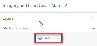
- Add the Lesson 2 Study Boundary.
- Download the L2Data.zip file from the Lesson Data tab on the main course website if you have not already done so. Be sure to keep the data zipped and follow the folder naming directions specified on the page. You will likely experience trouble later in the semester if you choose to use a different pathname.
- Click Your device and then browse to the L2Data zip file. The item type is a Shapefile. Select the "Add the L2Data.zip and create hosted feature layer" radio button. Click Next.


- Add a unique Title (e.g., Lesson2Data_YourInitials), Tags, and Summary description of the Lesson 2 study boundary file. Click Save.
- You will be redirected to an overview of the Lesson2Data shapefile. Verify and add relevant information.
- Click on the Open in Map Viewer button.
*Alternatively, you can select the Map tab to create an Untitled map in Map Viewer. Select Add a layer, navigate to My Content, and select "Lesson2Data" to add the Feature Layer.
- An "Untitled map" in a Map Viewer will open with the "Lesson2Data" added as a Feature Layer.
- Click on the "Lesson2Data" layer name to open the layer Properties along the right side. Click on Edit layer style under Symbology.

- Under #2 "Pick a style" select Style options.

- A dialog box will open that allows you to change the symbol style of the features in the layer. Click on the pencil to change the style of the "Symbol" of the Lesson 2 study boundary to a hollow red outline. Select the "X" to close the window when your symbol style selections have been made, and click Done two times to exit the Styles options.

- Click on the Options icon "…" after the file name in the Table of Contents, then "Zoom to" to center the Map on the study area.
- Save your Map by clicking on Save
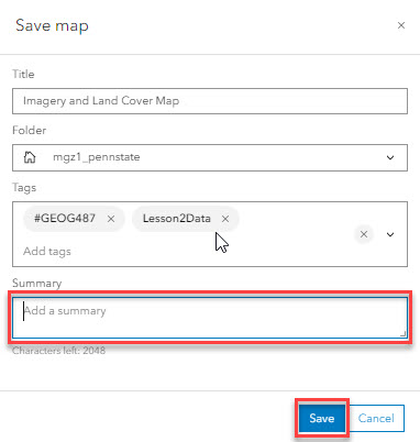
 > Save As. Note: It's a good idea to save often, just in case you lose your Internet connection or other unforeseen mishaps occur. Change the title to "Imagery and Land Cover Map," add tags for the class and your name, and write a summary of what the Map shows. The folder's name will default to match your login name (so it won't match the graphic below).
- Change the name of the Lesson2Data layer to "Study boundary" in the Table of Contents. To do this, click on the "…" after the layer name, then "Rename." Save your Map again to lock in your changes.

Note: Data layers often have default names that will be meaningless to most people who read your Map (like your boss and clients). Make sure you review layer names and change them, so your maps make sense to people other than yourself.
- Explore the surrounding area using the zoom and pan functions. To zoom, use the mouse wheel. To pan, left-click your mouse, hold it down, and then drag your mouse in the direction you want to view on the Map.
- Change the Basemap to "Imagery Hybrid."

- Explore the surrounding area again using the zoom and pan tools. Save your Map.
Which National Park is the Study Site near?
Which state(s) is the Study Area located in?
How much detail can you see in the imagery if you zoom in close?
-
Explore Land Cover Data & Add to Map
The second dataset we will explore is part of the United States Geological Survey (USGS) National Map. The land cover data service is hosted on their website and server. We can access the data in ArcGIS Online and by using their website (there are other options too).

- Let's start by exploring their website.
- Go to The National Map. Wait a few seconds, and the Map will automatically appear.
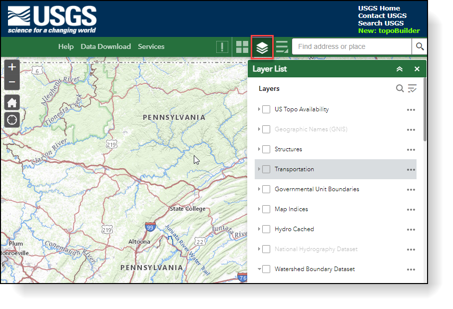
- Notice there are many datasets available in addition to Land Cover. Spend 10-15 minutes exploring the tools and datasets, as you will likely need to use these in many of your own environmental projects.
- Try to identify which layer or layers match the data sets we will add in this lesson. See the "Lesson Data" page for specific file names.
- Practice customizing the Map by turning layers on and off. You may need to click a button for the Map to redraw.
- Experiment with identifying the attributes of a vector data layer. Activate the vector feature layer by placing a check in the Layers List. For example, place a check beside the "Watershed Boundary Dataset" and "WBDLine" in the Layer List and then click on the Map to activate a pop-up containing attribute information.
- Look for tools or links to download datasets.
- Go to The National Map. Wait a few seconds, and the Map will automatically appear.
- Instead of downloading the data through the website, let's add the NLCD to our Map via ArcGIS Online. We can do this by performing a search. Search ArcGIS Online for the land cover dataset and add it to your Map.
- Select Add layer and change the drop to ArcGIS Online. Enter "USA NLCD Land Cover" in the search, and you should see a service published by ESRI. Add the NCLD Land Cover time series layer to your Map.

- Select Add layer and change the drop to ArcGIS Online. Enter "USA NLCD Land Cover" in the search, and you should see a service published by ESRI. Add the NCLD Land Cover time series layer to your Map.
- Navigate back to the Map. Change the order of the layers if necessary, and click on the legend icon
 to show the Legend. Review the Legend so you can understand what the colors represent.

- Change the transparency to ~50% so you can see the imagery beneath it. You must click on the "Properties" top right to do this. You can also rename the layer if you would like. Do you remember how we did that earlier in the lesson?
- Explore the land cover for the study area using the zoom and pan tools. Click on the "X" to close the Legend.
- Save your Map.
After exploring the same dataset using ArcGIS Online and the online viewer provided by the data creation agency, can you think of any scenarios where one method would be preferable over the other?
- Let's start by exploring their website.
Part III: Building a Web Application on the Penn State AGO Website
Part III: Building a Web App on the Penn State AGO Website
Now that we have created individual maps for each dataset, we can combine them into one using a template web application provided by Esri. You can use these templates to share your data in an easy-to-use format. Note: You need to be a member of the GEOG487 group to complete this section.
-
Share the Display Map
- Click on Home > Content to view the list of maps you created. The map list is found under the My Content tab.

- Share your maps with the class by using the visual guides below.

- Select “Geography 487 - Semester”
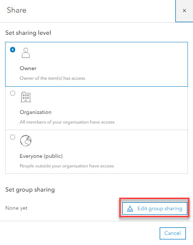
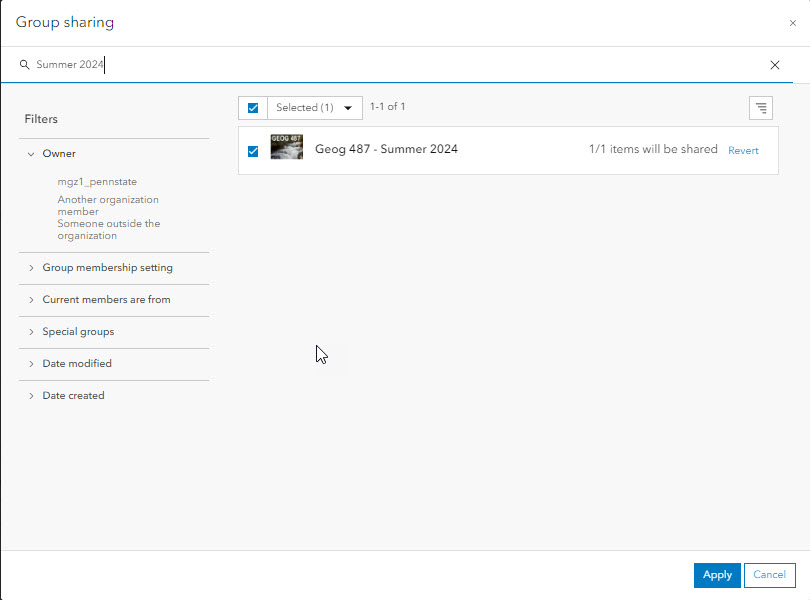
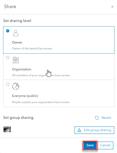
-
If necessary, click Update to synchronize sharing of the dependent items you have permission to update (e.g., Lesson2Data).
- You should see the Group listed as the Shared Status as shown below.

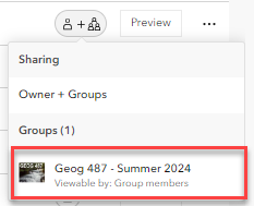
We will be sharing our work with the class throughout this course in ArcGIS Online. Please follow Penn State’s Academic Integrity guidelines covered in the Syllabus. (As a group administrator, I will be able to see if you created your own maps or made a copy of another student’s work).I encourage you to view other students' work to learn and be inspired. If you incorporate any of their ideas in your own work, please list their name and map URL in your sources.
- Edit the descriptions for a map by clicking on the title. Your text should be short and to the point. What do map viewers need to know about this dataset to use it quickly?
- Include the citation information requested by the data provider (see metadata) in the credits section.

When designing maps and applications, it is best to assume that your end users don’t know where the study area is and are not familiar with the data – where it came from, what it is supposed to be used for, etc.
It is your job to point them in the right direction by crafting descriptive titles, useful captions, and helpful legends. Be nice to your audience! A good rule of thumb is to show your map to a non-geospatial friend. If they look confused, you need to revise it.
Good captions describe what a map shows AND why the reader should care.
Bad Caption – “This map shows the study area in red.”
Good Caption – “The study area (shown in red) is located near Yellowstone National Park along the border of Montana and Wyoming. The terrain consists of steep mountains and valleys, making transportation by car difficult.
- Click on Home > Content to view the list of maps you created. The map list is found under the My Content tab.
-
Create Web Application
- Click on the Content tab to once again view a list of the maps you have created.
- Click on the + Create app menu. Select Web AppBuilder.

- Specify the Title: and Tags: for your web app. Make the title meaningful but succinct. The Summary: is optional and folder location will default to your My Content folder.
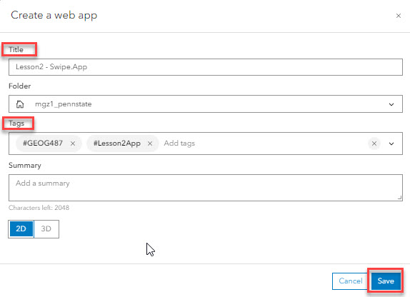
- The Web AppBuilder for ArcGIS will open. Click on the Map tab and select Choose web map.

- Under Choose web map, select the "Imagery and Land Cover Map"

- Click on the Widget tab, and select click on a widget placeholder.

- The Choose Widget window will open. Select the Swipe widget.

- Configure the Swipe widget based on the following options. The type of swipe tool will be a Vertical bar, the swipe mode is Single layer, the swipeable layers are "Study Area Boundary" and "USA NLCD Land Cover," and the default swipe layer is "USA NLCD Land Cover."

- To open the Swipe widget automatically when the app starts, hover over the bottom left of the Swipe icon under the Widget tab and click the circle.

- Select the Map tab. You should see the Swipe widget icon on the upper left corner of the map. Click on this widget icon to turn the widget on and off. Take some time to explore the functionality of the widget. Click on the Vertical bar to move it right or left. Be sure to Save your work.

- Navigate back to the Content tab within the Penn State AGO Organization and notice that the new App has been added to your My Content list.
- Be sure that your App is shared with the GEOG 487 Group.
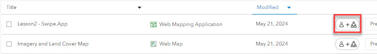
- Click on the Title of your App to open it. Review your final web application to make sure the titles, descriptions, and other information are correct. You may need to edit the individual maps for the information to update in the web application (legend titles, colors, extent, etc.). Double-check that you listed your map sources.
That’s it for the required portion of the Lesson 2 Step-by-Step Activity. Please consult the Lesson Checklist for instructions on what to do next.
Try This!
Review some of the other configurable web application templates at ArcGIS> Gallery > Apps. Do you think the Swipe/Spyglass WebApp widget is the best choice to present the two datasets from our lesson? Post your thoughts in Canvas Lesson 2 Discussion.
Try This! Activities are voluntary and are not graded, though I encourage you to complete the activity and share comments about your experience on the lesson discussion board.
Advanced Activity
Advanced Activity
Advanced Activities are designed to make you apply the skills you learned in this lesson to solve an environmental problem and/or explore additional resources related to lesson topics.
Directions:
In Lesson 2, we learned about several places to search for GIS and geospatial data online and created a web app to help a team get acquainted with their new field site. We only included a few pieces of information so far - imagery, land cover, and the study area boundary. Browse or search through the available datasets in ArcGIS Online (Click on Map > + Add layer > select Living Atlas from the pulldown and browse or search for available layers). Choose another dataset you feel would support the team's mission and add it to the map. Include the Study Area Boundary and Imagery Hybrid basemap. Save your map as "Map 3 - Your Dataset Name." Update the tags and description and share it with the class in ArcGIS Online. Esri has recently added a lot of new data to AGO (including ArcGIS Living Atlas live feeds that you can search for when you add features using +Add layer in the Map Viewer).
Summary and Deliverables
Summary and Deliverables
In Lesson 2, we discussed how and where to find geospatial data for environmental projects and common formats of GIS and geospatial data available on the Internet. We also used several online data services to create an interactive mapping application in ArcGIS Online for Organizations. There are both pros and cons of using online data services. In the next lesson, we will compare and contrast them with using raw geospatial data.
Lesson 2 Deliverables
Lesson 2 is worth a total of 100 points.
- (30 points) Lesson 2 Quiz
- (70 points) Lesson 2 Discussion Post The online maps and app you created in the Step-by-Step and Advanced Activities must be saved in Penn State's ArcGIS Online for Organizations Account to receive credit. To submit your assignment, post a note in the Lesson 2 [Deliverable] Discussion. Include your name and the elements below:
- Map Links:
- URL of your Interactive Web Application from the Step-by-Step Activity
- URL of your Web Map or Web Map Application from the Advanced Activity
- Reflection: (150-300 words) Consider the power of sharing your own maps and data on the Internet. Describe how you could have used this functionality for a previous project or could use it for a future project you'd like to work on. Describe at least one benefit and one drawback of publishing your maps online instead of creating a static map layout. Explain why you choose the particular dataset for your third map from the Advanced Activity.
- Map Links:
- Peer Review (optional): Explore other students' submission and add a short comment on their post.
Evaluation Criteria:
- Mastery: Demonstrate that you can find and share data using tools and templates in ArcGIS Online.
- Effective Communication: Map design (colors, titles, legends, and captions) makes it easy for readers to use maps for a specific, intended purpose and understand a particular message.
- Reflection: Demonstrate ability to recognize tradeoffs between different approaches.
- Follow Instructions: Include all required map elements, end products saved in Penn State's ArcGIS Online for Organizations Account, post deliverables, submit on time, etc.
| Swipe Map App | Link to swipe map app is present and includes proper imagery and land cover maps. (20pts) | Link is present, but app is missing an element. (15pts) | Link is present, but app is missing several elements. (10pts) | Link is missing. (0pts) | 20pts |
|---|---|---|---|---|---|
| Advanced Activity Map | Link to map is present and includes imagery, study area boundary, and one additional layer. Map is properly described. (20pts) | Link is present but is missing an element (map layers, descriptions.) (15pts) | Link is present but is missing several elements (map layers, descriptions or does not function properly. (10pts) | Link is missing. (0pts) | 20pts |
| Reflection | Discussion is present and includes 150-300 words addressing other applications for this activity, benefits, and drawbacks of online maps, and why the 3rd data layer was chosen. (15pts) | Discussion is present but is missing a required topic. (15pts) | Discussion is present but is missing several required topics. (10pts) | Discussion is missing. (0pts) | 20pts |
| Prose Quality | Is free or almost free of errors (complete sentences, student's own words, grammar, spelling, etc.). (10pts) | Has errors, but they don't represent a major distraction. (5pts) | Has errors that obscure meaning of content or add confusion. (0pts) | 10pts | |
| TOTAL | 70pts | ||||
Tell us about it!
If you have anything you'd like to comment on or add to the lesson materials, feel free to post your thoughts in the Lesson 2 General Discussion. For example, what did you have the most trouble with in this lesson? Was there anything useful here that you'd like to try in your own workplace?
Additional Resources
Additional Resources
This page includes links to resources such as additional readings, websites, and videos related to the lesson concepts. Feel free to explore these on your own. If you'd like to suggest other resources for this list please send the instructor an email.
Additional Training
Websites of Additional Data Providers
Lesson 3: Wetland Restoration and Invasive Species
Lesson 3 Overview and Checklist
Lesson 3 Overview
Introduction
In Lessons 3 and 4, we will practice completing many of the typical required steps in a GIS workflow:
- acquire or create new data;
- understand data content and limitations;
- customize data for your project;
- design & run analysis;
- interpret results; and
- present results (maps, charts, tables, photos, reports, etc.).
We will explore these ideas in the context of a wetland restoration project in the Great Lakes Region, where we will discuss what wetlands are, why they are important, and common environmental concerns. We will use both publicly available and private data sets, time series, site-level data created as part of a cooperative research project between the Environmental Protection Agency, the U.S. Fish and Wildlife Service, the U.S. Geological Survey, and the University of Michigan.
Scenario
You are part of a research team tasked with creating a restoration plan for a portion of a degraded wetland complex. You need to understand how the vegetation within the wetland has historically responded to changes in water levels. This information will enable you to predict the health of the wetland in future scenarios, including anticipated hydrological changes due to climate change. You begin by searching for publicly available sources of data for your analysis. You find that there isn't a dataset that has sufficient detail about vegetation for your study area. Furthermore, you are unable to find a dataset that shows wetland vegetation at multiple points in time. Your team hires a remote sensing specialist to acquire and interpret historical imagery and digitize polygons representing vegetation over time. Your job is to figure out how to use the vegetation data and GIS software to understand the relationship between fluctuating water levels and changes in vegetation.
Goals
At the successful completion of Lesson 3, you will have:
- loaded online data within ArcGIS;
- downloaded raw GIS files and customized them for a specific project;
- explored the pros and cons of publicly available data;
- viewed and interpreted time-series aerial photos.

Questions?
If you have questions now or at any point during this lesson, please feel free to post them to the Lesson 3 Discussion.
Checklist
This lesson is worth 100 points and is one week in length. Please refer to the Course Calendar for specific time frames and due dates. To finish this lesson, you must complete the activities listed below. You may find it useful to print this page out first so that you can follow along with the directions. Simply click the arrow to navigate through the lesson and complete the activities in the order that they are displayed.
- Read all of the pages in Lesson 3.
Read the information on the "Background Information," "Required Readings," "Lesson Data," "Step-by-Step Activity," "Advanced Activities," and "Summary and Deliverables" pages. - Download Lesson 3 datasets.
See the "Lesson Data" page. - Complete the Lesson 3 Step-by-Step Activity.
See the "Step-by-Step Activity" page for a link to a printable PDF of steps to follow. - Complete the Lesson 3 Advanced Activity.
See the "Advanced Activity" page. - Complete the Lesson 3 Quiz.
See the "Summary and Deliverables" page. - Optional - Check out the "Additional Resources" page. This section includes links to several types of resources if you are interested in learning more about the GIS techniques or environmental topics covered in this lesson.
SDG image retrieved from the United Nations
Background Information
Background Information
Customizing Data For Your Project
One of the amazing aspects of GIS is the ability to combine information about multiple topics from multiple time periods and from multiple sources into one place and then analyze them spatially. There are tradeoffs to consider for this convenience. As we saw in Lesson 2, before you can use data that you did not create yourself, you need to invest a great deal of time to acquire and understand each dataset. The more data sets you include, the more time you need to spend on these tasks. After you have acquired and understand your input datasets, you still need to customize them for your project. Other time-consuming tasks include interpreting the results of your analysis and figuring out how to best communicate them to your target audience. The analysis itself can be the quickest part – you typically just need to click a few buttons and wait for a GIS tool to run.
Customizing data for your project involves two main tasks: 1) modifying your input datasets so that they are consistent enough to combine them in spatial analysis and 2) modifying them so that they can answer your specific questions in your study area. The specific sub-tasks can be grouped into two main categories: spatial tasks and attribute tasks. It is better to address spatial issues first since you will likely add or remove records from your attribute tables in the process. Examples of each type are described below:
| Spatial Tasks | Attribute Tasks |
|---|---|
| Convert Data Format | Understand Coded Values |
| Resolve Projection / Misalignment Issues | Recode Missing Data |
| Customize Data Organization | Recode Typos |
| Correct Topology Errors | Reclassify Attributes |
| Modify Extent | Create New Attributes |
| Confirm Scale | Convert Units |
Spatial Tasks:
- Convert Data Format: You may find the original data format unsuitable for your project or analysis. For example, you may need to convert vector data to raster or vice versa to use a particular tool. You may also want to convert all of your input data into the same format (e.g., shapefile to a geodatabase, shapefile to GeoJSON, convert all rasters to vectors, or convert all vectors to rasters).
- Resolve Projection/Misalignment Issues: Sometimes, your datasets will not overlay properly in ArcGIS due to missing or incorrect spatial references. You may need to assign the projection to a file if none is listed. This comes up more often than you may think - the spatial reference information will be listed in the metadata or on a website. However, it might be missing the .prj file necessary for ArcGIS to recognize the projection information associated with a shapefile. Once all of your data sets have the correct spatial reference information defined, you need to reproject them all into the same system (coordinate system, zone, units, projection, and datum). There is an ArcGIS geoprocessing tool we will use this method later in the lesson. For vector data, use the “Project” tool; for raster data, use the “Project Raster” tool).
Keep in mind that ArcGIS Pro has the ability to project data on the fly, which can be misleading. According to Esri, the project on-the-fly capabilities within ArcGIS are for “display and query purposes only.” This means your actual data are NOT reprojected. Don’t let ArcGIS fool you. Just because your data sets may appear to align in a Map, they may not actually align if you try to combine them using geoprocessing tools (e.g., Tools group on the Analysis tab). For data sets to align for analysis purposes, you should actually reproject all of your input data into the same spatial reference.Note:
According to ESRI, project on-the-fly in ArcGIS works better for vector data since the process of projecting rasters on the fly is so much more complex than projecting vector data. Projecting data on the fly, regardless of whether the data is vector or raster, does not always produce consistent results. Sometimes, it works perfectly; other times, it does not. You can read more about it in this Esri Blog Post, "Projection on the fly and geographic transformations"
- Customize Data Organization: One of the major drawbacks to working with raw files is the data are not seamless like online data services. Murphy’s Law almost guarantees that your study site will fall right on the boundary of two or more geographic units from which your input data is aggregated. You may have to merge individual files before starting to work with the data. Alternatively, the input dataset may contain more detail than you need. You may want to dissolve it into larger units based on an attribute value.
- Correct Topology Errors: Topology errors such as gaps, overlaps, or empty geometry can cause errors during geoprocessing. Geodatabases have many tools to easily correct these types of errors. In this lesson, we will use a quick way to fill in gaps within a polygon shapefile.
- Modify Extent: Your input datasets may cover many different extents. You will need to clip them all to your study area. There are different tools to clip raster and vector datasets. In this lesson, we will clip vector datasets; in later lessons, we will clip raster data sets.
- Scale: The scale of your input data sets is not necessarily something you will modify but rather something you should be aware of. One common mistake is to assume a data set is more accurate than it really is. This is easy to do if you overlay two data sets - one with a fine scale and one with a course scale. ArcGIS allows you to zoom in and out infinitely. This is especially dangerous with vector data sets since they never appear pixilated as rasters do when you zoom in very close. This means at some point, you will zoom in past the scale meant for the data use. For example, National Wetland Inventory data is designed for use at 1:24,000 or coarser scales. It is tempting to zoom in closer than 1:24,000 or interpret the data at a finer scale than really exists in the data.
Attribute Tasks:
- Understand Coded Values: Attribute tables often contain mysterious coded or abbreviated values and cryptic field names. If metadata files are not packaged with the raw data, you can usually find the information you need somewhere on the source website, by doing a general Internet search, or by contacting the agency or organization. Alternatively, if metadata is easily accessible, it can take a substantial amount of time to read through all of the documentation. Either way, you need to budget at least a few hours for this task, especially if you are working with data products or providers you are not familiar with.
- Recode Missing Data\Typos: Missing values such as 0, <NULL>, or blanks can skew your results. Depending on how the data were created, you may find typos in the attributes such as extra spaces, capital letters, etc. (Wetlands vs. wetlands). Although we can tell both of these values should be “Wetlands,” the computer interprets them as separate values. You should look for these types of errors before starting an analysis, so you can exclude or recode values if necessary.
- Reclassify or Create New Attributes: All of the attributes included with a particular data set may not be relevant or useful for your particular application. You may want to remove attributes you don’t need to make your files easier to work with. You may also need to add new attributes to your input data to use them for your particular project. For example, you may calculate or derive new information from the existing attributes or join your data to tables with additional information.
- Convert Units: Measured or calculated values such as lengths or areas may be in different units. Multiplying inches by feet is not going to give you the answer you want.
Introduction to Wetlands and Invasive Species
What are wetlands? Wetlands can be broadly described as transition zones between water and land. They are notoriously hard to define because their characteristics vary greatly depending on their location and the environment in which they are located. One trait all wetland varieties share is that they have properties of both upland and aquatic environments that create unique ecosystems.

Wetlands are important for several reasons. First, they support a vast array of life with biodiversity and population counts comparable to tropical rainforests and coral reefs. For example, they are used as nesting and feeding grounds by many species of migratory birds, and most fish and shellfish are dependent on wetlands for some portion of their lifecycle. Second, wetlands help absorb and regulate the flow of water over large regions. During extremely wet periods, wetlands absorb and store excess water, preventing floods and associated damage. They are a natural disaster management system. Third, wetlands help to recharge groundwater aquifers, a source of drinking and irrigation water, during times of drought when rain is scarce. Fourth, wetlands help to filter and purify water. As water enters a wetland, its speed is drastically reduced, mitigating possible erosion of valuable soils. Reducing water speed also causes suspended and dissolved particles, such as pollutants and nutrients, to drop out of the water when they enter a wetland. Plants and microorganisms living in the wetland then absorb and break down these particles. Artificial and natural wetlands are often used to treat stormwater and wastewater for this reason. Lastly, the combination of water and wildlife found in wetlands supports several types of livelihood and recreation, such as fishing, boating, hiking, and bird watching.
Unfortunately, wetlands are often threatened by human activities. Wetlands can either be completely eliminated or degraded so much so that their ecosystem cannot function. For example, wetlands are often drained to expose new land for agriculture or development or are flooded to create lakes. Over 96% of the original wetlands along western Lake Erie have been lost in this manner since the 1860s. In addition, runoff from lawns and impervious surfaces can add excessive amounts of pollutants such as fertilizers, pesticides, and sediment, which degrade the wetlands that absorb the material. A common land management technique is to build earthen dikes around wetlands, causing them to be hydraulically separated from surrounding areas. This artificial process eliminates the natural cycle of high and low water levels necessary for vegetation regulation. It also limits the movement of small biota in and out of wetlands, which is critical for the reproduction of many species.

Wetlands are also threatened by the spread of invasive species, also known as non-native or exotic species. Both plants and animals can be considered invasive. These species are naturally very adaptable and aggressive and have a high reproductive capacity. They are considered invasive only when they spread outside of their natural range, where they out-compete native species due to their vigor and lack of natural enemies. Once established, they are extremely difficult to eliminate. Their presence in an ecosystem often causes economic, human health, and environmental damage. Some examples of invasive species in the Great Lakes Region are purple loosestrife, common reed, reed canary grass, narrow-leaved cattails, hybrid cattails (narrow/broad-leafed), emerald ash borer, common carp, sea lamprey, zebra mussels, and West Nile virus.
Recognizing the importance of wetlands is a relatively recent initiative. For example, the Ramsar Convention, an international treaty for the conservation of wetlands, wasn’t adopted until the mid-1970s. The U.S. North American Wetlands Conservation Act, which provides funding to protect and manage wetland habitat, wasn’t enacted until 1989. Since then, government agencies have created a set of laws regulating the use and management of wetlands. They also established a network of protected wetland areas that are managed by various state and federal agencies in which wetland managers try to restore degraded wetlands while attempting to balance the competing interests of recreation, habitat for particular species, and the spread of invasive species.
We are going to explore several of the data customization concepts described above in the context of a historical wetland restoration project within a federally protected area. The case study site is located in the Ottawa National Wildlife Refuge, located about 20 km east of Toledo, Ohio.
Required Readings
Required Readings
There are several required readings for Lesson 3. The first one describes a previous wetland restoration project involving GIS led by some of the same researchers who created the vegetation data we will use in Lessons 3 and 4. The wetland described in the report, Metzger Marsh, is adjacent to the study site. The second reading provides more information about invasive species in the Great Lakes. The third fact sheet describes the actual restoration work completed at the study site. The last link is additional information about a Magee Marsh Wildlife Area wetland improvement project, which is also adjacent.
USGS Fact Sheets and Additional Site Information:
Lesson Data
Lesson Data
This section provides links to download the Lesson 3 data and reference information about each dataset (metadata). Briefly review the information below so you have a general idea of the data we will use in this lesson. You do not need to click on any of the hyperlinks as we will do this in the Step-by-Step Activities.
In this lesson, we will experiment with two different types of data providers, both public and private. For the publicly available data, we will use a combination of online data services and raw GIS files, which you will have to download yourself. The private data is included in the zip file below.
Keep in mind, the websites and servers of public data providers may occasionally experience technical difficulties. If you happen to work on this lesson while one of the sites is down, you may need to stop work and start the following day again to allow time for the servers to reboot.
Lesson 3 Data Download:
Note: You should not complete this activity until you have read through all of the pages in Lesson 3. See the Lesson 3 Checklist for further information.
Create a new folder in your GEOG487 folder called "L3." Download a zip file of the Lesson 3 Data and save it in your "L3" folder. Extract the zip file and view the contents. Information about all datasets used in the lesson is provided below:
Metadata
Publicly Available Data:
Base Map:
- Source: ArcGIS Online
- Service Name: OpenStreetMap
- Within ArcGIS Pro, go to Map tab, Layer group, Basemap.
USDA Farm Service Agency - National Agricultural Imagery Program (NAIP):
- Source: National Agriculture Imagery Program (NAIP), ArcGIS Online
- Service Type: Web Map Service (WMS)
- Service Name: USA NAIP Imagery (2018)
- Metadata: NAIP Imagery
Boundaries of Fish & Wildlife Service Lands:
- Source: ArcGIS Online
- Service Type: Feature Service
- Service Name: U.S. Fish & Wildlife Service Lands
- Sub Layer: FWS Boundaries
- Metadata: U.S. Fish and Wildlife Service Lands
National Wetlands Inventory: The U.S. Fish and Wildlife Service National Wetlands Inventory classifies wetlands into 5 major ecological types, subdivided into numerous categories.
- Online viewer (Wetlands Mapper)
- Web Map Service
- Download Raw data
- Instructions on how to connect to NWI Web Services
- Metadata: National Spatial Data Infrastructure - Wetlands Layer, National Spatial Data Infrastructure Wetlands Layer
Great Lakes Coastal Wetland Inventory: Detailed wetlands inventory of the Great Lakes Region developed through the Great Lakes Coastal Wetland Consortium.
- File Name: glcwc_cwi_polygon.zip (12.46 MB) In addition to the Coastal Wetlands Inventory shapefile that you are downloading, embedded in the shapefile is its metadata (Data type: XML Document). This metadata, along with the full publication below, will help you to understand the classification system developed for the Great Lakes wetlands and how they can be applied to your analyses and planning. ** They will also help you to answer a quiz question or two.
- GLCWC Website
- GLCWC Metadata, Full Publication (enhanced metadata)
Private Data (Located Inside the Lesson 3 Folder):
- Study_Site: The study site boundary represents the wetland areas within Ottawa National Wildlife Refuge that are hydraulically connected to Lake Erie. The file is included in two formats - .shp and .kmz.
- Time Series Imagery: The images show the land cover in the study area at three different points in time. (The study site and historic imagery files are bundled in a file called a map package).
- Time Series Wetland Vegetation: This data was created as part of a research project entitled, “Coastal Wetland Habitat Restoration and Exploration.” Special thanks to Kurt Kowalski from the United States Geological Survey for allowing us to share this data with the class. The data was created by digitizing and classifying wetland vegetation from a series of historical aerial photos. There is one shapefile per study year. The smallest polygon digitized (minimum mapping unit) is 0.25 hectares. To save time, we will only explore 3 out of the 5 available time periods: 1962, 1973, and 2005. You have the option to explore the 1939 and 1950 data in the Advanced Activities section. We will look at some of the actual imagery used to create the data in the Step-by-Step Activity. These image dates and sources are shown in Figure 4, below.
 Figure 4: Historical time-series aerial photos of the study site between 1939 and 2006. All images except the 2005 & 2006 images are the original source images used to digitize the vegetation shapefiles used in this lesson.© Kurt Kowalski, USGS. Used with permission.
Step-by-Step Activity
Step-by-Step Activity: Overview
Step-by-Step Activity: Overview
The Step-by-Step Activity for Lesson 3 is divided into two parts. In Part I, we will look at publicly available datasets from Esri, the Fish & Wildlife Service National Wetlands Inventory, the Great Lakes Coastal Wetlands Inventory, and aerial photos from the USDA Farm Service Agency. In Part II, we will explore site-level data from three time periods that was digitized from high-resolution aerial photos. We will use the various datasets listed above to practice many of the data customization tasks covered in the lesson text.
Lesson 3 Step-by-Step Activity Download
Note: You should not complete this step until you have read through all of the pages in Lesson 3. See the Lesson 3 Checklist for further information.
Part I: Explore Publicly Available Wetlands Data & Historical Imagery
Part I: Explore Publicly Available Wetlands Data & Historical Imagery
Part I, we will explore our study area and the time-series aerial photos used to digitize the vegetation data we will use in Part II. We will also look at two publicly available datasets specifically related to wetlands: the National Wetlands Inventory from the U.S. Fish & Wildlife Service and a more detailed wetlands inventory from a regional public agency called the Great Lakes Commission. In the process, we will explore several different data delivery options and sources in ArcGIS: Esri Map Packages, Esri Basemaps, ArcGIS Online Datasets, Web Map Services (WMS) from GIS Servers, and raw GIS files.
-
Familiarize Yourself with the Study Area and Set Up Your Map
- Open the L3_Data folder you downloaded in the Lesson Data section. Double-click on the “Lesson3.mpkx” map package file. Designate your L3_Data folder as the unpacking location. This will open a map inside ArcGIS Pro with the study area boundary and historical imagery already loaded.
You can share your own data and maps by creating a map package in ArcGIS Pro. Go to the Share tab, Package group, and select Map Package
 . The file can either be uploaded to ArcGIS Online or saved locally.
 - Set your Current Workspace and Scratch Workspace to your L3 folder by navigating to the Analysis tab, Geoprocessing group, Environments
 . Make sure to read the associated help topics about “Current Workspace” and “Scratch Workspace.”

Setting your Current Workspace allows you to customize the location of where output files created during geoprocessing steps are saved. By default, files will be saved at …My Documents\ArcGIS.
To easily access information related to geoprocessing parameters and environments in ArcGIS: Click on the information icon
 which will open a dialog window with information about usage and options. It is also a good idea to read the help information related to tools you are not familiar with (click
  or go to the Project tab > Help).
 - Add the “Open Street Map” ArcGIS Online Service (go to the Map tab, Layer group, click on Basemap
 > select OpenStreetMap) so you can tell where the study area is located in relation to the other places. You may need to refresh your map for the Basemap to load. (You need to be connected to the Internet and Signed In to the PSU AGO Organization using your WebAccess account information).

- Use the Explore tool
 found on the Map tab, in the Navigate group to take a look at the study site and the surrounding area. What is the nearest major city? How far away is the site from the state border with Michigan?
 - Turn off the Basemap, as this can slow down the drawing speed of your map in late steps. Save your project.
- Open the L3_Data folder you downloaded in the Lesson Data section. Double-click on the “Lesson3.mpkx” map package file. Designate your L3_Data folder as the unpacking location. This will open a map inside ArcGIS Pro with the study area boundary and historical imagery already loaded.
-
Explore Historical and Recent Aerial Photos
- Zoom to the study area boundary by right-clicking on it in the Contents pane > Zoom to Layer.
- Turn on the “2005” layer in the Contents pane. This is a Color Infrared (CIR) image. Notice the information on the edge of the scanned film showing the date, location, and scale of the original image.
- Turn on the “1973” and “1962” images. These images are black and white, a common format before 2000.
- Compare the three images by turning them on and off and viewing them at a number of different scales: 1:15,000, 1:10,000, and 1:5,000. Try navigating to different locations within the study area. What differences do you notice between the three images?
Take a minute to look at the swipe and flicker tools available on the Raster Layer, Appearance tab, Compare group (be sure an image is highlighted in the Contents pane) These tools can be useful for temporal change detection (especially of satellite images or air photographs that were taken at different times of the same location), data quality comparison, and other scenarios where you want to visually compare the differences between two layers in your map. Swipe allows you to interactively reveal what is underneath a particular layer; Flicker flashes layers on and off at the rate you specify. You can read more about these tools in Esri help.
- The photos that were used to create the detailed vegetation data we will use in Part II all show the study area in the past. Let’s take a look at more current imagery and see if we notice any changes in the vegetation. We’ll use an image from 2018 to 2020 from the National Agricultural Imagery Program (NAIP).
- We can add ArcGIS Online data to the Map by going to the Map tab, Layer group, Add Data > Data. Under Portal, click ArcGIS Online.
- Search for USA NAIP Imagery. Click OK.

- The USA NAIP Imagery layer will be added to the Contents pane.
- Compare the NAIP Imagery with the historical aerials. What types of changes do you see? Notice that the NAIP Imagery is more natural in color, which is a bit easier to interpret (as compared to color infrared and black-and-white formats).
- Turn off the imagery layers in the Contents pane and save your project.
-
Add the boundaries of the Fish & Wildlife Service Wildlife Refuges to your map
- Again go to the Map tab, Layer group, Add Data > Data. Under Portal, click ArcGIS Online.
- In the ArcGIS Online search window, type “national wildlife refuges” Review the datasets that match the search. Locate the "National Wildlife Refuges” dataset in the results.

- Click on the "Details" button to review the metadata. Notice that this data is a Feature Layer and was last modified on 7/25/2022. Click OK to add the layer to the Map.
- Drag the study site boundary to the top of the Contents pane so you can see the site boundary on top of the feature service.
- Zoom out to 1:250,000 so that you can see the various federal lands in the vicinity. The refuge is shown as a pinkish-filled polygon, which means it is a Great Lakes National Wildlife Refuge. Use the explore tool to click on the feature and identify the refuge's name.
- Notice how the lesson study area only covers a portion of the whole refuge. The study site boundary represents the wetland areas within Ottawa National Wildlife Refuge that are hydraulically connected to Lake Erie. Some of the wetlands in the refuge are excluded from this area because they are hydraulically separated from Lake Erie by dikes and are therefore not susceptible to fluctuations in Lake Erie water levels. Other areas of the refuge are not wetlands.
- Right-click on the “FWSBoundaries” layer name in the Contents pane > select Attribute table. Explore the attribute table. Are there any abbreviations you don’t understand?
- Again, right-click on the “FWSBoundaries” layer > Properties > Source > Spatial Reference. Look at the spatial reference information. Is it the same as the study site? Does it match the data frame? (Right-click on StudyArea in the Contents pane > Properties > Coordinate Systems). Note: You may experience errors editing a data layer if it does not match that of the data frame.
-
Create a new shapefile of the Ottawa National Wildlife Refuge Boundary
- Right now, the refuge boundaries on our map are part of a feature layer. We want to create a new shapefile from just a portion of the records so we can customize it for our study site.
- Open the FWSBoundaries attribute table. Click on the “Select by Attributes” icon
 .
. - Create a new selection expression to select all of the polygons within the Ottawa National Wildlife Refuge Where "Organization Name" is equal to "Ottawa National Wildlife Refuge". Apply the expression. You should have 1 of 574 records selected. Close the attribute table. Notice that the polygon is a multipart feature, or it has more than one part but is defined as one feature because it references one set of attributes. Confirm this by viewing the attribute table.
- Right-click on the layer in the Contents pane and click Data > Export Features. Export the selected features to a new shapefile called “OttawaNWR.shp” to your L3 folder. Make sure to go to the Environments tab in the Export Features dialog to establish the Output Coordinates as the same coordinate system as the Current Map [Study Area], or you may not be able to edit this data later on in the lesson.
- The “OttawaNWR” shapefile will be added to your map. Verify the Coordinate System (Properties > Source > Spatial Reference) is the same as the StudyArea Map. Remove the “FWSBoudaries” dataset from your map and save the project.
- Save your project.
-
Download and Explore the National Wetlands Inventory (NWI) Data
- Connect to the National Wetlands Inventory data service. Go to the Insert tab, Project group, and click on Connections > Server > New WMS Server > Copy and paste the URL: https://fwspublicservices.wim.usgs.gov/wetlandsmapservice/services/Wetlands/MapServer/WMSServer?request=GetCapabilities&service=WMS and click OK.
- Go to the Map tab, Layer group, Add Data > Data. (Note: If you cannot view the layer using Add Data, try dragging the wetland layer from the Catalog pane > Project > Servers to the Map).
- Under the Project folder, click on Servers. Double-click on WMS (https://www.fws.gov/program/national-wetlands-inventory/web-mapping-serv...) > WMS > Layers. Highlight the Wetlands layer and click OK to add the data set to your map. The layer will be added to the Contents pane and will be named WMS > Wetlands.
- Drag the WMS Wetlands layer toward the top of the Contents pane but under the Study_Site layer. Zoom to the study area layer and explore the data.
- Use the Explore tool from the Map tab to see what information is included with the layer. Notice that you can’t view an attribute table like you could with the feature layers.
- According to the metadata, “the data are intended for use with base maps and digital aerial photography at a scale of 1:12,000 or smaller. Due to the scale, the primary intended use is for regional and watershed data display and analysis, rather than specific project data analysis.”
- Unfortunately, the data does not contain enough detail to help us analyze vegetation changes in a specific wetland. It also does not allow us to study changes over time.
- Turn off the “WMS” layer in the Contents pane and save your project.
-
Explore the Great Lakes Coastal Wetland Inventory Data
- Read a quick description of the data at Great Lakes Commission (scroll down to the "Links to Inventory and Metadata" heading). Notice the link to the product metadata provided on the site. We are going to use one file from this site called, “the complete polygon coverage in shapefile format.”
- Download the data zip file from the site or from the Lesson Data page (glcwc_cwi_polygons.zip - 12.46 MB), save it in your L3 folder, and unzip the file.
- Add the “glcwc_cwi_polygon” shapefile to your map.
- Open the attribute table and explore the available information. Notice how there is significantly more information than the previous wetland datasets we reviewed.
- The “HGM_CLS1” and “HGM_CLS2” attributes show the wetland classification codes. You can read detailed descriptions of these codes in the “Great Lakes Coastal Wetlands" (enhanced metadata) document.
- Right-click on the “glcwc_cwi_polygon” shapefile in the Contents pane > Zoom to Layer. It is difficult to see any detail.
- Zoom back to the Study_Site layer. Do you see any wetlands inside the Ottawa National Wildlife Refuge that are not inside our study site boundary? You may need to move the Study_Site boundary layer and OttawaNWR layers to the top of your Contents pane.
- Turn the layer off in your Contents pane and save your project.
- The Great Lakes Coastal Wetland Inventory provides much more detailed attribute information than the National Wetlands Inventory. However, it still doesn’t provide the time-series information we need to answer our research questions. For time-series data, we need to look at yet another data set.
Part II: Explore & Customize Site Level, Time Series Wetlands Data
Part II: Explore & Customize Site Level, Time Series Wetlands Data
The publicly available datasets we just explored are helpful for familiarizing yourself with your study area or for regional or other large-scale analyses. However, they do not contain the level of detail for the site level analysis we want to conduct. The highest resolution data you can usually find is 1:24,000 scale for vector data and 30 m cell size for raster data. Publicly available datasets also typically do not have time-series information available. In Part II, we are going to explore a high resolution, time-series dataset that was digitized from the aerial photos we reviewed in Part I. Oftentimes, you will need to digitize information in this manner if you have a small study site or if you want to do an in-depth, time series analysis. The work required to create the data is significant. However, you can do a lot more with your data.
We want to explore how vegetation has changed over time in our study area. To answer our research questions, we need the following datasets: 1) polygons of vegetation species over time 2) polygons of vegetation groups over time, and 3) polygons of invasive species over time. All of the files need to show just the region within our study site. We will create these custom datasets for three time periods using the Join, Union, Clip, and Dissolve tools. The workflow we will follow is illustrated in the diagram below using the data for the seventies time period. You may wish to consult this diagram after completing each step.

- Seventies + VEGCODE + join = 70s_Join
- 70s_Join + Study Site + union = 70s_union
- 70s_union + Study Site + clip = 70s_species
- 70s_species + dissolve = 70s_VegGrp + 70s_Invasive
-
Explore the Site Level Vegetation Data
- Open the map from Part I.
- Add the “sixties,” “seventies,” and “twothousands” vegetation shapefiles from the L3 folder to your map.
- The default symbology should show the vegetation polygons filled in. Do you see any gaps in coverage between the vegetation data and site boundary? Hint: turn some of the layers on and off and use the zoom tools. Look along the coastline along the northeast boundary.
- Compare the extents of the vegetation data and study site. Do you see any differences?
- Open the attribute tables. Do you notice any differences in the number of records in each dataset? Do you see any coded or missing values? Missing data may sometimes be coded as values of “0.”
- Notice how the vegetation files contain a lot more spatial detail than the publicly available datasets we looked at earlier. At this point, we do not know what the values in “VEG_ID” mean, though we can assume they correspond to different types of vegetation. Even without knowing what the “VEG_ID’s” mean, we can still tell that the "twothousands" data has a lot more polygons than the other time periods. What do you think the VEG_ID code “11” means?
-
Understand Coded Values
- Now that we have a general sense of what our starting data looks like, we can work on customizing it for our purposes. Let’s start by figuring out what the coded values in the “VEG_ID” fields mean.
- Add the “VEGCODE.dbf” table from your L3 folder to your map. Open the table.
- The VEGCODE table is a master lookup table that tells us what the coded values (VEG_IDs) mean. The VEG_IDs correspond with detailed vegetation types (Veg_Type).
- I have reclassified this information for you into 2 simpler categories: Veg_Group and Invasive. The numbers at the beginning allow us to sort the values based on the depth of water they prefer (e.g., most water (open water) to least water (upland vegetation) instead of alphabetically by name).
Note: You may notice that some of the Veg_IDs are listed as “May Be Invasive” in the “Invasive” field. Two of the most common invasive species in the wetland (narrow-leaved and hybrid narrow/broad-leaved cattails) look very similar to native species (broad-leaved cattails,) which makes them difficult to distinguish in aerial photos.
- Join the VEGCODE table to the sixties vegetation shapefile Right-click on the “sixties” shapefile > Joins and Relates > Add Join. Base the join on the Veg_IDs. Keep All Target Features. Validate the join and then click OK.
Caution - watch out for similar attribute names like OID. This is not the same as Veg_ID.
 Add Join
 - Open the attribute table of the sixties shapefile to make sure the join worked properly.
- To make the join permanent, export features to a new shapefile in your L3 folder called “60s_Join.” Be sure the new shapefile is added to your map.
- Repeat steps e - g for the remaining two vegetation data sets. Name them “70s_Join” and “00s_Join.” Remove the “sixties,” “seventies,” “twothousands,” and VEGCODE table from your map and save.

Make sure you have the correct answer before moving on to the next step.
The 60s_Join, 70s_Join, and 00s_Join shapefiles should have the number of records and all of the attributes shown below. If your data does not match this, go back and redo the previous step.
 60s_Join - 352, 70s_Join – 280 records and 00s_Join – 449 records.
 -
Modify Extents - Fill in Gaps
- We want all of our input data sets to have the same total area so we can compare changes in the area of different vegetation types over time. This means we need to remove pieces from some study years and fill in gaps for other years so they all cover the same extent.
- First, we will fill in gaps. A quick way to fill in gaps is to use the union tool to create new polygons in areas that overlap within the extent of two datasets. We will union the vegetation shapefiles with the study boundary since this file does not have any gaps and it covers the area we are interested in. Follow the steps below to union the two files:
- Go to the Analysis tab, Tools group > Union
 Union tool.
 - Click on the “Show Help” button for more information about what the tool does and what the different input criterion means.
- Input Features: Study Site; 60s_Join (make sure the study site is listed first).
- Output Feature Class: 60s_Union.shp (save it in your L3 folder not in the default.gdb).
- Keep the defaults for Join Attributes (ALL).
- Make sure the “Gaps Allowed” checkbox is NOT checked. Read the help topic about this, so you understand why.
- Keep the defaults for the Environments.
- Click Run.
- Compare the output file to the original shapefile from the same time period to make sure the tool worked as expected. Notice the records that have an FID_Study_ value of -1. What do these mean? Hint: See step vi.
- Repeat union for the remaining two vegetation shapefiles “70s_Join” and “00s_Join.” Name them “70s_Union” and “00s_Union.”
Geodatabases may have naming restrictions for table and field names. For instance, a table in a file geodatabase cannot start with a number or a special character such as an asterisk (*) or percent sign (%). Shapefiles do not have such restrictions and allow us to use names such as 60s_Join.
If you receive an Error 000361: The name starts with an invalid character during geoprocessing, check to make sure you are saving your output as a shapefile.
It’s very easy to make mistakes when using geoprocessing tools. For example, you can select the wrong input files by mistake. Another common error is running tools while unknowingly having records selected. Any output from geoprocessing tools will only contain the selected records. Comparing your results with your input datasets after using automated tools is a good habitat to get into.
If you want to double-check the input files you used previously, the parameter settings, environment settings, etc., you can view them under Geoprocessing > History.
Make sure you have the correct answer before moving on to the next step.
- 60s_Union should have 367 records
- 70s_Union should have 289 records
- 00s_Union should have 458 records
If your data does not match this, go back and redo the previous step.
-
Modify Extents - Remove Excess Area
- Notice that some of the study years still cover a larger area than others. For example, compare the 60s_Union shapefile with the 70s_Union shapefile. Let’s change the extent of all data sources to match the study area boundary by using the clip tool. Note: The Clip tool is only for vector datasets. In later lessons, we will look at tools to clip raster datasets.
- Go to the Analysis tab, Tools group > Clip

- Click on the “Show Help” button for more information about what the tool does and what the different input criteria mean.
- Input Features: 60s_Union.
- Clip Features: Study_Site.
- Output Feature Class: 60s_Species.shp (save it in your L3 folder).
- Keep the defaults for Environments.
- Click Run.
- Go to the Analysis tab, Tools group > Clip
- Compare the output file to the joined shapefile and unioned shapefile from the same time period. What differences do you notice?
- Clip 70s_Union and 00s_Union using the directions above. Name them “70s_Species” and “00s_Species.”
Make sure you have the correct answer before moving on to the next step.
- 60s_Species should have 240 records
- 70s_Species should have 206 records
- 00s_Species should have 325 records
If your data does not match this, go back and redo the previous step.
- Remove the original vegetation, unioned, and joined shapefiles from your map and save the project.
- All of our study years should now have the same extent. Let’s confirm this by calculating the area of each study year. Add a new double field
 to each year called “sqm” with the default scale and precision values. I find it helpful to name fields by their units so I remember what they mean later on. Remember to
  your changes.
Specifying a specific precision and scale when adding a field to a shapefile gives you the option to limit the number of digits (precision) and decimal places (scale) of values within number fields. There are many situations where you would want to do this. However, there are also occasions where it is best to keep all of your options open. Accepting the default value of 0 for both properties gives you the most versatility. It may seem counterintuitive, but the value of 0 acts somewhat similar to the value of infinity in this case. Setting custom precision and scale values is only relevant to data stored in an enterprise geodatabase. Default values are always enforced when editing data in a shapefile or file geodatabase. Refer to the ArcGIS field data types for more information.
I recommend using values of 0 when you are in the preliminary stages of data exploration. That way you won’t unknowingly exclude values in your results. For example, if you are calculating area values for the first time, you probably won’t know how many digits you will need to store your calculated values (precision) until after you’ve made the calculation. If you estimate a number to use for precision that ends up being too low, you will not be able to store the full range of values. For example, a precision of 2 would limit your values to two digits, whereas a precision of 4 would limit your values to four digits.
- In the open attribute table, right-click on the “sqm” field and click Calculate Geometry. Choose area and units of square meters. Use the coordinate system of the data source. Repeat this step for the remaining two shapefiles.
 Calculate Geometry
 - Use the statistics tool to find the total area for each year by right-clicking on the “sqm” field and choosing “Statistics”. All of the study years should have the same “SUM” value. You may notice very small differences between the layers. This is due to tiny topology errors such as overlapping sliver polygons. We could have corrected these with the Environments > XY Tolerance settings during our union and clip operations if we needed this level of precision for our analysis. In this case, we don’t, but I wanted to point out this issue in case you come across it in other projects. For more information about XY Tolerance, see the Esri Help.
- Notice that some of the study years still cover a larger area than others. For example, compare the 60s_Union shapefile with the 70s_Union shapefile. Let’s change the extent of all data sources to match the study area boundary by using the clip tool. Note: The Clip tool is only for vector datasets. In later lessons, we will look at tools to clip raster datasets.
-
Explore Attributes & Missing Data
- Now that we’ve fixed the geometry of our input data, we can start to work with the attributes. Before inputting data into an analysis, you should have a good understanding of the distribution of your values. You should also be aware of any missing values or outliers that can skew your results, so you can exclude or recode these if necessary.
- One way to quickly get a sense of the distribution of data values and missing data is to change the symbology to be categorical based on each attribute.
- Right-click on the 60s_Species shapefile in the Contents pane > Symbology. The Symbology pane will open to the right. Under Primary symbology > Unique values > Field 1 Veg_Type.
 Symbology pane
 - Expand the More dropdown list and click on Show Count. How many polygons have missing data (blank entry) in the “Value” column? Do you see any values with typos?
- Repeat this process for the “Veg_Group” and “Invasive” variables.
- Repeat steps c and d for the remaining two time periods (“70s_Species” and “00s_Species”).
-
Generalize Data
- For our analysis, we are particularly interested in two attributes, “Veg_Group” and “Invasive.” Right now, each polygon represents vegetation clusters of the same species, which is more detailed than we need. We want to create two new data sets in which the polygons represent clusters of vegetation groups and clusters of invasive types over time. We will use these customized data sets in Lesson 4, where we will discuss how to interpret and present results from several datasets.
- First, let’s create the time series shapefiles of vegetation groups.
- Go to the Analysis tab, Geoprocessing group > Tools
 .
. - In the Geoprocessing pane, search for "Dissolve".
- Click on the “Show Help” button for more information about what the tool does and what the different input criteria mean.
- Input Features: 60s_Species.
- Output Feature Class: 60s_VegGrp.shp (save it in your L3 folder, not the default.gdb).
- Dissolve Field: Veg_Group.
- Statistics Field: Select “sqm” as the field and “SUM” as the statistics type.
- “Create multipart features” should be checked.
- “Unsplit lines” should NOT be checked.
- Go to the Analysis tab, Geoprocessing group > Tools
- Compare the output file to the input file from the same time period.
- Repeat the dissolve for the remaining two time periods. Name them “70s_VegGrp” and “00s_VegGrp.”
Summary Statistics tool (go to the Analysis tab, Geoprocessing group >Tools
> search "Summary_Statistics") is another option you can use to calculate statistics for your data. This tool is similar to the “Summarize” option available by right clicking on a field in an attribute table. The advantage of the Summary Statistics tool is that it allows you to create statistics based on multiple fields. For example, you could use it to find the total area for every unique combination of vegetation type and invasive classification. You could interpret the results to find out which plant type makes up the majority of invasive species for each time period.Multipart polygons are features that have more than one polygon for each row in the attribute table. If you want to explode these into individual records at a later time, there is a tool available on the Edit tab, in the Tools group.
- Now, let’s create the time series shapefiles by invasive type.
- Go to the Analysis tab, Geoprocessing group > Tools.
- In the Geoprocessing pane, search for "Dissolve".
- Input Features: 60s_Species.
- Output Feature Class: 60s_Invasive.shp (save it in your L3 folder).
- Dissolve Field: Invasive.
- Statistics Field: Select “sqm” as the field and “SUM” as the Statistics Type.
- “Create multipart features” should be checked.
- “Unsplit lines” should NOT be checked.
- Go to the Analysis tab, Geoprocessing group > Tools.
- Compare the output file to the input file from the same time period.
- Repeat step c for the remaining two time periods. Name the output files “70s_Invasive” and “00s_Invasive.”
- Remove the “60s_Species,” “70s_Species,” and “00s_Species” from your map and save.
That’s it for the required portion of the Lesson 3 Step-by-Step Activity. Please consult the Lesson Checklist for instructions on what to do next.
After experimenting with online data services in Lesson 2 and raw data in Lesson 3, which do you think is easier to work with? What are the pros and cons of each one? Can you think of any scenarios in which one is preferable over the over?
Do you have a good understanding of why we completed each step in Part II? If not, compare the starting vegetation files and final outputs (XX_Species, XX_VegGrp, XX_Invasive) in terms of extent, area, gaps, spatial detail, and attributes.
Try This!
- In Lesson 3, we familiarized ourselves with the study site using the “Open Street Map” layer from Esri. Google Earth Pro is another excellent application for this purpose. If you are willing to install the software, try one or more of the activities listed below.
- Open the KMZ file of the Study Area (in the L3 Data folder) in Google Earth, zoom to the study boundary, and explore the area around the study site. For example, look for Street View images or other sources of imagery (Layers > More > DigitalGlobe Coverage). If you receive an error message by double-clicking directly on the KMZ file from Windows Explorer, open the file from within Google Earth > File > Open > Study_Boundary.kmz. You can also right-click on the KMZ file from your desktop > Opens With > Google Earth.
- Experiment with the “view historical imagery” tool by clicking on the clock icon to see if you can find these. How far back in time do the images go?

- Explore Great Lakes Phragmites Collaborative. Can you find any other Phragmites projects along the Lake Erie shoreline?
Note: Try This! Activities are voluntary and are not graded, though I encourage you to complete the activity and share comments about your experience on the lesson discussion board.
Advanced Activity
Advanced Activity
Advanced Activities are designed to make you apply the skills you learned in this lesson to solve an environmental problem and/or explore additional resources related to lesson topics.
Directions:
Repeat the data customization steps from Part II in the Step-by-Step Activity using the “thirties.shp” and “fifties.shp” shapefiles in your L3 folder. You may want to read the related quiz questions within the Lesson 3 Quiz before completing the activity so you know what information to look out for.
Summary and Deliverables
Summary and Deliverables
In Lesson 3, we talked about wetland conservation, management, and restoration and explored both public and private sources of GIS data for a wetland area on Lake Erie in Ohio. We also practiced customizing data for a particular site and set of research questions. In the next lesson, we will use the data we created to demonstrate how to interpret and present results from time series analyses.
Lesson 3 Deliverables
Lesson 3 is worth a total of 100 points.
- (100 points) Lesson 3 Quiz
Tell us about it!
If you have anything you'd like to comment on, or add to the lesson materials, feel free to post your thoughts in the Lesson 3 Discussion. For example, what did you have the most trouble with in this lesson? Was there anything useful here that you'd like to try in your own workplace?
Additional Resources
Additional Resources
This page includes links to resources such as additional readings, websites, and videos related to the lesson concepts. Feel free to explore these on your own. If you'd like to suggest other resources for this list, please send the instructor an email.
Other Wetlands Data:
- Ohio Department of Natural Resources GIS
- Ducks Unlimited Wetlands Conservation GIS Data
- USGS - Great Lakes Science Center
- Great Lakes Phragmites Collborative
Sources of Aerial Imagery:
Federal agencies such as the United State Geological Survey and the U.S. Department of Agriculture Aerial Photography Field Office distribute medium resolution imagery products. These are typically available for download in tiles or are hosted as seamless GIS services like the ones we used in Lessons 2 and 3. State and Local governments often collect and distribute their own high resolution, time series imagery products. These datasets can be distributed on websites similar to federal imagery products. They may be a fee to access these products, or you may need to contact the organization directly to obtain them. There are also private companies that collect high-resolution imagery which they make available for sale.
- United States Geological Survey Earth Explorer
- United States Geological Survey (USGS):
- USDA Aerial Photography Field Office (APFO) National Aerial Imagery Program (NAIP):
- ArcGIS Online Data Services. Map tab> Add Data > Data > ArcGIS Online Portal. Search for “Imagery.” - compiled from a variety of sources.
- Google Earth: If you zoom in close enough, you will eventually see an “Imagery Date” and “Source” listed at the bottom of the viewer. This is helpful for identifying local imagery sources that may not be listed in other clearinghouses (that’s actually how I found the Ohio Statewide Imagery Program).
Lesson 4: Wetland Restoration and Invasive Species Part II
Lesson 4 Overview and Checklist
Lesson 4 Overview
Introduction
In Lesson 3, we created several custom datasets for our study area wetlands within the Ottawa National Wildlife Refuge. These data contain information about plant species, vegetation groups, and invasive species for five snapshots in time between 1939 and 2005. In Lesson 4, we will use these datasets to understand how vegetation changes in response to water level fluctuations. In particular, we are interested in how emergent vegetation changes, since this group of plants provides the highest quality habitat in the wetland. We are also interested in how invasive species spread over time. Comparing multiple datasets over many time periods can get a bit complicated. In this lesson, we will explore several tools to make it easier to identify trends over time between multiple datasets.
Scenario
Lesson 4 is a continuation of the scenario from Lesson 3 - "You are part of a research team tasked with creating a restoration plan for a degraded wetland complex. You need to understand how the vegetation within the wetland has historically responded to changes in water levels. This information will enable you to predict the health of the wetland in future scenarios, including anticipated hydrological changes due to climate change. You begin by searching for publicly available sources of data for your analysis. You find that there is not a dataset that has sufficient detail about vegetation for your study area. Furthermore, you are unable to find a dataset that shows wetland vegetation at multiple points in time. Your team hires a remote sensing specialist to acquire and interpret historical imagery and digitize polygons representing vegetation over time. Your job is to figure out how to use the vegetation data and GIS software to understand the relationship between fluctuating water levels and changes in vegetation."
Goals
At the successful completion of Lesson 4, you will have:
- explored and interpreted results from GIS operations;
- used ArcGIS tools to visually compare multiple datasets (e.g., time-series data);
- used ArcGIS tools to statistically compare multiple datasets.
Questions?
If you have questions now or at any point during this lesson, please post them to the Lesson 4 Discussion.
Checklist
This lesson is worth 100 points and is one week in length. Please refer to the Course Calendar for specific time frames and due dates. To finish this lesson, you must complete the activities listed below. You may find it useful to print this page out first so that you can follow along with the directions. Simply click the arrow to navigate through the lesson and complete the activities in the order that they are displayed.
- Read all of the pages in Lesson 4.
Read the information on the "Background Information," "Required Readings," "Lesson Data," "Step-by-Step Activity," "Advanced Activities," and "Summary and Deliverables" pages. - Download and read the required readings.
See the "Required Readings" page for links to the PDFs. - Download Lesson 4 datasets.
See the "Lesson Data" page. - Download and complete the Lesson 4 Step-by-Step Activity.
See the "Step-by-Step Activity" page for a link to a printable PDF of steps to follow. - Complete the Lesson 4 Advanced Activity.
See the "Advanced Activity" page. - Complete the Lesson 4 Quiz.
See the "Summary and Deliverables" page. - Create and submit Lesson 4 Discussion Post.
Specific instructions are included on the "Summary and Deliverables" page.
Optional - Check out additional resources.
See the "Additional Resources" page. This section includes links to several types of resources if you are interested in learning more about the GIS techniques or environmental topics covered in this lesson.
SDG image retrieved from the United Nations
Background Information
Background Information
Water Levels and Wetland Vegetation

Last week, we talked about why wetlands are important, threats to wetlands such as human activities and invasive species, and wetland protection and restoration programs. This week, we will discuss how wetlands function. Hydraulic conditions are very important in wetland ecosystems because they influence their physical and chemical properties. Water depth is particularly important because it influences which types of vegetation are present, their abundance, and where they grow. Certain types of vegetation provide much better habitat than others. For example, aquatic and emergent vegetation provide cover that fish need to hide from predators and raise their young. Plants can be grouped into a few main categories based on the depth of water they prefer (listed from deepest water to dry land): submersed aquatic, floating aquatic, emergent, and terrestrial (e.g., shrubs and trees). These groups should look familiar to you (Hint: look in the Veg_Group shapefiles we created last week).
Wetlands are very dynamic; the physical and chemical properties of a given wetland can vary depending on current hydraulic conditions within a watershed. Some wetlands fluctuate more than others, especially those that are hydraulically connected to larger bodies of water such as drowned river-mouth wetlands along the Great Lakes or tidal salt marshes along the nation’s coasts. In these types of wetlands, the water elevation of the wetland rises and falls in response to water elevation changes in the main body of water. Water levels can fluctuate at different time scales, such as centuries, decades, annually, seasonally, daily, and even hourly. For example, the graph below shows the water levels of Lake Erie between 1850 and the present. You can see that water levels can fluctuate by more than 3 ft in a period of one or two years.

As water levels rise and fall, the water depths at any given location within a wetland will vary based on its bathymetry. For example, in an area with gentle slopes, an increase in water elevation will be spread over a larger area, so the water depth will not increase as much as in an area with steep slopes. This constant change in water depths naturally regulates plant communities. During periods of lower water levels, species that require deep water don’t survive. At the same time, underlying soils are exposed, allowing seeds from a variety of plants to germinate and mature. The opposite is also true. During periods of high water, species that require shallow water are drowned and eliminated. When the hydraulic properties of a wetland are modified, the natural cycle of vegetation regulation and regeneration is disturbed. Without low water levels to control their growth, some species are able to thrive season after season while others are never given the opportunity to grow.
Study Site Background Information

The drowned-river mouth wetlands within our study are part of the Ottawa National Wildlife Refuge, which was created in 1961 to preserve vital habitat for migratory birds. The refuge contains approximately 4,500 acres of wetlands, the majority of which have been diked to control their water levels for over 60 years. Refuge managers use the dikes to maintain a series of ponds with different water depths at different times of the year. This allows them to create habitat for a variety of species, though management techniques favor migratory birds. By mimicking the natural rise and fall of water levels within the diked wetlands, emergent vegetation, which is habitat for many species, is able to thrive. Without the dikes, much of the habitat would not exist. However, the dikes hydraulically disconnect the pools from Crane Creek and Lake Erie, so that only a subset of wetland species can utilize the habitat. For example, fish, clams, and other small organisms cannot travel over the dikes.
Only a small portion of the wetlands in the refuge are not diked (e.g., wetlands within the study site); however, they are severely degraded. These wetlands have the potential to provide critical habitat since they are still connected to Lake Erie. The frequent high water levels of Lake Erie since the 1970s have contributed to the lack of natural regeneration of emergent vegetation in the undiked wetlands. Without human intervention, it is unlikely that water levels will lower enough to re-establish the vegetation that fish use for spawning and protection of their young. Wetland managers are also struggling to control the spread of several invasive plants, that threaten the native flora and fauna, including giant reed-grass (Phragmites australis), reed-canary grass (Phalaris arundinacea), narrow-leaved cattail (Typha augustifolia), purple loosestrife (Lythrum salicaria), and flowering rush (Butomus umbellatus).
Using GIS for Wetland Restoration Projects
GIS is a powerful tool to help wetland managers. We know that wetlands fluctuate over time in response to changes in local and regional hydrological conditions. Historical aerial photos can help us understand these changes over time. For example, they can show how vegetation in a particular wetland has responded in the past to changes in water levels. Digitizing the vegetation into a GIS database is much more useful than just looking at the images. Once the data are in a GIS format, wetland managers can easily calculate statistics, identify trends, and create models that allow them to predict the types and abundance of vegetation they can expect at different water levels. For example, they could model future vegetation changes in response to water level fluctuations caused by climate change. They can also use the data to create baseline vegetation maps to evaluate restoration efforts, such as attempts to regenerate emergent vegetation, map the spread of invasive species over time, and evaluate control methods.
Last week, we used several publicly available datasets to familiarize ourselves with our study area wetlands. We also created several new datasets related to wetland vegetation, including species, vegetation groups, and invasive species. In Lesson 4, we are going to use this data to explore a real-world example of how GIS can be used to assist wetland managers in restoration efforts. We will also explore several methods in ArcGIS to interpret and compare multiple time-series datasets.
Required Readings and Website Exploration
Required Readings and Website Exploration
There are two types of required readings for Lesson 4, USGS information and Esri Help Topics, and a couple of websites that I would like you to explore. The first reading is a fact sheet that provides more information about the invasive species in our study area. The second link sends you to a Virginia Institute for Marine Science (VIMS)/Center for Coastal Resource Management (CCRM) page that outlines GIS methods that are used when producing a shoreline and tidal marsh inventory. The third is a link to the Virginia Coastal Resource Tools Portal and within that page is a link to the Virginia Comprehensive Map Viewer. The Comprehensive Map Viewer displays a specific example of the shoreline and tidal marsh inventory produced by the CCRM. Feel free to explore additional VIMS/CCRM pages, there are many additional links that provide tidal marsh inventory examples. There are also a handful of Esri help topics related to operations we will use in ArcGIS during the Step-by-Step Activity.
USGS and VIMS
- "Invasive Phragmites in the Great Lakes Wetlands"
- VIMS/CCRM - Shoreline & Tidal Marsh Inventory Methods
- Virginia Costal Resources Tools - select the Virginia Coastal Viewer and take a look at various layers, including Phragmites and Tidal Marsh, under Shoreline Inventory Layers. Also, look at the Virginia Coastal Resources Tools to view the various dashboards that monitor the local river and shoreline systems.
Esri Help Topics
Find the help articles listed below on ArcGIS Pro Resource Center website.
Lesson Data
Lesson Data
This section provides links to download the Lesson 4 data and reference information about each dataset (metadata). Briefly review the information below so you have a general idea of the data we will use in this lesson.
Lesson 4 Data Download:
Note: You should not complete this activity until you have read through all of the pages in Lesson 4. See the Lesson 4 Checklist for further information.
Create a new folder in your GEOG487 folder called "L4." Download a zip file of the Lesson 4 Data and save it in your "L4" folder. Extract the zip file and view the contents. Information about all datasets used in the lesson is provided below.
Metadata
In Lesson 4, we will use many of the same datasets from Lesson 3, including the custom data sets we created in Part II of the Step-by-Step Activity. I have provided clean copies of these datasets in the zip file above. Please use these during Lesson 4, just in case you made an error during Lesson 3. You may want to compare the data you created in Lesson 3 to the provided datasets and see if there are any differences.
- Base Map: OpenStreetMap from ArcGIS Online (see Lesson 3 for more details).
- The study site boundary (Study_Site) represents the wetland areas within Ottawa National Wildlife Refuge that are hydraulically connected to Lake Erie.
- Boundary of Ottawa National Wildlife Refuge: “OttawaNWR.”
- Polygons of Vegetation Groups for the 1930s (30s_VegGrp), 1950s (50s_VegGrp), 1960s ( 60s_VegGrp), 1970s (70s_VegGrp), and 00s (00s_VegGrp).
- Polygons of Invasive Species Classes for the 1930s (30s_Invasive), 1950s (50s_Invasive), 1960s ( 60s_Invasive), 1970s (70s_Invasive), and 00s (00s_Invasive).
- Polygons of Plant Species for the 1930s (30s_Species), 1950s (50s_Species), 1960s ( 60s_Species), 1970s (70s_Species), and 00s (00s_Species).
Step-by-Step Activity
Step-by-Step Activity: Overview
Step-by-Step Activity: Overview
In Part I, we will explore tools to visually explore and compare multiple datasets, such as animations and layouts with multiple map frames. In Part II, we will explore tools to statistically compare multiple datasets, including calculating percent area and creating graphs. We will use both techniques to interpret our data and explore how vegetation within our study area changes over time as it responds to changes in water levels.
Lesson 4 Step-by-Step Activity
Note: You should not complete this step until you have read through all of the pages in Lesson 4. See the Lesson 4 Checklist for further information.
Part I: Visually Explore Trends
Part I: Visually Explore Trends
Part I, we will explore several tools and technique to make it easier to visually interpret patterns in your data using ArcGIS. These can be especially helpful when you have multiple datasets to compare.
-
Organize Your Map and Data
- Open a new blank Map and save the project in your L4 folder (uncheck "Create a new folder for this project").
- Set your Current Workspace and Scratch Workspace to your L4 folder by navigating to the Analysis tab, Geoprocessing group, Environments .
- Add the study area boundary (Study_Site), Ottawa National Wildlife Refuge boundary (OttawaNWR), polygons of vegetation groups (60s_VegGrp, 70s_VegGrp, 00s_VegGrp), and polygons of invasive species classes (60s_Invasive, 70s_Invasive, and 00s_Invasive) from your L4 folder.
- Change the study site and refuge boundaries symbology to hollow outlines. You don’t need to alter the symbology of the remaining layers since we will be doing this in Step 3.
- Check the projection of the current Map by right-clicking on “Map” in the Contents pane > Properties > Coordinate System. It should say “NAD_1983_UTM_Zone_17N.”
- Add the Open Street Map layer as a Basemap.
- Save your project.
-
Review Contextual Information
- One of our main research questions is how vegetation within our study area changes over time in response to fluctuating water levels. We need to know what the water elevation was for our study area for each of our study years. Since the wetlands in our study area are hydraulically connected to Lake Erie, we know they will both have the same water elevation.
- The water levels in the table below are from the Lake Erie Hydrograph (graph of water level over time). Compare the water levels for each year and rank them as high, medium, or low.
Year water Level (m) High, Med, Low 1962 173.9 1973 174.9 2005 174.2 Based on the Lake Erie Hydrograph, how do the water levels for 1962, 1973, and 2005 compare to the long term averages for Lake Erie? Which years had the highest and lowest water levels between 1920 and the present?
-
Set Layer Symbology
- One of the first steps to understand trends in your data is to simply look at the spatial patterns. To compare time-series datasets, you want to make sure all of your layers have the same symbology settings. If not, it won’t make sense to visually compare them because changes in patterns may be related to different symbology settings instead of changes in your actual data.
- Layer files (.lyr) are a way to save symbology settings in ArcGIS. I’ve already created layer files for you for two purposes, first to save you time and second to demonstrate some of the tools available in ArcGIS to make your life easier.
- Highlight the 00s_VegGrp in the Contents pane. Under Feature Layer, on the Appearance tab, in the Drawing group, click Import. This will allow you to import symbology from symbology layer file. Browse to the 00s_VegGrp.lyr file in your L4 folder. Make sure the Value Field matches as shown below. Click OK to apply and import the Symbology. Repeat for the 70s_VegGrp and the 60s_Veg_Grp layers in the Contents pane. Import the 00_VegGrp.lyr as the Symbology layer for both.

- Use the 00s_Invasive.lyr layer in your L4 folder to set the symbology for the time series invasive shapefiles. Save your map.
- Turn the different layers on and off to explore the changes over time.
One of the challenges of looking at time-series data of the same location is that all of the datasets overlap each other. It is very difficult to see all of the datasets at the same time if you have them all on the same map, especially if they are polygon files.
-
Create Time Series Animation
- Turning layers on and off manually is not really the best technique to visualize changes over time, especially if you have a lot of datasets or if you want to repeat the task many times. ArcGIS has a tool that allows you to set up animations of datasets that are in the same Map.
- To use this tool, I like to organize our data into different group layers within the Contents pane. Hold down the Ctrl key and select the “60s_VegGrp,” “70s_VegGrp,” and “00s_VegGrp” layers. Right-click > Group.
- Name the group “Vegetation Groups.” Repeat for the invasive species shapefiles. Name the group “Invasive.”
- The order in which the layers appear in the animation we are going to create is based on the order the layers are arranged Contents. Arrange the layers within each group so they increase in time from top to bottom like the example below.

In this lesson, we arranged the layers within each group chronologically. You could also arrange them in a different order, such as by their water level (low, medium, high) to visualize how the vegetation changes correlate with water level changes.
- We’ll start by creating an animation of the vegetation groups over time. Turn the “Invasive Group Layer” off in the Contents pane.
- In the Contents pane, make only the "Study_Site" and "OttawaNWR" layers visible. Go to the View tab, Animation group, and select Add
 .
. - Select the Append tool
 from the Create group. An Animation Timeline window will open with one thumbnail image in the Keyframe Gallery (showing the study site and Ottawa NWR layers at zero seconds).
 - Continue to append keyframes for each Vegetation Group layer by clicking the append next keyframe button
 after updating your map by turning the layers off and on.

- Click the play button
 to preview your animation. You can adjust the duration if necessary.
 -
Make sure you have the correct answer before moving on to the next step.
When you preview your animation, you should see one layer turned on at a time beginning with the VegGrp_60s and ending with the VegGrp_00s.
If your data is not close to the example, go back and redo the previous step. You’ll need to clear the animation first by going to the View tab, Animation group, select Remove.

- Once you think that the animation is ready go to the Animation tab, Export group, and select Export Movie
 . Export the animation to your L4 folder (the example was exported to a .gif).
 - Now we’ll create an animation of the invasive species data over time using the Invasive Group Layer. Make sure you uncheck the “Vegetation Group Layer” and check the “Invasive Group Layer” in the Contents pane.
- Go to the Animation tab, Manage group, and select Create Animation
 to create a second animation within the Lesson4 project.
 - Repeat steps g and h using the Invasive Group layers.
- Preview your animation. Once you are satisfied with it, save it in your L4 folder. Go to the Animation tab, Export group, and select Export Movie.
If you want to be able to view your animation outside of ArcGIS, you can export your animation to a video file. You can also make your animations more sophisticated by exploring the available animation tools and options within ArcGIS. For example, you can add looping, string multiple animations together, add time-series labels, and add graphs that update over time along with your animation. You can find more information, such as help articles, sample animations, and tips in the Esri help topics.
-
Create a Map Layout with Multiple Map Frames
Animations are great for emailing to a client or adding to a presentation. However, if you want to print your maps, you need to create a layout. We are going to create a layout with multiple map frames to make it easier to compare our data over time. When working with multiple map frames that show similar information, it is easier to set the symbology, extent, and scale in one map, then make copies of the map, instead of setting up each map separately.
The final map layout should include all of the following elements:
- 7 map frames:
- The six main map frames should show the study area boundary, the Ottawa National Wildlife Boundary, and the Open Street Map layer.
- 3 of these map frames should show the vegetation group data, one for each time period (60s, 70s, 00s), each with its own title.
- 3 of these map frames should show the invasive species data, one for each time period (60s, 70s, 00s), each with its own title.
- 1 map frame should contain a locator map (see instructions below). This should be at a scale to show the study area in relation to the state of Ohio. It should include the Open Street Map layer and the location of the study area.
- The six main map frames should show the study area boundary, the Ottawa National Wildlife Boundary, and the Open Street Map layer.
- Legend (do not use default layer names with “_” or abbreviations)
- The water level during each time period (m)
- Scale (with units of km or miles)
- North Arrow
- Source Information:
-
In ArcGIS Pro, if two or more map frames reference the same map, any manipulation to the layers in the map (such as turning any layer on or off or zooming in or out) affects both map frames because the layout is referencing the same Map. To bypass this, a separate Map must be referenced for each Map Frame in a Layout. Go to the Insert tab, Project group, and select New Map. Insert six New Maps to your project (each should default to a different name Map, Map1, Map2, Map3...).
-
Switch back to your original Map. Switch off the Open Street Map Basemap for now, as it will increase the loading time while you are setting up your layout. Adjust your scale and extent, right-click on “Study_Site” in the Contents pane > Zoom to Layer. Turn on the 60sVegGrp layer.
-
Hold down the control key and highlight the "Study_Site", "OttawaNWR", "Vegetation Group" and "OpenStreetMap" layers in the Contents pane. Right-click and select Copy.
-
Go to Map1, right-click on the map name in the Contents pane > Paste. Turn the Study_Site, OttawaNWR, and 70sVegGrp layers on. Do the same in Map2 but turn Study_Site, OttawaNWR, and 00sVegGrp layers on.
-
Switch back to your original Map. Adjust your scale and extent, right-click on “Study_Site” in the Contents pane > Zoom to Layer.
-
Hold down the control key and highlight the "Study_Site", "OttawaNWR", "Invasive Group" and "OpenStreetMap" layers in the Contents pane. Right-click and select Copy.
-
Go to Map3, right-click on the Map name in the Contents pane > Paste. Turn the Study_Site, OttawaNWR, and 60s_Invasive layers on. Do the same in Map4 but turn Study_Site, OttawaNWR, and 70s_Invasive the layers on. And, then in Map5 turn on Study_Site, OttawaNWR, and 00s_Invasive the layers on.
-
Go to Map6, right-click on the Map name in the Contents pane > Paste. Turn the Study_Site, and OttawaNWR layers on.
- Go to the Insert tab, Project group, and select New Layout.
- Set up the page layout. Choose a Portrait page size of Tabloid (or another 11x 17-inch equivalent).
- Go to the Insert tab, Map Frames group, and click on the Map Frame tool
 . Select the default extent of the original Map in the gallery. On the layout, click and drag a rectangle to create the map frame for the original Map. Insert a total of 7 map frames (i.e., Map, Map1, Map2, Map3, Map4, Map5, and Map6) in your layout.
 - Select the Map6 map frame in the layout to activate it, and then right-click > Properties. In the Format Map Frame pane, select the placement button, and adjust the Width and Height. Resize the Map6 map frame to be 3 inches by 2 inches. This will become the locator map.
- Next, we’ll organize the map frames in the layout. Go to the Layout tab, Show group, and check the Rulers and Guides boxes.
- We’ll start by setting up guides and snapping to make it easier to format your layout. To add guides, right-click the ruler and pick "Add Guide" or "Add Guides". Pick Add Guide to create a single vertical or horizontal blue guide at the location you right-clicked the ruler. Pick Add Guides to open a dialog box with options for placing guides at exact locations.
- At the bottom of the layout view, click the Snapping button on. Also, click on the “Snap to guides” and "Snap to other elements" while in this option.

- Drag or reposition the map frames so they look like the example in the following template example. The locator map should fit in the area that says “Insert legend and other map elements here” in the graphic below.

- If one of your map frames has a handlebar border, this means it is the active map frame. The title of the active map frame will also appear bold in the Layout Contents pane. You can change which map frame is active by either selecting it in the layout or right-clicking on its name in the Contents pane > Activate.
Notice that all of the map frames are named “Map Frame.” Next, we’ll rename each map frame so we can tell which map frame belongs to which contents entry. It may help to click the arrow next to the titles in the Contents pane to hide the contents.
- In the layout, right-click on the map frame in the top left > Properties. The Format Map Frame pane will open, under General type “1962 Veg Groups” in the “Name”. Notice the map frame name also updates in the Contents pane. Rename the remaining map frames as shown in the graphic from step g above. Name the smallest map frame “Locator Map.”
- Remove the datasets that do not belong in each of the map frames. For example, in the “1962 Veg Group” remove the 70s and 00s VegGrp and all the invasive shapefiles.
- Insert a legend, scale bar, north arrow (you only need one of each since all of the map frames have the same symbology and scale), titles for each map frame, and source information.
- You will have to adjust the Legend to show all the layers in the map frames. After you insert the legend, right-click > Properties to see the Format Legend pane. Go to Options > Legend Items > Show properties and try turning off the Layer names to see multiple items in the legend. You may have to experiment a bit.
- Include the water levels for each year, from the table earlier in this document, on your map layout to aid in showing relationships between the water levels and the map layers.
- Turn back on the base maps in all of the map frames and save your project.
Adding neatlines to your map layouts helps to visually group elements together. This is helpful when your map has a lot of information. Go to the Insert tab, Graphics and Text group, and then click on Rectangle. After you place the rectangle in the layout, you can select it and right-click to format and adjust the symbology settings of the neatline.
- 7 map frames:
-
Visually Interpret Trends Using Maps
- Use the map layout you created in Step 5 to try to answer the following questions. We will repeat this exercise in Part II using statistical techniques instead of visual techniques.
- How has the amount and location of emergent vegetation changed over time? For example, has it increased or decreased?
- How has the amount and location of invasive species changed over time?
- How has the quality of habitat changed over time?
- How has the amount of emergent vegetation changed in response to water level fluctuations?
- Use the map layout you created in Step 5 to try to answer the following questions. We will repeat this exercise in Part II using statistical techniques instead of visual techniques.
Part II: Statistically Explore Trends
Part II: Statistically Explore Trends
Visually exploring your data is a good way to start interpreting your results. However, it is difficult to determine the magnitude of change just by looking at a map. Calculating statistics allows you to have actual numbers to work with, allowing you to say that “variable x increased by 12%” instead of “variable x increased.”
While calculating statistics, it is very easy to make mistakes such as typos, choosing incorrect input layers, or using incorrect order of operations. To avoid possible errors, you should first visually explore your data so you have an idea of the trends that exist in the data. After calculating statistics, you can compare your results to your visual interpretation to make sure your statistical results seem reasonable.
-
Calculate Area Statistics
- Use the attribute tables of the vegetation groups and invasive species data to fill in the table below. You will use this table to answer some of the Lesson 4 Quiz questions.
Study Results Work Table Study Year Water Level (High, Med, Low) Area Open Water (sq m) Area Emergent Vegetation (sq m) Area Invasive Species (sq m) Area Controlled Invasive Species (sq m) 1962 1973 2005 Which year has the most emergent vegetation? Which year has the most open water? Did you find it difficult to compare such complex numbers (lots of digits and decimal places)?
- Another technique to compare multiple datasets is to use percent of total area values instead of actual areas. It is important that all of the datasets you want to compare have the same area to use this technique, which is why we had to union and clip our starting data with the Study Area Boundary in Lesson 3.
- Add a new short integer field to the 60s_VegGrp named “pct_tot.” In this case, we are using an integer data type since we are not concerned with decimal places.
- Calculate the percent total of each vegetation group using the field calculator. (Percent Total Area = Area of Each VegGroup/Area of All VegGroups * 100). Hint: You can use the Statistics tool to easily find the combined area of all VegGroups. Right-click the SUM_sqm field. The graphics below show the area value from the 60s_Veg_Group file. There may be a slight difference in the total area values between the different layers.

![screenshot pct_tot= [SUM_sqm]/(sum from previous image) * 100](/geog487/sites/www.e-education.psu.edu.geog487/files/image/lesson04/pct_tot.png)
- Repeat for all of the remaining vegetation and invasive shapefiles.
- Fill in the table below based on your results. You will use this table to answer some of the Lesson 4 Quiz questions.
Study Results Work Table 2 Study Year Water Level (High, Med, Low) % Tot. Area Open Water % Tot. Area Emergent Vegetation % Total Area Invasive % Tot. Area Controlled Invasive 1962 1973 2005 Which year has the most invasive species? Which year has the least open water? How does this correlate with water levels? Which files have the most missing data? After comparing several datasets using calculated areas and percent total areas, which technique do you find is easier to detect trends between multiple datasets?
- Use the attribute tables of the vegetation groups and invasive species data to fill in the table below. You will use this table to answer some of the Lesson 4 Quiz questions.
-
Create Graphs from Attribute Tables
- You can combine statistical techniques with visual techniques by creating graphs from your attribute tables. There are many different types of graphs to choose from. In this lesson, we will look at two options: pie charts and vertical bar charts.
- Let's look at a vertical bar chart. In the Contents pane of your original Lesson 4 Map, right-click the 60s_VegGrp layer > Create Chart > Bar Chart. A Chart Properties pane will open that guides you through the graph creation process. Use the settings below:
- Category or Date: Veg_Group
- Aggregation: <none>
- Numeric field (s): SUM_sqm
- Check the box “Label bars”
- Click Apply
- Click General, give the graph a meaningful title and meaningful axis titles. Note: Do not use the default names, which have “_” and abbreviations that may be confusing to your target audience.
- Accept the defaults for the remaining options. You may need to resize it to view all of the labels.


- Look at the output graph. Is it easy to tell how the amount of vegetation within each group compares to other groups? Notice how the y-axis defaults to the highest value in your dataset. If you wanted to compare graphs from multiple datasets, you would need to make sure that all of the graphs have the same minimum and maximum values on the y-axis. You can add the graph directly to your layout. We are not going to do this in this lesson, but you could see how this may be valuable for other projects, especially if you combined it with the available animation tools.
-
Interpret Trends Using Statistics and Graphs
- Use the statistics and graph you calculated to answer the following questions again. Compare them to your answers from step 6 of Part I.
- How has the amount and location of emergent vegetation changed over time?
- How has the amount and location of invasive species changed over time?
- How has the quality of habitat changed over time?
- How has the amount of emergent vegetation changed in response to water level fluctuations?
- Use the statistics and graph you calculated to answer the following questions again. Compare them to your answers from step 6 of Part I.
After experimenting with both visual and statistical techniques to determine trends in your data, can you think of any scenarios in which one is preferable over the other?
That’s it for the required portion of the Lesson 4 Step-by-Step Activity. Please consult the Lesson Checklist for instructions on what to do next.
Advanced Activity
Advanced Activity
Advanced Activities are designed to make you apply the skills you learned in this lesson to solve an environmental problem and/or explore additional resources related to lesson topics.
Directions:
Use the tools and techniques covered in the lesson and data within your L4 folder to answer questions related to the 1930s and 1950s data. You may want to read the related questions within the Lesson 4 Quiz before completing the activity so you know what information to look out for.
Summary and Deliverables
Summary and Deliverables
In Lesson 4, we explored several techniques to interpret data and compare multiple datasets over time. Lesson 4 concludes the two-part lesson in which we completed the typical required steps in a GIS workflow (acquire or create new data, understand data content and limitations, customize data for your project, design & run analysis, interpret results, present results). In Lessons 5-8, we will demonstrate how to use several tools in ArcGIS, AGO, and Spatial Analyst to address a variety of specific environmental questions.
Lesson 4 Deliverables
Lesson 4 is worth a total of 100 points.
- (60 points) Lesson 4 Quiz
- (40 points) Lesson 4 Discussion Post. To submit your assignment, make a post in the Lesson 4 Blog Post [Deliverable] discussion. Include your name and the elements below:
- Map layout.
- Reflection: In ~500 words, discuss the process of communicating the kind of information from Lesson 4 in a cartographic medium, thinking specifically about the map elements you used in the activity. In what ways is a static map an effective vehicle for communicating this data? What audience would best benefit from these maps? In what ways was it challenging to present this data in map form? Would you have have packaged or presented this data to better communicate your message?
- Peer Review (optional): Explore other students' submission and add a short comment on their post.
| Map Layout | The layout is posted and includes the required elements (6 map frames and an overview map, legend, scale bar, north arrow, titles, water levels, data sources, and author). (20pts) | The layout is present but is missing one or two required elements. (15pts) | The layout is present but map is missing several elements or is poorly designed. (10pts) | Map is missing. (0pts) | 20pts |
|---|---|---|---|---|---|
| Reflection | Discussion is present and includes ~500 words addressing ways in which maps are effective, challenges to communicating this data, and other presentation options. (15pts) | Discussion is present but is missing a required topic. (10pts) | Discussion is present but is missing several required topics. (5pts) | Discussion is missing. (0pts) | 15pts |
| Prose Quality | Is free or almost free of errors (complete sentences, student's own words, grammar, spelling, etc.). (5pts) | Has errors, but they don't represent a major distraction. (2pts) | Has errors that obscure meaning of content or add confusion. (0pts) | 5pts | |
| TOTAL | 40pts | ||||
Tell us about it!
If you have anything you'd like to comment on, or add to the lesson materials, feel free to post your thoughts in the Lesson 4 Discussion. For example, what did you have the most trouble with in this lesson? Was there anything useful here that you'd like to try in your own workplace?
Additional Resources
Additional Resources
This page includes links to resources such as additional readings, websites, and videos related to the lesson concepts. Feel free to explore these on your own. If you'd like to suggest other resources for this list, please post them in the Lesson 4 Discussion.
Study Site Information:
Websites:
- Society of Wetland Scientists
- U.S. Environmental Protection Agency
- USDA National Invasive Species Information Center
- The Great Lakes Commission
Reports:
Lesson 5: Land Use Change
Lesson 5 Overview and Checklist
Lesson 5 Overview and Checklist
Scenario
You have been hired by the Pennsylvania Department of Environmental Protection to determine how land cover has changed historically in southeastern Pennsylvania between 1978 and 2005. You know that land cover grid data is available for the time periods of interest, but the datasets are from two different sources. You also know that while each data set is similar, the land use/land change categories and codes do not match up perfectly between the different historical sources. You must use Spatial Analyst to help standardize all of the datasets and determine how much land area has changed over time by land cover category (agriculture, residential, etc.)
Goals
At the successful completion of Lesson 5, you will have:
- reclassified grid data using Spatial Analyst;
- tabulated areas using Spatial Analyst; and
- calculated change over time using tabular data.

Questions?
If you have questions now or at any point during this lesson, please feel free to post them to the Lesson 5 Discussion.
Checklist
This lesson is worth 100 points and is one week in length. Please refer to the Course Calendar for specific time frames and due dates. To finish this lesson, you must complete the activities listed below. You may find it useful to print this page out first so that you can follow along with the directions. Simply click the arrow to navigate through the lesson and complete the activities in the order that they are displayed.
- Read all of the pages in Lesson 5.
Review the information on the "Background Information," "Required Readings, Video, and Podcasts" "Lesson Data," "Step-by-Step Activity," "Advanced Activities," and "Summary and Deliverables" pages. - Read, review, or listen to the required readings, video, and podcasts.
See the "Required Readings" page for links to the PDFs. - Download Lesson 5 datasets.
See the "Lesson Data" page. - Download and complete the Lesson 5 Step-by-Step Activity.
See the "Step-by-Step Activity" page for a link to a printable PDF of steps to follow. - Complete the Lesson 5 Advanced Activity.
See the "Advanced Activity" page. - Complete the Lesson 5 Quiz.
See the "Summary and Deliverables" page. - Optional - Check out additional resources.
See the "Additional Resources" page. This section includes links to several types of resources if you are interested in learning more about the GIS techniques or environmental topics covered in this lesson.
SDG image retrieved from the United Nations
Background Information
Background Information
Land Cover Datasets
Land cover data represents continuous measurements from satellites such as Landsat, Sentinel, and MODIS. Raster products derived from satellite data, such as the National Land Cover Dataset (NLCD), are commonly used to study how much of a region is covered by forests, wetlands, impervious surfaces, agriculture, and other land and water types. We used an NLCD dataset updated in 2021 and created in 2019 in Lesson 2. NLCD is a national dataset with information on land cover for a given time period for all areas in the U.S. Each grid cell represents a particular land cover category and was derived from classification algorithms that processed Landsat satellite imagery. Currently, there are eight NLCD datasets that represent 2001, 2004, 2006, 2008, 2011, 2013, 2016, 2019, and 2021 (2021 released in 2023). The NLCD is one of the most commonly used land cover datasets since it is available for such a large area and at multiple time periods.


Land Cover Change - Urban Sprawl
Land cover change is a common issue that has a wide range of environmental implications. Land cover will be an important driver of climate change in the next century. Some reasons for this are the increase in impervious surfaces and the reduction of agricultural and forested areas, which reduce the uptake of CO2 by plants. By reviewing Figure 1, it is easy to see the effect of urban sprawl, even over just a fifteen-year period. The increased amount of red and pink cells (which represent developed area) you see in the 2016 data highlight the urban sprawl that is taking place. During urban sprawl, areas that were previously covered in forests, grasslands, wetlands, etc., have become developed areas.
The reduction of agricultural and forest land due to the spread of low-density, single-use development into rural areas can increase air and water pollution. The loss of these lands affects human health, biological stability, wildlife habitat, and long-term sustainability. The disappearance of agricultural lands can also impact food security by reducing the amount of available food for the immediate area. This will most likely drive up prices, which will affect the overall economic health of that area. Forest loss will reduce the habitat for native species, which will cause them to encroach in urban areas and possibly result in population reductions or even extinction in that area.
Required Readings, Video, and Podcasts
Required Readings, Podcasts and Video
The required readings for this lesson include a research project page, a journal article, a land cover and land use chapter, the NCLD fact sheet, a video, three USGS podcasts, and three Esri Help Articles. The land use change article highlights the importance of tracking land cover changes as they relate to various environmental issues. There are also three Esri articles related to operations we will use in ArcGIS during the Step-by-Step Activity. Although we will explain how to use these tools in the Step-by-Step text, the help topics will provide you with a good overview of what the tools will do when executed.
Land Cover Readings:
USGS Land Cover / Land Use Change Research
Conterminous United States Land-Cover Change (1985–2016): New Insights from Annual Time Series (Published: February 2022)
Fact Sheet: National Land Cover Database
FOURTH NATIONAL CLIMATE ASSESSMENT Volume II: Impacts, Risks, and Adaptation in the United States:
Chapter 5, Land Cover and Land-Use Change
Listen to USGS Eyes on Earth Podcast Episodes:
JOHN HULT:
Hello everyone. Welcome to this episode of Eyes on Earth. We're a podcast that focuses on our ever-changing planet and on the people here at EROS and around the globe who use remote sensing to monitor and study the health of Earth.
My name is John Hult, and I will be your host for this episode.
If you are a regular listener, you have surely heard us talk about how the Landsat satellite data archive represents the longest continuously collected record of the Earth's surface in existence. You have also heard about how scientists monitor the health of the planet by looking back through that nearly 50-year record to track change. But how can data collected in 1972, by a satellite with 1972 technology, possibly align with data collected yesterday, by a satellite launched 40 years later? The answer, for the most part, is Collections. Landsat Collection 1 saw all that data calibrated to match up as closely as possible to match up as closely as possible across all 7 satellite systems. The work allowed scientists to track points on the surface of the Earth more easily and gave them more confidence in their conclusions.
The Landsat team at EROS has just released Collection 2. An upgrade that improves accuracy and expands access to higher level products like land surface temperature. Collection 2 also makes Landsat data available in a cloud friendly format.
Here with us to talk about Collection 2 is Dr. Chris Barnes a contractor at EROS who supports the Landsat International Cooperator Network. Dr. Barnes, thank you for joining us.
CHRIS BARNES:
Thank you very much. Great to be here.
HULT:
Also joining us is Dr. Christopher BARBER. A remote sensing scientist with the USGS Land Change Monitoring Assessment and Projecting Initiative also known as LCMAP. Dr. BARBER, thank you for joining us.
CHRIS BARBER:
Not a problem. Happy to contribute.
HULT:
Dr. Barnes and Dr. Barber, you both work in remote sensing. You are both names Chris. My guess is you have probably gone to the same conference once or twice. You guys must have had your luggage messed up at the airport at least once, right?
BARBER:
We have had frequent flyer miles mixed up.
HULT:
Oh really? Who was the beneficiary of that?
BARNES:
I'm pleased to say that it was me that took a trip to South America.
HULT:
Oh, nice. Let's get into Collection 2 here. Dr. Barnes, we are going to start with you. Why don't you tell us what the word "collections" means in relation to satellite data. How does a collection help scientists study the Earth?
BARNES:
Absolutely. That's a great question. Back in 2016, USGS released the first Collection, Landsat Collection 1, which was a major shift in the management of the USGS archive. Before that, the Landsat archive was processed based on the most current calibration parameters that were available at the time, or the best known updates. The users would have to spend some time and effort trying to determine where that data came from, what system was used to process it. Not all Landsat instruments were processed using the same product generation system. So, in recognizing these challenges, the USGS worked with the Landsat user community and also with the joint agency USGS-NASA, Landsat Science Team to determine how they could provide a consistent archive of known data quality. The bonus in that is, it would allow users more time to conduct their scientific research using Landsat data.
HULT:
If I can interject here really quickly ... I think what I heard was that in the past, before collections, the newest Landsat data had the best calibration, the best accuracy and all of that, and something from 20 years ago didn't have all of the newest processing and it didn't align with the rest of the data for the most part. There were issues, I guess.
BARNES:
Yes. There was a little disconnect in what is being acquired today as to what was acquired back in the 1970s and 1980s.
HULT:
So in Collection 1, you did that. You did align all of the data as well as possible, is that right?
BARNES:
Absolutely, yes that is right. So all the data going back to 1972 from the days of Landsat 1 all the way to Landsat 8, the most current Landsat that is in orbit. All of that data, over 9 million scenes, have all been processed to the same calibration and validation parameters. So that allows users to go back and forth through the entire Landsat archive and conduct their research knowing that the most up to date parameters have been used to calibrate that data.
HULT:
Now, I want to jump over to Dr. Barber here, because you worked with Landsat data before Collections, as I understand it, in some remote parts of the world. Tell us about that work, and tell us what it was like to work with Landsat data before Collection 1.
BARBER:
Not all the Landsat data that exists was collected by what we call the United States ground station. There's a collection that are called the foreign ground stations. They were scattered in a bunch of countries around the world and each of those started with the U.S. version of software for processing Landsat data, but then they customized to their particular needs and their particular tastes for their local user community. So when we start working in Southeast Asia or South America, and you start working with data from 2, 3, 4 different foreign ground stations, they have all been processed with different versions of the software, using different algorithms coming in different physical formats. You had to change the way you worked with each piece of data depending on when and where it came from.
HULT:
So, before the consolidation, the Landsat Global Consolidation, where all that international Landsat data was moved from those ground stations into the EROS archive and later processed into Collection 1, you were relying on data from ground stations that may have been and still could be processing data differently to serve their own local needs. It almost sounds as though you were working with black and white photography versus colored photography, maybe one image that is zoomed in and the other that's a little wider. You kind of had to cobble all that together. Does that sound right?
BARBER:
That's a very broad, rough analogy, yeah. Even countries right next to each other like Thailand and Indonesia, they aren't right next to each other, but they are close. They would process data differently.
HULT:
Interesting. Well, now they would be looking at, if they were looking at Collection 1, they would be looking at the same processing, the same standards and things would match up a lot easier.
Dr. Barnes, I want to turn back to you on this. How do we do that? I mean, how do we get to a place where we can compare a satellite image from 40 years ago to one collected just yesterday? Talk to us a little bit about the steps involved in making all those pixels align.
BARNES:
Well, all those kudos go to a very intelligent team of calibration and validation engineers both part of the USGS and NASA. Where they are constantly monitoring and looking at the performance of the instruments on board the Landsat spacecraft. They then publish those findings in peer reviewed journal articles. Those then get feedback by people in the calibration/validation community. It all comes down to monitoring on a daily basis how the instrument is performing and what changes, if necessary, need to be applied. That's kind of what's happened in this collection management structure. Any changes needed or observed that need to be applied, in a new collection, they make that call of when those will be implemented. That is exactly what's happened and in part what has triggered a reprocessing event for Collection 2.
HULT:
Collection 1 sounds pretty great. Sounds like you have done all the calibration/validation, they do all this work. They really dig down to make sure they have the right changes, the right alterations, the right fixes. They apply them all the way back through the archive and it sounds like you turned a Betamax video cassette into a DVD. Now we are looking at Collection 2. How much better could it possibly be? Tell us what's new with Collection 2 and what kinds of improvements we're going to see.
BARNES:
That's a great question. Some of the main improvements that the users will be very excited to learn about is the substantial improvement in the absolute geo-location accuracy which is used to do the ground control reference data set. Basically pinpoints, very accurately, the Landsat scene onto the Earth's surface. Not only being able to go back through the Landsat archive, but also improves interoperability with the European Space Agency's Sentinel 2 satellites, which are very similar.
HULT:
And if we can put a finer point on that, that seems like a pretty big deal. We are talking about a point on the Earth's surface. You are talking about each pixel. Each 30 meter by 30 meter pixel of Landsat from further back in the archive, matching up even closer to the front of the archive, because there were times where it was a little bit off even in Collection 1 as I understand it, right?
BARNES:
A little bit, yes. And improving this interoperability allows users to be able to get more frequent observations of the same place on the Earth's surface by pulling in the Sentinel 2 series of satellites alongside Landsat.
HULT:
It's not just lining up Landsat pixels but it's also bringing those pixels closer to alignment with a very similar system to get more observations. Interesting.
BARNES:
Absolutely. Some other major highlight that users will be pleased to hear there are some updated global digital elevation modeling sources that are used in the Collection 2 processing system. Also, for the first time, USGS will be producing global surface reflectance and surface temperature products from the early 1980s will also be distributed as part of Collection 2.
HULT:
And when you say distributed, just to make this clear to the people who are listening, for Collection 1 you could ask for surface reflectance and surface temperature for anywhere in the world, is that right? But now it is just going to be there. If you log into EarthExplorer and search Collection 2, you will just be able to get it, is that right?
BARNES:
That is right. Up until Collection 2 was publicly available, surface reflectance was only available to the user community on demand. The surface temperature products was only available through the U.S. Analysis Ready data, data set for the United States. This time, USGS will be processing and making that available for the entire world.
HULT:
Dr. Barber, tell us a little about LCMAP. My understanding is LCMAP uses Collection 1. Tell us just broadly what LCMAP does and do you see any improvements to LCMAP with Collection 2?
BARBER:
One of the things to think about is, you know, 20 plus years ago, monitoring the land surface with Landsat data was a bit of a challenge because data was expensive, computer storage was expensive. A half a dozen, a dozen or 20 images for your study period was about all you could handle for cost and storage. Some big projects, maybe 100 images, 200 images. Today, data is free, computer storage is inexpensive. So the idea of, "well let's look at all the images for the United States and look at how land cover is changing across the United States and the land surface is changing, using all the inputs" becomes an idea that is cost effective and storage effective so, why not? Before Collections, the problem was there was inconsistent data through that historical record. So if you want to do monitoring over time, especially with any kind of automated method it's really important that you are measuring the same thing and measuring with the same measurements all the time. So for example, if you want to track temperature in your backyard, you aren't going to mix up measurements of, some days you're going to take the temperature in your backyard, some days your front yard and some days in your neighbors driveway, and mix up Fahrenheit and Celsius. You're going to put one thermometer in the backyard with one measurement system to monitor that temperature. That's what Collection 1 allows us to do with LCMAP. To look at the conterminous United States and really look at all Landsat data available and track it through time and analyze land cover change. With Collection 2 coming up, we expect to see some improvements, especially in the geolocations so that thermometer is always in the same place even more precisely, and improvements in the calibration and things like that. I think the advantages of Collection 2 are going to be much more evident in other parts of the world, outside the United States. A lot of the data over the United States has already been, even in Collection 1, was well advanced. At some point in the future there's a potential of taking LCMAP global, and at that point Collection 2 or even Collection 3 or beyond is going to be really invaluable for taking that work forward.
HULT:
So what you do with LCMAP is to look at every pixel back through time, to create these products. That's only possible because of Collection 1. And Collection 2 is going to perhaps improve the results there because of the accuracy, the thermometer issue that you brought up. But it's also going to make better data available to a broader swath of the world, potentially taking this approach from LCMAP and making it possible to do in parts of the world where it maybe wasn't before. There is something else I wanted to ask about with LCMAP. Is there some interplay between Collection 2 and the possibility of including other data sets in the algorithm you have now?
BARBER:
The European Space Agency has program called Copernicus with a satellite called Sentinel-2, which produces some data that is similar to Landsat, and there is work that has been done on how do we take Landsat data and Sentinel data and do what is called harmonize it to make the measurements comparable easily. So we can start to compare them directly. We are in a really rich time for satellite observations compared to 20 years ago or even 10 years ago. So over the next 2, 5, 10 years there's going to be more and more Earth observation satellites up there. So learning how to incorporate different sensors and different space platforms together is the way forward.
HULT:
Right. So you at LCMAP, you are thinking about this stuff-the idea of harmonizing these datasets and incorporating more observations into your work. I know NASA is working on a harmonized Landsat/Sentinel product as well. So broadly speaking, that is where the future is and that is something that this particular improvement in Collection 2 will make easier.
BARBER:
That's it exactly. So going from before Collections to Collection 1 to Collection 2, we are taking data from up to today, 8 different Landsats and making that data all work together so it is easy for researchers to use it all together. The moving forward is, how do we take those lessons and expand it to more satellite systems and different sensors and make that data all usable directly to researchers without having to worry about the engineering stuff in the background.
HULT:
Dr. Barnes, it sounds like Dr. Barber is pretty pleased with the direction we're heading. So congratulations there. Good work for your team. But, I want to talk about something else with Collection 2, which you briefly mentioned. The idea of land surface temperature and surface reflectance, those higher-level products being available right there. What do you think that particular advancement might mean to the world of remote sensing? What kind of research is that going to aid?
BARNES:
Absolutely. The first advantage to the user community is that preprocessing has already been taken care of by the USGS. Hopefully with these being globally available products, people are going to be able to do more extensive research. For example, surface reflectance account for aerosols, water vapor and ozone in the atmosphere and therefore it helps to accurately map changes in the Earth's surface. So applications from all around the world will be able to use looking at the Earth's surface for change and impacts to how the Earth's surface is changing. They will be able to use that product. For the land surface temperature product, because that will also be globally available, people will now start to incorporate that into global energy balance studies. Looking at how the Earth's global energy is changing over time. Looking at hydrological modeling, looking to sort of take crop monitoring and also trying to get an indicator of vegetation health and also it can be used for looking at extreme heat events such as natural disasters, volcanic eruptions, wild fires and also how urban heat islands are propagating through time as global population rises and urban centers continue to gentrify out.
HULT:
We're looking at the possibility of, because it's available right there, being able to sort of automate, if you're the kind of person who does this research, you are going to be able to, if you want to, automate these processes to do some of these analyses without having to make extra requests for one thing, and you're also expanding it globally. We are talking about being able to see whether a particular city in India or Pakistan is hotter now than it was in 1994 and being able to quantify that much more easily. Is that maybe one example?
BARNES:
Absolutely. That would be one of the example applications of the surface temperature product. And to go one step further the fact that USGS moved to making Landsat Collection 2 available in a commercial cloud environment definitely lends its hand to those users who do want to do global-scale or even continental scale analyses using Collection 2. They will be able to bring their algorithms to the data, whereas in the past and what has historically been done, which is what Dr. Barber was referring to earlier, people had to download large volumes of data. That took a lot of time, cost a lot of money. You had to store that data and then run your algorithm on that data locally if you had that capability or transfer it to a place where you will be able to do that. So being accessible in a cloud environment really opens up a plethora of options for the user community to do all kinds of research. And we are really excited to see what this engenders.
HULT:
The idea of putting the data in the cloud and being able to work in the cloud environment, with Landsat data, doesn't it sort of level the playing field for folks who maybe otherwise wouldn't have access to the computing power it would take if they had to download all this data. Is that a fair characterization of one possibility?
BARNES:
Yes. I think that is a very good way of looking at this. USGS has processed the archive to the highest possible standard in the history of the Landsat program and taken it one step further by putting it in this cloud environment to allow what you are eluding to a more even playing field of accessibility to retrieving that data.
HULT:
Right. Because as I understand it, some of the work that LCMAP might do and even further with some of the global monitoring things that are taking place, you need some pretty serious horsepower to do that work. Don't you Dr. Barber?
BARBER:
Indeed. You know it is getting less and less as we move forward. One of the things that is important to remember is that science operates on a budget. And some of that money goes to computational resources and computer storage and time for human resources to do analysis. Pre-Collections, a lot of that time was taken up in just preparing data for analysis. If we can get to the point with Collection 2 where we can get real measurements of surface reflectance and land surface temperature, ready to go for science, that leaves a lot more in our kind of human resources and computational budget to use for actual analysis rather than data prep.
HULT:
That's a good point and gets to something we should probably address here and make clear. The data is being made available in this cloud friendly format but it is not as though the USGS is providing cloud storage, right? Like a person would have to pay for a cloud storage plan, just as they would have had to pay for a computer and an internet connection to download the data before. The data is there and is available in that format. Is that right, Dr Barnes?
BARNES:
That is exactly right. The USGS is making the Collection 2 Landsat archive freely available. There is no change to the 2008 Open Data Policy but users will have to work with the respective commercial cloud providers if they want to do running algorithms on the archive in the cloud, and also exporting the results from running that algorithm in that cloud environment.
HULT:
Just to wrap up here ... is there anything else you would like the world to know? How does it feel to have this job done?
BARNES:
Yes, I think obviously this is the second major reprocessing event USGS has done with the Landsat archive in 4 or 5 years. The major accomplishment with this is the amount of enhancements that have gone into this version of the archive. Not only just improving the quality of the Landsat archive but also new data access and distribution capabilities. And of course the new products of surface reflectance and surface temperature. Another major leap that the USGS took with this is migrating to the cloud environment. That not only means data access and distribution but also the processing of the Landsat archive in the cloud. So it really goes to show you how far the USGS have come in these last 5 years between Collection 1 and Collection 2 of really being able to turn around and produce the most high quality Landsat archive known to date.
HULT:
We've been talking to Dr. Chris Barnes and Dr. Chris Barber about Collection 2 and improvements to the Landsat archive. Doctors, thank you for joining us.
BARNES:
Thanks, John
BARBER:
Thanks, John. Exciting times ahead.
This podcast is a product of the U.S. Geological Survey, Department of Interior.
Esri Help Topics
Find the help articles listed below in the ArcGIS Pro Resources Center.
Search for:
Video:
Landsat in Action - Land Cover and Land Cover Change with Tom Loveland
Other Land Change resources:
Land Change Monitoring, Assessment, and Projection (LCMAP) Data
LCMAP Viewer
USGS How do changes in climate and land use relate to one another?
Causes and Consequences of Climate Change (European Commission, 2015)
Report on Climate Change and Land (World Resouces Institute, 2019)
Impacts of Land Use/Land Cover Change on Climate and Future Research Priorities (Rezaul Mahmood, Roger Pielke, Sr., et al. - AMERICAN METEOROLOGICAL SOCIETY)
Lesson Data
Lesson Data
This section provides links to download the Lesson 5 data along with reference information about each dataset (metadata). Briefly review the information below so you have a general idea of the data we will use in this lesson. You do not need to click on any of the hyperlinks as we will do this in the Step-by-Step Activities.
In this lesson, we will experiment with two different types of data providers, both public and private. For the publicly available data, we will use a combination of online data services and raw GIS files, which you will have to download yourself. The private data is included in the zip file below. Keep in mind, the websites and servers of public data providers may occasionally experience technical difficulties. If you happen to work on this lesson while one of the sites is down, you may need to stop work and start again the following day to allow time for the servers to reboot.
Lesson 5 Data Download:
Note: You should not complete this activity until you have read through all of the pages in Lesson 5. See the Lesson 5 Checklist for further information.
Create a new folder in your GEOG487 folder called "L5." Download a zip file of the Lesson 5 Data and save it in your "L5" folder. Extract the zip file and view the contents.
Information about all datasets used in the lesson is provided below:
Metadata
Publicly Available Data:
Base Map:
- Service Names: OpenStreetMap
- Within ArcGIS Pro, go to the Map tab, Layer group > Basemap
Pennsylvania Spatial Data Access (PASDA):
- PASDA Website
- Metadata: Available within each specific data page.
- Lesson Data:
- Pennsylvania Land Cover (2005):
- Data Type: Raster (Grid)
- Layer Name: PAMAP Program Land Cover for Pennsylvania, 2005
- Originator: The Pennsylvania State University
- Release Date: 2007
- Download Size: 166 MB
- Pennsylvania Land Cover (2005):
Private Data (Located Inside the L5 Data Folder):
- Study_Area (polygon shapefile): The study site boundary shows the extent of our analysis.
- Counties (polygon shapefile): Polygons showing counties within our study area.
- LU_1978 (raster grid): Grid representing land use in Pennsylvania in 1978. Coded values are explained in the Step-by-Step portion of the lesson.
Step-by-Step Activity
Step-by-Step Activity: Overview
Step-by-Step Activity: Overview
The Step-by-Step Activity for Lesson 5 is divided into two parts. In Part I, we will look at and obtain a publicly available historical land use dataset from the Pennsylvania Spatial Data Access (PASDA) website. We will also review the 1978 historical land cover data included with the lesson. In Part II, we will standardize the land cover data for analysis. Then we will determine the land cover area per category for each county using the Tabulate Area and Join Tools. Finally, we will calculate the percent change for land cover categories between 1978 and 2005.
Lesson 5 Step-by-Step Activity Download
Note: You should not complete this step until you have read through all of the pages under the Lesson 5 Module. See the Lesson 5 Overview and Checklist for further information.
Part I: Acquire Data and Organize the Map
Part I: Acquire Data and Organize the Map
In Part I, we will explore and obtain publicly available datasets from the Pennsylvania Spatial Data Access (PASDA ) website. We will also review the private data for this lesson and organize the map for analysis.
-
Download the Historical Land Use Data
- Download the data from the Lesson Data page and extract the files.
- Go to Pennsylvania Spatial Data Access.
- Under "Search Data by Keyword" enter "PAMAP land cover".
- Scroll down to locate "PAMAP Program Land Cover for Pennsylvania, 2005" and click on the Download name under data description.
- Review the metadata by clicking the Metadata link.
- Notice how the data is available both as a direct download and as an API map service. The map service will load very quickly in ArcGIS. However, it only provides a picture of the data, so we can't input it into our GIS analysis.
- Click "Download." Note the large download size (approximately 167 MB) and allow sufficient time for download.
*If you are using Chrome, you may need to switch to Microsoft Edge and proceed by right-clicking the Download button and click on "Open link in new tab" in order to download the data file. - It is helpful to come up with meaningful, standardized names when using datasets from multiple sources since different groups will usually follow different naming conventions. Rename the zip file from “palulc_05_utm18_nad83.zip” to “LU_2005.zip” so it matches the other dataset in our lesson (LU_1978).
- Save the zip file in your " L5Data” folder and extract it.
When working with raster data that you have downloaded, you need to be careful when placing it on your computer. Many raster datasets have an associated Info folder that contains critical reference information. The files contained within this folder are numerically named based on the particular order in which they were originally created. As a result, it is possible that different raster datasets have identically named reference files within this folder.
It is important to note that although these files may have the same name, they do not contain the same information. Therefore, it is possible to corrupt your data if you overwrite one set of a raster dataset’s files with another’s. You can avoid this potential problem by creating new folders for each dataset and extracting each zip file within its own folder.
-
Organize Your Map and Familiarize Yourself with the Study Area and Data
- Create a New Map and save your project to the L5Data folder without creating a new folder for the project.
- Add the "Study_Area" and "Counties" shapefiles to your map. Change the symbology for the features in each layer to hollow outlines.
- Add the "OpenStreetMap" ArcGIS Basemap to your map.
- Use the zoom and pan tools to explore the surrounding area.
What are the largest towns within the study area? Where is the study site in relation to the overall area of Pennsylvania?
- Confirm that the coordinate system of the map is “NAD_1983_Albers.”
- Save your project.
- Open a Catalog pane (Go to View tab, from the Window group > Catalog Pane) and explore the contents of the “LU_1978” and “LU_2005” folders. Notice that there are actually several different raster files in the 2005 folder. One is in a TIFF format (palulc_05) and the remaining two are in GRID format. We will use the dataset found in the "AlbersPA83" folder since it is already in the format and projection we need for this analysis.

- Add the "LU_1978" and "palulc_05" rasters to your map. If prompted with "Would you like to create pyramids?" select "No."
- Familiarize yourself with the contents of each data set to see similarities and differences between them. In particular, pay attention to the codes listed in the "VALUE" field of each attribute table. These are coded values representing land cover types, similar to the VEG_IDs from Lessons 3 and 4.
Raster attribute tables are different from vector attribute tables. Unlike with vector files, each unique value is only listed once.

Do all of the land cover raster datasets have the same number of coded values? How many unique codes does each raster dataset contain? Are any of the codes the same? Do they have the same extent and cell size? Do all of the datasets have the same spatial reference information?
Part II: Customize the Land Cover Data and Perform the Analysis
Part II: Customize the Land Cover Data and Perform the Analysis
We want to figure out how land use has changed between 1978 and 2005 for several counties in southeastern Pennsylvania. We are mainly interested in the urbanization of agricultural and forested areas. You may have noticed that the land cover categories and coded values are different for the 1978 and 2005 datasets. Since we are interested in comparing land use change, we will need to standardize these categories before we can compare them. We also want to remove extraneous information from our datasets to make them easier to work with. We will use the Reclassification Tool in Spatial Analyst to perform both of these tasks simultaneously.
We will reclassify both of the input raster data layers using the standardized codes below. Codes 1, 2, and 3 collapse the existing detailed categories into broader categories. The "NODATA" (ALL CAPS) category allows us to ignore all of the land cover categories that we are not using in our analysis.
| Value | Category |
|---|---|
| 1 | Developed Land |
| 2 | Agricultural Land |
| 3 | Forested Land |
| NODATA | All Other Values |
The tables below show the original land cover codes from the 1978 and 2005 land cover grids, associated descriptions, and the new codes we will use to reclassify the data.
| Original value | Original Category | NEW Reclass Value |
|---|---|---|
| 11 | Residential | 1 |
| 12 | Commercial and Services | 1 |
| 13 | Industrial | 1 |
| 14 | Transportation, Communications... | 1 |
| 15 | Industrial and Commercial Complexes | 1 |
| 16 | Mixed Urban or Built-up Land | 1 |
| 17 | Other Urban or Built-up Land | 1 |
| 21 | Cropland and Pasture | 2 |
| 22 | Orchards, Groves, Vineyards | 2 |
| 23 | Confined Feeding Operations | 2 |
| 24 | Other Agricultural Land | 2 |
| 31 | Herbaceous Rangeland | NODATA |
| 32 | Shrub and Brush Rangeland | NODATA |
| 33 | Mixed Rangeland | NODATA |
| 41 | Deciduous Forest Land | 3 |
| 42 | Evergreen Forest Land | 3 |
| 43 | Mixed Forest Land | 3 |
| 51 | Streams and Canals | NODATA |
| 52 | Lakes | NODATA |
| 53 | Reservoirs | NODATA |
| 54 | Bays and Estuaries | NODATA |
| 61 | Forested Wetland | 3 |
| 62 | Non-forested Wetland | NODATA |
| 72 | Beaches | NODATA |
| 73 | Sandy Areas other than Beaches | NODATA |
| 74 | Bare Exposed Rock | NODATA |
| 75 | Strip Mines, Quarries, and Gravel Pits | NODATA |
| 76 | Transitional Areas | NODATA |
| Original value | Original Category | NEW Reclass Value |
|---|---|---|
| 14 | Roads | 1 |
| 21 | Row Crops | 2 |
| 24 | Pasture/Grass | 2 |
| 41 | Deciduous Forest | 3 |
| 42 | Evergreen Forest | 3 |
| 43 | Mixed Deciduous and Evergreen | 3 |
| 50 | Water | NODATA |
| 51 | Streams and Canals | NODATA |
| 52 | Lakes | NODATA |
| 61 | Forested Wetlands | 3 |
| 62 | Emergent Wetlands | NODATA |
| 70 | Bare; Unclassified Urban/Mines, Exposed Rock, Other Unvegetated Surfaces | NODATA |
| 111 | Residential Land; 5-30% impervious | 1 |
| 112 | Residential Land; 31-74% impervious | 1 |
| 113 | Residential Land; 74% < impervious | 1 |
| 121 | Institutional/Industrial/Commercial Land; 5 - 30% impervious | 1 |
| 122 | Institutional/Industrial/Commercial Land; 31 - 74% impervious | 1 |
| 123 | Institutional/Industrial/Commercial Land; 74% < impervious | 1 |
| 124 | Airports | 1 |
| 241 | Golf Courses | 1 |
| 750 | Active Mines/Significantly Disturbed Mined Areas | NODATA |
| 1111 | Residential Land; 5 - 30% impervious; Deciduous Tree Cover | 1 |
| 1112 | Residential Land; 5 - 30% impervious; Evergreen Tree Cover | 1 |
| 1113 | Residential Land; 5 - 30% impervious; Mixed Tree Cover | 1 |
| 1121 | Residential Land; 31 - 74% impervious; Deciduous Tree Cover | 1 |
| 1122 | Residential Land; 31 - 74% impervious; Evergreen Tree Cover | 1 |
| 1123 | Residential Land; 31 - 74% impervious; Mixed Tree Cover | 1 |
| 1131 | Residential Land; 74% <impervious; Deciduous Tree Cover | 1 |
| 1132 | Residential Land; 74% <impervious; Evergreen Tree Cover | 1 |
| 1133 | Residential Land; 74% < impervious; Mixed Tree Cover | 1 |
| 1211 | Institutional/Industrial/Commercial Land; 5 - 30% impervious; Deciduous cover | 1 |
| 1212 | Institutional/Industrial/Commercial Land; 5 - 30% impervious; Evergreen tree cover | 1 |
| 1213 | Institutional/Industrial/Commercial Land; 5 - 30% impervious; Mixed tree cover | 1 |
| 1221 | Institutional/Industrial/Commercial Land; 31 - 74% impervious; Deciduous Tree Cover | 1 |
| 1222 | Institutional/Industrial/Commercial Land; 31 - 74% impervious; Evergreen Tree Cover | 1 |
| 1223 | Institutional/Industrial/Commercial Land; 31 - 74% impervious; Mixed Tree Cover | 1 |
| 1231 | Institutional/Industrial/Commercial Land; 74% < impervious; Deciduous tree cover | 1 |
| 1232 | Institutional/Industrial/Commercial Land; 74% < impervious; Evergreen tree cover | 1 |
| 1233 | Institutional/Industrial/Commercial Land; 74% < impervious; Mixed tree cover | 1 |
After all of the time periods share common land cover codes, we can calculate how much change has occurred in each category over time using the workflow below:
- Spatial Analyst > Reclassify: Standardize the two datasets in terms of land use codes, cell size and extent
- Field Calculator: Assign unique IDs to each record based on the year and land use type. These IDs will be used in the next step to generate column names.
- Spatial Analyst > Tabulate Area: Calculate the total area of each land use type by county
- Join: Join the output tables to the counties. This creates one master table with information from both study years.
- Field Calculator: Calculate the total area of each county. Calculate the percentage change over time by county and land use category.
-
Specify Geoprocessing Environment Settings
It is important to remember to double-check the environment settings within the Spatial Analyst tool pane, as ArcGIS sometimes ignores the global environment settings. A general rule of thumb is to always be certain of the environment settings used in your analysis, as they are critical to your results.
- Go to the Analysis tab, Geoprocessing group, Environments, verify that your workspace (Lesson 5 folder) and output coordinates (same as Study_Area) have been correctly set.
- We can remove portions of rasters by using the extent and mask settings. We’ll take advantage of this functionality to clip the two rasters to our study area.
- Under "Processing Extent", choose "Same as Layer Study_Area" as the extent.
- Under "Raster Analysis", choose the "Study_Area" as the mask.
- You typically want to use the same cell size as your coarsest dataset. Check the cell size of the 1978 and 2005 rasters (Properties > Source > Cell Size). Which one is the largest? Notice that both of the datasets have odd cell sizes with many decimal places. This is likely related to projection changes at some point during the preprocessing of the original data. We are going to pick "Maximum of Inputs".
- Finally, we want to ensure that we do not build pyramids for any layers. Pyramids will generalize data as you zoom out, which will reduce the visible accuracy of the displayed data. Scroll down to "Raster Storage", and uncheck Build.
- Click OK to save these settings. Save your project.
-
Reclassify the 1978 Land Use Data

- Within the Analysis tab, Geoprocessing group go to Tools > Toolboxes > Spatial Analyst Tools > Reclass > Reclassify.
- Verify the Reclassify tool Environments settings (i.e., Output Coordinates - "Study_Area", Processing Extent - "Same as Layer Study_Area", Raster Analysis - Cell Size "Maximum of Inputs", Mask "Study_Area")
- Within the Parameters, Select "lu_1978" as the "Input raster" and "VALUE" as the "Reclass field."
- Click "Unique" to populate the "Values" column with the unique values in the dataset.
- Using the reclassification values given in Table 2, enter the appropriate values into the "New" column. Pay strict attention to the values you are entering to ensure proper reclassification.
- Name the new grid "RC_lu_1978.tif" and save it in your L5 folder.
Note: In ArcGIS, the default Output Raster format is a TIFF (.tif). - Check the "Change missing values to NoData" box.
- Click Run to perform the reclassification. Be patient as this may take a couple of moments depending on your computer’s configuration.
- If you’d like to review the progress, environment settings, and inputs, go to the Analysis tab, Geoprocessing group >History.
- "RC_lu_1978.tif" will be added to your map. Set the symbology so 1= red, 2= orange, and 3=green, and NoData = grey (Mask tab).
- Compare the output to the original raster. Right-click on the “lu_1978” layer in the Contents pane > Zoom to layer.
Notice how the extent setting we used clipped the raster to a much smaller area, and the mask setting we used assigned values of NoData to all of the areas that are both outside our study area boundary and within the extent.
Also, notice the grey areas within our study area. These are places that we reclassified the original land cover to "NoData." Keep in mind that you could also do the opposite of what we did – you can reclassify cells with starting values of "NoData" to other values.
Make sure you have the correct answer before moving on to the next step.
The cell counts in your RC_lu_1978.tif should match the examples below. If your data does not match this, go back and redo the previous step. You can double-check settings and rerun the tool in the Results window.
You’ll need right-click the RC_lu_1978.tif in Contents pane > Attribute table to see the Count attribute.

- Change the color of NoData back to “no color.”
- Since we no longer need the original land use layer, remove the lu_1978 grid from your map and Save the project.
-
Reclassify the 2005 Land Use Data
- Use the process from Step 2 and the values in Table 3 to reclassify "palulc_05” into a simplified land cover grid.
- Name the new grid "RC_LU_2005.tif"
- Add "LU_2005_RC" to your map and set the symbology so 1= red, 2= orange, and 3=green, and NoData = grey.
- Compare the output to the original raster. Right-click on the “lu_2005” layer in the Contents pane > Zoom to layer.
How did the extent, mask, and cell size settings affect the output raster? You can view the cell size settings by right-clicking on the output raster > Properties > Source > Cell Size.
Make sure you have the correct answer before moving on to the next step.
Your LU_2005_RC grid should match the example below. If your data does not match this, go back and redo the previous step.

- Change the color of NoData back to “no color.”
- Since we no longer need the original land cover layer, remove the "palulc_05" grid from your map and Save the project.
Since you know the cell size and number of cells with each unique value, you can easily calculate the total area within each land cover category for the entire study area. Note that you need to use the area of the cell, not the length, when making these calculations.
-
Add Unique Identifier
In the next step, we will use the "Tabulate Area" tool to create a table with the areas of each land cover type within each county. We will repeat this for both time periods. The "Tabulate Area" tool will automatically generate column names based on the values in the input table. Since we will have two datasets with the same land cover codes, we need to be able to keep track of each year’s corresponding table. To do this, we will add new fields to each reclassified raster attribute table and populate them with a combination of the study year and the land cover code.
- Right now, the land covers are represented by arbitrary codes of 1, 2, and 3. We are going to assign more meaningful names (three letter abbreviations) so we don’t confuse the numeric codes later on. Open the RC_lu_1978.tif attribute table and add a new text field called “lu” with a length of 3.
- Select the first row (VALUE = 1) and use the calculate field to assign a value of “Dev.”

- Repeat for the remaining rows as shown below and then Save your edits.

- Add a new text field named "ID" with a length of 8 (4 characters for the year, one character for a "_", and three characters for the land use abbreviations).
- Set the values of the ID field to be equal to "1978_"!LU!. This will create a unique ID for each land use code and year. For example, the first row has a value of Dev, so the ID field would be set to "1978_Dev".

- View the results to make sure your calculation worked as planned. Close the attribute table.
- Repeat for the 2005 data. Make sure you use the correct year in your calculations.
- Clear the selected features and save your map. (If you skip this step, future operations will only be run on the fields you have selected).
Make sure you have the correct answer before moving on to the next step.
Your reclassified attribute tables should have their ID values populated as shown below. If your data does not match this, go back and redo the previous step.
 Click for a text alternative to the image above.
Accessible Version of Data Above, 1978 OID Value Count LU ID 0 1 3762517 DEV 1978_Dev 1 2 16778194 Agr 1978_Agr 2 3 11264313 For 1978_For  Click for a text alternative to the image above.
Accessible Version of Data Above, 2005 OID Value Count LU ID 0 1 6730640 Dev 2005_Dev 1 2 10679480 Agr 2005_Agr 2 3 14529196 For 2005_For
-
Tabulating Areas of the Land Use Grids
Now that we have reclassified the land cover data with standardized categories and created unique IDs, we can begin our land use change analysis. We need to calculate the area for each of the three land cover categories within each county for each time period. To do this, we will use the "Tabulate Area" tool. This tool calculates cross-tabulated areas between two datasets. This tool summarizes one dataset within regions specified by a second data set.
- Within the Analysis tab, Geoprocessing group go to Tools > Toolboxes > Spatial Analyst Tools > Zonal > Tabulate Area.
- Select "Counties" as the "Input raster or feature zone data" layer and "FIPS_CODE" as the "Zone field." The FIPS_CODE is a national naming convention system (similar to zip codes), that assigns a unique code to each county.
- Select RC_lu_1978.tif as the "Input raster or feature class data" layer and "ID" as the "Class field."
- Name the Output table "TA_1978.dbf" and save it in the L5 folder. Be sure to include the .dbf extension at the end of your file name to create a dBase table. Failure to add this file extension will result in an INFO table, which has different functionality than a DBF file. You will encounter trouble later in the lesson if you skip this small step.
- Make sure to read the embedded help topics about what each parameter controls.
- Leave the default processing cell size and click Run to tabulate the areas.

Open the "TA_1978.dbf" table in your map. Notice the names of the columns. What are the units of the tabulated areas?
- Repeat this process for the 2005 reclassified raster using "ID" for the class field. Name the output table "TA_2005.dbf.”
Make sure you have the correct answer before moving on to the next step.
Your tabulated area tables should match the examples below. Both of the tables should have 19 records and 5 columns. If your data does not match this, go back and redo the previous step.
 Click for a text alternative to the image above.
Sample Data 1978 OID FIPS_CODE A_1978_Dev A_1978_AGR A_1978_FOR 0 025 60044775.0275 140076533.603 764621228.308 1 029 283115147.234 1221605255.57 451162509.312 2 041 108895573.345 864337176.226 448917213.30 3 043 142616070.306 607690006.007 604278011.426 4 071 187182416.169 1895813331.92 374069736.292  Click for a text alternative to the image above.
Sample Data 2005 OID FIPS_CODE A_2005_Dev A_2005_AGR A_2005_FOR 0 025 85861467.5195 101130340.659 771302030.31 1 029 557661328.688 673340415.676 659276515.52 2 041 239732484.125 630922677.737 531524170.633 3 043 236418388.277 400440924.138 703767243.941 4 071 433833969.022 1367605682.98
608866798.469
-
Create a Master Table of the Two Tabulate Area Tables
We will use the Join function to create a "master table” that contains the information from both of the Tabulate Area tables and the attributes of the counties. Since a joined table contains only virtually referenced information, we will export this dataset, thus permanently saving the joins.
- Right-click on the "Counties" shapefile and choose Joins and Relates > Add Join. Use the settings below and click "Validate" and then "OK". There may be a warning about the .dbf file not being indexed, it is OK to proceed.

- Open the "Counties" attribute table to view the join. Notice how the FIPS_CODE’s match up with County Names.
- Right-click on the "Counties" shapefile again and create another join between the TA_2005 table based on the "FIPS_CODE." Open the "Counties" attribute table to view the second join. Your "Counties" attribute table should now have fourteen columns.
- You may notice that some of the field names are redundant. We will remove these by using a trick before exporting our data to make the joins permanent.
- Go to the Table > View tab and select Fields by unchecking the highlighted fields below and click Save.


- Close the Counties attribute table if it is open and then open the attribute table again to see the results.
Make sure you have the correct answer before moving on to the next step.
Your attribute tables should match the examples below. If your data does not match this, go back and redo the previous step.
 Click for a text alternative to the image above.
Sample Data, Counties FID county_Nam FIPS_code A_1978_Dev A_1978_agr A_1978_for A_2005_Dev A_2005_agr A_2005_for 0 Carbon 025 60044775.027 140076533.603 764621228.308
85861467.5195 101130340.659
771302030.31 1 Chester 029 283115147.23 1221605255.57 451162509.312 557661328.68 673340415.676
659276515.52 2 Cumberland 041 108895573.349 864337176.226
448917213.304 239732484.125 630927677.737 531524170.633 3 Dauphin 043 142616070.306 607690006.007 604278011.426 236418388.277 400440924.138 703767243.941 4 Lancaster 071 187182416.169 1895813331.92 374069736.292 433833969.022 1367605682.98 608866798.469
5 York 133 144054770.453 1585057521.64
609945566.225
451855625.63 1025137908.13
837911659.598 6 Philadelphia 101 322253436.539 9576897.87968 4153583.7766 275763193.022 18073754.4639 31790615.6787 7 Lebanon 075 70680207.6218 582750540.97 277862437.60 134141054.505 423053914.346 364983291.654 - Right-click on the "Counties" shapefile and choose Data > Export Features. Be sure to export all records and name it "LU_Change" in your L5 folder. Select "Yes" to add the shapefile to your map. Review the results.
- Right-click on the "Counties" shapefile and choose Joins and Relates > Remove Joins > Remove All Joins.
- Save your project.
- Right-click on the "Counties" shapefile and choose Joins and Relates > Add Join. Use the settings below and click "Validate" and then "OK". There may be a warning about the .dbf file not being indexed, it is OK to proceed.
-
Calculate the Area of Each County
- To identify the percent change over time for the three land-use layers, we first need to calculate the area of each county. Open the "LU_Change" attribute table and add a new float field called "TotAreaSQM" and Save. We need to use a float type since our numbers exceed the limits for short and long integers.
- Close the "LU_Change" attribute table.
- Reopen the "LU_Change" attribute table and populate the "TotAreaSqm" field using the "Calculate Geometry" tool. Make sure you use units of square meters.
Sometimes your calculated values will have too many digits to be stored in a long integer field. In these situations, you can use a data type of "float" instead.
-
Calculate the Percent Change Over Time By County and Time Period
As we saw in Lesson 2, it is much easier to compare numbers using percent areas vs. calculated areas. In this step, we are going to calculate the percent change within each land use type between 1978 and 2005.
- Before we can complete the calculations, we need to add new fields to hold the results. Add three new short integer fields using the names below.
- PctChg_dev
- PctChg_agr
- PctChg_for
- We are going to use a semi-complicated equation to avoid the extra steps of calculating the percent area of each category, in addition to calculating the percent change over time. The basic equation we will use is:
Note: Although you can represent a percentage as a fraction, multiplying that fraction by 100 will give you a range of 0 to 100%.
([ tot land use in later time] - [ tot land use in earlier time]) / [TotAreaSqm]) * 100
- Calculate the percent change for each of the three new fields using the equation above. For example, to calculate the field "PctChg_dev," the equation would be:

Make sure you have the correct answer before moving on to the next step.
Your calculated values should match the example below. If your data does not match this, go back and redo the previous step. I have only included the values for Adams County. You may need to sort your results to find this county.

- Before we can complete the calculations, we need to add new fields to hold the results. Add three new short integer fields using the names below.
-
Visualize Your Results Using Maps
Create a map layout with the 4 map frames below. (Note: You will not turn in these maps. However, you will need to consult them to complete the Lesson 5 Quiz).
- One data frame showing the agricultural land cover change between 1978 - 2005.
- One data frame showing developed land cover change between 1978 - 2005.
- One data frame showing forest land cover change between 1978 - 2005.
- One data frame with a locator map.
- Label each county with the % land cover change.
- Select a consistent color scheme that allows you to compare the three maps (e.g., red = increase, green = decrease, gray = no change)
In Lesson 5, we used the Reclassify Tool to collapse complex categories into simpler versions. We also used it to eliminate portions of our starting data that we did not need for our analysis using the "NoData" code. Can you think of any other ways you could use this tool?
That’s it for the required portion of the Lesson 5 Step-by-Step Activity. Please consult the Lesson Checklist for instructions on what to do next.
Try This!
Try one or more of the optional activities listed below.
- Use the Color Brewer website to help you choose symbology that highlights trends and spatial patterns in your data.

- Use the USDA/NRCS Geospatial Data Gateway Site to download land use data for an area of interest. Try reclassifying the data using the standardized categories from this lesson.
- Download the municipal boundaries for Pennsylvania using the PASDA site. On the home page, click on the “Boundaries” shortcut and select "Pennsylvania municipality boundaries." Use this file to define your zones instead of the county boundaries.
Advanced Activity
Advanced Activity
Advanced Activities are designed to make you apply the skills you learned in this lesson to solve an environmental problem and explore additional resources related to lesson topics.
Directions:
In the Step-by-Step portion of the lesson, we were mainly concerned with three land cover categories: developed, agriculture, and forest. We are also interested in how wetlands have changed between 1978 and 2005. We are particularly interested in the land cover categories below:
- 1978 Land Cover Categories: "Forested Wetland" and "Non-forested Wetland"
- 2005 Land Cover Categories: "Forested Wetlands" and "Emergent Wetlands"
We would like to figure out the following:
- How many counties contain wetlands in 1978 and 2005?
- Which locations have the most wetlands in 1978 and 2005?
Note: You may want to read the related quiz questions within the Lesson 5 Quiz before completing the activity so you know what information to look out for.
Summary and Deliverables
Summary and Deliverables
In Lesson 5, we determined land use change between 1978 and 2005 using land cover datasets from two different sources. We explored how standardizing data can be useful in comparing different, yet similar, datasets by utilizing reclassification tools. Then we calculated percent differences by determining the percent area for each land cover category and combining this information into one table using simple math.
Lesson 5 Deliverables
Lesson 5 is worth a total of 100 points.
- (100 points) Lesson 5 Quiz
Tell us about it!
If you have anything you'd like to comment on, or add to the lesson materials, feel free to post your thoughts in the Lesson 5 Discussion. For example, what did you have the most trouble with in this lesson? Was there anything useful here that you'd like to try in your own workplace?
Additional Resources
Additional Resources
This page includes links to resources such as additional readings, websites, and data related to the lesson concepts. Feel free to explore these on your own. If you would like to suggest other resources for this list, please send the instructor an email.
Additional Readings:
- A 125 Year History of Topographic Mapping and GIS in the U.S. Geological Survey 1884-2009, Part 2
- A Land Use And Land Cover Classification System For Use With Remote Sensor Data
Websites:
- USDA/NRCS Geospatial Data Gateway
- Greening the Lower Susquehanna
- United States Geological Survey (USGS) Earth Resources Observation and Science Center
- NASA Land Cover and Land Use Change Program
- National Land Cover Database factsheet
- Environmental Protection Agency (EPA) Multi-Resolution Land Characteristic Consortium (MRLC):
- National Oceanic and Atmospheric Administration (NOAA) Office or Coastal Management Digital Coast
Additional Land Use Data:
- Global Land Survey (historic NASA and the USGS collaboration from 2009 through 2011)
- Global Land Cover Data (Product Search, AVHRR Global Land Cover Product)
- NASA Goddard Space Flight Center MODIS Land Cover Data
Lesson 6: Forests, Carbon Sequestration, and Climate Change
Lesson 6 Overview and Checklist
Lesson 6 Overview and Checklist
Scenario
You have been hired by a local landowner to calculate the carbon sequestration potential of a small forested area in southeastern Michigan. You know it is possible to estimate carbon values using measurements of tree height and diameter. After an initial site visit to the property, you determine it will be too costly and time-consuming to measure every single tree on the property. Given these limitations, you decide to use a representative sample to estimate values for the entire forest. After setting up a sampling plan, you collect information in the field for 18 sample areas. After returning to the office, you enter your data into two CSV files, one with tree measurements and plot identification numbers and another with plot GPS coordinates. You get to use ArcGIS and the Spatial Analyst extension to create a plot shapefile from your tabular data and interpolate your sample data for the entire forest.
Goals
At the successful completion of Lesson 6, you will have:
- created shapefiles from tabular coordinate data;
- interpolated point data to raster grids;
- customized the Spatial Analyst environment settings.
Questions?
If you have questions now or at any point during this lesson, please feel free to post them to the Lesson 6 Discussion.
Checklist
This lesson is worth 100 points and is one week in length. Please refer to the Course Calendar for specific time frames and due dates. To finish this lesson, you must complete the activities listed below. You may find it useful to print this page out first so that you can follow along with the directions. Simply click the arrow to navigate through the lesson and complete the activities in the order that they are displayed.
- Read all of the pages in Lesson 6.
Review the information on the "Background Information," "Required Readings," "Lesson Data," "Step-by-Step Activity," "Advanced Activities," and "Summary and Deliverables" pages. - Read or review required readings.
See the "Required Readings" page for links to help topics. - Download Lesson 6 datasets.
See the "Lesson Data" page. - Download and complete the Lesson 6 Step-by-Step Activity.
See the "Step-by-Step Activity" page for a link to a printable PDF of steps to follow. - Complete the Lesson 6 Advanced Activity.
See the "Advanced Activity" page. - Complete the Lesson 6 Quiz.
See the "Summary and Deliverables" page. - Optional - Check out additional resources.
See the "Additional Resources" page. This section includes links to several types of resources if you are interested in learning more about the GIS techniques or environmental topics covered in this lesson.
SDG image retrieved from the United Nations
Background Information
Background Information
The Role of Forests in Climate Change

Calculating carbon sequestration and associated carbon credits for forests is an initiative related to climate change. Climate change, also known as global warming, is caused by increased levels of greenhouse gases trapped in Earth’s atmosphere. Some of the expected effects of global warming include melting glaciers, sea-level rise, changes in water resources, changes in food production, loss of biodiversity, increases in extreme weather, and threats to human health.
Forests play an important role in climate change due to the fact that trees naturally absorb and release carbon dioxide during their life cycle. During photosynthesis, they remove carbon dioxide from the air and store it as organic matter in their trunks, branches, foliage, roots, and soils. This process is known as carbon sequestration. When trees decay or burn, they release their stored carbon back into the atmosphere. The amount of carbon a particular tree absorbs or releases throughout its lifecycle is negligible. However, due to their global abundance, the cumulative effect is very large.
The Intergovernmental Panel on Climate Change (IPCC), winner of the 2007 Nobel Peace Prize, is the United Nations body for assessing the science related to climate change and, therefore, often considered the world’s leading authority on climate change. One of their recommendations is that we need to mitigate the future impacts of climate change by reducing current and future emissions. One way to reduce emissions is to reduce the number of forests that are clear-cut or degraded since these activities account for about 15% of global greenhouse gas emissions. There are simply some existing natural environments that we cannot afford to lose due to their irrecoverable carbon reserves. And, preserving existing forests is considered a much better alternative to reforestation or afforestation, as it takes decades for a new tree to grow and absorb the amount of carbon that is released when a mature tree is lost.
There are several initiatives to encourage the preservation of existing forests on a global scale. Reduced Emissions from Deforestation and Forest Degradation (REDD+) is a framework by the UNFCCC (United Nations Framework Convention on Climate Change) Conference that guides activities that will provide financial compensation to landowners for maintaining and protecting forests. To receive compensation under the REDD+ initiative, landowners need to be able to assess the amount of carbon that is stored in the trees on their property. Many of the methods to do this require a forest inventory in which tree species, height, and diameter at breast height (DBH) are measured. This information is used to estimate the volume of organic matter for each tree, which is then translated into results-based financing, whose value fluctuates depending on the current market trading value of carbon.

Field Data Collection & Representative Samples
While it would be more accurate to measure every tree in a forest during field inventories, limitations of time and money typically make this unfeasible. This is especially true for large or hard-to-access areas (e.g., mangrove forests, swamp forests, forests with steep topography). Therefore, a common practice has been to collect a representative sample and then interpolate the values for the entire study area or use remotely sensed data. In this activity, we will concentrate our efforts on a representative sample. Forests can be inventoried by demarcating a number of sampling locations known as plots. Trees are only measured if they fall within the plot boundaries. The number and location of plots required for a given area depend on the size of the forest and the amount of variation within the study area. Large forests or forests with a lot of variation in tree cover will require more plots than small forests or forests with uniform tree cover.
GIS can be very helpful when trying to decide on the number and location of sample plots. For example, you can overlay your site boundary with current and historical aerial photos to look for variations in forest cover. You can also incorporate other datasets such as Digital Elevation Models (DEMs), hydrology, parcel boundaries, and roads. These datasets will help you identify possible hazards in the field such as fences, large rivers, steep terrain, etc. They can also help you estimate the age of the forest, depending on how old the forest is and how far back you can find aerial photos.
Most of these concepts are not unique to forest inventories. It is actually quite common in the environmental field to use representative samples to understand larger areas. For example, environmental consultants typically install monitoring wells to understand how groundwater and soil conditions vary across a site. By measuring water levels in the monitoring wells, they are able to calculate the direction and speed of groundwater flow for the whole site. They also collect groundwater and soil samples at these locations to determine if pollution levels exceed legal limits. Since the locations of the samples are known, it is possible to plot them on a map and use their location to predict values between monitoring wells.
Interpolating Sample Data with Spatial Analyst
After data is collected in the field, it is common to enter the data into an electronic format such as an Excel table, CSV file, or a simple database. As long as the field measurements are in a digital format, it is possible to view them in ArcGIS. Depending on the native file type, you may need to complete some intermediate processing steps for ArcGIS Pro to recognize them. Using the "Join" and "Display XY Data" tools in ArcGIS, it is possible to create shapefiles from tabular data. You can then use your shapefiles to identify spatial patterns in your data and create maps of your results.
The interpolation tools available within the ArcGIS Spatial Analyst Extension are particularly helpful when working with representative point data. In Lesson 6, we will practice interpolating point data to estimate values for areas that were not actually sampled. We will also explore how the options and environment settings listed below affect the output grids created by Spatial Analyst tools. We will read more about these settings in the help articles listed in the required readings section.
- Cell Size: Specifies how coarse or fine the resolution of the output raster will be. Cell size is specified by the length of each cell in the output raster. Since pixels are square, the length and width will always be the same value. You can use the cell size to calculate areas of raster grids using the equation "length * width * the number of cells." A common mistake is to assume the units of cell size refer to the area instead of length. The units of cell size are the same as the units of the coordinate system stored with the data. The calculated area of a raster will vary depending on the cell size you specify.
- Extent: The overall size and location of your output rasters, defined as the coordinates of the lower-left cell and the coordinates of the upper-right cell. This setting is often confused with the mask setting.
- Mask: Specifies the portions of the output raster that will be assigned calculated values as opposed to "NoData." This setting is often confused with the extent setting. You can also use a combination of extent and mask settings to mimic the clip and union tools used for vector files.
- Output Coordinate System: The reference coordinate system for the output files. Modifying this setting is one way to project raster files.
- Work Space: The folder (pathname) where your output files will be saved. Spatial Analyst performs better if your input and output files are saved in the same directory.
Required Readings
Required Readings
The required readings for Lesson 6 are listed below. Each of the short articles provides specific information about the tools and techniques we will use in Lesson 6.
Esri Help Topics
Find the help articles listed below by searching the ArcGIS Pro Online help documentation or using the ArcGIS Pro Resources Center website.
Lesson Data
Lesson Data
This section provides links to download the Lesson 6 data along with reference information about each dataset (metadata). Briefly review the information below so you have a general idea of the data we will use in this lesson.
Lesson 6 Data Download:
Note: You should not complete this activity until you have read through all of the pages in Lesson 6. See the Lesson 6 Checklist for further information.
Create a new folder in your GEOG487 folder called "L6." Download a zip file of the Less
Metadata
Publicly Available Data:
Base Map:
- Source: ESRI Resource Center (see Lesson 2 for more details about this site)
- Service Names: OpenStreetMap
- Within ArcGIS Pro, go to the Map tab, Layer group > Basemap.
Private Data (Located Inside the Lesson 6 Folder):
The data we will use In Lesson 6 was collected by the International Forestry Resources and Institutions (IFRI) Organization. IFRI is a research network made up of 18 collaborating research centers around the globe. Since 1992, IFRI researchers have collected both ecological and social field data for over 400 sites in 15 countries. For this lesson, we are going to use a subset of their data to calculate the carbon sequestration and carbon credits for a small forest located in southeastern Michigan.
The data was collected by laying out 18 circular plots, every 10 meters in diameter, at random locations throughout the study forest. The coordinates of these locations were determined in advance using GIS. In the field, students used GPS and mobile apps to navigate to the middle of each plot, lay out the circular plot, and collect attribute information about the trees. Any trees that fell inside the plot boundaries were measured to obtain their height and diameter. Measurements were collected for a total of 278 trees.

- Parcel_Boundary: (Polygon shapefile) The boundary of the property where the study forest is located.
- Forest_Boundary: (Polygon shapefile) The boundary of the study forest.
- Plots: (CSV file) Table containing the GPS coordinates of plots along with their ID numbers.
- Tree Measurements: (CSV file) Table containing the field measurements of trees (diameter and height), along with the plot ID number where each tree is located.
- Vegetation07: (Polygon shapefile) Polygons representing homogeneous units of forest cover/age.
 Figure 4: The GPS and Tree_Measurement tables both contain field measurements. Since they share an ID field (PLOTID), they can be joined together in GIS.
Step-by-Step Activity
Step-by-Step Activity: Overview
Step-by-Step Activity: Overview
The Step-by-Step Activity for Lesson 6 is divided into two parts. In Part I, we will create a point shapefile from our starting data tables. We will then use the field calculator to calculate the carbon sequestration for each tree and create totals by plot. In Part II, we will use the Spatial Analyst extension tools to interpolate the plot data to a raster grid covering the entire study area. We will use the results to calculate the total carbon for the study forest. During interpolation, we will experiment with several different toolbar settings to see how they affect the results.
Lesson 6 Step-by-Step Activity Download
Note: You should not complete this step until you have read through all of the pages in Lesson 6. See the Lesson 6 Checklist for further information.
Part I: Create Shapefile from Field Data Tables
Part I: Create Shapefile from Field Data Tables
In Part I, we will create the shapefile we will use to interpolate our data (a point shapefile of plots with the total carbon as an attribute). To create this, we start with the two CSV files "GPS.csv" and "Tree _Measurements.csv".
-
Familiarize Yourself with the Study Area
- Create a New Map and save your project to the L6 folder without creating a new folder for the project.
- Add the parcel boundary and forest boundary from your L6Data folder to your Map.
- Change the parcel and forest boundaries symbols to hollow outlines.
- Go back to the Map tab and add the "OpenStreetMap" and “Imagery Hybrid” Basemaps to your Map.
- Use the Explore tool to pan and zoom within the surrounding area. Notice how the imagery shows that only the southern portion of the parcel is forested.
How far is the study forest from the city of Ann Arbor, MI or State College, PA? What is the surrounding land used for (commercial, agriculture, residential, etc.)?
- Confirm the coordinate system of the Map is set to “NAD 1983 UTM Zone 16N.” If yours does not match, right-click on the Lesson 6 Map in the Contents pane > Properties > Coordinate System > Projected Coordinate Systems Folder > UTM > NAD 83 > NAD 1983 UTM Zone 16N. Save your project to lock in the settings.
-
Create Plot Shapefile from GPS Data Table
- Add the "GPS.csv" file from your L6Data folder to your map and explore the attributes.
- Open the table and explore the attributes. What spatial reference do you think the x and y coordinates refer to?
- Right-click on the GPS table in the Contents pane > XY Table To Point
- X Field: LONGITUDE
- Y Field: LATITUDE
- Z Field: <None> (since we are not interested in height)
- Coordinate System: GCS_WGS_1984

- Right-click on the "GPS_XYTabletoPoint" layer in the Contents pane > Data > Export Features and export to a new shapefile in your L6 folder. Name it "Plots." Make sure you establish the output coordinate system under Environments as NAD_1983_UTM_Zone_16N.
- The "Plots" shapefile will be added to the Map, remove the GPS_XYTabletoPoint layer, and the GPS table from your Contents pane and Save the project.
Make sure you have the correct answer before moving on to the next step.
Check the Properties > Source Tab > Spatial Reference to make sure the Plot shapefile was projected correctly to NAD 183 UTM Zone 16N. If your projection doesn’t match, make sure you remove the base maps, and choose the coordinate system of the Map.

Make sure you have the correct answer before moving on to the next step.
Check the location of your plots by comparing your plot shapefile to the map below. Note: Your map will not look exactly like this by default. I changed the symbology of the points, added labels of Plot ID's, and added the Imagery layer in the background to make it easier to compare your data to the example. If you add the imagery base map again, make sure you remove it from your map and Save before moving on to the next step.

-
Calculate the Carbon Sequestered by Each Tree
- Add the tree measurements CSV file from your L6Data folder to your map and explore the attributes. What does DBH mean?
- We need to add several new fields to the table to calculate the carbon values for each tree. ArcGIS will not allow you to add new fields to a CSV file. Export it to a .dbf file of the same name using the export option listed in the dropdown menu in the upper left corner of the attribute table. Make sure to select the file type as dBASE table so it has the “.dbf” extension. Add the resultant file to your map.

- Remove the "Tree_Measurements" CSV file from your Map and Save the project.
We are going to use a somewhat general set of equations to estimate the carbon stored in each tree. For this lesson, we do not need a high level of accuracy. The important part is to demonstrate the concept of how one can calculate carbon credits using GIS. You can read more about the method we will use at: How to calculate the amount of CO2 sequestered in a tree per year.
There are more sophisticated methods you can use that take into account the tree species, age, climate, and other factors. The paper, “Methods for Calculating Forest Ecosystem and Harvested Carbon with Standard Estimates for Forest Types of the United States” highlights an example of a more complex methodology. An example of a simpler method is highlighted in the “Landowner’s Guide to Determining Weight and Value of Standing Pine Trees”.
- Add 7 new double fields to the Tree_Measurements dbf table. Save
 the changes after you have added the fields. Use the names below:
- DBH_in (this is to convert units from cm to in)
- Height_ft (this is to convert units from m to ft)
- Wa_lbs (above ground tree weight)
- Wt_lbs (total tree weight with roots)
- Wd_lbs (dry tree weight)
- Wc_lbs (weight of carbon)
- Ws_lbs (weight of carbon dioxide sequestered)
- Use the calculate field tool and the equations below to populate the new fields from step d.
Variable Description Units Equation D Measured tree diameter (DBH) Inches See Tree Measurements Table (be careful with your units here). H Measured tree height Feet See Tree Measurements Table (be careful with your units here). Wa Total above-ground weight of the tree (w/o roots) Pounds Wa = 0.15D2 *H Wt Total weight of the tree and roots Pounds Wt = 1.2 Wa Wd Dry weight of the tree Pounds Wd = 0.725Wt Wc Weight of carbon in the tree Pounds Wc = 0.5Wd Ws Weight of carbon dioxide sequestered in the tree Pounds Ws=3.6663Wc Tips for Success:
- Don’t forget to convert units when necessary. Check Online Conversion.com if you are unsure of the conversion equations. Round the conversion factors to the nearest 4 decimal places (e.g., 0.3937007874 = 0.3937). What is the conversion factor for meters to feet?
- Make sure to use double as the data type.
- Remember that you have the option to undo.
- To calculate D2 in the Python 3, multiply D * D or D**2 (e.g., 0.15 * !DBH_In!**2 * !Height_ft!)
- The example below shows the equation you would type into the calculate field (Python 3) to convert the DBH values from centimeters to inches.

Make sure you have the correct answer before moving on to the next step.
Compare your data with the summary statistics below for the "Ws" variable.
 Click here for an accessible version of the data above
Statistics Shown in the image above Mean 801.0505393089 Median 337.511190219 Std. Dev. 1,171.7755087661 Count 278 Min 0 Max 6,748.03406916 Sum 222,692.04992788 Nulls 0 Skewness 2.6994064237 Kurtosis 10.3340354971 If your data does not match this, go back and redo your calculations. Pay special attention to unit conversations (make sure to round to the nearest 4 decimal places), data types of the fields you used, and typos in equations.
-
Combine the Carbon Calculations with the Plot Shapefile
Ultimately, we want to join the calculations from Step 3 to the plot shapefile we created in Step 2. However, we can’t do this directly, because there is more than one entry in the tree measurement table for each plot in the shapefile. We know this is true because there are 278 trees but only 18 plots. Before we can join the two files, we need to summarize the tree data to the plot level.- Calculate the total carbon sequestered per plot. Open the "Tree_Measurement" dbf table. Right-click on the "PLOTID" field>Summarize. Use the settings shown in the following figure. Make sure the extension is a .dbf file.

- The "Carbon_per_plot" table will be added to your map. Notice there are only 18 records now instead of 278. The "FREQUENCY" is the number of trees within each plot. (Now is a good time to change the field alias to “Number _Trees” so you remember what this means later on. Right-click on the field > Field > alias.) The "Sum_Ws_lbs" is the total carbon sequestered for all trees within the plot.
- Now we know the total carbon sequestered for each plot. However, we still need to normalize this data before we can interpolate it since we’re estimating carbon values across the entire area where there aren’t any additional plots. Because the diameter of each plot is 10 meters, we know the area of each plot is 78.5 square meters. By dividing each carbon total by this area, we derive a “carbon per square meter” value, which can be interpolated across the entire study area.
- Add a new double field named "c_lbsqm" to the "Carbon_per_plot" table. Calculate the pounds of carbon sequestered per square meter for each plot.
Make sure you have the correct answer before moving on to the next step.
Compare your data with the summary statistics below for the "c_lbsqm" variable.
 Click here for an accessible version of the data above
Statistics Shown in the image above Mean 157.6023000198 Median 109.55277128 Std. Dev. 162.8283983546 Count 18 Min 6.420046445 Max 646.682030534 Sum 2,836.8414003566 Nulls 0 Skewness 1.5234771786 Kurtosis 5.4280093282 If your data does not match this, go back and redo your calculations.
- Join the "Carbon_per_plot" table with the "Plots" shapefile based on the PLOTID field. Open the attribute table to make sure your join worked properly.
- Export features to a new shapefile in your L6 folder named "Plots_carbon.shp" Be sure the new shapefile is added to your Map.
- Remove the "Tree_Measurements" table, "Carbon_per_plot" table, and "Plots" shapefile.
- Save the project.
- Calculate the total carbon sequestered per plot. Open the "Tree_Measurement" dbf table. Right-click on the "PLOTID" field>Summarize. Use the settings shown in the following figure. Make sure the extension is a .dbf file.
Part II: Interpolate Point Data to a Continuous Raster
Part II: Interpolate Point Data to a Continuous Raster
In Part II, we will use the Spatial Analyst extension tools to interpolate the carbon sequestration data we calculated for each plot to the entire forest. We will run the same interpolation tool several times to see how altering the extent, mask, and cell size settings affect the results. We will start by accepting all default settings. Then we will change the settings one at a time to see how each one affects the results.
-
Look for Trends in the Data
- Remember from Lesson 3 that it is wise to be aware of trends and spatial patterns in your data before you start to modify it using automated tools.
- Open the "Plots_carbon" attribute table and explore the data. You may need to set the alias of the Cnt_PLOTID again.
Do some plots have more trees than others? Is there a lot of variation in the total amount of carbon or carbon per square meter value? If so, why do you think this may occur? Hint: Look at an aerial image basemap.
- Change the symbology to Proportional Symbols. Use the "c_lbsqm" as the Field value. Accept the remaining defaults.
Do you see any spatial patterns in the data? For example, do some areas of the forest have higher values than others? If so, why do you think this may occur?
-
Explore Spatial Analyst Toolbox.
- Go to the Analysis tab, in the Geoprocessing group select Tools.

- In the open Geoprocessing pane, select Toolboxes
 and scroll to the Spatial Analyst Tools, and browse through the available tools. We will be using these tools for the remainder of this course.
- Go to the Analysis tab, in the Geoprocessing group select Tools.
-
Interpolate Data Using All Default Settings
Remember from the Background Information section that the Spatial Analyst tools are governed by user-specified settings. Two of the most common errors when using Spatial Analyst tools are to either completely ignore these settings, or to set them improperly. Let’s try to interpolate our data using all of the defaults and see what our results look like.
Make sure you double-check ALL environment settings before running ANY tools in Spatial Analyst! The program often resets your cell size, extent, and mask to program or data layer defaults.
- Within the Analysis tab, go to Tools > Toolboxes > Spatial Analyst Tools > Interpolation > IDW. Use the settings below to interpolate the carbon per square meter values. Save the output raster in your L6Data folder and name it "default." Click Run.

Click the Show Help >> button to help define particular input parameters.
You can review the specific input and environment settings you used in the Analysis tab, Geoprocessing group > History. This can be helpful if you are not sure if you made a mistake somewhere along the way during a complex workflow.

- Change the symbology of the default raster as shown below (5 classes, colors light to dark red).

Make sure you have the correct answer before moving on to the next step.
If your map does not match the example below, go back and redo the previous step.

- Compare the results with the "Plots_carbon" shapefile. Areas near plots with high carbon values should be darker than areas near plots with low carbon values. Confirming your output results assures you that you selected the correct input dataset and field to interpolate.
- Notice how the interpolated raster does not match the forest boundary, how the shape of the output grid is a perfect rectangle, how the extent of the raster matches that of the smallest rectangle that can contain all of the plot points, and that the cell size is 0.87999… meters.
- Why did this occur? Let’s take a look at some of the environment settings utilized by Spatial Analyst to find out. Go to Geoprocessing > Environments. As noted earlier in this course, environment settings are the system-wide default settings that are used by every tool. Spatial Analyst utilizes Workspace, Output Coordinates, Processing Extent, Raster Analysis, and Raster Storage settings.
- Read the embedded help articles for:
- Processing Extent > Extent
- Raster Analysis > Cell Size
- Raster Analysis > Mask
- Raster Storage > Pyramid (scroll down)

- Pyramids allow for the rapid display of large raster datasets at multiple scales. While this may prove useful for very large datasets, creating pyramids has two important drawbacks. First, because of its design, it will generalize data as the scale gets larger, which will reduce the visible accuracy of the displayed data. Second, because of this generalization, layouts created at large scales may not properly represent the actual data, and may appear coarser than it actually is.
- I recommend NOT creating pyramids unless working with a particular dataset significantly degrades the performance of ArcGIS. For this course, we will disable pyramid creation when we set the Spatial Analyst environment settings. To do this, go to Analysis tab, Geoprocessing group, Environments > Raster Storage (scroll down), and uncheck Build. Click OK to save this setting.

What is the default setting for analysis extent?
What is the cell size of the "default" raster we created? Why?
Raster Attribute Tables
You may notice that the option to open the attribute table of the "default" raster is grayed out. ArcGIS Pro only builds raster attribute tables if certain conditions are met. One of the conditions is that the values in the raster have to be integers. Since the values in our raster have decimals, it is not possible to view the attribute table.
- Within the Analysis tab, go to Tools > Toolboxes > Spatial Analyst Tools > Interpolation > IDW. Use the settings below to interpolate the carbon per square meter values. Save the output raster in your L6Data folder and name it "default." Click Run.
-
Interpolate Data – Set Extent
Now that we’ve explored the default settings, let’s see what happens if we alter just the extent settings. Unlike vector files, rasters will always have the shape of a perfect rectangle. The size and location of the rectangle is defined by its extent.
- Within the Analysis tab, Geoprocessing group go to Tools > Toolboxes > Spatial Analyst Tools > Interpolation > IDW.
- Name the output raster C:\GEOG487\L6Data\forest_extent.
- Notice the default cell size is currently listed as 0.879999994163401.
- There is an oddity within ArcGIS where it does not apply all of the global environment settings from the Analysis tab, Geoprocessing group > Environments to some tools within Geoprocessing Toolbox. We’ll need to set the extent settings using the Environments option within the IDW tool itself. Click on Environments > Processing Extent, choose "Same as Layer Forest_Boundary" as the extent.


- Notice how the output cell size changed to “1.17340837377682.” Make sure to review the embedded help topic to understand why this happened.
- To keep the output rasters consistent throughout the lesson, we need to manually override the cell size setting in Parameters. Copy and paste 0.879999994163401 into the cell size input and click Run.
Make sure you have the correct answer before moving on to the next step.
If your map does not match the example below, go back and redo the previous step.


- Change the symbology of the forest_extent raster as we did in Step 3b, except use light to dark blue for the color ramp.
- Compare the "forest_extent" raster to the "default" raster. You may need to rearrange the files in the Contents pane. Notice how the extent of the "forest_extent" raster matches that of the smallest rectangle that can contain the forest boundary polygon.
- Repeat Step 4, except use the "Parcel_Boundary" file as the extent. Make sure you use the same cell size as the default and forest-extent rasters. Name the output raster "parcel_extent."
- Change the symbology just as we did previously, except use an orange color scale. Compare the output with the parcel boundary. Save your map.
How do the extents of the "parcel_extent," "forest_extent" and "default" rasters compare?
-
Interpolate Data – Set Mask
Now, let’s see what happens if we alter the mask and extent settings. Even though all rasters are defined as perfect rectangles, you can still represent your data as a sinuous shape. The computer creates this illusion by assigning cells outside the sinuous shape values of "NoData." There is not a direct equivalent to this concept in vector files.
- Within the Analysis tab, Geoprocessing group go to Tools > Toolboxes > Spatial Analyst Tools > Interpolation > IDW.
- Change the output name to “for_msk_ext.”
- Click on Environments > Processing Extent > choose "Same as layer Forest_Boundary" as the extent.
- Within Raster Analysis > select Forest_Boundary as the Mask.
- Make sure the cell size is 0.879999994163401 under the Parameters. Click Run to run the tool.
- Change the symbology as before except use a purple color scale. Compare the output raster to the forest boundary. Your raster should now match the shape and size of the forest boundary polygon.
- What happened to the cells outside of the forest boundary? By default, ArcGIS displays raster values of NoData without a color. Change the color of NoData to black on the symbology tab and examine the results.

-
What would the output raster look like in the following scenario?
- Mask: forest boundary; Extent: parcel boundary
- Mask: parcel boundary; Extent: forest boundary
- Mask: "Plots_carbon" shapefile; Extent: forest boundary
-
Interpolate Data – Set Cell Size
In Step 3, we learned that the default cell size will depend on the input data. If you are using one or more rasters as inputs, the cell size will default to the coarsest raster resolution. If you are using a vector file, it will calculate the cell size based on the extent of the file to create 250 cells. The default for rasters seems appropriate since GIS best practices dictate that you should always go with the cell size of your coarsest input dataset. However, the default for vector files is quite arbitrary.
How do we choose a more meaningful cell size for our analysis? One rule of thumb is that you don’t want to "create" higher resolution data than what exists in your measured values. We know that the tree data was collected by measuring trees that fell within 10 m diameter circular plots. A cell size of 1 cm would not be appropriate, because we do not know how the data varies at that scale. A cell size of 1,000 m would be too large, since it is larger than our study area. For this project, we will use a cell size of 1 m, since our carbon values are in pounds per square meter.
- Within the Analysis tab, Geoprocessing group go to Tools > Toolboxes > Spatial Analyst Tools > Interpolation > IDW.
- Change the output name to "carbon1m."
- Click on Environments to Set the "Forest Boundary" as the mask and extent.
- Change the output cell size to 1. Click Run.
- Change the symbology as before, except use a green color scale. Compare the output to the "for_msk_ext" raster. At first glance, the output raster may not look very much different than the "for_msk_ext" raster, since they have the same mask, extent, and very similar cell size settings.
-
Right-click on the "carbon1m" raster in the Contents pane > Properties > Source. Browse through the available information. Notice the extent and cell size. Compare this information to the properties of the "for_msk_ext" raster as shown on the right.
"carbon1m" properties"for_msk_ext" properties

- Interpret Results – Calculate Carbon for Entire Study Area
Now that we have an understanding of how the spatial analyst environment settings function, we can return to our original question. We want to figure out how much carbon the study forest sequesters. To accomplish this, we will use the "Zonal Statistics" tool in Spatial Analyst. This tool allows us to calculate statistics of the cell values of one raster (e.g., carbon1m) within zones specified by another file (e.g., forest boundary). We will use it to sum the carbon values in each cell to create a total for the entire forest.
- Within the Analysis tab, Geoprocessing group go to Tools > Toolboxes > Spatial Analyst Tools > Zonal > Zonal Statistics as Table. Use the settings below to find the total carbon for the forest. Name the output table "carbon1m_sum" in your L6 folder.

- After you click Run, the summary table will appear in the Contents pane. Right-click to Open the table. Notice the field "SUM." This value represents the total carbon in the forest. Close the table.
- Notice that this table can be joined to the "Forest_Boundary" layer since they share the field "Name". You may find it useful to join these tables together if you wish to visually map the zonal statistics.
ArcGIS may not show all the digits in a table by default. If your numbers do not match the numbers in the quiz, expand the columns in your table to display all the digits.
- One credit is earned for each metric ton (mT) of carbon sequestered. How many carbon credits does the study forest qualify for? Note that 1 metric ton = 2,204.6 lbs.
The monetary value of each carbon credit fluctuates based on the current market conditions. Check out the more information about the California’s cap and trade system at Center for Climate and Energy Solutions(C2ES).
One of the main take away points from this lesson is that Spatial Analyst is a modeling tool. Models don’t give exact final answers; rather they give you estimates of reasonable answers based on a set of assumptions.
Environments settings allow you to easily alter the underlying assumptions of your model (cell size, mask, extent) and then quickly recalculate your results.
Selecting environment settings in Spatial Analyst tools can be confusing and seem somewhat arbitrary. If you don’t know which Environments setting you should use for a particular scenario, you can try experimenting with a variety of options. This type of sensitivity analysis will help you understand how changing model assumptions affect your final results.
That’s it for the required portion of the Lesson 6 Step-by-Step Activity. Please consult the Lesson Checklist for instructions on what to do next.
Try This!
Try one or more of the activities listed below:
- In Lesson 6, we used the defaults for many of the input parameters of the Interpolation Tool such as "z value field," "power," and "search radius type." Alter some of these parameters to see how they affect your results.
- There are several other interpolation methods to choose from in addition to Inverse Distance Weighted, such as "Spline" and "Kriging." Explore some of the other options to see how they affect your results.
- Export the study boundary to a KML file using Toolboxes > Conversion Tools > KML > KML to Layer. Open the KML file in Google Earth, zoom to the study boundary, and explore the historical imagery for the study site.
Note: Try This! Activities are voluntary and are not graded, though I encourage you to complete the activity and share comments about your experience on the lesson discussion board.
- Within the Analysis tab, Geoprocessing group go to Tools > Toolboxes > Spatial Analyst Tools > Zonal > Zonal Statistics as Table. Use the settings below to find the total carbon for the forest. Name the output table "carbon1m_sum" in your L6 folder.
Advanced Activity
Advanced Activity
Advanced Activities are designed to make you apply the skills you learned in this lesson to solve an environmental problem and/or explore additional resources related to lesson topics.
Directions:
After looking at current aerial photos of the site, you realize that the density of tree cover varies across the study area. In fact, there are many parts of the study area that are not covered with trees. Historical aerial photos reveal that the forest is quite young and that many parts of the study area were used for agriculture until quite recently. Using aerial photos from the 1940s to the present, you create a shapefile showing areas of similar age and forest type (Vegetation07.shp in your L6 folder).
Given this new information, you realize that your original estimate of carbon sequestered by the forest is too large since many of the interpolated cells are located within areas that are not covered with trees. You decide to redo your interpolation to remove areas that are not forested from your results. What is your new estimate of carbon sequestered by the study forest?
Summary and Deliverables
Summary and Deliverables
In Lesson 6, we talked about climate change, forests, and carbon credits. We explored how to use GIS to plot and interpolate representative sample data measured in the field. We also explored how altering the extent, mask, and cell size settings within Spatial Analyst lead to very different results. We learned that you need to select settings appropriate for your analysis since accepting the defaults can have unintended consequences. In the next lesson, we will look at two different Spatial Analyst tools: "reclassify" and "tabulate area" to investigate land use change over time.
Lesson 6 Deliverables
Lesson 6 is worth a total of 100 points.
- (100 points) Lesson 6 Quiz
Tell us about it!
If you have anything you'd like to comment on, or add to the lesson materials, feel free to post your thoughts in the Lesson 6 Discussion. For example, what did you have the most trouble with in this lesson? Was there anything useful here that you'd like to try in your own workplace?
Additional Resources
Additional Resources
This page includes links to resources such as additional readings, websites, and videos related to the lesson concepts. Feel free to explore these on your own. If you would like to suggest other resources for this list please send the instructor an email.
Websites:
- REDD+ Reducing Emissions from Deforestation and Forest Degradation
- United Nations Framework Convention on Climate Change
- Intergovernmental Panel on Climate Change (IPCC)
- IPCC Assessment Reports
- USDA Climate Hubs
- Forest Service Office of Sustainability & Climate
- US Forest Service Climate Change Resource Center
- United Nations Carbon Offset Platform
- Green Climate Fund
- Individual and Canopy Tree Assessment Tools
Articles & Reports:
- Measuring tree diameter to calculate aboveground forest carbon at Penn State's Stone Valley Experimental Forest
- Mapping the irrecoverable carbon in Earth’s ecosystems
- How Costa Rica Reversed Deforestation and Became an Environmental Model
- Findings of the Intergovernmental Panel on Climate Change Report on Climate Change Impacts Part II
- "Deforestation Success Stories: Tropical Nations Where Forest Protection and Reforestation Policies Have Worked"
- "Mapping the potential for REDD+ to deliver biodiversity conservation in Viet Nam"
- Congressional Reserach Service "Reduction in Emissions from Deforestation and Forest Degradation (REDD+)"
Lesson 7: The Role of Forests
Lesson 7 Overview and Checklist
Lesson 7 Overview
Scenario
You have been hired by a conservation group to determine how selective logging practices have changed a rainforested area in the Congo Basin of Central Africa. You must use ArcGIS and Spatial Analyst to determine the number of forest fragments that have been created by logging roads. You also need to characterize the habitat quality of each forest fragment in terms of the ratio of interior to edge habitat, the edge to area ratio, the thickness, and the overall area.
Goals
At the successful completion of Lesson 7, you will have:
- converted vector data to raster data using Spatial Analyst;
- created raster regions using Spatial Analyst;
- calculated thickness, area, and perimeter of raster regions;
- shared analysis results created in ArcGIS using ArcGIS Online.

Questions?
If you have questions now or at any point during this lesson, please feel free to post them to the Lesson 7 Discussion.
Checklist
This lesson is one week in length and is worth a total of 100 points. Please refer to the Course Calendar for specific time frames and due dates. To finish this lesson, you must complete the activities listed below. You may find it useful to print this page out first so that you can follow along with the directions. Simply click the arrow to navigate through the lesson and complete the activities in the order that they are displayed.
- Read all of the pages listed under the Lesson 7 Module.
Read the information on the "Background Information," "Required Readings," "Lesson Data," "Step-by-Step Activity," "Advanced Activities," and "Summary and Deliverables" pages. - Read and watch the required readings and videos.
See the "Required Readings and Videos" page for links. - Download Lesson 7 datasets.
See the "Lesson Data" page. - Download and complete the Lesson 7 Step-by-Step Activity.
- See the "Step-by-Step Activity" page for a link to a printable PDF of steps to follow.
- Complete the Lesson 7 Advanced Activity.
See the "Advanced Activity" page. - Complete the Lesson 7 Quiz.
See the "Summary and Deliverables" page. - Create and post links to Lesson 7 Maps and App.
Specific instructions are included on the "Summary and Deliverables" page. - Optional - Check out additional resources.
See the "Additional Resources" page. This section includes links to several types of resources if you are interested in learning more about environmental data covered in this lesson.
SDG image retrieved from the United Nations
Background Information
Background Information

Logging in Tropical Rainforests
Tropical rainforests are extremely valuable in terms of the ecological services they provide, such as biodiversity and carbon sequestration. Although they cover only 6% of the earth's surface, they provide habitat for over half of the plants and animals in the world. Many of these plants and animals are threatened or endangered species. Rainforests are also highly prized for their commercial hardwood trees. The trees are cut down and processed to create products such as teak and mahogany furniture, plywood, and flooring.
Historically, there are two main types of logging practices used in tropical forests: clearcutting, and selective logging. During clearcutting, loggers remove all of the trees in a given area, leaving large clearings in their wake. These clearings reduce the amount of usable habitat for plants and animals. You can view an example of clearcutting in Brazil by looking in Google Maps. Notice the large grey patches in the images. These are areas of the forests that were cleared of all vegetation. Without vegetation to stabilize the soil, winds, and rain quickly erode the nutrient-rich soils required for new species to colonize the area. Clearcutting is a very environmentally destructive process. While on Google Maps, be sure to zoom out a little, and you will see the fishbone pattern that is characteristic of logging in tropical forests. Also, check out the article "Roads could help protect the environment rather than destroy it, argues Nature Paper."
In contrast, only species of value are extracted from the forest during selective logging. It seems like this process would be much more environmentally friendly, considering that much of the logged area remains forested. However, it is also a destructive process because it opens up previously inaccessible areas to human exploitation, damage, and degradation. Once logging roads are built, they tend to be used for many other activities. For example, bushmeat hunters use new roads to extract and transport illegal forest products such as monkeys, gorillas, and chimpanzees. Migrating people often travel along these roads and establish new villages. Once settled, they tend to clear surrounding areas of the forest for agriculture using slash-and-burn techniques.
Forest Fragmentation and Edge Effects
As loggers build new roads, they break up large tracts of forest into progressively smaller areas or “patches.” This process is known as "forest fragmentation." Scientists use a quantity called the "edge to area ratio" to characterize forest fragments. The measurement, calculated as the perimeter of forest/area of forest, represents the complexity of the shape of each forest patch. The higher the value, the more irregular the forest boundary.
In addition to breaking up forests into smaller patches, road building activities also increase disturbances known as "edge effects." Some examples of edge effects include changes in species composition, diversity, and seed dispersion, increased tree mortality and susceptibility to fires, microclimate shifts (humidity and sunlight), increased carbon emissions, and impeding movement of animals. Scientists have observed edge effects up to 2 km from road edges.

Logging activities can have a significant impact on the local ecosystem since the smaller forest patches do not provide the same quantity and quality of habitat as large tracts. As new roads are built, fragments of forests are further degraded as the ratio of interior habitat to edge habitat decreases. Native animal species of tropical rainforests can require blocks of interior habitat greater than 1,000 sq km. Large mammals and species under hunting pressure can require interior areas of at least 10,000 sq km. To create large areas of interior habitat, care must be taken to limit road building activities to certain areas.
Study Area
In Lesson 7, we are going to examine the effects of historical commercial logging activities for a forested area in southeastern Cameroon. The study area is part of the Congo Basin, which contains the world's second-largest concentration of tropical rainforests. The study area boundary encompasses two main types of land management areas: protected areas and logging areas. The Lobeke National Park is the main protected area within the study site. Using GIS datasets showing road centerlines, we will use ArcGIS Spatial Analyst to quantify the fragmentation and edge effects within the study area.

Required Readings & Videos
Required Readings & Videos
There are three types of required readings for Lesson 7: a short video describing issues facing forests and the conservation group - World Resources Institute (WRI) that created the data we will use in the lesson, background information about the study area, and Esri Help Topics related to the GIS tools we will use in the lesson.
Video: WRI's Forest Team - Part I (9:54)
Note: If you do not see the embedded video below, try clicking the refresh button on your browser, try viewing this page in another browser, or click on the hyperlink listed as the source.
This is a water filtration system.
This is an air purifier.
This is food and shelter.
This is building material and paper.
This is a pharmacy.
This is fuel to millions of people around the world.
This is a climate regulator.
This is a forest.
I'm Jonathan Lash. I'm the president of the World Resources Institute and I'd like to talk with you about forests. It's very likely that the breakfast table you sat at this morning was made with wood from a forest you've never met. In fact, probably the coffee you drank used water and coffee that came or were affected by a forest somewhere on earth. In light of all the things that forests do for us, it's actually quite astonishing how little good information there is about forests worldwide, and the forces affecting them. That's why my colleagues work with partners in every forested country to provide better information to governments, to non-governmental organizations, and to businesses, to enable better decisions about the future of forests. I hope you'll enjoy meeting some of my colleagues and hearing about what they do.
WRI’s global network has mapped all of the world's intact forest landscapes. Companies, governments, and environmental groups use our maps and expertise to balance conservation and development needs.
We train our partners on how to use computer-based information to help them make better decisions about forest management.
We help decision-makers address complex interconnected issues, such as climate change and deforestation.
We provide buyers with reliable, impartial, and easy-to-understand advice and sustainable procurement of forest products.
We build partnerships among timber companies, governments, training institutions, civil society organizations, and local populations. This ensures that our partners buy in and use our information tools.
At the dawn of Agriculture, almost half of the planet's land surface was covered by vast tracks of forest. Since then, almost half of those forests have been lost. Today, five large intact forest landscapes remain. They are the Boreal forests of Russia and Canada and the tropical forests of Southeast Asia, Central Africa, and the Amazon basin. Some of these forests are under tremendous pressure. From agricultural and timber industry expansion to illegal logging and lack of accountability, all can lead to these intricate landscapes being degraded or disappearing entirely.
To manage forests, you need recent and reliable information. WRI creates maps with accurate and up-to-date data. These maps show where the forests are and where deforestation is occurring. They allow decision-makers to analyze decreasing forest areas and figure out how to better manage their forests.
Let us take you on four brief trips to Russia, South America, Central Africa, and Indonesia and show you what we do.
In Russia, our maps have helped the negotiation and conflict resolution. WRI and our partners created a detailed forestry atlas of high conservation value forest in the Russian Far East. This atlas makes it possible to see both the Russian government's forest quadrants and the high conservation value forest on the same map. The atlas helped settle an impasse between a big Russian timber company called Turnalias and a group of Russian and international NGOs. At issue was Turnalias’ activity in a hitherto untouched river basin. Once both parties had access to an accurate and detailed map, they were able to negotiate meaningfully and reach a lasting compromise solution. Turnalias agreed to keep a moratorium on logging and road construction in the higher conservation value areas. They further agreed to support working with the NGOs to survey the areas and decide which would become protected areas and which would be opened up to logging.
WRI maps are guiding forest companies doing business in boreal forest regions across Russia and Canada. The Forest Stewardship Council, one of the globally recognized labels for sustainable forest management, also uses WRI Maps. FSC ensures that timber companies seeking to be certified take proper account of large forests of high conservation value.
The Amazon is a precious natural resource subject to significant human pressures. For successful forest management and conservation, it is critical to identify these pressures and understand how they are related. Two major pressures on forests are agriculture and ranching, but to get a more complete picture WRI and a Brazilian organization, Amazon, identified additional factors, such as settlements, fires, and mining. Together they mapped these pressures across the Brazilian Amazon. This map provided critical data to the Brazilian government and informed the government's decisions about where to establish new federally and state protected areas, leading to the protection of over 16 and a half million hectares of important rainforest.
After the Amazon, the Congo Basin of Central Africa contains the second-largest block of a moist tropical forest in the world. But lack of information, limited government capacity, and weak governance have led to poor forest management. WRI is working with governments in the region to address these issues and to help improve the management of forest resources in central Africa. In central Africa, until recently, forest information was paper-based and scattered throughout various government ministries in each country. The result was a lack of standardized data and sometimes even led to conflicting information. Gathering all of the information in one standardized geographic information system or GIS database, to produce up-to-date forestry maps and interactive atlases, was WRI’s first step to improve the accuracy, completeness, and quality of the forest information. To do this, WRI set up in-country GIS laboratories and partnered with these countries' governments and local NGOs to digitize maps of all recognized logging titles and protected areas. Working with local partners, WRI was able to clean up overlapping boundaries and fill in the missing information. We also trained our partners on how to use satellite images to pinpoint when and where logging activity was occurring. The government ministries in charge of forests in central Africa now use these atlases to monitor activities in the country's forests and better manage logging concessions. With a single harmonized set of digital forest data, the forest ministries avoid past mix-ups between agencies and local NGOs are now able to more effectively monitor ongoing activity. These atlases are proving to be powerful tools for fighting illegal logging.
Indonesia has one of the world's highest deforestation rates. WRI’s fire maps and interactive atlases are now helping Indonesia and other countries address climate change. Large intact forest landscapes, such as those in Indonesia, are vital to keeping the world's climate in balance. But the clearing and burning of primary forests and peatlands, much of it for new oil palm plantations, has made Indonesia one of the highest emitters of greenhouse gases in the world.
The international community is developing a mechanism to combat climate change through better forest management, called RED, which stands for Reduced Emissions from Deforestation and Forest Degradation, in developing countries. Through RED, industrialized countries that cannot reduce their carbon emissions to target levels would pay developing countries to keep their forests intact. WRI partnered with Indonesia's Ministry of Forestry, the World Bank, local NGOs, and remote sensing experts, to analyze the carbon content of Indonesia's forests. This unique forest monitoring system helps equip the Indonesian government with the credible information it needs to enter into international negotiations on RED.
Study Area Information:
- Description of the Lobeke National Park - "Mapping Suitable Great Ape Habitat in Lobéké National Park, South-East Cameroon".
Esri Help Topics
Find the help articles listed below in the ArcGIS Pro Resources Center.
Search for:
Lesson Data
Lesson Data
This section provides links to download the Lesson 7 data along with reference information about each dataset (metadata). Briefly review the information below so you have a general idea of the data we will use in this lesson.
Lesson 7 Data Download:
Note: You should not complete this activity until you have read through all of the pages in Lesson 7. See the Lesson 7 Checklist for further information.
Create a new folder in your GEOG487 folder called "Lesson7." Download a zip file of the Lesson 
Metadata
Publicly Available Data:
Base Map:
- Source: Esri Basemap
- Service Names: Imagery Hybrid
- Within ArcGIS, go to the Map tab within the Layer group and click on the Basemap (select Imagery Hybrid from the dropdown menu).
Private Data (Located Inside the Lesson7 Data Folder):
The data for this lesson is contained in a geodatabase called Lesson7.gdb. Read about geodatabases in the online help provided by Esri if you are not familiar with this data format.
- Study_Boundary: The study site is located in Southeastern Cameroon.
- Management Units: Encompasses land management units designated for conservation and logging.
- Roads07: Road centerlines digitized from 2007 Landsat images.
- Roads01: Road centerlines digitized from 2001 Landsat images.
- Roads21: Road centerlines sourced from 2021 Landsat images and OpenStreetMap
The roads and study boundary were sourced from portions of the Interactive Forestry Atlas, Global Forest Watch Open Data Portal, Humanitarian Data Exchange, and OpenStreetMap for our study area. The original data was created by the World Resources Institute - Global Forest Watch (GWF), a nongovernmental organization (NGO) focused on environmental issues. They regularly produce reports and data about the state of forests and logging in Central Africa and other locations around the world. Part of their work involves the creation of GIS datasets to assist forest managers.
Step-by-Step Activity
Step-by-Step Activity: Overview
Step-by-Step Activity: Overview
In Part I, we will review the historical data and organize the map for analysis. In Part II, we will use the roads dataset to create rasters of habitat quality and forest patches. In Part III, we will generate statistics about the size, shape, and habitat quality of each forest patch. We will also generate statistics of habitat quality by land management type (conservation vs. logging areas). In Part IV, we will share our analysis results using ArcGIS Online.
Lesson 7 Step-by-Step Activity Download
Note: You should not complete this step until you have read through all of the pages under the Lesson 7 Module. See the Lesson 7 Checklist for further information.
Part I: Review the Relevant Data Layers and Organize the Map
Part I: Review the Relevant Data Layers and Organize the Map
In Part I, we will review the data and organize the map for analysis.
-
Unzip the Data for Use in ArcGIS
- Unzip the Lesson 7 data in your L7 folder. Since all of the data is included in this zip file, you do not need to worry about how you unzip the data.
- Familiarize yourself with the contents of the data included in this zip file. Refer to the Lesson Data section for additional information.
-
Organize the Map and Familiarize Yourself with the Study Area
Since all of the datasets used in this lesson have the same projection, we do not have to be concerned with the order in which we load the data.
- Start ArcGIS and create a new blank map and save the project in your Lesson7 folder.
- Add the "Study_Boundary," "Management_Units," and "Roads07" feature classes from the "L7Data.gdb" geodatabase located in your L7Data folder.
- Change the symbology of the layers as follows: Study_Boundary – hollow red line; Management_Units – unique values by ‘Use’; Roads07 – black line.
- Rearrange the layers so the study area boundary is on top and the roads are on the bottom.
- Explore the attribute tables of the three feature classes.
- Update your Environments: workspaces should be the L7 folder, and the output coordinates, mask, and extent should be the same as layer "Study_Boundary," the cell size to 100 meters, and uncheck the “Build Pyramids” box.
- Add the "Imagery Hybrid" ArcGIS Basemap to your map and drag it below the boundaries. Notice the location of the study boundary in relation to the country of Cameroon and the Congo Basin.
- Save your project. You may want to turn off the basemap if you experience any slow-down during the lesson.
How many of the management units are used for logging? What about conservation?
Using the "Imagery Hybrid" layer, can you see the approximate extent of the rainforests located in the Congo Basin? What kind of details can you see in the forest if you zoom in very close?
Part II: Create Habitat Quality and Forest Patch Datasets
Part II: Create Habitat Quality and Forest Patch Datasets
In Part II, we will use the roads dataset to create raster data layers of habitat quality and forest patches. In Part III, we will generate statistics about the size, shape, and habitat quality of each forest patch.
We will use the following coded values:
- 1- Low Quality Habitat (Road Clearings)
- 2- Medium Quality Habitat (Forest, Edge Habitat)
- 3- High Quality Habitat (Forest, Interior Habitat)
 Road Dataset Flow ChartClick here for an accessible text alternative to the image aboveRoads → Road Buffers → Edge/Interior Habitat → Spacial Statistics Roads → Forested Areas → Forest Patches → Spacial Statistics
-
Create Grid of Low-Quality Habitat (Road Clearings)
- Open the "Roads07" attribute table and add a new short integer field named "HabitatCode." Save your changes.
- Use the Calculate Field tool to assign all of the roads a HabitatCode of "1." Clear the selected records.
When you convert a feature layer to a raster, you have to choose a field in the feature layer from which to base the grid cell values on. You often need to create a new dummy field and assign a value that is consistent for all of the records you want to convert (like we did above).
It is also important to note that if there are any selected records in the vector layer, only those records will be converted to a raster layer. Therefore, be sure to clear any selected features before performing the conversion.
The data type of the field you choose is very important. For example, if you choose a numerical field that contains decimal values, the resultant grid will not have an attribute table. However, if you choose an integer field, the resultant raster will have an attribute table. If you choose a text field, ArcGIS will automatically assign each unique text value an integer code in a new field named "VALUE."
The new raster layer will be created based on all defined Spatial Analyst environment settings. Always check these settings before converting features to a raster to avoid potentially undesirable results.
- Convert the roads feature class to a raster named "RoadsGrid.tif" using the settings below: Analysis > Tools > Toolboxes > Conversion Tools > To Raster > Feature to Raster.

- Click Run. Compare the "RoadsGrid.tif" to the road centerlines. Make sure you zoom to several different scales. Open the "RoadsGrid.tif" attribute table to view the results.
It is important to note that although the extent setting is utilized by Feature to Raster, the mask setting is ignored. Although you will not notice this with the "RoadsGrid.tif" layer, you will see the effects of this when you create a buffered grid later in this lesson.
Make sure you have the correct answer before moving on to the next step.
The "RoadsGrid.tif" raster should have the following information. If your data does not match this, go back and redo the previous step.

-
Create Edge Effects Grid
Remember from the Background Information section that edge effects can occur up to 2 km from roads. We will consider all areas 2 km from roads as "edge habitat" and areas farther than 2 km from roads as "interior habitat." To do this, we need to create a buffer of the road centerlines.
- Create a 2 km buffer of the road centerlines. Go to the Analysis tab, within the Tools group and click Buffer
 . Using the settings specified in red boxes below (allow other settings to default). Save the file inside the Lesson 7 geodatabase.
Click Run.
. Using the settings specified in red boxes below (allow other settings to default). Save the file inside the Lesson 7 geodatabase.
Click Run.

- Compare the buffer to the road centerlines. You may want to use the measuring tool to double check your buffer is the correct width.
- Add a new short integer field named "HabCode" to the "Roads07_Buffer" feature class and assign it a value of "2" using the field calculator. The value of "2" corresponds to medium quality habitat (forested areas within 2 km of a road).
- Convert the road buffer to a grid named "EdgeGrid.tif" based on the "HabCode" field. Be sure to pay attention to the cell size.
- Compare the "EdgeGrid.tif raster to the "Roads07" and "Roads07_Buffer" datasets. Notice how the conversion tool did not follow the mask setting, as the raster cells with values extrude beyond the study area boundary. It may be easier to see the effect if you assign values of NoData in the EdgeGrid raster a color as we did in previous lessons.

Make sure you have the correct answer before moving on to the next step.
The "EdgeGrid" raster should have the following information. If your data does not match this, go back and redo the previous step.

- Create a 2 km buffer of the road centerlines. Go to the Analysis tab, within the Tools group and click Buffer
-
Create Interior Forests Grid
- Open the "Study_Boundary" attribute table and add a new short integer field named "Value." Save your changes.
- Use the Calculate Field tool to assign a Value of "1" to the study boundary.
- Convert the Study_Boundary feature class to a raster named "Study_Boundary.tif" using the Value field and an output cell size of 100: Analysis > Tools > Toolboxes > Conversion Tools > To Raster > Feature to Raster.
- Reclassify the "EdgeGrid.tif" and use the "Study_Boundary.tif" as the mask. See the other settings below. Name the output grid "InteriorGrid.tif" and click Run.

- Compare the "InteriorGrid.tif" raster layer to the "EdgeGrid.tif" and "RoadsGrid.tif" layers. Notice how we were able to "flip" the areas with NoData. It is easier to see the effect if you turn off all of the layers except the Roads, InteriorGrid, and Study Boundary. It’s important that you choose appropriate mask and extent settings when using this technique.
Did the Reclassify Tool honor the mask and extent settings?
Hint: Compare the InteriorGrid.tif and EdgeGrid.tif rasters along the study area boundary.
Make sure you have the correct answer before moving on to the next step.
The "InteriorGrid.tif" grid should have the following information. If your data does not match this, go back and redo the previous step.

-
Create Final Habitat Quality Grid
In steps 1, 2, and 3, we created three individual grids, one for each level of habitat quality. To continue the analysis, we need a way to merge all of the data sets into one grid. The Mosaic to New Raster tool in Toolboxes will allow you to mosaic multiple raster data layers together by stacking them on top of one another. The values in the output raster will be determined based on the order the files are specified during the mosaic. Cells will first be assigned according to the cell values in the first input raster; all remaining null values will be filled in with the middle input raster, and so on. We want the roads to be on top of the stack, the edge habitat in the middle, and the forests on the bottom.
- Go to the Analysis tab, Geoprocessing group and select Tools > Toolboxes > Data Management Tools > Raster > Raster Dataset > Mosaic to New Raster and enter the settings as shown below. Name the new grid "HabMosaic" and save it to your L7 folder. When adding the input rasters, pay attention to the order in which you add them. Along with the output location and the raster dataset name, you will need to assign a cell size and number of bands. The number of bands refers to a color map. Since we are not dealing with multiple band data, enter "1" to identify the new raster dataset as a single band layer. As mentioned above, we want the raster to be created based on a hierarchy from first to last. Therefore, we need to set the Mosaic Operator to "FIRST" so that the analysis runs as intended. You can leave the Mosiac Colormap Mode setting to "FIRST" since we are dealing with single-band data.
This tool does not honor the Output extent environment settings. If you want a specific extent for your output raster, consider using the Clip tool. You can either clip the input rasters prior to using this tool, or clip the output of this tool.

Make sure you have the correct answer before moving on to the next step.
The "HabMosaic" raster should have the following information. If your data does not match this, go back and redo the previous step.

What value was assigned to areas with roads, since they have data in both the "RoadsGrid" and "EdgeGrid" rasters?
Which habitat type (roads, edge, or interior) covers the majority of the study area?
How can you calculate the area of each habitat type?
- Notice that some edges of the "HabMosaic" grid fall outside of the study boundary. As mentioned earlier, this is because the Mosaic to New Raster tool does not utilize the environments extent setting. Therefore, we need to "clip" the data to the extent of our study boundary. To do this, we will use the Raster Calculator. Open the Raster Calculator (Toolboxes > Spatial Analyst Tools > Map Algebra > Raster Calculator), click the "HabMosaic" grid to enter it into the expression window, set the output raster as "HabitatGrid" and click OK to run the expression.

- Compare the "HabitatGrid" to the "HabMosaic" grids to see how the Raster Calculator "clipped" the data. Hint: Zoom into the study area boundary,
The Raster Calculator utilizes all raster environment settings, so it is highly useful when working with raster data. As displayed above, simply selecting a raster layer and running the Raster Calculator will generate a new raster layer based on the current environmental settings. Try changing these settings to see the differences when running the Raster Calculator on a particular raster layer.
Make sure you have the correct answer before moving on to the next step.
The "HabitatGrid" raster should have the following information. If your data does not match this, go back and redo the previous step.

- Go to the Analysis tab, Geoprocessing group and select Tools > Toolboxes > Data Management Tools > Raster > Raster Dataset > Mosaic to New Raster and enter the settings as shown below. Name the new grid "HabMosaic" and save it to your L7 folder. When adding the input rasters, pay attention to the order in which you add them. Along with the output location and the raster dataset name, you will need to assign a cell size and number of bands. The number of bands refers to a color map. Since we are not dealing with multiple band data, enter "1" to identify the new raster dataset as a single band layer. As mentioned above, we want the raster to be created based on a hierarchy from first to last. Therefore, we need to set the Mosaic Operator to "FIRST" so that the analysis runs as intended. You can leave the Mosiac Colormap Mode setting to "FIRST" since we are dealing with single-band data.
-
Create Grid of Forested Areas
We now have one grid with values showing the range of habitat quality within the study area. The next step is to create a grid of forested areas, which we need to create the forest fragments. We will use the "RoadsGrid.tif" raster we created in Part II Step 1 to create a new grid representing forested areas (cells that are NOT roads).
- Reclassify "RoadsGrid.tif" using the settings below:

- Compare the "ForestGrid.tif" raster to the "RoadsGrid.tif" raster.
Make sure you have the correct answer before moving on to the next step.
The "ForestGrid.tif" raster should have the following information. If your data does not match this, go back and redo the previous step. You may need to adjust for the Mask and Processing Extent here as well.

- Reclassify "RoadsGrid.tif" using the settings below:
-
Create Grid of Individual Forest Patches
- Examine the "ForestGrid.tif" attribute table. Notice there is not a way to distinguish groups of contiguous cells from one another. We need to be able to do this to determine which cells belong to the same forest patch.
- To accomplish this, we will use the RegionGroup tool. RegionGroup is an operation that takes adjacent cells with the same value and assigns them a unique value. So, in essence, it creates a grid with groups of cells similar to polygons in a feature class layer. This is an important operation since it enables further analysis with expressions and operations that require grouped regions, such as calculating the area and width of forest patches.
- Go to Toolboxes > Spatial Analyst Tools > Generalization > Region Group, select "ForestGrid.tif" as the input raster, name the output raster "ForestPatches.tif", leave the number of neighbors to use as "FOUR", the zone grouping method as "WITHIN", leave the link and excluded value setting, and click Run.

- Compare the ForestPatches.tif attribute table to the ForestGrid.tif attribute table. Notice how the attribute table now has multiple rows, one for each forest patch. The "Rowid" and "VALUE" fields both contain unique ID numbers for each contiguous forest patch. The "COUNT" field shows the number of cells in each forest patch.
Make sure you have the correct answer before moving on to the next step.
The "ForestPatches.tif" grid should have the following information. If your data does not match this, go back and redo the previous step.
 Click here for an accessible version of the image above
Data to Compare your results to OID Value Count link 0 1 64201 1 1 2 58 1 2 3 122867 1 3 4 19 1 4 5 30 1 - The "VALUE" field is very important since it uniquely identifies each forest patch. However, the default name assigned by the computer is not very meaningful. It would be very easy to forget what it means later on. It’s also easy to confuse the "VALUE" and "Rowid" field since they contain similar numbers.
- To prevent these issues, let’s create a more meaningful attribute to keep track of the forest patches. Add a new short integer field named "ForestID" to the "ForestPatches.tif" attribute table. Populate it with the numbers in the !VALUE! field.
- Change the symbology to "unique values" based on the "ForestID" field. Notice how groups of contiguous cells are now considered one unit. Also, notice how the default colors assigned by ArcGIS are not very meaningful. We will address this later in the lesson.
- The "COUNT" field is also very important since it tells us how many cells are within each forest patch. As we saw in Lesson 5, we can use the number of cells and the size of each cell to calculate area values.
- Add a new float field to the "ForestPatches.tif" attribute table named "AREA_SQM." Use the calculate field tool to populate the field.
You can also delete the Link field.

Why did we use the number "100" to calculate the area?
Make sure you have the correct answer before moving on to the next step.
The "ForestPatches.tif" grid should have the following information. If your data does not match this, go back and redo the previous step.
 Click here for an accessible version of the image above
Data Values to Compare To oid value count forestid area_sq 0 1 64201 1 642010000 1 2 58 2 580000 2 3 122867 3 1228670000 3 4 19 4 190000 4 5 30 5 300000 5 6 1 6 10000 6 7 13 7 130000 7 8 1 8 10000 8 9 318427 9 3184270000 How many individual forest patches are there? Which forest patch is the largest? Which forest patch is the smallest? Why do you think there are so many patches with an area of exactly 10,000 sq m?
Part III: Calculate Spatial Statistics of Forest Patches
Part III: Calculate Spatial Statistics of Forest Patches
In Part III, we will use two Spatial Analyst tools to bring together the raster layers we created in Part I (habitat quality) and Part II (forest patches). Zonal Geometry calculates several geometry measures, such as area and thickness, for zones in a raster. We will use it to generate a table of statistics about the size and shape of each forest patch. We will also use the Zonal Histogram Tool to tabulate the number of cells of each habitat type within each forest patch and management unit.
-
Calculate the Geometry of Each Forest Patch
- Go to Toolboxes > Spatial Analyst Tools > Zonal > Zonal Geometry as Table. Use the settings shown below. Name the table "PatchGeometry.dbf" and save it in your Lesson7 folder. Make sure to include the .dbf file extension.

Make sure you have the correct answer before moving on to the next step.
The "PatchGeometry" table should have the following information. If your data does not match this, go back and redo the previous step.
 Click here for an accessible alternative to the image above
Accessible PatchGeometry Data Set OID Value Area Perimeter Thickness Xcentroid ycentroid Majoraxis minoraxis orientation 0 1 642010000 350600 6343.9 1688100 359206 24878.6 8214.21 81.9311 1 2 580000 3800 212.1 1696040 379519 631.205 292.488 84.2196 2 3 1228670000 907000 6250.3 1756350 335775 36173.2 10811.8 134.675 3 4 190000 2400 150 1698610 378516 270.871 223.275 140.531 4 5 300000 2800 170.7 1699130 378353 401.382 237.911 110.363 5 6 10000 400 50 1699560 378016 56.419 56.419 90 6 7 130000 1600 150 1700800 377131 219.193 188.785 166.224 7 8 10000 400 50 1698360 377216 56.419 56.419 90 Which field in the "PatchGeometry" table is the equivalent to the "ForestID" field? What are the units of the fields "AREA," "PERIMETER," and "THICKNESS"? What do the values in the fields "XCENTROID," "YCENTROID," "MAJORAXIS," "MINORAXIS", and "ORIENTATION" mean?
- Add a new short integer field named "ForestID" and populate it with the values in the "VALUE" field using the field calculator. This step will make it easier to compare the Patch Geometry table with other outputs later in the lesson.
- Add three new float fields named “TotAreaSQM,” “PerimeterM", and “ThicknessM.” Calculate them to equal the values in “AREA,” "PERIMETER,” and "THICKNESS,” respectively. This will help us remember the units of the calculations later on.
- Go to Toolboxes > Spatial Analyst Tools > Zonal > Zonal Geometry as Table. Use the settings shown below. Name the table "PatchGeometry.dbf" and save it in your Lesson7 folder. Make sure to include the .dbf file extension.
-
Calculate Habitat Statistics by Forest Patch
The Zonal Histogram tool will create a summary table that contains one row for each unique value in the "Value raster" and one column for each unique value in the "Zone dataset." The tool will calculate the total number of cells for each combination of a unique row and column. The tool can also create a graph based on the output table, which we are going to skip.
- Open the Zonal Histogram tool (Toolboxes > Spatial Analyst Tools > Zonal > Zonal Histogram). Use the settings below and click "Run." Make sure to add the .dbf extension.

- Open the "Habitat_by_Patch" table. The "LABEL" field contains values equivalent to the "Rowid" field within "ForestPatches." The "VALUE_2" field contains the number of cells of edge habitat for each forest patch. The "VALUE_3" field contains the number of cells of interior habitat for each forest patch (Remember that we used codes of 1, 2, and 3 to represent the different habitat types throughout the lesson).
- These field names are not very intuitive, and we may forget what they mean later on. Let’s add a few new meaningful fields to address this potential problem.
- Add a new short integer field called "ForestID" to the "Habitat_by_Patch" table. Use the calculate field tool to populate it with the values in the “LABEL” field.
- Add two new float fields named "Edge_SQM" and "Int_SQM." Calculate the fields as shown below (# of cells * cell length * cell width):


- Remember from Lesson 4 that it is a lot easier to compare multiple area values if you use percent of the total area instead of actual area values. Add two new short integer fields named "PctTotEdge" and "PctTotInt." Calculate the fields as shown below. Notice the 100 in the equation is used to create a percent value and is not related to the 100 value we used in step e, which corresponds to the length and width of the raster cells.


Make sure you have the correct answer before moving on to the next step.
The "Habitat_by_Patch" table should have the following information. If your data does not match this, go back and redo the previous step.
 Click here for an accessible alternative to the image above
Accessible Habitat_by_Patch Data Set oid Label Value_2 Value_3 FORESTID EDge_sqm int_sqM PCTtotedge pcttotint 0 1 22207 41994 1 222070000 419940000 35 65 1 2 58 0 2 580000 0 100 0 2 3 74095 48772 3 740950000 487720000 60 40 3 4 19 0 4 190000 0 100 0 4 5 30 0 5 300000 0 100 0
- Open the Zonal Histogram tool (Toolboxes > Spatial Analyst Tools > Zonal > Zonal Histogram). Use the settings below and click "Run." Make sure to add the .dbf extension.
-
Calculate Habitat Statistics by Management Unit
- Use the Zonal Histogram Tool to determine the amount of each habitat type by management unit as shown in the example below: Don’t forget the file extension.

What do numbers in the "LABEL" field of the "Habitat_by_MU" mean? Which management unit "use" has the most roads?
- Add a new text field (length 25) named “Habitat.” Use the field calculator and the information below to update the new field.
- 1 - Low-Quality Habitat (Road Clearings)
- 2 - Medium Quality Habitat (Forest, Edge Habitat)
- 3 - High-Quality Habitat (Forest, Interior Habitat)
- Add two new float fields named “LogSQM” and “ConsSQM.” Add two new short integer fields named “PctTotLog” and “PctTotCons.” Calculate them using the technique we used in Step 2 e and f.
Make sure you have the correct answer before moving on to the next step.
The "Habitat_by_MU" table should have the following values. If your data does not match this, go back and redo the previous step.
 Click here for an accessible alternative to the image above
Accessible Habitat_by_MU dataset OID Label logging coservation habitat logSqm conssqm pcttotlog pcttotcons 0 1 35322 1428 Low Quality Habitat 353220000 14280000 96 4 1 2 635978 44954 Medium Quality Habitat 6359780000 449540000 93 7 2 3 302425 167611 High Quality Habitat 3024250000 1676110000 64 36 -
Join Forest Patches to Geometry Table
- Since we no longer need the forest patches to be in raster format, let’s convert them to a shapefile so they are easier to use.
- Convert the "ForestPatches.tif" grid to a polygon shapefile using the settings below: Toolboxes > Conversion Tools > From Raster > Raster to Polygon.

- Add a new short integer field named "FORESTID" and populate it with the values in the "GRIDCODE" field.
Make sure you have the correct answer before moving on to the next step.
The "forestpatchpoly" shapefile should have the following information. If your data does not match this, go back and redo the previous step. Note that this table has been sorted based on "gridcode".
 Click here for an accessible alternative to the image above
Accessible ForestPatchPoly Data Set Fid Shape* Id gridcode ForestID 36 Polygon 37 1 1 0 Polygon 1 2 2 61 Polygon 62 3 3 1 Polygon 2 4 4 2 Polygon 3 5 5 - Join the "PatchGeometry" and "Habitat_by_Patch" tables to the "forestpatchpoly" shapefile using the link fields shown below.


- Open the attribute table to make sure the joins worked properly. Notice how it is hard to view the attributes we are most interested in since there are so many fields.
- On the ribbon, go to the Table > View tab >Fields
 , and uncheck the "Visible" box on the top left side. Add the checkboxes back to the eight fields listed below and click "Save."
- ForestID
- TotAreaSQM
- PerimeterM
- ThicknessM
- Edge_SQM
- Int_SQM
- PctTotEdge
- PctTotInt
- Close and then re-open the ForestPatchPoly attribute table. Notice how it is much easier to interpret the results now.
- To make the joins and table design permanent, export the "forestpatchpoly" to a new shapefile in your Lesson 7 folder named “Final_Forest_Patches.shp.”
- Examine the attribute table.
-
Calculate the Edge to Area Ratio of each Forest Patch
- Calculate the edge to area ratio for each patch. Add a new float field named "EdgetoArea." Calculate it as shown below. Note: we are going to multiply the result by "100" to make the values easier to compare.

Why is there such a large range of values for the edge to area ratio results?
How would the results of the analysis change if we used a larger or smaller cell size?
Make sure you have the correct answer before moving on to the next step.
The "Final_Forest_Patches" attribute table should have the following information. If your data does not match this, go back and redo the previous step.
 Click here for an accessible alternative to the image above
Accessible Final_Forest_Patches Dataset FID Shape* Forest ID Totareasqm perimeterm thichnessm edge_sqm int_sqm pcttotedge pcttotint edgetoarea 36 Polygon 1 642010000 350600 6343.9 222070000 419940000 35 65 0.05461 0 Polygon 2 580000 3800 212.1 580000 0 100 0 0.655172 61 Polygon 3 1228670000 90700 6250.3 740950000 487720000 60 40 0.07382 1 Polygon 4 190000 2400 150 190000 0 100 0 1.26316 2 Polygon 5 300000 2800 170.7 300000 0 100 0 0.933333 3 Polygon 6 10000 400 50 10000 0 100 0 4 5 Polygon 7 130000 1600 150 130000 0 100 0 1.23077 Notice how the default outputs from many of the Spatial Analyst tools are not very easy to understand. It’s worth the time to create more intuitive fields, units, and names while you are doing the analysis. That way you can easily interpret your results later on and share them with others in a meaningful format.
- Calculate the edge to area ratio for each patch. Add a new float field named "EdgetoArea." Calculate it as shown below. Note: we are going to multiply the result by "100" to make the values easier to compare.
- Use the Zonal Histogram Tool to determine the amount of each habitat type by management unit as shown in the example below: Don’t forget the file extension.
Part IV: Share Your Results
Part IV: Share Your Results
In Part IV, we will finalize our map in ArcGIS, then you will be asked to share your results with the Geog487 AGO group as web maps. As a final step, you will combine the output from the Step-by-Step and Advanced Activity into a web application.
-
Prepare Your Map to Publish in ArcGIS Online
- When you publish your map to ArcGIS Online, it preserves many of the features such as the extent and visible datasets. Let’s begin by removing all of the data we do not want to include on our final map. Remove the base map, all of the data sets, and all of the tables (you may need to switch to the List by Source view in the Contents pane) from your map except the following: Final_Forest_Patches, Study_Boundary, Roads07, and Management_Units. Save your map.
- Remove the underscores from the file names in the Contents pane.
- Change the symbology of the Final Forest Patches to Quantities > Graduated Colors based on the PctTotEdge field. Select a color scheme and number of classes you think best represent the message you want to convey about the results. You may want to consult ColorBrewer2 for advice and tips.
- Update the labels in the Symbology or Contents pane so the numbers in the Final Forest Patches make sense to your viewers. (What are the units? What’s being shown?)
- Change the symbology of the management units to hollow outlines with a unique color for each “Use.”
- Review your map. Ask yourself the following questions: 1) What are the main messages I am trying to convey with my map? (Remember, you want to show the relationship between logging and forest health.) 2) Does my map design communicate these messages clearly? 3) Will someone unfamiliar with my analysis be able to use my map to make a decision? Make any changes you think are necessary and save your map.
-
Share Your Results with the Group using ArcGIS Online
- Share your 2007, 2001, and 2021 Forest Patches maps with our GEOG487, Environmental Applications of GIS Group, through the Penn State AGO Enterprise Organization. You can either build a web application or create a story map for the web application requirement listed as Step 2 below.
- Sharing data as AGO web feature layers from ArcGIS Pro.
- Go to Share tab. In the Share As group, click on the Web Layer drop-down, then select Publish Web Layer
- The Share As Web Layer pane appears.
- Provide a Name for the web layer.
- Complete the Summary and Tags fields.
- For Layer Type, click Feature.
- Select or create a folder location within your AGO My Content
- Share with the Groups (pull down to find the Geog487 Group)
- Click Analyze to review potential problems
- Click Publish when ready
- Sharing data as AGO web feature layers from ArcGIS Pro.
- Step 1: Publish Three Maps in Penn State's ArcGIS Online for Organizations Account
- Forest Patches 2007 (Final Results from Step-by-Step Activity)
- Forest Patches 2001 (Final Results from Advanced Activity)
- Forest Patches 2021 (Final Results from Advanced Activity)
- Step 2: Create a Web Application in ArcGIS Online that incorporates your Advanced Activity results.
- I encourage you to select a template that allows the reader to easily compare at least two of the maps listed above (e.g., 2007 and 2001 or 2007 and 2021).
- Share your 2007, 2001, and 2021 Forest Patches maps with our GEOG487, Environmental Applications of GIS Group, through the Penn State AGO Enterprise Organization. You can either build a web application or create a story map for the web application requirement listed as Step 2 below.
That’s it for the required portion of the Lesson 7 Step-by-Step Activity. Please consult the Lesson Checklist for instructions on what to do next.
Try This!
Try one or more of the optional activities listed below.
- Explore the Global Forest Watch Interactive Mapping Website
Many of the data sets we will use in the lesson were originally created by Global Forest Watch.
- Explore the USGS Earth Explorer website.
Landsat satellite images were used to digitize the road data we used in this lesson. You can read more about Landsat data on NASA’s website. As of October 2008, Landsat data is available for free to the public. It can be viewed and downloaded from the USGS Earth Explorer Viewer.
Note: Try This! Activities are voluntary and are not graded, though I encourage you to complete the activity and share comments about your experience on the lesson discussion board.
Advanced Activity
Advanced Activity
Advanced Activities are designed to make you apply the skills you learned in this lesson to solve an environmental problem and/or explore additional resources related to lesson topics.
Directions:
In the Step-by-Step activity, we used road center-lines from the year 2007 to explore forest fragmentation and edge effects. Using the road centerlines from 2001 (roads01), how many forest patches were located in the study site in 2001? Using the road centerlines from 2021 (roads21), how many forest patches were located in the study site in 2021?
Summary and Deliverables
Summary and Deliverables
In Lesson 7, we used Buffers, the Reclassify Tool, RegionGroup, ZonalGeometry, and Zonal Histograms to explore how logging roads have degraded tropical rainforests in southeastern Cameroon. Specifically, we determined how many forest patches were created, the area and shape of each forest patch, their edge/area ratio, and the area of edge and interior habitat. We also summarized the habitat type by management unit to see whether conservation areas or logging areas provide the best habitat.
Lesson 7 Deliverables
Lesson 7 is worth a total of 100 points.
- Create Web Maps and Application (80 points)
- Step 1: Publish Three Maps in Penn State's ArcGIS Online for Organizations Account
- Forest Patches 2007 (Final Results from Step-by-Step Activity). Include a description.
- Forest Patches 2001 (Final Results from Advanced Activity). Include a description.
- Forest Patches 2021 (Final Results from Advanced Activity). Include a description.
- Step 2: Create a Web Application in ArcGIS Online
- Select a template that allows the reader to easily compare at least two of the maps (e.g., the 2007 and 2021 maps or the 2007 and 2001 maps). Include a description of the app that sufficiently orients the reader and helps to convey trends.
- Map Design Considerations:
- Your web application will be used by the World Bank to make decisions regarding funding in the region. It is important that your map tells a compelling story, or you may lose funding for your team.
- Share the maps and applications you create with the GEOG 487 Group in ArcGIS Online.
- Select colors and break values that are consistent between both maps to make it easier to visually compare the changes over time.
- Include informative and professional map titles, layer names, and legend labels.
- Map descriptions should succinctly summarize the main trends you want your map readers to notice and explain what the map colors mean. What kind of changes do you see between the two years? Why does this matter?
- Include data sources. List other classmates as sources if you consult their work for inspiration.
- Your web application will be used by the World Bank to make decisions regarding funding in the region. It is important that your map tells a compelling story, or you may lose funding for your team.
- Step 3: Share Results
- Post a link to your web application.
- Post a link to your Forest Patches 2007 (Final Results from Step-by-Step Activity).
- Post a link to your Forest Patches 2001 (Final Results from Advanced Activity).
- Post a link to your Forest Patches 2021 (Final Results from Advanced Activity).
- Your maps and app need to be saved in Penn State's ArcGIS Online for Organizations Account and shared with the GEOG487 Group to receive credit.
- Step 1: Publish Three Maps in Penn State's ArcGIS Online for Organizations Account
- Lesson 7 Quiz (20 points)
Peer Review (optional): Explore other students' submission and add a short comment on their discussion post.
| 2007 Forest Patches Map | Web map is posted to ArcGIS Online and link is made available in Canvas. Map is sufficiently designed and described. (20pts) | Map is linked, but it is missing an element or two (layers, descriptions, symbology, etc.) (15pts) | Map is linked but is missing several elements (map, layers, description) or is poorly designed. (10pts) | Link is missing. (0pts) | 20pts |
|---|---|---|---|---|---|
| 2001 Forest Patches Map | Web map is posted to ArcGIS Online and link is made available in Canvas. Map is sufficiently designed and described. (20pts) | Map is linked, but it is missing an element or two (layers, descriptions, symbology, etc.) (15pts) | Map is linked but is missing several elements (map, layers, description) or is poorly designed. (10pts) | Link is missing. (0pts) | 20pts |
| 2021 Forest Patches Map | Web map is posted to ArcGIS Online and link is made available in Canvas. Map is sufficiently designed and described. (20pts) | Map is linked, but it is missing an element or two (layers, descriptions, symbology, etc.) (15pts) | Map is linked but is missing several elements (map, layers, description) or is poorly designed. (10pts) | Link is missing. (0pts) | 20pts |
| Web Map Application | Web app link is posted and made available in Canvas. App facilitates the direct comparison between at least two of the maps (e.g., the 2007 and 2001 maps or the 2007 and 2021 maps). Symbology is consistent between the two maps. Description of the app and maps sufficiently orients the reader and helps to convey trends. (20pts) | Web app link is posted. Some elements of the assignment are missing, but the app still allows for map comparison. (15pts) | Web app link is present but is missing several elements, does not function properly, or otherwise impairs the ability to compare the two maps. (10pts) | Web app link is missing. (0pts) | 20pts |
| TOTAL | 80pts | ||||
Tell us about it!
If you have anything you'd like to comment on, or add to the lesson materials, feel free to post your thoughts in the Lesson 7 Discussion. For example, what did you have the most trouble with in this lesson? Was there anything useful here that you'd like to try in your own workplace?
Additional Resources
Additional Resources
This page includes links to resources such as additional readings and websites related to the lesson concepts. Feel free to explore these on your own. If you'd like to suggest other resources for this list, contact the instructor
Reports:
- Interactive Forestry Atlas
- An Analysis of Access to Central Africa's Rainforests
- OFAC's report CONGO BASIN FORESTS - STATE OF THE FORESTS 2021
- The Forests of the Congo Basin - State of the Forest 2015
- An Overview of Logging in Cameroon
- 9 Maps that Explain the World's Forests
Websites:
- World Resource Institute - Links to WRI's Maps & Data webpages; maps and downloadable GIS data about forests and forest management around the world can be found here.
- Global Forest Watch - Deforestation Alerts
Videos:
- "Save Africa's rainforest to save the climate" (3:47)
- Central African Forest Initiative (CAFI)
- "Working to Save Central Africa's Forests" (3:28)
- Highlights WRI’s work in Central Africa. Contains great images of intact forests, logging practices, and GIS and remote sensing data sets from the region.
- "Independent Forest Monitoring Part 1" (9:02)
- "Independent Forest Monitoring Part 2" (9:56)
- A set of videos produced by Global Witness that provide an excellent overview of the logging practices, corruption, and difficulty of monitoring logging activities in Cameroon. They also show how GIS maps and GPS are used to assist in monitoring efforts.
- "Illegal Logging in Cameroon" (4:55)
- Illegal logging is big business in Cameroon. Forty percent of the country is covered by rainforest, but the illicit timber trade places unsustainable pressure on the ecosystem and its communities – which see few benefits from logging.
Lesson 8: Groundwater Vulnerability Modeling
Lesson 8 Overview and Checklist
Lesson 8 Overview
Scenario
You have been hired by the Lake Raystown Watershed Council to identify potential sludge disposal sites within a watershed in south-central Pennsylvania. You must take into account the vulnerability of groundwater contamination, distance from surface water, and area of each potential site. To accomplish this task, you will use ArcGIS Spatial Analyst tools to recode and overlay maps depicting important factors that affect inherent vulnerability. You will then combine your results with information about surface water and site area to identify potential sites for sludge disposal.
Goals
At the successful completion of Lesson 8, you will have:
- calculated slope from Digital Elevation Models;
- created weighted overlays of multiple grids using the Raster Calculator;
- identified suitable locations based on multiple input criteria using Spatial Analyst.
Questions?
- Read all of the pages listed under the Lesson 8 Module.
Read the information on the "Background Information," "Required Readings," "Lesson Data," "Step-by-Step Activity," "Advanced Activities," and "Summary and Deliverables" pages. - Read and watch the required readings and videos.
See the "Required Readings and Videos" page for links. - Download Lesson 8 data.
See the "Lesson Data" page. - Download and complete the Lesson 8 Step-by-Step Activity.
- See the "Step-by-Step Activity" page for a link to a printable PDF of steps to follow.
- Complete the Lesson 8 Advanced Activity.
See the "Advanced Activity" page. - Complete the Lesson 8 Quiz.
See the "Summary and Deliverables" page. - Optional - Check out additional resources.
See the "Additional Resources" page. This section includes links to several types of resources if you are interested in learning more about environmental data covered in this lesson.
If you have questions now or at any point during this lesson, please feel free to post them to the Lesson 8 Discussion.
Background Information
Background Information
Sewage Sludge Disposal
Sewage sludge is the solid waste created during the process of domestic wastewater treatment. This material is often inadvertently contaminated with many toxic organic and inorganic compounds. Lesson 8 focuses on the identification of suitable locations within the Lake Raystown Watershed, where processed sewage sludge can be applied to the soil surface as part of a controlled bio-degradation treatment alternative. There area two primary advantages of this process: 1) the natural renovative capabilities of the soil are used to further break down residuals that remain after standard wastewater treatment processes, and 2) the nutrient-rich sludge material serves as a beneficial soil amendment which can complement, and in many cases replace, standard fertilization practices.
An important consideration in evaluating the suitability of potential sewage disposal sites is the potential impact such sites might have on existing groundwater quality. There are a number of approaches that can be used to evaluate pollution problems associated with groundwater resources, ranging from very complex to relatively simple. An example of a complex approach is the use of sophisticated computer models (such as the MODFLOW model developed by the U.S. Geological Survey) to track the dispersion of contaminants through the soil profile and beyond. While this approach may help one to accurately quantify contaminant movement and loads, it does have a very serious limitation in the form of very extensive data needs. For this reason, simpler, empirical approaches are often used to evaluate pollution potential. One such approach is the DRASTIC methodology developed by the U.S. Environmental Protection Agency.
DRASTIC Methodology
"DRASTIC" is an acronym in which each letter stands for one of seven hydrogeological parameters that directly influence the movement of pollutants into and through the soil and sub-soil layers. Measurements within each parameter are assigned DRASTIC Ratings between 1 and 10 based on how they affect the movement of contaminants. Some of the parameters (e.g., depth to groundwater) have a much greater influence on the overall groundwater vulnerability than others. This is incorporated into the DRASTIC Index calculation by assigning weights to each of the parameters based on their relative importance. Areas with higher DRASTIC Index Scores are more likely to experience groundwater contamination in the event of a release than areas with low DRASTIC Index Scores.
The equation to calculate the DRASTIC Index is:
$$(\mathbf{D} \times 5)+(\mathbf{R} \times 4)+(\mathbf{A} \times 3)+(\mathbf{S} \times 2)+(\mathbf{T} \times 1)+(\mathbf{I} \times 5)+(\mathbf{C} \times 3)$$The seven parameters are briefly described below:
- D - Depth to Groundwater Parameter
- Depth below the surface that groundwater is located.
- DRASTIC Ratings range from 1 (deep depth to groundwater) to 10 (shallow depth to groundwater).
- Relative Importance: highest weight (5).
- R - Net Recharge Parameter
- Rate at which water infiltrates through the soil and into the groundwater.
- DRASTIC Ratings range from 1 (slow recharge rate) to 9 (fast recharge rate).
- Relative Importance: high weight (4).
- A - Aquifer Media Parameter
- Rock type the groundwater (aquifer) is located in.
- DRASTIC Ratings range from 1 (material impedes water movement) to 10 (material encourages groundwater movement).
- Relative Importance: medium weight (3).
- S - Soil Media Parameter
- Soil type the water must travel through to reach the groundwater.
- DRASTIC Ratings range from 1 (material impedes water movement) to 10 (material encourages groundwater movement).
- Relative Importance: low weight (2).
- T - Topography (Slope) Parameter
- How steep or gentle the slope is.
- DRASTIC Ratings range from 1 (steep slope - water likely to run off) to 10 (gentle slope / water likely to infiltrate).
- Relative Importance: lowest weight (1).
- I - Impact of Vadose Zone Parameter
- The vadose zone is the area beneath the surface that is not saturated with groundwater.
- DRASTIC Ratings range from 1 (impedes water movement /breaks down contaminants) to 10 (encourages water movement / does not break down contaminants).
- Relative importance - highest weight (5).
- C - Hydraulic Conductivity Parameter
- Ability of the aquifer to transmit water.
- DRASTIC Ratings range from 1 (low water transmission ability) to 10 (high water transmission ability).
- Relative importance - medium weight (3).
Study Area
The Lake Raystown watershed is located in South Central Pennsylvania and covers an area of approximately 1,000 square miles. Contained within this watershed is Raystown Lake. This man-made recreational lake was created as a flood control dam designed to protect the populated areas from Huntingdon, Pennsylvania to the mouth of the Susquehanna River.

Required Readings
Required Readings
All of the required readings for Lesson 8 are Esri help articles. Although we will demonstrate how to use these tools in the Step-by-Step Activity, the help topics will provide you with a good overview of what the tools will do when executed.
Find the help articles listed below on ArcGIS Pro Resource Center website.
- "How Slope works"
- "What is Map Algebra?"
- "Overview of the Rules for Map Algebra"
- "An Overview of the Map Algebra Operators"
- "Working with Operators in Map Algebra" (pay attention to the "Operator Precedence" section)
- "Extract by Attributes (Spatial Analyst)"
Lesson Data
Lesson Data
This section provides links to download the Lesson 8 data, along with reference information about each dataset (metadata). Briefly review the information below so you have a general idea of the data we will use in this lesson.
For this lesson, you will be provided with all of the data in the Lesson 8 Data zip file. All of these data were created by your own work organization. While receiving data from an in-house source may seem like a blessing, it often comes without some of the typical information you receive from well-known data clearinghouses. Two of the most common shortcomings are a lack of metadata and projection information. Therefore, it may be difficult to determine the source of the data, the attribute definitions, the scale of the data, and the coordinate system and datum. As distressing as this may sound, there will generally be someone in your office who can provide some reliable information pertaining to the data.
Lesson 8 Data Download:
Note: You should not complete this activity until you have read through all of the pages in Lesson 8. See the Lesson 8 Checklist for further information.
Create a new folder in your GEOG487 folder called "L8." Download a zip file of the Lesson 8 Data and save it in your "L8" folder. Extract the zip file and view the contents. Information about all datasets used in the lesson is provided below:
Metadata
Publicly Available Data:
Base Map:
- Source: Esri Resource Center (see Lesson 2 for more details about this site).
- Service Names: OpenStreetMap.
- Within ArcGIS, go to Map tab, Layer group > Basemap.
Private Data (Located Inside the L8 Data Folder):
Spatial Reference Parameters:
- Spatial Reference: NAD_1983_Albers
- Linear Unit: Meter (1.000000)
- Angular Unit: Degree (0.017453292519943295)
- False Easting: 0
- False Northing: 0
- Central Meridian: -78
- Standard Parallel 1: 40
- Standard Parallel 2: 42
- Latitude of Origin: 39
- Datum: D_North_American_1983
Datasets:
- LakeRaystown:
- Data Type: Polygon Shapefile
- Description: Boundary of the Lake Raystown Watershed.
- Elev:
- Data Type: Raster (Grid)
- Description: Elevation in meters.
- Geology:
- Data Type: Polygon Shapefile
- Description: Surface geology (i.e., geologic formations).
- Soil:
- Data Type: Polygon Shapefile
- Description:Generalized soil mapping units.
- Streams_buffer:
- Data Type: Polygon Shapefile
- Description: 300 meter buffer of streams.
- D:
- Data Type: Raster (Grid)
- Description: DRASTIC ratings based on the depth to groundwater (D).
- R:
- Data Type: Raster (Grid)
- Description: DRASTIC ratings based on recharge (R).
- Landgrid:
- Data Type: Raster (Grid)
- Description: Land use classified from satellite imagery.
- 2 = Developed
- 3 = Woodland
- 4 = Water
- 5 = Mined/Disturbed
- 7 = Agriculture
Step-by-Step Activity
Step-by-Step Activity: Overview
Step-by-Step Activity: Overview
The Step-by-Step Activity for Lesson 8 is divided into three parts. In Part I, we will review the relevant datasets and organize your Map. In Part II, we will create a DRASTIC Groundwater Vulnerability grid. In Part III, we will determine suitable land areas for sewage sludge application sites based on the DRASTIC ratings, distance from surface water, and size of each region.
Lesson 8 Step-by-Step Activity Download
Note: You should not complete this step until you have read through all of the pages under the Lesson 8 Module. See the Lesson 8 Checklist for further information.
Part I: Review the Relevant Data Layers and Organize your Map
Part I: Review the Relevant Data Layers and Organize your Map
In Part I, we will review the starting datasets and organize the map for analysis.
-
Unzip the Data for Use in ArcGIS
- Unzip the Lesson 8 data in your L8 folder. Since all of the starting raster format layers are included in this zip file, you do not need to worry about how you unzip the data.
- Familiarize yourself with the contents of the data included with this zip file. Refer to the Lesson Data section for additional information.
-
Organize the Map Document and Familiarize Yourself with the Study Area
Since all of the datasets used in this lesson have the same projection, we do not need to be concerned with the order that we load the data.
- Start ArcGIS, create a new map, and save it in your L8 folder.
- Add the LakeRaystown, geology, soil, elev, and streams_buffer datasets from your L8Data folder.
- When prompted, "Build pyramids and Calculate statistics for elev," allow the defaults, which are checks beside "Build" and "Calculate." Click OK.
- Examine the metadata and attribute tables of all of the starting datasets.
- Change the symbology of the "LakeRaystown" and "streams_buffer" layers to hollow outlines, the geology layer to unique values by "rock_type," and the soils layer to unique values by "texture."
- Zoom to the layer extent of the Lake Raystown Watershed and look for spatial patterns in the geology and soil datasets.
- Add the Open Street Map basemap. Explore the study area.
Do the all of the provided raster grids have the same cell size?
Do all of the input datasets have the same extent?
What are the units of the "VALUE" attribute in the elevation grid?
How many different types of soil and rock types are in the study area?
How wide a buffer was used to create the streams data?
Where is the Lake Raystown Watershed located in relation to the state of Pennsylvania?
-
Set the Spatial Analyst Option Settings
- Go to the Analysis tab, Geoprocessing group > Environments
- Set your workspace and scratch space to your Lesson 8 folder.
- Set the output coordinates, mask, and extent to the same as "LakeRaystown.”
- Set the cell size to 30 meters.
- Choose to not build pyramids.
- Save your project to lock in the options.
- Go to the Analysis tab, Geoprocessing group > Environments
Part II: Customize the Data and Produce the DRASTIC Groundwater Vulnerability Layer
Part II: Customize the Data and Produce the DRASTIC Groundwater Vulnerability Layer
In Part II, we will create a series of grids representing the DRASTIC Ratings for each parameter (D -Depth to Water Table, R- Net Recharge, A - Aquifer Media, S - Soil Media, T - Topography, I - Impact of Vadose Zone, and C- Hydraulic Conductivity). The dataset we will use to create each grid is shown in the graphic below. In this section, we will introduce two new spatial analyst concepts: creating slope grids from elevation and reclassifying ranges of values as opposed to unique values.

-
Add DRASTIC ratings to the Soil Layer
- Open the Soil attribute table and examine the data. Pay particular attention to the "TEXTURE" field. We will use this field to convert the vector file to a raster grid.
- Go to the Analysis tab, Geoprocessing group > Tools > Toolboxes > Conversion Tools > To Raster > Feature to Raster.

Make sure you have the correct answer before moving on to the next step.
The "soilgrid.tif" attribute table should have all of the attributes shown below. If your data does not match this, go back and redo the previous step. Be sure to go to Feature to Raster tool > Environments and double-check and the output coordinates and processing extent to the same as "LakeRaystown.” Also, be sure to expand the table columns to view all COUNT totals.

- Compare the "soilgrid.tif" map and attribute table to that of the "soil" shapefile.
- Now that the soil data is in grid format, we can reclassify the grid to assign DRASTIC Ratings to each soil type.
- Use the values in the table below to reclassify "soilgrid.tif" based on the "TEXTURE" field. Name the output file "s.tif" (This is the letter used in the DRASTIC acronym to represent the Soil Media). Be sure to confirm the Reclassify > Environments > output coordinates, processing extent and mask are the same as "LakeRaystown.”
Table 1: DRASTIC Ratings for Soil Textures (S) Texture DRASTIC Rating Silty Clay Loam 3 Loam 5 Loamy Sand 6 
Make sure you have the correct answer before moving on to the next step.
The "s.tif" attribute table should match the example below. If your data does not match this, go back and redo the previous step.

-
Add DRASTIC ratings to the Geology Layer
Three of the seven DRASTIC factors (A - Aquifer media, I - Impact of the vadose zone, and C - Hydraulic Conductivity) can be defined on the basis of geology. We will use the Reclassify Tool again to assign DRASTIC ratings corresponding to these three factors for the appropriate surface geology units contained in the geology layer.
- Open the Geology attribute table and examine the data. Pay particular attention to the "ROCK_TYPE" field. We will use this field to convert the vector file to a raster grid.
- Convert the Geology shapefile to a grid. Use "ROCK_TYPE" as the "Field." Name the grid "geologygrid.tif"
Make sure you have the correct answer before moving on to the next step.
The "geologygrid.tif" attribute table should have all of the attributes shown below. If your data does not match this, go back and redo the previous step.
 Click here for an accessible text version of the image above
Accessible geologygrid.tif dataset OID Value Count Rock_type 0 1 1480784 Interbedded Sedimentary 1 2 643096 Sandstone 2 3 388372 Shale 3 4 256791 Carbonate - Tables 2, 3, and 4 show the DRASTIC ratings for Aquifer Media, Vadose Zone, and Hydraulic Conductivity, respectively. Create three new grids from the "geology grid" raster .tif using the reclassify tool and "ROCK_TYPE" field. Name the new grids "a.tif," "i.tif," and "c.tif". Remember to confirm the Reclassify > Environments >output coordinates, processing extent and mask are the same as "LakeRaystown.”
Table 2: DRASTIC Ratings for Aquifer Media (a) Rock Type DRASTIC Rating Interbedded Sedimentary 6 Sandstone 6 Shale 2 Carbonate 10 Table 3: DRASTIC Ratings for Vadose Zone (i) Rock Type DRASTIC Rating Interbedded Sedimentary 6 Sandstone 6 Shale 3 Carbonate 10 Table 4: DRASTIC Ratings for Hydraulic Conductivity (c) Rock Type DRASTIC Rating Interbedded Sedimentary 2 Sandstone 1 Shale 1 Carbonate 10 Make sure you have the correct answer before moving on to the next step.
The "a," "i," and "c" attribute tables should have all of the attributes shown below. If your data does not match this, go back and redo the previous step. Again, be sure to expand the COUNT field to see all the complete values.


-
Create a Slope Map from the Digital Elevation Model and add DRASTIC ratings
When you have data that represents elevation, you can create several different types of raster layers, one is a slope grid. Slope represents steepness, incline, or grade of a line or area. A higher slope value indicates a steeper incline. With Spatial Analyst, it is easy to create a slope layer from elevation data.
- Go to the Analysis tab, Geoprocessing group > Tools > Toolboxes > Spatial Analyst Tools > Surface > Slope.
- Choose "elev" as the "Input raster", select "PERCENT RISE" for the "Output measurement." Leave the "Z factor" at 1 and name the output raster "pctslope.tif". The resulting layer depicts steep slopes with high values and gentle slopes with low values. Remember to confirm that the Slope > Environments > output coordinates, processing extent, and mask are the same as "LakeRaystown.”

Degree vs. Percentage
Be careful when choosing the slope output measurement. There are two ways to express slope values, either as a percent or as a degree. "45 degrees" slope and "45 %" slope are NOT equivalent values.
Degree slope (θ): angle created by a right triangle with sides of length "rise" and "run"
Percent slope: length of "rise"/length of "run" * 100

- Examine the "pctslope.tif" grid. Notice how the attribute table is greyed out. Remember from Lesson 5 that raster attribute tables are not created if the values contain decimals.
- We want to reclassify the "pctslope.tif" grid using the DRASTIC Ratings in Table 6.
Table 6: Ranges and Ratings for Topography Topography Range DRASTIC Rating 0-2 10 2-6 9 6-12 5 12-18 3 >18 1 - Open the Reclassify tool and select the "pctslope.tif" grid. Notice the default number of classes and break values listed in the "Start" and "End" columns. These are not particularly useful to us, since we want to use 5 break values (2, 6, 12, 18, and the largest number in the dataset).
- The quickest way to change these settings is to click on the "Classify" button. Change the number of classes to "5." Manually type in the break values. "

- Modify the "New Values" in the reclassify window based on the values in Table 6. Name the resulting grid "t.tif". Make sure you check the box "Change missing values to NoData" and confirm the Reclassify > Environments > output coordinates, processing extent and mask are the same as "LakeRaystown.”
Make sure you have the correct answer before moving on to the next step.
The "t" attribute table should have all of the attributes shown below. If your data does not match this, go back and redo the previous step.

Reclassifying Ranges of Numbers vs. Unique Values
When you need to reclassify data based on ranges of values instead of unique values. For example, notice above that the old value of "2" is specified as the upper bound in the range "0-2" and the lower bound in the range "2-6." What new value, either "10" or "9," will be assigned to old values of "2" in the output grid?
In this case, ArcGIS will assign the old value "2" to a new value of "10," and the old value of "2.0001" to a new value "9" in the output grid. The general rule is that ArcGIS will include the break values themselves in the group that it forms the upper range boundary. Notice that you will encounter this same issue for all break values (e.g., "6", "12", and "18" in the example above).
This is particularly important when the break values themselves are meaningful in your analysis. The most common example of this situation is when you encounter specifications of "less than x" vs. "less than or equal to x" in your requirements. If you want to reclassify values "less than 5" to a new value, you would need to specify a break value of "4.99999999," so the value of "5" is not included in your new category. The particular number of decimals you need to specify will depend on the number of decimals in your input data. For example, if your data layer has five decimal places, then you would set the reclassification thresholds as follows: a.aaaaa - b.bbbbb, b.bbbbb - c.ccccc, and so forth.
See the ArcGIS Help for further information regarding reclassification by range.
-
Explore the DRASTIC Rating Output Grids
- Add the "r" and "d" grids from your L8 folder and open the attribute tables. The numbers in the "VALUE" fields correspond with DRASTIC ratings based on each cell’s recharge rate and depth to groundwater, respectively. These are the final input datasets required to calculate DRASTIC groundwater vulnerability ratings for the watershed.
- Change the symbology of the d, r, a, s, t, i, and c grid layers so that low vulnerability ratings (1-3) are green, medium ratings (4-7) are yellow, and high ratings (8-10) are red. You can classify similar values together using "Unique Values" on the Symbology pane > Press the Ctrl key and click to select rows under Value heading to group > Right-click select Group values.
- Update the label column as shown below so the results are easier to interpret.

Compare the "d" grid to the "streams_buffer" shapefile. Do areas near streams have high or low vulnerability?
Which input datasets (d, r, a, s, t, i, c) have the highest DRASTIC rating values?
Do you see any spatial patterns in the individual drastic grids?
- Remove all of the datasets other than the drastic grids, the steam buffers, and the watershed boundary so your map is easier to work with. Save your map.
-
Calculate the DRASTIC Groundwater Vulnerability Index
Now that you have the required data layers, you can create a DRASTIC groundwater vulnerability grid based upon the DRASTIC index equation. This will involve use of the Raster Calculator to combine several grids in a weighted overlay. The graphic below shows an example of how cell values are updated during the calculation.

Combining raster layers is a simple, yet very important process with Spatial Analyst. You will often find that it is necessary to create a single layer that is comprised of several data sets. The idea is similar to that of performing an overlay with vector layers, in that you are making one out of many, with the major exception that the cell values change based on the expression used.
The addition (+) and multiplication (*) signs are the most common arithmetic operators used to combine raster layers. The plus (+) sign performs an addition with each cell, so the value in a given cell of one grid will be added to the value of the same cell in the next grid, and so on. The multiplication (*) sign, as expected, performs a multiplication based on the values in each cell.
Either of these can be used when the purpose is to simply combine grids, although you should use the same operator for all grids. However, when forming an expression that includes additional operations on individual grids, as in the case above, it is important to understand the precedence that the operators will be performed. In mathematical order of operation rules, multiplication always takes precedence over addition. Hence, in the expression above, the values in the "D" grid will be multiplied by 5 before they are added to the values in the "R" grid. If an expression should occur that is out of precedence, enclose that expression with parentheses, as you would when using a calculator.
- Open the Raster Calculator Analysis tab, Geoprocessing group > Tools > Toolset > Spatial Analyst Tools > Map Algebra > Raster Calculator) and enter the expression below and name the grid "drastic_index". Be careful when choosing your input files. Also, the syntax for the raster calculator must be absolutely correct, or you will get a "syntax error."
"d" * 5 + "r" * 4 + "a.tif" * 3 + "s.tif" * 2 + "t.tif" * 1 + "i.tif" * 5 + "c.tif" * 3
- Change the color ramp so that high values are shades of red and low values are shades of green like the example below.

Make sure you have the correct answer before moving on to the next step.
The" drastic_index" grid should have the following information. The statistics from the "COUNT" field are also provided. If your data does not match this, go back and redo the previous step.


What do the numbers in the "VALUE" field of the "drastic_index" mean in the real world? For example, do high values represent areas with high or low vulnerability to groundwater pollution?
Which parts of the watershed are most vulnerable to groundwater pollution?
Do any of the parameters have a greater influence on the final results?
- Open the Raster Calculator Analysis tab, Geoprocessing group > Tools > Toolset > Spatial Analyst Tools > Map Algebra > Raster Calculator) and enter the expression below and name the grid "drastic_index". Be careful when choosing your input files. Also, the syntax for the raster calculator must be absolutely correct, or you will get a "syntax error."
Part III: Identify the Potential Suitable Sites for Sludge Disposal
Part III: Identify the Potential Suitable Sites for Sludge Disposal
Now that the groundwater vulnerability layer has been produced, we can use this data to help find the areas in the watershed most suitable for sludge disposal. Along with this dataset, we also need to incorporate the stream buffer dataset. Remember from previous lessons that it is possible to reclassify grid cells to values of "NoData" to exclude them from your analysis. We will use this technique to remove portions of each dataset that do not meet the relevant criteria. For example, we will reclassify suitable areas within each dataset as "1" and unsuitable areas as "NoData."
You can also do the opposite of this by assigning existing values of "NoData" to more meaningful values. We will use this technique to create a grid of areas that are outside of steam buffers. Then, we will use the Raster Calculator to combine the individual suitability results into one grid. We will then use the "RegionGroup” command to create regions from adjacent cells with the same results. This process is illustrated in the graphic below.

For the purposes of this lesson, we assume that state regulations require the following for a site to be considered for sludge disposal:
- Areas that are very vulnerable to groundwater contamination must be avoided. Therefore, we will only consider areas with DRASTIC Index values less than 150.
- Sites must be at least 300 meters from surface water.
- Sites must have a contiguous area of at least 0.5 square km.
-
Explore the DRASTIC Rating Output Grids
- In Part II Step 3, we talked about the potential pitfalls of using the reclassify tool when break values are important in your results. One way to avoid this issue is to use the Raster Calculator, which allows us to use mathematical sign of less than or greater than. Enter the expression shown below and name your grid "di150."

The calculation performed in the previous step combines the results of two Boolean operations that are either evaluated as:
TRUE (indicated by a value of 1) OR FALSE (indicated by a value of 0)
We are only interested in cells that meet the criteria (values of 1).
- Reclassify the "di150" grid using the settings below. Name the output grid "OK_Drastic.tif" and confirm the tool Environments.

Make sure you have the correct answer before moving on to the next step.
The "OK_DRASTIC.tif" attribute table should have all of the attributes shown below. If your data does not match this, go back and redo the previous step.

- In Part II Step 3, we talked about the potential pitfalls of using the reclassify tool when break values are important in your results. One way to avoid this issue is to use the Raster Calculator, which allows us to use mathematical sign of less than or greater than. Enter the expression shown below and name your grid "di150."
-
Create a Grid of Suitable Surface Water
- Convert the "steams_buffer" shapefile to a raster using the "Id" field. Name the output "streambuffgrd.tif" and save it in your L8 folder and confirm the tool Environments.
- Reclassify "streambuffgrd.tif" as shown below. Name the output "OK_Streams.tif" and confirm the tool Environments.

Make sure you have the correct answer before moving on to the next step.
The "OK_Streams" attribute table should have all of the attributes shown below. If your data does not match this, go back and redo the previous step.

- Compare the "OK_Streams.tif" layer to the "steambuffgrd." Notice how we have essentially flipped the areas of NoData. It is important that you choose an appropriate mask and extent settings when using this technique.
-
Combine the Suitability Grids Using the Raster Calculator
- Use the raster calculator to multiply the "OK_Drastic.tif" and "OK_Streams.tif" rasters together. Cells that meet both of the criteria will be assigned a value of "1" in the output raster. Cells that do not meet either one or both of the criteria will be assigned a value of "NoData" in the output raster. Name the new grid "OK2criteria."
Make sure you have the correct answer before moving on to the next step.
The "OK2criteria.tif" attribute table should have all of the attributes shown below. If your data does not match this, go back and redo the previous step.

- Examine the attribute table. Notice there is only 1 row. We need a way to lump together cells that make up contiguous units. To accomplish this, we will use the Region Group tool like we did in Lesson 7.
- Go to Toolboxes > Spatial Analyst Tools > Generalization > Region Group, select " OK2criteria.tif" as the input raster, name the output raster " OK_Regions ", leave the number of neighbors to use as "FOUR", the zone grouping method as "WITHIN", uncheck the "Add link field to output", leave the excluded value setting , and click OK.
Make sure you have the correct answer before moving on to the next step.
The "OK_Regions" statistics for the "COUNT" field should match the example below. If your data does not match this, go back and redo the previous step.

- Use the raster calculator to multiply the "OK_Drastic.tif" and "OK_Streams.tif" rasters together. Cells that meet both of the criteria will be assigned a value of "1" in the output raster. Cells that do not meet either one or both of the criteria will be assigned a value of "NoData" in the output raster. Name the new grid "OK2criteria."
-
Create Grid of Suitable Regions Greater than 0.5 sq km
-
The last criteria we need to incorporate is - Area (sites greater than 0.5 sq km). We learned in Lesson 5 that you can calculate the area of a raster by multiplying the number of cells by the area of each cell. To calculate the area of regions within a raster, we can use this same method.
- Add a new float field to the "OK_Regions" attribute table named "AREA_SQM." Use the field calculator to populate the field.

Why did we use the number "30" to calculate the area?
- We will use Extract by Attributes to perform a query on sites > 0.5 sq km. Extract by Attributes is similar to the Raster Calculator, except that it makes entering specific field expressions much easier.
- Go to Toolboxes > Spatial Analyst Tools > Extraction > ExtractByAttributes. Select "OK_Regions.tif" as the input raster and name the output raster "OK_Area". To populate the "Where clause" with the expression given below, click the "Query Builder" button. The "Query Builder" dialog will appear. Click on "AREA_SQM", and then on "greater than or equal to", and type 500000 at the end of the expression (0.5 sq km = 500,000 sq m). Confirm the tool Environments. Click Run to automatically input the expression into the "Where clause."

Make sure you have the correct answer before moving on to the next step.
The "OK_Area" statistics for the "COUNT" field should match the example below. If your data does not match this, go back and redo the previous step.

- Reclassify "OK_Area.tif". Change the number of classes to "1," since all of the start and end values match all of the site selection criteria. Name the grid "FinalSites.tif" and confirm the tool Environments. These are your potential sludge disposal sites.
This is all for the required portion of the Lesson 8 Step-by-Step Activity. Please consult the Lesson Checklist for instructions on what to do next.

-
Try This!
Try one or more of the optional activities listed below.
- Redo Part III of the lesson using the value of "0" to denote unsuitable areas instead of "NoData." Compare your results with the "FinalSites.tif" grid.
- Redo Part III of the lesson, except add the suitable grids together instead of multiplying them. How do you need to alter the reclassification values to find suitable sites using this methodology?
Note: Try This! Activities are voluntary and are not graded, though I encourage you to complete the activity and share comments about your experience on the lesson discussion board.
Advanced Activity
Advanced Activity
Advanced Activities are designed to make you apply the skills you learned in this lesson to solve an environmental problem and explore additional resources related to lesson topics.
Directions:
The regulations for sludge disposal sites were revised to help prevent land use change in the watershed. The new regulations require that sludge disposal can only occur on land that is currently used for agriculture. This will prevent areas such as forests and wetlands from being used as disposal sites.
Find suitable sites in the Lake Raystown Watershed that meet all of the following criteria:
- DRASTIC value less than 150;
- at least 300 meters from streams;
- agricultural land use (hint - use the "landgrid" raster layer);
- contiguous area of 0.5 sq km or greater.
Summary and Deliverables
Summary and Deliverables
In Lesson 8, we created a DRASTIC Groundwater Vulnerability grid and identified the potentially suitable sites for sludge disposal. We used Spatial Analyst tools to convert vector into raster data, calculate slope, reclassify grids, and combine multiple rasters. Next week, you will apply the skills and techniques you learned in the course to explore an environmental challenge on your own.
Lesson 8 Deliverables
Lesson 8 is worth a total of 100 points.
- (100 points) Lesson 8 Quiz
Tell us about it!
If you have anything you'd like to comment on, or add to the lesson materials, feel free to post your thoughts in the Lesson 8 Discussion. For example, what did you have the most trouble with in this lesson? Was there anything useful here that you'd like to try in your own workplace?
Additional Resources
Additional Resources
This page includes links to resources such as additional readings and websites related to the lesson concepts. Feel free to explore these on your own. If you'd like to suggest other resources for this list, please send the instructor an email.
Study Site Information:
DRASTIC Information:
- DRASTIC: A Standardized System for Evaluating Ground Water Pollution Potential Using Hydrogeologic Settings, Aller et al. (1985)
- Evaluating Ground Water Pollution Potential
- Derivation of a Physiographically-Based Depth to Groundwater Map for the State of Pennsylvania, Evans and Anderson (1997)
Sludge Site Screening:
- Sludge Application Site Screening Using a Geographic Information System, Brandt et al. (1989)
Final Project: Lead a GIS Team
Final Project Overview & Checklist
Final Project Overview
Scenario
You are a GIS Manager for a non-profit environmental organization where you lead a small team of GIS Analysts. A pre-proposal your organization submitted for a funding opportunity made it past the first round of review. You received an invitation to present your proposal to a panel of reviewers, who will choose between your organization and a pool of competitors for the project award.
Your job is to design a GIS work plan, summarize it in a visual presentation, and convince the panel of judges that your team is the best choice. Your role as a leader is to think through the potential opportunities and obstacles, provide a vision for your team to implement and bring in the project.
At the successful completion of the Final Project, you will:
- apply concepts and tools from previous lessons;
- design a Visual GIS Work Plan;
- consider your target audience and their requirements;
- persuade a client to hire you and your GIS team.

Questions?
If you have questions now or at any point during this lesson, please feel free to post them to the Final Project Discussion.
Checklist
This lesson is two weeks in length and is worth a total of 200 points. Please refer to the Course Calendar for specific time frames and due dates. To finish this lesson, you must complete the activities listed below. You may find it useful to print this page out first so that you can follow along with the directions. Simply click the arrow to navigate through the lesson and complete the activities in the order that they are displayed.
- Read all of the pages listed under the Final Project Module. Read the information on the "Background Information," "Required Readings," "Approach," and "Summary and Deliverables" web pages.
- Review the required readings and videos. See the "Required Readings & Videos" page.
- Create and submit deliverables. Specific instructions are included on the "Summary and Deliverables" page.
- Review another student's project. Specific instructions are included on the "Summary and Deliverables" page.
- Optional - Check out additional resources. See the "Additional Resources" page. This section includes links to several types of resources if you are interested in learning more about the techniques or topics covered in this lesson.
If you have questions now or at any point during this lesson, please feel free to post them to the Final Project Discussion.
SDG image retrieved from the United Nations
Background Information
Background Information
Spatial Problem Solving

-
Seventies + VEGCODE + join = 70s_Join
-
70s_Join + Study Site + union = 70s_union
-
70s_union + Study Site + clip = 70s_species
-
70s_species + dissolve = 70s_VegGrp + 70s_Invasive
You have been applying spatial problem-solving skills throughout this course. In previous lessons, I provided step-by-step workflows illustrating how to use GIS to explore specific environmental scenarios.
Now, it is your turn to apply your spatial skills by designing a workflow from scratch. Workflow planning is not a linear process. It involves loops and iterations, and some dead ends along the way.
There are also multiple correct paths in GIS that will lead to the same end product, so you may need to think through a few different options. I find it easier to design a GIS workflow if I create a visual map of the process like the example shown here, from Lesson 3.
Designing a Visual Plan
Prezi.com is a great tool for planning complex processes. The program makes it is very easy to compile several ideas in one workspace, rearrange them into groups, and add more details later on as your plans solidify. Unlike Microsoft Word and PowerPoint, Prezi does not impose a linear order on your information. Another helpful feature of Prezi is the ability to include relative scale in your brainstorming map, so main ideas are larger than minor details. This approach makes it easier to break your analysis into several pieces, then focus on one piece at a time. With Prezi, you can also embed screenshots, videos, and other media to keep track of your ideas in a visual manner.
You may make a copy of a Prezi blue circles template and then edit it for your own project. If you are not a Prezi fan, I also recommend Canva.com or ArcGIS StoryMaps. Canva is a cloud-based program that also allows you to map out your own ideas or use built-in templates. And, you will read more about ArcGIS StoryMaps in the required readings and videos section.
Video: How to Use Prezi (5:32)
Hello everybody. Welcome to a brand new tutorial. In this video, I will be showing you how to use a website called Prezi. And if you haven't heard of it, what it is is a zooming PowerPoint presentation type deal. So this is my personal account of Prezis I have made. So I just want to show you what all it can do and this is a good little example. I'm just going to click through it really fast. This is a project I did for a worldview class on Lord of the Rings with a couple of friends. So what it allows you to do is zoom around a background picture or a color, and move around. And this is basically what Prezi can do and zoom around to help get your point across and all that. It's often used in a lot of classes anymore as well as professional presentation situations. And it also allows you to add multiple photo layers. So when you zoom in further, you then enter a new photo layer of your background.
So without further ado, let's go ahead and get started. So, first things first, you will need to go to Prezi.com, you'll click the get started button, come over to the free account. When you have a free account then all your Prezis are publicly visible, you have no control over if it's private or not. I'm going to just fill this out. Once I am done, I will click "create your free public account". Once you have created an account, Prezi will show you the basics and you can continue editing the one they give you just for further playing around with Prezi. But to show you everything, I am going to create my own new Prezi and then a page like this will load and you can scroll through the ones they give you immediately. You can also look up more. I'm going to use this one. If you don't like any of the templates, you can start a blank Prezi. What they have here is a preset of where all your slides will go. You can also choose to move them elsewhere. Let's say you need more slides than what they give you, then you can add a frame just by clicking up here and it adds it right after whichever one you were just on, I think. But you can also rearrange the path. So if I want it to happen after it zooms out, then I can do that. I can edit the path. You can also have some form of animation happen just by clicking the edit path and then click on the star. You can apply a fade in effect but that is the only effect they give you, unfortunately. You're kind of limited effects-wise because most of the effects are from the zooming in and around and out and whatnot. So I'm going to be done editing the path. You can add text. This type of online presentation stuff is pretty easy to use. You can insert an image, you can insert symbols and shapes, you can even insert YouTube videos. You can add layouts, and they have single-frame, as well as multi-frame layouts to help you get the point that you want across. You can also highlight things, you can also add background music, and you can even insert slides from a PowerPoint. So if you want to upgrade a PowerPoint you just made and be able to zoom around and add a few more things, you can do that in Prezi. You can even customize the theme by clicking up here. You can also make your background a picture, you can add multiple photo layers in your Prezi. So to do that, you will come down to the advanced button, you'll come over to the 3D background and click Edit, then you can upload up to three photo layers. So this time I actually will use a weird picture of me. I'd rather embarrass myself. Then I will click done in the advanced area. You can adjust the theme colors and whatnot. Once you are done, then you click Done. If you zoom in far enough, then the picture changes, except I have awkwardly zoomed in on my own shirt. I zoom out and then we get the original picture that I started with. Otherwise, it is pretty simple to use and understand and it's not overly complex. So we're going to exit a presentation. It will exit and save automatically.
Let's get into the account settings. Let me go over to the profile page. If you want to add a picture, I believe it pulls your a picture. You can insert a profile picture via a site called Gravatar and I'll put a link to that down below.
So that was a brief overview of how to use Prezi. If you have any further questions about how to use it, you can leave me comments down below and I will do my best to answer your questions. So anyway, thank you guys so much for watching. If you enjoyed this video, give it a big thumbs up and don't forget to click on the red subscribe button to subscribe to the respective channels and as always I will see you guys in the next tutorial. Bye-bye.
Translating "GeoJargon"
GIS professionals who communicate well are the ones who get ahead. Effective communication in the GIS field involves researching your audience, choosing language that appeals to them, and communicating how you add value. Most clients and end-users are not interested in the nuts and bolts of GIS. They want to know how they can make better decisions, save money or time, more easily share information, or better reach their organization's goals. A general rule to follow is "simpler is better." The more you can make your products self-explanatory and appealing to your target audience, the more likely your audience is to use them and value your work.
My first boss told me a story that has stuck with me for many years. He said:
"When you take your car to the auto shop, do you want to receive a lengthy report about the model number of the tools the mechanic used, how high they had to raise your car on the lift or the particular order of steps they followed to change your oil or rotate your tires? Probably not. You likely just want to know when you can get your car back, how much it costs, any serious issues you need to address and what will happen if you wait too long to fix them. It's the same with GIS. Your client hired you to handle the technical details because it is not something they are particularly interested in, have time for, or are good at themselves. It's your job to apply your skills to their problem, then translate the results into terms that they care about."
I frequently experience GIS students and professionals tossing around data formats and Esri command names as though they were common verbs and nouns. To most prospective clients and proposal review teams, these are unknown terms. and they will quickly lose interest. My advice here is to avoid them, but when you feel they are necessary, you must remember to provide a definition.
You will need to apply these skills often - for example: when pitching a new project to a client, convincing your boss that your GIS department or team should receive funding, writing grant applications, responding to Request for Proposals (RFPs), presenting your work at technical conferences, or marketing your own portfolio and skills to potential new employers. Creating a communication plan is also an iterative process. Rarely is a first draft a final product.
Required Readings & Videos
Required Readings & Videos
- Use the Five-Step GIS Analysis Process
- Thinking Spatially, Directions Magazine
- Esri ArcGIS Story Maps Advice:
Video: A map for every story (3:45)
Son: Even the birds?
Father: Some birds fly south for the winter.
Son: Do they go where the Penguins live?
Father: They don’t go that far. Penguins are really far south where its freezing cold.
Son: Where's that?
Father: Let's take a look. Here's a map of the South Pole where penguins live.
Son: Let me see.
Father: Look someone's tracked the migration on the map.
Male 1: Temperature is minus 18 degrees centigrade today in the Ross Sea of Antarctica. The Adderley penguins have returned from their nearly 13,000 kilometers journey, where they fed on krill, squid, and silverfish. They venture north during winter because they need light and open water to forage in the ocean.
[New Map Shown]
Woman 1: In addition to our main menu, we have some specials tonight. Fresh calamari flown in from Santa Cruz, Filet Mignon from the Blacktail Mountains of Dillon, Montana, fresh King Crab from Bristol Bay, Alaska and fresh Kiwi salad from New Zealand.
[New Map Shown]
Male 2: February 9, 2011, 3:00 a.m. This is the spirit of Enderby departing from Port of Bluff New Zealand. Current position 47.1 degrees south, 168.2 degrees east, steering one, seven, four, making 10.8 knots on route to Ross Island. We have landed at Auckland islands and while walking through the forest, we stumbled across seals resting on the grass. We have deployed the first Argo float at 51.4 degrees south, 165.1 degrees east, and it is now sending data to our satellite. There is a lot of ice around Cape Adare, so we have to make our way around that to go to our next destination, Franklin Island. We should spot a large rookery of penguins there.
[New Map Shown]
Male 3: This is a great trail. Yeah, fast and beautiful Let's follow the trail on the left, takes us to a great view of the coastline. Whoa!
[New Map Shown]
Male 4: Speaking is in Chinese (Translation: Using the public transportation demographic and population layers, we can determine the locations with the highest demand for housing, then align that information with our investment and location for the new mixed-use development. This area offers outdoor activities and is still close to the urban center.)
[New Map Shown]
Male 5: That was a great ride. Wow about the Appalachian Trail for our next trip.
Male 6: Cool. I'm in.
[New Map Shown]
Male 7: Sarah, this is Wiser State Reforestation, can you provide the GPS plots for the impacted areas from the fire last year and the reforestation zones? Over.
Woman 2: Copy that. I'm near the first reforestation area now, then we'll give you GPS coordinates of the area outline and some current photos for the map. Over.
[New Map Shown]
Father: This is where we saw the deer. It's about a mile up and we reach Eagle's Nest shelter, we can spend the night.
Son: Awesome, let's go.
Approach
Approach
Consider the questions below as you design your work plan. (You need to demonstrate evidence in your visual work plan that you considered questions in each section for full credit).
Why?
- Imagine a scenario where you can apply GIS to address a specific environmental question. Hint - review the introduction pages from previous lessons that describe several different scenarios.
- Briefly describe the scenario.
- What are the specific questions you need to address?
- Who are the main stakeholders?
- What's at stake?
- What is the purpose of using GIS in the project? (e.g., determine the best location, quantify change, compare multiple options, combine various information sources, create new information, etc.)
Where?
- Where does the scenario take place?
- What defines the boundaries of your site? (e.g., county, city, parcel, region, watershed, national park, etc.)
- Will you need to digitize your study area in ArcGIS, or can you download it from an internet source?
What Data?
- Describe the main data sets required for the analysis.
- What information do they need to contain (e.g., essential attributes or spatial data)?
- Note - You must use at least one of each of the formats listed below in your workflow:
- raster
- vector
- data table with either x,y coordinates or text description of the location (e.g., FIPS code)
- ArcGIS base map (why did you choose it?)
- Where are you likely to find the data you need (e.g., government websites, create in-house)? (It's OK if you can't find the actual data for this project. The point is to use your imagination to design a realistic project.)
- Will you need to collect field data? If so, why?
- Do you need to acquire high-resolution imagery?
- Does scale/accuracy matter? What about time?
Which GIS Tools?
- Which GIS tools and operations will you use to standardize and overlay the datasets? (Note - You should include at least five major steps in your workflow).
- Does order matter (e.g., step 1, step 2, step 3)?
- What will you use for your environment settings? Why?
- Briefly describe the conceptual inputs and outputs from each step?
- Tool/operation name (e.g., Reclassify) and why?
- Input (e.g., raster of rock types)
- Output (e.g., raster of DRASTIC ratings corresponding to each rock type)
- Important parameters (e.g., mask, extent, cell size)
- Purpose (e.g., create intermediate dataset needed for suitability analysis)
- Note: You do not need to include nearly as much detail as the Step-by-Step Activities from the course. For example, you do not need to describe how to access the tools, where to click, etc. You will be presenting this information to a board of non-GIS specialists, so it's better to focus on the big picture and purpose of each step.
- The table below lists the main GIS tools and operations covered in this course. You can use this as a basis for deciding the main steps in your workflow.
GIS Tools and Operations in Geography 487 Tables Vectors Rasters Present & Share Field Calculator Clip Raster to Polygon ArcGIS Explorer Online Summary Statistics Union Reclassify (Unique Values & Ranges) Google Earth Join Merge Reclassify NoData to Values Screen Captures/Videos Calculate Geometry Dissolve Tabulate Area Prezi Recode Missing Data Buffer Environment Settings Animations Convert units Feature to Raster Mosaic Multi-Dataframe Maps Plot X,Y Coordinates Interpolate to Raster Raster Calculator - Clip Graphs Change Projection Raster Calculator - Mathematical Overlay ArcGIS Online Maps Export Selection Raster Calculator - Select by Expression ArcGIS Online Web Apps Region Group Publish Web Services Zonal Geometry Zonal Histogram Slope Extract by Attributes Change Projection
How Do You Know You Are Right?
- What types of checks will you have your team do to make sure they have the correct answer?
- How will you advise your team to avoid common issues with projections, coded values, unit changes, etc.?
- Are there any references/past work that you can compare your results to make sure your outputs are reasonable?
Who is Your Audience?
- Describe your client and target end-user. Are they the same?
- What is their level of GIS/technical expertise? Are they executives, managers, GIS analysts, scientists, members of the general public or a particular interest group, etc.?
- Tip: It may help you create a mental picture if you find and download an actual photo that portrays your target audience.
How Will You Add Value? (a.k.a. Who Cares?)
- How will they use your analysis results?
- Will your analysis and end products help your client save money, time, make their processes more efficient, make it easier to share information, reduce redundancies, improve communication, facilitate participation, etc.?
How Will You Communicate?
- What are the three main messages you want to share about the analysis and results with your target audience?
- What buzz words do they use? (A good place to find this type of information is on client websites, in their professional newsletters, or within the call for proposals.)
- Will you provide recommendations for action based on your interpretation of the analysis results?
- What types of questions or resistance do you expect your audience to have?
- What end products will you produce for your client (raw data, static maps, interactive maps, custom mapping applications, animations, videos, an executive summary, a technical report, a website with embedded interactive maps with supporting text, etc.)? How will you share your results?
- What types of visual aids do you need to communicate your message to your target audience best? (e.g., diagrams, videos, graphics, etc.)
- If you choose to use a story map or other ArcGIS Online template, will you include pop-ups? If so, what will they contain?
Summary and Deliverables
Summary and Deliverables
In the Final Project, we applied spatial problem-solving skills and concepts covered in the course to design a GIS work plan from scratch and pitch it to a client.
Final Project Deliverables
The Final Project is worth a total of 200 points (20% of total course points).
Part I: (See Course Calendar for Due Date)
- (100 points) Visual GIS Work Plan
- Create a visual plan outlining your approach (see the Approach Page).
- Text should be concise (bullet points/short sentences/talking points).
- Include at least 3 screen captures and 1 visual aid (photo, video, etc.)
- Required Format: Prezi.com or Canva.com or Esri StoryMap
- (50 points) Video Presentation
- Present your plan to the review board in a short video (up to 5 minutes long). You need to convince them that they should choose your team for the project award. Remember, your audience is NOT your instructor and classmates.
- Use Kaltura, Screencast-O-Matic, or another video program of your choice.
- (25 points) Public Post
- Create a new Public Post.
- Use a meaningful title for your post (e.g., Wetland Restoration in Michigan).
- Include the URL of your Visual GIS Work Plan in Prezi, Canva, or ArcGIS StoryMap.
- Include the URL of your video presentation.
- Include a short reflection (~ 200-300 words). What did you like about this project? Which parts were easiest/hardest?
Part II: (See Course Calendar for Due Date)
- (25 points) Peer Review
- Select another student's project to review.
- Respond to their post with two positive comments and one tip for improvement.
- Your review should be ~ 200-300 words.
Final Project Evaluation Criteria:
- Mastery: Demonstrate a conceptual understanding of a range of GIS tools and operations covered in the course, including Spatial Analyst.
- Accuracy: Analysis steps and the scenario make sense and are plausible in the real world.
- Creativity: Incorporate resources beyond ArcGIS such as Kaltura, Prezi, Canva, ArcGIS StoryMaps, other ArcGIS Online Maps and Apps, Google Earth, etc.
- Effective Communication: Supporting graphics, appropriate word choice, confidence, speaking pace, etc.
- Follow Instructions: Demonstrate that you considered the questions in the Approach Section, include at least 5 main steps in your workflow, follow time limits for video, submit on time, etc.
| Work Plan (Mastery) | Demonstrates conceptual understanding of GIS concepts and operations. (25pts) | Demonstrates an understanding of most GIS concepts, but appears unclear about some. (15pts) | Demonstrates a complete lack of understanding of most GIS concepts and operations. (0pts) | 25pts |
|---|---|---|---|---|
| Work Plan (Accuracy) | Work plan accurately represents a real-world scenario. (25pts) | Work plan is incomplete or is in some ways unrealistic. (15pts) | Work plan is not plausible to a real-world scenario. (0pts) | 25pts |
| Work Plan (Creativity) | Work plan is designed in a creative way utilizing a variety of tools. (15pts) | Work plan shows some creativity but is largely out-of-the-box ArcGIS. (8pts) | Work plan contains little creativity beyond basic ArcGIS tools. (0pts) | 15pts |
| Work Plan (Effective Communication) | Work plan is designed in a way that effectively communicates the scenario. (15pts) | Work plan communicates all required information but is a bit hard to understand. (8pts) | Work plan is poorly designed and is confusing or overwhelming to the reader. (0pts) | 15pts |
| Work Plan (Follow Instructions) | Work plan includes all required elements (Prezi/Canva/StoryMap, raster/vector/xy, >5 steps, 3 screen captures, etc.). (20pts) | Work plan is missing an element or two. (10pts) | Work plan is missing several required elements. (0pts) | 20pts |
| Video Presentation (Effective Communication) | Video conforms to instructions and was produced in a manner that renders it compelling and informative. (25pts) | Video adequately meets requirements but appears hastily produced making it more difficult to follow and understand. (15pts) | Video was poorly produced making it difficult or impossible for the audience to understand the work plan. (0pts) | 25pts |
| Video Presentation (Follow Instructions) | <5-minute video is linked. (25pts) | Video is linked but does not conform to instructions. (15pts) | Video is missing. (0pts) | 25pts |
| Reflection | Post includes 200-300 words sufficiently discussing the favorite, hardest, and easiest parts of this project. (25pts) | Post is present but does not adequately discuss the experience of working on this project. (15pts) | Posting is missing. (0pts) | 25pts |
| Peer Review | A 200-300 word post about another student's project is present and includes 2 positive comments and 1 suggestion for improvement. (25pts) | Post is present but does not adequately evaluate another student's project. (15pts) | Post is missing. (0pts) | 25pts |
| TOTAL | 200pts | |||
Tell us about it!
If you have anything you'd like to comment on, or add to the lesson materials, feel free to post your thoughts in the Final Project Discussion. For example, what did you have the most trouble with in this lesson? Was there anything useful here that you'd like to try in your own workplace?
Additional Resources
Additional Resources
This page includes links to resources such as additional readings and websites related to the lesson concepts. Feel free to explore these on your own. If you'd like to suggest other resources for this list, please send the instructor an email.
Additional Information and Example Story Maps:
- Lifeways of the Little Colorado River, Grand Canyon Trust.
- Sounds of the Wild West, Acoustic Atlas.
- A Year in the Life of a Piping Plover, The National Audubon Society.
- Five Compelling Story Maps for Earth Day, Esri.
- ArcGIS StoryMaps: An Introduction to the What, Why, and How of Storytelling with Maps, Esri (58:41)
- Coral Reefs at Risk, World Resources Institute.
Presentation Best Practices:
- Slide:ology, The Art and Science of Creating Great Presentations, by Nancy Duarte.
- What It Takes to Give a Great Presentation, Harvard Business Review