Maps and the Geospatial Revolution
Maps and the Geospatial Revolution
Open Educational Resources
Now available for self study or re-use in your classes - the Maps MOOC [1] offered on Coursera is now offered as an Open Educational Resource by Penn State.
Since 2013, Maps and the Geospatial Revolution has been taught many times, reaching more than 150,000 learners from around the world on Coursera.
Now the course content and assignments are offered here for free for anyone to use, at any time, to support their own learning or to help them teach others about mapping and GIScience.
Want to go deeper? Penn State offers award winning online GIS, GEOINT, Geodesign, and Remote Sensing programs - check them out at the GIS program home page! [2]
Course Overview
About the Course
The past decade has seen an explosion of new mechanisms for understanding and using location information in widely-accessible technologies. This Geospatial Revolution has resulted in the development of consumer GPS tools, interactive web maps, and location-aware mobile devices. These radical advances are making it possible for people from all walks of life to use, collect, and understand spatial information like never before.
This course brings together core concepts in cartography, geographic information systems, and spatial thinking with real-world examples to provide the fundamentals necessary to engage with Geography beyond the surface-level. We will explore what makes spatial information special, how spatial data is created, how spatial analysis is conducted, and how to design maps so that they’re effective at telling the stories we wish to share. To gain experience using this knowledge, we will work with the latest mapping and analysis software to explore geographic problems.
This class has been taught three times on Coursera [1] in a Massive Open Online Course (MOOC) format. More than 100,000 learners from around the world have enrolled in the class over three offerings since 2013. This site provides the primary content of the course as Open Educational Resources for anyone to use for self-study, adapt for their own teaching, or otherwise re-use under a Creative Commons License.
Note:
This course content is provided as-is. It's a free resource that you may use and re-use under a Creative Commons License. We cannot provide service or support for anyone who uses it, sorry.
Course Overview
Lesson One: The Geospatial Revolution; highlighting the massive changes in geospatial and mapping technology in recent years and their impact on people from all walks of life.
Lesson Two: Spatial is special; an exploration of spatial thinking and geographic thought to provide the context necessary to understand the underpinnings of the Geospatial Revolution.
Lesson Three: Spatial data; how spatial data is created, what makes it different from other types of information, and how it is managed using new technologies.
Lesson Four: Spatial analysis; basic techniques for solving geographic problems that take spatial relationships into account.
Lesson Five: Cartographic design; fundamentals necessary to design great maps to tell compelling stories about geographic patterns.
Recommended Background
No background is required; all are welcome. If you're already a Geospatial Guru, then you might find this class a bit basic, in which case I hope you'll consider taking the online courses [3] that we offer at Penn State.
Suggested Readings
No readings aside from the course content are required, but students are encouraged to explore the Nature of Geographic Information [4] and the Geographic Information Science & Technology Body of Knowledge [5].
Course Format
The class consists of short lecture videos, which are 5-10 minutes in length, as well as written and graphical content to cover key geospatial concepts and competencies. Each lesson features a hands-on lab assignment using ArcGIS Online [6] using their free public account option (no downloads or purchases required).
FAQ
- What resources will I need for this class?
- For this course, all you need is an Internet connection and the time to watch lectures, read course content, complete lab assignments, and discuss your lab work with your peers. You do not need to buy or download any software.
- What will I learn if I take this class?
- You’ll learn how to make maps and analyze geographic problems using the latest tools [6], and you’ll know what makes a good map. You’ll also learn why spatial makes things special, and you’ll understand how Geography permeates nearly everything we do.
- What future learning opportunities will this class prepare me for?
- Students who successfully complete this class will be prepared to continue their education in more advanced GIS and Mapping classes [3].
- What if I need help with this course content or its assignments?
- This class content is provided as-is. Unfortunately, I'm not able to provide individual support for its use and re-use. More than 100,000 students have taken this class since 2013 on Coursera, so most of the kinks have been worked out, but I can't guarantee that its elements won't go stale, that the labs will still work, etc...
- I really need to ask you a question - how can I do that?
- If you really need to send me an email, please send it to maps@psu.edu [7] so that I can keep my inbox semi-reasonable. I will do my best to answer questions there whenever I can.
- Will this class be taught again as a MOOC on Coursera (or elsewhere)?
- Coursera is radically changing how it does courses and I am working on converting the Maps MOOC to adapt to their new model. Teaching a MOOC is a voluntary portion of my job (and most others who teach MOOCs), so it's important to understand that what my day job expects from me vs. what people want me to do for free are often incompatible with one another. I hope to relaunch it soon!
- What's the backstory on how this course was developed? What metrics can you share about how many people passed the class?
- Several research articles on aspects of the Maps MOOC are available at my Google Scholar [8] and ResearchGate [9] profiles.
- Where are the quizzes and exams?
- I haven't included those here, as I'd like to reserve the ability to use those assessments in future runs of the MOOC and other classes I may teach.
Technical Requirements
For this course, we recommend the minimum technical requirements outlined in Technical and Communication Requirements [10]. If you need technical assistance at any point during the course, please contact the Technical Support [11] (for World Campus students) or the IT Service Desk [12](for students at all other campus locations).
Internet Connection
Access to a reliable broadband Internet connection is required for this course. A problem with your Internet access may not be used as an excuse for late, missing, or incomplete coursework. If you experience problems with your Internet connection while working on this course, it is your responsibility to find an alternative Internet access point, such as a public library or wireless hotspot.
Mixed Content
This site is considered a secure website, your connection is encrypted. We do, however, link to content that isn't necessarily encrypted. This is called mixed content. By default, mixed content is blocked in Internet Explorer, Firefox, and Chrome. This may result in a blank page or a message saying that only secure content is displayed. Follow the directions on our Technical Requirements page [10] to view the mixed content.
Equations
This course must be viewed using one of the following browsers: Firefox (any version), Safari (versions 5.1 or 6.0), Chrome (0.3 or later), or Internet Explorer with the MathPlayer PlugIn (link is external) [13]. If you use any other browser, there will be pages containing equations that do not render properly. If you need technical assistance at any point during the course, please contact the Outreach Helpdesk (link is external) [14] (for World Campus students) or the IT Service Desk (link is external) [12] (for students at all other campus locations).
Course Copyright
All course materials students receive or to which students have online access are protected by copyright laws. Students may use course materials and make copies for their own use as needed, but unauthorized distribution and/or uploading of materials without the instructor’s express permission is strictly prohibited. University Policy AD 40, the University Policy Recording of Classroom Activities and Note Taking Services addresses this issue. Students who engage in the unauthorized distribution of copyrighted materials may be held in violation of the University’s Code of Conduct, and/or liable under Federal and State laws.
For example, uploading completed labs, homework, or other assignments to any study site constitutes a violation of this policy.
Accommodations for Students with Disabilities
Penn State welcomes students with disabilities into the University's educational programs. Every Penn State campus has an office for students with disabilities. The Student Disability Resources (SDR) website provides contact information for every Penn State campus: Contacts for Disability Resources at all Penn State Campuses (link is external) [15]. For further information, please visit the Student Disability Resources (SDR) website (link is external) [16].
To receive consideration for reasonable accommodations, you must contact the appropriate disability services office at the campus where you are officially enrolled. You will participate in an intake interview and provide documentation, see Applying for Services from Student Disability Resources (link is external) [17]. If the documentation supports your request for reasonable accommodations, your campus’s disability services office (link is external) [15] will provide you with an accommodation letter. Please share this letter with your instructors and discuss the accommodations with them as early in your courses as possible. You must follow this process for every semester that you request accommodations.
Reporting Bias-Motivated Incidents
Penn State takes great pride to foster a diverse and inclusive environment for students, faculty, and staff. Acts of intolerance, discrimination, or harassment due to age, ancestry, color, disability, gender, gender identity, national origin, race, religious belief, sexual orientation, or veteran status are not tolerated (Policy AD29 Statement on Intolerance (link is external) [18]) and can be reported through Educational Equity via the Report Bias webpage (link is external) [19].
Military Personnel
Veterans and currently serving military personnel and/or spouses with unique circumstances (e.g., upcoming deployments, drill/duty requirements, disabilities, VA appointments, etc.) are welcome and encouraged to communicate these, in advance if possible, to the instructor in the case that special arrangements need to be made.
Connect Online with Caution
Penn State is committed to educational access for all. Our students come from all walks of life and have diverse life experiences. As with any other online community, the lack of physical interaction in an online classroom can create a false sense of anonymity and security. While one can make new friends online, digital relationships can also be misleading. Good judgment and decision-making are critical when choosing to disclose personal information with others whom you do not know.
Author Information

318 Walker Building / 430 EES Building
The Pennsylvania State University
University Park, PA 16802
Email: maps@psu.edu [20]
Homepage: http://sites.psu.edu/arobinson [21]
Twitter: @A_C_Robinson [22]
Availability: E-mail is always the best way to get in touch with me. If you contact me by phone, know that I have two offices here at PSU and only one of them has the phone, so I have to be there to see voicemail messages I might have.
About Me:
Hi! I'm Anthony Robinson, Assistant Professor of Geography and your instructor this term for Planning GIS for Emergency Management. I serve as the Director for our Online Geospatial Education programs here at Penn State, and I split my time between research with the GeoVISTA Center [23] and online education for the John A. Dutton e-Education Institute [24]. My research work focuses closely on design issues with GIS and Geovisualization. I work with end-users and developers alike to help shape new tools and systems for a variety of application areas. I conduct experiments with users to develop design guidelines and to evaluate prototype tools. I also develop design proposals for new systems. Since I started working at Penn State in 2003 I have worked on projects for epidemiology, crisis management, and intelligence analysis domains. My research portfolio [25] is available if you'd like to see some examples.
I have a very strong passion for cartography, and I teach resident courses in cartographic design in addition to this class and GEOG 583 for our MGIS program. Outside of work, I've got plenty to keep me busy. My wife and I have a daughter who likes to break everything in our house. I have a problem collecting hobbies. Among other things, I travel as much as possible, I'm a photographer [26], I have a home studio where I record guitar and drums, I love cooking, I am an airliner [27]/airline fanatic, and I always want to go fishing. Fast cars [28] that make noise are also a passion of mine.
This course content was first presented in 2013 as a Massive Open Online Course (MOOC) on the Coursera [1] platform. Since 2013, the course has been taught three times, reaching more than 100,000 learners from around the world. The purpose of this site is to share the content and assignments from this MOOC to a wider audience who are now free to use and re-use this material under a Creative Commons License.
Cheers,
Anthony
Lesson 1: The Geospatial Revolution
Lesson 1, Lecture 1
Please watch the Lesson 1, Lecture 1 video (5:38):
Okay, let's get started. This is Lecture 1 from Lesson 1.
So I think the geospatial revolution is transforming how we do three major things. One of them is how we navigate, how we get from point A to point B. How we make decisions using geography. And how we share stories about what we do everyday.
Maps are now interactive, as opposed to static. We don't have to go to a bookstore anymore to buy something. You gotta plan way ahead for a trip or anything like that. And maps are now embedded in almost every single thing we do. So there's new technologies that have made spatial information more widely accessible like our phones, laptops, tablets all that kind of stuff. But it's also new science, new geographic science, that's made it possible for us to actually use spatial information in new and more powerful ways. So I'm going to talk about all three of these aspects that use spatial revolution today. So how we navigate is one of the major things that I think has transformed. If you think about even what, what someone like my daughter, who's a year and half old now, what she expects to have available at her fingertips now in terms of navigation is completely different than even someone born in 1980 like me. when I was born you know, the way you get from point A to point B is by already, already knowing the route somehow, having done it yourself. Or you go to bookstore, buy a paper map, hopefully they have one for the place you're going, and then you navigate that way. Or you stop and ask for directions, which is kind of hard and awkward to do.
Now my daughter for example, is born into a world where that's almost an insane notion to have to depend, depend on static technology like that. And for someone like her, her entire life is going to be filled with these digital affordances digital maps that come wirelessly to a device and tell you exactly where to go. So even the time it takes to plan a trip is now completely different than it was about ten years ago, for most people, assuming that you have these devices, right? and we're already kind of annoyed that our technology isn't even perfect yet, right? It's reached the point where it's pervasive at the level that we kind of complain about the free stuff that helps us navigate almost anywhere in the world with almost no notice. and most of the time flawlessly, right, whenever there's a little problems with it we sort of get a little bit upset about it. So I think that's revolutionary that it's now pervasive that anybody can navigate almost anywhere with very little technical ability, right? You can just fire up web browser and use your phone, do it.
Beyond just navigation though, I think what's revolutionary is, is now how we use geography to make better decisions. So, even simple decisions like the wonderful, age-old spousal argument around, where should we eat dinner tonight, are now enabled made easier by geospatial technology, or in some cases, harder because we have more options, right? So my wife and I want to know, want to figure out where we're going to go eat. And that could be like, well, I want to have Chinese food and she wants something with bacon in it, and we need to know where is the nearest restaurant that serves Chinese food with bacon in State College, right? We want to, we want to know whether or not it's open. What's the traffic like between here and there. And we can actually get an answer to that really quickly and help us make a decision. it doesn't actually solve the argument, right? It just kind of makes it a little bit longer in some cases. But, those kinds of decisions are now possible because of geography as well. It's not just navigation, it's actually knowing what to do, right? How, how to do things next. And that's a really mundane, silly kind of example, but the cutting edge of technology in science and geography is focused on way harder questions, such as what parts of this coast should we evacuate for the hurricane that's coming. And that's a way more difficult problem than one where the answers are not quite as clear yet. But there's a lot of effort in the science of geography right now to try to figure out questions like this. And we're going to cover a lot of that stuff in this class.
The third area that I think is quite revolutionary now is the geography can be used to ground the stories of our lives. So pictures, for example, can be really easily geotagged to make maps of your memories. You can, you can add a place to where you did something. you can add a place to your tweet, for example, and say that I talked about this wonderful coffee I had at the coffee place that I bought the drink, right? You can share all these crazy, mundane things. You can start to tell stories about your lives that are grounded in where exactly they happened. And if you think about even ten years ago, this was an extremely cumbersome thing to do. It may have been possible then with the technology that existed, but it was not easy and it certainly wasn't accessible to lots of people. And 20 years ago, it really wasn't even possible, to be honest. I mean there were maybe some people who had at the extreme cutting edge who were using lots of devices to try to do this kind of geotagging, but it certainly wasn't even a little bit common at that point. So I think that's a really transformative thing. So here's an example to look at. this is Flickr, a big popular photo sharing site. And what I've done here is I'm going to capture the priceless memory of my daughter crying during a time when she was getting a bunch of presents, I think this was at Christmas. And I want to ground this in the geographic context in where it happened. So I've assigned a location for it in our neighborhood at the house the place where this happened. And, and now I have this memory attached to a map. And so, for the rest of her life, whenever she wants to go to see exactly this time when she was so upset, so unhappy, and and really couldn't understand how many presents she was getting and, you know, her, her emotional turmoil was connected to this place. I want her to be able to relive that memory in the same depth and richness that I did, when it first happened, right? So I think that telling stories with with maps now is one of the most amazing things that's possible from geospatial revolution.
Look at the great stuff we can capture like this.
The Geospatial Revolution

I think the Geospatial Revolution involves major transformations in the way we do these things:
- How we navigate
- How we make decisions
- How we share stories
What’s unique here is that concepts of space and technologies designed to leverage location information have made huge advances in all three of these areas possible. The past decade alone has seen a complete paradigm shift in how normal people are able to use and think about Geography. It’s not just geeks like me with fancy software and high-tech expensive gear who can make and use maps anymore. And maps aren’t just for naming places or placing pins on the nearest Waffle House, although that’s pretty important too.
How We Navigate
So are we really experiencing a Geospatial Revolution? Let’s use my daughter as an example. Claire was born in 2012. When she arrived, it had already become commonplace for many people to have interactive maps accessible through computers and handheld devices at relatively low cost. In her world, nobody needs to learn how to use a paper road atlas to find their way to Grandma’s house. Instead, directions to and from almost anywhere can be had for free in an instant using easy-to-manipulate tools like Google Maps and MapQuest.
So that’s one way in which personal navigation has been completely transformed. In contrast to Claire, when I was born, it was really important to plan ahead about where you were going (using paper maps, which you had to buy or borrow) or you had to be prepared to take longer, rambling journeys that relied on dead reckoning alone. I still have fond memories of working as the navigator on our family car trips to the beach in South Carolina, spending hours poring over a big paper road atlas that showed only a couple of map scales. When we hit a lot of traffic, I might have to help find an alternate route. Today, we still need to intervene from time to time to find a new way to get somewhere, but it’s as simple as dragging the route around on the map, or telling the GPS to give us another option.
For Claire, by the time she’s ready to drive, I suspect it’s likely that making those alternate route decisions will also be a thing of the past. Our cars will simply know the best way to go given current weather and traffic conditions, and take us there with minimal intervention. We’ll all be a little dumber because we won’t even remember how to navigate the old way. I will be stumbling around an old folks home, dragging a shopping cart behind me filled with dog-eared paper atlases while loudly decrying the downfall of civilization.
Making Decisions
The Geospatial Revolution is much more than just a transformation in how we go from Point A to Point B, however. It’s also about making decisions and analyzing problems using Geography. Let’s consider the age-old problem of deciding where to eat dinner tonight. We’ll assume that we’ve already looked through the cabinets and decided that nothing good was there for us to make, so we’ll need to take a trip. My wife and I are pretty bad at reaching a decision about such matters, and thankfully we can rely on geospatially-enabled stuff to help us reach consensus. Today, we can just fire up Yelp [29] from a phone and ask it to find the nearest restaurant that serves amazing Sushi and also happens to be open on a Monday night. That question can be answered in just a few seconds now, and if we haven’t been there before, we can tap on a little button to tell us how to get from where we’re standing to our reserved table. It won’t help us sort out the personal conflict that arises when I want a sub and she wants tacos, however. That’s what we need Facebook and Twitter for—to gripe about mundane crap and hear what other people think about our mundane crap. But I digress.
Figuring out where to eat is a pretty simple decision for me to describe. What about making decisions like where to locate the next shopping mall in your home town? How about forecasting the potential for a city to be impacted by natural disasters? What about protecting endangered species? Each of these problems requires one to use and make sense of Geography in various ways. What’s exciting is that the Geospatial Revolution has brought about new sources of data and amazing interactive tools that are capable of helping us make those decisions. In each of the five lab assignments you’ll complete in this course, you’ll gain experience evaluating Geographic problems like these and you’ll see how powerful (and how complicated) geospatial analysis can be. You’ll also lose weight, feel happy about yourself, and maximize your earning potential!
Sharing Stories
In less practical, but more engaging terms, we’re also able to use Geography now to share our personal stories in much richer ways. I’m a big photo nerd (and map nerd, and airplane nerd, and… basically just a many-faceted nerd) and even if you’ve barely been paying attention for the past 10 years, you’ve no doubt seen photo sharing sites like Flickr and Picasa. Both services allow you to easily Geotag your photos. Geotagging is a form of geocoding, which is the term used to describe the assignment of location information to a data record. After you upload your pictures to Flickr, you can say where they were taken by either assigning place information manually (“tagging” a photo of the Eiffel Tower by saying it was taken in Paris) or by uploading coordinates that were captured by a GPS device that you used to track your movements (so you can be much more specific about the exact spot on the earth where the photo was taken). I bought a new camera recently (a Canon 6D [30]) that has a built-in GPS tracker to assign coordinates to every photo automatically. As I travel, I’m actually making maps. Awesome.
It’s this kind of revolution that allows us to tell stories using Geography much more easily than ever before. In 1999 if I wanted to make a map that showed all of the places where I stood and took pictures on the epic 5-week trip I took across Bolivia, Peru, and Ecuador, I would have had to buy and carry with me a heavy, cumbersome Global Positioning System (GPS) receiver and develop my own workflow for scanning my photos from film and digitizing everything into Esri’s ArcView 3.0 Geographic Information System [31] (GIS) software. While it was possible, it would have been incredibly difficult to pull off, and it was certainly the type of thing that was well out of reach of most normal people who just want to document their cool travel experiences. If we went back another ten years to 1989, even that clumsy process would have been impossible to imagine unless you happened to also run a huge spy agency.
Today, however, I could actually go back and scan those photos, and just drag them onto the map in Flickr (assuming I remember where I took the pictures… but just play along with me). I’ve shown that process here using the current Flickr interface and a picture of my daughter crying which I thought really needed to be on my personal map [32].

Lesson 1, Lecture 2
The Changing Nature of Place
It may seem like the basic attachment of location information to anything and everything reveals a relatively stable future for Geography and Geospatial technology. All we have to do is Geotag everything and we’re done with this Geospatial Revolution thing, right? I don’t think it’s that simple, because the enormous potential of location-enabled everything faces similarly huge barriers for people who want to make sense of interconnected and massive spatial data sources. Moreover, the super-simple common format for a location—one set of coordinates on the Earth—completely fails to describe the richness of Geography.
For starters, it’s often impossible to assign a single relevant location to an observation. Let’s even take something as constrained as a Tweet as an example. You only have 140 characters on Twitter to tell your story, so not much can happen here with locations, right? Wrong. There are multiple relevant locations with any Tweet. Where is the Twitter user from? Where were they when they Tweeted their message? What about the message itself? Does it contain references (explicit or implicit) to locations? We’ve done some research [33] on this area at Penn State and found that many Tweets contain references to many different locations. So how do we show that on a map? Which ones are the most important or explanatory? Like most complex analytical problems, the answer may depend a lot on what you’re trying to learn from that information. Let’s say you’re working for a crisis management organization and you want to monitor what’s happening on Twitter to identify emerging concerns in the wake of a major disaster. What types of locations would you want to see? Could you use location information to establish a basis for comparing the credibility of a particular report? How would you show millions of these reports on maps that could be used by a normal human being who isn’t just studying this stuff after the fact?

In the more benign example here, which places are relevant to this important discussion on where to find a delicious Cinnabon cinnamon roll? The United Kingdom, Los Angeles, Chicago, and Austin are all mentioned here explicitly. But what about the hometowns for each of these folks, or the place where Cinnabon is headquartered (Yumtown at the corner of Godhelpme Ave. and Gimmeicing Lane)?
While we’re at it, let’s talk about defining locations more broadly as well. Until now I’ve emphasized a single point in space as a location. Geographic locations can include well-defined formal regions like states and counties, natural areas like watersheds and mountain ranges that can sometimes be formally defined by their observable features, and ill-defined cultural regions like neighborhoods. I live in a place informally known as Happy Valley. It’s not just the city of State College or its surrounding townships and boroughs. It includes space outside of those formal areas, and it cannot be defined precisely despite the fact that it clearly corresponds to a place on Earth. We still have a lot to learn about how to collect people’s conceptions of these sorts of places and use them on maps. The example here by Andy Woodruff [34] and Tim Wallace [35]at Bostonography.com [36] shows how people in Boston conceive of their city’s neighborhoods. It’s pretty blobby and imprecise, and parts of the map are empty. This is a much more faithful representation of what we can actually know about these types of places than the neat and tidy borders we can define for legal boundaries.

What is Geography?
Geography is the science of place and space [37]. It involves the study of spatial (all stuff exists somewhere in space) phenomena of all kinds. I’m pleased to say it’s much more than just naming places on maps. I fly a lot, which means I often have to explain to someone sitting next to me that I’m a Geographer. This prompts one of several typical responses:
- Oh cool, I have a cousin who’s a Geologist!
- Haven’t all of the maps already been made?
- Oh neat, I have no idea what that is!
- Wow, that is so sad!*
*full disclosure, this didn’t happen to me but it did happen to a map nerd friend of mine who said what she did for a living to a guy hitting on her at a bar. It prompted this response.
When I talk about Geospatial stuff in this course, I’m referring to information and technology that has location as one of its key components. So Geography is the science of understanding places and spaces, while Geospatial refers to the data and technologies that allow one to explore Geographic problems. Geospatial is always a modifying term – so I’ll talk about Geospatial information, or geospatial systems, or geospatial bacon, never just “Geospatial” all on its own. This is somewhat simplified, and Geographers are infamous for having almost no ability to reach consensus on how we define ourselves or what we do, but I’ve given it my best shot here.
Maps To Tell Stories, Maps To Provide Context
There are two major categories of maps. Thematic maps are used to showcase geographic data observations. Thematic maps are almost always associated with storytelling of one kind or another. For example, let’s assume I have a dataset showing the proportion of U.S. citizens who are currently talking about something inane on their cellphones. This hypothetical data might be collected at the county-level, and I’d want to tell a story with my map about which places in the U.S. have the most insipid talkers. The pattern of those observations by county would allow map readers to understand the geographic distribution of those folks, and begin to formulate hypotheses about their causes (places with lots of teenagers, middle-aged men roaming airports, etc…).
Or you could have a much more serious example, like the one shown below. This map shows the proportion of households in the Lower 48 United States that are headed by women.

Now you’re probably wondering about the kind of maps you thought I’d start with here. Reference maps (also frequently called basemaps) provide the basic Geographic context required to situate other stuff. A good example here would be a Web Map [38] that shows roads, physical, and cultural features. Reference maps are used all the time these days as the backdrops upon which we plop all sorts of digitally-rendered map pins [39]. If you fire up Yelp and search for a nearby place to buy a very large bag of delicious Nacho Cheese Combos at 4AM, you’ll see a bunch of these pins appear on top of a basic, multi-purpose reference map. Designing these map canvases is really hard. To give you a tiny flavor of the challenges here, check out how many named geographic features exist for just one county [40] (select "Pennsylvania" from the state dropdown and type "Centre" into the county field). You should end up with 1177 named features. Now, poke around with the web map example here [41] and pay close attention to which features exist, what they are named, and how they are drawn at different scales. Try zooming in to the area around Grand Canyon in Arizona and see how the labeling and symbols change as you change scales. Computers can’t do this stuff automatically (er… at least not without a lot of human intervention), so there is a huge amount of work that goes into designing these now taken-for-granted reference sources.
The Earth Is Round And Maps Are Flat
That’s really all you need to know, but I guess I need to explain a bit more, huh?
To identify a location for anything, we need to set up a reference system. The one we use most commonly is the geographic coordinate system of Latitude and Longitude. Think of it as an addressing system for the entire planet. It’s really just a grid system, with standard lines of Latitude providing North/South parallels and standard lines of Longitude providing East/West meridians. Latitude varies from +/- 90 degrees from the Equator, and Longitude varies from +/- 180 degrees from the Prime Meridian, which runs through the Royal Observatory in Greenwich, England [42].

Latitude and Longitude coordinates are expressed in either decimal degrees or in degrees, minutes, and seconds. Both methods are useful for different tasks, but it’s a bit beyond the scope of this class and I don’t want you to fall asleep so early in the course.
This is all well and good, but a major problem we have to deal with here is that the Earth is spherical (erm, it’s an imperfect one, so it’s actually an ellipsoid) and we need ways to take stuff off this 3D object and present it in 2D on paper or on screen (since carrying a globe around is pretty annoying). For an illustration on exactly why this is a problem at all, get yourself an orange, draw crude versions of the continents on it, and then try to peel the orange without distorting or tearing the map at all. Don’t do this on top of your iPad or while you’re supposed to be paying attention on a conference call. You’ll notice that it’s very hard to do anything that doesn’t totally ruin the map, and the best you can approximate is something like the image shown here (if you’re really good). Nathan Belz [43] tells a neat little story [44] about what he did to create this example.

This is all a lead-up to tell you that in order to make maps, we have to flatten the Earth using math. The act of making transformations to translate points on a sphere (Lat/Long) to points on a 2-dimensional plane (a map) is called Map Projection. Because math is fancy witchcraft concocted by devious wizards, there are hundreds and hundreds of possible mathematical transformations from the Earth to a map in the form of named Projections. The one you see above is called the Goode Homolosine. I’m personally partial to the Robinson Projection [45], although I unfortunately had nothing to do with its creation.
What you really need to know is that Projections allow you to preserve some, but never all of the basic characteristics of Geographic relationships. Specifically, you can preserve direction, shape, area, distance, or the shortest route between locations. Alternatively, you can choose to preserve none of these attributes and instead focus on a compromise across them (as is done with the Robinson projection and many other World Map projections).
Video Activity
Now that I’ve set things in motion a little, I want you to watch Episode 1 of the Geospatial Revolution video series [46] produced by WPSU at Penn State [47]. This video is 13 minutes long, so it’s a fair bit longer than most of the other videos you’ll watch in this class. I’ll do everything possible to keep the remaining videos short and snappy – but this one is really compelling and has cool dramatic music so I think you’ll be able to hang in there without snoozing.
Mapping Assignment
Introduction
This week, you learned that geography is the science of understanding places and spaces. You also learned that one of the ways people have sought to understand places and spaces is through maps. As you are discovering, part of what the geospatial revolution means is the advent of geospatial technology. Geospatial technology helps us create content that can be changed. In this lab, you will have the opportunity to get started with web mapping.
You probably already use cloud-based technologies when you use Google Drive, Facebook, Flickr, or Dropbox, for example. Web mapping is GIS in the cloud. Web mapping includes spatial data in the form of maps, databases, map services, and satellite images, and it also contains tools and functions such as the ability to measure things and to do spatial analysis.
Not all digital maps are dynamic; millions of maps exist in presentations, PDFs, and as static images like the ones I’ve made for this class. But unlike static digital maps, dynamic digital maps can show real-time things like weather, floods, or traffic. Layers of information can be added or subtracted from them so that you can change the map design yourself at will. The scale, colors, symbols, and the way their data is classified can all be changed. They can be embedded into live web pages, changed from 2D to 3D, and formatted for a smartphone. Therefore, they move beyond being simply reference documents (“Where is Uzbekistan? OK, great! Next?”) to being tools of geographic inquiry, used to understand spatial and temporal patterns in order to solve problems.
To give you hands-on experience making your own maps and doing spatial analysis, we’ll be using Esri’s (cloud-based GIS called ArcGIS Online [48]). Joseph Kerski works for Esri’s Education Team and has done a ton of great work to develop these labs for you. ArcGIS Online does many of the things a desktop GIS system can do, but it has a much easier learning curve, can be used right in your web browser, and makes it really easy to share interactive maps you make with others. Esri paid me zero dollars to say that and use this stuff in this MOOC and they have been enormously helpful to make sure that you can do awesome stuff in this class using their software.
In addition to tools made by companies like Esri, there is a flourishing community of free and open-source software for doing all things geospatial (see osgeo.org [49] for an overview and live.osgeo.org/ [50] for tools). For the final assignment in this course you’ll have the opportunity to explore an open-source options (like CartoDB [51], for example) or use ArcGIS Online.
Investigating Global Population and Ecoregions
Have you heard about “big data?" Since they seek to understand the whole world and everything in it, geographers were into big data way before the term existed. With the explosion of datasets of all types, geospatial data abounds as well, at scales from local to global, and across themes ranging from natural hazards, to energy, to water, and geology. For example, in terms of population, not only can you obtain the locations of cities, but the size of those cities, and not only total population counts, but also population density, how population is changing, and characteristics of the population such as age, ethnicity, income, education, life expectancy, and other variables. You can examine the relationship of population to other phenomena, represented as map layers. In this lab, you will examine the relationship of where people have settled to the physical environment. You will also determine how population impacts the physical environment in which it exists.
Before you start using the tools, try to answer the following questions as best you can. You don't need to submit your answers, but you may want to write them down someplace.
- What is an ecoregion? You’ll probably want to fire up your Google to sort this out. That’s what I’d do.
- In what ecoregion do you live?
- What is one factor that influences population density in a given area?
- Describe the population density in the neighborhood in which you work. Make a little note of what you think this is. You’ll need it later in this lab.
Let’s Make a Freaking Map Already
When you’re ready, click here to begin building a map [52]. You may want to open links like these in a new window so that you can switch between the lab instructions and the mapping tools.
This map was built using ArcGIS Online. First, note that you have the map occupying most of the screen (as it should be!). Second, you have a set of map layers on the left. Third, you have tools—some of which are at the top, and some are available through the list of layers on the left.
This map shows Ecoregions, Population Density, and Imagery. To see these, select “Modify Map” in the upper right of the interface, then click Content above the Legend to see the list of available layers.
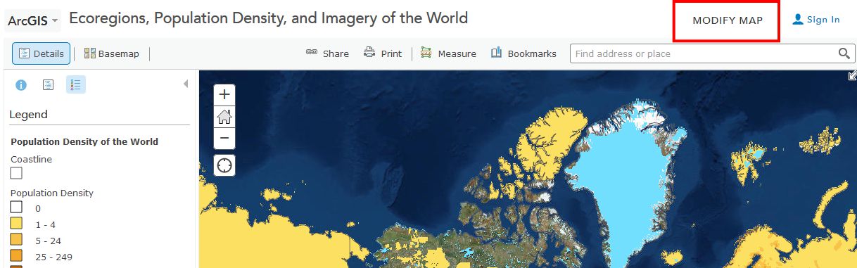
Take some time now to explore the About, Content, and Legend buttons directly above the Legend. Get comfortable with what these buttons do. Zoom using the vertical scale bar at the left side of the map—the middle scroll wheel of your mouse if you have one—or by holding the shift key and drawing a box on the map with your mouse. Bookmarks are another way to zoom in or out (change the map scale).
Now use Bookmarks (just left of the search bar at the top) and select World. Show the map legend. Your map should look like this:
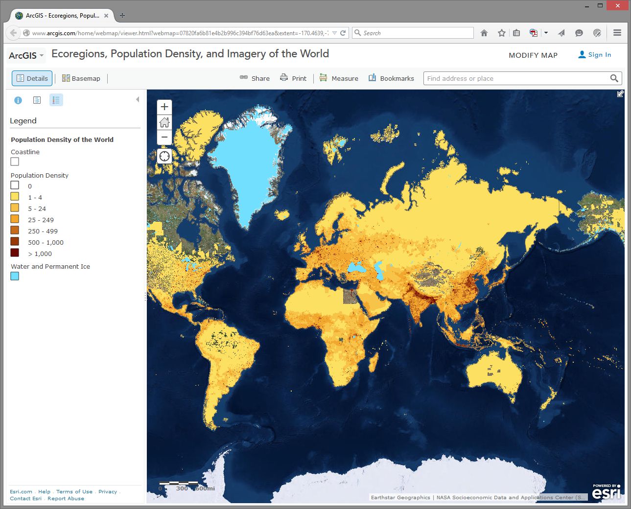
How would you describe the pattern of world population density?
Change the Basemap back and forth from Imagery to Terrain With Labels so that you can refer to country and city names that are part of the Terrain with Labels layer.
- As we will discuss later in this course, knowing where data comes from is, to put it into geographical terms, a Very Big Deal, particularly with maps. To start thinking along these lines, examine the “details” of the population density layer by clicking the right arrow next to the layer and selecting Description.
- Who created this data, and what sources did they use?
Use Bookmarks and select India-Nepal. Toggle between population density and the imagery base map. Try making the population density layer transparent by clicking on the small right arrow next to the layer name, selecting Transparency, and using the slider bar that appears.
- What is one reason you can think of for the difference between the population density in northern India compared to that of Nepal?
- Use the Measure tool and determine the distance between the area of highest population density in India to the area of lowest population density in Nepal. Be sure to note the distance units you are using (miles or kilometers).
- Switch from the Legend view to the Contents view and turn on the Ecoregions layer. Turn the Population layer on and off and note the predominant ecoregions in the most densely settled regions of northern India. Also, explore the relationship between population density and major rivers. How do you think the dense settlement here may have an effect on the ecoregions of this area?
- Describe the ecoregion and the population density in the region in which you live using the map. How does the population density compare with your earlier observation where you were asked to reflect upon the population density of your area without the aid of a map?
Exploring Population Dynamics (That’s A Lot Of Babies)
Let’s take a deeper look now at how population is changing all over the world and explore what might be driving those patterns.
Use the Add button, then Search For Layers and search for: World Bank Age and Population in ArcGIS Online. Select the one authored by “Intl_User_Community.” Then click the big blue Done Adding Layers button at the bottom to add this layer to your map.
First, select the Content button to show the map layers instead of the legend. Then, expand your newly added age and population layer by clicking on its title and then click on Age Population. You will see that this map is actually a set of 10 layers (ideally, every map should be turned up to 11 though). Uncheck any layers in this set of 10 that might already be selected - we want to start with a clean slate.
Next, select the checkbox for the Annual Population Growth Percentage, show the legend by clicking on the layer name, and note how much the growth rate varies around the world. Make sure that no other layers listed before this one are turned on, since those could obscure the layer you want to see. Now turn on Age Dependency Ratio. Age Dependency Ratio [53] is the ratio of dependents (people younger than 15 or older than 64) compared to folks in the working age population (15-64). Click the Age Dependency Ratio layer name to display its legend. Your map should look similar to the one shown here:
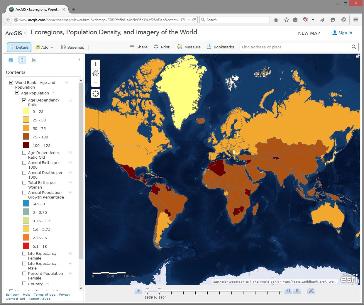
Which statement is correct?
- Countries with a higher growth rate typically have a higher age dependency ratio.
- Countries with a higher growth rate typically have a lower age dependency ratio.
Why do you suppose the growth rate and age dependency ratio are related in the way that you've indicated above? The percentage of working age population is also known as the “dependency ratio,” because this number represents how much of the population (young and old) that is dependent upon the working age population.
- What impact do you think a high population growth rate has on a country?
Note that these data sets go back in time—to 1960 in some cases. My parents were born in 1960. Every photograph automatically looked like an Instagram back then. You can use the arrows in the popup boxes to access the different years. You can use the slider bar under the map and the play button to animate the data over time, or slide the marker all the way to the right to 2014 to display the most recent data. So with these maps you can examine not only the spatial dimensions, but also the temporal ones.
Pick a country that interests you and examine the growth percentage and life expectancy in that country over time. If you’re a rockstar student you’ll share something you discovered with your peers in the discussion forums. You can always click on the Share button to get a link to embed in your post.
- Recall your recent reading about map projections. This map uses the Web Mercator projection. How are the areas near the North and South Pole shown on this map?
- How does the projection that this map is using affect your interpretation of what you are studying?
Geodemographics – Having Fun With Stereotypes
The statistics you are examining about population tell only part of the story about the people in those places, of course. People live and behave in ways that might be described with a combination of variables, not all of which are captured on census surveys. One of the ways to measure this aspect of demography is through the creation of a variable that captures a “lifestyle” by neighborhood. It is this variable that marketing folks often use to send you forty catalogs of gourmet food products and coupons for discounted hair transplant surgery (wait - you mean that’s just me?). Marketing folks use this stuff to help determine what is stocked on your local stores’ shelves, what types of cars or bicycles or breakfast sandwiches are sold in your area, what sorts of movies are shown, and a whole lot more.
Go to Bookmarks and select the North America bookmark. Turn off all map layers. Then use the Add button and search for the data layer called Tapestry in ArcGIS Online. The “Tapestry segment” is one of these lifestyle variables we have been discussing. Add the USA Tapestry Segmentation (Mature Support) layer to your map (it should be the first result in your search results list). Zoom in and out a couple levels and watch what happens to your map (you should see counties turn into states as you zoom out to show the entire world).
Click on the state you live in (or, if you live outside the USA, pick one that sounds cool). What is the predominant tapestry segment for your state? In the popup box that appears, select See full description to learn more about how that segment is defined. Your map should look something like this:
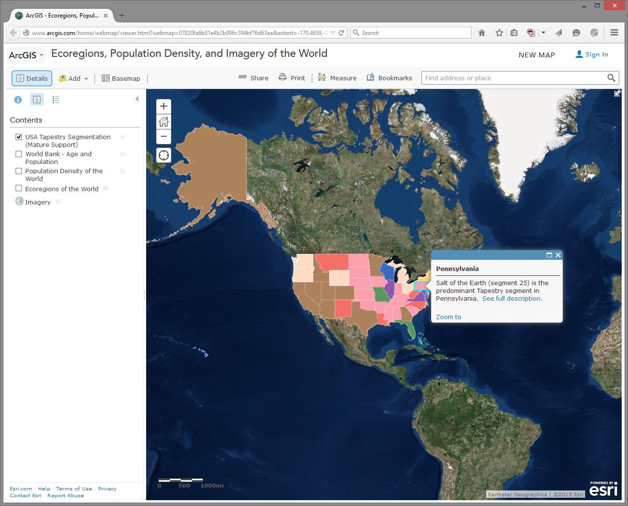
- What is the tapestry segment of your neighborhood or a neighborhood you are interested in?
- Would you say that the tapestry segment describes you accurately? Does it describe some of your neighbors? Does the segment description make you laugh, or laugh nervously?
- What influence does the map scale have on the data you are analyzing?
Now change the Basemap in the neighborhood you are examining to Imagery and then make the Tapestry layer semi-transparent.
Is there anything on the imagery that gives a clue as to the neighborhood’s lifestyle? What do the structures and streets tell you about this place?
If you have time, feel free to explore additional data layers inside ArcGIS Online. We’ll be using it throughout this course, so if you can become more familiar with it now, it will serve you well later. Add other population data of interest to you, such as median income, median age, and median home value. Do these variables help explain the tapestry segment of your chosen neighborhood and surrounding ones?
Congratulations – You Just Made Some Maps!
Awesome job. You have just been using maps in exciting ways to explore the relationships between the environment and people and to examine components of the population, using a web mapping system. Along the way, you have considered scale, data, the map projection, and other geographic concerns.
Credit Where It's Due
This lab was developed by Joseph Kerski [54] and Anthony Robinson [55].
Discussion Prompts
Privacy and the Geospatial Revolution
Have a look at a map that was created by students who took this class in 2015. [56] This map shows student's self-reported locations and some basic demographic information. It's incredibly interesting and helpful for me as the instructor, because now I have a better sense of all of the amazing places where people were experiencing this course. Some shared what seem to be very specific locations (down to a specific house, for example). Others shared locations that seem to be much more generic. People have always had conceptions of private and public space, but geospatial privacy is more relevant than ever due to the proliferation of ways in which your personal location can be shared.
Here are some prompts you can use to discuss what you've learned in this lesson:
- Why did you feel comfortable sharing what you shared?
- What is scary about potentially losing control over your geospatial privacy?
- What are some positive things that could come from openly sharing your personal location with others?
- What about geospatial privacy has really changed over time? 200 years ago, would it have been possible to live in your current location without your friends and family knowing where you were most of the time?
- Have a look around at what people submitted for answers to the question “How do you use maps?” Are there spatial patterns associated with certain types of answers?
Lesson 2: Spatial is Special
Lesson 2, Lecture 1
Spatial is Special

Leading off with a cliché is always dangerous, but I do really believe that Geography as the science of place and space depends in part on the axiom that what is Spatial is Special. This Lesson focuses on spatial thinking and spatial relationships that underpin everything we try do to with mapping and geographical analysis. A lot of this stuff will seem like common sense when you see the examples, and other aspects are likely to represent a new way of thinking about the world.
Most sciences have associated laws and axioms that govern fundamental principles and methodological approaches. In Geography we really just have one: Tobler’s First Law of Geography. In 1970, in a paper describing an urban growth model for the city of Detroit [57], Waldo Tobler proposed “the first law of geography: that everything is related to everything else, but near things are more related than distant things.”
If this law makes you say, “Well, yeah, duh!” – Great. That’s how I felt when I first encountered it too. Of course that’s true, as it makes perfect sense when you think about any possible example. I’m more likely to interact with people in my neighborhood in Central Pennsylvania than I am to interact with folks in Kolkata. The law of course extends well beyond stuff related to humans – you can expect animals, plants, and people sending too much email to each other to generally follow this law as well. Note that Tobler is talking about relationships between things. Near things are more related, but that doesn’t mean they’re necessarily more similar. The measure of similarity of observations that are close to one another is called spatial autocorrelation. While it’s not necessarily true that stuff nearby is in fact similar, there are often aspects of similarity that can be observed and measured (e.g. there are a lot of people at Dulles Airport who wear those annoying Bluetooth headset things, and they often buy very large Soy Lattes at Starbucks).

Plenty of studies have attempted to formally evaluate Tobler’s Law, and there remains consensus that it is a fundamental principle of Geography. It turns out that it even extends to something like Wikipedia if you explore the spatial relationships that underpin thousands of its articles [58].
So I think it’s quite clear that Spatial is Special, and it’s what helps separate Geographic analysis from all other forms of investigation. We aim to take location into account and leverage what we know about spatial relationships to answer questions.
However, I’d be remiss if I didn’t point out that Geographers are a really self-conscious lot (we cry if someone shouts), and there’s been considerable debate on whether or not Spatial is Special (maybe if we exclude the IT part? [59]), and whether or not Tobler’s Law is really a law [60] after all or if it matters. I’m pointing out these debates here to acknowledge that my perspective, while it’s certainly the most common one in Geography, isn’t the only valid point of view. Academics love some navel gazing, that's for sure.
Thinking like a Geographer
(by thinking Aspatially)
Chances are that you already think like a Geographer all the time, you just don’t know it yet. You compare places to one another based on their distance and their similarity across a range of attributes. You talk with your friends about Red States and Blue States [61] whenever there’s a Presidential election. You decide where to buy a house based on how long it takes for you to drive to the nearest delicious breakfast food [62] and based on which school district it’s in.
But I want you to go a couple steps deeper here, and a good way to do that is to first try to ignore space and place entirely while exploring a problem. Consider the following dataset:
| # of Annoying People | Total Population | Average Age | Average Income | # of SUVs | County | State |
|---|---|---|---|---|---|---|
| 72 | 998 | 26 | 48000 | 72 | Hatchback | Wholefood |
| 48 | 2000 | 65 | 32000 | 48 | Dialupia | Wholefood |
| 776 | 2250 | 44 | 72000 | 750 | Sriracha | Traderjo |
| 789 | 3500 | 36 | 12000 | 700 | Muffintown | Wholefood |
| 469 | 1200 | 31 | 22500 | 461 | Fixieplaid | Traderjo |
| 525 | 1400 | 43 | 66000 | 400 | Burb-on-Burb | Wholefood |
| 62 | 65 | 33 | 92000/td> | 59 | Bluetooth Village | Wholefood |
| 2300 | 16450 | 51 | 35000 | 1950 | Pabsto | Traderjo |
| 9654 | 52510 | 44 | 49000 | 8912 | University Collegeville | Traderjo |
| 779 | 1459 | 41 | 61000 | 398 | Kingo | Traderjo |
What are some things we could do to analyze this information *without* considering anything spatial? For starters, we could count how many annoying people exist (14,695). The overall rate of annoying people as compared to all people can be calculated (~18% of all people in this dataset are annoying). We could determine the average age of this sample dataset (~45 years old). You get the idea.
I’ll bet almost anything (a bag of the best Gummi bears ever [63]) that you’re finding it hard to ignore the spatial stuff that’s inherent in this data. You want to see these counties and states, compare them to one another, identify the possible urban areas and rural locales, explore possible cultural differences, etc… If so, then congratulations, you’re a spatial thinker! If not, then allow me to demonstrate further.

This is a map of the fake states and counties from Table 2.1. The top row of counties is Muffintown, Bluetooth Village, and Dialupia. Below that is Hatchback and Burb-on-Burb. These 5 counties make up the state of Wholefood. Below Wholefood is the 5 counties of Traderjo. The first row of Traderjo is Kingo, University Collegeville, and Pabsto. Below that is Sriracha and Fixieplaid.
Here’s the basic Geography of my fake states and counties.* Now you are able to compare the relative distances between places, right? Let’s overlay some additional information here to give you more context. I’ve made a little population map using graduated circles (each circle size represents a given range, so the smallest circle size here would include everything from 0-1000). Next to it I’ve made a choropleth map (not chloropleth – there’s no chlorine in this map). Choropleth is a fancy way of saying “colored areas.”

This map estimates the populations of each county. It shows that Bluetooth Village and Hatchback have the 2 smallest populations, at between 0 to 1000 people. Muffintown, Dialupia, Burb-on-Burb, Kingo, Fixieplaid, and Sriracha all have populations between 1000 to 3000. Pabsto has a population between 3000 and 10000. University Collegeville has a population between 10000 and 50000.

This map estimates the percentage of each county's population that owns SUVs. In Muffintown, Dialupia, Hatchback, University Collegeville, and Pabsto 0 to 25% own SUVs. In Burb-on-Burb, Fixieplaid, and Sriracha 26 to 50% of people own SUVs. In Kingo 51 to 75% of people own SUVs. In Bluetooth Village, 76 to 100% of people own SUVs.
Now that you’ve seen both of these maps, what can you start to say about possible spatial patterns? What other maps would you want to see in order to answer questions about this data? For instance – I’d want to know the location of major roads and businesses. I’d want to see how the population relates to those features. I’d want additional data showing the # of fancy coffee places in each county so I could compare SUVs to Coffee and see if I could develop a community profile much like the ones you explored in Lab 1 [64].
I’m sure you’re thinking spatially now. If you still think this is crazy talk then maybe we’re just not meant for each other after all. :(
*Want to know why I’m using hexagons? Check out Central Place Theory [65].
Lesson 2, Lecture 2
Spatial Relationships
To have a science of place and space, and to investigate whether or not Spatial is Special, you need to set some ground rules for what is possible when it comes to spatial relationships. Spatial Topology is the set of relationships that spatial features (points, lines, or polygons) can have with one another. To make this pretty dry topic a lot more interesting, let’s consider spatial relationships using our personal relationships as a metaphor.
Some common spatial topological relations include:
Equals – A is the same as B
When we first met each other, we felt like we were “one.”
Touches – A touches B
Our first kiss was gentle – no tongue.
Overlaps - A and B have multiple points in common
During our honeymoon we… <deleted>
Contains – A contains B
For 9 months the baby was inside (and much quieter).
Disjoint – A shares nothing with B
Later on, we got sick of each other and watched TV from opposite sides of the room.
Covers – A covers B (or vice versa)
The dog sleeps on top of me, creating a huge amount of heat.
Crosses – A and B have at least one point in common
Although we both know how to find our way home from the grocery store, the only routing point we have in common is our driveway.

This list isn’t exhaustive, but it’s a good starting point. If you really get excited about this stuff (congratulations on being single!) then there is a ton of literature out there to review. I recommend starting with this paper [66] and spiraling out from there.
This stuff may seem a bit dry, but it’s really important because it formalizes the ways in which we can expect things to interact in space. Moreover, knowing all of the possible spatial relations allows us to create great software tools that can take these relationships into account.
Consider what would happen if we didn’t take these relationships into account. Let’s say you have 500 road segments that you’ve digitized to show your neighborhood’s streets. In order to ask a GIS to identify a driving route from one house to another, all of those road segments have to “know” how they are related to one another. So if your street intersects with the next street, we have to specify how both routes are topologically connected. This is how Mapquest or Google understands that when you leave a highway and go on an offramp that there are certain possibilities for navigation (the offramp is a one-way route and connects to a cross-street), and other things you can’t do (the offramp only allows right-hand turns at the end where it intersects with the cross-street). If you didn’t have a theory behind how things can relate, and ways to specify those spatial relations, you’d just have a zillion streets with their basic locations on Earth, but no way to actually use that information for routing.
Almost all of us have experienced the frustrating case where automagical navigation devices and websites have bad or missing topological information. We exit the highway believing we can make a left turn, but it turns out to be a one-way street and we can only go right. Much cursing ensues. Depending on how well we handle this problem, our topological relationship with our significant other may change drastically that night once we finally make it to the hotel.
Scale and Time
Scale
There are two concepts of scale that are fundamental to Geography. Let’s talk first about scale as it pertains to maps. Map scale is the ratio of the distance on the map to the corresponding real distance on Earth. You’ll often see a bar drawn on a map that says 1 inch equals 10 miles, or something to that effect. This means that one inch of distance measured on the map can be considered equivalent to 10 miles of actual distance on the Earth. It’s common to see these equivalencies written in fractional form instead of plain English, e.g. 1:100 or 1/24000. These are called representative fractions.
You learned a bit in Lesson 1 [67] about why it’s impossible to make perfect translations from the 3D Earth to 2D maps. This has an important impact on map scale. Depending on what map projection you’re using, your map scale will vary across your 2D map. This is another reason why map projections are important. Imagine if I gave you a paper map for a kayaking trip and I designed it using a projection that looked really cool but had scale varying wildly across the map (1 inch in the middle = 1 mile, 1 inch at the top = 50 miles). You might plan out your entire trip without realizing that you’re comparing completely different distances. That would be very mean of me to do, especially if there are lots of mosquitoes and you only brought one bag of beef jerky. At large scales (i.e. “zoomed in”), if you use a conformal projection [68], the differences in scale measurements are small enough to be insignificant for most users.
The second major concept of scale is a more general one. With Geography you have the power to explore and analyze phenomena at different levels of granularity. You could look at really large-scale (1:100) patterns in a neighborhood, or you could look at really small-scale (1:10,000,000) patterns across multiple countries. You did that last week in the lab assignment when you looked at Tapestry data at state, county, and finally neighborhood levels. At each scale the story you could tell totally changed, didn’t it? This kind of scale is often called the scale of analysis by Geographers, as opposed to the specific map scale that refers to how reality is directly translated by a map.
What About Time?
Geography requires space and spatial relationships in order to exist, but it also requires attention to time. Practically all geographic problems take place through some sort of dynamic process – meaning that things are changing from Day 1 to Day 100, for example. If you think about how most maps are made, this presents a problem, doesn’t it? How do you show changes over time? What if you don’t have data for every time step?
It’s outside the scope of this course to delve very deeply into this topic, but I want you to be aware of a couple of key examples so that you can understand the impact that time has on every map you read (and every map that you make).
I am still amazed that we can now poke around tons and tons of high-resolution satellite imagery to look at the Earth from above. Back in the old days when we had to yodel over the phone [69] to connect to the internet, this kind of thing was a total pipe dream. Anyway, let’s do a little exploring right now to have a peek at how time is inextricably linked to Geography.

In the first example here, I’m playing around on Bing Maps [70] to look at satellite imagery of Salzburg. My Grandmother was born in Salzburg, met my Grandfather there after the war, and a lot of my extended family lives there today. A summer afternoon on the rooftop at the Hotel Stein [71] is an unforgettable experience if you ever have the opportunity. But I digress. Check out what’s happening on the west side of the city; see how it looks like two pictures have been abruptly slammed together?

Furthermore, they’re of considerably different quality as well. The stuff on the west is blurry compared to the stuff on the east. So there’s a quality problem that’s immediately apparent, but there’s a bigger issue that you should always pay attention to – look at the lower right corner on any mapping service like this and you’ll see a copyright notice identifying who took the images and when they were copyrighted. In this case, there are two different sources cited from different times (2012 by Nokia and 2013 by Microsoft).

The images were taken at different times and from different sensors. This could be a good thing if you had complete coverage from both times and you wanted to look at changes happening to Salzburg, right? But it’s often the case that Geographers have exactly this sort of scenario where you have part of your data from one time and part from another, without any overlap at all. We don’t know when exactly in each year, but they could be taken during completely different seasons (which would explain some of the color differences), not to mention during different years.
The bottom line here is that time is an important factor to consider, and it’s rare to have perfect information covering every place you want to explore for every relevant time period. It doesn’t mean that you can’t make a useful map. Remember when you worked with demographic data in the Lesson 1 Mapping Assignment [72]? All of that data was based on snapshots at particular times, and frequently you were mixing together measurements taken at one time with measurements taken at another. The Geospatial Revolution has brought us closer, but we’re still a really long way away from having real-time Geographic information about everything at every second.
Video Activity
This Lesson's video assignment is to watch Chapter Two, from Episode Two of the WPSU Geospatial Revolution series [73]. This video highlights how businesses are using geospatial technologies to support better customer service and efficient operations.
Mapping Assignment
Changing Landscapes, Sharing Maps, and Fun With Projections
In this lesson you reflected on spatial relationships across space and time. This lab gives you the opportunity to practice these concepts using GIS tools. GIS was originally created way back in the 1960s to analyze these kinds of relationships. Sure, you could analyze spatial relationships via paper maps or plastic transparencies, but that’s clunky (ever tried to fold a paper map back into its original shape?). And what if you want to change the variables, or the way the data is classified, or the map scale? A GIS gives you the flexibility and power to analyze lots of data efficiently.
Ch-Ch-Ch-Changesm(sorry)
One type of change that is evident all around us is physical change and demographic change in our own communities. Think about your own community:
- What has changed since you moved there? What forces are causing that change? How did your community look in terms of the people who live there and the uses of the land in your community 10 or 100 years ago?
- How will your community look in 10 or 100 years? Could any of these changes be mapped? How do these changes compare in magnitude and scale from those changes in other parts of the world?
Unless you have been living under a rock since the 1950s, you know about space probes that have been launched to observe the Moon, Mars, and other objects in our own solar system and beyond. Since the early 1970s, satellites have also been launched specifically to observe the Earth. Some observe oceans, while others observe agricultural health, atmospheric composition, weather, or other phenomena. The first of these was Landsat [74], short for “land satellite.” Landsat became a series of satellites operated by NASA and the US Geological Survey since 1972. Landsat observes the Earth in the visible and infrared portions of the spectrum. In an infrared image, healthy vegetation appears red, cities appear gray, water appears black, and other interesting colors appear as well. The point is not actually to create weird colors, but that the infrared imagery allows for changes to be detected easily on the landscape, such as urban sprawl, agriculture, deforestation, and fluctuations in water elevation.
Open a web browser and access the Esri Change Matters site [75].
Change Matters uses Landsat imagery and ArcGIS Online. You should see three side-by-side web GIS maps, similar to the image below.

The first set of scenes is that of Mount St. Helens from 1975 and 2000. Use the information provided in the link at the lower right "how to interpret a change image" if you need it, to answer the following questions:
- Describe a few changes you observe in Mount St. Helens from 1975 to 2000.
- What do you think is the reason for those changes? Google about St. Helens if you need to.
Using the search box above the images, enter "Aral Sea."
- Describe the changes in the Aral Sea.
- What do you think are the reasons for those changes? Do some more research if you need to.
Now, examine other places around the world using this resource. What does your hometown look like?
Zoom in on one of the Change Matters image sets. The spatial resolution of Landsat imagery is now 30 meters x 30 meters (it was coarser in its earliest iterations). So, while you can’t peep on people sunbathing at this resolution, you can detect large changes across the Earth’s surface.
To share a map from the Change Matters site: click on the green box icon at the top right of the interface. That will give you a URL you can share, and those Twitter/Facebook buttons work nicely too.
Scale Matters
Now, head over to ArcGIS Online [76].
You are looking at the Northeastern Junior College campus in Sterling, Colorado. Click the Content button at the upper left of the interface to see the map layers that you have at your disposal. You should have Map Notes, USA Topo Maps, and Imagery with Labels.
Click on the pushpin at the intersection of the paths that form an “X” on campus. In the popup box that appears, you should see some notes and a photograph taken on the ground. In a few minutes you’ll create your own map notes and popups. Click on the photograph. You should be directed to a new website.
- What website was the photograph linked to?
Unlike the Landsat images, this satellite image was taken in the visible spectrum. It comes from a satellite operated by DigitalGlobe [77], and it has a much finer resolution than the Landsat imagery. You could definitely use this stuff to count the number of dog turds in someone’s lawn.
- What is the smallest object that you can see on this satellite image?
Now go to Bookmarks and select Sterling. You should now be looking at the town of Sterling, Colorado, with the USA Topo Maps layer as semi-transparent. Earlier, you used a side-by-side set of images to detect change over time. Here, using transparency on layers is another way you can look at change over time. Click the small arrow next to USA Topo Maps in the list of layers and adjust the visibility of that layer by clicking on Transparency and then drag the slider around. The USA Topo maps layer is a USGS [78] topographic map; and in the case of Sterling, the map was created in 1971. Your MOOC instructor was -9 years old at the time.
- Describe two changes you can detect in the town of Sterling from 1971 to 2011.
Now examine the Northeastern Junior College Campus, comparing the current campus as seen in the satellite image to the features on the 1971 topographic map by sliding the transparency control back and forth for the USA Topo Maps layer.
- What feature occupied most of the campus back in 1971?
Until now in our lab assignments you have been using maps and layers created by others. One of the revolutionary things about today’s mapping methods is that you can create your own content, save it, and share it with others quite easily. Let’s start doing that now. To do so, click on Sign In in the upper right hand corner of the map that you are examining.
Your screen should look similar to the one shown below. If it doesn't, navigate to the ARCGIS home page [79] directly.

At the lower left, click the link to Create a Public Account. Follow the steps there to create your account. Where it asks you to name the Organization you're part of, you can just say "Coursera" there. You will also need to give Esri a phone number, but you don't have to give them a real one. Just plug in 999 instead. You also need to review and accept the terms of use before you can click Create My Account. Once you have created your account, you should be automatically logged in. It should drop you at a page where you can edit your profile details if you'd like.
None of this will cost you any money, result in 40 catalogs sent to your house or anything crazy like that – it’s just a way for you to be able to upload stuff, save your maps, and share things more easily.
Now that you are signed into ArcGIS Online, you can do everything that you have been doing last week and earlier in this current lab exercise, but now you can save your maps. You can build on them as you see fit. And because these maps live online, you can share them with colleagues; you can embed them into your own web pages, you can create web applications from them, and you can reduce your cholesterol by 30% while improving your ability to sing opera. But let’s not get ahead of ourselves: let’s begin with those pushpins, popups, and embedded images and links that you were examining earlier by creating your own. On the menu bar at the top of the page, click Map to continue.

Navigate now to a different location in the United States that is of interest to you. If your map still is titled “Northeast Junior College” then click on “New Map” to start creating a completely new map. I would navigate to Princeville, Hawaii because it’s freaking [80] awesome [81]. Add the USA Topo Maps layer from ArcGIS Online (uncheck the "within map area" option) and compare the Imagery layer from the Basemap to the USA Topo Maps layer for your chosen location. Zoom to a location where you can observe change on the landscape between the topographic map and the satellite image.
Add a pushpin, some text, an image, and a link to a point by following these steps: Using the Add button, Add Map Notes and select Create once you’ve given it a name. Select a Point, Line, or Areas from the Add Features menu. Click on the map then to add your point, line, or area to the map. Fill out the popup box that appears with the following:
- An appropriate title.
- A description of the changes on the landscape that you observe.
- Find an image of that community or your chosen location and enter its URL in the “Image URL” box. Note that this image URL should be a link to a JPG, PNG, TIF, or other image.
- Enter an Image Link URL that will take the reader of your map to an appropriate website. The website could be the government site for that community, a local restaurant that you think embodies that place, or whatever else you see fit to use.
Exit the Add Features panel by clicking the Close button at the bottom right corner of the popup. Test your popup by first exiting the "edit" mode and then clicking on your map note. You should see your note title, text, and image. Click on your image - you should be directed to the website that you selected.
Now go to Bookmarks and set up a few bookmarks at different locations and scales in your chosen community. You can do this by clicking Add Bookmark in the Bookmark list, type in a name, and hit Enter to save it. It'll use the map settings at that moment to make a Bookmark, so you'll need to navigate, change your layers, etc... before you add a specific Bookmark.
Once you’ve added a couple map notes and bookmarks, save your map by clicking the Save button. Give it an appropriate title. If you call it “Map” that’d be pretty lame.
In the Tags area you can enter keywords to help people discover your map. In the Summary field you can write a short description about your map that will be helpful to the readers of your map. This is known as the map’s metadata—information about the map. It is sort of like the list of ingredients on a bag of chips.
- Why do you think it would be important to spend time adding metadata like this?
Next, let’s make your map viewable to others: using the Share button, share your map with Everyone. Write down or copy the URL of your map to your clipboard. You can give this to anyone and they’ll be able to load and use your map.
Now click on the ArcGIS in the top left corner of the interface and select My Content. You should see your map listed in your content. In subsequent labs, your content will grow as you create more maps.
Finally, let’s test your map: First, make sure you copied that URL for your map that you created when you shared it just a minute ago. Next, Log out of ArcGIS online. Open a new web browser frame. Add your map URL to the address bar in your browser and see if you can access your map without being logged into ArcGIS Online. This is possible because you shared your map with everyone in the step above. While you are in your map, test your bookmarks.
- Have you made something great? Feel free to share the URL of your map with a friend or classmate and describe what you’ve created.
Examining Resolution
As you learned in the reading this week, different locations on the planet contain different data at different resolutions. You saw a satellite image of Salzburg that featured two different resolutions, and earlier in this lab, you saw that the USA Topo map resolution was at a lower resolution than the imagery.
One reason why maps are noteworthy today is that you can easily create your own content. And so can others - this is commonly called crowdsourced data or volunteered geographic information. In the not too distant past, the only geospatial data providers were government agencies and nonprofit organizations. Nowadays, everyone is empowered to create their own data and share it. Esri has a program called the Community Maps program where folks can contribute content to a topographic basemap.
Log in to ArcGIS Online and start a new Map if you aren't already there. Change your Basemap to Topographic (it may already be set this way by default, that's OK too). Use the search box to search for the following address: 1000 Broadway, Boulder, CO. You should now be in Boulder, Colorado. Broadway is the street that runs from the southeast to the northwest across this part of Boulder. Compare the detail to the northeast of Broadway to the map details shown to the southwest of Broadway.
- Which part of the map – to the northeast of Broadway or to the southwest of Broadway—contains a more detailed basemap?
- What is the most detailed feature that is visible in the higher detail section of the basemap?
The higher detail section of this map was contributed to through the community maps program [82].
Recall that you populated the metadata with information about the map that you created.
- Now that citizens are contributing data to the spatial data “cloud,” what are the implications of data quality?
Projections Aren’t Just To Make Maps Pretty
Everything in a GIS is tied to a specific location on the Earth’s surface. All of those locations are measured based on a mathematically-computed map projection. Recall from Lesson 1 where we talked about why transforming stuff from the 3D globe to a 2D map requires some transformation (and therefore compromises).
The map projection that you use makes a big difference in your spatial analysis. If you are creating zones that consider Tobler’s First Law of Geography and want to determine which things are near other things, you usually create areas of proximity, or buffer zones around map features. These could represent the areas within 100 kilometers of the earthquakes of at least magnitude 7 that have occurred over the past year, for example, or areas within 100 meters of rivers in your local community. Those zones that you create, as well as everything else you do and create in a GIS, are all dependent on the map projection used. Using different map projections will yield different results. The results might not matter so much at a small scale for, say, the list of cities within a certain climate zone, but they would matter at a large scale to determine, say, all of the natural gas pipelines underneath a school building that you would need to be careful about when constructing a new library.
Now I’d like you to start a New Map, zoom out to show the whole world, and compare the size of Greenland versus that of South America. Greenland looks larger than South America, doesn’t it? Greenland is actually only about 12% as large as South America (~2 million square kilometers vs. ~17 million square kilometers). Why does Greenland look huge? The default projection in ArcGIS Online is a modified version of a Mercator [83] projection. In the Mercator projection, latitude and longitude lines are conveniently shown as straight lines and it allows us to plot navigational directions in straight lines. But as you can see, objects near the poles are really distorted.
Next, expand the ArcGIS list in the top left corner and click on Groups. Groups are, as the name implies, sets of maps with a specific theme. Click on the Search box in the top right corner and select Search For Groups and then type Projected Basemaps into the search field before hitting Enter. Click on the group name "Projected Basemaps" to open this group and you will see two pages of projected basemaps. Browse these basemaps and open a few of them. Each is based on a different map projection. Think about the advantages and disadvantages of each projection. The map projections represented here are just a few of the thousands of map projections that exist. Why so many? Each projection has advantages and disadvantages. Each projection preserves some, but not all, of the following properties: Area, shape, direction, bearing, and distance.
- What map projection do you like best, and why?
- Which map projection would be best to analyze tsunamis in the Pacific Basin? Why?
Wrap Up
Nice work! In this lab you’ve examined issues of resolution and map projection. You also explored issues related to change detection in Geography. And you created your own map with your own content and shared it with others. That’s pretty cool, huh?
Credit Where It's Due
This lab was developed by Joseph Kerski [54] and Anthony Robinson [55].
Discussion Prompts
Change Matters In Geography
As food for thought, I suggest building on what you've done in the mapping assignment [84], so if you haven't yet completed that assignment, make sure you do so now. The lab in this lesson focused on change detection, and I want you to find and explain the changes taking place in parts that we didn't explore during the lab activity. Then I'd like you to review what your classmates have posted and weigh in on their explanations and/or provide additional examples.
- Share map links with your classmates that shows another area (that we didn't look at as part of the lab assignment) where you've detected interesting changes, and describe your rationale for explaining those changes.
- Review the maps and explanations that your classmates have posted. Do their explanations make sense? Can you find another example in a different place that shows the same types of changes?
- Find and share a map you've come across on the web that you think does a nice job of showing and explaining Geographic changes. What works (or doesn't) about its design?
Lesson 3: Understanding Spatial Data
Lesson 3, Lecture 1
Spatial Data

Understanding Spatial Data
In this lesson we’ll focus on spatial data itself – it’s what makes maps possible. To be a fabulously awesome geographer you need to understand how spatial data is created, who makes it, and what its limitations are.
Where are we now?
It all begins with measuring location. Back when dragons prowled the oceans [85] and headache relief was achieved by drilling a hole in your head, location was measured rather simply by taking angular measurements using the sun, moon, or stars. These methods are still taught and used [86] by some today, but since this MOOC isn’t about sailing a Sloop to pick up spices in the Orient, I want to focus instead on how locations are measured today.
You’re probably thinking, “Yeah, I know, everything uses GPS to know where things are.” And if I asked you how GPS works, you’d say, “Yeah, Google invented it and there are Magic Laser Genies that send location beam particles to my iPhone.” And that would be incorrect.
The Global Positioning System (GPS) is no doubt one of the most important methods we have available today for measuring locations. GPS is the system designed by the United States starting in the 1970s, originally for military purposes, to provide location services around the world using satellites. GPS is one example of a Global Navigation Satellite System (GNSS). There are several others, like the Russian GLONASS (jeez, awkward acronym - comrades) system or the European Union’s Galileo system. Every GNSS works using the same general principle. You need a network of satellites in space to broadcast signals down to Earth that include position information about the location of each satellite as well as the exact time when the signal was sent. A GNSS receiver (like the GPS antenna on your fancy phone) can listen for these signals and compare the times/locations from multiple satellites to triangulate your exact location on Earth.
There’s much more to learn about GPS and GNSS [87] if you’re so inclined. It’s quite a bit more complicated than my explanation might imply. For example, these systems only work when you have line-of-sight to a collection of satellites (which is why your Garmin is no good if you drive into a parking garage), and there’s an enormous amount of math going on to deal with signals that are constantly moving while you are moving yourself. You can also combine these satellite signals now with cell phone tower signals, wi-fi signals from routers, and other sources to improve accuracy and coverage.
The bottom line is that in the last decade it’s become much more likely for normal people to have access to handheld devices that use a GNSS to determine locations. The consumer-grade stuff you have in your phone or car can figure out where you are to within a few meters in some conditions, while in others you may be several hundred meters off target. Professional surveying equipment using big antennas and fancier computing hardware/software can be accurate to within several centimeters. If you’re trying to find the nearest curly fries while you’re sailing down the highway on a road trip, consumer-grade accuracy will do just fine. If you’re deciding exactly how much property tax someone should pay, you want to have the hardcore professional stuff.
If I use the GPS on my phone, I can see that I'm sitting at [88] Latitude: 40.77004, Longitude: -77.896744 in my house writing this lesson. If I save that information I’ve effectively got a point location on Earth. If I walked around my house collecting multiple points, I could create a polygon by connecting multiple points. If I collected points in a row walking the shortest distance straight from my couch to the fridge (to retrieve delicious chocolate pie [89]) I could connect them and have a line feature. These three location types (point, line, and polygon) comprise the spatial data foundations of modern Geographic Information Systems (GIS). They are considered vector data, because they can represent any kind of geometry. The other major data type is raster data which we’ll cover in the next section.
The Earth from Above
The proliferation of Virtual Globe tools like Google Earth [90] has made imagery of the Earth more accessible than ever. This new mapping technology has also coincided with rapid advances in civilian satellite and airborne imaging systems that can provide extremely high detail images of the Earth. You can even build and launch your own little DIY Drone [91] and create your own imagery quite easily.
Geographic image data is raster data, which captures information by assigning values to cells in a grid. A satellite in space can detect visible light or other invisible parts of the electromagnetic spectrum [92] (infrared heat, for example) and assign values to each grid cell to develop an image. The size of those grid cells has an impact on how much resolution (detail) you have in the final image. Some satellites have a 30 kilometer resolution, meaning each grid cell is 30 km x 30 km in size. This is fine for mapping entire countries and stuff like that, but if you want to spy on what’s in your neighbor’s back yard, you’ll need a sensor that can resolve 10 centimeters x 10 centimeters, right?

The science and technology associated with imaging the Earth from above is called Remote Sensing. It’s a thriving discipline focused on developing new ways of imaging the Earth as well as methods for interpreting and analyzing those images. In addition to the visible photography we all know and love, some sensors use radar, infrared imaging, and even lasers to create maps. Each has its own particular utility – for example, infrared imaging is often used to map the weather and land use. The infrared image shown here comes from a NASA satellite and shows the wake of a major Tornado [93] that impacted Tuscaloosa, Alabama in 2011. The image looks kind of weird, but because infrared is not visible light, you have to assign false colors to make the image, and in this case they chose red to signify areas where vegetation exists and blue to reveal man-made features and places where there isn’t much vegetation. Both types of land use give off different infrared heat signatures that can be detected by this particular sensor.

Lasers are now used for Light Detection and Ranging (LIDAR mapping [94]). This technique is capable of generating extremely high detailed 3-dimensional models of the Earth's surface. In the examples shown here, LIDAR was used to map the coastline [95] in New York and New Jersey before and after Hurricane Sandy in 2012. With these images you can see how it’s possible to study really intricate differences before and after the storm by using this radically precise new spatial data gathering method.


LIDAR [97] has also been used by one of my favorite bands to make a really cool music video [98]. If this sort of stuff intrigues you, there are great organizations in the U.S. [99] and worldwide [100] worth checking out that focus entirely on the science and professional practice of Remote Sensing. And, you could always take a class [101]...
Lesson 3, Lecture 2
Who Makes Spatial Data?
Who Makes Spatial Data? Good question. Today, the answer is more often than not: everyone.
It used to be that the primary developers of spatial data were governments, and more specifically, the military. Defense mapping remains a really important driving force for all-things-mapped, but it’s not the only game in town anymore. Consumer-grade location technology is now widely available, so if you want to make a map, you don’t need to launch your own satellites or enlist cavalry.
In the United States, a critically important source for civilian spatial data is the U.S. Census Bureau [102]. The Census collects all sorts of boundary (points, lines, and polygons – remember?) and attribute data during each decennial population census. These boundaries and their associated attributes allow industry and academia to study changes in population and to analyze social, economic, environmental, and health problems.
The business community often takes these public spatial datasets and modifies them for use in commercial applications. For example, you worked with Esri Tapestry data [103] in the Lesson 1 Lab assignment. Tapestry segment categories (like “Sophisticated Squires [104]” and “Dorms to Diplomas [105]”) are developed using combinations of Census population data [106] such as median age, average income, and home values along with other data sources gathered by private firms that focus on defining other consumer-related variables (most common makes/models of car in a county, for example). Because you’re cool and signed up for this MOOC, you got access to the Tapestry data for free. The idea, however, is to sell specialized data sets like Tapestry to businesses that are looking to improve their market share through location intelligence [107].
In addition to governments and industries that create tons of new spatial data all the time, there’s something more exciting that’s begun in the past few years. You’re creating new spatial data every day, whether you know it or not. Most mobile phone contracts allow for carriers to track your movements [108] and what you do with your device all the time. This information is then stored and analyzed [109] to try and sell you stuff, to design better devices, to sell you more stuff, and… to sell you stuff to go with your other stuff.
So you don’t have a phone, therefore nobody is tracking you? Well, if you’re reading this on the Coursera site, your IP address location [110] is logged. Granted, determining locations from internet site logs is not as tidy as tracking someone with a GPS (certainly less awkward to explain than if your girlfriend/boyfriend finds the GPS you stuck under their bumper), but it’s enough for us to do some basic analysis on which countries have the most visitors to this course page and stuff like that. Therefore, every interaction on this course site has the effect of creating new spatial data.
Now that I’ve gone and made geography scary again, let’s focus on the good stuff that’s happening too. There are now communities of volunteers who actively create spatial data to contribute to the greater good of humanity. OpenStreetMap [111] is one such effort – which aims to create a free basemap of the world, using only volunteer contributions. The basic way this works is that volunteers map their community using GPS trackers, or they digitize roads and features using existing satellite images. Why do this when Google, Bing, and others have already done this for most of the world? Well, those services are not actually “free” in the sense that you have no right to download or re-use the underlying data. All you can do is view the maps the way those companies want you to see them, and if Google decides someday to charge you for asking for directions to your Grandma’s house, you have no right to be upset. OpenStreetMap wants to create a free alternative that can be used and re-used by anyone for any purpose. OSM data is considered to be Volunteered Geographic Information (VGI), since it is spatial data created on a volunteer-basis. VGI [112] is now cropping up in all sorts of contexts; it is quite important for crisis management, as evidenced in the 2010 Haiti Earthquake, when thousands of reports on the ground in Haiti were collected, translated, and mapped by volunteers using a mapping system called Ushahidi [113].
The power of “the crowd” to create spatial data is pretty impressive when the goals are clear and the tools to develop those datasets are usable. Check out this time-lapse video showing how volunteers worked quickly after the 2010 Haiti Earthquake to develop a detailed OpenStreetMap basemap for Port-au-Prince (a place that didn’t have widely accessible digital basemaps before the disaster struck).
OpenStreetMap - Project Haiti [114] from ItoWorld [115] on Vimeo [116].
Describing Spatial Data
Once you have location information from a GNSS, celestial surveying, or carefully studying an Ouija Board, you’ll probably want to attach some attributes to that location data. Even if you’re only interested in mapping the boundaries of something, you’ll want to describe those locations in some way (e.g. this is a county boundary line, this is a highway with four lanes, etc…).
A typical snapshot of spatial data will look something like this.

The basic spatial data items here are point locations (latitude and longitude for each Tweet). The attributes associated with each observation include the Twitter Username, the Tweet itself, and the date/time when the Tweet was posted. You could theoretically have all sorts of other additional attributes – you’d just need to define them and collect them (links to Twitter profile pictures, for example).
Beyond attributes, spatial datasets are often given broader descriptions to identify information sources, when the data was collected, its overall geographic coverage, and measurements of data quality. This data that describes the data is called metadata (have I used “data” enough in one sentence?). You often need metadata in order to understand the value of a particular spatial dataset. There are lots of existing models for defining spatial metadata, and you can read about them [117] if you pine for incredibly boring tasks. This becomes especially important when you make a map that includes multiple layers. Let’s say I’ve got road data from the U.S. Census Bureau, World Region polygons and water bodies from Natural Earth Data [118] (one of the best free sources for excellent geospatial data), and this set of Tweets that I want to map on top of those layers. I’d need to know how and when each dataset was created, and who created it, right?
The answers to these questions will almost always reveal that none of your data came from the same source, and none of it covers the exact same time range or level of detail. Fundamentally, mapping involves dealing with uncertainty at multiple levels. You may have to use data from multiple sources, each having its own relative quality. You may want to show the same phenomenon for two different countries, and have lower quality data for one of them.
Uncertainty sounds scary, but you deal with it every day. Weather predictions are imperfect, your recollection of what happened at last night’s office party is incomplete, and your dog may or may not have an accident on your new bedspread the day after you bought it. It’s OK. It doesn’t mean that maps are useless because they nearly always show less-than-perfect information. It just means that you should be a shrewd consumer of maps, and you should make sure you ask questions about their underlying information.
Video Activity
In this lesson I'd like you to watch Chapter Four from Episode Four of the WPSU Geospatial Revolution [119] series. This episode talks about the ways in which new geospatial technologies can empower community actions that go beyond what governments can (or are willing to) provide.
Mapping Assignment
Mapping Natural Hazards (And Understanding Spatial Data While We're At It)
This week you learned that an increasing amount of data is geographic. You read about and reflected on how data are collected—locations from GPS, and raster and vector data from remote sensing systems and GIS. You learned about how sensors use certain parts of the electromagnetic spectrum to provide fascinating data with which we can learn about the Earth. And the data at your fingertips on your fancy iPad is increasingly available in real time and at increasingly higher resolutions. With this vast increase in the amount of data available comes additional responsibilitu ny: yoeed to be a critical consumer of that data—and be able to evaluate data quality, decide whether you should use certain data, and know how to bring that data into a format that you can analyze.
This week’s lab gives you the opportunity to practice these concepts using GIS tools. You will be analyzing natural hazards at multiple scales. You will upload a data set into the GIS cloud. The maps you make will be glorious and compelling. Your skin will glow from your renewed intellectual energy. You will become inspired to knit a sweater with your professor's likeness on the back.
Let's Smash Some Plates
The earth is a dangerous place sometimes. The study of natural hazards gets into the nuts and bolts of Physical Geography and Plate Tectonics but is also important to Human Geography through understanding human perceptions of risk, human-environmental interactions, and the impacts that hazards have on the life of a community. Because all natural hazards have a spatial component, they can be analyzed geographically. Imagine trying to understand a disaster and its impacts *without* using a map. I bet you can’t.
Let's start with a common natural hazard that impacts people all over the world: Earthquakes.
First, head over to ArcGIS Online [120]. Log in using the account that you set up in Lab 2 [84].
In the search box in the upper right corner of the interface, click on the empty box to see a list of search options and select Search For Maps. Next, type “plates 4 types” (you don’t need the quotes) into the search box and hit Enter. You should see several search results, and the one you want is the first one in the list, which was authored by "jjkerski." Click on Open underneath the map thumbnail and select Open in map viewer. You should now be on this page [121].
Make sure you are still logged in to ArcGIS Online by checking the upper right of your web browser screen, above the map. If it says “Sign In,” it means you are not yet signed in. Fix that.
Now show the map legend by clicking the rightmost button where you can edit your map layers. Your map should look like the map below:
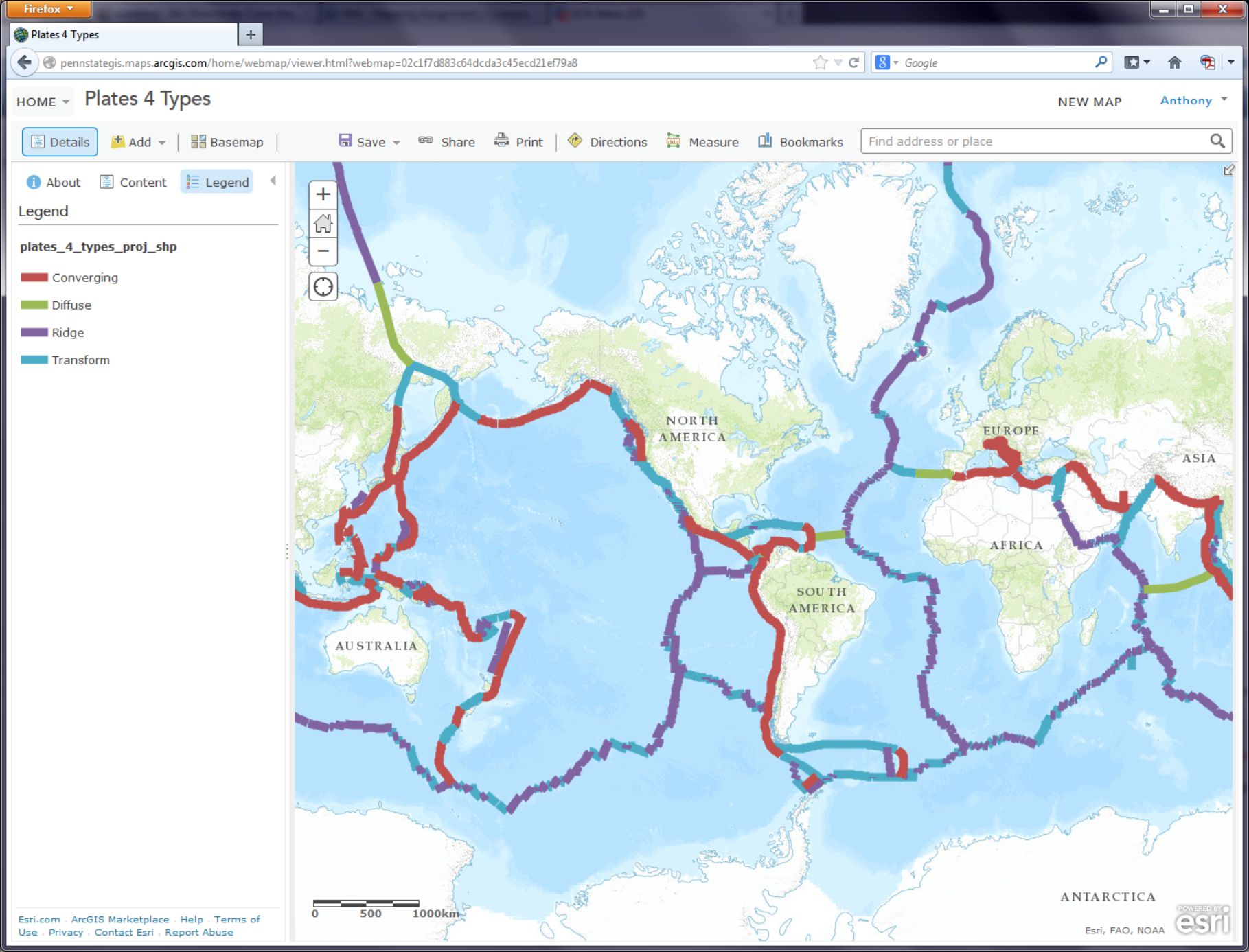
- How would you describe the pattern of plate boundaries around the world?
- Where do you hypothesize that most earthquakes around the world should occur?
A Web GIS like the one you’re using can bring in all kinds of additional data. In the case of earthquakes, we can use the real-time earthquake data feed from the USGS to examine recent earthquakes. To test your hypothesis about where you think earthquakes are likely to occur, go to the USGS earthquakes feed: http://earthquake.usgs.gov/earthquakes/feed/v1.0/summary/2.5_week.csv [122]. On some browsers this action might prompt you to download a file, on others it will just display the raw data. If you are prompted to download a file, do that and view the resulting .CSV file in a text editor like Notepad or a spreadsheet application like Excel / Open Office Calc [123].
- Does the number of earthquakes surprise you? How many did you expect to see for the past 7 days?
This earthquake data is encoded in a comma-separated value (CSV) text file, meaning that its values are separated by commas (imagine that). The first line acts as a blueprint for the data that follows it: the first line is the header line, containing the field names. Each data line below the header line includes a latitude and longitude coordinate pair, which is all a GIS needs in order to map the data. Each line also contains information about each earthquake's magnitude and depth, and some other variables. As with any data, it is important to know the relevant units of measurement. The magnitude is given in the Richter Scale, and the depth is given in kilometers below the surface of the Earth.
- You can open the CSV by using a simple text editor or your favorite spreadsheet application. Look closely at the table: Why are some of the latitude values negative? Why are some of the longitude values negative?
It may seem confusing because in most everyday speech we refer to “latitude and longitude,” with latitude typically mentioned first. So when plotting point locations it’s tempting to think of these as being equivalent to x, y, with latitude being “x” and longitude being “y.” However, latitude is actually “y” and longitude is “x.” In location-enabled devices and tools, such the GIS you’re using here, latitude and longitude are entered as y and x, respectively. Confused yet? Sorry. Being a Geographer is Hard.
The Cartesian coordinate system helps us understand why the sign (positive or negative) of latitude and longitude is important. The Equator divides the area above the X axis, the northern hemisphere, from the area below the X axis, the southern hemisphere. The Prime Meridian divides the area to the right of the Y axis, the eastern hemisphere, from the area to the left of the Y axis, the western hemisphere. Any x value to the right, or east, of the Y axis is positive. Here's what that looks like when you abstract the coordinate system a lot:
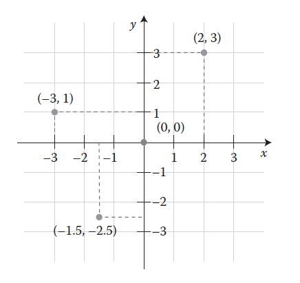
Therefore, when given the following coordinate pairs, one can determine their correct hemisphere:
X, Y Eastern and northern hemisphere
−X, Y Western and northern hemisphere
X, −Y Eastern and southern hemisphere
−X, −Y Western and southern hemisphere
- In which 2 hemispheres of the world do you live?
This earthquake data also provides a good illustration for the goals of this class: What’s the big deal about maps? Consider the following:
- How easy is it for you to determine spatial patterns just by looking at this table?
You know spatial patterns are there because you know that earthquakes don’t just happen in random or regular places around the planet (er… hopefully you know that). But unless you are really good at making a mental map from these latitude and longitude pairs, it will be virtually impossible for you to detect any sort of spatial pattern in the data. Therefore, you really need to make a map.
In ArcGIS Online, click the Add button as you have done before, but this time use Add Layer from Web, select the CSV choice from the dropdown list of options, and in the URL field, paste the link to the USGS data feed [122] that you have been examining.
Click Add Layer and you will be prompted to change the style for the symbols used to show your earthquakes. For Choose a Variable to Show select "mag" from the dropdown list. For Select a drawing style select Counts and Amounts (Size). Select Done once you've made these choices.
On your map, you should now see pin markers showing the last 7 days’ worth of earthquakes 2.5 magnitude and above.
- Describe the pattern you see with these earthquakes. Does it match your expectations?
Making Sense Out Of Your Data
You will probably now need to change the visibility of the plate boundaries by clicking on the Content button and then the little arrow next to the layer called plates 4 types proj shp. Click Transparency there and adjust the slider over to the right to make those mostly transparent. While you're in this menu, click Rename to give your layer a more meaningful name than the default "2". Let's name it "Last 7 days of earthquakes 2.5 magnitude and above."
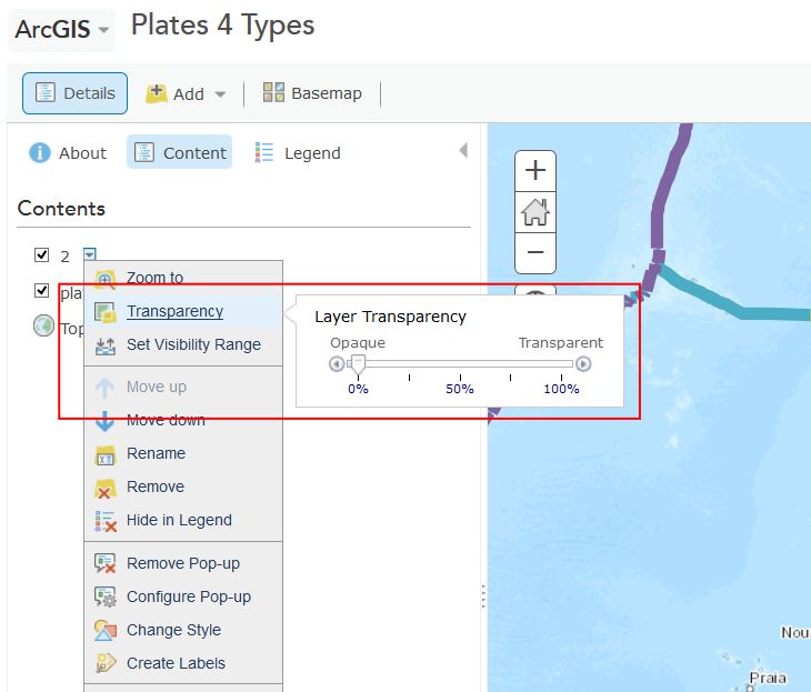
Now you should be able to see the colored points showing the magnitudes of recent earthquakes and their relation to plate boundaries. Cool, huh? This is a good time to save (and share if you like) your map.
- What is the pattern associated with large earthquakes that occur around the world?
The way you classify your data has a big impact on how your map is interpreted and understood. Just like no single map projection is the best option for every situation, no single classification method is perfect either. Choosing one that best meets your needs is a complex subject, and we’ll talk about it more in Lesson 5, but let's play now with several different methods in ArcGIS Online. Try a few of these classification methods for your earthquake points by clicking on the arrow next to their layer (remember, you need to be in the Show Contents of Map mode to see this arrow) and selecting Change Style. From the menu, under Counts and Amounts, click the Options button. Check the box next to Classify Data and you will be able to select Natural Breaks (divides the data at natural breaking points); equal interval (creates the same numeric range for each class); standard deviation (divides your data into one or more standard deviations from the mean); quantile (places the same number of data observations into each class); and manual breaks (categories specified by you, the user).
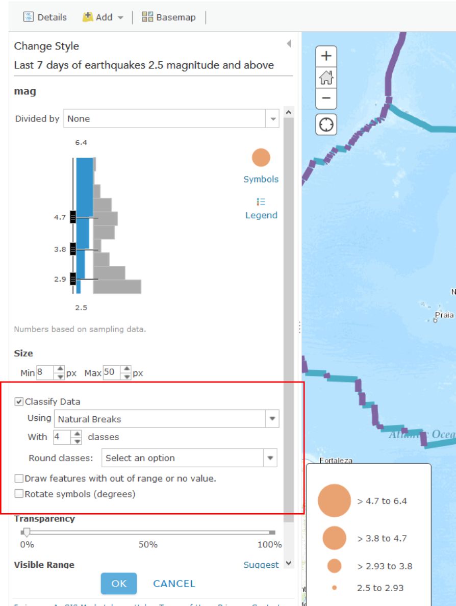
- What do you think is the best classification method for your earthquake data? Why?
When you're finished playing around with different classification methods, click on the little arrow next to your earthquake layer and select Show Table. This shows you the raw data that’s driving your map (which you brought in from the USGS site). In the table, note how many earthquakes have occurred over 2.5 magnitude around the world over the past 7 days. Now click on the time field and Sort Descending. Observe how old the last earthquake in the table is (this is in UTC time). Now click on the mag field and Sort Descending. Click on the field containing the largest earthquake. Then, select Table Options and then select “Center on Selection.” You should see your highlighted earthquake that you highlighted in the table also appear highlighted on the map. Zoom to that earthquake. Set a Bookmark here if you like.
- In which country (or near which country) did the largest earthquake over the past 7 days occur, and what was its magnitude and depth? Fire up Google to research this earthquake to find out if anyone felt this quake and determine what its effects were. There may even be someone in this class who felt it. If that’s you, go post something about that experience in the forums, because that would be really neat and your professor would be forever grateful.
As this course has emphasized a lot, it is critical to understand the sources, dates, data authors, the scale at which data was created, why and how the data was created, and so on, because maps are so easily misinterpreted. In the case of the earthquake data, note the numerous low-magnitude earthquakes in the Western USA. This is due to the fact that the USGS earthquake center recording the data is in Colorado. The earthquake center receives signals from the global seismic network through satellite dishes on the grounds of its facility, but it can also sense seismic waves directly at its facility, and the nearby ones, from western North America, are also added to the data set. So there are not necessarily more small earthquakes in western North America than elsewhere in the world. So sometimes the location of where data is gathered affects the nature of the recorded data. Tobler is right, man.
- How far was the most recent earthquake from where you live? Use the Measure tool and note the units you are using. How long ago did it occur, and what was its magnitude?
Change your symbology now to map the earthquake depth instead of magnitude. Remember that depth is measured in this case in kilometers beneath the Earth’s surface. This is a good time to save your map if you haven't done so recently.
- What is the pattern of the deep earthquakes occurring around the world?
If you have time, visit the USGS feeds page [124] and download and map other earthquakes—for the past hour, past day, 30 days, or for historically significant earthquakes. If you’re not enjoying this at all then I will be happy to provide you a full refund within the next 90 days.
Tornadoes Are Freaking Scary
You have now analyzed one type of natural hazard from a global to local scale, spatially and temporally. Let's do the same thing with one more natural hazard that is unfortunately quite common in the United States - tornadoes.
Close the data table for your earthquake layer by clicking the X in the top right corner of the table. Next, turn off your plate boundary and earthquake layers by unchecking their checkboxes in the Content view of your layers. Add a new tornado data service by clicking Add and then Add Layer from Web, and select An ArcGIS Server Web Service, and enter the following address (noting the underscores in the URL):
http://maps1.arcgisonline.com/ArcGIS/rest/services/NOAA_US_Historical_Tornadoes/MapServer [125]
Save your map and adjust the metadata and title so it reflects the fact that you are now mapping earthquakes and tornadoes.
Zoom to the United States so that you can see the lower 48 states.
- What is the pattern of tornadoes at this scale in the USA? Does it reflect the map showing the most frequent tornado zones in “tornado alley” below? Why or why not?
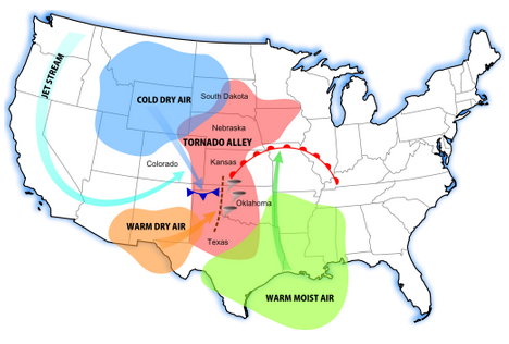
Turn on the map legend. You can now see that you were only examining Fujita 4 and Fujita 5 intensity tornadoes at this scale. You can also see that the data set goes back to the 1950s.
- Even though you can zoom in to a very large scale for any particular tornado, do you think the spatial accuracy of a tornado recorded during the 1950s and 1960s is the same as that of a tornado recorded during recent years? Why or why not?
- Do you think that if you zoom in, you will see some tornadoes in Colorado and in other western states? Test your hypothesis by searching for “Colorado” in the search box in the upper right and zooming there.
- Was your hypothesis correct? Describe the pattern of tornadoes in Colorado and why the pattern looks the way it does.
Tornadoes are not devastating because they simply touch down, of course, but because they move across the landscape. Zoom in to a larger scale until you see some of the tracks of the tornadoes. Keep in mind what you learned about resolution from this week’s course discussion. The tornado data are stored not only as points, but as lines, and the storage is scale dependent.
- What is the predominant direction that tornadoes move in eastern Colorado? Does the map above help you understand why?
In May 2013, an enormous tornado destroyed parts of Moore, Oklahoma. Search for and zoom to Moore, Oklahoma on your map. In the Content panel click on the arrow next to the NOAA US Historical Tornadoes layer and expand the Large Scale Data group so that you can click the arrow next to Historical Tornadoes there and Enable Pop-ups. Now when you click on tornado points at large map scales (e.g. zoomed in fairly far) you can see a bunch of additional information about each Tornado.
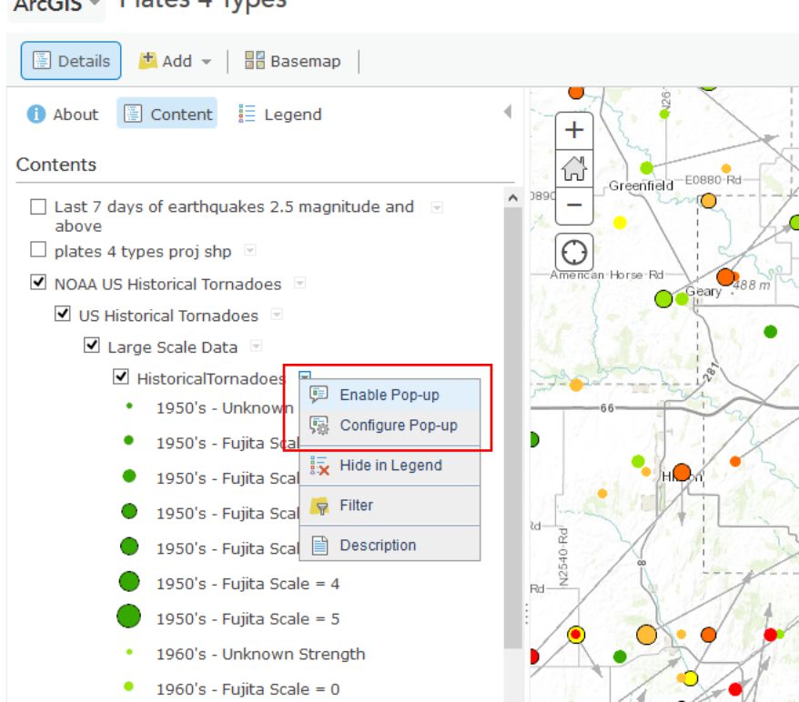
- Describe the number, pattern, and direction of historical tornadoes to strike Moore in the past. How typical is the post 1990 activity in Moore compared to prior decades?
Wrap Up
You’re doing very well – you definitely know enough to be dangerous with maps at this point. You have used data spanning different resolutions and time periods. You classified data in different ways and examined tabular attributes. You have added data from different types of servers. You have saved new data into the GIS cloud and shared it with others. You’re becoming quite the Cartographer now!
Credit Where It's Due
This lab was developed by Joseph Kerski [54] and Anthony Robinson [55].
Discussion Prompts
Where Do Disasters Happen, And How Can Maps Help?
In the mapping assignment for this lesson you've been working with data on Earthquakes and Tornadoes. These aren't the only types of disasters that receive attention from mapmakers, and nearly every government agency or NGO that deals with disaster management has a wide range of geospatial needs in such circumstances. For our discussion this week I'd like to focus on disasters and the kinds of things we can learn about them from using maps and geospatial technology. Here are some prompts for this week's discussion:
- Identify the most frequent natural hazards in the region in which you live and work in terms of damage to infrastructure and human impact (injuries and fatalities)
- Compare these hazards to the ones that happen most frequently in another region
- Describe a natural hazard that you have personally witnessed, and talk about the scales at which the natural hazard had an impact (local, regional, global – some disasters impact all of these in some way), make a map to show what you experienced.
- Find and share examples of good (or bad) maps about recent disasters. Describe what you think makes them work well (or not work at all), and propose your vision for better disaster mapping in the future. What would need to happen to make your ideas possible?
Lesson 4: Doing Spatial Analysis
Lesson 4, Lecture 1
Spatial Analysis

Overlay (and Beyond)
Now that you’ve got a grasp on the basics about thinking like a geographer and understanding geographic information, it’s time to focus on how to understand geography through analysis.
The most basic method of spatial analysis uses a really simple technique: overlay. It’s exactly as it sounds – all you do is stick one layer (number of people currently talking too loudly on their cell phone) on top of another layer (one that shows Starbucks locations) and compare the results (look, lots of people talking too loudly are standing in/around a Starbucks!). You could do this with lots of layers and end up with a composite overlay that lets you explore all sorts of possible relationships.
Overlay analysis also goes beyond simply looking at where two things overlap. You could also do overlay analysis to extract just the area where two things intersect, to delete any areas where two or more things intersect, to join two datasets into one larger dataset, and more. Check out some of the options here at the ARC GIS Resources page, [126] if you’re interested.
Put A Ring On It
In the previous example, I mentioned the area around a Starbucks location. Identifying these areas is part of another common spatial analysis technique. Buffering identifies areas of interest around locations based on distance or time. This could include a 20-mile radius around a terribly disgusting diaper that my daughter creates, or an irregular shape that shows the places that are reachable within a 20-minute drive of my house if I try to escape this terrifying situation.

Surface Analysis and Interpolation (Heat Maps Are Not Always Hot)
Another common spatial analysis scenario occurs when you’ve got lots of individual observations and you want to create a map that shows the overall trends that correspond to an area. Let’s say you have a bunch of temperature readings for a collection of cities and small towns. In the maps shown below, you can see what I can do just using colors assigned to each point observation. You can get a sense of the overall pattern this way, but temperature doesn’t just exist at discrete points, does it? It’s a continuous phenomenon, so it would be nicer to show this data in a way that communicates this aspect more clearly.
In the map on the right hand side you can see how this would look if you interpolate between those observations to estimate the overall pattern of temperatures in this region. There are many mathematical methods [127] for interpolating between values and creating surfaces (hence the label “surface interpolation” below). These types of maps are frequently called heat maps, after the “hot” color scheme normally used in their design. A more correct name would be "density surface," but cartographers seem to have lost that battle, as heat map is way more popular (it sounds cool, so why let the actual name for things get in the way?). I don’t know what you should do if you want to create a heat map to show the density of ice bars [128] in Scandinavia.

In the Geospatial Revolution video you'll watch later in this lesson, you will learn about John Snow’s famous map of a cholera outbreak in London. Dr. Snow’s work revealed that cholera cases were happening close to one particular water source. A set of spatial observations that differ from the expected variation around a point or region is called a cluster. In the example from John Snow, the cluster was detected based on his intuition. Today we have the advantage of mathematical methods that can detect clusters automatically. More importantly, these methods can help us identify spatial clusters that are unlikely or impossible to detect through our own intuition or visual inspection alone. While it’s outside the scope of this course to learn the inner-workings of cluster detection, I do want you to know that today the folks who work in epidemiology would never rely on their intuition alone to detect clusters. They’ve got fancy software [129] that uses fancy space-time math [130] to do that.
Lesson 4, Lecture 2
Analysis Pitfalls
Rain Causes Lung Cancer (No, It Doesn’t)
Now that you know a bit more about ways to do spatial analysis, I want you to understand some all-too-common ways in which these analyses can fall apart if you’re not careful.
Most of the analysis techniques mentioned earlier in this lesson will cause you (or the people who read your maps) to start making assumptions about the correlation between observations. To put it plainly, just because there appears to be co-occurrence between two things, it doesn’t mean that one of things is causing the other to happen.
To explore this pitfall further, let’s check out a wacky example that we wrestled with here at the GeoVISTA Center [131] back in the early 2000s. At the time we had a research project with cancer epidemiologists from the National Cancer Institute [132]. Dan Carr [133] from George Mason University (who was also working with the same folks at NCI at the same time) had discovered a really intriguing pattern while trying to explore geographic patterns of cancer mortality and its possible correlation to a bunch of social, economic, and environmental variables. Here’s what he found – lung cancer mortality correlates quite well with… mean annual precipitation. Yeah. Rain. Does that sound plausible to you?

You can see the in map above (created using the GeoViz Toolkit [134]) that there are a lot of counties that show up as dark blue/green. This is a bivariate (two variable) choropleth map. The Y-axis here (with green category colors) is used to show the precipitation variable, and the X-axis (with blue category colors) shows the lung cancer mortality rates. When you see the dark blue/green color at the high end of both X and Y axes, you’re looking at counties that are high in both of those variables. Places that are only green or only blue are lower on the other respective variable. The scatterplot shown in the bottom right corner shows the data distribution of both variables. You probably can’t read the correlation measure, but it says that the R-squared value is .48 – this was a strong correlation measurement compared to most of the known relationships between lung cancer mortality and other variables (poverty and smoking show strong associations too, for example).

When I select just the counties that are both high in precipitation and high in lung cancer mortality, you get the map above. Most of the counties are located in the Southeast United States. We spent awhile working with Dan Carr and the epidemiologists at NCI to try and tease this apart further, to no avail. There’s nothing there to report – it’s just correlation, nothing causal. It’s not that rain has any real impact on lung cancer mortality. It just happens to rain more where there are people who meet a range of other risk factors. This is a perfect example to demonstrate how correlation is not the same as causation.
Playing Tricks with Scale
Another major pitfall here relates to the scale at which you conduct spatial analysis. Depending on the scale at which you look at a Geographic pattern, you can derive completely different results from the exact same underlying data. This is called the “Modifiable Areal Unit Problem” or MAUP in acronym form (and said aloud it sounds like the noise that comes out of your throat after eating too many nachos).
Let’s explore this issue now by looking at some data about Solar Potential in the lower 48 United States. Solar Potential refers to the suitability of a particular place to develop solar power. The data [135] I’m working with here is from the National Renewable Energy Laboratory (NREL [136]). The first map shows the average annual solar potential by States. You can see right away that some states look better than others.

But what if I use the same underlying data and instead of aggregating to States, I come up with measures for counties instead? You can see the map below showing the same data if it’s represented at the county level. The picture is already a lot more nuanced than the state map, right? A lot of states that were shown in one color up above actually include members of several categories when you look at the data by county.

And the third map here shows the original underlying data that the other two maps were based on. The original data source calculates solar potential in 10 kilometer grid cells. So that’s why things look a bit rough at the edges. This is actually the most precise measurement level, however. I’ve overlaid the state and county boundaries so that you can see how the raw data compares to the units by which we typically try to aggregate things.

Normalization
Mapping Rates, Not Totals
A stunningly common analytical mistake by newbie mapmakers is to neglect normalization when you’re working with population-dependent data. Let me to say that in normal-people language instead: if you map something about people without calculating the rate based on the how many people live at that place, you’ll get a really stupid map. Same goes for if you’re mapping something about dogs (how many of them have breath that smells like dead fish? – there’s one at my house, for sure). You’d want to normalize your observations against the total number of dogs that could be mapped.
Check out what happens if you don’t normalize your data. This map shows the number of vacant houses by county in the lower 48 United States (you can find this data, along with tons of other stuff at the U.S. Census website [137]). What does it tell you? It looks like there are lots of vacant houses in and around major cities. And that’s it.

Here’s a version of this map that’s been normalized. I calculated the proportion of vacant homes to the overall population in each county (in thousands). That gives me a rate, rather than a raw total value. Now I can see which counties have high percentages of vacant homes, relative to all other places. It turns out that there’s an interesting pattern happening in northern Michigan, Wisconsin, and Minnesota where vacant homes are more common per person than in many other parts of the country. I did a little digging around and I think I know why – can you figure it out? If you think you have the answer, post it in the forums and debate the possible reasons with your classmates. There are different reasons why different counties across the country might have a lot of vacant homes, of course, but I think there are a few key reasons why these particular counties show this pattern.

A normalized map is much more useful, right? If you don’t normalize data for choropleth maps like these, you’ll end up having a zillion versions of the first map above – where there are more people, more houses, more dogs, whatever – you’ll have more of the thing you’re interested in and it’ll always just highlight the major population centers. This phenomenon is called population dependence because the thing you want to know about (nasty dog breath), will vary depending entirely on the size of the overall population (number of dogs that are breathing).
Video Activity
For this lesson I'd like you to watch Chapter Three from Episode Four of the WPSU Geospatial Revolution [119] series. This video highlights how geospatial technologies and analytical methods are transforming how we conduct disease surveillance and implement health interventions to prevent major outbreaks.
Mapping Assignment
Real Time Data, Social Media Mapping, and Finding The Best Place For Things
This week, your reading and lectures focused on understanding geography through analysis. You learned about map overlays, buffer zones, heat maps, and other methods. You also learned that simply having a plethora of spatial analysis tools at your fingertips to apply to your maps does not mean you can let the tools do the work with your brain taking a much needed coffee break. On the contrary, with the power you have comes responsibility: You need to consider things like the scale that is appropriate for analyzing your data, mapping totals vs. mapping rates, and correlation vs. causation.
This week’s lab gives you the opportunity to practice these concepts in ArcGIS Online. You will be evaluating relationships among different variables. You will examine maps that show geolocated social media in all of its ephemeral glory. You will analyze data using tables and maps. And you’ll do some spatial analysis, including the creation of buffers and routes.
Analyzing Real Time Weather Data
Real-time data is increasingly available, and much of it also includes geographic data. Let’s analyze some weather-related real time data by opening Esri’s public information map on severe weather [138].
This map should look similar to the map below. Note that this map is an example of a live map embedded in a web page. If you are using a browser with language settings other than English, this may not work for you. In that case, please check out this similar example [139].
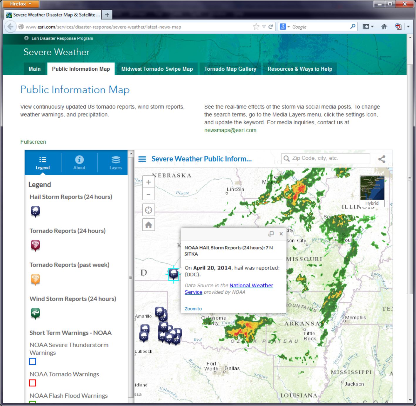
- How would you say that tornadoes, wind storms, hail storms, and precipitation are related in space and in time?
Now head over to Esri’s Flood public information map [140].
This information on flood warnings and observed floods comes in part from USGS stream gauges along rivers. These stream gauges upload data to a national network which is then fed in as a live web mapping service in ArcGIS Online. Click on the “i” information button and then the link to More Information to explore details about where the data are coming from.
- Which agency provides the flood data? How often is it updated?
- Can you find a relationship between where precipitation is falling and floods on the map?
Think about how the duration of precipitation and the time between when precipitation falls and when a flood might start to occur. Then think about how the size of the watershed that is drained by the rivers that flow by a particular gauging station influences the river height at that gauging station. Several factors influence the relationship between precipitation and floods as displayed on a map. You can examine the other Esri disaster response program maps on Esri's disaster response page [141].
- Can you find a spatial and temporal relationship between data layers on the hurricanes and cyclones, wildfires, or earthquakes pages?
In the next section you will examine geospatially-oriented social media [142] related to severe weather events. Who knew that thunderstorms would cause a Flickr apart from the lights going out in your house?
Mapping Social Media
Social media frequently contains geographic information, because social media posts are often sent from devices that can snag a location from a GNSS. Therefore we can make maps showing social media in many cases. Entire platforms like Ushahidi [143] and Tweak The Tweet [144] are built around the use of social media mapping. So let’s see what we can do with it ourselves.
Head over to the Esri severe weather public information page [138].
Click the Layers button in the panel on the left side of the map and scroll down until you see Media Layers. Notice that you have a choice of Instagram, Flickr, Twitter, and Webcams. On Flickr, click on the gear icon to look at the Flickr Search Settings. Notice that it is currently set to storm or tornado. Change it to hail or tornado and select Search.
- Can you find any correlation between the locations of hail and the locations of tornadoes?
Zoom to different scales and pan the map to explore multiple locations, and see if you can observe any patterns (or lack thereof). Next, change the Flickr settings search term to Oklahoma. You may expect that your results will only show Oklahoma, but what happens if someone refers to Oklahoma in a photograph they take in Pennsylvania? If the search term you use is in the metadata that the sender of the post, video, or photograph provided, it will appear on the map, even if the post did not originate from the place listed in the post.
- What are a few benefits and limitations associated with gathering and using data from social media?
Raw Data Analysis
Let's have a look now at the information behind the map, which is stored as a table.
The Human Development Index (HDI) is a composite statistic used by the United Nations to rank countries by level of "human development." It can be considered a synonym of the older terms “standard of living” or “quality of life,” and countries can be thought of as "very high human development," "high human development," "medium human development," and "low human development" in terms of the UN HDI. This index is used to make decisions on policy issues for economic, social, political, and cultural development worldwide.
You can read about the HDI here: Human Development Reports [145]
- What benefits (or limitations) do you see from these documents about the HDI?
- Where do you think HDI will be highest and lowest around the world?
Now navigate to ArcGIS Online [120]. Log in using the account you set up in Lesson 2.
Copy and paste this web link into your browser navigation bar: http://www.arcgis.com/home/webmap/viewer.html?webmap=da264828e12741948799e9d8ffac3a48 [146]. You can also just click the link here and it should open the map just fine. You want to make sure you're logged in, though, because later you'll want to save the changes you make to this map.
- Is your hypothesis about where HDI will be highest and lowest supported by what you see on the map?
Next, click the little arrow to the right of the HDI 2006 layer and select Show Table. Use the Sort Ascending or Descending Order function on the HDI2006 column to answer the following questions (note that some countries come up as -99, which is the value assigned when there is missing data):
- What country is the lowest in HDI? What is its HDI rank?
- What country has the #1 HDI Rank? What is its HDI value?
Now click Table Options at the top right of the table view and choose Filter. In the following dialog box, select Human Development Index 2006 (HDI2006) from the first dropdown list. Then select is less than from the second dropdown. And finally, enter .5 into the Value field. Click Apply Filter when you're ready.
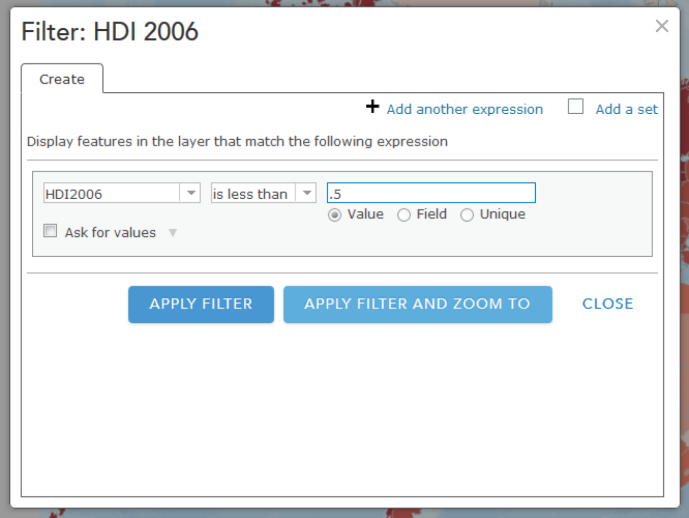
You should now see only the filtered countries on your map that have an HDI of less than .5. Now is a good time to try out other filtering operations that you think might be interesting. You might also want to save this map (every Map is sacred).
Spatial Analysis
Note: Some of the apps you'll try in this section of the assignment will take a little while to return results. Please be patient! Clicking lots of times really fast won't help.
This week you read about one type of spatial analysis called buffering. Click this link to try creating your own buffers: http://developers.arcgis.com/en/javascript/samples/util_buffergraphic/ [147]
Let’s say you are seeking to start a new boat repair service (Salt Lake Sloops or Saline Sails) near the Great Salt Lake, Utah, and you want to locate your service within 25 kilometers of the lake to maximize the number of potential customers. Under the Buffer Parameters heading, set the distance to 25 kilometers. Then use the Freehand Polygon tool to trace the outline of the Great Salt Lake in the north-northwest section of Utah.
- Would Salt Lake City be included in your list of cities to consider? What about Provo?
Another kind of buffer is a temporal buffer, which calculates the amount of time required to walk, bicycle, or drive to or from a certain location. Open this map to create some buffers to show drive times:
http://developers.arcgis.com/en/javascript/samples/gp_servicearea/ [148]
Click on a location in Lawrence, Kansas and wait for the drive time buffer to appear. Click on Interstate Highway 70 (a limited access highway) and note the differences. Click just north of the river and note the effect of the river on access to areas south of it. Observe that the drive time buffers depend not only on the street density, but they have intelligence beyond street location: they take into account one-way streets, stop signs and stop lights, traffic volume, speed limit, and terrain. Pan the map to a rural area outside Lawrence and click on the map in that location.
- What is the difference in the amount of terrain someone could reach in 1, 2, and 3 minutes from a rural area vs. from an urban area?
Now that you've seen how drive times might be helpful for understanding service areas, let's check out what happens when you use a similar method to explore attributes about people in a particular area. Open this map to explore population in Census Block groups [149] within 1 mile from whichever place you click.
Each of the purple dots represents a block that is included in the total count of the population within the 1 mile buffer. Notice that at the upper right of the display you can see the total population inside this buffer. You can use this sort of data to drive a more sophisticated service like this one:
http://developers.arcgis.com/javascript/samples/geoenrichment_infographic/ [150]
In this example, when you click on the map a population pyramid is created for the buffer area. You can compare the population categories for each place vs. all of Los Angeles, California, or the entire United States. A good way to start exploring this example is to click first right on the center of downtown Los Angeles. Take note of the overall shape of the pyramid. Next, try clicking on Bel Air (to the northwest of Downtown LA, home of the Fresh Prince). What differences do you see? What other data would you want to have to explore these differences further?
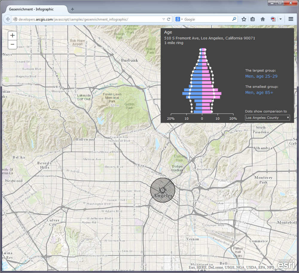
Viewsheds and Zonal Statistics
Viewsheds are another type of buffer. Viewsheds indicate how much terrain is visible from specified locations. Viewsheds are important not only in planning scenic overlooks along trails and highways, but help in everyday decisions such as siting cell phone towers, determining how much terrain would be in shadow if a certain high-rise were to be constructed, helping plan safe roadway curves, and much more.
Use this map to create your own viewsheds [151].
This map service shades the terrain viewable within 5 miles of your chosen point. Let's say you are interested in taking photographs in San Francisco but you only have two hours to do so, since you’re on a layover at SFO on your way to Sydney. You want to be as efficient as possible, choosing locations that allow you a magnificent view. Click several locations on the map and observe the viewshed for each location. Your viewshed should be better if you click on one of San Francisco’s hills. For example:
- Judging from the shape of this viewshed, would you be standing on a south-facing hillside or a north-facing hillside?
Click on the Golden Gate Bridge (leading northward from San Francisco on US 101).
- Why is the 5-mile viewshed so much greater in area at this location?
Another type of spatial analysis that computes and summarizes data from rasters is called zonal statistics. Try this little application to summarize population in specific areas [152].
Click on the words Summarize Population in the lower left section of the map and then draw a polygon that encompasses Atlanta, Georgia.
- What is the population in and around Atlanta?
- Why is your result different each time you draw the polygon?
- What aspect of the population data layer influences the results you receive from these area calculations?
Routing
Finally, we also have a whole set of functions to determine the best route and the closest facilities to specific locations. This is important for a wide range of applications, from emergency services bringing people in an ambulance to the nearest hospital to finding the nearest competitor for your planned new Taco & Donut Gastropub (Carnitas & Crullers).
Open the following map: http://developers.arcgis.com/en/javascript/samples/routetask_closest_facility/ [153] and click on the map.
What is the closest competing restaurant to your chosen point? Change the choice under the map to find the routes to show the two closest facilities instead of just one.
- Can you think of an application where knowing where two or more closest facilities would be really important?
Often, as in the case of the Kansas River that you earlier examined in Lawrence, Kansas, there are barriers. Barriers may be physical (rivers or mountains), or they may be human-caused, such as construction projects, one-way streets, or a blockage due to a car accident.
Examine this map on route barriers. [154] (uses Javascript)
Let's assume you are running a bicycle courier service in downtown San Diego. Your pick up point is at 1st Avenue and Market Street. Your destination is at 10th Avenue and Market Street. Add these 2 stops and have the map calculate your route, shown in blue. Now let’s say there is construction at 8th Avenue and Market. Use Add Barriers and add a barrier at 8th Avenue and Market (2 blocks West of 10th and Market).
- What changed on your map after you added a barrier?
Supermarket Sweep
Open the following map that incorporates point, line, and polygon data and some of the spatial analysis techniques that you have been exploring above:
ARCGIS Map [155]
This map shows access to supermarkets. The supermarkets have been buffered for walking (1 mile) and driving (10 minutes), and aggregated poverty data is also shown. If you click on the Legend button you'll see that supermarkets and farmers' markets are also shown. Notice how the symbology changes as you zoom out from Detroit to the county level.
- What is the purpose of this map? Why is access to supermarkets a concern in Detroit?
- How has at least one of the spatial analysis techniques you have been exploring in this lab been used to create this map?
Wrap Up
Wow, you're a mapping machine now. In this lab you analyzed real time data and studied the relationships among different variables. You also worked a bit with mapping social media. You used a variety of spatial analysis techniques including buffers, viewsheds, drive time analyses, and routing algorithms. You pretended like you were repairing boats, running a restaurant, and working as a bike courier. It would be cool to have all of that on one resume.
Credit Where It's Due
This lab was developed by Joseph Kerski [54] and Anthony Robinson [21].
Discussion Prompts
Mapping Social Media: What's It Good For?
You've now had some experience playing around with mapping Flickr photos and other social media sources, so let's talk about what this means for the future. Let's say everyone registered for this MOOC tweets five times (once each week) and mentions locations in each message (plus they have profile locations, and a GPS-recorded place where the phone was located when the Tweet was posted). That would result in tweets all over the world by the tens of thousands.
- Look for some examples outside of the ones we've used in class that use maps to show social media. Share them if you like. Can you understand the stories they're trying to tell? Why or why not?
- Scale is an issue for multiple reasons when it comes to mapping social media. What are some ways scale plays a role in social media mapping?
- How would you propose to show tens of thousands of messages on a map so that you could actually do something with this sort of data?
- What real-world tasks do you think can be accomplished (at least in part) by using social media maps?
Summary and Final Tasks
In this lesson, you've seen how to modify the Google Maps user interface, open info windows when markers are clicked, implement a custom marker icon, and code the addition of line and polygon overlays. To this point, we've only dealt with a small number of points and have been able to hard-code their locations in our JavaScript code.
In the next lesson, you'll learn how to handle a larger number of markers in a more realistic way by storing their attributes in an XML file. You'll also learn how to add a sidebar that lists the names of your markers and how to use the API's address geocoder.
Lesson 5: Making Great Maps
Lesson 5, Lecture 1
Making Great Maps

Making Great Maps
In this Lesson I want you to understand some of the essentials of Cartography – the art and science of making maps. We Cartographers [157] are an eccentric lot, caught between several really distinct priorities. Every map has an audience, a target format, and a specific purpose. There isn’t a single “right” map for a given problem situation. Maps are not the objective truth, but they offer enormous help for us to understand the world. By default, they are simplifications of reality because we can’t show all of the infinite detail that makes up what exists on Earth (or elsewhere if you’re mapping planets, genomes, whatever). This simplification actually helps us make decisions, identify patterns, or realize where we made a wrong turn on the way to buy a bucket of chicken. Quite often maps are intended to tell a story, or at least to serve as the context for a story to take place. Maps are like snowflakes or children; they can’t be easily compared on objective metrics, and only some of them are truly good looking.
Maps are products of a design process. There are lots of decisions to be made, and every design decision influences the final outcome. To be a Cartographer, you have to understand and accept the responsibility [158] that comes along with making those design decisions. Depending on what I want you to think, I can design my map accordingly to try and sway you. What you choose to include, how you symbolize features, how you show data patterns through analysis, and even the colors you assign to things all have a huge impact on how people will interpret a map. John Krygier [159] and Denis Wood [160]’s book called Making Maps: A Visual Guide to Map Design for GIS [161] has some great examples of how maps can use different representations of the same underlying data to tell very different stories:
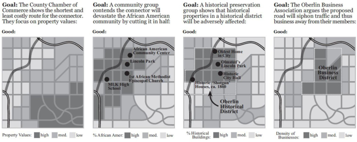
Who Wants A Map? Where Will It Be Seen? What Is Its Purpose?
These are the three key questions you have to answer when approaching a map design task. Failure to adequately think through any of these three areas will result in great shame to you and your family. I like to start by thinking about the proposed audience for whatever I’m designing. Who are the people who will look at this map? Is it a group of ten experts, or 40,000 anxious parents who are wondering if schools are closed today due to a 6 micron layer of snow outside? In the case of this class, I’m designing maps to work for thousands of map readers, most of whom I will know very little about aside from the fact that they thought this class would be cool to take. Since I know that my Grandpa, my Mom, and most of my friends are taking this class, I at least have some sense of the range of users I need to design my maps to serve.
After you determine who your map should be serving, you need to consider the place where it’ll be seen. Are you making something to print and take on a canoe trip through a fly-infested backwater? Are you planning on showing off your mad iPad skillz by making a fancy digital slippy map [162]? Perhaps you want to make a digital map that’s not interactive like I’ve done in lots of examples for this course. Maybe you need to design something that’ll work in digital formats and printed formats, including black and white. We’re working on lab assignments in this MOOC that only focus on designing interactive digital maps. If you took a Cartography class [163] with me or any of my fellow academic cartographers around the world, you’d gain experience with all of these other mapping formats as well. Each one has its own constraints, naturally. The design I make to work for black and white prints would be totally different from one that has to be legible and work with interactive tools on your cell phone.
Finally, the third, and potentially most important question you need to answer pertains to the purpose of your map. Simply put, what story are you trying to tell (Thematic Mapping)? Or are you just trying to provide the context for other stories to take place (Reference Mapping)? Everything you do to design your map should correspond to the purpose you’re trying to serve. Maybe I need to design a digital interactive map for college students to easily find the nearest place selling cheap yoga pants. Or maybe I need to design a printed black and white map designed to help first responders instantly recognize the location of hazardous materials in a 2-mile radius of a football stadium.
Layout and Symbolization
Designing a Layout
When you design a map, you need to carefully consider the relative balance of all of its visual elements. You have the map itself, and perhaps you have multiple maps (an inset showing where the location of interest is in relation to the rest of the world, for example). You’ll also probably have a title, a legend, scale bar, source information, and other little bits and pieces. Map nerds (cartographers) call those bits and pieces (aside from the main map) marginalia. The act of sorting things out so that clarity is maximized is called establishing a visual hierarchy. Consider the two examples below from Designing Better Maps: A Guide for GIS Users [164] by Cindy Brewer [165]to see what this means in practice. It’s all about shaping the layout items around your message. The map on the top has all of the necessary elements, but they’re not balanced on the page. The example on the bottom shows the same elements arranged in a way that promotes clarity and harmony in the map design. The first example is a bad layout. The second one is a good layout.
Symbolization
By this point you’ve encountered a wide range of ways in which things can be represented on maps. You’ve worked a lot with choropleth (colored-area) maps in labs and you’ve seen a lot of those as examples in the course content. There are many other ways to show stuff though, and I want you to be aware of some of the most common methods.
Point Symbols
One of the simplest things you can do is to use icons to represent point features. We call these point symbols, and they can range from very detailed in their design (you could even use small photographs if you really wanted to), to very abstract and iconic. Here’s an example of point symbols used to show the locations of important services in Lower Mapistan. Good resources for point symbols include MapBox’s Maki [166] set and our own Penn State Symbol Store [167].
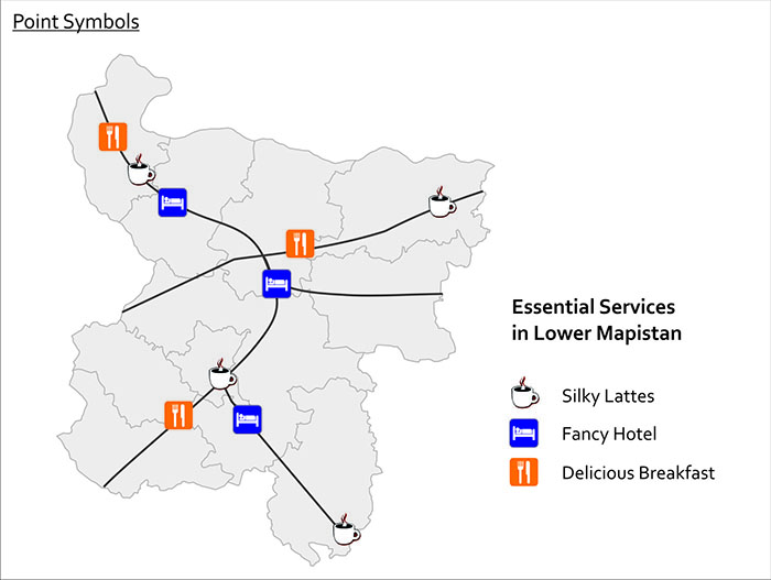
Proportional & Graduated Symbols
Another form of point symbol is one that changes its size based on underlying data values. These are called proportional symbols when you size each symbol in relation to its attribute value. In a proportional symbol map it’s possible for every symbol to be a slightly different size, since size relates to the data value itself. In contrast, graduated symbols use preset symbol sizes to represent a category of values. It’s usually easier for people to make quick comparisons with graduated symbols, while proportional symbols do a nicer job of revealing the underlying diversity in your dataset. You can see the difference here with this map of cable bill delinquency. Both methods are good to use if you want to map raw values rather than rates (remember our previous work on normalization?).
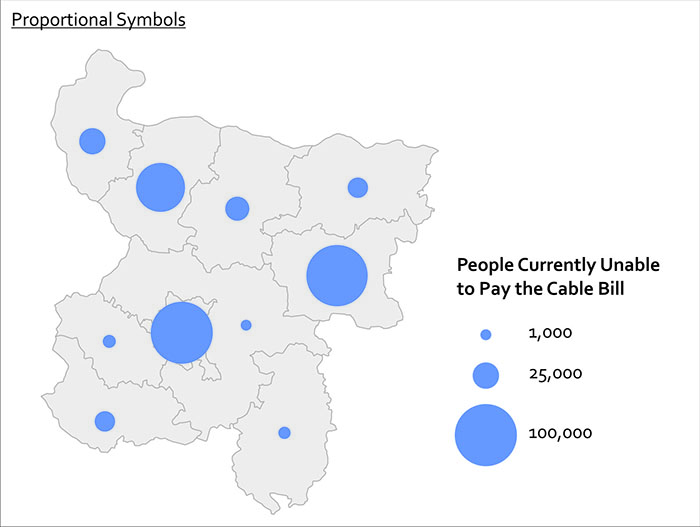
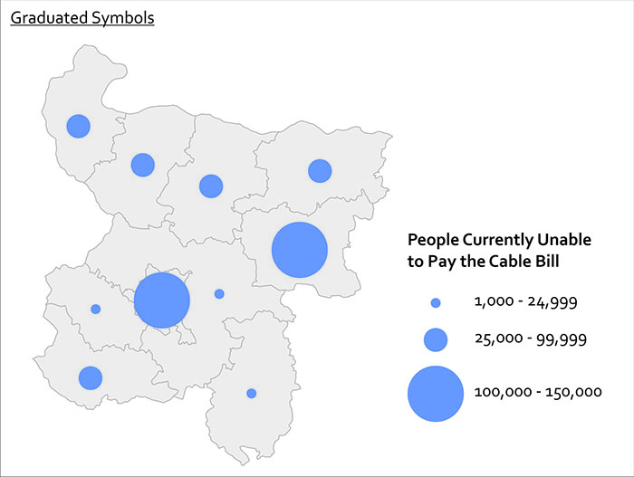
Quite often you want to show more than one thing at a time with your symbols. You can use bar charts, pie charts, and other fancy things like cartograms [168] and bivariate choropleth [169] maps to show more than one variable at once. Pie charts work reasonably well if you just have a few variables you want to show.
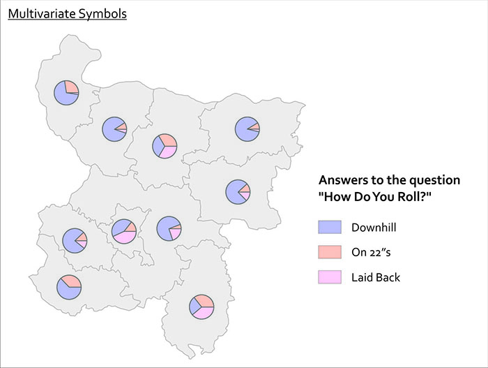
Lesson 5, Lecture 2
Choosing Colors
Match Colors To Your Data
The best way to get you thinking about color design on maps is to think first about the data you’re trying to show. There are four primary levels of measurement [170] associated with data, but I can make it even simpler for you. Are you dealing with numerical data or are you dealing with categorical data? In the former case you might have conducted a neighborhood census to count the number of households that leave their children’s toys in the front lawn. In the latter case you might be recording what all of your coworkers consider their favorite curse word. Mine rhymes with “duck.”
When you’re choosing colors for a map, you have three major categories to choose from. Color schemes exist for sequential (less-to-more), diverging (+ / - deviation from an average value), and categorical (movie genres in your Netflix queue) data. And fortunately for you, very clever folks have already done all sorts of science [171] around designing effective color schemes for each of these three types. I’m extremely lucky to work quite a bit with Cindy Brewer [165] here at Penn State, who developed something fabulous called ColorBrewer [172], which is a handy web-tool you can use to choose and preview color schemes. Go try it now.
These color schemes work well for all sorts of things outside of mapping. I’ve even used them to choose paint colors at home (we have a green kitchen that couples nicely with a purple wall, like one of Cindy’s diverging color schemes shows). Note that ColorBrewer gives you the ability to choose schemes that are still OK for colorblind [173] viewers, suitable for printing, and usable with a digital projector. 5-8% of males are colorblind, and ~1% of females are colorblind, so it's a really important audience to consider when designing anything. You can use tools like VisCheck [174]to predict what a colorblind person will see when they come across your image.
Below I’ve made two examples to show you why thinking about your data first makes color scheme selection easy. I’ve got data here showing the number of Internet Users per 100 people [175] by country. In the first map, you see a sequential color scheme from ColorBrewer. In the second map I’ve used a categorical color scheme from ColorBrewer. Which one is super-easy to understand? The first one, right? The categorical one doesn’t work – you have to study it over and over to determine which places are high and low, respectively, and at a glance you could not interpret this map easily.
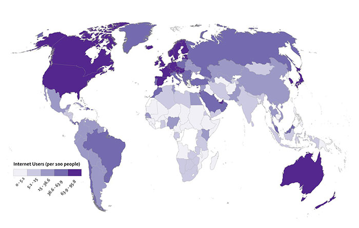
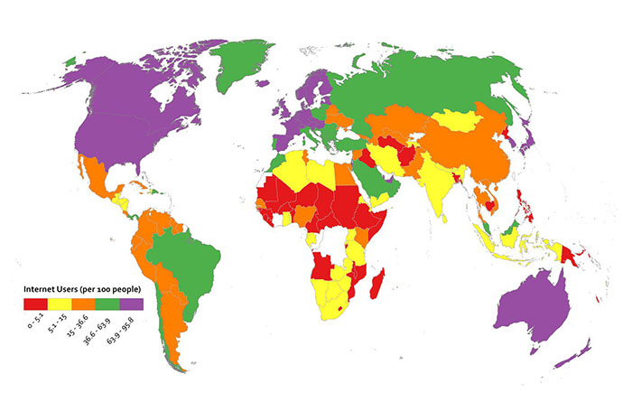
Diverging color schemes are really useful for when you want to show which places are above and below an average value. A lot of the time what you want to do with a map is to convince people to pay attention to particularly high and low outliers in your data, not the stuff that is expected or normal. You can see here what happens when I use a ColorBrewer diverging scheme for the Internet User dataset. I think you’ll agree that this works nicely to show which places are above and below the middle category.
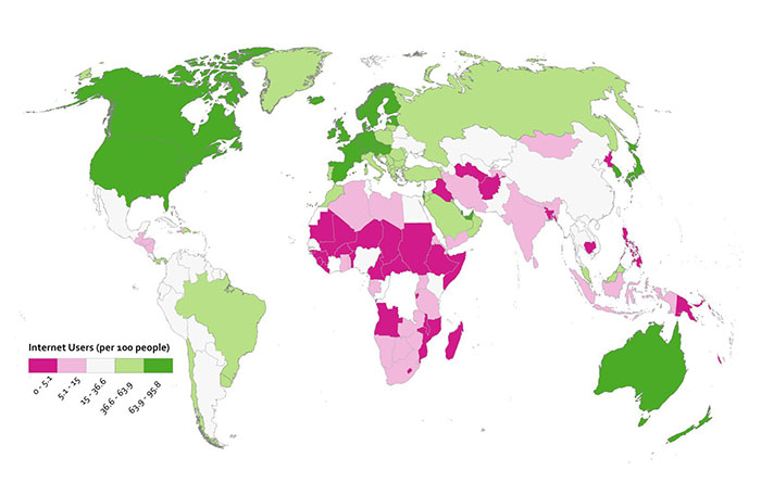
Since this is numerical data that’s not appropriate to represent with a categorical color scheme, I cooked up another example here to show you when using a categorical color scheme would make sense. I may have completely made up this data myself, or it may be absolutely accurate. You decide.
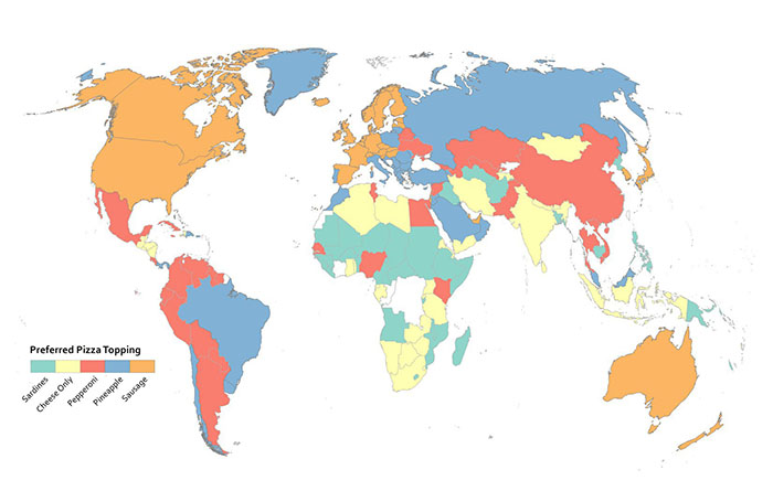
Rainbows Kill People, So Stop Using Them On Maps
Do I have your attention? Good. Resist the urge to use continuous rainbow color schemes to assign colors to things on your map. They’re formally referred to as spectral color schemes, as they typically use most of the named colors in the visible spectrum. They’re also a type of qualitative color scheme. You see them all the time on maps, and they’re a default choice of many folks when visualizing nearly anything you can imagine. They are almost always the wrong choice.
Here’s why they’re awful – 99% of the time when you see them, they have been applied to data that is sequential or divergent in nature, not qualitative. For example, they’re used a lot to show different levels of rainfall on weather maps. Ask yourself this question; how much more does purple represent than orange? See what I mean? You have to learn how to interpret data categories on a map that uses a rainbow of colors to represent something sequential (more or less rain) – it’s never intuitive. A spectral scheme also emphasizes variation where there may not be anything significant. It may also hide the variation you’re actually supposed to be revealing with your data. They don’t work well for color blind users, either. Many others (misleading maps) [176] aside from me have elaborated on these and other reasons to stop the rainbow scourge (here’s one example (no more rainbow scales) [177], and another (color and design) [178]).
They’re popular in part because they result in very bold-looking, colorful maps. More exciting ≠ better when it comes to making any kind of data graphic (such as a map). It’s much more intuitive to have your color scheme match closely with the kind of data you’re using. If it’s a “less-to-more” dataset as in the rainfall example, then you should be using something that goes from a light to dark range with the same hue.
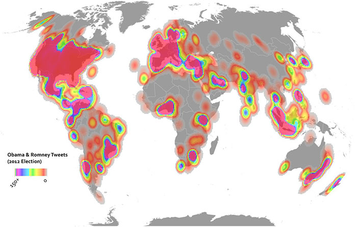
Here are two examples showing some Twitter data from the 2012 U.S. Election. In the above map I’ve used the terrible rainbow thing to symbolize my data. It looks really bright and exciting. All it’s supposed to show though is where things are high and low, so you have to study the color scheme closely to see what bright yellow means in comparison to bright purple, and so on. The map below uses a single hue increasing in saturation in a sequential manner. It’s more subtle, but it’s also more honest when it comes to showing what’s really in this data, and the reader will have no problem identifying the trend immediately.
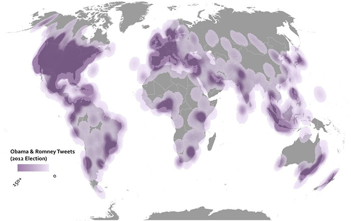
But don’t just rely on my rant here – check out what scientists have learned from studying doctors [179] as they try to interpret heart scanning images using spectral schemes vs. sequential schemes. Doctors make worse decisions (ones that would impact serious healthcare decisions) using rainbow color schemes. People could die, so don’t use rainbows on maps.
Data Classification
Breaking Up Is Hard To Do
Most thematic maps require the mapmaker to assign individual data observations to categories. The act of assigning observations to categories in mapmaking is called data classification. We use it as a verb in Cartography – I classify my data before I design a map. If you map everything on a 1-to-1 basis, e.g. you show every observation and identify it as a unique thing on your map, then you’re not using classification. An example would be if I had reports from every city in the world about the number of babies who refuse to sleep through the night. I could report each value individually, but most likely I’d want to group similar values together to make it easier to reveal patterns in the data. In every choropleth map in this course, you’ve seen classified data – I collected values within a certain range and assigned one color to describe them.
There are three major types of classification that I want you to know about. There are many other types too, but I’m sure someone will be along shortly to teach a MOOC just about data classification. Equal Interval classification sets category boundaries at a specified data value interval. Quantile classification works the other way around – you decide how many categories you want and then add observations to each class until you’ve got equal members in each subset. This can help your map look nice and visually balanced because there are equal numbers of each color for a choropleth map, for example. The last type I want you to know about is called Natural Breaks, which uses some fancy math to look for “natural” breakpoints in the overall data distribution to place category boundaries there. There’s no best solution for every map – you have to understand your data, understand the story you want to tell, etc… and choose a method that makes sense given those constraints.
Each method is shown below on a histogram showing some fake data. I’ve got 50 observations (hollow circles), and each observation has a particular value (shown on the axis). In this case let’s say I did a survey of all 50 U.S. States to identify the number Audi A4 Avant [180] admirers per 100 people. I would really enjoy doing this survey.


Map Examples
Using Equal Interval classification, I would set class breaks at intervals of 20 Avant Fans Per 100 People and end up with five classes to represent my data.

With Quantile classification, I decide I want five classes first, and then add observations to each class until I’ve got equal numbers in each one. Since I have 50 people who responded to my survey, I need to put 10 observations in each class. So I move from left to right on the data distribution axis and set my classes accordingly.

Using Natural Breaks, I let the fancy math decide where to put breaks in between the most consistent groupings that appear in the responses.

If you’re intrigued by this stuff, check out this excellent article (Visualizing Cancer Data using GIS) [181] by Cindy Brewer on how classification impacts mapping in the context of public health.
Text on Maps
While it’s a bit outside of the scope of this introductory class, I’d be doing you a disservice if I didn’t at least briefly describe the role of labeling and type design on maps. Cartographers often spend a huge amount of effort just trying to decide where to locate labels on a map layout (the map itself and its marginalia). Normally there are too many labels to show in too small of a space, so we need to design a clear visual hierarchy by varying the characteristics of text [182] to emphasize the important bits and de-emphasize the less important bits. Fortunately for you, there are some easy rules to follow – the graphic here shows the priority you should place on label location.

And when you’re faced with the daunting task of choosing among zillions of fonts [183] for the text on your map, Ben Sheesley [184] from Axis Maps [185] has created a great little tool called TypeBrewer [186] (in the spirit of ColorBrewer). Avoid Comic Sans [187] and Papyrus [188] (the default font choice for restaurant menus around the world, unfortunately), please.
Video Activity
For the final lesson of this class, I'd like you to watch this video from Chapter One of Episode Four in the WPSU Geospatial Revolution [119] series. This video shows how geospatial technologies and analytical methods are used to monitor and predict the impacts of climate change. Among others in this video, you'll see Richard Alley [189], another Penn State professor who happens to have his own quite interesting MOOC [190] on Coursera.
Mapping Assignment
Storytelling with Maps
For your final mapping assignment, I want you to take initiative and design a map that tells a story about a topic of your choice. You have some decisions to make:
-
Which mapping platform will you use? You can use anything you like, so long as you’re able to link to an interactive web map or a static image of your map in your peer assessment submission. I’ve listed your options here in order of their relative difficulty.
- Easy: For many of you, sticking with ArcGIS Online will be the easiest option. You know by now how to get to ArcGIS Online, search for data, make a map, and share it with a link.
- Moderate: If you’d like to try something a bit more sophisticated, you can also use ArcGIS Online’s Story Maps [191] capability. You can also review a video series [192] showing how to make a Story Map, and read "Web Maps, Web Apps, Story Maps" [193] to explore what makes them different from other web maps. You should also consider CartoDB [194]. CartoDB offers very nice animated map tools and features to style your web maps and share them with the rest of the world. They have excellent documentation [195], so this is a great option if you want to branch out a bit and try a popular open source web mapping platform.
- Hard: Make use of free, open source desktop GIS software like QGIS [196] or GRASS [197] (see the excellent OsGeo Live site [198] for tons of open source options and tutorials), or commercial software like ArcGIS Desktop. To use the latter, you’d need to have a license already (I can’t help you with that, sorry).
-
What story do you want to tell? I really want you to come up with ideas on your own (be creative!). But here are a few examples if you have no idea how to get started:
- Convince me (and your classmates) that your hometown is vulnerable to one or more types of disasters.
- Show how your home country/state/neighborhood has changed over time in relation to its neighbors.
- Tell a story about your most recent travels, augmenting the map with photos and other media to highlight your experiences.
- Use spatial analysis to identify good locations for your favorite type of restaurant.
-
Where will your data come from?
- You've got tons of options available searching inside ArcGIS Online [199], and you know how to bring in an outside dataset in CSV format from your earlier lab work.
- You should also consider making your own geospatial data. See below for some simple tips on making your own data using a smartphone or GPS.
Collect Your Own Geospatial Data
One thing I'd like to encourage is for you to go out and collect your own data about your community, a problem you'd like to solve, or something else that you think would make good fodder for telling a story. You don't have to do this - I know some of you may not have the time, energy, or devices to pull this off. But it's a cool option for those of you who want to go the extra mile. These are basic guidelines that will cover a lot of the bases, but there is no way for me to provide technical support for thousands of people who might all use different devices.
- Before going out into the field, think carefully about what you would like to collect, the story you would like to tell about it, and your final audience. Think about what attributes you will collect, and how many points you need. Then consider how you will collect the data: Your route, what equipment you will need, and any relevant safety precautions. If you are planning on collecting GPS locations while in free-fall from a basejump off of a radio tower then I want nothing to do with it.
- You will need to gather two pieces of information: (1) a latitude-longitude coordinate (ideally in decimal degree format), and (2) Attributes about each point you are collecting. This could be tree height and species, type of litter or graffiti, length of mullet haircuts, noise from loud car stereos, soil types, jaywalking pedestrians in a 5 minute timespan, or anything you are interested in. Be creative!
- Collect latitude-longitude coordinates for the desired data you want to examine. A few ways to do this include:
- Use a handheld GPS to collect waypoints and tracks. Make sure the GPS is set to WGS 84 datum, and that the coordinate system is set to decimal degree, if possible.
- Use a Smartphone to manually collect waypoints (iPhone: Utilities, Compass) (Android: you'll need GPS Status [200] or another latitude-longitude app). Make note of latitude/longitude using phone notes or on an old fashioned piece of paper.
- Use a Smartphone to collect automatically collect waypoints with MyTracks [201] (Android) or Motion X [202] GPS (iPhone). Make sure the datum is set to WGS 84.
- Use ArcGIS app on iPhone or Android to obtain latitude-longitude coordinates for your current position.
- If you have no field collection device, go to the ArcGIS website [120] and create a new map. Navigate to the locations where you wish to gather information. Change the base map to imagery or another base map that best meets your needs. Click on the measure tool and then the point symbol to obtain the latitude-longitude for each of the points you wish to gather information about. Write down the latitude-longitude coordinates in a digital file or on paper.
- Collect attributes for each of your points that you collect. Use your phone’s note function, or an actual paper notebook to record the attribute data. Make sure that your attributes correspond to each waypoint that you collected.
-
Map and analyze your field data.
- Create a text file or an Excel table with the following column structure as an example: Point ID (1,2,3,4 etc...), Latitude, Longitude, Attribute 1, Attribute 2, and so on.
- Convert your latitude-longitude values into Decimal Degrees if they're not in that format already.
- For example if I was doing a neighborhood tree census: Point ID, Latitude, Longitude, Tree Species, Tree Height (m) might have a first row showing: [A, 34.01234, -117.23946, palm tree, 30]
- Save your file as a CSV file. In ArcGIS Online, Use Add data to Add data from file to import your CSV file. Your points will appear on the map. Symbolize and classify your data how you see fit, and save and share your map through a link for your peer assessment assignment.
For more information on adding field data to ArcGIS Online, see videos explaining the process at the ESRI page "Add Features from a File [203]" and the geographyuberalles YouTube channel [204].
Suggested Grading Rubric for Storytelling Assignment
This assignment can be rated on these four criteria with scores ranging from 1 to 5 (strongly disagree to strongly agree). The four main criteria that you will rate your agreement with are:
- This map tells a complete story.
- This map tells a compelling story.
- This map is designed in a way that reflects the use of best practices in cartographic design and geospatial analysis.
- This map has a look and feel that reinforces the objectives of the story it tells.
You'll also provide a brief written statement to explain your ratings.
Credit Where It's Due
This lab was developed by Anthony Robinson [21] and Joseph Kerski [54].
Discussion Prompts
Storytelling With Maps
For the final lesson, I want to focus on what makes maps work to tell stories (and to explore why they don't work sometimes). You now know enough to be dangerous about the underpinnings that make maps possible, and this week we focused closely on making sure maps are designed effectively to communicate the things we want to share. Here are a few prompts for this lesson:
- Share your final project map and explain the story it's supposed to tell. Here is your chance to share your work with the whole class and get feedback on your work in progress.
- Find and share a map that you think does a great job telling a story. Describe the things about its design that work, as well as those that do not.
- Find and share a map that you think does a terrible job telling a story. Describe the things about its design that work, as well as those that do not.
- What impact do you think new technologies (digital maps, web maps, mobile maps, etc...) have had on how maps are used to tell stories?
- What needs to happen in terms of new technology and science about maps in order to improve the way they're used to tell stories?
Postscript and Credits
Making A MOOC Is Hard
Developing this MOOC on Mapping has been the most exciting project I’ve ever worked on. While I have spent a lot of time and effort on developing this course, it’s not something I did alone.
Erin Long [205] is my learning designer for this course. A lot of folks assume that online classes are the result of professors just slamming a bunch of lecture videos on the web. That’s a good way to develop a crappy online class, actually. Erin knows how people learn, understands how to enable that learning through the right uses of technology and assessment methods, and her expertise has enabled this class to offer something of sustained value to students. Plus, she’s a great co-worker. Good online classes require collaborative development between professors and learning designers. I couldn’t have asked for a better one than Erin.
This MOOC started off on the right foot with tremendous support from the Esri Education Team [206], led by David DiBiase [207]. He and his colleagues Joseph Kerski [208] and Angela Lee [209] helped to critique my initial course objectives and paved the way on Esri’s side to develop cool lab assignments in ArcGIS Online that would scale well for thousands of MOOC students. Joseph Kerski developed the core content for most of the lab assignments after we dreamt up lab objectives together, and his enthusiasm for doing everything possible to make this class great has been incredible.
A lot of people at Penn State have helped make this class possible, starting with Craig Weidemann [210] and Cole Camplese [211] who kicked off our University’s MOOC efforts and invited me to take part in the early planning phases of that work (which led to me badgering people about this course concept). Craig and Cole were very supportive of my proposal, despite the fact that I was definitely not an obvious choice for one of Penn State’s first MOOC professors (Geography + Not a Famous Professor = Great MOOC?).
I am fortunate to have had tremendous support from Ann Taylor [212], Director of the Dutton e-Education Institute [24], who has backed this project since day one and has made sure that I have what I need to be successful. My colleagues who teach in our Online Geospatial Education [213] programs have also been very supportive of this MOOC, and I’m hoping that it compels some of you to take classes with us [3] to experience their excellence firsthand.
Patrick Blonski [214] came aboard at just the right time and did a great job editing the lecture videos, while adding little tidbits here and there to jazz things up.
Finally, I’d like to acknowledge my wife and daughter who have tolerated six months of exceptionally ridiculous workaholic behavior from me. I couldn’t have done this without their love.
Did You Like This Class?
If you thought this class was cool and you’d like to do something nice for me, here’s my wish list (in descending order of likelihood that any of these things will happen):
- Tell a friend or family member about the class. Convince them that Geography is completely awesome. Show them your maps.
- Say something nice about this class on CourseTalk [215].
- Send a postcard to 430 Earth and Engineering Sciences, University Park, PA, 16802, USA.
- Donate a few bucks [216] to my unit at Penn State so that we can afford to crazy stuff like MOOCs.
- Buy a t-shirt [217], mug, or ridiculous area rug. All proceeds will go toward future improvements to this class.
- Take a class [3] with us here at Penn State.
- Figure out a way for me to drive an Audi RS4 Avant or RS6 Avant, two cars that have captured my desire but will never be imported to the United States. I've tried begging Audi to take money from me so I could drive one while I was in Germany and that didn’t work.
Did You Hate This Class?
If you hated this class, then I sincerely apologize for wasting your time. Please tell all of your friends on Facebook and Twitter that I made a terrible class and that I should be banished from the Earth. And tell them that you'll never again pay zero dollars for something that someone spent 6 months of their life creating for you.