Lesson 5: Making Great Maps
Lesson 5, Lecture 1
Making Great Maps

Making Great Maps
In this Lesson I want you to understand some of the essentials of Cartography – the art and science of making maps. We Cartographers [2] are an eccentric lot, caught between several really distinct priorities. Every map has an audience, a target format, and a specific purpose. There isn’t a single “right” map for a given problem situation. Maps are not the objective truth, but they offer enormous help for us to understand the world. By default, they are simplifications of reality because we can’t show all of the infinite detail that makes up what exists on Earth (or elsewhere if you’re mapping planets, genomes, whatever). This simplification actually helps us make decisions, identify patterns, or realize where we made a wrong turn on the way to buy a bucket of chicken. Quite often maps are intended to tell a story, or at least to serve as the context for a story to take place. Maps are like snowflakes or children; they can’t be easily compared on objective metrics, and only some of them are truly good looking.
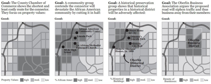
Maps are products of a design process. There are lots of decisions to be made, and every design decision influences the final outcome. To be a Cartographer, you have to understand and accept the responsibility [3] that comes along with making those design decisions. Depending on what I want you to think, I can design my map accordingly to try and sway you. What you choose to include, how you symbolize features, how you show data patterns through analysis, and even the colors you assign to things all have a huge impact on how people will interpret a map. John Krygier [4] and Denis Wood [5]’s book called Making Maps: A Visual Guide to Map Design for GIS [6] has some great examples of how maps can use different representations of the same underlying data to tell very different stories:
Who Wants A Map? Where Will It Be Seen? What Is Its Purpose?
These are the three key questions you have to answer when approaching a map design task. Failure to adequately think through any of these three areas will result in great shame to you and your family. I like to start by thinking about the proposed audience for whatever I’m designing. Who are the people who will look at this map? Is it a group of ten experts, or 40,000 anxious parents who are wondering if schools are closed today due to a 6 micron layer of snow outside? In the case of this class, I’m designing maps to work for thousands of map readers, most of whom I will know very little about aside from the fact that they thought this class would be cool to take. Since I know that my Grandpa, my Mom, and most of my friends are taking this class, I at least have some sense of the range of users I need to design my maps to serve.
After you determine who your map should be serving, you need to consider the place where it’ll be seen. Are you making something to print and take on a canoe trip through a fly-infested backwater? Are you planning on showing off your mad iPad skillz by making a fancy digital slippy map [7]? Perhaps you want to make a digital map that’s not interactive like I’ve done in lots of examples for this course. Maybe you need to design something that’ll work in digital formats and printed formats, including black and white. We’re working on lab assignments in this MOOC that only focus on designing interactive digital maps. If you took a Cartography class [8] with me or any of my fellow academic cartographers around the world, you’d gain experience with all of these other mapping formats as well. Each one has its own constraints, naturally. The design I make to work for black and white prints would be totally different from one that has to be legible and work with interactive tools on your cell phone.
Finally, the third, and potentially most important question you need to answer pertains to the purpose of your map. Simply put, what story are you trying to tell (Thematic Mapping)? Or are you just trying to provide the context for other stories to take place (Reference Mapping)? Everything you do to design your map should correspond to the purpose you’re trying to serve. Maybe I need to design a digital interactive map for college students to easily find the nearest place selling cheap yoga pants. Or maybe I need to design a printed black and white map designed to help first responders instantly recognize the location of hazardous materials in a 2-mile radius of a football stadium.
Layout and Symbolization
Designing a Layout
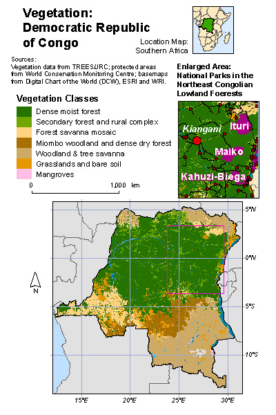
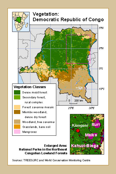
When you design a map, you need to carefully consider the relative balance of all of its visual elements. You have the map itself, and perhaps you have multiple maps (an inset showing where the location of interest is in relation to the rest of the world, for example). You’ll also probably have a title, a legend, scale bar, source information, and other little bits and pieces. Map nerds (cartographers) call those bits and pieces (aside from the main map) marginalia. The act of sorting things out so that clarity is maximized is called establishing a visual hierarchy. Consider the two examples below from Designing Better Maps: A Guide for GIS Users [9] by Cindy Brewer [10]to see what this means in practice. It’s all about shaping the layout items around your message. The map on the top has all of the necessary elements, but they’re not balanced on the page. The example on the bottom shows the same elements arranged in a way that promotes clarity and harmony in the map design. The first example is a bad layout. The second one is a good layout.
Symbolization
By this point you’ve encountered a wide range of ways in which things can be represented on maps. You’ve worked a lot with choropleth (colored-area) maps in labs and you’ve seen a lot of those as examples in the course content. There are many other ways to show stuff though, and I want you to be aware of some of the most common methods.
Point Symbols
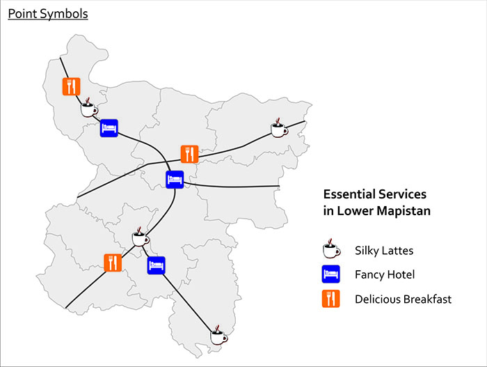
One of the simplest things you can do is to use icons to represent point features. We call these point symbols, and they can range from very detailed in their design (you could even use small photographs if you really wanted to), to very abstract and iconic. Here’s an example of point symbols used to show the locations of important services in Lower Mapistan. Good resources for point symbols include MapBox’s Maki [11] set and our own Penn State Symbol Store [12].
Proportional & Graduated Symbols
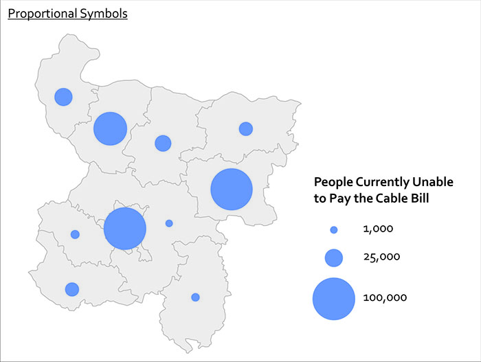
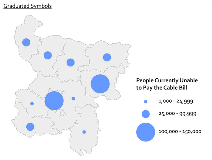
Another form of point symbol is one that changes its size based on underlying data values. These are called proportional symbols when you size each symbol in relation to its attribute value. In a proportional symbol map it’s possible for every symbol to be a slightly different size, since size relates to the data value itself. In contrast, graduated symbols use preset symbol sizes to represent a category of values. It’s usually easier for people to make quick comparisons with graduated symbols, while proportional symbols do a nicer job of revealing the underlying diversity in your dataset. You can see the difference here with this map of cable bill delinquency. Both methods are good to use if you want to map raw values rather than rates (remember our previous work on normalization?).
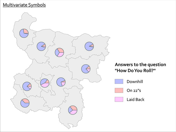
Quite often you want to show more than one thing at a time with your symbols. You can use bar charts, pie charts, and other fancy things like cartograms [13] and bivariate choropleth [14] maps to show more than one variable at once. Pie charts work reasonably well if you just have a few variables you want to show.
Lesson 5, Lecture 2
Choosing Colors
Match Colors To Your Data
The best way to get you thinking about color design on maps is to think first about the data you’re trying to show. There are four primary levels of measurement [15] associated with data, but I can make it even simpler for you. Are you dealing with numerical data or are you dealing with categorical data? In the former case you might have conducted a neighborhood census to count the number of households that leave their children’s toys in the front lawn. In the latter case you might be recording what all of your coworkers consider their favorite curse word. Mine rhymes with “duck.”
When you’re choosing colors for a map, you have three major categories to choose from. Color schemes exist for sequential (less-to-more), diverging (+ / - deviation from an average value), and categorical (movie genres in your Netflix queue) data. And fortunately for you, very clever folks have already done all sorts of science [16] around designing effective color schemes for each of these three types. I’m extremely lucky to work quite a bit with Cindy Brewer [10] here at Penn State, who developed something fabulous called ColorBrewer [17], which is a handy web-tool you can use to choose and preview color schemes. Go try it now.
These color schemes work well for all sorts of things outside of mapping. I’ve even used them to choose paint colors at home (we have a green kitchen that couples nicely with a purple wall, like one of Cindy’s diverging color schemes shows). Note that ColorBrewer gives you the ability to choose schemes that are still OK for colorblind [18] viewers, suitable for printing, and usable with a digital projector. 5-8% of males are colorblind, and ~1% of females are colorblind, so it's a really important audience to consider when designing anything. You can use tools like VisCheck [19]to predict what a colorblind person will see when they come across your image.
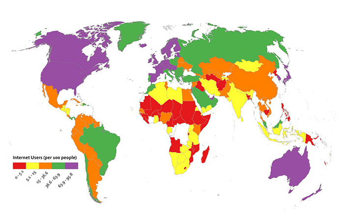
Below I’ve made two examples to show you why thinking about your data first makes color scheme selection easy. I’ve got data here showing the number of Internet Users per 100 people [20] by country. In the first map, you see a sequential color scheme from ColorBrewer. In the second map I’ve used a categorical color scheme from ColorBrewer. Which one is super-easy to understand? The first one, right? The categorical one doesn’t work – you have to study it over and over to determine which places are high and low, respectively, and at a glance you could not interpret this map easily.
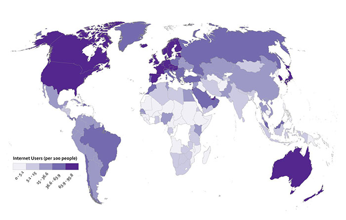
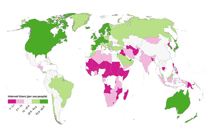
Diverging color schemes are really useful for when you want to show which places are above and below an average value. A lot of the time what you want to do with a map is to convince people to pay attention to particularly high and low outliers in your data, not the stuff that is expected or normal. You can see here what happens when I use a ColorBrewer diverging scheme for the Internet User dataset. I think you’ll agree that this works nicely to show which places are above and below the middle category.
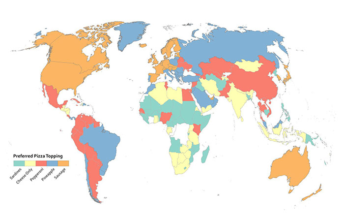
Since this is numerical data that’s not appropriate to represent with a categorical color scheme, I cooked up another example here to show you when using a categorical color scheme would make sense. I may have completely made up this data myself, or it may be absolutely accurate. You decide.
Rainbows Kill People, So Stop Using Them On Maps
Do I have your attention? Good. Resist the urge to use continuous rainbow color schemes to assign colors to things on your map. They’re formally referred to as spectral color schemes, as they typically use most of the named colors in the visible spectrum. They’re also a type of qualitative color scheme. You see them all the time on maps, and they’re a default choice of many folks when visualizing nearly anything you can imagine. They are almost always the wrong choice.
Here’s why they’re awful – 99% of the time when you see them, they have been applied to data that is sequential or divergent in nature, not qualitative. For example, they’re used a lot to show different levels of rainfall on weather maps. Ask yourself this question; how much more does purple represent than orange? See what I mean? You have to learn how to interpret data categories on a map that uses a rainbow of colors to represent something sequential (more or less rain) – it’s never intuitive. A spectral scheme also emphasizes variation where there may not be anything significant. It may also hide the variation you’re actually supposed to be revealing with your data. They don’t work well for color blind users, either. Many others (misleading maps) [21] aside from me have elaborated on these and other reasons to stop the rainbow scourge (here’s one example (no more rainbow scales) [22], and another (color and design) [23]).
They’re popular in part because they result in very bold-looking, colorful maps. More exciting ≠ better when it comes to making any kind of data graphic (such as a map). It’s much more intuitive to have your color scheme match closely with the kind of data you’re using. If it’s a “less-to-more” dataset as in the rainfall example, then you should be using something that goes from a light to dark range with the same hue.
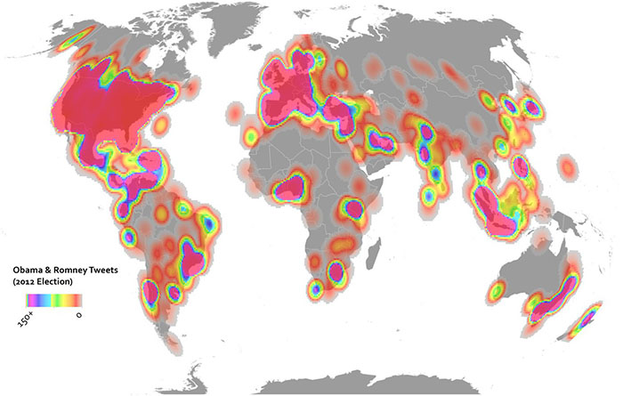
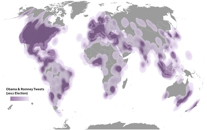
Here are two examples showing some Twitter data from the 2012 U.S. Election. In the above map I’ve used the terrible rainbow thing to symbolize my data. It looks really bright and exciting. All it’s supposed to show though is where things are high and low, so you have to study the color scheme closely to see what bright yellow means in comparison to bright purple, and so on. The map below uses a single hue increasing in saturation in a sequential manner. It’s more subtle, but it’s also more honest when it comes to showing what’s really in this data, and the reader will have no problem identifying the trend immediately.
But don’t just rely on my rant here – check out what scientists have learned from studying doctors [24] as they try to interpret heart scanning images using spectral schemes vs. sequential schemes. Doctors make worse decisions (ones that would impact serious healthcare decisions) using rainbow color schemes. People could die, so don’t use rainbows on maps.
Data Classification
Breaking Up Is Hard To Do
Most thematic maps require the mapmaker to assign individual data observations to categories. The act of assigning observations to categories in mapmaking is called data classification. We use it as a verb in Cartography – I classify my data before I design a map. If you map everything on a 1-to-1 basis, e.g. you show every observation and identify it as a unique thing on your map, then you’re not using classification. An example would be if I had reports from every city in the world about the number of babies who refuse to sleep through the night. I could report each value individually, but most likely I’d want to group similar values together to make it easier to reveal patterns in the data. In every choropleth map in this course, you’ve seen classified data – I collected values within a certain range and assigned one color to describe them.
There are three major types of classification that I want you to know about. There are many other types too, but I’m sure someone will be along shortly to teach a MOOC just about data classification. Equal Interval classification sets category boundaries at a specified data value interval. Quantile classification works the other way around – you decide how many categories you want and then add observations to each class until you’ve got equal members in each subset. This can help your map look nice and visually balanced because there are equal numbers of each color for a choropleth map, for example. The last type I want you to know about is called Natural Breaks, which uses some fancy math to look for “natural” breakpoints in the overall data distribution to place category boundaries there. There’s no best solution for every map – you have to understand your data, understand the story you want to tell, etc… and choose a method that makes sense given those constraints.
Each method is shown below on a histogram showing some fake data. I’ve got 50 observations (hollow circles), and each observation has a particular value (shown on the axis). In this case let’s say I did a survey of all 50 U.S. States to identify the number Audi A4 Avant [25] admirers per 100 people. I would really enjoy doing this survey.


Map Examples
Using Equal Interval classification, I would set class breaks at intervals of 20 Avant Fans Per 100 People and end up with five classes to represent my data.

With Quantile classification, I decide I want five classes first, and then add observations to each class until I’ve got equal numbers in each one. Since I have 50 people who responded to my survey, I need to put 10 observations in each class. So I move from left to right on the data distribution axis and set my classes accordingly.

Using Natural Breaks, I let the fancy math decide where to put breaks in between the most consistent groupings that appear in the responses.

If you’re intrigued by this stuff, check out this excellent article (Visualizing Cancer Data using GIS) [26] by Cindy Brewer on how classification impacts mapping in the context of public health.
Text on Maps
While it’s a bit outside of the scope of this introductory class, I’d be doing you a disservice if I didn’t at least briefly describe the role of labeling and type design on maps. Cartographers often spend a huge amount of effort just trying to decide where to locate labels on a map layout (the map itself and its marginalia). Normally there are too many labels to show in too small of a space, so we need to design a clear visual hierarchy by varying the characteristics of text [27] to emphasize the important bits and de-emphasize the less important bits. Fortunately for you, there are some easy rules to follow – the graphic here shows the priority you should place on label location.

And when you’re faced with the daunting task of choosing among zillions of fonts [28] for the text on your map, Ben Sheesley [29] from Axis Maps [30] has created a great little tool called TypeBrewer [31] (in the spirit of ColorBrewer). Avoid Comic Sans [32] and Papyrus [33] (the default font choice for restaurant menus around the world, unfortunately), please.
Video Activity
For the final lesson of this class, I'd like you to watch this video from Chapter One of Episode Four in the WPSU Geospatial Revolution [34] series. This video shows how geospatial technologies and analytical methods are used to monitor and predict the impacts of climate change. Among others in this video, you'll see Richard Alley [35], another Penn State professor who happens to have his own quite interesting MOOC [36] on Coursera.
Mapping Assignment
Storytelling with Maps
For your final mapping assignment, I want you to take initiative and design a map that tells a story about a topic of your choice. You have some decisions to make:
-
Which mapping platform will you use? You can use anything you like, so long as you’re able to link to an interactive web map or a static image of your map in your peer assessment submission. I’ve listed your options here in order of their relative difficulty.
- Easy: For many of you, sticking with ArcGIS Online will be the easiest option. You know by now how to get to ArcGIS Online, search for data, make a map, and share it with a link.
- Moderate: If you’d like to try something a bit more sophisticated, you can also use ArcGIS Online’s Story Maps [37] capability. You can also review a video series [38] showing how to make a Story Map, and read "Web Maps, Web Apps, Story Maps" [39] to explore what makes them different from other web maps. You should also consider CartoDB [40]. CartoDB offers very nice animated map tools and features to style your web maps and share them with the rest of the world. They have excellent documentation [41], so this is a great option if you want to branch out a bit and try a popular open source web mapping platform.
- Hard: Make use of free, open source desktop GIS software like QGIS [42] or GRASS [43] (see the excellent OsGeo Live site [44] for tons of open source options and tutorials), or commercial software like ArcGIS Desktop. To use the latter, you’d need to have a license already (I can’t help you with that, sorry).
-
What story do you want to tell? I really want you to come up with ideas on your own (be creative!). But here are a few examples if you have no idea how to get started:
- Convince me (and your classmates) that your hometown is vulnerable to one or more types of disasters.
- Show how your home country/state/neighborhood has changed over time in relation to its neighbors.
- Tell a story about your most recent travels, augmenting the map with photos and other media to highlight your experiences.
- Use spatial analysis to identify good locations for your favorite type of restaurant.
-
Where will your data come from?
- You've got tons of options available searching inside ArcGIS Online [45], and you know how to bring in an outside dataset in CSV format from your earlier lab work.
- You should also consider making your own geospatial data. See below for some simple tips on making your own data using a smartphone or GPS.
Collect Your Own Geospatial Data
One thing I'd like to encourage is for you to go out and collect your own data about your community, a problem you'd like to solve, or something else that you think would make good fodder for telling a story. You don't have to do this - I know some of you may not have the time, energy, or devices to pull this off. But it's a cool option for those of you who want to go the extra mile. These are basic guidelines that will cover a lot of the bases, but there is no way for me to provide technical support for thousands of people who might all use different devices.
- Before going out into the field, think carefully about what you would like to collect, the story you would like to tell about it, and your final audience. Think about what attributes you will collect, and how many points you need. Then consider how you will collect the data: Your route, what equipment you will need, and any relevant safety precautions. If you are planning on collecting GPS locations while in free-fall from a basejump off of a radio tower then I want nothing to do with it.
- You will need to gather two pieces of information: (1) a latitude-longitude coordinate (ideally in decimal degree format), and (2) Attributes about each point you are collecting. This could be tree height and species, type of litter or graffiti, length of mullet haircuts, noise from loud car stereos, soil types, jaywalking pedestrians in a 5 minute timespan, or anything you are interested in. Be creative!
- Collect latitude-longitude coordinates for the desired data you want to examine. A few ways to do this include:
- Use a handheld GPS to collect waypoints and tracks. Make sure the GPS is set to WGS 84 datum, and that the coordinate system is set to decimal degree, if possible.
- Use a Smartphone to manually collect waypoints (iPhone: Utilities, Compass) (Android: you'll need GPS Status [46] or another latitude-longitude app). Make note of latitude/longitude using phone notes or on an old fashioned piece of paper.
- Use a Smartphone to collect automatically collect waypoints with MyTracks [47] (Android) or Motion X [48] GPS (iPhone). Make sure the datum is set to WGS 84.
- Use ArcGIS app on iPhone or Android to obtain latitude-longitude coordinates for your current position.
- If you have no field collection device, go to the ArcGIS website [49] and create a new map. Navigate to the locations where you wish to gather information. Change the base map to imagery or another base map that best meets your needs. Click on the measure tool and then the point symbol to obtain the latitude-longitude for each of the points you wish to gather information about. Write down the latitude-longitude coordinates in a digital file or on paper.
- Collect attributes for each of your points that you collect. Use your phone’s note function, or an actual paper notebook to record the attribute data. Make sure that your attributes correspond to each waypoint that you collected.
-
Map and analyze your field data.
- Create a text file or an Excel table with the following column structure as an example: Point ID (1,2,3,4 etc...), Latitude, Longitude, Attribute 1, Attribute 2, and so on.
- Convert your latitude-longitude values into Decimal Degrees if they're not in that format already.
- For example if I was doing a neighborhood tree census: Point ID, Latitude, Longitude, Tree Species, Tree Height (m) might have a first row showing: [A, 34.01234, -117.23946, palm tree, 30]
- Save your file as a CSV file. In ArcGIS Online, Use Add data to Add data from file to import your CSV file. Your points will appear on the map. Symbolize and classify your data how you see fit, and save and share your map through a link for your peer assessment assignment.
For more information on adding field data to ArcGIS Online, see videos explaining the process at the ESRI page "Add Features from a File [50]" and the geographyuberalles YouTube channel [51].
Suggested Grading Rubric for Storytelling Assignment
This assignment can be rated on these four criteria with scores ranging from 1 to 5 (strongly disagree to strongly agree). The four main criteria that you will rate your agreement with are:
- This map tells a complete story.
- This map tells a compelling story.
- This map is designed in a way that reflects the use of best practices in cartographic design and geospatial analysis.
- This map has a look and feel that reinforces the objectives of the story it tells.
You'll also provide a brief written statement to explain your ratings.
Credit Where It's Due
This lab was developed by Anthony Robinson [52] and Joseph Kerski [53].
Discussion Prompts
Storytelling With Maps
For the final lesson, I want to focus on what makes maps work to tell stories (and to explore why they don't work sometimes). You now know enough to be dangerous about the underpinnings that make maps possible, and this week we focused closely on making sure maps are designed effectively to communicate the things we want to share. Here are a few prompts for this lesson:
- Share your final project map and explain the story it's supposed to tell. Here is your chance to share your work with the whole class and get feedback on your work in progress.
- Find and share a map that you think does a great job telling a story. Describe the things about its design that work, as well as those that do not.
- Find and share a map that you think does a terrible job telling a story. Describe the things about its design that work, as well as those that do not.
- What impact do you think new technologies (digital maps, web maps, mobile maps, etc...) have had on how maps are used to tell stories?
- What needs to happen in terms of new technology and science about maps in order to improve the way they're used to tell stories?