Lesson 5: Remote Sensing of the Atmosphere
Motivate...
By this point in the course, you've already encountered many different weather observations (temperature dew point, wind, etc.). But, most of the observations we've learned about so far have something in common: they're collected by a sensor in direct contact with the medium being measured. For example, a standard thermometer measures temperature by being in contact with the air it's measuring. Obviously, such measurements aren't possible over the entire breadth and depth of the atmosphere. We can't have weather stations covering every single point on Earth (although some meteorologists might have dreams about such things)!
To help fill the many gaps between our direct measurements, we need to be able to measure the atmosphere from afar, or "remotely." So-called "remote sensing" is just that -- taking a measurement without having a sensor in direct contact with the medium being measured. If this idea sounds odd, keep in mind that humans have very sophisticated remote sensors on their bodies. It's true! Consider human eyes: they allow humans to observe and measure things from great distances by "seeing" wavelengths over a relatively large band of the electromagnetic spectrum (which is something that most remote sensors can't do).
So, what types of remote sensing instruments do meteorologists use? I'm sure that you are very familiar with satellite and radar images available online and shown on TV weathercasts. These are two very important types of remote sensing observations, and we will discuss how they're created and how to interpret them in this lesson. In addition to common radar and satellite images, many more types of remote sensing data exist, which measure a vast array of atmospheric properties. Although many of these data lie beyond the scope of this course, they all have something in common: All remote sensing data is based on measurements of electromagnetic radiation.

You already know quite a bit about the behavior of electromagnetic radiation (remember the "four laws of radiation" from earlier in the course?), and knowing how radiation behaves helps meteorologists understand the creation and interpretation of remote sensing data. One of the most important things to keep in mind when using remote sensing data is that no perfect, one-size-fits-all, remote sensors exist. Again, think about human eyes. Although they can see in the visible spectrum, they cannot see in the infrared spectrum. Remote sensing instruments are typically designed to measure a specific thing, and can't measure other things beyond their capabilities.
Other limitations stem from the fact that what the sensor "sees" is often not actually what's happening or what we're interested in measuring. The measurements taken by remote sensors must be interpreted or converted into the observation that you really desire, but to make this conversion, we have to make assumptions. Optical illusions are a good example of this idea. Why does this optical illusion involving forced perspective [1] work? Our eyes play "tricks" on us because we make certain assumptions about how light travels to our eyes, and those assumptions are hard to break, even though our brain says, "Hey, that can't be happening!" Interpreting other types of remote sensing data requires assumptions, too. Sometimes those assumptions are perfectly appropriate and sometimes they're not. But, anyone looking at remote sensing data needs to know the limitations so that they can draw the correct conclusions!
We'll focus a lot on satellite and radar images in this lesson because they're so common, and I hope that by the end of the lesson, you really understand what you're looking at when you see such imagery online or on TV. To get started, though, we need to talk a little bit more about remote sensing (and where remote sensing data comes from), and contrast it with more direct measurements. Let's get started!
In-Situ and Remote Sensing Measurements
Prioritize...
When you've finished this page, you should be able to distinguish between in-situ and remote sensing measurements, and be able to give examples of each. You should also be able to determine whether a remote sensing instrument is active or passive.
Read...
There's no doubt that we've talked a lot about weather observations in this course (that's because they're really important to meteorologists). As I mentioned previously, many of the observations we've covered so far are taken by instruments that are in direct contact with the medium that they're "sensing." Formally, any observation taken by an instrument in direct contact with the medium it "senses" is called an in-situ observation.
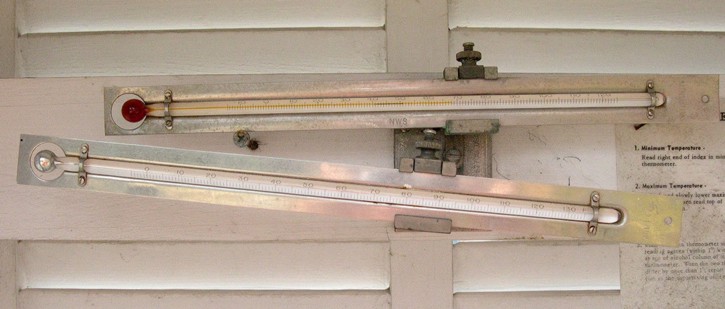
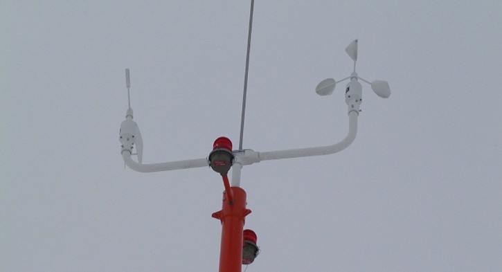
What are some common in-situ observations? Temperatures measured by standard thermometers, wind speeds and directions measured by a cup anemometer and wind vane [2], and precipitation measured by a rain gauge are all very common in-situ weather observations. You may have even taken your own "homemade" in-situ weather observations before. Picking up blades of grass and tossing them in the air to get a sense for the wind direction, for example, would be an example of an in-situ observation.
In-situ observations are extremely helpful to meteorologists, but they don't exist everywhere. Huge gaps exist between weather stations where temperature, dew point, winds, and precipitation are measured. That's where remote sensing comes in. By definition, a remote sensing instrument is not in direct contact with the medium that it "senses." Conventional radar and satellite images that you've probably seen online or on TV are products of remote sensing, but other types of remote sensing equipment exist even outside the world of meteorology. A medical X-ray machine, for instance, is another example of a remote sensing instrument.
Ultimately, many types of remote sensors exist, and we can further break down remote sensors into two basic types -- active and passive remote sensors. To really understand the capabilities of remote sensing instruments, it's important that you understand the difference between the two:
- Active remote sensors emit electromagnetic waves that scatter back to the sensor when they strike "targets."
- Passive remote sensors detect natural electromagnetic waves emitted or scattered by objects.
The difference between active and passive remote sensors is easy to remember if you remember that active remote sensors are "doers" (they emit radiation, which is scattered back to the sensor). One example of an active remote sensor would be an X-ray machine. These machines emit low doses of X-ray radiation into the body, which pass through and strikes a special plate, causing a chemical reaction that produces an image. Conventional weather radar is another example of an active remote sensor (as we'll cover later, the radar emits radiation which strikes targets in the atmosphere, and scatters back to the radar unit).

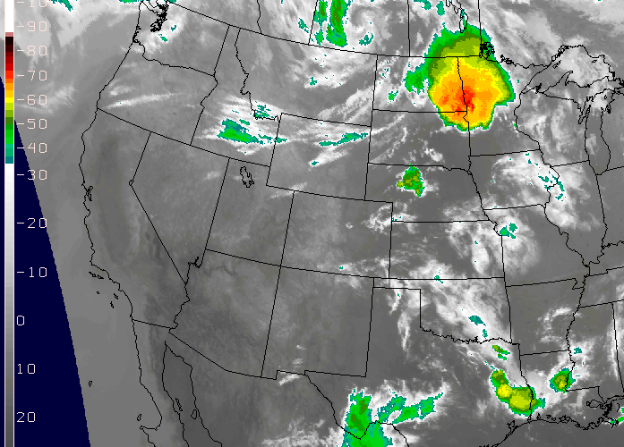
On the other hand, passive remote sensors just wait around and detect the radiation that comes to them naturally from other objects. Human eyes are a good example of passive remote sensors because they collect visible light scattered and emitted by objects. Satellite imagery, such as the image above, showing Hurricane Harvey just before landfall in southeast Texas on August 25, 2017, is also a product of passive remote sensing.
This particular satellite image was created from reflected visible light that was "seen" by a weather satellite orbiting high above the earth. Data from these satellites is transmitted back to Earth, where computers process the data and covert it into cloud pictures and other products. Also of note, the yellow dots and associated text superimposed on the satellite image above show in-situ weather observations around southeast Texas and just offshore. Obviously, there's lots of real estate not being measured by those in-situ observations! The remotely sensed satellite image, on the other hand, was able to show meteorologists the position and structure of Hurricane Harvey.
Ultimately, meteorologists get a lot of data from weather satellites, and not all satellites are created equal. Up next, we'll devote some attention to learning the differences between "geostationary satellites" and "polar-orbiting satellites." As it turns out, they each have different views of Earth because their orbits are very different. Read on!
Observing Weather From Space
Prioritize...
At the end of this section, you should be able to distinguish between geostationary and polar-orbiting satellites. You should also be able to describe their differences and roles in observing the earth, and be able to identify a satellite image as being collected by a geostationary satellite or a polar-orbiting satellite.
Read...
Today, meteorologists have an ever-increasing number of sophisticated, computerized tools for weather analysis and forecasting. But, before 1960, meteorologists drew all their weather maps by hand and no useful computer models existed. Seems like the dark ages, right? Furthermore, before 1960, forecasters did not have weather satellites to afford them a birds-eye view of cloud patterns. The dark ages ended after NASA launched Tiros-I on April 1, 1960.

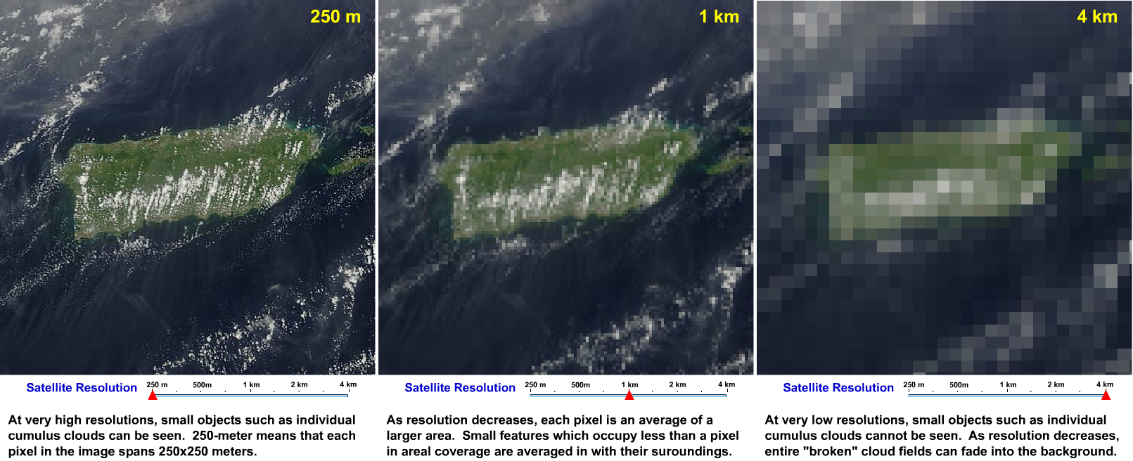
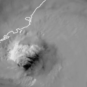
Though the unrefined, fuzzy appearance of this image may seem crude and almost prehistoric, it was an eye-opener for weather forecasters, paving the way for new discoveries in meteorology (not to mention improved forecasts). Today, satellite imagery with high spatial resolution [3] allows meteorologists to see fine details in cloud structures. For example, check out this close-up loop of the eye of Hurricane Dorian [4] in 2019 (loop credit: Dakota Smith). We've come a long way, wouldn't you agree?
Two types of flagships exist in the select fleet of weather satellites that routinely beam back images of Earth and the atmosphere -- geostationary satellites and polar-orbiting satellites.
Geostationary Satellites

Geostationary satellites orbit approximately 35,785 kilometers (22,236 miles) above the equator, completing one orbit every 24 hours. Thus, their orbit is synchronized with the rotation of the Earth about its axis, essentially fixing their position above the same point on the equator (hence the name "geostationary"). In the United States, the National Oceanic and Atmospheric Administration's (NOAA) geostationary satellites go by the name of "GOES" (Geostationary Operational Environmental Satellite) followed by a number. To get an idea of what a geostationary satellite looks like, check out the artist's rendering of GOES-16 on the right.
Two operational GOES satellites currently orbit over the equator at 75 and 135 degrees west longitude, respectively. The terms "GOES East" and "GOES West" are the generic terms for the operational satellites stationed at those longitudes. GOES-East is in a good spot to keenly observe Atlantic hurricanes as well as weather systems over the eastern half of the United States. GOES-West is in better position to observe the eastern Pacific and the western half of the United States. If you are interested in learning more about the current condition of any particular GOES satellite, you can check out the GOES Spacecraft Status [5] page run by the NOAA's Office of Satellite Operations.
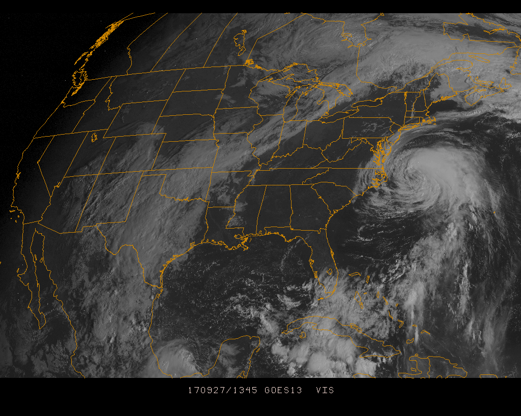
From their extremely high vantage point in space, GOES-East and GOES-West can effectively scan about one-third of the Earth's surface. Their broad, fixed views of North America and adjacent oceans make our fleet of geostationary satellites very effective tools for operational weather forecasters, providing constant surveillance of atmospheric "triggers" that can spark thunderstorms, flash floods, snowstorms and hurricanes (among other things). Once threatening conditions develop, the broad, fixed view of geostationary satellites is especially handy because we can create loops of geostationary satellite imagery, which allow forecasters to monitor the paths and intensities of storms. For example, this loop of GOES satellite images [6] spans from 1345Z to 1745Z on September 27, 2017, and shows Hurricane Maria spinning just off the East Coast.
Geostationary satellites are far from perfect, however. Geostationary satellites don't have a very good view of high latitudes because they're centered over the equator. Therefore, clouds at high latitudes become highly distorted and at latitudes poleward of approximately 70 degrees, geostationary satellites become essentially useless.
I don't want to leave you with the impression that the GOES program is unique, however. Other countries also own and operate geostationary weather satellites (here's an international perspective on geostationary weather satellites [7] if you're interested). If you want to access images from GOES or geostationary weather satellites operated by other countries, surf to the University of Wisconsin's website [8], or try NOAA's GOES Satellite Server [9].
Summary: Geostationary satellites provide fixed views of large areas of the earth's surface (a large portion of an entire hemisphere [10], for example). The fact that their view is fixed over the same point on earth means that sequences of their images can be created to help forecasters track the movement and intensity of weather systems. The primary limitation of geostationary satellites is that they have a poor viewing angle for high latitudes and are essentially useless poleward of 70 degrees latitude.
Polar-Orbiting Satellites
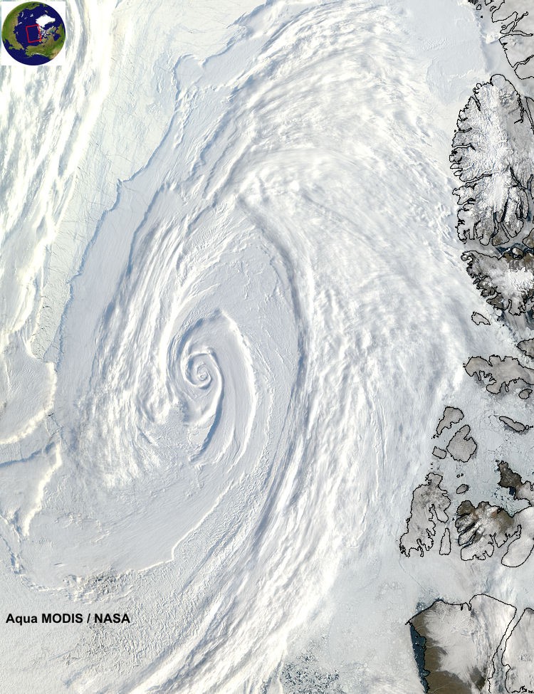
Polar-orbiting satellites pick up the high-latitude slack left by geostationary satellites. In the figure below, note that the track of a polar orbiter runs nearly north-south above the earth and passes close to both poles, allowing these satellites to observe, for example, large polar storms [11] and large Antarctic icebergs [12]. Polar-orbiting satellites orbit at an average altitude of 850 kilometers (about 500 miles), which is considerably lower than geostationary satellites.
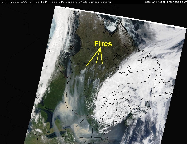
Each polar orbiter has a track that is essentially fixed in space, and completes 14 orbits every day while Earth rotates beneath it. So, polar orbiters get a worldly view, but not all at once! Like making back-and-forth passes while mowing the lawn, these low-flying satellites scan the Earth in swaths [13] about 2600 kilometers (1600 miles) wide, covering the entire earth twice every 24 hours. The appearance of a "lawn-mowing-like" swath against a data-void, dark background on a satellite image is a dead give-away that it came from a polar orbiter, as illustrated by this visible image of smoke sweeping over the Northeast States [14] from fires in Quebec in early July 2002.

NOAA designates its polar orbiters with the acronym "POES" (Polar Orbiting Environmental Satellite) followed by a number. NOAA currently classifies the newest satellite as its "operational" polar orbiter, while slightly older satellites that continue to transmit data are classified as "secondary" or "backup" satellites. As a counterpart to the GOES satellites, the NOAA Office of Satellite Operations operates a POES Spacecraft Status [15] page as well. NASA and the Department of Defense also operate polar orbiters.
Summary: Polar-orbiting satellites orbit at a much lower altitude than geostationary satellites, and don't have a fixed view since the earth rotates beneath their paths. The benefit of polar-orbiters is that they can give us highly-detailed images, even at high latitudes. The main drawback is that they have a limited scanning width, and don't provide continuous coverage for any given area (like geostationary satellites do). A single image from a polar orbiter will often show a swath with sharply defined edges that mark the boundaries of what the satellite could see on a particular pass.
Data from satellites has truly revolutionized weather analysis and forecasting. Satellites can measure atmospheric temperatures, moisture, and winds, among other things. Roughly 80 percent of all data used to run computer forecast models comes from polar orbiting satellites alone, so satellites are a critical part of weather forecast operations around the globe! Now that you have some background about the different types of satellites providing crucial weather data, we'll soon turn our attention to interpreting some main types of satellite images. First, however, we're going to examine some basic cloud types, which will help us in our discussion about interpreting satellite images.
Clouds from Bottom to Top
Prioritize...
At the completion of this section, you should be able to name and describe the three basic cloud types (cirrus, stratus, and cumulus). You should also be able to describe the meaning of the prefixes cirro, alto, cumulo, and nimbo (and the suffix nimbus) in order to decipher common cloud names.
Read...
Meteorologists regularly look at clouds from above via satellite imagery, but before we get into learning how to interpret clouds on satellite images, we need to learn about some basic cloud types. From the perspective of an observer standing on Earth's surface, clouds can be classified by their physical appearance. Accordingly, there are essentially three basic cloud types:
- Cirrus, which is synonymous with a "streak cloud" (detached filaments of clouds that literally streak across the blue sky).
- Stratus, which, derived from Latin, translates to a "layered cloud."
- Cumulus, which means "heap cloud."
From these basic cloud types, meteorologists further classify clouds by their altitudes:
| Image | General Description |
|---|---|
 |
High clouds (cirrus, cirrocumulus, cirrostratus) observed over the middle latitudes typically reside at altitudes near and above 20,000 feet. At such rarefied altitudes, high clouds are composed of ice crystals. |
 |
Middle clouds (altostratus, altocumulus) reside at an average altitude of ~10,000 feet. Keep in mind that middle clouds can form a couple of thousand feet above or below the 10,000- foot marker. Middle clouds are composed of water droplets and/or ice crystals. |
 |
Low clouds (stratus, stratocumulus, nimbostratus) can form anywhere from the ground to an altitude of approximately 6,000 feet. Fog is simply a low cloud in contact with the earth's surface. |
 |
Clouds of vertical development (fair-weather cumulus, cumulus-congestus, cumulonimbus) cannot be classified as high, middle or low because they typically occupy more than one of the above three altitude markers. For example, the base of a tall cumulonimbus cloud often forms below 6,000 feet and then builds upward to an altitude far above 20,000 feet. |
Just by knowing the three basic cloud types (cirrus, stratus, cumulus) and the four classifications (high, middle, low, and clouds of vertical development), along with their corresponding prefixes and suffixes, we can name lots of different types of clouds.
- High clouds can either be "plain" cirrus, or we can add the prefix "cirro" to a suffix that describes their appearance (cirrostratus for high-altitude, layered clouds; cirrocumulus for high-altitude, "heap" clouds).
- Middle clouds carry the prefix "alto" and also a suffix that describes their appearance (altostratus for mid-level, layered clouds; altocumulus for mid-level, "heap" clouds).
- Clouds of vertical development always include the word "cumulus" or the prefix "cumulo," but can have various suffixes or other descriptive modifiers (like "fair-weather cumulus").
- The names of low clouds have more variation. Low clouds can be referred to as plain "stratus" (if they're smooth and layered) or "stratocumulus" if they have both layered and heap-like characteristics, for example. If low, layered clouds are precipitating, they're called nimbostratus. The prefix "nimbo" comes from "nimbus," which means that this low cloud produces precipitation (note that nimbus can also be used as a suffix, as in cumulonimbus when a cumulus cloud is producing precipitation).
To get a better feel for these various cloud types, I highly recommend checking out this interactive cloud atlas [16]. Move your cursor over each red pin to see an example photo and description of that particular cloud type. Exploring this tool should give you a better feel for the various cloud types.
Learning to identify and describe the major cloud types can help you "read the sky," and as we learn more about the processes that make clouds throughout the course, you may be able to make your own simple weather forecasts just based on the types of clouds you see in the sky! However, now that you've looked at clouds from the bottom side, you're ready to look at clouds from the top side and tackle the principles of interpreting clouds on satellite imagery.
Visible Satellite Imagery
Prioritize...
At the completion of this section, you should be able to describe how a satellite constructs an image in the visible spectrum, and describe how to discern the relative thickness of various clouds types on visible satellite imagery. In particular, you should be able to describe how very thick clouds (such as cumulonimbus) appear compared to very thin clouds (like cirrus).
Read...
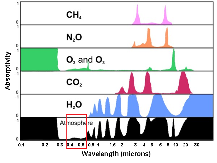
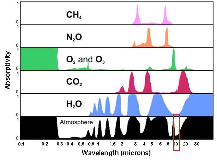
Perhaps you've heard a television weathercaster use the phrase "visible satellite image" before. Perhaps you also thought, "Of course it's visible if I can see it!" So, why make the distinction that a satellite image is "visible?" In short, visible satellite images make use of the visible portion of the electromagnetic spectrum. If you recall the absorptivity graphic [17] that we used back when we studied radiation, notice that from a little less than 0.4 microns to about 0.7 microns, there's very little absorption of radiation at these wavelengths by the atmosphere. In other words, the atmosphere transmits most of the sun's visible light all the way to the Earth's surface.
Along the way, of course, clouds can reflect (scatter) some of the visible light back toward space. Moreover, in cloudless regions, where transmitted sunlight reaches the earth's surface, land, oceans, deserts, glaciers, etc. unequally reflect some of that visible light back toward space (with little absorption along the way). You might say that visible light generally gets a free pass while it travels through the atmosphere.
An instrument on the satellite, called an imaging radiometer, passively measures the intensity (brightness) of the visible light scattered back to the satellite. I should note that, unlike our eyes, or even a standard camera, this radiometer is tuned to measure only very small wavelength intervals (called "bands"). The shading of clouds, the earth's surface (in cloudless areas) and other features, such as smoke from a large forest fire or the plume of an erupting volcano, all can be see on a visible satellite image because of the sunlight they reflect.
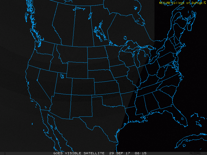
What determines the brightness of the visible light reflected back to the satellite and thus the shading of objects on a visible satellite image? Well to start with, we need to have a some source of light. To see what I mean, check out this visible satellite loop of the United States [18] spanning from 0815Z to 1945Z on September 29, 2017. The image is completely dark at the beginning because 0815Z is the middle of the night in the United States, but gradually we start to see clouds appear on the image from east to west as the sun rose and the reflected sunlight reached the satellite. The bottom line is that standard visible satellite imagery is only useful during the local daytime because we are measuring the amount of sunlight being reflected from clouds and the surface. If there's no sunlight, there's no image.
Now, assuming that it's during the day, the brightness of the visible light reflected by an object back to the satellite largely depends on the object's albedo, which as you may recall is simply the percentage of light striking an object which gets reflected. Since the nature of Earth's surface varies from place to place (paved streets, forests, farm fields, water, etc.), the surface's albedo varies from place to place.
For example, take a look at the visible satellite image showing Pennsylvania and surrounding states around 18Z on October 2, 2017 (below). For the full effect, I recommend opening the full-sized version of the image [19] for a better look. This particular day was nearly cloudless over Pennsylvania, so it gives us a great opportunity to really see how albedo makes a difference in the appearance of an object on visible satellite imagery. The surface in Pennsylvania hardly looks uniform, and that's a result of differing albedos associated with different surfaces. For example, bare soil reflects back about 35 percent of the visible light that strikes it. Vegetation has an albedo around 15 percent. By the way, bodies of water, with a representative albedo of only 8 percent, typically appear darkest on visible satellite images. See how the labeled bodies of water all look darker than the land surfaces?
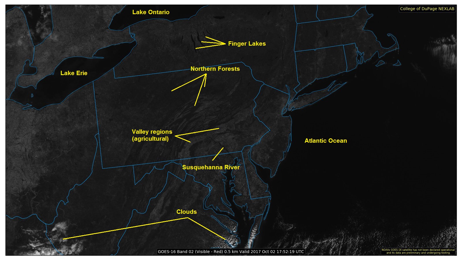

If you want another comparison point, check out the ”true color“ satellite view of Pennsylvania and surrounding states from Google [20]. Can you see how the heavily forested areas of northern Pennsylvania match up with the darker shaded areas I've highlighted above? Can you see how the largely agricultural valleys of southeastern Pennsylvania (with their higher albedo) appear a bit brighter on the image above? Of course, the brightest areas on the visible satellite image above correspond to clouds, which have a much higher albedo than the surface of the earth under most circumstances.
But, many different types of clouds exist, and they all have varying albedos, too! To see what I mean, let's perform an experiment. First, start with a tank of water (upper left in the photograph below). Now add a just tablespoon of milk (upper right), which increases the albedo a bit. By adding the milk, some of the radiation that is passing front-to-back through the tank is being scattered back towards the observer and the water-milk mixture takes on a whitish appearance. In frames #3 and #4 (lower-left and lower-right, respectively), we've added more milk. Now we see that the tiny globules of milk fat further increase albedo as more of the visible light is being scattered back toward the observer, while the transmission of light through the water-milk mixture decreases (that's why the word "SURFACE" is obscured).
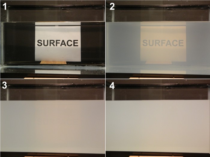
Some key observations that you should note from this experiment:
- It didn't take many globules of milk fat (1 tablespoon of milk in a 10-gallon fish tank) to begin noticeably decreasing transmission and increasing albedo.
- A medium can very quickly become "optically thick" -- that is, nearly zero transmission and a high albedo (a large percentage of light is reflected back to the observer)
- In frame #4, we had only added a total of three tablespoons of milk to the tank (so the tank is still mostly filled with water, yet the transmission of light through the tank is minimal and the albedo is fairly high. Even if we switched to a tank filled with pure milk, the albedo would only increase marginally (maybe another 20 or 30 percent).
This last point is true of clouds as well; once a cloud becomes "thick enough," additional growth will not change its albedo (and appearance on visible satellite imagery) appreciably. The bottom line is that thick clouds, like cumulonimbus (which are associated with showers and thunderstorms), are like tall glasses of milk in the sky; they contain lots of light-scattering water droplets and/or ice crystals. Meteorologists say that such clouds have a "high-water (or ice) content" and can have albedos as high as 90 percent, which causes them to appear bright white on visible satellite imagery.
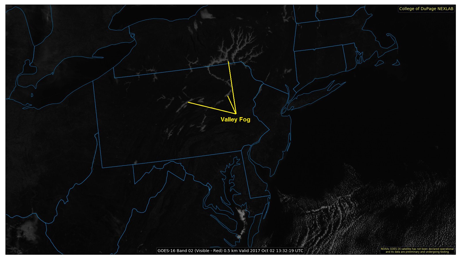
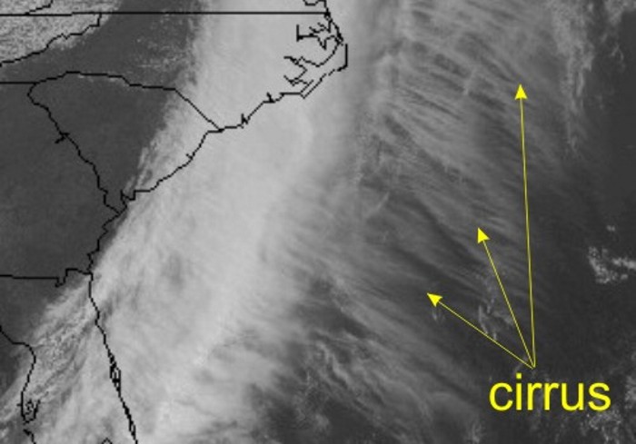
More subdued clouds, such as fog and stratus [21], typically have a lower water content and a lower albedo (like a glass of water with only a tiny bit of milk). Indeed, the albedo for thin (shallow) fog and stratus can be as low as 40 percent. So, as a general rule, fog and stratus often appear as a duller white compared to thicker, brighter cumulus clouds. Here's an example of valley fog [22] over Pennsylvania and New York on the morning of October 2, 2017, for reference. Wispy, cirrus clouds (high-altitude, thin clouds made of ice crystals) have the lowest albedo (low ice content), averaging about 30 percent. They appear almost grayish compared to the bright white of thick cumulonimbus clouds outlined on the satellite image below.
As a general caveat to our discussion about determining shading on visible satellite images, I point out that brightness also depends on sun angle. For example, the brightness of the visible light reflected back to the satellite near sunset is limited, given the low sun angle and the relatively high position of the satellite. To see what I mean, check out this loop of visible satellite images [23] from the afternoon and evening of March 7, 2017, when severe thunderstorms erupted over Nebraska and Iowa. The tall, thick cumulonimbus clouds that developed appear bright white initially, but as sunset approaches, the appearance of the clouds darkens. If you look closely at the images later in the loop, you'll be able to see tall cumulonimbus clouds casting shadows to the east. Pretty cool, eh?
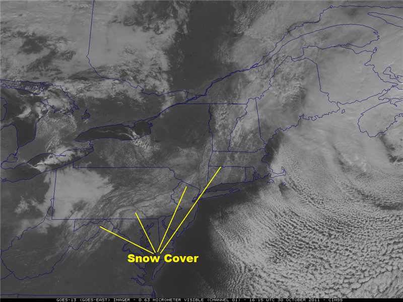
One more quick point about interpreting visible images. Clouds aren't the only objects that can have very high albedos; therefore, they're not the only objects that can appear whitish. Indeed, cloudless, snow-covered regions can have albedos as high as 80 percent, and they also appear bright white on visible imagery. So, how can you tell the difference between clouds and snow cover on standard visible imagery? Two main ways exist:
- Regions of snow covered ground still often reveal details of the local terrain, which appear somewhat darker (unfrozen water lakes and rivers, dense forests which mask the snow pack below, etc.), as in this example from October 30, 2011 [24] in the wake of a big Northeast U.S. snowstorm.
- If you're looking at a loop of visible images, snow cover doesn't move, but clouds do! Here's the corresponding loop of visible images from October 30, 2011 [25]. Can you differentiate the stationary snow cover from the moving clouds?
That about wraps up our section on visible satellite imagery. If you're interested in looking at current visible satellite images, NOAA's GOES satellite server [9], the National Center for Atmospheric Research (NCAR) [26], the College of DuPage [27], and Penn State [28] all serve as good sources. On those pages, you'll also find other types of satellite imagery, which we're about to cover. But, before you move on, make sure to review the following key points:
Visible satellite imagery...
- is based on the albedo of objects (the fraction of incoming sunlight that is reflected to the satellite).
- can tell you about the thickness of clouds (thicker clouds have higher albedos and appear brighter than thinner clouds, which have lower albedos)
- can be used to distinguish between snow cover and clouds, given that surface features such as lakes and rivers can be observed
- is not able to detect clouds (or anything else) during the satellite's local night (visible imagery requires sunlight).
- is not useful for determining whether precipitation is present under the observed clouds.
Infrared Satellite Imagery
Prioritize...
After reading this section, you should be able to describe what is displayed on infrared satellite imagery, and describe the connection between cloud-top temperature retrieved by satellite and cloud-top height. You should also be able to discuss the key assumption about vertical temperature variation in the atmosphere that meteorologists make when interpreting infrared imagery.
Read...
Visible satellite imagery is of great use to meteorologists, and for the most part, its interpretation is fairly intuitive. After all, the interpretation of visible imagery somewhat mimics what human eyes would see if they had a personal view of the earth from space. But, visible satellite imagery also has its limitations: it's not very useful at night, and it only tells us about how thick (or thin) clouds are.
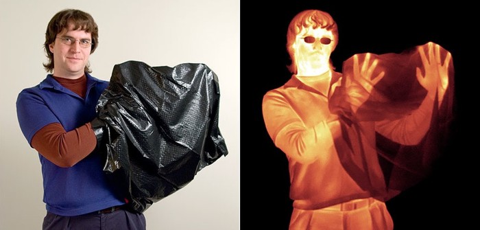
By limiting our "vision" only to the visible part of the spectrum, we diminish our ability to describe the atmosphere accurately. Consider the images below. The image on the left shows a photo (which uses the visible portion of the spectrum) of a man holding a black plastic trash bag. On the right is an infrared image of that same man. Notice that switching to infrared radiation gives us more information (we can see his hands) than we had just using visible light. Furthermore, the fact that the shading in the infrared image is very different from the visible image suggests that perhaps we can gain different information from this new "look."
Before we delve into what we can learn from infrared satellite imagery, we need to discuss what an infrared satellite image is actually displaying. Just like visible images, infrared images are captured by a radiometer tuned to a specific wavelength. Returning to our atmospheric absorption chart [29], we see that between roughly 10 microns and 13 microns, there's very little absorption of infrared radiation by the atmosphere. In other words, infrared radiation at these wavelengths emitted by the earth's surface, or by other objects like clouds, gets transmitted to the satellite with very little absorption along the way.
You may recall from our previous lesson on radiation that the amount of radiation an object emits is tied to its temperature. Warmer objects emit more radiation than colder objects. So, using the mathematics behind the laws of radiation, computers can convert the amount of infrared radiation received by the satellite to a temperature (formally called a "brightness temperature" even though it has nothing to do with how bright an object looks to human eyes). Finally, these temperatures are converted to a shade of gray or white (or a color, as you're about to see), to create an infrared satellite image. Conventionally, lower temperatures are represented by brighter shades of gray and white, while higher temperatures are represented by darker shades of gray.
While visible satellite images pretty much all look the same, that's not the case with infrared images (see the montage of images below). Some infrared images are in grayscale so that they resemble visible images (upper-left), while others include all the colors of the rainbow! Such infrared images that contain different color schemes are usually called enhanced infrared images, not because they are better, but because the color scheme highlights some particular feature on the image (usually very low temperatures). There's really no fundamental difference between a "regular" (grayscale) infrared image and an enhanced infrared image; the coloring does not change the data it is presenting. The key with any IR image is to locate the temperature-color scale (usually on the side or bottom of the image) and match the shading to whatever feature you're looking at. Here are the uncropped images for the ”traditional“ IR image [30] and lower-right ”enhanced image“ [31], for reference.
So, we know that an infrared radiometer aboard a satellite measures the intensity of radiation and converts it to a temperature, but what temperature are we measuring? Well, because atmospheric gases don't absorb much radiation between about 10 microns and 13 microns, infrared radiation at these wavelengths mostly gets a "free pass" through the clear air. This means that for a cloudless sky, we are simply seeing the temperature of the earth's surface. To see what I mean, check out this loop of infrared images of the Sahara Desert [32]. Note the very dramatic changes in ground temperatures from night (light gray ground) to day (dark gray/black ground). This is because surface temperatures often dramatically change during the day over deserts, where the broiling sun bakes the earth's surface by day. At night, however, the desert floor often cools off rapidly after sunset.
Of course, sometimes clouds block the satellite's view of the surface; so what's being displayed in cloudy areas? Well, while atmospheric gases absorb very little infrared radiation at these wavelengths (and thus emit very little by Kirchhoff's Law), that's not the case for liquid water and ice, which emit very efficiently at these wavelengths. Therefore, any clouds that are in the view of the satellite will be emitting infrared radiation consistent with their temperatures. Furthermore, infrared emitted by the earth's surface is completely absorbed by the clouds above it. Remember that since clouds emit infrared radiation effectively at this wavelength, they also absorb radiation very effectively. So even though there is plenty of infrared radiation coming from below the cloud and even from within the cloud itself, the only radiation that reaches the satellite is from the cloud top. Therefore, infrared imagery is the display of either cloud-top temperatures or Earth's surface temperature (if no clouds are present).

So, infrared imagery tells us the temperature of the cloud tops, but how is that useful? Well, remember that temperature typically decreases with increasing height in the troposphere, and if we make that assumption, then we can equate cloud-top temperatures to cloud-top heights. In other words, clouds with cold tops are at high altitudes (for example: cirrus, cumulonimbus). Clouds (such as stratus, stratocumulus, or cumulus) with warmer tops have tops that reside at a low altitude.
Given that infrared imagery can tell us about the altitude of cloud tops, and visible imagery can tell us about the thickness of clouds, meteorologists use both types of images in tandem. Using them together makes for a powerful combination that helps to specifically identify types of clouds. Let's apply this quick summary to a real case so I can drive home this point. Check out the side-by-side visible and infrared images below, and we'll use both types of images to diagnose the cloud type at each labeled point. Note that even though no temperature scale is shown on the infrared image, brighter shades of gray and white correspond to lower temperatures (as is typically the case).
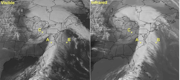
- Point A -- Located in the line of bright white clouds extending from the Outer Banks of North Carolina to central Florida. Their brightness on visible imagery indicates that these are thick clouds. These clouds also appear bright on infrared imagery, so they have cold cloud tops, indicating that the tops are high in the troposphere. Thus, given that these clouds are thick and have cold tops, we can assume that they are cumulonimbus (which can have tops reaching altitudes as high as 60,000 feet).
- Point B -- Located in the area of "feathery" clouds over the Atlantic. Obviously, these feathery clouds are not as bright as the area of cumulonimbus on visible imagery, which means the clouds at Point B are much thinner. On the infrared image, these thin clouds appear bright white, meaning that they have cold tops, which are high in the troposphere. Therefore, they must be cirrus clouds (which are high and thin). I should quickly mention that sometimes when clouds have very thin spots, infrared radiation from the earth's surface can leak through holes in the clouds and reach the satellite. That bit of extra radiation from the warm earth can make the tops of very thin clouds appear a little warmer (and lower) than they really are.
- Point C: Located in the region of clouds over the Great Lakes and upper Ohio Valley. The darker grayish appearance on infrared imagery tells us that they're low clouds with warm tops. These clouds are fairly bright on the visible image, however, meaning that they must be moderately thick. Given the somewhat "cellular" nature and breaks in between blobs of clouds, these are likely stratocumulus clouds (although farther north in the Great Lakes there's likely a more solid deck of stratus).
The lesson learned here is that you can use both visible and infrared imagery to identify cloud types during the daytime. For another example of how forecasters interpret infrared and visible imagery in tandem to maximize their usefulness, check out this short video (4:53) below:
At night, routine visible imagery is not feasible, so weather forecasters must rely almost exclusively on infrared imagery. Still, infrared imagery has some limitations. Detecting nighttime low clouds and fog can be difficult because the radiating temperatures of the tops of low clouds and fog are often nearly the same as nearby ground where stratus clouds haven't formed, for example. Thanks to newer satellite technology (with more available channels), however, meteorologists can often get around this problem and better identify low clouds and fog at night.
Of course, another limitation of infrared imagery is that we have to make a major assumption (that temperatures decrease with increasing height) to interpret it. While that assumption is usually true, it's not always true. Remember that on calm, clear nights, nocturnal inversions can form (temperatures increase with increasing height in a layer of air near the ground). Therefore, at night or early in the morning, the ground in cloud-free areas can sometimes actually be colder than the tops of nearby low clouds. For example, check out this infrared image collected at 1131Z on February 25, 2008 [34]. Focus your attention on the slightly darker patch over south central Texas that I've circled. Is this region covered by clouds, or is it clear?
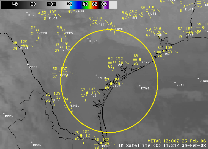
It's tempting to think that the darker patch is warmer and thus must be the bare ground. But, check out the station model observations. The stations in the dark region show overcast skies or sky obscured by fog. In fact, the colder areas surrounding the circle have clear skies and the warmer region within the circle is covered by low clouds and fog! The time of the image is 1131Z, which is right before sunrise, and a nocturnal inversion developed in the clear areas as the ground became very cold. The top of the low clouds and fog was higher and warmer than the ground, which is why the region of fog and low clouds appeared darker than its surroundings. The bottom line here is that you must remember that you're looking at temperature when you're looking at an infrared image. In situations where our assumption about temperatures decreasing with increasing height isn't true, your eyes might play tricks on you (brighter areas might not actually be clouds after all).
If you're interested in looking at current infrared satellite images, NOAA's GOES satellite server [9], the National Center for Atmospheric Research (NCAR) [26], the College of DuPage [27], and Penn State [35] all serve as good sources. Up next, we'll briefly discuss another type of imagery from satellites -- water vapor imagery. But before you move on, review the following key points on infrared imagery.
Infrared satellite imagery...
- is based on the fact that measuring an object's infrared emission tells you something about its temperature.
- displays the temperature of either cloud tops or the earth's surface (if the sky is clear).
- can be combined with the assumption that temperature decreases with height to determine cloud-top heights. Colder cloud-tops (lower temperatures) mean higher clouds.
- is not able to give any direct indication of cloud thickness or the presence of precipitation (although inferences can be made in some cases).
Water Vapor Imagery
Prioritize...
At the completion of this section, you should be able to describe and interpret what is displayed on water vapor imagery, describe what it's most commonly used for, and discuss its limitations (in other words, what it typically cannot show).
Read...
Our look at visible and infrared imagery has hopefully shown you that using a variety of wavelengths in remote sensing is helpful because this approach gives us a more complete picture of the state of the atmosphere. Meteorologists can use visible and infrared imagery to look at the structure and movement of clouds because these types of images are created using wavelengths at which the atmosphere absorbs very little radiation (so radiation reflected or emitted from clouds passes through the clear air to the satellite without much absorption). Now, what if we took the opposite approach? What if we looked at a portion of the infrared spectrum where atmospheric gases (namely water vapor) absorbed nearly all of the terrestrial radiation? What might we learn about the atmosphere? Water vapor imagery addresses that question.
In case you didn't catch it in the paragraph above, let me be clear: Water vapor imagery is another form of infrared imagery, but instead of using wavelengths that pass through the atmosphere with little absorption (like traditional infrared imagery), water vapor imagery makes use of slightly shorter wavelengths between about 6 and 7 microns. As you can tell from our familiar atmospheric absorption chart [36], these wavelengths are mostly absorbed by the atmosphere, and by water vapor in particular. Therefore, water vapor strongly emits at these wavelengths as well (according to Kirchoff's Law). Thus, even though water vapor is an invisible gas at visible wavelengths (our eyes can't see it) and at longer infrared wavelengths, the fact that it emits so readily between roughly 6 and 7 microns means the radiometer aboard the satellite can "see" it.
This fact makes the interpretation of water vapor imagery different than traditional infrared imagery (which is mainly used to identify and track clouds). Unlike clouds, water vapor is everywhere. Therefore, you will very rarely see the surface of the earth in a water vapor image (except perhaps during a very dry, very cold Arctic outbreak). Secondly, water vapor doesn't often have a hard upper boundary (like cloud tops). Water vapor is most highly concentrated in the lower atmosphere (due to gravity and proximity to source regions like large bodies of water), but then the concentration tapers off at higher altitudes.
The fact that water vapor readily absorbs radiation between roughly 6 and 7 microns also raises an interesting question -- just where does the radiation that ultimately reaches the satellite originate from? The answer to that question is the effective layer, which is the highest altitude where there's appreciable water vapor. In other words, the effective layer is the source for the radiation detected by the satellite. Above the effective layer, there is not enough water vapor to absorb the radiation emitted from below, nor is there enough emission of infrared radiation to be detected by the satellite. Any radiation emitted below the effective layer is simply absorbed by the water vapor above it. Therefore, the satellite measures the radiation coming only from the effective layer, and like traditional infrared imagery, this radiation intensity is converted to a temperature. Here's the key point: Water vapor imagery displays the temperature of the effective layer of water vapor (notice that the water vapor image below has a temperature scale, just like traditional infrared imagery).

So what can we infer by knowing the temperature of the effective layer? Just like traditional infrared imagery, we make the assumption that temperature decreases with increasing altitude, which implies that colder effective layers reside higher in the atmosphere. This means that if we know the height of the effective layer, we can infer the depth of the dry air above it (remember that we cannot make any assumptions about what lies below the effective layer). For example, consider the region shaded orange over southern California in the image above. Here the temperature of the effective layer is a relatively balmy -18 degrees Celsius. This temperature corresponded to a height of 19,000 feet (5.8 km) on this date -- approximately in the middle region of the troposphere (I looked up the temperature profile for this location and time). So, if the effective layer is located at 19,000 feet, then we can infer that some of the mid-level and all of the upper-level atmospheric column is dry.
For a location over Denver, Colorado, which shows a temperature of - 30 degrees Celsius, the height of the effective layer was nearly 30,000 feet (9.1 km) on this date, and we can conclude that the upper troposphere contains more water vapor here than over southern California. Finally, turn your attention to the region of -60 degrees Celsius over central Texas (light blue). Here, the effective layer was way up at 40,000 feet (12.2 km) on this date. Such a cold, high effective layer can only be caused by high ice clouds typical of the tops of cumulonimbus clouds. I should point out that at such low temperatures very little water exists in the vapor phase. However, ice crystals also have a fairly strong emission signature between 6 and 7 microns, so if you see such cold effective layers (less than -45 degrees Celsius or so), you are most likely looking at ice clouds (cirrus, cirrostratus, cumulonimbus tops, etc.) rather than at water vapor.
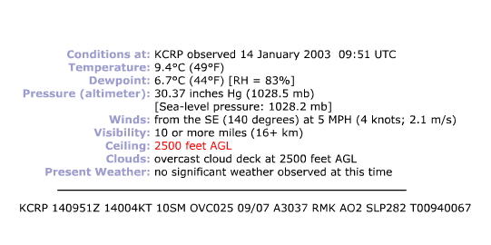
In the case above, did you notice that the lowest effective layer that we observed was 19,000 feet? That's not uncommon. Because emissions from water vapor near the earth's surface are absorbed by water vapor higher up, it's often impossible to detect features at very low altitudes. In other words, low clouds (stratus, stratocumulus, and nimbostratus) are rarely observable on water vapor imagery. To see what I mean, check out the pair of satellite images below (infrared on the left, water vapor on the right). The yellow dot represents Corpus Christi, Texas, which was shrouded in low clouds (gray shading on the infrared image). The surface observation from Corpus Christi at this time [37] actually showed low clouds at 2,500 feet. Now examine the water vapor image. The effective layer resided in middle troposphere as evidenced by the dark shading on the water vapor image (indicating a warm effective layer). However, not even a hint of the low clouds can be seen. In this case, the effective layer (located above the low clouds) absorbed all of the radiation emitted from below, rendering the low clouds undetectable on the water vapor image.

I should note that newer satellite technology, which allows meteorologists to look at water vapor imagery created from multiple wavelengths, allows for features below 10,000 feet to be seen more commonly than in "the old days." However, features right near the surface are still only viewable in very cold, dry air masses (when the effective layer is near the surface).
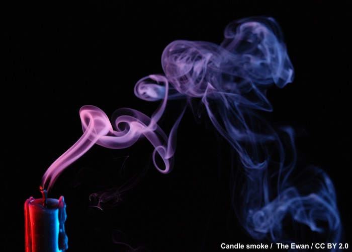
Now that we've discussed how to interpret water vapor imagery, what might we use it for? Well, because water vapor is everywhere, and it moves along with the wind, forecasters most often use water vapor imagery to visualize upper-level circulations in the absence of clouds. In other words, water vapor can act like a tracer of air movement, much like smoke from an extinguished candle [38]. For example, consider this enhanced infrared satellite loop [39] and focus your attention on the Southwest U.S. Since no clouds are present, we can't really tell how the air is moving over this region. Now, check out the corresponding loop of water vapor images [40] and focus your attention on the same area. What do you see? Do you notice the ever-so-slight counter-clockwise circulation of the air off the California coast? Such upper-level circulations are important to weather forecasters (they can sometimes be triggers for inclement weather), and we were only able to identify this circulation with the aid of water vapor imagery.
To see another example of how to interpret water vapor imagery, and to see the types of insights that meteorologists can get from examining it, check out the short video (2:33) below. In the video, ignore the black arc over the Pacific Ocean toward the left. That's just the satellite filtering out some bad data.
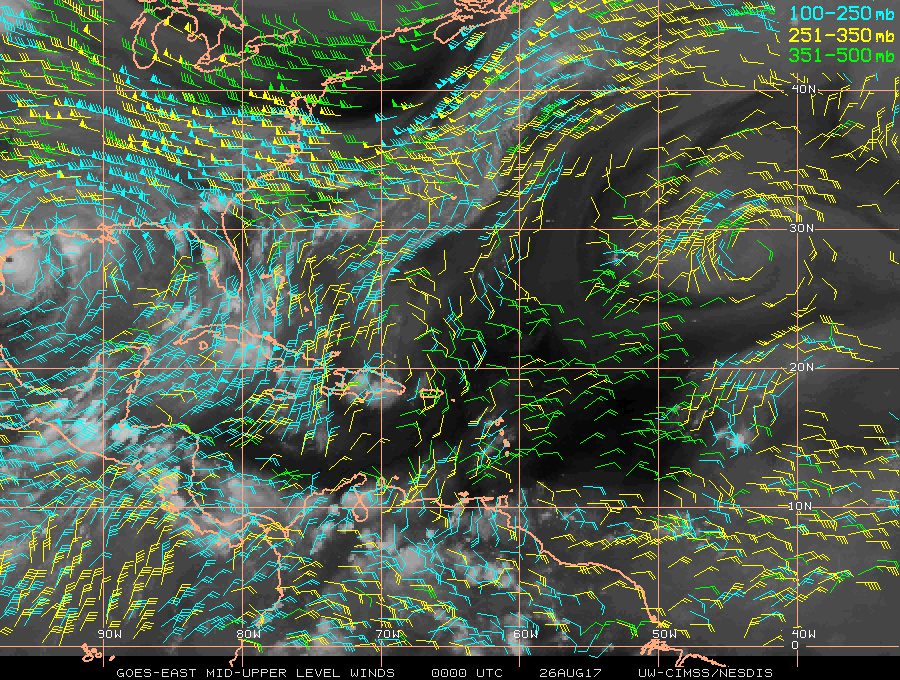
Water vapor imagery's ability to trace upper-level winds ultimately allows forecasters to visualize upper-level winds, and computers can use water vapor imagery to approximate the entire upper-level wind field. Here's an example of such "satellite-derived winds [41]" in the middle and upper atmosphere at 00Z on August 26, 2017 (on the far left side of the image, you can see Hurricane Harvey about to make landfall in Texas). Having such observations over the data-sparse oceans is extremely valuable to forecasters, and much of this information gets put into computer models so that they better simulate the initial state of the atmosphere, which leads to better forecasts than if we didn't have these observations.
If you're interested in looking at current water vapor images, NOAA's GOES satellite server [9], the National Center for Atmospheric Research (NCAR) [26], the College of DuPage [27], and Penn State [28] all serve as good sources. Now that we've covered the three most commonly used types of satellite imagery, we're going to shift gears from remotely observing the weather from space, to remotely observing the weather from right near the ground with radar. Before moving on to radar imagery, take a moment to review the key points about water vapor imagery.
Water Vapor imagery...
- uses infrared radiation; except unlike traditional infrared imagery, it uses wavelengths at which water vapor strongly emits and absorbs infrared radiation.
- displays the temperature of the effective layer of water vapor. Warm effective layers mean that the middle to upper troposphere are "dry" (they contain very little water vapor). By comparison, colder effective layers indicate a higher concentration of water vapor and/or ice clouds in the upper troposphere.
- is not able to give any measure of the atmospheric water vapor content below the effective layer.
- usually does not show the presence of low clouds or water vapor near the surface. These almost always lie below the effective layer.
- is used to trace air motions in the middle and upper troposphere, even in areas with no clouds.
How Radar Works
Prioritize...
After reading this section, you should be able to describe how a radar works and what portion of the electromagnetic spectrum that modern radars use. You should also be able to define the term "reflectivity" as well as its units. Furthermore, you should be able to explain how a radar locates a particular signal and describe concepts such as beam elevation and ground clutter.
Read...
I'd guess that most folks have seen weather radar imagery before, either on television, on the Web, or on your favorite weather app. Radar imagery is perhaps the remote sensing product that's most commonly consumed by the public. Radar imagery has been helping weather forecasters detect precipitation since World War II, but the roots of modern radar can be traced all the way back to the late 1800s and German physicist Heinrich Hertz's work on radio waves. While early radars used radio waves (radar is actually an acronym for RAdio Detection And Ranging), the United States, in a joint effort with Great Britain, advanced the design of radar by using microwaves, which have shorter wavelengths than radio waves as you may recall from our discussions on the electromagnetic spectrum.
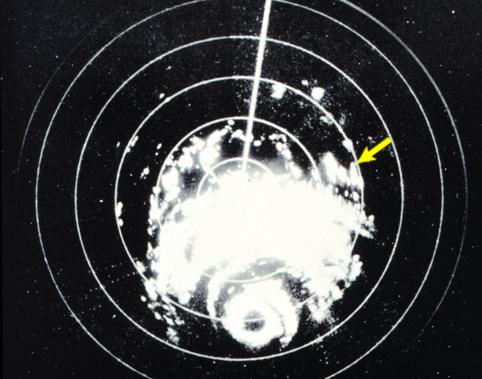
The shift to shorter wavelengths provided more precision in detecting and locating objects relative to the microwave transmitter, and in World War II radar was to detect enemy aircraft, as well as squadrons of airborne raindrops, ice pellets, hailstones, and snowflakes. Ultimately, the World War II radars served as the prototypes for the WSR-57 radars that were used by the National Weather Service for decades (WSR stands for "Weather Surveillance Radar" and the "57" refers to 1957, the first year they became operational). This image, taken from a WSR-57 radar [42], which looks rather crude by modern standards, shows the pattern of precipitation in Hurricane Carla near the Texas Coast on September 10, 1961. The yellow arrow in the north-east quadrant of the storm points to the location where a tornado (a rapidly rotating column of air extending from the base of a cloud all the way to the ground) occurred near Kaplan, Louisiana.
The next generation of radars, appropriately tagged with the acronym, NEXRAD for NEXt Generation RADars, became operational in 1988. Weather forecasters often refer to one of these radars as a WSR-88D. The "WSR" is short for "Weather Surveillance Radar," the "88" refers to the year this type of radar became operational and the "D" stands for "Doppler," indicating the radar's capability of sensing horizontal wind speed and direction relative to the radar (we'll talk more about this later). Check out the sample image (below) from the WSR-88D radar at State College, PA, at 23Z on April 27, 2011.

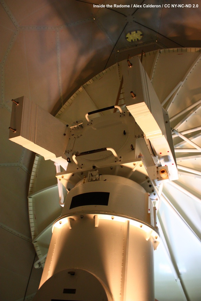
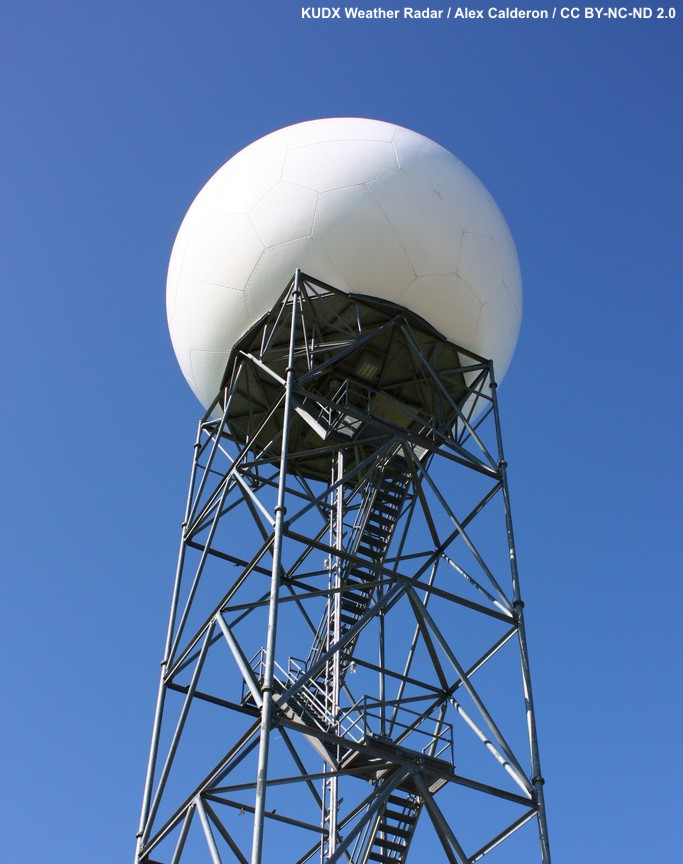
So, ultimately, how do radars work? Well, for starters, radar is an active remote sensor, unlike the satellite-based sensors we've just covered. While radiometers sit aboard satellites orbiting in space and passively accept the radiation that comes their way from Earth and the atmosphere, the antenna of a WSR-88D [43], housed inside a dome, [44] transmits pulses of microwaves at wavelengths near 10 centimeters. Once the radar transmits a pulse of microwaves, any airborne particle lying within the path of the transmitted microwaves (such as bugs, birds, raindrops, hailstones, snowflakes, ice pellets, etc.) scatters microwaves in all directions. Some of this microwave radiation is back-scattered or "reflected" back to the antenna, which "listens" for "echoes" of microwaves returning from airborne targets (see the animation below).

The radar's routine of transmitting a pulse of microwaves, listening for an echo, and then transmitting the next pulse happens faster than a blink of an eye. Indeed, the radar transmits and listens at least a 1000 times each second. But, like a friend who's a good listener, the radar spends most of its time listening for echoes of returning microwave energy. The radar's antenna has to have a really "good ear" for listening because only a tiny fraction of the power that's emitted by the radar actually gets scattered back. Indeed, the pulse emitted by the radar has about 100 million times more power than the return signal. It turns out that it's easiest for meteorologists to convert these weak radar return signals to an alternative measure of echo intensity called reflectivity with units of dBZ (which stands for "decibels of Z"), which is a logarithmic measure of reflectivity. Don't worry about the details of "logarithmic" measure; the bottom line is that the value of dBZ increases as the strength (power) of the signal returning to the radar increases.
To pinpoint the position of an echo relative to the radar site (within the circular range of the radar), the target's linear distance and compass bearing [45] from the radar must be determined. First, realize that the transmitted and returning signals travel at the speed of light, so by measuring the time of the "round trip" of the radar signal (from the time of transmission to the time it returns), the distance that a given target lies from the radar can be determined. For example, it takes less than two milliseconds for microwaves to race out a distance of 230 kilometers (143 miles) and zip back to the radar antenna (143 miles represents the maximum range of radars operated by the National Weather Service).
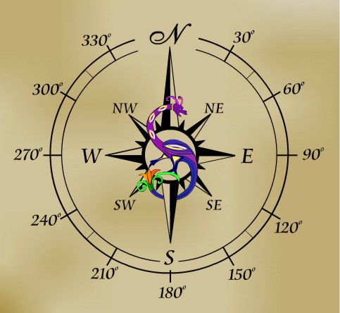

How does the radar know the direction or bearing of the target relative to the radar? Well, in order to "see" in all directions, the radar antenna rotates a full 360 degrees at a speed usually varying from 10 degrees to as much as 70 degrees per second. A computer keeps track of the direction that the antenna is pointing at all times, so when a signal is received, the computer calculates the reflectivity, figures out the angle and distance from the radar site, and plots a data point at the proper location on the map. Believe it or not, all of this happens in just a fraction of second!
I need to mention, however, that the radar typically does not transmit its signal parallel to the ground. Indeed, the standard angle of elevation is just 0.5 degrees above a horizontal line through the radar's antenna (see the schematic below); however, some NEXRAD units can scan at even smaller angles of elevation if local terrain allows. Either way, the radar "beam" is initially not much higher above the ground than the radar itself, but with increasing distance from the radar, the "beam" gets progressively higher above the ground (and its width increases). At a 0.5 degree scanning angle and a distance of 120 kilometers (about 75 miles) from the radar transmitter, the radar "beam" is more than 1 kilometer above the surface (nearly 3,300 feet). Near the maximum range of 230 kilometers, the radar beam is at twice that altitude.

Don't worry about the specifics of calculating specific "beam" heights, but I do want to make you aware of several implications of the increasing elevation of the radar scan. First, you should realize that radar imagery often shows reflectivity from the precipitation targets within a cloud, and not necessarily what is falling out of the cloud. If you don't realize this fact, you can sometimes get confused when looking at radar imagery. For example, often when light precipitation falls into a layer of dry air below, it evaporates entirely before reaching the ground. Yet, it may look like it's precipitating on a radar image because the radar "sees" the precipitation at the level of the cloud.
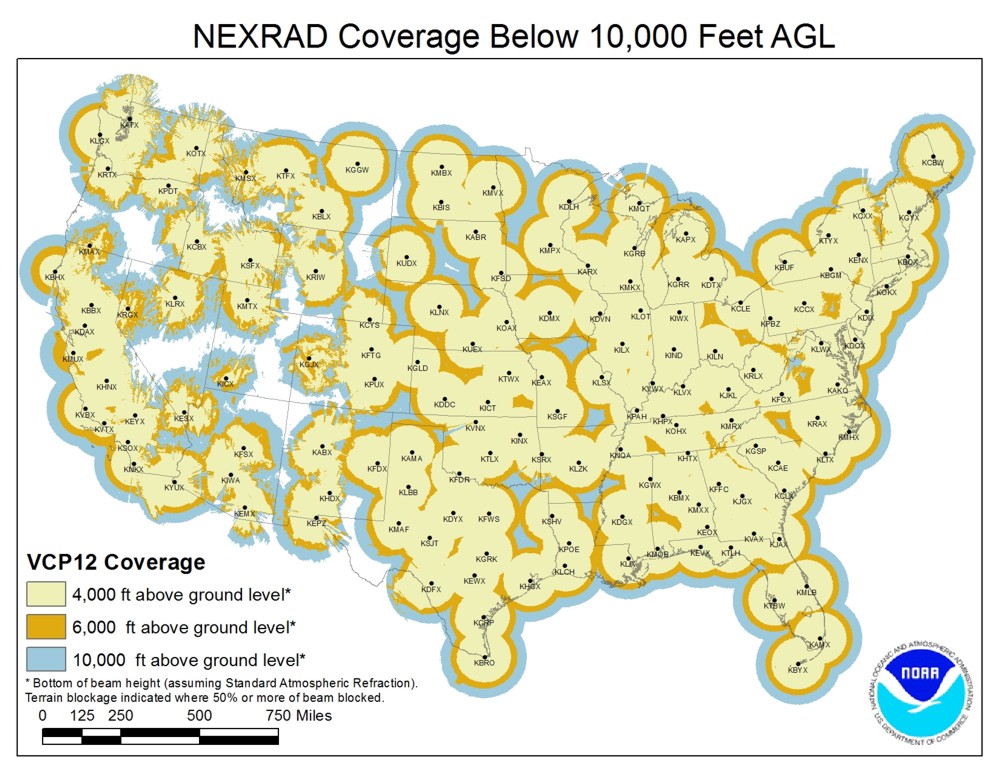
Secondly, you should realize that radar signals are not typically obstructed by geography at distances more than, say, 25 miles from the radar (the "beam" is more than 1,100 feet off the ground at that point). The only exception to this rule is that there are certain locations, particularly in the western United States, where tall mountains can block portions of the radar "beam." Check out this image showing the coverage of NEXRAD radars [46] for the U.S. Note how some of the "circles of echoes" in the West look like somebody took a bite out of them. The irregular radar coverage over the western U.S. is a direct result of the mountainous terrain blocking some of the radar "beams."
At most sites, however, less than 25 miles from the radar site, a collection of stationary targets called "ground clutter [47]," including buildings, hills, mountains, etc., frequently intercepts and back-scatters microwaves to the radar. Computers routinely filter out the common ground clutter so that radar images don't lend the impression that precipitation is always falling near the radar site.
So, now that you know how radar works, what determines the strength of the returning radar signal? And, how do you interpret the rainbow of colors on radar images? We'll cover these questions in the next section. Before continuing, however, please review these key facts about radar imagery.
Radar imagery...
- originates from ground-based sensors (not from satellites) that actively emit pulses of radiation.
- uses the microwave part of the electromagnetic spectrum (not the infrared).
- usually displays the variable "reflectivity" (units dBZ) which is the measure of the amount of signal returned to the radar from the original transmitted pulse.
- can help forecasters identify areas of precipitation.
- cannot tell you anything about cloud top temperature, cloud height, or cloud thickness.
Interpreting Radar Images
Prioritize...
At the completion of this section, you should be able to list and describe the three precipitation factors that affect radar reflectivity, and draw general conclusions about precipitation based on radar reflectivity. You should also be able to discuss why snow tends to be under-measured by radar, and explain the difference between "base reflectivity" and "composite reflectivity."
Read...
Now that you know how a radar works, we need to discuss how to properly interpret the returned radar signal. As with any remote sensing tool, we have to understand what factors influence the amount of radiation that is received by the instrument. As you recall, radar works via transmitted and returned microwave energy. The radar transmits a burst of microwaves and when this energy strikes an object, the energy is scattered in all directions. Some of that scattered energy returns to the radar and this returned energy is then converted to reflectivity (in dBZ). Ultimately, the intensity of the return echo (and therefore, reflectivity) depends on three main factors inside a volume of air probed by the radar "beam":
- the size of the targets
- the number of targets
- the composition of the targets (raindrops, snowflakes, ice pellets, etc.)
Allow me to elaborate a bit on each of these factors impacting radar reflectivity. For starters, the size of the precipitation targets always matters. The larger the targets (raindrops, snowflakes, etc.,) the higher the reflectivity. By way of example, consider that raindrops, by virtue of their larger size, have a much higher radar reflectivity than drizzle drops (the tiny drops of water that appear to be more of a mist than rain). Secondly, the power returning from a sample volume of air with a large number of raindrops is greater than the power returning from an equal sample volume containing fewer raindrops (assuming, of course, that both sample volumes have the same sized drops). The saying that "there's power in numbers" certainly applies to radar imagery!
To see how the size and number of targets impact reflectivity, consider this example. Many thunderstorms often show high reflectivity on radar images, with passionate colors like deep reds marking areas within the storm with a large number of sizable raindrops. A large number of sizable raindrops falling from a cumulonimbus cloud also leads to high rainfall rates at the ground. Thus, high radar reflectivities are usually associated with heavy rain.

The radar image above from 2255Z on June 1, 2012 shows a line of strong thunderstorms (called a "squall line") just to the west of State College, Pennsylvania (UNV on the map). Although the storm moved through the region very quickly, rainfall rates at the Penn State Weather Center exceeded 0.6 inches in a 10 minute period. This converts to a rainfall rate of 3.6 inches (91.4 mm) per hour! That said, let me caution you that inferring specific rainfall rates from radar images can be tricky business. A given reflectivity can translate to different rainfall rates, depending on, for example, whether there are a lot of small drops versus fewer large drops.
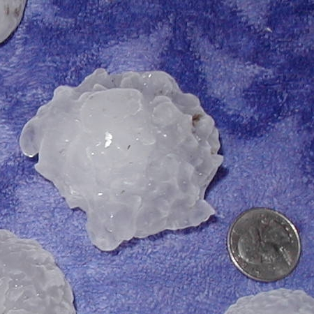
The presence of large hail [48] in thunderstorms can really complicate the issue of inferring rainfall rates from radar reflectivity. Typically, radar reflectivity from a thunderstorm is greatest in the middle levels of the storm because large hailstones have started to melt as they fall earthward into air with temperatures greater than 0 degrees Celsius (the melting point of ice). Covered with a film of melt-water, these large hailstones look like giant raindrops to the radar and can have reflectivity values higher than 70 dBZ. So, when large, "wet hailstones" are present in thunderstorms, rainfall rates inferred from the very large reflectivity are typically overestimated. The bottom line is that higher reflectivity usually corresponds to higher rainfall rates, but the connection is not always neat and tidy.
Okay, lets move on to the final controller of radar reflectivity -- composition. The intensity of the return signal from raindrops is approximately five times greater than the return from snowflakes that have comparable sizes. Snowflakes have inherently low reflectivity compared to raindrops, so it's easy to underestimate the area coverage and intensity of snowstorms if you're unaware of this fact. It might be snowing quite heavily, yet radar reflectivity from the heavy snow might be less than from a nearby area of rain (even if the rainfall isn't as heavy) because the return signal from raindrops is more intense.
Limitations of Radar Reflectivity
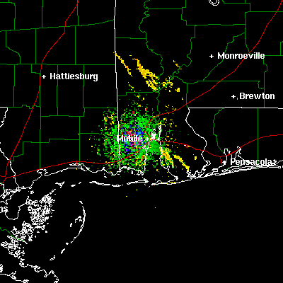
For all of radar's benefits, it has some limitations, too. One big limitation relates to something we covered in the last section -- the increasing elevation of the radar "beam" at increasing distance from the radar transmitter. Indeed, nimbostratus clouds (especially those bearing snow in the winter) are often shallow (not very tall). This fact can cause problems because the radar beam will sometimes overshoot snow-bearing clouds located relatively far away from the radar site (see radar beam on the left, below). When this occurs, snow can fall while the radar shows no reflectivity whatsoever.

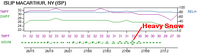
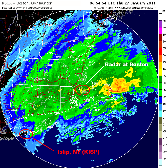
To see what I mean, check out the graph showing weather conditions [49] at Islip, New York (on Long Island), from 14Z on January 26, 2011, to 14Z on January 27, 2011. Note the report of heavy snow at 07Z on the 27th. Now take a look at the 07Z reflectivity from the radar at Boston [50], and focus your attention on the very weak reflectivity at Islip. Clearly, Islip is almost out of the range of the Boston radar (the white circle), so the radar beam really overshot the relatively shallow nimbostratus clouds producing heavy snow at Islip at the time. Fortunately, the radar at Upton, New York is located closer to Islip, and as you can see its 07Z image of reflectivity [51], it gives a much more realistic look for Islip. The moral of this story is that you need to be careful interpreting radar images in winter where snow might be falling.
To further complicate interpreting radar images during winter, I point out that partially melted snowflakes present a completely different problem to weather forecasters during winter. When snowflakes melt, they melt at their edges first. With water distributed along the edges of the "arms" of melting flakes, partially melted snowflakes appear like large raindrops to the radar. Thus, partially melted snowflakes have unexpectedly high reflectivity. For pretty much the same reason, wet or melting ice pellets (sleet) also have a relatively high reflectivity. During winter, radar images sometimes show a blob of high reflectivity embedded in an area of generally light rain. Often, this renegade echo of high reflectivity is "wet sleet".
Common Radar Reflectivity Products
The principles I've just described serve as the basis for interpreting most radar reflectivity products that you'll encounter. But, if you regularly watch television weathercasts, or you frequently use an app to look at radar, there's a good chance you've encountered some "enhancements" on basic radar reflectivity. I want to quickly summarize some of these common radar reflectivity products.

Radar Mosaics: While the National Weather Service maintains a network of individual radars covering most of the United States [46], you've learned that the range of each radar is only 143 miles. That's not very helpful for tracking very large areas of precipitation, so meteorologists often create "radar mosaics," which "stitch together" the reflectivity from the individual radars into a single image covering a larger region (or even the entire country), as shown in the example on the right.
Precipitation-Type Imagery: Commonly, regional or national radar mosaics visually distinguish areas of rain from snow and mixed precipitation (any combination of snow, sleet, freezing rain, and/or rain) using different color keys. Note that rain, mixed precipitation, and snow each has its own color key in this larger version of the radar mosaic above on the right [52]. While the exact methods for creating such images vary, they all start with radar reflectivity, and often incorporate surface temperature and other observations to give a "best guess" of precipitation type. Radars now have some additional capabilities to help discern precipitation type, too, which we'll cover in the next section. Still, keep in mind that such "precipitation-type" radar images aren't perfect (they don't always show the correct precipitation type).
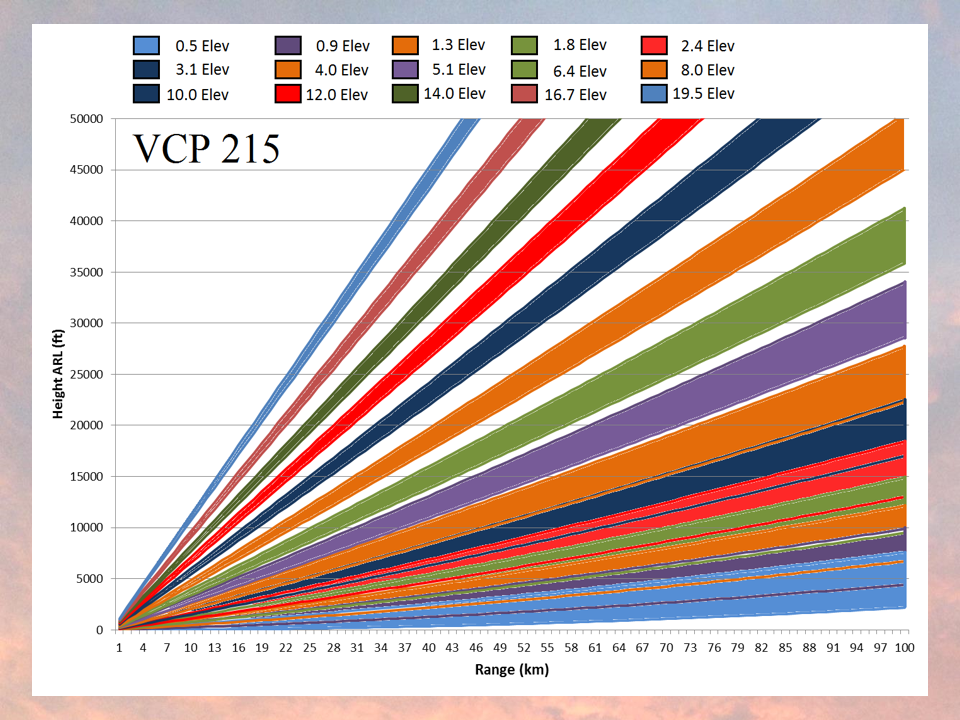
Composite Reflectivity: The radar reflectivity derived from a single radar scan is called "base reflectivity." However, the regional and national radar mosaics that you see on television or online actually show something called composite reflectivity, which represents the highest reflectivity gleaned from all of the radar's scan angles. That's right, radars scan at more than just the 0.5 degree angle we've discussed. NEXRAD units are capable of tilting upward and regularly scanning at angles of elevation as large as 19.5 degrees [53], which helps forecasters get a feel for the three-dimensional structure of precipitation. For example, if a powerful thunderstorm erupts fairly close to the radar, a scan at the shallowest angle of 0.5 degrees would likely intercept the storm below the level where the most intense reflectivity occurs. Such a single, shallow scan falls way short of painting a proper picture of the storm's potential. As a routine counter-measure, the radar tilts upward at increasingly large angles of elevation, scanning the entire thunderstorm [54] like a diagnostic, full-body MRI.

So, a radar image created from composite reflectivity will likely display a higher dBZ level (more intense colors) than a radar image of base reflectivity. For example, on August 19, 2008, Tropical Storm Fay was moving very, very slowly over the Florida peninsula. The 1938Z base reflectivity (on the left, above) shows fairly high dBZ values (orange) in the immediate vicinity of the radar site at Melbourne, FL (KMLB). At the time, heavy thunderstorms were pounding the east-central coast of Florida. Now shift your attention to the image of composite reflectivity on the right (above). Notice the reddish colors near Melbourne, which indicate higher dBZ values (compared to the corresponding radar echoes on the image of base reflectivity). Composite reflectivity may not be representative of current precipitation rates at the ground, but it can show the potential if the precipitation causing the highest reflectivity (often well up into the cloud) can fall to the surface.
Now that you know how to interpret radar reflectivity, we're going to look at some additional capabilities of NEXRAD, which allow weather forecasters to infer wind velocities and and better detect severe weather like hail and tornadoes. Read on.
Doppler and Dual Polarization Radar
Prioritize...
Upon completion of this page, you should be able to discuss the Doppler effect, its use in radar data collection, and the benefits of Doppler radar data. You should also be able to discuss what is meant by dual polarization radar and discuss its advantages.
Read...
Modern radars are capable of much more than just measuring reflectivity. As I mentioned briefly before, the generation of radars known as NEXRAD, which have been in operation since 1988, also are "Doppler" radars. Those radars have since been upgraded to include "dual polarization" capabilities, which provide meteorologists with a variety of other useful information. While we won't cover the details of Doppler radar or dual polarization in depth, I do want you to have a basic understanding of how they work and what they're useful for.
Doppler Radar
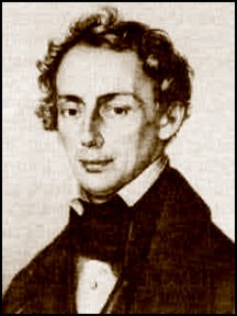
Johann Christian Doppler [55] was an Austrian mathematician who applied his expertise to astronomy. In 1842, he wrote a landmark paper, in which he explained that an observer's perception of the change in the frequency of starlight was a result of the relative motion between the observer and the star (or stars).
Doppler broadened the scope of his hypothesis to include sound, suggesting that the pitch of a sound (frequency of the sound waves) would change when the source of the sound was moving. He tested his hypothesis in 1845, when he employed two groups of trumpeters to participate in an experiment: One group rode in an open, moving train car while the other group prepared to play at a train station. He instructed both groups of musicians to hold the same note (we assume that they all had perfect pitch). As the train passed the station, there was a noticeable difference in the frequency of the notes -- essentially proving Doppler's hypothesis. The change in frequency of a wave when either the source or an observer moves became known as the Doppler effect, and Doppler's work paved the way for the modern network of NEXRAD Doppler radars.
You may be most familiar with the Doppler effect as it relates to moving automobiles or trains. For example, check out this short video of a driver sounding the horn on a minivan [56] traveling 45-50 miles per hour past a stationary camera. Listen to the change in the horn's pitch as the minivan moves toward the camera and then away from the camera. It is important that you do not liken the change in pitch (a change in the frequency of sound waves) to a change in loudness, which is how most people erroneously perceive the Doppler effect.
The Doppler effect also applies to pulses of microwaves transmitted by radars. Baseball scouts rely on the Doppler effect when they point radar guns at the fastballs hurled by prospective pitchers. The change in frequency of the returning signal after it bounces off a thrown baseball is quickly translated into a velocity. Radar guns used by police to catch speeders operate in the same way. In a nutshell, the frequency of microwaves back-scattered from a radar target changes if the target is moving.
In terms of radar, microwaves back-scattering off raindrops moving toward the radar return at a higher frequency, and the faster the speed of the raindrops, the higher the frequency of the reflecting microwaves. Conversely, microwaves back-scattering off raindrops that are moving away from the radar return at a lower frequency. Changes in frequencies are then translated, by computer, into velocities, which are sometimes simply called "Doppler velocities." I should note, however, that Doppler radars can only "see" two directions of motion -- toward the radar (inbound) and away from the radar (outbound).
So, what is Doppler velocity data useful for? One major benefit of this data is that it can help forecasters detect areas of rotation within thunderstorms, which can be precursors to tornado formation. When forecasters spot strong outbound velocities (conventionally depicted by reds and pinks) adjacent to areas of inbound velocities (conventionally depicted by greens and blues), as shown on the image of Doppler velocities on the right below, the apparent rotation definitely catches their attention! If you imagine a pinwheel located between the two arrows I've drawn, do you see how it would rotate? In this particular case, a violent tornado was tracking near Yazoo City, Mississippi at the time of these corresponding reflectivity and Doppler velocity images. Fortunately, thanks in part to Doppler velocities, forecasters had issued a tornado warning roughly a half hour before the tornado struck Yazoo City. Still, 10 people died, but it would likely have been much worse without the advanced warning made possible by Doppler radar.
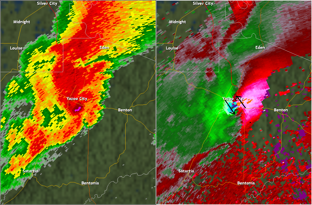
In addition to helping forecasters detect storms that may produce tornadoes, Doppler radar can also help forecasters measure wind speeds above the surface (remember the radar "beam" increases in elevation at greater distances from the radar), which can help forecasters assess the potential for damaging wind gusts, even in non-tornadic thunderstorms. So, there's no doubt that Doppler radar is an invaluable public-safety asset, but radar coverage in the U.S. is not perfect. Because the radar "beam" rises in elevation at greater distances, some areas of the U.S. are not adequately covered with the low-altitude radar scans that are ideal for severe weather forecasting. If you're interested in reading more about this topic, I suggest this article from the Capital Weather Gang in The Washington Post [57] from 2015.
Dual Polarization Radar
Historically, radars (even NEXRAD Doppler radars) sent out pulses of microwave radiation that traveled in the horizontal dimension [58]. But, in early 2012, the National Weather Service began to upgrade its fleet of radars with dual polarization capability ("dual pol," for short). A dual-polarized radar transmits (and eventually detects) pulses of microwave energy in both horizontal and vertical dimensions (see the idealized schematic below). In this way, the radar provides information about the horizontal and vertical configuration of targets that scatter radar-transmitted microwave energy back to the radar. In other words, dual polarization gives meteorologists a better sense for the size and shape of the atmospheric targets detected by the radar.
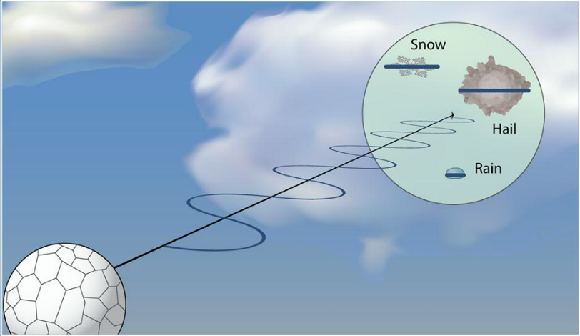

With the additional information about the size and shape of targets, the bottom line is that dual-pol radars can:
- alert forecasters that there's more than one type of precipitation present within the range of the radar
- identify airborne debris from tornadoes (pieces of insulation and shingles, for example), and
- differentiate between precipitation targets (rain, snow, hail, etc.) and "biological targets" (birds, insects, etc.)
Dual pol radar gives forecasters several additional products to look at, but I'll spare you the details (they're beyond the scope of this course). Still, I want to give you an idea of the value of dual pol data, using one of the additional products that dual pol provides, called "correlation coefficient."
In short, "correlation coefficient" helps forecasters identify whether an area as a large or small variety of radar targets and can help forecasters discern whether an area has "meteorological" targets (rain, snow, hail, etc.) or "non-meteorological" ones, like flying debris in a tornado. The ability to better identify airborne debris can give weather forecasters additional confirmation that a tornado is actually occurring (with Doppler velocity data alone, we usually can't be sure).
To see what I mean, check out this animation showing the simultaneous images of base reflectivity, Doppler velocities, and correlation coefficient [59] from February 29, 2012 in Missouri. Focus near the center of the image, where there's an area of rotation on the Doppler velocity image (outbound velocities in red, adjacent to inbound velocities in green). On the image of correlation coefficients, the corresponding area has low values [60] (the circled blob of blue and green), which marked a "tornado debris signature." The low values of correlation coefficient in that area signaled that the dual pol transmission had encountered irregularly shaped debris flying through the air. I should note, however, that forecasters must use dual pol data in conjunction with reflectivity and Doppler velocity data to identify tornado debris signatures. The key to identifying this as a tornado debris signature was that the blob of low correlation-coefficient values was co-located with a strong area of rotation in the storm.
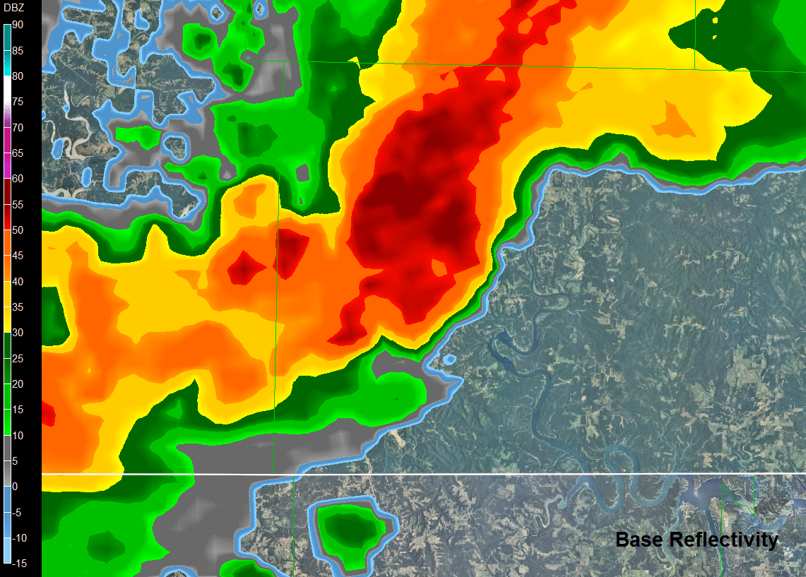
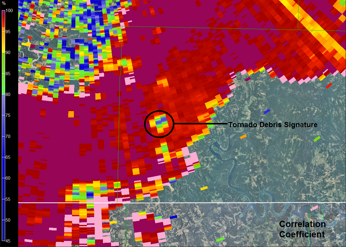
I'm just scratching the surface, but in addition to better identifying airborne debris from tornadoes, dual pol data also helps forecasters distinguish between raindrops, snowflakes, and hailstones, which helps improve the accuracy of “precipitation type” radar reflectivity images [61], and improves the radar's ability to estimate rainfall rates and totals. So, there's no doubt that dual pol radar is becoming an increasingly important tool for weather forecasters!
Up next, we'll wrap up our lesson with a brief summary of the remote sensing tools that we've covered in this lesson.
Summary: Satellite and Radar Imagery
Prioritize...
This page is meant to summarize the characteristics and capabilities of the various types of satellite and radar images we've covered in this lesson. At this point, you should be able to decide which remote sensing product (visible, infrared, or water vapor satellite imagery, or radar imagery) is appropriate given a particular need.
Read...
We've covered several different types of remote sensing products in this lesson, ranging from images created by passive remote sensors aboard satellites to those created by active remote sensors located in ground-based radars. Before we wrap up, I want to quickly summarize the characteristics and capabilities of each product. Knowing the characteristics and capabilities of each type of imagery will help you choose the most useful type of remote sensing product given a particular need. For example, if you needed to know where the nearest area of rain was located, which type of imagery would you use? If you needed to know if skies were cloudy overnight, which type of imagery would you use? You should be able to answer those types of questions based on your knowledge of these products.
Visible satellite imagery...
- is based on the albedo of objects (the fraction of incoming sunlight that is reflected to the satellite).
- can tell you about the thickness of clouds (thicker clouds have higher albedos and appear brighter than thinner clouds, which have lower albedos).
- can be used to distinguish between snow cover and clouds, given that surface features such as lakes and rivers can be observed.
- is not able to detect clouds (or anything else) during the satellite's local night (visible imagery requires sunlight).
- is not useful for determining whether precipitation is present under the observed clouds.
Infrared satellite imagery...
- is based on the fact that measuring an object's infrared emission tells you something about its temperature.
- displays the temperature of either cloud tops or the earth's surface (if the sky is clear).
- can be combined with the assumption that temperature decreases with height to determine cloud-top heights. Colder cloud-tops (lower temperatures) mean higher clouds.
- is not able to give any direct indication of cloud thickness or the presence of precipitation (although inferences can be made in some cases).
Water Vapor imagery...
- uses infrared radiation; except unlike traditional infrared imagery, it uses wavelengths at which water vapor strongly emits and absorbs infrared radiation.
- displays the temperature of the effective layer. Warm effective layers mean that the middle to upper troposphere contains very little water vapor (that is, they're "dry"). By comparison, colder effective layers indicate a higher concentration of water vapor and/or ice clouds in the upper troposphere.
- is not able to give any measure of the atmospheric water vapor content below the effective layer.
- usually does not show the presence of low clouds or water vapor near the surface. These almost always lie below the effective layer.
- is used to trace air motions in the middle and upper troposphere, even in areas with no clouds.
Radar imagery...
- originates from ground-based sensors (not from satellites) that actively emit pulses of radiation.
- uses the microwave part of the electromagnetic spectrum (not the infrared).
- usually displays the variable "reflectivity" (units dBZ) which is the measure of the amount of signal returned to the radar from the original transmitted pulse.
- can help forecasters detect areas of precipitation (via reflectivity) as well as potential areas of severe weather via Doppler velocities and dual polarization data.
- cannot tell you anything about cloud top temperature, cloud height, or cloud thickness.