Lesson 2 - Climate Observations, part 1
The links below provide an outline of the material for this lesson. Be sure to carefully read through the entire lesson before returning to Canvas to submit your assignments.
Introduction
About Lesson 2
How do we know that climate change is taking place? Or that the factors we believe to be driving climate change, such as greenhouse gas concentrations, are themselves changing?
To address these questions, we turn first to instrumental measurements documenting changes in the properties of our atmosphere over time. These measurements are not without their uncertainties, particularly in earlier times. But they can help us to assess whether there appear to be trends in measures of climate and the factors governing climate, and whether the trends are consistent with our expectations of what the response of the climate system to human impacts ought to look like.
What will we learn in Lesson 2?
By the end of Lesson 2, you should be able to:
- Discuss the various modern observational data characterizing changes in surface and atmospheric temperature over the historical period;
- Discuss the nature of the uncertainties in the observational record of past climate; and
- Perform simple statistical analyses to characterize trends in, and relationships between, data series.
What will be due for Lesson 2?
Please refer to the Syllabus for the specific time frames and due dates.
The following is an overview of the required activities for Lesson 2. Detailed directions and submission instructions are located within this lesson.
- Read:
- IPCC Sixth Assessment Report, Working Group 1 -- Summary for Policy Makers (link is external) [1]
- The Current State of the Climate: p. 4-11 (same as Lesson 1, but review information about the atmosphere)
- Dire Predictions, v.2: p. 34-35, 38-39, 80-81
- IPCC Sixth Assessment Report, Working Group 1 -- Summary for Policy Makers (link is external) [1]
- Problem Set #1: Perform basic statistical analyses of climate data.
Questions?
If you have any questions, please post them to our Questions? discussion forum (not e-mail), located under the Home tab in Canvas. The instructor will check that discussion forum daily to respond. While you are there, feel free to post your own responses if you can help with any of the posted questions.
Observed Changes in Greenhouse Gases
Before we assess the climate data documenting changes in the climate system, we ought to address the question — is there evidence that greenhouse gases, purportedly responsible for observed warming, are actually changing in the first place?
Thanks to two legendary atmospheric scientists, we know that there is such evidence. The first of these scientists was Roger Revelle [2].

Revelle, as we will later see, made fundamental contributions to understanding climate change throughout his career. Less known, but equally important, was the tutelage and mentorship that Revelle provided to other climate researchers. While at the Scripps Institution for Oceanography at the University of California in San Diego, Revelle encouraged his colleague Charles David Keeling [4] to make direct measurements of atmospheric CO2 levels from an appropriately selected site.
Think About It!
Why do you suppose it is adequate to make measurements of atmospheric CO2 from a single location as an indication of changing global concentrations?
Click for answer.
Revelle and Keeling settled on the top of the mountain peak Mauna Loa on the big island of Hawaii, establishing during the International Geophysical Year of 1958 an observatory that would be maintained by Keeling and his crew for the ensuing decades.


From this location, Keeling and crew would make continuous measurements of atmospheric CO2 from 1958 henceforth. Since then, long-term records have been established in other locations over the globe as well. The result of Keeling's labors is arguably the most famous curve in all of atmospheric science, the so-called Keeling Curve. That curve shows a steady increase in atmospheric CO2 concentrations from about 315 ppm when the measurements began in 1958 to over 400 ppm today (and climbing by about 2 ppm per year presently).

You might be wondering at this point, how do we know that the increase in CO2 is not natural? For one thing, as you already have encountered in your readings, the recent levels are unprecedented over many millennia. Indeed, when we cover the topic of paleoclimate, we will see that the modern levels are likely unprecedented over several million years. We will also see that there is a long-term relationship between CO2 and temperature, though the story is not as simple as you might think.
But there is other more direct evidence that the source of the increasing CO2 is indeed human, i.e., anthropogenic. It turns out that carbon that gets buried in the earth from dying organic matter and eventually turns into fossil fuels tends to be isotopically light. That is, nature has a preference for burying carbon that is depleted of the heavier, 13C, carbon isotope. Fossil fuels are thus relatively rich in the lighter isotope, 12C. However, natural atmospheric CO2 produced by respiration (be it animals like us, or plants which both respire and photosynthesize) tends to have a greater abundance of the heavier 13C isotope of carbon. If the CO2 increase were from natural sources, we would therefore expect the ratio of 13C to 12C to be getting higher. But instead, the ratio of 13C to 12C is getting lower as CO2 is building up in our atmosphere -- i.e., the ratio bears the fingerprint of anthropogenic fossil fuel burning.

Of course, CO2 is not the only greenhouse gas whose concentrations are rising due to human activity. A combination of agriculture (e.g., rice cultivation), livestock raising, and dam construction led to substantial increases in methane (CH4) concentrations. Agricultural practices have also increased the concentration of nitrous oxide (N2O).
Using air bubbles in ice cores, we can examine small bits of atmosphere trapped in ice, as it accumulated back in time, to reconstruct the composition of the ancient atmosphere, including the past concentrations of greenhouse gases. The ice core evidence shows that the rise over the past two centuries in the concentrations of the greenhouse gases mentioned above is unprecedented for at least the past 10,000 years. Longer-term evidence suggests that concentrations are higher now than they have been for hundreds of thousands of years, and perhaps several million years.

© 2015 Pearson Education, Inc.
We are continuously monitoring these climate indicators. This website [8] shows the latest values as well as their change since the year 1000.
Modern Surface Temperature Trends
Instrumental surface temperature measurements consisting of thermometer records from land-based stations, islands, and ship-board measurements of ocean surface temperatures provide us with more than a century of reasonably good global estimates of surface temperature change. Some regions, like the Arctic and Antarctic, and large parts of South America, Africa, and Eurasia, were not very well sampled in earlier decades, but records in these regions become available as we move into the mid and late 20th century.
Temperature variations are typically measured in terms of anomalies relative to some base period. The animation below is taken from the NASA Goddard Institute for Space Studies [9] in New York (which happens to sit just above "Tom's Diner" [10] of Seinfeld fame), one of several scientific institutions that monitor global temperature changes. It portrays how temperatures around the globe have changed in various regions since the late 19th century. The temperature data have been averaged into 5 year blocks, and reflect variations relative to a 1950-1980 base period, i.e., warm regions are warmer than the 1950-1980 average, while cold regions are colder than the 1950-1980 average, by the magnitudes shown. You may note a number that appears in the upper right corner of the plot. That number indicates the average temperature anomaly over the entire globe at any given time, again, relative to the 1950-1980 average.
Take some time to explore the animation on your own. You may want to go through it several times, so you can start to get a sense of just how rich and complex the patterns of surface temperature variations are. Do you see periodic intervals of warming and cooling in the eastern equatorial Pacific? What might that be? [We will talk about the phenomenon in upcoming lessons].
Take note of any particularly interesting patterns in space and time that you see as you review the animation. You can turn your sound off the first few times, so you do not hear the annotation of the animation. Then, when you are ready, turn the sound on, and you can hear Michael Mann's take.
Video: Surface Temperature Patterns (1:19)
We can average over the entire globe for any given year and get a single number, the global average temperature. Here is the curve we get if we plot out that quantity. Note that in the plot below, the average temperature over the base period has been added to the anomalies, so that the estimate reflects the surface temperature of the Earth itself.

© 2015 Pearson Education, Inc.
We can see that the Earth has warmed a little less than 1°C (about 1.5 F) since widespread records became available in the mid-19th century. That this warming has taken place is essentially incontrovertible from a scientific point of view. What is the cause of this warming? That is a more difficult question, which we will address later.
We discussed above the cooling that is evident in parts of the Northern Hemisphere (particularly over the land masses) from the 1940s-1970s. There was a time, during the mid 1970s, when some scientists thought the globe might be entering into a long-term cooling trend. There was a reason to believe that might be the case. In the absence of other factors, changes in the Earth's orbital geometry did favor the descent (albeit a very slow one!) into the next ice age. Also, the buildup of atmospheric aerosols, which, as we will explore, can have a large regional cooling impact, favored cooling. Precisely how these cooling effects would balance out against the warming impact of greenhouse gases was not known at the time.
Some critics claim that if the scientific community thought we're entering into another Ice Age in the 1970s, why should we trust the scientists to know about global warming? In fact, it was far from a scientific consensus [12] within the scientific community in the mid 1970s that we were headed into another Ice Age. Some scientists speculated this was possible, but the prevailing viewpoint was that increasing greenhouse gas concentrations and warming would likely win out.
We know that, indeed, the short term cooling trend for the Northern Hemisphere continents ended in the 1970s, and, since then, global warming has dominated over any cooling effects.

© 2015 Pearson Education, Inc.
As mentioned earlier, we cannot deduce the cause of the observed warming solely from the fact that the globe is warming. However, we can look for possible clues. Just like forensics experts, climate scientists refer to these clues as fingerprints. It turns out that natural sources of warming give rise to different patterns of temperature change than human sources, such as increasing greenhouse gases. This is particularly true when we look at the vertical pattern of warming in the atmosphere. This is our next topic.
Vertical Temperature Trends
As alluded to previously, the vertical pattern of observed atmospheric temperature trends provides some important clues in establishing the underlying cause of the warming. While upper air temperature estimates (from weather balloons and satellite measurements) are only available for the latter half of the past century, they reveal a remarkable pattern. The lower part of the atmosphere — the troposphere, has been warming along with the surface. However, once we get into the stratosphere, the temperatures have actually been decreasing! As we will learn later when we focus on the problem of climate signal fingerprinting, certain forcings are consistent with such a vertical pattern of temperature changes, while other forcings are not.

© 2015 Pearson Education Inc.
Think About It!
Care to venture a guess as to which forcing might be most consistent with this vertical pattern of temperature change?
Click for answer.
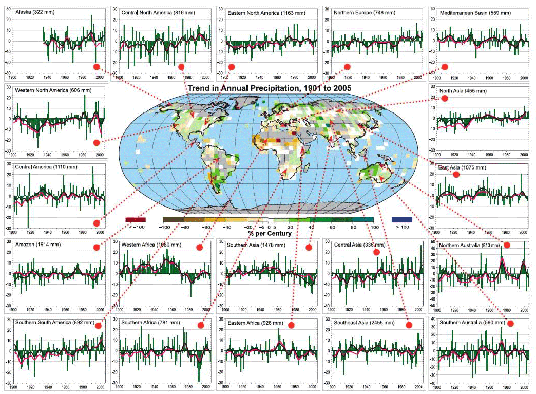
Historical Variations in Precipitation and Drought
Recall our discussion of the general circulation of the atmosphere [13] from Lesson #1.
There we learned that the circulation of the atmosphere is driven by the contrast in surface heating between the equator and the poles. That contrast results from the difference between incoming short wave solar heating and outgoing loss from the surface through various modes of energy transport, including radiational heat loss as well as heat loss through convection and latent heat release through evaporation.
It, therefore, stands to reason that climate change — which in principle involves changing the balance between incoming and outgoing radiative loss via changes in the greenhouse effect — is likely to alter the circulation of the atmosphere itself, and thus, large-scale precipitation patterns. The observed changes in precipitation patterns are far noisier (very variable and difficult to interpret) than temperature changes, however. Regional effects related to topography (e.g., mountain ranges that force air upward leading to wet windward and dry leeward conditions) and ocean-atmosphere heating contrasts that drive regional circulation patterns, such as monsoons, etc., lead to very heterogeneous patterns of changes in rainfall, in comparison with the pattern of surface temperature changes.

We might expect certain reasonably simple patterns to emerge, nonetheless. As we shall see in a later lesson [15]looking at climate change projections, climate models predict that atmospheric circulation cells and storm tracks migrate poleward, shifting patterns of rainfall between the equator and poles. The subtropics and middle latitudes tend to get drier, while the subpolar latitudes get wetter (primarily in winter). The equatorial region actually is predicted to get wetter, simply because the rising motion that occurs there squeezes out more rainfall from the warmer, moister lower atmosphere. If we average the observed precipitation changes in terms of trends in different latitudinal bands, we can see some evidence of the changes.

For example, we see that over time the high northern latitudes (60-80N) are getting wetter, while the subtropical and middle latitudes of the Northern Hemisphere are getting drier. However, there is a lot of variability from year to year, and from decade to decade, making it difficult to clearly discern whether the theoretically predicted changes are yet evident.
Drought, as we will see, does not simply follow rainfall changes. Rather, it reflects a combination of both rainfall and temperature influences. Decreased rainfall can lead to warmer ground temperatures, increased evaporation from the surface, decreased soil moisture, and thus drying.
Like rainfall, regional patterns of drought are complicated and influenced by a number of different factors. However, the combination of shifting rainfall patterns and increased evaporation has led to very pronounced increases in drought in subtropical regions, and even in many tropical and subpolar regions, where rainfall shows little trend (as indicated in the earlier graphic) but warmer temperatures have led to decreased soil moisture. These broad trends are seen in measurements of the Palmer Drought Severity Index -- an index that combines the effects of changing rainfall and temperature to estimate soil moisture content; the more negative the index, the stronger the drought.


In the next lesson, we will assess evidence for changes in extreme weather events, such as heat waves, floods, tropical cyclone activity, etc. In the meantime, however, we are going to digress a bit and discuss the topic of how to analyze data for inferences into such matters as discerning whether or not trends are evident in particular data sets, and whether it is possible to establish a relationship between two or more different data sets.
Review of Basic Statistical Analysis Methods for Analyzing Data - Part 1
Now that we have looked at the basic data, we need to talk about how to analyze the data to make inferences about what they may tell us.
The sorts of questions we might want to answer are:
- Do the data indicate a trend?
- Is there an apparent relationship between two or more different data sets?
These sorts of questions may seem simple, but they are not. They require us, first of all, to introduce the concept of hypothesis testing.
To ask questions of a data set, one has to first formalize the question in a meaningful way. For example, if we want to know whether or not a data series, such as global average temperatures, display a trend, we need to think carefully about what it means to say that a data series has a trend!
This leads us to consider the concept of the null hypothesis. The null hypothesis states what we would expect purely from chance alone, in the absence of anything interesting (such as a trend) in the data. In many circumstances, the null hypothesis is that the data are the product of being randomly drawn from a normal distribution, what is often called a bell curve, or sometimes, a Gaussian distribution (after the great mathematician Carl Friedrich Gauss [16]):

In the normal distribution shown above, the average or mean of the data set has been set to zero (that is where the peak is centered), and the standard deviation (s.d.), a measure of the typical amplitude of the fluctuations, is set to one. If we draw random samples from such a distribution, then roughly 68% of the time the values will fall within 1 s.d. of the mean (in the above example, that is the range -1 to +1). That means that roughly 16% of the time the data will fall above 1 s.d., and roughly 16% of the time the data will fall below 1 s.d. About 95% of the time, the randomly drawn values will fall within 2 s.d. (i.e., the range -2 to +2 in the above example). That means only 2.5% of the time the data will fall above 2 s.d. and only 2.5% of the time below 2 s.d. For this reason, the 2 s.d. (or 2 sigma) range, is often used to characterize the region we are relatively confident the data should fall in, and the data that fall outside that range are candidates for potentially interesting anomalies.
Random Time Series
Here is an example of what a random data series of length N = 200 which we will call ε(t), drawn from a simple normal distribution with mean zero and standard deviation one looks like (for example, you can think of this data set as a 200 year long temperature anomaly record).
This sort of noise is called white noise because there is no particular preference for either higher-frequency or lower-frequency fluctuations. The fluctuations have equal amplitude.

There is another form of random noise, known as red noise because the long-term fluctuations have a greater relative magnitude than short-term fluctuations (just as red light is dominated by low-frequency visible wavelengths of light).
A simple model for Gaussian red noise takes the form
where ε(t) is Gaussian white noise. As you can see, a red noise process tends to integrate the white noise over time. It is this process of integration that leads to more long-term variation than would be expected for a pure white noise series. Visually, we can see that the variations from one year to the next are not nearly as erratic. This means that the data have fewer degrees of freedom (N' ) than there are actual data points (N). In fact, there is a simple formula relating N' and N:
The factor measures the "redness" of the noise. Let us consider again a random sequence of length N = 200, but this time it is "red" with the value ρ = 0.6. The same random white noise sequence used previously is used in equation 2 for ε(t):

Self-Check
How many distinct peaks and troughs can you see in the series now?
Click for answer.
Self-Check
How many degrees of freedom N ' are there in this series?
Click for answer.
As ρ gets larger and larger, and approaches one, the low-frequency fluctuations become larger and larger. In the limit where ρ = 1, we have what is known as a random walk or Brownian motion. Equation 2 in this case becomes just:
You might notice a problem when using equation 3 in this case. For ρ = 1, we have N' = 0! There are no longer any effective degrees of freedom in the time series. That might seem nonsensical. But there are other attributes that make this a rather odd case as well. The time series, it turns out, now has an infinite standard deviation!
Let's look at what our original time series looks like when we now use ρ = 1:

As you can see, the series starts out in the same place, but immediately begins making increasingly large amplitude long-term excursions up and down. It might look as if the series wants to stay negative. But if we were to continue the series further, it would eventually oscillate erratically between increasingly large negative and positive swings. Let's extend the series out to N = 1000 values to see that:

The swings are getting wider and wider, and they are occurring in both the positive and negative direction. Eventually, the amplitude of the swings will become arbitrarily large, i.e., infinite, even though the series will remain centered about a mean value of zero. This is an example of what we refer to in statistics as a pathological case.
Now let's look at what the original N = 200 long pure white noise series look like when there is a simple linear trend of 0.5 degree/century added on:

Can you see a trend? In what direction? Is there a simple way to determine whether there is indeed a trend in the data that is distinguishable from random noise. That is our next topic.
Review of Basic Statistical Analysis Methods for Analyzing Data - Part 2
Establishing Trends
Various statistical hypothesis tests have been developed for exploring whether there is something more interesting in one or more data sets than would be expected from the chance fluctuations Gaussian noise. The simplest of these tests is known as linear regression or ordinary least squares. We will not go into very much detail about the underlying statistical foundations of the approach, but if you are looking for a decent tutorial [17], you can find it on Wikipedia. You can also find a discussion of linear regression in another PSU World Campus course: STAT 200 [18].
The basic idea is that we test for an alternative hypothesis that posits a linear relationship between the independent variable (e.g., time, t in the past examples, but for purposes that will later become clear, we will call it x) and the dependent variable (i.e., the hypothetical temperature anomalies we have been looking at, but we will use the generic variable y).
The underlying statistical model for the data is:
where i ranges from 1 to N, a is the intercept of the linear relationship between y and x, b is the slope of that relationship, and ε is a random noise sequence. The simplest assumption is that ε is Gaussian white noise, but we will be forced to relax that assumption at times.
Linear regression determines the best fit values of a and b to the given data by minimizing the sum of the squared differences between the observations y and the values predicted by the linear model . The residuals are our estimate of the variation in the data that is not accounted for by the linear relationship, and are defined by
For simple linear regression, i.e., ordinary least squares, the estimates of a and b are readily obtained:
and
The parameter we are most interested in is b, since this is what determines whether or not there is a significant linear relationship between y and x.
The sampling uncertainty in b can also be readily obtained:
where std(ε) is standard deviation of ε and μ is the mean of x. A statistically significant trend amounts to the finding that b is significantly different from zero. The 95% confidence range for b is given by . If this interval does not cross zero, then one can conclude that b is significantly different from zero. We can alternatively measure the significance in terms of the linear correlation coefficient, r , between the independent and dependent variables which is related to b through
r is readily calculated directly from the data:
where over-bar indicated the mean. Unlike b, which has dimensions (e.g., °C per year in the case where y is temperature and x is time), r is conveniently a dimensionless number whose absolute value is between 0 and 1. The larger the value of r (either positive or negative), the more significant is the trend. In fact, the square of r (r2) is a measure of the fraction of variation in the data that is accounted for by the trend.
We measure the significance of any detected trends in terms of a a p-value. The p-value is an estimate of the probability that we would wrongly reject the null hypothesis that there is no trend in the data in favor of the alternative hypothesis that there is a linear trend in the data — the signal that we are searching for in this case. Therefore, the smaller the p value, the less likely that you would observe as large a trend as is found in the data from random fluctuations alone. By convention, one often requires that p<0.05 to conclude that there is a significant trend (i.e., that only 5% of the time should such a trend have occurred from chance alone), but that is not a magic number.
The choice of p in statistical hypothesis testing represents a balance between the acceptable level of false positives vs. false negatives. In terms of our example, a false positive would be detecting a statistically significant trend, when, in fact, there is no trend; a false negative would be concluding that there is no statistically significant trend, when, in fact, there is a trend. A lower threshold (that is, higher p-value, e.g., p = 0.10) makes it more likely to detect a real but weak signal, but also more likely to falsely conclude that there is a real trend when there is not. Conversely, a higher threshold (that is, lower p-value, e.g., p = 0.01) makes false positives less likely, but also makes it less likely to detect a weak but real signal.
There are a few other important considerations. There are often two different alternative hypotheses that might be invoked. In this case, if there is a trend in the data, who is to say whether it should be positive (b > 0) or negative (b < 0)? In some cases, we might want only to know whether or not there is a trend, and we do not care what sign it has. We would then be invoking a two-sided hypothesis: is the slope b large enough in magnitude to conclude that it is significantly different from zero (whether positive or negative)? We would obtain a p-value based on the assumption of a two-sided hypothesis test. On the other hand, suppose we were testing the hypothesis that temperatures were warming due to increased greenhouse gas concentrations. In that case, we would reject a negative trend as being unphysical — inconsistent with our a priori understanding that increased greenhouse gas concentrations should lead to significant warming. In this case, we would be invoking a one-sided hypothesis. The results of a one-sided test will double the significance compared with the corresponding two-sided test, because we are throwing out as unphysical half of the random events (chance negative trends). So, if we obtain, for a given value of b (or r) a p-value of p = 0.1 for the two-sided test, then the p-value would be p = 0.05 for the corresponding one-sided test.
There is a nice online statistic calculator tool [19], courtesy of Vassar college, for obtaining a p-value (both one-sided and two-sided) given the linear correlation coefficient, r , and the length of the data series, N. There is still one catch, however. If the residual series ε of equation 6 contains autocorrelation, then we have to correct the degrees of freedom, N', which is less than the nominal number of data points, N. The correction can be made, at least approximately in many instances, using the lag-one autocorrelation coefficient. This is simply the linear correlation coefficient, r1, between ε, and a carbon copy of ε lagged by one time step. In fact, r1 provides an approximation to the parameter ρ introduced in equation 2. If r1 is found to be positive and statistically significant (this can be checked using the online link provided above), then we can conclude that there is a statistically significant level of autocorrelation in our residuals, which must be corrected for. For a series of length N = 100, using a one-sided significant criterion of p = 0.05, we would need r1 > 0.17 to conclude that there is significant autocorrelation in our residuals.
Fortunately, the fix is very simple. If we find a positive and statistically significant value of r1, then we can use the same significance criterion for our trend analysis described earlier, except we have to evaluate the significance of the value of r for our linear regression analysis (not to be confused with the autocorrelation of residuals r1) using a reduced, effective degrees of freedom N', rather than the nominal sample size N. Moreover, N' is none other than the N' given earlier in equation 3 where we equate
That's about it for ordinary least squares (OLS), the main statistical tool we will use in this course. Later, we will encounter the more complicated case where there may be multiple independent variables. For the time being, however, let us consider the problem of trend analysis, returning to the synthetic data series discussed earlier. We will continue to imagine that the dependent variable (y) is temperature T in °C and the independent variable (x) is time t in years.
First, let us calculate the trend in the original Gaussian white noise series of length N = 200 shown in Figure 2.12(1). The linear trend is shown below:

The trend line is given by: , and the regression gives r = 0.0332. So there is an apparent positive warming trend of 0.0006 °C per year, or alternatively, 0.06 °C per century. Is that statistically significant? It does not sound very impressive, does it? And that r looks pretty small! But let us be rigorous about this. We have N = 200, and if we use the online calculator link provided above, we get a p-value of 0.64 for the (default) two-sided hypothesis. That is huge, implying that we would be foolish in this case to reject the null hypothesis of no trend. But, you might say, we were looking for warming, so we should use a one-sided hypothesis. That halves the p-value to 0.32. But that is still a far cry from even the least stringent (e.g., p = 0.10) thresholds for significance. It is clear that there is no reason to reject the null hypothesis that this is a random time series with no real trend.
Next, let us consider the red noise series of length N = 200 shown earlier in Figure 2.12(2).

As it happens, the trend this time appears nominally greater. The trend line is now given by: , and the regression gives r = 0.0742. So, there is an apparent positive warming trend of 0.14 degrees C per century. That might not seem entirely negligible. And for N = 200 and using a one-sided hypothesis test, r = 0.0742 is statistically significant at the p = 0.148 level according to the online calculator. That does not breach the typical threshold for significance, but it does suggest a pretty high likelihood (15% chance) that we would err by not rejecting the null hypothesis. At this point, you might be puzzled. After all, we did not put any trend into this series! It is simply a random realization of a red noise process.
Self Check
So why might the regression analysis be leading us astray this time?
Click for answer.
The problem is that our residuals are not uncorrelated. They are red noise. In fact, the residuals looks a lot like the original series itself:

This is hardly coincidental; after all, the trend only accounts for , i.e., only about half a percent, of the variation in the data. So 99.5% of the variation in the data is still left behind in the residuals. If we calculate the lag-one autocorrelation for the residual series, we get r1 = 0.54. That is, again not coincidentally, very close to the value of ρ = 0.6 we know that we used in generating this series in the first place.
How do we determine if this autocorrelation coefficient is statistically significant? Well, we can treat it like it were a correlation coefficient. The only catch is that we have to use N-1 in place of N, because there are only N-1 values in the series when we offset it by one time step to form the lagged series required to estimate a lag-one autocorrelation.
Self Check
Should we use a one-sided or two-sided hypothesis test?
Click for answer.
If we use the online link and calculate the statistical significance of r1 = 0.54 with N-1 = 199, we find that it is statistically significant at p < 0.001. So, clearly, we cannot ignore it. We have to take it into account.
So, in fact, we have to treat the correlation from the regression r = 0.074 as if it has ≈ 60 degrees of freedom, rather than the nominal N = 200 degrees of freedom. Using the interactive online calculator, and replacing N = 200 with the value N' = 60, we now find that a correlation of r = 0.074 is only significant at the p = 0.57 (p = 0.29) for a two-sided (one-sided) test, hardly a level of significance that would cause us to seriously call into doubt the null hypothesis.
At this point, you might be getting a bit exasperated. When, if ever, can we conclude there is a trend? Well, why don't we now consider the case where we know we added a real trend in with the noise, i.e., the example of Figure 2.12(5) where we added a trend of 0.5°C/century to the Gaussian white noise. If we apply our linear regression machinery to this example, we do detect a notable trend:

Now, that's a trend - your eye isn't fooling you. The trend line is given by: . So there is an apparent positive warming trend of 0.56 °C per century (the 95% uncertainty range that we get for b, i.e., the range b±2 σb, gives a slope anywhere between 0.32 and 0.79 °C per century, which of course includes the true trend (0.5 °C/century) that we know we originally put in to the series!). The regression gives r = 0.320. For N = 200 and using a one-sided hypothesis test, r = 0.320 is statistically significant at p<0.001 level. And if we calculate the autocorrelation in the residuals, we actually get a small negative value (), so autocorrelation of the residuals is not an issue.
Finally, let's look at what happens when the same trend (0.5 °C/century) is added to the random red noise series of Figure 2.12(2), rather than the white noise series of Figure 2.12(1). What result does the regression analysis give now?

We still recover a similar trend, although it's a bit too large. We know that the true trend is 0.5 degrees/century, but the regression gives: . So, there is an apparent positive warming trend of 0.64 °C per century. The nominal 95% uncertainty range that we get for b is 0.37 to 0.92 °C per century, which again includes the true trend (0.5 degrees C/century). The regression gives r = 0.315. For N = 200 and using a one-sided hypothesis test, r = 0.315 is statistically significant at the p < 0.001. So, are we done?
Not quite. This time, it is obvious that the residuals will have autocorrelation, and indeed we have that r1 = 0.539, statistically significant at p < 0.001. So, we will have to use the reduced degrees of freedom N'. We have already calculated N' earlier for ρ = 0.54, and it is roughly N' = 60. Using the online calculator, we now find that the one-sided p = 0.007, i.e., roughly p = 0.01, which corresponds to a 99% significance level. So, the trend is still found to be statistically significant, but the significance is no longer at the astronomical level it was when the residuals were uncorrelated white noise. The effect of the "redness" of the noise has been to make the trend less statistically significant because it is much easier for red noise to have produced a spurious apparent trend from random chance alone. The 95% confidence interval for b also needs to be adjusted to take into account the autocorrelation, though just how to do that is beyond the scope of this course.
Often, residuals have so much additional structure — what is sometimes referred to as heteroscedasticity (how's that for a mouthful?) — that the assumption of simple autocorrelation is itself not adequate. In this case, the basic assumptions of linear regression are called into question and any results regarding trend estimates, statistical significance, etc., are suspect. In this case, more sophisticated methods that are beyond the scope of this course are required.
Now, let us look at some real temperature data! The videos below show how to use a linear regression tool. Here is a link to the online statistical calculator tool [19] mentioned in the videos below.
Video: Custom Linear Regression Tool - Part 1 (3:16)
Click for transcript
Video: Custom Linear Regression Tool - Part 2 (1:03)
Click for transcript
Video: Custom Linear Regression Tool - Part 3 (1:53)
Click for transcript
Review of Basic Statistical Analysis Methods for Analyzing Data - Part 3
Establishing Relationships Between Two Variables
Another important application of OLS is the comparison of two different data sets. In this case, we can think of one of the time series as constituting the independent variable x and the other constituting the independent variable y. The methods that we discussed in the previous section for estimating trends in a time series generalize readily, except our predictor is no longer time, but rather, some variable. Note that the correction for autocorrelation is actually somewhat more complicated in this case, and the details are beyond the scope of this course. As a general rule, even if the residuals show substantial autocorrelation, the required correction to the statistical degrees of freedom (N' ), will be small as long as either one of the two time series being compared has low autocorrelation. Nonetheless, any substantial structure in the residuals remains a cause for concern regarding the reliability of the regression results.
We will investigate this sort of application of OLS with an example, where our independent variable is a measure of El Niño — the so-called Niño 3.4 index — and our dependent variable is December average temperatures in State College, PA.
The demonstration is given in three parts below:
Video: Demo - Part 1 (3:22)
Video: Demo - Part 2 (4:10)
Video: Demo - Part 3 (3:22)
You can play around with the data set used in this example using this link: Explore Using the File testdata.txt [20]
Problem Set #1
Activity: Statistical Analysis of Climate Data
NOTE: For this assignment, you will need to record your work on a word processing document. Your work must be submitted in Word (.doc or .docx), or PDF (.pdf) format.
The documents associated with this problem set, including a formatted answer sheet, can be found on CANVAS.
- Be sure also to download the answer sheet from CANVAS (Files > Problem Sets > PS#1).
Each problem (#2 through #7) is equally weighted for grading and will be graded on a quality scale from 1 to 10 using the general rubric as a guideline. Thus, a raw score as high as 70 is possible, and that raw score will be adjusted to a 50-point scale; the adjusted score will be recorded in the grade book.
The objective of this problem set is for you to work with some of the data analysis/statistics concepts and mechanics covered in Lesson 2, namely the coefficient of variation (You are welcome to use any software or computer programming environment you wish to complete this problem set, but the instructor can only provide support for Excel should you need help. The instructions also will assume you are using Excel.
Now, in CANVAS, in the menu on the left-hand side for this course, there is an option called Files. Navigate to that, and then navigate to the folder called Problem Sets, inside of which is another folder called PS#1. Inside that folder is a data file called PS1.xlsx. Download that data file to your computer, and open the file in Excel. You should see two time series: average annual temperature for State College, PA [home of the main campus of Penn State!], and Oceanic Niño Index [ONI, a measure of ENSO phase]. Both series are for 1950 to 2021.
- An important first step of exploratory data analysis is always to visualize the data. Construct a scatterplot of each time series (i.e., two different plots). If you need pointers on how to make a scatterplot in Excel, this is a good resource [21]. Include only markers in the scatterplots, and remember that a proper graph always has a descriptive title and axis labels, including the units of the quantities being displayed. Place the scatterplots on the answer sheet.
- An important second step of exploratory data analysis is to find some basic summary statistics. For both time series, find the mean, median, and standard deviation, and record the values of these statistics on the answer sheet.
- The next step is to explore whether there is a linear trend in State College annual average temperature over time and the nature of that trend. You will explore the calculation of the linear trend line in a couple of different ways.
The first way is using the equations derived in Lesson 2 [22]. As a recap, the equation for a linear trend line is:
where ranges from 1 to , is the intercept of the linear relationship between and , and is the slope of that relationship. In this context, is given by the number of years (and also values) in the time series, is given by State College annual average temperature, and is given by time. Accordingly, and are calculated from the data as follows:
and
Note that must be calculated before can be calculated. To calculate the value of , first calculate each value that is in the equation for it, recording your results on the answer sheet:
As a hint, the second value that you are to calculate is a summation (which is what the sigma notation indicates), and it is suggested that you use Excel to find the sum of all the values (i.e., State College annual average temperature values); if you need a resource on sum functions in Excel, look here [23]. For the fourth value, you should first calculate the “” products (again, Excel would be helpful), and then add those products together. For the fifth value, you are finding the square of each value and then summing those squares. For the sixth value, you are finding the square of the sum of all the values; in other words, you are squaring a value that you previously found.
Now, you can calculate . Substitute the values you calculated above into the equation for that is given above (and also given in Lesson 2). On the answer sheet, report the value you calculate for , and also show the equation for with the values substituted into the equation. If you need a refresher on Microsoft Word Equation Editor, look here [24]. Be cautious with order of operations!
The calculation of the value of is more straightforward, as you might note that you have already calculated all the values that appear in the equation for . On the answer sheet, report the value you calculate for , and also show the equation for with the values substituted into the equation.
You now can write the equation for the linear trend line. Report this equation on the answer sheet.
You may have found this calculation to be tedious. It is a useful exercise to work through the mechanics of how a linear trend line equation comes together, but you would not want to go through all this work every time you want to perform a regression analysis. Excel has already helped quite a lot, but it can help even more.
The second way of exploring whether there is a linear trend in State College annual average temperature over time is to use Excel to add a linear trend line to the scatterplot you already made for the State College annual average temperature time series dataset and to display the equation for that trend line. Use Excel to do this, and place the scatterplot with trend line and trend line equation on the answer sheet. If you need help with how to do this in Excel, look here [25]. You will find that the trend line equation given by Excel is likely different than the one that you found, especially in terms of the y-intercept. This discrepancy is due to rounding: you likely rounded more than Excel does. Do not worry about this.
Now, you will consider whether the linear trend is statistically significant. (It is likely that you can already see a trend!) Calculate the correlation coefficient , and report that value on the answer sheet. It is suggested that you use Excel’s CORREL function [26] to do this, but, whatever tool or software you use, make sure you are calculating Pearson’s correlation coefficient value, as there are many different flavors of correlation value.
Next, use the online calculator [19] that is introduced in Lesson 2 to test whether the correlation coefficient is statistically significant. Note that we are using the correlation coefficient as a means of evaluating the statistical significance of the linear trend. Report the P-value on the answer sheet, and state, in a complete sentence, whether the correlation coefficient is statistically significant based on that P-value.
For the last part of the exploration, you will consider whether the time series exhibits autocorrelation by calculating the lag-1 autocorrelation coefficient . This calculation can be done using the CORREL function in Excel with one modification that is illustrated below:
The third column shown is actually just the second column shifted forward one year (a lag of one year, hence lag-1 autocorrelation). This leaves pairs (i.e., the degrees of freedom) on which you can implement the CORREL function to calculate the lag-1 autocorrelation coefficient. Report the value of ρ that you find on the answer sheet. Then, use the online calculator [19] that is introduced in Lesson 2 to determine whether the value of is statistically significant. Report the P-value that you find on the answer sheet and, in a complete sentence, whether the autocorrelation in the time series is statistically significant, and also report the value of that you inputted into the calculator.
- Perform a similar linear trend analysis as you performed in #4 for the ONI time series. That is, calculate the linear trend line (you can use Excel and need not calculate the and values using the equations), calculate the correlation coefficient, calculate the lag-1 autocorrelation coefficient, and discuss whether the linear trend and whether any autocorrelation are statistically significant. Report all results and your discussion on the answer sheet.
- Is there a linear relationship between ONI and State College annual average temperature? If so, what is the strength of that relationship, and is the relationship statistically significant? Is there any concern about autocorrelation in this context? Report your results and discussion on the answer sheet.
- Suppose, hypothetically, that you split the State College annual average temperature time series into two sub-time series – one covering the earlier 1950-1984 period and another covering the latter 1985-2021 period. You calculate the slopes of the linear trend lines corresponding to these sub-time series and the standard errors of those slopes [22]. By adding the corresponding standard error to each slope value and also subtracting it from each slope value, you find the upper and lower bounds, respectively, of the 95% confidence interval for each slope. You find that the two confidence intervals overlap. Given this finding, explain whether or not the slopes are statistically different. Give your discussion on the answer sheet.
Lesson 2 Summary
In this lesson, we reviewed key observations that detail how our atmosphere and climate are changing. We have seen that:
- Greenhouse gas concentrations, including atmospheric CO2 and methane, are increasing dramatically, and these increases are associated with human activity;
- The surface of the Earth is warming and certain regions (e.g., the Arctic) are warming faster than others, consistent, as we will see, with expectations from climate model projections;
- The vertical pattern of the warming indicates that the surface and lower atmosphere (troposphere) are warming, while the atmosphere is cooling at altitude (in the stratosphere), a pattern that is consistent with greenhouse warming, but not with the natural factors such as solar output changes;
- There is a complicated pattern of changes in rainfall patterns around the globe, with some regions becoming wetter while other regions become drier;
- Despite the heterogeneous pattern of changes in rainfall, there is a trend towards more widespread drought, consistent with the additional impact of warming on evaporation from the soil.
We also learned how to analyze basic relationships in observational data, including:
- How to assess whether or not there is a statistically significant trend over time in a data series;
- How to assess whether or not there is a statistically significant relationship between two distinct data series.
In our next lesson, we will look at some additional types and sources of observational climate data, and we will explore some additional tools for analyzing data.
Reminder - Complete all of the lesson tasks!
You have finished Lesson 2. Double-check the list of requirements on the first page of this lesson to make sure you have completed all of the activities listed there before beginning the next lesson.