Lesson 3 - Climate Observations, part 2
Introduction
About Lesson 3
In Lesson 2, we focused on atmospheric observations documenting historical changes in the climate system. In this lesson, we will turn to other evidence of climate change, including paleoclimate data that can be used to document, albeit with added uncertainty, more distant past changes in climate, and other variables documenting changes in the climate system including measures of ocean circulation, changes in sea ice, glaciers, and other climate change data documenting extreme weather, including tropical cyclone and hurricanes.
What will we learn in Lesson 3?
By the end of Lesson 3, you should be able to:
- discuss the various modern observational and paleoclimate data sets relevant to assessing modern-day climate change, and their uncertainties;
- discuss the role of both the oceans and atmosphere in observed climate variability and climate change;
- perform statistical analyses where there are multiple potential factors influencing some climate variable.
What will be due for Lesson 3?
Please refer to the Syllabus for specific time frames and due dates.
The following is an overview of the required activities for Lesson 3. Detailed directions and submission instructions are located within this lesson.
- Read:
- IPCC Sixth Assessment Report, Working Group 1 -- Summary for Policy Makers (link is external) [1]
- The Current State of the Climate: p. 4-11 (same as Lesson 1, but review information about the cryosphere, sea level, and oceans)
- Dire Predictions, v.2: p. 36-37, 100-101, 110-111, 148-149
- IPCC Sixth Assessment Report, Working Group 1 -- Summary for Policy Makers (link is external) [1]
- Problem Set #2: Statistical Analysis of Atlantic Tropical Cyclones and Underlying Climate Influences.
- Take Quiz #1.
Questions?
If you have any questions, please post them to our Questions? discussion forum (not e-mail), located under the Home tab in Canvas. The instructor will check that discussion forum daily to respond. Also, please feel free to post your own responses if you can help with any of the posted questions.
Sea Ice, Glaciers, Ice Sheets, and Global Sea level
From the standpoint of climate change impacts, nothing could be more important than the potential changes in Earth's cryosphere — that is, the sea ice, the glaciers, and the two major ice sheets.
Sea Ice
As temperatures warm in the Arctic, the extent of summer sea ice coverage continues to decrease. Ice extent dropped to precipitous levels in 2007. Arctic sea ice seemed to recover in 2008, but then the sea-ice cover decline resumed. In 2012, the area of Arctic sea ice at the end of the summer melting season reached a low of 3.3 million square kilometers (1.3 million square miles), well below the projections of IPCC models. You can read more about the current state of Arctic sea ice at the National Snow and Ice Data Center [2].

© 2015 Pearson Education, Inc.
Perhaps more significantly, much of the more resilient, thicker multi-year ice (the ice that survives the summer melt season so that it can further accumulate winter after winter) has disappeared, and the remaining ice is largely just seasonal ice that is far more prone to melting. In fact, when the decreasing thickness, as well as the extent, is taken into account, based on sophisticated computer analyses, the decrease in sea ice volume (the most relevant quantity) is in fact seen to be declining even more abruptly than the extent alone.

As we will see later, the decreases shown by the observations are actually ahead of schedule as far as state-of-the-art climate change projections are concerned. In fact, some predictions based on the observed trends have Arctic sea ice disappearing completely during the summer in as few as a couple of decades.
Glaciers
Mountain glaciers can be found on all of the continents of the world with the exception of Australia. They exist typically at high elevations where the accumulation of snow out-paces the ablation — the loss of ice through melting or sublimation. Because glaciers are vertically distributed, the accumulation and ablation may take place in different locations. For example, the accumulation may take place largely at the apex of a mountain where conditions are cold and most if not all precipitation falls as snow, while the ablation may take place at the periphery of the glacier at lower elevation, where temperatures are high enough, at least seasonally, for ice to melt.
Mountain glaciers have been retreating around the world over the past century. Below are some examples of "before and after" photos demonstrating the dramatic retreat of mountain glaciers in various regions of the world including (top) the McCall Glacier of the Brooks Range in Alaska, (middle) Muir Glacier in Alaska, and (bottom) Qori Kalis Glacier in Peru.

This is primarily because of warming temperatures leading to increased summer melt.
In some cases, the situation is a bit more complicated. Consider for example Mount Kilimanjaro. The iconic glacier fields atop this mountain are essentially located at the equator. This iconic equatorial ice cap was immortalized by Ernest Hemingway during the 1930s in his novel The Snows of Kilimanjaro [6]. Ironically, the snows of Kilimanjaro are disappearing rapidly (see below).

At the current rate of ablation, Kilimanjaro's ice fields will be gone within the next two decades. Is this imminent disappearance due to global warming? Well, Kilimanjaro's ice fields have been around for at least 12,000 years. It would seem quite a coincidence, therefore, that they just happened to choose to disappear now. However, it isn't quite as simple as one might imagine. Melting is probably not the primary process responsible for the ablation of the ice. At this altitude of nearly 6 km (placing it in the mid-troposphere), the primary mechanism by which ice is lost is sublimation, not melting. Moreover, as with many tropical glaciers (see e.g., this article on Tropical Glacier Retreat [7] at the site RealClimate.org), changes over time in the overall mass balance are heavily influenced by accumulation (i.e., the amount of snowfall), not just melting. Some have argued, for these reasons, that the rapid disappearance of Kilimanjaro's ice cap cannot be blamed on human-caused climate change. That argument is probably wrong, however. While changes in humidity and precipitation have clearly played a role in decreasing accumulation, these changes may in part reflect the large-scale reorganization of the atmospheric circulation that is tied to human-caused climate change. Moreover, some direct melting of Kilimanjaro's ice fields has been observed in recent decades, and that melting is almost certainly part of the picture. Such increases in melting have been observed for high-elevation mountain glaciers throughout the tropics, and are tied to large-scale warming of the tropical mid-troposphere that appears to be connected with the larger-scale pattern of a warming troposphere.
Now, there are some exceptions to the pattern of widespread global glacial retreat. See the map below. Certain outlet glaciers in Scandinavia and the Pacific Northwest have actually expanded in extent in recent decades.

Think About It!
Why do you suppose that expansion is taking place in some locations? [Hint: what do those regions have in common?]
Click for answer.
If we aggregate all of the major glaciers around the world into a single estimate of 'mass balance', i.e., the net change in ice mass which represents the balance between accumulation through snowfall and loss through melting and sublimation, we find a pronounced trend towards decreasing glacial ice mass, which in many respects mirrors the loss of sea ice shown earlier. However, unlike melting sea ice which does not contribute to global sea level rise (because the ice is already floating on the ocean), the melting glaciers do make a significant contribution to rising global sea levels — a topic we address below.

Ice Sheets
While we have seen that the world's glaciers are melting en masse, and at an accelerating rate, we have not yet addressed the behavior of the two largest glaciers in the world — glaciers that are so large, we call them continental ice sheets. There are two continental ice sheets — the Greenland ice sheet and the Antarctic Ice Sheet. In reality, only a portion of the Antarctic ice sheet is susceptible to collapse. The East Antarctic ice sheet sits at a relatively high elevation and is relatively stable. It is unlikely to disappear under most projected climate change scenarios. However, the lower elevation West Antarctic ice sheet is likely susceptible to mass wastage.
The mass of the major ice sheets, like that of smaller glaciers, depends on the balance between accumulation and loss to ablation. Also, as with smaller glaciers, the regions of accumulation and ablation are typically not the same. The primary accumulation is in the colder interiors of the continents, while ice flowing out towards the periphery at lower latitudes is subject to melting and the calving of ice into the ocean. In the case of the Greenland ice sheet, fissures known as moulins may form, allowing meltwater to percolate to the bottom and help lubricate streams of melting ice that escape to the ocean in ice channels. In the case of the Antarctic Ice sheet, ice calves into the southern ocean at the periphery of expansive ice shelves that extend out over the relatively warm ocean.
Because of the complex balance between the processes favoring accumulation and ablation, it was not known for some time whether the observed warming of the globe had in fact led to any net loss of ice mass for either of the two continental ice sheets. In recent years, however, careful satellite measurements have suggested that detectable changes are indeed underway. The area of summer ablation over Greenland, for example, has expanded greatly in recent years (see figure below).

© 2015 Pearson Education, Inc.


Figure 3.9: Changes in Ice Mass for the Antarctic Ice Sheet over Past 40 Years.
Credit: Riguot et al. (2019), PNAS
Global Sea Level
We have seen that the world's ocean surface is warming [9]. Indeed, as we will see later in this lesson, that warmth is slowly penetrating down into the deep ocean. As ocean water warms, it expands, and thus contributes to raising sea level. We refer to this component of global sea level rise as the thermosteric component. But there are other key contributions of global warming to global sea level. In fact, we've just discussed them above: the melting of glaciers, and the loss of ice mass now underway for both of the two continental ice sheets.
The latter contribution exceeds the expectations scientists had just a few years ago, before there was any consensus that the decay of the Greenland and West Antarctic ice sheets was likely to happen in the near future, let alone already be underway. Not surprisingly, we are observing that global sea level rise is proceeding at the very upper extreme of the range that was projected by the models just a couple decades ago (see below).

The Oceans
As we have seen previously, the entire surface of the Earth has warmed by a bit less than 1°C over the past century. It is evident that the oceans, on average, have warmed a bit less than the land regions. The warming of the oceans has been damped by their greater thermal inertia — water has a greater heat capacity than land, and the oceans are several kilometers deep, and heat can efficiently be buried below the surface.

© 2015 Pearson Education, Inc.
Part of the reason that the surface of the oceans is warming less than the land surface, then, is that a good deal of the heat is being buried below the ocean surface. In other words, the heating from global warming is slowly diffusing down through the ocean, warming the entire layer of ocean water several kilometers down below the surface.

© 2015 Pearson Education, Inc.
Because the processes (small-scale convection and diffusion) by which this heat penetrates down through the ocean are slow, these processes lead to a substantial delay in how the ocean (surface and sub-surface) warms in response to any given radiative forcing, including that due to increasing greenhouse gas concentrations. These considerations have profound implications for global sea level rise, as alluded to in the previous section on sea level rise. Because seawater expands with warming, ocean levels continue to slowly rise as the heating penetrates down through the deep ocean. As we will see later in the course when we discuss climate change impacts [10], it is such slow, delayed responses to global warming that leads to very long-term consequences of policy decisions being made today; global sea level will continue to rise for several centuries, even if we were to freeze greenhouse gas concentrations at current levels. Such lasting impacts of current human influences on climate are referred to as the committed climate change. They are part of the motivation for calls by many for immediate reductions in greenhouse gas emissions.
It is important to recognize that the oceans are not simply a passive reservoir for absorbing surface heating. They are, as we saw in our first lesson, highly dynamic [11]. Oceans play a key role, for example, in transporting heat from low latitudes to higher latitudes to help relieve the imbalance in solar heating. Much of this transport takes place within the horizontal ocean gyres. As the gyres are governed primarily by the latitudinal pattern of variations in surface winds, they are relatively robust. Climate change may alter prevailing wind patterns somewhat, but the main features, e.g., the presence of easterly surface winds in the tropics and westerly surface winds in mid-latitudes, are not projected to change. Therefore, we don't expect substantial changes in the role played in the climate system by the horizontal ocean gyres.
There could be a larger role, however, played by the ocean's thermohaline circulation.

We know that the thermohaline circulation plays a significant role in the natural long-term variability of the climate system. Indeed, there is a mode of climate variability known as the Atlantic Multidecadal Oscillation [12] (or simply 'AMO') that appears to arise from long-term oscillations in the North Atlantic component of the thermohaline circulation, although evidence is mounting that the AMO is not a reflection of internal variability.

There may also be a role of the thermohaline circulation in climate change itself. As we will see later in the course when we examine climate model projections of future climate change, there is the possibility that the thermohaline circulation could weaken, or even collapse, in a global warming scenario. It is a combination of the salty and cold properties of surface waters in the sub-polar North Atlantic that leads to their high density, and consequent sinking motion. That sinking motion forms the descending limb of the thermohaline circulation, so any substantial freshening and warming of these waters could inhibit that sinking. It has long been suspected that global warming, through the influx into the North Atlantic of fresh water from melting land snow and ice, could thus inhibit or even shut down the thermohaline circulation. There is quite a bit of debate as to whether or not the data show that such a weakening is underway. Direct measurements of the strength of the thermohaline circulation are scarce and are sparse over time. Thus, evidence for trends are at best equivocal.
As we will see later in this lesson, there is some evidence that a thermohaline circulation collapse scenario may have played out at the end of the last ice age, during a period known as the Younger Dryas. At that time, the large amount of meltwater produced from the initial termination of the ice age appears to have shut down the thermohaline circulation. Since the thermohaline circulation is a source of poleward heat transport in regions surrounding the North Atlantic, this event appears to have temporarily sent the climate back into a glacial state before the final termination of the ice age a thousand or so years later. Could such a scenario play out because of human-caused climate change? We will revisit that question in a later lecture.
The El Niño/Southern Oscillation
We have already seen an example of a natural mode of climate variability above in the AMO. However, the single most important mode of natural variability in the climate system—certainly on interannual timescales—is the El Niño/Southern Oscillation or ENSO. ENSO represents a coupled mode of the ocean and atmosphere, which is to say that the atmosphere influences the ocean (primarily through the impact of surface winds on horizontal and vertical 'upwelling' ocean currents), while the oceans, in turn, influence the atmosphere (primarily through the effect of east/west variations in ocean surface temperature, which, in turn, drive a pattern of circulation in the overlying atmosphere). The net result is that the tropical Pacific combined ocean/atmosphere system naturally oscillates with a characteristic timescale of roughly 2-7 years.
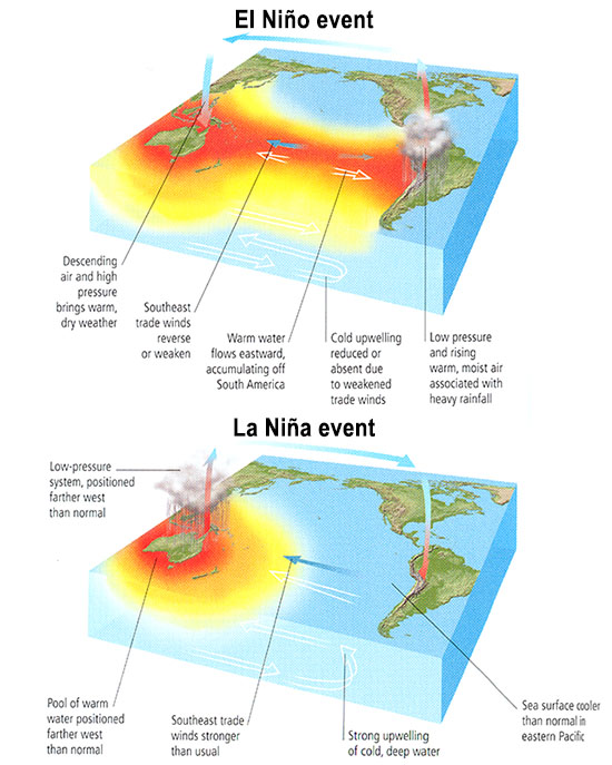
During the El Niño phase of the oscillation, the eastern/central tropical Pacific is warmer than usual. Sea level in the eastern tropical Pacific is higher than usual because the waters are warm (and thus less dense), in the absence of vertical upwelling of colder, denser water. The warmer waters in the central equatorial Pacific lead to rising motion in the atmosphere, shifting the rising limb of the so-called Walker Circulation (the vertical and longitudinal pattern of atmospheric circulation over the equatorial Pacific), and associated tendency for rainfall, from its normal position in the western equatorial Pacific. This circulation pattern, in turn, implies a decrease in the strength of the easterly trade winds in the eastern tropical Pacific. But it is those trade winds that are responsible for the upwelling of the cold waters in the first place. Thus, the ocean and atmosphere work in concert to sustain the ENSO pattern of temperature, winds, and rainfall. The La Niña state, when sea surface temperatures are cooler than normal in the eastern and central tropical Pacific, is based on these various features of the tropical Pacific ocean-atmosphere system being opposite to that described above for the El Niño phase.

© 2015 Pearson Education, Inc.
The system tends to oscillate between the El Niño and La Niña phases because of equatorial ocean wave dynamics that are beyond the scope of this course. The net effect of these waves—Kelvin waves and Rossby waves—is to make the system unstable so that it does not persist either in the El Niño or La Niña phase for more than a year or so, constantly oscillating between these two phases with a characteristic 2-7 year timescale.

If we look at the pattern of evolution of sea surface temperature anomalies over the tropical Pacific during recent years, we can clearly see this alternation between states when the eastern and central tropical Pacific are relatively warm (El Niño events) and states when the regions are relatively cold (La Niña events).

By some measures, ENSO is the largest signal in the observational climate record, even competing with the climate change signal itself. That is because El Niño and La Niña events can be large, leading to more than a degree C cooling or warming over a large part of the tropical Pacific Ocean, and ENSO events have global teleconnections. That is to say, ENSO affects seasonal weather patterns around the world through the impact of the tropical Pacific cooling/warming on the extratropical jet streams, the Monsoons, and other regional atmospheric circulation patterns. As we will see in the next section, ENSO even influences Atlantic seasonal hurricane activity. The largest and most reliable regional impacts of ENSO are shown below:

© 2015 Pearson Education, Inc.
Given the prominent impact of ENSO on year-to-year variations in climate around the world, it is well worth asking, how might ENSO itself change, in response to human-caused climate change? Such questions are key to assessing regional impacts of future climate change. Yet, we don't have the firm answers here that one might expect or want. In the time series plot above, there does seem to be some evidence of a trend towards more El Niño-like conditions in recent decades, but it is difficult to establish any statistical significance in this trend. Indeed, some climate models suggest the possibility of the opposite trend—a prevalence of the La Niña state—in response to anthropogenic climate change. We will return to the issue of climate variability [16] in a later lecture on projections of future climate change.
Tropical Cyclones / Hurricanes
There is perhaps no more impressive or—for that matter—deadly a weather phenomenon than tropical cyclones (and hurricanes—which are simply strong tropical cyclones).
We will focus, for the purpose of our discussion, on Atlantic tropical cyclones (TCs), as they are the best observed, providing records that go back more than a century (albeit with some uncertainties, particularly in earlier decades), and they are most relevant from the standpoint of North American impacts.
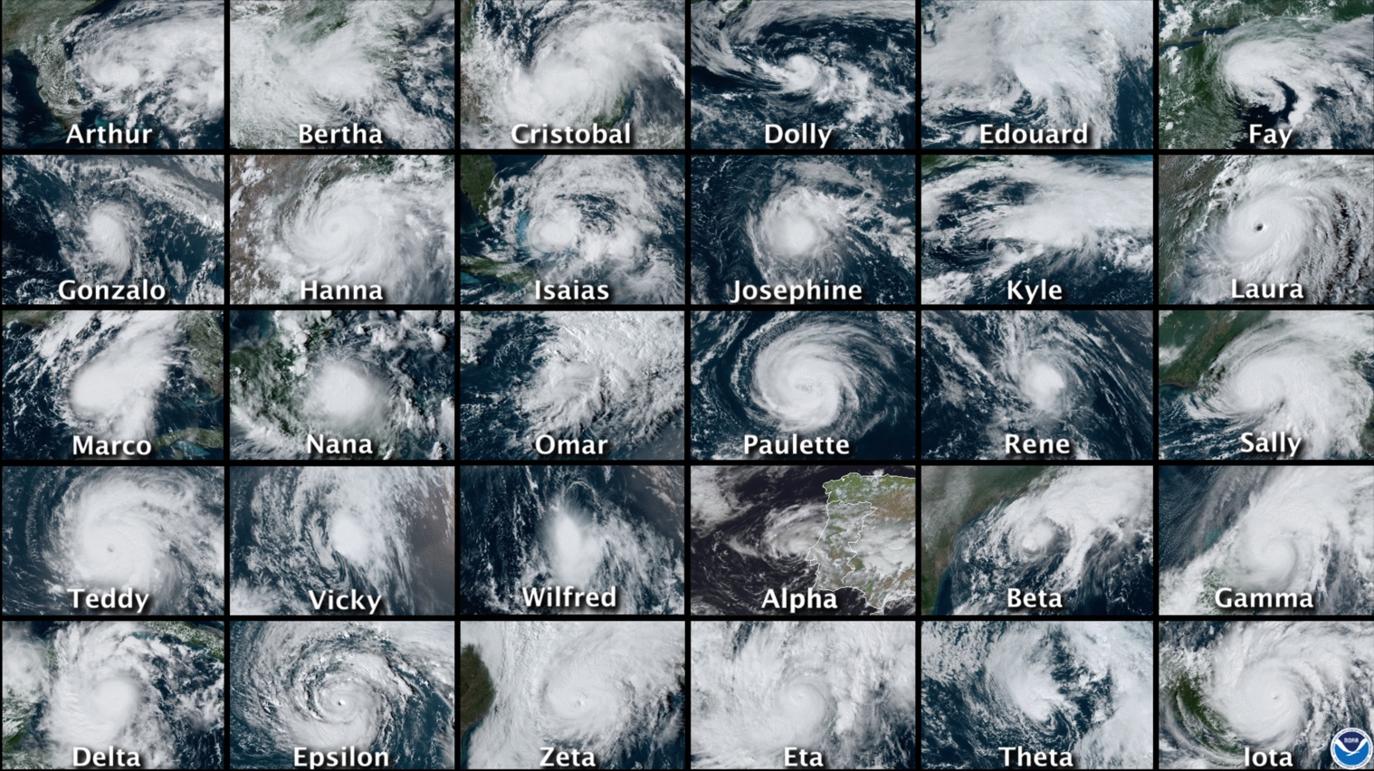
The 2020 Atlantic hurricane season was the most active ever, with a total of 30 TCs forming over the course of the Atlantic hurricane season (which formally runs from Jun 1-Nov 30, though storms sometimes occur outside this window).
One might well ask, is the apparent recent trend towards more destructive Atlantic hurricanes in some way tied to climate change? Well—as we will discuss in more detail in the next section on extreme weather—it is never possible to attribute any single weather event to climate change. But we can arguably see the impacts of climate change in the longer-term shifts in frequency and intensity of such events. In the case of Atlantic tropical cyclones & hurricanes, one convenient measure of activity is the net power dissipation, a measure that measures the energy dissipated by tropical cyclones & hurricanes as they interact with the ocean surface, averaged over the integrated lifetime of all storms during a particular season. Simple theoretical arguments developed by MIT hurricane expert Kerry Emanuel [17] imply that this measure of hurricane activity should closely follow sea surface temperatures.
If we compare sea surface temperatures over the tropical Atlantic in the main development region (MDR) for tropical storms during the core of the hurricane season (August-October) to estimates of the power dissipation index, we do, indeed, find a very close relationship as far back as reliable records go (the mid 20th century). Indeed, the increase in powerfulness of storms in recent decades (the broader context for the unusually active 2005 season) does appear to be tied to the warming of Atlantic Ocean surface temperatures. Moreover, computer modeling studies aimed at detecting and attributing human impacts on climate (a topic discussed in later lectures) do indeed tie this warming to human causes. In this sense, it can be argued that human-caused climate change has played a role in the increased destructiveness of Atlantic hurricanes in recent years.

What about the number of Atlantic TCs, including the hyperactive 2005 season with its 28 named storms? Is this part of a longer-term trend? And if so, is that trend related to human influences on the climate? This question is still being actively debated within the scientific community. For one thing, there is some question about how reliable long-term records of TC counts are, particularly prior to the use of modern aircraft reconnaissance in the mid 1940s (if you're interested in the details, you can find a journal article about this topic by Michael Mann entitled Evidence for a modest undercount bias in early historical Atlantic tropical cyclone counts [18]). Furthermore, while sea surface temperatures are one factor driving Atlantic tropical cyclone activity, there are other important factors as well. Even if sea surface temperatures are high—a favorable factor for development—other factors may mitigate tropical storm formation. High amounts of vertical wind shear, for example, are unfavorable for development. Such conditions typically prevail over the Caribbean during El Niño years, which are consequently unfavorable for Atlantic TC activity. La Niña years, by contrast, are favorable for Atlantic TC activity. Another climate pattern known as the North Atlantic Oscillation ('NAO'), which represents the year-to-year changes in the configuration of the jet stream over the North Atlantic, also has an influence on Atlantic TC activity. During years with a tendency for the negative phase of the NAO, when the Bermuda subtropical high pressure system is weaker than normal, storms are more likely to track through the tropical Atlantic and Caribbean where they encounter more favorable conditions for development. During positive NAO years, storms are more likely to track northward over colder extratropical Atlantic waters.
It is thus possible to relate year-to-year changes in Atlantic TC counts to three basic climate factors: (1) tropical Atlantic sea surface temperatures (SSTs) over the MDR during the August-October season, (2) ENSO, and (3) NAO. The long-term history of annual Atlantic TC counts, along with the time histories of factors (1)-(3) are shown below (for a, the red coloring indicates years with greater than average annual TC counts; for b-d, the red coloring indicates that the factor in question is more favorable than average for Atlantic TC activity. The Niño3.4 index is a time series that measures the state of ENSO where positive values indicate El Niño events and negative values indicate La Niña events.

There are a number of observations that can be made here. First of all, it is clear that annual TC counts have increased over time. How much we can conclude they have increased depends on the assumptions regarding how many TCs might have been missed in earlier decades, but even allowing for the upper-end estimates of undercounted past activity, the levels of activity over the past 15 years are without any modern-day precedent. It is also clear that this increase is coincident with increasing sea surface temperatures in the MDR. (Some researchers have argued that much of the long-term variability in temperatures is associated with the AMO mode discussed in the previous section; others, however, have argued that the long-term trends are mostly forced by a combination of human influences including greenhouse gases and sulphate aerosols [19]. If you're interested in Michael Mann's work in this area, you can refer to the publication in the journal Eos entitled Atlantic Hurricane Trends Linked to Climate Change [20]).
In the absence of other factors, we might assume that any continued warming of the tropical Atlantic in the future will lead to further increases. Yet, as alluded to earlier, there may be mitigating influences as well. We can, for example, see the mitigating impacts on annual TC counts of individual El Niño events if we look carefully at the respective time series shown above. Is it possible that a future trend towards a more El Niño-like climate could offset the effects of warming temperatures on Atlantic TC activity? We will revisit such questions in a later lecture on projected climate change impacts.
The historical relationship between annual TC counts and three climate factors identified above provide us with an ideal application of a new, somewhat more sophisticated statistical tool in our arsenal of methods for analyzing data. We will investigate the method of multivariate linear regression, a generalization of the OLS method investigated in our first problem set, which allows us to investigate a problem where there is more than one factor or 'predictor' (in our case, multiple climate factors such as MDR SST, El Niño, and the NAO) that appear to influence some target variable (in this case, annual TC counts) of interest. [note: Technically speaking, ordinary linear squares methods, including multivariate linear regression, are not strictly valid for discrete data, i.e., data such as storm counts that take on integer values, i.e., 0, 1, 2...rather than like, say, temperature, which takes on continuous values which better conform to a Gaussian distribution, as discussed in our previous lesson. Strictly speaking, a more sophisticated regression approach, known as Poisson Regression, is best used in such cases. However, it turns out that, as the counts become large, the assumption of continuous Gaussian behavior becomes increasingly valid. If we were looking at, say, the number of U.S. land falling major hurricanes, where numbers are quite small (typically at most a couple in any given year), that condition would not be met. But for looking at total named TCs, where the average value is about 10 per year, the Gaussian assumption is not too bad, and we can get away with applying standard regression methods.]
Later, you will perform a multivariate regression using these data in your next problem set, using the multivariate option in the online Regression Tool that you used in your previous problem set. In the meantime, however, we will use another example to explore how multivariate linear regression works...
Multivariate Regression Demonstration
We will now investigate the multivariate generalization of ordinary linear regression, using a data set of Northern Hemisphere land temperature data over the past century. We will attempt to statistically model the observed data in terms of a set of three predictors: (1) estimates from a simple climate model (discussed in our next lesson) known as an Energy Balance Model [21]that has been driven by estimated historical anthropogenic (greenhouse gas and aerosol) and natural (volcanic and solar) radiative forcing histories, and two internal climate phenomena discussed in the previous subsection: the (2) DJF Niño3.4 index, measuring the influence of the El Niño phenomenon, and the (3) DJFM NAO index.
The demonstration is in 4 parts below:
Video: Linear Regression Demonstration - Part 1 (1:52)
Video: Linear Regression Demonstration - Part 2 (2:09)
Video: Linear Regression Demonstration - Part 3 (1:56)
Video: Linear Regression Demonstration - Part 4 (3:23)
Extreme Weather
We have already looked at the relationship between climate (and climate change), and one particular type of severe weather—tropical cyclones & hurricanes. Let's now consider other types of severe weather and possible connections with climate change.
Heat Waves
It is perhaps obvious that global warming leads to more frequent and intense heat waves. What is not so obvious, however, is just how profound an impact even modest warming has on the frequency of heat extremes. It all has to do with the statistical properties of our friend, the Gaussian distribution [22].

Note from this schematic that even a modest warming can lead to a dramatic increase in the shaded region that exceeds some threshold (i.e., that exceeds 1 or even 2 standard deviations above the mean). Let's work out a simple example based on things we already know about the standard deviation. Let us consider a hypothetical city where the mean daily high temperature in July is 28°C (82°F), and the standard deviation in that measure (i.e., the amplitude of typical day-to-day fluctuations) is 5°C (9°F). Then, using what we know about the standard deviation, roughly 16% of the time, the daily high temperature would be expected to exceed 1 s.d. above the mean (i.e., 33°C/91°F). [You can check this out yourself using Vassar's online calculator [23], setting z = 1 and using the one-sided test result.] Only roughly 2.5% of the time would it be expected to exceed 2 s.d. above the mean (i.e., 38°C/100°F). [Again, you can check this with the online calculator, using z = 2 and observing the one-sided result.] Put in even more basic terms, we would only expect one day in July when the temperature would exceed the 'century mark' of 100°F.
Now, consider the effect of a hypothetical warming of 1°C/2°F (the rough actual warming of the globe since pre-industrial time). We can represent the effect of this warming by shifting the entire temperature distribution to the right by 1°C as shown qualitatively in the schematic above. Now, with the mean of 29°C (and assuming the standard deviation is still 5°C), a 'century mark' temperature of 38°C/100°F is only 1.8 s.d. above the mean.
Think About It!
Use Vassar's online calculator [23] to determine the probability of exceeding the 'century mark' after a warming of 1°C/2°F has occurred.
Click for answer.
So, is there evidence that this is really happening? Indeed, there is. Let's start with the single example of the 2003 European heat wave. This wasn't just 'another heat wave'. It killed more than 30,000 people as a result of exposure to extremely high temperatures coupled with a lack of widespread access to modern air conditioning in large parts of Europe. The entire summer was unusually warm, making individual record breaking heat waves exceptionally more likely.
In Europe, there are reasonably reliable temperature records stretching back several centuries (including thermometer measurements back to the late 18th century—see figure below, and longer-term documentary evidence stretching back as far as 500 years). The 2003 summer temperatures were by far the warmest on record. So, there was a context for the summer 2003 European heat wave. It wasn't just a single random event, but it occurred in the larger-scale context of an unusually warm summer, imbedded in a long-term trend of warming European summer temperatures. One prominent study in the journal Nature in 2004 suggested that global warming had already played a significant role in the European heat waves, taking what might have been thought as a one-in-a-thousand-year event (what is termed a 'thousand year event') and instead turning it into a 20-year event. Additional projected warming, the authors argued, would turn it into a 2-year event, i.e., every other summer would have similar heat waves. Indeed, prolonged European heat waves in 2018 and 2019 eclipsed many of the records that were set in 2003!

That unusually warm summer was associated with a poleward expansion of the jet stream relative to its typical position and a migration of the warm, dry descending air usually found in the descending limb of the Hadley circulation that is typically located in the subtropics (e.g., the Sahara desert), well into Northern Europe (see figure below).

© 2015 Pearson Education, Inc.
Indeed, as we will see later in the course when we cover projected changes in atmospheric circulation [24], this pattern of poleward migration of the descending limb of the Hadley circulation is a robust prediction of state-of-the-art climate models. Viewed in this context, the 2003 European summer heat wave is probably as good an example as any of the potential impact of anthropogenic climate change on heat extremes.
The year 2010 saw record heat around the globe. Perhaps best publicized was the record-breaking heat wave in Moscow and western Russia [25], where new all-time temperature records (111°F) were set, and temperatures hovered around or above 100°F for most of July, replete with massive wildfires and dangerously poor air quality. However, a large number of other countries set new heat records for maximum warmth, including Finland, Pakistan, Sudan, Saudi Arabia, Iraq, and Pakistan.

One might rightfully argue that pointing to any one year, be it 2003 in Europe, or 2010 in many other countries, is cherry-picking. And indeed, we need to look at the broader picture in which this fits.
The plot below shows the change over the course of the latter half of the 20th century in the number of days per decade qualifying as unusually warm (defined as exceeding the 90 percentile). Most, though not all, regions have seen an increase in the frequency of extremely warm days. Even more striking is the fact that virtually all regions have seen increases in the frequency of extremely warm nights. As we will discuss further in our assessment of climate change impacts [27] later in the course, it is actually the latter feature—the increase in very warm nights—that represents a greater threat from the standpoint of human mortality.

What about closer to home, i.e., the U.S.? 2010 was a record-breaking year for heat in many respects for the U.S.
On any given day, just by chance alone, there are likely some places in the U.S. where it is unusually cold, and other places where it is unusually warm. Record cold and record warm are often likely to be found somewhere. The real question to ask is, if we look at all of the reporting locations in the U.S. over all of the days of year, how often are we breaking warm records vs. cold records. As temperatures warm overall, we expect cold records to increasingly be outstripped by warm records. This was certainly the case for 2010.

Not surprisingly, summer (June-August) 2010 was the warmest, or one of the few warmest, summers ever for a large swath of the southeastern and mid-Atlantic U.S. [for example, in State College, PA, daily maximum temperatures in the summer exceeded 90°F more than twice as often as usual] and were unusually warm over much of the rest of the U.S. Only in the northwestern corner of the U.S. was it relatively cool.

Again, one might be tempted to argue that focusing on any particular year is cherry-picking. So let us again step back, and look at the long-term context for this anomalous recent warmth. We will look at the trend from decade to decade in the frequency of warm and cold record-breakers, totaled over all locations of the U.S. and over all days of the year. This is what the trend looks like through 2015:

In the absence of global warming, one would expect record highs to occur as often as lows. This was true in the middle of the century. Then during the 60s and 70s as mean northern hemisphere temperatures—as we have seen before—actually cooled a bit, cold records began to slightly outpace warm records. Since then, we have seen a dramatic increase in the ratio of warm to cold record-breakers as the globe, northern hemisphere, and North America have continued to warm. This trend culminates in a warm/cold record-breaker ratio of more than two-to-one for the past decade. In other words, we've now seen a doubling in the relative frequency of hot vs. cold temperature extremes. Note that this increase (roughly a factor of two) in probability of heat extremes is similar to that motivated by the simple example I used at the very beginning of this section on heat waves.
An excellent analogy for the impact of global warming on temperature extremes involves the simple rolling of a six-sided die. So we're going to do a little experiment with die rolling—I think you'll find it both fun and instructive (and amusing—a special thanks to Penn State's David Babb and Matt Croyle for their help in constructing this!).
Start rolling the pair of dice. One of the dice is a fair die, and the other is "loaded", though just how, you'll need to figure out. It should become clearer and clearer as time goes on, and the number of rolls increases. Note that you can "roll" in rapid succession to get larger and larger samples (you don't need to wait for the animation to complete on each roll). Start out with 1 roll, then 5, then 10, 30, 50, 100, and so on, as many as 500 or more if you have the patience! rolls of the die. Pay attention to the number of numbers you've rolled for each of the two dice (the % of time each possible value of the die is rolled is conveniently recorded for you).
Do your rolls seem to be converging towards some well-defined fraction? Is one number showing up more often on one of the two die? How does it compare with your expectation for a fair die? When you think you're ready to guess which of the two dice is loaded, go for it. You can repeat the experiment over and over again. Sometimes it's the red die that will be loaded, other times it will be the blue die. How quickly can you successfully identify which is which?
Think About It!
Can you figure out which number is favored and how scewed (loaded) the results are?
Click for answer.
So, as you've figured out by now, I loaded the die so that sixes would come up twice as often as they ought to. The more rolls of the die you do, the more obvious that becomes. Consider your first incidence of rolling a six with the loaded die. Was the fact that you rolled a six on that roll directly attributable to the loading of the die? Of course not, you might rightly respond! Even with a fair die, there was a chance (1 in 6) of rolling a six. But the loading of the die nonetheless made it twice as likely that, on any given roll—including that one—you would roll a six. And this becomes increasingly clear as you roll the die more times.
This is a very useful analogy for talking about the influence of global warming on weather extremes such as heat waves. In our first example, we showed that a moderate amount of warming—equivalent to that which has occurred on average over the past century—nearly doubled the probability of breaching the 'century mark' of 100°F during mid-summer. We furthermore saw above that, on average, the relative frequency of extremely warm days in the U.S. has roughly doubled since the mid 20th century. Using the die rolling analogy, we can think of these changes as the equivalent of loading the die in the way we did in the above example. And just as we can't say for certain that any one extremely hot summer day was due to global warming, we can say that the chances were twice as high—and because of global warming. We are indeed seeing the loading of the weather die in the trends toward greater heat extremes in the U.S., and elsewhere.
Other Weather Extremes
Climate change appears to have influenced other types of meteorological extremes (see table below). Not surprisingly, for example, extremely cold days, early frosts, etc., have decreased. Extremely heavy precipitation events and flooding episodes appear to have increased, consistent with the more vigorous hydrological cycle expected with a warming atmosphere. Extratropical cyclones (i.e., mid-latitude storm systems) appear to have strengthened, though the confidence on this observation is somewhat less. Ironically, on the day the first version of this lecture was written (October 27, 2010), the mid-west of the U.S. had just experienced their strongest extratropical cyclone on record, with a central low pressure of 954 millibars (that is lower than that of many category 2 Hurricanes!). This is what the October 2010 'superstorm' looked like:

Modeling studies suggest that human-caused climate change may actually decrease the number of extratropical cyclones because the projected polar amplification of warming is likely to reduce the equator-to-pole temperature gradient, which is ultimately what drives these storms through the process of baroclinic instability [11]. However, it may at the same time increase the intensity of the storms systems that do form, because the greater amounts of water vapor available in a warmer atmosphere, once condensed into precipitation as the air rises along frontal boundaries, yield additional latent heating that can add to the energetics of the storm. You can find an excellent discussion of this topic here [30] on Jeff Master's Weather Underground site).
Here is a summary of some extreme weather and other climate indicators from Figure 1.2 of the Fourth National Climate Assessment in 2018 [31]:

| Phenomenon | Change | Region | Period | Confidence | Section |
|---|---|---|---|---|---|
| Low-temperature days/nights and frost days | Decrease, more so for nights than days | Over 70% of global land area | 1951 - 2003 (last 150 years for Europe and China) | Very likely | 3.8.2.1 |
| High-temperature days/nights | Increase, more so for nights than days | Over 70% of global land area | 1951- 2003 | Very likely | 3.8.2.1 |
| Cold spells/snaps (episodes of several days) | Insufficient studies, but daily temperature changes imply a decrease | ||||
| Warm spells (heat waves) (episodes of several days) | Increase: implicit evidence from changes in inter-seasonal variability | Global | 1951 - 2003 | Likely | FAQ 3.3 |
| Cold seasons/warm seasons (seasonal averages) | Some new evidence for changes in inter-seasonal variability | Central Europe | 1961 - 2004 | Likely | 3.8.2.1 |
| Heavy precipitation events (that occur every year) | Increase, generally beyond that expected from changes in the mean (disproportionate) | Many mid-latitude regions (even where reduction in total precipitation) | 1951 - 2003 | Likely | 3.8.2.2 |
| Rare precipitation events (with return periods > ~10 yrs) | Increase | Only a few regions have sufficient data for reliable trends (e.g. UK and USA) | Various since 1893 | Likely (consistent with changes inferred for more robust statistics) | 3.8.2.2 |
| Drought (season/year) | Increase in total area affected | Many land regions in the world | Since 1970's | Likely | 3.3.4 and FAQ 3.3 |
| Tropical cyclones | Trends towards longer lifetimes and greater storm intensity, but no trend in frequency | Tropics | Since 1970's | Likely; more confidence in frequency and intensity | 3.8.3 and FAQ 3.3 |
| Extreme extratropical storms | Net increase in frequency/intensity and a poleward shift in track | NH land | Since about 1960 | Likely | 3.8.4, 3.5 and FAQ 3.3 |
| Small-scale severe weather phenomena | Insufficient studies for assessment |
Paleoclimate Evidence
Among contrarians in the public debate about climate change, one often hears an argument that goes something like this:
"Sure, the climate is changing. But climate is always changing. It was warmer than today in the past due to natural causes! So the warmth today could also be due to natural causes?"
Is this a legitimate argument? Well, we began to address the issue back during our introduction to the concept of climate change [33]. Let's explore the issue in more detail now, looking at what observations are available to document (a) how climate changed in the past and (b) what factors appear to have been responsible for those changes.
Geological Variations
Let's start out with a look at the longest timescale changes that are documented in the geological record. We're talking hundreds of millions of year timescales. While the records are imperfect at best, we do have a rough idea from very old sedimentary records as to the broad-scale changes in global temperatures and in atmospheric CO2 over these timescales. On these very long timescales, the changes in atmospheric CO2 are related to geologic processes such as plate tectonics, which govern the outgassing of CO2 from Earth's interior by volcanoes, and the slow changes in Earth's continental configuration and relief, which influence natural processes such as chemical and physical weathering that take CO2 out of the atmosphere.

Its quite clear from the comparison above that, on these long timescales, atmospheric CO2 levels and global temperatures appear to be very closely correlated. Warm periods, with some exceptions, are periods of high atmospheric CO2, and cold periods, geologically, have been periods of low atmospheric CO2. You can hear Penn State professor Richard Alley's eloquent Bjerknes Lecture [34] on the subject at the 2009 meeting of the American Geophysical Union.
Let's zoom in further over the past 50 million years.

© 2015 Pearson Education, Inc.
This interval takes us from the warm early Eocene period [35], to the cooler Miocene period [36], and eventually to the Plio-Pleistocene period [37] of the past 5 million years, during which large-scale glaciation of the modern continents was first observed. We see that this transition from a warm to glacial climate was accompanied by a major decrease in atmospheric CO2 levels.
The decrease in atmospheric CO2, once again, doesn't explain all of the details of course. For example, CO2 appears relatively flat for the final two million years, even as the climate continues to have cooled through the Plio-Pleistocene transition. Some of that cooling may represent positive ice albedo feedbacks that kick in once large-scale glacial inception takes hold over the past 20-30 million years. Nonetheless, CO2 clearly remains the major knob controlling global climate over the past 50 million years. Once we zoom in on yet shorter timescales, that is tens of thousands of years, we see that another dynamic appears to have been at play.
Glacial/Interglacial Variations
Once we enter into the Pleistocene period of the past 1.5 million years, large-scale glaciation of the Northern Hemisphere takes hold, but there are prominent alternations between relatively ice-covered periods (the "Ice Ages"), and warmer periods more similar to modern, pre-industrial conditions. It is instructive to consider what factors appear to have been driving these variations.
Pleistocene Ice Ages
For nearly the past million years, CO2 concentrations, as recorded in Antarctic ice cores, have oscillated by roughly 100 ppm, alternating between low glacial levels of roughly 180 ppm and relatively high interglacial levels of roughly 280 ppm. Methane (CH4) concentrations oscillate by nearly a factor of two as well. And temperatures in Antarctica, as recorded by oxygen isotopes in the ice cores, have varied in concert with these greenhouse gas concentrations changes. If one takes into account the typical polar amplification [9] of warming, the peak-to-peak changes in temperature in Antarctica (roughly 10°C) translate to a change in global mean temperature of about 3°C. At least half of that temperature change is due to changes in Earth's albedo (reflectivity) associated with the changes in surface ice cover. That leaves the remaining 1.5°C temperature change to be explained by the changes in greenhouse gas concentrations (CO2 and also CH4). If we work out the implied sensitivity of the global climate to greenhouse gas concentrations, it implies a value that lies within the typical range of estimates [19], i.e., between 1.5° and 4.5°C for a doubling of CO2 concentrations. (You can read more about the details of this argument in The lag between temperature and CO2 [38] article from Real Climate).

But why do the oscillations occur? Why do they have a roughly 100,000 year ('100 kyr') periodicity? And why is the shape of the oscillation not a sinusoidal cycle, but a "sawtooth" waveform with a slow, long-term descent into glacial conditions and a very rapid termination? These features certainly require further explanation.
The pacing of the 100 kyr oscillation is almost certainly tied to long-term changes in Earth orbital geometry. As I alluded to in the introductory lecture of the course [40], the geometry of Earth's annual orbit around the Sun changes slowly over time. These changes are subtle, but they are persistent over thousands of years and have a profound impact on climate.
The first of these orbital variations involves the very slow wobble (or to use the more technical term, the precession [41]) of the Earth's rotational axis. One full wobble (analogous to the wobbling of a gyroscope—see animation below) takes roughly 19-23 kyr. The precession determines when the Northern and Southern Hemisphere are each tilted toward (summer) or away (winter) from the Sun.

The primary importance of this factor is that it determines whether the summer solstice in a given hemisphere occurs when Earth is farthest (making summer a little cooler) or closest (making summer a little warmer) to the Sun. This factor only matters, then, because Earth's annual orbit around the Sun is not circular, but slightly elliptical - a factor discussed further below.
The second of these changes involves the tilt angle (or to use the more technical term, the obliquity [43]) of Earth's orbit. The Earth's rotational axis today is inclined at an angle of roughly 23.5 degrees from the vertical (this is the angle of the precessing top shown in the animation above). This is why the tropics are located at 23.5N and 23.5S and why the Arctic and Antarctic circles are located at 90-23.5 = 66.5 N and S respectively. This angle of inclination is not fixed over time, however. It varies between roughly 21.5 degrees and 25.5 degrees. Seasonality only exists because of the tilt; if not for the tilt, neither hemisphere would be preferentially tilted towards the Sun at any time of the year. Therefore, periods when the tilt angle is greatest are periods of heightened seasonality, while periods when the tilt angle is smallest have reduced seasonality. It takes roughly 41 kyr for the tilt angle to go through one full cycle of alternation between lesser and greater values of the obliquity.
The final of the changes involves the ellipticity (or, to use the more technical term, the eccentricity [44]) of the orbit. Earth's orbit around the Sun is not circular, but, instead, is slightly elliptical. The degree of ellipticity is measured by the eccentricity, which ranges from roughly zero (an essentially circular orbit) to a maximum of roughly 4% (a very slightly elliptical orbit). It takes roughly 100 kyr for the eccentricity to go through one full cycle of alternation between low and high eccentricity.
This might sound like the smoking gun to explain the dominant 100 kyr periodicity of the ice ages. But it's not quite that simple.
The changes in insolation associated with the 100 kyr eccentricity variations is considerably smaller than the shorter (19-23 kyr and 41 kyr) precession and obliquity periodicities. And prior to about 700,000 years ago, the glacial/interglacial cycles were dominated by these shorter periodicities. So what is it that is responsible for the dominant 100 kyr oscillation of the past 700,000 years?
To understand this, we have to think a bit more about how these various effects interact. The precession and obliquity don't actually change the net solar radiation at the top of the atmosphere; they simply redistribute it with respect to season and latitude. The eccentricity, however, does change the net solar radiation. When Earth's orbit is more elliptical, it spends more time over the course of a year being relatively far away from the sun, and thus there is a decrease in the received solar radiation. Because the change is very small, however, it's necessary to have large amplifying feedbacks to give this effect a greater role.
Think About It!
Any guess as to what feedbacks may do the trick?
Click for answer.
The ice-albedo feedback is key to understanding the glacial/interglacial cycles. While this feedback is a moderate player in the context of modern climate change (responsible, for example, for only about 0.6°C of the 2.5-3°C warming [19] expected for a doubling of CO2 concentrations), it is considerably more important during ice ages, when continental ice sheets reached as far south as New York City.
This observation provides a clue as to how the 100 kyr periodicity emerges when the actual radiative forcing at the 100 kyr timescale is so weak. Roughly every 100 kyr or so, the eccentricity reaches a particularly high value, favoring the largest possible differences in Earth-Sun distance over the course of the annual cycle. During such times, there will be a point over the course of the much faster 19-23 kyr precession cycle, where the Northern Hemisphere winter solstice will coincide with the minimum Earth-Sun distance ('perihelion'), and the summer solstice will coincide with the maximum Earth-Sun distance ('aphelion'). This makes winters at high northern latitudes unusually warm and summers at high northern latitudes unusually cool. Such conditions are ideal for growing ice sheets: the warm winters actually allow for greater amounts of snowfall (since warm winter air holds more moisture than cold winter air), and the cool summers help prevent any accumulated winter snow from melting over the course of the summer. Ice begins to accumulate, more solar radiation is reflected to space, and the cooling spreads southward. Pretty soon, you've got a full-fledged ice age on your hands. This effect, of course, is enhanced when the obliquity is greatest.
So, we can see how all three factors—the eccentricity, the precession, and the obliquity—work together to create ice ages. But the thing that appears to trigger it all is the slow, 100 kyr eccentricity forcing, since high eccentricity—reached roughly every 100 kyr—sets up the perfect storm of conditions for establishing an ice age. Once those conditions occur, an ice age slowly sets in and builds, for tens of thousands of years. This is the slow descent into the ice ages seen in the ice core figure earlier. Eventually, however, as we near 100 kyr from the starting point, the eccentricity again rises to high levels. Then, when the faster precession cycle reaches a point where seasonality is enhanced rather than diminished, ie., northern summers are especially warm—the ice begins to melt, and the positive ice-albedo feedback kicks in in an especially dramatic fashion, yielding the rapid warming that defines the abrupt termination evident in the ice core figure.
The mechanism described below requires the possibility of building large ice sheets. It is widely speculated that the climate had to cool beyond some threshold where large ice sheets could grow, and that the slow cooling was provided by the gradual lowering of CO2 concentrations over the course of the Pleistocene. Eventually, the climate cooled to that point, and the 100 kyr oscillations ensued.
And what about the role of CO2 in all of this? As I noted above, CO2 is clearly an important player. We cannot explain the extent of the warming and cooling over the glacial/interglacial cycles without including the direct warming effect of CO2. But the situation is somewhat more complicated than that since CO2 is not simply a control variable on these timescales. The global carbon cycle (in particular the oceanic carbon cycle) is changing in response to the climate changes taking place. For example, a warming ocean favors outgassing of CO2 into the atmosphere, which of course amplifies the warming further because of the greenhouse effect.
So CO2 is acting both as a forcing and as feedback. That is different from the current situation, where we essentially have our hands on the CO2 knob of the system (though, even here, there are some complications, as we will discuss in more detail in Lesson 6 on carbon emission scenarios [45]).

The Younger Dryas
At the termination of the last ice age, roughly 12 kyr ago, something surprising happened. Just as Earth appeared to be coming out of the ice age, it staged a reversal and headed back into glacial conditions for at least 1000 years. The cooling event seems to have been centered in the North Atlantic ocean. This episode is known as the Younger Dryas (named after the spread of the tundra-loving Dryas flower [46], whose range during this time interval plunged southward in regions surrounding the North Atlantic ocean).

While there is still some scientific debate about the details, it is generally believed that this rapid cooling resulted from a slowdown or collapse of the ocean's thermohaline circulation in response to the massive flux of freshwater into the high-latitude North Atlantic as the Northern Hemisphere ice sheets and glaciers rapidly began to melt. This fresh water would have inhibited the sinking motion that typically occurs in the sub-polar regions of the North Atlantic, suppressing the overturning circulation associated with the North Atlantic drift current which helps to warm the high-latitudes of the North Atlantic and surrounding regions.
It is, in fact, this event from the distant past that has given rise to the popular, if rather flawed (as we will see when we look at actual climate projections [49]), concept that global warming may ironically lead to another ice age. This concept was caricatured in the movie 'The Day After Tomorrow [50]'. The problem with the analogy is that there isn't nearly the amount of ice around today to melt that there was at the termination of the last ice age, and thus the effect is likely to be much smaller. As we will see later [49]in the course, however, there may be a very small grain of truth to the scenario laid out in the movie.
The Holocene
Even during interglacial intervals, when there is relatively little ice around, the higher-frequency orbital forcings still have an influence on climate. In particular, the impacts of the roughly 19-23 thousand year precession cycle are evident over the course of the current interglacial period of the past 12,000 years known as the Holocene. Today, precession has the effect of minimizing Northern Hemisphere seasonality, since perihelion occurs very close (January 3) to the winter solstice (Dec 22nd). Roughly 1/2 of a precession cycle (i.e., about 11,000 years) ago, precession had the effect of maximizing Northern Hemisphere seasonality. Indeed, it was this exaggerated seasonality that helped end the last ice age by favoring summer melting. Over the next 12,000 years, the seasonal pattern of insolation slowly evolved to what it is today.
If we look at temperature estimates based on oxygen isotopes from Arctic ice cores, we find that summer temperatures were relatively high during a period sometimes called the Holocene optimum that lasted from about 10,000-6,000 years ago, before slowly declining towards pre-industrial levels (and then spiking again over the last 100 years—something we'll discuss more below). This pattern of high-latitude summer temperature change is precisely what we expect, given the precession changes discussed above. On the other hand, tropical insolation was actually reduced, as was winter insolation at higher northern latitudes. That makes these natural past changes in radiative forcing very different from those associated with modern greenhouse increases which are positive during both seasons, in both hemispheres, and in the tropics as well as high latitudes.

As the seasonal and latitudinal pattern of solar heating evolved over the course of the Holocene, so did the atmospheric circulation which is driven in substantial part by those variations in heating. For example, paleoclimate evidence suggests that the Sahara desert was considerably more lush than today, supporting steppe vegetation and large lakes that were home to crocodiles and hippopotamuses. Simulations with climate models, forced by the known changes in seasonal insolation, reproduce this pattern, as a consequence of strengthened west African monsoon, driven by the larger seasonal changes in insolation.

The Past 1,000 Years
Over the past 1,000 years, changes in insolation due to Earth orbital effects are relatively small. The primary natural radiative forcings believed to be important on this time frame (as we will see in Lesson 5 when we talk about Estimating Climate Sensitivity [53]) are volcanic eruptions and changes in solar output.
The basic 'boundary conditions' on the climate (distribution of ice sheets, orbital geometry, continental configuration, etc.) were essentially the same as they are today, making this a useful interval to study from the standpoint of modern climate change. The pre-industrial interval of the past 1,000 years forms a sort of 'control', as the only real difference from today is the added impact over the past century or two of human influence on climate. Some (in particular, the atmospheric chemist Paul Crutzen, who won the Nobel Prize for his work on the stratosphere ozone hole) have argued that the period since the dawn of industrialization (i.e., the past two centuries) has been impacted substantially enough already by human activity that we should consider it as a distinct interval separate from the current interglacial, i.e., that we are no longer in the Holocene, but rather, an entirely new, human-created interval of Earth history known as the anthropocene [54].
Patterns of surface temperature can be estimated in past centuries from "proxy" records such as tree-rings, corals, ice cores, faunal remains and other sources. For more information about the work that Michael Mann has done on this topic, you might check out an Interactive Presentation of the Global Temperature Patterns in Past Centuries [55].

Looking at the temperature patterns reconstructed from these proxy records, we can gain a longer-term perspective on the natural climate variability associated with ENSO [57], and the NAO [58], and other known dynamical patterns influencing the climate system. Can you spot some big El Niño events in the 18th century? What about the effect of the NAO—can you discern that in the patterns? How?
If we average over these patterns (focusing on the Northern Hemisphere, since information in the Southern Hemisphere is limited) , we can obtain an estimate of the average temperature in past centuries. There are numerous reconstructions that have been performed of this sort, using different types of proxy data, and different statistical approaches to estimating temperatures from the data. But one thing they all have in common is finding that the recent warming is anomalous as far back as these reconstructions go (more than 1,000 years now).
Does this mean that the warming is due to human activity? No—it's possible that the warming could just be a fluke of nature. To assess whether or not the recent warming can be attributed to human activity, we'll need to turn to theoretical climate models - the topic of our next lesson!

Problem Set #2
Activity: Statistical Analysis of Atlantic Tropical Cyclones and Underlying Climate Influences
NOTE: For this assignment, you will need to record your work on a word processing document. Your work must be submitted in Word (.doc or .docx) or PDF (.pdf) formats. A formatted answer sheet is available on CANVAS as a convenience for students enrolled in the course.
- Be sure also to download the answer sheet from CANVAS (Files > Problem Sets > PS#2).
Each problem (#2 through #6) is equally weighted for grading and will be graded on a quality scale from 1 to 10 using the general rubric as a guideline. Thus, a score as high as 50 is possible, and that score will be recorded in the grade book.
The objective of this problem set is for you to work with some of the data analysis/statistics concepts and mechanics covered in Lesson 2, namely the coefficient of variation and multi-variate regression. You are welcome to use any software or computer programming environment you wish to complete this problem set, but the instructor can only provide support for Excel and an online tool that is introduced in this problem set should you need help. The instructions also will assume you are using Excel and that online tool.
Now, in CANVAS, in the menu on the left-hand side for this course, there is an option called Files. Navigate to that, and then navigate to the folder called Problem Sets, inside of which is another folder called PS#2. Download the data file PS2.xlsx in that folder to your computer, and open the file in Excel. You should see five time series: HURDAT (“unadjusted”) tropical-cyclone (TC) count for the Atlantic basin, Vecchi-Knutson (2008) (“adjusted”) TC count, August-October Main Development Region (MDR) sea-surface temperature (SST), December-March North Atlantic Oscillation (NAO) index, and December-February Niño3.4 index (which measures ENSO phase). All five series cover 1878 to 2019.
- Construct a scatterplot and calculate the mean, median, and standard deviation for each of the five time series in the data file. Recall that you constructed scatterplots and calculated these summary statistics in PS#1. Place the five scatterplots and report the summary statistics for each time series on the answer sheet
- The two TC count time series should be thought of as dependent variables; you will be building models that should give meaningful predictions of those two dependent variables. One TC count series is “unadjusted” and comes from the HURDAT data-set [60]. However, a weakness of this data-set is that it does not take into account the effect of satellite observations on TC counts. Satellite observations began to be used to observe TCs around 1966, providing comprehensive counts of annual TC activity, whereas, prior to 1966, some TCs were missed due to sparse observation networks, which grow more sparse going back farther and farther in time. Many scientists have tried to estimate the undercount of TCs in the more distant past, and Vecchi and Knutson made such an estimate in a 2008 paper [61], yielding the “adjusted” TC count series that you will explore in this data-set.
On the other hand, the MDR SST, NAO, and Niño3.4 time series should be thought of as independent variables, or predictor variables. The justification for the choice of these predictor variables is that warmth of the surface of the seawater in the Main Development Region [62] (an area of the Atlantic Ocean roughly east of the Caribbean Sea), pressure patterns in the North Atlantic region, and pressure patterns in the equatorial Pacific region, respectively corresponding to MDR SST, NAO, and Niño3.4, are thought to be related to TC activity in the Atlantic basin.
Considering the “unadjusted” TC count as the predictand, calculate the linear trend line equation (i.e., single-variable regression equation) for each of the three predictor variables. Also calculate the correlation coefficient r and the coefficient of variation R2 for each of the three regression equations. Moreover, for each of the three regressions, state how much of the variation in the predictand is explained by the predictor. Report your results on the answer sheet.
- Repeat the calculations and analysis that you performed in #3, but, this time, consider the “adjusted” TC count as the predictand. Comment on any differences compared to the “unadjusted” regressions. Report your results on the answer sheet.
- Multi-variate regression methods, which you learned about in Lesson 3, allow for the simultaneous use of multiple variables to predict a response. Instead of constructing a separate regression for each predictor-predictand pair, like you did in #4, one regression can be constructed that uses all available predictors to predict a response.
A sidebar: Excel could be used to construct a multi-variate regression, but it is not the best tool for this task. In the real world, you might leverage your computer programming skills to accomplish this task, but knowledge of programming is not a pre-requisite for this course. More likely, you might have available a statistical software package for the task, but such packages generally are proprietary and cost money and are not a required technical capability for this course. In past offerings of this course, for this problem set, we asked students to use the regression tool that you saw used in video demonstrations in Lesson 3, but it presents technical problems depending on the Web browser being used. Therefore, we suggest use of this online multi-variate regression calculator [63], but you may use any tool you wish.
Using this online multi-variate regression calculator [63] (or any tool you wish), calculate two multi-variate regressions using all three predictor variables available to you: one to predict the “unadjusted” TC count and one to predict the “adjusted” TC count. The equation should be given in the form
where y is the predictand, is a constant, and , , and are coefficients for predictor variables , , and respectively. If you are using the online calculator, display output to four decimal places, and include no interactions. Find the coefficient of variation for each regression, and interpret it, comparing it to the coefficients of variation for the single-variable regressions you calculated in #3 and #4. Note that is an output of the online calculator. Report your results and discussion on the answer sheet.
- In #5, you found two multi-variate regressions, one that predicts (or models) “unadjusted” TC counts and one that predicts “adjusted” TC counts. You now will see how well these regressions model 2020 TC count. Given that, in 2020, August to October MDR SST was 28.3531 degrees Celsius, December to March NAO index was -0.135, and Niño3.4 index was -0.987, use both regressions to model 2020 TC count in the Atlantic basin. Research (citing your source) the number of TCs that actually occurred in the Atlantic basin in 2020, showing predictor values substituted into the multi-variate regression equation, and compare your modelled counts to the actual count. Report your results and discussion on the answer sheet.
Lesson 3 Summary
In this lesson, we reviewed key observations that detail how our atmosphere and climate are changing. We have seen that:
- Ice in its various forms (sea ice, glaciers, and ice sheets) is disappearing as the globe warms;
- Global sea level is rising due both to the expansion of warming seawater and the contribution from melting glaciers and ice sheets;
- The deep ocean, as well as the ocean surface, is warming in a manner consistent with a warming climate; the slow nature of the ocean warming means that global sea level will continue to rise for several centuries, even if we were to freeze greenhouse concentrations at current levels;
- Ocean circulation trends are difficult to establish, but there is some reason to believe that the ocean's thermohaline circulation may weaken;
- There is substantial natural multidecadal variability that appears related to oscillations in the strength of the ocean's thermohaline circulation;
- The El Niño/Southern Oscillation (ENSO) is the most prominent mode of climate variability on interannual timescales, and one important uncertainty in projecting future climate change involves uncertainties in how ENSO will change in the future;
- There is a trend toward increasingly powerful Atlantic Hurricanes over the past half century, and this increase appears to mirror warming tropical Atlantic sea surface temperatures;
- There is also a trend toward increased Atlantic tropical cyclone counts, though the reliability of the data, particularly in earlier decades, has been called into question. A variety of factors, including sea surface temperatures, El Niño, and the so-called North Atlantic Oscillation (NAO) atmospheric circulation pattern, influence Atlantic tropical cyclone counts;
- Other extreme weather events appear to have become more common in recent decades. The increased frequency and duration of heat waves around the world is likely related to large-scale warming; there is also some evidence that mid-latitude storm systems have become more powerful, consistent with predictions of climate models;
- Paleoclimate evidence demonstrates that CO2 has been the 'major lever' influencing global climate change over geological time;
- CO2 and CH4 greenhouse gas forcing is a key component in the glacial/interglacial cycles of the late Pleistocene, with ice albedo feedback playing an especially important role, and with changes in Earth orbital geometry providing the pacing, including the dominant 100 kyr oscillations of the past 700,000 years;
- The Younger Dryas cooling, even in the North Atlantic, that occurred at the termination of the last ice age demonstrates the potentially important role of ocean dynamical responses to meltwater fluxes; such effects are unlikely to be as important in the context of modern climate change;
- Earth orbital changes have influenced climate changes over the course of the current interglacial period (the Holocene). Increased high-latitude summer insolation was responsible for the relatively warm summers at high Northern latitudes during a period from roughly 10,000-6,000 years ago known as the Holocene optimum. The same seasonal and latitudinal redistribution of solar insolation was responsible for changes in atmospheric circulation such as the strengthened west African Monsoon that led to the greening of the Sahara at this time;
- Temperatures over the past millennium have been dominated by other radiative forcings, such as natural forcing by volcanic eruptions and solar insolation changes, and anthropogenic forcing over the past two centuries;
- The warming of the past few decades appears to exceed the range seen for at least the past millennium.
Reminder - Complete all of the lesson tasks!
You have finished Lesson 3. Double-check the list of requirements on the first page of this lesson to make sure you have completed all of the activities listed there before beginning the next lesson.