Lessons
Use the links below to link directly to one of the lessons listed.
† indicates lessons that are Open Educational Resources (OER).
Lesson 2: Statistical Hypothesis Generation and Testing (Part 1)
Motivate...
Did you know that the first frost in the UK is linked to increases in purchases of cauliflower and birdseed at Tesco, a supermarket chain in the UK? Or that hot weather increases the sales of hair removal products by 1,400%? Or that strawberry sales typically increase by 20% during the first hot weekend of the year in the UK? Consumer spending is linked to the weather. The video above is from a segment on BBC about the weather’s influence on consumer purchase behavior. The segment showcases the use of weather analytics in two major supermarket chains in the UK: Sainsbury and Tesco. These two supermarket chains use weather analytics every day to make decisions related to product placement, ordering, and supply and demand. Both Tesco and Sainsbury believe the weather “defines how a customer shops and what they want to buy” (BBC Highlights article).
Changes in temperature can result in changes of demand for a particular product. Retail companies need to keep up with the demand, ensuring that the right product is on the right shelf at the right time. Currently, in the UK, about £4.2 billion of food is wasted each year: 90% of this consisting of perishable food. Thoughtful application of supply and demand relationships could be emphasized to increase profit. But how do companies do this? One way is to meaningfully increase product availability based on how the weather affects consumer spending, such as how temperatures greater than 20°C in Scotland can triple BBQ sales.
But how do we implement such relationships in a profitable way on a daily basis? There’s no such thing as a sure thing in weather forecasting. A forecaster may predict that the temperature will reach a certain threshold, but there is uncertainty with this result. Historically, we may expect to see the temperature rise above 20°C in the first week of April, but we know this won’t happen every year because there is variability. How do we quantify the impact of this uncertainty on our use of weather forecasts? In particular, is a result consistent enough to act on?
Hypothesis testing provides a way to determine whether a result is statistically significant, i.e., consistent enough to be believed. For example, a hypothesis test can determine how confident we are that the temperature during the first week of April will exceed 20°C in Scotland. Furthermore, confidence intervals can be created through hypothesis generation and testing. We can determine a range of weeks that are highly likely to exceed the temperature threshold. By creating these confidence intervals and performing tests to determine statistical significance, retail companies can develop sound relationships between weather and business that allow them to prepare ahead of time to make sure appropriate goods are available during highly profitable weeks - like BBQ equipment and meat.
Below is a flow chart you can refer to throughout this lesson. This is an interactive chart; click on the box to start.
Newsstand
- Christison, A. (2013, April 16). Tesco saves millions with supply chain analytics [9] Retrieved January 21, 2019.
- Curtis, J. (2003, July 17). The Weather Effect: Marketers have no excuse not to harness data on the weather to make gains [10]. Retrieved April 7, 2016.
Lesson Objectives
- Identify instances when hypothesis testing would be beneficial.
- Know when to invoke the Central Limit Theorem.
- Describe different test statistics and when to use them.
- Formulate hypotheses and apply relevant test statistics.
- Interpret the hypothesis testing results.
Normal Distribution Review
Prioritize...
After completing this section, you should be able to estimate Z-scores and translate the normal distribution into the standard normal distribution.
Read...
The normal distribution is one of the most common distribution types in natural and social science. Not only does it fit many symmetric datasets, but it is also easy to transform into the standard normal distribution, providing an easy way to analyze datasets in a common, dimensionless framework.
Review of Normal Distribution
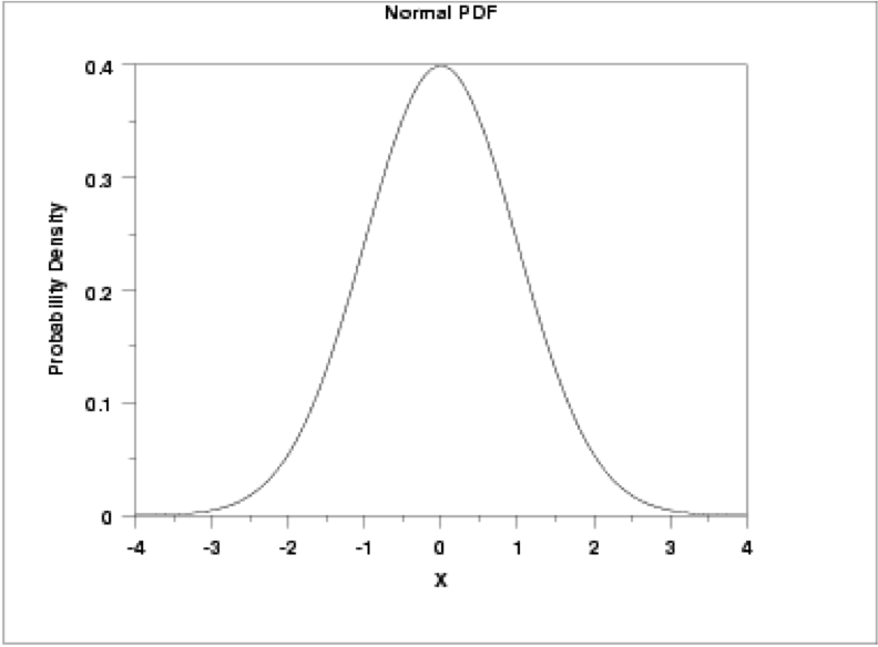
This distribution is parametrized using the mean (μ), which specifies the location of the distribution, and the variance (σ2) of the data, which specifies the spread or shape of the distribution. Some more properties of the normal distribution:
- the mean, median, and mode are equal (located at the center of the distribution);
- the curve is always unimodal (one hump);
- the curve is symmetric around the mean and is continuous;
- the total area under the curve is always 1 or 100%.
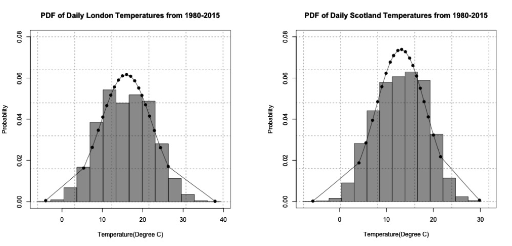
If you remember, temperature was a prime example of meteorological data that fits a normal distribution. For this lesson, we are going to look at one of the problems posed in the motivation. In the video and articles from the newsstand, there was an interesting result: BBQ sales triple when the daily maximum temperature exceeds 20°C in Scotland and 24°C in London. As a side note, there is a spatial discrepancy here: London is a city while Scotland is a country. For this example, I will stick with the terminology used in the motivation (Scotland and London), but I want to highlight that we are really talking about two different spatial regions, and, in reality, this is not what we are comparing because the data is specifically for a station near the city of London and a station near the city of Leuchars, which is in Scotland, but doesn't necessarily represent Scotland as a whole. Let’s take a look at daily temperature in London and Scotland from 1980-2015. Download this dataset [13]. Load the data, and prepare the temperature data by replacing missing values (-9999) with NAs using the following code:
There are two stations: one for London and one for Scotland. Extract out the maximum daily temperature (Tmax) from each station along with the date:
Estimate the normal distribution parameters from the data using the following code:
Finally, estimate the normal distribution using the code below:
The normal distribution looks like a pretty good fit for the temperature data in Scotland and London. The figures below show the probability density histogram of the data (bar plot) overlaid with the distribution fit (dots).
If we wanted to estimate the probability of the Tmax exceeding 20°C in Scotland and 24°C in London, we would first have to estimate the Cumulative Distribution Function (CDF) using the following code:
Remember that the CDF function provides the probability of observing a temperature less than or equal to the value you give it. To estimate the probability of exceeding a particular threshold, you have to take 1-CDF. To estimate the probability of the temperature exceeding a threshold, use the code below:
Since 1980, the temperature has exceeded 20°C in Scotland 9.5% of the time and has exceeded 24°C in London about 10.8% of the time.
Standard Normal Distribution
The simplest case of the normal distribution is when the mean is 0 and the standard deviation is 1. This is called the standard normal distribution, and all normal distributions can be transformed into the standard normal distribution. To transform a normal random variable to a standard normal variable, we use the standard score or Z-score calculated below:
X is any value from your dataset, μ is the mean, σ is the standard deviation, and n is the number of samples. The Z-score tells us how far above or below the mean a value is in terms of the standard deviations. What is the benefit of transforming the normal distribution into the standard normal? Well, there are common tables that allow us to look up the Z-score and instantly know the probability of an event. The most common table comes from the cumulative distribution and gives the probability of an event less than Z. Visually:
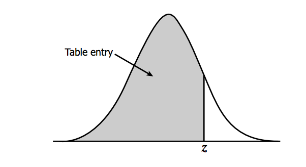
You can find the table here [14] and at Wikipedia [15] (look under Cumulative). To read the table, take the first two digits of the Z-score and find it along the vertical axis. Then, find the third digit along the horizontal axis. The value where the row and column of your Z-score meets is the probability of observing a Z value less than the one you provided. For example, say I have a Z-score of 1.21, the probability would be .8869. This means that there is an 88.69% chance that my data falls below this Z-score. To translate the temperature data to the standard normal for Scotland and London in R, use the function 'scale' which automatically creates the standardized scores. Fill in the missing code using the variable 'ScotlandTemp':
The standard normal distribution for the temperatures from London and Scotland are shown in the figure below:
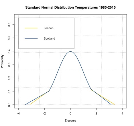
As you can see from the figure, the temperatures have been transformed to Z-scores creating a standard normal distribution with mean 0. If we want to know the probability of temperature falling below a particular value, we can use ‘pnorm’ in R, which calculates the probabilities of any distribution function given its mean and standard deviation. When these two parameters are not provided, ‘pnorm’ calculates the probability for the standard normal distribution function. R thus gives you the choice to transform your normally distributed data into Z-scores. Remember that the Z-scores can be used in the CDF to get a probability of an event with a score less than Z or in the PDF to get the probability density at Z. Fill in the missing spots for the Scotland estimate to compute the probability of the temperature exceeding 20°C.
The probability for the temperature to exceed 20°C in Scotland is about 9.9%, and the probability for the temperature to exceed 24°C in London is about 10.6%, similar to the estimate using the CDF. It might not seem beneficial to translate your results into Z-scores and compute the probability this way, but the Z-scores will be used later on for hypothesis testing.
For some review, try out the tool below that lets you change the mean and standard deviation. On the first tab, you will see Plots: the normal distribution plot and the corresponding standard normal distribution plot. On the second tab (Probability), you will see how we compute the probability (for a given threshold) using the normal distribution CDF and using the Z-table. Notice the subtle differences in the probability values.
Empirical Rule and Central Limit Theory
Prioritize...
By the end of this section, you should be able to apply the empirical rule to a set of data and apply the outcomes of the central limit theory when relevant.
Read...
The extensive use of the normal distribution and the easy transformation to the standard normal distribution has led to the development of common guidelines that can be applied to this PDF. Furthermore, the central limit theory allows us to invoke the normal distribution, and the corresponding rules, on many common datasets.
Empirical Rule
The empirical rule, also called the 68-95-99.7 rule or the three-sigma rule, is a statistical rule for the normal distribution which describes where the data falls within three standard deviations of the mean. Mathematically, the rule can be written as follows:
The figure below shows this rule visually:

What does this mean exactly? If your data is normally distributed, then typically 68% of the values lie within one standard deviation of the mean, 95% of the values lie within two values of the mean, and 99.7% of your data will lie within three standard deviations of the mean. Remember the Z-score? It defines how many standard deviations you are from the mean. Therefore, the empirical rule can be described in terms of Z-scores. The number in front of the standard deviation (1, 2, or 3) is the corresponding Z number. The figure above can be transformed into the following:

This rule is multi-faceted. It can be used to test whether a dataset is normally distributed and checks whether the data lies within 3 standard deviations. The rule can also be used to describe the probability of an event outside a given range of deviations, or used to describe an extreme event. Check out these two ads from Buckley Insurance and Bangkok Insurance.
Both promote insuring against extreme or unlikely weather events (outside the normal range) because of the high potential for damage. So, even though it is unlikely that you will encounter the event, these insurance companies use the potential of costly damages as a motivator to buy insurance for rare events.
The table below, which expands on the graph above, shows the range around the mean, the Z-score, the area under the curve over this range (the probability of an event in this range), the approximate frequency outside the range (the likelihood of an event outside the range), and the corresponding frequency to a daily event outside this range (if you are considering daily data, translate the frequency into a descriptive temporal format).
| Range | Z-Scores | Area under Curve | Frequency outside of range | Corresponding Frequency for Daily Event |
|---|---|---|---|---|
| 0.382924923 | 2 in 3 | Four times a week | ||
| 0.682689492 | 1 in 3 | Twice a week | ||
| 0.866385597 | 1 in 7 | Weekly | ||
| 0.954499736 | 1 in 22 | Every three weeks | ||
| 0.987580669 | 1 in 81 | Quarterly | ||
| 0.997300204 | 1 in 370 | Yearly | ||
| 0.999534742 | 1 in 2149 | Every six years | ||
| 0.999936658 | 1 in 15787 | Every 43 years (twice in a lifetime) | ||
| 0.999993205 | 1 in 147160 | Every 403 years | ||
| 0.999999427 | 1 in 1744278 | Every 4776 years | ||
| 0.999999962 | 1 in 26330254 | Every 72090 years | ||
| 0.999999998 | 1 in 506797346 | Every 1.38 million years |
A word of caution: the descriptive terminology in the table (twice a week, yearly, etc.) can be controversial. For example, you might have heard the term 100-year flood (for example the 2013 floods in Boulder, CO). The 100-year flood has a 1 in 100 (1%) chance of occurring every year. But how do you actually decide what the 100-year flood is? When you begin to exceed a frequency greater than the number of years in your dataset, this interpretation becomes foggy. If you do not have 100 years of data, claiming an event occurs every 100 years is more of an inference of the statistics than an actual fact. It’s okay to make inferences from statistics, and this can be quite beneficial, but make sure that you convey the uncertainty. Furthermore, people can get confused by the terminology. For example, when the 100-year flood terminology was used in the Boulder, CO floods, many thought that it was an event that occurs once every 100 years, which is incorrect. The real interpretation is: the event had a 1% chance of occurring each year. Here is an interesting article [16] on the 100-year flood in Boulder, CO and the use of the terminology.
Central Limit Theorem
At this point, everything we have discussed is based on the assumption that the data is normally distributed. But, what if we have something other than a normal distribution? There are equivalent methods for other parametric distributions that we can use, but let's first discuss a very convenient theory called the central limit theorem. The central limit theorem, along with the law of large numbers, are two theorems fundamental to the concept of probability. The central limit theorem states:
The sampling distribution of the mean of any independent random variable will be approximately normal if the sample size is large enough, regardless of the underlying distribution.
What is a sampling distribution of the mean? Consider any population. From that population, you take 30 random samples. Estimate the mean of these 30 samples. Then take another 30 random samples and estimate the mean again. Do this again and again and again. If you create a histogram of these means, you are representing the sampling distribution of the mean. The central limit theorem then says that if your sample size is large enough, this distribution is approximately normal.
Let’s work through an example using the precipitation data from Lesson 1. As a reminder, this data was daily precipitation totals from the Amazon. You can find the dataset here [17]. Load the data in and extract out the precipitation:
We found that the Weibull distribution was the best fit for the data. The figure below is the probability density histogram of the precipitation data with the Weibull estimate overlaid.
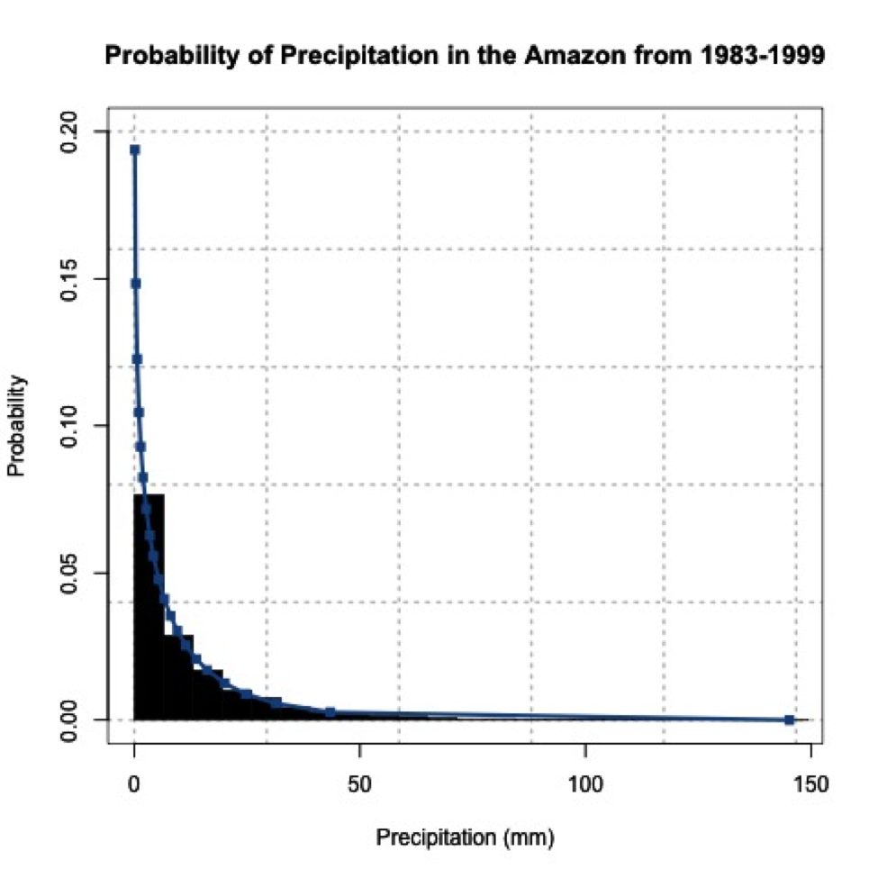
When you look at the figure, you can clearly tell it looks nothing like a normal distribution! Let’s put the central limit theory to the test. We need to first create sample means from this dataset. Since the underlying distribution is Weibull, we will need quite a few sample mean estimates to converge to a normal distribution. Let’s estimate 100 sample means randomly from the dataset. We have 6195 samples of daily precipitation in the dataset, but only 3271 are greater than 0 (we will exclude values of 0 because we are interested in the mean precipitation when precipitation occurs). Use the code below to remove precipitation equal to 0.
For each sample mean, let's use 30 data points. We will randomly select 30 data points from the dataset and compute the sample mean 100 times. To do this, we will use the function 'sample' which randomly selects integers over a range. Run the code below (no need to fill anything in), and look at the histogram produced.
We provided 'sample', a range from 1 through the number of data points we have. Thirty is the number of random integers we want. Setting replace to 'F' means we won’t get the same numbers twice.
You can see that the histogram looks symmetric and resembles a normal distribution. If you increased the number of sample mean estimates to 1000, you would get the following probability density histogram:
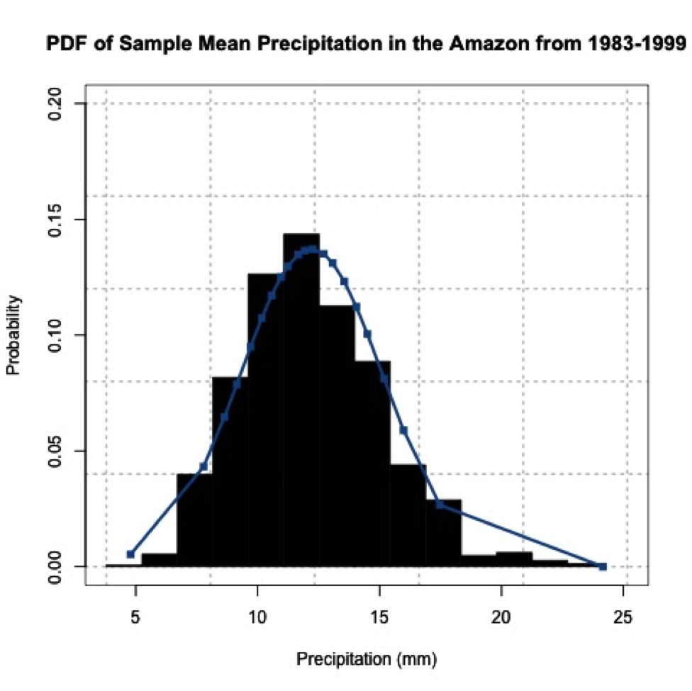
The more sample means, the closer the histogram looks to a normal distribution. One thing to note, your figures will not look exactly the same as mine and if you rerun your code you will get a slightly different figure each time. This is because of the random number generator. Each time a new set of indices are created to estimate the sample means, thus changing your results. We will, however, still get a normally distributed dataset; proving the central limit theory and allowing you to assume that any independent dataset of sample means will converge to a normal distribution if the sample size is large enough.
Hypothesis Formation and Testing for 1 Sample: Part 1
Prioritize...
By the end of this section, you should be able to distinguish between data that come from a parametric distribution and those that do not, select the null and alternative hypotheses, identify the appropriate test statistic, and choose and interpret the level of significance.
Read...
Let's say you think BBQ sales triple when the temperature exceeds 20°C in Scotland. How would you test that? Well one way is through hypothesis testing. Hypothesis generation and testing can seem confusing at times. This section will contain a lot of potentially new terminology. The key for success in this section is to know the terms; know exactly what they mean and how to interpret them. Working through examples will be extremely beneficial. There will be an entire section filled with examples. Take the time now to understand the terminology.
Here is a general overview of hypothesis formation and testing. This is meant to be a basic procedure which you can follow:
- State the question.
- Select the null and alternative hypothesis.
- Check basic assumptions.
- Identify the test statistic.
- Specify the level of significance.
- State the decision rules.
- Compute the test statistics and calculate confidence intervals.
- Make decision about rejecting null hypothesis and interpret results.
State the Question
Stating the question is an important part of the process when it comes to hypothesis testing. You want to frame a question that answers something you are interested in but also is something that you can answer. When coming up with questions, try and remember that the basis of hypothesis testing is the formation of a null and alternative hypothesis. You want to frame the question in a way that you can test the possibility of rejecting a claim.
Selection of the Null Hypothesis and Alternative Hypothesis
When selecting the null and alternative hypothesis, we use the question that we stated and formulate the hypotheses based on questioning the null hypothesis. A common example of a hypothesis is to determine whether an observed target value, μo, is equal to the population mean, μ. The hypothesis has two parts, the null hypothesis and the alternative hypothesis. The null hypothesis (Ho) is the statement we will test. Through hypothesis testing, we are trying to find evidence against the null hypothesis. The null hypothesis is what we are trying to disprove or reject. The alternative hypothesis (H1 sometimes HA) states the other alternative - it's usually what think to be true. The two are mutually exclusive and together cover all possible outcomes. The alternative hypothesis is what you speculate to be true and is the opposite of the null hypothesis.
There are three ways to format the hypothesis depending on the question being asked: two tailed test, upper tailed test (right tailed test), and the lower tailed test (left tailed test). For the two tailed test, the null hypothesis states that the target value (μo) is equal to the population mean (μ). We would write this as:
An example would be that we want to know whether the total amount of rain that fell this month is unusual.
The upper tailed test is an example of a one-sided test. For the upper tailed test, we speculate that the population mean (μ) is greater than the target value (μo). This might seem backwards, but let’s write it out first. The null hypothesis would be that the population mean (μ) is less than or equal to the target value (μo):
And the alternative hypothesis would be that the population mean (μ) is greater than the target value (μo):
It’s called the upper tailed test because we are examining the likelihood of the sample mean being observed in the upper tail of the distribution if the null hypothesis were true. In this case, the null hypothesis is that the target value (μo) is equal to or greater than the population mean (μ); it lies in the upper tail. An example would be that the temperature today feels unusually cold for the month. We are hoping to reject that the temperature is actually warmer than the usual.
The lower tailed test is also an example of a one-sided test. For the lower tailed test, we speculate that the target value (μo) is greater than the population mean (μ). Again, let's write this out. The null hypothesis would be that the target value (μo) is less than or equal to the population mean (μ):
This is called the lower tailed because we are testing whether the target value (μo) is less than the population mean (μ); we are testing that the target value (μo) lies in the lower tail. An example would be that the wind feels unusually gusty today. We speculate that the wind is gusty. We want to reject that the wind is lower than usual, so we test whether it is in the lower tail or not.
For now, all you need to know is how to form the null hypothesis and alternative hypothesis and whether this results in a two-sided or one-sided test (lower or upper). Knowing the type of test will be important when determining the decision rules. Here is a summary:
Speculate that the population mean is simply not equal to the target value:
- Two-Tailed Test
Speculate that the value is less than the mean:
- One-Tailed Test: Upper
Speculate that the value is greater than the mean:
- One-Tailed Test: Lower
For nonparametric testing, the null and alternative hypothesis are stated the same way. Both one-tailed and two tailed tests can be performed. The main difference is that generally the median is considered instead of the mean.
Basic Assumptions
There are several assumptions made when hypothesis testing. These assumptions vary depending on the type of hypothesis test you are interested in, but the assumptions will usually involve the level of measurement error of the variable, the method of sampling, the shape of the population distribution, and the sample size. If you check these assumptions, you should be able to determine whether your data is suitable for hypothesis testing.
All hypothesis testing requires your data to be an independent random sample. Each draw of the variable must be independent of each other; otherwise hypothesis testing cannot proceed. If your data is an independent random sample, then you can continue on. The next question is whether your data is parametric or not. Parametric data is data that is fit by a known distribution so you can use the set of hypothesis tests specific to that distribution. For example, if the data is normally distributed then the data meets the requirements for hypothesis testing using that distribution and you can continue with the associated procedures. For non-normally distributed data, you can invoke the central limit theory. If this does not work, you can transform to normal, use the parametric test appropriate to the distribution your data is fit by, or use a nonparametric test. In any case, at that point your data meets the requirements for hypothesis testing and you can continue on. If your data is non-normally distributed, has a small sample size, and cannot be transformed, you will have switch to the nonparametric testing methods which will be discussed later on. The caveat about nonparametric test statistics is that, because they make no assumptions about the underlying probability distributions, the results are less robust. Below is an interactive flow chart you can use to help you determine whether your data meets the requirements for hypothesis testing. Here is a larger, static view. [18]
Test Statistics
Once we have stated the hypotheses, we must choose a test statistic appropriate to our null hypothesis. We can calculate any statistic from our sample data and there is more than one test to allow us to see how likely it is that the population value is different from some target. For this lesson, we are going to focus specifically on the means. There are two test statistics for data that are either normally distributed or numerous enough that we can invoke the central limit theory. The first is the Z-test. The Z-test is the same as the Z-score:
X is the target value (μo from the hypothesis statement), μ is the population mean, σ is the population standard deviation, and n is the number of samples. When we use the Z-test, we assume that the number of samples is sufficiently large enough so that the sample mean and standard deviation are representative of the population mean and standard deviation. We use a Z-table to determine the probability associated with the Z-statistic value calculated from our data. The Z-test can be used for both one-sided and two sided tests.
If we have a small dataset (less than 30), then we will need to perform a t-test instead. The main difference between the t-test and the Z-test is that in the Z-test we assume that the standard deviation of the data (the sample standard deviation) represents the population standard deviation, because the sample size is large enough (greater than 30). If the sample size is small, the standard deviation of the dataset does not represent the population standard deviation. We therefore have to assume a t-distribution. The test statistic itself is calculated exactly the same as the Z-statistic:
The difference is that we use a t-table to determine the corresponding probability. The probabilities in the t-table vary with the number of cases in the dataset, so that they approach the probabilities in the Z-table as the number of cases approaches 30, so there's no "lurch" as you switch from one table to the other at 30. Note that you do not have to memorize these formulas. There are functions in R that will calculate these tests for you. I will show them later on.
Those are the two tests to use for parametric fits: distributions that are normal with a sample size greater than 30, normally distributed but with sample size less than 30, or a sample size large enough to assume it is normally distributed even with a different underlying distribution.
If we have data that is nonparametric, we need to apply tests which do not make assumptions about its distribution. There are several nonparametric tests available. I will only be going over two popular ones in this lesson.
The first is the Sign Test, S=, which makes no assumption about symmetry of the data, meaning that if your data are skewed you can still use this test. One thing that is different from the tests above: the hypothesis is in terms of the median (η) instead of the mean (μ):
- Two Sided:
- Upper Tailed:
- Lower Tailed:
The other popular nonparametric test is the Wilcoxon statistic. This statistic assumes a symmetric distribution - but it can be non-normal. Again, the hypothesis is written in terms of the median (same as above). There are functions in R which I will show later on that will calculate these test statistics for you. Below is another interactive flow chart that shows you one way to pick your test statistic. Again, a static view is available [19].
Level of Significance
The next step in the hypothesis testing procedure is to pick a level of significance, alpha (α). Alpha describes the probability that we are rejecting a null hypothesis that is actually true, which is sometimes called a "false positive". Statisticians call this a type I error. We want to minimize this probability of a type I error. To do that, we want to set a relatively small value for alpha, increasing our confidence in the results. You must choose alpha before calculating the test statistics because it determines the threshold of the test statistic beyond which you reject the null hypothesis! The exact value is up to you. Consider the dataset you are using, the problem you are trying to solve, and the amount of confidence you require in your result, or how comfortable you are with the potential of a type I error. The choice depends on the cost, to you, of falsely rejecting the null hypothesis. Two traditional choices for alpha are 0.05 or 0.01, a 5% and 1% probability, respectively, of having a type I error. We would describe this as being 95% or 99% confident in our result.
Since there are type I errors, you're probably not surprised that there are also type II errors. They're just the opposite, falsely not rejecting the null hypothesis, a “false negative”. But this type of error is harder to deal with or minimize. Because of this, we will only focus on the level of significance, alpha. You can read more about type II errors and how to minimize them here [20].
Hypothesis Formation and Testing for 1 Sample: Part 2
Prioritize...
By the end of this section, you should be able to generate a hypothesis, distinguish between questions requiring a one-tailed and two tailed test, know when to reject the null hypothesis and how to interpret the results.
Read...
Decision Rules
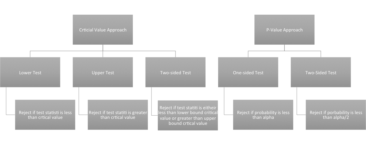
Now that we have the hypothesis stated and have chosen the level of significance we want, we need to determine the decisions rules. In particular, we need to determine threshold value(s) for the test statistic beyond which we can reject the null hypothesis. There are two ways to go about this: the P-Value approach and the Critical Value approach. These approaches are equivalent, so you can decide which one you like the most.
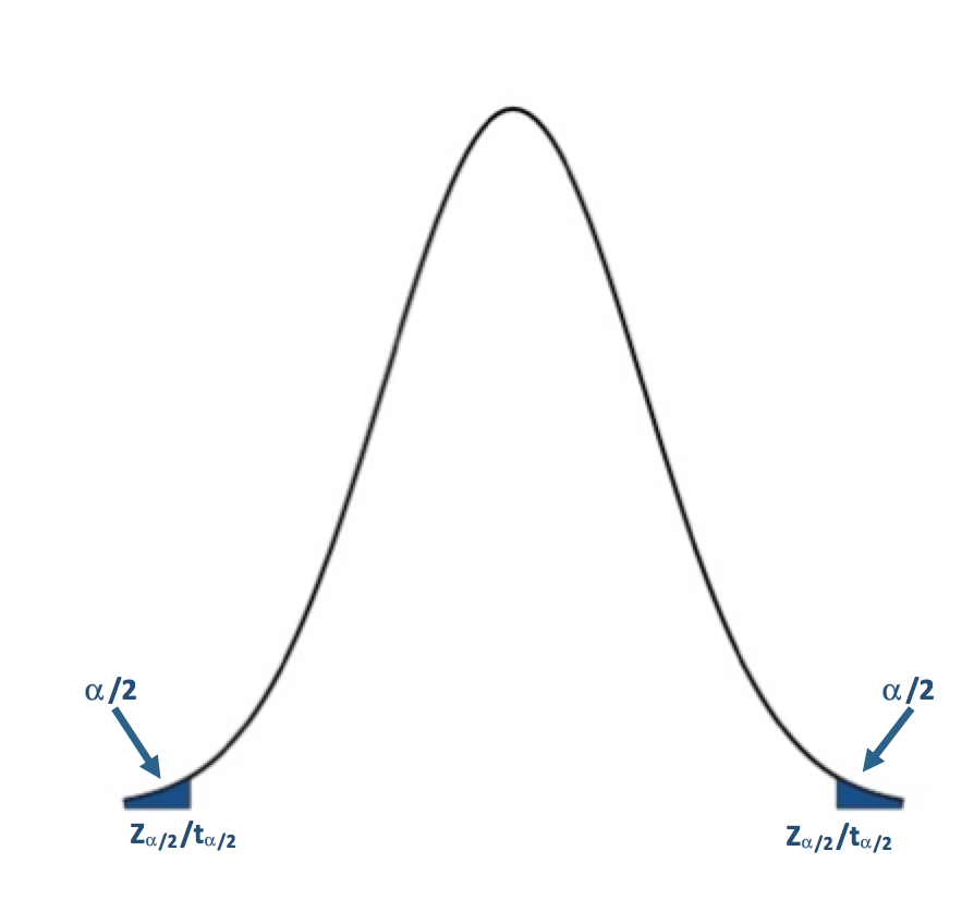
The P-value approach determines the probability of observing a value of the test statistic more extreme than the threshold assuming the null hypothesis is true; you look at the probability of the test statistic value you calculated from your data. For the P-value approach, we compare the probability (P-value) of the test statistic to the significance level (α). If the P-value is less than or equal to α, then we reject the null hypothesis in favor of the alternative hypothesis. If the P-value is greater than α, we do not reject the null hypothesis. Here is the region of rejection of the null hypothesis for a one-sided and two sided test:
- If H1: μ<μo (Lower Tailed Test) and the probability from the test statistic is less than α, then the null hypothesis is rejected, and the alternative is accepted.
- If H1: μ>μo (Upper Tailed Test) and the probability from the test statistic is less than α, then the null hypothesis is rejected, and the alternative is accepted.
- If H1: μ≠μo (Two Tailed Test) and the probability from the test statistic is less than α/2, then the null hypothesis is rejected, and the alternative is accepted.
For the P-value approach, the direction of the test (lower tail/upper tail) does not matter. If the probability is less than α (α/2 for a two-tailed test), then we reject the null hypothesis.
The critical value approach looks instead at the actual value of the test statistic. We transform the significance level, α, to the test statistic value. This requires us to be very careful about the direction of the test. If your test statistic lies beyond the critical value, then reject the null hypothesis. Let's break it down by test:
If H1: μ<μo (Lower Tailed Test):
Simply find the corresponding test statistic value of the assigned significance level (α); that is, if α is 0.05 find the t or Z-value that corresponds to a probability of 0.05. This is your critical value and we denote this as Zα or tα.
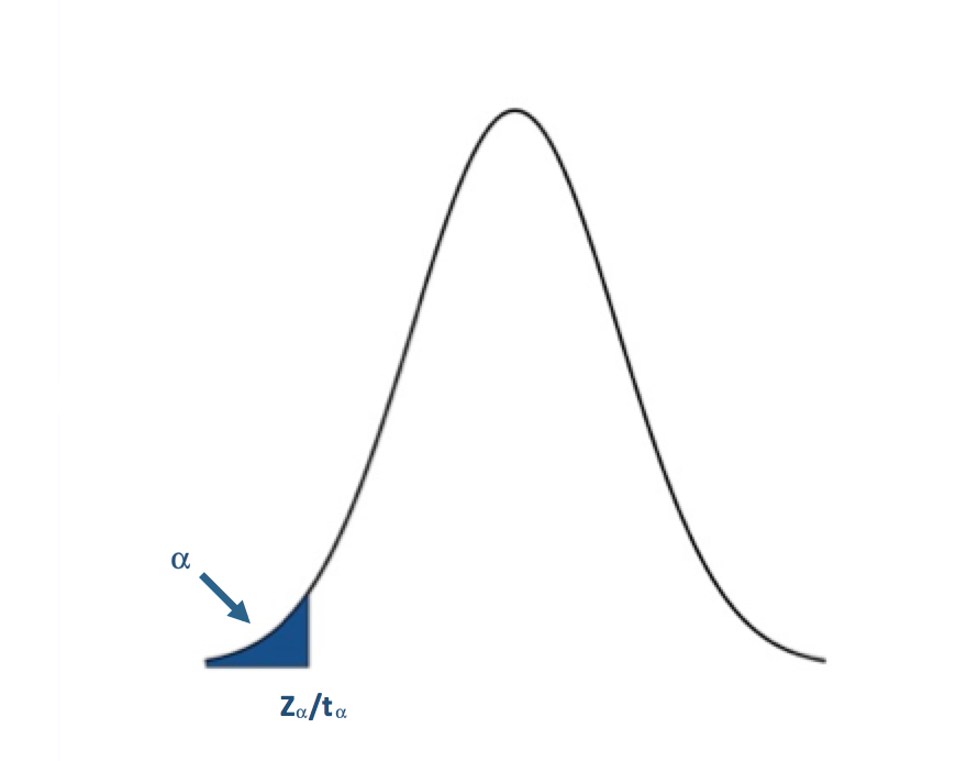
The blue shaded area represents the rejection region. For the lower tailed test, if the test statistic is to the left of the critical value (less than) in the rejection region (blue shaded area), we reject the null hypothesis. I said before that one common α value was 0.05 (a 5% chance of a type I error). For α=0.05, the corresponding Z-value would be -1.645. The Z-statistic would have to be less than -1.645 for the null hypothesis to be rejected at the 95% confidence level.
If H1: μ>μo (Upper Tailed Test):
You have to remember that the t and Z-values use the CDFs of the PDF. This means that for the right tail or upper tail the corresponding t and Z-values will actually come from 1-α. For example, if α is 0.05 and we have an upper tail test, we find the t or Z-value that corresponds to a probability of 0.95. This would be the critical value and we denote this as Z1-α or t1-α.
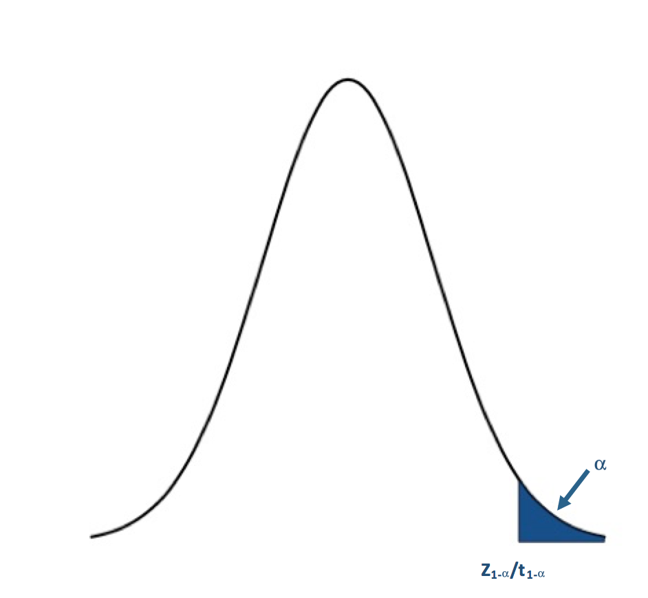
For the upper tailed test, if the test statistic is to the right of the critical value (greater than), we reject the null hypothesis. For α=0.05, the corresponding Z-value would be 1.645. The Z-statistic would have to be greater than 1.645 for the null hypothesis to be rejected at the 95% confidence level.
If H1: μ≠μo (Two Tailed Test):
For the two-tailed test, if your test statistic is to the left of the lower critical value or the right of the upper critical value, then we reject the null hypothesis. For α=0.05, the corresponding Z-value would be ±1.96. The Z-statistic would have to be less than -1.96 or greater than 1.96 for the null hypothesis to be rejected at the 95% confidence level.
I suggest that for nonparametric tests, such as the Wilcoxon or Sign test, that you use the P-value approach because the functions available in R will estimate the P-value for you which means you do not have to estimate the critical value for these tests, avoiding a tedious task. Here is a flow chart for the rejection of the null hypothesis. Here is a larger view (opens in another tab) [21].
Computation and Confidence Interval
Finally, after we have set up the hypothesis and determine our significance level, we can actually compute the test statistic. In this section, I will briefly talk about functions available in R to calculate the Z, t, Wilcoxon, and the Sign test statistics. But first, I want to talk about confidence intervals. Confidence intervals are estimates of the likely range of the true value of a particular parameter given the estimate of that parameter you've computed from your data. For example, confidence intervals are created when estimating the mean of the population. This confidence interval represents a range of certainty our data gives us about the population mean; we are never 100% certain the mean of a sample dataset represents the true mean of a population, so we calculate the range in which the true mean lies within with a certain confidence. Most times confidence intervals are set at the 95% or 99% level. This means we are 95% (99%) confident that the true mean is within the interval range. To estimate the confidence interval, we create a lower and upper bound using a Z-score reflective of the desired confidence level:
where is the estimated mean from the dataset, σ is the estimate of the standard deviation of the dataset, n is the sample size, and z is the Z-score representing the confidence level you want. The common confidence levels of 95% and 99% have Z-scores of 1.96 and 2.58 respectively. You can estimate a confidence interval using t-scores instead if n is small, but the t-values depend on the degrees of freedom (n-1). You can find t-scores at any confidence level using this table [22]. Confidence intervals, however, can be calculated in R by supplying only the confidence level as a percentage; generally, you will not have to determine the t-score yourself.
For the Z-test, you can just calculate the Z-score yourself or you can use the function "z.test" from the package "BSDA". This function can be used for testing two datasets against each other, which will be discussed further on in this section. For now, let's focus on how to use this function for one dataset. There are 5 arguments for this function that are important:
- The first is "x", which is the dataset you want to test. You must remove NaNs, NAs, and Infs from the dataset. One way to do this is use "na.omit".
- The second argument is "alternative", which is a character string. "Alternative" can be assigned "greater", "less", or "two.sided". This refers to the type of test you are performing (one-sided upper, one-sided lower, or two-sided).
- The third argument is "mu" which is the mean stated in the null hypothesis. This value will be the μo from the hypothesis statement.
- "Sigma.x" is the standard deviation of the dataset. You can calculate this using the function "sd"; again you must remove any NaNs, NAs, or Infs.
- Lastly, the argument "conf.level" is the confidence level for which you want the confidence interval to be calculated. I would recommend using a confidence level equal to 1-α. If you are interested in a significance level of 0.05, then the conf.level will be set to 0.95.
The great thing about the function "z.test" is that it provides both the Z-value and the P-value so you can use either the critical value approach or the P-value approach. The function will also provide a confidence interval for the population. Note that if you use a one-sided test, your confidence interval will be unbounded on one side.
When the data is normally distributed but the sample size is small, we will use the t-test, or the function "t.test" in R. This function has similar arguments to the "z.test".
- The first is "x" which again is the dataset.
- The next argument is "alternative" which is identical to the "z.test", set to "two.sided", greater," or "less".
- Next is "mu" which again is set to μo in the hypothesis statement.
- The argument "conf.level" is the confidence level for the confidence interval.
- Lastly, there is an argument "na.action" that can be set to "TRUE" which would omit NaNs and NAs from the dataset, meaning you do not have to use "na.omit".
Similar to the "z.test", the "t.test" provides both the t-value and the P-value, so you can either use the critical value approach or the P-value approach. It will also automatically provide a confidence interval for the population mean. Again, if you use a one-sided test your confidence interval will be unbounded on one side.
The 'z.test' and 't.test' are for data that is parametric. What about nonparametric datasets - ones in which we do not have parameters to represent the fit? I'm only going to show you the functions for the Wilcoxon test and the Sign test which I described previously. There are, however, many other test statistics you can calculate using functions available in R.
The Wilcoxon test or 'wilcox.test' in R, which is used for nonparametric cases that appear symmetric, has similar arguments as the 'z.test'.
- You first must provide 'x' which is the dataset.
- 'Alternative' describes the type of test i.e., "less", "greater", or "two-sided".
- Next, you provide "mu" which generally is the median value in the hypothesis, ηo.
- This function will also create a confidence interval for the estimate of the median. To do this, provide the 'conf.level' as well as set 'conf.int' equal to "TRUE".
The test provides a P-value as well as a critical value, but I would recommend for nonparametric tests to follow the P-value approach because of the tediousness in estimating the critical value.
For the sign test use the function 'SIGN.test' in R. The arguments are:
- 'x' which is the dataset,
- 'md' which is the median value, ηo, from the hypothesis,
- 'alternative' which is the type of test, and lastly
- 'conf.level' which is the confidence level for the estimate of the confidence interval of the median.
Again, the test provides a P-value as well as a critical value, but I would recommend for nonparametric tests to follow the P-value approach.
Decision and Interpretation
The last step in hypothesis testing is to make a decision based on the test statistic and interpret the results. When making the decision, you must remember that the testing is of the null hypothesis; that is, we are deciding whether to reject the null hypothesis in favor of the alternative. The critical region changes depending on whether the test is one-sided or two-sided; that is, your area of rejection changes. Let’s break it down by two-sided, upper, and lower. Note that I will write the results with respect to the Z-score, but the decision is the same for whatever test statistic you are using. Simply replace the Z-value with the value from your test statistic.
For a two-tailed test, your hypothesis statement would be:
You will reject the null hypothesis (Ho) and accept the alternative (H1) if:
- the probability from the test statistic is less than α/2 or
- the Z-score is less than -Zα/2 or greater than +Zα/2
- For Nonparametric data, this critical value will not be symmetric, i.e., you must calculate the critical value for the lower bound (α/2) and the upper bound (1-α/2)
For an upper one-tailed test, your hypothesis statement would be:
You will reject the null hypothesis (Ho) and accept the alternative (H1) if:
- the probability from the test statistic is less than α or
- the Z-score is greater than Z1-α
For a lower one-tailed test, your hypothesis statement would be:
You will reject the null hypothesis (Ho) and accept the alternative (H1) if:
- the probability from the test statistic is less than α or
- the Z-score is less than Zα
Again, for any other test (t-test, Wilcox, or Sign), simply replace the Z-value and Z-critical values with the corresponding test values.
So, what does it mean to reject or fail to reject the null hypothesis? If you reject the null hypothesis, it means that there is enough evidence to reject the statement of the null hypothesis and accept the alternative hypothesis. This does not necessarily mean the alternative is correct, but that the evidence against the null hypothesis is significant enough (1-α) that we reject it for the alternative. The test statistic is inconsistent with the null hypothesis. If we fail to reject the null hypothesis, it means the dataset does not provide enough evidence to reject the null hypothesis. It does not mean that the null hypothesis is true. When making a claim stemming from a hypothesis test, the key is to make sure that you include the significance level of your claim and know that there is no such thing as a sure thing in statistics. There will always be uncertainty in your result, but understanding that uncertainty and using it to make meaningful decisions makes hypothesis testing effective.
Now, give it a try yourself. Below is an interactive tool that allows you to perform a one-sided or two-sided hypothesis test on temperature data for London. You can pick whatever threshold you would like to test, the level of significance, and the type of test (Z or t). Play around and take notice of the subtle difference between the Z and t-tests as well as how the null and alternative hypothesis are formed.
Parametric Examples of One Sample Testing
Prioritize...
At the end of this section, you should feel confident enough to create and perform your own hypothesis test using parametric methods.
Read...
The best way to learn hypothesis testing is to actually try it out. In this section, you will find two examples of hypothesis testing using the parametric test statistics we discussed previously. I suggest that you work through these problems as you read along. The examples will use the temperature dataset [13] for London and Scotland. If you haven’t already downloaded it, I suggest you do that now. Each example will work off of the previous example, and the complexity of the problem will increase. However, for each example, I will pose a question and then work through the following procedure which was discussed previously step by step. You should be able to easily follow along.
- State the question.
- Select the null and alternative hypothesis.
- Check basic assumptions.
- Identify the test statistic.
- Specify the level of significance.
- State the decision rules.
- Compute the test statistics and calculate confidence interval.
- Make decision about rejecting null hypothesis and interpret results.
Z-Statistic Two Tailed
- State the Question
If you remember from the motivation, I highlighted a video that showcased an interesting relationship between BBQ sales and temperature in London and Scotland. If the temperature exceeds a certain threshold (from here on out I will call this the BBQ temperature threshold), 20°C for Scotland and 24°C for London, BBQ sales triple. Here is my question:Is the BBQ temperature threshold in Scotland and London a temperature that is typically observed in summer?My instinct is that the BBQ temperature threshold is not what is generally observed in London and Scotland during the summer and that’s why the BBQ sales triple; it's an ‘unusual’ temperature that spurs people to go out and buy or make BBQ. To assess this question, I'm going to use the daily temperature dataset from London and Scotland from 1980-2015 subsampled for the summer months (June, July, and August). Here is the code to subsample for summer:
Show me the code... - Select the null and alternative hypothesis
Since my data is parametric, I will state my hypothesis with respect to the mean (μ) instead of the median (η). My instinct is that the BBQ temperature threshold does not equal the mean temperature observed in London and Scotland during the summer months. The null hypothesis will therefore be stated as the opposite; that is that the BBQ temperature threshold is equal to the mean temperature. This is a two sided test. We will assume that the mean temperature is equal to the BBQ temperature threshold, so we will test whether the mean temperature lies above or below. If it does, then we reject the null hypothesis. The alternative hypothesis will be:
- Check basic assumptions
We need to determine what type of data I have and whether it's usable for hypothesis testing. The data is independent and randomly sampled. In addition, I previously showed that this temperature dataset is normally distributed. This means that my data is parametric (fits a normal distribution), and, therefore, I can continue on with the hypothesis testing. - Identify the test statistic
Since the data is normally distributed, we can use a Z-test or a t-test. The dataset is quite large, even with the subsampling for summer months (more than 1000 samples), so we can safely use the two-sided Z-test. - Specify the level of significance
We have a very large dataset, so I feel comfortable making the level of significance very small, thereby minimizing the potential of type I errors. I will set the level of significance (α) to 0.01. - State the decision rules
I generally prefer the P-value approach, but I will show the Critical Value approach for this one example. Let’s first visualize the two sided rejection region:If the P-value is less than 0.005 (α/2) or the Z-score is less then -2.58 (-Zα/2) or greater than 2.58 (Zα/2), we will reject the null hypothesis: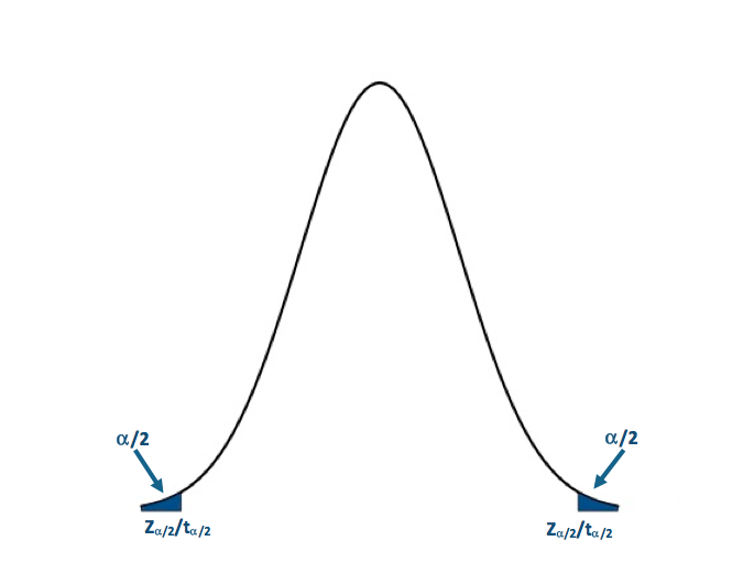 Visual of the two-sided test.Credit: J. Roman
- Compute the test statistics and calculate confidence interval
Now we can calculate the test statistic along with the confidence interval for the mean of the dataset. I will use the function 'z.test' in R to compute my Z-test. Here is the code to compute the Z-score:Show me the code...You will notice that I've assigned 'alternative' to "two.sided", so the function performs a two sided test. I set the confidence level to 0.99. This means that my confidence interval for the mean summer temperature will be at the 99% level. The P-value for the London test is 2.2e-16 and the Z-score is -19.978. The confidence interval is (22.36067°C, 22.73512°C). For Scotland, the P-value is 2.2e-16 and the Z-score is -27.712. The confidence interval is (18.27994°C, 18.57251°C). - Make decision about rejecting null hypothesis and interpret results
Remember our decision rule to reject the null hypothesis:
For both London and Scotland, our P-values and Z-scores are less than the critical values, so we can confidently reject the null hypothesis in favor of the alternative hypothesis. This means that the BBQ temperature threshold does not equal the summer time mean temperature observed in each city with a 1% probability of a type I error. We are 99% confident that the mean summer temperature is within the range of 22.36°C and 22.74°C for London and 18.28°C and 18.57°C for Scotland, about 2°C less than the BBQ temperature threshold values. This hints that the temperature threshold for BBQ sales is warmer than the average summer temperature, and has a smaller probability of occurring. There are fewer chances for BBQ retailers to utilize this relationship and maximize potential profits through marketing schemes.
T-Statistic One Tailed
The technological world we live in allows us to instantaneously ‘Google’ something we don't know. For example, where is a good BBQ place? What’s the best recipe for BBQ chicken? What BBQ sauce should I use for my ribs? Google Trends is an interesting way to gain insight into what is trending. Below is a figure showing the interest in 'BBQ' over time in London based on the number of queries Google received:
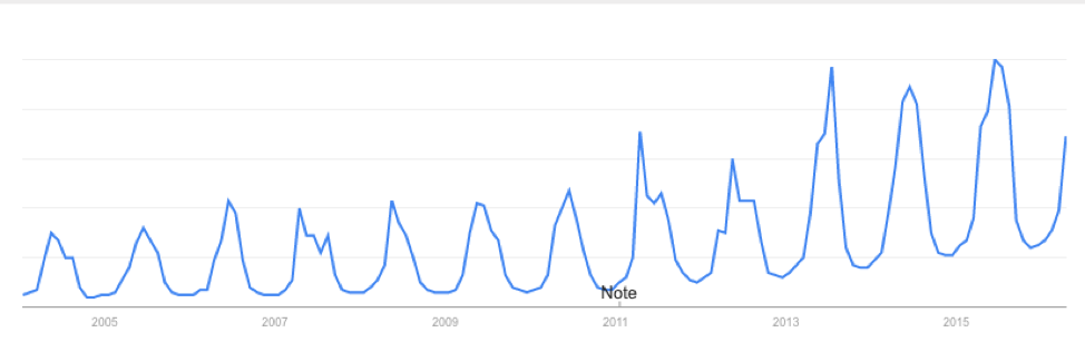
You will notice that the interest varies seasonally, which is expected, and each year there is a peak. June 2015 saw the most queries of the word 'BBQ' in London. I see two possible reasons for the large query in June. The first is that the temperature in June 2015 was relatively warm and the BBQ temperature threshold was met quite often, resulting in a large number of BBQ queries for the month. The second is that the temperature in June 2015 was actually quite cool and the BBQ temperature threshold was rarely met. When it was, more people were interested in getting out and either grilling or getting some BBQ. During a cold stretch, I personally look forward to that warm day. I make sure I’m outside enjoying the rare warm weather. My inclination is that during June 2015 the mean temperature for the month was cooler than the BBQ temperature threshold. So once that threshold was met, a spur of 'BBQ' inquiries occurred.
- State the Question
Was the mean temperature in June of 2015 less than the BBQ temperature threshold?
To answer this question, I'm going to use daily temperatures from June 1st 2015-June 30th 2015 for London and Scotland. First, we have to extract the temperatures for this time period. Use the code below:
Show me the code... - Select the null and alternative hypothesis
Since my data is parametric, I will state my hypothesis with respect to the mean (μ) instead of the median (η). The instinct is that the mean temperature in June 2015 was cooler than the BBQ temperature threshold. The null hypothesis will be stated as the opposite of my instinct: that is, that the mean temperature in June was warmer than the BBQ temperature threshold. This is a lower one-tailed test. We will assume that the mean temperature is greater than the threshold, so we will test if the mean temperature lies in the region below or less than the BBQ temperature threshold. If it does, then we reject the null hypothesis and accept the alternative hypothesis which is: - Check basic assumptions
Again, we know that temperature is normally distributed and the data is independent and random, so we can continue with the hypothesis testing. - Identify the test statistic
Since the data is normally distributed, we can use a Z-test or a t-test. The dataset has been sub-sampled, however, and the number of samples is no more than 30. We must use the lower one-tailed t-test. - Specify the level of significance
Since we have a smaller dataset, I'm going to set the significance level (α) to 0.05. I still want to minimize the potential of type I errors but, because of the small sample size, I will loosen the constraint on type I errors. - State the decision rules
I'm only going to use the P-value approach for this example. Let's visualize the lower one-sided rejection region:If the P-value is less than 0.05 (α), we will reject the null hypothesis in favor of the alternative: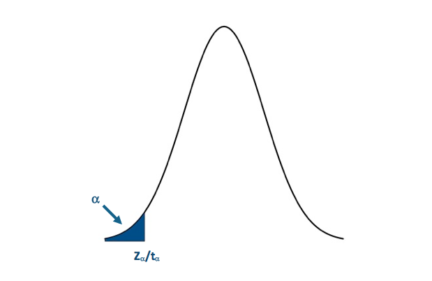 Visual of the lower one-sided test.Credit: J. Roman
- Compute the test statistics and calculate confidence interval
Now we can calculate the test statistic along with the confidence interval for mean temperature in June 2015. I will use the function 't.test' in R to compute my t-test. The code is supplied for London. Fill in the missing parts for Scotland: You will notice that I've assigned 'alternative' to "less" so the function performs a lower one-tailed test. I set the confidence level to 0.95. This means that my confidence interval will be at the 95% level. The P-value for the London test is 0.002735. The confidence interval is (-Inf, 23.19994ºC). Remember that for one-tailed tests, we only create an upper or lower bound for the interval (depending on the type of test). For Scotland, the P-value is 0.0001958. The confidence interval is (-Inf,18.53317ºC). - Make decision about rejecting null hypothesis and interpret results
Remember our decision rule to reject the null hypothesis was:
For both London and Scotland, our P-value is less than the critical P-value so we can confidently reject the null hypothesis in favor of the alternative hypothesis. The population mean for June temperatures in 2015 was less than the BBQ temperature threshold in each location with a 5% probability of a type I error.
Nonparametric Examples of One Sample Testing
Prioritize...
At the end of this section, you should feel confident enough to create and perform your own nonparametric hypothesis test.
Read...
In this section, you will find two examples of hypothesis testing using the nonparametric test statistics we discussed previously. Again, I suggest that you work through these problems as you read along. The examples will use the temperature dataset for London and Scotland. Each example will work off of the previous example and the complexity of the problem will increase. For each example, I will again pose a question and then work through the procedure discussed previously step by step. You should be able to easily follow along.
- State the question.
- Select the null and alternative hypothesis.
- Check basic assumptions.
- Identify the test statistic.
- Specify the level of significance.
- State the decision rules.
- Compute the test statistics and calculate confidence interval.
- Make decision about rejecting null hypothesis and interpret results.
Wilcoxon One Tailed
Ads are not only displayed in the newspaper anymore; they are seen online, through apps on your phone or tablet, and can be constantly updated or changed. Although new platforms for advertising may seem beneficial, the timing of an ad is everything. Check out this marketing strategy by Pantene:
Depending on the weather conditions, an ad will appear that promotes a specific type of shampoo/conditioner that will counteract those conditions. The ad is time and location dependent; only displaying at the most advantageous time for a particular location.
From a marketing perspective, it would be advantageous to display ads for BBQ when people are most interested in BBQ. Since BBQ sales triple when the temperature reaches a particular threshold, we can use that information as a guideline for choosing the optimal advertising time. We should also take advantage of the time when people are querying for BBQ; online advertisement is a great way to market to thousands of people. So, how does the inquiry of BBQ relate to the BBQ temperature threshold? We can determine which week in a given year London and Scotland are most likely to observe temperatures above the BBQ temperature thresholds. But do the inquiries on BBQ peak during the same week?
- State the question
Does the peak week in BBQ inquiries coincide with the week in which the BBQ temperature threshold is most likely to occur?
To answer this question, I'm going to extract every date in which the temperature exceeded the BBQ temperature threshold for London and Scotland. Instead of working with day/month/year, I will work with ‘weeks'. That is what week (1-52) can we expect the temperature to exceed the BBQ threshold. Use the code below to extract out the dates and transform them into weeks:
Show me the code...The variable ScotlandBBQWeeks and LondonBBQWeeks represents every instance from 1980-2015 in which the temperature reached or was above the required BBQ threshold in the form of weeks (1-52). The range is between week 13 and week 42.
- Select the null and alternative hypothesis
Since I'm conducting a nonparametric test, I will state my hypothesis with respect to the median (η) instead of the mean (μ). My instinct is that the most likely week in which the temperature will be above the BBQ temperature threshold occurs after the week of peak BBQ inquiries. The peak week of BBQ inquiries through Google trends is week 22 for both London and Scotland. This was computed by calculating the median peak week based on the 12 years of Google trend data available. The null hypothesis will be stated as the opposite.
This is an upper one-tailed test. We will assume that the BBQ temperature threshold week is before the peak inquiry week, so we will test if the BBQ temperature threshold week lies in the region above the inquiry week. If it does, then we reject the null hypothesis, and accept the alternative hypothesis, which is: - Check basic assumptions
Now temperature is normally distributed, but I'm not examining temperature in this case. I'm looking at weeks. Look at the histograms for the ScotlandBBQWeeks and the LondonBBQWeeks:I'm not going to assume that it does not fit any particular distribution. That is, I'm going to conduct a nonparametric test.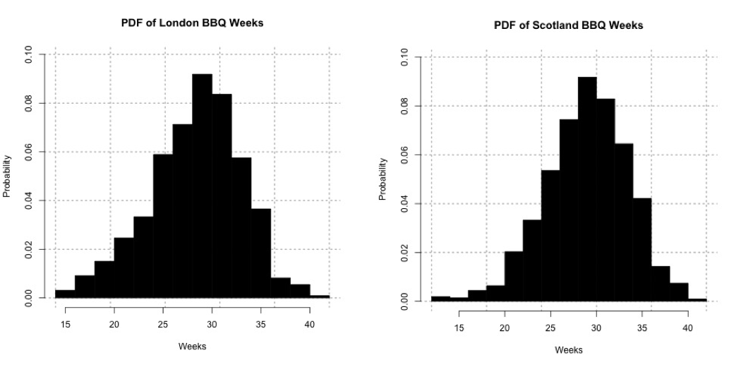 Probability density histogram of weeks in which the temperature is greater than or equal to 24oC for London (left) and 20oC Scotland (right).Credit: J. Roman
 - Identify the test statistic
We are using a nonparametric test static. The data appears somewhat symmetric so I will use the Wilcoxon test statistic. - Specify the level of significance
Since we have a fairly large sampling (more than 100 samples), I'm going to set the significance level (α) to 0.01. - State the decision rules
I'm only going to use the P-value approach for this example. Let's visualize the upper one-tailed rejection region:If the P-value is less than 0.01 (α) we will reject the null hypothesis in favor of the alternative.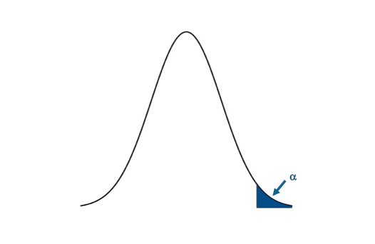 Visual of the upper one-sided test.Credit: J. Roman
- Compute the test statistics and calculate confidence interval
Now we can calculate the test statistic along with the confidence interval for the median week in which the temperature exceeds the BBQ temperature threshold. I will use the function ‘wilcox.test' in R to compute my nonparametric test statistic. Here is the code for London, fill in the missing parts for Scotland: You will notice that I've assigned 'alternative' to "greater" so the function performs an upper one-tailed test. I also had to use the command 'as.numeric'; this translates the strings in the variable “Scotland/LondonBBQWeeks” into integers. I set the confidence level to 0.99. This means that my confidence interval will be at the 99% level. The P-value for the London test is 2.2e-16. The confidence interval is (28.99999th week Inf). Remember that for one-tailed tests, we only create an upper or lower bound for the interval (depending on the type of test). For Scotland, the P-value is 2.2e-16. The confidence interval is (29.49995th week, Inf). - Make decision about rejecting null hypothesis and interpret results
Remember our decision rule to reject the null hypothesis:
For both London and Scotland, our P-value is less than the critical P-value, so we confidently reject the null hypothesis in favor of the alternative hypothesis. The week in which the temperature is most likely to exceed the BBQ threshold is after the week of peak Google inquiries, with a 1% chance of having a type I error. We are 99% confident that the week for exceeding the BBQ temperature threshold is at least the 29th week for London and the 30th week for Scotland, more than 6 weeks after the peak inquiry week. This result suggests that people are inquiring way before they are most likely to observe a temperature above the BBQ threshold. Remember that the BBQ temperature threshold is the temperature in which BBQ sales triple. So why is there this disconnect? Maybe people are relying on a forecast? But a 6-week forecast is generally not reliable. Or maybe the inquiry actually occurs when we first reach the BBQ temperature threshold; after that initial event and inquiry we know everything about BBQ so we don't need to Google it again.
Sign Test Two Tailed
A natural follow-on question would be: does the peak inquiry week coincide with the first week in which we observe temperatures above the BBQ temperature threshold? This would be an optimal time to advertise for BBQ products online.
- State the question
Does the peak week in BBQ inquiries coincide with the first week in which the temperature exceeds the BBQ threshold?
To answer this question, I'm going to extract the first week each year in which the temperature exceeds the BBQ threshold for London and Scotland. Use the code below to extract out the dates and transform the dates into weeks:
Show me the code... - Select the null and alternative hypothesis
Since my data is nonparametric, I will state my hypothesis with respect to the median (η) instead of the mean (μ). The null hypothesis will be that the peak week of inquiries coincides exactly with the typical first week of temperatures exceeding the BBQ threshold: This is a two tailed test. We will assume that the first week coincides with the peak inquiry week, so we will test if the first week lies above or below the inquiry week. If it does, then we reject the null hypothesis, and accept the alternative hypothesis which is: - Check basic assumptions
Again, I will be examining ‘weeks' instead of temperature. Look at the histograms for the FirstScotlandBBQWeek and the FirstLondonBBQWeek, which is the week in which we first observe temperatures above the BBQ temperature threshold:The data for Scotland definitely does not fit a parametric distribution, so I will continue on with the nonparametric process.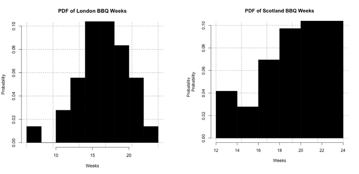 Probability histogram of the first week in which the temperature exceeds 24oC for London (left) and 20oC for Scotland (right).Credit: J. Roman
 - Identify the test statistic
Since the data is nonparametric we need to use a nonparametric test statistic. The data doesn't appear very symmetric, especially for Scotland, so I will use the Sign test. - Specify the level of significance
We have one week for each year, so that's 36 samples total. This is fairly small, so I will loosen the constraint on the level of significance. I'm going to set the significance level (α) to 0.05. - State the decision rules
I'm only going to use the P-value approach for this example. Let's visualize the two-tailed rejection region:If the P-value is less than 0.025 (α/2), we will reject the null hypothesis in favor of the alternative.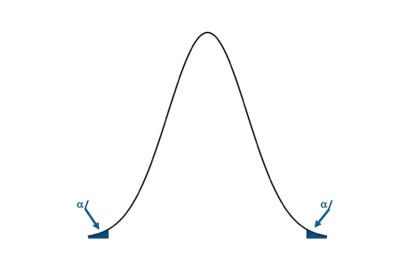 Visual of the two-sided test.Credit: J. Roman
- Compute the test statistics and calculate confidence interval
Now we can calculate the test statistic along with the confidence interval for the range in which we expect to first observe the temperature exceeding the BBQ threshold. I will use the function 'SIGN.test' in R to compute my nonparametric test statistic. Here is the code:Show me the code...You will notice that I've assigned 'alternative' to "two.sided" so the function performs a two-sided test. I also have to use the command 'as.numeric'; this translates the strings into integers. I set the confidence level to 0.95. This means that my confidence interval will be at the 95% level. The P-value for the London test is 4.075e-09. The confidence interval is (16th week, 18th week). For Scotland, the P-value is 0.02431. The confidence interval is (19th week, 21.4185st week). - Make decision about rejecting null hypothesis and interpret results
Remember our decision rule to reject the null hypothesis:For London and Scotland, our P-value is less than the critical P-value. We can confidently reject the null hypothesis in favor of the alternative hypothesis. The first week in which we exceed the temperature threshold for BBQ sales does not coincide with the week of peak inquiries, with a 5% chance of creating a type I error. For London, the first week in which we exceed the temperature threshold is most likely to occur between the 16th week and the 18th week, with a 95% confidence level. For Scotland, the first week in which we are most likely to exceed the temperature threshold occurs between the 19th and 21st week, at a 95% confidence level. In terms of supply and demand for a retailer, a store might consider increasing their BBQ supplies during these weeks. In terms of marketing, for London, the peak inquiry occurs more than a month after the first occurrence of temperature above the BBQ threshold, while for Scotland it is less than a week; highlighting the need for advertising that is both time and location relevant. In-store ads would potentially be more successful coinciding when the temperature exceeds the BBQ threshold and customers are known to buy more products. If, however, you want to catch the BBQ inquiry at its peak, you might display online ads a week (3 weeks) after the first occurrence of temperature exceeding the BBQ threshold in Scotland (London) to get a better impact online and possibly invoke a second wave of BBQ sales.
Self Check
Test your knowledge...
Lesson 5: Linear Regression Analysis
Motivate...
In the previous lesson, we learned how to calculate the strength and sign of a linear relationship between two datasets. The correlation coefficient, itself, is not a directly useful metric. The correlation coefficient represents the linear dependence of the two datasets. If the correlation is strong, a linear model would be a good fit for the data, pending an inspection into the data and confirming whether a linear relationship is plausible.
Fitting a model to data is beneficial for many reasons. Modeling allows us to predict one variable based on another variable, which will be discussed in more detail later on. In this lesson, we are going to focus on fitting linear models to our data using the approach called linear regression. We will build off our previous findings in Lesson 4 on the relationship between drought, temperature, and precipitation. In addition, we will work through an example focused on climate - how the atmosphere behaves or changes on a long-term scale, whereas weather is used to describe short time periods [Source: NASA - What's the Difference Between Weather and Climate? [23]]. As the world becomes more concerned with the effects of climate and as more companies prepare for the long-term impacts, climate analytic positions will only continue to grow. Being able to perform such an analysis will be beneficial to you and your current or future employers.
Newsstand
- Latham, Ben. (2014, December 9). Weather to Buy or Not: How Temperature Affects Retail Sales [24]. Retrieved September 13, 2016.
- Tobin, Mitch. (2013, December 3). Snow Jobs: America's $12 Billion Winter Sports Economy and Climate Change [25]. Retrieved September 13, 2016.
- Bagley, Katherine. (2015, December 24). As Climate Change Imperils Winter, the Ski Industry Frets [26]. Retrieved September 13, 2016.
- Scott, D., Dawson, J. & Jones, B. Mitig. (2008). Climate Change Vulnerability of the US Northeast Winter Recreation-Tourism Sector [27]. Retrieved September 13, 2016.
- Vidal, John. (2010, November 26). A Climate Journey: From the Peaks of the Andes to the Amazon's Oilfields [28]. Retrieved September 13, 2016.
- Gordon, Lewis, and Rogers. (2014, June). A Climate Risk Assessment for the United States [29]. Retrieved September 13, 2016.
- Kluger, Jeffrey. Time and Space [30]. Retrieved September 13, 2016.
- Schmith, Torben. (2012, November). Statistical Analysis of Global Surface Temperature and Sea Level Using Cointegration Methods [31]. Retrieved September 13, 2016.
- Iwasaki, Sasaki, and Matsuura. (2008, April 1). Past Evaluation and Future Projection of Sea Level Rise Related to Climate Change Around Japan [32]. Retrieved September 13, 2016.
Lesson Objectives
- Remove outliers from a dataset and prepare for a linear regression analysis.
- Break down the steps of a linear regression analysis and describe the process.
- Perform a linear regression in R, plot results, and interpret.
Regression Overview
Prioritize...
At the end of this section you should have a basic understanding of regression, know what we use it for, why we use it, and what the difference is between interpolation and extrapolation.
Read...
We began with hypothesis testing, which told us whether two variables were distinctly different from one another. We then used chi-square testing to determine whether one variable was dependent on another. Next, we examined the correlation, which told us the strength and sign of the linear relationship. So what’s the next step? Fitting an equation to the data and estimating the degree to which that equation can be used for prediction.
What is Regression?
Regression is a broad term that encompasses any statistical methods or techniques that model the relationship between two variables. At the core of a regression analysis is the process of fitting a model to the data. Through a regression analysis, we will use a set of methods to estimate the best equation that relates X to Y.
The end goal of regression is typically prediction. If you have an equation that describes how variable X relates to variable Y, you can use that equation to predict variable Y. This, however, does not imply causation. Likewise, similar to correlation, we can have cases in which a spurious relationship exists. But by understanding the theory behind the relationship (do we believe that these two variables should be related?) and through metrics that determine the strength of our best fit (to what degree does the equation successfully predict variable Y?), we can successfully use regression for prediction purposes.
I cannot stress enough that obtaining a best fit through a regression analysis does not imply causation and, many times, the results from a regression analysis can be misleading. Careful thought and consideration should be given when using the result of a regression analysis; use common sense. Is this relationship realistically expected?
Types of Regression
The most common and probably the easiest method of fitting, is the linear fit. Linear regression, as it is commonly called, attempts to fit a straight line to the data. As the name suggests, use this method if the data looks linear and the residuals (error estimates) of the model are normally distributed (more on this below). We want to again begin by plotting our data.
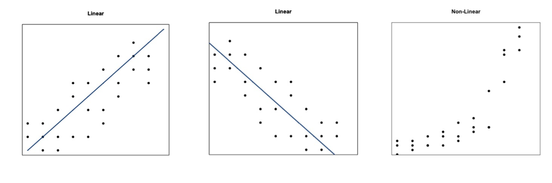
The figures above show you two examples of linear relationships in which linear regression would be suitable and one example of a nonlinear relationship in which linear regression would be ill-suited. So what do we do for non-linear relationships? We can fit other equations to these curves, such as quadratic, exponential, etc. These are generally lumped into a category called non-linear regression. We will discuss non-linear regression techniques along with multi-variable regression in the future. For now, let’s focus on linear regression.
Interpolation vs. Extrapolation
There are a number of reasons to fit a model to your data. One of the most common is the ability to predict Y based on an observed value of X. For example, we may believe there is a linear relationship between the temperature at Station A and the temperature at Station B. Let’s say we have 50 observations ranging from 0-25. When we fit the data, we are interpolating between the observations to create a smooth equation that allows us to insert any value from Station A, whether it has been previously observed or not, to estimate the value from Station B. We create a seamless transition between actual observations from variable X and values that have not occurred yet. This interpolation occurs, however, only over the range in which the inputs have been observed. If the model is fitted to data from 0-25, then the interpolation occurs between the values of 0 and 25.
Extrapolation occurs when you want to estimate the value of Y based on a value of X that’s outside the range in which the model was created. Using the same example, this would be for values less than 0 or greater than 25. We take the model and extend it to values outside of the observed data range.
Assuming that this pattern holds for data outside the observed range is a very large assumption. It could be that the variables outside this range follow a similar shape, such as linear, but the parameters of the equation could be entirely different. Alternatively, it could be that the variables outside of this range follow a completely different shape. It could be that the data follows a linear shape for one portion and an exponential fit for another, requiring two distinctly different equations. Although we won’t be focusing on predicting in this lesson, I want to make it clear the difference between interpolation and extrapolation, as we will indirectly employ this throughout the lesson. For now, I suggest only using a model from a regression analysis when the values are within the range of data it was created with (both for the independent variable, X, and dependent variable, Y).
Normality Assumption
When you perform a linear regression, the residuals (error estimates-this will be discussed in more detail later on) of the model must be normally distributed. This is more important later on for more advanced analyses. For now, I suggest creating a histogram of the residuals to visually test for normality or if your dataset is large enough you can use the central limit theory and assume normality.
Basics of Fitting
Prioritize...
At the end of this section, you should be able to prepare your data for fitting and estimate a first guess fit.
Read...
At this point, you should be able to plot your data and visually inspect whether a linear fit is plausible. What we want to do, however, is actually estimate the linear fit. Regression is a sophisticated way to estimate the fit using several data observations, but before we begin discussing regression, let’s take a look at the very basics of fitting and create a first guess estimate. These basics may seem trivial for some, but this process is the groundwork for the more robust analysis of regression.
Prepare the Data
Removing outliers is an important part of our fitting process, as one outlier can cause the fit to be off. But when do we go too far and become overcautious? We want to remove unrealistic cases, but not to the point where we have a ‘perfect dataset’. We do not want to make the data meet our expectations, but rather discover what the data has to tell. This will take practice and some intuition, but there are some general guidelines that you can follow.
At the very minimum, I suggest following the guidelines of the dataset. Usually the dataset you are using will have quality control flags. You will have to read the ‘read me’ document to determine what the QC flags mean, but this is a great place to start as it lets you follow what the developers of the dataset envisioned for the data since they know the most about it. Here is an example of temperature data from Tokyo, Japan. The variables provided our mean daily temperature, maximum daily temperature, and minimum daily temperature. I’m going to compare the mean daily temperature to an average of the maximum and minimum. The figure on the left is what I would get without any quality control. The figure on the right uses a flag within the dataset that was recommended- it flags data that is bad or doubtful. How do you think the QC flags did?

There are many ways to QC the data. Picking the best option will be based on the data at hand, the question you are trying to answer, and the level of uncertainty/confidence appropriate to your problem.
Estimate Slope Fit and Offset
Let’s talk about estimating the fit. A linear fit follows the equation:
Where Y is the predicted variable, X is the input (a.k.a. predictor), a is the slope and b is the offset (a.k.a intercept). The goal is to find the best values for a and b using our datasets X and Y.
We can take a first guess at solving this equation by estimating the slope and offset. Remember, slope is the change in Y divided by the change in X
Let’s try this out. Here is a scatterplot of QCd Tokyo, Japan temperature data. I’ve QCd the data by removing any values greater or less than 3 Std. of the difference.

Now, let’s take two random points (using a random number generator) and calculate the slope. For this example, the daily mean temperature is my X variable and the estimated daily mean temperature from the maximum and minimum variables is my Y variable. For one example, I use indices 1146 and 7049 to get a slope of 0.812369. In another instance, I use indices 18269 and 9453 and get a slope of 0.7616487. And finally, if I use indices 6867 and 15221, I get a slope of 0.9976526.
The offset (b) is the value where the line intersects the Y-axis, that is, the value of Y when X is 0. Again, this is difficult to accurately estimate in such a simplistic manner, but what we can do is solve our equation for a first cut result. Simply take one of your Y-values and the corresponding X-value along with your slope estimate to solve for b.
Here are the corresponding offsets we get. For the slope of 0.812369, we have an offset of 8.178721. The slope of 0.7616487 has a corresponding offset of 8.280466. And finally, the slope of 0.9976526 has an offset of -0.1326291.
What sort of problems or uncertainties could arise using this method? Well, to start, the slope is based on just 2 values! Therefore, it greatly depends on which two values you choose. And only looking at two values to determine a fit estimate is not very thorough, especially if you have an outlier. I suggest only using this method for the slope and offset estimate as a first cut, but the main idea is to show you ‘what’ a regression analysis is doing.
Plot Fit Estimate
Once we have a slope and offset estimate, we can plot the results to visually inspect how the equation fits the data. Remember, the X-values need to be in the realistic range of your observations. That is, do not input an X-value that exceeds or is less than the range from the observations.
Let’s try this with our data from above. The range of our X variable, daily mean temperature, is 29.84 to 93.02 degrees F. I’m going to create input values from 30-90 with increments of 1 and solve for Y using the three slopes and offsets calculated above. I will then overlay the results on my scatterplot. Here’s what I get:
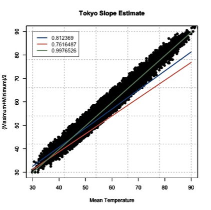
This figure shows you how to visually inspect your results. Right away, you will notice that the slope of 0.9976526 is the better estimate. You can see that it’s right in the middle of the data points, which is what we want. Remember to always visually inspect to make sure that your results make sense.
Best Fit-Regression Analysis
Prioritize...
This section should prepare you for performing a regression analysis on any dataset and interpreting the results. You should understand how the squared error estimate is used, how the best fit is determined, and how we assess the fit.
Read...
We saw that the two point fit method is not ideal. It’s simplistic and can lead to large errors, especially if outliers are present. A linear regression analysis compares multiple fits to select an optimal one. Moreover, instead of simply looking at two points, the entire dataset will be used. One warning before we begin. It’s easy to use R and just plug in your data. But I challenge you to truly understand the process of a linear regression. What is R ‘doing’ when it creates the best fit? This section should answer that question for you, allowing you to get the most out of your datasets.
Squared Error
One way to make a fit estimate more realistic is to estimate the slope and offset multiple times and then take an average. This is essentially what a regression analysis does. However, instead of taking an average estimate of the slope and offset, a regression analysis chooses the fit that minimizes the squared error over all the data. Say, for example, we have 10 data points from which we calculate a slope and offset. Then, we can predict the 10 Y-values based on the observed 10 X-values and compute the difference between the predicted Y-values and the observed Y-values. This is our error; 10 errors in total. The closer the error is to 0, the better the fit.
Mathematically:
Where is the predicted value (the line), and Y is the observed value. Next, we square the error so that we don't have to worry about the sign of the error when we sum up the errors across our dataset. Here is the equation mathematically:
With the regression analysis, we are calculating the squared error for each data point based on a given slope and offset. For each fit estimate, we will provide a mean of the squared error. Mathematically,
For each observation, (i) we calculate the squared error and sum up all of the errors (N). Then divide by the number of errors estimated (N) to obtain the Mean Squared Error or MSE. The regression analysis seeks to minimize this mean squared error by making the best choice for a and b. While this could be done by trial and error, R has a more efficient algorithm which lets it compute these best values directly from our dataset.
Estimate Best Fit
In R, there are a number of functions to estimate the best fit. For now, I will focus on one function called ‘lm’. ‘lm’, which stands for linear models, fits your data with a linear model. You supply the function with your data, and it will go through a regression analysis (as stated above) and calculate the best fit. There is really only one parameter you need to be concerned about, and that is ‘formula’. The rest are optional, and it’s up to you whether you would like to learn more about them or not. The ‘formula’ parameter describes the equation. For our purposes, you will set the formula to y~x, the response~input.
There are a lot of outputs from this function, but let me talk about the most important and relevant ones. The primary output we will use will be the coefficients, which represent your model's slope and offset values. The next major output is the residuals. These are your error estimates (predicted Y – true Y). You can use these to calculate the MSE by squaring the residuals and averaging over them. If you would like to know more about the function, including the other inputs and outputs, follow this link on "Fitting Linear Models [34]."
Let me work through an example to show you what ‘lm’ is doing. We are going to calculate a fit 3 times ‘by hand’ and choose the best fit by minimizing the MSE. Then we will supply the data to R and use the 'lm' function. We should get similar answers.
Let’s examine the temperature again from Tokyo, looking at the mean temperature supplied and our estimation of the average of the maximum and minimum values. After quality control, here is a list of the temperature values for 6 different observations. I chose the same 6 observations that I used to calculate the slope 3 different times from the previous example.
| Index | Average Temperature | (Max + Min)/2 |
|---|---|---|
| 1146 7049 |
37.94 57.02 |
39.0 54.5 |
| 18269 9453 |
39.02 50.18 |
38.0 46.5 |
| 6867 15221 |
62.78 88.34 |
62.5 88 |
Since I already calculated the slope and offset, I’m going to supply them in this table.
| Index | Slope | Offset |
|---|---|---|
| 1146 7049 |
0.8123690 | 8.1787210 |
| 18269 9453 |
0.7616487 | 8.2804660 |
| 6867 15221 |
0.9976525 | -0.1326291 |
We saw that the last fit estimate visually was the best, but let’s check it by calculating the MSE for each fit. Remember the equation (model) for our line is:
For each slope, I will input the observed mean daily temperature to predict the average of the maximum and minimum temperature. I will then calculate the MSE for each fit. Here is what we get:
| Index | MSE |
|---|---|
| 1146 7049 |
21.11071 |
| 18269 9453 |
54.16036 |
| 6867 15221 |
3.02698 |
If we minimize the MSE, our best fit would be the third slope and offset (0.9976525 and -0.1326291); confirming our visual inspection.
Let’s see how the ‘lm’ model in R compares. Remember, the model is more robust and will definitely give a different answer, but we should be in the same ballpark. The result is a slope of 1.00162 and an offset of -0.06058 with an MSE of 2.925. Our estimate was actually pretty close, but you can see that we’ve reduced the MSE even more by doing a regression analysis and have changed the slope and offset values slightly
Methods to Assess Goodness of Fit
Now that we have our best fit, how good is that fit? There are two main metrics for quantifying the best fit. The first is looking at the MSE. I told you that the MSE is used as a metric for the regression to pick the best fit. But it can be used in your end result as well. Let’s look at what the units are for the MSE:
The units for MSE will be the units of your Y variable squared, so for our example it would be (degrees Fahrenheit)2. This is kind of difficult to utilize. Instead, we will state the Root-Mean-Square-Error (RMSE) (sometimes called root-mean-square deviation RMSD). The RMSE is the square root of the MSE which will give you units that you can actually interpret, which in our example would be degrees Fahrenheit. You can think of the RMSE as an estimate of the sample deviation of the differences between the predicted values and the observed.
For our example, the MSE was 2.926 so the RMSE would be 1.71oF. The model has an uncertainty of ±1.71oF. This is the standard deviation estimate. Remember the trick we learned for normal distributions? 1 standard deviation is 66.7% of the data, 2 will be 95% and 3 will be 99%. If we multiply the RMSE by 2, you can attach the confidence level of 95%. That is, you are 95% certain that the predicted values should lie within this range of ±2 RMSE.
The second metric to calculate is the coefficient of determination, also called R2 (R-Squared). R2 is used to describe the proportion of the variance in the dependent variable (Y) that is predicted from the independent variable (X). It really describes how well variable X can be used to predict variable Y and capture not only the mean but the variability. R2 will always be positive and between 0 and 1-the closer to 1 the better.
In our example with the Tokyo temperatures, the R2 value is 0.9859. This means that the mean temperature explains 98.5% of the variability of the average max/min temperature.
Let’s end by plotting our results to visually inspect whether the equation selected through the regression is good or not. Here is our data again, with the best fit determined from our regression analysis in R. I’ve also included dashed lines that represent our RMSE boundaries (2*RMSE=95% confidence level).
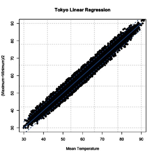
By using the slope and offset from the regression, the line represents the values we would predict. The dashed lines represent our uncertainty or possible range of values at the 95% confidence level. Depending on the confidence level you choose (1, 2, or 3 RMSE), your dashed lines will either be closer to the best fit line (1 standard deviation) or encompass more of the data (3 standard deviations).
Best Fit-Regression Example: Precip, Tmax, & PZI
Prioritize...
After finishing this page, you should be able to set up data for a regression analysis, execute the analysis, and interpret the results.
Read...
In our previous lesson, we saw a strong linear relationship between precipitation and drought. We will continue with our study on the relationship between temperature, precipitation, and drought.
Precipitation and Drought
Let’s begin by loading in the dataset and extracting out precipitation and drought (PZI) variables.
We know the data is matched up, we already saw that the relationship was linear, and we’ve already calculated the correlation coefficient, so let’s go right into creating the linear model. Use the following code to create a linear model between precipitation and drought.
Note that the only parameter I used was the formula, which tells the function how I want to model the data. That is, I want to use precipitation to estimate drought. The 'summary' command provides the coefficient estimates, standard error estimates for the coefficients, the statistical significance of each coefficient, and the R-squared values.
Let’s pull out the R-squared value and estimate the MSE. We do this by using the output variable ‘residuals’.
The result is an MSE of 0.17 and an R-squared of 0.80, which means that the model captures 80% of the variability in the drought index. The last step is to plot our results. Use the code below to overlay the linear model on the observations.
Here is a version of the figure:

Visually and quantitatively, the linear model looks good. Let’s look at maximum temperature next and see how it compares as a predictor of drought.
Maximum Temperature and Drought
Let’s look at the linear model for maximum temperature and drought. I have already extracted out the maximum temperature (Tmax). Fill in the missing code below to create a linear model.
I've pulled out the R-squared value, fill in the missing code below to estimate the MSE value and save it to the variable 'MSE_droughtTmax'.
You should get a MSE of 0.56 and an R-Squared of 0.37. Quantitatively, the fit is not as good compared to the precipitation. Let’s confirm this visually. I've set up the plot for the most part. You need to add in the correct coefficient index (1 or 2) for the plotting at 'b'.
Here is a larger version of the figure:

You can see that the line doesn't fit these data as well. Compared to the precipitation model (with an R^2 of 0.80), the maximum temperature does not do as well at predicting the drought index (R^2 of 0.37).
Application
We use linear models for prediction. Let’s predict the 2016 PZI value based on the observed 2016 precipitation and maximum temperature values. Since we are using the model for an application, we should check that the model meets the assumption of normality. To do this, I suggest plotting the histogram of the residuals. If you believe the model meets the requirement then continue on.
I've already set up the PZI prediction using precipitation, fill in the missing code to predict PZI using temperature.
The PZI index is predicted to be 0.76 using precipitation and -1.45 for maximum temperature. We can provide a range by using the RMSE from each model. For precipitation, the RMSE is 0.42 and for temperature it is 0.75. At the 95% confidence, the PZI is estimated to be in the range of -0.08 and 1.59 using precipitation and -2.94 and 0.05 using the maximum temperature. The actual 2016 PZI value was -0.2 which is within the range predicted for both models.
One thing to note. The 2016 observed value for precipitation and maximum temperature was within the range of observations used to create the linear models. This means applying the linear model to the 2016 value was a realistic action. We did not extrapolate the model to values outside the data range.
Best Fit-Regression Example: CO2 & SLC
Prioritize...
After reading this page, you should be able to set up data for a regression analysis, execute an analysis, and interpret the results.
Read...
We have focused, so far, on weather and how weather impacts our daily lives. But what about the impacts from long-term changes in the weather?
Climate is the term used to describe how the atmosphere behaves or changes on a long-term scale whereas weather is used to describe short time periods [Source: NASA - What's the Difference Between Weather and Climate? [23]]. Long-term changes in our atmosphere, changes in the climate, are just as important for businesses as the short-term impacts of weather. As the climate continues to change and be highlighted more in the news, climate analytics continues to grow. Many companies want to prepare for the long-term impacts. What should a country do if their main water supply has disappeared and rain patterns are expected to change? Should a company build on a new piece of land, or is that area going to be prone to more flooding in the future? Should a ski resort develop alternative activities for patrons in the absence of snow?
These are all major and potentially costly questions that need to be answered. Let’s examine one of these questions in greater detail. Take a look at this study from Zillow [35]. Zillow examined the effect of sea level rise on coastal homes. They found that 1.9 million homes in the United States could be flooded if the ocean rose 6 feet. You can watch the video below that highlights the risk of flooding around the world.
You can check out this tool [36] that allows you to see projected sea level rise in various U.S. counties.
Let’s try to determine the degree to which carbon dioxide (CO2) and sea level (SL) relate and whether we can model the relationship using a linear regression.
Data
Climate data is different than weather data. Thus, we need to view it in a different light. To begin with, we are less concerned about the accuracy of a single measurement. This is because we are usually looking at longer time periods instead of an instantaneous snapshot of the atmosphere. This does not mean that you can just use the data without any quality control or consideration for how the data was created. Just know that the data accuracy demands are more relaxed if you have lots of data points going into the statistics, as is often the case when dealing with climate data. Quality control should still be performed.
For this example, we are going to use annual globally averaged data. We can get a pretty good annual global mean because of the amount of data going into the estimation even if each individual observation may have some error. The first dataset is yearly global estimates for total carbon emissions from the Oak Ridge National Laboratory [37].
The second dataset will be global average absolute sea level change [38]. This dataset was created by Australia’s Commonwealth Scientific and Industrial Research Organization in collaboration with NOAA. It is based on measurements from both satellites and tide gauges. Each value represents the cumulative change, with the starting year (1880) set to 0. Each subsequent year, the value is the sum of the sea level change from that year and all previous years. To find more information, check out the EPA's website [39] on climate indicators.
CO2 and Sea Level
Before we begin, I would like to mention that from a climate perspective, comparing CO2 to sea level change is not the best example as the relationship is quite complicated. However, this comparison provides a very good analytical example and, thus, we will continue on.
We are interested in the relationship between CO2 emissions and sea level rise. Let’s start by loading in the sea level and the CO2 data.
Now extract for corresponding time periods.
And plot a time series.
You should get the following plots:
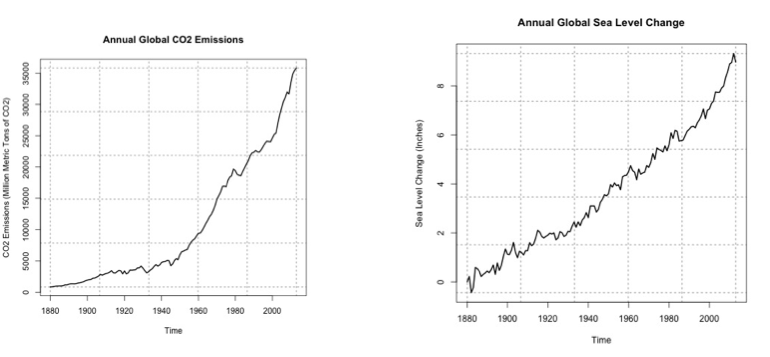
As a reminder, the global sea level change is the cumulative sum. This means that the starting year (1880) is 0. Then, the anomaly of the sea level for the next year is added to the starting year. The anomaly for each sequential year is added to the previous total. The number at the end is the amount that the sea level has changed since 1880. Around the year 2000, the sea level has increased by about 7 inches since 1880. You can see that the two variables do follow a similar pattern, so let’s plot CO2 vs. the sea level to investigate the relationship further.
The code will generate this plot. I’ve estimated a fit to visually inspect the linearity of the data.
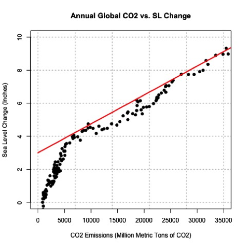
You can see that there appears to be a break around 5,000-10,000 CO2. Below that threshold, the data drops off at a different rate. This actually may be a candidate for two linear fits, one between 0 and 10,000 and one after, but for now, let’s focus on the dataset as a whole. Let’s check the correlation coefficient next.
The correlation coefficient was 0.96, a strong positive relationship. Let’s attempt a linear model fit. Run the code below
This is the figure you would create:
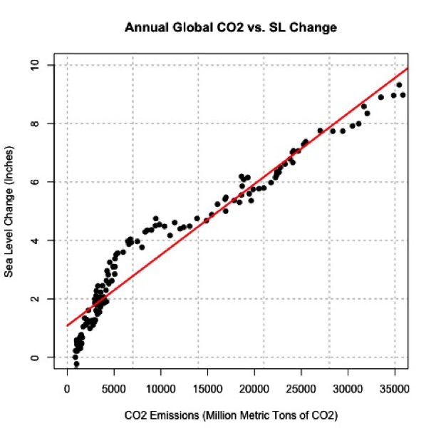
Visually, the fit is pretty good except for CO2 emissions less than 10,000. Quantitatively, we get an R2 of 0.929 which is pretty good, but let’s split our data up into two parts and create two separate linear models. This may prove to be a better representation. I’m going to create two datasets, one for CO2 less than 10,000 and one for values greater. Let's also re-calculate the correlation.
The correlation for the lower end is 0.96 and for the higher is 0.98. Both values suggest a strong postive linear relationship, so let’s continue with the fit. Run the code below to estimate the linear model. You need to fill in the code for 'lm_estimateGreater'.
The MSE for the lower end is 0.1379 and for the higher end is 0.057, which is significantly smaller than our previous combined MSE of 0.4323. Furthermore, the R2 is 0.9167 for the lower end and 0.9686 for the higher end. This suggests that the two separate fits are better than the combined. Let’s visually inspect.
The figure should look like this:
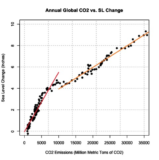
The orange line is the fit for values larger than 10,000 CO2 and the red is for values less than 10,000. This is a great example of the power of plotting and why you should always create figures as you go. CO2 can be used to model sea level change and explains 91-96% (low end – high end) of the variability.
CO2 and Sea Level Prediction
Sea level change can be difficult to measure. Ideally, we would like to use the equation to estimate the sea level change based on CO2 emissions (observed or predicted in the future). Again, since we are using the model for an application, we should make sure the model meets the assumption of normality. If you plot the histogram of the residuals, you should find that they are roughly normal.
The 2014 CO2 value was 36236.83 million metric tons. Run the code below to estimate the sea level change for 2014 using the linear model developed earlier.
The result is a sea level change of 9.2 inches. If we include the RMSE from our equation, which is 0.24 (inches), our range would be 9.2 ±0.48 inches at the 95% confidence level. What did we actually observe in 2014? Unfortunately, the dataset we used has not been updated. We can see that the 2014 NOAA adjusted value [40] was 8.6 inches. The NOAA adjusted value is generally lower than the CSIRO adjusted, so our estimate range is probably realistic.
But what sort of problems do you see from this estimation? The biggest issue is that the CO2 value was larger than what was observed before and thus outside our range of observations in which the model was created. We’ve extrapolated. Since we saw that this relationship required two separate linear models, extrapolating to values outside of the range should be done cautiously. There could very well be another threshold where a new linear model needs to be created, but that threshold maybe hasn’t been crossed yet. We will discuss prediction and forecasting in more detail in later courses.
Self Check
Test your knowledge...
Lesson 7: Introduction to Data Mining
Motivate...
As we near the end of this course, I’d like to provide a bigger picture of how we can utilize all of the tools we’ve learned so far. For this lesson, nothing new will be presented. Instead, we will combine all the statistical metrics we have already learned into one process - a simplified yet effective template for data mining. Please note that there are many ways to go about data mining; this lesson will only present one method.
Before we talk about data mining, I want to present a general motivation for the case study we will focus on. In this lesson, we are going to look at corn. As an agricultural product, you might think that weather (and climate) play a big part in the market. But there are two reasons why this is not necessarily true.
The first is that corn has been genetically altered many times to withstand the extremes of weather. In particular, ongoing research has created drought-tolerant corn hybrids. The second part of this problem is that corn, and in particular corn prices, are largely governed by the futures market. Understanding futures markets is not a requirement for this class, but if we want to ask the right questions, we need to learn a little about all the aspects of the problem. Check out this video that describes the futures markets.
The futures market is regulated more by contracts than by supply and demand. Weather, however, does play an important role (source: "Investing Seasonally In The Corn Market [41]"). If we can predict the amount of corn that will be produced or the amount of acreage that will be harvestable (not damaged from weather), that information could be used to help farmers decide how many contracts to sell now or whether a company should wait to buy a contract because the supply will be larger (greater harvest) than anticipated.
Our goal for this lesson is to determine how much weather impacts the corn supply (in the form of harvest, yield, price, etc.), and if certain weather events can be used to predict the corn harvest, providing actionable information on whether to buy or sell a futures contract.
Newsstand
- Global Crop Losses August 2016, Insurers Reel from Losses [42] (6:02)
- Corn Field Day Demonstrates Power Of Weather Over Crops [43] (3:49)
- Wessell, Maxwell. (2016, November 3). You Don’t Need Big Data — You Need the Right Data [44]. Retrieved November 18, 2016.
- Brown, Meta S. (2016, October 31). 5 Big Data And Analytics Learning Resources That Most People Miss (But Shouldn't) [45]. Retrieved November 18, 2016.
- (2016. October 30). How One University Used Big Data To Boost Graduation Rates [46]. Retrieved November 18, 2016.
Lesson Objectives
- Identify instances when data mining may be useful.
- Describe the general process of data mining.
- Explain what can and cannot be achieved through data mining.
- Interpret results and use for prediction.
Data Mining Overview
Prioritize...
By the end of this section you should be able to describe how data mining works, know when to use it, and why it may be beneficial.
Read...
Big data, data mining, data analytics. These are all popular terms you probably have seen in the news recently. But what exactly is data mining, and how can it be used on weather data? Data mining might sound complicated, but in reality you already know all about it.
What is Data Mining?

What exactly is data mining? Well, let’s start by stating the goal. The general goal of data mining is to transform data into useful, sometimes actionable, information. It is the general process of looking through the data and finding key patterns that could be used to predict something. Data mining will examine massive amounts of information to determine which variables are pertinent and which are nonessential with respect to predicting the variable of interest.
When to use it?
This might sound amazing - we have an easy and quick way to obtain useful information in a predictive format. But I stress that you should not tread lightly. Data mining can be used for many reasons, but when abused, data mining can produce misleading results and erroneous interpretation. An understanding of what’s behind this data mining ‘machine’ is important. You should be able to answer questions such as: How did we find the patterns? Can we repeat them? What do the results actually mean?
My suggestion is to use data mining for two purposes. The first purpose is to eliminate irrelevant data. Big data is called big data for a reason. There is an enormous amount of data out there, especially for weather and climate. Here is a graph illustrating the amount of data available from NOAA.
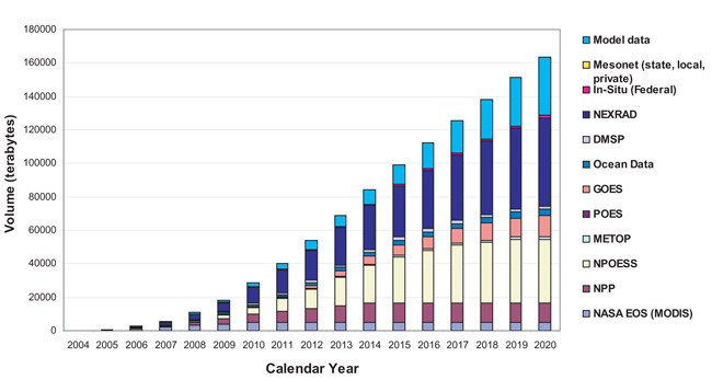
The second reason to use data mining is to provide an initial pass at predictive analytics. Use it to determine whether the data you collected can actually be used to predict the variable of interest. Then you can take the variables deemed essential and examine the model in more detail, evaluating and changing when necessary.
I want to stress that data mining should not be used as a one and done tool. Although the process can be helpful, letting a computer decide things can be risky. You need to know what’s going on inside the black box. Simply running a data mining scheme is not okay. A thoughtful reasoning behind the results is mandatory (at least for this class).
Process Overview
The process is pretty simple. Supply the data and let R do everything else. But like I stressed above, we will focus on what is actually being performed during the data mining process. Here is an overview of what we will do to set up the analysis. Each step will be discussed in more detail later on. As a reminder, there are many ways to go about data mining. This is just one example that utilizes the tools you have already learned.
- Prepare the Data -> This is incredibly important for data mining. You want a clean dataset (no missing values or invalid numbers).
- Visualize and Summarize the Data -> Don’t go into this process blindly. Look at the data, inspect it, make sure you caught all ‘odd’ values.
- Perform Regression Analysis -> The regression analysis is the pattern detection tool. This is where we look for the patterns. In this lesson, we will be focusing on two types of regression analyses:
- Multiple Linear Regressions -> Perform several linear regressions.
- Regression Trees -> Create a "20-questions" style tree to find nonlinear patterns.
- Evaluate the Models and Select -> You will create multiple models; you must select which one is best. But how do you decide?
- Predict -> Put the model to the test. Predict some independent cases and double check how well it does, further evaluating your model selection.
Pick a Question
Formulating the scope of the question can be difficult. A question that is too wide and expansive can make it difficult to interpret the results, but a question that is too specific doesn’t use data mining to its full advantage. You want the question to optimize the ability of data mining and your ability to interpret the results.
For this lesson, we are going to look at one case study, related to corn, with one question. The goal is to determine if weather data can play a role in the futures market of corn. Specifically, can weather data aid in the decision on whether to buy contracts for corn? To do this, we want to be able to predict the corn harvest. Here is my initial question:
Can the weather during the growing season be used to predict the corn harvest in the United States?
We can’t narrow our question down more until we get an idea of what data is available. It is narrow enough to give us a starting point to look for data, but broad enough that we can select a variety of variables.
Prepare Data
Prioritize...
At the end of this section you should be able to download storm events data and fill in missing values using various methods, and understand when one method may be more appropriate over another.
Read...
Data mining begins with the data. It’s the most important part of the process. You should carefully consider which variables to actually examine and how to create a clean dataset. Although data mining can look at an abundance of variables, we still want to be able to understand the results, and too many variables can be overwhelming to digest.
Let’s begin by selecting the data and the specific variables for this case study. There are two types of variables we will need. The first is the response variable(s) or the variable(s) we will try to predict. The second type are the factor variables or the variables that will be used to predict the response variable(s).
Corn Data
Let’s start by choosing the response variables which are going to be related to corn harvest. We need to rely on what’s freely available. For agriculture purposes in the United States, a good place to start is the Department of Agriculture. They have an Economics, Statistics and Market Information System that archives statistics on different agricultural crops. One such crop is sweet corn [50]. (Note that there are other types of corn, specifically feed corn, but for now I’m going to focus on sweet corn).
Before even looking at the details in the data (search for sweet corn), you will probably notice that some data is organized by states while others represent the entire Continental United States (CONUS). Weather is location-specific, so right away I know I want to look at the individual states instead of CONUS.
You might also notice that some datasets are labeled ‘fresh’ while others are labeled ‘processed’. If you remember from the motivational video at the beginning of the lesson, they specifically discussed processed corn. Corn futures were bought and sold primarily for companies that would use the corn to create a product. Sticking with that route, I will focus on processed sweet corn.
If you open up one of the Excel sheets [51], you will find seven variables: Year, Acreage Planted, Acreage Harvested, Yield per Acre, Production, Season-Average Price, and Value of Production. Most of these variables are self-explanatory. The only one I will mention is the value of production, which is simply the production amount times the average price. All these variables are metrics used to measure how good the harvest was, with the exception of acreage planted. Six response variables to predict is not unreasonable; so we will keep them all. The acreage planted can be used as a known or factor variable to aid in prediction since we will know that information each year before the growing season begins. Let’s refine the question now.
Question:
How does the weather, along with acreage planted, affect the value of production, the average price, the total production, the yield per acre, or the acreage harvested for sweet corn intended for processing in the United States?
You will notice that not all states in CONUS are listed. This could be due to lack of data or simply that those states do not grow corn. Whatever the reason, we will stick with what’s available and let those states ‘represent’ the outcome for the United States. Remember, the futures market is not on a state by state basis so we need to create a model that reflects the United States.
I’ve already combined all of the state data into one file. You can download the file here [52].
Storm Events Summary
We have the response variables, now we need the factor variables, which are the ones that we will use to predict the response variables. There are a number of weather variables we could look at such as daily mean temperature or precipitation. Although these more typical variables are important, I think that high impact events might have a bigger effect on the corn harvest.
For this example, I’m going to look at the storm events database. This Storm Events Database [53] provides a list of several different weather phenomena. Data is available from January 1950 - July 2016, however, only tornados were documented from 1950-1954; tornados, hail, and thunderstorm wind events from 1955-1996; and all 48 event types from 1996 onward. To learn more about each variable you can find the documentation here [54].
What’s great about this database is that it's extremely localized, meaning events are listed at the county level. This is beneficial to us because corn is not grown everywhere in one state. In fact, most states have specific counties where corn production is more prevalent. You can find this list here: Vegetables - Usual Planting and Harvesting Dates [55].
If we know the counties in each state where corn is grown, we can extract out the storm events data for only those counties. This means we are examining only cases where a storm or weather event likely affected the crop. Furthermore, we have typical harvesting dates by county. We can extract out events for each county only between the planting and harvesting dates. This narrows our time and spatial sampling to something more specific and realistic. Let’s rework our question now into the final form.
Question:
How does the frequency of storm events during the growing season, along with acreage planted, affect the value of production, the average price, the total production, the yield per acre, or the acreage harvested for sweet corn intended for processing in the United States?
We have a refined and clear question. Now we need to prepare the data. We want the frequency of each type of storm event only for the counties where corn is typically grown during the growing season. How do we actually extract that?
Here is an Excel sheet that contains the harvest dates [56] and a sheet that contains the principle counties [57] where corn is grown broken down by state. All you need to do is bulk download the storm events data [53]. You want to download only the files that say ‘StormEvents_details’. Download these files (by year) into a folder. Now we can start extracting out the data. The goal is to have one file that contains the response and factor variables temporally and spatially matched up. To begin, load in the growing season dates and key counties by state as well as the sweet corn data.
Next, we are going to prep the storm events data.
The code above saves the path of your CSV files for storm events (the ones you downloaded in bulk form). It also creates an array with length ‘Years’ for each variable you will include. I selected a sub-selection of what is available. For each year, the variable will contain the frequency of the event. Now we will loop through each year and count the number of times each storm event type occurred.
For each year, we open the corresponding storm events file. Next, we loop through each state and extract out the key counties for that state.
For this given state, we have the counties in which corn is grown. We can use this to subset the storm events data. We want to also subset the storm data for the growing season. Let’s begin by determining the typical planting date for this state.
The data provided a range of when planting typically begins. What I've done is taken an average of that range, which will be used as the planting date. Now we need to determine the harvest date.
We have done the same thing as the planting date: taken the average of the range for the harvest date. We want to extract out the storm events only between these two dates. For this particular file (year), let’s create a spatial index (counties) and a time index (growing season).
Now extract out the intersection of these.
This index represents all the cases in which storms occurred in our key counties for this particular state during the growing season. For each corn production observation, we want a corresponding storm events data observation. To determine the correct index, use this code:
The corn index is just the row in which we will store the storm frequency (refer to the initialization of the variables). Now we can save the frequency of each event.
If the year is 1996 or later, we have more variables to look at.
Now finish the loop of states and storm files (years):
Finally, assign the storm event variables to the corn data frame. Remember, the goal was to create one CSV file that contains both the response variables and the factor variables.
We are left with one file. For every observation of corn production for each state/year, we have a corresponding frequency of storm events that is spatially (key counties) and temporally (growing season) relevant. For your convenience, here is the R code from above in one file [58].
Missing Values
Now that the variables have been selected and the data has been extracted, we need to talk about missing values. In data mining, unknown values can be problematic. Choosing the best method for dealing with missing values will depend on the question and the data. There’s no right or wrong way. I’m going to discuss three ways we can deal with missing values (some of which may be a review from Meteo 810).
To show you these three methods, I will use our actual data but to make things simpler I will only look at one state. This will minimize the number of observations. Let’s begin by loading in our final data file.
Let’s extract the data for one state, picking a state that has a lot of observations.
The state selected should be Minnesota. Before I go into the different methods for filling missing values, let’s start by looking at the data and determining how many missing values we are dealing with. Run the code below to see the number of variables that have missing data.
For each row (each year) of data in the stateData data frame we count the number of variables that had missing data. You will see that the majority of years had 22 missing values, and these are years prior to 1996. If you change the 1 to 2, you will get the total number of missing values for each column – the number of missing values for each variable. If you have a threshold that you want to meet, like I want the variable to have at least 80% of the values (20% missing values), you can use the function ‘manyNAs’.
By changing the 0.2 you can adjust the threshold. This is a helpful function in pointing out which variables need to be addressed.
So, how do we deal with the missing values? Well, the first method is to fill the missing values with the most representative value. But how do you decide what the most representative value is? Do you use the mode? Median? Mean? Let’s take for example the variable flashflood. If we want to fill in the missing values with the median we could use the following code.
The median was 1, so now all the observations in that variable that were NAs have been replaced with 1. If we use the function ‘centralImputation’, we can fill in all missing values automatically for all variables in the data frame using this method.
Now rerun the code to determine the number of missing values in each row:
You should get 0. But is it realistic to say that from 1960-1995 we can replace missing values with the median from 1996-2009? Probably not. So let’s look at another method. If you are following along in R, you need to reset your stateData data frame.
The next method we will talk about is based on correlations. Many times meteorological variables (or variables in general) can be correlated with other variables. If you have the data observations for variable A and you know that variable B is correlated to variable A, you can estimate Variable B using the correlation. Start by looking at the correlations among the variables. Run the code below to see a table of correlation coefficients and to synthesize the results.
This uses symbols for the level of significance of the correlation. You will see that the highest correlation is 0.629 between extremeColdWindChill and hail. (You will also notice a correlation of 1 between highWind and iceStorms, but I will talk about this in a bit.) So how do we use this correlation? We create a linear model between the two variables. Since hail has fewer missing values, I want to use hail to predict extremeColdWindChill. Use this code to create the linear model and fill in the missing values from extreme cold wind chill with predictions from the model.
The code above fills in the missing values from extremeColdWindChill by finding the corresponding hail values and running the function that uses the linear model to create a new value. What are the problems with this method? Well, the primary issue is that we are calculating correlations between 14 observations (1996-2009). That is not nearly enough to create a valid result. Hence, the correlation coefficient of 1 for highWind and iceStorms. If you look at the data, they have 1 instance of each event over the 14 observations. This correlation is probably spurious rather than real.
The third and more realistic method for this example is to simply remove cases. Make sure you reset your data if you are following along in R.
You can do two things: either set a threshold requiring no more than x% of missing values or completely get rid of all missing values. If we wanted a dataset of only complete cases, we would use the following code:
This code removes any row (year) in which any variable has a missing value. This means we would only retain values from 1996 onward. In this case, I think it would be better to just remove variables that have too many unknowns. I’m going to say any variables with more than 20% of the data missing should be omitted. To do this, use the following code (remember to reset your state data frame):
You will be left with the corn variables for all years along with the thunderstorm/wind, tornado, and hail storm event variables. In this case, I decided it was more valuable to have fewer variables with more observations than more variables with limited observations, so as to avoid overfitting when too many variables are used to fit the model. Any of these methods are acceptable; it just depends on the situation and your justification.
Visualize and Summarize
Prioritize...
After finishing this section, you should be able to visualize and summarize data using numerous methods.
Read...
Before diving into the analysis, it is really important that we synthesize the data. Although the purpose of data mining is to find patterns automatically, you still need to understand the data to ensure your results are realistic. Although we have learned several methods of summarizing data (think back to the descriptive statistics lesson), with data mining you will potentially be using massive amounts of data and new techniques may need to be used for efficiency.
In this section, I will present a few new methods for looking at data that will help you synthesize the observations. You don’t always need to apply these methods but having them in your repertoire will be helpful when you come across a result you don't understand.
For simplicity, I will use clean.stateData for the rest of the lesson, showing you the data mining process with this one state’s data that has been ‘cleaned’ (missing values dealt with). Furthermore, since we are only looking at one state, I’m going to only consider the three storm variables that have a longer time period (tornado, hail, and thunderstorm/wind). I want more data points to create a more robust result. At the end, I’ll show you how we could create one process to look at all of the states at once.
Enrich Old Techniques
Run the code below to summarize the data:
This provides the minimum, maximum, median, mean, 1stquantile and 3rd quantile values for each variable. The next step is to visualize this summary. We can do this by plotting probability density histograms of the data. Let’s start with the TsWind variable.
You would get the following figure:
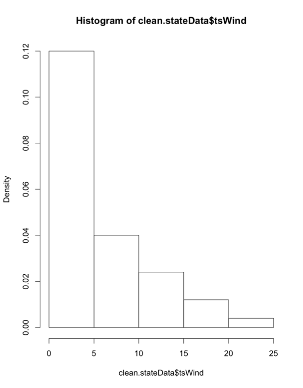
Visually, the greatest frequency occurs for annual event counts between 0 and 5, which means the frequency of this event (tsWind) is relatively low, although there are instances of the frequency exceeding 25 events for one year. How do we enrich this diagram? Run the code below to plot the PDF overlaid with the actual data, as well as a Q-Q plot.
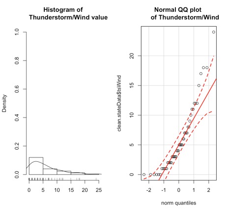
The left plot is the probability density histogram, but we’ve overlaid an estimate of the Gaussian distribution (line) and marked the data points on the x-axis. The plot on the right is the Q-Q plot which we’ve seen before; it describes how well the data fits the normal distribution.
But what if the data doesn’t appear normal? We can instead visualize the data with no underlying assumption of the fit. We do this by creating a boxplot.
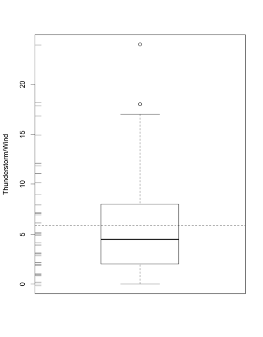
We have done boxplots before, so I won’t go into much detail. But let’s talk about the additional functions I used. The rug (jitter) function plots the data as points along the y-axis (side2). The abline functions (horizontal dashed line) plots the mean value, allowing you to compare the mean to the median. The boxplot is also a great tool to look at outliers. Although we have ‘cleaned’ the dataset of missing values, we may have outliers which are represented by the circle points.
Visualize Outliers
If we want to dig into outliers a bit more, we can plot the data and create thresholds of what we would consider ‘extreme’. Run the code below to create a plot with thresholds:
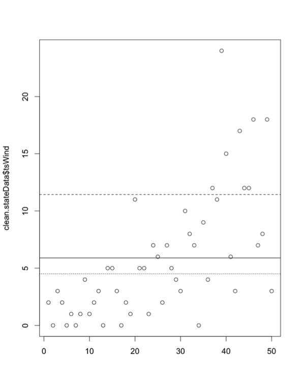
This code creates a horizontal line for the mean (solid line), median (dotted line), and mean+1 standard deviation (dashed line). It creates boundaries of realistic values and highlights those that may be extreme. But remember, you create those thresholds, so you are deciding what is extreme. By adding one more line of code, we can actually click on the outliers to see what their values are:
1 | identify(clean.stateData$tsWind) |
This function allows you to interactively click on all possible outliers you want to examine (hit ‘esc’ when finished). The numbers displayed represent the index of the outliers you clicked. If you want to find out more details, then use this code to display the data values for those specific indices:
If, instead, you don’t want to use the identify function but have some threshold in mind, you can look at the indices by using the following code:
Conditional Plots
The last type of figures we will discuss are conditional plots. Conditional plots allow us to visualize possible relationships between variables. Let’s start by looking at acreage planted and how it compares to the yield per acre. First, create levels of the acreage planted (low, high, moderate).
Run the code below that uses the function bwplot from lattice to create a conditional boxplot.
For each level of acreage planted (y-axis), the corresponding corn yield data (x-axis) is displayed as a boxplot. As one might expect, if the acreage planted is low the yield is low (boxplot shifted to the left), while if the acreage planted is high we have a higher corn yield (boxplot shifted to the right). This type of plot is a good first step in exploring relationships between response variables and factors.
We can enrich this figure by looking at the density of each boxplot. Run the code below.
Below is an enlarged version of the figure
Credit: J. Roman
The vertical lines represent the 1st quantile, the median, and the 3rd quantile. The small dashes are the actual values of the data (these are pretty light on this figure and difficult to see).
The final conditional plot we will talk about uses the function stripplot. In this plot, we are going to add the ts_wind variable to our conditional plot about acreage planted and yield. It adds another layer of synthesis. To start, we chunk up the ts_wind data into three groups.
The function ‘equal.count’ essentially does what we did for the acreage planted. We created three categories for the frequency of thunderstorm/wind events. Now use the function stripplot to plot the acreage planted, conditioned by yield and ts_wind.
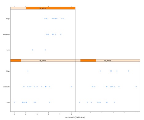
The graph may appear complex, but it really isn't so let’s break it down. There are three panels: one for high ts_wind (upper left), one for low (bottom left), and one for moderate (bottom right); displayed in the orange bar. The x-axis on each is the yield and the y-axis is the acreage planted. For each panel, the yield/acre data corresponding to the level of ts_wind is extracted and then chunked based on the corresponding acreage. This plot can provide information for questions such as: Does a high frequency of thunderstorm wind, along with a high acreage planted result in a higher yield, than say, a low thunderstorm wind frequency? This type of graph may or may not be fruitful. It can also be used as a follow-up figure to an analysis (once you know which factors are important to a response variable).
Pattern Analysis Part 1: Multiple Linear Regressions
Prioritize...
By the end of this section, you should be able to perform multiple linear regressions on a dataset and optimize the resulting model.
Read...
There are many techniques for pattern analysis, but for this course we are going to talk about two that utilize what we already have learned. They are multiple linear regressions and regression trees. In other courses within this program, we may come back to data mining and explore more advanced techniques. But for now, let’s focus on expanding what we already know.
Initial Analysis
We discussed linear regression in a previous lesson, so you are already familiar with this method. A multiple linear regression analysis applies the linear regression method multiple times to hone in on an optimal solution. Before we get into how we decide what’s optimal, we need an initial model to start with. Let’s begin by creating a linear model for each of our response variables (yield/acre, production, season average price, value of production and acreage harvested) using all the factor variables.
For each response variable, we have a linear equation that takes as inputs our four factor variables: acreage planted, tornado, hail, and thunderstorm wind frequency. Run the code below to summarize each model.
The first thing to start with is the P-value at the bottom, which tells us if we should reject the null hypothesis. In this case, the null hypothesis is that there is no dependence which is that the response variable does not depend on any of the factor variables (tornado, hail, thunderstorm/wind, acreage planted). If this P-value is greater than 0.05, we know that there is not enough evidence to support a linear model with these variables. Which means we should not continue on! If the p-value is less than 0.05 (remember, this is a 95% confidence - you can change this depending on what confidence level you want to test), then we can reject the null hypothesis and continue examining this model. All P-values are less than 0.05 for this example, so we can continue on.
The next step is to look at the R-squared and adjusted R-squared value. Remember, R-squared tells us how much variability is captured using this model - it’s a metric of fit. The closer to 1, the better the fit. If the R-squared value is really low (< 0.5), the linear model is probably not the best method for modelling the data at hand and should no longer be pursued. If it’s greater than 0.5, we can continue on. The adjusted R-squared value is a more robust result (usually it’s lower than the other R-squared value). One thing to note about the adjusted R-squared: if the adjusted R-squared is substantially bigger than the R-squared, you do not have enough training cases for the number of factor variables you are using. This will be important to look at later on. For now, all the R-squares are greater than 0.5; we can move on.
The next step is to look at the individual coefficients for the factor variables. We want to know whether the coefficients are statistically significant. We do this by testing whether the null hypothesis, that the coefficient is equal to 0, can be rejected. The probability is shown in the last column; Pr(>t). If a coefficient has a value that is statistically significant, then it will be marked by a symbol. As long as you have at least one coefficient that is significant, you should keep going. In this example, each model has at least one coefficient that’s statistically significant.
At this point, we have an initial model (for each response variable) that is statistically significant. Now we want to begin optimizing the model. Optimizing a model is a balance between creating a simple and efficient model (few factor variables) and minimizing errors from the fit.
Backwards Elimination
One method for optimization is called backwards elimination. We start by looking at an initial model containing all the factor variables and determine which factor variable coefficients are least significant and then remove the corresponding factor variables. We then update the model using just the remaining factor variables. There are several metrics to decide which factor variables to reject next. You could look at which coefficient doesn’t pass the null hypothesis in the summary function, suggesting that the coefficient is not statistically different to 0. Another option is to look at how well the model predicts the response variable. We can do this by using ANOVA. If you remember from our previous lesson, we used ANOVA as sort of a multiple t or Z-test. It told us whether the response variable is affected by a factor variable with different levels. If we rejected the null hypothesis, then the evidence suggested the factor variable affected the response variable. Since ANOVA uses a GLM to estimate the p-value, we can also use it to test the fit of the model. Run the code below to give this a try:
For ANOVA, the null hypothesis is that each coefficient does not reduce the error. You want to look at the values of Pr(>F) which are again marked by symbols if they are statistically significant. If a coefficient is statistically significant, then that factor variable statistically reduces the error created by the fit. If a coefficient is not marked, it would be optimal to remove that variable from our model.
For this example, I would get rid of ts_Wind for the response variables yield/acre, production, season average price, value of production, and tornado for the response variable acreage harvested. Let’s update our models by removing these variables. Fill in the missing code for the 'AcreageHarvested' linear model. Make sure you remove the variable 'tornado'.
Now we repeat the process, by summarizing our new models.
The P-value should still be less than 0.05 and the adjusted R-squared should have increased. Generally, if you remove a factor variable in regression the R-squared will always decrease but the adjusted R-squared may increase. The goal here is to minimize the factor variables to drive up the adjusted R-squared, even though the loss of each factor variable will cost you a bit of R-squared. If the adjusted R-squared didn't increase, then the update wasn't successful. Let’s compare the two models (before and after). Add in the code for the Acreage Harvested models.
This format of the ANOVA test tells us how significant the update was. If the change was statistically significant, the value Pr(>f) would be less than 0.05 and would have a symbol by it. None of our models statistically changed. However, we still have optimized the model by reducing factor variables and increasing the adjusted R-Square. Now we can repeat this process on the new model and remove another variable, further refining the model.
Automated Backward Elimination
If you have a lot of factor variables, you would not want to do this routine manually. There are functions in R that allow you to set this routine up automatically. One such function is called ‘step’. By default, ‘step’ is a backward elimination process but instead of using the ANOVA fit as a metric, it uses the AIC score. As a reminder, the AIC score is the Akaike Information Criterion, another metric describing the quality of the model relative to other models. AIC focuses on the information lost when a given model is used, whereas R-squared focuses on the prediction power. ‘Step’ will compare the before and after AIC scores to optimize the model. You still need to make the initial linear model, but then you can run ‘step’ to automatically optimize. Fill in the missing code for the Value of Production final linear model.
We can then summarize the final models by running the code below:
You are left with the optimized model. Please note that there is a random component, so the results will not always be the same. For the example I ran, the models with high adjusted R-squared values are the models for variables acreage harvested (0.885) and production (0.7689). This means that 88.5% of the variability of acreage harvested can be explained by the acreage planted and the frequency of hail events. 76.9% of the variability of production can be explained by the combination of acreage planted, hail, and ts_wind events. We will discuss evaluating these models in more detail later on. For now, make sure you understand what the ‘step’ function does and how we perform a data mining process using a multiple linear regression approach.
Pattern Analysis Part 2: Regression Trees
Prioritize...
By the end of this section, you should be able to perform a regression tree analysis on a dataset and be able to optimize the model.
Read...
Sometimes we can overfit our model with too many parameters for the number of training cases we have. An alternative approach to multiple linear regression is to create regression trees. Regression trees are sort of like diagrams of thresholds. Was this observation above or below the threshold? If above, move to this branch; if below, move to the other branch. It's kind of like a roadmap for playing the game "20 questions" with your data to get a numerical answer.
Initial Analysis
Similar to the multiple linear regression analysis, we need to start with an initial tree. To create a regression tree for each response variable, we will use the function 'rpart'. When using this function, there are three ways a tree could stop growing.
- The complexity parameter, which describes the amount by which splitting that node improved the relative error (deviance), goes below a certain threshold (parameter cp).
- If the new branch does not improve by more than 0.01, the new branch is deemed nonessential.
- By default, cp is set to 0.01. This means that a new branch must result in an improvement greater than 0.01.
- The number of samples in the node is less than another threshold (parameter minsplit).
- You can set a threshold of the number of samples required in each node/breakpoint.
- By default, the minsplit is 20. This means that after each threshold break, you need to have at least 20 points to consider another break.
- The tree depth, the number of splits, exceeds a threshold (parameter maxdepth).
- You don't want really large trees. Too many splits will not be computationally efficient for prediction.
- By default, the max depth is set to 30.
Use the code below to create a regression tree for each variable. Note the indexing to make sure we create a tree with respect to other variables in the data set. I included one example (AcreageHarvested) of the summary results of the regression model.
The result is an initial threshold model for the data to follow. Use the code below to visualize the tree:
The boxes represent end points (cutely called the leaves of the tree). The circles represent a split. The tree depth is 5 and the 'n' in each split represents the number of samples. You can see that the 'n' in the final boxes is less than 20, less than the minimum requirement for another split. Here is the tree for the response variable yield/acre.
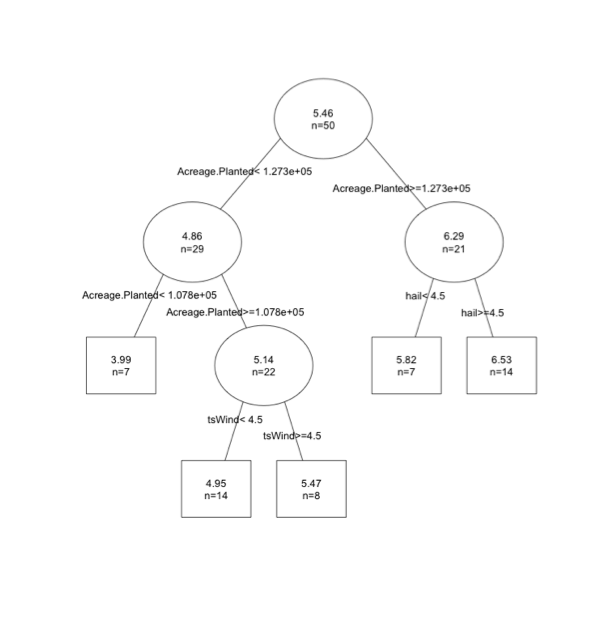
You can think of the tree as a conditional plot. In this example, the first threshold is acreage planted. If acreage planted is greater than 12,730 we then consider hail events. If hail is greater than 4.5 we expect a yield of 6.53 per acre.
Regression trees are easy in that you just follow the map. However, one thing you might notice is that your predictions are set values, and in this case there are 5 possible predictions. You don't capture variability as well relative to linear models.
Pruning
Similar to the multiple linear regression analysis, we want to optimize our model. We want a final tree that minimizes the error of the predictions but also minimizes the size of the tree which tend to generalize poorly for forecasting by fitting the noise in the training data. We do this by 'pruning', deciding which splits provide little value and removing them. Again, there are a variety of metrics that can be used for optimizing.
One option would be to look at the number of samples (n= value in each leaf). If you have a leaf with a small sample size (<5,10 - it depends on the number of samples you actually have), you might decide that there aren't enough values to really confirm whether that split is optimal. Another option is to obtain the subtrees and calculate the error you get for each subtree. Let’s try this out; run the code below to use the command 'printcp'.
What is displayed here? Our whole tree has 4 ‘subtrees’, so the results are broken into 5 parts representing each subtree and the whole tree. For each subtree (and the whole tree), we have several values we can look at. The first relevant variable is the relative error (rel error). This is the error compared to the root node (the starting point of your tree) and is calculated using a ten-fold cross-validation process. This process estimates the error multiple times by breaking the data into chunks. One chunk is the training data, which is used to create the model, and the second chunk is the test data, which is used to predict the values and calculate the error. For each iteration, it breaks the data up into new chunks. For 10-fold cross validation, the testing chunk always contains 1/10 of the cases and the training chunk 9/10. This lets R calculate the error on independent data in just 10 passes while still using almost all of the data to train each time. You can visualize this process below.
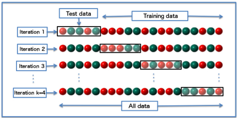
#/media/File:K-fold_cross_validation_EN.jpg)
For more information on cross-validation, you can read the cross-validation wiki page [60]. The xerror is an estimate of the average error from the 10 iterations performed in the cross- validation process.
Let’s look at the results from our yield/acre tree.
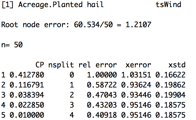
(Please note that your actual values may be different because the cross-validation process is randomized). The average error (xerror) is lowest at node 3 or split 2. You would prune your tree at split 2 (remove everything after the second split).
An alternative and more common optimization method is the One Standard Error (1 SE) rule. The 1 SE rule uses the xerror and xstd (average standard error). We first pick the subtree with the smallest xerror. In this case, that is the third one (3). We then calculate the 1 SE rule:
xerror+1*xstd
In this case, it would be 0.93446+0.19904=1.1325. We compare this value to the relative error column (rel error). The rel error represents the fraction of wrong predictions in each split compared to the number of wrong predictions in the root. For this example, the first split results in a rel error of 0.587, meaning the error in this node is 58% of that in the first node (we have improved the error by 1-0.587 or 41%). However, the rel_error is computed using the training data and thus decreases as the tree grows and adjusts to the data. We should not use this as an estimate of the real error, instead we minimize the xerror and xstd which uses the testing data. We still want to minimize the rel_error, so we select the first split that has a rel_error less than 1.1325 (the 1 SE rule). In this case, that is tree 1. To read how xerror, rel_error, and xstd are calculated in this function, please see the documentation [61].
If we want to prune our tree using this metric, we would prune the tree to subtree 1. To do this in R, we will use the 'prune' function and insert the corresponding cp value to that tree, in this case 0.4. Run the code below to test this on the YieldAcre variable.
You will end up with the first tree- visually:
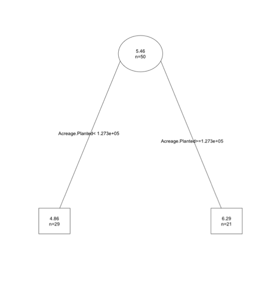
This may seem a bit confusing, especially the metric portion. All you should know is that if using the 1 SE rule, we calculate a threshold (xerror+1*xstd) and find the first node with a relative error less than this value. Remember, the key here is we don't want the most extensive tree; we want one that predicts relatively well but doesn't over fit.
Automate
The good thing is that we can automate this process. So if you don't understand the SE metric well, don't fret. Just know that it's one way of optimizing the error and length of the tree. To automate, we will use the function rpartXse.
Again, you need to remember that due to the ten-fold cross validation, the error estimates will be different if you rerun your code.
Select Model
Prioritize...
At the end of this section you should be able to employ tools to choose the best model for your data.
Read...
By now you should know how to create multiple linear regression models as well as regression tree models for any dataset. The next step is to select the best model. Does a regression tree better predict the response variable than a multiple linear regression model? And which response variable can we best predict? Yield/acre, production, acreage harvested? In this section, we will discuss how to evaluate and select the best model.
Predict
Now that we have our models using the multiple linear regression and regression tree approach, we need to use the models to predict. This is the best way to determine how good they actually are. There are multiple ways to go about this.
The first is to use the same data that you trained your model with (when I say train, I mean the data used to create the model). Another option is to break your data up into chunks and use one part of it for training and the other part for testing. For the best results with this option, use the 10-fold cross-validation so that you exploit most of it for training and all of it for testing. The last option is to have two separate datasets: one for training and one for testing. But this will provide a weaker model and should only be used to save time.
Let’s start by predicting our corn production response variables using our multiple linear regression models that were optimized. To do this, I will use the function ‘predict’. Use the code below to predict response variables.
Because we may have predictions less than 0 which are not plausible for this example, I’ve changed those cases to 0 (the nearest plausible limit). This is a caveat with linear regression. The models are lines and so their output can theoretically extend to plus and minus infinity, well beyond the range of physical plausibility. This means you have to make sure your predictions are realistic. Next, let’s predict the corn production response variables using the optimized regression trees.
We don’t have to worry about non-plausible results because regression trees are a ‘flow’ chart - not an equation. Now we have predictions for 50 observations and can evaluate the predictions.
Evaluate
To evaluate the models, we are going to compare the predictions to the actual observations. The function regr.eval compares the two and calculates several measures of error that we have used before including the mean absolute error (MAE), mean standard error (MSE), and root mean square error (RMSE). Let’s evaluate the linear models first.
There are 6 metrics of which you should already know 3: MAE, MSE, and RMSE. MAPE is the mean absolute percent error – the percentage of prediction accuracy. For the model of yield/acre, the MAPE is 0.11. The predictions were off by 11% on average. MAPE can be biased. NMSE is the normalized mean squared error. It is a unitless error typically ranging between 0 and 1. A value closer to 0 means your model is doing well, while values closer to 1 mean that your model is performing worse than just using the average value of your observations. This is a good metric for selecting which response variable is best predicted. In the yield/acre model, the NMSE is 0.397 while in acreage harvested it is 0.11, suggesting that the acreage harvested is better predicted than yield/acre. The last metric is NMAE, or normalized mean absolute error, which has a value from 0 to 1. For the yield/acre model, the NMAE is 0.59 while in acreage harvested it is 0.32.
Now let’s do the same thing for the regression tree results.
For the regression tree, the smallest NMSE is with acreage harvested (0.13) similar to the linear model.
Visual Inspection
Looking at the numbers can become quite tedious, so visual inspection can be used. The first visual is to plot the observed values agianst predicted values. Here’s an example for the ‘production’ response variable.
You should get a figure similar to this:
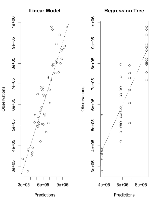
The x-axes for both panels are the predicted values; the y-axes are the observations. The left panel is using the linear model and the right is using the regression tree. The dashed line is a 1-1 line. The linear model does really well, visually, while the regression tree has ‘stacked’ points. This is due to the nature of the ‘flow’ type modeling. There are only a few possible results. In this particular case, there are 4 values as you can see from the tree chart:
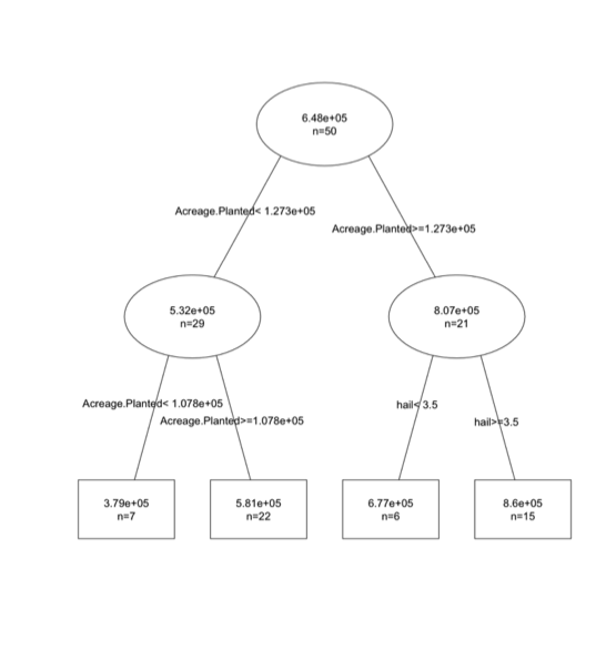
For this particular problem, we are not able to capture the variability as well using the tree. But if the relationship had a discontinuity or was nonlinear, the tree would have won.
Let’s say you notice some poorly predicted values that you want to investigate. You can create an interactive diagram that lets you click on poor predictions to pull out the data. This allows you to look at the observations and predictions, possibly identifying the cause of the problem.
Doing this for every single model, especially when you have several response variables, can be tedious. So how can we compare all the model types efficiently?
Model Comparison
When it comes to data mining, the goal is to be efficient. When trying to choose between types of models as well as which response variable we can best predict, automating the process is imperative. To begin, we are going to set up functions that automate the processes we just discussed: create a model, predict the model, and calculate a metric for comparison. The code below creates two functions: one using the multiple linear regression approach and one with the regression tree approach.
1 2 3 4 5 6 7 8 9 10 11 12 13 14 15 | # create function to train test and evaluate models through cross-validationcvRT <- function(form,train,test,...){ modelRT<-rpartXse(form,train,...) predRT <- predict(modelRT,test) predRT <- ifelse(predRT <0,0,predRT) mse <- mean((predRT-resp(form,test))^2) c(nmse=mse/mean((mean(resp(form,train))-resp(form,test))^2))}cvLM <- function(form,train,test,...){ modelLM <- lm(form,train,...) predLM <- predict(modelLM,test) predLM <- ifelse(predLM <0,0,predLM) mse <- mean((predLM-resp(form,test))^2) c(nmse=mse/mean((mean(resp(form,train))-resp(form,test))^2))} |
Let’s break the first function (cvRT) down.
You supply the function the form of the model you want, response variables~factor variables. You then supply the training data and the testing data. When this function is called, it uses the same function we used before ‘rpartXse’. Once the optimal regression tree is created, the function predicts the values using the optimized model (modelRT) and the test data. We then replace any nonsensical values (less than 0) with 0. Then we calculate NMSE and save the value. This is the value we will use for model comparison.
The second function (cvLM) is exactly the same, but instead of using the regression tree approach we use the multiple linear regression approach.
Once the optimal models for each response variable are selected (one for each approach), we want to select the approach that does a better job. To do this, we are going to use the function ‘experimentalComparison’. This function implements a cross-validation method. With this function, we need to supply the datasets (form, train, test) and the parameter called ‘system’. These are the types of models you want to run (cvLM and CVRT). Here is where you would supply any more parameters you may want to use. For example, in the function rpartXse we can assign thresholds like the number of splits or the cp. The last parameter is cvSettings. These are the settings for the cross-validation experiment. It is in the form of X, K, Z where X is the number of times to perform the cross-validation process, K is the number of folds (the number of equally sized subsamples), and Z is the seed for the random number generator. Let’s give this a try for the acreage harvested response variable.
For the regression tree, I added the parameter SE=0, 0.5, and 1. Remember, SE is xerror+xstd. But in reality there is a coefficient in front of xstd, given by the numbers used in this setting (0, 0.5 and 1). This setting will create three random forests with varying SE threshold (xerror, xerror+0.5xstd, xerror+1*xstd). I set ‘cvSettings’ to 3,10,100 which means we are going to run a 3-10 Fold cross-validation. We want 3 iterations chunking the data into 10 equally sized groups. We set the random number generator to 100.
Why do we run iterations? It provides statistics on the performance metric! Let’s take a look by summarizing the results.
The output begins by telling us the type of cross-validation that was used, in this case 3X10. It also tells us the seed for the random number generator. Next, the data sets are displayed followed by four learners (model types): one version of a linear model and three versions of a regression tree (se=0,0.5, and 1). Next is the summary of the results, which are broken down by the learner (model). We only saved the metric NMSE, so that is the only metric we will consider. You can change this depending on what you are interested in, but with respect to comparing models the NMSE is a pretty good metric. The NMSE for each learner, the average, the std, the min, and the maximum are computed. This can be done because of the cross-validation experiment! Because we ran it 3 times with 10 folds (10 chunks of data) we can create statistics on the error of the model. For this case, it appears the linear model is the best as it has the lowest average NMSE.
If we want to visualize these results, we can run the following code:
You should get a figure similar to this:
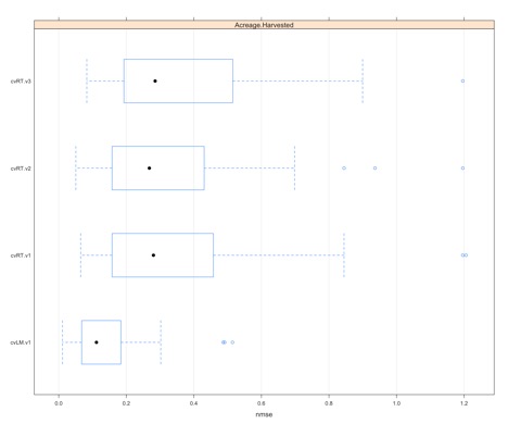
This creates a boxplot of the NMSE values estimated for each iteration and fold (30 total points). It’s a good way to visually determine which model type is best for this particular response variable as well as display the spread of the error.
Ensemble Model and Automation
We now want to take the automation to another level. We want to be able to create models for all the response variables, not just one. To do this, we need to create a list that contains the form of each model. Use the code below:
dataForm is a list variable that contains the datasets needed for the experimental comparison: form, train, and test. Now we can automate the whole process.
Notice that this time I’ve decided to perform a 5x10 cross-validation process. This might take a bit longer to run, so be patient.
Now let’s plot the results to get a visual.
You should get the following figure:
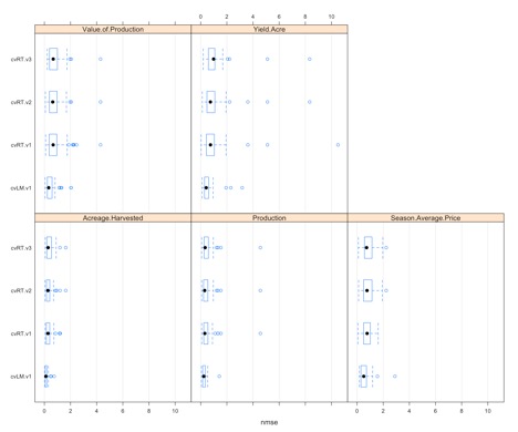
Each panel represents one of the response variables we want to predict. Within each panel, we see a boxplot for the four learners (the one linear model and the 3 regression trees). In this case, we have 50 estimates of NMSE going into the boxplot. We will see that some variables, like acreage harvested or yield/acre, might have an obvious model selection, but for others it's unclear. We can use the function ‘bestscores’ to select the model with the smallest average NMSE for each response variable.
For this example, the linear model is actually chosen for all response variables. And acreage harvested has the smallest overall NMSE, suggesting that acreage harvested might be the corn response variable we should focus on.
There is one more type of model that we should discuss. In addition to regression trees and linear regression models we can create a random forest. A random forest is an example of an ensemble model. Ensembles are the combinations of several individual models that at times are better at predicting than their individual parts. In this case, a random forest is an ensemble of regression trees. Let’s begin by creating a function to compute the random forest
1 2 3 4 5 6 7 8 9 | # now create a random forest (ensemble model)library(randomForest)cvRF <- function(form,train,test,...){ modelRF <- randomForest(form,train,...) predRF <- predict(modelRF,test) predRF <- ifelse(predRF <0,0,predRF) mse <- mean((predRF-resp(form,test))^2) c(nmse=mse/mean((mean(resp(form,train))-resp(form,test))^2))} |
Similar to the other model methods, we need a dataset with the form, train, and test inputs. We then use the experimental comparison but add in our new learner- cvRF.
The ntree parameter tells the random forest how many individual trees to create. You want a large enough number of individual trees to create a meaningful result but small enough to be computationally efficient. Here’s an article, "How Many Trees in a Random Forest? [62]," that says the number should be between 64 and 128. If the function is taking too long to run, you probably have too many trees.
Let’s run the code with the random forest included and determine the best scores.
After running this, you will notice that now we have some random forests listed as the best models instead of only the linear regression model.
Obtain Model and Predict
Prioritize...
After reading this section you should be able to obtain the best model and use it.
Read...
Now we know which model is best (linear, regression forest, or random forest). But how do we actually obtain the model parameters and use it?
Obtain Model
At this point, we have determined which type of model best represents the response variable but we have yet to actually obtain the model in a usable way. Let's extract out the best model for each response variable. Start by determining the best model names.
1 2 3 | # obtain the best model for each predicted variableNamesBestModels <- sapply(bestScores(allResults), function(x) x['nmse','system']) |
Next, classify the model type.
1 | modelTypes <- c(cvRF='randomForest',cvRT='rpartXse',cvLM='lm') |
Now create a function to apply each model type.
1 2 | modelFuncs <- modelTypes[sapply(strsplit(NamesBestModels,split="\\."), function(x) x[1])] |
Then obtain the parameters for each model.
1 2 | modelParSet <- lapply(NamesBestModels, function(x) getVariant(x,allResults)@pars) |
Now we can loop through each response variable and save the best model.
The code above begins by creating a formula for the model (response variable~factor variable). It then calls the 'modelFuncs' function, which is our learners (lm, randomForest, rpartXse), and supplies the arguments and the parameters. You are left with a list of five models. For each response variable, the list contains the formula of the best model.
Predict
Now that we have the formulas, let's try predicting values that were not used in the training set. Here is a set of corn and storm data from 2010-2015 [63]. We can use this data to test how well the model actually does at predicting values not used in the training dataset. Remember, the reason I didn't use this dataset for testing before was due to the limited sample size but we can use it as a secondary check.
Begin by loading the data and extracting it out for our state of interest (Minnesota).
Now we will predict the values using the best model we extracted previously.
We loop through each observation and apply the best model for each response variable. We then replace any non-plausible predictions with 0. You are left with a set of predictions for each year for each corn response variable. Although we have only 6 years to work with, we can still calculate the NMSE to see how well the model did with data not included in the training dataset. The hope is that the NMSE is similar to the NMSE calculated in our process for selecting the best model.
The code starts by calculating an average value of each corn response variable based on the longer dataset. Then we calculate the MSE from our 6-year prediction and normalize it by scaling the test data by the long-term average value. You should get these scores:
| Average.Harvested | Yield.Acre | Production | Season.Average.Price | Value.of.Production |
|---|---|---|---|---|
| 0.1395567 | 0.7344319 | 0.4688927 | 0.6716387 | 0.7186660 |
For comparison, these were the best scores during model selection. Remember, the ones listed below may be different from yours due to the random factor in the k-fold cross-validation.
1 2 3 4 5 6 7 8 9 10 11 12 13 14 15 16 17 18 19 | $Acreage.Harvested system scorenmse cv.lm.v1 0.2218191$Yield.Acre system scorenmse cv.rf.v2 0.624105$Production system scorenmse cv.lm.v1 0.2736667$Season.Average.Price system scorenmse cv.rf.v3 0.4404177$Value.of.Production system scorenmse cv.lm.v1 0.4834414 |
The scores are relatively similar. Yield/acre has the highest score while the lowest score is from acreage harvested and production. This confirms that our factor variables are better at predicting the acreage harvested than Yield/Acre.
US Example
Let’s go through one more example of the whole process for the entire United States (not just Minnesota). In addition, I'm going to use more factor variables and only look at observations after 1996 (this will include events such as flash floods, wildfires, etc.).
To start, let's extract out the data from 1996 onward for all states.
Now clean up the data. I've decided that if no events happen, I will remove that event type. Start by summing up the number of events for each event type (over the whole time period) and determining which factor variables to keep.
Now subset the data for only event types where events actually occurred and remove any missing cases.
Now create the functions to train, test, and evaluate the different model types.
Now apply these functions to all the response variables.
Finally, look at the scores.
Hopefully, by including more data points (in the form of multiple states) as well as more factor variables, we can decrease the NMSE. The best score is still for acreage harvested, with an NMSE of 0.0019, but production and value of production are quite good with NMSEs of 0.039 and 0.11 respectively.
Again the end goal is prediction, so let's obtain the best model for each response variable.
And let's test the model again using the separate test dataset. We need to create a clean test dataset first.
Now calculate the predictions.
Finally, calculate the NMSE.
In this case, I get relatively high scores for every corn response variable except acreage harvested. Remember, there are fewer points going into this secondary test, so it may be skewed. But one thing is for sure, acreage harvested seems to be the best route for us to go. If we want to add value to corn futures, we would predict the acreage harvested using storm event frequency and acreage planted. Let's just look at the acreage harvest model in more detail. First, let's visually inspect the predictions and the observations for acreage harvested.
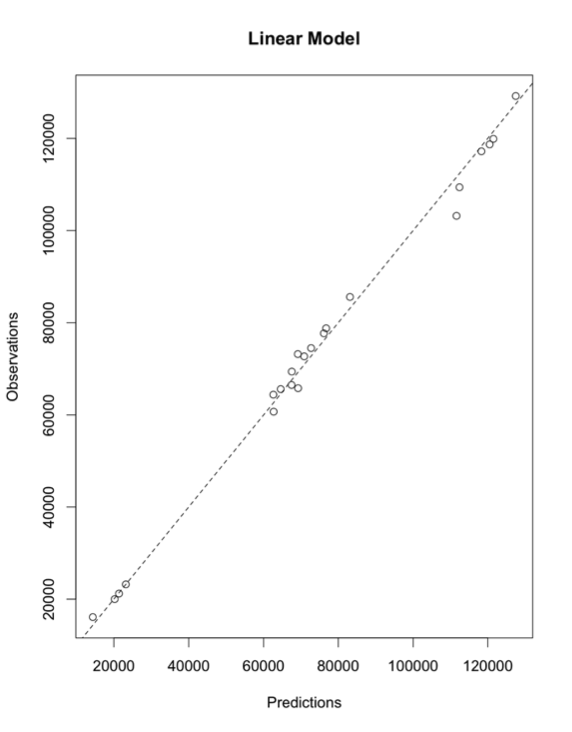
After visually inspecting, we see a really good fit. One of the things to note is that acreage planted is a factor in this model. If there is no difference between acreage planted and acreage harvested, then we aren't really providing more information by looking at storm event frequency. Let's start by looking at the difference between acreage harvested and acreage planted.
If you now apply the summary function to the difference you will see that although there are instances where no change has occurred between the planted and the harvested, the general difference is between 800-1700 acres. We can also perform a t-test. As a reminder, the t-test will tell us whether the mean acreage planted is statistically different than the mean acreage harvested.
The result is a P-value <0.01, which means that the mean acreage planted and the acreage harvested are statistically different.
Let's check which variables have statistically significant coefficients in this model (coefficients different from 0)
We see that the coefficients for the factor variables cold wind chill events, winter storm events, and droughts are statistically significant. The last thing we can do is compare a linear model only using acreage planted (as this is where most of the variability is probably being captured), one which uses acreage planted and the other statistically significant coefficients (cold wind chill events, winter storm events, and droughts), and the one we selected with our automated process.
If you apply the summary function on all the models you will see that the second model is almost a perfect fit and that lm.3 (which is the best model selected through cross-validation) has a slightly higher R-squared value than lm.1. If we perform an ANOVA analysis between the models, we can determine if the models are statistically different.
The results suggest that the change was statistically significant from lm.1 to lm.2. As for the difference between lm.1 and lm.3 (lm.3 is the actual model selected), it is not as strong. This follow-up analysis suggests that it might be best to use linear model 2, which is less complex than linear model 3 but provides a statistically different result from the simple usage of acreage planted. You can see that even though the automation created a good model, by digging in a little more we can further refine it. Data mining is a starting point, not the final solution.
By combining a number of tools you have already learned, we were able to successfully create a model to predict an aspect of the corn harvest effectively. We were able to dig through a relatively large dataset and pull out patterns that could bring added knowledge to investors and farmers, hopefully aiding in better business decisions.