Lesson 2: Statistical Hypothesis Generation and Testing (Part 1)
Motivate...
Did you know that the first frost in the UK is linked to increases in purchases of cauliflower and birdseed at Tesco, a supermarket chain in the UK? Or that hot weather increases the sales of hair removal products by 1,400%? Or that strawberry sales typically increase by 20% during the first hot weekend of the year in the UK? Consumer spending is linked to the weather. The video above is from a segment on BBC about the weather’s influence on consumer purchase behavior. The segment showcases the use of weather analytics in two major supermarket chains in the UK: Sainsbury and Tesco. These two supermarket chains use weather analytics every day to make decisions related to product placement, ordering, and supply and demand. Both Tesco and Sainsbury believe the weather “defines how a customer shops and what they want to buy” (BBC Highlights article).
Changes in temperature can result in changes of demand for a particular product. Retail companies need to keep up with the demand, ensuring that the right product is on the right shelf at the right time. Currently, in the UK, about £4.2 billion of food is wasted each year: 90% of this consisting of perishable food. Thoughtful application of supply and demand relationships could be emphasized to increase profit. But how do companies do this? One way is to meaningfully increase product availability based on how the weather affects consumer spending, such as how temperatures greater than 20°C in Scotland can triple BBQ sales.
But how do we implement such relationships in a profitable way on a daily basis? There’s no such thing as a sure thing in weather forecasting. A forecaster may predict that the temperature will reach a certain threshold, but there is uncertainty with this result. Historically, we may expect to see the temperature rise above 20°C in the first week of April, but we know this won’t happen every year because there is variability. How do we quantify the impact of this uncertainty on our use of weather forecasts? In particular, is a result consistent enough to act on?
Hypothesis testing provides a way to determine whether a result is statistically significant, i.e., consistent enough to be believed. For example, a hypothesis test can determine how confident we are that the temperature during the first week of April will exceed 20°C in Scotland. Furthermore, confidence intervals can be created through hypothesis generation and testing. We can determine a range of weeks that are highly likely to exceed the temperature threshold. By creating these confidence intervals and performing tests to determine statistical significance, retail companies can develop sound relationships between weather and business that allow them to prepare ahead of time to make sure appropriate goods are available during highly profitable weeks - like BBQ equipment and meat.
Below is a flow chart you can refer to throughout this lesson. This is an interactive chart; click on the box to start.
Newsstand
- Christison, A. (2013, April 16). Tesco saves millions with supply chain analytics [1] Retrieved January 21, 2019.
- Curtis, J. (2003, July 17). The Weather Effect: Marketers have no excuse not to harness data on the weather to make gains [2]. Retrieved April 7, 2016.
Lesson Objectives
- Identify instances when hypothesis testing would be beneficial.
- Know when to invoke the Central Limit Theorem.
- Describe different test statistics and when to use them.
- Formulate hypotheses and apply relevant test statistics.
- Interpret the hypothesis testing results.
Normal Distribution Review
Prioritize...
After completing this section, you should be able to estimate Z-scores and translate the normal distribution into the standard normal distribution.
Read...
The normal distribution is one of the most common distribution types in natural and social science. Not only does it fit many symmetric datasets, but it is also easy to transform into the standard normal distribution, providing an easy way to analyze datasets in a common, dimensionless framework.
Review of Normal Distribution
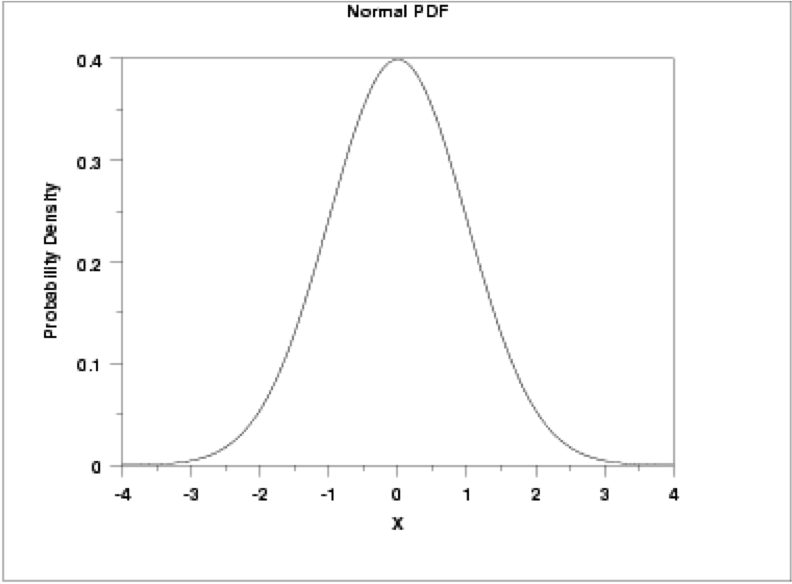
This distribution is parametrized using the mean (μ), which specifies the location of the distribution, and the variance (σ2) of the data, which specifies the spread or shape of the distribution. Some more properties of the normal distribution:
- the mean, median, and mode are equal (located at the center of the distribution);
- the curve is always unimodal (one hump);
- the curve is symmetric around the mean and is continuous;
- the total area under the curve is always 1 or 100%.
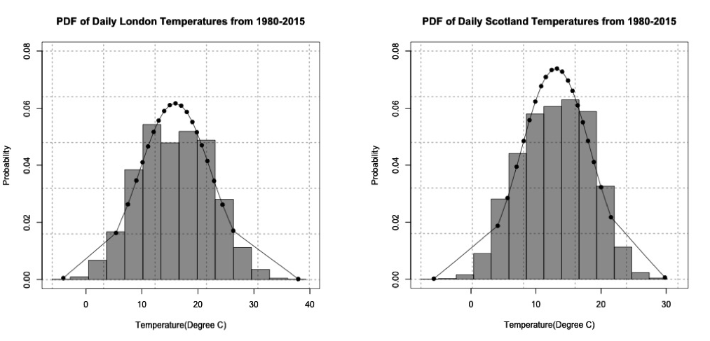
If you remember, temperature was a prime example of meteorological data that fits a normal distribution. For this lesson, we are going to look at one of the problems posed in the motivation. In the video and articles from the newsstand, there was an interesting result: BBQ sales triple when the daily maximum temperature exceeds 20°C in Scotland and 24°C in London. As a side note, there is a spatial discrepancy here: London is a city while Scotland is a country. For this example, I will stick with the terminology used in the motivation (Scotland and London), but I want to highlight that we are really talking about two different spatial regions, and, in reality, this is not what we are comparing because the data is specifically for a station near the city of London and a station near the city of Leuchars, which is in Scotland, but doesn't necessarily represent Scotland as a whole. Let’s take a look at daily temperature in London and Scotland from 1980-2015. Download this dataset [5]. Load the data, and prepare the temperature data by replacing missing values (-9999) with NAs using the following code:
There are two stations: one for London and one for Scotland. Extract out the maximum daily temperature (Tmax) from each station along with the date:
Estimate the normal distribution parameters from the data using the following code:
Finally, estimate the normal distribution using the code below:
The normal distribution looks like a pretty good fit for the temperature data in Scotland and London. The figures below show the probability density histogram of the data (bar plot) overlaid with the distribution fit (dots).
If we wanted to estimate the probability of the Tmax exceeding 20°C in Scotland and 24°C in London, we would first have to estimate the Cumulative Distribution Function (CDF) using the following code:
Remember that the CDF function provides the probability of observing a temperature less than or equal to the value you give it. To estimate the probability of exceeding a particular threshold, you have to take 1-CDF. To estimate the probability of the temperature exceeding a threshold, use the code below:
Since 1980, the temperature has exceeded 20°C in Scotland 9.5% of the time and has exceeded 24°C in London about 10.8% of the time.
Standard Normal Distribution
The simplest case of the normal distribution is when the mean is 0 and the standard deviation is 1. This is called the standard normal distribution, and all normal distributions can be transformed into the standard normal distribution. To transform a normal random variable to a standard normal variable, we use the standard score or Z-score calculated below:
X is any value from your dataset, μ is the mean, σ is the standard deviation, and n is the number of samples. The Z-score tells us how far above or below the mean a value is in terms of the standard deviations. What is the benefit of transforming the normal distribution into the standard normal? Well, there are common tables that allow us to look up the Z-score and instantly know the probability of an event. The most common table comes from the cumulative distribution and gives the probability of an event less than Z. Visually:
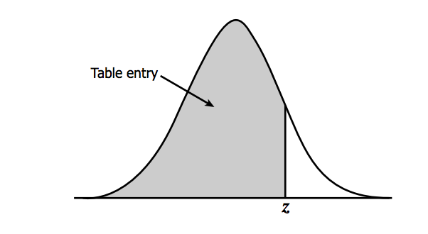
You can find the table here [6] and at Wikipedia [7] (look under Cumulative). To read the table, take the first two digits of the Z-score and find it along the vertical axis. Then, find the third digit along the horizontal axis. The value where the row and column of your Z-score meets is the probability of observing a Z value less than the one you provided. For example, say I have a Z-score of 1.21, the probability would be .8869. This means that there is an 88.69% chance that my data falls below this Z-score. To translate the temperature data to the standard normal for Scotland and London in R, use the function 'scale' which automatically creates the standardized scores. Fill in the missing code using the variable 'ScotlandTemp':
The standard normal distribution for the temperatures from London and Scotland are shown in the figure below:
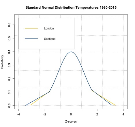
As you can see from the figure, the temperatures have been transformed to Z-scores creating a standard normal distribution with mean 0. If we want to know the probability of temperature falling below a particular value, we can use ‘pnorm’ in R, which calculates the probabilities of any distribution function given its mean and standard deviation. When these two parameters are not provided, ‘pnorm’ calculates the probability for the standard normal distribution function. R thus gives you the choice to transform your normally distributed data into Z-scores. Remember that the Z-scores can be used in the CDF to get a probability of an event with a score less than Z or in the PDF to get the probability density at Z. Fill in the missing spots for the Scotland estimate to compute the probability of the temperature exceeding 20°C.
The probability for the temperature to exceed 20°C in Scotland is about 9.9%, and the probability for the temperature to exceed 24°C in London is about 10.6%, similar to the estimate using the CDF. It might not seem beneficial to translate your results into Z-scores and compute the probability this way, but the Z-scores will be used later on for hypothesis testing.
For some review, try out the tool below that lets you change the mean and standard deviation. On the first tab, you will see Plots: the normal distribution plot and the corresponding standard normal distribution plot. On the second tab (Probability), you will see how we compute the probability (for a given threshold) using the normal distribution CDF and using the Z-table. Notice the subtle differences in the probability values.
Empirical Rule and Central Limit Theory
Prioritize...
By the end of this section, you should be able to apply the empirical rule to a set of data and apply the outcomes of the central limit theory when relevant.
Read...
The extensive use of the normal distribution and the easy transformation to the standard normal distribution has led to the development of common guidelines that can be applied to this PDF. Furthermore, the central limit theory allows us to invoke the normal distribution, and the corresponding rules, on many common datasets.
Empirical Rule
The empirical rule, also called the 68-95-99.7 rule or the three-sigma rule, is a statistical rule for the normal distribution which describes where the data falls within three standard deviations of the mean. Mathematically, the rule can be written as follows:
The figure below shows this rule visually:

What does this mean exactly? If your data is normally distributed, then typically 68% of the values lie within one standard deviation of the mean, 95% of the values lie within two values of the mean, and 99.7% of your data will lie within three standard deviations of the mean. Remember the Z-score? It defines how many standard deviations you are from the mean. Therefore, the empirical rule can be described in terms of Z-scores. The number in front of the standard deviation (1, 2, or 3) is the corresponding Z number. The figure above can be transformed into the following:

This rule is multi-faceted. It can be used to test whether a dataset is normally distributed and checks whether the data lies within 3 standard deviations. The rule can also be used to describe the probability of an event outside a given range of deviations, or used to describe an extreme event. Check out these two ads from Buckley Insurance and Bangkok Insurance.
Both promote insuring against extreme or unlikely weather events (outside the normal range) because of the high potential for damage. So, even though it is unlikely that you will encounter the event, these insurance companies use the potential of costly damages as a motivator to buy insurance for rare events.
The table below, which expands on the graph above, shows the range around the mean, the Z-score, the area under the curve over this range (the probability of an event in this range), the approximate frequency outside the range (the likelihood of an event outside the range), and the corresponding frequency to a daily event outside this range (if you are considering daily data, translate the frequency into a descriptive temporal format).
| Range | Z-Scores | Area under Curve | Frequency outside of range | Corresponding Frequency for Daily Event |
|---|---|---|---|---|
| 0.382924923 | 2 in 3 | Four times a week | ||
| 0.682689492 | 1 in 3 | Twice a week | ||
| 0.866385597 | 1 in 7 | Weekly | ||
| 0.954499736 | 1 in 22 | Every three weeks | ||
| 0.987580669 | 1 in 81 | Quarterly | ||
| 0.997300204 | 1 in 370 | Yearly | ||
| 0.999534742 | 1 in 2149 | Every six years | ||
| 0.999936658 | 1 in 15787 | Every 43 years (twice in a lifetime) | ||
| 0.999993205 | 1 in 147160 | Every 403 years | ||
| 0.999999427 | 1 in 1744278 | Every 4776 years | ||
| 0.999999962 | 1 in 26330254 | Every 72090 years | ||
| 0.999999998 | 1 in 506797346 | Every 1.38 million years |
A word of caution: the descriptive terminology in the table (twice a week, yearly, etc.) can be controversial. For example, you might have heard the term 100-year flood (for example the 2013 floods in Boulder, CO). The 100-year flood has a 1 in 100 (1%) chance of occurring every year. But how do you actually decide what the 100-year flood is? When you begin to exceed a frequency greater than the number of years in your dataset, this interpretation becomes foggy. If you do not have 100 years of data, claiming an event occurs every 100 years is more of an inference of the statistics than an actual fact. It’s okay to make inferences from statistics, and this can be quite beneficial, but make sure that you convey the uncertainty. Furthermore, people can get confused by the terminology. For example, when the 100-year flood terminology was used in the Boulder, CO floods, many thought that it was an event that occurs once every 100 years, which is incorrect. The real interpretation is: the event had a 1% chance of occurring each year. Here is an interesting article [8] on the 100-year flood in Boulder, CO and the use of the terminology.
Central Limit Theorem
At this point, everything we have discussed is based on the assumption that the data is normally distributed. But, what if we have something other than a normal distribution? There are equivalent methods for other parametric distributions that we can use, but let's first discuss a very convenient theory called the central limit theorem. The central limit theorem, along with the law of large numbers, are two theorems fundamental to the concept of probability. The central limit theorem states:
The sampling distribution of the mean of any independent random variable will be approximately normal if the sample size is large enough, regardless of the underlying distribution.
What is a sampling distribution of the mean? Consider any population. From that population, you take 30 random samples. Estimate the mean of these 30 samples. Then take another 30 random samples and estimate the mean again. Do this again and again and again. If you create a histogram of these means, you are representing the sampling distribution of the mean. The central limit theorem then says that if your sample size is large enough, this distribution is approximately normal.
Let’s work through an example using the precipitation data from Lesson 1. As a reminder, this data was daily precipitation totals from the Amazon. You can find the dataset here [9]. Load the data in and extract out the precipitation:
We found that the Weibull distribution was the best fit for the data. The figure below is the probability density histogram of the precipitation data with the Weibull estimate overlaid.
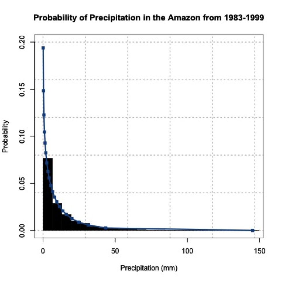
When you look at the figure, you can clearly tell it looks nothing like a normal distribution! Let’s put the central limit theory to the test. We need to first create sample means from this dataset. Since the underlying distribution is Weibull, we will need quite a few sample mean estimates to converge to a normal distribution. Let’s estimate 100 sample means randomly from the dataset. We have 6195 samples of daily precipitation in the dataset, but only 3271 are greater than 0 (we will exclude values of 0 because we are interested in the mean precipitation when precipitation occurs). Use the code below to remove precipitation equal to 0.
For each sample mean, let's use 30 data points. We will randomly select 30 data points from the dataset and compute the sample mean 100 times. To do this, we will use the function 'sample' which randomly selects integers over a range. Run the code below (no need to fill anything in), and look at the histogram produced.
We provided 'sample', a range from 1 through the number of data points we have. Thirty is the number of random integers we want. Setting replace to 'F' means we won’t get the same numbers twice.
You can see that the histogram looks symmetric and resembles a normal distribution. If you increased the number of sample mean estimates to 1000, you would get the following probability density histogram:
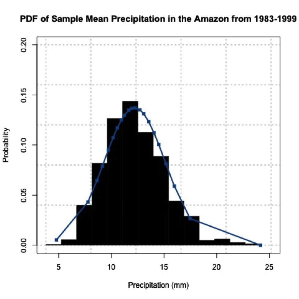
The more sample means, the closer the histogram looks to a normal distribution. One thing to note, your figures will not look exactly the same as mine and if you rerun your code you will get a slightly different figure each time. This is because of the random number generator. Each time a new set of indices are created to estimate the sample means, thus changing your results. We will, however, still get a normally distributed dataset; proving the central limit theory and allowing you to assume that any independent dataset of sample means will converge to a normal distribution if the sample size is large enough.
Hypothesis Formation and Testing for 1 Sample: Part 1
Prioritize...
By the end of this section, you should be able to distinguish between data that come from a parametric distribution and those that do not, select the null and alternative hypotheses, identify the appropriate test statistic, and choose and interpret the level of significance.
Read...
Let's say you think BBQ sales triple when the temperature exceeds 20°C in Scotland. How would you test that? Well one way is through hypothesis testing. Hypothesis generation and testing can seem confusing at times. This section will contain a lot of potentially new terminology. The key for success in this section is to know the terms; know exactly what they mean and how to interpret them. Working through examples will be extremely beneficial. There will be an entire section filled with examples. Take the time now to understand the terminology.
Here is a general overview of hypothesis formation and testing. This is meant to be a basic procedure which you can follow:
- State the question.
- Select the null and alternative hypothesis.
- Check basic assumptions.
- Identify the test statistic.
- Specify the level of significance.
- State the decision rules.
- Compute the test statistics and calculate confidence intervals.
- Make decision about rejecting null hypothesis and interpret results.
State the Question
Stating the question is an important part of the process when it comes to hypothesis testing. You want to frame a question that answers something you are interested in but also is something that you can answer. When coming up with questions, try and remember that the basis of hypothesis testing is the formation of a null and alternative hypothesis. You want to frame the question in a way that you can test the possibility of rejecting a claim.
Selection of the Null Hypothesis and Alternative Hypothesis
When selecting the null and alternative hypothesis, we use the question that we stated and formulate the hypotheses based on questioning the null hypothesis. A common example of a hypothesis is to determine whether an observed target value, μo, is equal to the population mean, μ. The hypothesis has two parts, the null hypothesis and the alternative hypothesis. The null hypothesis (Ho) is the statement we will test. Through hypothesis testing, we are trying to find evidence against the null hypothesis. The null hypothesis is what we are trying to disprove or reject. The alternative hypothesis (H1 sometimes HA) states the other alternative - it's usually what think to be true. The two are mutually exclusive and together cover all possible outcomes. The alternative hypothesis is what you speculate to be true and is the opposite of the null hypothesis.
There are three ways to format the hypothesis depending on the question being asked: two tailed test, upper tailed test (right tailed test), and the lower tailed test (left tailed test). For the two tailed test, the null hypothesis states that the target value (μo) is equal to the population mean (μ). We would write this as:
An example would be that we want to know whether the total amount of rain that fell this month is unusual.
The upper tailed test is an example of a one-sided test. For the upper tailed test, we speculate that the population mean (μ) is greater than the target value (μo). This might seem backwards, but let’s write it out first. The null hypothesis would be that the population mean (μ) is less than or equal to the target value (μo):
And the alternative hypothesis would be that the population mean (μ) is greater than the target value (μo):
It’s called the upper tailed test because we are examining the likelihood of the sample mean being observed in the upper tail of the distribution if the null hypothesis were true. In this case, the null hypothesis is that the target value (μo) is equal to or greater than the population mean (μ); it lies in the upper tail. An example would be that the temperature today feels unusually cold for the month. We are hoping to reject that the temperature is actually warmer than the usual.
The lower tailed test is also an example of a one-sided test. For the lower tailed test, we speculate that the target value (μo) is greater than the population mean (μ). Again, let's write this out. The null hypothesis would be that the target value (μo) is less than or equal to the population mean (μ):
This is called the lower tailed because we are testing whether the target value (μo) is less than the population mean (μ); we are testing that the target value (μo) lies in the lower tail. An example would be that the wind feels unusually gusty today. We speculate that the wind is gusty. We want to reject that the wind is lower than usual, so we test whether it is in the lower tail or not.
For now, all you need to know is how to form the null hypothesis and alternative hypothesis and whether this results in a two-sided or one-sided test (lower or upper). Knowing the type of test will be important when determining the decision rules. Here is a summary:
Speculate that the population mean is simply not equal to the target value:
- Two-Tailed Test
Speculate that the value is less than the mean:
- One-Tailed Test: Upper
Speculate that the value is greater than the mean:
- One-Tailed Test: Lower
For nonparametric testing, the null and alternative hypothesis are stated the same way. Both one-tailed and two tailed tests can be performed. The main difference is that generally the median is considered instead of the mean.
Basic Assumptions
There are several assumptions made when hypothesis testing. These assumptions vary depending on the type of hypothesis test you are interested in, but the assumptions will usually involve the level of measurement error of the variable, the method of sampling, the shape of the population distribution, and the sample size. If you check these assumptions, you should be able to determine whether your data is suitable for hypothesis testing.
All hypothesis testing requires your data to be an independent random sample. Each draw of the variable must be independent of each other; otherwise hypothesis testing cannot proceed. If your data is an independent random sample, then you can continue on. The next question is whether your data is parametric or not. Parametric data is data that is fit by a known distribution so you can use the set of hypothesis tests specific to that distribution. For example, if the data is normally distributed then the data meets the requirements for hypothesis testing using that distribution and you can continue with the associated procedures. For non-normally distributed data, you can invoke the central limit theory. If this does not work, you can transform to normal, use the parametric test appropriate to the distribution your data is fit by, or use a nonparametric test. In any case, at that point your data meets the requirements for hypothesis testing and you can continue on. If your data is non-normally distributed, has a small sample size, and cannot be transformed, you will have switch to the nonparametric testing methods which will be discussed later on. The caveat about nonparametric test statistics is that, because they make no assumptions about the underlying probability distributions, the results are less robust. Below is an interactive flow chart you can use to help you determine whether your data meets the requirements for hypothesis testing. Here is a larger, static view. [10]
Test Statistics
Once we have stated the hypotheses, we must choose a test statistic appropriate to our null hypothesis. We can calculate any statistic from our sample data and there is more than one test to allow us to see how likely it is that the population value is different from some target. For this lesson, we are going to focus specifically on the means. There are two test statistics for data that are either normally distributed or numerous enough that we can invoke the central limit theory. The first is the Z-test. The Z-test is the same as the Z-score:
X is the target value (μo from the hypothesis statement), μ is the population mean, σ is the population standard deviation, and n is the number of samples. When we use the Z-test, we assume that the number of samples is sufficiently large enough so that the sample mean and standard deviation are representative of the population mean and standard deviation. We use a Z-table to determine the probability associated with the Z-statistic value calculated from our data. The Z-test can be used for both one-sided and two sided tests.
If we have a small dataset (less than 30), then we will need to perform a t-test instead. The main difference between the t-test and the Z-test is that in the Z-test we assume that the standard deviation of the data (the sample standard deviation) represents the population standard deviation, because the sample size is large enough (greater than 30). If the sample size is small, the standard deviation of the dataset does not represent the population standard deviation. We therefore have to assume a t-distribution. The test statistic itself is calculated exactly the same as the Z-statistic:
The difference is that we use a t-table to determine the corresponding probability. The probabilities in the t-table vary with the number of cases in the dataset, so that they approach the probabilities in the Z-table as the number of cases approaches 30, so there's no "lurch" as you switch from one table to the other at 30. Note that you do not have to memorize these formulas. There are functions in R that will calculate these tests for you. I will show them later on.
Those are the two tests to use for parametric fits: distributions that are normal with a sample size greater than 30, normally distributed but with sample size less than 30, or a sample size large enough to assume it is normally distributed even with a different underlying distribution.
If we have data that is nonparametric, we need to apply tests which do not make assumptions about its distribution. There are several nonparametric tests available. I will only be going over two popular ones in this lesson.
The first is the Sign Test, S=, which makes no assumption about symmetry of the data, meaning that if your data are skewed you can still use this test. One thing that is different from the tests above: the hypothesis is in terms of the median (η) instead of the mean (μ):
- Two Sided:
- Upper Tailed:
- Lower Tailed:
The other popular nonparametric test is the Wilcoxon statistic. This statistic assumes a symmetric distribution - but it can be non-normal. Again, the hypothesis is written in terms of the median (same as above). There are functions in R which I will show later on that will calculate these test statistics for you. Below is another interactive flow chart that shows you one way to pick your test statistic. Again, a static view is available [11].
Level of Significance
The next step in the hypothesis testing procedure is to pick a level of significance, alpha (α). Alpha describes the probability that we are rejecting a null hypothesis that is actually true, which is sometimes called a "false positive". Statisticians call this a type I error. We want to minimize this probability of a type I error. To do that, we want to set a relatively small value for alpha, increasing our confidence in the results. You must choose alpha before calculating the test statistics because it determines the threshold of the test statistic beyond which you reject the null hypothesis! The exact value is up to you. Consider the dataset you are using, the problem you are trying to solve, and the amount of confidence you require in your result, or how comfortable you are with the potential of a type I error. The choice depends on the cost, to you, of falsely rejecting the null hypothesis. Two traditional choices for alpha are 0.05 or 0.01, a 5% and 1% probability, respectively, of having a type I error. We would describe this as being 95% or 99% confident in our result.
Since there are type I errors, you're probably not surprised that there are also type II errors. They're just the opposite, falsely not rejecting the null hypothesis, a “false negative”. But this type of error is harder to deal with or minimize. Because of this, we will only focus on the level of significance, alpha. You can read more about type II errors and how to minimize them here [12].
Hypothesis Formation and Testing for 1 Sample: Part 2
Prioritize...
By the end of this section, you should be able to generate a hypothesis, distinguish between questions requiring a one-tailed and two tailed test, know when to reject the null hypothesis and how to interpret the results.
Read...
Decision Rules
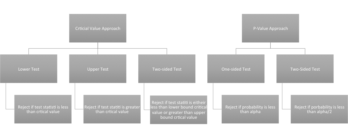
Now that we have the hypothesis stated and have chosen the level of significance we want, we need to determine the decisions rules. In particular, we need to determine threshold value(s) for the test statistic beyond which we can reject the null hypothesis. There are two ways to go about this: the P-Value approach and the Critical Value approach. These approaches are equivalent, so you can decide which one you like the most.
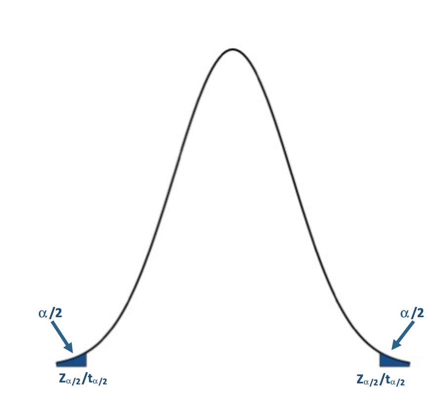
The P-value approach determines the probability of observing a value of the test statistic more extreme than the threshold assuming the null hypothesis is true; you look at the probability of the test statistic value you calculated from your data. For the P-value approach, we compare the probability (P-value) of the test statistic to the significance level (α). If the P-value is less than or equal to α, then we reject the null hypothesis in favor of the alternative hypothesis. If the P-value is greater than α, we do not reject the null hypothesis. Here is the region of rejection of the null hypothesis for a one-sided and two sided test:
- If H1: μ<μo (Lower Tailed Test) and the probability from the test statistic is less than α, then the null hypothesis is rejected, and the alternative is accepted.
- If H1: μ>μo (Upper Tailed Test) and the probability from the test statistic is less than α, then the null hypothesis is rejected, and the alternative is accepted.
- If H1: μ≠μo (Two Tailed Test) and the probability from the test statistic is less than α/2, then the null hypothesis is rejected, and the alternative is accepted.
For the P-value approach, the direction of the test (lower tail/upper tail) does not matter. If the probability is less than α (α/2 for a two-tailed test), then we reject the null hypothesis.
The critical value approach looks instead at the actual value of the test statistic. We transform the significance level, α, to the test statistic value. This requires us to be very careful about the direction of the test. If your test statistic lies beyond the critical value, then reject the null hypothesis. Let's break it down by test:
If H1: μ<μo (Lower Tailed Test):
Simply find the corresponding test statistic value of the assigned significance level (α); that is, if α is 0.05 find the t or Z-value that corresponds to a probability of 0.05. This is your critical value and we denote this as Zα or tα.
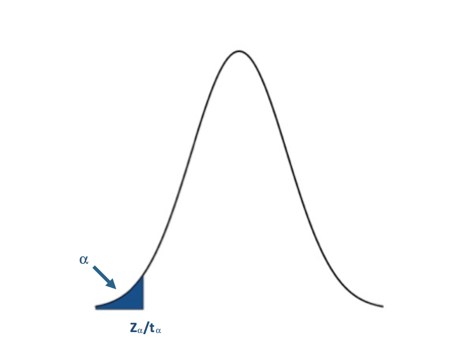
The blue shaded area represents the rejection region. For the lower tailed test, if the test statistic is to the left of the critical value (less than) in the rejection region (blue shaded area), we reject the null hypothesis. I said before that one common α value was 0.05 (a 5% chance of a type I error). For α=0.05, the corresponding Z-value would be -1.645. The Z-statistic would have to be less than -1.645 for the null hypothesis to be rejected at the 95% confidence level.
If H1: μ>μo (Upper Tailed Test):
You have to remember that the t and Z-values use the CDFs of the PDF. This means that for the right tail or upper tail the corresponding t and Z-values will actually come from 1-α. For example, if α is 0.05 and we have an upper tail test, we find the t or Z-value that corresponds to a probability of 0.95. This would be the critical value and we denote this as Z1-α or t1-α.
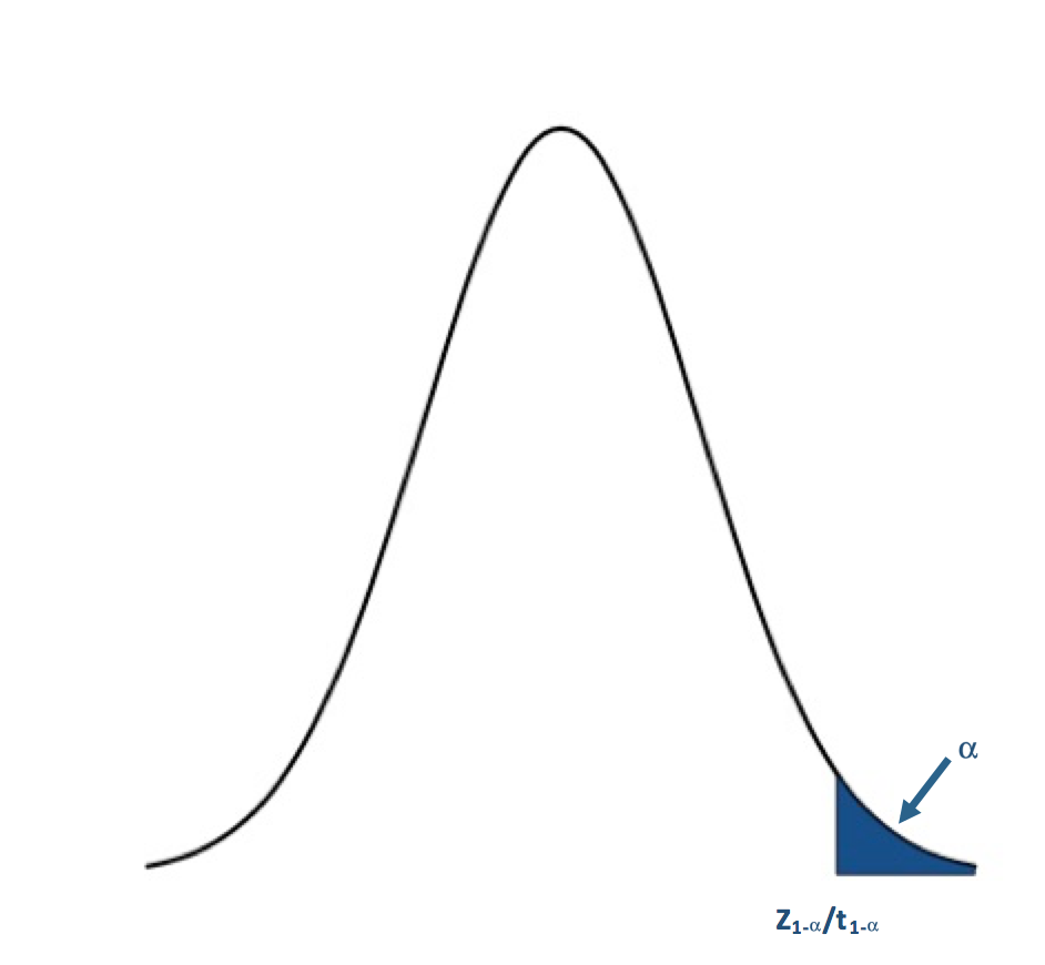
For the upper tailed test, if the test statistic is to the right of the critical value (greater than), we reject the null hypothesis. For α=0.05, the corresponding Z-value would be 1.645. The Z-statistic would have to be greater than 1.645 for the null hypothesis to be rejected at the 95% confidence level.
If H1: μ≠μo (Two Tailed Test):
For the two-tailed test, if your test statistic is to the left of the lower critical value or the right of the upper critical value, then we reject the null hypothesis. For α=0.05, the corresponding Z-value would be ±1.96. The Z-statistic would have to be less than -1.96 or greater than 1.96 for the null hypothesis to be rejected at the 95% confidence level.
I suggest that for nonparametric tests, such as the Wilcoxon or Sign test, that you use the P-value approach because the functions available in R will estimate the P-value for you which means you do not have to estimate the critical value for these tests, avoiding a tedious task. Here is a flow chart for the rejection of the null hypothesis. Here is a larger view (opens in another tab) [13].
Computation and Confidence Interval
Finally, after we have set up the hypothesis and determine our significance level, we can actually compute the test statistic. In this section, I will briefly talk about functions available in R to calculate the Z, t, Wilcoxon, and the Sign test statistics. But first, I want to talk about confidence intervals. Confidence intervals are estimates of the likely range of the true value of a particular parameter given the estimate of that parameter you've computed from your data. For example, confidence intervals are created when estimating the mean of the population. This confidence interval represents a range of certainty our data gives us about the population mean; we are never 100% certain the mean of a sample dataset represents the true mean of a population, so we calculate the range in which the true mean lies within with a certain confidence. Most times confidence intervals are set at the 95% or 99% level. This means we are 95% (99%) confident that the true mean is within the interval range. To estimate the confidence interval, we create a lower and upper bound using a Z-score reflective of the desired confidence level:
where is the estimated mean from the dataset, σ is the estimate of the standard deviation of the dataset, n is the sample size, and z is the Z-score representing the confidence level you want. The common confidence levels of 95% and 99% have Z-scores of 1.96 and 2.58 respectively. You can estimate a confidence interval using t-scores instead if n is small, but the t-values depend on the degrees of freedom (n-1). You can find t-scores at any confidence level using this table [14]. Confidence intervals, however, can be calculated in R by supplying only the confidence level as a percentage; generally, you will not have to determine the t-score yourself.
For the Z-test, you can just calculate the Z-score yourself or you can use the function "z.test" from the package "BSDA". This function can be used for testing two datasets against each other, which will be discussed further on in this section. For now, let's focus on how to use this function for one dataset. There are 5 arguments for this function that are important:
- The first is "x", which is the dataset you want to test. You must remove NaNs, NAs, and Infs from the dataset. One way to do this is use "na.omit".
- The second argument is "alternative", which is a character string. "Alternative" can be assigned "greater", "less", or "two.sided". This refers to the type of test you are performing (one-sided upper, one-sided lower, or two-sided).
- The third argument is "mu" which is the mean stated in the null hypothesis. This value will be the μo from the hypothesis statement.
- "Sigma.x" is the standard deviation of the dataset. You can calculate this using the function "sd"; again you must remove any NaNs, NAs, or Infs.
- Lastly, the argument "conf.level" is the confidence level for which you want the confidence interval to be calculated. I would recommend using a confidence level equal to 1-α. If you are interested in a significance level of 0.05, then the conf.level will be set to 0.95.
The great thing about the function "z.test" is that it provides both the Z-value and the P-value so you can use either the critical value approach or the P-value approach. The function will also provide a confidence interval for the population. Note that if you use a one-sided test, your confidence interval will be unbounded on one side.
When the data is normally distributed but the sample size is small, we will use the t-test, or the function "t.test" in R. This function has similar arguments to the "z.test".
- The first is "x" which again is the dataset.
- The next argument is "alternative" which is identical to the "z.test", set to "two.sided", greater," or "less".
- Next is "mu" which again is set to μo in the hypothesis statement.
- The argument "conf.level" is the confidence level for the confidence interval.
- Lastly, there is an argument "na.action" that can be set to "TRUE" which would omit NaNs and NAs from the dataset, meaning you do not have to use "na.omit".
Similar to the "z.test", the "t.test" provides both the t-value and the P-value, so you can either use the critical value approach or the P-value approach. It will also automatically provide a confidence interval for the population mean. Again, if you use a one-sided test your confidence interval will be unbounded on one side.
The 'z.test' and 't.test' are for data that is parametric. What about nonparametric datasets - ones in which we do not have parameters to represent the fit? I'm only going to show you the functions for the Wilcoxon test and the Sign test which I described previously. There are, however, many other test statistics you can calculate using functions available in R.
The Wilcoxon test or 'wilcox.test' in R, which is used for nonparametric cases that appear symmetric, has similar arguments as the 'z.test'.
- You first must provide 'x' which is the dataset.
- 'Alternative' describes the type of test i.e., "less", "greater", or "two-sided".
- Next, you provide "mu" which generally is the median value in the hypothesis, ηo.
- This function will also create a confidence interval for the estimate of the median. To do this, provide the 'conf.level' as well as set 'conf.int' equal to "TRUE".
The test provides a P-value as well as a critical value, but I would recommend for nonparametric tests to follow the P-value approach because of the tediousness in estimating the critical value.
For the sign test use the function 'SIGN.test' in R. The arguments are:
- 'x' which is the dataset,
- 'md' which is the median value, ηo, from the hypothesis,
- 'alternative' which is the type of test, and lastly
- 'conf.level' which is the confidence level for the estimate of the confidence interval of the median.
Again, the test provides a P-value as well as a critical value, but I would recommend for nonparametric tests to follow the P-value approach.
Decision and Interpretation
The last step in hypothesis testing is to make a decision based on the test statistic and interpret the results. When making the decision, you must remember that the testing is of the null hypothesis; that is, we are deciding whether to reject the null hypothesis in favor of the alternative. The critical region changes depending on whether the test is one-sided or two-sided; that is, your area of rejection changes. Let’s break it down by two-sided, upper, and lower. Note that I will write the results with respect to the Z-score, but the decision is the same for whatever test statistic you are using. Simply replace the Z-value with the value from your test statistic.
For a two-tailed test, your hypothesis statement would be:
You will reject the null hypothesis (Ho) and accept the alternative (H1) if:
- the probability from the test statistic is less than α/2 or
- the Z-score is less than -Zα/2 or greater than +Zα/2
- For Nonparametric data, this critical value will not be symmetric, i.e., you must calculate the critical value for the lower bound (α/2) and the upper bound (1-α/2)
For an upper one-tailed test, your hypothesis statement would be:
You will reject the null hypothesis (Ho) and accept the alternative (H1) if:
- the probability from the test statistic is less than α or
- the Z-score is greater than Z1-α
For a lower one-tailed test, your hypothesis statement would be:
You will reject the null hypothesis (Ho) and accept the alternative (H1) if:
- the probability from the test statistic is less than α or
- the Z-score is less than Zα
Again, for any other test (t-test, Wilcox, or Sign), simply replace the Z-value and Z-critical values with the corresponding test values.
So, what does it mean to reject or fail to reject the null hypothesis? If you reject the null hypothesis, it means that there is enough evidence to reject the statement of the null hypothesis and accept the alternative hypothesis. This does not necessarily mean the alternative is correct, but that the evidence against the null hypothesis is significant enough (1-α) that we reject it for the alternative. The test statistic is inconsistent with the null hypothesis. If we fail to reject the null hypothesis, it means the dataset does not provide enough evidence to reject the null hypothesis. It does not mean that the null hypothesis is true. When making a claim stemming from a hypothesis test, the key is to make sure that you include the significance level of your claim and know that there is no such thing as a sure thing in statistics. There will always be uncertainty in your result, but understanding that uncertainty and using it to make meaningful decisions makes hypothesis testing effective.
Now, give it a try yourself. Below is an interactive tool that allows you to perform a one-sided or two-sided hypothesis test on temperature data for London. You can pick whatever threshold you would like to test, the level of significance, and the type of test (Z or t). Play around and take notice of the subtle difference between the Z and t-tests as well as how the null and alternative hypothesis are formed.
Parametric Examples of One Sample Testing
Prioritize...
At the end of this section, you should feel confident enough to create and perform your own hypothesis test using parametric methods.
Read...
The best way to learn hypothesis testing is to actually try it out. In this section, you will find two examples of hypothesis testing using the parametric test statistics we discussed previously. I suggest that you work through these problems as you read along. The examples will use the temperature dataset [5] for London and Scotland. If you haven’t already downloaded it, I suggest you do that now. Each example will work off of the previous example, and the complexity of the problem will increase. However, for each example, I will pose a question and then work through the following procedure which was discussed previously step by step. You should be able to easily follow along.
- State the question.
- Select the null and alternative hypothesis.
- Check basic assumptions.
- Identify the test statistic.
- Specify the level of significance.
- State the decision rules.
- Compute the test statistics and calculate confidence interval.
- Make decision about rejecting null hypothesis and interpret results.
Z-Statistic Two Tailed
- State the Question
If you remember from the motivation, I highlighted a video that showcased an interesting relationship between BBQ sales and temperature in London and Scotland. If the temperature exceeds a certain threshold (from here on out I will call this the BBQ temperature threshold), 20°C for Scotland and 24°C for London, BBQ sales triple. Here is my question:Is the BBQ temperature threshold in Scotland and London a temperature that is typically observed in summer?My instinct is that the BBQ temperature threshold is not what is generally observed in London and Scotland during the summer and that’s why the BBQ sales triple; it's an ‘unusual’ temperature that spurs people to go out and buy or make BBQ. To assess this question, I'm going to use the daily temperature dataset from London and Scotland from 1980-2015 subsampled for the summer months (June, July, and August). Here is the code to subsample for summer:
Show me the code... - Select the null and alternative hypothesis
Since my data is parametric, I will state my hypothesis with respect to the mean (μ) instead of the median (η). My instinct is that the BBQ temperature threshold does not equal the mean temperature observed in London and Scotland during the summer months. The null hypothesis will therefore be stated as the opposite; that is that the BBQ temperature threshold is equal to the mean temperature. This is a two sided test. We will assume that the mean temperature is equal to the BBQ temperature threshold, so we will test whether the mean temperature lies above or below. If it does, then we reject the null hypothesis. The alternative hypothesis will be:
- Check basic assumptions
We need to determine what type of data I have and whether it's usable for hypothesis testing. The data is independent and randomly sampled. In addition, I previously showed that this temperature dataset is normally distributed. This means that my data is parametric (fits a normal distribution), and, therefore, I can continue on with the hypothesis testing. - Identify the test statistic
Since the data is normally distributed, we can use a Z-test or a t-test. The dataset is quite large, even with the subsampling for summer months (more than 1000 samples), so we can safely use the two-sided Z-test. - Specify the level of significance
We have a very large dataset, so I feel comfortable making the level of significance very small, thereby minimizing the potential of type I errors. I will set the level of significance (α) to 0.01. - State the decision rules
I generally prefer the P-value approach, but I will show the Critical Value approach for this one example. Let’s first visualize the two sided rejection region:If the P-value is less than 0.005 (α/2) or the Z-score is less then -2.58 (-Zα/2) or greater than 2.58 (Zα/2), we will reject the null hypothesis: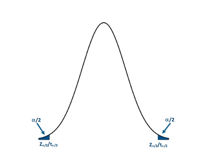 Visual of the two-sided test.Credit: J. Roman
- Compute the test statistics and calculate confidence interval
Now we can calculate the test statistic along with the confidence interval for the mean of the dataset. I will use the function 'z.test' in R to compute my Z-test. Here is the code to compute the Z-score:Show me the code...You will notice that I've assigned 'alternative' to "two.sided", so the function performs a two sided test. I set the confidence level to 0.99. This means that my confidence interval for the mean summer temperature will be at the 99% level. The P-value for the London test is 2.2e-16 and the Z-score is -19.978. The confidence interval is (22.36067°C, 22.73512°C). For Scotland, the P-value is 2.2e-16 and the Z-score is -27.712. The confidence interval is (18.27994°C, 18.57251°C). - Make decision about rejecting null hypothesis and interpret results
Remember our decision rule to reject the null hypothesis:
For both London and Scotland, our P-values and Z-scores are less than the critical values, so we can confidently reject the null hypothesis in favor of the alternative hypothesis. This means that the BBQ temperature threshold does not equal the summer time mean temperature observed in each city with a 1% probability of a type I error. We are 99% confident that the mean summer temperature is within the range of 22.36°C and 22.74°C for London and 18.28°C and 18.57°C for Scotland, about 2°C less than the BBQ temperature threshold values. This hints that the temperature threshold for BBQ sales is warmer than the average summer temperature, and has a smaller probability of occurring. There are fewer chances for BBQ retailers to utilize this relationship and maximize potential profits through marketing schemes.
T-Statistic One Tailed
The technological world we live in allows us to instantaneously ‘Google’ something we don't know. For example, where is a good BBQ place? What’s the best recipe for BBQ chicken? What BBQ sauce should I use for my ribs? Google Trends is an interesting way to gain insight into what is trending. Below is a figure showing the interest in 'BBQ' over time in London based on the number of queries Google received:
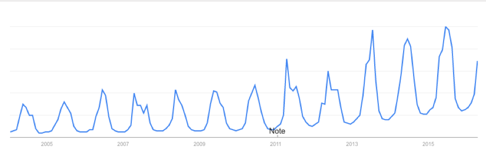
You will notice that the interest varies seasonally, which is expected, and each year there is a peak. June 2015 saw the most queries of the word 'BBQ' in London. I see two possible reasons for the large query in June. The first is that the temperature in June 2015 was relatively warm and the BBQ temperature threshold was met quite often, resulting in a large number of BBQ queries for the month. The second is that the temperature in June 2015 was actually quite cool and the BBQ temperature threshold was rarely met. When it was, more people were interested in getting out and either grilling or getting some BBQ. During a cold stretch, I personally look forward to that warm day. I make sure I’m outside enjoying the rare warm weather. My inclination is that during June 2015 the mean temperature for the month was cooler than the BBQ temperature threshold. So once that threshold was met, a spur of 'BBQ' inquiries occurred.
- State the Question
Was the mean temperature in June of 2015 less than the BBQ temperature threshold?
To answer this question, I'm going to use daily temperatures from June 1st 2015-June 30th 2015 for London and Scotland. First, we have to extract the temperatures for this time period. Use the code below:
Show me the code... - Select the null and alternative hypothesis
Since my data is parametric, I will state my hypothesis with respect to the mean (μ) instead of the median (η). The instinct is that the mean temperature in June 2015 was cooler than the BBQ temperature threshold. The null hypothesis will be stated as the opposite of my instinct: that is, that the mean temperature in June was warmer than the BBQ temperature threshold. This is a lower one-tailed test. We will assume that the mean temperature is greater than the threshold, so we will test if the mean temperature lies in the region below or less than the BBQ temperature threshold. If it does, then we reject the null hypothesis and accept the alternative hypothesis which is: - Check basic assumptions
Again, we know that temperature is normally distributed and the data is independent and random, so we can continue with the hypothesis testing. - Identify the test statistic
Since the data is normally distributed, we can use a Z-test or a t-test. The dataset has been sub-sampled, however, and the number of samples is no more than 30. We must use the lower one-tailed t-test. - Specify the level of significance
Since we have a smaller dataset, I'm going to set the significance level (α) to 0.05. I still want to minimize the potential of type I errors but, because of the small sample size, I will loosen the constraint on type I errors. - State the decision rules
I'm only going to use the P-value approach for this example. Let's visualize the lower one-sided rejection region:If the P-value is less than 0.05 (α), we will reject the null hypothesis in favor of the alternative: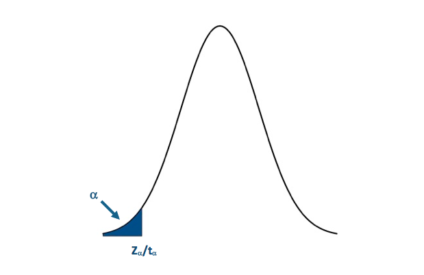 Visual of the lower one-sided test.Credit: J. Roman
- Compute the test statistics and calculate confidence interval
Now we can calculate the test statistic along with the confidence interval for mean temperature in June 2015. I will use the function 't.test' in R to compute my t-test. The code is supplied for London. Fill in the missing parts for Scotland: You will notice that I've assigned 'alternative' to "less" so the function performs a lower one-tailed test. I set the confidence level to 0.95. This means that my confidence interval will be at the 95% level. The P-value for the London test is 0.002735. The confidence interval is (-Inf, 23.19994ºC). Remember that for one-tailed tests, we only create an upper or lower bound for the interval (depending on the type of test). For Scotland, the P-value is 0.0001958. The confidence interval is (-Inf,18.53317ºC). - Make decision about rejecting null hypothesis and interpret results
Remember our decision rule to reject the null hypothesis was:
For both London and Scotland, our P-value is less than the critical P-value so we can confidently reject the null hypothesis in favor of the alternative hypothesis. The population mean for June temperatures in 2015 was less than the BBQ temperature threshold in each location with a 5% probability of a type I error.
Nonparametric Examples of One Sample Testing
Prioritize...
At the end of this section, you should feel confident enough to create and perform your own nonparametric hypothesis test.
Read...
In this section, you will find two examples of hypothesis testing using the nonparametric test statistics we discussed previously. Again, I suggest that you work through these problems as you read along. The examples will use the temperature dataset for London and Scotland. Each example will work off of the previous example and the complexity of the problem will increase. For each example, I will again pose a question and then work through the procedure discussed previously step by step. You should be able to easily follow along.
- State the question.
- Select the null and alternative hypothesis.
- Check basic assumptions.
- Identify the test statistic.
- Specify the level of significance.
- State the decision rules.
- Compute the test statistics and calculate confidence interval.
- Make decision about rejecting null hypothesis and interpret results.
Wilcoxon One Tailed
Ads are not only displayed in the newspaper anymore; they are seen online, through apps on your phone or tablet, and can be constantly updated or changed. Although new platforms for advertising may seem beneficial, the timing of an ad is everything. Check out this marketing strategy by Pantene:
Depending on the weather conditions, an ad will appear that promotes a specific type of shampoo/conditioner that will counteract those conditions. The ad is time and location dependent; only displaying at the most advantageous time for a particular location.
From a marketing perspective, it would be advantageous to display ads for BBQ when people are most interested in BBQ. Since BBQ sales triple when the temperature reaches a particular threshold, we can use that information as a guideline for choosing the optimal advertising time. We should also take advantage of the time when people are querying for BBQ; online advertisement is a great way to market to thousands of people. So, how does the inquiry of BBQ relate to the BBQ temperature threshold? We can determine which week in a given year London and Scotland are most likely to observe temperatures above the BBQ temperature thresholds. But do the inquiries on BBQ peak during the same week?
- State the question
Does the peak week in BBQ inquiries coincide with the week in which the BBQ temperature threshold is most likely to occur?
To answer this question, I'm going to extract every date in which the temperature exceeded the BBQ temperature threshold for London and Scotland. Instead of working with day/month/year, I will work with ‘weeks'. That is what week (1-52) can we expect the temperature to exceed the BBQ threshold. Use the code below to extract out the dates and transform them into weeks:
Show me the code...The variable ScotlandBBQWeeks and LondonBBQWeeks represents every instance from 1980-2015 in which the temperature reached or was above the required BBQ threshold in the form of weeks (1-52). The range is between week 13 and week 42.
- Select the null and alternative hypothesis
Since I'm conducting a nonparametric test, I will state my hypothesis with respect to the median (η) instead of the mean (μ). My instinct is that the most likely week in which the temperature will be above the BBQ temperature threshold occurs after the week of peak BBQ inquiries. The peak week of BBQ inquiries through Google trends is week 22 for both London and Scotland. This was computed by calculating the median peak week based on the 12 years of Google trend data available. The null hypothesis will be stated as the opposite.
This is an upper one-tailed test. We will assume that the BBQ temperature threshold week is before the peak inquiry week, so we will test if the BBQ temperature threshold week lies in the region above the inquiry week. If it does, then we reject the null hypothesis, and accept the alternative hypothesis, which is: - Check basic assumptions
Now temperature is normally distributed, but I'm not examining temperature in this case. I'm looking at weeks. Look at the histograms for the ScotlandBBQWeeks and the LondonBBQWeeks:I'm not going to assume that it does not fit any particular distribution. That is, I'm going to conduct a nonparametric test.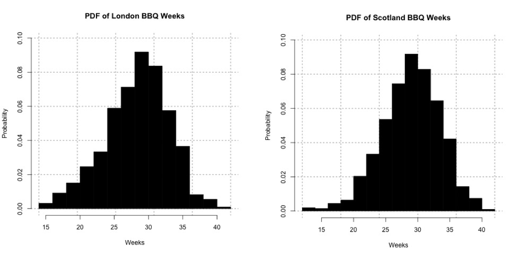 Probability density histogram of weeks in which the temperature is greater than or equal to 24oC for London (left) and 20oC Scotland (right).Credit: J. Roman
 - Identify the test statistic
We are using a nonparametric test static. The data appears somewhat symmetric so I will use the Wilcoxon test statistic. - Specify the level of significance
Since we have a fairly large sampling (more than 100 samples), I'm going to set the significance level (α) to 0.01. - State the decision rules
I'm only going to use the P-value approach for this example. Let's visualize the upper one-tailed rejection region:If the P-value is less than 0.01 (α) we will reject the null hypothesis in favor of the alternative.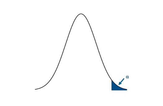 Visual of the upper one-sided test.Credit: J. Roman
- Compute the test statistics and calculate confidence interval
Now we can calculate the test statistic along with the confidence interval for the median week in which the temperature exceeds the BBQ temperature threshold. I will use the function ‘wilcox.test' in R to compute my nonparametric test statistic. Here is the code for London, fill in the missing parts for Scotland: You will notice that I've assigned 'alternative' to "greater" so the function performs an upper one-tailed test. I also had to use the command 'as.numeric'; this translates the strings in the variable “Scotland/LondonBBQWeeks” into integers. I set the confidence level to 0.99. This means that my confidence interval will be at the 99% level. The P-value for the London test is 2.2e-16. The confidence interval is (28.99999th week Inf). Remember that for one-tailed tests, we only create an upper or lower bound for the interval (depending on the type of test). For Scotland, the P-value is 2.2e-16. The confidence interval is (29.49995th week, Inf). - Make decision about rejecting null hypothesis and interpret results
Remember our decision rule to reject the null hypothesis:
For both London and Scotland, our P-value is less than the critical P-value, so we confidently reject the null hypothesis in favor of the alternative hypothesis. The week in which the temperature is most likely to exceed the BBQ threshold is after the week of peak Google inquiries, with a 1% chance of having a type I error. We are 99% confident that the week for exceeding the BBQ temperature threshold is at least the 29th week for London and the 30th week for Scotland, more than 6 weeks after the peak inquiry week. This result suggests that people are inquiring way before they are most likely to observe a temperature above the BBQ threshold. Remember that the BBQ temperature threshold is the temperature in which BBQ sales triple. So why is there this disconnect? Maybe people are relying on a forecast? But a 6-week forecast is generally not reliable. Or maybe the inquiry actually occurs when we first reach the BBQ temperature threshold; after that initial event and inquiry we know everything about BBQ so we don't need to Google it again.
Sign Test Two Tailed
A natural follow-on question would be: does the peak inquiry week coincide with the first week in which we observe temperatures above the BBQ temperature threshold? This would be an optimal time to advertise for BBQ products online.
- State the question
Does the peak week in BBQ inquiries coincide with the first week in which the temperature exceeds the BBQ threshold?
To answer this question, I'm going to extract the first week each year in which the temperature exceeds the BBQ threshold for London and Scotland. Use the code below to extract out the dates and transform the dates into weeks:
Show me the code... - Select the null and alternative hypothesis
Since my data is nonparametric, I will state my hypothesis with respect to the median (η) instead of the mean (μ). The null hypothesis will be that the peak week of inquiries coincides exactly with the typical first week of temperatures exceeding the BBQ threshold: This is a two tailed test. We will assume that the first week coincides with the peak inquiry week, so we will test if the first week lies above or below the inquiry week. If it does, then we reject the null hypothesis, and accept the alternative hypothesis which is: - Check basic assumptions
Again, I will be examining ‘weeks' instead of temperature. Look at the histograms for the FirstScotlandBBQWeek and the FirstLondonBBQWeek, which is the week in which we first observe temperatures above the BBQ temperature threshold:The data for Scotland definitely does not fit a parametric distribution, so I will continue on with the nonparametric process.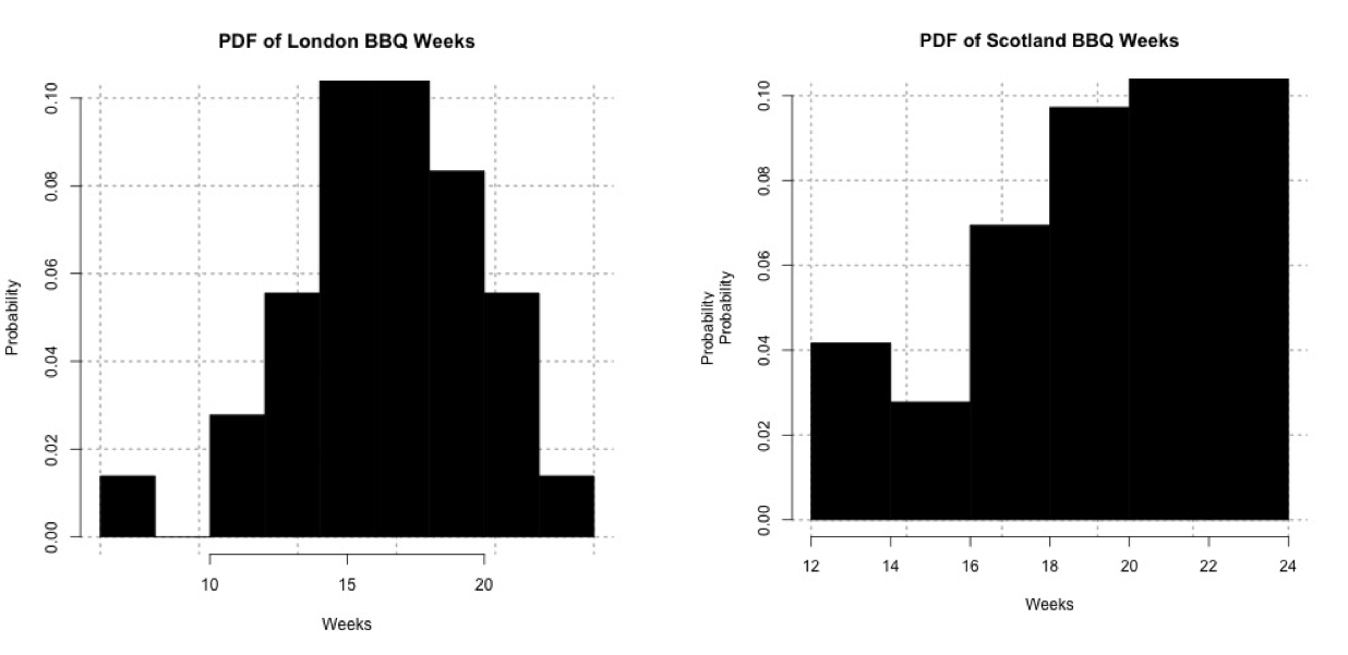 Probability histogram of the first week in which the temperature exceeds 24oC for London (left) and 20oC for Scotland (right).Credit: J. Roman
 - Identify the test statistic
Since the data is nonparametric we need to use a nonparametric test statistic. The data doesn't appear very symmetric, especially for Scotland, so I will use the Sign test. - Specify the level of significance
We have one week for each year, so that's 36 samples total. This is fairly small, so I will loosen the constraint on the level of significance. I'm going to set the significance level (α) to 0.05. - State the decision rules
I'm only going to use the P-value approach for this example. Let's visualize the two-tailed rejection region:If the P-value is less than 0.025 (α/2), we will reject the null hypothesis in favor of the alternative.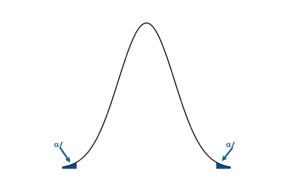 Visual of the two-sided test.Credit: J. Roman
- Compute the test statistics and calculate confidence interval
Now we can calculate the test statistic along with the confidence interval for the range in which we expect to first observe the temperature exceeding the BBQ threshold. I will use the function 'SIGN.test' in R to compute my nonparametric test statistic. Here is the code:Show me the code...You will notice that I've assigned 'alternative' to "two.sided" so the function performs a two-sided test. I also have to use the command 'as.numeric'; this translates the strings into integers. I set the confidence level to 0.95. This means that my confidence interval will be at the 95% level. The P-value for the London test is 4.075e-09. The confidence interval is (16th week, 18th week). For Scotland, the P-value is 0.02431. The confidence interval is (19th week, 21.4185st week). - Make decision about rejecting null hypothesis and interpret results
Remember our decision rule to reject the null hypothesis:For London and Scotland, our P-value is less than the critical P-value. We can confidently reject the null hypothesis in favor of the alternative hypothesis. The first week in which we exceed the temperature threshold for BBQ sales does not coincide with the week of peak inquiries, with a 5% chance of creating a type I error. For London, the first week in which we exceed the temperature threshold is most likely to occur between the 16th week and the 18th week, with a 95% confidence level. For Scotland, the first week in which we are most likely to exceed the temperature threshold occurs between the 19th and 21st week, at a 95% confidence level. In terms of supply and demand for a retailer, a store might consider increasing their BBQ supplies during these weeks. In terms of marketing, for London, the peak inquiry occurs more than a month after the first occurrence of temperature above the BBQ threshold, while for Scotland it is less than a week; highlighting the need for advertising that is both time and location relevant. In-store ads would potentially be more successful coinciding when the temperature exceeds the BBQ threshold and customers are known to buy more products. If, however, you want to catch the BBQ inquiry at its peak, you might display online ads a week (3 weeks) after the first occurrence of temperature exceeding the BBQ threshold in Scotland (London) to get a better impact online and possibly invoke a second wave of BBQ sales.