16. Mapping Rates and Densities
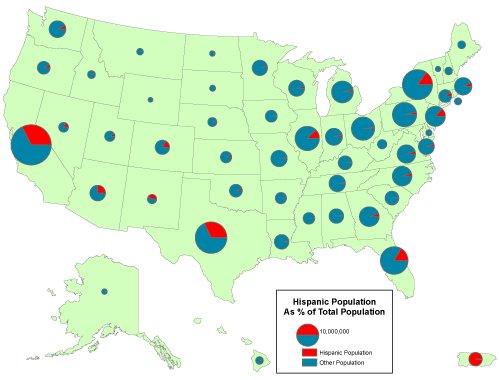
A rate is a proportion between two counts, such as Hispanic population as a percentage of total population. One way to display the proportional relationship between two counts is with what ArcMap calls its Pie Chart option. Like the Proportional Symbol map, the Pie Chart map plots a single symbol at the centroid of each geographic area by default, though users can opt to place pie symbols such that they won't overlap each other (This option can result in symbols being placed far away from the centroid of a geographic area.) Each pie symbol varies in size in proportion to the data value it represents. In addition, however, the Pie Chart symbol is divided into pieces that represent proportions of a whole.

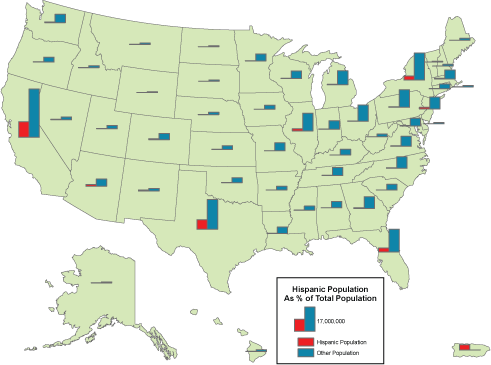
Some perceptual experiments have suggested that human beings are more adept at judging the relative lengths of bars than they are at estimating the relative sizes of pie pieces (although it helps to have the bars aligned along a common horizontal base line). You can judge for yourself by comparing the effect of ArcMap's Bar/Column Chart option.

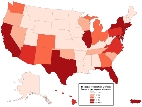
Like rates, densities are produced by dividing one count by another, but the divisor of a density is the magnitude of a geographic area. Both rates and densities hold true for entire areas, but not for any particular point location. For this reason, it is conventional not to use point symbols to symbolize rate and density data on thematic maps. Instead, cartography textbooks recommend a technique that ArcMap calls "Graduated Colors." Maps produced by this method, properly called choropleth maps, fill geographic areas with colors that represent attribute data values.

Because our ability to discriminate among colors is limited, attribute data values at the ratio or interval level are usually sorted into four to eight ordinal level categories. ArcMap calls these categories classes. Users can adjust the number of classes, the class break values that separate the classes, and the colors used to symbolize the classes. Users may choose a group of predefined colors, known as a color ramp, or they may specify their own custom colors. Color ramps are sequences of colors that vary from light to dark, where the darkest color is used to represent the highest value range. Most textbook cartographers would approve of this, since they have long argued that it is the lightness and darkness of colors, not different color hues, that most logically represent quantitative data.
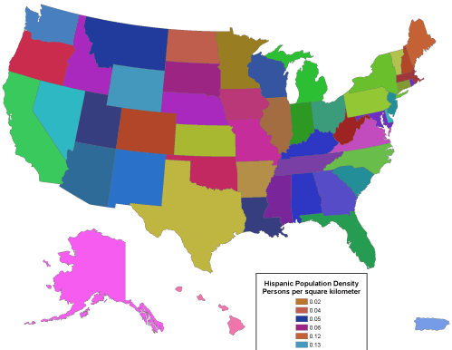
Logically or not, people prefer colorful maps. For this reason some might be tempted to choose ArcMap's Unique Values option to map rates, densities, or even counts. This option assigns a unique color to each data value. Colors vary in hue as well as lightness. This symbolization strategy is designed for use with a small number of nominal level data categories. As illustrated in the map below (Figure 3.17.4), the use of an unlimited set of color hues to symbolize unique data values leads to a confusing thematic map.

