Lesson 1: The Geospatial Revolution
Lesson 1, Lecture 1
Please watch the Lesson 1, Lecture 1 video (5:38):
The Geospatial Revolution

I think the Geospatial Revolution involves major transformations in the way we do these things:
- How we navigate
- How we make decisions
- How we share stories
What’s unique here is that concepts of space and technologies designed to leverage location information have made huge advances in all three of these areas possible. The past decade alone has seen a complete paradigm shift in how normal people are able to use and think about Geography. It’s not just geeks like me with fancy software and high-tech expensive gear who can make and use maps anymore. And maps aren’t just for naming places or placing pins on the nearest Waffle House, although that’s pretty important too.
How We Navigate
So are we really experiencing a Geospatial Revolution? Let’s use my daughter as an example. Claire was born in 2012. When she arrived, it had already become commonplace for many people to have interactive maps accessible through computers and handheld devices at relatively low cost. In her world, nobody needs to learn how to use a paper road atlas to find their way to Grandma’s house. Instead, directions to and from almost anywhere can be had for free in an instant using easy-to-manipulate tools like Google Maps and MapQuest.
So that’s one way in which personal navigation has been completely transformed. In contrast to Claire, when I was born, it was really important to plan ahead about where you were going (using paper maps, which you had to buy or borrow) or you had to be prepared to take longer, rambling journeys that relied on dead reckoning alone. I still have fond memories of working as the navigator on our family car trips to the beach in South Carolina, spending hours poring over a big paper road atlas that showed only a couple of map scales. When we hit a lot of traffic, I might have to help find an alternate route. Today, we still need to intervene from time to time to find a new way to get somewhere, but it’s as simple as dragging the route around on the map, or telling the GPS to give us another option.
For Claire, by the time she’s ready to drive, I suspect it’s likely that making those alternate route decisions will also be a thing of the past. Our cars will simply know the best way to go given current weather and traffic conditions, and take us there with minimal intervention. We’ll all be a little dumber because we won’t even remember how to navigate the old way. I will be stumbling around an old folks home, dragging a shopping cart behind me filled with dog-eared paper atlases while loudly decrying the downfall of civilization.
Making Decisions
The Geospatial Revolution is much more than just a transformation in how we go from Point A to Point B, however. It’s also about making decisions and analyzing problems using Geography. Let’s consider the age-old problem of deciding where to eat dinner tonight. We’ll assume that we’ve already looked through the cabinets and decided that nothing good was there for us to make, so we’ll need to take a trip. My wife and I are pretty bad at reaching a decision about such matters, and thankfully we can rely on geospatially-enabled stuff to help us reach consensus. Today, we can just fire up Yelp [1] from a phone and ask it to find the nearest restaurant that serves amazing Sushi and also happens to be open on a Monday night. That question can be answered in just a few seconds now, and if we haven’t been there before, we can tap on a little button to tell us how to get from where we’re standing to our reserved table. It won’t help us sort out the personal conflict that arises when I want a sub and she wants tacos, however. That’s what we need Facebook and Twitter for—to gripe about mundane crap and hear what other people think about our mundane crap. But I digress.
Figuring out where to eat is a pretty simple decision for me to describe. What about making decisions like where to locate the next shopping mall in your home town? How about forecasting the potential for a city to be impacted by natural disasters? What about protecting endangered species? Each of these problems requires one to use and make sense of Geography in various ways. What’s exciting is that the Geospatial Revolution has brought about new sources of data and amazing interactive tools that are capable of helping us make those decisions. In each of the five lab assignments you’ll complete in this course, you’ll gain experience evaluating Geographic problems like these and you’ll see how powerful (and how complicated) geospatial analysis can be. You’ll also lose weight, feel happy about yourself, and maximize your earning potential!
Sharing Stories
In less practical, but more engaging terms, we’re also able to use Geography now to share our personal stories in much richer ways. I’m a big photo nerd (and map nerd, and airplane nerd, and… basically just a many-faceted nerd) and even if you’ve barely been paying attention for the past 10 years, you’ve no doubt seen photo sharing sites like Flickr and Picasa. Both services allow you to easily Geotag your photos. Geotagging is a form of geocoding, which is the term used to describe the assignment of location information to a data record. After you upload your pictures to Flickr, you can say where they were taken by either assigning place information manually (“tagging” a photo of the Eiffel Tower by saying it was taken in Paris) or by uploading coordinates that were captured by a GPS device that you used to track your movements (so you can be much more specific about the exact spot on the earth where the photo was taken). I bought a new camera recently (a Canon 6D [2]) that has a built-in GPS tracker to assign coordinates to every photo automatically. As I travel, I’m actually making maps. Awesome.
It’s this kind of revolution that allows us to tell stories using Geography much more easily than ever before. In 1999 if I wanted to make a map that showed all of the places where I stood and took pictures on the epic 5-week trip I took across Bolivia, Peru, and Ecuador, I would have had to buy and carry with me a heavy, cumbersome Global Positioning System (GPS) receiver and develop my own workflow for scanning my photos from film and digitizing everything into Esri’s ArcView 3.0 Geographic Information System [3] (GIS) software. While it was possible, it would have been incredibly difficult to pull off, and it was certainly the type of thing that was well out of reach of most normal people who just want to document their cool travel experiences. If we went back another ten years to 1989, even that clumsy process would have been impossible to imagine unless you happened to also run a huge spy agency.
Today, however, I could actually go back and scan those photos, and just drag them onto the map in Flickr (assuming I remember where I took the pictures… but just play along with me). I’ve shown that process here using the current Flickr interface and a picture of my daughter crying which I thought really needed to be on my personal map [4].

Lesson 1, Lecture 2
The Changing Nature of Place
It may seem like the basic attachment of location information to anything and everything reveals a relatively stable future for Geography and Geospatial technology. All we have to do is Geotag everything and we’re done with this Geospatial Revolution thing, right? I don’t think it’s that simple, because the enormous potential of location-enabled everything faces similarly huge barriers for people who want to make sense of interconnected and massive spatial data sources. Moreover, the super-simple common format for a location—one set of coordinates on the Earth—completely fails to describe the richness of Geography.
For starters, it’s often impossible to assign a single relevant location to an observation. Let’s even take something as constrained as a Tweet as an example. You only have 140 characters on Twitter to tell your story, so not much can happen here with locations, right? Wrong. There are multiple relevant locations with any Tweet. Where is the Twitter user from? Where were they when they Tweeted their message? What about the message itself? Does it contain references (explicit or implicit) to locations? We’ve done some research [5] on this area at Penn State and found that many Tweets contain references to many different locations. So how do we show that on a map? Which ones are the most important or explanatory? Like most complex analytical problems, the answer may depend a lot on what you’re trying to learn from that information. Let’s say you’re working for a crisis management organization and you want to monitor what’s happening on Twitter to identify emerging concerns in the wake of a major disaster. What types of locations would you want to see? Could you use location information to establish a basis for comparing the credibility of a particular report? How would you show millions of these reports on maps that could be used by a normal human being who isn’t just studying this stuff after the fact?

In the more benign example here, which places are relevant to this important discussion on where to find a delicious Cinnabon cinnamon roll? The United Kingdom, Los Angeles, Chicago, and Austin are all mentioned here explicitly. But what about the hometowns for each of these folks, or the place where Cinnabon is headquartered (Yumtown at the corner of Godhelpme Ave. and Gimmeicing Lane)?
While we’re at it, let’s talk about defining locations more broadly as well. Until now I’ve emphasized a single point in space as a location. Geographic locations can include well-defined formal regions like states and counties, natural areas like watersheds and mountain ranges that can sometimes be formally defined by their observable features, and ill-defined cultural regions like neighborhoods. I live in a place informally known as Happy Valley. It’s not just the city of State College or its surrounding townships and boroughs. It includes space outside of those formal areas, and it cannot be defined precisely despite the fact that it clearly corresponds to a place on Earth. We still have a lot to learn about how to collect people’s conceptions of these sorts of places and use them on maps. The example here by Andy Woodruff [6] and Tim Wallace [7]at Bostonography.com [8] shows how people in Boston conceive of their city’s neighborhoods. It’s pretty blobby and imprecise, and parts of the map are empty. This is a much more faithful representation of what we can actually know about these types of places than the neat and tidy borders we can define for legal boundaries.

What is Geography?
Geography is the science of place and space [9]. It involves the study of spatial (all stuff exists somewhere in space) phenomena of all kinds. I’m pleased to say it’s much more than just naming places on maps. I fly a lot, which means I often have to explain to someone sitting next to me that I’m a Geographer. This prompts one of several typical responses:
- Oh cool, I have a cousin who’s a Geologist!
- Haven’t all of the maps already been made?
- Oh neat, I have no idea what that is!
- Wow, that is so sad!*
*full disclosure, this didn’t happen to me but it did happen to a map nerd friend of mine who said what she did for a living to a guy hitting on her at a bar. It prompted this response.
When I talk about Geospatial stuff in this course, I’m referring to information and technology that has location as one of its key components. So Geography is the science of understanding places and spaces, while Geospatial refers to the data and technologies that allow one to explore Geographic problems. Geospatial is always a modifying term – so I’ll talk about Geospatial information, or geospatial systems, or geospatial bacon, never just “Geospatial” all on its own. This is somewhat simplified, and Geographers are infamous for having almost no ability to reach consensus on how we define ourselves or what we do, but I’ve given it my best shot here.
Maps To Tell Stories, Maps To Provide Context
There are two major categories of maps. Thematic maps are used to showcase geographic data observations. Thematic maps are almost always associated with storytelling of one kind or another. For example, let’s assume I have a dataset showing the proportion of U.S. citizens who are currently talking about something inane on their cellphones. This hypothetical data might be collected at the county-level, and I’d want to tell a story with my map about which places in the U.S. have the most insipid talkers. The pattern of those observations by county would allow map readers to understand the geographic distribution of those folks, and begin to formulate hypotheses about their causes (places with lots of teenagers, middle-aged men roaming airports, etc…).
Or you could have a much more serious example, like the one shown below. This map shows the proportion of households in the Lower 48 United States that are headed by women.

Now you’re probably wondering about the kind of maps you thought I’d start with here. Reference maps (also frequently called basemaps) provide the basic Geographic context required to situate other stuff. A good example here would be a Web Map [10] that shows roads, physical, and cultural features. Reference maps are used all the time these days as the backdrops upon which we plop all sorts of digitally-rendered map pins [11]. If you fire up Yelp and search for a nearby place to buy a very large bag of delicious Nacho Cheese Combos at 4AM, you’ll see a bunch of these pins appear on top of a basic, multi-purpose reference map. Designing these map canvases is really hard. To give you a tiny flavor of the challenges here, check out how many named geographic features exist for just one county [12] (select "Pennsylvania" from the state dropdown and type "Centre" into the county field). You should end up with 1177 named features. Now, poke around with the web map example here [13] and pay close attention to which features exist, what they are named, and how they are drawn at different scales. Try zooming in to the area around Grand Canyon in Arizona and see how the labeling and symbols change as you change scales. Computers can’t do this stuff automatically (er… at least not without a lot of human intervention), so there is a huge amount of work that goes into designing these now taken-for-granted reference sources.
The Earth Is Round And Maps Are Flat
That’s really all you need to know, but I guess I need to explain a bit more, huh?
To identify a location for anything, we need to set up a reference system. The one we use most commonly is the geographic coordinate system of Latitude and Longitude. Think of it as an addressing system for the entire planet. It’s really just a grid system, with standard lines of Latitude providing North/South parallels and standard lines of Longitude providing East/West meridians. Latitude varies from +/- 90 degrees from the Equator, and Longitude varies from +/- 180 degrees from the Prime Meridian, which runs through the Royal Observatory in Greenwich, England [14].

Latitude and Longitude coordinates are expressed in either decimal degrees or in degrees, minutes, and seconds. Both methods are useful for different tasks, but it’s a bit beyond the scope of this class and I don’t want you to fall asleep so early in the course.
This is all well and good, but a major problem we have to deal with here is that the Earth is spherical (erm, it’s an imperfect one, so it’s actually an ellipsoid) and we need ways to take stuff off this 3D object and present it in 2D on paper or on screen (since carrying a globe around is pretty annoying). For an illustration on exactly why this is a problem at all, get yourself an orange, draw crude versions of the continents on it, and then try to peel the orange without distorting or tearing the map at all. Don’t do this on top of your iPad or while you’re supposed to be paying attention on a conference call. You’ll notice that it’s very hard to do anything that doesn’t totally ruin the map, and the best you can approximate is something like the image shown here (if you’re really good). Nathan Belz [15] tells a neat little story [16] about what he did to create this example.

This is all a lead-up to tell you that in order to make maps, we have to flatten the Earth using math. The act of making transformations to translate points on a sphere (Lat/Long) to points on a 2-dimensional plane (a map) is called Map Projection. Because math is fancy witchcraft concocted by devious wizards, there are hundreds and hundreds of possible mathematical transformations from the Earth to a map in the form of named Projections. The one you see above is called the Goode Homolosine. I’m personally partial to the Robinson Projection [17], although I unfortunately had nothing to do with its creation.
What you really need to know is that Projections allow you to preserve some, but never all of the basic characteristics of Geographic relationships. Specifically, you can preserve direction, shape, area, distance, or the shortest route between locations. Alternatively, you can choose to preserve none of these attributes and instead focus on a compromise across them (as is done with the Robinson projection and many other World Map projections).
Video Activity
Now that I’ve set things in motion a little, I want you to watch Episode 1 of the Geospatial Revolution video series [18] produced by WPSU at Penn State [19]. This video is 13 minutes long, so it’s a fair bit longer than most of the other videos you’ll watch in this class. I’ll do everything possible to keep the remaining videos short and snappy – but this one is really compelling and has cool dramatic music so I think you’ll be able to hang in there without snoozing.
Mapping Assignment
Introduction
This week, you learned that geography is the science of understanding places and spaces. You also learned that one of the ways people have sought to understand places and spaces is through maps. As you are discovering, part of what the geospatial revolution means is the advent of geospatial technology. Geospatial technology helps us create content that can be changed. In this lab, you will have the opportunity to get started with web mapping.
You probably already use cloud-based technologies when you use Google Drive, Facebook, Flickr, or Dropbox, for example. Web mapping is GIS in the cloud. Web mapping includes spatial data in the form of maps, databases, map services, and satellite images, and it also contains tools and functions such as the ability to measure things and to do spatial analysis.
Not all digital maps are dynamic; millions of maps exist in presentations, PDFs, and as static images like the ones I’ve made for this class. But unlike static digital maps, dynamic digital maps can show real-time things like weather, floods, or traffic. Layers of information can be added or subtracted from them so that you can change the map design yourself at will. The scale, colors, symbols, and the way their data is classified can all be changed. They can be embedded into live web pages, changed from 2D to 3D, and formatted for a smartphone. Therefore, they move beyond being simply reference documents (“Where is Uzbekistan? OK, great! Next?”) to being tools of geographic inquiry, used to understand spatial and temporal patterns in order to solve problems.
To give you hands-on experience making your own maps and doing spatial analysis, we’ll be using Esri’s (cloud-based GIS called ArcGIS Online [20]). Joseph Kerski works for Esri’s Education Team and has done a ton of great work to develop these labs for you. ArcGIS Online does many of the things a desktop GIS system can do, but it has a much easier learning curve, can be used right in your web browser, and makes it really easy to share interactive maps you make with others. Esri paid me zero dollars to say that and use this stuff in this MOOC and they have been enormously helpful to make sure that you can do awesome stuff in this class using their software.
In addition to tools made by companies like Esri, there is a flourishing community of free and open-source software for doing all things geospatial (see osgeo.org [21] for an overview and live.osgeo.org/ [22] for tools). For the final assignment in this course you’ll have the opportunity to explore an open-source options (like CartoDB [23], for example) or use ArcGIS Online.
Investigating Global Population and Ecoregions
Have you heard about “big data?" Since they seek to understand the whole world and everything in it, geographers were into big data way before the term existed. With the explosion of datasets of all types, geospatial data abounds as well, at scales from local to global, and across themes ranging from natural hazards, to energy, to water, and geology. For example, in terms of population, not only can you obtain the locations of cities, but the size of those cities, and not only total population counts, but also population density, how population is changing, and characteristics of the population such as age, ethnicity, income, education, life expectancy, and other variables. You can examine the relationship of population to other phenomena, represented as map layers. In this lab, you will examine the relationship of where people have settled to the physical environment. You will also determine how population impacts the physical environment in which it exists.
Before you start using the tools, try to answer the following questions as best you can. You don't need to submit your answers, but you may want to write them down someplace.
- What is an ecoregion? You’ll probably want to fire up your Google to sort this out. That’s what I’d do.
- In what ecoregion do you live?
- What is one factor that influences population density in a given area?
- Describe the population density in the neighborhood in which you work. Make a little note of what you think this is. You’ll need it later in this lab.
Let’s Make a Freaking Map Already
When you’re ready, click here to begin building a map [24]. You may want to open links like these in a new window so that you can switch between the lab instructions and the mapping tools.
This map was built using ArcGIS Online. First, note that you have the map occupying most of the screen (as it should be!). Second, you have a set of map layers on the left. Third, you have tools—some of which are at the top, and some are available through the list of layers on the left.
This map shows Ecoregions, Population Density, and Imagery. To see these, select “Modify Map” in the upper right of the interface, then click Content above the Legend to see the list of available layers.
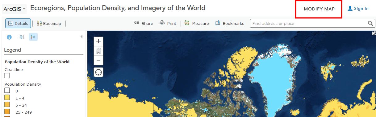
Take some time now to explore the About, Content, and Legend buttons directly above the Legend. Get comfortable with what these buttons do. Zoom using the vertical scale bar at the left side of the map—the middle scroll wheel of your mouse if you have one—or by holding the shift key and drawing a box on the map with your mouse. Bookmarks are another way to zoom in or out (change the map scale).
Now use Bookmarks (just left of the search bar at the top) and select World. Show the map legend. Your map should look like this:
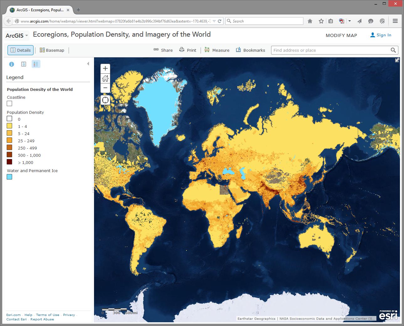
How would you describe the pattern of world population density?
Change the Basemap back and forth from Imagery to Terrain With Labels so that you can refer to country and city names that are part of the Terrain with Labels layer.
- As we will discuss later in this course, knowing where data comes from is, to put it into geographical terms, a Very Big Deal, particularly with maps. To start thinking along these lines, examine the “details” of the population density layer by clicking the right arrow next to the layer and selecting Description.
- Who created this data, and what sources did they use?
Use Bookmarks and select India-Nepal. Toggle between population density and the imagery base map. Try making the population density layer transparent by clicking on the small right arrow next to the layer name, selecting Transparency, and using the slider bar that appears.
- What is one reason you can think of for the difference between the population density in northern India compared to that of Nepal?
- Use the Measure tool and determine the distance between the area of highest population density in India to the area of lowest population density in Nepal. Be sure to note the distance units you are using (miles or kilometers).
- Switch from the Legend view to the Contents view and turn on the Ecoregions layer. Turn the Population layer on and off and note the predominant ecoregions in the most densely settled regions of northern India. Also, explore the relationship between population density and major rivers. How do you think the dense settlement here may have an effect on the ecoregions of this area?
- Describe the ecoregion and the population density in the region in which you live using the map. How does the population density compare with your earlier observation where you were asked to reflect upon the population density of your area without the aid of a map?
Exploring Population Dynamics (That’s A Lot Of Babies)
Let’s take a deeper look now at how population is changing all over the world and explore what might be driving those patterns.
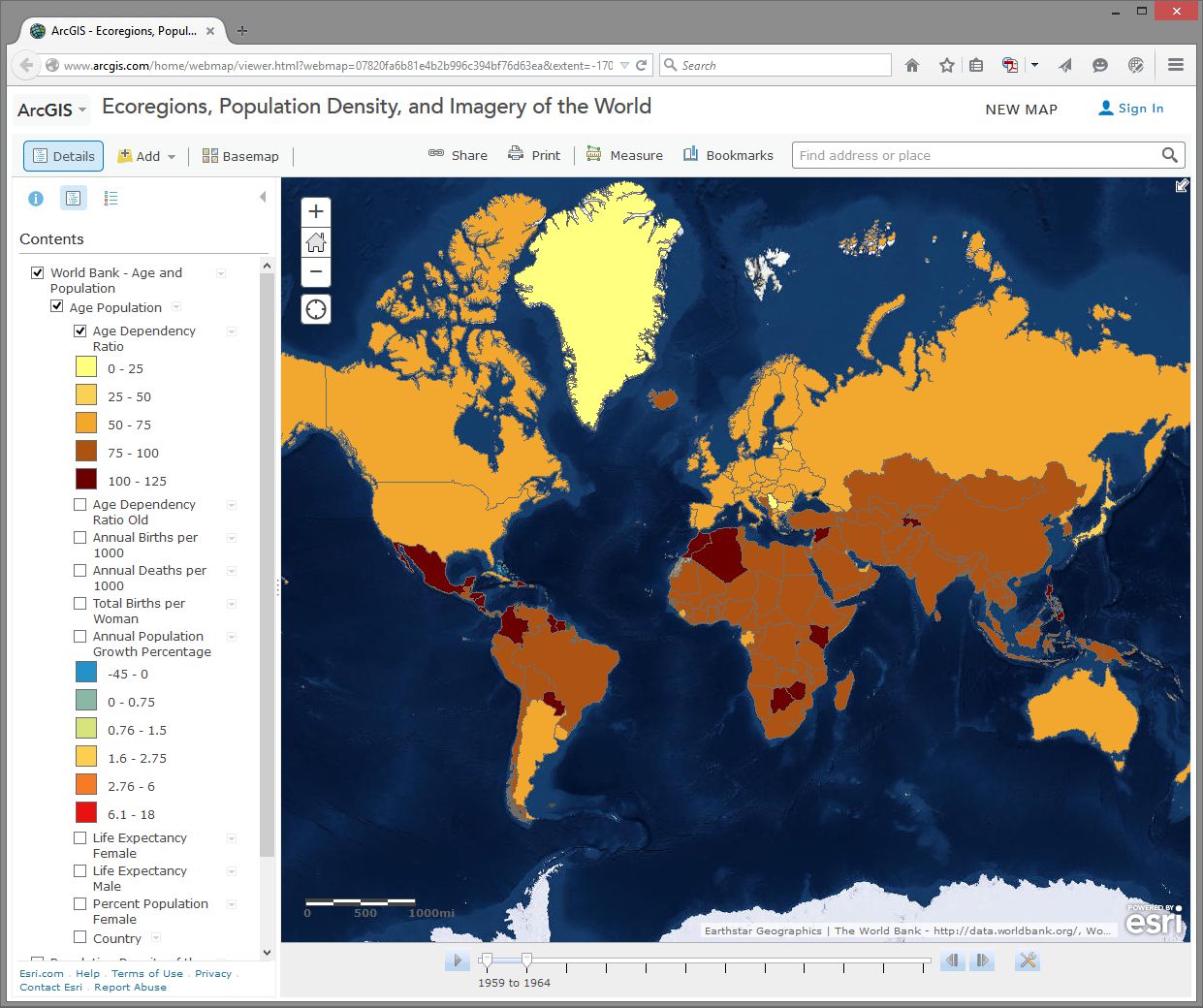
Use the Add button, then Search For Layers and search for: World Bank Age and Population in ArcGIS Online. Select the one authored by “Intl_User_Community.” Then click the big blue Done Adding Layers button at the bottom to add this layer to your map.
First, select the Content button to show the map layers instead of the legend. Then, expand your newly added age and population layer by clicking on its title and then click on Age Population. You will see that this map is actually a set of 10 layers (ideally, every map should be turned up to 11 though). Uncheck any layers in this set of 10 that might already be selected - we want to start with a clean slate.
Next, select the checkbox for the Annual Population Growth Percentage, show the legend by clicking on the layer name, and note how much the growth rate varies around the world. Make sure that no other layers listed before this one are turned on, since those could obscure the layer you want to see. Now turn on Age Dependency Ratio. Age Dependency Ratio [25] is the ratio of dependents (people younger than 15 or older than 64) compared to folks in the working age population (15-64). Click the Age Dependency Ratio layer name to display its legend. Your map should look similar to the one shown here:
Which statement is correct?
- Countries with a higher growth rate typically have a higher age dependency ratio.
- Countries with a higher growth rate typically have a lower age dependency ratio.
Why do you suppose the growth rate and age dependency ratio are related in the way that you've indicated above? The percentage of working age population is also known as the “dependency ratio,” because this number represents how much of the population (young and old) that is dependent upon the working age population.
- What impact do you think a high population growth rate has on a country?
Note that these data sets go back in time—to 1960 in some cases. My parents were born in 1960. Every photograph automatically looked like an Instagram back then. You can use the arrows in the popup boxes to access the different years. You can use the slider bar under the map and the play button to animate the data over time, or slide the marker all the way to the right to 2014 to display the most recent data. So with these maps you can examine not only the spatial dimensions, but also the temporal ones.
Pick a country that interests you and examine the growth percentage and life expectancy in that country over time. If you’re a rockstar student you’ll share something you discovered with your peers in the discussion forums. You can always click on the Share button to get a link to embed in your post.
- Recall your recent reading about map projections. This map uses the Web Mercator projection. How are the areas near the North and South Pole shown on this map?
- How does the projection that this map is using affect your interpretation of what you are studying?
Geodemographics – Having Fun With Stereotypes
The statistics you are examining about population tell only part of the story about the people in those places, of course. People live and behave in ways that might be described with a combination of variables, not all of which are captured on census surveys. One of the ways to measure this aspect of demography is through the creation of a variable that captures a “lifestyle” by neighborhood. It is this variable that marketing folks often use to send you forty catalogs of gourmet food products and coupons for discounted hair transplant surgery (wait - you mean that’s just me?). Marketing folks use this stuff to help determine what is stocked on your local stores’ shelves, what types of cars or bicycles or breakfast sandwiches are sold in your area, what sorts of movies are shown, and a whole lot more.
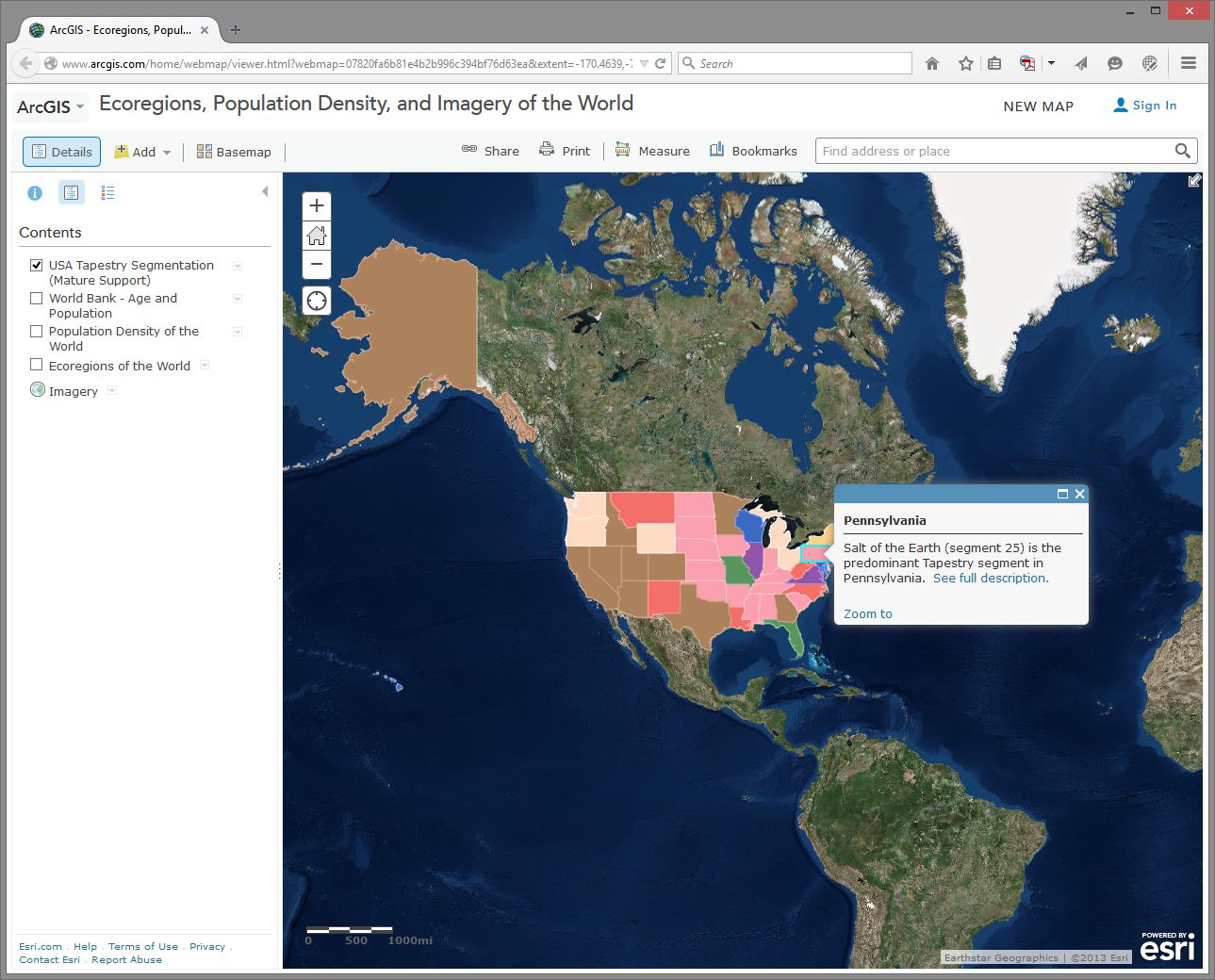
Go to Bookmarks and select the North America bookmark. Turn off all map layers. Then use the Add button and search for the data layer called Tapestry in ArcGIS Online. The “Tapestry segment” is one of these lifestyle variables we have been discussing. Add the USA Tapestry Segmentation (Mature Support) layer to your map (it should be the first result in your search results list). Zoom in and out a couple levels and watch what happens to your map (you should see counties turn into states as you zoom out to show the entire world).
Click on the state you live in (or, if you live outside the USA, pick one that sounds cool). What is the predominant tapestry segment for your state? In the popup box that appears, select See full description to learn more about how that segment is defined. Your map should look something like this:
- What is the tapestry segment of your neighborhood or a neighborhood you are interested in?
- Would you say that the tapestry segment describes you accurately? Does it describe some of your neighbors? Does the segment description make you laugh, or laugh nervously?
- What influence does the map scale have on the data you are analyzing?
Now change the Basemap in the neighborhood you are examining to Imagery and then make the Tapestry layer semi-transparent.
Is there anything on the imagery that gives a clue as to the neighborhood’s lifestyle? What do the structures and streets tell you about this place?
If you have time, feel free to explore additional data layers inside ArcGIS Online. We’ll be using it throughout this course, so if you can become more familiar with it now, it will serve you well later. Add other population data of interest to you, such as median income, median age, and median home value. Do these variables help explain the tapestry segment of your chosen neighborhood and surrounding ones?
Congratulations – You Just Made Some Maps!
Awesome job. You have just been using maps in exciting ways to explore the relationships between the environment and people and to examine components of the population, using a web mapping system. Along the way, you have considered scale, data, the map projection, and other geographic concerns.
Credit Where It's Due
This lab was developed by Joseph Kerski [26] and Anthony Robinson [27].
Discussion Prompts
Privacy and the Geospatial Revolution
Have a look at a map that was created by students who took this class in 2015. [28] This map shows student's self-reported locations and some basic demographic information. It's incredibly interesting and helpful for me as the instructor, because now I have a better sense of all of the amazing places where people were experiencing this course. Some shared what seem to be very specific locations (down to a specific house, for example). Others shared locations that seem to be much more generic. People have always had conceptions of private and public space, but geospatial privacy is more relevant than ever due to the proliferation of ways in which your personal location can be shared.
Here are some prompts you can use to discuss what you've learned in this lesson:
- Why did you feel comfortable sharing what you shared?
- What is scary about potentially losing control over your geospatial privacy?
- What are some positive things that could come from openly sharing your personal location with others?
- What about geospatial privacy has really changed over time? 200 years ago, would it have been possible to live in your current location without your friends and family knowing where you were most of the time?
- Have a look around at what people submitted for answers to the question “How do you use maps?” Are there spatial patterns associated with certain types of answers?