Cluster Analysis
So far, we have discussed two ways of mapping multiple variables—combining visual variables to encode multiple variables into one map, and visually comparing sets of maps of different data. There is a third, considerably different method that is often used for mapping multivariate data sets: cluster analysis. Cluster analysis refers to mathematical methods used to combine multiple quantitative variables into one map (Slocum et al. 2009).
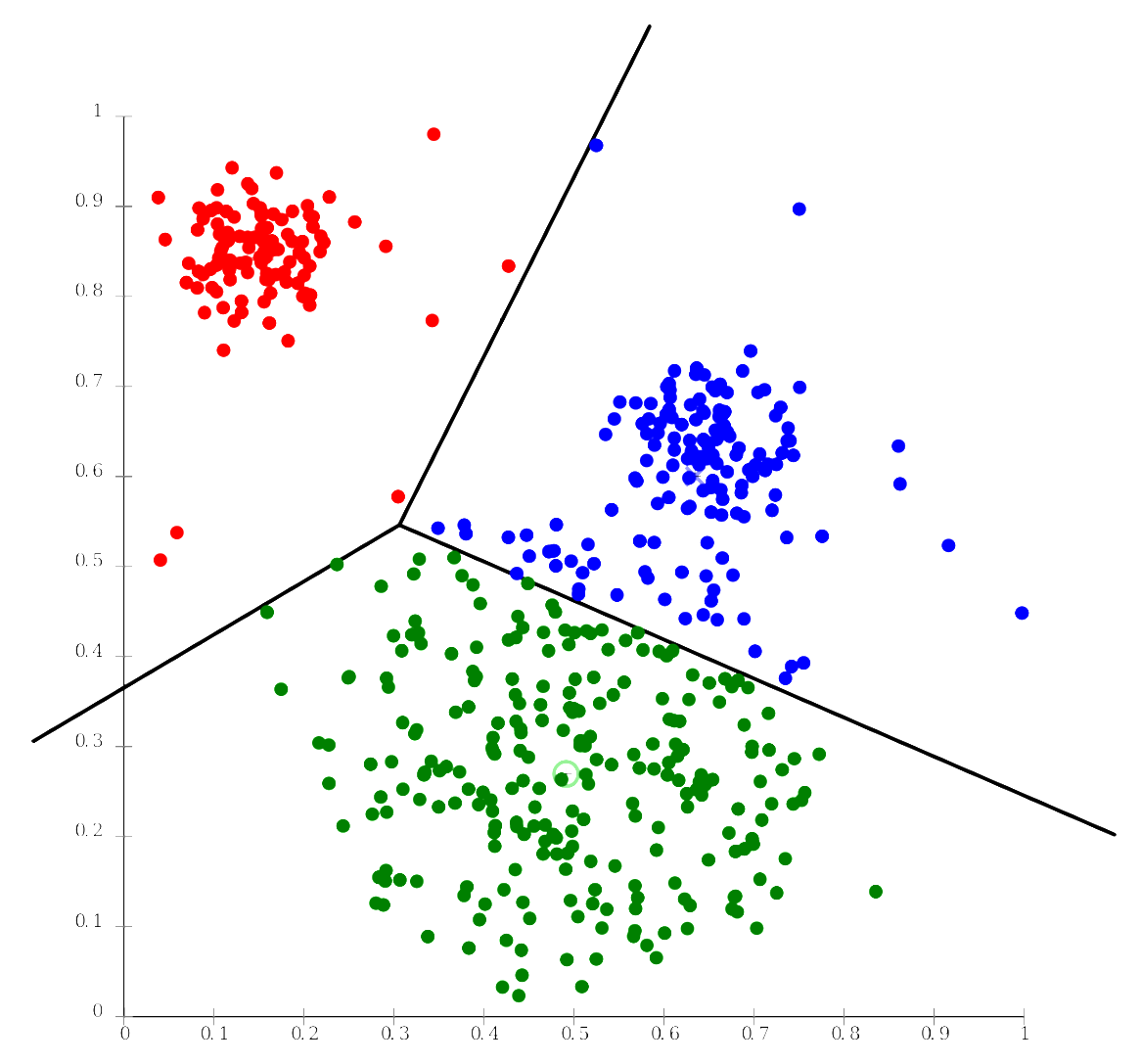
There are multiple methods for clustering, the most popular of which is the K-Means algorithm, the goal of which is to identify groups of like observations based on several attributes—groups are assigned in a way that minimizes intra-group differences, while maximizing inter-group differences. Consider, for example, that you are interested in visualizing education, income, and access to green space in the US by county. You could map these three variables individually, or you could use cluster analysis to identify groups of counties that are similar along all three dimensions. Once such groups are determined, you could map them with a qualitative color scheme onto a chorochromatic map.

Cluster analysis is a complicated topic, and we will not go into its details in this course. What is important to understand is that it provides a mathematical alternative to the other more design-based multivariate mapping techniques we have explored so far. You are encouraged to explore the recommended readings if you are interested in learning more about cluster analysis and about implementing it in GIS.
Recommended Reading
ArcGIS Pro Tool Reference: How Multivariate Clustering Works. Esri 2018.
Jain, A. K. 2009. "Data Clustering: 50 years beyond K-Means." Pattern Recognition Letters.