Lesson 5 Lab Visual Guide
Lesson 5 Lab Visual Guide Index
- Starting File
- Explore the Health Insurance Data in Excel
- Standardize Chosen Data for Visualization
- Join Operation in ArcGIS
- Create Dot Plots Using your Standardized Data
- Use this Plot to Visually Select Breaks
- Create Map #1 Using These Breaks
- Create Map #2 Using Diverging Colors
- Create Map Pair #2 Unclassed vs. Classed
- Final Deliverables
- Additional Tips
-
Starting File
This is your starting file in ArcGIS Pro. It includes county-level boundary data for the United States. This county-level file will need to be joined with health insurance data for New England from the American Community Survey (ACS). A state boundaries file is also included. While this state-level file is not needed to map the health insurance data, you should consider it when symbolizing the state boundaries on your map.
-
Explore the Health Insurance Data in Excel
Within the health insurance data provided in the Lab 5 zipped folder, find one variable that you are interested in and its associated universe. “Universe” refers to the total number of people in a category. For example, if you were interested in uninsured people under 18, your value and universe would be those shown in Figure 5.2 below.
-
Standardize Your Chosen Data for Visualization
Paste the two columns that you selected as “values" (see Figure 5.3) into the Chosen Data worksheet. Remember, use something other than just age for your maps. Doing so will eliminate the clutter of the full dataset, giving you space to calculate standarized values from your data. We will use these standardized values to determine class breaks for our first set of maps.
 Visual Guide Figure 5.3: Pasting data as "Values" into the Chosen Data worksheet.Credit: Cary Anderson, Penn State University; Data Source, US Census Bureau.
Once you have your variable of interest (and its universe) in the Chosen Data worksheet (e.g., columns A and B in Figure) use Excel to calculate a standardized column of data for each of your variables (e.g., column C). To standardize, divide each variable of interest by its universe (recall the Data Standardization section in Lesson 5). This calculation results in a proportion that you should then convert to a percentage (multiply the result by 100).
-
Join Operation in ArcGIS
Once you have completed the standardization process in Excel, you can proceed with the join operation in ArcGIS. Doing so will allow your standardization calculations to be included in the County shapefile attribute table. On the other hand, once you carry out the standardization process in Excel, you should easily be able to recreate the standardization calculations in County shapefile's attribute table. Either way, the goal is to calculate stadandardized variables which are needed for the choropleth symbolization method.
-
Create Dot Plots Using your Standardized Data
Once you have computed your standardized data, insert a column of 1s and 2s as shown in Figure 5.5. We will use these numbers to tell Excel to superimpose two dot plots along a single number line. When you select columns A and B below and insert a scatter plot, this will create two dot plots showing the distributions of your two standardized variables along a single number line that reflects the numerical values contained in both datasets.
 Visual Guide Figure 5.5: Adding values in a second column - these are just so we can create a visually organized dot plot.Credit: Cary Anderson, Penn State University; Data Source, US Census Bureau.
 -
Use this Plot to Visually Select Breaks
Now that the dot plots have been created, manually draw lines with the "insert shape" tool to illustrate where you will be placing breaks in your data. Annotate your lines if you choose the breaks for a reason other than just eyeing the dot distribution. For example, if you place a break at the national average for a variable, annotated this break with a text box explanation such as "US national average." Ex: “national average."
Note that Figure 5.7 is an example of how to draw lines above your dot plot, but these are not good breaks.
-
Create Map #1 Using These Breaks
After the normalization (standardization) process is complete, you will manually edit your class breaks to match the ones you drew on your dot plot (use your eye to estimate the values). The screenshot in Figure 5.8 (below) is an example from the Symbology Pane. You will submit a screenshot of the Symbology Pane for both maps in layout one, in addition to an image of your dot plot with annotated breaks.
 Visual Guide Figure 5.8: A sequential color map (left); manually editing data classes (right).Credit: Cary Anderson, Penn State University; Data Source, US Census Bureau.
Remember to represent the data for your first map using a sequential color scheme!
-
Create Map #2 Using Diverging Colors
For this map, you will be setting a critical class break (e.g., based on the mean of the data) and using a diverging color scheme. To create your second map, choose a diverging color scheme. Then, set a deliberate and useful critical class or break. Once the break is set, you should manipulate the other class breaks manually. As a suggestion, for the other class breaks you could start with the manual breaks you chose for your first two maps, but may need to adjust them to work with this new color scheme. Reference the Lesson 5 reading for ideas and advice on how to choose a critical class or break.
-
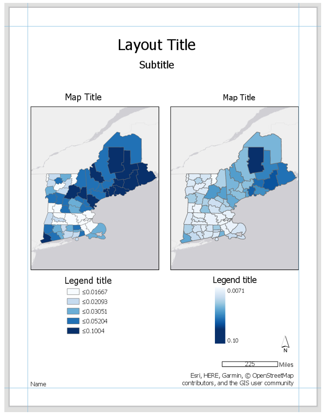
Create Map Pair #2 Unclassed vs. Classed
For the next set of maps, abandon your previously selected class breaks. In this pair of maps, you will compare the visual difference between a classed map and an unclassed map. Use the same sequential color scheme for both maps so they can be adequately compared (but not the same color scheme as Map Pair #1). You should also use consistent line design, etc., so as to not distract from the primary difference of interest - the classification method used. The purpose here is to visualize your chosen variable from Maps #1 and #2 but using different classification methods.
 Visual Guide Figure 5.10: The unclassed map symbology option (left); An example set of a classed and unclassed map, shown here without their respective legends (right).Credit: Cary Anderson, Penn State University; Data Source, US Census Bureau.
For your classed map, choose any of the methods available in ArcGIS Pro – but have a reason why! You will discuss your reasoning for choosing one of these methods in your write-up for this map pair.
-
Final Deliverables
For this lab you will submit two (2) PDF layouts, each containing a single pair of maps. You will also submit a write-up document, with a 200+ word explanation of your design (data classification and color choices). Make sure to also design neat and useful layouts - see Lesson/Lab 2 for layout design advice.
 Visual Guide Figure 5.12: Visual example of sample layouts (albeit not well-designed ones) - but these demonstrate the elements required for inclusion in the different requested layouts for this lab.
-
Example Map Pair #1
Don’t copy this (poor) layout design – use your own knowledge and judgment. Clean up titles, marginal elements, alignments, etc. – use either portrait or landscape, whichever you prefer. Note that elements which refer to both maps (legend; north arrow; scale bar) need only be included once.
-
Example Map Pair #2
Don’t copy this (poor) layout design – use your own knowledge and judgment.
 Visual Guide Figure 5.14: Example Map Layout #1Credit: Cary Anderson, Penn State University; Data Source, US Census Bureau.
Use convert to graphics to manually improve your legend. Use a text box to annotate your critical class/break!
Some Legend Design Considerations
Below are three topics that explain why the default legend appearance is not appropriately designed. Changes to the default legend design are provided.
-
Set Upper and Lower Numerical Legend Class Limits
By default, the legends in Figure 5.14 only show the upper numerical bound. The lower limit is represented using the “≤” sign. Consider the meaning of this ≤ sign as a class limit. Referring to Figure 5.14, note that the first class is represented as ≤0.01847. The literal interpretation of this statement is that the class range essentially runs from some unknown number that is less than 0.01847 to 0.01847. Consequently, the map reader has no sense of what the lower numeric limit of this data class is. In fact, the use of the ≤ sign for all other classes implies the same uncertainty as to what the lower limit of any class is. To convey the numeric range of each class, a definitive lower numeric limit should be included with the upper numeric limit expressing the full range of the class.
-
Replace the “-“ with “to”
Although this next suggestion may seem trivial, it is important. By default, once you replace the “≤” sign with the appropriate numeric values, you will need an additional symbol to separate the upper and lower class limits. You may have seen on other maps that the “-“ sign is used. While using the “-“ sign may seem appropriate, it use can appear redundant when negative values are present (e.g., -0.0448 - -0.0366). To remove the redundancy (even if there are no negative values) and improve readability, replace the “-“ sign with the word “to.” Doing so will improve the readability of each data class range.
-
Be Mindful of the Reported Units
Based on the calculations that you carried out in Excel, you either produced proportions or percentages. While mapping proportions is fine, one can argue that people may be more familiar with interpreting percentages. If you map percentages, your title reflects percentages, but your legend includes proportions, then there will lead to confusion between the units that readers assume are mapped and what units are really mapped. In Figure 5.14, note that proportions are shown in the legend rather than percentages. To change proportions in the legend to percentages, a quick edit of the legend is needed to easily convert proportions to percentages – moving the decimal two places to the right.
In summation, following the above recommendations, a better designed legend can be created. The table below highlights these changes. The “≤” sign has been replaced by a numerical lower limit for each class. Notice that the lower limit numeric value has also been adjusted so that the lower and upper limits of adjacent classes are unique in numeric value. The word “to” has been added to each class separating the lower and upper numeric limits. The proportion values originally reported in Figure 5.14 have been converted to percentages. The “%” sign has been added to each data value to assist in conveying the units.
Redesigned Legend 0.08% to 1.8% 1.9% to 3.1% 3.2% to 4.7% 4.8% to 6.6% 6.7% to 10.0% -
Example Map Pair #2
Don’t copy this (poor) layout design; use your own knowledge and judgment. Remember this map pair uses the same data for each map; it is demonstrating the effects of classification. Your goal should be to make a clean, useful legend for each map. Make it look better than the legend design below.
 Visual Guide Figure 5.16: Example Map Layout #2.Credit: Cary Anderson, Penn State University; Data Source, US Census Bureau.
-
-
Additional Tips
Think about color and what you are mapping. Are you mapping insured or uninsured? Choose colors wisely–what do they represent?
Remember that you can employ text to explain your map! Use text sparingly but effectively – don’t be afraid to use convert to graphics and/or manually edit text and layout elements. When choosing a color scheme as well as when doing your write-up, keep in mind: the perceptual progression of your data should match the perceptual progression of your color scheme.
 Visual Guide Figure 5.17: Cleaning up your scale bar design–the "adjust width" option for resize behavior can be very helpful!Credit: Cary Anderson, Penn State University; Data Source, US Census Bureau.
 Visual Guide Figure 5.18: Simplifying legend labels in the Symbology Pane–think about how your data values were calculated when selecting a label format.Credit: Cary Anderson, Penn State University; Data Source, US Census Bureau.


