Insolation
Insolation — Incoming Solar Radiation
It all starts with the Sun, where the fusion of hydrogen creates an immense amount of energy, heating the surface to around 6000°K; the Sun then radiates energy outwards in the form of ultraviolet and visible light, with a bit in the near-infrared part of the spectrum. By the time this energy gets out to the Earth, its intensity has dropped to a value of about 1370 W/m2 —as we just saw this is often called the solar constant (even though it is not truly constant — it changes on several timescales):

Sun's energy shining onto Earth
Click for a text description.
The climate system begins with energy from the Sun. At Earth’s distance from the Sun, the light has an intensity of 1370 W/m2 — this value is sometimes called the solar constant, although it does change over time. The Earth is so far away from the Sun that the incoming rays of energy are all essentially parallel (thin black lines within the yellow region). Note that the sunlight strikes the planet perpendicular to the surface near the equator, but it strikes at an oblique angle near the poles, such that L2>L1. This means that the insolation is more concentrated near the equator and weaker near the poles. In other words, the heat flux density (W/m2) is greater at the equator than at the poles.
Credit: David Bice © Penn State University is licensed under
CC BY-NC-SA 4.0Since the Earth spins, the insolation is spread out over an area 4 times greater than the disk shown in the figure above, so the solar constant translates into a value of 343 W/m2. This is a bit less than six 60 Watt light bulbs shining on every square meter of the surface, which adds up to a lot of light bulbs since the total surface area of Earth is 5.1e14 m2. How much energy do we get from the Sun in a year? Take 1370 W/m2, multiply by the area of the disk (pi x r2 where r=radius of Earth, 6.37e6 m), and this gives us an answer in Watts, which has units of joules per second, so if we then multiply by the number of seconds in a year, then we get the total energy in joules per year. The number is staggering — 5.56e24 Joules of energy — and is 10,000 times greater than all of the energy generated and consumed by humans each year.

Earth's Orbit, Axial Tilt, and Seasons
Click for a text description
The Earth orbits around the Sun with its spin axis (the line connecting the North and South Poles) tilted at 23.4° from a line perpendicular to the orbital plane. This tilt, or obliquity, gives rise to the variation in seasons, and the larger the tilt angle, the greater the contrast in seasons (this tilt changes on a timescale of about 40,000 years). If the tilt were 0°, there would be no real difference between winter and summer; the difference in distance between perihelion (the closest point of the orbit) and aphelion (the farthest point) is very small at present, but this, too, changes. The degree of ellipticity is called the orbital eccentricity; it changes on timescales of 95,000, 125,000, and 405,000 years. A very nice
animated version of Earth’s orbit can be found here(link is external).
- Central Elements:
- The Sun is depicted in the center as an orange circle.
- Earth's elliptical orbit around the Sun is shown as a black oval path, with Earth positioned at four points corresponding to the seasons.
- Earth’s Positions and Seasons:
- Summer (Northern Hemisphere):
- Earth is shown on the left side of the orbit, tilted with the Northern Hemisphere facing the Sun.
- Labeled "Summer Northern Hemisphere."
- An annotation reads: "the South Pole receives no sunlight during this part of the orbit."
- The position is marked as "Aphelion – Jul. 4, 1.01671 AU," indicating Earth is farthest from the Sun (1.01671 Astronomical Units).
- Spring (Northern Hemisphere):
- Earth is shown at the top of the orbit, with its axis tilted at an angle.
- Labeled "Spring Northern Hemisphere."
- Winter (Northern Hemisphere):
- Earth is shown on the right side of the orbit, tilted with the Northern Hemisphere facing away from the Sun.
- Labeled "Winter Northern Hemisphere."
- An annotation reads: "the North Pole receives no sunlight during this part of the orbit."
- The position is marked as "Perihelion – Jan. 4, 0.98329 AU," indicating Earth is closest to the Sun (0.98329 Astronomical Units).
- Fall (Northern Hemisphere):
- Earth is shown at the bottom of the orbit, with its axis tilted at an angle.
- Labeled "Fall Northern Hemisphere."
- Axial Tilt Annotation:
- A label on the right side of the diagram reads: "Earth’s spin axis is tilted relative to the orbital plane," explaining the cause of seasonal variations.
- The tilt angle is marked as 23.5° on the Earth diagrams.
- Visual Details:
- Each Earth is depicted as a globe with visible continents, primarily showing North and South America.
- The tilt of Earth’s axis is indicated by a dashed line running through the center of each Earth, with the North Pole (marked with a small symbol) tilted toward or away from the Sun depending on the season.
- Arrows on the orbital path indicate the direction of Earth’s movement around the Sun (counterclockwise).
Credit: David Bice © Penn State University is licensed under
CC BY-NC-SA 4.0The insolation is not constant over the surface of the Earth — it is concentrated near the equator (first figure on the page) because of the curvature of the Earth. But, the situation is complicated by the fact that the Earth’s spin axis is tilted by 23.4° relative to a line perpendicular to the Earth’s orbital plane (see the second figure on the page), so that as Earth orbits around the Sun, the insolation is concentrated in the Northern Hemisphere (the Northern Hemisphere summer) and then the Southern Hemisphere (winter in the Northern Hemisphere). This tilt of the spin axis, also called the obliquity, is the main reason we have seasons.
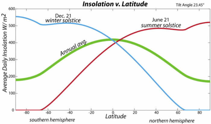
Insolation with latitude graph
Click for a text description
The image is a graph titled "Insolation v. Latitude," showing the variation in average daily insolation (solar energy received per unit area) across different latitudes on Earth. The graph includes three curves representing insolation at different times of the year, with a note indicating Earth's tilt angle as 23.45°.
- Axes:
- X-Axis (Latitude): Labeled "Latitude," ranging from -80° (Southern Hemisphere) to 80° (Northern Hemisphere), with major ticks at intervals of 20° (-80, -60, -40, -20, 0, 20, 40, 60, 80). The equator is at 0°.
- Y-Axis (Insolation): Labeled "Average Daily Insolation W/m²," ranging from 0 to 600 watts per square meter (W/m²), with major ticks at intervals of 100 W/m² (0, 100, 200, 300, 400, 500, 600).
- Data Representation:
- Three curves are plotted, each representing the average daily insolation at different times:
- Winter Solstice (Dec. 21): Plotted in blue, labeled "winter Dec. 21 solstice."
- Summer Solstice (June 21): Plotted in red, labeled "summer solstice."
- Annual Average: Plotted in green, labeled "Annual avg."
- Curve Characteristics:
- Winter Solstice (Dec. 21, Blue Curve):
- Shows high insolation in the Southern Hemisphere, peaking at around 500 W/m² near -20° latitude.
- Insolation decreases sharply toward the Northern Hemisphere, dropping to nearly 0 W/m² at 80° latitude (North Pole), reflecting minimal sunlight during the Northern Hemisphere's winter.
- Summer Solstice (June 21, Red Curve):
- Shows high insolation in the Northern Hemisphere, peaking at around 500 W/m² near 20° latitude.
- Insolation decreases sharply toward the Southern Hemisphere, dropping to nearly 0 W/m² at -80° latitude (South Pole), reflecting minimal sunlight during the Southern Hemisphere's winter.
- Annual Average (Green Curve):
- Shows a more balanced distribution, peaking at around 400 W/m² near the equator (0° latitude).
- Insolation gradually decreases toward both poles, reaching around 150 W/m² at ±80° latitude, reflecting the yearly average sunlight received.
- Overall Trend:
- The graph illustrates how Earth's axial tilt causes significant seasonal variations in insolation, with the Northern Hemisphere receiving more sunlight during the summer solstice (June 21) and the Southern Hemisphere receiving more during the winter solstice (Dec. 21).
- The annual average curve shows that the equator receives the most consistent and highest insolation year-round, while the poles experience the greatest seasonal extremes.
The graph effectively demonstrates the relationship between latitude, Earth's tilt, and the distribution of solar energy, which drives seasonal climate patterns
Credit: David Bice © Penn State University is licensed under
CC BY-NC-SA 4.0The tilt of the spin axis also means that day length changes, and these changes are most dramatic at the poles, which experience 24 hours of daylight during their summers and no daylight during their winters. The varying day length, along with the angle of incidence of the Sun’s rays, combine to control the average daily insolation variation (see figure above). On a yearly average, the equatorial region receives the most insolation, so we expect it to be the warmest, and indeed it is.
Earlier, we mentioned the Solar Constant — a measure of the amount of solar energy reaching Earth. In reality, this value is not a constant because the Sun is a dynamic star with lots of interesting changes occurring. One of the best known of these changes is the solar cycle, related to sunspots. Sunspots are dark regions on the surface of the Sun related to intense magnetic activity, and measurements have shown that the greater the number of sunspots, the greater the energy output of the Sun. Early observations of these sunspots revealed a pronounced cyclical pattern to them, varying on an 11-year cycle, as shown below.

Sunspot History and Solar Constant, comparing the number of sunspots per calendar year.
Click for a text description of the Sunspot History and Solar Constant graph.
The image is a graph showing two overlapping time series, likely representing climate-related data such as temperature anomalies or another paleoclimate proxy, over a period of time. The graph lacks specific labels for the axes and title, but the y-axis appears to represent a measurement scale, and the x-axis likely represents time, with specific years marked on the right side.
- Axes:
- Y-Axis: The vertical axis ranges from -50 to 200, with major ticks at intervals of 50 (-50, 0, 50, 100, 150, 200). The units are not specified but could represent temperature anomalies (e.g., in °C or a proxy like δ¹⁸O in ‰).
- X-Axis: The horizontal axis is not explicitly labeled with a time scale, but specific years are marked on the right side, suggesting a time series. The years are not shown on the x-axis itself but are inferred from the right-side labels.
- Data Representation:
- Two curves are plotted:
- A blue line representing one dataset.
- A pink line representing another dataset.
- Both lines show similar patterns, indicating they might be measuring related variables or the same variable from different sources.
- Curve Characteristics:
- Both the blue and pink lines exhibit significant variability, with frequent peaks and troughs.
- The values generally fluctuate between -50 and 150, with occasional peaks reaching close to 200.
- The two lines closely follow each other, suggesting a strong correlation between the datasets, though there are slight differences in amplitude and timing of peaks.
- Year Markers (Right Side):
- Specific years are marked on the right side of the graph, corresponding to certain points on the curves:
- 1967 at the top (around 150 on the y-axis).
- 1964.5 (around 100 on the y-axis).
- 1964 (around 50 on the y-axis).
- 1963.5 (around 0 on the y-axis).
- 1963 (around -50 on the y-axis).
- These years suggest the data spans at least from 1963 to 1967, though the full time range of the graph is not clear without x-axis labels.
- Overall Trend:
- The graph shows cyclical fluctuations with no clear long-term trend over the visible period.
- The data appears to oscillate around a mean value (possibly around 50 on the y-axis), with periodic increases and decreases.
- The close alignment of the blue and pink lines indicates consistency between the two datasets, possibly representing different measurements of the same phenomenon or related climate variables.
The graph likely represents a paleoclimate or climate variability record, showing short-term fluctuations over a few years in the 1960s, but without specific labels, the exact nature of the data (e.g., temperature, isotopic ratios, or another proxy) remains unclear.
Credit: David Bice © Penn State University is licensed under
CC BY-NC-SA 4.0;
Here, in blue, we see the annual number of sunspots and in red we see the reconstructed solar intensity or Solar Constant. The reconstruction is made by studying the relationship between sunspot number and solar intensity in the last few decades, where we have good direct measurements of the solar intensity — this provides a relationship that is fairly simple and directly proportional. Higher sunspot numbers correspond to higher solar intensity. Both records are characterized by a strong 11-year cycle, often called the sunspot cycle.
The magnitude of variation in the Solar Constant, however, is quite small, and we shall see in our lab activity for this module that this amounts to a very small change in the temperature of the Earth.
