
Reading Assignment
Read Chapter 3 (pages 53-77) in the text. This chapter covers the material that will be covered in the next three course lessons, although it is in a bit of a different order to how we will cover it. I will focus on a few specific issues, and try to go into a little bit more depth than the text. So, I suggest that before you start this lesson, you should read through Chapter 3 and then refer back to the appropriate material as we work through the next three lessons.
OK, now on to the content.
The main goal of analyzing markets is to try to figure out:
- “How much of what stuff is made, and by what methods?”
- “At what price is it sold?”
To figure these things out, we study supply and demand. The basic analytical tool is the supply and demand diagram, which is a MODEL of a market, as shown below:
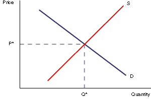
Parts of the Supply and Demand Diagram:
- x-axis: measurement of quantity
- y-axis: measurement of price
- Demand curve: relationship between price and quantity people are willing to buy
- Supply curve: relationship between price and quantity that firms are willing to sell
- Intersection point of supply and demand curves: “market equilibrium”
Markets are dynamic—always changing—so a supply-demand diagram is always just a “snapshot” of a market at a moment in time. Another dimension is “time,” which we do not consider at this point.
Figure 2.1 has two lines, which represent the two sides of the market, or the two parties in any economic transaction. The demand curve describes the behavior of the demanders in the economy. These people can also be called buyers or consumers. Restating: "demanders," "buyers" and "consumers" all mean essentially the same thing.
The other side of the market is described by the supply curve - the red upward-sloping line in the diagram above. The people *(or, typically, firms) on this side of the market can be called suppliers, or sellers, or producers. These three terms all mean basically the same thing.
| Demand curve describes behavior of: | Supply curve describes behavior of: |
|---|---|
| Demanders | Suppliers |
| Buyers | Sellers |
| Consumers | Producers |
Demand Curve
Reading Assignment
Read pages 53-55 in the text for this section.
We will look at the supply and demand curves separately before we look at the way that they work together. We will start by looking at the demand curve. This is a Functional Relationship between the price of something and the amount of that thing that buyers (consumers, demanders) will buy at a given price. Looking at it another way, it is the maximum amount that a person is willing to pay for some amount of a good.
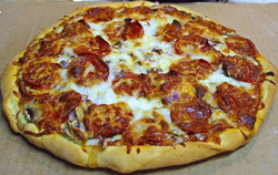
Where does the demand curve come from? It comes from individual preference and utility. An “individual demand curve” is how much a person will pay for a certain amount. This is calculated based upon the idea of “declining marginal utility,” which is another way of saying that the more we have of a certain thing, the less we value getting an additional unit of that good. For example, when you are hungry, you may place a lot of value on the first slice of pizza because you get a lot of utility (happiness) out of that first slice. The second slice gives you more happiness, but not as much as the first, and so on.
When you have had 3 slices, you place very little value on the 4th slice.
A person is willing to pay up to his marginal utility, but not more (because you will not give away more money than the amount of utility you get from using something).
Individual Demand Schedule
| Quantity of Pizza Consumed | Utility derived from consuming last slice |
|---|---|
| 1 | $5 |
| 2 | $4 |
| 3 | $3 |
| 4 | $2 |
| 5 | $1 |
| 6 | $0 |
Individual Demand Curve

Figure 2.2 tells us that after eating five slices of pizza, a person derives no marginal utility from consuming the sixth slice. It is entirely possible that the demand curve can go negative, although economists never really examine this. However, just think about it: let's say you have eaten six slices, and are very full. Eating another slice may cause you to get an upset stomach, or may make you throw up your food. Both of these are things that people do not want to happen under normal circumstances. In this case, the seventh slice of pizza is no longer a "good," but it is a "bad": consuming it will actually decrease the total amount of happiness of the individual. A rational person would certainly not eat a seventh slice.
Figure 2.2 is the demand curve for an individual. Usually, a market consists of more than one individual, so if we want to find out what the demand curve looks like for a market in its entirety, we simply add together all individual demand curves.
What do we mean by "add together"? Well, we can construct a demand schedule for everybody in the market added together. Looking at the demand schedule, we have it written in the form "How much utility do I get from each slice?" We can reverse this, however, and say "At a certain price, how many slices would I buy? If the price of a slice is $2.50, the person described by the demand schedule would buy three slices. They would not buy the fourth slice, because this slice only gives the $2 of utility, but they would pay $2.50 for it. That means that this person would be voluntarily making himself poorer by buying a fourth slice of pizza, and this would violate our assumption about rational utility maximization. As I have said before, in real life there are cases where people do not make the proper decision, but we have to assume that people usually intend to make a utility-maximizing decision. If we don't make that assumption, there are basically no rules for examining human behavior. We are left with chaos; I would not be able to teach this course. So, the assumption of rational utility maximization gives us a sense of peace and order that allows us to study economics. We can look at the messier stuff about bad market decisions later on.
So, getting back on topic, how do we create a market demand curve? Well, let's do a demand schedule, but instead of having the number of slices in the first column, instead we have the price in the first column. In the second column, we have the total amount of slices sold at that price. By "total amount," we want to think about the total in the market area for one pizza store, or in one town, or on one university campus. It also makes this problem easier to analyze if we assume that the pizza from every shop in town or on campus is identical. Obviously, in the real world this is not true, but we make this assumption, called "product homogeneity," because it makes life easier for us. Don't worry, we will relax it a little later in the course and see what happens. (Hint: more chaos! I prefer to avoid chaos.)
So, let's assume that I have collected a demand schedule from every person in town, and that every person knew just how much utility they got from eating each extra slice of pizza. (Maybe they are all economics students and think about every aspect of their lives in terms of declining marginal utility and rational utility maximization.) (Hey, I do. It makes me a real hit at parties.)
So, now I put together a schedule of how much pizza will be sold at each price point. Let's say it looks like this:
| Price | Quantity of slices sold |
|---|---|
| $1 | 3000 |
| $2 | 2050 |
| $3 | 1350 |
| $4 | 750 |
| $5 | 350 |
| $6 | 125 |
| $7 | 5 |
If we were to plot this, like the individual demand curve, we get the following:
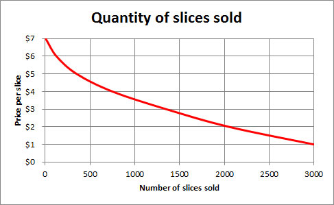
So, Figure 2.3 is what a "market demand curve" looks like. If you were the owner of the only pizza joint in town, this would let you know how many slices you will sell at each price. Of course, real life is a little more complicated for several reasons. Firstly, it is very unlikely that you have "perfect knowledge" of the demand curve. After all, how can you get everybody in town to tell you how much utility they get from each additional slice? And then, of course, we have another dimension: time. The demand for pizza on Friday night during the school year is a lot different than the demand on a Wednesday morning in the summer. And if you aren't the only guy in town, but one of several pizzerias, how much of that market will you capture? But, of course, we are making simplifications for the purpose of explaining simple principles here. As I keep promising, we can relax some of these assumptions and make things more complicated later. But, for now, let's keep things simple.
There is one thing you should note about the demand curves in both of the above graphs: they slope downwards as we go to the right. This means that as the price of a good decreases, more of it will be sold. Or you can say that as the price rises, fewer will be sold. Why? Because of declining marginal utility. After a person has consumed one unit of a good, they usually get a little bit less happiness from consuming the second unit of a good. Sometimes the difference in utility is very small, which means the curve will be very flat (more on this in the next section), sometimes it will be very steep, but in any case, it will be downward sloping. We cannot believe that somebody gets more marginal utility from consuming an additional unit. This is what we call the "First Law of Demand": demand curves are downward sloping. This means that if a seller raises the price, fewer of an item will sell.
Some Marginal Analysis
You are looking to buy pizza. Your “pizza happiness” in $s is described in the table below. Pizzas cost $2 each. How many should you buy?
| # of Pizzas | 0 | 1 | 2 | 3 | 4 | 5 |
|---|---|---|---|---|---|---|
| Pizza Happiness ($) | 0 | 10 | 17 | 22 | 25 | 26 |
Method 1: Brute Force
Simply figure out your happiness for each number. Happiness=Pizza Happiness-Total Cost (remember pizzas cost $2 each). Inelegant, low score on exam, but it will work. Fill in the table below and choose the spot that maximizes your happiness (what we will soon call consumer surplus).
| # of Pizzas | 0 | 1 | 2 | 3 | 4 | 5 |
|---|---|---|---|---|---|---|
| Pizza Happiness ($) | 0 | 10 | 17 | 22 | 25 | 26 |
| Total Cost ($) | 0 | 2 | 4 | |||
| Happiness ($) | 0 | 8 | 13 |
Method 2: The Elegant Economic Way of Thinking (This gets you all the credit!)
Let Marginal Happiness(X)=Pizza Happiness(X)-Pizza Happiness(X-1). Keep buying pizza as long as marginal happiness>cost of pizza (here $2).
Remember, decisions are made on the margin!
| # of Pizzas | 0 | 1 | 2 | 3 | 4 | 5 |
|---|---|---|---|---|---|---|
| Pizza Happiness ($) | 0 | 10 | 17 | 22 | 25 | 26 |
| Marginal Happiness ($) | - | 10 | 7 | |||
| Total Cost ($) | 0 | 2 | 4 | |||
| Total Happiness (Consumer Surplus) | 0 | 8 | 13 |
Fill in the blanks, and pick your bliss point!
A Problem for You
Delicious cuy (a delicacy in Peru) costs $10 a serving. Your cuy happiness is given in the table below. How many cuy will you buy, and what will be your total happiness?

| # of Cuy | 1 | 2 | 3 | 4 | 5 |
|---|---|---|---|---|---|
| Cuy Happiness ($) | 20 | 36 | 47 | 52 | 54 |
| # of Cuy | 1 | 2 | 3 | 4 | 5 |
|---|---|---|---|---|---|
| Cuy Happiness ($) | 20 | 36 | 47 | 52 | 54 |
| Marginal Cuy Happiness ($) | 20 | 16 | 11 | 5 | 2 |
| Total Cost ($) | 10 | 20 | 30 | 40 | 50 |
| Your Consumer Surplus ($) | 10 | 16 | 17 | 12 | 4 |
Note that you keep buying cuy until your marginal cuy happiness is lower than your cost of buying cuy (10$). That is 3 servings of cuy, for a consumer surplus of 17.
Some people talk about something called a Giffen Good. This is a mythical good with an upward sloping demand curve, meaning that more sell if the price is higher. Sir Robert Giffen hypothesized that an inferior staple good, such as bread, might actually see an increase in demand as its price rises. The idea being that as the price of bread increases, poor consumers would have less money to spend on other goods (meat, for example), and would actually need to purchase more bread. You can probably see, however, that there would have to be a lot of constraints on this hypothetical world- no other types of inferior staple goods available as substitutes, and no corresponding wage inflation to provide additional income to buy bread, to name a few. In order to come up with a scenario where we have an actual, upward-sloping demand curve, we need to do a lot of semantical gymnastics and make a lot of special-case assumptions. Life is much simpler if we just believe that the First Law of demand holds. Which it does, of course, because it is the law, and not merely just a good idea. I like to think of it as the economic law of gravity. In a few special, rare and carefully constructed circumstances, you can appear to circumvent it, but for almost all of us almost every day, it holds true. (Or, I should say, is not falsified.)
Mathematical Representation of Demand Curve
We often want to perform calculations concerning total utility in a market, or total costs, or some such thing, and to do this, it is helpful to define the functional relationships on a supply and demand diagram with mathematical equation.
So, an example of a demand curve may be specified as follows (Please note that P stands for "Price," and Q stands for "Quantity") : P = 100 - 2Q
This describes a downward sloping line, which intersects the y-axis (which represents price in a supply-demand diagram) at a value of 100, and declines in value by 2 for each extra unit we travel along the x-axis (which represents quantity of goods sold in a supply-demand diagram.)
So, if the Quantity is 20, we would say Q = 20, P = 100 - 2x20 = 100 - 40 = 60, and so on.
If you look at the individual demand curve for pizza, above, we might want to describe it as P = 6 - Q, which describes a straight line with a y-intercept of 6 and a slope of -1. The market demand curve is not a straight line, but a more complicated function. This illustrates what I have mentioned before: real life is a very complicated thing to model, but in economics we can use simple models to describe and explain human behavior and market outcomes. So assuming a linear demand curve may be a simplification of reality, but it aids our understanding of markets, and if we can perform numerical examples, it makes illustration of concepts even easier for a lot of us.
Definitions
Demand Curve
relationship between price and quantity that people want to buy. Demand is not a number or a constant: it is a function, with different values at different places.
Marginal
This is an adjective (a descriptive word) that refers to the effect of doing a little bit more of something. So, the Marginal Utility from consuming pizza refers to the extra amount of utility you will get from eating one more slice of pizza. We often say “what will change at the margin,” which means “What will be the effect of a small change in one of the inputs?”
Main points about the demand curve:
- Demand curves always slope downwards (have a negative slope).
- This is called the “First Law of Demand.”
- They slope downwards because of Declining Marginal Utility: the amount of utility we get from consuming an extra unit of something is less than the amount we got from consuming the previous unit of that thing.
- Market demand curves are the sum of all individual demand curves.