Including Maps, Graphs, and Illustrations in a Paper
Maps, Graphs, and Illustrations
All maps, images, and graphs should be uniquely and sequentially referenced with figure numbers. Each figure reference should appear in the text as Figure 1, Figure 2, and so forth according to the number of figures you use. The location of a specific figure should follow the first mention of the figure in the text. You do not need to break a paragraph in order to place a figure. Simply place the figure at the end of the paragraph where that figure is first mentioned. Each figure should have a short caption that briefly explains the important information about what is being illustrated. The figure caption should be positioned below the figure.
Discussing Maps, Graphs, and Other Illustrations in a Paper
You probably spent hours creating your figures. Thus, you have an intimate knowledge of the details of what each one shows. Unfortunately, your reader does not share this same intimacy. Therefore, you must make clear to the reader the important information, patterns, or trends that they should see. To be clear, start your discussion with a general overview of each figure. For example, "Figure 5 shows a prototype interface for the bicycle accident recording app." Once that general overview is presented, you can move on to discuss some of the relevant details. Below are two examples of figures and their captions.
Here is an appropriate example discussion:
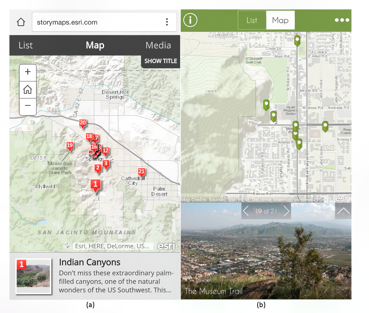
Figure 1.03 shows an example of a story map that was created for locating notable features of Palm Springs, California, as a website (a) (Esri, 2013) and app (b) (Esri, 2015). The interface of this story map would be a good starting place for a more robust mobile reporting app. If there are instances reported on the app by other trail users, anyone else opening the site would be alerted to these notations from a map similar to this based on their current GPS location. The trail user could then use a form to either add his/her own suggestion or corroborate an existing notation. However, would the trail users be comfortable with a more sophisticated solution such as this, or would a simpler form be necessary? This would ultimately be solved in meetings between trail users, organizations, and database managers, and the prototype testing that would follow.

Note that in addition to a brief explanation of each image, the image source is provided as well as a disclaimer that the images are used solely for educational purposes.
Here is a discussion of an illustration shown in Figure 1.04:
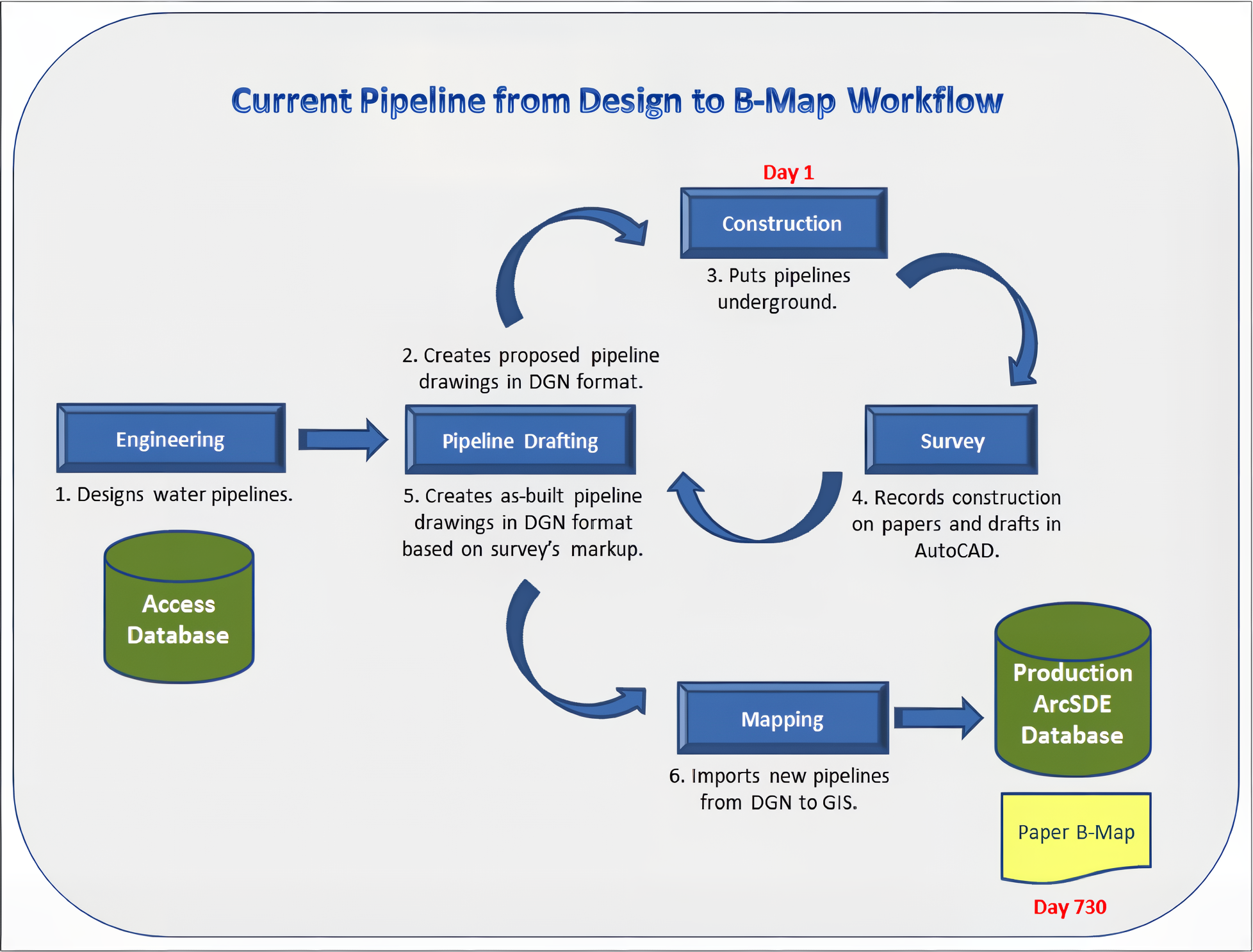
When a pipeline is designed, constructed and mapped, the same information will go through several departments. In the existing workflow, see Figure 1.04, Engineering designs pipelines, and Pipeline Drafting draws pipelines in Microstation. The Construction builds the pipelines, which may not match the original Engineering design. Afterward, Survey staff record as-built pipelines by marking up the design drawing on paper and draft in AutoCAD. A finalized as-built drawing will be created by Pipeline Drafting. Finally, Mapping brings the pipelines from Microstation to ArcSDE database. The same pipeline information is created by several departments in different formats and saved at different locations. Clearly, the duplication of effort and data redundancy has contributed to the inefficient workflow.

The following table shows what to avoid when discussing maps, graphs, and other illustrations in a paper.
| Wording issues with Graphics | Irrationality of the Statement |
|---|---|
| Figure 1 below shows… | "Below" is unnecessary as the Figure 1 reference will direct the reader to the appropriate location. |
| A county like Bennington County in Vermont… | Unless the place name is specifically located on the map (or graphic), don’t mention it. This reference will only confuse the reader as they look on the map for something that doesn’t exist. Avoid repeating the same word in the same sentence (“county” is redundant). |
| Inserting a graphic without any reference to it or explanation of it. | If you are going to insert a graphic, make sure you reference it and explain it for the reader’s benefit. |
| Since the results show a positive correlation, each of the significant counties must be explored | First, make sure that you did, in fact, assert that a positive correlation was observed and verified. Second, if you say you are going to do something, then make sure you do - or the reader will be lost. |
| Figure 3 shows a region between these NARS that supports similar habitats and inhabitants that are also of great ecological and biological value. | If you say there is something of importance appearing in a graphic (i.e., “great ecological and biological value”) make sure that it does so. And then explain what that importance is to the reader. |
| Figure 8 shows a map of a reclassification of values ranging from 0 to 6. In this figure, cells of a 0 value imply that no variables met the desired parameters and cells whose value is 6 suggests that all parameters were met. | What about the values in between? |
| Taking a closer look at the data in Figure 10. It exhibits a lot of potential habitat available for further protection efforts. | The problem when using "a lot" or other similar descriptors is that they are ambiguous in meaning. What exactly does “a lot” quantify to? |