Prioritize...
After you have read this section, you should be able to assess the skill of a deterministic forecast using both graphical methods and statistical metrics.
Read...
So far in this lesson, we have highlighted when we need to assess a forecast. A natural follow-on is how do we assess a forecast? There are many different ways to test the forecast skill, both qualitatively and quantitatively. The choice of technique depends upon the type of predictand and what we're going to use the forecast for. In this section, we will discuss techniques used specifically for deterministic forecasts, which are forecasts in which we state what is going to happen, where it will happen and when (such as tomorrow’s temperature forecast for New York City).
Graphical Methods
As always, plotting the data is an essential and enlightening first step. In this case, the goal is to compare each forecast to the corresponding observation. There are two main types of plots we will focus on for deterministic forecasts: scatterplots and error histograms.
Scatterplots, which you should remember from Meteo 815 and 820, plot the forecast on the horizontal axis and the corresponding observation on the vertical axis. Scatterplots allow us to ask questions such as:
- Did our sample of forecasts cover the full range of expected weather conditions?
- If not, we really need a bigger sample in order to judge the forecast system accurately, or the forecast system lacks the statistical power to forecast extreme events.
- Do we have a good climatology of observations?
- Can the forecast system reproduce the full range of that climatology?
- Are there any outliers?
- If so, can we figure out what went wrong with our forecast system (or our observations!) for those cases?
- If we can, then we can fix them.
- If so, can we figure out what went wrong with our forecast system (or our observations!) for those cases?
- Is there either a multiplicative or additive bias (regression and correlation discussion from Meteo 815)?
- If so, could they be corrected by linear regression?
Let’s work through an example. We are going to create a scatterplot of forecasted daily maximum temperature versus observed daily maximum temperature in Ames, IA. Begin by downloading these predictions of daily MOS (Model Output Statistics) GFS (Global Forecast System) forecasted maximum temperature (degrees F) for Ames, IA. You can read more about the forecast here. In addition, download this set of observations of daily maximum temperature (degrees F) for Ames, IA. You can read more about the observational dataset here.
Now, let’s start by loading in the data using the code below:
Your script should look something like this:
### Example of MOS Max Temp (https://mesonet.agron.iastate.edu/mos/fe.phtml)
# load in forecast data
load("GFSMOS_KAMW_MaxTemp.RData")

# load in observed data (https://mesonet.agron.iastate.edu/agclimate/hist/dailyRequest.php)
load("ISUAgClimate_KAMW_MaxTemp.RData")
I have already paired the data (and all data in future examples) so you can begin with the analysis. Let’s overlay a linear model fit on the scatterplot. To do this, we must create a linear model between the observations and the predictions. Use the code below:
# create linear model
linearMod <- lm(obsData$maxTemp~
                forecastData$maxTemp,na.action=na.exclude)
Now, create the scatterplot with the forecasted maximum temperatures on the x-axis and the observed on the y-axis by running the code below.
You should get the following figure:
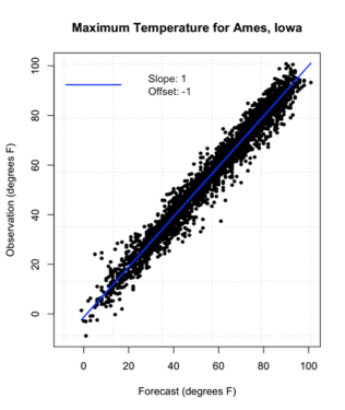
The linear fit is quite good, and you can see we do not need to apply any correction.
The second type of visual used in assessing deterministic forecasts is the error histogram. The formula for error is as follows:
An error histogram, as the name suggests, is a histogram plot of the errors. You can ask the following questions when using an error histogram:
- Are the errors normally distributed?
- Are there any extreme errors?
- How big are the most extreme positive and negative 1, 5, or 10% forecast errors?
- This basically creates confidence intervals for forecast errors.
Now, let’s work on an example using the data from above. To start, calculate the error for each forecast and observation.
# calculate error
error <- forecastData$maxTemp-obsData$maxTemp
Now, estimate the 1st, 5th, 10th, 90th, 95th, and 99th percentiles which we will include on the error histogram.
# estimate the percentiles (1st, 5th, and 10th)
errorPercentiles <- quantile(error,
                             probs=c(0.01,0.05,0.1,0.9,0.95,0.99),
                             na.rm=TRUE)
Now, plot the error histogram using the ‘hist’ function. Run the code below:
You should get the following figure:
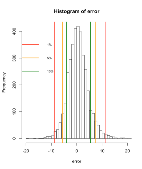
The figure above shows the frequency histogram of the errors with confidence intervals at 1% (1st and 99th percentile), 5% (5th and 95th percentile), and 10% (10th and 90th percentile). The errors appear to be normally distributed.
Statistical Metrics
Now that we have visually assessed the forecast, we need to perform some quantitative assessments. As a note, most of the statistical metrics that we will discuss should be a review from Meteo 815. If you need a refresher, I suggest you go back to that course and review the material.
There are four main metrics that we will discuss in this lesson.
- Bias
The first obvious approach to quantifying the forecast error is to average the errors from our sufficient sample of forecasts. This average is called forecast bias. The formula for bias is as follows:
Where N is the number of cases. A good forecast system will exhibit little or no bias. A bad forecast system, however, can still have little bias because the averaging process lets positive and negative errors cancel out. Let’s compute the bias for our maximum temperature example from above. Run the code below: The bias is 0.52 degrees F, suggesting little bias. - MAE
Since the bias averages out the positive and negative errors, we need a method of seeing how big the errors are without the signs of the errors getting in the way. A natural solution is to take the absolute value of the errors before taking the average. This metric is called the Mean Absolute Error (MAE). Mathematically:
Let’s try computing this for our example. Run the code below:
The result is 3.03 degrees F, which is much larger than the bias, suggesting there were some large errors with opposite signs that canceled out in the bias calculation. - RMSE
Another popular way of eliminating error signs so as to measure error magnitude is to square the errors before averaging. This is called the Mean Squared Error (MSE). Mathematically:
The downside to this approach is that the MSE has different units than those of the forecasts (the units are squared). This makes interpretation difficult.
The solution is to take the square root of the MSE to get the Root Mean Squared Error (RMSE). The RMSE formula is as follows:
RMSE is more sensitive to outliers than MAE, thus, it tends to be somewhat larger for any given set of forecasts. Neither the MSE nor RMSE is as appropriate, however, as error confidence intervals if the error histogram is markedly skewed.
Now, let’s try calculating the RMSE for our maximum daily temperature example. Run the code below:
The resulting RMSE is 4.02 degrees F, slightly larger than the MAE. - Skill Score
To aid in the interpretation of these error metrics, their value can be compared for the forecast system in interest to some well-known no-skill reference forecast. This comparison effectively scales the forecast system error by how hard the forecast problem is. That way you know if your forecast system does well because it is good or because the problem is easy. The usual way to do this scaling is as a ratio of the improvement in MSE to the MSE of the reference forecast. This is formally called the Skill Score (SS). Mathematically:
Climatology and persistence are commonly used reference forecasts.
Let’s give this a try with our daily maximum temperature example. We already have the MSE from the forecast, all we need is to create a reference MSE. I’m going to use the observations and create a monthly climatology of means. Then I will estimate the MSE between the observations and the climatology to create a reference MSE. Use the code below:Show me the code...# initialize errorRef variable errorRef <- array(NA,length(obsData$Date)) # create climatology of observations and reference error (anomaly) for(i in 1:12){ index <- which(as.numeric(format(obsData$Date,"%m"))==i) # compute mean monthMean <- mean(obsData$maxTemp[index],na.rm=TRUE) # estimate anomaly errorRef[index] <- obsData$maxTemp[index]-monthMean } mseRef <- sum((errorRef^2),na.rm=TRUE)/length(errorRef)
The code above loops through the 12 months and pulls out the corresponding maximum daily temperatures that lie in that month for the length of the data set and estimates the mean. The monthly mean is then subtracted from the observations of the maximum temperature in the corresponding month, which is identical to creating an anomaly. The reference MSE is then calculated. Now we can calculate the skill score by running the code below:
A skill score of 1 would mean the forecast was perfect, while a skill score of 0 would suggest the forecast is equal in skill to that of the reference forecast. A negative skill score means the forecast is less skillful than the reference forecast. In this example, the SS is 0.86 (no units), which is a pretty good skill score.