Visualization: One Variable
 Read It: Visualizations with One Variable
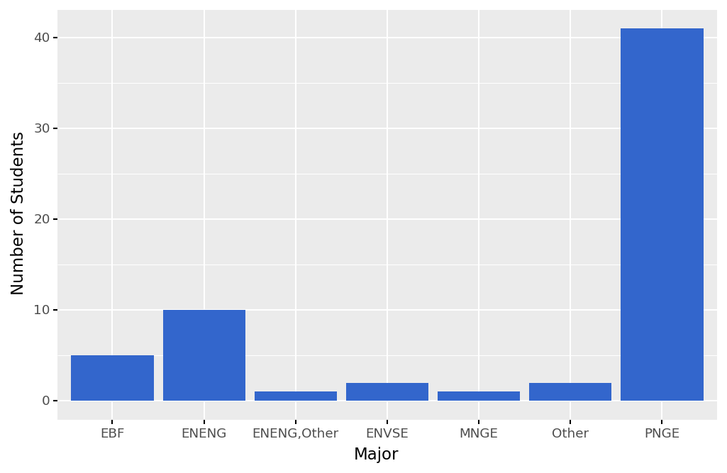
In this lesson, you will learn about various types of plots and how to create those in Python. In particular, we will start with plots that consider one variable. If the variable that you want to plot is a categorical variable, often you will want to create a bar plot, as shown below. Here, the variable we are plotting is the majors of students that took this survey, and on the y-axis we are showing the count of those majors. This type of plot can also be considered a graphical representation of a frequency table.
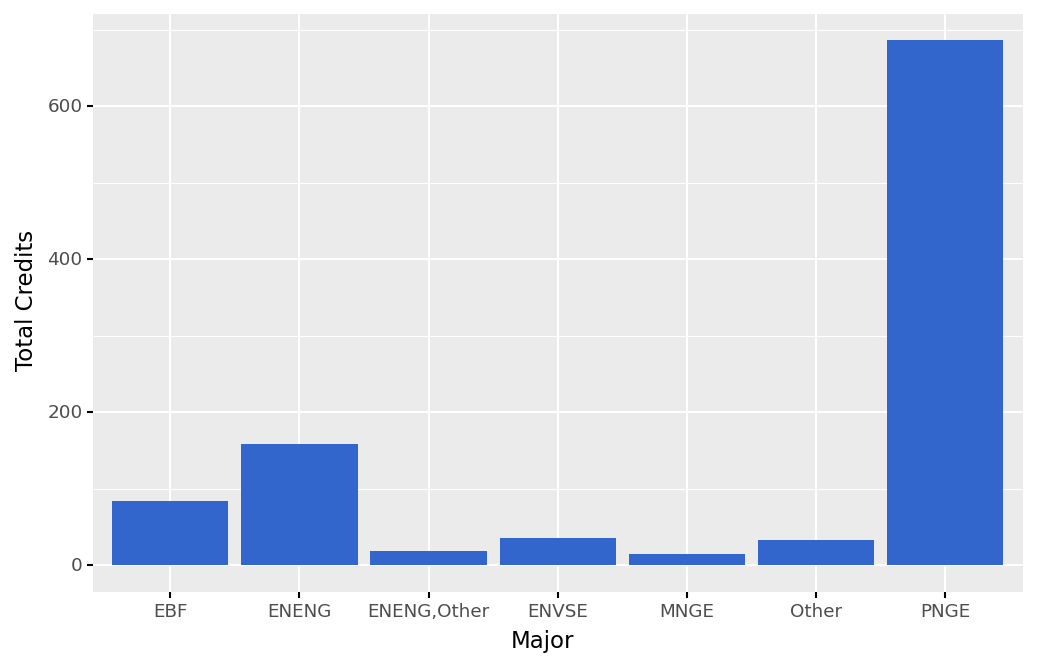
You can also use bar plots to show a quantitative variable that is separated by a category. For example, the plot below shows the total number of credit hours taken by students in the survey, separated by major. We can see that PNGE students took the most credit hours in total, largely because they represent the largest major that took the survey.
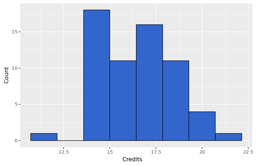
Another way that you can plot quantitative data is through histograms. Histograms are similar to bar plots, but they are only used to show counts of variables. Below, we show an example histogram that plots the credit hours taken by students in the survey. Plotting a histogram can also be a great way to visualize a variable's distribution.
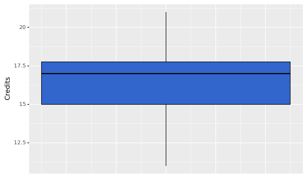
Similar to histograms, box plots can be used to visualize a distribution. They can also be used to identify the 5-number summary of a quantitative variable. Below, we show a boxplot of the credit hours taken by students. We can see the minimum value, the maximum value, the median, and the first and third quantiles. Additionally, box plots will show you which values, if any, are outliers. In this plot, we do not have any outliers.
 Assess It: Check Your Knowledge
 FAQ
FAQ