Visualization: Multiple Variables
 Read It: Visualization with Multiple Variables
So far in this lesson, you have learned about various types of plots that demonstrate one variable. In this lesson, we will extend these plots to include multiple variables.
First, we will return to bar plots. To add a third variable to a bar plot, you can create a fill variable, which can be used to show a categorical variable. Here, we are plotting a categorical variable on the y-axis (Emissions Scenario), a quantitative variable on the x-axis (Change in Emissions Relative to 2005), and a categorical variable as the fill (Source).

If we have two quantitative variables, we can plot a scatter plot. Below, we show a scatter plot of the maximum gas and the total gas extracted from wells in the Marcellus Shale.

When we have two quantitative variables, we can also begin to discuss the correlation or association between the two variables. For example, based on the plot above, we can say that the maximum and total gas extracted from a well are positively associated. However, if we want to quantitatively measure that association, we need to understand the correlation.
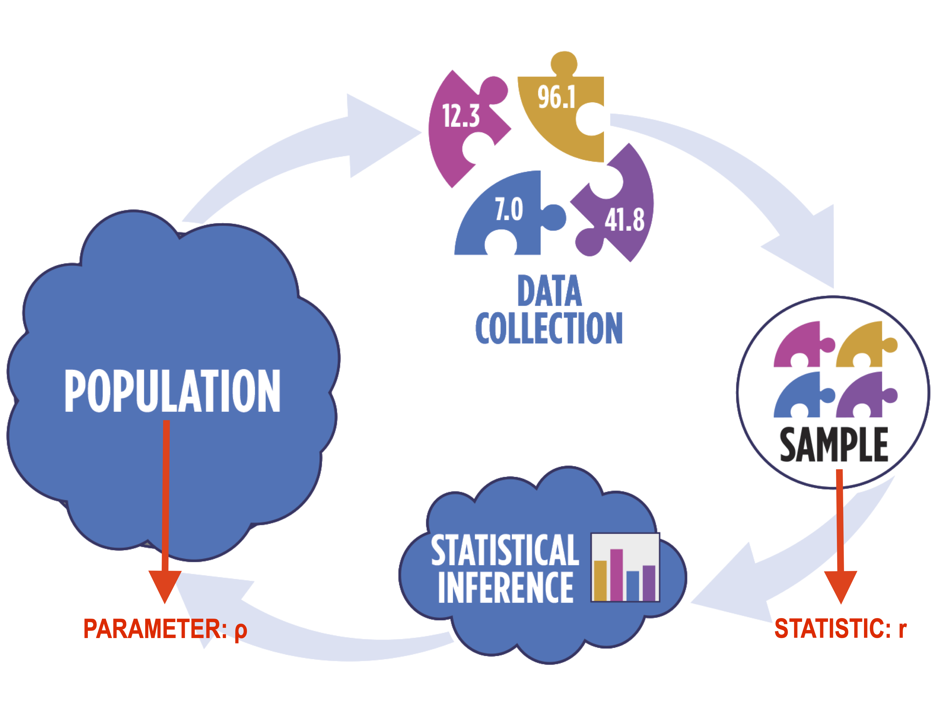
In particular, when working with correlation, you need to use distinct notation, as shown below. In particular, we use the Greek letter "rho" (ρ) to denote the population correlation and the Latin letter "r" to denote the sample correlation.
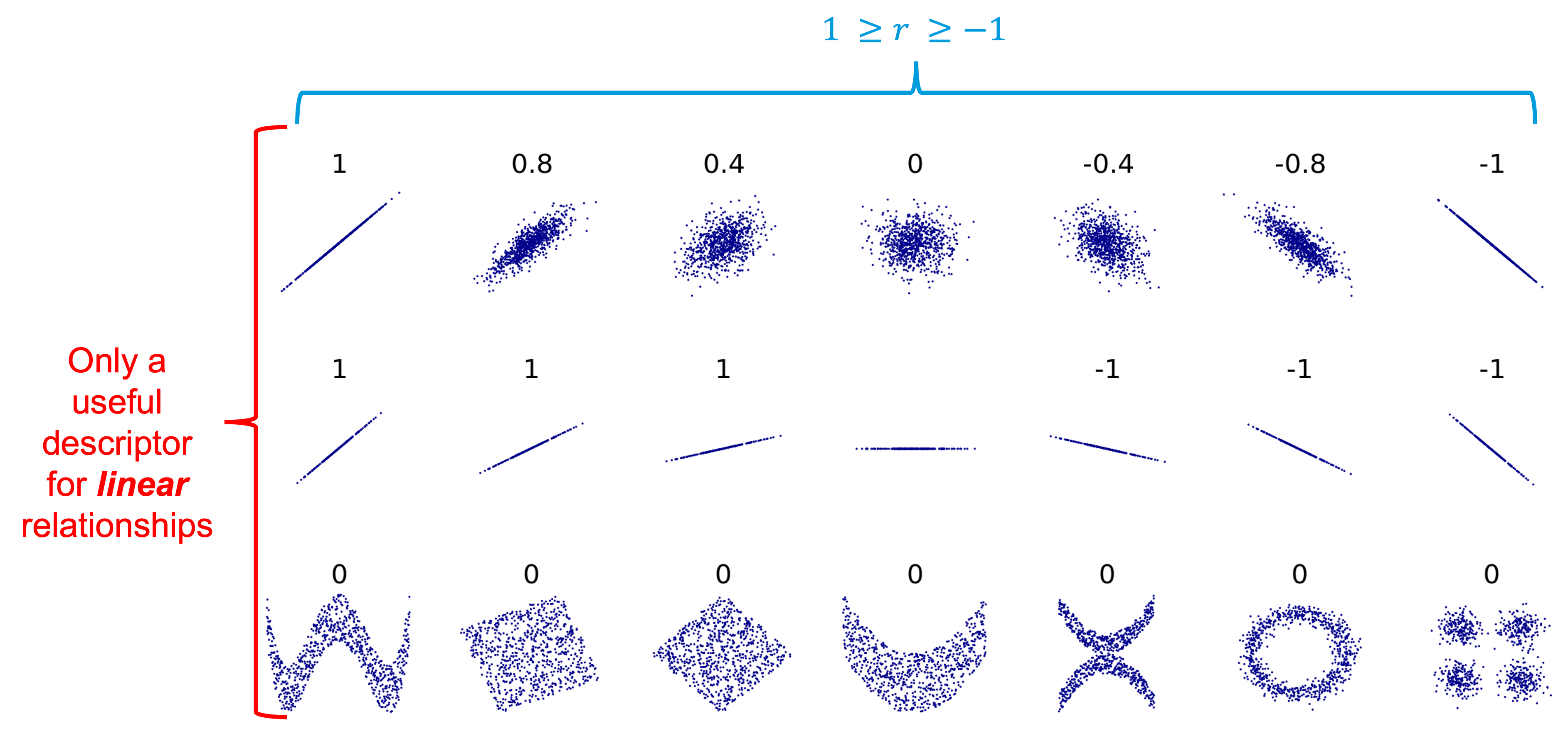
In terms of correlation, the values typically range from -1 to 1, with values at the edge of the range representing strong correlation (positive or negative, depending on the sign) while values closer to 0 represent weak correlation. The figure below shows possible correlation values. It is important to note, however, that correlation is only applicable to linear relationships! Non-linear relationships can have associations, but they will always have a correlation of 0, as shown below.
A good example of this is the line plot below, which shows the average hourly kWh produced by Dr. Morgan's solar panels in 2021. There is clearly an association between the time of day and the kWh production, but it is not linear, so the correlation coefficient will be 0.

A final important note when determining correlation is that correlation does NOT equal causation. For example, the plot below shows the number of people that have died in swimming pools plotted against the electricity generated by nuclear power plants in the US. The correlation coefficient is 0.90, which is very strongly positive! This correlation, however, doesn't mean that the increased use of nuclear power has caused the increased swimming pool deaths, simply that they have both increased at roughly the same rate over the years.

 Assess It: Check Your Knowledge
 FAQ
FAQ