EME 210
Data Analytics for Energy Systems

Bar Plots: Multiple Variables

PrintPrint

Bar Plots: Multiple Variables

  Read It: Bar Plots with Multiple Variables

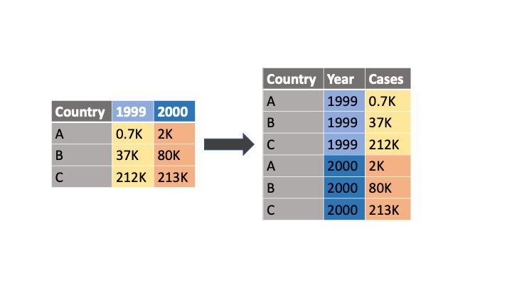
In this lesson, we are going to demonstrate how to create bar plots using ggplot/Plotnine. First, however, we will need to prepare the dataset for plotting. This will involve importing the data and melting the data to get it into "long" form. In other words, the melt command will convert the column names of select variables into their own categorical variable. For example, the code below will convert the data as shown in the figure. 

df.melt(id_vars='Country', value_vars=['1999', '2000'], var_name='Year', value_name='Cases')
Enter image and alt text here. No sizes!
Demonstration of how the "melt" command works in Python. 
Credit: © Penn State is licensed under CC BY-NC-SA 4.0 

Below, we will demonstrate this command with the Emissions Scenarios dataset.

  Watch It: Video - Importing and Cleaning the Data for Visualization (5:14 minutes)

Click here for a transcript.

Hello. In this set of videos, we're going to be talking about how we can add second, third, and sometimes even four variables into our plots. But before we get into the visualization, I'm also going to take a video to show you how we can use melt, the function, to transform our data into a more plottable format.

So, here we are in a new Google Colab file for this part of the lesson. And in particular, we've got the libraries that we're using that we've used before, but we are now adding in num pi, which we have nicknamed as np. So, let's get into the data. So, I've already mounted my Google Drive using option one from earlier. And I'm going to go ahead and read it in. And the data that we are working with is from mission scenarios. So, this data, actually going to cut that, cut that short to make it a little bit easier to type later on. And essentially what these emission scenarios are, they're published by the US, and they're saying what percent change that we might have in emissions based off of different scenarios. So, in 2005 we assumed 100 percent fossil fuel emissions. And then, when we do reference in 2035, those emissions drop because we're actually having negative emissions from zero carbon and solar, and we've got differences here based off of these different scenarios.

And now we could go ahead and plot this to see a variety of different plots, but it's very difficult to work with data sets that are, what we call, wide data sets. Meaning, that there's many columns that fall into different row-based categories, instead of being long and having a short amount of column-based categories. And so, in order to get this data set into what we call long form, we need to use the melt command. And so, I'm going to create a new data frame called emsc_melt. And I'm just going to type our original data frame dot melt.

And there are several things that go into melting the data set. The first is that we need to tell it which variables we want to maintain as they are now. And in this case, we want to maintain category. So, this is the column name. Up here, we want these variables to be the same in our new melted data set. What we want, though, is all of these numbers to be in a single column. And we want these row or column names to become their own categorical variable. And so, we need to provide what we will name our new variable, and in this case, this is whatever your column names currently are. So, we'll just name it source because that's the source of electricity up here. And then we also need to provide a value name, and this is whatever your actual numbers are. And so, we will just call that, emissions. And so, then if we print this, we can see that this data is now what we call long form. All the numbers are in a single column, and we've got these categories. Instead of being individual columns, they're now within a single column to specify. And this really helps us when we go to plot, which we will do in the upcoming videos.

Credit: © Penn State is licensed under CC BY-NC-SA 4.0

Below, we will use the melted dataframe to create a bar plot with three variables.

  Watch It: Video - Bar Plots with Multiple Variables (4:54 minutes)

Click here for a transcript.

Welcome back. So, we're going to talk about how we can add a third variable to our bar plots today. So, in the previous bar plot video, we showed how to get apply a categorical variable with counts on the y-axis, and then a categorical variable with a quantitative variable on the y-axis. But if you wanted to add a third variable, you could do that through adding fills, which is what we will demonstrate here using the Plot9 or ggplot plotting tool.

So, we are here in the Google collab file that we started in the previous video. We've got our libraries. We've got our data that has already been read in. And at the end of the previous video, we melted the data set. And this will become very important when we go to use ggplot to make this bar plot. And so, we can go ahead and just get started with our ggplot. So, similar to the previous videos, we start off with listing our data frame. And then we're still doing a bar plot, so we say geom_bar. And we still need an aes. And so, in the past we specified an x-axis, we'll say category. We specified a y-axis, emissions. And then we did stat equals identity to say we want the actual data; we don't want to do any calculation on it. And then we added the fill outside of the aes. And that's how we got to variable plot.

However, if you want to add a third variable, you need to do it within the aes statement. And so, here we say fill equals source. So, if we run this, we can see that now we've got emissions, we've got category, and we've got source. And it automatically creates this legend for us, so we don't need to worry about that. And we can see how it works. Now, this plot isn't the most descriptive, nor is it the most readable. And so, to show you a few other things that you can do within ggplot, we can first flip the coordinates with chord underscore flip. So, if we run that, we can see that now. Because it's on the y-axis we can actually read what those categories are, which makes it a lot nicer.

And then we can actually add some labels. So, we can say xlab equals emissions scenario. And note that I said x label. It needs to follow whatever you mapped your x value to in the aes statement. So, in this case, when I run this, the x label is actually on the Y, because I flipped those coordinates. But the program is able to track where you, which value you coded as the x value and attach the actual, know that that's what value you mean when you do the label instead of assuming that it goes on the x-axis automatically. So, instead of tracking a specific axis at this point, we're tracking a variable. And the program knows where to put that label based off of the variable. And so, this is an example of how you can add a third fill based variable to your bar plots.

Credit: © Penn State is licensed under CC BY-NC-SA 4.0

  Try It: Apply Your Coding Skills in Google Colab

  1. Click the Google Colab file used in the video is linked here.
  2. Go to the Colab file and click "File" then "Save a copy in Drive", this will create a new Colab file that you can edit in your own Google Drive account.
  3. Once you have it saved in your Drive, use the partial code below to create a multiple variable bar plot using plotnine/ggplot.

Note: You must be logged into your PSU Google Workspace in order to access the file. 

from plotnine import * # import the library
 
# fill in the blank (...) to plot a bar plot with 'Category' on the y-axis, 'Emissions' on the x-axis, and 'Source' as the fill variable
ggplot(emsc_melt) + ...
 

Once you have implemented this code on your own, come back to this page to test your knowledge. 


  Assess It: Check Your Knowledge

Knowledge Check