EME 210
Data Analytics for Energy Systems

Sampling Distributions

PrintPrint

 Read It: Sampling Distributions

Recall the animation from Lesson 1, showing the process of collecting a sample from a population, then using that sample to make an inference about the population.

cyclical diagram showing how a data is collected from a population to quantify as a statistic to measure and make an inference; the standard deviation  is noted and described in the text above
Illustrates the collection of a small sample of data from a much larger population. This course will primarily focus on the "Statistical Inference" process in this diagram; what do we learn about the whole population from just a small collection of data?Enter caption here
Eugene Morgan © Penn State is licensed under CC BY-NC-SA 4.0 

Often, we will want to collect a number of samples in order to bolster the statistical power of our inference. In other words, we want to obtain a sampling distribution, which we can use to conduct statistical inference tests. This sampling distribution is made up of some statistic (e.g., the mean) of each individual sample. For example, say we roll two dice 10 times and record the average roll, this average is x . Then, we repeat the process with a new set of 10 rolls, and so on, until we have a large number of samples. Each of these individual x s makes up the sampling distribution, which can be visualized in the figure below.

sampling distribution of average dice rolls fully described in text below
Sampling distribution of average dice rolls.
Credit: Eugene Morgan © Penn State is licensed under CC BY-NC-SA 4.0 

In this figure, each point represents the statistic (e.g., x , p ^ ). Note that for most parameters, the sampling distribution will be centered at the population parameter if the following are met:

  • The samples are random
  • The sample size is large enough
  • There are enough samples

Definition: The sampling distribution is the distribution of sample statistics (e.g., x , p ^ ) calculated on different samples of the same size and from the same population.

 Watch It: Video - Introduction to Sampling Distributions (10:33 minutes)

Click here for a transcript.

Hello and welcome to this new lesson on confidence intervals. Before we get into confidence intervals, we're going to talk about sampling distributions. Because we ultimately perform the confidence interval on the sampling distribution. So we need to talk about how we actually get those sampling distributions. And so, in this video series, we're going to be using some simulated dice rolls. And so, you can imagine a situation in which you roll two dice, you take the total, and then you record that total. And ultimately we did this four times, but 10 rules in each time. So, we've got four different samples of 10 data points. So with that, let's go ahead and jump in to the video.

So, we are here in Google Codelab. We're going to be using two main libraries in this series of videos. The first is going to be pandas and the second is plot nine. And then, as I mentioned, we're going to go over sampling distributions. So I went ahead and preloaded this sampling data and as I mentioned we've got four samples here, and we've got 10 dice rolls in each sample, and we recorded the total. What we're actually doing here with these curly brackets is essentially creating a dictionary and then converting it in to a data frame right away. So if you recall in lesson one, we talked about dictionaries and data frames and how we can convert between the two. Here we're just doing it all in one step. So we've got our data underscore DF for data frame. however, we're going to convert this into a long form data frames, which will allow us to help with plotting down the line. So we're going to be using that melt command that we talked about in lesson three.

So, I'm just going to rename override the data DF name and say data df dot melt. And then, we need to give it our value vars. So, which values do we want to maintain and in this case we want to maintain sample One, sample two. Each of these samples is a column, so we want to keep them as they are. So those are going to be our value vars and I forgot an equal sign, right there, and then we also need to give it a var name. So what do we want these new values to be called? We'll call them sample, and we give it a value name. What do we want what's in them could be called? And we'll call that outcome.

And so then I'll just print the data frame. We'll just show the first five rows using this dot head command. And so we can see here we've got our sample, and we've got our outcomes. And so, we can use this to create plots. And so, as we talked about in lesson three, it's often a lot easier to plot using this long form, especially when we're working with gg plot. So our first visualization is to just look at how these different samples relate, and so we're going to do a histogram with filled bars. So we're going to have our basic histogram, and then we're going to add a variable using the fill command. So I'll start with the gg plot command. So we say gg plot data underscore DF.

And then we give our geom. So geom underscore histogram and then we give our AES. So this is the requirement. So we need an x value which we will call, which will plot our outcome so our actual dice rolls. And then, it's a histogram, so we don't need a y value because it's just going to give us the count. But we will add a fill based off of sample within the AES statement because we want to attach it to a variable. And then I'm going to specify that I want 12 bins we want one bin per possible dice roll and I want each of those bins to be one long. So if we run this, we can see our plot here. We've got each of our samples has been automatically put into a legend. And then we can see sort of the distribution and because we've done fill. It's stacked each of these samples on top of each other, so we can see as the whole group of samples. All 40 data points that we ran. The most common was seven across all the samples. And it does tend to follow you know vaguely normal distribution. But we can see that, for example, sample 4 was heavily skewed towards the lower values. It looks like sample two and three might have more of the higher values, and so we do see that there are differences there between our samples. So this is just a good way to get an idea about what your samples exist.

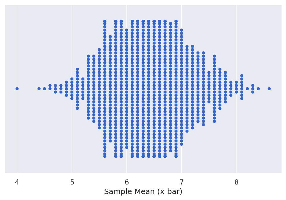
But we still need to determine the sampling distribution. And so we have two steps to determine the sampling distribution. The first is to find the mean of each sample, and then we're going to plot it. So the sampling distribution is the distribution of statistics, and in this case we're going to say x bar is our statistic. So we need to first find the mean of each sample. So we say data means, and we are going to use a group by function. So we want to group by sample. So we want to group first we're going to group by sample. Then we're going to take the mean of each of those rows in the now grouped sample. And then we're going to tag on a rename function. So here we just will rename our outcome column to sample means. Which just is a little bit more descriptive because it'll no longer be the outcome. It'll be the means of the outcome. So we can print that and in theory you can do each of these steps individually. But one of the benefits of working with pandas, is that you can just sort of tag on these additional commands using this period or dot right here. So we can do dot group by dot mean dot rename, and it'll integrate them all in order. So if we print this, we can now see our sample means here. So we've got sample one with a mean of six, sample two 6.3, 7.5, and 5.7. So this is our sampling distribution, it's our sample means or distribution of the sample means. To visualize that, we'll often use what's called a Dot Plot, and so it will function very similarly to a histogram. But we'll start with just plotting data means. And now the geom is geom dot plot. It still requires an AES.

Here we want our sample means. There's no other data that we're doing. We're not adding a fill. No need to specify any y-axis, but normally we will specify the dot size. Just so that the dots don't overwhelm the plot, and so here we can see that it's plotted a single dot for each of our sample means. But it stacked them into bins the way that a histogram would. And so you can use this as a way to see the distribution of data the way you would a histogram, but you can also see how frequently a certain points are. Where they are each located and if we wanted to we can add additional variables to show the fill. To show lines that can make this a bit more descriptive. So with that, this is how we can create a sampling distribution from a small subset of samples.

Credit: © Penn State is licensed under CC BY-NC-SA 4.0

 Watch It: Video - Comparing Samples to Population (13:51 minutes)

Click here for a transcript.

Welcome back to the video series on sampling distributions. We're just going to continue to work with our sampling distribution, and today we're going to get into how we can compare that to the true values. So if you recall from the last video, we had these the sample of dice rolls that we were able to visualize. And then create a sampling distribution of the means of each sample. So, one of the reasons that we developed these sampling distributions is that we use them to test things. So we can say, does the sampling distribution center around the true mean? And so, in this case one of the benefits of working with dice rolls, as an example, is that we know what the true mean is. it's seven. You will always, in theory, if you roll enough dice you will always get seven is the most common and sort of central number. And in particular, the dice outcomes sort of followed this trend, where there's, you can roll one and a one to get a two, but you can roll a one and a two to get a three you can get one out of two that way. And so, we have the most values for seven.

So let's go ahead and jump right in to the coding here. So I've pre-coded this aspect of the theoretical outcomes. And this is a little bit of a faster way to develop a large data frame, because we've pre-wrote all of these. And so each of these. If we run this, and come down here, we can print out twos for example. And it's just one, two. But then if we look at sevens, it's a list of six sevens. And so this is a quick way to develop a data frame or a series of data frames, and then we can connect them. So we can create a new data frame called true DF. Use our PD dot data frame command and again, doing this curly bracket, so that we can specify the outcome. And the outcome is just twos plus threes plus fours plus fives and so on. So this is why we create these variables above because we can quickly just add them together in order to create a data frame that doesn't need us to sit there and write out every single number that is included in our true data frame. And so we can come down here and print true DF. And so, then we can see that we've got the outcome here, and we've got all of our data in a single column. And so then we can also you know plot that plot those values. And so we're going to use a histogram. So we'll say ggplot true BF. And then we say geom histogram and give it our AES statement, so our X is just equal to outcome. We don't have any y we're not doing any fill. We say bins equals 12. Bin with equals one. And then outside of the histogram, I'm going to add a second or a third line that we say scale X continuous and we say breaks range from 2 to 13. And this will essentially tell the histogram where we want our specific breaks for our bins. And so the range tells it the first value, and you'll notice that it only goes until 12. But we said 13. This is something that you have to do in Python whenever you're having a range of data. The last one is not inclusive, so you can say from 2 to 13. Exclusive to 13 meaning that it's really 2 to n minus 1, in this case. n minus 1 is 12. So here we've got our data frame of true values, which is exactly what we expect. We have this nice bell curve. Seven up here is the maximum, and we can go on either side. So this is our population. This is our true population, and what we want to do is compare our data or our samples to that theory or true population.

So we've got several steps here. The first thing we're going to do is create a new column called label, which is going to specify that this is the true outcome as opposed to a sample. So to create a new variable a new column, we just add it here and tell it what goes into it. So it's just going to be true. So, if we just print out the first five rows, we can now see that we've got this label and everything is set to true. So then, the next thing that we need to do is reset the index, and we do this so that the sample number can, well we're resetting the index to our data frame up here, so that we can make sure that we have the actual values in a column instead of as an index. So this is just data DF dot reset index. And so now we can see that we've got what used to be an index is now a row or a column, and then we need to rename so just so that it matches the true DF column. We want them both to be called label. So we say data DF. We need to save it as something, so data DF equals data DF dot rename and then we change sample to label, making sure that we match exactly what we wrote up here down to the proper cases and just to show how that is changing, we can print out the first five rows. So now we can see that this is no longer called sample. It's called label. And then finally we can concatenate this into two data frames, while maintaining our long format. So we'll just call it data frame concat. We use the TD dot concat function and, in this case, we give it our first data frame comma our second data frame in square brackets. We print that. We can see that it starts off with all of our true data, and then it ends with all of our sample data.

And so, then the last thing that we can do to compare the true population with our sample is that we can create a histogram. And so, what we'll do is again using ggplot, we'll say DF concat is our data. Again, geom histogram. We give it the AES statement, so we say x equals outcome. In this case, we're going to add a y and in particular we're going to use this to essentially make it do a statistic rather than a count on the histogram. So we're going to say after stat density. So this will tell it to be used the density calculation as the Y value instead of a count, and then we want to fill based off of the label. And again, we want to specify 12 bins. I've bin width one, and we're going to add an extra thing called position, which will essentially prevent it from stacking on top of each other. We'll just separate them out, so they're next to each other, and then we'll do our scale X continuous so that our range is as expected. So we can run this. And so, now we can see the distribution of all of these values. So our true value in purple here we can see it's got this nice bell curve, but we can see that sample 4 for example had a lot of sixes and less down here. We can see that sample three to one two and four have more sevens than the true value and so forth. And so, we can use this to see how these distributions compare. And then if we wanted to find the sample distribution again, we need to get the distribution of the means in order to make it a sample distribution. So we'll call this DF means two. So we can say DF underscore concat dot group by, and in this case, we're going to group by label. We're going to say mean, and then we're also going to rename so that they're a bit more descriptive. Outcome will become sample means. And so, now we can see each of our sample means and the true population mean down here at the bottom, and we can use that to compare. And what we'll get into in the next series of videos is how we can use this data to develop confidence intervals and start to make some inferences based off of our samples.

Credit: © Penn State is licensed under CC BY-NC-SA 4.0

  Try It: Apply Your Coding Skills in Google Colab

  1. Click the Google Colab file used in the video is linked here.
  2. Go to the Colab file and click "File" then "Save a copy in Drive", this will create a new Colab file that you can edit in your own Google Drive account.
  3. Once you have it saved in your Drive, use the partial code below to add two additional samples to the dataframe with data from 10 dices rolls each (use either real dice or a virtual roller), then calculate the new sample distribution.

Note: You must be logged into your PSU Google Workspace in order to access the file. 

# Dice roll data, as data frame
data_df = pd.DataFrame({'sample1' : [5, 7, 4, 6, 3, 8, 7, 7, 8, 6],
                        'sample2' : [3, 11, 7, 9, 7, 2, 7, 5, 4, 8],
                        'sample3' : [7, 8, 6, 10, 8, 4, 9, 3, 9, 11],
                        'sample4' : [5, 6, 6, 6, 4, 7, 6, 7, 3, 7], 
                        'sample5' : [...],
                        'sample6' : [...})

# melting the data to get it into "long form"
data_df = data_df.melt(value_vars = [...], var_name = 'Sample', value_name = 'Outcome')

# Find the mean of each sample
data_means = ...

data_means


  Assess It: Check Your Knowledge

Knowledge Check 

 FAQ