EME 210
Data Analytics for Energy Systems

Normal Distribution and Z-Scores

PrintPrint

Normal Distribution and Z-Scores

Read It: The Normal Distribution

The normal distribution is a common distribution of data, which is frequently plotted as a bell-shaped curve. In this curve, the mean is plotted at the center or peak of the bell with the sides of the curve being completely symmetrical. The width of this curve is determined by the standard deviation of the data. In this sense, to plot a normal distribution, you need only two parameters: the mean and the standard deviation. We define, or denote, the normal distribution by using the capital letter N, followed by the mean,  μ, and the standard deviation, σ. You can calculate the normal distribution for any any dataset using the probability distribution function, shown below.  

The probability density function (pdf) of the Normal distribution is:

N ( x ; μ , σ )  or just  N ( μ , σ ) = 1 σ 2 π e 1 2 ( x μ σ ) 2

with parameters μ = mean and σ = standard deviation

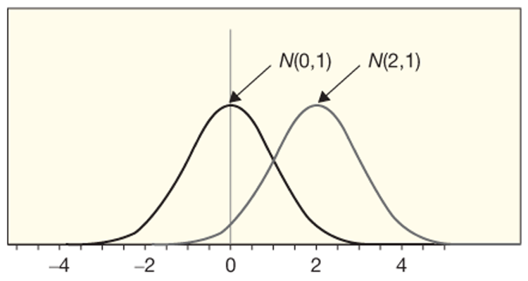
The standardized version of normal distribution has a mean of 0 and a standard deviation of 1, as shown in the figure below. Note that by changing the mean from 0 to 2, the plot shifts to the right, but maintains the same width since we did not change the standard deviation.

Example of 2 normal distributions with different means. Shape remains the same, but shifted because the means are different.

The normal distribution. Notice how the shape remains the same, but shifted slightly due to the higher mean value.
Credit: Eugene Morgan & Renee Obringer © Penn State is licensed under CC BY-NC-SA 4.0 

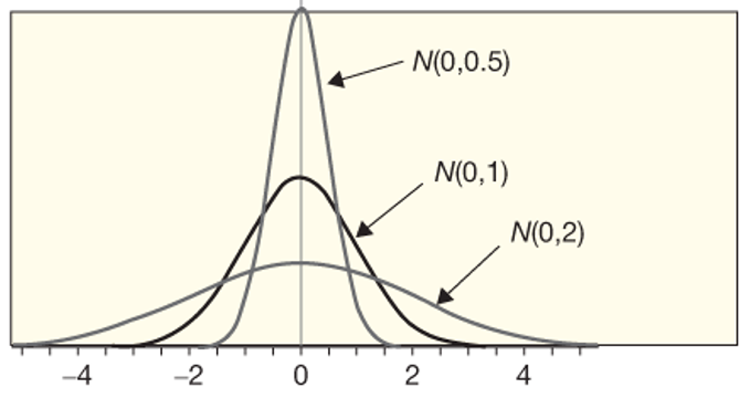
In the figure below, you can see as the standard deviation goes from 0.5 to 2, the curves get wider, but the plot remains centered at 0 since we do not change the mean at all.  

bell shaped curve depicting "flattening" of data as the standard deviation changes from 0.5 to 1 and then to 2 while the mean remains 0. As described in text above and caption below
The normal distribution. Notice how the center remains the same, but the shape is changing slightly due to the higher standard deviation values.
Credit: Eugene Morgan & Renee Obringer © Penn State is licensed under CC BY-NC-SA 4.0 

Read It: Z-Scores

Often, when working with traditional statistical inference, you will need to calculate a quantity known as the "z-score". The z-score is a means of standardizing any data to fit with the standard normal distribution (e.g., N(0,1)). This calculation is performed using the equation below. Essentially, you subtract the mean from your data and divide by the standard deviation.

z =  X μ σ
 with parameters  μ =  mean, and  σ =  standard deviation 

Traditionally, this z-score is used to find confidence intervals and test hypotheses using the central limit theorem. However, it can also be used to detect outliers: a z-score > 3 is generally considered to be an outlier.

Watch It: Fitting Normal Distributions - (7:45 minutes)

Click here for a transcript.

All right. Welcome back to our series on more traditional statistical inference. And in this video, we're going to talk about the normal distribution and how we can fit the normal distribution to our existing data. And for demonstration purposes, we're going to use a version of the card draw data set that we collected in the previous video on significance. All right, so we are here in Google Colab. We're using these libraries up here. So we've got numpy, pandas, plot9, and scipy.stats. And we're going to use this scipy.stats library to generate and fit normal distributions. The documentation can be found here, and also linked in the pages. And in particular, we're going to use the stats.norm.pdf to fit a normal distribution to the data. So I copied down some code from the significance level test where we drew six red cards in a row. And I am just going to multiply it by 10, so that we have a. sufficiently large data set. You've got 60 data points then. And then we conducted a binomial test, calculated the proportion, and converted that into a data frame. And so, to fit a normal distribution, we need to know two values. We need to know the mean and the standard error. These are the two main parameters that control the shape of a normal distribution. So we always need to find them. So we can say the mean r for red is just phatdf p hat dot mean. And then likewise, the SER for red is phatdf phat dot std. I made a typo right there. And then to show these, we can print the mean, it's just mean r. We can print the standard error and go ahead and run that code. So we can see that the average phat was 0.5, and that the standard error is 0.06. And these are proportions, so this makes sense.

When we run our binomial distribution, we expect it to be centered around whatever our null hypothesis assumption is, which in this case was 0.5. So, before we can then visualize this normal distribution, we need to create new data that fits the normal distribution to our existing data. And so, we say phat data frame, a new column called x underscore pdf. This is the x variables of our normal distribution. And so, to create them they're just evenly spaced variables, so we say np numpy.lin space. And in this case you give it the first value, the second value, and how many data points you want. So, in other words, this will give us 1000 evenly spaced data points between 0 and 1. And then we also need a y variable, so y pdf and this needs to be p hat df. And this is where we actually fit the normal distribution. We say, stats dot norm dot pdf. And then we give it the x values that we already created, x underscore pdf. We give it the location, which is the mean value, and we give it the scale, which is the standard error value. So then those run as expected. We can now look at what p hat looks like. If we just, you know, print the first five rows we can see that we've got our proportions here, and then we've got our x values that run from zero to one thousand, or zero to one with a thousand in between, and then we've got the pdf values that are associated with these x values but follow the same shape as p hat.

So then we can go ahead and visualize this. And so, we'll do ggplot with our p hat data frame. And the first thing that we're going to plot is a dotplot so we'll say, genome dotplot aes, x equals p hat and dot size is 0.25. So I'll go ahead and run this to give you a look about what this looks like. So we've got a fairly normal-esque distribution of our data points. So to add the actual normal distribution onto it, we can add a line plot, say geomline aes. And our x value is just that x pdf. And our y value is the y pdf. And then we can say color equals, red. And I'm going to add a size equal to one, make it show up a little better. So here that should be x. And so now we can see how this normal distribution looks with our actual data. So we've got our actual data in these black dots, and then we've got this normal distribution. And what has been done with this, y stats norm pdf, which created ypdf, is we specified the center of the normal distribution to be centered on the mean value of our real data. And the standard error, the spread of this normal distribution, to be equal to our sampling distribution. And therefore, we can see what this idealized normal distribution would look like. And therefore, can look at where we're maybe over estimating normal, where it's less normal, and where it's possibly more normally distributed.

Credit: © Penn State is licensed under CC BY-NC-SA 4.0

Try It: Google Colab

  1. Click the Google Colab file used in the video here.
  2. Go to the Colab file and click "File" then "Save a copy in Drive", this will create a new Colab file that you can edit in your own Google Drive account.
  3. Once you have it saved in your Drive, try to edit the following code to fit a normal distribution to some data:

Note: You must be logged into your PSU Google Workspace in order to access the file.

meandist = ...
SEdist = ...

phatdf['x_pdf'] = np.linspace(...) 
phatdf['y_pdf'] = stats.norm.pdf(..., loc = ..., scale = ...)

(ggplot(...) +
    geom_dotplot(aes(...), dotsize = 0.25) +
    geom_line(aes(...), color = 'red', size = 1)
)

Once you have implemented this code on your own, come back to this page to test your knowledge.


 Assess It: Check Your Knowledge

Knowledge Check