Let's start our discussion with histograms, because this particular form of data visualization is useful for illustrating the measures of center that we discuss a little later in this section. Histograms simply show the number (or "Count") of observations whose values fall within pre-defined intervals (or "bins"). There are many ways to make a histogram in Python, and a convenient method is in the Pandas library, where one applies the function hist to any quantitative variable:
df['x'].hist()
where you would replace df with your dataframe name and x with the variable name. The height of the columns indicates the relative number of observations in each interval. For example, in the histogram below, the tallest column belongs to the interval 0 to 0.1.
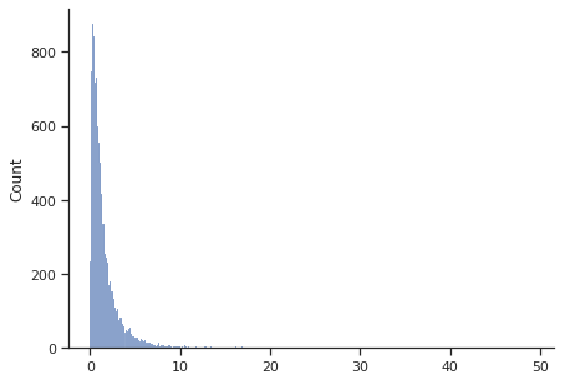
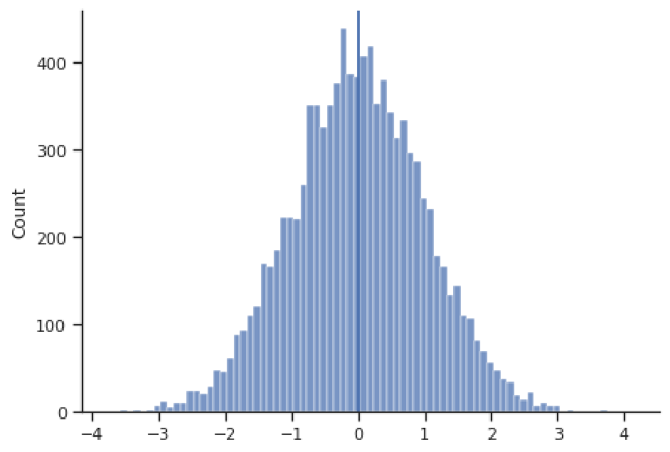
Histograms effectively visualize the distribution of a quantitative variable, showing us what values that variable spans (i.e., the minimum and maximum), where most values are concentrated, and how spread-out typical values are. Some typical shapes of histograms are represented in this section. In the figure above, we have a bell-shaped and symmetric distribution, in which the counts fall off in a similar pattern above and below the center (this example happens to be centered at 0). The next figure shows an example of a right-skewed distribution, where observations are concentrated at lower values, with fewer observations at much larger values. This distribution appears to have a "tail" going off to the right. Note that the values need not be concentrated at 0, or even be positive; these are just features of this example.
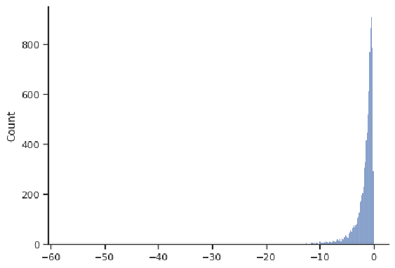
The next figure shows a left-skewed distribution, with a "tail" going off to the left. Most observations are concentrated at larger values. Note that the values need not be concentrated at 0, or even be negative; these are just features of this example.
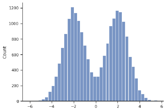
An example of a distribution that is symmetric but not bell-shaped is depicted below. Even though it is centered at 0, that is not where most values are concentrated. This particular example is "bimodal", in that it has two locations where values are concentrated (about -2 and 2).
Most often, the primary characteristic of interest for a distribution of data is its center, because one wants to know the most representative value for the variable of interest. in the example below, even though we witness values as large as 4 and as small as -4, these are very rare; the most common values are close to the center at approximately 0.
Perhaps the most common way to measure the center of a quantitative variable is with the mean, in which you add up all the values and divide by the number of values:
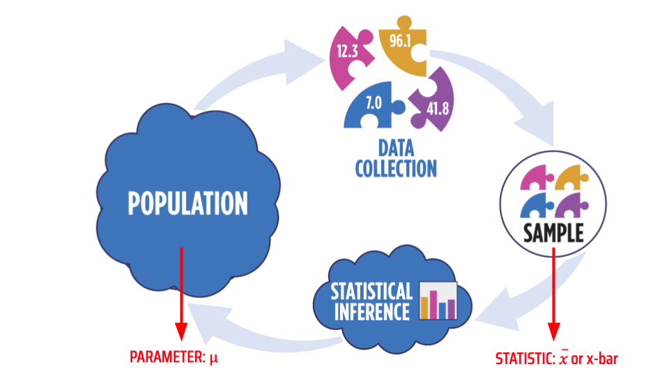
Here, n is the length of x, or the number of values in that vector. When someone talks about the "average", they usually are referring to the mean. When one calculates the mean from a sample of data, we call that the "sample mean" and note it with $\bar{x}$ or "x-bar", whereas the mean of the entire population is noted with $\mu$ or "mu" (a Greek letter). The image below shows this distinction in notation graphically. Throughout this course, whenever we talk about a value that characterizes the population, we refer to that as a "parameter"; and when we talk about a value calculated from a sample, we call that a "statistic".
Another measure of the center of a distribution is the median, which is the middle value after you sort the values from lowest to highest (or the mean of the middle two if there are an even number of values):
Median:
If is odd, median is middle value of ordered data values
If is even, median is mean of the middle two values of ordered data values
The median value is noted with m.
A third measure of the center of a distribution is the mode, which is simply the value that appears most often in a variable:
Mode: The value that appears most frequently
We won't work with the mode much in this course, as it is a less useful measure of the center. Often with quantitative variables, the mode cannot be calculated because each value is unique. It is better applied to ranges of values (e.g., comparing the heights of bins in the histograms above), or for categorical data, where values do tend to repeat and one usually sees a distinct category with more observations.
Notation for Mean
Click for a text description of Notation for Standard Deviation.
The mean is more affected by skewness (and outliers) than the median!
For symmetric distributions, the mean and median will agree upon the measure of the center. Take the example below, where the mean estimates the center at 0.004 and the median at 0.005. Although not exactly equal, these values are very close (indeed, both are represented by vertical dark blue lines, which are indistinguishable because they plot right on top of one another).
Influence of Skewness: Mean = 0.004. Median = 0.005
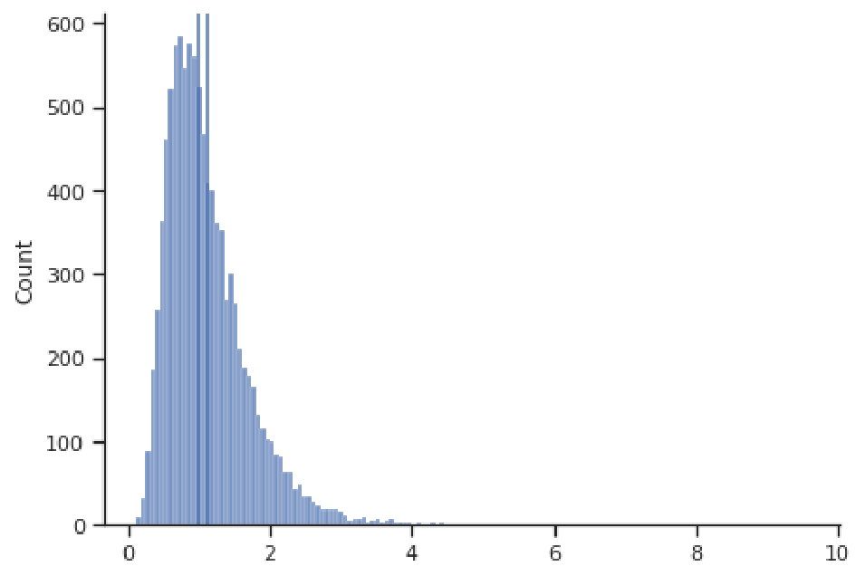
However, for skewed distributions, the mean and median will generally not agree, and the more skewed the distribution, the more these two estimates will disagree. The reason for this disagreement is that the mean will be more influenced by the extreme values in the tail of the distribution, since it sums the values in the numerator. The median doesn't care about the magnitude of the values, just their rank in terms of smallest to largest. Take for example the right-skewed distribution below, where the mean is 1.123 and significantly greater than the median of 0.993 (here the two dark blue vertical lines representing these values are distinguishable). The large positive values in the right tail have led to a larger mean than the median.
Influence of Skewness: Mean = 1.123 Median = 0.993
Thus, the median tends to give a more stable measure of the center that is robust to extreme values and outliers. For this reason, the median is often the go-to measure of the center for skewed distributions, such as salaries and housing prices, for example.
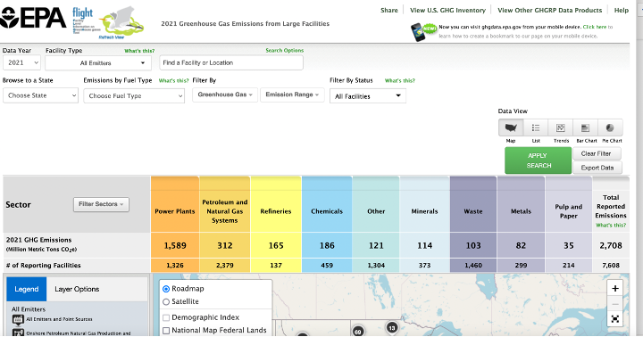
Read It: EPA Flight Tool
In the videos below use data from EPA's Greenhouse Gas Reporting Program (GHGRP(link is external)) to demonstrate how to make histograms and find the mean and median in Python. You may want to first explore the EPA's web app: Facility Level Information on GreenHouse gases Tool (FLIGHT(link is external)). This will help you understand the content of the dataset, which gives volumes of emissions from power plants, factories, refineries, etc. across the country.
Hi, in this video we're going to take a look at the underlying data for the EPA's flight tool. These are data on greenhouse gas emissions from facilities all across the United States by facilities, I mean, power plants, waste processing centers, factories, and so on, and so forth. So, I highly recommend you click on this flight tool to explore the database in another format. And if you click on that, you'll go to their web app. So, this is the flight tool here, and here it's a map-based overview of the data. You can zoom in on different localities and see where these facilities are located and information about them. You can also filter by different facilities and variables, and so on, so forth. So go ahead and check that out. However, what we're going to do here is we're going to look again at the underlying data. We're going to do our own thing with it outside of the web app. And we are going to ultimately find which state has the largest amount of emissions from facilities. So this is not emissions from the automotive sector or anything else, just from facilities. And along the way we're going to look at histograms. We're going to see how to calculate the mean and the median and then ultimately how to summarize all the emissions within each state.
So, let's get to it. So, we're all familiar with importing the data. We've got that. Those lines of code here, except there's one difference now that you may not be familiar with, and that is this skip rows argument. So, why do I have skip rows here? Let me explain. If we take a look at the underlying CSV, our data frame or our table doesn't really start until row four, here with the column headers. And then all the data below. We've got three superfluous lines here that really aren't part of the data frame at all. And we don't want to include. So, we just need to skip those three rows. So, pandas makes this incredibly easy. We say skip rows equals three. So, we skip over those unnecessary lines there. And here, highlight this. This highlights the importance of taking a look at the CSV file before doing the importing just to understand exactly what is in this data file. And you can open up these CSV files and in Google Sheets, or Microsoft Excel. So, once we have this imported, let's go ahead and take a look at the size of this data set. And one handy function to do this is shape. And all the shape gives us are the number of rows in this data set, and the number of columns. So, 1, 5, 3, 8, 6 some odd rows. The rows here are different facilities and we've got 66 columns. Furthermore, we should take a look at what the columns are exactly. So, let's print out the column names here.
So, we've got facility ID, facility names, city, state, etc, etc. And one really important variable here is total reported direct emissions. So, we're going to focus on that, although there's a lot of other interesting things here too, in particular, the industry type. So what type is, what form of industries producing these emissions. Lots of other useful things here, so let's get down to it. Let's start by finding the histogram. So, with a histogram we want to make sure that the data that we plot in our visualization in the histogram spans from the minimum of the data to the maximum of the data. At least it needs to cover the span of the data. So, if we want to find the min and the max, let's just say ghg min. we want to find our minimum total reported direction emissions. We just use the min function, very easy. We'll do the same thing for the max. And let's print these results. We'll say min is ght min and max is ghg max. So, our direct emission values for all the facilities span from zero to some really large number here. So, what is this, about 20 million? More than 20 million, so very large number here. So, let's see what happens when we make a histogram of this. So, we'll call our data frame, and one easy way to make a histogram is through pandas. We just say histogram.hist and we give it the column that we want to make the histogram of. And this is, in this case, total reported direct emissions. And we'll run this. And so, here we go. We get our histogram, and what is done is it's used some predefined, you know, rules of thumb to to make adequate bin sizes of our histogram here. So, the histogram is counting the values that fall within specified ranges and and then plotting those frequencies as bars. So, this is essentially a frequency table represented graphically where the categories are just different ranges of the quantitative variable. However, when we use the default method here, we don't know what those ranges are. And that's a little bit problematic. We're not sure basically what the break point is between this first bin and the second bin. We don't know where this stops. So, it's good practice to manually specify the number of bins that you have. So, we could do this fairly crudely, and we could say one e to the 7 7 when you do the seven being 10 million up to 20 million. But then we have to go up to 30 million because our largest value is slightly more than 20 million. So, we could do this, we'll have three bins. We've got four values specifying the break points between those three bins. You visualize this and we see a pretty crude histogram. I say this is crude because we pretty much have all our values in this first bin here and then a few values in the second bin and probably one value in this third bin. So, these bins are too fat. We don't have a good enough resolution. And so, we could break this up some more. We could subdivide it. A handy tool here is the range function. Built in range will just give us a sequence of values from some integer to some other integer. So, let's say, so let's say 21 million. And by some step, let's say we want to go by 1 million. And we get that, all the list of values going up in that increment. So, this is a handy way to build these bins if we want to have many of them. And we don't want to manually specify the break point between each and every one. So, there we go. We get a much finer histogram, and we know where the break points are. We know this is going from zero to one million, one million to two million, two million to three million, and so on, so forth.
Okay, so that's the histogram, and it's telling us the spread of the emissions from the facilities. In particular, we see we've got a lot of values that are close to zero, very few values that are really, really large. So this is what we call right-skewed. This is an example of a right-skewed histogram. Let's go ahead and calculate some measures of center. So, what is the average level of emissions in these facilities? I'll just do this in a couple of print statements. So, if we want to find the mean, also denoted x bar, this is going to be equal to our quantitative variable, phdm in this case, is total reported direct emissions. And we just say dot mean. Calculate the mean. It's also a good practice to include units. Our units here are millions of tons of CO2 equivalent, so, mmt CO2 millions of metric tons CO2 equivalent. So, that'll give us the mean. And let's compare this to the median. So instead of the mean function we just have the median dependent on there. And this doesn't have the notation x bar. The median is just the median. Let's run this. We see that our mean, it's got 388 000, our median 65 000, or so. A lot less. What this indicates to us, with the mean being much larger than the median, is that the distribution is indeed right skewed. In other words, this mean, the value of the mean, gets pulled up by these much larger values up here. These are most likely outliers. So, the mean is more susceptible to these outliers. The median is more robust to them. Note that the median falls, you know, well within this first spike here. The mean somewhere up here.
Watch It: Measures of Center Part 2 (6:16 minutes)
Click here for a transcript.
Lastly, let's find our total emissions for each state. So what we need to do here is within each state, sum up all of the emissions from all of the facilities within that state. So far we've just been looking at all the facilities collectively, but let's actually tally up the quantities within each state. So in order to do that, let's create a new object called stem, for state emissions. And we'll reference our initial data set. And we're going to use this group by function. So we're going to say we want to group by the variable, state, here. So they're going to be our groups. And within each group we want to perform whatever comes next. In this case we want to sum up the values.
When we do this, we retain all of our columns there. But ultimately, our total reported direct emissions are the sum within each state. Also one byproduct of this is that state becomes an index here. So let's reset that. Let's include in here this function reset index. And that'll just turn the state back into a normal column. There we go. So now we see state is just a regular column. Okay, so we've done that. We've summed all the total reported direct emissions within each state. Now let's find what the max is. So our max emissions will be the max of stem total reported direct emissions. And let's see what that max value is. Some really large value. What is this? This is 372 million and some change.
Okay. But we don't know what state that belongs to, so now we need to find which row contains this max value. So let's just make some dummy variable, we'll call it f. And we'll say stem total reported direct emissions equals equals max m. Note that I'm making a logical statement here. I'm using this equals to say which of these values are equal to max m. And what we'll get then is a Boolean variable. In other words, a variable containing only true and false. So it's false everywhere where it doesn't contain max m. And then we've got this one true in row 45, or index 45 here. But still that doesn't tell us what state, it just tells us the index. But we're getting there. So now we just need to query that row. We say stem of f. And you get the row that has the max total for direct emissions, the state being Texas. And there we have our answer. A quicker way to do this would be to say max row stem dot loc, using our loc function here of stem total reported direct emissions. And instead of max we're going to use idx max. So return the index where max is located, not the max value itself. Okay. And I need to type square brackets here so we can then see what max row is. And it reports all the variables, all the variable values for whatever the max is. We see it's Texas here. And we could put this into a nice print statement. I could say print the state with the highest facility emissions is, and then we say max row state.
There we go. So we found our answer. All right, so we've covered histograms, mean, median, and then ultimately summarizing data within groups. Note that Texas here, you know, it is the largest of the continental United States. And so you might say well of course it has the highest total direct emissions it's a really, really large state - lots of people, lots of industrial activity, makes a lot of sense. If we wanted to normalize this by state size, we could look at the average, what the average is across all the facilities. See if there's any state that's got, whose facilities are producing above average emissions, which case we'd replace the sum here with mean. So you can replace this sum with any other functions if you want to summarize your data differently than groups. Okay, we'll stop there for now.
 Read It: Histograms
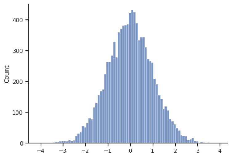
 Watch It: Measures of Center (10:39 minutes)
 Try It: DataCamp - Find the mean and median
 Assess It: Check Your Knowledge
 FAQ
FAQ