Click here for a transcript.
Hello, and welcome to a new lesson on linear regression. So throughout this lesson we're going to walk you through a series of tests and ways in which we can conduct linear regression. In particular, this video is going to focus on correlation and how we can actually conduct eventually a hypothesis test for testing the significance of correlation. So we're going to start with an introduction to the subject, and then later we'll get into the actual hypothesis test.
So, we are here in Google Colab, and we have several libraries that we're going to use that we've all used before in different settings. And in particular, we're going to ask the question, does... we're going to test the significance of correlation, so we're going to ask the question, “Does using more water for fracking yield more natural gas production?” And so, if you're not familiar, there's some context here provided that you can read through on your own time. But essentially, we are going to be using data from the Marcellus Shale formation in Pennsylvania to test, to answer this question. So there's two CSV files that we're going to use. And I have them ready to go and read in. The first one is lecture eight, Marcellus Wells and the second one is lecture twenty, Pennsylvania Wells Frack. And so, both of these have data on fracking wells, but they have a little bit of a different, different columns. And so, we can see here for in the Marcellus data which I've called Marc, we've got all of this information about drilling. And what we're going to be interested in is the data down here, total gas and max gas. These are the values that tell us how much gas was produced from a well. The water data on the other hand, has less columns. So we've got basically what we're interested in is total base water volume. And there's a few other extra things. So before we can actually get into working with this data, we need to merge it together. So we need to do a little bit of pre-processing. And we also need to do some grouping. So the first thing we're going to do is group the water data. So I'm just going to call this water2 so that I don't override my original data frame. I'm going to say water dot group by, and I want to group my API number. So the API number is a way to identify the actual well that we are referring to. And this water data set has multiple values for multiple wells. And so, we need to essentially group them all together. And we want to get the total for that well over the entire study period.
So to give you a look about what this now looks like after I run that, I'm using that dot head command to print the first five rows. And essentially we've sort of condensed our data set down to API number and total base water volume, as opposed to having multiple columns up here. Because I'm not grouping them, I'm not storing them. So, they just sort of drop off, which is fine because we really only need the API number and the total base water volume. So, now we've grouped the data, the next step is to merge our water data in our wells data. However before we can do that, you look up here we've got this API number column but it has a different name than our API number column here. Now these are the same API numbers, they're just called different things for the different data sets. So, in order to merge on them we actually need to rename the column. And so, we don't need to rename every column, we just need to change API N o to API number, so that it matches what the water data set has. And then in that same block of code I'm going to go ahead and merge our data frame using td.merge and say marc water2. We're going to do an inner join so that we only keep data points that are in both columns. and we're going to join on our newly renamed API number and again I will print the first five rows. And so, here we can see we've got this big data set now. If we scroll to the end now we've got our total base water volume at the very end to go with our total gas column.
And so, this is the data set that we're going to use throughout the correlation lectures. But before we get started with correlation, a good habit to be in is to visualize our data so we know what is going on. So we're going to use ggplot with merge_df, and I'm going to do a little bit of a different modeling or visualization technique. And, I'm going to put our AES command within the larger ggplot command. So it's still going to look the same. I'm still going to have an X value and a Y value which is going to be total gas. But the benefit to doing it this way is that these AES statements carry throughout the whole plotting thing, so when I go to do geom_point I don't need to actually type anything. I don't need to provide an AES statement because it carries it down from the main ggplot command. And that makes this go a little easier because then we can add our stat_smooth. Again, we don't need to give it the AES. We do still need to specify a linear model and we can change the color to red.
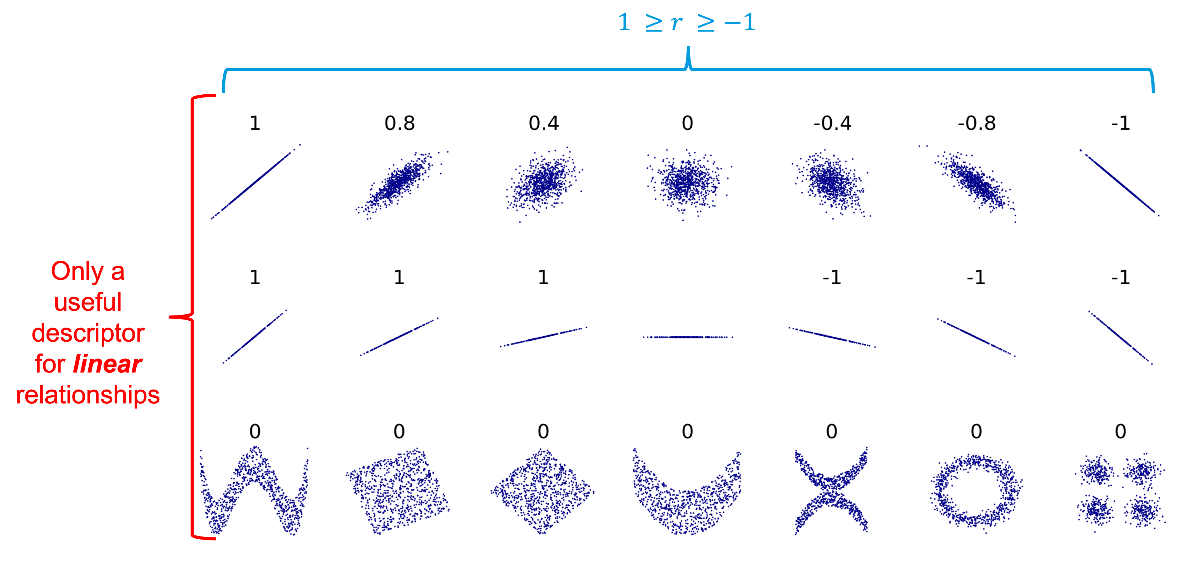
And so, here we have what the total base water volume in the total gas looks like. And now we could make some qualitative statements about the correlation. Here we can say that it is positively correlated and that maybe if I had to estimate it might be about 0.4, maybe, just based off of the example thoughts that we have to go off of. But again, we haven't added any numerical quantity to that yet, and in order to do that we need to find the sample correlation coefficient, which is r. So, I'm actually going to do this inside a print statement. So, I'm going to say correlation coefficient, and then I'm going to do a round statement so that it's not printing a bunch of different, a bunch of extra numbers. We really only need a few. And then I'm going to give the command for finding the correlation of sample data. So we can say merge_df total base water volume and then the command after the square bracket is dot core open parentheses.
And then we just give the second variable, total gas. And then there's one more thing that we need to do, and that's to finish off our round command. And so it's going to be right here. So you can see how the parentheses are highlighted. So we're still inside that round command, but we're outside of the correlation command. And I'm going to say comma three, which rounds to three decimal places. So we can print it out. And say the correlation coefficient is 49, or 0.494, which is actually,
it's okay. It's not the best correlation coefficient that we have, but it's not terrible. And so, based off of this plot and this correlation coefficient, we can write a conclusion. So, generally when we're thinking about correlation, our core, our conclusion should focus on the direction of the associations of the relationship between the two variables and the evidence for this relationship. And so, I'm just going to paste in some text that I had preloaded and say that to make this conclusion, we can say there is a positive association between total water volume and total gas, which means as total water volume increases, the total gas increases. And the evidence for this is the correlation coefficient, which is positive, and the slope of the line which we can see is also positive. And so, this is sort of a basic way to make do some inference from correlation, but it's still a bit qualitative. It's not, although we do have a quantitative number, it's not necessarily the most statistically sound. And so, what we'll do in the next video is conduct a hypothesis test in order to get at more of that statistical inference instead of just looking solely at one sample.
 Read It: Review of Correlation
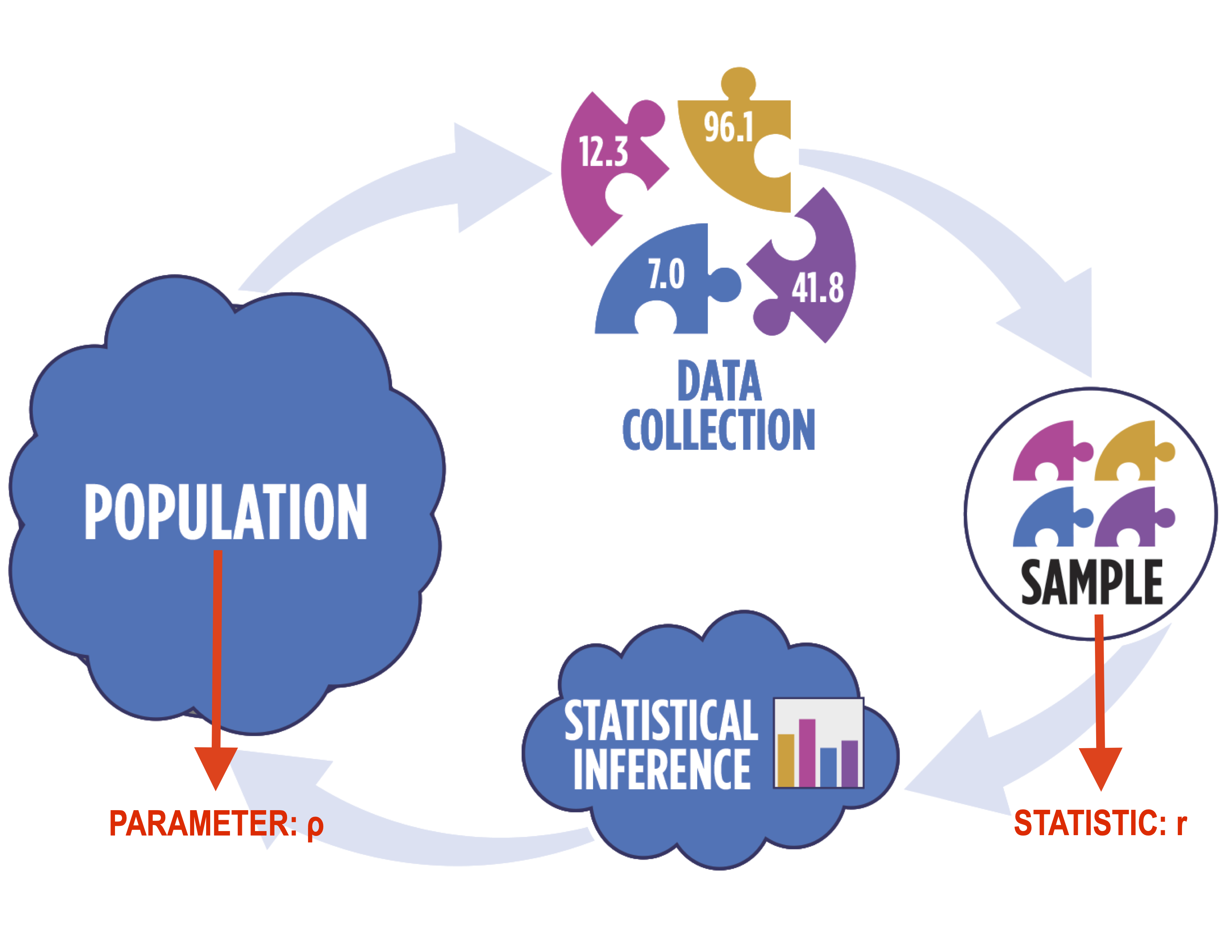
 Watch It: Video - Introduction Correlation (11:37 minutes)
 Try It: DataCamp - Apply Your Coding Skills
 Assess It: Check Your Knowledge