Prioritize...
After reading this page, you should be able to set up data for a regression analysis, execute an analysis, and interpret the results.
Read...
We have focused, so far, on weather and how weather impacts our daily lives. But what about the impacts from long-term changes in the weather?
Climate is the term used to describe how the atmosphere behaves or changes on a long-term scale whereas weather is used to describe short time periods [Source: NASA - What's the Difference Between Weather and Climate?]. Long-term changes in our atmosphere, changes in the climate, are just as important for businesses as the short-term impacts of weather. As the climate continues to change and be highlighted more in the news, climate analytics continues to grow. Many companies want to prepare for the long-term impacts. What should a country do if their main water supply has disappeared and rain patterns are expected to change? Should a company build on a new piece of land, or is that area going to be prone to more flooding in the future? Should a ski resort develop alternative activities for patrons in the absence of snow?
These are all major and potentially costly questions that need to be answered. Let’s examine one of these questions in greater detail. Take a look at this study from Zillow. Zillow examined the effect of sea level rise on coastal homes. They found that 1.9 million homes in the United States could be flooded if the ocean rose 6 feet. You can watch the video below that highlights the risk of flooding around the world.
[ON SCREEN TEXT]: Carbon emission trends point to 4°C (7.2°F) of global warming. The international target is 2°C (3.6°F). These point to very different future sea levels.
GOOGLE EARTH GENERATED GRAPHICS OF HIGH SEA LEVELS IN PLACES SUCH AS NEW YORK CITY, LONDON, AND RIO DE JANEIRO.
[ON SCREEN TEXT]: These projected sea levels may take hundreds of years to unfold, but we could lock in the endpoint now, depending on the carbon choices the world makes today.
You can check out this tool that allows you to see projected sea level rise in various U.S. counties.
Let’s try to determine the degree to which carbon dioxide (CO2) and sea level (SL) relate and whether we can model the relationship using a linear regression.
Data
Climate data is different than weather data. Thus, we need to view it in a different light. To begin with, we are less concerned about the accuracy of a single measurement. This is because we are usually looking at longer time periods instead of an instantaneous snapshot of the atmosphere. This does not mean that you can just use the data without any quality control or consideration for how the data was created. Just know that the data accuracy demands are more relaxed if you have lots of data points going into the statistics, as is often the case when dealing with climate data. Quality control should still be performed.
For this example, we are going to use annual globally averaged data. We can get a pretty good annual global mean because of the amount of data going into the estimation even if each individual observation may have some error. The first dataset is yearly global estimates for total carbon emissions from the Oak Ridge National Laboratory.
The second dataset will be global average absolute sea level change. This dataset was created by Australia’s Commonwealth Scientific and Industrial Research Organization in collaboration with NOAA. It is based on measurements from both satellites and tide gauges. Each value represents the cumulative change, with the starting year (1880) set to 0. Each subsequent year, the value is the sum of the sea level change from that year and all previous years. To find more information, check out the EPA's website on climate indicators.
CO2 and Sea Level
Before we begin, I would like to mention that from a climate perspective, comparing CO2 to sea level change is not the best example as the relationship is quite complicated. However, this comparison provides a very good analytical example and, thus, we will continue on.
We are interested in the relationship between CO2 emissions and sea level rise. Let’s start by loading in the sea level and the CO2 data.
Your script should look something like this:
# Load in CO2 data
mydata <- read.csv("global_carbon_emissions.csv",header=TRUE,sep=",")

# extract out time and total CO2 emission convert from units of carbon to units of CO2
CO2 <- 3.667*mydata$Total.carbon.emissions.from.fossil.fuel.consumption.and.cement.production..million.metric.tons.of.C.
CO2_time <- mydata$Year

# load in Sea Level data
mydata2 <- read.csv("global_sea_level.csv", header=TRUE, sep=",")

# extract out sea level data (inches) and the time
SL <- mydata2$CSIRO...Adjusted.sea.level..inches.
SL_time <- mydata2$Year
Now extract for corresponding time periods.
Your script should look something like this:
# determine start and end corresponding times
start_time <- max(CO2_time[1],SL_time[1])
end_time <- min(tail(na.omit(CO2_time),1),tail(na.omit(SL_time),1))

# extract CO2 and SL for corresponding periods
SL <- SL[which(SL_time == start_time):which(SL_time == end_time)]
time <- SL_time[which(SL_time == start_time):which(SL_time == end_time)]

CO2 <- CO2[which(CO2_time == start_time):which(CO2_time == end_time)]
And plot a time series.
Your script should look something like this:
plot.new()
frame()
grid(nx=NULL,lwd=2,col='grey')
par(new=TRUE)
plot(time,SL,xlab="Time",type='l',lwd=2,ylab="Sea Level Change (Inches)", main="Annual Global Sea Level Change", xlim=c(start_time,end_time))

# plot timeseries of CO2
plot.new()
frame()
grid(nx=NULL,lwd=2,col='grey')
par(new=TRUE)
plot(time,CO2,xlab="Time",type='l',lwd=2,ylab="CO2 Emissions (Million Metric Tons of CO2)", main="Annual Global CO2 Emissions",      xlim=c(start_time,end_time))
You should get the following plots:
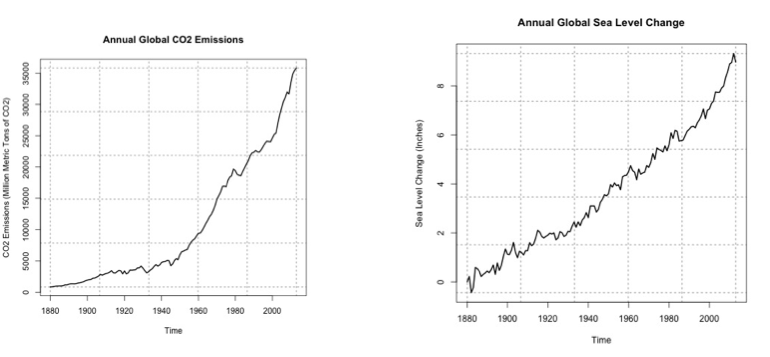
As a reminder, the global sea level change is the cumulative sum. This means that the starting year (1880) is 0. Then, the anomaly of the sea level for the next year is added to the starting year. The anomaly for each sequential year is added to the previous total. The number at the end is the amount that the sea level has changed since 1880. Around the year 2000, the sea level has increased by about 7 inches since 1880. You can see that the two variables do follow a similar pattern, so let’s plot CO2 vs. the sea level to investigate the relationship further.
Your script should look something like this:
# plot CO2 vs. SL
plot.new()
frame()
grid(nx=NULL,lwd=2,col='grey')
par(new=TRUE)
plot(CO2,SL,xlab="CO2 Emissions (Million Metric Tons of CO2)",pch=19,ylab="Sea Level Change (Inches)", main="Annual Global CO2 vs. SL Change",
     ylim=c(0,10),xlim=c(0,35000))
par(new=TRUE)
plot(seq(0,40000,1000),seq(3,10,0.175),type='l',lwd=3,col='red',ylim=c(0,10),xlim=c(0,35000),
     xlab="CO2 Emissions (Million Metric Tons of CO2)",ylab="Sea Level Change (Inches)", main="Annual Global CO2 vs. SL Change"
The code will generate this plot. I’ve estimated a fit to visually inspect the linearity of the data.
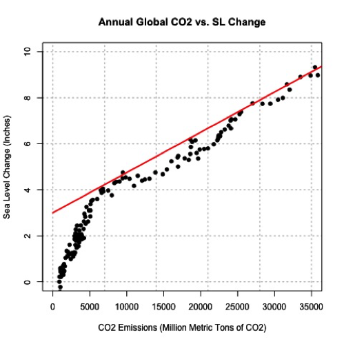
You can see that there appears to be a break around 5,000-10,000 CO2. Below that threshold, the data drops off at a different rate. This actually may be a candidate for two linear fits, one between 0 and 10,000 and one after, but for now, let’s focus on the dataset as a whole. Let’s check the correlation coefficient next.
Your script should look something like this:
# estimate correlation
corrPearson <- cor(CO2,SL,method="pearson")
The correlation coefficient was 0.96, a strong positive relationship. Let’s attempt a linear model fit. Run the code below
This is the figure you would create:
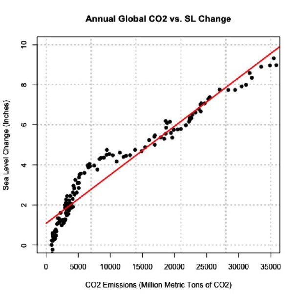
Visually, the fit is pretty good except for CO2 emissions less than 10,000. Quantitatively, we get an R2 of 0.929 which is pretty good, but let’s split our data up into two parts and create two separate linear models. This may prove to be a better representation. I’m going to create two datasets, one for CO2 less than 10,000 and one for values greater. Let's also re-calculate the correlation.
Your script should look something like this:
# split CO2
lessIndex <- which(CO2 < 10000)
greaterIndex <- which(CO2 >= 10000)

# estimate correlation
corrPearsonLess <- cor(CO2[lessIndex],SL[lessIndex],method="pearson")

corrPearsonGreater <- cor(CO2[greaterIndex],SL[greaterIndex],method="pearson")
The correlation for the lower end is 0.96 and for the higher is 0.98. Both values suggest a strong postive linear relationship, so let’s continue with the fit. Run the code below to estimate the linear model. You need to fill in the code for 'lm_estimateGreater'.
The MSE for the lower end is 0.1379 and for the higher end is 0.057, which is significantly smaller than our previous combined MSE of 0.4323. Furthermore, the R2 is 0.9167 for the lower end and 0.9686 for the higher end. This suggests that the two separate fits are better than the combined. Let’s visually inspect.
Your script should look something like this:
plot.new()
frame()
grid(nx=NULL,lwd=2,col='grey')
par(new=TRUE)
plot(CO2,SL,xlab="CO2 Emissions (Million Metric Tons of CO2)",pch=19,ylab="Sea Level Change (Inches)", main="Annual Global CO2 vs. SL Change",
     ylim=c(0,10),xlim=c(0,35000))
par(new=TRUE)
plot(seq(0,10000,1000),seq(0,10000,1000)*lm_estimateLess$coefficients[2]+lm_estimateLess$coefficients[1],type='l',lwd=3,col='firebrick2',ylim=c(0 ,10),xlim=c(0,35000),
     xlab="CO2 Emissions (Million Metric Tons of CO2)", ylab="Sea Level Change (Inches)", main="Annual Global CO2 vs. SL Change")
par(new=TRUE)
plot(seq(10000,40000,1000),seq(10000,40000,1000)*lm_estimateGreater$coefficients[2]+lm_estimateGreater$coefficients[1],type='l',lwd=3,col='darkorange1',ylim=c(0 ,10),xlim=c(0,35000),
     xlab="CO2 Emissions (Million Metric Tons of CO2)", ylab="Sea Level Change (Inches)", main="Annual Global CO2 vs. SL Change"
The figure should look like this:
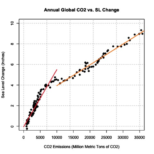
The orange line is the fit for values larger than 10,000 CO2 and the red is for values less than 10,000. This is a great example of the power of plotting and why you should always create figures as you go. CO2 can be used to model sea level change and explains 91-96% (low end – high end) of the variability.
CO2 and Sea Level Prediction
Sea level change can be difficult to measure. Ideally, we would like to use the equation to estimate the sea level change based on CO2 emissions (observed or predicted in the future). Again, since we are using the model for an application, we should make sure the model meets the assumption of normality. If you plot the histogram of the residuals, you should find that they are roughly normal.
The 2014 CO2 value was 36236.83 million metric tons. Run the code below to estimate the sea level change for 2014 using the linear model developed earlier.
The result is a sea level change of 9.2 inches. If we include the RMSE from our equation, which is 0.24 (inches), our range would be 9.2 ±0.48 inches at the 95% confidence level. What did we actually observe in 2014? Unfortunately, the dataset we used has not been updated. We can see that the 2014 NOAA adjusted value was 8.6 inches. The NOAA adjusted value is generally lower than the CSIRO adjusted, so our estimate range is probably realistic.
But what sort of problems do you see from this estimation? The biggest issue is that the CO2 value was larger than what was observed before and thus outside our range of observations in which the model was created. We’ve extrapolated. Since we saw that this relationship required two separate linear models, extrapolating to values outside of the range should be done cautiously. There could very well be another threshold where a new linear model needs to be created, but that threshold maybe hasn’t been crossed yet. We will discuss prediction and forecasting in more detail in later courses.