Prioritize...
After completing this section, you should be able to describe different ways that wind data can be displayed. Specifically, you should be able to interpret wind data plotted as station models, vectors, and streamlines.
Read...
Before we start dissecting the processes that cause the wind to blow, you should be familiar with a few different ways to visualize wind data. Although there are many ways that wind speed and direction data can be displayed, a few of the most common ways are listed below.
A Station Model Review
By way of review, let's recall how wind is displayed on a station model. Remember that one of the most fundamental rules is that the wind direction is always expressed as the direction FROM which the wind blows and NOT the direction toward which the wind blows. So, if the wind blows from the north, for example, it is a "northerly" (or "north") wind, NOT a "southerly" or "south" wind. I know that I bring this concept up at every opportunity, but it is so often forgotten that I want you to think of it every time you are dealing with wind data.
On a station model, the thin-solid line extending outward from the sky coverage symbol denotes the wind direction. Rather than brand the wind with a general direction such as "north" or "southeast," weather forecasters routinely use standard compass angles to fine-tune the wind direction. For sake of illustration, the wind direction from the north is said to blow from a direction of 0 degrees. A wind that blows from the east is a 90-degree wind, while a wind direction of 270 degrees corresponds to a wind that blows from the west.
In terms of decoding the wind speed on a station model, remember that it is always expressed in units of knots (1 knot = 1.15 mph). To quantify the speed of the wind, notches (called "wind barbs") are drawn on the clockwise side of the line representing wind direction at the station. Each longer notch counts as a tally of 10 knots. The shorter notch counts as a tally of five knots. For very strong winds, a "triangular" barb counts as a tally of 50 knots. If the surface wind is "calm," then it has neither direction nor speed. In this case, a larger circle is drawn around the circle that represents the weather station. Remember, that if you need to review how a station model displayed a particular wind speed and direction, you can use the interactive station model tool.
Vector Winds Map
Another approach to displaying wind information is by using a vector winds map. To understand this type of display, we first need to discuss what is meant by a vector. Some variables (such as temperature) only have a single value at a given location and time. These variables are called scalars. Other variables such as the wind are better represented by multiple values. These variables are best represented by a vector. Typically, when we talk about a variable being vector, we mean that this variable has both a magnitude and direction. For example, wind velocity (or any other velocity for that matter) is composed of both wind speed and wind direction. Certainly, we can talk about only wind speed or only wind direction (both are scalar values by themselves), but to get a true picture of the wind, we need to examine the vector quantity of both speed and direction.
Just so you don't think that vectors relate only to movement, consider that the temperature gradient is a vector quantity. In the last lesson we learned how to calculate the magnitude of the temperature gradient by dividing the change in temperature by the change in distance. However, if you think about it, you will realize that the temperature gradient has a direction (or orientation) as well. Therefore, professional meteorologists think about the temperature gradient vector as pointing up the steepest change in temperature and having the magnitude equal to the change in temperature divided by the change in distance.
In order to learn a few more things about how vector quantities are displayed, consider the following composite plot of wind vectors created from data supplied by the Weather Center at Plymouth State University(link is external).
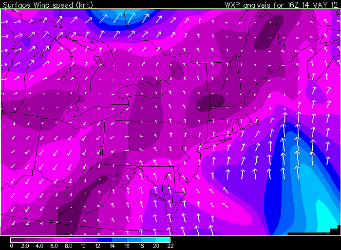
First, notice that vector winds are plotted as arrows. This arrows point in the direction that the wind is blowing (so if the arrow is pointing toward the north, the wind is blowing toward the north). Note, we still report the wind direction that the wind is coming from, regardless of how it is displayed (station model, vector, etc.). The length of each arrow is proportional to the magnitude of the vector. So, the longer the arrow, the stronger the wind. Sometimes vector plots have a "key" with an arrow of a certain length and reference value. Most often in the case of vector winds, a contour plot of wind speed (usually color-coded) accompanies the vectors for ease of interpretation.
I will also point out that in some cases the wind vectors are not scaled with respect to their magnitude. Here is an example of upper-level vector winds in the Northern Hemisphere on January 1, 2012. Note how the vector arrows are used to designate direction only while the color contours are used to display the speed of the wind. The bottom line with these types of data displays is to take a moment and orient yourself with respect to what is being displayed.
Streamlines
You have already been exposed to streamline wind maps when learning about advection. In order that you have a better understanding of these maps, let's look at some more examples and discuss how they are constructed.
Below is a close-up streamline analysis over surface station models and visible satellite imagery at 2015Z on May 8, 2009 (the analysis covered portions of the Central Plains and Middle Mississippi Valley). Notice that you can very quickly see the entire circulation pattern for this region (a task that would be more difficult if you only had the station models). With streamlines, you can easily identify areas where the wind is coming together and where it is spreading apart. We will learn that identifying these regions is key for understanding surface pressure patterns and the weather resulting from such circulations.
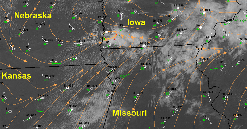
I should point out that drawing streamline maps is beyond the scope of this course. Still, you should understand how these maps are constructed so that you can interpret them correctly.
When weather forecasters manually create a streamline analysis, they generally draw the streamlines tangent(link is external) to local winds. Think of a streamline as the path a child's helium balloon will make if accidentally released to drift with the wind. Each streamline represents the trajectory of the air at that location. For sake of presentation, it's helpful if streamlines are drawn as long as possible, with an arrowhead at the termination point (the arrowhead always points in the direction that the wind is blowing). There are no hard-and-fast rules for drawing streamlines. In fact streamlines may begin or end at any point and are even permitted to join or branch. Sometimes, certain wind observations are ignored when the forecaster suspects that the observed wind direction is caused by a local effect and is unrepresentative of the overall large-scale pattern. Remember that streamlines are all about visualizing the overall circulation of air, not pin-pointing the wind direction at a particular location. (By the way, if you want to see streamlines in action check out this interactive data visualization(link is external) page. It gives you a great feel of how the atmosphere "flows".)
Generally, the the packing of streamlines should qualitatively (and roughly) indicate wind speed; for example, relatively large gradients of streamlines should occur in regions where wind speeds are relatively high (you may add or subtract streamlines to enhance the presentation). Sometimes, streamline analyses are accompanied by a contour plot of wind speed as well (as you saw in the lesson on advection). Finally, it's customary to end streamlines over regions where there are dramatic wind shifts or where the wind spirals inward on itself. These situations are indicative of special surface features such as low pressure centers and troughs. We'll learn more about these features in this lesson.
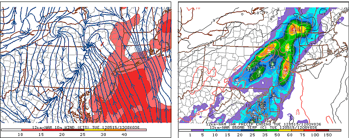
For a final example of streamlines, check out the image below. This graphic shows a 36-hour computer generated forecast for May 15, 2012. Notice that the streamlines all seem to come together in eastern Pennsylvania and central Virginia. Now look at the precipitation forecast on the right. Hmmm... there must be something important going on along this surface wind feature that is in some way tied to precipitation.
In order to understand such situations, we need to know more about what causes the wind and the implications that result from the movement of air at the surface. Read on.
Quiz Yourself...
Take this quick quiz to make sure that you understand how to read the wind direction from a station model.