Global Energy Consumption
Since we are going to be modeling the future of global energy consumption, we should first familiarize ourselves with the recent history of energy consumption.

Figure 4. This plot shows the history of global energy production from different sources. Note that as time goes on, we are getting our energy from more sources. Data from Smil (2010).
Click for a text description of the History of Global Energy Consumption graph.
The image is a stacked area chart titled "History of Global Energy Consumption," showing the consumption of various energy sources from 1800 to 2000. The y-axis represents energy consumption in exajoules (EJ), ranging from 0 to 500 EJ. The x-axis represents the years, marked at intervals from 1800 to 2000.
The chart includes data for six different energy sources, each represented by a different colored area:
- Biofuels: Represented by a red area at the bottom of the stack, biofuel consumption starts at around 10 EJ in 1800 and shows a gradual increase, peaking around 50 EJ by 2000.
- Coal: Represented by a green area above biofuels, coal consumption starts near 0 EJ in 1800, begins to rise significantly around 1850, and continues to increase sharply, reaching approximately 150 EJ by 2000.
- Crude Oil: Represented by a yellow area above coal, crude oil consumption starts near 0 EJ around 1880, with a notable increase starting around 1900, reaching about 150 EJ by 2000.
- Natural Gas: Represented by a light blue area above crude oil, natural gas consumption starts near 0 EJ around 1900, with a sharp increase post-1950, reaching around 100 EJ by 2000.
- Hydro Electricity: Represented by an orange area above natural gas, hydro electricity consumption starts near 0 EJ around 1900, with a steady increase over time, reaching about 30 EJ by 2000.
- Nuclear Electricity: Represented by a dark blue area at the top, nuclear electricity consumption starts near 0 EJ around 1950, with a rapid increase from that point, reaching around 30 EJ by 2000.
Key observations:
- The total energy consumption shows a steep rise starting around the mid-20th century.
- Coal and crude oil have the largest contributions to the total energy consumption, especially from the late 19th century onwards.
- Natural gas becomes significant post-1950.
- Hydro and nuclear electricity start later but show steady growth.
- Biofuels have a consistent but smaller share throughout the period.
A legend on the right side of the chart identifies the colors associated with each energy source.
Credit: David Bice @ Penn State is licensed under CC-BY-NC-4.0
Question: Why has our energy consumption increased over this time period?
Here, we will explore a few possibilities, the first of which is global population increase — more people on the planet leads to a greater total energy consumption. To evaluate this, we need to plot the global population and the total energy consumption on the same graph to see if the rise in population matches the rise in energy consumption.

Figure 5. Data from Smil (2010), and UN (population).
Click for a text description of the Energy Consumption and Population graph.
The image is a line graph titled "Energy Consumption and Population," showing the relationship between global energy consumption and global population from the year 1800 to 2000.
- Axes:
- The x-axis represents the years, ranging from 1800 to 2000.
- The left y-axis represents energy consumption in exajoules (EJ), ranging from 0 to 500 EJ.
- The right y-axis represents population in billions, ranging from 0.800 to 6.800 billion
- Data Series:
- Energy Consumption: Represented by blue squares connected by a line, this series shows the trend of global energy consumption over time. It starts at a low level around 10 EJ in 1800 and increases steadily, with a significant rise starting around 1950, reaching approximately 450 EJ by 2000.
- Population: Represented by red circles connected by a line, this series shows the trend of global population growth. It starts at around 1 billion in 1800 and grows gradually, with a sharp increase post-1950, reaching about 6.8 billion by 2000
- Trends:
- Both energy consumption and population show a similar trend of gradual increase until around 1950, after which both exhibit exponential growth.
- The correlation between the two trends is evident, with both lines rising sharply in the latter half of the 20th century, indicating a strong relationship between population growth and energy consumption
- Key Points:
- Around 1800, energy consumption is very low, and the population is just above 1 billion.
- By 1900, energy consumption has risen to about 30 EJ, and the population has grown to approximately 1.6 billion.
- Post-1950, there is a dramatic increase in both metrics, with energy consumption reaching nearly 450 EJ and the population reaching 6.8 billion by 2000
The graph uses two different scales to represent energy consumption and population, with the right y-axis for population being in billions and the left y-axis for energy consumption being in exajoules. The visual representation highlights the parallel growth of these two variables over the 200-year period.
Credit: David Bice @ Penn State is licensed under CC-BY-NC-4.0
The two curves match very closely, suggesting that population increase is certainly one of the main reasons for the rise in energy consumption. But is it as simple as that — more people equals more energy consumption?
If the rise in global energy consumption is due entirely to population increase, then there should be a constant amount of energy consumed per person — this is called the per capita energy consumption. To get the per capita energy consumption, we just need to divide the total energy by the population (in billions) — so we’ll end up with Exajoules of energy per billion people.
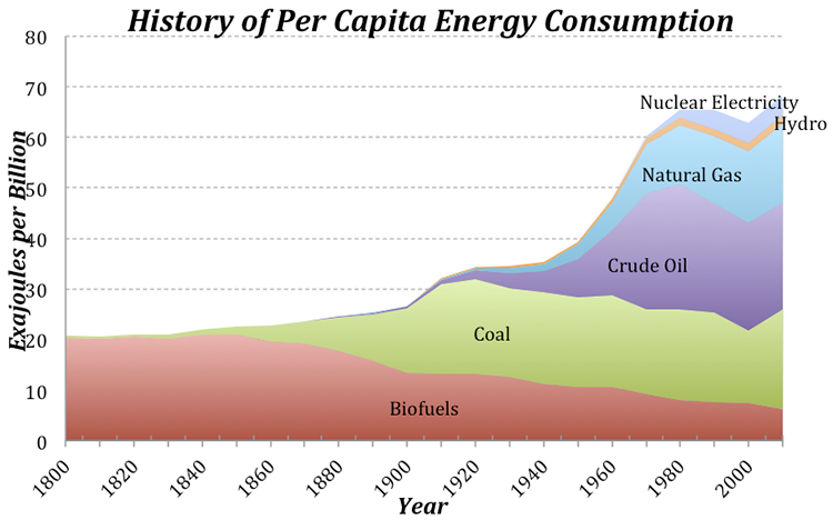
Figure 6. The globally averaged per capita energy consumption, broken down by energy source. Data from Smil (2010), and UN (population).
Click for a text description of the History of Per Capita Energy Consumption graph.
The image is a stacked area chart titled "History of Per Capita Energy Consumption," showing the consumption of various energy sources per capita from 1800 to 2000. The y-axis represents energy consumption in exajoules per billion people, ranging from 0 to 80 EJ per billion. The x-axis represents the years, marked at intervals from 1800 to 2000.
The chart includes data for six different energy sources, each represented by a different colored area:
- Biofuels: Represented by a red area at the bottom of the stack, biofuel consumption starts at around 10 EJ per billion in 1800 and shows a gradual increase, peaking around 20 EJ per billion by the mid-20th century before declining slightly towards 2000.
- Coal: Represented by a green area above biofuels, coal consumption starts near 0 EJ per billion in 1800, begins to rise significantly around 1850, and continues to increase, reaching a peak of about 30 EJ per billion around 1950, then declines slightly but remains significant.
- Crude Oil: Represented by a purple area above coal, crude oil consumption starts near 0 EJ per billion around 1880, with a notable increase starting around 1900, reaching about 30 EJ per billion by 1970, then slightly decreases.
- Natural Gas: Represented by a light blue area above crude oil, natural gas consumption starts near 0 EJ per billion around 1900, with a sharp increase post-1950, reaching around 20 EJ per billion by 2000.
- Hydro: Represented by an orange area above natural gas, hydro energy consumption starts near 0 EJ per billion around 1900, with a steady increase over time, reaching about 10 EJ per billion by 2000.
- Nuclear Electricity: Represented by a dark blue area at the top, nuclear electricity consumption starts near 0 EJ per billion around 1950, with a rapid increase from that point, reaching around 10 EJ per billion by 2000.
Key observations:
- The total per capita energy consumption shows a steady increase from 1800, with a significant rise starting around the mid-20th century.
- Coal and crude oil have significant contributions to per capita energy consumption, especially from the late 19th century onwards.
- Natural gas becomes a major contributor post-1950.
- Hydro and nuclear electricity start later but show steady growth, becoming more prominent towards the end of the 20th century.
- Biofuels have a consistent but decreasing share towards the end of the period.
A legend on the right side of the chart identifies the colors associated with each energy source.
Credit: David Bice @ Penn State is licensed under CC-BY-NC-4.0
Today, we use about 3 times as much energy per person than in 1900, which is not such a surprise if you consider that we have many more sources of energy available to us now compared to 1900. Note that at the same time that the population really takes off (see Fig. 5), the per capita energy consumption also begins to rise. This means that the total global energy consumption rises due to both the population and the demand per person for more energy.
Let’s try to understand this per capita energy consumption a bit better. We know that the global average is 74 EJ per billion people, but how does this value change from place to place? There are some huge variations across the globe — Afghans use about 4 GJ per person per year, while Icelanders use 709 GJ per person. Why does it vary so much? Is it due to the level of economic development, or the availability of energy, or the culture, or the climate? You can come up with reasons why each of these factors (and others) might be important, but let’s examine one in more detail — the economic development expressed as the GDP (the gross domestic product, which reflects the size of the economy) per capita.

Figure 7. The per capita energy as a function of the per capita GDP. The axes of this plot are not linear, but logarithmic in order to show more clearly what is going on at the lower values. If you plot this with linear axes, the data mostly form a big cloud in the lower left. The red squares show the global averages in 2013 and about 1950. Data World Bank.
Click for a text description of Relationship Between GDP and Energy Consumption.
The image is a scatter plot graph titled "Relationship Between GDP and Energy Consumption." It illustrates the relationship between per capita GDP (in $) on the x-axis and per capita energy consumption (in GJ/person) on the y-axis for various countries over time. The graph uses a logarithmic scale for both axes.
- Axes:
- The x-axis is labeled "Per Capita GDP $" and ranges from 1,000 to 100,000.
- The y-axis is labeled "Per Capita Energy Consumption (GJ/person)" and ranges from 1 to 1,000.
- Data Points:
- Each data point represents a country, with blue circles indicating data from various years.
- Specific countries are highlighted with labels:
- Afghanistan is located at the lower left of the graph, indicating low GDP and low energy consumption.
- Mexico is positioned towards the middle of the graph.
- USA is located towards the upper right, indicating higher GDP and energy consumption.
- Qatar and Iceland are at the far right, with very high GDP and energy consumption, with Iceland having the highest energy consumption
- Global Averages:
- Two red squares mark the global averages:
- One labeled "Global Average 1950" is located lower on the graph, indicating lower GDP and energy consumption.
- Another labeled "Global Average 2013" is positioned higher, showing an increase in both GDP and energy consumption over time.
- Trends:
- There is a general upward trend, suggesting that as per capita GDP increases, so does per capita energy consumption.
- The spread of data points widens as GDP increases, indicating variability in energy consumption among countries with similar GDP levels.
- Annotations:
- Arrows point to the labeled countries and global averages, providing a visual guide to their positions on the graph.
The graph uses a logarithmic scale to accommodate the wide range of values, and the data points are densely packed, showing the distribution and relationship between GDP and energy consumption across different countries.
Credit: David Bice @ Penn State is licensed under CC-BY-NC-4.0
The obvious linear trend to these data suggests that per capita energy consumption is a function of GDP, while the fact that it is not a tight line tells us that GDP is not the whole story in terms of explaining the differences in energy consumption. Not surprisingly, we are near the upper right of this plot, consuming more than 300 GJ per person per year. Iceland’s economy is not as big per person as ours, and yet they consume vast amounts of energy per person, partly because it is cold and they have big heating demands, but also because they have abundant, inexpensive geothermal energy thanks to the fact that they live on a huge volcano. Many European countries with strong economies (e.g., Germany) use far less energy per person than we do (168 GJ compared to our 301 GJ), in part because they are more efficient than us and in part because they are smaller, which cuts down on their transportation. A big part of the reason they are more efficient than us is that energy costs more over there — for instance, a gallon of gas in Italy is about $8. Our neighbor, Mexico, has a per capita energy consumption that is just about the global average.
Pay attention to the two red squares in Fig. 7 — these show the global averages in terms of GDP and energy consumption per person for two points in time. The trend is most definitely towards increasing GDP (meaning increasing economic development) and increasing energy consumption per person. Economic development is definitely a good thing because it is tied to all sorts of indicators of a higher quality of life — better education, better health care, better diet, increased life expectancy, and lower birth rates. But, economic growth has historically come with higher energy consumption, and that means higher carbon emissions.
Now that we’ve seen what some of the patterns and trends are, we are ready to think about the future.
