Prioritize...
After finishing this section, you should be able to visualize and summarize data using numerous methods.
Read...
Before diving into the analysis, it is really important that we synthesize the data. Although the purpose of data mining is to find patterns automatically, you still need to understand the data to ensure your results are realistic. Although we have learned several methods of summarizing data (think back to the descriptive statistics lesson), with data mining you will potentially be using massive amounts of data and new techniques may need to be used for efficiency.
In this section, I will present a few new methods for looking at data that will help you synthesize the observations. You don’t always need to apply these methods but having them in your repertoire will be helpful when you come across a result you don't understand.
For simplicity, I will use clean.stateData for the rest of the lesson, showing you the data mining process with this one state’s data that has been ‘cleaned’ (missing values dealt with). Furthermore, since we are only looking at one state, I’m going to only consider the three storm variables that have a longer time period (tornado, hail, and thunderstorm/wind). I want more data points to create a more robust result. At the end, I’ll show you how we could create one process to look at all of the states at once.
Enrich Old Techniques
Run the code below to summarize the data:
This provides the minimum, maximum, median, mean, 1stquantile and 3rd quantile values for each variable. The next step is to visualize this summary. We can do this by plotting probability density histograms of the data. Let’s start with the TsWind variable.
Your script should look something like this:
# plot a probability density histogram of variable TsWind
hist(clean.stateData$tsWind,prob=T)
You would get the following figure:
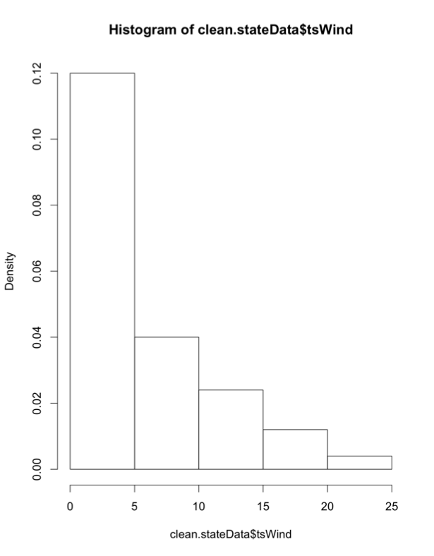
Visually, the greatest frequency occurs for annual event counts between 0 and 5, which means the frequency of this event (tsWind) is relatively low, although there are instances of the frequency exceeding 25 events for one year. How do we enrich this diagram? Run the code below to plot the PDF overlaid with the actual data, as well as a Q-Q plot.
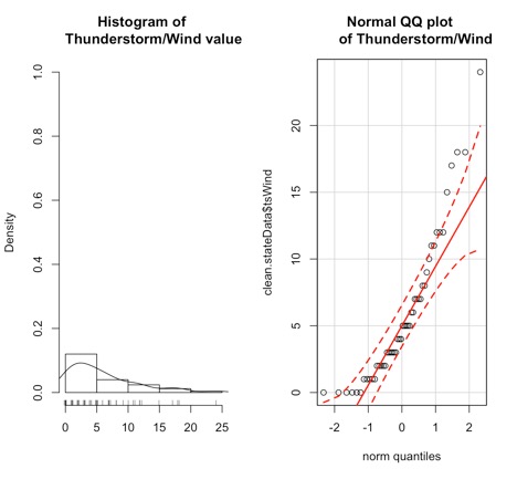
The left plot is the probability density histogram, but we’ve overlaid an estimate of the Gaussian distribution (line) and marked the data points on the x-axis. The plot on the right is the Q-Q plot which we’ve seen before; it describes how well the data fits the normal distribution.
But what if the data doesn’t appear normal? We can instead visualize the data with no underlying assumption of the fit. We do this by creating a boxplot.
Your script should look something like this:
# plot boxplot
boxplot(clean.stateData$tsWind,ylab="Thunderstorm/Wind")
rug(jitter(clean.stateData$tsWind),side=2)
abline(h=mean(clean.stateData$tsWind,na.rm=T),lty=2)
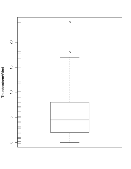
We have done boxplots before, so I won’t go into much detail. But let’s talk about the additional functions I used. The rug (jitter) function plots the data as points along the y-axis (side2). The abline functions (horizontal dashed line) plots the mean value, allowing you to compare the mean to the median. The boxplot is also a great tool to look at outliers. Although we have ‘cleaned’ the dataset of missing values, we may have outliers which are represented by the circle points.
Visualize Outliers
If we want to dig into outliers a bit more, we can plot the data and create thresholds of what we would consider ‘extreme’. Run the code below to create a plot with thresholds:
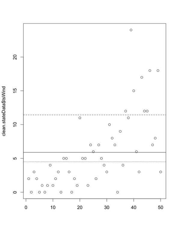
This code creates a horizontal line for the mean (solid line), median (dotted line), and mean+1 standard deviation (dashed line). It creates boundaries of realistic values and highlights those that may be extreme. But remember, you create those thresholds, so you are deciding what is extreme. By adding one more line of code, we can actually click on the outliers to see what their values are:
identify(clean.stateData$tsWind)
This function allows you to interactively click on all possible outliers you want to examine (hit ‘esc’ when finished). The numbers displayed represent the index of the outliers you clicked. If you want to find out more details, then use this code to display the data values for those specific indices:
Your script should look something like this:
# output outlier values
clicked.lines <- identify(clean.stateData$tsWind)
clean.stateData[clicked.lines,]
If, instead, you don’t want to use the identify function but have some threshold in mind, you can look at the indices by using the following code:
Your script should look something like this:
# look indices with Tswind frequency greater than 20
clean.stateData[clean.stateData$tsWind > 20,]
Conditional Plots
The last type of figures we will discuss are conditional plots. Conditional plots allow us to visualize possible relationships between variables. Let’s start by looking at acreage planted and how it compares to the yield per acre. First, create levels of the acreage planted (low, high, moderate).
Your script should look something like this:
# determine levels of acreage planted
clean.stateData$levelAcreagePlanted <- array(data="Moderate",dim=length(clean.stateData$Year))
highBound <- quantile(as.numeric(clean.stateData$Acreage.Planted),0.75,na.rm=TRUE)
lowBound <- quantile(as.numeric(clean.stateData$Acreage.Planted),0.25,na.rm=TRUE) clean.stateData$levelAcreagePlanted[which(as.numeric(clean.stateData$Acreage.Planted) > highBound)] <- "High" clean.stateData$levelAcreagePlanted[which(as.numeric(clean.stateData$Acreage.Planted) < lowBound)] <- "Low"
Run the code below that uses the function bwplot from lattice to create a conditional boxplot.
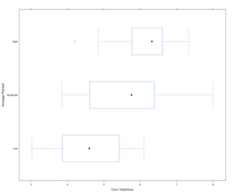
For each level of acreage planted (y-axis), the corresponding corn yield data (x-axis) is displayed as a boxplot. As one might expect, if the acreage planted is low the yield is low (boxplot shifted to the left), while if the acreage planted is high we have a higher corn yield (boxplot shifted to the right). This type of plot is a good first step in exploring relationships between response variables and factors.
We can enrich this figure by looking at the density of each boxplot. Run the code below.
Below is an enlarged version of the figure
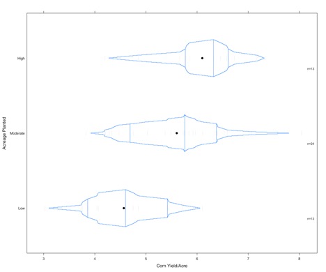
Credit: J. Roman
The vertical lines represent the 1st quantile, the median, and the 3rd quantile. The small dashes are the actual values of the data (these are pretty light on this figure and difficult to see).
The final conditional plot we will talk about uses the function stripplot. In this plot, we are going to add the ts_wind variable to our conditional plot about acreage planted and yield. It adds another layer of synthesis. To start, we chunk up the ts_wind data into three groups.
Your script should look something like this:
ts_wind <- equal.count(na.omit(clean.stateData$tsWind),number=3,overlap=1/5)
The function ‘equal.count’ essentially does what we did for the acreage planted. We created three categories for the frequency of thunderstorm/wind events. Now use the function stripplot to plot the acreage planted, conditioned by yield and ts_wind.
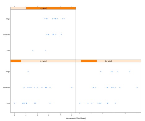
The graph may appear complex, but it really isn't so let’s break it down. There are three panels: one for high ts_wind (upper left), one for low (bottom left), and one for moderate (bottom right); displayed in the orange bar. The x-axis on each is the yield and the y-axis is the acreage planted. For each panel, the yield/acre data corresponding to the level of ts_wind is extracted and then chunked based on the corresponding acreage. This plot can provide information for questions such as: Does a high frequency of thunderstorm wind, along with a high acreage planted result in a higher yield, than say, a low thunderstorm wind frequency? This type of graph may or may not be fruitful. It can also be used as a follow-up figure to an analysis (once you know which factors are important to a response variable).